Author: Adam Simmons
Date published: November 6th 2012
Table of Contents
Introduction
One of the most noteworthy display trends in recent times is the increasing affordability of In-Plane Switching (IPS) technology – 21-23” models in particular. There has traditionally been quite a gulf when it comes to 27” models, however. IPS models of this size tend to go ‘all out’ with 2560 x 1440 resolutions, high colour depths and relatively steep price tags. Now the main IPS player, LG Display, have took the initiative and produced some lower cost 27” IPS panels with 1920 x 1080 (Full HD) resolutions.
The Dell S2740L is the first monitor to make use of a glossy 27” IPS panel. With its glossy glass-covered design and capable technology within Dell are hoping that this monitor can brew up a bit of a storm. If that is the case then will it be for the right reasons? We pummel the monitor (with games, movies and other little tests) to find out.
Specifications
The basic specifications reveal the use of a 27” LED-backlit AH-IPS panel with a ‘Full HD’ (1920 x 1080) resolution. This provides enhances viewing angles of 178 degrees horizontally and vertically whilst supporting 6-bits per colour channel natively with additional AFRC (Advanced Frame Rate Control) temporal dithering to make up to 8-bits. Contrast ratio is quoted as the usual 1000:1 static and the response time is given as 7ms which is fairly conservative but confirms the presence of grey to grey acceleration. The price is set at a level which reflects the overall brand reputation of Dell and the panel quality but also the lower resolution of the monitor. These key ‘talking points’ of the specification have been highlighted in blue.
Features and aesthetics
The glossy screen with edge-to-edge glass covering is a dominant feature at the front of the Dell S2740L. This confers a number of advantages over matte surfaces. The glass surface is also quite pleasing aesthetically and makes the front of the screen flush. At around 21mm the bezels are not massively thick for a glass-covered screen, either. The downside of this is that the monitor is best suited to controlled lighting environments as reflections can be an issue. As illustrated below, windows facing the screen during daylight are certainly something to avoid with this one.
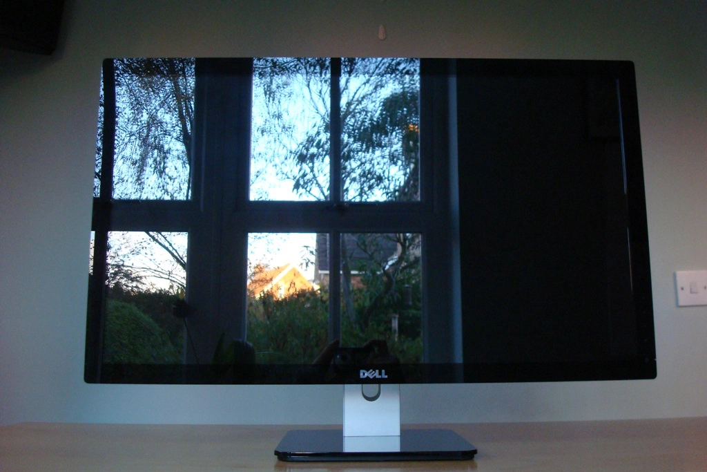
Once the monitor is on and placed in a more suitable location things improve, particularly when it’s displaying lighter content. Strong light streaming in from the sides can still be an issue, however. The image below shows the monitor displaying some light content under bright and clear autumn daylight conditions. Sun is streaming in through a window to the side and you can see that although reflections are less noticeable than on the first photograph they are still very much present.
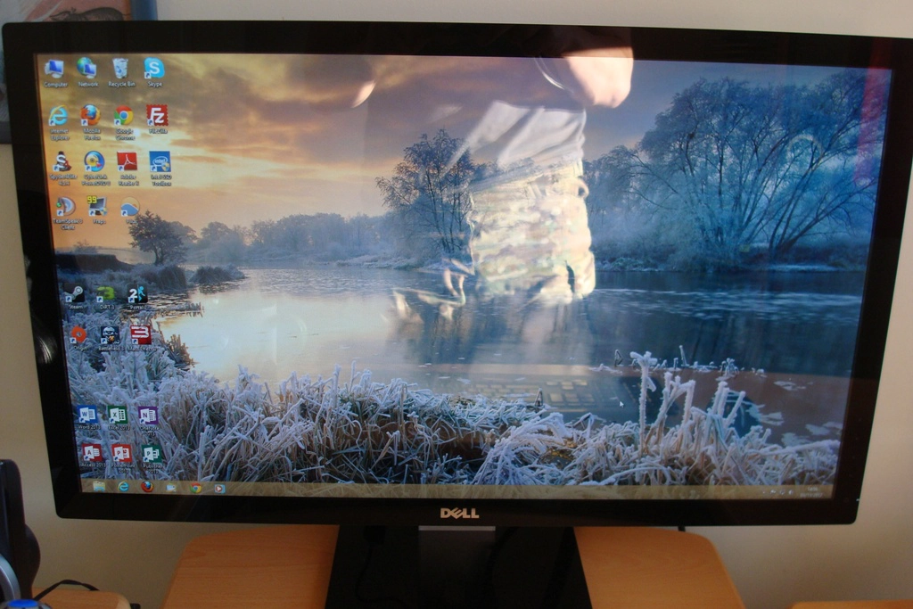
Under dimmer conditions, including daylight without sun streaming in through the window, things certainly improve. It is worth taking a quick look at the ‘features and aesthetics’ section of our S2440L which illustrates how the glass surface behaves in various lighting conditions when displaying both dark and lighter content. The surface and entire front face of the S2740L is identical to this but larger – the effect is the same.
Due to the space between the screen itself and the glass ‘cover’ you can sometimes observe internal reflections. These are most likely to happen when light content (particularly white) is displayed against a much darker background as illustrated in the picture below. We didn’t find this too bothersome and it wasn’t all that common but it’s worth noting as some users may find this bothersome.
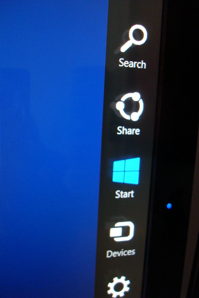
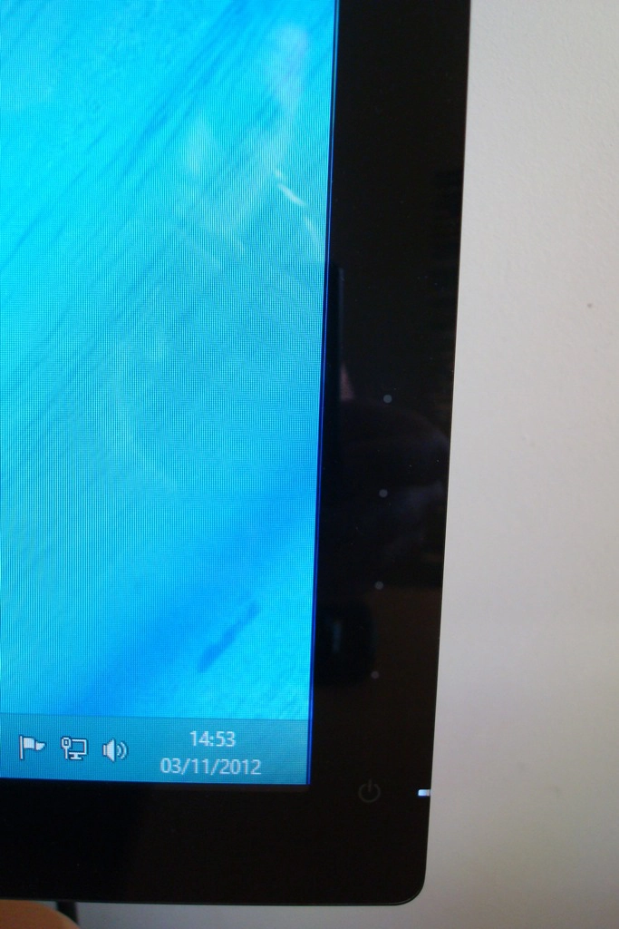
The menu controls and power button arrangement can also be found at the front of the monitor, at the bottom of the right bezel. This consists of 4 touch sensitive areas (marked by faint grey dots), a power button and LED as shown in the following image. When the monitor is switched on the power LED glows an icy white – certainly less blue than it appears in the image. When the monitor is on standby this turns orange.
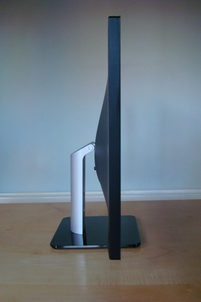
The side profile is fairly slender, particularly near the edges where the screen is 19mm thick. It ‘lumps out’ at the centre where the ports are located and the stand attaches. The stand itself is a fairly simple flat, glossy and black plastic square with a matte silver plastic neck.
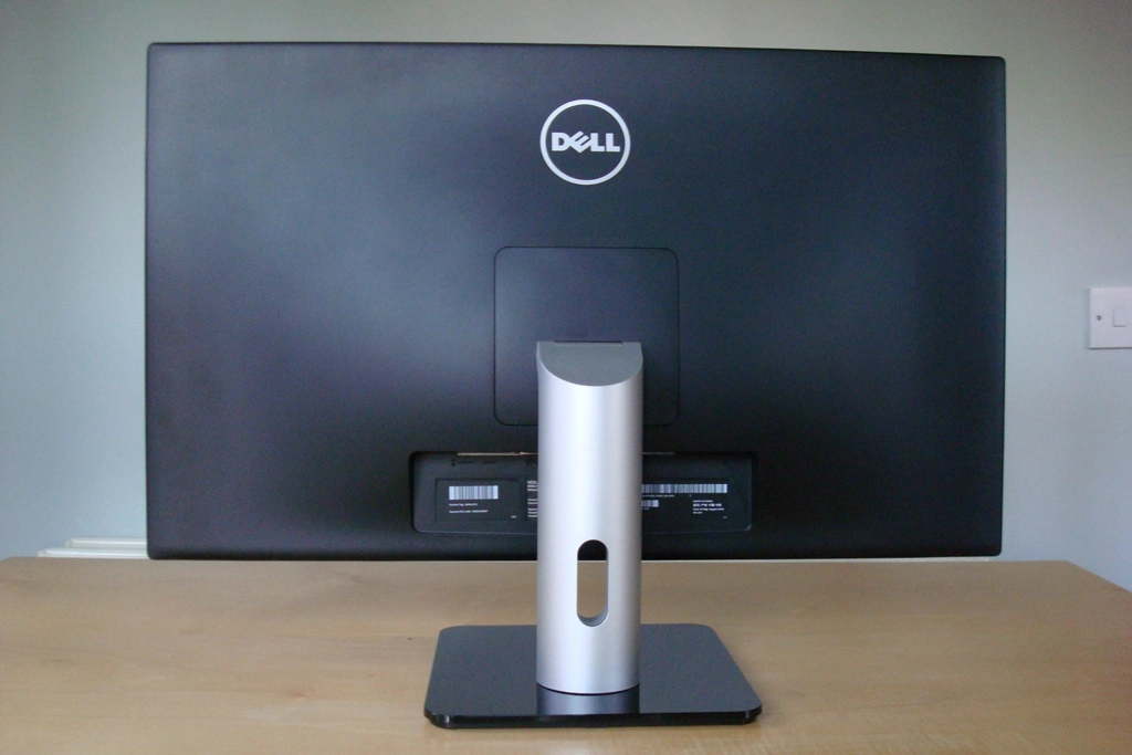
At the rear the monitor is quite plain with a simple matte plastic finish, Dell logo at the top and the stand and ports at the bottom.
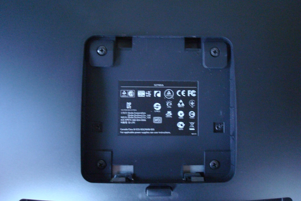
The stand is easily detached using a quick release mechanism above the ports. You will then find screws which can be removed to facilitate alternative mounting using a 100 x 100mm VESA arrangement.
The ports are fairly minimal compared to what you would see on a 27” UltraSharp but include the basics and a couple of nice additions; audio out, HDMI, DVI-D, VGA, DC power input, USB upstream and 2 USB 2.0 ports. No USB 3.0 ports, DisplayPort or additional HDMI ports but a reasonable selection nonetheless.
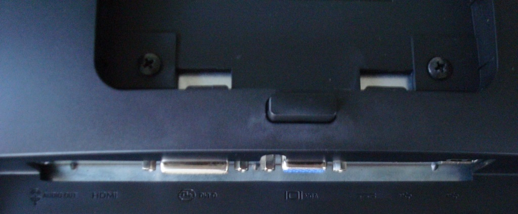
The port selection is quite limited on this model – audio out, HDMI, VGA and DC (power) input. There is also a Kensington lock socket just to the right of the ports. The monitor comes with a VGA cable and the power adaptor but doesn’t include an HDMI cable. You’ll need to use your own to make use of this digital input.
To round off this section we’ll take a look at the OSD (On Screen Display) of the S2740L, which is controlled by the touch-sensitive pads at the bottom of the right bezel. Pressing any of these once brings up a simple menu which labels each button with a distinct function. The top two buttons are customisable in the main menu, which is accessed with the third button down. The menu is identical to that on the S2440L – which has its main features highlighted in the video below.
Calibration
We hooked up the monitor via DVI to our Radeon 7950 and observed some familiar desktop images, game content and the Lagom website as well as using a Spyder4Elite colorimeter to assess performance. Using default settings the image appeared fairly well balanced with a reasonably rich and vibrant quality. It was a touch strong in the green and blue channels relative to red giving the image a cool cast whilst some areas lacked appropriate depth and saturation. This was easily corrected by lowering brightness and switching to the ‘Custom Color’ preset mode to access the colour channels. The following settings were adopted as our ‘test settings’ – note that individual units may vary and these settings should only be used as a guide.
Preset Mode= Custom Color
Brightness= 60 (depending on lighting)
Contrast= 75
Red= 100
Green= 97
Blue= 97 We also hooked up an Nvidia GTX 670 by DVI to see if our test settings would need adjusting at all for Nvidia GPUs. The image appeared very similar. If you wish to use the HDMI output on an Nvidia graphics card, though, you will probably notice the image appearing a bit washed out with lightened blacks, a lack of shade range and depth alongside instances of obvious banding. That is because the GPU is sending the incorrect (limited range) colour signal to the screen and treating it as an HDTV rather than a monitor. This is easy to rectify by setting a custom resolution in the Nvidia Control Panel. The trick here is to use a refresh rate that is just a fraction off 60Hz so it doesn’t duplicate an existing resolution. The monitor and GPU will essentially treat this as a 60Hz signal but will display the proper shade range. This process is shown in the video below. Using a Konica Minolta CS-200 ‘Chroma Meter’ we measured the luminance of pure white and black using a range of settings on the monitor and from this calculated the contrast ratio. Unless otherwise stated assume default settings but with dynamic contrast disabled in all cases. The highest white luminance, lowest black luminance and highest contrast ratio are highlighted in black whilst the results for our test settings are highlighted in blue. Contrast performance on the Dell S2740L was strong, averaging 1092:1 on ‘Standard’ mode which ranks amongst the best we’ve seen from IPS monitors. The monitor was also able to maintain a ratio of 1072:1 following the slight colour channel adjustments of our test settings which is very pleasing. Some weaknesses were evident in some of the preset modes, particularly ‘Cool’ where a static contrast of 709:1 was recorded. ‘Multimedia’, ‘Movie’ and ‘Game’ also fell below the 1000:1 mark, hovering at around 900:1. To be honest though, the oversaturation, excessive sharpness and general unbalanced appearing of the image are more pressing concerns for these modes. Some users may wish to use ‘Game’ or ‘Movie’ mode simply to access the dynamic contrast feature exclusive to these presets. It is a pretty rapidly reacting dynamic contrast mode and is certainly very dynamic. Perhaps more practical is the ‘Energy Smart’ feature located in the ‘Other Settings’ section of the OSD. This is a more measured and gentle dynamic contrast implementation with a more comfortable peak luminance. Importantly it is also available in any preset mode, which is good. We are also pleased to note that this monitor does not use PWM dimming for the backlight. Some users are sensitive to the rapid ‘on-off’ pulses used to dim the backlight on some modern monitors so it’s good that this dimming method isn’t used on this model. To assess the uniformity of colours other than black we used a Spyder4Elite to measure the luminance of 9 white ‘quadrants’ laid out across the screen from top left to bottom right. The table below shows the luminance at each as well as a percentage difference between a given quadrant and the brightest point on the screen. Uniformity was excellent with deviation of 1-8% from the brightest point (‘quadrant 5’ at the centre) and every other quadrant. The greatest deviations occurred at ‘quadrant 4’ (left of centre) and ‘quadrant 6’ (right of centre) where around 176 cd/m2 was recorded – 8% dimmer than the 192.2 cd/m2 maximum. The lowest deviation occurred at ‘quadrant 1’ (top left) where 190 cd/m2 was recorded, which is a mere 1% off the brightest point. Elsewhere there was between 2-6% deviation from the central point which is very pleasing. Overall the average deviation between the centre and non-central quadrants was just under 5%. Uniformity may vary a bit between individual S2740Ls but these were some encouraging results. For those that prefer a graphical representation of uniformity the contour map below combines these readings with extrapolated intermediates. The lighter the grey, the higher the luminance – as you can see the map is devoid of any particularly dark grey shades. This is good because dark greys would indicate particularly troublesome areas and high deviation from the brightest point. We also like bring everything together and give our subjective impressions of the contrast performance in a range of game and movie titles. Our first test title, Battlefield 3, was given a quite immersive experience really. Bright elements such as gunfire, lamps and explosions had a very smooth and pure look to them thanks to the glossy screen and really jumped out at you. A good level of ‘dark detail’ was also visible, with the exception of the areas near the corner of the screen that were shrouded somewhat by IPS glow. Some quite subtle detail such as reflection on the eyepieces of weapon optics could be picked out with ease which is a positive thing. Dirt 3 told a similar story. Aside from the slight loss of detail towards the corners (IPS glow) the dark and dingy aspects of the image showed good levels of detail. Some of the most subtle detail to material textures and whatnot lacked the distinctness that you’d get from a good VA panel but was as good as we’ve seen from the remaining LCD panel types. The bright aspects such as car headlights and lamps in the night really stood out with a lifelike purity to them which is always nice to see. The Dell S2740L also gave a competent performance in the Blu-ray of ‘The Girl with The Dragon Tattoo’. A good range of distinct shades was visible with the only noticeable loss of detail occurring right in the corners where the glow was present. The bright lights and fires in the film had an excellent lifelike quality and contrasted nicely with their dark surroundings. This monitor was also a strong performer on the Lagom LCD tests for contrast, where we observed the following. The Dell S2740L’s colour gamut (red triangle) was compared to the sRGB space (green triangle) under our testing settings using the Spyder4Elite’s reporting features. The results are shown in the image below. The colour gamut corresponds very closely with the sRGB reference in this view of the colour gamut. There is some slight extension in some green shades but it’s very close overall. This is good news as far as colour accuracy is concerned and it’s something that many users will be happy to see. Although a small amount of extension beyond sRGB can be useful for adding a little extra ‘pop’ to the image, the glossy screen surface certainly makes up a lot of ground in this department. The monitor handled colours very nicely on our first game test title, Battlefield 3. Some surprisingly rich and full oranges and reds were displayed which brought fires and explosions to life. Bright cyans from the engineer’s repair tool and the in-game markers were also distinctly vibrant. Although shade variety was confined somewhat by the games ‘art direction’ it was as good as we’ve seen really, giving environments a rich and diverse look. Many of the colours on Dirt 3 also appeared rich, pure and full with a good ‘pop out the screen’ quality to them. The car liveries showcased a pleasing variety of vibrant colours – with deep reds, bright oranges and ‘highlighter’ greens and yellows looking particularly vivid. Some shades such as deep blues and purples were not quite as vivacious as we’ve seen, but this is largely down to the colour gamut not edging past sRGB in this region. Overall the colours were undeniably vibrant but looked natural and appropriate. The rich array of browns and greens certainly gave a pleasing look to the racing environments. It also gave the different environments and indeed elements within the environments unique visual identities, which is a definite strength of IPS panels. Colour performance in Blu-ray movies was also strong. ‘The Girl with The Dragon Tattoo’ looked very natural and appropriately saturated with a nice shade variety. Different woods and vegetation, for example, showcased this nicely. Colours were also very consistent across the screen without any observable shift in colour or contrast. ‘Futurama: Into the Wild Green Yonder’ offers quite a different and much more lively aesthetic but is definitely an excellent test for colour reproduction. The S2740L displayed some excellent neon greens, bright pinks and cyans. The range and consistency of colours on this title was impressive with subtly distinct pastel shades coming through nicely. Large areas of solid colour are also common on this title and appeared as they should regardless of position on the screen. This compares favourably to the slight gradient effect you would see on TN (and to a lesser extent VA) monitors. The strong consistency we’d seen on the games and movie titles we tested was reflected by the Lagom test for viewing angles. This aspect of a monitor is particularly important for colour-critical work but is also good for ensuring shades remain distinct with their own during general use. We observed the following. Dell specify a 5ms grey to grey response time for the S2740L which confirms the use of pixel overdrive to boots transition speeds. We analysed performance on a typical range of rapid grey to grey transitions using a tool called PixPerAn (Pixel Persistence Analyser). This was set to maximum tempo to ensure results were ‘worst case’ as far as this test goes, highlighting any weaknesses. A high-sensitivity camera was used to capture the results as shown below. There is a primary trail which isn’t all that bold, indicating the grey to grey acceleration is doing well at speeding up these transitions. Accompanying this is a dark ‘inverse ghost’ trail as well as a light ‘halo’ trail. These are both examples of overdrive or RTC (Response Time Compensation) artifacts which result from overly aggressive grey to grey acceleration. Dell does not give you the option to disable or reduce the level of acceleration on this monitor. To assess a broad range of pixel transitions at various speeds there is no substitute for careful subjective evaluation of actual games and movies. On Battlefield 3 trailing was generally fairly insignificant, manifesting itself as a light or moderate blur depending on the pace of action. On foot, for example, a decent degree of texture sharpness was maintained even whilst moving quickly. There were fairly frequent occurrences of ‘overdrive artifacts’ as observed on PixPerAn. Some examples of these included some inverse ghosting (and a less noticeable ‘halo’ effect) when looking up at jets moving quickly against the deep blue skies of some levels. Strafing past light objects (tree trunks, lamp posts and some buildings) or bright in-game markers with dark skies overhead produced a similar effect. Perhaps the best example of this could be observed during the high contrast transitions between dark grey runways and the bright white lines painted on them. The video below shows what can be observed whilst manoeuvring a helicopter over such a runway (in this case the USS Essex aircraft carrier). On our second game test title Dirt 3, trailing was relatively low during race modes with a much less pronounced blur than you’d see from a non-overdriven or lightly overdriven IPS panel. Dark trailing and some less noticeable halo artifacts were both fairly common on this title due to the variety of contrasting colours on and around the tracks and the pace of the action. The Gymkhana mode was actually handled relatively well overall as objects and the course did not smear into a mess of colour. They took on a more measured blurred look with reasonable sharpness – on top of this there were some instances of inverse trailing, however. It should certainly be stressed that how bothersome and noticeable these trailing artifacts are is quite subjective. In some ways the overall playability is very good due to how effectively the overdrive algorithm is able to cut a lot of the conventional trailing. On the other hand some people will be bothered by the inverse trailing in particular and may find it hampers their enjoyment. It would certainly be better if it wasn’t there and perhaps Dell had implemented it more moderately as they did on their U2713HM or provided some options to moderate it. There is at least some respite in the way of input lag, which we tested subjectively and using a similar measurement method to our other recent reviews. At around 4ms (quarter of a frame) that is one less thing to worry about and the overall responsive feeling was as good as you get from any 60Hz LCD monitor. Movie fans will also be pleased to hear that we didn’t observe any problematic trailing (overdrive related or otherwise) on our Blu-ray movie test titles. It seems that the limited framerate at which these titles run limit the transition speed enough (and break up the transitions to some extent) to keep any such issues at bay. Of course the motion isn’t as fluid overall as a result but that certainly isn’t the monitors fault. The Dell S2740L is an interesting and unique monitor, combining a 27” Full HD IPS panel with a glossy and glassy screen. The screen is quite unforgiving when it comes to reflections and is best used in controlled lighting environments. Under such circumstances you are rewarded with a crisp, clear and vibrant image. Although the ‘from the box’ setup of the monitor did not provide a perfectly balanced image it wasn’t too far off and provided a good base to work with respect to gamma in particular. Just a few minor colour channel adjustments in the ‘Custom Color’ mode was enough to let the monitor strut its stuff. The consistency of colours, the depth of some of the shades and the overall rich look to the image was very pleasing to the eye. The contrast performance of the monitor was also good with static contrast ratios and ‘dark details’ that are as good as IPS panels will give. As with all modern IPS panels, though, you did have peripheral loss of detail in the form of ‘IPS glow’ to content with. Keen to promote this as an ‘entertainment monitor’ and home-crowd pleaser Dell also gave the S2740L some rather strong grey to grey acceleration to speed up the pixel responses. Whilst this eliminated a lot of exaggerated trailing and improved the overall fluidity of motion it was a bit too strong, really. When strongly contrasting colours moved against one another visible response time compensation errors resulted – most noticeably as dark trails or ‘inverse ghosting’. How troublesome this would be to a user is quite subjective really and also depends on the pace and aesthetic of the game titles they play. It must be said, though, that some of these responsiveness sins were redeemed by the exceptionally low levels of input lag. So whilst it won’t satisfy the needs of every user with its relatively limited resolution, overdrive trailing and highly reflective screen surface the Dell S2740L does have a lot of admirable qualities. Combined with the relatively modest price and unique nature of the product it will be just what some users are after.
This relatively minor modification to colour channels improved what was already a pleasing and very workable image. The brightness was now at a more suitable level for our testing – but this should be modified according to your own preferences and viewing environment. White point was now at 6500K without any of the main colour channels becoming overly dominant or under-represented. Gamma tracking was also very good using these settings, sticking to the 2.2 curve very closely for the values assessed by the colorimeter.
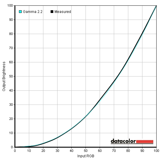
Good gamma performance after some minor adjustments
Contrast and brightness
Monitor Profile White luminance (cd/m2) Black luminance (cd/m2) Contrast ratio (x:1) ‘Standard’, 100% brightness 275 0.25 1100 ‘Standard’, 80% brightness 225 0.21 1071 ‘Standard’, 60% brightness 180 0.16 1125 ‘Standard’, 40% brightness 134 0.12 1117 ‘Standard’, 20% brightness 91 0.08 1138 ‘Standard’, 0% brightness 50 0.05 1000 Test settings, 60 brightness, 75 contrast (custom RGB) 193 0.18 1072 ‘Multimedia’ 207 0.23 900 ‘Movie’ 204 0.22 927 ‘Game’ 202 0.22 918 ‘Text’ 165 0.15 1100 ‘Warm’ 245 0.23 1065 ‘Cool’ 163 0.23 709 ‘Custom Color’ 246 0.22 1118
Whilst observing the monitor displaying a black screen fill in a dark room we observed very slight backlight bleed in the bottom left corner. This was not too obtrusive and manifested itself as a small area of dark grey clouding that was a bit lighter than the surrounding black. There was also the characteristic IPS glow visible near the screen edges, particularly at the bottom corners from an ergonomically correct viewing position. As explored in the viewing angles video later on in the review it becomes even more pronounced ‘off angle’. You would have to sit centrally around 47 inches (1.2m) from the screen for this to disappear completely which isn’t really practical. In a well-lit room this effect isn’t readily observed, although some underlying detail is lost in affected areas.

Luminance uniformity table
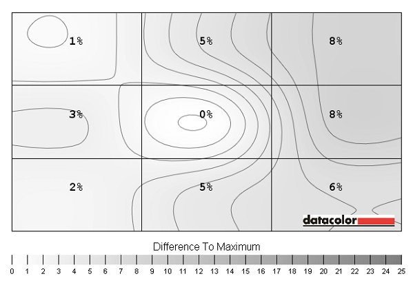
Luminance uniformity map
Colour reproduction
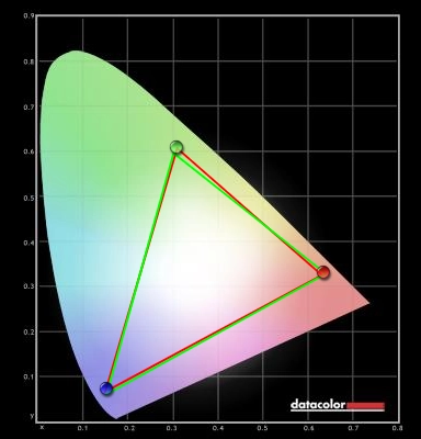
Colour gamut
Viewing angles
We also took a look at the influence of off-centre viewing angles on performance on the Lagom text and some desktop images. The video below shows that the image does not shift much in colour and that contrast shifts are relatively slight and only really become noticeable at quite wide angles. The screen is free from the noticeable colour shift and inversion of TN panels and does not shift in contrast and gamma as readily as TN or VA panels. The final section of the video shows a dark desktop background, highlighting the ‘IPS glow’ phenomenon which becomes more pronounced as viewing angle shifts. You can also see some internal reflection of the desktop icons against the black background.
Response times

Trailing on PixPerAn
Conclusion
Positives Negatives Strong static contrast performance from the panel and good clarity from the glossy screen surface
IPS glow causes some loss of detail peripherally and the screen surface is highly reflective
A pleasing shade range with good vibrancy and ‘pop’ to the image. Also good uniformity and consistency of colours with a colour gamut tightly fitting sRGB Image required just a little tweaking to balance it out and it is sometimes nice from an entertainment perspective to see the colour gamut extend just a little further for extra depth to some shades Exceptionally low input lag and strong grey to grey acceleration to reduce trailing
Artifacts (such as dark trails) resulting from overly aggressive grey to grey acceleration – it would be nice to have configurable overdrive
A streamlined, stylish and unique monitor at a reasonable price with VESA mounting flexibility Stand is fairly plain and only allows tilt adjustment
![]()
