Author: Adam Simmons
Date published: September 16th 2012
Table of Contents
Introduction
The U2711 redefined people’s expectations as one of the first widely available monitors with a 2560 x 1440 resolution. Coupled with its In-Plane Switching (IPS) panel and wide colour gamut Cold Cathode Fluorescent (WCG-CCFL) backlight it became a firm favourite for many home users as well as business and colour professionals. As time moved on and monitor technology moved forwards some sweeping changes were being made in the industry – most notably that manufacturers were moving away from hot and power-hungry CCFL backlights to more environmentally friendly Light Emitting Diode (LED) varieties. Other manufacturers also latched on to the dislike that many users had for the grainy high-haze matte screen surface used on monitors such as the U2711 with. Samsung, for example, launched a competing monitor in the SA850 series using its Plane to Line Switching (PLS) technology which combined LED backlighting with a low-haze screen surface. Apple meanwhile had a glossy LED-backlit alternative in the form of the Apple Cinema Display – with companies such as Hazro, DGM and Nixeus following with some more affordable alternatives.
The Dell U2713HM is the follow-up to the company’s prime 27” member of the UltraSharp series. Featuring a White LED (WLED) backlight, a new AH-IPS panel and adopting the more ‘homely’ look of the UltraSharp U2x12 series; Dell hopes that this new model will rekindle people’s interest and excitement in the series. Whilst the 2560 x 1440 resolution, stand adjustability, underlying panel technology and many key features and specifications remain similar to the much-loved U2711 the change in backlight does have some implications for the colour gamut performance. Whilst the older model was able to achieve colour gamut coverage of just beyond NTSC and comprehensively cover the AdobeRGB space the U2713 is only designed for ~72% NTSC (sRGB) coverage. This will be welcome news for some as this is the current ‘common standard’ but this does make it a complimentary rather than replacement model. That’s just how things look on the surface, though, and in our testing we will dig deeper and see how the new model fares in a range of quantitative and subjective testing scenarios.
Specifications
The U2713HM’s basic specifications reveal the aforementioned AH-IPS panel with WLED backlight and 2560 x 1440 resolution. A grey to grey response time of 8ms has been given which indicates the use of a pixel overdrive algorithm to speed to some transitions – this figure may seem a tad higher than you would see on other IPS panels but it is probably just more conservative and less misleading in comparison. Typical power consumption is given as 42W which is well under half of the 113W stated for the U2711.
Some other points of interest include the 8-bits per subpixel colour support without dithering which distinguishes this again from the older model with its 10-bit internal support and 12-bit LUT processing. Given that a very specific workflow, hardware setup and usage would be required to really make anything of this difference it isn’t something for the average user to get hung up about. At the time of review the U2713 wasn’t in full scale production for UK consumers and not available officially in the United States. As such prices are unsettled – but we have given the current representative UK price as a point of reference.
The key ‘talking points’ of the specification have been highlighted in blue for your reading convenience.
Features and aesthetics
The U2713HM is styled in a similar way to last year’s U2x12(H)M series models. Compared to the U2711 the edges are softer and more gently curved. The usual ‘business-like’ matte black plastic is found at the front and on the stand. The buttons, located at the bottom right can be pressed physically and are not touch-sensitive. This will please some people who find touch sensitive buttons a bit frustrating to use, although Dell’s touch implementation is usually rather responsive anyway.
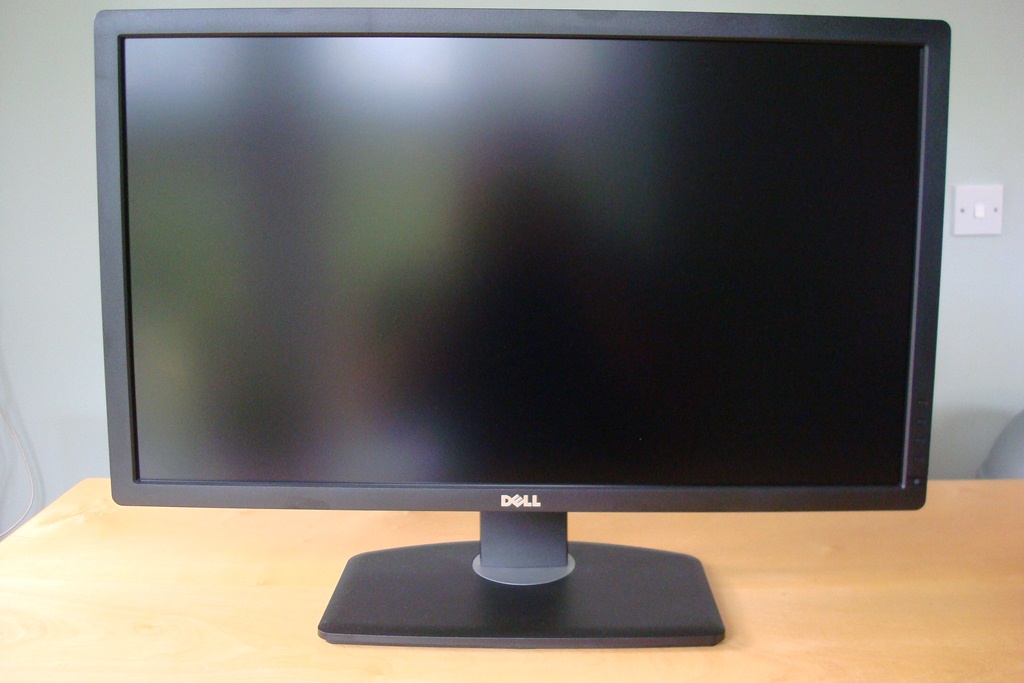
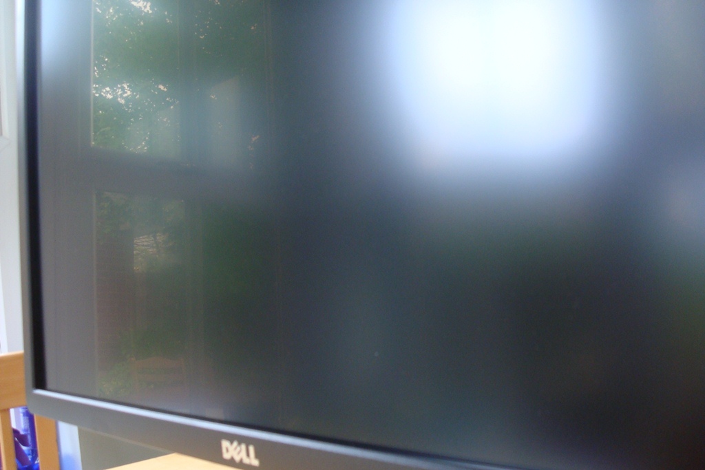
Something that should strike you in the above image is the reflection on the screen – you can see an outline of the cameraman and window frame behind. The screen surface is low haze matte anti-glare (‘semi-glossy’), similar to that found on certain AMVA panels and the Samsung SA850 series. It is significantly lighter and less grainy than the surfaces used on previous Dell UltraSharps. As we explore later this has a significant positive impact on the image – and once switched on the slight residual reflection is not a problem. The relatively smooth nature of the surface can perhaps be seen more clearly from a slightly sharper angle, as below.
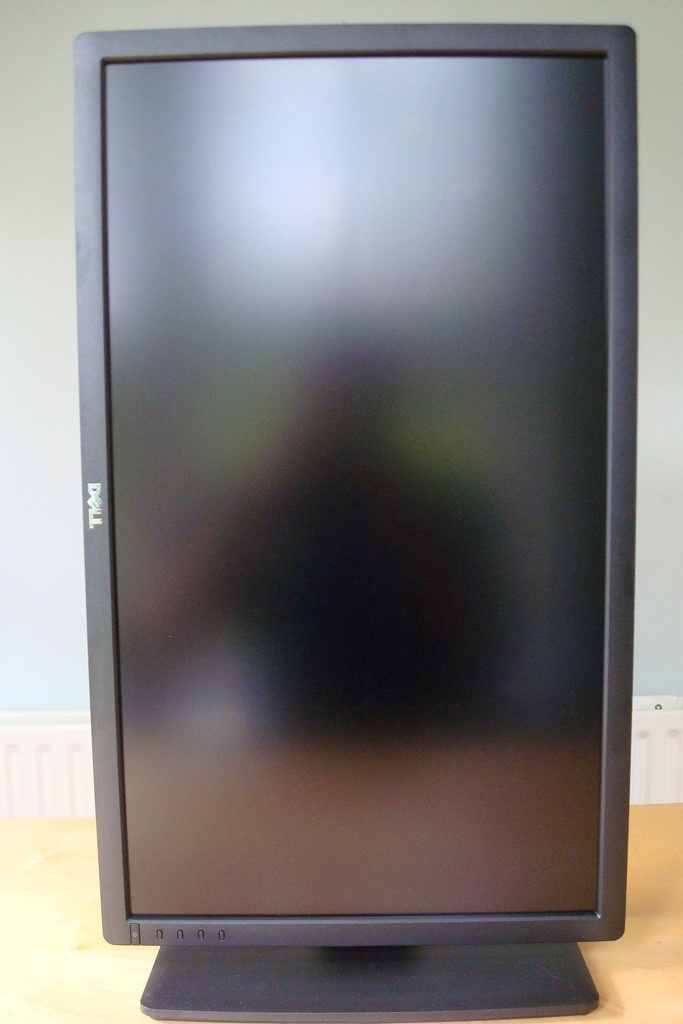
Another trick up the monitor’s sleeves is its full adjustability. It can be (very smoothly) swivelled 45 degrees each side, tilted 21 degrees backwards and 4 degrees forwards and also adusted in height by around 4.5 inches (12cm). Unlike the U2711 you can also pivot the screen 90 degrees clockwise, into portrait orientation, as shown below.
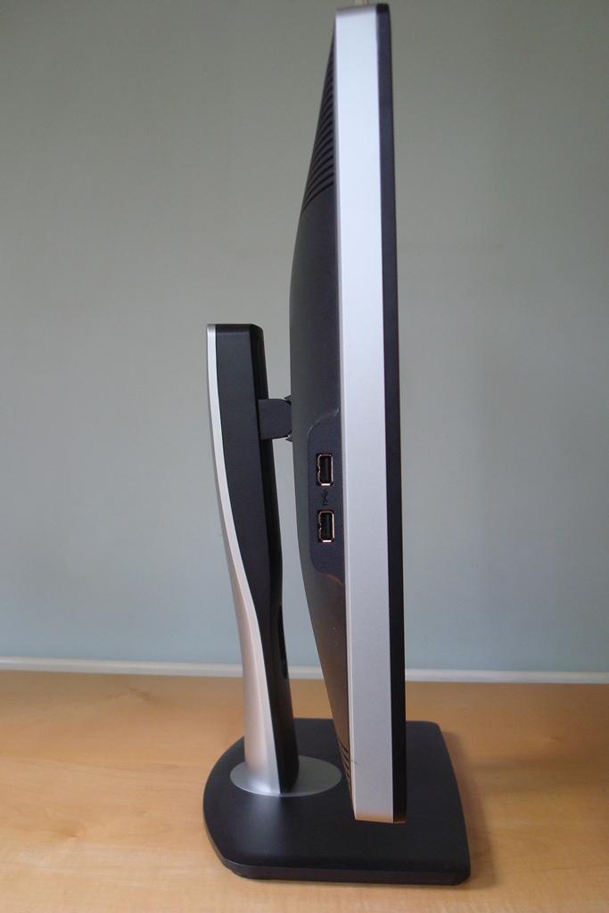
The monitor doesn’t have a ‘super-slim’ appearance from the side like some modern displays but is considerably slimmer than the U2711 thanks to its WLED backlight. There are also 2 USB 3.0 ports on the left side which is a nice addition – the monitor must be switched on for these to function. There is no multi-function card reader this time around but that isn’t a huge loss really. Also note the two-tone silver and black look on both the monitor and stand neck.
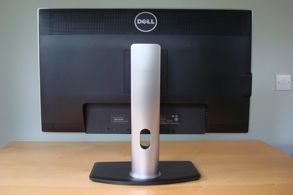
The rear of the U2713HM is dominated by the stand, which is detachable to allow VESA mounting in a 100 x 100mm arrangement. This is one of the reasons the monitor is still a little thicker from the side than some models. It also houses an internal AC-DC power converter and all of its electronics internally. You can see a ventilation grill running along the top and the two bottom flanks to aid cooling. Overall it’s a solidly build piece of kit and it runs much cooler than its predecessor without getting overly warm, even at high brightness.
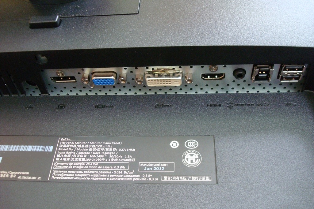
As you would expect the remaining inputs and outputs are also housed here. They are downward facing (so not to impede wall mounting) as you can see in the image below. They include, from left to right; DC power input (not pictured), DC power output (for Dell AX510 Soundbar), DisplayPort 1.2, VGA, DVI-D dual-link, HDMI, audio out, USB 3.0 upstream and two further USB 3.0 downstream ports. The USB ports at the back are again inactive unless the monitor is switched on. You may not get the same extensive range of audio ports as on this model’s predecessor but the important bases are covered with some nice extras like USB 3.0.
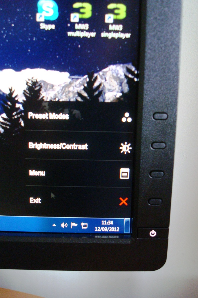
To wrap this section of the review up we will take a look at the OSD (On Screen Display), which proved intuitive and easy to navigate. When a control button is pressed a menu appears which labels buttons with their functions; ‘Preset Modes’, ‘Brightness/Contrast’, ‘Menu’ and ‘Exit’. The buttons are not illuminated but they are nicely spaced out and easy enough to operate in the dark. The power button glows a mild icy white and did not prove distracting in the dark – there is no option to disable this light or change its colour like you might see on NEC monitors and suchlike.
Entering the menu by pressing the third button down brings up the main menu which is divided into 7 sections, or 6 if you exclude ‘Auto Adjust’ that is specifically designed for an analogue (VGA) connection to the PC. These sections include useful ‘Color Settings’, which change according to the preset mode you’re in. There is also an ‘Energy Use’ bar present on all menus that indicates how the brightness of your current settings will affect the power consumption of the monitor. A number of ‘Other Settings’ are also available which include options affecting the OSD itself and an LCD conditioning program feature to help alleviate any mild image retention issues. We didn’t come across any such issues during our testing but it’s nice to have a quick and convenient colour-cycling program built into the monitor. There is also an ‘Energy Smart’ feature which is similar to a more conservative dynamic contrast feature with a significantly dimmer maximum luminance. It increases and decreases the screen brightness according to the on-screen content and unlike ‘Dynamic Contrast’ can be activated in any mode. The main features of the menu are highlighted in the video below.
Calibration
The monitor comes factory calibrated under its sRGB preset to meet desirable image criteria such as white point, gamma and colour accuracy (with an average Delta-E <5 promised). A calibration report unique to each unit is included in the box as shown for our unit below.
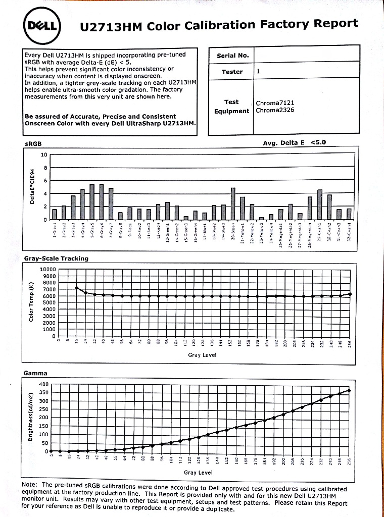
The default ‘Standard’ mode does not have such a stringent calibration profile but still offers a good gamma and white point setup. Under this mode colour appear rich and full with a good degree of vibrancy, despite the screen being a bit on the bright side by default. As we explore in the ‘Colour reproduction’ section the colour gamut roams a bit beyond sRGB in this mode, fitting the standard more tightly in the aptly named sRGB preset. Really you should use this preset and make full use of the factory calibration if you require a good degree of colour accuracy. Because each system is different and the factory calibration can only really make partial corrections, users requiring the highest degree of colour accuracy may want to use a colorimeter to create a unit, system and lighting-condition specific calibration profile. The sRGB mode offers a good base for this as the only mode to restrict the native gamut.
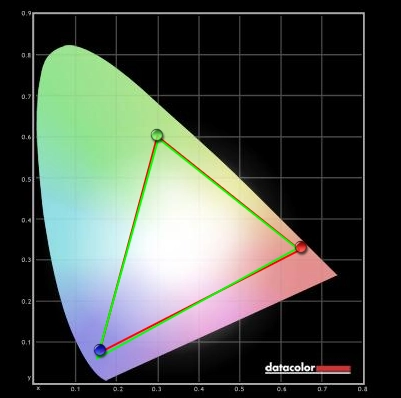
For the scope of our testing the native performance of the monitor under its native ‘Standard’ preset was pleasing. We used the Lagom website, some familiar images and a Spyder4Elite colorimeter to help determine this. The white point was measured as 6413K which is close enough to the 6500K daylight target. It is worth remembering that the overall hue of white is actually dictated in part by the spectral energy of the backlight and lighting conditions in the room – so meeting this target perfectly isn’t something to get too hung up on. An average gamma of ‘2.2’ is often desirable to fit in with common PC standards. According to the calibration report this is exactly what Dell have gone for on the U2713HM. We were able to confirm that an average gamma of just over 2.2 was achieved on our setup as shown below. This was consistent with the results on the U2713HM’s sRGB preset, the ‘Color Temp.’ preset that allows a colour temperature to be selected and on the ‘Custom Color’ preset that allows individual control of the red, green and blue channels. For those who are interested in using the ‘Color Temp’ preset you will be interested to note that it does exactly what it says on the tin and we can confirm that the intended colour temperature targets (see the OSD video in previous section) are met very closely indeed. As aforementioned we opted to change very little for the purposes of our testing as the image was well-balanced to the eye with a good level of vibrancy and colour range. Our test settings are shown below: Brightness= 64 (according to preferences and lighting – this was on a bright day) Contrast= 75 Preset= Standard There will always be slight differences between individual units and systems, particularly with respect to GPU vendor. We used an AMD Radeon 7950 connected using the supplied DVI Dual-link cable. For the purposes of this review we used an AMD Radeon 7950 connected to the monitor by the supplied DVI dual-link cabled. Due to popular demand we have also acquired an Nvidia 600 Series GPU; sometimes an image can display quite differently on Nvidia GPUs and this may alter how we would set the monitor up and the test settings we would use. The image retained its rich and well-balanced look on the Nvidia setup. The level of vibrancy was perhaps just a touch lower but the image still had a good ‘pop’ to it and you would be hard pushed to notice a difference without a side-by-side comparison. It is very pleasing to see this kind of ‘out of the box’ performance on both Nvidia and AMD setups. The panel technology, reduced haze screen surface and colour gamut all pool together to give the attractive image performance that we will now explore. Using a KM CS-200 ‘Chroma Meter’ we measured the luminance of ‘black’ and ‘white’ under a range of settings and calculated the consequent contrast ratio. Assume default settings are used unless otherwise stated – with dynamic contrast disabled and factory preset brightness in all cases. The greatest white luminance, lowest black luminance and highest recorded contrast ratio have been highlighted in black and results from our test settings in blue for convenience. The Dell U2713HM put in a strong and consistent contrast performance with an average recorded static ratio of 974:1 under ‘Standard’ mode. This dropped somewhat in some of the presets – as low as 843:1 under ‘Movie’. Luckily the contrast ratio was recorded as between 950:1 and 1000:1 under all of the ‘main’ preset modes; ‘Standard’ (any brightness), ‘sRGB’, ‘Color Temp.’ and ‘Custom Color’. Also good to see is the phenomenal luminance adjustment range of 380 cd/m2 – with a retina-searing 420 cd/m2 recorded at ‘Standard, 100 brightness’ and a diminutive 40 cd/m2 at ‘Standard, 0 brightness’. Also worth mentioning is that the backlight does not use any sort of PWM (Pulse Width Modulation) to dim to lower brightness than this retina-scorching 420 cd/m2. Some individuals are sensitive to the rapid flickering effects of certain LED backlights that come from rapid ‘on-off’ pulses of PWM and can become uncomfortable using such displays – so that fact that it isn’t used here will be a relief to these people. Also worth a quick mention is the ‘Dynamic Contrast’ mode that can be activated under the ‘Game’ and ‘Movie’ presets and enabled by default (disabled for the above table). Our regular readers will know we are not fans of this operating mode, but it is there if you want to use it. The U2713HM reacts very promptly to any changes in ‘light’ and ‘dark’ on the screen for a very dynamic (and potentially distracting) experience. Worth a less brief mention is how brightness can vary at different points across the screen. Firstly when looking at an all-black screen in a dark room we observed minor backlight bleed at the bottom central region. This manifested itself as a small light yellow-grey patch which was quite unobtrusive even when viewing a black screen in a dark room. Elsewhere no peripheral leakage was present, although ‘IPS glow’ could be seen. On a monitor of this size the light silver-blue sheen can be seen towards the bottom corners in particular from a normal seating position. The effect is exaggerated if you move ‘off-angle’ and only disappears completely if you sit back around 40 inches (just under 1m) from the screen and remain completely central. In a well-let room this isn’t readily observed, but neither is the detail that it may be flooding out. We explore this it a bit more in subsequent sections of the review. It is also important to consider how lighter colours can be affected by variation at different points of the screen. This is best illustrated by looking at luminance variation of white patches at various points along the screen. We used a Spyder4Elite colorimeter to measure the luminance of 9 equidistant white quadrants running along the screen from top left to bottom right. The table below shows these readings and the percentage difference between each value and the brightest point on the screen (which in this case is the central region, ‘quadrant 5’) under our test settings. Results here were good with single-figure percentage deviation from the ‘quadrant 5’ (central region) at 6 of the 8 surrounding quadrants. The greatest deviations occurred at ‘quadrant 1’ (top left) and ‘quadrant 3’ (top right) where 199-200 cd/m2 was recorded – 10% lower than the 221.5 cd/m2 central reading. In practice colours on the screen showed impressive uniformity and consistency and this is a good result from a screen without any sort of uniformity compensation technology. The luminance deviations can also be represented with a visual contour map as shown below. This combines recorded values with extrapolated values to illustrate differences in luminance across the screen. The central region (‘quadrant 5’) appears the lightest shade of grey on the map as it is the brightest point – the darker the shade the lower the luminance and hence greater the deviation from the central value. We also assessed the contrast performance of the monitor using a number of game and movie titles. The first test title was the FPS game Battlefield 3 complete with all current expansions. Contrast performance at the high-end (light colours) was impressive on this title. Bright white lights pierced through their dark surroundings in dark areas whilst neon tracer rounds whizzed past to create a nice (or not so nice) atmosphere. These lights and other light-colour elements such as sky and lightly coloured buildings appeared relatively ‘clean’. The screen surface texture gave a light grain to the image which was significantly less obtrusive than the usual matte surfaced used on Dell UltraSharps. This helped small details come through and put the WQHD resolution to good use on BF3. If you look carefully at particularly light shades such as white you can actually notice very faint and thin diagonal striations (cross hatching) towards the bottom of the screen running in both directions. Not all members of the team even noticed these as they are extremely faint and very unobtrusive and only visible low down on the screen from a normal seated position. Still they are worth mentioning as they seem to be a characteristic of the panel rather than a fault with the monitor. Moving on to the low-end now where the detail was again mostly good. The main detail and integrity of the image was maintained in dark areas with subtle details visible on most of the screen but not peripherally due to IPS glow overpowering this detail. The much lighter grain (lower haze value) of the screen surface was once again noticeable on our second game test title, Dirt 3. Bright elements such as sky, lights and the snow-covered tracks of Norway appeared clearer. The image didn’t have the absolute smoothness of a glossy display in this respect but certainly didn’t have an obtrusive dirty appearance either. Light sources at night contrasted nicely with their dark surroundings. Detail levels in dark and shaded areas were respectable, despite some minor detail being lost again to IPS glow towards the corners of the screen in particular. The playability of the title wasn’t really affected by this and all major detail and most minor detail could be seen elsewhere on the screen. We also considered the contrast performance on the Blu-ray movie ‘The Girl with the Dragon Tattoo’ (the 2009 edition without Daniel Craig). If any of our regular readers are wondering why we weren’t testing the sequel, ‘The Girl Who Played with Fire; it’s simply because of a small accident with the disc. All major and most minor detail was visible in this title, which is good. A small amount of detail was lost in some scenes peripherally due to the IPS glow. The film is shot in a 2.35:1 aspect ratio and so has black bars accompanying it – these looked quite black in the light but showcased a bit of IPS glow in the dark. This isn’t something we found distracting whilst watching the film though and isn’t specific to this monitor. The U2713HM’s colour gamut (red triangle) was compared to the sRGB reference space (green triangle) under our testing settings and the sRGB preset using the Spyder4Elite’s reporting functionality. The results are shown in the images below for our test settings and the sRGB preset, respectively. Under our test settings this particular representation of the colour gamut shows extension a little beyond sRGB, particularly in the green and blue region with no under-coverage. In contrast, the sRGB preset restricts the native colour gamut of the monitor so it confers more tightly to the sRGB standard. You can notice this difference when cycling between the sRGB preset and presets which use the native gamut, such as ‘Custom Color’ and ‘Standard’. Certain colours, particularly ‘pure’ blues and greens appear more saturated under the native colour gamut – to the trained eye you start to identify shades that go beyond what would be possible within the sRGB colour space. This worked out nicely for the purposes of our testing, as explored below, but those that require high levels of colour accuracy should make use of the sRGB preset as mentioned in the calibration section. The first test title used to assess ‘real world’ colour performance, from an entertainment perspective, was Battlefield 3. Although the range of colours is limited by this game’s ‘art direction’ the U2713HM really showed off this game’s colour palette nicely. Deep blues and reds looked remarkably solid with good levels of saturation. Lighter shades also showed a good and appropriate intensity with elements such as in-game markets having a dose of that neon look that they crave. The swirling fusion of yellows and oranges from burning fires and an appropriate mixed and muted palette of plant greens also looked rich and in-place. Our second test title, Dirt 3, allowed the Dell to showcase an eclectic mix of colours. The racing environment looked rich and vibrant but appropriately natural at the same time. The range of browns and greens in the environment was pleasing, as was the lushness of some of the greens. The dashing advertising around the track and bright nicely painted cars complimented this nicely. Rich reds, deep oranges and blues and bright neon greens and yellows were amongst the most dashing colours shown. The combination of generous but not excessive colour gamut, light matte screen surface and underlying panel technology seemed to work well on this title. We also tested the U2713’s colour performance on two Blu-ray film titles with two very different looks. Futurama: Into the Wild Green Yonder is set in a colourful futuristic animated universe. The monitor showed a fine mix of good solid-looking colours. Deep reds, purples and blues had a particularly impressive richness whilst neon pinks, light blues, greens and yellows were vibrant and striking. An excellent range of pastel shades were intertwined with these. The consistency of large blocks of colour (such as a character’s skin) was also excellent; bringing some subtle shade variation and identity that is sometimes lost. The second movie we tested (The Girl with the Dragon Tattoo) looked rich but natural with a pleasing variety of colours. Character skin tones looked appropriately saturated, as did environmental elements such as grass and vegetation. Some of the brighter pieces of clothing, red wine and roaring flames in the film showed a good level of vibrancy without looking too heavily saturated. In our testing thus far it was clearly evident that this display was a strong performer when it comes to colour consistency. We used the Lagom LCD tests for viewing angles to look at this more specifically and look for any weaknesses that could prove problematic for colour-critical workflows. The monitor’s native resolution of 2560 x 1440 is a joy to use on the desktop as you have so much space at your disposal. It also creates an excellent level of detail in all applications, allowing for superbly detailed images and beautifully crisp textures to be displayed. This resolution is significantly more demanding on the GPU during 3D tasks such as gaming and users with weaker systems or running particularly demanding game titles may be wondering about how the monitor handles non-native resolutions such as ‘Full HD’ (1920 x 1080). Because the 2560 x 1440 resolution has around 1.77 as many pixels as 1920 x 1080 the image must be ‘stretched’ to fill up the screen and all its pixels. This process is known as interpolation and is how the monitor handles the desktop if you select the 1920 x 1080 resolution and likewise in PC games if you select this option in the menu. We tested a number of game titles at this lower resolution including Portal 2, Battlefield 3, Dirt 3 and Mass Effect 3. All of these titles were quite disappointing in terms of sharpness – not a specific fault of the U2713HM but simply how things are when interpolated in this way. Everything had quite a soft look to it and lacked the crisp detail of a native 1920 x 1080 display and certainly compared to the monitor running its native 2560 x 1440 resolution. Unfortunately it was very hard to capture this accurately in a photograph so we can’t give you any nice images to look at. Things looked a lot better when viewing upscaled 1080p content at the native resolution of the monitor. The monitor is able to display 1080p content from external devices such as Blu-ray players connected via HDMI and upscale it to its native 1440p resolution, at 24Hz. It is also how the monitor handles films that are run from the PC itself, such as from a Blu-ray drive. Our Blu-ray test titles were displayed with a good level of clarity at the monitor’s native resolution. Because the 16:90 aspect ratio is maintained the image is handled much as it is on a native 1920 x 1080 display. There is a slight loss of sharpness due to the fact that it is upscaled to fill the 2560 x 1440 pixels but it still looks sharp, detailed and undistorted from a normal viewing distance. Dell quote an 8ms grey to grey response time for the monitor – unlike the 4ms and 5ms you may see quoted for some IPS displays this value is actually likely to be quite representative of reality. To assess the pixel response performance we started by using a small piece of software called PixPerAn (Pixel Persistence Analyser) and a camera at high ISO. With the tempo set as high as it would go this represents the ‘worst case’ scenario for this particular range of grey to grey transitions. Results are shown below. You can see a moderate first trail but no secondary trail and no noticeable artifacts in this test. This is a good result and shows that Dell have tweaked the grey to grey acceleration (pixel overdrive impulse) to make it more balanced than on previous UltraSharp models. No conspicuous overdrive-related artifacts cropped up in any of our subsequent testing, either. Some users may like the flexibility to change the level of grey to grey acceleration or perhaps disable it completely for some applications. We think that a very good balance has been struck here despite the overdrive being unconfigurable by the user. This was evident in our game testing. There was some trailing (mild ghosting if you prefer) when on foot on Battlefield 3 but this wasn’t particularly bothersome. It manifested itself as a mild vibration rather than a pronounced smeary blur. This was most noticeable when strafing past objects, as textures would lose some of their sharpness and show a slight vibrating fringe on the outside. The fringe appears a slightly lighter-coloured blend of the object and background colours rather than anything overly conspicuous. This trailing became more extensive and noticeable if you up the pace of action and enter a vehicle – most notably on the nimble ATV (All-Terrain Vehicle) added to the Armored Kill expansion. Fortunately textures didn’t break up even in these fast-paced moments and the scene remained free from visible overdrive artifacts. Dirt 3 provided a similar experience to Battlefield 3’s vehicular action. Blur was frequent but predictable with even gentle cornering causing texture displacement. Sharp cornering caused a more exaggerated trailing. This went beyond the scope of the game’s motion blur effect but did not prove particularly problematic; it wasn’t too difficult to follow the track. The trailing was most significant, as you might expect, during the dizzying spins of the Gymkhana mode. Objects blended into each other for a suitably dizzying experience. The good news is that the scene remained overdrive-artifact free so there wasn’t texture breakup or unsightly inverse ghosting. We also looked for any particular issues in both of our film test titles. The limited frame rate of around 24fps in these films limited the fluidity and pace of action such that it wasn’t held back in any way by the monitor’s pixel transitions. This relatively low frame rate and disparity between this and the monitor’s refresh rate was really the limiting factor here. To round off the testing we also measured the input lag which is one of the factors affecting how the monitor feels in response to a user’s input. Using a similar method to our other recent reviews we measured an average of around 20ms (1.25 frames) of input lag on the Dell U2713HM. This certainly could be lower and may put some people off. It is all very subjective and the people most affected by this are likely to benefit more from the responsiveness of a decent 120Hz TN panel monitor. Thinking about it more broadly, though, this is perhaps a little lower than on the U2711 which many people use very happily for gaming. Following in the wake of a monitor as successful and iconic as the UltraSharp U2711 is not something to be taken lightly. Dell really set the benchmark for high-resolution high-performance 27” displays with that one and it is something that many other manufacturers (such as HP, Samsung and Hazro) have been trying to better ever since. But it is now some years since the birth of Dell’s premier WQHD display and there is a ‘new boy’ in town; the U2713HM. With its more restrictive colour gamut and colour processing this ‘new boy’ is not designed to replace but to complement its predecessor – and that is something it does very nicely indeed. Despite looking a bit softer around the edges (the ‘homely look’) and losing a lot of its bulk the monitor has a good solid build to it. With full adjustability, including pivot into portrait this time, substance again takes precedence over style. Another point of substance and long-standing contention on this series of monitors is the matte anti-glare screen surface. This is something that many would agree was overly grainy and caused heavy diffusion of light that visibly affected the image clarity and quality. On this kind of monitor, designed for both home and office use, it does make sense to have some sort of anti-glare surface rather than a glossy highly reflective one – but it isn’t all or nothing. Dell and panel manufacturer LG Display have taken this criticism on board and have made significant improvements in this area. The matte screen surface now takes on a low-haze (‘semi glossy’) texture that makes a huge visible difference to the image both in terms of clarity and colour output. But a good screen surface can only get you so far if the panel within isn’t up to the task. Fortunately that wasn’t the case with the factory calibrated AH-IPS panel. As soon as you turn the monitor on you are greeted with a rich and varied image which appears well-balanced, suitably vibrant and consistent across the screen. Gamma and whitepoint were within good range and in this configuration (‘Standard Mode’) the monitor runs a native colour gamut that extends a little beyond sRGB. Coupled with the relatively light screen surface you get an image that is quite punchy without looking messy and horribly oversaturated. After knocking down the brightness a touch it was good to go for our testing. For colour-critical work within the sRGB colour space Dell provides an ‘sRGB’ preset that restricts the colour gamut. It also applies some degree of internal calibration for not just gamma and whitepoint but also the colours themselves – a proper calibration on your own system is preferred if colour accuracy is particularly important, though. Many home users happily used the U2711 for gaming, too. This was not its intended purpose but many it provided an experience that was just what some individuals were looking for. The U2713HM proved to be a quite decent gaming monitor in our testing, overall. The grey to grey acceleration was particularly well implemented and really showed off what a modern IPS panel is capable of. Some would argue that with moderate input lag and ‘reasonable’ pixel responsiveness it couldn’t hold a candle to your cream of the gaming crop ultra-responsive 120Hz TN panel monitors. As experienced reviewers and keen gamers ourselves we can certainly see where they are coming from, but must again stress that subjectivity is important and for many people this would be a fine monitor for gaming. At the time of testing the model had not reached full levels of retail availability so comparing the price to competing models and of course its predecessor with their heavy sales discounts is perhaps not prudent. What we can say, though, is that this is another very solid all-round monitor from a company with a great track record in supporting the customer and keeping to their side of the bargain – it is certainly one to consider.
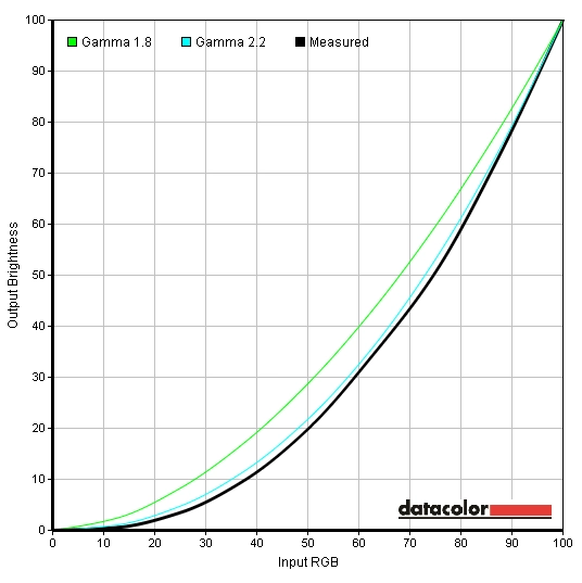
Gamma curve 'Standard' preset
Contrast and brightness
Monitor Profile White luminance (cd/m2) Black luminance (cd/m2) Contrast ratio (x:1) ‘Standard’, 100% brightness 320 0.33 970 ‘Standard’, 80% brightness 283 0.29 976 ‘Standard’, 60% brightness 207 0.21 986 ‘Standard’, 40% brightness 152 0.16 950 ‘Standard’, 20% brightness 96 0.10 960 ‘Standard’, 0% brightness 40 0.04 1000 Test settings, 66 brightness, 50 contrast (other settings customised) 219 0.22 995 ‘Multimedia’ 208 0.24 867 ‘Movie’ 236 0.28 843 ‘Game’ 213 0.24 888 ‘Text’ 172 0.18 956 ‘Color Temp.’ 248 0.26 954 ‘sRGB’ 244 0.25 976 ‘Custom Color’
247 0.25 988
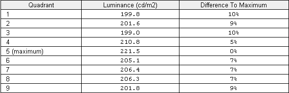
Luminance uniformity table
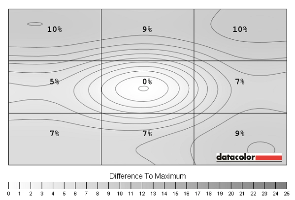
Luminance uniformity map
Colour reproduction

Colour gamut test settings
Colour gamut sRGB preset
Viewing angles
Next we include a video which shows the Lagom text test, a mixed desktop background and a dark desktop background from central and off-angle positions. You can see a slight shift in colour on the Lagom text and a shift in contrast on the mixed desktop background but only at relatively sharp angles. You don’t get the kind of obvious and instantaneous flashing between colours on the Lagom text or a severe flooding and colour inversion on the mixed desktop background as you might see on a TN panel monitor. The dark desktop backgrounds shows the ‘IPS glow’ that can be observed when viewing dark content in a darkened room. It is difficult to capture subtle instances of this such that you can observe in reality from directly in front of the screen but the video does show the off-angle glow quite readily.
Interpolation and upscaling
Response times

Ghosting on PixPerAn
Conclusion
Positives Negatives Good contrast and gradation performance and a relatively clean high-end due to the low-haze screen surface
IPS glow can cause some loss of low-end detail towards the edges in particular. Glossy screens still have a ‘cleaner’ look at the expense of reflection
Excellent colour reproduction with a strong out of the box setup and a solid, vibrant look. The screen surface is again helpful here Colours aren’t as punchy as on a glossy screen – but an excellent balance has been struck given the intended market and effective anti-glare properties
Excellent adjustability and build, solid OSD and an effective factory-calibrated sRGB preset to restrict the native colour gamut
No support for extended colour gamuts although more than complete sRGB coverage is obtained
Nicely implemented pixel overdrive showcasing what modern IPS technology is capable of in motion Moderate input lag may put some people of – as might the pixel response limitations of IPS in general
![]()

