Author: Adam Simmons
Date published: November 7th 2013
Table of Contents
Introduction
The Dell ‘Professional’ P Series has traditionally been overshadowed by the UltraSharp series. There are aesthetic similarities, similar adjustability and in some cases the prices are also similar. When it comes to image quality the TN (Twisted Nematic) panels of the P series were left in the dust by the UltraSharp series’ IPS (In-Plane Switching) panels, however. The Dell P2414H is a key member of the new ‘14H’ P Series models, shaking things up considerably by featuring a new 23.8” AH-IPS panel rather than TN. We put the monitor through its paces with a series of tests, including the obligatory game and movie test titles, to find out whether Dell have made good use of the quite capable panel.
Specifications
The AH-IPS panel used features 6-bit+ FRC (Frame Rate Control) dithering. This is the norm for such monitors with 8-bit panels only being seen in IPS flavours on more expensive 24”, 27” and larger models. Past experience has shown that the dithering is usually very well implemented on such monitors and isn’t something that the majority of users have to worry about. As usual Dell are quite conservative with their grey to grey response time figures, stating 8ms. This can cause some users (particularly gamers) to panic as they’re used to seeing 5ms or less, but as we explore there is a lot more to consider when it comes to actual real-world responsiveness. With a typical price of £220 ($260) at launch the monitor seems reasonably priced for what appears to be a solidly-built Dell monitor.
The key ‘talking points’ of the specification have been highlighted in blue for your reading convenience.
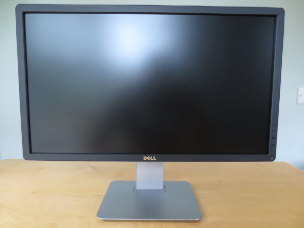
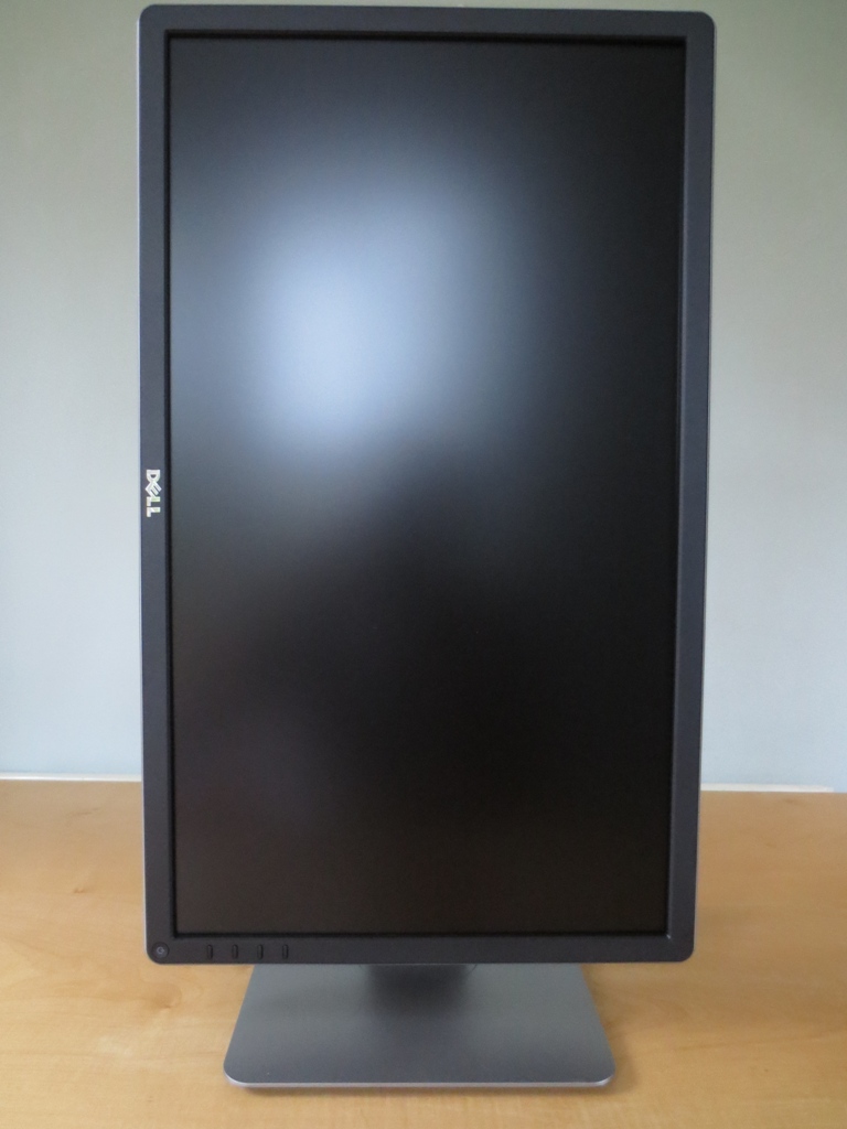
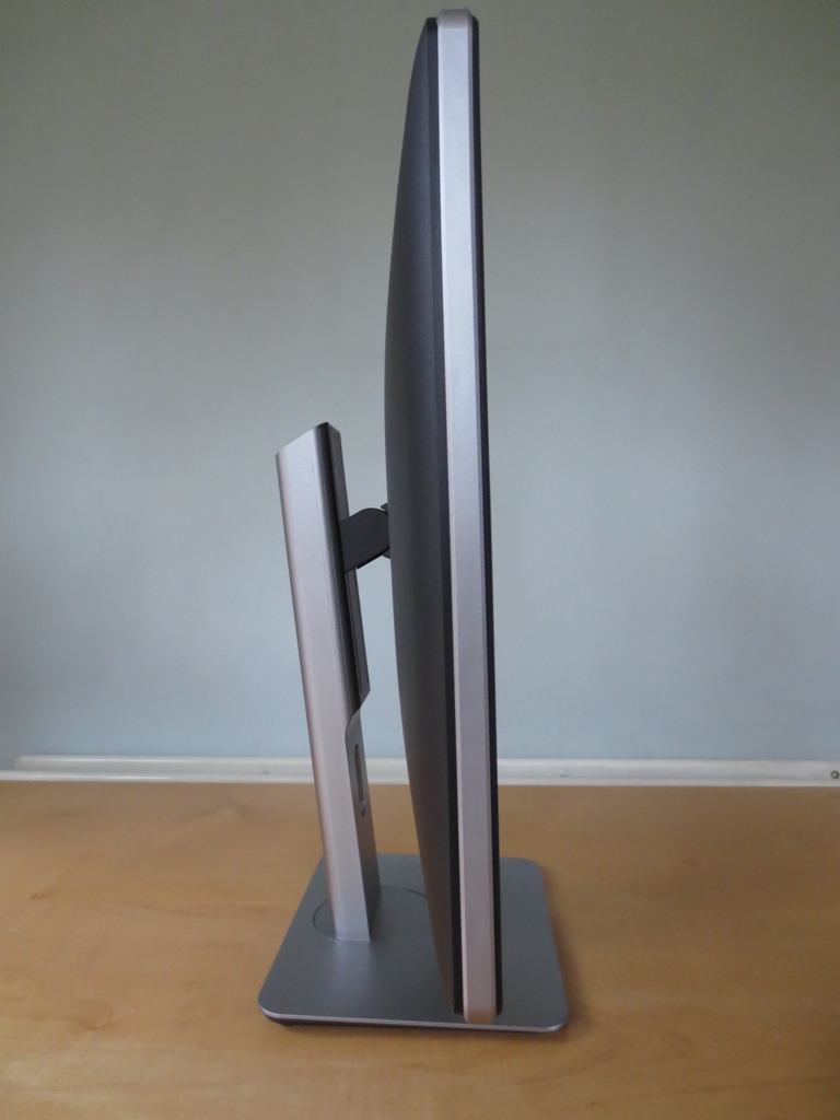
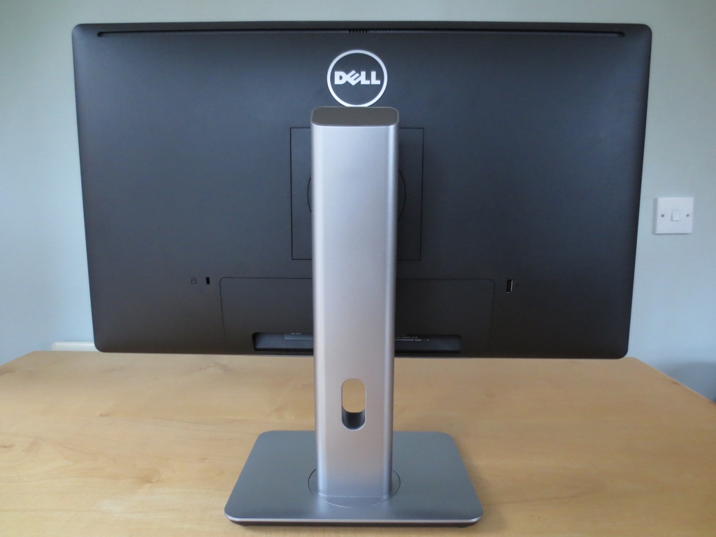
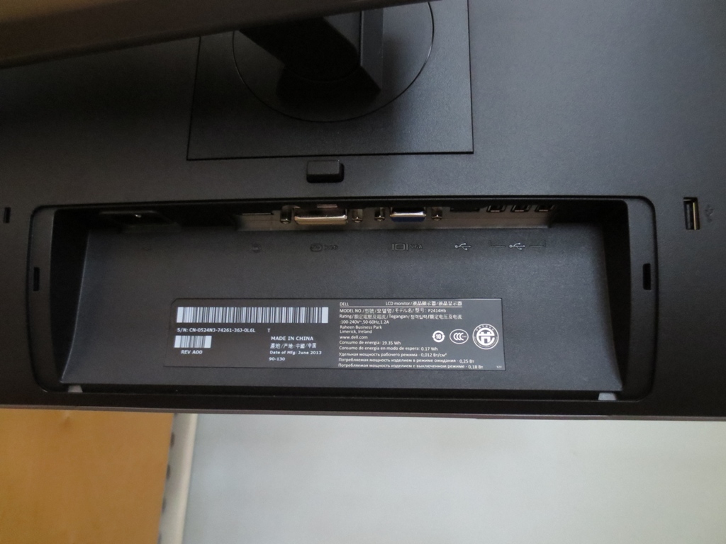
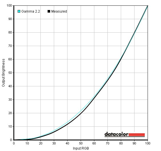
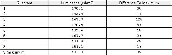
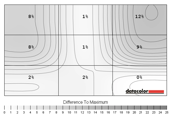
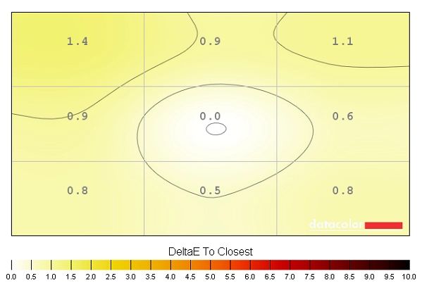
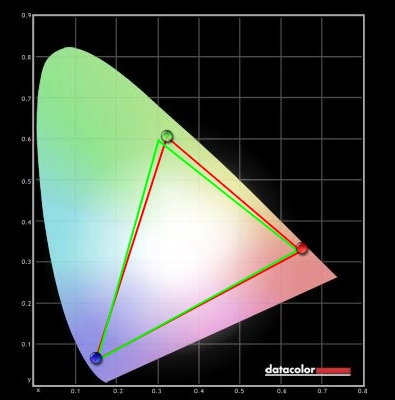
From the front the monitor has that business-like but still homely look about it that Dell strives for these days. The bezels are matte black plastic with gently rounded corners. With a thickness of 18mm (0.71 inches) all around they are not too thick nor exceptionally slender. The bezels also have a slight springiness if you press them in rather than feeling completely rigid. This is possibly an intentional part of the design as it means that pressure applied here isn’t directly transferred to the panel. Pressure transfer to the panel can exacerbate backlight bleed and other uniformity issues. The stand has a more rigid construction with a platinum-coloured (silver) matte plastic. To fit in with the modern design of the monitor the edges are also gently rounded. There are some other aspects to note at the front. The screen surface is a relatively light matte anti-glare, similar to that seen on 23” AH-IPS panels. This surface type provides effective glare reduction whilst helping preserve greater vibrancy and clarity to the image than ‘heavier’ and grainier (higher haze value) matte surfaces. It is not as ‘light’ as semi-glossy surfaces, however. The stand is fully adjustable on the P2414H, giving users around 140mm (5.5 inches) of height adjustment, tilt (21° back and 5° forwards) and swivel (45° either direction). At lowest stand height the screen clears the desk by just 42mm (1.65 inches) making it relatively compact for a screen of this size. The total height in that configuration is just under 380mm (15 inches). The screen can also be pivoted 90° into portrait as shown below. Back in landscape orientation the monitors control buttons are found running along the right bezel, towards the bottom. They can be pressed rather than reacting to touch (touch-sensitive) which will be music to the ears of some users. By default the button functions from top to bottom are; ‘Preset Modes’, ‘Brightness/Contrast’, ‘Menu’ and ‘Exit’. As you enter deeper into the menu they become navigation buttons, with the function labelled on-screen beside the button. The slightly concave power button is also pressable and glows a gentle and undistracting white by default when the monitor is on, flashing when the monitor is on standby. An option in the OSD (On Screen Display) allows you to force the power light to switch off when the monitor is on if you prefer. The main menu of the OSD is well laid out, easy to navigate and fairly feature-rich. As usual there is a focus on energy saving with an ‘Energy Use’ bar at the top right to give a quick indication of power use. There is also a new dedicated ‘Energy Settings’ menu that allows you to enable ‘Energy Smart’ (Dynamic Contrast type mode), set whether the power LED illuminates if the monitor is on and also enable or disable USB when the monitor is on standby. Some other thoughtful extras include the ability to change the function of the top two monitor buttons at the first menu level, referred to as ‘Shortcut Key 1’ and ‘Shortcut Key 2’. There is also an ‘LCD Conditioning’ function built into the monitor which is designed to help alleviate mild image retention. It doesn’t mean this is likely to occur on the monitor, but it is something of a standard feature on Dell’s ‘Premium’ and ‘UltraSharp’ monitors. The video below gives a run-through of the OSD. Further details on page 27 onwards of the PDF user guide. From the side you can see the fairly robust-looking matte silver stand which leans back slightly by design. The screen itself has a band of similar matte silver plastic running around it. At around 20mm (0.79 inches) at thinnest point the screen is reasonably slender without taking things to the extreme. It also lumps out a bit more centrally to around 50mm (2 inches). The rear of the monitor is matte black plastic aside from the silver stand and Dell logo. There is a Kensington lock socket to the left of the stand and a single USB 2.0 port to the right. The main ports are concealed under a detachable cable routing cover which sits behind the stand neck. They are, from left to right; AC power input (no external ‘power brick’), DP 1.2a input, DVI-D input, VGA input, 1 USB 2.0 upstream and 4 USB 2.0 downstream ports (including the lone port mentioned previously). Being focused primarily on PC users there are no HDMI ports, although DVI to HDMI converters are readily available at low cost should they be required. Dell includes a power cable, DP cable, VGA cable and USB upstream cable in the box. The Dell P2414H has a number of different presets available which make various alterations to the image; ‘Standard’, ‘Multimedia’, ‘Movie’, ‘Game’, ‘Text’, ‘Warm’, ‘Cool’ and ‘Custom Color’. Specific options are tied to specific presets in the ‘Color Settings’ and ‘Display Settings’ menus. The table below shows some key readings (white point and gamma) alongside the extra menu options available in each preset and general observations about the image. Our test system used an Nvidia GTX 780 connected via DisplayPort. The DVI port provides a very similar image, as does connection to a modern AMD GPU. The readings and observations in this table were based on testing using a Spyder4Elite colorimeter alongside some familiar games, desktop images and other applications. The P2414H gave a pretty decent image out of the box (‘Standard’ preset), despite a bit of a green hue and the gamma being slightly above the 2.2 standard. Most of the presets affected the image in a negative rather than positive way, with the most useful being ‘Custom Color’. This lessened the tint, boosted the brightness (and contrast) levels without affecting the monitor setting which remained at ‘75’ for each but had little if any observable effect on gamma. For our test settings listed in the proceeding section we used the ‘Custom Color’ preset and made some slight adjustments to colour channels and brightness. Gamma remained at 2.4 on average, shown in the graph below, but we didn’t find this at all problematic for our testing. For general use, movies and gaming the gamma behaviour on the monitor is fine and doesn’t really have a strong impact on the image. There is slight extra depth to some shades which can make them look a little richer without throwing off the balance too much. Our test settings are listed below. Even the most minor (single unit) changes to colour channels have a fairly significant impact on the overall image. You will also notice a sudden bump down in brightness (and contrast if you care to measure it). Each individual unit will be slightly different so these settings should only be used as a guide – but go easy when making your own adjustments. You should observe and use the monitor using ‘Custom Color’ and just the brightness set to a comfortable level for a bit before making these changes. Brightness= 62 (according to preferences and lighting) Contrast= 75 Red= 99 Green= 97 Blue= 98 You could show even some fairly keen-eyed users this monitor using our ‘test settings’ and then the same monitor calibrated with a tailored ICC profile applied (to correct the gamma and slight colour deviation) and they may well look puzzled and ask you to explain what changed. What we’re getting at here is that the majority of users should find the image on the P2414H great with just a few minor OSD adjustments and should not rush to apply this profile. For colour-critical work it can be particularly advantageous to have further correction made to the gamma and colour behaviour. For such users (or anybody else curious) this ICC profile could be worth trying, but again bear in mind inter-unit variation – nothing beats creating your own personal ICC profile with your own calibrator. We did not apply this profile whilst testing the monitor and simply used the test settings alone. To use our ICC profile, do the following. A Konica Minolta CS-200 was used to measure the white and black luminance levels. From this contrast ratios were calculated, shown in the table below alongside the other readings. A range of monitor settings were used including those discussed in the calibration section and ‘Custom Color’ with brightness levels adjusted. Unless otherwise stated in the table assume default settings were used with the exception of ‘Dynamic Contrast’ being disabled in all cases. Black highlights indicate the highest white luminance, lowest black luminance and highest static contrast ratio recorded. Blue highlights indicate the results of our test settings. On the Dell P2414H static contrast was pleasing with an average contrast ratio of 1211:1 on ‘Custom Color’ with brightness only adjusted. Our test settings involved adjustments to colour channels as well, yielding a contrast ratio of 1125:1 which is still pleasing. Following further correction using an ICC profile this dropped further to 1029:1. The ‘Standard’ preset users some factory determined colour channel alterations which drops the contrast ratio down a bit compared to ‘Custom Color’, at 1129:1. The peak white luminance we recorded was 290 cd/m2 which comfortably exceeded the typical maximum specified for the panel (250 cd/m2). The lowest white luminance recorded was 62 cd/m2, giving the monitor a 228 cd/m2 luminance adjustment range under the settings we tested which is very good. Dell offers two different Dynamic Contrast modes. The first is the traditional ‘Dynamic Contrast’ setting activated by default in the ‘Game’ and ‘Movie’ presets. This reacts at a moderate pace to changes in scene brightness and adjusts the backlight brightness to suit the overall scene (adjusting the backlight as one whole unit). It tended towards high brightness even in mixed scenes with plenty of dark areas and seemed a bit reluctant to dim considerably even when particularly dark images were displayed. The second setting is ‘Energy Smart’ which can be enabled in any preset. This tends to give dimmer luminance, dimming more for darker images as a measure intended to save energy when high backlight intensity is not required. It reacted quickly to changes in scene brightness and seemed to work better for dimmer images – and was easier on the eyes at any rate. The P2414H does not use PWM (Pulse Width Modulation) to moderate backlight brightness and instead uses DC (Direct Current) modulation. The monitor is therefore considered to have a ‘flicker free’ backlight, which will be welcome news for some individuals who suffer visual discomfort from monitors using PWM-regulated backlights. Observing a black screen in a dark room using our test settings revealed very minor backlight bleed in the bottom left corner. This was very slight and entirely hidden from a normal viewing position by so-called IPS glow. This is a greyish blue glow that is visible near the corners and edges of the screen from a normal viewing position and becomes more intense as you move to more extreme viewing angles. We also used a Spyder4Elite to analyse the uniformity of white luminance across the screen, indicating any potential issues related to brightness that could affect lighter colours on the screen. The 9 ‘quadrants’ analysed run from top left to bottom right. Values are shown alongside deviation from the brightest point recorded on the table below. The screen’s luminance uniformity was good. The brightest point was ‘quadrant 9’ at the bottom right of the screen (185.3 cd/m2). The highest deviation occurred at ‘quadrant 3’ at the top right (163.7 cd/m2, a 12% deviation). Elsewhere the screen was 1-9% dimmer than the brightest point with 4 of the remaining quadrants within only 1-2% of the brightest point. ‘Quadrant 5’ at the centre, where calibrations are based, was only 1% dimmer than the brightest point at 182.6 cd/m2. This is a relatively low level of variation and is a good thing to see for this particular test. The contour map below gives a visual representation of the differences with darker greys representing lower luminance and hence greater deviation from the brightest point. Another uniformity issue to consider is how consistent colour temperature is at various points of the screen. The graph below again considers deviations in ‘pure white’ at 9 different quadrants of the screen. Here deviations in colour temperature from the point closest to 6500K (D65) are given as DeltaE values with higher values being accompanied by darker colours (as shown on the scale). Anything above a DeltaE of 3 is broadly considered to be a significant deviation that some users will notice ‘by eye’ during normal use. The deviations here are all slight – this is a pleasing result. The central point (‘quadrant 5’) is closest to 6500K as you might expect given that this is the focal point of calibration. The highest deviation occurs at the top left (‘quadrant 1’) with a DeltaE of 1.4. Elsewhere deviations are between a DeltaE of 0.5 and 1.1 which indicates strong uniformity in this area. It should be noted that all uniformity issues (including colour temperature variations, brightness variations and areas of clouding and backlight bleed) can vary between individual units. It is good to see our sample being strong in this area, however. Aside from the loss of detail peripherally, attributable to IPS glow, detail levels were quite good in dark areas on Battlefield 4. The most minor details, such as different parts of a weapon, were not as distinct as they could be. They were still quite respectable for an IPS panel without hugely skewed gamma, however. Bright elements such as fires, explosions and gunfire stood out quite well amongst darker surroundings. On Dirt 3 the level of detail in dark areas was good on the whole with even some fairly subtle car interior details visible towards more central areas of the screen. Peripherally such distinctions were lost due to IPS glow. Light areas contrasted well with their darker surroundings. Car lights and other light areas exhibited mild graininess due to the screen surface, affecting the purity and ‘pop’ somewhat without giving a dirty or smeary look to the screen. On the Blu-ray movie Skyfall good detail levels were maintained in dark areas, with the exception of the corners and edges of the screen. Here the aforementioned IPS glow reduced detail levels. Bright elements stood out nicely without the excessively grainy appearance associated with some ‘stronger’ matte surfaces. The Lagom tests for contrast allow specific weaknesses to be identified, even those that may not be readily apparent during other testing. The following observations were made. The Dell P2414H offers quite good coverage of the sRGB colour space. There is a small amount of under-coverage in some areas and slight over-coverage in others. This shouldn’t be problematic for most users and shouldn’t deter users who wish to use the monitor in a calibrated state for photography either – the deviations from the sRGB colour space are reasonably small. On Battlefield 4 there was a rich and lively look with plenty of depth and variety. Vegetation showed a good range of shades, from quite lush dark greens to lighter minty shades and various khaki greens and browns. The multiplayer map ‘Zavod 311’showcased this depth and variety particularly well. Some of the more vibrant elements in the game included in-game markers, neon lights and various painted objects on many of the maps. These elements were quite vivid and stood out fairly well. Dirt 3 was also pleasing in the colour department with an excellent variety of natural greens and golden browns in the racing environments. Some of the deep forest greens were not quite as vibrant as we’ve seen on glossy or semi-glossy models (particularly those with slightly more generous colour gamuts) but still looked rich and far from faded. The same could be said for the eclectic mix of vibrant colours found on the cars’ bodywork. Here colours were nice and deep and suitably varied despite lacking the ‘painted on’ smooth glossy look. On the Blu-ray of Skyfall colour reproduction was handled very well. Despite the 2.4 average gamma the film had a natural, appropriate and suitably rich look. Subtle variations in skin tone were displayed properly and with appropriate saturation. Some of the most vivid colours found in this film can be seen in the Shanghai night scenes. The neon lights showed a good mix of eye-catching deep reds, blues and purples. Some of the brighter neon colours (cyan shades for example) didn’t have the pop or smoothness you might see on a glossy screen but weren’t excessively grainy in appearance either. We also tested another Blu-ray with quite a different aesthetic; Futurama: Into the Wild Green Yonder. Here the strengths of the P2414H’s well-configured IPS panel were readily apparent. In many scenes an individual shade covered large areas of the screen – with excellent consistency. This high level of consistency allowed even subtly different pastel shades to have their own unique identity. Deep and bold colours were also handled nicely with respectable vibrancy and good depth. The strong colour consistency was also reflected on Lagom’s tests for viewing angle, where the following observations were made. Input lag was measured on the monitor using the same method described in this review. Around measured under 3ms (under 1/4 of a frame) of input lag. This indicates a very low signal delay on the monitor which will not impede gaming. A small tool called PixPerAn (Pixel Persistence Analyser) was used alongside a highly sensitive camera to capture trailing (ghosting) resulting from the monitor’s pixel response behaviour. PixPerAn was set to the maximum movement speed for this test. A moderate primary trail and very faint overdrive trail (light overshoot) can be seen in the image. This indicates quite well balanced grey to grey acceleration, just as well seeing as this isn’t adjustable in the OSD. There are a couple of limitations with PixPerAn that are worth noting. Firstly is that our eyes naturally move constantly when viewing moving content on a screen and this creates blur that isn’t reflected on a static photo. Secondly PixPerAn tests a fairly limited range of pixel transitions and a monitor’s performance usually varies for transitions between different shades (grey levels). We therefore fired up some games to test things more thoroughly in a way that would take all of these factors into account. On Battlefield 4 pixel responsiveness was good without obvious trailing from sluggish response times. The level of blur was quite comparable to the fastest 60Hz monitors. In other words the pixel responses were fast enough to be largely overshadowed by the main source of blur when viewing a monitor; the movement of our own eyes. You often aren’t conscious you’re doing it, but your eyes constantly move to track movement (changes) on the screen. There was clearly effective pixel overdrive employed – fortunately no obvious overshoot (inverse ghosting) was present. There were small hints of weak inverse ghosting during a limited range of pixel transitions on this title. We actually had to cycle through all the maps to try to find an example of this overshoot that was distinct enough to be captured on video but we couldn’t. Where it does crop up it manifests itself as a very faint dark (or light, depending on transition) trail similar to that seen on PixPerAn. It’s really not something most users will even notice and we feel it’s too faint and occasional to be at all bothersome. On Dirt 3 similar observations were made. The overall fluidity of motion was largely in-line with the fastest 60Hz LCDs. During race modes there was a moderate level of blur, particularly when cornering sharply. The blur intensified during rapid spins on the Gymkhana mode but remained on-par with the snappiest 60Hz offerings. There was no obvious overshoot, either. To round things off we also tested our Blu-ray movie titles and found that the response performance of the monitor did not impede the experience here at all. There was no trailing resulting from the pixel transitions nor any noticeable overdrive trailing. Fluidity was somewhat limited by the approximate 24fps frame rate at which current movies run but this was not a fault of the monitor. Although many users still admire the all-round performance characteristics of the U2312HM, we feel that things have moved on. Monitors adopting LG’s latest AH-IPS panels have shown a default colour setup, motion performance and overall clarity and vibrancy of the image that comfortably surpasses Dell’s aging U12 series. The Dell P2414H puts LG’s latest 23.8” AH-IPS panel to excellent use. Although still marred in some respects by IPS glow (a current characteristic of all IPS panels in production) the contrast performance was very pleasing with strong static contrast and good uniformity. The screen surface marks a significant improvement in clarity over the old UltraSharps, whilst not being quite as light and ‘grain free’ as the light matte surfaces on 29″ models or the semi-glossy surfaces seen on some new higher end offerings (like the Dell U2413). A PWM-free (flicker free) backlight is also used with a good luminance adjustment range, promoting good visual comfort. The colour performance was also pleasing with pretty good results straight from the box. Following a few minor tweaks in the OSD you were greeted with a rich and varied image that makes for very enjoyable gaming and general computing. Colour aficionados may find the slightly elevated gamma (2.4 average) slightly sub-optimal, but this is easily correctable through an ICC profile or proper calibration – with the latter being recommended for colour critical work on any monitor. The overall enjoyment of the monitor was not hampered by poor responsiveness, either. Dell have implemented their pixel overdrive quite carefully to minimise overshoot whilst providing a good level of trail-busting acceleration. Coupled with the extremely low input lag this monitor is definitely a worthy choice for 60Hz gaming. Being a ‘Professional’ series model the P2414H also features a fully adjustable stand and ‘sensible’ matte bezels rather than fingerprint magnet glossy plastics. Whilst some users may not like this sort of smart business-like look, others will relist in the simple style and ergonomic flexibility on offer. Given the excellent all-round performance and appealing price this is certainly a model we recommend considering. Donations are also greatly appreciated.
Features and aesthetics

Calibration
Testing the presets
Preset Mode
Gamma (central average)
White point (kelvins) Extra OSD features Notes ‘Standard’
2.4 6759K Image Enhance, Sharpness Moderately bright with a noticeable green tint (readily observed on many greys). Colours otherwise quite rich with decent balance and depth. ‘Multimedia’
2.4 6764K Image Enhance, Sharpness Fairly similar to ‘Standard’ but dimmer and some shades looking a bit deeper than they should. ‘Movie’ 2.5 10664K Hue, Saturation, Image Enhance, Sharpness, Dynamic Contrast Bright (dynamic contrast) with an extremely blue tint, excessive sharpness (a filter not entirely correctable using sharpness settings) and generally unbalanced and look. Not entirely clear what this will add to the movie viewing experience. ‘Game’ 2.6 6785K Hue, Saturation, Image Enhance, Sharpness, Dynamic Contrast Excessive sharpness (again a filter) and brightness (dynamic contrast) but overall balance better than ‘Movie’. ‘Text’
2.4 6781K Sharpness Quite comparable to the ‘Standard’ preset. ‘Warm’
2.4 5586K Sharpness Noticeably warm red tint, otherwise similar to ‘Standard’. ‘Cool’ 2.3 10681K Sharpness Excessively cool blue tint, otherwise similar to ‘Standard’. ‘Custom Color’
2.4 6666K Sharpness Very bright with a slight green tint but otherwise with decent balance and depth. Test Settings (‘Custom Color’ modified as below)
2.4 6498K Sharpness Good balance overall with a rich look and no unwanted tint. Calibrated settings (ICC profile applied, see below)
2.2 6500K Sharpness Essentially similar to test settings but gamma now averages 2.2. Some shades are lifted to appear slightly lighter but differences are quite subtle overall.
Gamma Test Settings
Test Settings
Preset Mode= Custom Color
ICC profiles
2) Set the monitor up using our test settings. Brightness may be adjusted if you feel it is necessary. The profile was created using a brightness of ‘62’ which gave a brightness of 175 cd/m2 on our unit after the ICC profile was applied.
3) Take a look at this article for instructions on installing the ICC profile and some limitations to be aware of particularly when gaming. You may also like to download the ‘Display Profile’ utility mentioned in the article which gives a quick and easy way to enable or disable the ICC profile.
Contrast and brightness
Contrast ratios
Monitor Profile White luminance (cd/m2) Black luminance (cd/m2) Contrast ratio (x:1) ‘Custom Color’ 100% brightness 290 0.24 1208 ‘Custom Color” 80% brightness 245 0.2 1225 ‘Custom Color’ 60% brightness 201 0.17 1182 ‘Custom Color’ 40% brightness 156 0.13 1200 ‘Custom Color’ 20% brightness 109 0.09 1211 ‘Custom Color’ 0% brightness 62 0.05 1240 Test settings
180 0.17 1088 ICC calibration
175 0.17 1029 ‘Standard’
192 0.17 1125 ‘Multimedia’ 178 0.15 1187 ‘Movie’ 163 0.18 906 ‘Game’ 192 0.16 1200 ‘Text’ 171 0.15 1140 ‘Warm’ 201 0.18 1117 ‘Cool’ 164 0.18 911
PWM (Pulse Width Modulation)
Luminance uniformity
Luminance uniformity table
Luminance uniformity map
Colour temperature uniformity map
Contrast in games and movies
Lagom contrast tests
Colour reproduction
Colour gamut
Colour gamut test settings
Colour in games and movies
Viewing angles
The following video highlights the strength of the Dell’s colour consistency when viewed ‘off angle’. It includes the Lagom text test, a mixed desktop background and a dark desktop background as viewed from various angles. Note the ‘IPS glow’ that was mentioned previously manifests itself quite noticeably on the video as viewing angle is changed.
Responsiveness
Input lag
Pixel responsiveness

Trailing on PixPerAn
Responsiveness in games and movies
Conclusion
Positives Negatives A strong colour performance with excellent shade consistency and variety accompanied by a rich look overall. The relatively light matte screen surface also helps in this respect
Gamma is a little higher than the 2.2 standard many users will aim for and the screen surface isn’t as light or ‘grain free’ as the semi-glossy surfaces seen on some recent higher end IPS models
Excellent static contrast performance and superior clarity to older IPS models and other monitors with higher-haze matte surfaces IPS glow may bother some users, although this is currently a compromise with all IPS panels in production Extremely low input lag and well-implemented pixel overdrive giving a strong gaming performance overall
60Hz refresh rate will limit the appeal for some gamers and there are some very faint overdrive artifacts in places
Good ergonomic flexibility and an appealing price given the performance on offer
No HDMI port may be inconvenient for some users
