Author: Adam Simmons
Date published: February 2nd 2014
Table of Contents
Introduction
The 2560 x 1440 (WQHD) resolution and 27” screen size remains the most practical choice for many users. First we saw this restricted to LG’s IPS (In-Plane Switching Panels) and more recently in Samsung’s own version of this, PLS (Plane to Line Switching). There is even a unique TN (Twisted Nematic) monitor from ASUS designed for gaming that sports this resolution – but nothing that can hold a candle to LG IPS or Samsung PLS when it comes to colour accuracy, consistency and viewing angle performance. BenQ panel manufacturer AU Optronics (AUO) has now developed their own IPS-like technology called AHVA (Advanced Hyper Viewing Angle). Despite the confusing choice of letters in the acronym, this is an IPS-mode rather than VA (Vertical Alignment) panel type and is designed to complete with IPS and PLS models. The first monitor to use this novel AHVA panel is the BenQ BL2710PT, which we put through its paces in our usual thorough fashion.
Specifications
The monitor uses a 27” AU Optronics AHVA panel which is capable of outputting ‘true 8-bit’ colour per subpixel and pumping out 1000:1 static contrast. There is a ‘WQHD’ resolution and a specified grey to grey response time of 4ms. For your reading convenience the key ‘talking points’ of the specification have been highlighted in blue below.
Features and aesthetics
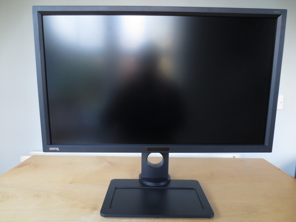
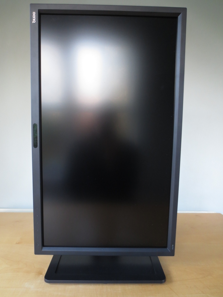
From the front the monitor has quite a conventional, sturdy look. The matte black plastic bezels are 20mm (0.79 inches) at the top and sides and 24mm (0.94 inches) at the bottom. The screen surface is very light matte anti-glare (also referred to as ‘semi glossy’). The surface is similar to that used by AUO on some of their modern VA panels. With a 15% haze value rather than around 18% this is slightly lighter than the ‘semi glossy’ surfaces seen on some IPS and PLS models. This preserves a high level of vibrancy and clarity whilst also reducing glare and unwanted reflection.
Once the monitor is switched on and put in a sensible lighting environment (i.e. without strong direct light hitting the screen surface) you’re free to admire the image rather than an outline of your head and upper body.
Other interesting points to note at the front include some features of the bottom bezel. At the left there is a metal BenQ logo. In the middle is the ‘Eye Protect’ ambient light sensor and ‘Eco Sensor’ proximity sensor. These features can be enabled, disabled and configured in the OSD (On Screen Display). The OSD control buttons are illuminated proximity and touch-sensitive pads found at the right of the bottom bezel. There is also a touch-sensitive power LED which glows a cool white when the monitor is on and pulses dark amber when the monitor is on standby. Once the monitor is switched on, placing your fingers near the OSD control area prompts them to glow fairly bright white. They are now responsive to your touch. These buttons have the following functions initially; ‘Picture Mode’, ‘Input’, ‘Volume’, ‘Menu’ and ‘Exit’. The first 3 buttons are actually ‘Custom Keys’ which can be configured in the OSD. These touch sensitive controls were fairly responsive, responding particularly well to presses with the fleshy pad of the thumb.
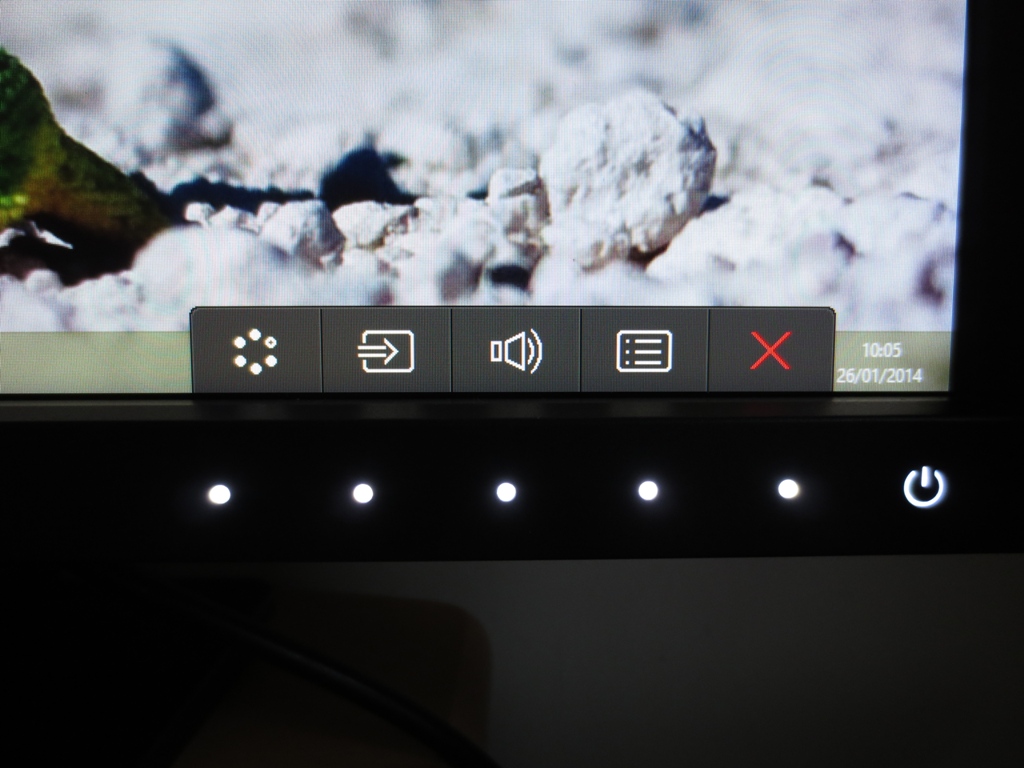
Deeper into the menu system, for example in the main menu, these buttons become navigational; ‘Up’, ‘Down’, ‘Right (enter)’, ‘Left (back)’ and ‘Exit’. Once in the main menu everything is set up in BenQ’s familiar ‘Intuitive UI’ style. As noted in the calibration section certain features are only available in certain presets. The ‘Ergonomics’ menu allows you to configure the ‘Eye Protect’ ambient light sensor. Once enabled you can see an intermittent and very dull red flash from two small LEDs in the sensor area. You can also enable an on-screen ‘meter’ that indicates the ambient brightness on-screen when the ‘Eye Protect’ sensor is enabled. This feature worked well and gave good and fairly sensible brightness adjustments based on ambient light levels. Some users would prefer slightly dimmer and some slightly brighter levels than those enforced by the sensor in some lighting conditions, though. You can’t tweak the adjustment range. You can also set a ‘Smart Reminder’ in the ‘Ergonomics’ menu – an on-screen reminder to take a break after a set time has elapsed.
The ‘ECO’ menu allows you to configure the ‘ECO Sensor’ proximity sensor. This sets the screen into a reduced power state if nobody is detected at a configurable distance – ‘Near’, ‘Middle’ or ‘Far’ from the monitor. This isn’t the same as the standby state indicated by a flashing dark amber power LED and is instead indicated by a flashing white power LED. There is slightly more power draw compared to standby because the sensor needs to remain active. When this sensor is activated there is again an intermittent and dim red flashing, which is difficult to notice and not at all distracting even in a dark room. You can also enable the ‘meter’ to give you an on-screen prompt that the sensor has detected that nobody is present in front of the monitor. This is useful if you are actually using the computer but the monitor doesn’t detect you, perhaps if you’re sitting back a bit. We found this sensor worked very well and did its job. Our only minor criticism of this sensor is that it takes over 5 seconds for the screen to spring back to life once you return to the computer and it shuts off the screen fairly soon after detecting that nobody is present. It can be annoying during quick breaks. The video below runs through the main OSD features.
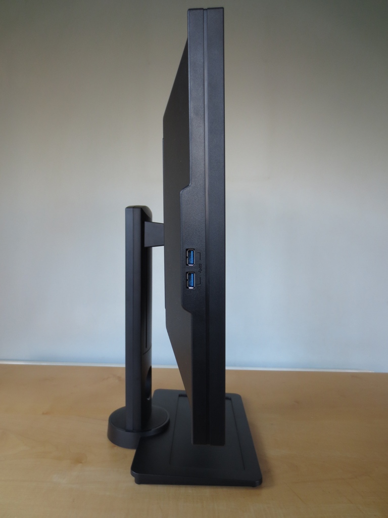
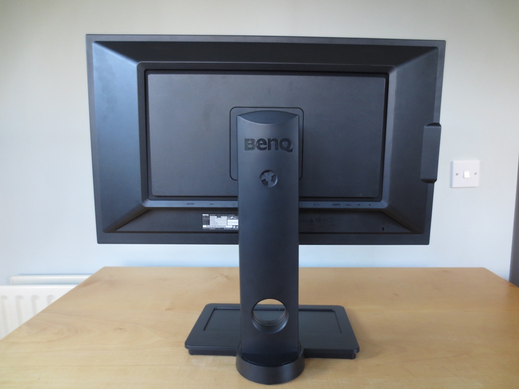
The left side of the monitor houses two USB 3.0 downstream ports. The monitor is of reasonable thickness without being overly chunky – 31mm (1.22 inches) at thinnest point, lumping out centrally to around 80mm (3.15 inches) where the stand attaches. The stand is solid and fully adjustable, offering; tilt (5° forwards, 20° backwards), swivel (45° each way), height (150mm or 5.91 inches) and pivot (90° rotation clockwise). Using the included ‘Display Pilot’ software the image can be made to automatically rotate when you pivot the monitor so that things are automatically in the correct orientation. The screen sits very low to the table at its lowest height, clearing it by just 15mm (0.59 inches) or so. In this position the top of the monitor sits just below the top of the stand.
The rear of the monitor is again matte black plastic, dominated by the centrally attaching stand. There is a screw-on blue headphone hanger that you can attach if you like that is included with the monitor – unfortunately this was missing from our review sample. There are also a pair of 3W up-firing speakers hidden away here. These provide a reasonable but not particularly dynamic or bassy sound output. Towards the bottom is a fairly generous selection of down-firing ports and a Kensington lock socket.
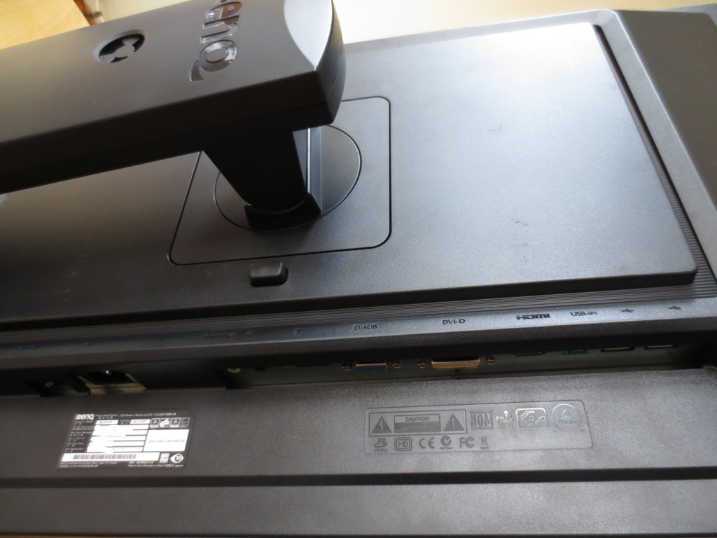
The monitor ports and related featured are, from left to right; a ‘zero watt’ power switch, AC power input (no ‘power brick’ outside the monitor), 3.5mm line-in, 3.5mm headphone jack, DP input, VGA, Dual Link DVI-D, HDMI, USB 3.0 upstream and 2 USB 2.0 ports. BenQ are very generous with the cables they include with the monitor; DP, HDMI, DVI, VGA, USB upstream, 3.5mm audio and a power cable. Note that the included accessories may vary between retailers and different countries.
Calibration
Testing the presets
The BenQ BL2711PT has broad range of presets referred to as ‘Picture Modes’ and using what BenQ dub ‘Senseye3’ technology; ‘sRGB’, ‘CAD/CAM’, ‘Present’, ‘Standard’, ‘Movie’, ‘Photo’, ‘Reading’, ‘Eco’, ‘M-book’ and ‘User’. Different presets have different options available – the most flexible and useful of which are ‘Standard’ and ‘User’ which give the user access to 5 different ‘Gamma’ settings. Rather than testing each of the presets and documenting them, we’ll be focusing on the ones we feel are most useful (as well as unique) and looking at how those ‘Gamma’ settings affect performance.
The table below gives some key readings (taken using a Spyder4Elite colorimeter) and information about the presets we chose to test in detail for the review. Our test system used an Nvidia GTX 780 connected by DisplayPort. We tested HDMI and DVI and found that the image looked very much the same. The HDMI signal provided a full 2560 x 1440 @ 60Hz with proper ‘Full Range RGB’ colours which we don’t always see on these WQHD monitors. Most other modern Nvidia and AMD GPUs should get a similar image over DVI, DP and HDMI, too.
| Monitor Profile | Gamma (central average) | White point (kelvins) | Extra OSD features | Notes |
| ‘Standard’, Gamma 1 | 1.7 | 6606K | Gamma, Color Temperature, Eye Protect | Bright with a washed out (faded) look but good white balance. |
| ‘Standard’, Gamma 2 | 1.9 | 6579K | Gamma, Color Temperature, Eye Protect | As ‘Gamma 1’ with extra depth, but still quite a washed out look. |
| ‘Standard’, Gamma 3 | 2.1 | 6662K | Gamma, Color Temperature, Eye Protect | White balance is slightly off-target with a relatively strong blue channel and weak green channel, but the overall depth is good and colours look quite well balanced. |
| ‘Standard’, Gamma 4 | 2.3 | 6716K | Gamma, Color Temperature, Eye Protect | A good vibrant but well-balanced look overall with some more depth compared to ‘Gamma 3’. A slightly cool tint with slight green channel weakness. |
| ‘Standard’, Gamma 5 | 2.4 | 6785K | Gamma, Color Temperature, Eye Protect | Even more depth and a cooler tint than ‘Gamma 4’ – slightly too much depth to many shades giving a somewhat oversaturated look. |
| ‘sRGB’ | 2.4 | 6436K | Red channel is slightly too dominant and there is again too much depth (as with ‘Gamma 5’). | |
| ‘CAD/CAM’ | 2.5 | 5859K | A warm and green tint with extreme oversaturation. This mode is designed specifically to highlight wireframe meshes and other such features when designing. | |
| ‘Present’ | 1.3 | 5814K | A very flooded and under-saturated look (the polar opposite of ‘CAD/CAM’ mode). This preset is designed to simulate what your work might look like once outputted to a typical projector. | |
| ‘Reading’ | 1.9 | 5802K | This mode is somewhat dimmer with a warmer tint, designed for comfortable reading or evening computer use. Lower brightness is still recommended | |
| ‘User’ (Color Temperature= User Define) | 2.1 | 6611K | Gamma, Color Temperature (including ‘User Define’), Hue, Saturation | As ‘Standard – Gamma 3’ with a warm green tint. |
| Test Settings 1 (‘Standard’ modified as below) | 2.3 | 6611K | Gamma, Color Temperature, Hue, Saturation, Eye Protect | Very rich and varied shades, pleasing balance with an accurate representation of colours overall. |
| Test Settings 2 (‘User’ modified as below) | 2.2 | 6506K | Gamma, Color Temperature (including ‘User Define’), Hue, Saturation | Good balance and a rich look overall. Some shades are a bit problematic as described below. |
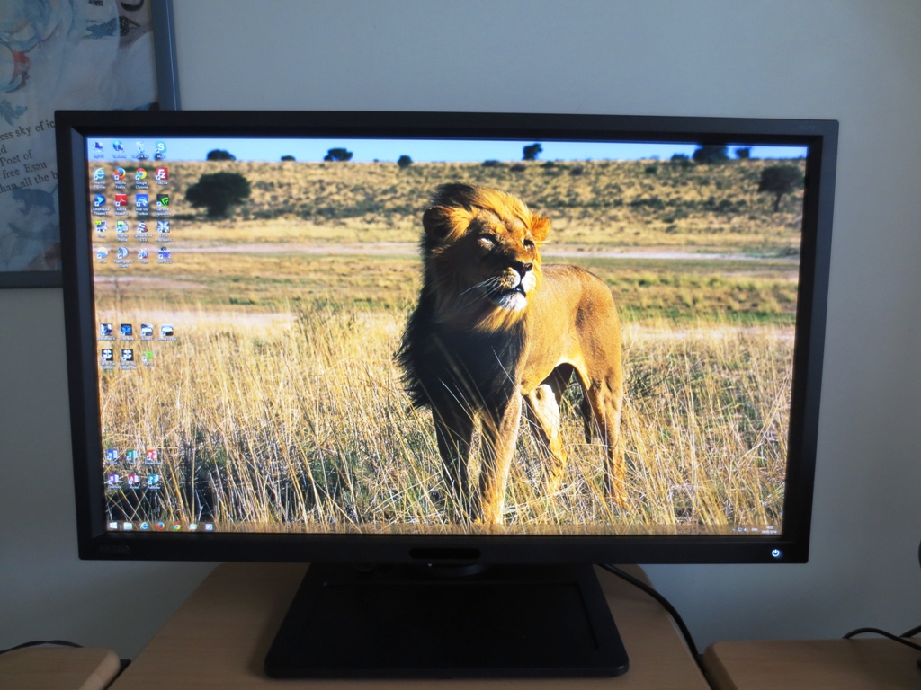
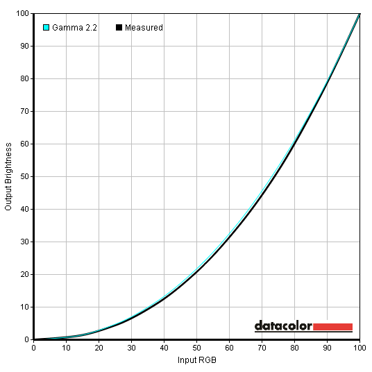
The BenQ BL2710PT provided a pleasing performance straight from the box – in fact, if anything, the ‘Standard’ preset was the most impressive of the lot. The gamma flagged a little behind under the default ‘Gamma 3’ setting but could be raised so it was close to the 2.2 target (just slightly above) by selecting ‘Gamma 4’. This contrasts with older revisions of the monitor, reviewed elsewhere, where ‘Gamma 2’ was the optimal setting. Definitely bear this in mind and be sure to test all ‘Gamma’ settings on your own unit to make sure you know which is best. After dropping the brightness as we did in ‘Test Settings 1’ the white point came closer to the 6500K target and gamma was fairly close to the 2.2 curve on the whole, despite averaging just under 2.3 as shown below. The ‘User’ mode allows you to configure the Red, Green and Blue colour channels to provide further correction to the white point if desired. We did this for ‘Test Settings 2’, getting gamma and white point even closer to target values. The gamma curve is shown below. When in the ‘User’ mode we noticed a vertical pinstripe pattern on certain shades. Like a strange form of dithering whereby alternating bands of a slightly lighter and darker variation of a shade are displayed. This was particularly noticeable on various blues, cyans and purples. The purple and blue blocks on the Lagom viewing angle test, for example, highlighted this very nicely. Even where the pinstripe effect wasn’t apparent, certain shades had a slightly dirty look (highlighter yellow, for example, looked a muddy gold colour). We decided to adopt ‘Test Settings 1’ (TS1) as our main test settings for the review due to the slight issues we had with some shades using ‘Test Settings 2’ (TS2). Be aware that individual units of this monitor will vary and you may not find our settings optimal on your unit. Feel free to use them and see how you find them, but be prepared to experiment further. Brightness= 54 (TS1) / 46 (TS2) – according to preferences and lighting Contrast= 50 Gamma= 4 Color Temperature= Normal (TS1) / User Define (TS2) Red= 91 (TS2) Green= 92 (TS2) Blue= 100 (TS2) Using a Konica Minolta CS-200 luminance meter we were able to accurately measure the white and black luminance levels of the monitor using a range of monitor settings. These settings are based on those discussed in the calibration section of the review. From these readings we calculated the contrast ratio for each setting as shown in the table below. The maximum white luminance, lowest black luminance and highest contrast ratio recorded is highlighted in black and the results from our test settings in blue. In ‘Standard’ mode with brightness only adjusted the average contrast ratio recorded was 835:1, pretty average for a WQHD monitor with factory calibration applied. Lower ‘Gamma’ settings gave a slight edge in contrast with ‘Gamma 1’ producing the highest brightness and ‘Gamma 5’ the lowest despite the black point remaining the same. The settings between these had progressively weaker contrast – about 888:1 for ‘Gamma 1’ vs. 803:1 for ‘Gamma 5’, a slight difference. Using ‘Test Settings 1’ involved using ‘Gamma 4’ which gave just slightly weaker contrast than the default ‘Gamma 3’ at 818:1. The full contrast capabilities of the panel could be realised with the settings completely unlocked, using the ‘User’ preset with ‘Color Temperature’ set to ‘User Define’ and each colour channel at the default ‘100’. Using this setting we recorded 1036:1 which is good, but as noted in the calibration section this mode was not without its flaws. After the adjustments made to white point for ‘Test Settings 2’ we recorded 900:1. The highest luminance recorded under any setting was actually achieved using the ‘Present’ mode at 392 cd/m2 – unfortunately this mode isn’t really useful except for its very specific intended purpose, with 314:1 contrast. Taking this into consideration along with the 43 cd/m2 minimum white luminance recorded in this testing (‘Standard’ mode at 0% brightness) this gives an excellent luminance adjustment range of 349 cd/m2 and an excellent range of settings to use. The monitor has a ‘Dynamic Contrast’ mode which can be activated on the ‘Movie’ and ‘Photo’ presets. The brightness range with which this works can be adjusted from ‘1’ to ‘5’, with a higher setting essentially increasing how ‘dynamic’ the contrast is. We found the brightness to be rather high during mixed images even using the ‘1’ setting. The backlight reacted very rapidly to reflect changes in scene brightness. You can choose how broad the brightness range is (from 1-5) for this setting. Using the lowest setting, ‘1’, the monitor tended to produce rather high brightness during mixed images and didn’t go as dim as it should during dark scenes. The highest setting ‘5’ worked well for dark scenes as it muted the backlight brightness considerably. For bright scenes the backlight went very bright indeed (uncomfortably so even during some mixed images). Given that most scenes in games and movies, where this mode is usually used, are mixed with lots of bright and dark elements (and the simple fact that backlight brightness changes can be distracting) we wouldn’t generally recommend using this mode. This is also a fairly high-calibre monitor and the colours are hardly shown off at their best in the ‘Movie’ and ‘Photo’ presets. This model is part of of BenQ’s ‘Eye-care’ initiative and is marketed to be ‘flicker free’. We can confirm that the backlight does not use PWM (Pulse Width Modulation) at any brightness and instead uses a Direct Current (DC) modulation method. This means that the backlight is considered ‘flicker-free’ as the company advertises which will be welcome news to some who suffer visual discomfort and other issues from PWM-regulated backlights. Observing a black screen in a dark room using our test settings revealed very little backlight bleed. You can see in the image below that there are a few isolated patches near the very edges of the screen (towards the bottom corners) where a slight yellow glow can be seen. This affects a very small section of the screen and didn’t cause any issues during normal use. The image above was taken around 2m back from the monitor to eliminate any ‘glow’ which is a product of light behaviour in this sort of panel. As with IPS and PLS panels, there is what we will now dub ‘AHVA glow’. This manifests itself as a sort of silver or gold sheen, depending on viewing angle, which blooms out quite noticeably if you move your viewing position relative to the screen. From a normal viewing position you can see this towards the bottom two corners of the screen in particular. We show how this ‘blooms out’ from various viewing angles in a video featured later in the review and mention some of its effects on contrast from a normal viewing position. We used a Spyder4Elite to assess the luminance uniformity of 9 ‘pure white’ quadrants running along the screen from top left to bottom right. Weaknesses here can be reflected not just when viewing white on the monitor but also other light shades. The table below provides the recorded values alongside the percentage deviation between a given quadrant and the brightest point on the screen. The luminance uniformity of the monitor was reasonable. The brightest point recorded on the screen was the central quadrant, ‘quadrant 5’ (179.7 cd/m2). The top of the monitor showed the greatest deviation from this, particularly at ‘quadrant 2’ (top central region, 155.2 cd/m2) and ‘quadrant 3’ (top left, 155.1 cd/m2) which is 14% dimmer than the centre. Elsewhere brightness deviated from centre between 5% and 11% which is good. It’s worth remembering that individual units can vary a bit in this regard. Overall on our unit, although the luminance uniformity was not perfect, there was nothing particularly worrying here. The graphic below represents these deviations as a contour map, included recorded and extrapolated values. Here darker greys represent lower brightness and hence greater deviation from the brightest point on the screen. It isn’t just brightness deviations that can affect the colour output or the visible uniformity of a monitor. Another key factor to consider is deviation in white point (colour temperature). The following graphic shows DeltaE deviations between each quadrant and the point closest to the 6500K (D65) white point. A DeltaE >3 is generally considered significant deviation that some users will spot quite readily by eye. On this graphic darker colours represent greater deviations than lighter colours (higher DeltaE values). Performance here was impressive. There are no significant deviations between any quadrant and the quadrant closest to 6500K (‘quadrant 6’, right of centre). The highest deviation is 1.7 DeltaE at the bottom left (‘quadrant 7’). It’s worth remembering that, as with other uniformity issues, individual units can vary. There can also be some variation beyond the 9 quadrants considered. Nonetheless it’s good to see such strong colour temperature consistency here. On Battlefield 4 there was a fairly good level of detail in dark areas, overall, and good contrasting bright elements such as fires and tracers. Dark elements didn’t have the old and inky look of a VA panel but looked comparable to an IPS or PLS panel with a ~1000:1 contrast ratio. There was some detail loss towards the edges of the screen, particularly the bottom two corners, due to ‘AHVA glow’. Detail levels in dark areas were quite good on Dirt 3. Some subtle details weren’t as distinct as they could be, such as material textures in shaded car cockpits and tire treat patterns. Detail levels were still good on the whole, though. There was again some weaknesses towards the bottom corners due to ‘AHVA glow’. Bright elements contrasted quite nicely with their darker surroundings and had a rather smooth and grain-free appearance. Not quite as ‘pure’ as on a clear glossy screen but not too far off. On the Blu-ray movie Skyfall there was a good level of detail without any concerning loss of detail. In some of the darkest scenes in the film some minor details such as creases in clothes were not as distinct as they could be but were still visible on most of the screen. The only exception to this was towards the bottom corners of the screen where ‘AHVA glow’ ate away at detail a bit more. The high-end (bright shades) stood out well and had an impressively crisp and smooth appearance for a matte screen surface. The flames in the Macau night scenes were a good example of this. Performance on the contrast gradients was very good. All bands were visible with distinct brightness steps, although the deepest blue band blended into the background a bit too well. The BenQ BL2710PT offers complete coverage of the sRGB colour space with slight extension beyond in some areas. This is still considered a ‘standard gamut’ screen and is able to faithfully reproduce content designed with sRGB in mind. The image below shows the colour gamut under our test settings. This varied very little regardless of preset, including in the ‘sRGB’ preset. Battlefield 4 had a varied and inviting look with plenty of depth and shade variety. Some of the deeper green shades were impressively lush whilst lighter green shades and dusty khaki colours showed excellent variety and an appropriately muted appearance. There were plenty of lively shades, too, such as some fairly striking cyans from the engineer’s blowtorch flame and in-game markers. Various red elements (such as painted emblems of some vehicles) and orange flames were also quite striking in their vividness without appearing oversaturated or out of place. The colour performance was very pleasing in Dirt 3. Car liveries showcased an excellent variety of strong, vibrant and smooth-looking colours. The closest to a ‘painted on’ glossy-look to colours that you’ll see on a monitor with a matte screen surface. It’s difficult to pick stand-out colours here, but some of the rich reds and dark greens were particularly impressive. The natural environments had an excellent range of natural colours. The greens of the Finnish forest highlighted the range and consistency of colours that this monitor can provide very well indeed. The Skyfall Blu-ray looked very much as it should with appropriate skin tone range and saturation. Natural environments also had a good rich and natural look with pleasing variety. There were plenty of good eye-catching vibrant shades, where it was appropriate. Some excellent bright cyans, deep reds and bright oranges were particularly noteworthy. Futurama: Into the Wild Green Yonder showed an impressive variety of shades. Bright colours such as neon greens, yellow and pinks stood out very well. Deep purples, reds and oranges were also displayed in a good solid and bold way. Subtle variations in pastel shades, such as pink and brown skin tones, were also very impressive in their consistency at different points of the screen. This sort of consistency is typical of IPS-type panels. We further analysed colour consistency using Lagom’s tests for viewing angle. The following observations were made, highlighting excellent colour consistency on the monitor. The BL2710PT has a 2560 x 1440 (WQHD) resolution which, when coupled with the semi-glossy screen surface, gives game content a crisp and detailed look. It also gives you a lot of space to play with on the desktop. With 1.77 times as many pixels to push as 1920 x 1080 there may be a temptation for some users to set the monitor into a 1920 x 1080 resolution for extra performance when gaming. With games consoles, even the latest ones like the PS4 and Xbox One, there isn’t the choice of running at a higher resolution anyway. Running ‘1080p’ on this monitor and allowing it to use interpolation to fit it to the full screen area was not a pretty experience. The first issue is that, as is usual when running a 2560 x 1440 monitor at 1920 x 1080, everything appears very soft. It’s as if you’re looking at the game world through a soft-focus lens with sharpness that is just not comparable to running the resolution on a 27” Full HD display. You can run the monitor in a ‘1:1’ pixel mapping mode which will give a large black border around the image but make things look appropriately sharp. This is shown in the image below on the U2713H – the same screen size and resolution so the same border applies. The second issue with running 1920 x 1080 on this monitor applies regardless of whether running 1:1 or letting the image fill the entire screen. The contrast is knocked down to very low levels (around 300:1) and everything looks quite flooded and washed out. We don’t recommend gaming at 1080p on this monitor unless it’s unavoidable. Fortunately the monitor handles upscaled content much better – for example playing Blu-rays through the PC at 2560 x 1440. There was a slight softening on the Blu-rays we watched but nothing too severe. Things still looked distinctly ‘Blu-ray like’ without any real detail being lost. Bear in mind that plugging a Blu-ray player into the monitor rather than using a drive on the PC will force the screen to run at 1920 x 1080 with the aforementioned issues applying. We used SMTT 2.0 to compare the BL2710PT’s with a range of monitors of known latencies. By doing this over 30 times we were able to gauge an accurate representation of input lag on our test sample. We recorded 19.5ms (over 1 frame) of input lag. This level of latency will bother some users but many should find it low enough to game with quite happily. PixPerAn (Pixel Persistence Analyser) was used to assess pixel response performance on the monitor using the three AMA (Advanced Motion Acceleration) settings available. The image below show AMA set to ‘Off’, ‘High’ and ‘Premium’, respectively. A highly sensitive camera was used to capture the images and PixPerAn was set to the highest movement speed (tempo). With AMA ‘Off’ you can see a bold primary trail and very faint secondary trail, quite typical to see on this test for an IPS-type panel with little or no grey to grey acceleration. Using the ‘High’ AMA setting made the primary trail fainter and made the secondary trail as good as non-existent. The ‘Premium’ AMA setting provided extremely high levels of acceleration. The voltage surges here caused the pixels to ‘overshoot’ their desired state. This created obvious overshoot artifacts – strong inverse ghosting and halos which are very unsightly and quite obvious during normal use. Needless to say ‘AMA High’ is the setting we settled for during our testing and would recommend users stick to. It is indeed the default value. As we explore in this article you have to look far beyond pixel responsiveness over a fairly limited range of pixel transitions. By subjectively assessing a range of game titles we were able to give a far more realistic representation of the monitor’s visible motion performance. On Battlefield 4 there was a degree of motion blur, particularly when turning even fairly slowly in a vehicle. Most of this was caused by eye movement and linked to the refresh rate of the display rather than the pixel responses (a concept explored in the article linked to above). In addition to this there was a little bit of trailing caused by some slightly slow pixel responses, but this was quite minor. There were no instances of overshoot (inverse ghosting) at all and overall BenQ have carefully balanced the pixel overdrive on the BL2710PT. On Dirt 3 there was moderate blur even during fairly gentle cornering. Overall the motion blur was similar to what you’d see on even the fastest 60Hz monitor. There was just a touch of extra blur in the form of trailing, here and there, due to some slightly slower than optimal pixel transitions (i.e. those creeping well above 8ms). The most notable example of this occurred where medium and darker shades moved alongside one another – for example when racing in the snow at night. Even then the most significant contributor to motion blur was eye movement. There was not even a trace of overshoot so again it was clear that BenQ had been careful and balanced with their ‘AMA High’ acceleration. Really if you take particular issue with the motion performance of this monitor then 60Hz monitor’s probably aren’t for you. To round off we tested our Blu-ray movie titles. Although fluidity was limited by the low frame rate of around 24fps at which the films run there were no nasty surprises from the monitor itself. There was not even a hint of inverse ghosting nor any trailing attributable to slow pixel responses. The BenQ BL2710PT marks a bold step from their panel manufacturer AUO into uncharted territory. Even if this wasn’t their first attempt at the IPS-like ‘AHVA’ panel technology, we’d give them plenty of credit for what they’ve achieved. It seems they have carefully observed the improvements made by LG Display to their IPS panels and have kept an eye on Samsung’s PLS models and made sure the first generation of their technology can compete with the newest IPS and PLS models. As with other ‘IPS-type’ panels, there was a certain ‘glow’ affecting parts of the monitor from a normal viewing position and becoming quite obtrusive at times from varied viewing angles. Overall the contrast performance was really much as we’ve seen on other recent WQHD models. A huge improvement over older IPS models but not a scratch on the Vertical Alignment technology that AUO are famous for. The screen surface adopted by AUO was very similar to that seen on some of their latest VA models and we felt that was a positive thing as far as image clarity and vibrancy was concerned. The colour performance, of course, is where most of the credit is due. BenQ included a range of presets and ‘Gamma’ modes, but we found performance most pleasing in the default ‘Standard’ preset after adjusting brightness and ‘Gamma’ mode. White point was not quite dot on the 6500K daylight target and gamma was just a little way from the target of ‘2.2’ but things were close. This setting complimented by the generous colour gamut, strong colour consistency and very light matte screen surface gave a very pleasing colour performance during our testing. It was possible to get things closer to the targets by making use of the ‘User’ preset. Unfortunately this introduced some odd ‘pinstripe’ banding for some shades and muddied the appearance of others. BenQ also seemed to have carefully watched how various IPS panels have approached their grey to grey acceleration over the years. With their default ‘AMA High’ setting they’ve achieved very good balance here, managing to keep a conservative but effective level of acceleration and a completely artifact-free experience. The unit we tested had a moderate degree of input lag but nothing unusual for a WQHD monitor with such a broad range features and ports. This is something that some users may take issue with, but the majority shouldn’t. If you’re not sure if this will affect you then chances are it won’t. Overall we have to give BenQ credit for this valiant first attempt at a WQHD IPS-like monitor. A strong performance was complimented by an excellent robust and fully adjustable stand, plenty of ports and a reasonable price for this level of quality. This may not be the first monitor that springs to mind when people consider the 2560 x 1440 options available, but it certainly deserves careful consideration.
Gamma 'Test Settings 1'

Gamma 'Test Settings 2'
Test Settings
Picture Mode= Standard (TS1) / User (TS2)
Contrast and brightness
Contrast ratios
Monitor Profile White luminance (cd/m2) Black luminance (cd/m2)) Contrast ratio (x:1) ‘Standard’ 100% brightness 286 0.35 817 ‘Standard’ 80% brightness 242 0.29 834 ‘Standard’ 60% brightness 196 0.24 817 ‘Standard’ 40% brightness 147 0.18 817 ‘Standard’ 20% brightness 95 0.11 864 ‘Standard’ 0% brightness 43 0.05 860 Test Settings 1 180 0.22 818 Test Settings 2 180 0.20 900 ‘Standard’ Gamma 1 302 0.34 888 ‘Standard’ Gamma 2 294 0.34 865 ‘Standard’ Gamma 4 280 0.34 824 ‘Standard’ Gamma 5 302 0.34 803 ‘User: Color Temperature= User Define” 373 0.36 1036 ‘sRGB’ 240 0.27 889 ‘CAD/CAM’ 313 0.34 921 ‘Present’ 392 1.25 314 ‘Reading’ 216 0.36 600
PWM (Pulse Width Modulation)
Luminance uniformity
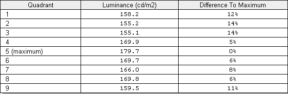
Luminance uniformity table
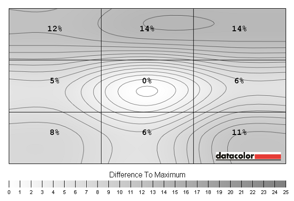
Luminance uniformity map
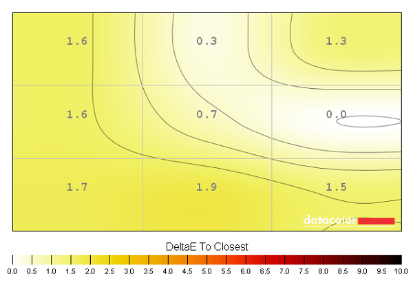
Colour temperature uniformity map
Contrast in games and movies
Lagom contrast tests
Colour reproduction
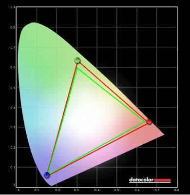
Colour gamut
Colour gamut test settings
Colour in games and movies
Viewing angles
Interpolation
![]()
Responsiveness
Input lag
Pixel responsiveness

BL2710PT trailing 'AMA Off'

BL2710PT trailing 'AMA High'

BL2710PT trailing 'AMA Premium'
Responsiveness in games and movies
Conclusion
Positives Negatives Solid colour performance with plenty of rich variety, a nice semi-glossy screen surface and good performance following minimal tweaking
Fine-tuning the colour channels is only possible in the ‘User’ preset and this preset suffers from some unusual ‘pinstripe banding’ and muddying of some shades
Contrast performance on-par with modern IPS and PLS rivals overall and pleasing colour temperature and black uniformity from our test sample ‘AHVA glow’ was present in much the same way as ‘IPS glow’ or ‘PLS glow’. Following the corrections made to better calibrated presets such as ‘Standard’ contrast dropped a bit to around 835:1 Well balanced pixel overdrive produced a good level of acceleration without introducing any inverse ghosting at all
A moderate degree of input lag and just a little bit of trailing that went beyond the scope expected from an optimally tuned 60Hz monitor
A solid design, plenty of ports, high resolution and some nice extras such as auto pivot, an ambient light and proximity sensor
Poor performance when running at 1920 x 1080
![]()

