Author: Adam Simmons
Date published: February 18th 2020
Table of Contents
Introduction
The 21:9 UltraWide aspect ratio and 3440 x 1440 resolution offer some attractive benefits. Not just for productivity, but also for entertainment purposes – games and movie content. The AOC CU34G2X provides this experience, combining it with a 144Hz refresh rate that’s potentially very attractive. On paper and economically speaking this seems to be quite a compelling choice. But just how well does it actually perform? We put this intriguing screen to the test.
Specifications
This monitor uses a 144Hz Samsung SVA panel with custom backlight solution. This includes a 3440 x 1440 (21:9 UltraWide) resolution, a 1500R curve and supports 8-bits per subpixel colour output without dithering. A 1ms MPRT (Moving Picture Response Time) is specified, with the monitor using its strobe backlight setting. As usual, approach such specifications with caution as they’re often very misleading. Some of the key ‘talking points’ of the specification have been highlighted in blue below.
The front of the monitor has what we’d describe as a ‘slightly gamery’ aesthetic. It’s largely matte black plastic, with a few dark red metallic plastic elements. These are just subtle hints of colour, nothing we found eye-catching when just using the monitor normally. The stand base is a star-shaped design, with 2 longer front feed and 2 short rear feet. This is matte silver in some regions such as North America, rather than the black shown in the image. A dual-stage design is adopted for the bezels at the top and sides, including a fairly slender panel border and a slim hard plastic outer component. The panel border appears to blend in seamlessly when the monitor is switched off, it’s flush with the rest of the screen. Including both elements the bezels are ~7.5mm (0.30 inches). The bottom bezel is thicker, without more than a sliver of panel border visible, at ~21mm (0.83 inches). The dominant feature from the front, though, is the fairly large UltraWide screen. This has a light matte anti-glare finish alongside a 1500R curve – both elements are explored deeper into the review. The image below is a macro photograph taken on Notepad with ClearType disabled. The letters ‘PCM’ are typed out to help highlight any potential text rendering issues related to unusual subpixel structure, whilst the white space more clearly shows the actual subpixel layout alongside a rough indication of screen surface. The monitor employs a light matte screen surface, offering respectable glare handling whilst keeping the image free from strong graininess. It also helps preserve vibrancy better than ‘stronger’ matte screen surfaces. The screen surface used on competing IPS UltraWides is somewhat lighter, by comparison, but the AOC’s screen surface is similar to that used on other 34” 3440 x 1440 VA UltraWides. There is a slight ‘misty’ graininess to lighter content, but this isn’t a ‘heavy’ or ‘smeary’ graininess. The AOC CU34G2X includes various ‘Game Mode’ image presets; ‘FPS’, ‘RTS’, ‘Racing’, ‘Gamer 1’, ‘Gamer 2’ and ‘Gamer 3’. These presets alter various OSD settings whilst blocking access to some adjustments. Many also add a sharpness filter that can’t be disabled on that specific preset, providing an over-sharpened image. The presets do nothing to improve input lag or monitor responsiveness, although different presets have different ‘Overdrive’ settings associated with them. The ‘FPS’, ‘RTS’ and ‘Racing’ presets lock off the ‘Luminance’ menu (brightness locked to a high level), ‘Color Setup’ menu and disable access to most of the ‘Game Setting’ menu (including ‘Overdrive’). The numbered ‘Gamer’ presets offer more flexibility and allow a range of settings to be customised. But there are still some restrictions, such as the ‘Color Setup’ menu being blocked off. We briefly explore the presets and other associated settings in the OSD video, but for this section we’ll look at various manual adjustments that we see more value in. The table below shows white point and gamma readings taken using a Datacolor SpyderX Elite colorimeter, using various OSD settings. General observations made by eye are also included. Our test system runs Windows 10 and an Nvidia GTX 1080 Ti connected using the supplied DP cable. Additional testing was performed using an AMD Radeon RX 580 and using HDMI. The monitor was left to run for over 2 hours before readings were taken and observations were made. No additional monitor drivers or ICC profiles were specifically loaded for testing purposes. Aside from for our ‘Test Settings’, where various adjustments were made, assume factory defaults were used. The refresh rate was set to 144Hz in Windows, unless otherwise stated. When viewing the figures in this table, note that for most PC users ‘6500K’ for white point and ‘2.2’ for gamma are good targets to aim for. Individual targets depend on individual uses, tastes and the lighting environment, however.
As an Amazon Associate I earn from qualifying purchases made using the below link. Where possible, you’ll be redirected to your nearest store. Further information on supporting our work.

Features and aesthetics


The OSD (On Screen Display) is controlled by pressable buttons on the underside of the bottom bezel, towards the right side. There’s also a small front-facing triangular power LED which glows a cool white when the monitor is switched on and amber when the monitor enters a low power state. The following video explores the OSD menu system.
The screen is reasonably slim from the side – ~14.5mm (0.57 inches) at thinnest point, with extra central bunk towards the stand attachment point. The included stand offers decent ergonomics; tilt (5° forwards, 23° backwards), swivel (30° left, 30° right) and height adjustment (130mm or 5.12 inches). At lowest stand height, the monitor sits ~36mm (1.42 inches~) above the desk surface, with the top of the screen ~402mm (15.83 inches) above the desk. The total depth of the monitor including stand is ~250mm (9.84 inches), with the centre of the screen sitting ~60mm (2.36 inches) back from the frontmost points of the stand base. So a somewhat shallower stand design than some UltraWides.

The rear of the monitor is mainly matte black plastic, with a few dark red satin-finish plastic elements. These include some inwards-facing chevrons at either side, a stripe down the centre of the stand neck and a ring where the stand neck and base join. The stand attaches using a central quick-release mechanism and can be easily removed by pushing the switch below the attachment point upwards. This reveals 100 x 100mm VESA holes for alternative mounting. The stand neck includes a cable-tidy loop, towards the bottom. A K-Slot can be found towards the bottom right of the screen. The ports face downwards and include; 4 USB 3.2 ports (plus upstream), 2 HDMI 2.0 ports, 2 DP 1.4 ports, a 3.5mm headphone jack and AC power input (internal power converter). Note that the yellow-coloured USB port supports fast-charging, whilst the headphone jack is to the right of the DP 1.4 ports but was out of the frame for this image.


3440 x 1440 @144Hz is supported via DP 1.4, whilst HDMI 2.0 is limited to 100Hz maximum. Adaptive-Sync is supported by both input types. A DP cable, HDMI cable and power cable is included in the box.
Calibration
Subpixel layout and screen surface
![]()
As shown above, the monitor uses the standard RGB (Red, Green and Blue) stripe subpixel layout, which is the default expected by modern operating systems such as Microsoft Windows and Apple’s MacOS. Windows users don’t need to run through the ClearType wizard, although may still with to do so and adjust according to preferences. Mac users needn’t worry about text fringing from less usual subpixel layouts. The subpixels are slightly squat as is fairly typical for Samsung SVA panels, with relatively thick vertical gaps between subpixels. This can lead to or exacerbate issues such as static ‘interlace pattern artifacts’, although this model didn’t have such issues as explored shortly. It can also make some text or fine edges appear just a touch softer, but only to a minor degree. The subpixels do not show partial illumination as some VA models do, which would lead to more obvious text and fine-edge clarity issues. The subpixel layout and arrangement is therefore considered normal and we had no major subpixel-related concerns with respect to sharpness or text clarity on this model.
Testing the presets
Monitor Settings Gamma (central average) White point (kelvins) Notes Gamma1 (Factory Defaults) 2.0 6982K A cool look to the image and a lack of depth in places due to gamma, but some shade presented in a vibrant way. Some saturation losses towards the bottom and side edges of the screen. This is due to viewing angle related perceived gamma changes of the VA technology. Relatively minor from a normal viewing position for a VA panel of this size. Eco Mode = Uniformity 2.0 7102K A Uniformity Compensation (UC) setting designed to improve screen uniformity. Similar to factory defaults, marginally dimmer with a very slightly cooler tint. Gamma2 1.8 6939K Gamma now even lower, making the image appear quite anaemic in places. Gamma3 2.2 7055K Gamma now appropriate, injecting extra depth and saturation. A fairly vivid and varied look overall, again with a cool tint due to slightly high colour temperature. Gamma1 (60Hz) 2.2 6970K Similar to ‘Gamma3’ at 144Hz. Although not documented, 120Hz and 100Hz were also tested. Gamma behaviour was quite similar to 144Hz. Color Temp. User 2.0 6442K Cool tint removed but somewhat green cast introduced, otherwise similar to factory defaults (a bit brighter). Color Temp. sRGB 2.0 6523K This is an sRGB emulation mode, restricting the colour gamut so that it corresponds more closely with the sRGB reference space. As we explore later there’s some under-coverage and the gamma setting is locked (2.0 measured). Things appear significantly less saturated. Colour temperature is well balanced (colour channels locked) and brightness can be adjusted. LowBlue Mode = Multimedia 2.0 6485K This is a weak Low Blue Light (LBL) setting. The blue colour channel is reduced compared to factory defaults and is actually quite close to the target 6500K white point. Green channel slightly strong, introducing a bit of a green tint. LowBlue Mode = Internet 2.0 6283K As above, slightly more effective. LowBlue Mode = Office 2.0 5905K As above but more effective again. Further weakening of the blue channel makes this a moderately effective LBL setting. Green channel remains relatively strong, so there’s a bit of a green tint to the image. LowBlue Mode = Reading 2.0 5501K The most effective LBL setting. Blue light output is significantly reduced, especially if further brightness reduction is made. The image appears warm with a bit of a green cast. This is due to the green channel remaining relatively strong – your eyes adjust to this fairly readily. Test Settings (see below) 2.2 6526K A good balance to the image – quite vibrant and varied overall.
Out of the box the monitor provided an image that was pretty rich in places but lacking depth in others. A slightly cool cast plus overly bright to our eyes. These things were all correctable in the OSD, as we did for our ‘Test Settings’. Following that gamma tracking stuck fairly close to the ‘2.2’ curve, as shown below. Given the intended uses for monitor, inter-unit variation and pleasing performance following OSD tweaking alone we will not be using any ICC profiles for this review or including any measurements or graphs using them. We wouldn’t recommend using them unless created for your specific unit with your own calibration device. But we appreciate some users still like to use profiles and some aspects such as gamut mapping for colour-aware applications can be useful. You can download our ICC profile for this model if you wish, which was created using our ‘Test Settings’ as a base. But note again it is not used in this review. The monitor also includes various ‘LowBlue Mode’ Low Blue Light (LBL) settings, accessible in the ‘Game Setting’ section of the OSD. We would’ve liked to have seen a shortcut key or way to quickly access these without cycling through the main menu, but access is still pretty simple once you know where to look. The most effective LBL setting, ‘Reading’, significantly reducing blue light output from the monitor – particularly if coupled with a reduction in brightness. Note that you can apply the LBL settings over other colour channel adjustments with ‘Color Temp.’ set to ‘User’. Reducing exposure to blue light is particularly important in the hours leading up to sleep as blue light affects sleep hormones. Increasing alertness and making it more difficult for the body to shut off. We used the ‘Reading’ setting (on top of our ‘Test Settings’) for our own viewing comfort in the evenings but not for specific testing beyond that involving the setting itself. There was a slight green cast to the LBL settings, more so with the more effective settings, as a relatively strong green channel was maintained. This is to reduce the impact on contrast as reducing the green channel significantly has a noticeable adverse effect on that. Your eyes do adjust to the green cast so it becomes less noticeable in time and it wasn’t as extreme as we’ve seen with some LBL implementations. For our ‘Test Settings’ we significantly reduced brightness, made some colour channel adjustments and changed the ‘Overdrive’ setting. It’s important to remember that individual units and preferences vary, so these settings are just a suggestion and won’t be optimal in all cases. We’ve also included the refresh rate used in Windows. Assume any setting not mentioned, including ‘Contrast’, was left at default. Note that these settings only apply to SDR testing, which is the bulk of our review. HDR has separate settings associated with it as explored in the relevant section of the review. Color Temp. = User R= 50 G= 46 B= 50 Overdrive= Medium Adaptive-Sync= On Refresh rate (Windows setting)= 144Hz An X-Rite i1Display Pro was used to measure the luminance of white and black using various monitor settings, including those explored earlier in the calibration section. From these values, static contrast ratios were calculated. The table below shows the result, with blue highlights indicating the results with HDR active and under our ‘Test Settings’. Black highlights indicate the highest white luminance, lowest black luminance and highest contrast ratio recorded (‘MBR’ deactivated). Assume any setting not mentioned was left at default, aside from the exceptions noted here or in the calibration section.
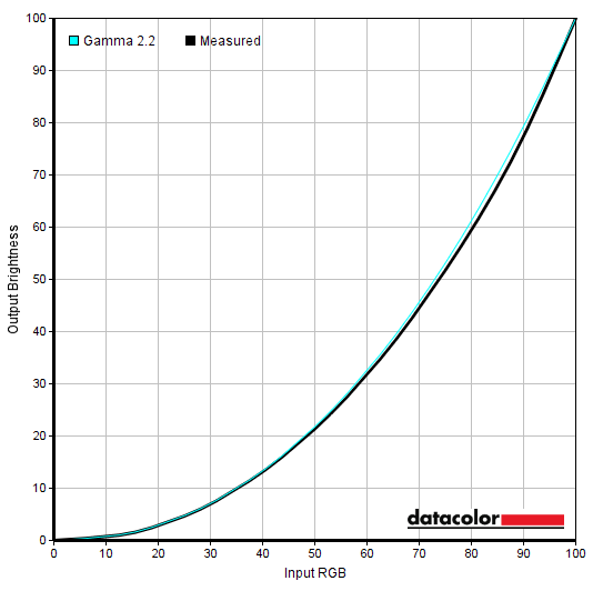
Gamma 'Test Settings'
Test Settings
Brightness= 40 (according to preferences and lighting)
Contrast and brightness
Contrast ratios
Monitor Settings White luminance (cd/m²) Black luminance (cd/m²) Contrast ratio (x:1) 100% brightness 222 0.10 2220 80% brightness (Factory Defaults) 209 0.10 2090 60% brightness 194 0.09 2156 40% brightness 159 0.07 2271 20% brightness 102 0.05 2040 0% brightness 40 <0.02 >2000 HDR = DisplayHDR* 159 0.07 2271 HDR = HDR Picture* 223 0.10 2230 HDR = HDR Movie* 223 0.10 2230 HDR = HDR Game* 223 0.10 2230 Eco Mode = Uniformity 217 0.11 1973 Gamma2 212 0.10 2120 Gamma3 205 0.10 2050 Gamma1 (60Hz) 208 0.10 2080 Color Temp. User 242 0.09 2689 Color Temp. User (100% brightness) 256 0.10 2560 Color Temp. sRGB 203 0.09 2256 LowBlue Mode = Multimedia 201 0.09 2233 LowBlue Mode = Internet 198 0.09 2200 LowBlue Mode = Office 196 0.09 2178 LowBlue Mode = Reading 193 0.09 2144 MBR = 1 @100Hz 178 0.08 2225 MBR = 1 @120Hz 177 0.08 2213 MBR = 1 @144Hz 179 0.08 2238 MBR = 10 @100Hz 125 0.06 2083 MBR = 10 @120Hz 125 0.06 2083 MBR = 10 @144Hz 124 0.06 2067 MBR = 20 @100Hz 65 0.03 2167 MBR = 20 @120Hz 64 0.03 2133 MBR = 20 @144Hz 65 0.03 2167 Test Settings 173 0.07 2471
*HDR measurements were made using this YouTube HDR brightness test video, running full screen at ‘1440p HDR’ on Google Chrome. The maximum reading from the smallest patch size (measurement area) that comfortably covered the entire sensor area and colorimeter housing was used for the white luminance measurement, which was ‘4% of all pixels’ in this case. The black luminance was taken at the same point of the video with the colorimeter offset to the side of the white test patch, equidistant between the test patch and edge of the monitor bezel.
The average contrast ratio with only brightness adjusted was 2155:1, excluding at ‘0%’ brightness where the measurements lack the necessary precision. This falls short of the specified 3000:1 – with all colour channels in their neutral position (‘Color Temp. User’) we recorded 2689:1 as the maximum value on this table. Under our ‘Test Settings’ we recorded 2471:1, which is fairly well beyond what non-VA LCDs provide without effective local dimming. With the exception of the ‘Eco Mode = Uniformity’ (Uniformity Compensation) setting, the monitor maintained > 2000:1 with all settings tested. The ‘Uniformity’ setting is designed to even out brightness across the screen at the expense of contrast – the ‘Brightness’ and ‘Contrast’ controls of the monitor are locked off. The highest white luminance recorded was 256 cd/m² (lower than the specified 300 cd/m²), whilst the lowest recorded white luminance was a reasonably dim 40 cd/m². This gives a luminance adjustment range of 216 cd/m². The monitor offers no local dimming and therefore no contrast advantage is gained under HDR. Furthermore, the maximum luminance isn’t boosted in any way. In fact, it was very low (for HDR) at 159 cd/m² or 223 cd/m² depending on settings used. Although not documented on this table, the maximum luminance reading in the test using the largest available white square (filling most of the screen) was very similar.
The monitor also has a Dynamic Contrast (‘DCR – Dynamic Contrast Ratio’) setting when running under SDR which allows backlight brightness and other aspects such as gamma to adjust according to the content being displayed. The monitor makes other similar adjustments itself under HDR. As usual global dimming is used rather than local dimming, so a compromise is always made based on the weighting of dark vs. light being displayed on the screen. The backlight responded at a fairly leisurely pace to changes in the scene and dimmed quite effectively for predominantly dark content. Although the brightness tended to be a bit high when a fair amount of lighter content was also displayed. So it wasn’t as distracting as some Dynamic Contrast settings, but we really didn’t feel it added anything to the experience. We prefer manual brightness control over using this setting.
PWM (Pulse Width Modulation)
The CU34G2X does not use PWM (Pulse Width Modulation) to regulate backlight brightness at any level and instead uses DC (Direct Current). The monitor is therefore considered ‘flicker-free’, which will come as welcome news to those sensitive to flickering or worried about side-effects from PWM usage. The exception to this is with ‘MBR’ active, as this is a strobe backlight function which causes the backlight to flicker at a frequency matching the refresh rate of the display.
Luminance uniformity
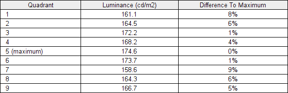
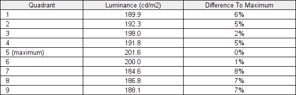
Whilst observing a black screen in a dark room, using our ‘Test Settings’, we observed some backlight bleed and a fair amount of clouding, particularly lower down the screen. It’s important to remember that individual units vary when it comes to all aspects of uniformity, including backlight bleed and clouding. The following image was taken a few metres back to eliminate ‘VA glow’. This is a silverish-purple glow that appears towards the edges, particularly near the bottom corners of the screen from a normal viewing position. This ‘VA glow’ blooms out more noticeably from sharper angles, as demonstrated in the viewing angles video later on. The luminance uniformity was very good in both cases. With our ‘Test Settings’ the brightest point recorded was ‘quadrant 5’ in the centre of the screen (174.6 cd/m²). The maximum deviation from this occurred at ‘quadrant 7’, towards the bottom left (158.6 cd/m², which is 9% dimmer). The average deviation between each quadrant and the brightest point was 5%, which is pleasing. With ‘Eco Mode = Uniformity’, the brightest point recorded was again ‘quadrant 5’ in the centre of the screen (201.6 cd/m²). The maximum deviation from this again occurred at ‘quadrant 7’, towards the bottom left (184.6 cd/m², which is 8% dimmer). The average deviation between each quadrant and the brightest point was 5.13%, very similar to under our ‘Test Settings’. It’s important to remember that uniformity varies between individual units and you can also expect variation beyond the points measured. The contour maps below show these deviations graphically, with darker greys representing lower luminance and hence greater deviation from the brightest recorded point than lighter greys. Percentage deviations between each quadrant and the brightest point are also given. The SpyderX Elite was also used to analyse variation in the colour temperature (white point) for the same 9 quadrants. The deviation between each quadrant and the quadrant closest to the 6500K (D65) daylight white point target was analysed and a DeltaE value assigned. A DeltaE <3 represents deviation that most users shouldn’t readily notice by eye. The top map shows the results under out ‘Test Settings’ and the bottom with ‘Eco Mode = Uniformity’. Under our ‘Test Settings’ the colour temperature was relatively consistent, with no significant deviations recorded. The bottom right quadrant was identified as being closest to 6500K, with the maximum deviation (DeltaE 2.0) to the left of centre. Using the ‘Color Temperature = Uniformity’ setting gave borderline significant deviation towards the centre and right of centre, with the top left closest to 6500K. So not really a positive effect from this UC setting according to this testing (reinforced by general observation), but this could be largely due to the quite pleasing uniformity on our sample without using this. It’s again important to remember that individual units vary when it comes to uniformity and that deviation beyond measured points can be expected. Also note that there are some perceived deviations in both brightness and colour temperature that are typical on VA panels and aren’t reflected by these readings. In addition to the quantitative testing above, we performed a subjective assessment of the uniformity of a variety of ‘medium’ shades, including 50% grey. Some monitors exhibit uniformity issues such as splotches or striations when viewing screen fills of such shades, giving an inconsistent appearance that some users refer to as ‘DSE’ (‘Dirty Screen Effect’). VA models are particularly prone to this. We observed slight patchiness and striations for some sections of the screen, but no heavy patchiness or strong striations. The monitor provided a strong contrast performance overall on Battlefield V. The increased static contrast compared to competing IPS models helped create superior depth and atmosphere to dark scenes. Without a super-high static contrast ratio and ‘VA glow’, though, things didn’t exactly appear ‘deep and inky’ throughout the screen. This ‘VA glow’ lightens up dark shades towards the bottom of the screen and in particular the bottom corners of the screen, from a normal viewing position. It was at a normal level for a VA UltraWide and not as extensive as the bloom of ‘IPS glow’ on IPS competitors from our normal seated viewing position (eyes ~70cm from screen). We also observed ‘black crush’, whereby some of the darker shades in the central region of the screen appeared even darker than intended when viewed from a normal viewing position. They essentially blend into a darker than intended mass, which masks some of the finer detail. The level of ‘black crush’ was about as low as we’ve seen on a VA UltraWide, however. Observing these shades closer to the edges of the screen reveals extra detail. Towards the very edges of the screen perceived gamma was lower, revealing some extra (‘unintended’) detail, although this wasn’t as pronounced as the gamma shifts on some VA models (horizontally) or any on any TN model (vertically). Moving your head to the side rather than viewing quite centrally exaggerates this effect. Brighter content stood out well against darker surroundings, whilst the screen surface imparted only a very light misty graininess to the image rather than a course or heavy graininess. Shadow of the Tomb Raider told a similar contrast story. Overall, the contrast was quite strong and it delivered a more atmospheric look to the many dark caves and dimly lit interiors of this game. Brighter elements stood out well, with the screen surface keeping such elements quite smooth in their appearance. ‘VA glow’ could again be observed and the static contrast was fairly strong but not exceptional, so the atmosphere could still have been improved for darker elements. But it was still a step above what IPS-type alternatives produce. ‘Black crush’ was also there, but was again about as subdued as we’ve seen from a VA UltraWide and isn’t something we see as hugely detrimental to the experience. We also made some observations using the film Star Wars: The Last Jedi. This movie features many bright elements such as explosions and energy pulses set against much darker backgrounds. The monitor provided a more cinematic look to such scenes than non-VA models without intricate local dimming. The was again ‘VA glow’ and ‘black crush’, with a bit of extra ‘unintended’ detail towards the very sides of the screen. When observing heavily compressed content, typical streamed media on Netflix and YouTube for example, this extra detail can bring out so-called ‘compression artifacts’. Although such details were lifted out a bit, this was not extreme and things appeared pretty well-blended overall. On some monitors perceived gamma is far too low or there are other issues which would give an obvious ‘blocky’ or ‘banded’ appearance – not the case here from a reasonable viewing distance (~70cm in our case). The Lagom tests for contrast allow specific weaknesses in contrast performance to be identified. The following observations were made. The AOC CU34G2X’s colour gamut (red triangle) was compared with the sRGB (green triangle) and DCI-P3 (blue triangle) reference colour spaces using our ‘Test Settings’, as shown below. The gamut offers quite comprehensive coverage of the sRGB colour space (99%), with some extension beyond in some regions. According to our measurements it covers 88% of the DCI-P3 colour space and although not shown in the graphic, covers 83% Adobe RGB. This gives the monitor the potential to output pretty much all shades within the sRGB colour space, with some extra saturation. The monitor also offers an sRGB emulation setting – setting ‘Color Temp.’ to ‘sRGB’ in the ‘Color Setup’ section of the OSD. As explored earlier, you retain brightness control but can’t adjust gamma or individually address colour channels. The colour gamut using this setting is shown below, with a fair bit of undercoverage of the sRGB colour space (92%) but no extension beyond. To maximise colour accuracy within the sRGB colour space, for colour-managed workflows, full calibration and profiling with a colorimeter or similar device using the full native gamut is recommended. You may try the ICC profile featured in the calibration section which includes gamut mapping for colour-aware applications, but best results are always obtained by calibrating your own unit with your own hardware. Instead of setting ‘Color Temp.’ to ‘sRGB’ and putting up with the restrictions associated with that, AMD users can activate an sRGB emulation setting with superior sRGB coverage and flexibility. This is done by opening ‘AMD Radeon Software’, clicking ‘Settings’ (cog icon towards top right) and clicking on ‘Display’. You should then ensure that the ‘Custom Color’ slider to the right is set to ‘Enabled’ and ‘Color Temperature Control’ set to ‘Disabled’. This is shown in the image below. The colour gamut under our ‘Test Settings’ with this driver tweak applied is shown below. The colour gamut now closely follows sRGB (99% coverage), without any real extension beyond. This is a useful setting if you’re an AMD user and wish to gain close tracking of the sRGB gamut without profiling, including in applications that aren’t colour-managed. On Battlefield V the monitor outputted a good variety of vivid-looking shades. The relatively generous colour gamut, extending some way beyond sRGB, injected some extra vibrancy. Most content you consume, including games like this (under SDR) are designed around the sRGB colour space. Extension in the gamut beyond this increases the saturation of the output, although this is an even boost in saturation and suitable shade variety is maintained. This contrast with a digital saturation enhancement, such as Nvidia Digital Vibrance Control or ‘Game Color’ in the OSD. Such digital enhancements simply pull shades closer to the edge of the gamut without expanding the gamut itself, crushing shades together and affecting shade variety. A pleasing variety of greens and browns were displayed, with some extra saturation giving environments a lush but not ‘cartoonish’ appearance. Roaring flames were displayed in a vivid way, with a nice variety of yellows, oranges and reds – again, more saturated than intended but without being crushed together like a digital saturation enhancement. There were some slight saturation shifts, with loss of saturation towards the edges and bottom of the screen due to perceived gamma behaviour. For a VA model, particularly one this wide, the shifts were as slight as we’ve seen. They’re more pronounced if you’re sitting close to the monitor or decentralised (particularly to the side). From our preferred viewing distance of ~70cm there were only slight saturation losses for some shades towards the sides and bottom, with a pretty vivid look overall. Shadow of the Tomb Raider showcased similar shade representation. Skin tones such as the almost too-perfect skin of Lara Croft appeared well-saturated overall without looking completely overblown. The perceived gamma shifts and loss of saturation towards the edge was perhaps most noticeable for pastel shades like this, but was again not extreme. The environments showcased some good earthy browns, rich greens and more muted greens. Some of the greens appeared somewhat brighter and more saturated than they should and some of the browns had red hues brought out a bit too strongly. But this was much more of a gentle saturation boost than some models provide, including some of the competing IPS models with greater DCI-P3 coverage. We also made some observations using the animated TV series Futurama. With large areas of a single shade and an excellent variety of shades, this is a very effective test for colour consistency. The monitor performed as well as we’ve seen for a VA model in this respect. There were some losses of saturation towards the edges and to some extent bottom of the screen, most noticeable for pastel shades. But much less pronounced than on some VA models and any TN model we’ve seen (vertically). There was again an uplift in saturation, but a universal and therefore well-balanced one overall. Pastel shades appeared suitably muted compared to much more lively bright and neon shades – some impressive strong reds, deep purples and bright greens included. Lagom’s tests for viewing angle help explore the idea of colour consistency and viewing angle performance. The following observations were made from a normal viewing position, eyes around 70cm from the screen. Sitting closer to the screen exaggerates the sort of shifts explored here. On some monitors, particularly but not exclusively those with high refresh rates, interlace patterns can be seen during certain transitions. We refer to these as ‘interlace pattern artifacts’ but some users refer to them as ‘inversion artifacts’ and others as ‘scan lines’. They may appear as an interference pattern, mesh or interlaced lines which break up a given shade into a darker and lighter version of what is intended. They often catch the eye due to their dynamic nature, on models where they manifest themselves in this way. Alternatively, static interlace patterns may be seen with some shades appearing as faint horizontal or vertical bands of a slightly lighter and slightly darker version of the intended shade. We observed dynamic interlace pattern artifacts in the form of a polygonal mesh when observing movement with some medium to light shades (smoke, clouds and suchlike). This pattern was extremely faint and difficult to notice for the most part, although it became somewhat more noticeable (but not extreme) during frame rate drops below 100fps with Adaptive-Sync active. We also observed some static interlace pattern artifacts. These were visible mainly but not exclusively for some medium to light grey and blues plus some red and orange shades. They were faintest at 60Hz and became more visible at higher refresh rates. Even at 144Hz they remained reasonably faint, so most users would find them fine or simply not notice them during normal use. Sensitive users might notice them and potentially find them bothersome, however. A small utility called SMTT 2.0 was used alongside a sensitive camera to analyse the latency of the CU34G2X, with over 30 repeat readings taken to help maximise accuracy. Using this method, we calculated 5.28ms (around 3/4 of frame at 144Hz) of input lag. There was no measurable difference at 144Hz with ‘Low Input Lag’ enabled in the OSD vs. ‘Adaptive-Sync’ set to ‘On’ in the OSD and enabled in the graphics driver. We recorded a similar value at 60Hz, provided ‘Low Input Lag’ was enabled in the OSD and Adaptive-Sync was disabled. At 60Hz having ‘Adaptive-Sync’ enabled appeared to add an additional frame of delay compared to ‘Low Input Lag’ being enabled – ~16ms extra (~21ms total). Note that the input lag measured here is influenced by both the element you ‘see’ (pixel responsiveness) and the element you ‘feel’ (signal delay). It indicates a reasonably low signal delay which most users should be comfortable with. Unfortunately, we don’t have the means to accurately measure input lag with Adaptive-Sync active in a variable refresh rate environment or with HDR active in an HDR environment. We’ve got an article on monitor responsiveness which explores some key aspects of the topic. A principle idea explored here is perceived blur, which is contributed to by both the pixel responsiveness of the monitor and the movement of your eyes as you track motion on the screen. Both factors are important, although it’s actually your own eye movement which creates most perceived blur on modern monitors. In the article we also cover a photography technique called ‘pursuit photography’. This uses a moving camera to capture motion on a screen in a way that reflects both elements of perceived blur, rather than simply reflecting pixel responsiveness. The images below are pursuit photographs taken using the UFO Motion Test for ghosting, with the UFO moving across the screen from left to right at a frame rate matching the refresh rate of the display. The test is set to run at its default speed of 960 pixels per second, which is a practical speed for such photographs whilst also highlighting key weaknesses. The monitor was tested at 60Hz (directly below), 100Hz and 144Hz with all ‘Overdrive’ options analysed; ‘Off’, ‘Weak’, ‘Medium’ and ‘Strong’. Although not documented here, 120Hz behaved some way between the tested refresh rates (100Hz and 144Hz), as you might expect. All rows of the UFO Motion Test were used to help broaden the shades (grey levels) tested. The final columns show some reference screens for comparison, both set to what we consider their optimal pixel response time settings. The first reference screen is the AOC C24G1, an interesting point of comparison as we consider this to be a pretty well-tuned VA model in terms of pixel overdrive. The second reference screen is the ViewSonic XG240R, a fast and well-tuned TN model (particularly at high refresh rates) that shows how things look where pixel responsiveness isn’t really a limiting factor. Note that the saturation and brightness of the screen and the way the camera captured things caused the segments of the UFO to appear a bit more blended on the CU34G2X than they do in reality. The segmentation is a bit more distinct in reality, similar to the respective reference shots. As well as increasing refresh rate to minimise perceived blur due to eye movement, the monitor offers an alternative with its ‘MBR’ (Motion Blur Reduction) feature. This is a strobe backlight setting that causes the backlight to pulse at a frequency matching the refresh rate of the display – either 100Hz, 120Hz or 144Hz. Adaptive-Sync must be disabled, otherwise MBR and associated settings are inaccessible. By its very nature, this mode causes the backlight to flicker at a rate matching the refresh rate of the display – individual sensitivity to this flickering varies. Some users may notice accelerated eye fatigue when using this setting even if they aren’t actively noticing any flickering. The pursuit photographs below were taken with the monitor set to 144Hz with MBR active and set to various values. Under MBR, the brightness slider is greyed out and replaced by the ability to set MBR between ‘1’ and ‘20’. This adjusts the ‘Pulse Width’, with a higher number decreasing the length of time for the on periods of the backlight pulses. This decreases brightness whilst potentially improving motion clarity. We also test a new overdrive setting called ‘Boost’ that’s available with Adaptive-Sync disabled that sets the monitor to ‘MBR = 20’ with different tuning to the other overdrive settings. The ‘Boost’ setting maintains similar overshoot levels to ‘Strong’ for the light background. For the dark and medium backgrounds ‘Boost’ sits some way between ‘Medium’ and ‘Strong’, reducing the boldness of the fragmented trailing without introducing overshoot. We consider the ‘Boost’ setting optimal for this reason, but the imperfections (strobe crosstalk) are still rather eye-catching and impair motion clarity a lot more than in the reference shots. The images below show the monitor running with this ‘Boost’ setting but set to 100Hz and 120Hz, allowing comparison with the 144Hz MBR performance. The pixel overdrive settings and relative effect of the MBR level worked in much the same way at reduced frame rate, so we’re keeping the comparison a bit simpler here. On Battlefield V, at frame rates keeping pace with the refresh rate, the monitor offered a reasonably low level of perceived blur. Most of this perceived blur was linked to eye movement and the 144Hz refresh rate. With the monitor pumping out ~2.4 times as much visual information ever second as a 60Hz monitor (or this running at 60Hz), there was a significant reduction in eye movement and hence a decrease in perceived blur. In addition, the high refresh rate and frame rate combination greatly improved the ‘connected feel’. This describes the precision and fluidity during interactions with your character and the game world. The low input lag helped in this respect, too. There were some weaknesses in pixel responsiveness which added to overall perceived blur, however. Such weaknesses are common on VA models, although there’s still quite a gap between the fastest and slowest VA performers. We’d put this one somewhere in the middle in that respect, with more pronounced weaknesses in pixel responses compared to something like the Acer X35 but a significant improvement over some models, like the Acer Z35. Where lighter and medium shades were involved in the transitions, more common during brightly lit daylight scenes on BFV for example, the weaknesses were relatively minor. Some ‘light powdery’ trailing in places, adding a bit of perceived blur. Where darker or medium-dark shades were added to the equation, some more pronounced weaknesses were observed. This included ‘heavy powdery’ trailing and some with a ‘smeary’ appearance – a bolder and more extended form of trailing which significantly increases perceives blur for affected transitions. This was clearest where very dark shades moved against lighter backgrounds, such as a dark tree trunk against a dusky sky. Or bright objects such as white text moved against medium to dark shades such as earth or sand. We observed some ‘break-up’ trailing as well, whereby some of the hues contained in the object or background appeared to leach out in a more obvious way. Purples and blues for example, appearing to flow out of some dark objects as if you’re wetting a page with water soluble ink on it. These weaknesses certainly weren’t as pronounced as we’ve seen on some VA models and overall performance will be just fine for some users, but we still found these weaknesses quite eye-catching. There were traces of overshoot in places as well, but this was very light and easy to ignore in comparison. The section of video review below highlights the strengths and weaknesses of the pixel response performance. We made similar observations on Shadow of the Tomb Raider. The weaknesses described previously were brought out here because of how common darker shades were. Lots of dimly lit locations, inviting the ‘smeary’ trailing and ‘heavy powdery’ trailing. There was no extensively ‘smoke-like’ trailing, which you’d get from some of the slowest VA performers. Sometimes the weaknesses in pixel responses manifested themselves as a sort of ‘flickering’ effect, very commonly observed on VA models. Where there were fine alternations between bright and dark shades, such as thatched roofing, the brighter shades were dimmed during movement due to being blended with the darker shades. There was no real overshoot to speak of using our preferred ‘Medium’ overdrive setting. To add to our comparisons with other models made previously, the weaknesses in pixel responsiveness were somewhat more pronounced than on the AOC C24G1 using its ‘Medium’ overdrive setting. And unlike on that model, the ‘Strong’ setting on this one is useless due to extreme overshoot levels. But we wouldn’t say it’s a million miles away. For gamers who enjoy playing titles like this, we feel they’ll generally be able to enjoy some benefits from the 144Hz refresh rate where frame rate permits (enhanced ‘connected feel’ and reduced perceived blur). And they may not find the standout weaknesses too much of a distraction – but it’s ultimately very subjective. We also observed video content at a range of frame rates, including 24 – 30fps Netflix content and 60fps YouTube content. For the 24 – 30fps content we didn’t observe any distinct weaknesses, perhaps a small amount of ‘powdery’ trailing for some transitions with dark shades but nothing that stood out. For the higher frame rate content these weaknesses were more apparent, although not as pronounced as during our high frame rate gameplay. The pixel response requirements are significantly lower at such reduced frame rates and you don’t need to worry about losing a competitive edge – because you’re sitting there passively watching the action. Despite still being noticeable to us in places, the weaknesses didn’t really detract too much from the video viewing experience even at 60fps. As an Amazon Associate I earn from qualifying purchases made using the below link. Where possible, you’ll be redirected to your nearest store. Further information on supporting our work. AMD FreeSync is a variable refresh rate technology, an AMD-specific alternative to Nvidia G-SYNC. Where possible, the monitor dynamically adjusts its refresh rate so that it matches the frame rate being outputted by the GPU. Both our responsiveness article and the G-SYNC article linked to explore the importance of these two elements being synchronised. At a basic level, a mismatch between the frame rate and refresh rate can cause stuttering (VSync on) or tearing and juddering (VSync off). FreeSync also boasts reduced latency compared to running with VSync enabled, in the variable frame rate environment in which it operates. FreeSync requires a compatible AMD GPU such as the Radeon RX 580 used in our test system. There is a list of GPUs which support the technology here, with the expectation that future AMD GPUs will support the feature too. The monitor itself must support ‘VESA Adaptive-Sync’ for at least one of its display connectors, as this is the protocol that FreeSync uses. The CU34G2X supports FreeSync via DP and HDMI on compatible GPUs and systems. Note that HDR can be activated (at the same time as FreeSync) on GPUs and systems with DP 1.4 or HDMI 2.0. With the CU34G2X you also need to make sure ‘Adaptive-Sync’ is set to ‘On’ in the ‘Game Setting’ section of the OSD. On the GPU driver side recent AMD drivers make activation of the technology very simple and something that usually occurs automatically. You should ensure the GPU driver is setup correctly to use FreeSync, so open ‘AMD Radeon Software’, click ‘Settings’ (cog icon towards top right) and click on ‘Display’. You should then ensure that the first slider, ‘Radeon FreeSync’ is set to ‘Enabled’ as shown below. To configure VSync, open ‘AMD Radeon Software’. Click ‘Settings’ (cog icon towards top right) and click ‘Graphics’. The setting is listed as ‘Wait for Vertical Refresh’. This configures it globally, but if you wish to configure it for individual games click ‘Game Graphics’ towards the top right. The default is ‘Off, unless application specifies’ which means that VSync will only be active if you enable it within the game itself, if there is such an option. Such an option does usually exist – it may be called ‘sync every frame’ or something along those lines rather than simply ‘VSync’. Most users will probably wish to enable VSync when using FreeSync to ensure that they don’t get any tearing. You’d therefore select either the third or fourth option in the list, shown in the image below. Above this dropdown list there’s a toggle for ‘Radeon Enhanced Sync’. This is an alternative to VSync which allows the frame rate to rise above the refresh rate (no VSync latency penalty) whilst potentially keeping the experience free from tearing or juddering. This requires that the frame rate comfortably exceeds the refresh rate, not just peaks slightly above it. We won’t be going into this in detail as it’s a GPU feature rather than a monitor feature. We ran a range of game titles with FreeSync enabled on the monitor and as usual found it worked in much the same way across these titles. Any issues identified on one specific title would suggest a game or GPU driver issue rather than a monitor issue. We’ll therefore simply focus on a single title for this section; Battlefield V. With excellent flexibility with its graphics settings and scenes of varying intensity, it allows the full refresh rate range of the monitor to be tested under FreeSync. The lowly Radeon RX 580 used in our test system is no powerhouse, so maintaining a solid 144fps was difficult even with significant graphics settings sacrifices. Without a variable refresh rate technology such as FreeSync, even slight dips in frame rate would cause obvious tearing (VSync disabled) or stuttering (VSync enabled). Obvious to us at least, as users sensitive to tearing and stuttering. Having such nuisances removed was a very nice bonus. With more significant dips in frame rate, the technology continued to work to get rid of tearing and stuttering. There was a drop off in ‘connected feel’ and an increase in perceived blur as frame rate was reduced. FreeSync doesn’t change the fact that lower frame rates are still lower frame rates – it just helps remove tearing and stuttering from mismatches between frame and refresh rate. The technology worked all the way down to 48Hz (48fps) and even at such low refresh rates there was no obvious overshoot introduced. Unlike monitors with G-SYNC modules, Adaptive-Sync models like this typically lack variable overdrive and are only really tuned for their native refresh rate (144Hz in this case). As refresh rate reduces, occurring alongside frame rate dips with Adaptive-Sync active, the pixel overdrive should ideally be re-tuned to avoid the introduction of increasingly obvious overshoot. Whilst there was some extra overshoot introduced using our preferred ‘Medium’ pixel overdrive setting, it was not substantial and wasn’t something most users will find bothersome or necessarily notice at all. Beneath 48fps, the monitor employed LFC and stuck with a multiple of the frame rate with its refresh rate. Keeping tearing and stuttering at bay. When crossing the LFC boundary, we observed momentary flickering – something we very commonly observe on FreeSync models. We noticed more intense and actually quite bothersome flickering during certain frame rate fluctuations below the LFC boundary, however. Fluctuations between 20 – 40fps, for example, caused very obvious flickering which we found quite distracting. We observed some mild flickering at times outside of the LFC window (>48fps) as well. This generally occurred during significant fluctuations in frame rate, such as a sudden momentary drop of 40-50fps followed by an increase. We commonly observe flickering on VA models under such conditions as they’re sensitive to the sudden voltage changes that occur in such scenarios. Sometimes heavy fluctuations in frame rate with a variable refresh rate technology active can cause slight flickering with models using other panel types as well. Unlike the flickering observed in the LFC window (<48fps), we didn’t find this bothersome or distracting during gameplay - but some users might. As noted earlier, AMD FreeSync makes use of Adaptive-Sync technology on a compatible monitor. As of driver version 417.71, users with Nvidia GPUs (GTX 10 series and newer) and Windows 10 can also make use of this Variable Refresh Rate (VRR) technology. When a monitor is used in this way, it is something which Nvidia refers to as ‘G-SYNC Compatible’. Some models are specifically validated as G-SYNC compatible, which means they have been specifically tested by Nvidia and pass specific quality checks such as the inclusion of effective variable overdrive. The make use of the technology, you need to connect the monitor up via DisplayPort and make sure ‘Adaptive-Sync’ is set to ‘On’ in the ‘Game Setting’ section of the OSD. When you open up Nvidia Control Panel, you should then see ‘Set up G-SYNC’ listed in the ‘Display’ section. Ensure the ‘Enable G-SYNC, G-SYNC Compatible’ checkbox as well as ‘Enable settings for the selected display model’ is enabled as shown below. Press OK – the monitor should briefly flick off then on again and the technology should be active. Our suggestions regarding use of VSync also apply, but obviously you’re using Nvidia Control Panel rather than Radeon Settings to control this. The setting is found in ‘Manage 3D settings’ under ‘Vertical sync’, where the final option (‘Fast’) is equivalent to AMD’s ‘Enhanced Sync’ setting. You’ll also notice ‘G-SYNC Compatible’ listed under ‘Monitor Technology’ in this section, as shown below. Make sure this is selected (it should be if you’ve set everything up correctly in ‘Set up G-SYNC’). Earlier on we introduced the ‘MBR (Motion Blur Reduction)’ feature, including its principles of operation and how it performs using specific tests. When using MBR or any strobe backlight feature, it’s essential that your frame rate exactly lines up with the refresh rate of the display. If that isn’t the case, you’re left with extremely obvious stuttering or juddering, which stands out because there’s very little perceived blur due to eye movement to mask it. You can’t use Adaptive-Sync at the same time as MBR. We tested a range of games whilst using the feature but for simplicity will simply focus on Battlefield V, running solidly at 144fps. The monitor was set to 144Hz using the ‘Boost’ setting, which as we explored earlier we consider to be optimal in terms of motion clarity. Some of the observations made below apply to other overdrive settings and refresh rates, however. There was certainly a reduction in perceived blur overall compared to having the feature disabled. The clarity of the main object was demonstrated using ‘Test UFO’ earlier and is also reflected during gameplay. Rapid turns resulted in superior detail levels being retained, potentially giving a competitive edge and making it easier to engage and track enemies. This was not the ‘cleanest’ strobe crosstalk implementation, however. There was a fair degree of strobe crosstalk and general pixel response time weaknesses evident throughout the screen. With repetitions of various objects, the environment enemies and anything else that might be moving in the scene. Quite a few of these repetitions were at least fainter than the actual object or element, but some were almost as bold. Particularly where darker shades were included or further down the screen where strobe crosstalk was very strong even for medium shades. The strobe crosstalk was detrimental to motion clarity and just looked a bit messy in places. Additional points to note include that the backlight flickers at a frequency matching the refresh rate of the display, which could bother sensitive users. We also observed some red and green flashes at times, especially when moving the eyes rapidly or observing thin white objects moving on the screen. This is something we commonly notice on wide gamut models with strobe backlight implementations. Coupled with the flickering, we found using MBR accelerated visual fatigue and preferred the normal flicker-free operation of the monitor. But sensitivity to flickering varies and some users may see some utility in this mode despite its drawbacks. On an ideal monitor, HDR (High Dynamic Range) involves simultaneous output of very bright light shades and very deep dark shades. Additionally, the monitor must possess the ability to display an excellent range of shades between these extremes. From muted pastel shades to highly vivid saturated shades. Ideally the monitor would allow per-pixel illumination or failing that offer many dimming zones controlled with excellent precision. In other words, an FALD (Full Array Local Dimming) solution with a very high number of dimming zones which allows some areas of the image to remain very dim whilst others are very bright. Colour reproduction is also an important aspect of the HDR experience. The ultimate goal is support for a huge colour gamut, Rec. 2020, whilst a more achievable near-term goal is for a monitor to offer coverage of at least 90% DCI-P3 (Digital Cinema Initiatives standard colour space). Finally, HDR makes use of at least 10-bit precision per colour channel, so its desirable that the monitor supports at least 10-bits per subpixel. Monitors most commonly support the HDR10 pipeline, the most ubiquitous HDR standard used in HDR games and movies. For most games and other full screen applications that support HDR, the AOC CU34G2X automatically switches into its HDR operating mode. As of the latest Windows 10 update, relevant HDR settings in Windows are found in ‘Windows HD Color settings’ which can be accessed via ‘Display settings’ (right click the desktop). Most game titles will activate HDR correctly when the appropriate in-game setting is selected. A minority of game titles that support HDR will only run in HDR if the setting is active in Windows as well. Specifically, the toggle which says ‘Play HDR games and apps’. If you want to view HDR movies on a compatible web browser, for example, you’d also need to activate the ‘Stream HDR Video’ setting. These settings are shown below. Also note that there’s a slider that allows you to adjust the overall balance of SDR content if HDR is active in Windows. This simply acts as a digital brightness slider, so you lose but never gain contrast by adjusting it. For regular SDR content, the image generally appeared bleached, unappealing and poorly balanced regardless of what this was set to. We’d recommend only activating HDR in Windows if you’re about to specifically use an HDR application that requires it, and have it deactivated when viewing normal SDR content on the monitor. For this section we’ll focus on two titles; Battlefield V and Shadow of the Tomb Raider. These and similar titles are ones we’ve tested on a broad range of monitors under HDR and we know they offer a solid HDR experience on monitors with appropriate capability. Although this testing is focused on HDR PC gaming using DisplayPort and HDMI, the observations apply more broadly to other HDR content including HDR movies and running HDR on compatible games consoles. The experience described here is largely dictated and limited by the screen itself. The monitor has 4 different ‘HDR’ settings available under HDR in the ‘Luminance’ section of the OSD; ‘DisplayHDR’, ‘HDR Picture’, ‘HDR Movie’ and ‘HDR Game’. Image controls such as ‘Brightness’, ‘Contrast’, ‘Gamma’ and the ‘Color Setup’ menu are locked off under HDR. We’ll discuss the HDR modes shortly, but first it’s worth talking a bit about where the monitor sits in terms of its overall HDR capabilities and specification. The AOC CU34G2X does not meet the criteria for even the lowest level of VESA DisplayHDR certification. The HDR output of the monitor is therefore very rudimentary, although that’s not to say some users won’t enjoy some elements of the experience. We recorded a colour gamut of 88% DCI-P3 on the AOC. This is shown in the gamut representation below, where the red triangle shows the monitor’s colour gamut, the blue triangle shows DCI-P3 and green triangle sRGB for reference. Because DCI-P3 is the near-term standard game developers and HDR movie directors have in mind when creating HDR content, it makes sense to have good coverage of this colour space for HDR purposes. Having decent (although in this case not exceptional) DCI-P3 coverage is useful, although it also needs to be put to good use by the HDR implementation. When running via DisplayPort, the ‘DisplayHDR’ setting on the AOC is anaemic on this model. We also feel the name is somewhat misleading, given the monitor falls short of any VESA ‘DisplayHDR’ level. Things appear pretty washed out or hazy overall, as the gamma is set far too low. This can’t be adjusted in the OSD. Using HDMI alleviates this issue, although you’re restricted to 100Hz maximum. Again sticking with the HDMI representation, the colour gamut is put to good use. DCI-P3 is targeted for HDR content such as this rather than sRGB. There are some good vibrant elements such as flames and dark paints which appear significantly more saturated than shades within the sRGB colour space would. Meanwhile, natural green shades appear appropriately rich without the extent of oversaturation or slight yellowing observed under SDR. Brown shades appear rich and deep where appropriate, without the slight red push observed under SDR. The remaining settings show significantly increased saturation and higher brightness overall. There’s also a sharpness filter applied, which is pretty tame using ‘HDR Picture’ but stronger under ‘HDR Movie’ and ‘HDR Game’. The most noticeable change as you move from ‘DisplayHDR’ to any of the remaining settings is a reduction in the ‘hazy look’ using DisplayPort. Unfortunately, there’s still a lack of depth overall with some shades appearing far too muted. Many skin tones appear flat and undersaturated and flames a lot less lively than they should – we observed this using the ‘DisplayHDR’ setting, too. This wasn’t an issue when using HDMI. Other shades, such as lush greens and deep reds appear cartoonish in a way that they didn’t under either SDR or using the ‘DisplayHDR’ setting. They appear digitally oversaturated, which eats into shade variety by the mechanisms explored earlier in the ‘Colour Reproduction’ section. Overall, regardless of setting used, there was something quite ‘off’ about the colour representation under HDR. The monitor doesn’t natively support 10-bit colour reproduction at all refresh rates at the native resolution, although the HDR10 pipeline does make use of 10-bits per channel colour output. If required, the additional 2-bit dithering stage is offloaded to the GPU under HDR. We’ve carefully observed a range of content (including fine gradients) on various monitors where 10-bit is supported monitor side (usually 8-bit + FRC) and where the GPU handles the dithering under HDR and the end result is really very similar. A side by side comparison or certain content may reveal some differences, but even when observing fine gradients and subtle shade variations the GPU dithering route works well. Sticking with the ‘DisplayHDR’ setting and using HDMI, at least, this enhanced precision provided some benefits to the experience. It provided a more nuanced variety of dark shades than you’d see under SDR, giving shaded regions a more believable look. This was very different to simply raising the gamma and lightening many of the shades and it maintained a natural rather than ‘flooded’ look to the image. Again, not something replicated outside of this specific mode and display connection on this model. The enhanced precision also applied to brighter shades. Fine gradients such as the sun’s rays in the sky, mist and smoke effects appeared smoother and again showed a greater nuanced variety of shades and a more natural progression. The image below is one of our favourites from Shadow of the Tomb Raider for showcasing HDR on a monitor. The photo is purely for illustrative purposes and in no way represents how the monitor appeared running HDR first hand. The 3440 x 1440 resolution and 21:9 aspect ratio offers some benefits for both work and play. Our article on the resolution delves into some of the benefits of the resolution and experience it provides on desktop, for movie content and in games. The screen used as an example in the article is the same size and resolution as this one (34” 3440 x 1440), providing a pixel density of 109.68 PPI (Pixels Per Inch). This is a similar pixel density to a 27” 2560 x 1440 (WQHD) screen and offers a similar vertical height. The key difference is the extra width and horizontal pixels to go with it. This provides a nice boost in terms of productivity on the desktop, something we like to refer to as ‘desktop real-estate’. This AOC model, unlike the one used in the article, includes a curve – a 1500R curve more specifically, which is relatively steep. Despite it seeming quite steep ‘on paper’ and indeed in photos and videos you might see of the monitor, we adapted to the curve quickly and found it perfectly comfortable and natural to use. The effect of the curve is greatly exaggerated on pictures and videos – there’s a pincushion effect observed in photos and videos which isn’t observed in person when you’re using the monitor at a desk. The curve simply draws you into the experience a bit, whilst brining potential viewing comfort benefits as well. Some users, such as graphic designers, may prefer the geometric predictability of a flat screen, but most users should find the curve just fine and actually quite enjoy the experience it provides. The images below exaggerate the curve and makes it appear deeper and more obvious than it is in practice and are purely for illustrative purposes. Due to graphical demands or incompatibility with a certain system (e.g. games console), it might be necessary to run the monitor at a lower resolution than 3440 x 1440. The monitor supports scaling functionality via any of its display inputs, at certain resolutions such as 1920 x 1080 (Full HD) and 2560 x 1080. To ensure the monitor rather than GPU is handling the scaling process, you need to make sure the GPU driver is set up correctly. For AMD GPU users the monitor will handle the scaling by default, when gaming at non-native resolutions. Nvidia users should open the Nvidia Control Panel and navigate to ‘Display – Adjust desktop size and position’. They should ensure that ‘No Scaling’ is selected and ‘Perform scaling on:’ is set to ‘Display’ as shown below. The monitor offers a range of scaling options in the OSD, listed as ‘Image Ratio’ settings in the ‘Extra’ section of the OSD. These can only be changed if Adaptive-Sync is disabled and only apply to specific resolutions where the monitor provides scaling support. With Adaptive-Sync enabled, the monitor defaults to the ‘Wide’ setting which tries to fill up as much of the screen space as possible. The way in which this works depends on the resolution and refresh rate selected, so it’s quite confusing in that respect. The section of the OSD video below runs through these scaling options and how they apply to various resolutions. The monitor provided interpolation for 1920 x 1080 (Full HD) and 2560 x 1080, with up to 144Hz supported in both cases. No interpolation was supported for 2560 x 1440, so GPU scaling needs to be used for that resolution. The interpolation process used by the monitor, for example displaying 1920 x 1080 using the default ‘Wide’ setting (144Hz) or 2560 x 1080 (any selectable refresh rate) was very effective. Whilst there was a degree of softening compared to running these resolutions natively on a 27” 16:9 and 34” 21:9 monitor, respectively, an effective sharpness filter was applied to help overcome this. This wasn’t an extreme or excessive sharpness filter and in our view struck a very good balance. It made such resolutions very usable, with 2560 x 1080 providing a useful fallback if you find 3440 x 1440 too demanding. As usual, if you’re running the monitor at 3840 x 2160 and viewing 1920 x 1080 content (for example a video over the internet or a Blu-ray, using movie software) then it is the GPU and software that handles the upscaling. That’s got nothing to do with the monitor itself – there is a very small amount of softening to the image compared to viewing such content on a native Full HD monitor, but it’s slight and shouldn’t bother most users. The video below shows the monitor in action. The camera, processing done and your own screen all affect the output – so it doesn’t accurately represent what you’d see when viewing the monitor in person. It still provides useful visual demonstrations and explanations which help reinforce some of the key points raised in the written piece. Whether gaming, watching videos or browsing the internet, the 3440 x 1440 resolution and 21:9 aspect ratio provides some benefits. Combine this with a 34” screen and 144Hz refresh rate and you’ve hit the sweet spot for some users. The AOC CU34G2X achieves this, with a pleasing pixel density and screen size for both work and play. The design is certainly less striking than some ‘gaming monitors’, although there are some hints of dark metallic red for a bit of visual interest. The monitor offers good ergonomic flexibility, including height adjustment, and has a reasonably solid feel overall. The screen also adopts a 1500R curve, which we feel makes sense on a screen this wide and simply draws you in a bit without feeling unnatural. The OSD controls weren’t the most intuitive we’ve come across (far from it), with a row of pressable buttons instead of a joystick or remote. We’re quite used to this style of menu system so didn’t find it too bad, but for those who struggle they may find the ‘G-Menu’ software a nice alternative. This can be used without needing a USB cable connected and gives easy access to many OSD features, plus some unique additions not found there. As a VA panel, contrast was the main strength of this model. Although static contrast fell a bit short of the panel specifications, it was well above what other LCD panel types provide without fancy local dimming technologies. This gave a bit of an edge to the depth and atmosphere in dark scenes and gave dark text on light backgrounds a fairly bold look. The light matte anti-glare screen surface helped keep lighter content appearing quite smooth and free from obvious graininess. There was a little ‘black crush’, although about as little as we’ve seen from a VA model. And a moderate amount of ‘VA glow’ – it would be nicer if that wasn’t there, but we found it less obtrusive than ‘IPS glow’ from a normal viewing angle on competing IPS UltraWides. Another comparison to make with the IPS alternatives is in terms of colour and gamma consistency. The IPS models certainly have an edge here, although this model was about as good as we’ve seen in both respects for a VA panel. Despite slight saturation losses towards the edge of the screen, the fairly generous colour gamut kept things looking pretty vibrant overall. Not extreme extra saturation, but a dose of extra vibrancy. The fairly generous colour gamut was put to good use under HDR, at least when using HDMI. With DisplayPort the balance, saturation and gamma was simply ‘off’ under HDR regardless of the HDR mode used in the OSD. Under HDMI things were better balanced and the monitor could put its gamut to appropriate use. Whilst further extension beyond sRGB and superior coverage of the DCI-P3 colour space would have been preferable even there, the combination of 88% DCI-P3 coverage and 10-bit pipeline provided quite good shade variety and precision. In terms of brightness levels and contrast performance, though, there was very little ‘HDR’ about the experience. The fairly restrictive maximum luminance and lack of local dimming just didn’t deliver in that respect. The monitor provided quite a mixed experience in terms of responsiveness, although this is expected to some extent given the panel type used. Input lag was fairly low and the 144Hz refresh rate provided some nice benefits in terms of ‘connected feel’ and a reduction in perceived blur. There were some fairly widespread weaknesses in terms of pixel responsiveness, though, introducing some ‘powdery’ and in places ‘smeary’ trailing. Some users won’t find this bothersome, especially if they prefer playing non-competitively. But the monitor certainly didn’t make optimal use of its 144Hz refresh rate and we’d put it somewhere in the middle in terms of VA pixel response performance. Not terrible, but not amazing either. Adaptive-Sync worked to combat tearing and stuttering from frame and refresh rate mismatches on both our AMD (via FreeSync) and Nvidia (via ‘G-SYNC Compatible Mode’) GPUs. The experience was soured a bit at lower frame rates, though. There was fairly intense flickering below the floor of operation on our AMD GPU (<48fps), whilst on our Nvidia GPU the floor of operation was a higher 70fps. Below this there was a fair amount of flickering in places but also some ‘screen blanking’ issues with our GPU. We still found the technology usable on our Nvidia GTX 1080 Ti where suitable visual sacrifices were made to keep frame rates relatively high. But it’s sometimes difficult to avoid those drops below 70fps and if that range is frequently visited it might make sense to disable the technology. Overall we feel the monitor provided a nice experience in some respects, with the sort of image quality and visual experience some will really love. It certainly could’ve done with a bit more polish in some areas, such as Adaptive-Sync implementation at lower frame rates. Competing IPS models like the LG 34GK950F are really more accomplished in terms of their response performance and colour consistency and benefit from an even lighter matte screen surface. For an even smoother image and more direct emission of light, at the expense of slightly worse glare handling. On the flip side the AOC offers an edge in terms of contrast, and what simply can’t be ignored is the fact it costs roughly half as much.

The SpyderX Elite was used to assess the uniformity of lighter shades, represented by 9 equidistant white quadrants. The luminance of each quadrant was measured and compared to the brightest measured quadrant. The tables below show these values as well as the percentage deviation between each quadrant and the brightest measured point. The first table shows the results under our ‘Test Settings’, whilst the bottom table shows results using the ‘Eco Mode = Uniformity’ Uniformity Compensation (UC) setting mentioned previously.
Luminance uniformity table 'Test Settings'
Luminance uniformity table 'Uniformity'
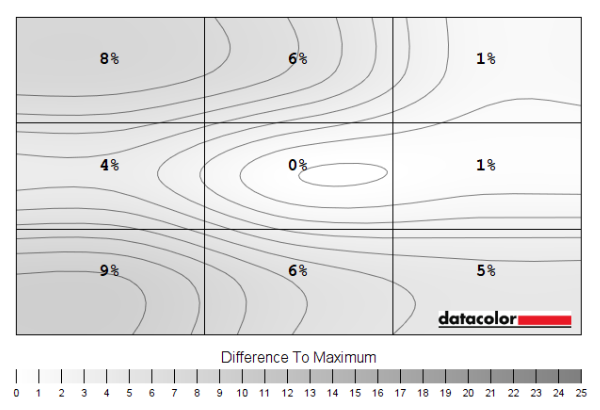
Luminance uniformity map 'Test Settings'
Luminance uniformity map 'Uniformity'
Colour temperature uniformity map 'Test Settings'
Colour temperature uniformity map 'Uniformity'
Contrast in games and movies
Lagom contrast tests
Colour reproduction
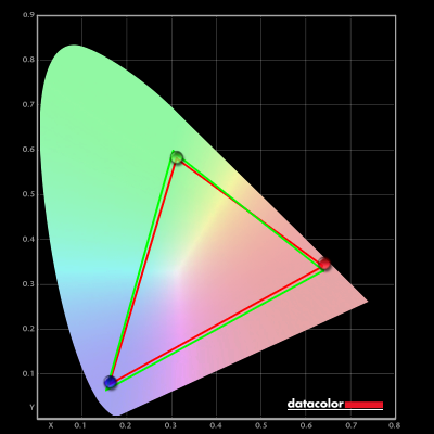
Colour gamut
Colour gamut 'Test Settings'
Colour gamut 'sRGB'

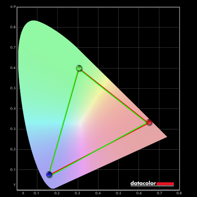
Colour gamut AMD 'CTC disabled' setting
Colour in games and movies
Viewing angles

The following video shows the Lagom text test, a mixed desktop background and dark desktop background from various viewing angles. For the mixed image you can see some shifts in colour and contrast. They’re most pronounced at steeper angles, although losses of saturation can be observed quite following more gentle viewing position shifts. There is no ‘colour inversion’ as you’d observe on a TN model vertically and the shifts vertically are not as extreme. The final third of the video shows a dark desktop background and highlights ‘VA glow’ mentioned earlier. This blooms out more noticeably from sharper viewing angles but is not as strong from centralised viewing angles.
Interlace pattern artifacts
Responsiveness
Input lag
Perceived blur (pursuit photography)

At 60Hz, shown above, the UFO appears softly focused and relatively broad. This look to the object itself reflects a significant amount of perceived blur due to eye movement and is shared with the reference screens. Behind the UFOs you can see varying degrees of trailing, caused by weaknesses in pixel responsiveness. Moving up from ‘Off’ to ‘Weak’ and then ‘Medium’ offers slight incremental improvements to pixel responsiveness. The boldest trailing is observed for the dark background (top row), with the medium background (middle row) showing a reduction and the light background (bottom row) a further reduction. Using the ‘Medium’ setting, you can see a little overshoot (inverse ghosting) introduced for the light background. More specifically a little ‘halo trailing’ that’s brighter than the object or background colour. There is a bit more overshoot for the C24G1 reference shots but less conventional trailing. The ‘Strong’ overdrive setting introduces extreme overshoot, bright and colourful trailing that’s extremely eye-catching both in the images and in practice. We consider ‘Medium’ to be the optimal setting at 60Hz. The following image set shows how things look with the refresh rate bumped up to 100Hz.

At 100Hz, shown above, the UFO now appears somewhat narrower and more sharply focused. This reflects a significant decrease in perceived blur due to eye movement. You can again see varying degrees of trailing behind the object. There was again an incremental improvement going up from ‘Off’ to ‘Weak and then ‘Medium’. The trailing behind was more extended and somewhat bolder than at 60Hz, reflecting the more stringent pixel response requirements of the increased refresh rate. The ‘Strong’ setting again introduced extreme overshoot, particularly for the medium background. We again consider the ‘Medium’ setting optimal at 100Hz. The trailing is more distinct than on the C24G1 reference and certainly compared to the snappy XG240R reference at this refresh rate. The image below shows what things look like with a further bump up in refresh rate to 144Hz.

At 144Hz, above, the UFO appears somewhat narrower with sharper internal detailing. This reflects a further decrease in perceived blur due to eye movement. There was again varying degrees of trailing behind the object, due to weaknesses in pixel responsiveness. With another step up in refresh rate, the pixel response requirements for optimal performance increase further. The trailing is therefore slightly more extended in places compared to at 100Hz, but this was marginal. The weaknesses were already exposed quite readily by 100Hz. The ‘Strong’ setting again introduces obvious overshoot, especially for the medium background. We consider the ‘Medium’ setting optimal again due to a slight reduction in trailing compared to the ‘Weak’ setting without a noticeable negative impact. This is reflected by broader testing. Comparing to the references, the C24G1 shows somewhat less bold trailing behind the cockpit (yellow area) of the UFO for the dark background and less trailing throughout for the medium background. The light background is actually a bit cleaner on the CU34. The XG240R is a superstar at 144Hz, very well-optimised with no obvious weaknesses apparent on this test.

With MBR active you can see that the image appears more sharply focused compared to with the setting deactivated, reflecting a significant decrease in perceived blur due to eye movement. This is most noticeable at ‘MBR = 20’ or with ‘Overdrive = Boost’ (same MBR level), which corresponds with the dimmest setting with highest potential motion clarity. We’d again stress that the camera made the segments appear a bit less distinct than they appeared to the eye, at ‘MBR = 10’ and above. You can see that the trailing is now fragmented due to the strobe nature of the backlight. These repetitions are due primarily to the pixel responses not keeping up with the rigorous demands of the refresh cycle. The all-encompassing term ‘strobe crosstalk’ is used to describe this fragmented trailing around the object. The fragmentation of the trailing is clearest at increased MBR levels. Using the ‘Strong’ setting there is very strong overshoot for the medium background and a smaller amount for the light background.

The internal detailing is somewhat reduced at a respective decrease in refresh rate. But even at 100Hz, there’s a certain level of focus and narrowness to the object that simply isn’t there with MBR deactivated. Even in an apples to oranges comparison with 144Hz. This is due to a significant decrease in perceived blur due to eye movement when using MBR, even when compared with a higher refresh rate and the setting deactivated. The strobe crosstalk we mentioned earlier – imperfections you see around the main object – is visible in much the same way. There are multiple repetitions and particularly for the dark background many of these repetitions are particularly bold and distinct. It’s worth noting not all areas of the screen refresh simultaneously, so the appearance of strobe crosstalk can differ depending on how high up or low down on the screen the movement is being observed. This is demonstrated in the image below, with the monitor set to our preferred ‘Boost’ setting at 144Hz.

You can see rather strong strobe crosstalk throughout the screen. Further up you can see it in front of the object as well as behind. A bit lower down (just above centre) it only appears behind. Centrally the strobe crosstalk appears only behind the object, but the initial trail in particular appears bolder. A bit further down the screen the initial trail becomes so bold it’s essentially a duplication of the main object. This strobe crosstalk didn’t make the MBR setting useless by any means, but it did impact its motion clarity. We explore this subjectively with some in-game testing shortly.
Responsiveness in games and movies
FreeSync – the technology and activating it

The AOC supports a variable refresh rate range of 48 – 144Hz. That means that if the game is running between 48fps and 144fps, the monitor will adjust its refresh rate to match. When the frame rate rises above 144fps, the monitor will stay at 144Hz and the GPU will respect your selection of ‘VSync on’ or ‘VSync off’ in the graphics driver. With ‘VSync on’ the frame rate will not be allowed to rise above 144fps, at which point VSync activates and imposes the usual associated latency penalty. With ‘VSync off’ the frame rate is free to climb as high as the GPU will output (potentially >144fps). AMD LFC (Low Framerate Compensation) is also supported by this model, which means that the refresh rate will stick to multiples of the frame rate where it falls below the 48Hz (48fps) floor of operation for FreeSync. If a game ran at 36fps, for example, the refresh rate would be 72Hz to help keep tearing and stuttering at bay. This feature is used regardless of VSync setting, so it’s only above the ceiling of operation where the VSync setting makes a difference.

Some users prefer to leave VSync enabled but use a frame rate limiter set a few frames below the maximum supported (e.g. 141fps) instead, avoiding any VSync latency penalty at frame rates near the ceiling of operation or tearing from frame rates rising above the refresh rate. If you enable ‘Frame Counter’ in the ‘Game Setting’ section of the OSD, this will reflect the frame rate when the monitor is within its variable refresh rate range and Adaptive-Sync is doing its thing. The final point to note is that FreeSync only removes stuttering or juddering related to mismatches between frame rate and refresh rate. It can’t compensate for other interruptions to smooth game play, for example network latency or insufficient system memory. Some game engines will also show stuttering (or ‘hitching’) for various other reasons which won’t be eliminated by the technology.
FreeSync – the experience
Nvidia Adaptive-Sync (‘G-SYNC Compatible’)

You will also see in the image above that it states: “Selected Display is not validated as G-SYNC Compatible.” This means Nvidia hasn’t specifically tested and validated the display, not that it doesn’t work. The technology did indeed work, largely mirroring the FreeSync experience including allowing HDR to be used simultaneously. At least, the overall experience was similar at higher frame rates and refresh rates. The floor of operation was shifted up to 70Hz (70 – 144Hz) instead of 48Hz. When the frame rate fell below 70fps, an LFC-like frame to refresh multiplication technology was used. Unfortunately, when the monitor passes the LFC boundary or sits below this, it frequently caused the screen to go blank for a split second and then turn back on. This will be fine if you’re always well clear of the boundary, but unexpected dips down to 70fps or below are sometimes difficult to avoid. Some game menu systems will cause such dips, even if the game itself can be run at much higher frame rates. According to our research and experience with other models, this issue may not exist on newer GPU generations such as the RTX 20 and RTX 30 Series.

Finally, note again that you can enable ‘Frame Counter’ in the ‘Game Setting’ section of the OSD. This will reflect the frame rate when the monitor is within its variable refresh rate range and Adaptive-Sync is doing its thing.
MBR (Motion Blur Reduction)
HDR (High Dynamic Range)

Colour gamut 'Test Settings'

Although the enhanced precision was nice, a true HDR experience needs to couple this with strong contrast. As a model with VA panel, the AOC has natively fairly strong contrast and this was at least evident using the ‘DisplayHDR’ setting and HDMI. But there’s no local dimming capability and the peak luminance is very limited for an HDR model. So the contrast under HDR is limited in exactly the same way as under SDR. The scene above has the potential to look very impressive under HDR, if the monitor is a capable HDR performer at least. There is an intermingling of very bright shades such as the reflection on the water and waxy leaf surfaces, plus plenty of dark shaded areas which demand much greater depth. With this model this simply wasn’t achieved. The bright elements had no real ‘pop’ to them and with no enhancement to contrast there simply weren’t the powerful distinctions between bright and dark elements you’re supposed to see under HDR. Although the variety of brighter shades was good, this really needs to be accentuated by a powerful backlight and effective local dimming solution to work properly – that ‘wow factor’ simply wasn’t there in this case. The section of the video review below focuses on the HDR performance of the monitor and gives some specific examples using Shadow of the Tomb Raider.
The 34″ 3440 x 1440 curved ‘UltraWide’ experience

The 1500R curve combined with the significant screen width makes the curve more noticeable than other monitors, but as noted earlier is something we readily adapted to. When gaming, it draws you into the experience a bit but doesn’t feel out of place in any way. It’s quite easy to forget it’s even there after a short adjustment period, bringing with it an effect that’s subtle and natural. The 21:9 aspect ratio itself has a more noticeable impact, really, with the significant Field of View (FOV) advantage it brings to the table on most titles. This is explored in our experience article linked to previously, which also touches upon the screen-filling experience you can expect on appropriate video content. As with the pictures from the desktop, the in-game images below exaggerate the effect of the curve and don’t in any way indicate the image quality observed when using the monitor in person. They’re simply there to fire up your imagination and show the monitor in action on a few game titles.


Interpolation and upscaling

Video review
Timestamps:
Features & Aesthetics
Contrast
Colour reproduction
HDR (High Dynamic Range)
Responsiveness
Conclusion
The bottom line; a decent performer in some respects with a few kinks – but an excellent price for a 144Hz 3440 x 1440 UltraWide.
Positives Negatives Good but not extreme extension in the colour gamut beyond sRGB, providing quite a vibrant and varied image
Gamut doesn’t reach any wider standards, HDR support very basic and has some issues when using DisplayPort Relatively strong static contrast and a light matte screen surface free from obvious graininess, delivering better depth and atmosphere than other LCD panel types (without fancy local dimming) A little ‘black crush’ and some ‘VA glow’, although not a massive amount of either, whilst the static contrast fell a little short of the specified value A 144Hz refresh rate and fairly low input lag provided good fluidity overall, whilst Adaptive-Sync did its thing on both our AMD and Nvidia GPUs
Far from an optimal 144Hz experience due to some pixel response weaknesses and some problems below the floor of operation for Adaptive-Sync A decent pixel density and resolution, good for productivity and play. Decent ergonomic flexibility without an outlandish ‘gamery’ look Awkward OSD controls and some red touches which, whilst subtle in our opinion, won’t be to everyone’s taste
As an Amazon Associate I earn from qualifying purchases made using the below link. Where possible, you’ll be redirected to your nearest store. Further information on supporting our work.
