Author: Adam Simmons
Date published: June 6th 2018
Table of Contents
Introduction
When it comes to gaming, some users really appreciate the strong contrast of a VA panel. But they also want an immersive and fluid experience, with a large screen and support for high refresh rates. The AOC AG352UCG6 “Black Edition” is a souped-up version of the AG352UCG curved UltraWide VA model, adding support for an increased refresh rate of 120Hz. Although that is the only major change to this new AGON series model ‘on paper’, alongside a change to how the contrast is specified (see below), we know that there’s more to a monitor than just the listed specifications. We will be putting this screen through the same rigorous testing as the old model to see how it stacks up.
Specifications
This model features a 35” AU Optronics AMVA panel with support for a 120Hz refresh rate and true 8-bit colour per channel (no dithering). It also features a 3440 x 1440 resolution, with a specified 4ms grey to grey response time. The static contrast is listed as 2500:1 vs. 2000:1 for the old model, but this is perhaps better reflecting the panel specifications rather than indicating a fundamental change to the actual contrast performance. Some of the key ‘talking points’ have been highlighted in blue below.
Key talking points of the specifications are highlighted in blue below.
Features and aesthetics
The monitor has a somewhat more subdued look than its predecessor, sort of stealthy, if you will. That isn’t because the older model was inherently showy and flaunted obvious colourful ‘gaming’ touches, but simply because the copious amounts of glossy plastic have been replaced with matte black plastics. We prefer this look, we fee; it’s more subtle and sophisticated and less of a finger-print magnet. The stand has the same shapely design, but it is matte black rather than a silver colour – materials are similar, powder-coated metal with a good solid feel. The bezels are fairly slender; ~16.5mm (0.65 inches) at the top and sides and ~30mm (1.18 inches) at the bottom. There is also a sliver of panel border visible, a few mm at the top and sides. This single-stage design differs from the dual-stage design with super-slim outer bezel and slim (several mm) panel border. On the underside of the bottom bezel, LED strips are again located which can be illuminated in red, green or blue. Or switched off if preferred, as show in the OSD (On Screen Display) video shortly. There’s a central AGON logo on the bottom bezel, but this is a darker red than before to help compliment the ‘stealthy’ look of the screen. Additional features to note at the front include the screen itself (duh), which features a 1800-2000R curve and light matte anti-glare screen surface, as explored later.


The OSD (On Screen Display) is controlled by a joystick facing downwards in the centre of the bottom bezel, beneath the AGON logo. This is gently illuminated by a power LED, which is only really visible if you view the model from below. It glows dark blue during normal operation and amber if the monitor enters a low power state (loses signal to the computer). The video below runs through this OSD menu system.
From the side the screen is quite slender- ~24mm (0.94 inches) at thinnest point, lumping out centrally towards the stand attachment point. At the right side of the monitor there is a matte black retractable headphone hook (vs. silver coloured on the old model), which you can fold down to use or fold up so it is tucked away behind the monitor. The solid and interestingly shaped stand can be seen from this angle. It offers good ergonomic flexibility to the screen; tilt (5.5° forwards, 29° backwards), swivel (30° left, 30° right) and height adjustment (120mm or 4.72 inches). The total depth of monitor including stand is ~275mm (10.83 inches) with the screen quite in-line with the stand elements closest to the viewer. This means that the screen is potentially brought quite close to the viewer, so be aware of this if you don’t have a particularly deep desk. VESA mounting onto a shallower stand is always an option. At lowest screen height, the bottom edge of the screen clears the desk by ~95mm (3.74 inches), with the top of the screen ~490mm (19.29 inches) above the desk.


The rear of the screen features matte black plastic broken up by silver plastic ‘wings’. These wings are probably the most eye-catching feature on the exterior of the monitor; although, in most cases, they will be facing a wall. These wings feature 2 LED strips per wing, which are illuminated alongside the downwards-facing LEDs. They are controlled simultaneously and can’t be independently activated or deactivated, so again you can select red, green, blue or off. The stand has a carrying handle at the top and attaches to the screen via 100 x 100mm VESA screws. You can remove the included stand and attach an alternative VESA compatible solution instead, if preferred. The ports are down-firing and located beneath one of the wings and behind the stand neck. The ports beneath the wing include; a 3.5mm microphone jack, 3.5mm headphone jack and 2 USB 3.0 ports (yellow coloured one supports fast-charging) plus upstream. Behind the stand neck there the remaining ports are located; DP 1.2, HDMI 1.4b, 3.5mm microphone jack and a DC power input (external power brick, shown below). There is also a K-slot beneath the port area and 2W speakers which offer pretty basic and not wonderfully high-quality sound output.


The monitor supports 120Hz operation at 3440 x 1440 via DP 1.2. G-SYNC is supported via DP 1.2 on compatible Nvidia GPUs. The HDMI 1.4b port is there for compatible with other devices such as games consoles. Standard accessories include a power cable and adaptor plus an HDMI cable. Additional cables may be included, depending on retailer and location.
Calibration
Subpixel layout and screen surface
The image below is a macro photographs taken on Notepad with ClearType disabled. The letters ‘PCM’ are typed out to help highlight any potential text rendering issues related to unusual subpixel structure, whilst the white space more clearly shows the actual subpixel layout alongside a rough indication of screen surface. A light matte anti-glare screen surface is employed, with a smooth surface texture. This aids the vibrancy potential of the monitor, keeps the image free from obvious graininess and maintains good glare-handling characteristics. Although glare handling is effective enough to prevent reflections (as you’d get on a glossy screen) and also reduce visible glare compared to even lighter matte screen surface, you should still position the screen appropriately and control your ambient lighting where possible.
![]()
As shown above, the monitor uses an RGB (Red, Green and Blue) stripe subpixel layout. This is the standard subpixel layout that modern operating systems such as Microsoft Windows and Apple’s MacOS are designed to handle. Apple users needn’t worry about text fringing caused by less usual subpixel layouts and Windows users don’t necessarily need to run ClearType. They may still wish to run the ClearType wizard and adjust according to preferences, however. The subpixel layout and arrangement is quite normal and we had no subpixel-related concerns related to sharpness or text clarity on this model.
Testing the presets
The monitor includes various ‘Game Mode’ image presets; ‘FPS’, ‘RTS’, ‘Racing’ and ‘Gamer’. These make various changes to various settings in the ‘Luminance’ menu, but leave all settings unlocked. They don’t achieve anything you can’t achieve yourself through manual tweaking. Given this, we won’t be specifically testing these and will instead focus on manual adjustment of various settings in the OSD, such as ‘Gamma’. The table below shows key readings take using a Datacolor Spyder5ELITE colorimeter, such as gamma and white point, alongside general observations. Our test system runs Windows 10 with an Nvidia GTX 1070 connected via DisplayPort. No additional monitor drivers or ICC profiles were specifically loaded. Prior to collecting the data in the table, the monitor was left to run for over 2 hours. Aside from our ‘Test Settings’ where various adjustments are made, assume factory defaults are used. The exception to this was the refresh rate, which was set to 120Hz in Windows following use of the ‘OverClock’ feature of the monitor. This did not impact the values or observations in this table, however. When viewing the figures in this table, note that for most PC users ‘6500K’ for white point and ‘2.2’ for gamma are good targets to aim for.
| Monitor Settings | Gamma (central average) | White point (kelvins) | Notes |
| Gamma1 (Factory Defaults) | 1.9 | 6307K | A lack of depth for some shades, but good richness and strong shade variety elsewhere. As is typical for a VA panel, perceived gamma changes depending on which part of the screen you’re looking at. There are losses of saturation lower down the screen and towards the sides. This is more pronounced if you sit closer to the screen. |
| Gamma2 | 1.8 | 6311K | As above but average gamma reduced, with shades appearing less deep and saturated and giving a ‘washed out’ appearance overall. |
| Gamma3 | 2.1 | 6304K | As factory defaults with more appropriate depth. The image looks quite rich overall and has good balance and shade variety. |
| Color Temp. User | 1.9 | 6294K | Noticeably dimmer than factory defaults with inferior contrast. This is due to all colour channels being set to ‘50’ by default in this setting, even though ‘65’ per channel is the neutral position (point of optimal contrast). Be aware of this when making adjustments, using ‘65’ per channel as a base. |
| LowBlue Mode = 20 | 1.9 | 4938K | This is an effective ‘Low Blue Light’ (LBL) setting, significantly reducing the strength of the blue channel. This gives a warmer look to the image and significantly reduced blue light output from the monitor. Especially when coupled with reduced brightness, this is a suitable setting for relaxing viewing in the evening or whenever else you wish to reduce blue light exposure. |
| Test Settings (see below) | 2.1 | 6508K | Similar to ‘Gamma3’ above with reduced brightness and some tweaks to colour channels. Image is well balanced with a rich and natural look overall. |
Out of the box the monitor provided an image that was very bright (as usual) and lacking in depth in many respects. With the flexibility offered in the OSD, it was easy to rectify this and provide a richer and better-balanced image. The graph below shows gamma tracking using our ‘Test Settings’. There is some deviation from the ‘2.2’ curve, with an average of ‘2.1’, although nothing extreme. This ‘sag’ in the curve for the lower-mid range was a bit less pronounced than we observed on the AG352UCG we tested. Th gamma tracking went some way to counteracting a bit of ‘black crush’ (we explore this concept later). We considered including an ICC profile which targets ‘2.2’ gamma. However; the changes here to the image and in particular the richness of most shades was subtle. Too subtle to outweigh any benefit, especially when inter-unit variation and the trials and tribulations of using ICC profiles for gaming are taken into account. The monitor also includes a ‘LowBlue Mode’ Low Blue Light (LBL) slider, which can be set between ‘0’ (off) and ‘20’ (maximum effect) in single unit increments. We made use of this for our own viewing comfort in the evening, but not for most of the testing in the review. It is important to cut out as much blue light as possible in the hours leading up to bed as it is disruptive to sleep hormones; it’s one of several viewing comfort factors explored in our dedicated article on the topic. We would have preferred that it was easier to activate and deactivate this setting, with a toggle ‘on’ and ‘off’ rather than having to slide the slider all the way up to ‘20’ to activate and down to ‘0’ to deactivate. Furthermore, this feature is decoupled from the ‘Game Mode’ presets and does not revert when you switch presets. These ‘Game Mode’ presets only make changes in the ‘Luminance’ menu (not ‘Color Setup’) and except for ‘Gamer’ (and ‘Off’) revert every single setting to the defaults for that preset once activated. None of this was a massive inconvenience but was inconvenient nonetheless. For our ‘Test Settings’ we significantly reduced the brightness, changed to ‘Gamma3’ and made slight adjustments to colour channels in the ‘User’ colour temperature mode. We also enabled the ‘OverClock’ function in the OSD to unlock the 120Hz refresh rate and selected this in Windows. Anything not mentioned below was left at default, including contrast being left at the default value of ‘50’. We’ve also included the ‘Overdrive’ setting and refresh rate used for most of our testing, for reference. Gamma = Gamma3 Color Temp. = User Red= 63 Green= 64 Blue= 65 Overdrive= Medium Refresh rate= 120Hz We used a BasICColor SQUID 3 (X-Rite i1Display Pro) to measure the luminance of black and white. From these readings, static contrast ratios could be calculated. This data is shown in the following table, with blue highlights indicating the results under our ‘Test Settings’ and black highlights indicating the peak white luminance, minimum black luminance and highest contrast ratio recorded. Aside from the exceptions mentioned in the calibration section, assume default settings were used.

Gamma 'Test Settings'
Test Settings
Brightness= 36 (according to preferences and lighting)
Contrast and brightness
Contrast ratios
Monitor Settings White luminance (cd/m²) Black luminance (cd/m²) Contrast ratio (x:1) 100% brightness 348 0.17 2047 80% brightness 297 0.14 2121 60% brightness 242 0.11 2200 40% brightness 180 0.08 2250 20% brightness 109 0.05 2180 0% brightness 27 <0.02 >1350 Factory Defaults (90% brightness) 325 0.16 2031 Gamma2 323 0.16 2019 Gamma3 321 0.16 2006 Color Temp. User 202 0.16 1263 Low Blue Light = 20 310 0.15 2067 Test Settings 165 0.08 2063
The average contrast ratio with only brightness adjusted was 2160:1, excluding the value at ‘0’ brightness with a black depth too low to accurately measure. This is very similar to what we recorded on this model’s predecessor. Even the peak value recorded (2200:1) falls short of the overly ambitious 2500:1 specified static contrast. Blacks and other dark shades don’t have the sort of inky depth to them you might see on some VA models with much stronger contrast, perhaps 2 – 2.5x what is seen here. Nonetheless, it still gives a distinct ‘VA’ look to the image with fairly solid-looking blacks and dark colours that are significantly deeper than non-VA models provide. We also recorded quite strong contrast following the adjustments made to our ‘Test Settings’ (2063:1), whilst even the strongest LBL setting had little impact on contrast (2067:1). The weakest static contrast reading was taken in the ‘User’ setting (1263:1), but as covered earlier that’s because the channels were at ‘50’ rather than the optimal ‘65’ by default. The peak luminance recorded was 348 cd/m², whilst the minimum was a good dim 27 cd/m². This gave a luminance adjustment range without contrast loss of 321 cd/m².
PWM (Pulse Width Modulation)
This monitor does not use PWM (Pulse Width Modulation) at any brightness level. Instead, DC (Direct Current) modulation is used to dim the backlight at all brightness levels. The backlight is therefore flicker-free, which will come as welcome news to those worried about any of the potential side-effects associated with PWM usage.
Luminance uniformity
We observed a black background in a dark room and could see slight backlight bleed and clouding towards the bottom of the screen. The image below shows this and was taken far enough back from the screen to eliminate ‘VA glow’. This is a silver or purple glow (depending on viewing position) which is visible from a normal viewing position towards the bottom corners of the screen in particular. It blooms out more noticeably from sharper angles, as demonstrated later on in the review. It is a bit more pronounced than on some VA models but by no means extreme for a VA model of this size. It’s nowhere near as obtrusive or detrimental to detail as ‘IPS glow’. Note that individual screens vary when it comes to uniformity issues such as backlight bleed and clouding, although VA models are generally relatively strong in this regard as the most effective LCD light blockers. The luminance uniformity of the screen was good overall. The brightest point recorded was ‘quadrant 5’ in the centre of the screen (157.0 cd/m²). The greatest deviation from this occurred at ‘quadrant 9’ towards the bottom right of the screen (136.8 cd/m², which is 13% dimmer). Elsewhere deviation between a given quadrant and the brightest point was 3-10%, giving an overall average deviation of 7.38% – which is pleasing. It’s important to note that uniformity varies between individual units and you can expect deviation beyond the measured points. The contour map below represents this information graphically, with darker greys representing lower luminance and hence greater deviation from the central point than lighter greys. We also analysed colour temperature (white point) deviation of the same 9 quadrants. Deviation here is shown in DeltaE values, with higher values and darker shades on the contour map representing greater deviations from 6500K (D65) than lower values and lighter shades. A DeltaE<3 represents deviation that most users would not readily notice by eye. The results here were good. Borderline significant deviation was observed towards the top right (DeltaE 3.0). No further significant deviation was recorded. Note again that individual units vary when it comes to colour temperature uniformity and that there may be deviation beyond the measured points. Also be aware that VA panels such as this have perceived shifts in gamma that aren’t accounted for in these readings. These shifts can change the perception of colour temperature (and to a lesser extent brightness) depending on which section of the screen you’re looking at. On Battlefield 1 (BF1) the monitor put in a good contrast performance. Bright elements such as explosions stood out well against darker backgrounds, whilst the light and smooth matte a screen surface kept even the lightest shades looking quite smooth and free from obvious graininess. Dark areas such as dimly lit building interiors were displayed with decent depth, creating a good atmosphere for such scenes. Whilst the depth wasn’t as extreme as on some VA models with much stronger static contrast, it was beyond what is delivered by non-VA LCD panels. This also helped make shadow detail more defined, helping improve the ‘3D structure’ of various textures and objects. There was a bit of lightening towards the flanks of the screen, particularly near the bottom corners, due to ‘VA glow’. From our preferred viewing distance of ~70cm, this had a relatively subtle effect on the image, especially when compared to ‘IPS glow’. It was by no means extreme given the width of this monitor. As with other VA models there was also a degree of ‘black crush’ whereby dark shades observed in the central region of the screen appear darker than intended from a normal viewing position. This causes them to blend into one another a bit better than they ideally would, masking some subtle details. If you view these shades from a sharper angle or when they’re towards the edges of the screen, visibility is improved. This was a minor factor on this model and overall detail levels remained pleasing. Dirt Rally told a similar story, with some night scenes that really crave good black depth. With the static contrast being somewhat lower than some VA models and ‘VA glow’ added to the mix, the depth and atmosphere wasn’t perfect particularly if you’re viewing in a dim room. However; it was still good and well beyond what you’d see from a non-VA LCD. There was again a small amount of black crush, making some subtle details such as car tread patterns less distinct than ideal– but nothing severe. Bright elements such as car headlights stood out nicely against darker surroundings, whilst the light and smooth screen surface kept such elements free from graininess. We also made some observations on the Blu-ray of Star Wars: The Force Awakens. With many scenes involving a clash of ‘dark’ and ‘light’ (rather appropriately), this film does demand a strong contrast performance to look its best. Bright elements such as light sabers stood out nicely against darker surroundings, whilst the darker surroundings themselves had decent depth to them. Again, not as strong as on some VA models but beyond what other LCD panel types deliver and quite in-line with other high refresh rate VAs. We used Lagom’s contrast tests to further analyse contrast performance and help identify issues that may not have been picked up during other testing. The following observations were made. The AOC AG352UCG6’s colour gamut (red triangle) was compared to the sRGB colour space (green triangle) as shown below. The monitor comprehensively covers sRGB (100%) with a bit of extension beyond this in the green and lesser extent red region of this diagram. The colour gamut is similar to this model’s predecessor, with just a touch more over-extension for some red shades in this representation. It allows a touch of extra vibrancy in places whilst potentially outputting all shades within the sRGB colour space. It doesn’t deliver the sort of eye-catching vibrancy of models with a more generous colour gamut (approaching DCI-P3, for example) but still delivers some allows delivery of some good vivid shades. The monitor presented Battlefield 1 (BF1) in a rich and natural way. There was a good range of earthy browns and green tones, including some fairly lush deep greens and a good variety of more muted shades. This kept the in-game environments looking natural and ‘believable’. There were some saturation losses towards the edges of the screen and to a lesser extent the bottom. This is linked to perceived gamma changes depending on which section of the screen you’re observing (viewing angle related) and typical for a VA model, particularly one this wide. The weakening of saturation towards the edges was more pronounced if you sit relatively close to the screen, but from our preferred viewing distance (~70cm) were not too bad. More pronounced than on models using the 34” Samsung SVA panels (such as the Samsung C34F791) but not as extensive as we’ve seen on some models. Some of the more vibrant shades in this game were also presented nicely, such as warm glowing orange fires and some bright red poppies. These elements didn’t ‘pop’ in the same way as they would on a model with a more generous colour gamut but looked far from ‘washed out’. Perhaps we’re misremembering, but we feel that the image was a touch richer compared to on this model’s predecessor. Perhaps something to do with the image setup, the sliver of extra colour gamut or slightly better gamma handling. Either way, whilst this monitor didn’t deliver the most vibrant experience in BF1, it did deliver a nice palette of natural shades with some good vivid shades in the mix. Dirt Rally showed similar strengths and weaknesses. The racing environments appeared natural and in-place, with a nice variety of rich browns and greens alongside more muted shade variants. The subtle variety of shades and overall saturation was affected by perceived gamma changes and weakening saturation towards the edges of the screen. Some of the rich mahogany browns and lush green foliage of certain vegetation, for example, lost their edge towards the flanks of the screen and appeared more muted than they should. But this wasn’t extreme, even compared to some VA models and especially compared to the vertical shifts on TN models. Some fairly vivid shades were showcased for the car liveries as well, including some eye-catching bright blues and oranges. These didn’t ‘pop’ in the same way as they do on models with a more generous colour gamut, but were presented in quite an accurate way with good saturation on the whole. Finally, we assessed colour reproduction on the Blu-ray of Futurama: Into the Wild Green Yonder. This is an unforgiving test of colour consistency as it comprises large areas of individual shade. As expected, this highlighting some of the weaknesses in colour consistency mentioned previously. But again highlighted the fact they weren’t as extreme as on TN models. Character skin tones appeared less saturated towards the edges and bottom of the screen, for example, and as such they lost their individuality and identity to an extent. They avoided the clearly ‘washed out’ look you get lower down on TN models of this sort of vertical size, though. The overall look of the movie was quite rich, with a nice palette of deep and neon shades showcased alongside a decent variety of more muted pastels. Some of the bright neon shades, such as greens and yellows, stood out particularly well against darker backgrounds. The fairly strong contrast performance helped lift these up and give a bit of extra ‘pop’. Lagom’s tests for viewing angle were used to analyse colour consistency and viewing angle performance in a more specific way. The following observations were made from a normal viewing position, with eyes around 70cm from the screen. On some monitors, particularly but not exclusively those with high refresh rates, interlace patterns can be seen during certain transitions. We refer to these as ‘interlace pattern artifacts’ but some users refer to them as ‘inversion artifacts’ and others as ‘scan lines’. They may appear as an interference pattern or mesh or interlaced lines which break up a given shade into a darker and lighter version of what is intended. They often catch the eye due to their dynamic nature, on models where they manifest themselves in this way. Alternatively, static interlace patterns may be seen with some shades appearing as faint horizontal bands of a slightly lighter and slightly darker version of the intended shade. We did not observe any dynamic interlace pattern artifacts, although we did observe fairly faint static interlace patterns on some shades. These shades appeared with faint horizontal bands of an alternating slightly lighter and slightly darker variant of the intended shade. This was only noticeable if the monitor was observed quite closely and easiest to spot on medium-light shades (smoke or fog in a game, for example). Sensitivity varies, but these shouldn’t really catch the attention of most users from a normal viewing distance. We also observed some ‘flickering’ inversion artifacts when certain patterns were displayed. These aren’t all that uncommon, particularly on high refresh rate monitors. We occasionally noticed this when browsing certain websites that displayed certain patterns. We didn’t notice it when gaming except in a specific isolated example on BF1. The material texture on the top of the airship caused the monitor to flicker, as shown in the video below. We used a small tool called SMTT 2.0 and a sensitive camera to compare the AG352UCG6’s latency with a range of screens of known latency. To help maximise accuracy, over 30 repeat readings were taken. Using the method, we measured 5.51ms (over 1/2 a frame @120Hz) of input lag. This value is influenced by the element of input lag you ‘feel’ (signal delay) and that which you ‘see’ (pixel responsiveness). It indicates a low signal delay which shouldn’t bother even sensitive users. We can’t accurately measure input lag with G-SYNC active and doing its thing, unfortunately, but we did feel that input lag was very low with G-SYNC active in the variable refresh rate environment. In this article we explore the factors affecting PC monitor responsiveness. One of the key concepts explored is perceived blur, something that is contributed to not only by the monitor’s pixel responsiveness, but also the movement of our eyes as we track motion on the screen. Eye movement is generally the dominant cause of perceived blur on modern monitors, but pixel responsiveness also plays an important role. We also explore a method of capturing both elements of perceived blur, called pursuit photography is also introduced. This uses a moving camera to simulate eye movement and capture pixel responsiveness, giving a much more accurate representation of motion on a monitor than static photographs or videos which reflect pixel responsiveness alone. The following images are pursuit photographs taken using the UFO Motion Test for ghosting. The test was set to run at its default speed of 960 pixels per second, which is a good practical speed for taking such photographs. The UFOs move across the screen from left to right at a frame rate matching the refresh rate of the display. All three rows of the test are looked at (dark background, medium background and light background) to help highlight how different shades affect the pixel response behaviour on this monitor. The monitor was tested at 60Hz (directly below), 100Hz and 144Hz using all of its ‘Overdrive’ (OD) settings. We’ve also included some reference shots from the AG352UCG (this models predecessor), running its ‘Medium’ response time setting. At 60Hz (above) the object itself appears relatively blurred and unfocused, indicating significant perceived blur due to eye (camera) movement. There is also varying degrees of trailing behind the object, due to pixel response behaviour. With ‘OD’ set to ‘Off’ there is a bold and extended trail behind the object, particularly for the dark and to a fair extent medium background. The ‘Weak’ setting’ reduces this trail a fair bit, whilst the ‘Light’ setting makes little further improvement. The ‘Medium’ setting further reduces the extent of the trailing, but it is replaced with a bit of overshoot (inverse ghosting) This is most noticeable behind the yellow cockpit area of the UFO, with the trailing appearing fairly dark and shadowy. The behaviour here is quite similar to the older model used as a reference here. The ‘Strong’ setting ramps up the pixel overdrive significantly and creates a huge amount of overshoot, giving obvious bright and colourful inverse ghosting behind the object for all transitions but most noticeable for the dark and medium backgrounds. The image below shows the results at 100Hz. At 100Hz (above) the UFO is significantly narrower and more sharply focused, indicating a significant reduction in perceived blur due to eye movement. There are again varying degrees of trailing behind the object. For the ‘Off’, ‘Weak’ and ‘Light’ settings behaviour is quite similar to at 60Hz. For the ‘Medium’ setting, fairly strong pixel overdrive is used. The overshoot behind the UFO is more pronounced. It’s somewhat stronger in comparison than on the reference shot, although conventional trailing is also reduced. The reference shot with the older model shows trailing that extends further back from the object (it appears as more of a ‘smear’ in motion), particularly for the dark and medium backgrounds. The ‘Strong’ setting gives obvious bright and colourful inverse ghosting, a bit less extensive than at 60Hz but still very obvious. Stepping up to 120Hz (above) narrows the UFO further and gives a bit of an edge in detail (note the segments of the UFO body, for example). This difference is less pronounced than at 60Hz, but you’re talking about a step up of 20Hz rather than 40Hz here so that’s not surprising. This reflects a further decrease in perceived blur due to eye movement. The trailing behind the object is largely similar to at 100Hz. It’s somewhat bolder in some cases and extends a bit further back. This is due to the faster frame rate and increased refresh rate, which demands faster pixel responsiveness and as mentioned reduces perceived blur so trailing is masked less. Focusing on the ‘Medium’ setting, there is a good reduction in the extent and boldness of trailing compared to weaker settings. The difference between 100Hz is slight and actually the overshoot looks to be somewhat lighter for the medium background. Looking at a broader range of transitions by testing games, we certainly favoured ‘Medium’ due to the snappier pixel response times. There were some more obvious examples of overshoot than captured for the transitions tested above, however. We also found the boost in refresh rate from 100Hz to 120Hz beneficial, as we explore in the proceeding section. On Battlefield 1 (BF1) the monitor provided a very fluid experience, where the frame rate kept up with the 120Hz refresh rate. The ‘connected feel’ was greatly aided by the combination of low input lag and fact that the monitor has half the frame delay of a 60Hz monitor at 60fps. In other words, it outputs potentially twice the visual information every second. As you interacted with the game world with your character, there was a certain connectedness between your movements of the mouse and movement of your character. A certain precision that is simply lacking on a 60Hz monitor regardless of input lag which we felt gave a real competitive edge to gameplay. The combination of increased refresh rate and frame rate also significantly reduced eye movement and hence greatly decreased perceived blur. As we explained earlier, pixel responses are also important, and we’ll come onto that in a little more detail shortly. But the monitor certainly looked and felt like it took very good advantage of the 120Hz refresh rate. Compared to its predecessor or indeed with this model set to 100Hz, that extra 20Hz did make a positive difference to both the ‘connected feel’ and reduced perceived blur. In most cases the pixel responses were able to keep up with the 120Hz refresh rate and provide a pretty much optimal experience. There were some weaknesses in pixel responsiveness, though, which is expected to a degree on any VA panel. There were some transitions that were a bit slower than optimal, giving a thin ‘powdery trail’ in places. This generally occurred between lighter and medium shades and was akin to the slight weaknesses you might see on high refresh rate IPS-type panels. Using our preferred ‘Medium’ response time setting, there was no extensive ‘smeary’ trailing nor any heavy powdery trailing. In that sense this model was improved over the predecessor, where transitions involving darker shades tended to highlight these sorts of weaknesses quite readily. There was some ‘break-up’ trailing whereby some very dark shades appeared to separate out into some of the constituent hues (for example dark red or purple), which leached out in a somewhat colourful way. This was not particularly eye-catching or extensive and was clearly reduced compared to the older model or this model using a lower response time setting than ‘Medium’. The conventional VA weaknesses such as more noticeable trailing, smearing and ‘break-up’ trailing were not significantly reduced by pixie dust, however. Quite strong pixel overdrive was used, resulting in a moderate amount of overshoot (inverse ghosting). There were some ‘snail-slime’ semi-transparent trails in places that were like a brighter blend of the background and object shades. There were some brighter ‘halo’ trails in places which appeared as a brighter shade than either the object and background colour. And some dark trails in places, appearing darker than either the object or background colour. These were readily observed with brighter objects moving against a foggy or smoky background, for example. Although we found this overshoot noticeable, particularly when we were looking for it, we did not find it obnoxious enough to distract us from gameplay. By way of comparison, the overshoot was fairly similar to what you might see on your typical BenQ XL series model with ‘AMA’ set to ‘High’ and to the ‘Normal’ response time setting on the Dell S2716DG (which we use as one of our reference monitors for responsiveness). Sensitivity to overshoot varies, but in general we feel most users will find this moderate overshoot preferable to the alternative of more obvious ‘smeary’ and heavy powdery trailing. It allows the monitor to maintain strong 120Hz performance, giving an overall level of perceived blur that’s lower than you’d typically see on a 120Hz VA model. The section of the video review below highlights some of the strengths and weaknesses in the monitor’s response performance. Given the depth of analysis on BF1 above and the fact that these strengths and weaknesses broadly apply to any game title, we don’t have much to add using other game examples. Still, we like to mix things up a little and at least give a passing mention to Dirt Rally, a game from a clearly different genre. The monitor again put its 120Hz refresh rate to good use, delivering a good low level of perceived blur and excellent ‘connected feel’. We wouldn’t say this made us supremely good at the game and it’s no substitute for practice, but we can certainly see that avid racing fans would appreciate this sort of performance. Most of the pixel transitions were performed flawlessly or with only minor weaknesses, such as very light powdery trailing or a little overshoot. Where some darker shades were involved in the transitions, though, the slight ‘break-up’ trailing and moderate overshoot sometimes came into play. These sorts of transitions were more widespread when driving at night, for example, but we didn’t observe anything too extreme or eye-catching. We also analysed responsiveness on our Blu-ray test titles. These were limited to ~24fps, so the fluidity of the action was greatly limited. Nonetheless, there were no obvious weaknesses in terms of pixel responsiveness and juddering was decreased compared to a 60Hz model due to 24fps dividing evenly into 120Hz. There was a small amount of overshoot here in there, but it was effectively masked by the low frame rate and didn’t jump out at all. Higher frame rate film content (for example 60fps) highlighted some of the weaknesses we observed when gaming, such as some more noticeable overshoot in places. But we still found such content perfectly watchable and didn’t find the monitor provided any distracting responsiveness issues there. Nvidia G-SYNC is a variable refresh rate technology that can be activated when a compatible Nvidia GPU is connected to a compatible monitor (such as the AOC AG352UCG6). Our article on the technology explores the principles behind the technology and its benefits, so we won’t be repeating too much of that. Essentially the technology allows the monitor to dynamically adjust its refresh rate to match, where possible, the frame rate outputted by the GPU. When the two are in sync it gets rid of the tearing (VSync off) and stuttering (VSync on) that occurs when the two are unsynchronised. An additional benefit for those who hate tearing and usually like to use VSync is a reduction in latency compared to ‘VSync on’ in the variable frame rate environment. As noted in the responsiveness section, though, we don’t have a way to accurately measure this. This monitor supports G-SYNC via DP 1.2 (DisplayPort), once connected to a compatible Nvidia GPU such as the GTX 1070 on our test system. Once connected up, G-SYNC should be automatically configured and ready to use. There’s usually even a little notification icon in the system tray telling you that a G-SYNC compatible display is detected. To check everything is configured correctly, open Nvidia Control Panel and navigate to ‘Display – Set Up G-SYNC’. Ensure that the checkbox for ‘Enable G-SYNC’ is checked, then select your preferred operating mode. As the image below shows, this technology works in both ‘Full Screen’ and ‘Window’ modes, provided the correct option is selected for this. If the G-SYNC options seem to be missing from Nvidia Control Panel, this may be remedied by reconnecting the GPU or possibly connecting the monitor to a different DP output if there’s one available. If the options are still missing, reinstalling the GPU driver or updating this is recommended. Next you should navigate to ‘Manage 3D settings’. Here there are a few settings of interest, the first of which is ‘Monitor Technology’. This should be set to ‘G-SYNC’ as shown below. Assuming this is all set up correctly, you should also see ‘G-SYNC’ written beside the resolution and refresh rate at the bottom of the OSD. Note that the refresh rate listed there indicates the static refresh rate you’ve selected and does not dynamically change according to frame rate (and hence the current refresh rate of the monitor). The second setting of interest is VSync, which can be set to one of the following; ‘On’, ‘Use the 3D application setting’, ‘Off’ or ‘Fast’ (GPU dependent). The AOC supports a variable refresh rate range of 30 – 120Hz, with the maximum value (ceiling) corresponding to the refresh rate you’ve selected for the monitor in Windows. That means that if the game is running between 30fps and 120fps, the monitor will adjust its refresh rate to match. When the frame rate rises above 120fps, the monitor will stay at 120Hz and the GPU will respect your VSync setting in the graphics driver. If you select ‘On’, VSync activates if the frame rate exceeds the static refresh rate that you’ve selected (e.g. 120Hz / 120fps) and the usual VSync latency penalty applies. If you select ‘Off’ then the frame rate is free to rise in an unrestricted way, but the monitor will only go as high as 120Hz – tearing and juddering will ensue if the frame rate rises above this. The ‘Use the 3D application setting’ largely works as you’d expect, but the general recommendation is to set VSync in the graphics driver if you wish to use it as in-game implementations can interfere with the smooth operation of G-SYNC. Some users prefer to leave VSync enabled but use a frame rate limiter set several frames below the maximum supported (e.g. 116fps) instead, avoiding any VSync latency penalty at frame rates near the ceiling of operation or tearing from frame rates rising above the refresh rate. The ‘Fast’ option is available on some newer GPUs, such as the GTX 1070 used in our test system. This enables a technology called ‘Fast Sync’, which only applies above the refresh rate and frame rate ceiling (>120Hz / 120fps). Below this G-SYNC operates as normal, whereas above this a special version of VSync called ‘Fast Sync’ is activated. This is a GPU rather than monitor feature so isn’t something we will explain in detail, but it is designed to reduce tearing at frame rates well above the refresh rate of the monitor. If you’re interested in this technology, which may be the case if you play older or less graphically demanding games at very high frame rates, you should watch this section of a video by Tom Petersen. If the frame rate drops below the lowest refresh rate supported by the monitor (i.e. the G-SYNC floor of 30Hz / 30fps) then the monitor sets its refresh rate to a multiple of the frame rate. This occurs regardless of VSync setting. If for example the game ran at 20fps, the monitor would set itself to 40Hz. This keeps stuttering and tearing from the usual frame and refresh rate mismatches at bay. As we explore shortly, though, low frame rates are low frame rates regardless of the technology. So whilst it is always beneficial to have stuttering and tearing removed, it’s also beneficial to have an elevated frame rate where possible. It’s also worth remembering that G-SYNC can’t eliminate stuttering caused by other issues on the system or game environment such as insufficient RAM or network latency. We played various game titles with G-SYNC active and found the experience much the same across all of them. Because of this and because it has tremendous flexibility in its graphics options, we’ll simply be focusing on Battlefield 1 (BF1). With the graphics options set to fairly modest settings, which we feel give a good mixture of image quality and performance on our GTX 1070, things rarely stayed at 120fps. There were frequent dips below this, sometimes into the high double-digits. Without G-SYNC active this would result in obvious (to us – sensitivity varies amongst individuals) tearing if VSync was off or stuttering if VSync was on. The technology worked its magic to smooth things out, making the experience far more pleasant. We still preferred the edge in ‘connected feel’ and decreased perceived blur provided by frame rates being on the upper end of this range, ideally at or close to 120fps. But for users such as ourselves who are sensitive to tearing and stuttering, the benefits of variable refresh rate technology can’t be understated. If we increased the graphics settings further, frame rate dipped potentially much lower. Using the ‘Ultra’ preset, for example, often saw the frame rate dip to around 50 – 60fps. This felt distinctly different to significantly higher frame rates, with the ‘connected feel’ much worse and perceived blur levels increased significantly. Nonetheless, the lack of tearing or stuttering from frame rate and refresh rate mismatches was very welcome. For users who are sensitive to stuttering or tearing, it really becomes apparent how beneficial G-SYNC is once you disable it. But low frame rates remain low frame rates, so ideally you’d stay as far away from them as you can. This became increasingly apparent as frame rate dropped further. If we increased the ‘Resolution scale’ slider, we could easily cause frame rate to drop much lower and potentially below the 30fps (30Hz on the monitor) floor of operation. As covered in the previous section, the monitor sticks to a multiple of the frame rate with its refresh rate under such conditions. This kept tearing and stuttering at bay. Unlike on many FreeSync models, overshoot didn’t become more of an issue as frame rate dropped and seemed to be ‘re-tuned’ to various refresh rates quite effectively. We did not observe any flickering outside of points we’d normally see some on models with variable refresh rate models, for example where frame rate drops to extremely low values such as in some cutscenes or menus. We’ve got a dedicated article looking at the 3440 x 1440 resolution and 21:9 aspect ratio using a 34” screen as an example. The 35” screen here is only marginally larger so changes very little about this experience. We therefore won’t be repeating a lot of what was said in the article. The AG352UCG6 does throw in an extra consideration, and that is the 1800-2000R curve. This is a moderate curve and can appear exaggerated in photos and videos. Once you’re sitting in front of the screen and use it for a bit, though, the experience is very natural and one you quickly adapt to. There is some evidence that curved screens offer benefits in terms of viewing comfort – we certainly found this screen comfortable to use but couldn’t directly attribute that to the curved screen. For us it was the increase in immersion and subtle increase in depth that we found attractive. It is difficult to describe and something you really need to experience first hand to appreciate, but it just seems to draw you into the content a bit better without feeling in any way unnatural. On the desktop we didn’t find anything out of place of unnatural, either, and enjoyed the real-estate benefits of the large 3440 x 1440 screen. The images below demonstrate this real-estate and again exaggerate the curve. Whilst for general purpose use and entertainment use we see the curve as a benefit rather than a hindrance, we appreciate some users who require geometric perfection (CAD/CAM work etc.) could find it troublesome. As per the previous paragraph, the screen size and curvature added some immersion to the experience. It simply ‘drew us in’ to the game environment a bit better without making the experience feel uncomfortable or alien. This effect is more pronounced with a curve of this sort of steepness (or more so if steeper) but also on a screen that’s this wide. The 21:9 aspect ratio also offers a good Field of View advantage in most titles, as explored in our article on the topic linked to previously. The images below, which again tend to exaggerate the curve, in no way indicate the image quality when observing the screen in person. They’re simply there to fire up your imagination and also demonstrate the screen in action with its 21:9 aspect ratio. The titles shown are, respectively; BF1, Dirt Rally and Wolfenstein II: The New Colossus. This monitor does not provide any scaling capability via DP, which is usual for G-SYNC models. PC users can instead use the scaling functionality of the GPU. It does provide basic scaling capability via HDMI, however. You can therefore connect AV devices such as games consoles (or a PC, if you need to) and run the monitor at a non-native resolution such as 1920 x 1080 (‘1080p’ Full HD). If you run the monitor at 1920 x 1080, it uses ratio scaling to maintain a 16:9 aspect ratio. More specifically, a 27” diagonal screen space is used along with 2560 x 1440 of its pixels – the remaining horizontal pixels are simply blacked out. An interpolation process is then used to map the source resolution onto those 2560 x 1440 active pixels. As a PC user, if you would want to ensure that the GPU is handling this scaling rather than the GPU, via HDMI, you need to configure the graphics driver correctly. For AMD GPU users this is automatically handled by the monitor when gaming, by default. Nvidia users should open the Nvidia Control Panel and navigate to ‘Display – Adjust desktop size and position’. They should ensure that ‘No Scaling’ is selected and ‘Perform scaling on:’ is set to ‘Display’ as shown below. Because interpolation is used to display 1920 x 1080 onto 2560 x 1440 pixels, there is a degree of softening compared to a native 27” Full HD display. This isn’t extreme and does allow the monitor to be used for console gaming as a secondary use. Note that the scaling functionality is fairly basic and you can’t set the monitor itself to run at custom resolutions like 2560 x 1440 or 2560 x 1080. You would need to use GPU scaling if you wish to use such resolutions, which works over both HDMI and DP. If you use GPU scaling for a 2560 x 1440 resolution with appropriate settings, the image will appear as a crisp and undistorted 27” WQHD (2560 x 1440). Be aware that GPU scaling can add additional latency. Discussion or testing of this is beyond the scope of this review, though, as it is down to the GPU rather than the monitor. The video below summarises some of the key points raised in this written review and shows the monitor in action. The video review is designed to complement the written piece and is not nearly as comprehensive. For some users, the marriage of a large 21:9 UltraWide screen and strong contrast VA panel is very appealing indeed. Throw in a high refresh rate and support for a variable refresh rate technology such as Nvidia G-SYNC and things become even more attractive. The AOC AG352UCG6, the so-called ‘Black-Edition’ follow-up to the AG352UCG delivers this. Aesthetically it took on a similar form and overall design to its predecessor but replaced glossy black plastics with more subtle matte black plastics. And silver-coloured elements with black elements, including the robust-feeling fully adjustable stand. The RGB LED lighting feature underneath the bottom bezel and on the ‘wings’ at the rear are probably the flashiest most ‘gameresque’ elements on this thing, but they can be dimmed or turned off if preferred. Whilst the aesthetic changes don’t sound like much, we still appreciated the switch away from fingerprint, dirt and dust magnet glossy plastics. The 3440 x 1440 resolution, 35” screen size and 1800-2000R curve were of course all maintained. We found this combination provided a good level of immersion and gave a comfortable experience, with the curve drawing us into the experience just a little bit without feeling unnatural. The image itself was quite similar to its predecessor. With a few simple tweaks in the OSD, the image had a rich and natural look. Gamma tracking was not quite at the ‘2.2’ target using any practical OSD settings, although was slightly closer than on the older model we tested. Regardless of this, the deviations were not extreme and didn’t significantly upset the image itself. The light matte screen surface didn’t impart heavy graininess onto the image, whilst the slight extension beyond sRGB gave an edge of vibrancy compared to models with less generous sRGB coverage (or over-coverage). There was a sliver of extra gamut measured compared to the older model, but the gamut doesn’t extend as far as on some models. For example, the Samsung C34F791, which extends further past the sRGB boundaries and has an extra dose of vibrancy. The 34” Samsung SVA panel also had slightly better colour consistency, maintaining saturation better towards the extremities of the screen compared to the 35” AMVA panel used here. Nonetheless, from a reasonable viewing distance we didn’t find the saturation losses to be extreme on this model. The contrast performance was good overall, again similar to the older model. At ~2000:1, though, the static contrast was nothing to write home about for a VA model and is on the lower end of what you’d see from this panel technology. Nonetheless, it gave an edge over non-VA panel types. The ‘VA glow’ was more pronounced than on some models and there was some ‘black crush’ which affected the visibility of dark shades. Still, any detail loss of ‘atmosphere loss’ associated with both of these was much less significant than ‘IPS glow’ on a model of anywhere near this size. And also the vertical gamma shifts associated with TN technology. One area where this model was distinctly different from its predecessor was responsiveness. Input lag was similarly low, but the maximum refresh rate was boosted to 120Hz. There was also a noticeable increase to the level of grey to grey acceleration provided for the ‘Medium’ (optimal) pixel overdrive setting. This did give moderate overshoot, but also cut down on a lot of the ‘smeary’ trailing, heavy powdery trailing and ‘break-up’ trailing. It allowed the monitor to make good use of its 120Hz refresh rate, allowing it to put those extra 20Hz to good use and deliver the sort of reduction in perceived blur you’d hope for from a 120Hz model. Plus the good ‘connected feel’ to go with it, which was a step above 100Hz for sensitive users like ourselves. G-SYNC also worked as we’ve come to expect from our considerable experience with the technology, getting rid of pesky tearing and stuttering from frame rate and refresh rate mismatches. Whilst we preferred the overall colour reproduction characteristics of the C34F791’s 34” SVA panel compared to the current 35” AMVA panels, we’ve seen the 35” panel put to very good use here. It doesn’t deliver same same level of vibrancy as some other models out there, but still delivers a rich experience with some nice touches of vibrancy here and there. The contrast performance is not astronomical but is still relatively good compared to non-VA LCDs. When you throw responsiveness into the mix plus support for Nvidia G-SYNC, it starts to look like quite a capable all-rounder. It’s also cheaper than competing IPS models, which have their own strengths and weaknesses to consider. The bottom line; a responsive monitor with decent contrast and colour reproduction, a nice size and resolution and support for Nvidia G-SYNC – just make sure you don’t have an overshoot allergy first.

The Spyder5ELITE was used to analyse the uniformity of white, by measuring the luminance of 9 equidistant white quadrants running from the top left to bottom right of the screen. The table below shows the luminance recorded at each quadrant alongside the percentage deviation between each quadrant and the brightest point recorded.

Luminance uniformity table

Luminance uniformity map

Colour temperature uniformity map
Contrast in games and movies
Lagom contrast tests
Colour reproduction
Colour gamut

Colour gamut test settings
Colour in games and movies
Viewing angles

The video below shows the Lagom text, a mixed and a dark desktop background from various viewing angles. For the mixed desktop background you can see some shifts in colour and contrast that become more pronounced from steeper angles, but no ‘colour inversion’ as you’d see vertically on a TN model. The shifts in general are not as pronounced, either. The final section of the video, with the dark background, highlights ‘VA glow’ which blooms out from more extreme angles.
Interlace pattern artifacts
Responsiveness
Input lag
Perceived blur (pursuit photography)


Responsiveness in games and movies
G-SYNC – the technology and activating it
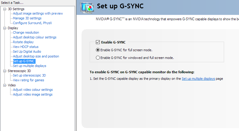
Enable G-SYNC
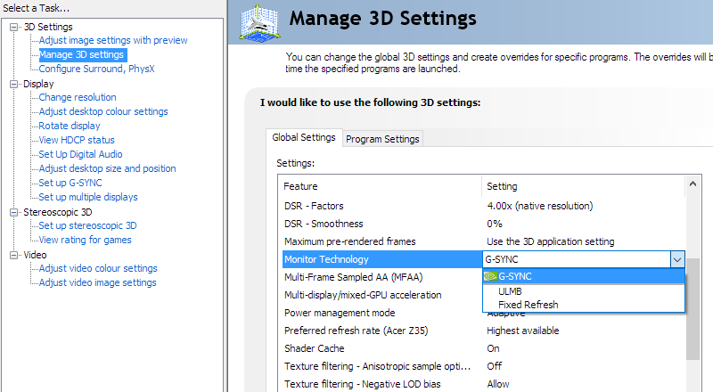
Set Monitor Technology to G-SYNC
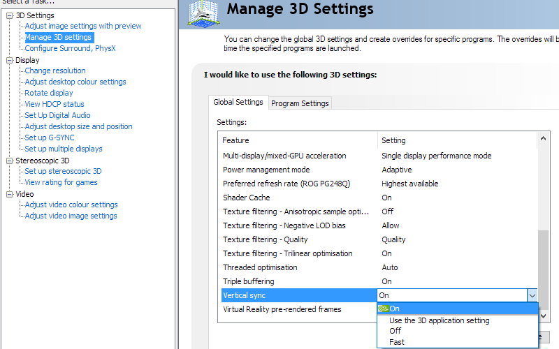
Set VSync according to preferences
G-SYNC – the experience
The 35” 3440 x 1440 curved ‘UltraWide’ experience


Interpolation and upscaling

Video review
Timestamps:
Features & Aesthetics
Contrast
Colour reproduction
Responsiveness
Conclusion
Positives Negatives A rich and natural look to the image following some basic OSD tweaks. Some extension beyond sRGB from the colour gamut delivers a bit of extra vibrancy Some ‘sagging’ below ‘2.2’ for the gamma curve and some perceived gamma and saturation changes related to VA viewing angle weaknesses Good static contrast, exceeding non-VA panels and a light matte screen surface that’s free from obvious graininess Slight ‘black crush’ and static contrast that’s significantly weaker than some VA models Low input lag, a 120Hz refresh rate and strong pixel overdrive to make a good go of this – plus G-SYNC, which works as intended Some slower than optimal pixel responses and moderate overshoot will not be to everyone’s liking A good pixel density and practical resolution, an understated and generally agreeable design, good ergonomic flexibility and a curve to the screen that complements the performance without making the image appear unnatural The bezels are not the sleekest amongst modern monitors and not everyone will like the somewhat ‘chunky’ and robust aesthetic
![]()

