Author: Adam Simmons
Date published: February 20th 2017
Table of Contents
Introduction
We’ve seen a few UltraWide models with native 100Hz+ refresh rates, including the AOC C3583FQ and Acer Z35. Despite supporting high refresh rates, there are some obvious issues with pixel responsiveness. And the 2560 x 1080 resolution is somewhat limiting for a screen of that size. The AOC AG352UCG, of the AGON series, goes further than this by offering higher resolution of 3440 x 1440. A VA panel is again used – and as for responsiveness, that’s something we will be testing out in detail. We’ll also be taking a look at other aspects of image quality, such as contrast and colour reproduction.
Specifications
This model features a 35” AU Optronics AMVA panel with 100Hz refresh rate and true 8-bit colour (no dithering). This is accompanied by a 3440 x 1440 resolution and specified 4ms grey to grey response time. Some of the key ‘talking points’ have been highlighted in blue below.
Key talking points of the specifications are highlighted in blue below.
Features and aesthetics
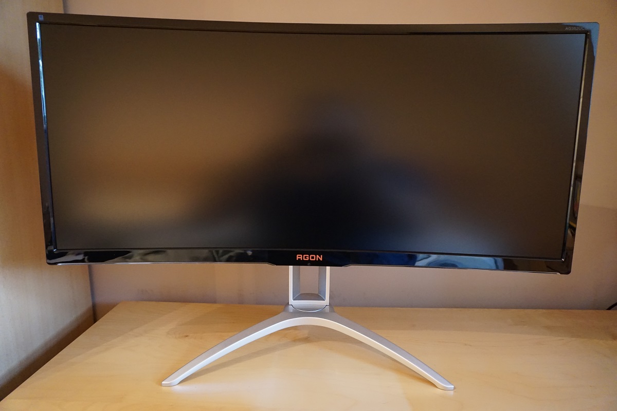
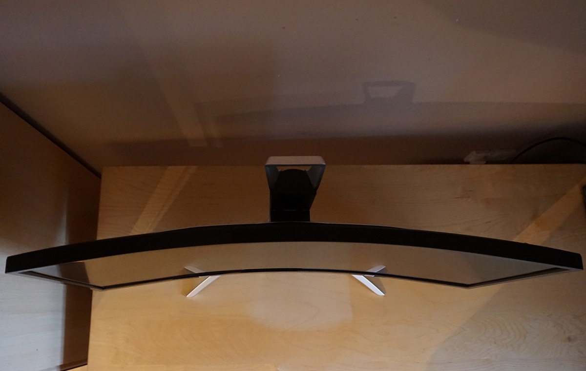
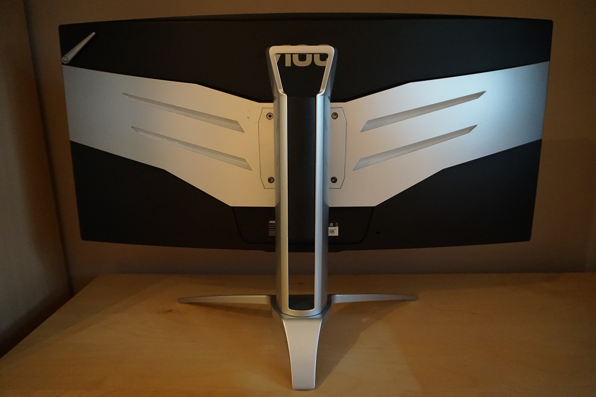
From the front the monitor has reasonably slender glossy black bezels. These are; ~18mm (0.71 inches) at the top and sides and ~30mm (1.18 inches) at the bottom. This includes a sliver of panel border that’s not quite covered by the bezel and for the bottom bezel is measured centrally where the bezel is thickest. At the bottom edge of the bottom bezel, some additional colour is provided by LED strips which can be illuminated green, red or blue as demonstrated in the OSD (On Screen Display) video shortly. They can also be switched off or dimmed if preferred. The tripod-shaped stand is made from powder-coated metal, providing a solid base for the screen. There’s also a red ‘AGON’ logo to identify this as a member of the AOC AGON range of gaming monitors. The screen surface is light matte anti-glare, whilst the screen itself has a 2000R curvature. Both elements are explored later on.
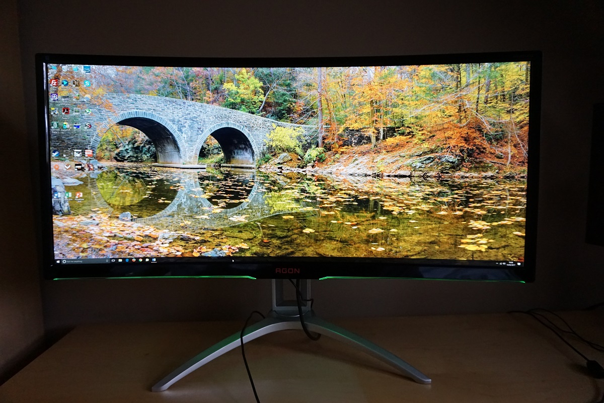
In the middle of the bottom bezel, near the AGON logo, the OSD (On Screen Display) controls are located. There is one single joystick (JOG button) that controls the entire menu system and is pushed in to turn the monitor ‘off’. A faint power LED illuminates this joystick, but it’s only visible if you look from below. This glows dark blue during normal operation and amber if the monitor loses signal from the computer and goes into a low power state. The video below runs through this OSD menu system.
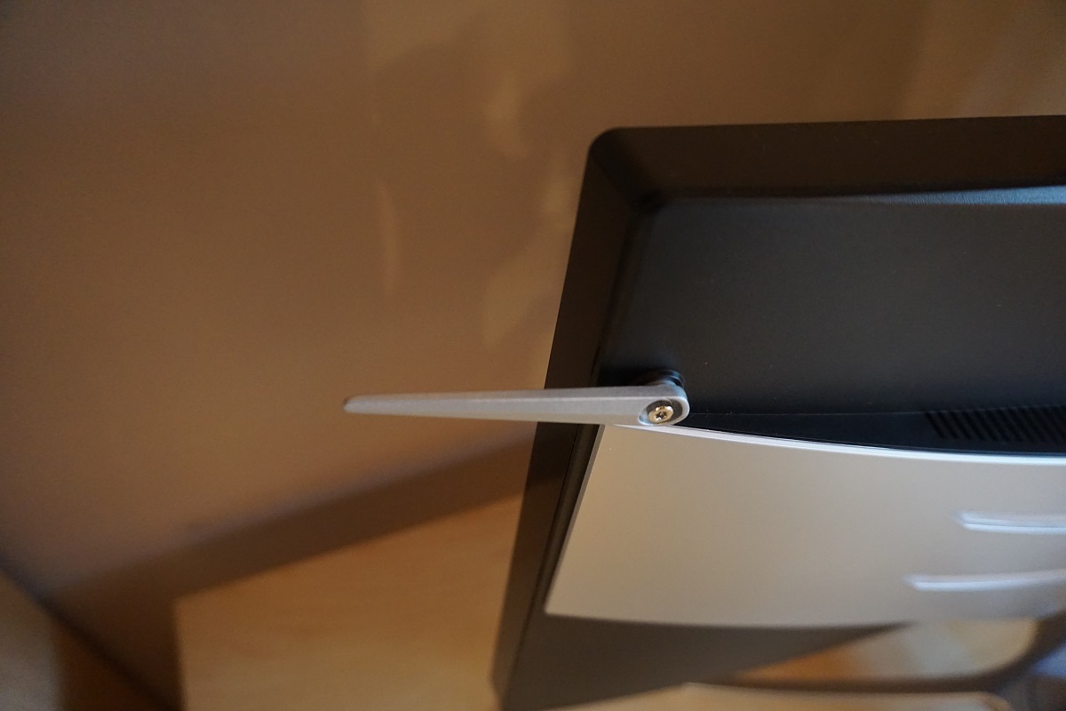
From the side the screen is ~24mm (0.94 inches) at thinnest point, bulking out centrally. At the right side of the monitor there is a silver-coloured retractable headphone hook, which is a bit like an aerial that you can move down so that it sticks out at the side. You can see the solid tripod-shaped stand quite clearly from the orientation. As well as offering a solid base and a reassuring heft to the monitor, the stand offers good ergonomic flexibility; tilt (5.5° forwards, 29° backwards), swivel (30° left, 30° right) and height adjustment (120mm or 4.72 inches). At lowest height the screen clears the desk by ~89mm (3.50 inches), with the top of the screen ~483mm (19.02 inches) clear of the desk surface. The total depth of the monitor including both the screen and stand is ~275mm (10.83 inches).
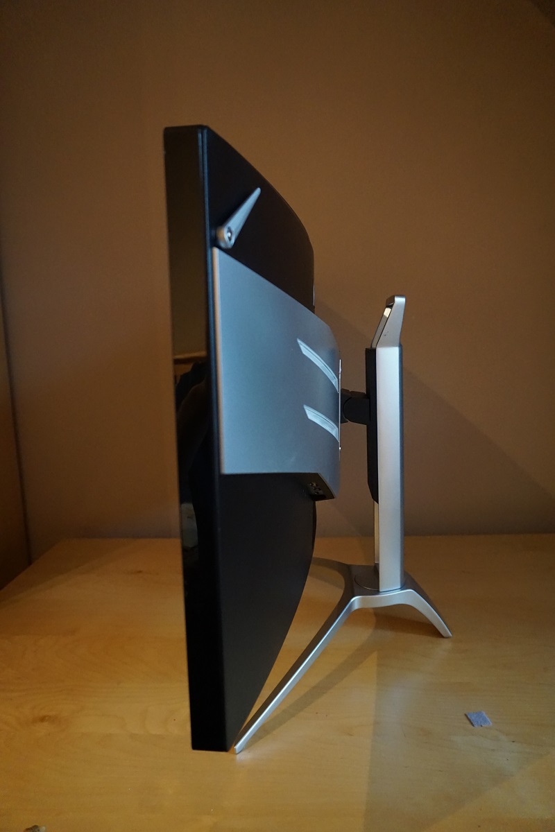
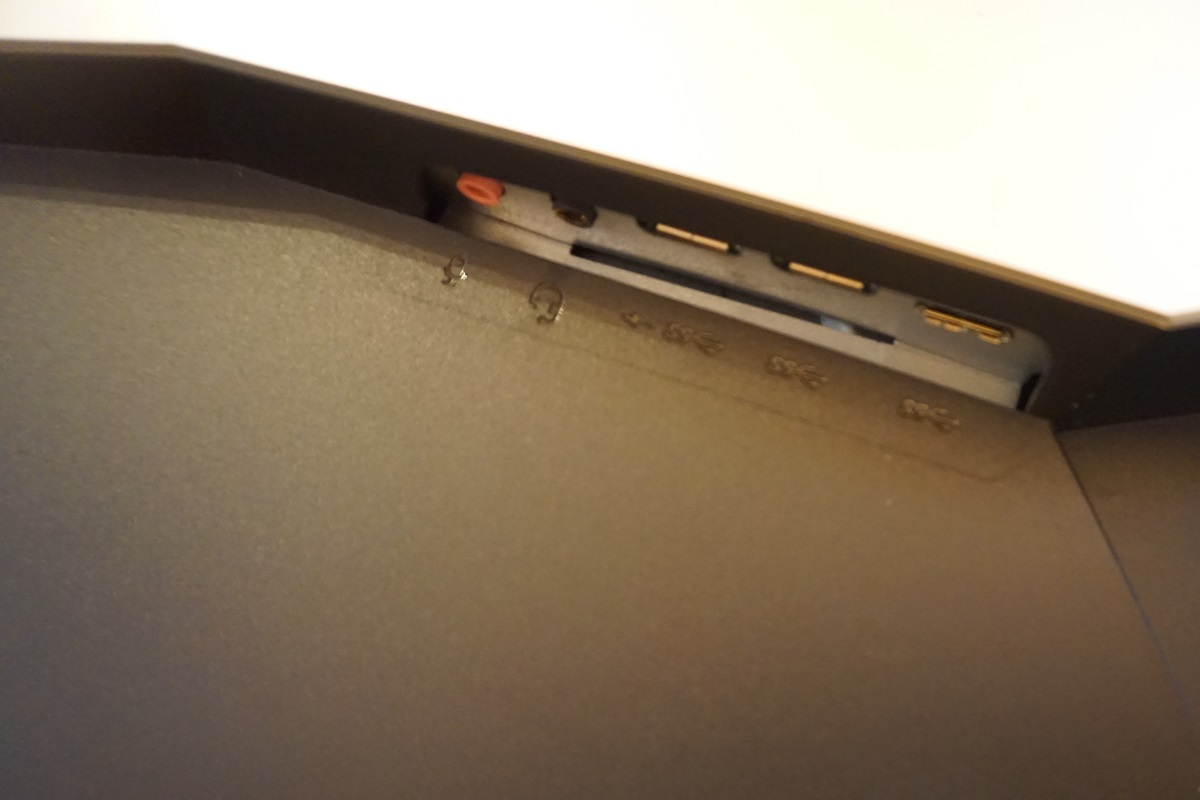
The rear of the screen features matte black plastic broken up by silver plastic ‘wings’. These wings feature two LED strips either side, which are lit alongside the strips on the bottom bezel using the same control in the OSD. The stand features a carrying handle at the top and a cable tidy area towards the bottom and attaches by 100 x 100mm VESA screws. It can be removed and an alternative stand or mount used instead. The ports are down-firing and located beneath one of the wings and behind the stand neck. Beneath one of the wings there is a 3.5mm microphone jack, 3.5mm headphone jack and 2 USB 3.0 ports (the first, coloured yellow, supports fast-charging) plus upstream. Behind the stand neck there are the remaining ports; DP 1.2 (supports G-SYNC), HDMI 1.4b, 3.5mm microphone jack and a DC power input (external power brick). There is also a K-slot beneath the port area and 2W speakers for basic sound output.
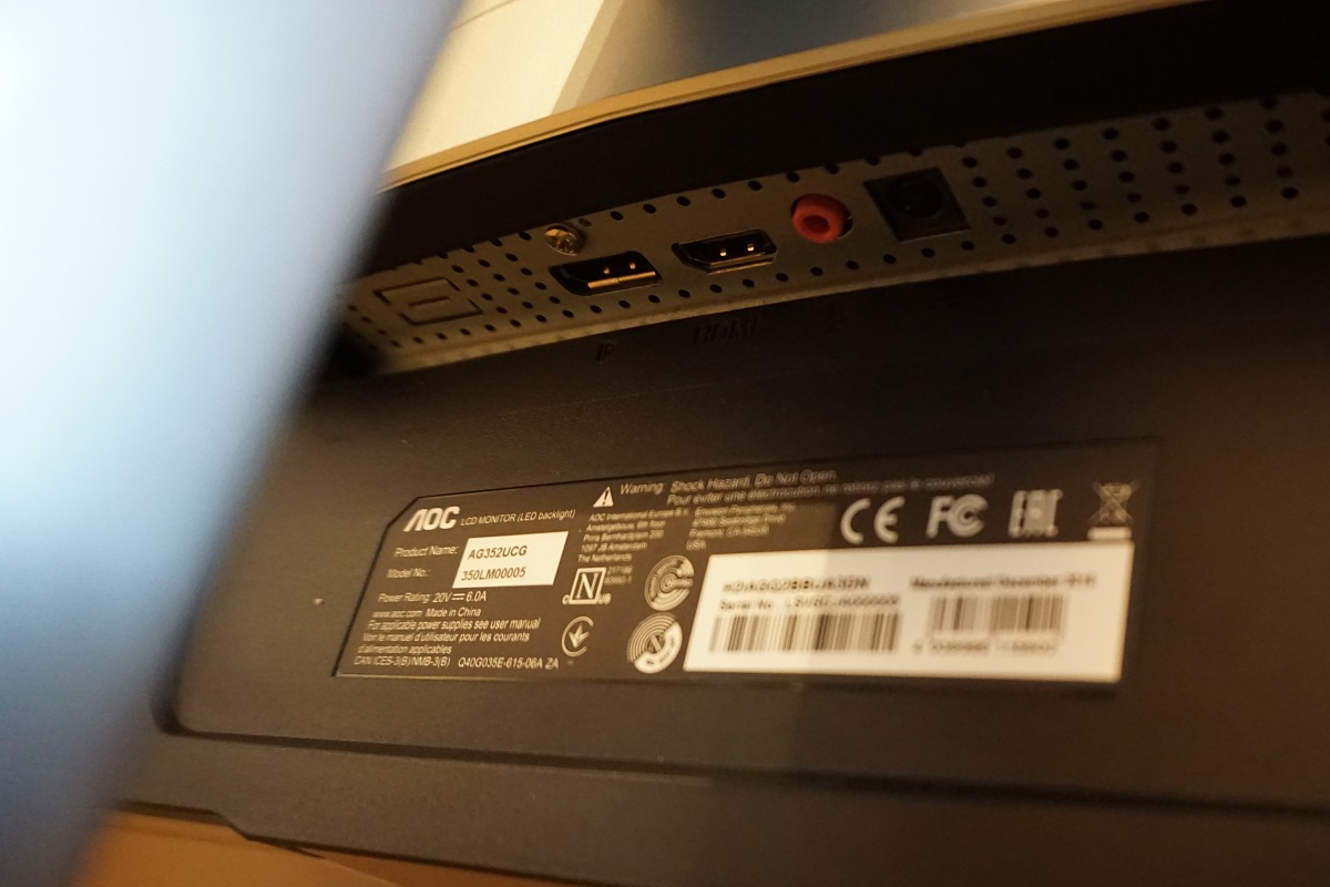
The full capabilities of the monitor, including G-SYNC and 100Hz operation at 3440 x 1440, require the use of DP 1.2. G-SYNC requires a compatible Nvidia GPU, although the refresh rate and resolution is supported on AMD GPUs via DP 1.2 as well. The HDMI 1.4b port is simply there for compatibility with other devices such as games consoles. Standard accessories include the power cable, DP cable, HDMI cable, USB 3.0 cable and 3.5mm audio cable.
Calibration
Subpixel layout and screen surface
The monitor uses a light matte anti-glare screen surface with a smooth surface texture. This keeps the image free from obvious graininess and aids the vibrancy potential, whilst maintaining good glare-handling. Although glare handling is effective and you shouldn’t expect reflections as you’d get on a glossy screen surface, you should always be mindful of your lighting environment on any screen surface and avoid direct light striking the screen where possible.
![]()
The monitor uses an RGB (Red, Green and Blue) stripe subpixel layout, as shown above. This is the standard subpixel layout that modern operating systems such as Microsoft Windows and Apple’s MacOS are designed to deal with by default. Apple users needn’t worry about text fringing caused by less usual subpixel layouts and Windows users don’t necessarily need to run ClearType. They may still wish to run through this process simply to adjust according to preferences, though.
Testing the presets
The monitor includes a range of ‘Game Mode’ presets; ‘FPS’, ‘RTS’, ‘Racing’ and ‘Gamer’. These set the settings on the ‘Luminance’ menu to various values, so don’t achieve anything you couldn’t achieve through manual tweaking. We are more interested in some of these specific settings, such as the ‘Gamma’ settings and also the ‘Color Setup’ menu. The table below shows key readings (gamma and white point) taken using a Datacolor Spyder5ELITE colorimeter alongside general observations, using a range of settings on the monitor. Our test system used an Nvidia GTX 1070 connected via DisplayPort. The operating system used on this system was Windows 10, with no additional monitor drivers or ICC profiles loaded. Before the data in this table was collected, the monitor was left to run for over 2 hours. Aside from our ‘Test Settings’ where various adjustments are made, assume factory defaults are used. The exception to this was the refresh rate which was set to 100Hz in Windows – this did not impact image quality.
| Monitor Settings | Gamma (central average) | White point (kelvins) | Notes |
| Gamma1 (Factory Defaults) | 2.0 | 6160K | Very bright with some shades lacking appropriate depth and a bit of a warm tint to the image. Strong shade variety overall, though, and some vibrant shades in the mix. As usual for a VA panel there are some perceived gamma changes which mean shades lose some saturation towards the edges and bottom of the screen. |
| Gamma2 | 1.8 | 6164K | As above but image sapped of even more depth and looking quite washed out really. |
| Gamma3 | 2.1 | 6157K | Depth is more appropriate and the image appears rich and varied overall, otherwise similar to factory defaults. |
| Color Temp. Normal | 2.0 | 7145K | An obvious cool tint is introduced, otherwise similar to factory defaults. |
| Color Temp. User | 2.0 | 6208K | Noticeably dimmer than factory defaults with weaker contrast. The neutral colour channel position on this monitor (i.e. point of optimal contrast) is actually ‘65’ for each channel as per factory defaults, but ‘User’ defaults to ‘50’ for each channel – be aware of this when making adjustments. |
| Low Blue Light = 20 | 2.0 | 5020K | The image appears significantly warmer, as this is an effective ‘Low Blue Light’ (LBL) setting that significantly reduces blue light output from the monitor. The brightness remains high but is adjustable, lowering this is of course advised if you wish to use this setting for relaxing evening viewing. |
| Test Settings (see below) | 2.1 | 6484K | The image appears vivid and varied with more pleasing depth and much more comfortable brightness compared to the factory defaults. |
The image straight from the box was excessively bright and a bit faded in places, but was easy to improve using the OSD. Following this, the image was vivid and varied with good depth. As is usual for a VA model, particularly one this wide, there was some saturation lost towards the flanks and bottom of the screen. Nothing extreme, though, and even here the image did not appear ‘washed out’. The gamma tracking (shown below, for our ‘Test Settings’) deviated a bit from the ‘2.2’ curve at the mid-low end, averaging ‘2.1’. This counteracted some of the ‘black crush’ associated with such panels, as we explore later, whereby some detail in dark areas is lost. Meanwhile shades maintain good vibrancy due to the fact gamma is still fairly close to ’2.2’ overall and the colour gamut is quite generous for an sRGB monitor. We suspect the gamma profile was tuned with all of this in mind. The monitor also includes a ‘Low Blue Light’ slider which can be set between ‘0’ (off) and ‘20’ (maximum effect) in single unit increments. With this set to maximum and brightness reduced, this proved to be a useful setting for relaxing evening viewing. It would’ve been nice to have a quick and convenient way to toggle this on and off, rather than having to reduce the slider back down to ‘0’ to disable it. Even so, it is a nice setting to have and one which we used for our own evening viewing comfort (but not our testing). Also note that the setting is applied on top of other ‘Color Temp.’ settings, which is good in terms of flexibility but potentially a bit confusing. There is an ‘sRGB’ setting in the ‘Color Setup’ menu that we did not cover in the table. That is because it is simply the same as the factory defaults (‘Warm’) with no ability to adjust brightness, contrast, ‘Game Color’, ‘Shadow Control’ or ‘Gamma’. For our ‘Test Settings’ we massively reduced brightness, changed the ‘Gamma’ mode and made some adjustments to colour channels. As mentioned previously the gamma tracking on the monitor is fine for its intended uses and some users would actually find it preferable to absolute adherence to the ‘2.2’ curve. Given this, plus inter-unit variation and some of the drawbacks mentioned in this article we will not be providing any ICC profiles for this monitor. Anything not mentioned below was left at default, including contrast being left at ‘50’ (the default). We’ve included the ‘Overdrive’ setting used here and refresh rate, for reference. Gamma = Gamma3 Color Temp. = User Red= 63 Green= 63 Blue= 65 Overdrive= Medium Refresh rate= 100Hz We used a BasICColor SQUID 3 (X-Rite i1Display Pro) to measure the luminance of black and white. From these readings, static contrast ratios could be calculated. This data is shown in the following table, with blue highlights indicating the results under our ‘Test Settings’ and black highlights indicating the peak white luminance, minimum black luminance and highest contrast ratio recorded. Aside from the exceptions mentioned in the calibration section, assume default settings were used.

Gamma 'Test Settings'
Test Settings
Brightness= 33 (according to preferences and lighting)
Contrast and brightness
Contrast ratios
Monitor Settings White luminance (cd/m²) Black luminance (cd/m²) Contrast ratio (x:1) 100% brightness 371 0.17 2182 80% brightness (Factory Defaults) 318 0.15 2120 60% brightness 259 0.12 2158 40% brightness 194 0.09 2156 20% brightness 119 0.06 1983 0% brightness 34 <0.02 >1700 Factory Defaults (90% brightness) 345 0.16 2156 Gamma2 343 0.16 2144 Gamma3 343 0.16 2144 Color Temp. Normal 273 0.16 1706 Color Temp. User 209 0.16 1306 Low Blue Light = 20 331 0.16 2069 Test Settings 163 0.08 2038
The average contrast ratio with only brightness adjusted was 2120:1, slightly exceeding the specified 2000:1. This excludes the reading at ‘0’ brightness due to a lack of precision with the black luminance reading. Whilst this falls a little short of what some VA models can muster, it still provides a distinctive ‘VA’ contrast experience that other LCD panels types can’t match. Dark shades have good depth to them, including black text having a fairly solid and almost inky look against lighter backgrounds. The ‘User’ mode provided relatively weak contrast, but this is only due to the colour channels defaulting to ‘50’ rather than their neutral position of ‘65’ as explained earlier. Under our ‘Test Settings’, with minor adjustments from neutral to the red and green channels, a contrast ratio of 2038:1 was recorded which is good. Equally pleasing is that contrast remained similar (2069:1) even after applying the full ‘Low Blue Light’ setting. The peak luminance recorded in the table was a rather bright 371 cd/m², whilst the minimum white luminance recorded was a dim 34 cd/m². This provided a luminance adjustment range of 337 cd/m² without loss of contrast.
PWM (Pulse Width Modulation)
This monitor does not use PWM (Pulse Width Modulation) at any brightness level. Instead, DC (Direct Current) modulation is used to dim the backlight at all brightness levels. The backlight is therefore flicker-free, which will come as welcome news to those worried about any of the potential side-effects associated with PWM usage.
Luminance uniformity
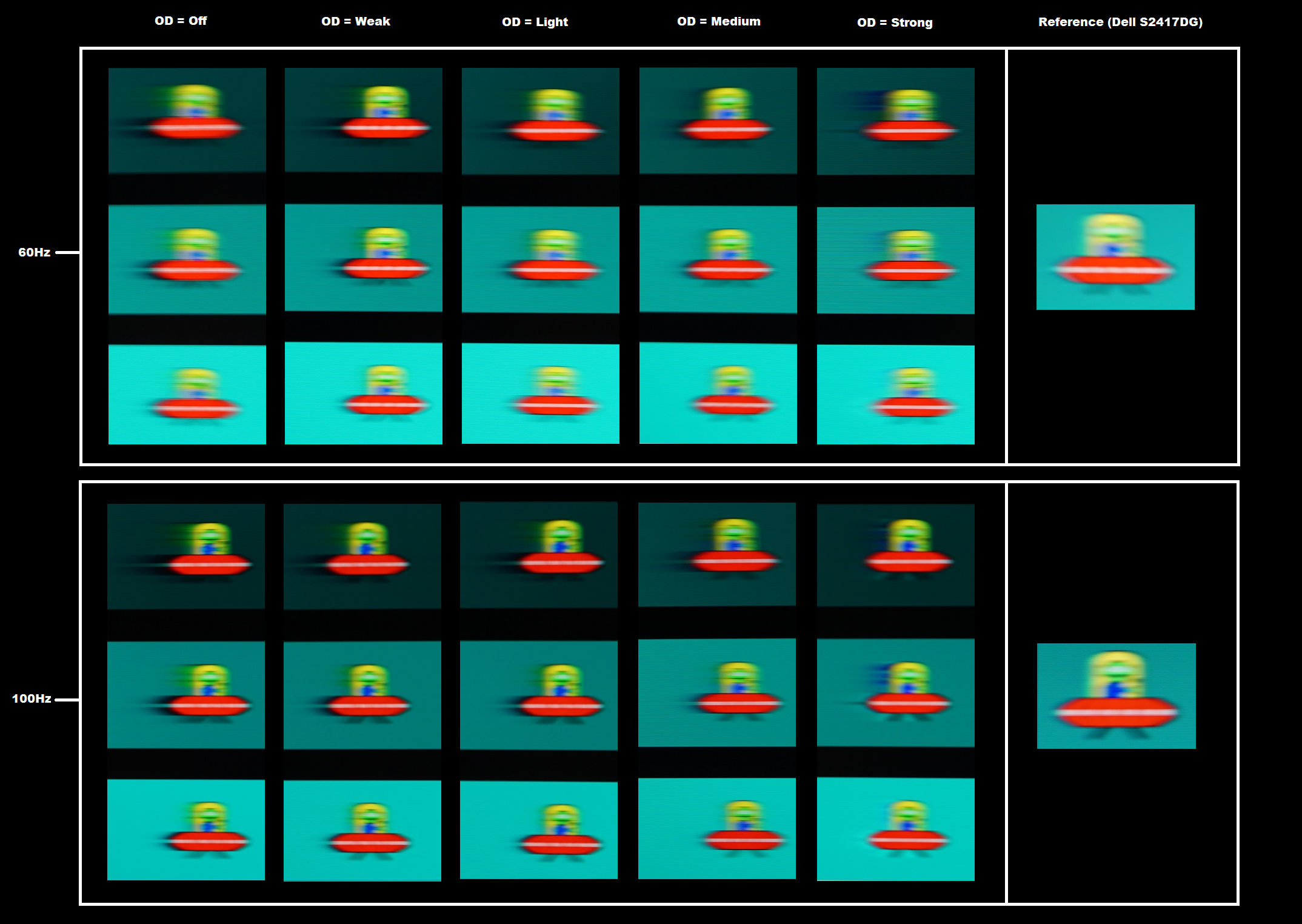
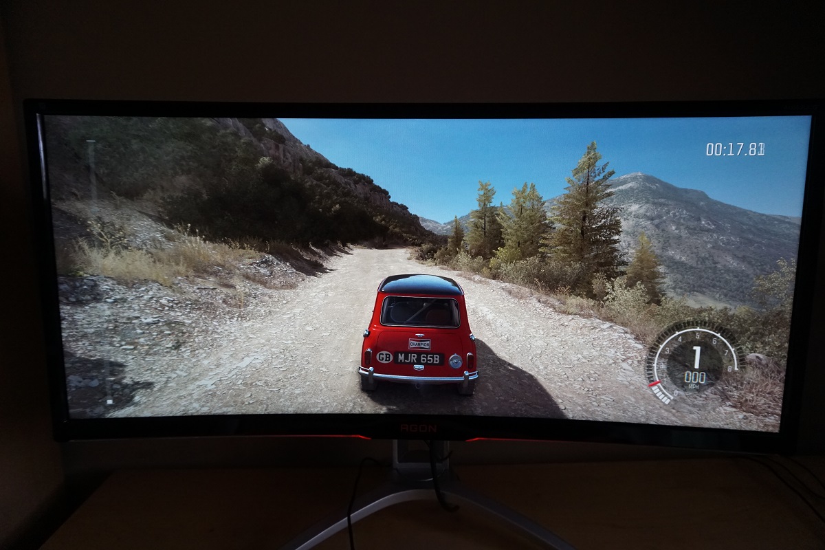
We observed a black background in a dark room and could see some backlight bleed towards the bottom of the screen and a little clouding towards both the top and bottom of the screen. This is shown in the image below, which was taken far enough back from the monitor to eliminate so-called ‘VA glow’. This is a silverish or purple (depending on viewing position) glow that is visible towards the bottom of the screen from a normal viewing position. It also ‘blooms out’ if you view the screen from more extreme angles, as demonstrated in a video deeper into review. This is not at all comparable to ‘IPS glow’ as it is nowhere near as noticeable and does not have the same impact on detail in dark scenes from a normal viewing position. Bear in mind when looking at the image below that individual screens vary when it comes to backlight bleed. The luminance uniformity of the screen was variable, but not too bad overall. The brightest point recorded was ‘quadrant 8’ below the central point of the screen (160.6 cd/m²). The greatest deviation from this occurred at ‘quadrant 1’ towards the top left of the screen (127.3 cd/m², which is 21% dimmer). Elsewhere deviation between a given quadrant and the brightest point was 2-15% which is fair. It’s important to remember that uniformity varies on individual units and you can expect deviation beyond the measured points. The contour map below represents this information graphically, with darker greys representing lower luminance and hence greater deviation from the brightest point than lighter greys. We also analysed colour temperature (white point) variations in the same 9 quadrants analysed above. Deviation here are assigned DeltaE values, with higher values and darker shades on the contour map representing greater deviations from 6500K (D65) compared to lower values and lighter shades. A DeltaE >3 represents deviation that most users would not readily notice by eye. The results here were good overall. The point closest to 6500K was the upper right quadrant. Significant deviations were recorded towards the top right and below the central point of the screen, although these were borderline at DeltaE 3.1. No further significant deviations were recorded. Be aware of the points raised earlier regarding inter-unit variation and the possibility of deviation beyond the measured points. Also be aware that slight perceived colour temperature changes occur on VA panels due to viewing angle weaknesses, even from a normal viewing position. On Battlefield 1 (BF1) the monitor provided a strong contrast performance. Dark areas of the game were displayed with good depth. There was no atmosphere-breaking ‘IPS glow’ or anything of that nature, just a small amount of lightening from ‘VA glow’ towards the bottom of the screen. This had a relatively subtle effect on the image, barely noticeable even where particularly dark content was visible. There was also a small amount of ‘black crush’, whereby very dark shades appeared even darker than intended and blended into each other. This is common on VA models, related to perceived gamma behaviour, but was actually rather minor on this model. Some fairly subtle detail such as vegetation structures, rock crevices and suchlike was reasonably distinct even in dark scenes. The brighter shades were also handled well, standing out very nicely against darker surroundings. Gunfire and explosions lit up the night sky very nicely – and these light shades were free from obvious graininess thanks to the smooth and light matte screen surface. Strong contrast was also displayed on Dirt Rally, with the particularly dark night-time racing environments appearing with good depth overall. The ‘VA glow’ was only minor and in no way affected the atmosphere of such scenes in the same way as ‘IPS glow’ or even TN-related gamma shifts. There was a small amount of black crush, which meant that some very minor details appeared a bit less distinct from a normal viewing position than if you viewed them from an angle. But overall detail levels were pleasing, with subtle details like tire tread patterns and wrinkles in leather visible even in dark scenes. At the high-end the monitor provided quite a clean look to bright shades, without obvious graininess thanks to the light matte screen surface and smooth surface texture. We also assessed contrast using the Blu-ray of Star Wars: The Force Awakens. This film is a good test for contrast as it features some very dark environments lit up by brightly glowing objects or special effects – light sabers, violent explosions and the like. This gave the monitor a chance to show off its prowess in the contrast department. Although not as extreme in its contrast as some VA models, there was a distinctly ‘VA’ look to such scenes and pleasing distinction between the bright objects and the much darker surroundings. We used Lagom’s contrast tests to further analyse contrast performance and help identify issues that may not have been picked up during other testing. The following observations were made. The AOC AG352UCG’s colour gamut (red triangle) was compared to the sRGB colour space (green triangle) as shown below. The monitor offers complete (100%) sRGB coverage, with a bit of over-extension in the green corner of this representation in particular. This gives the monitor a touch of extra vibrancy whilst allowing it to reproduce all shades within the sRGB colour space. This is good for its intended uses. On Battlefield 1 (BF1) a good variety of rich shades were displayed. The environments appeared much as they should, with some pleasingly rich forest greens, a good palette of more muted greens and good earthy browns. There was a degree of saturation lost lower down the screen and particularly towards the edges. This was a bit more pronounced than on the ASUS MX34VQ we tested just prior to this, but by no means extreme from our preferred viewing distance (70-80cm). Even here shades appeared quite rich and it’s only really your peripheral vision that would be engaged in these regions anyway, so it isn’t something that sticks out too much when gaming. There was also a pleasing depth to fire in the game (very important, of course) without it appearing overly red as it might on some models with wider colour gamuts nor too muted or yellow. The skin tones of characters in the game also appeared largely as they should, with appropriate saturation save for some loss of saturation towards the flanks and bottom of the screen. Colour reproduction was also pleasing on Dirt Rally. The racing environments appeared rich and inviting but also natural, with strong vivid greens, good deep browns and a good mix of more muted pastel shades where appropriate. Shades that should look deep and luscious did, for the most part, whilst khaki shades appeared appropriately muted as well. Some saturation was again lost in some regions of the screen, more so than on the likes of the ASUS MX34VQ, but nothing particularly extreme considering this is a very wide VA panel. The overall look was vibrant, highlighted particularly well by the car liveries. These showcased some strong vivid shades, such as neon pinks and deep purples. These were particularly impressive where they were painted against a darker background, with the strong contrast of the screen helping them stand out nicely in such instances. To round off, we assessed colour reproduction on the Blu-ray of Futurama: Into the Wild Green Yonder. With large areas of individual shade, this is one of our favourite tests for colour consistency. This did highlight the aforementioned saturation losses towards the bottom and sides of the screen quite nicely. There are lots of closely matching (but subtly different) shades on display here, for example for character skin colours. They may appear correct in the central region of the screen but lose saturation (and appear incorrect) further out near the edges and bottom of the screen. They lose their individuality and identity to an extent, to a greater degree than models like the ASUS MX34VQ with their Samsung SVA panels. However; these shifts in saturation aren’t extreme enough for them to appear completely faded or ‘washed out’ as some VA models might show. And on that note, there were plenty of good deep shades and strong neon shades on display here with a distinctly different look from those pastel shades. The strong contrast, good colour gamut and light matte screen surface aided the display of these as well. Lagom’s tests for viewing angle were used to analyse colour consistency and viewing angle performance in a more specific way. The following observations were made from a normal viewing position, with eyes around 70cm from the screen. Perceived changes in gamma and saturation can be more pronounced if you sit closer to the screen. We used a small tool called SMTT 2.0 and a sensitive camera to compare the AG352UCG’s latency with a range of screens of known latency. To help maximise accuracy, over 30 repeat readings were taken. Using the method, we measured 5.93ms (over 1/2 a frame @100Hz) of input lag. This value is influenced by the element of input lag you ‘feel’ (signal delay) and that which you ‘see’ (pixel responsiveness). It indicates a fairly low signal delay which shouldn’t bother even fairly sensitive users. We can’t accurately measure input lag with G-SYNC active and doing its thing, unfortunately, but we did feel that input lag was very low with G-SYNC active in the variable refresh rate environment. In this article we take a detailed look at the factors which affect monitor responsiveness. One of the key concepts explored here is the idea of perceived blur, something that is contributed to not only by the monitor’s pixel responsiveness, but the movement of our eyes as we track motion on the screen. A method of capturing both elements called pursuit photography is also introduced. This uses a moving camera to simulate eye movement and capture pixel responsiveness, giving a much more accurate representation of motion on a monitor than static photographs or videos which reflect pixel responsiveness alone. The following images are pursuit photographs taken using the UFO Motion Test for ghosting. The test was set to run at its default speed of 960 pixels per second, which is a good practical speed for taking such photographs. All three rows of the test are looked at (dark background, medium background and light background) to help highlight how different shades affect the pixel response behaviour on this monitor. The monitor was tested at both 60Hz and 100Hz, using all of its ‘Overdrive’ (OD) settings. Note that the monitor can also be set to 85Hz, with results some way between those for 60Hz and 100Hz as below. We’ve also included some reference shots to show how things should look where pixel responsiveness isn’t really a limiting factor. This is a Dell S2417DG, a fast TN model that offers very well-tuned pixel responsiveness at all refresh rates you can set it at. At 60Hz there was significant blur on the object itself. It appeared relatively wide and soft. This reflects perceived blur due to eye (camera) movement and is the same as the reference 60Hz reference in that respect. With ‘OD’ set to ‘Off’ there was also a significant amount of bold trailing behind the object for the dark background and to a lesser extent the medium background. This reflects perceived blur due to slower than optimal pixel responses. The light background was unproblematic, however. Using the ‘Weak’ setting decreased this trailing, whilst ‘Light’ decreased it further. Using the ‘Medium’ setting provided a further reduction, although some overshoot (inverse ghosting) was introduced for the black background – visible as a dark trail behind the UFO cockpit. The ‘Strong’ setting introduced significant overshoot for the dark background with a colourful-looking inverted trail behind the object. Moderate overshoot was also introduced for the medium and light backgrounds using this setting. At 100Hz the object appeared more sharply focused and thinner, indicating a significant reduction in perceived blur due to eye (camera) movement. The trailing due to pixel responsiveness followed a similar pattern to at 60Hz. With ‘OD’ set to ‘Off’ there was obvious bold trailing behind the UFO for the dark background in particular, but still a fair bit elsewhere. The ‘Weak’ setting reduced this whilst ‘Light’ reduced it further – although even there, a fairly bold trail was visible even for the medium cyan background. The ‘Medium’ setting reduced the trailing further, particularly for the medium background. There was a slightly ‘dirty’ look behind the UFO cockpit for the dark background – this is overshoot. The ‘Strong’ setting introduced obvious overshoot, this time most eye-catching for the medium background but still quite obvious elsewhere as well. From this analysis and considering pixel responses over a broader range of transitions than analysed here, we felt that ‘Medium’ offered the best balance between conventional trailing reduction and overshoot. The ‘Light’ setting did cut down on overshoot, but it also introduced some more obvious trailing in places and some instances of fairly obvious smeary trailing that was avoided using the ‘Medium’ setting. It’s nice that AOC provides this sort of flexibility with their overdrive control, as some users may particularly dislike overshoot whilst others will prefer the reduction in conventional trailing. We think it’s really between the ‘Light’ and ‘Medium’ settings that most users will find themselves deciding between. Some monitors, particularly with high refresh rates, suffer from certain artifacts when viewing motion on the screen. These may appear as an interference pattern or mesh or interlaced lines which break up a given shade into a darker and lighter version of what is intended. They often catch the eye due to their dynamic nature, on models where they manifest themselves in this way. There were no such issues on this monitor, however. There were some extremely faint static interlacing patterns visible on some shades, whereby they were shown as very faint bands of a slightly darker and slightly lighter variant of the intended shade. This could only be seen if the monitor was observed closely and the shade itself was static. This was far too faint for most users to notice during normal use or indeed from a normal viewing distance and is just something we have noted for completeness. The monitor provided a fluid experience on Battlefield 1 (BF1), where the frame rate kept pace with its 100Hz refresh rate. By outputting up to 1.67 times as much visual information every second to the user as a 60Hz monitor, the ‘connected feel’ as we like to call it was very good. As you interact with your character on BF1, there is a certain level of precision and fluidity that’s simply lacking at lower refresh rates. The low input lag also aided this feeling. The increased refresh rate and frame rate output also significantly reduces eye movement, as explored earlier, and therefore reduces perceived blur significantly. The Achilles heel of the VA panel type, though, is pixel responsiveness – which is the other important element of perceived blur. And in that respect the AOC coped surprisingly well. Many of its pixel transitions were performed about as quickly as they needed to be for optimal 100Hz performance, or were only slightly slower than optimal. This meant that there wasn’t generally a significant amount of trailing from slower than optimal pixel responses, just a bit of an extra ‘thin and powdery’ trail in places. Similar to what you’d see on models with high refresh rate IPS-type panels, like the ViewSonic XG2703-GS and ASUS PG348Q. This contrasts with most VA models, including some high refresh rate models like the Acer Z35, whereby there would be obvious and fairly widespread extended or ‘smeary’ trailing. There were some weaknesses, though, which affected some specific pixel transitions. There was a bit of overshoot in places, particularly noticeable where very light shades were involved in the transition. Moving your character and observing the moon against the night sky, for example, produced a dark silhouette trail behind the moon. Observing in-game markers against a dusty desert background provided a fairly bright halo trail around the marker as well. This overshoot was not particularly obnoxious, although was a bit more noticeable than on the ASUS MX34VQ at 100Hz, for example. There were also some instances of ‘break-up trailing’, whereby trailing could be seen behind certain dark shades that was coloured with certain hues contained within the dark shades. In other words, the object itself might appear pretty much black and you might expect any trailing behind this to appear similar to the perceived object colour – but the object might also contain small traces of red or blue, for example. This appears to ‘bleed out’ of the object, a bit like ink being slightly smudged. As with overshoot, sensitivity to this varies and this was some of the more subdued ‘break-up’ trailing we’ve seen – there were no obvious flashes of colour or extended inky smears, just short sharp trails of different colour to either the object or background. Finally, there were a few transitions that occurred slowly enough to form ‘smeary’ trailing, with an almost smoke-like effect. This was not as widespread or obvious as the smeary trailing on some VA models, even for the small number of transitions where it occurred, but is worth noting. The range of transitions that were affected by this was greater on the likes of the Acer Z35, compared to the AOC. Be cautious of any response time measurements you see where grey levels of ‘0’ and ’50’ are considered, but nothing between, as this makes a big difference in practice to how widespread or obvious this ‘smearing’ is. In reality there are many transitions that occur in dark scenes in games between ‘0’ (black) and ’50’ (a dark grey), so to paint a full picture you have to consider them all. We appreciate it can be difficult to visualise the some of ‘weaknesses’ we’re describing here, so have provided a summary with visual examples in the video below. Given the depth of analysis on BF1, we don’t have too much to add from our experiences on Dirt Rally. Again, the monitor made good use of the 100Hz refresh rate overall. At high frame rates matching this, the ‘connected feel’ was certainly good. Due to our fairly low skill level and use of a keyboard as the main controller on this game, though, this was not something we appreciated as much as on FPS titles like BF1. For hardcore racing fans, the low latency and high refresh rate combination offered by the AOC can certainly provide a much more enjoyable and competitive experience than at 60Hz. When racing in the daytime there were no obvious weaknesses in pixel responses, save for a little overshoot in places such as where trees were cast against a bright daytime sky. This was not eye-catching and was something we had to actively look out for. Even when racing at night, where the weakest pixel transitions come into play, things were relatively clean without distracting smearing or obvious inky break-up trailing. This was a far nicer racing experience than provided by most VA models, including the likes of the Acer Z35 which are built for speed but fail to really make proper use of the refresh rates supported. There was some overshoot here and there, including a bit of bright trailing and some dark trailing that was distinct from the background and object colour – but nothing we found distracting or even eye-catching when we were just playing the game rather than looking for issues. Overall, we feel that the imperfections in this monitors responsiveness were too slight to really impede our enjoyment when gaming. Sensitivity to this does vary, as we’ve mentioned previously, but this is certainly one of the stronger VA models we’ve seen in terms of pixel responsiveness. We didn’t find things quite as well balanced as on the ASUS MX34VQ, but the experience was not far off that really and fortunately far superior to the older high refresh rate VA models we’ve tested. We also analysed responsiveness on our Blu-ray test titles. The monitor’s surprisingly good fluidity and generally good pixel responsiveness didn’t really come into play here. After all, you don’t interact with the content and it’s limited to around 24fps. Nonetheless, there were no obvious weaknesses caused by the monitor itself. Nvidia G-SYNC is a variable refresh rate technology that can be activated when certain compatible Nvidia GPUs are connected to compatible monitors (such as the AOC AG352UCG). We look at the technology and the benefits it brings in this article, so don’t intend to repeat too much of what is already said there. At a basic level, G-SYNC allows the monitor to adjust its refresh rate based on the frame rate outputted by the GPU. This perfect synchronisation between refresh rate and frame rate gets rid of the stuttering (VSync on) or tearing (VSync off) that would come where the refresh rate and frame rate are misaligned. You also get a reduction in latency compared to running with VSync on in this variable frame rate environment, although as mentioned earlier we don’t have the means to accurately measure this. This monitor supports G-SYNC via DP 1.2a (DisplayPort) when connected to a compatible Nvidia GPU. Having done so, everything should be configured automatically with G-SYNC ready to go. If that isn’t the case or you want to double check, open Nvidia Control Panel and navigate to ‘Display – Set Up G-SYNC’. Ensure that the checkbox for ‘Enable G-SYNC’ is checked, then select your preferred operating mode. As the image below shows, this technology works in both ‘Full Screen’ and ‘Window’ modes, provided the correct option is selected for this. If the G-SYNC options seem to be missing from Nvidia Control Panel, this may be remedied by reconnecting the GPU or possibly connecting it to a different DP output if you can. If the options are still missing, reinstalling the GPU driver or updating this would be recommended. The next step is to navigate to ‘Manage 3D settings’. Here there are a few settings of interest, the first of which is ‘Monitor Technology’. This should be set to ‘G-SYNC’ as shown below. Assuming this is all set up correctly, you should also see ‘G-SYNC’ written beside the resolution and refresh rate at the bottom of the OSD. The second setting of interest is VSync, which can be set to one of the following; ‘On’, ‘Use the 3D application setting’, ‘Off’ or ‘Fast’ (GPU dependent). If you select ‘On’, then VSync kicks in if the frame rate exceeds the maximum refresh rate supported by the monitor (i.e. the G-SYNC ceiling of 100Hz / 100fps). If you select ‘Off’ then the frame rate will climb as high as it can whilst the monitor will only go as high as 100Hz, causing tearing and juddering as the frame rate rises above 100fps. Nvidia used to recommend you select either ‘On’ or ‘Off’ rather than ‘Use the 3D application setting’ as some in-game VSync implementations could potentially interfere with the smooth operation of G-SYNC. In practice it’s likely to work just fine if enforced in-game instead, however. The ‘Fast’ option will be available on some newer GPUs, such as the GTX 1070 used in our test system. This enables a technology called ‘Fast Sync’, which only applies above the refresh rate and frame rate ceiling (>100Hz / 100fps). Below this G-SYNC operates as normal, whereas above this a special version of VSync called ‘Fast Sync’ is activated. This is a GPU rather than monitor feature so isn’t something we will explain in detail, but it is designed to reduce tearing at frame rates well above the refresh rate of the monitor. If you’re interested in this technology, which may be the case if you play older or less graphically demanding games at very high frame rates, you should watch this section of a video by Tom Petersen.. If the frame rate drops below the lowest refresh rate supported by the monitor (i.e. the G-SYNC floor of 30Hz / 30fps) then the monitor will set its refresh rate to a multiple of the frame rate. This keeps stuttering or tearing from uneven frame and refresh rate divisions in check – and it works in this way regardless of the VSync setting used. As explored in the proceeding section, though, low frame rates remain low frame rates regardless of the technology. At such low frame rates the experience is far from fluid even if tearing and stuttering are absent. Also note that G-SYNC can’t eliminate stuttering caused by other issues in the system or game environment such as insufficient RAM or network latency. We played a broad range of game titles on this monitor and found G-SYNC to work just as we’d hoped in all of them. Rather than repeating our experiences over a range of game titles, which would be both tedious and pointless, we will instead focus on a single game title. In this case Battlefield 1 (BF1), as G-SYNC certainly enhances the playability there and there are appropriate graphics options available to test the full range of frame rates and refresh rates supported. Using settings we were happy to use (fairly modest ones), the frame rate was generally high but not always laser-locked to 100fps. It was common for the frame rate to dip a bit, spending much of its time fluctuating between about 75fps and 100fps. Without G-SYNC active and simply keeping the monitor at a static 100Hz, obvious (to us) tearing and juddering would ensure with VSync disabled. Enabling VSync got rid of this tearing and associated juddering, but in its place was obvious stuttering. With G-SYNC active there were no such nuisances and the game simply ‘flowed’ in a smooth manner, making it more enjoyable to play. There was still benefit to be had from frame rates of the upper end of that scale, though, close to or matching 100fps. The level of perceived blur increased and the ‘connected feel’ decreased somewhat as the frame rate fell lower. If we increased the graphics settings it was possible to see further dips – to as low as about 50fps using the ‘Ultra’ preset. The perceived blur and ‘connected feel’ was further affected by these drops in frame rate, but we certainly found the playability greatly enhanced with G-SYNC active owing to a lack of tearing, stuttering and juddering from mismatches between frame and refresh rate. If the ‘Resolution Scale’ slider was increased, which improves the game’s render resolution, then the frame rate dipped further. Increasing this sufficiently actually brought the frame rate below the 30fps minimum supported by G-SYNC on the hardware side. As explained earlier, though, the monitor sticks to multiples of the frame rate with its refresh rate. This worked correctly to avoid the tearing and stuttering that you’d otherwise expect, but the experience was frankly abhorrent at such low frame rates anyway. One thing that must be stressed is that sensitivity to tearing and stuttering varies, so not everybody will find G-SYNC as much of a game changer as others. In general, we find gamers do appreciate the technology – and once they disable it or go back to a monitor without it, they find it quite painful. Whilst it’s the case of ‘the higher the better’ in terms of frame rate and gaining the most fluid gaming experience the monitor can offer, the flexibility that G-SYNC provides is certainly welcome. If you’re sensitive to tearing or stuttering then you might choose to lower your in-game settings sufficiently so that you gain a consistently high frame rate matching the refresh rate of the monitor. With G-SYNC, the slight dips below this are far more palatable and so you can be a little more adventurous with your settings. For users who are sensitive to both tearing and stuttering, such as ourselves, it is quite literally a game-changing technology. In this article we explore the 3440 x 1440 resolution on a 34” screen, including a look at what it brings to the table on the desktop, in movies and in games. The benefits of this aspect ratio and resolution apply equally to the AG352UCG, but an additional aspect to consider is the 2000R curve. There’s also an extra inch of diagonal screen space, but that makes a negligible difference really. Although the curve can look more pronounced in videos and images and the thought of a curved screen doesn’t sit well with all users, those preconceptions are generally blown out of the water once you actually sit down and use one. The curve on the AOC does not make the experience uncomfortable (quite the opposite) or unnatural and in little time at all feels completely natural. We appreciate that users who require geometric perfection on their screen (CAD/CAM work etc.) would prefer a flat screen, but for general usage we feel the curve is quite a nice addition. We don’t find flat screens of this size uncomfortable, so we can’t really verify the manufacturers claims of enhanced viewing comfort, but we certainly did find it comfortable to use for extended periods. The images below exaggerate the curve and it’s certainly not as noticeable in practice, but they are more intended to give an indication of the sort of desktop space you have available on the monitor. As explained in our article on the topic, the 21:9 aspect ratio provides a nice boost to the Field of View in most modern game titles. Coupled with the curve screen, there was a subtle sense of being ‘drawn into’ the game – a certain extra level of depth that most monitors don’t provide. It was almost a subconscious addition, the curve, as you soon forget it’s even there. It just feels quite natural and as if it was something monitors always had, which we don’t feel is a bad thing. The images below again make the curve appear more prominent than it does when you’re sitting in front of the monitor using it. They also give no indication of the image quality to expect from the monitor – photos and videos are inherently unable to do this. They are just there for illustrative purposes. As is usual for a G-SYNC monitor, no scaling capability is provided by the monitor itself when connected via DP. The G-SYNC board replaces this, amongst other electronics in the monitor. Basic scaling functionality is provided for compatibility purposes via HDMI. The monitor is able to run at lower resolutions that may be used by games consoles and other AV devices – such as 1920 x 1080 (‘1080p’). The monitor uses ratio scaling to ensure that the image does not appear stretched or distorted. It is displayed in the correct 16:9 aspect ratio in a 27” diagonal area of the screen, with black borders either side. Interpolation is used for the vertical element to translate ‘1080’ into ‘1440’ so that the vertical screen space is used completely. This gives a degree of softening compared to a monitor that runs 1920 x 1080 natively. But it isn’t extreme and we feel this does make the monitor it least usable for this sort of thing as a secondary use, even if not ideal. PC users who are playing older titles or those that simply don’t support 21:9 (the same titles that would lack support for Nvidia Surround or Eyefinity) will probably find the best experience is gained by running at 2560 x 1440 and using GPU scaling to ensure 1:1 pixel mapping is used. Unlike for 1920 x 1080, this does not require interpolation – black bars are displayed either side and the vertical component of the monitor (‘1440’) remains the same. Things therefore look just as sharp as a native 2560 x 1440 display, although be aware that GPU scaling can add additional latency. Discussion or testing of this is beyond the scope of this review, though, as it is down to the GPU rather than the monitor. We’ve experienced quite a few VA models with higher than 60Hz refresh rates now and in general they haven’t really had adequate pixel responsiveness to make a proper go of the refresh rates they support. The ASUS MX34VQ bucked that trend by making a really good go of its 100Hz refresh rate. The AOC AGON AG352UCG features a slightly different panel, an AU Optronics 35” model rather than a Samsung 34” model. But it benefits from G-SYNC (rather than offering support for AMD FreeSync) and the same panel type (VA) with a similar curvature and resolution. We found the overall package to be rather appealing, with the physical width of the screen and the curvature providing an engrossing but natural-feeling experience both on the desktop and when gaming. The ergonomic flexibility (height adjustment in particular) will also be quite welcome on this model, something which the ASUS was notably lacking. Out of the box the monitor delivered an undeniably bright image, but one that was lacking a bit of depth and ‘punch’. This was easily rectified in the OSD, particularly once the gamma mode was changed and brightness was lowered to more comfortable levels. The static contrast was generally slightly above the 2000:1 specified and although it did not reach the levels of some VA models, did deliver a distinctive ‘VA look’ to the image. Overall depth was pleasing, whilst bright elements stood out nicely against darker surroundings. The screen surface was also smooth and light, meaning that there wasn’t obvious graininess to contend with either. The colour performance was strong overall, with a good range of vivid-looking shades and a generous but not excessive colour gamut that helped deliver the sort of experience a gaming monitor should deliver. As is typical for a VA panel, there was a degree of saturation lost towards the side edges and bottom of the screen. Although performance was weaker in that respect than on models such as the ASUS MX34VQ, it was by no means extreme for a VA model of this size. Whilst we can’t say it provided a flawless performance in terms of responsiveness, it certainly impressed in many respects. Pixel responses were generally snappy enough to make a good go of the 100Hz refresh rate, which when coupled with the low latency of the monitor aided a very nice ‘connected feel’. There was a bit of extra perceived blur in places over 100Hz models with much stronger pixel responsiveness, but this was far removed from the mess of extensive smeary trailing that VA models are renowned for. Even those that boast high refresh rates, such as the Acer Z35. The monitor did use strong grey to grey acceleration to achieve this, with the side effect being a bit of overshoot. This was a bit more visible than on the ASUS with both running at 100Hz and using their optimal response time setting, but nothing we felt was particularly eye-catching or obtrusive. G-SYNC worked in exactly the way we had come to expect from extensive testing of the technology on other models, too, removing the tearing and stuttering associated with traditional frame and refresh rate mismatches. One notable absence on this model is ULMB, a strobe backlight feature that greatly reduces perceived blur at frame rates matching the refresh rate of the monitor. On this model that would have meant flickering at 100Hz (or 85Hz) which some users would find unpleasant, and perhaps AOC or Nvidia didn’t feel that the model was well-suited to the technology for other reasons as well. Overall, we found this a worthy companion to our Nvidia GTX 1070 and one with the flexibility to stretch considerably more powerful GPUs as well. The marriage of UltraWide screen, 3440 x 1440 resolution, 100Hz refresh rate and G-SYNC is one which looks nice on paper and in this case worked nicely in practice as well. It’s also difficult to ignore the (at this time projected) retail price of this model, too, which whilst not cheap is certainly more affordable than the competing UltraWide G-SYNC models using overclocked 60Hz IPS panels. Whether the relatively high-contrast VA panel free from ‘IPS glow’ makes for a better experience than the more consistent colours and tighter pixel responsiveness of the IPS alternatives is a matter for debate. But in our view there is a lot to like about the AOC and it certainly warrants careful consideration for Nvidia gamers. The bottom line; a model with a pleasing mixture of strong contrast, fairly vivid colour reproduction, decent responsiveness and the all-important (to some) addition of G-SYNC.

The Spyder5ELITE was used to analyse the uniformity of white, by measuring the luminance of 9 equidistant white quadrants running from the top left to bottom right of the screen. The table below shows the luminance recorded at each quadrant alongside the percentage deviation between each quadrant and the brightest point recorded.

Luminance uniformity table

Luminance uniformity map

Colour temperature uniformity map
Contrast in games and movies
Lagom contrast tests
Colour reproduction
Colour gamut

Colour gamut test settings
Colour in games and movies
Viewing angles
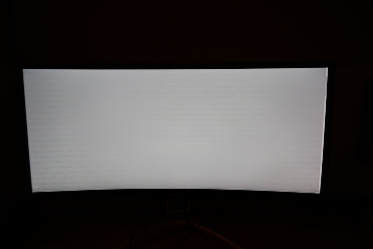
The video below shows this text test alongside a mixed and a dark desktop background, from a range of viewing angles. For the dark desktop background you can see the ‘VA glow’ mentioned previously, as it blooms out from a variety of viewing angles.
Responsiveness
Input lag
Perceived blur (pursuit photography)
Interlace pattern artifacts
Responsiveness in games and movies
G-SYNC – the technology and activating it
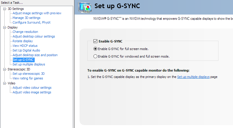
Enable G-SYNC
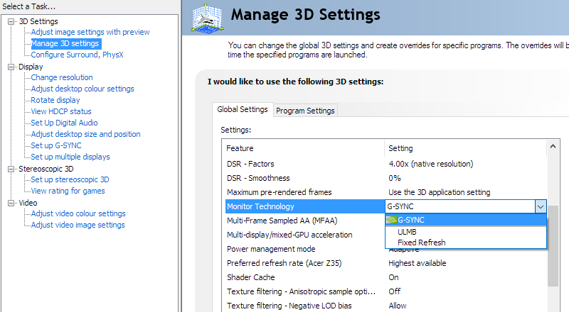
Set Monitor Technology to G-SYNC
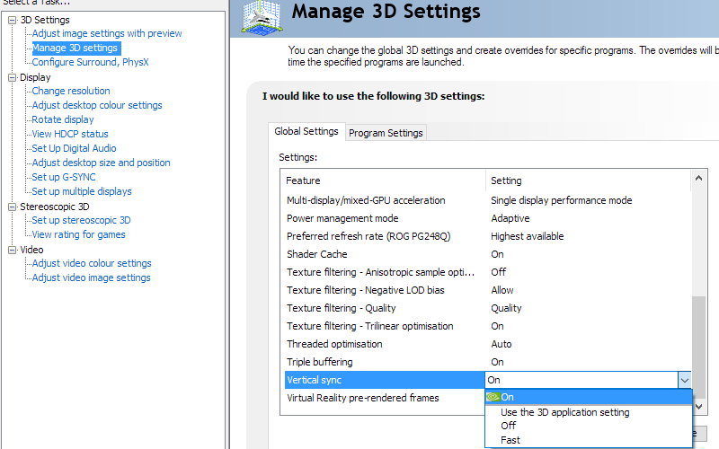
Set VSync according to preferences
G-SYNC – the experience
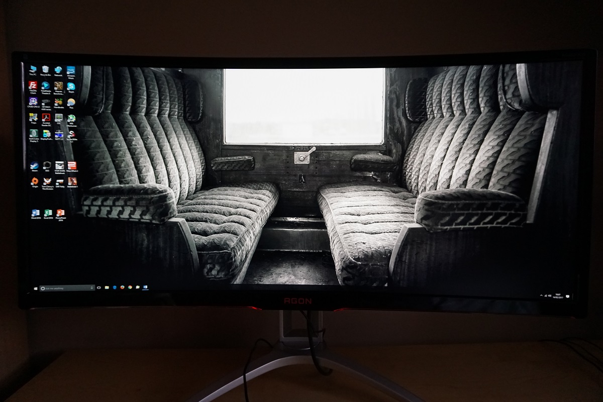
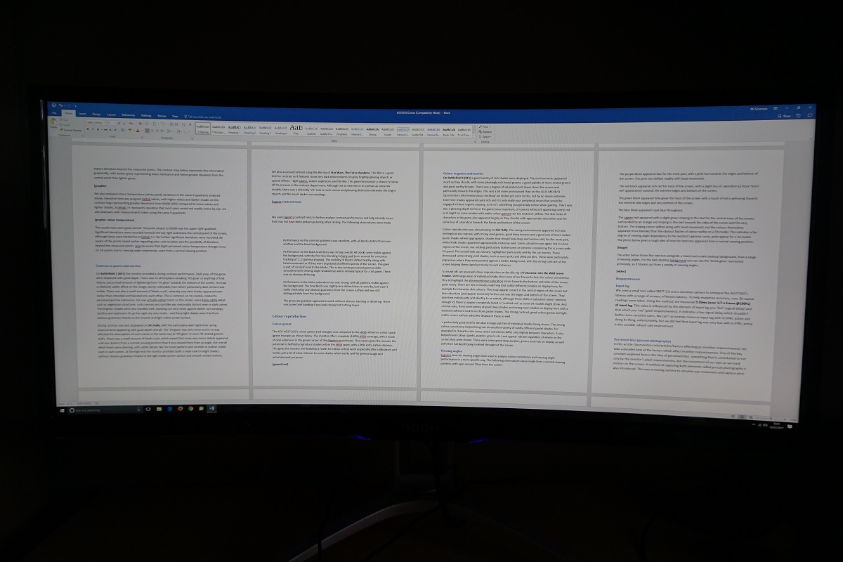
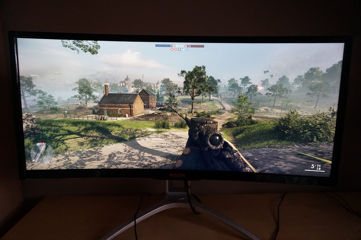
The 35” 3440 x 1440 curved ‘UltraWide’ experience
Interpolation and upscaling
Conclusion
Positives Negatives Quite a vivid and varied image following appropriate OSD tweaking, with a light matte screen surface and generous colour gamut complementing the VA panel nicely Gamma tracks at ‘2.1’ on average using the optimal gamma mode, but this is likely intentional and designed to alleviate ‘black crush’ Strong static contrast delivering some good deep shades and good distinctive bright shades, with the screen surface free from obvious graininess A little ‘black crush’, although quite minor really, and some saturation lost at the edges and bottom of screen. This usual for a VA panel, but a bit more pronounced than on 100Hz+ UltraWides using Samsung SVA models G-SYNC, low input lag and a 100Hz refresh rate was coupled with decent pixel responsiveness to provide a convincing gaming experience Some weaknesses in pixel responsiveness in places and a bit of overshoot as well, plus no support for ULMB Good ergonomic flexibility, a nice pixel density and practical resolution and a curve to the screen that complements the performance without making the image appear unnatural The design won’t be to everyone’s taste, although that could be said about any monitor – and in many respects, it’s fairly subdued for a ‘gaming monitor’ without bright painted stripes etc.
![]()

