Author: Adam Simmons
Date published: January 30th 2016
Table of Contents
Introduction
We’ve seen some exciting trends for gaming monitors over the years. Monitors with higher refresh rates, for example, allow users to feel much more ‘connected’ to their game world when they’re running at high frame rates. For those times when the frame rate drops below the refresh rate, which is all too common in modern titles, it helps to have a variable refresh rate technology such as Nvidia G-SYNC. We’ve also seen the advent of UltraWide screens in the 21:9 aspect ratio, some with a curve to them, to try to create a more engrossing game experience. The Acer Z35 combines all of these things, bringing G-SYNC and 200Hz capability to a 35” curved UltraWide screen. This all sounds very exciting on paper, but we find out how it all fits together in the end product.
Specifications
The monitor uses a 35” VA (Vertical Alignment) panel with 200Hz refresh rate support and a typical contrast ratio of 2000:1. This has quite a steep curve to the screen (2000R) and supports true 8-bit colour without dithering. A 4ms grey to grey response time is specified, which as usual should be taken with a pinch of salt. Some of the key ‘talking points’ of this monitor have been highlighted in blue below.
Features and aesthetics
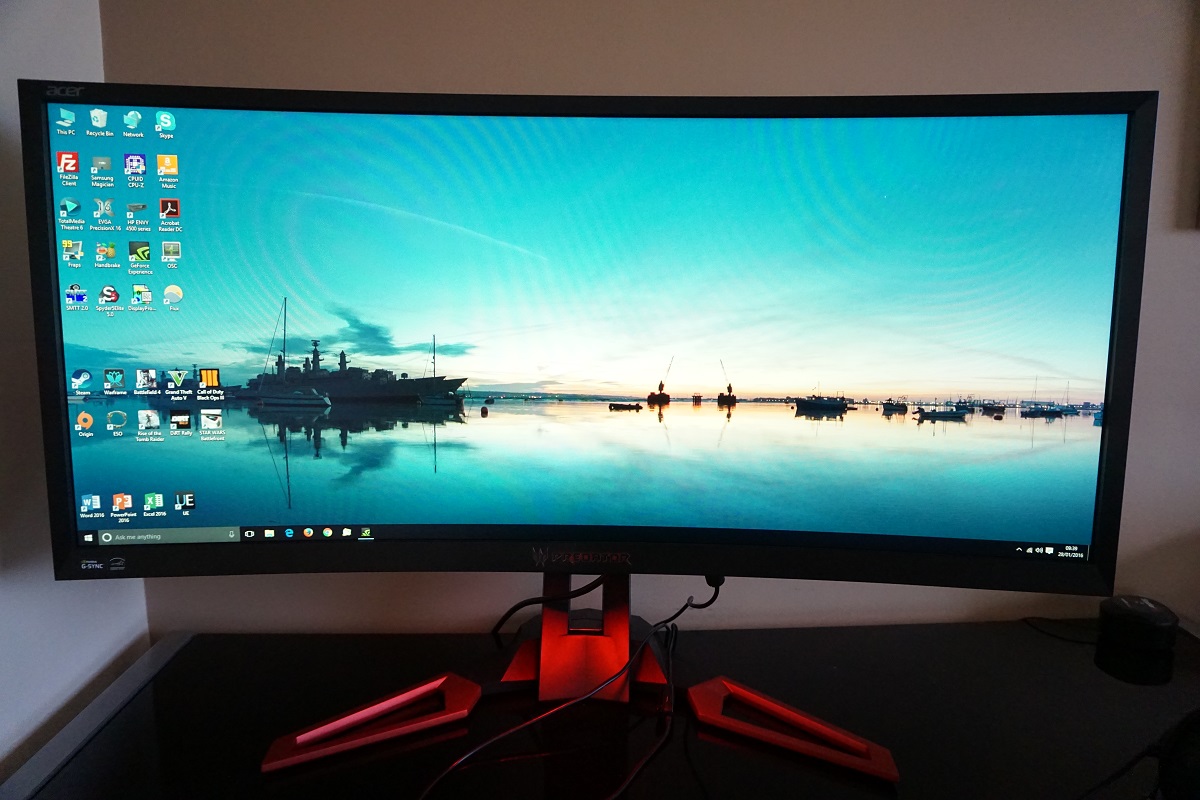
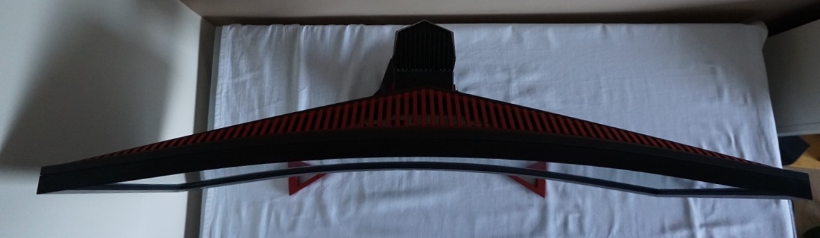
From the front you are greeted by a large curved screen with quite ‘loud and proud’ styling. The curvature is difficult to capture from directly in front of the screen, perhaps shown a bit better from a top-down view as per the third image below. The screen surface is fairly light matte anti-glare, explored a little later on. The bezels of the monitor are made from matte black plastic and are moderately thick – ~19mm (0.75 inches) at the top and sides and ~254mm (1.00 inch) at the bottom. There is a silver ‘Predator’ logo in the centre of the bottom bezel with dark red highlights alongside some red ‘feet’ on the stand. These feet are metal with a metallic red powder coating on them. This red colour is associated with Acer’s ‘Predator’ products and it’s a theme that runs throughout this product. As with the bezels, the stand base is made from matte plastic.
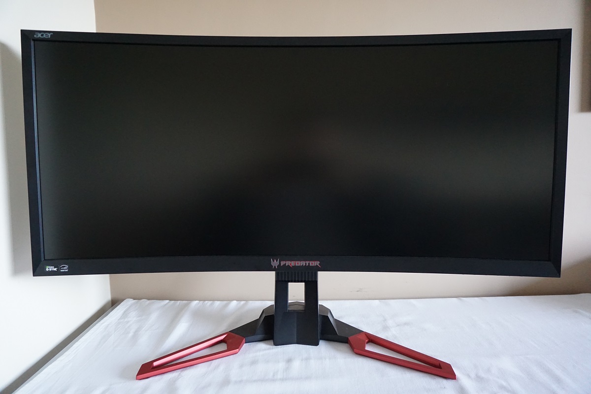
The bottom bezel also houses tactile OSD (On Screen Display) control buttons, facing downwards along the right side. There is also an ‘Ambient Light’ feature integrated into the bottom bezel. This is a strip of downwards facing LEDs that can be controlled in the OSD to light up in various different colours and with various different effects. This feature and the rest of the OSD system is explored in the video below.
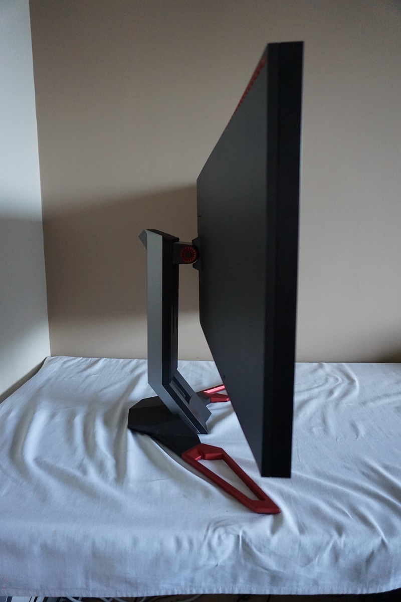
From the side the monitor has quite an angular appearance. This is accentuated not just by the screen itself, but also the stand neck and feet which are angular rather than smoothly contoured. The thickness of the screen is ~29mm (1.14 inches) at thinnest point, extending further back where the stand attaches. The total depth of the monitor including stand is ~250mm (9.84 inches), which is reasonably deep. This could bring the screen closer to your eyes than you’d like if you have the monitor against the wall and don’t have a particularly deep desk. Some ergonomic flexibility is offered by the stand, namely tilt (5º forwards, 25º backwards) and height adjustment (130mm or 5.12 inches). At lowest height the screen clears the desk by ~42mm (1.65 inches) with the top of the screen ~429mm (16.89 inches) above the desk surface.
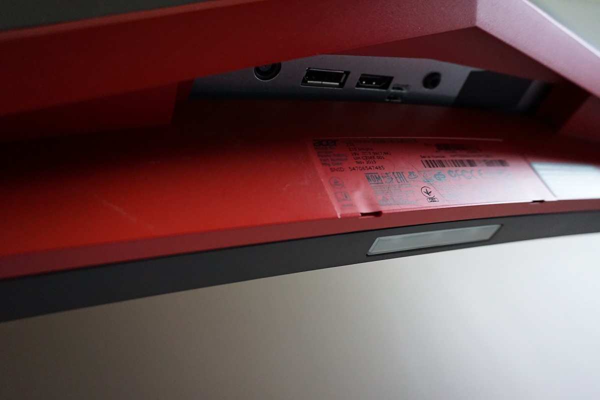
The rear of the screen continues the matte black and red colour scheme, as you can see. There is another bold predator logo, again a shiny silver colour with a red accent in the background. The rear of the stand neck is made from a matte black plastic. There are 4 USB 3.0 downstream ports and a USB upstream port towards the left side, facing backwards. The leftmost of these fast charging capabilities. There is a K-Slot towards the right side. The remaining ports of the monitor face downwards, tucked away behind the stand neck when viewing from the rear. These are; a DC power input (external power brick), DP 1.2 (supports G-SYNC), HDMI 1.4 (limited to 60Hz @ 2560 x 1080 maximum) and a 3.5mm headphone jack. An HDMI, DisplayPort and USB 3.0 cable is included in the box.
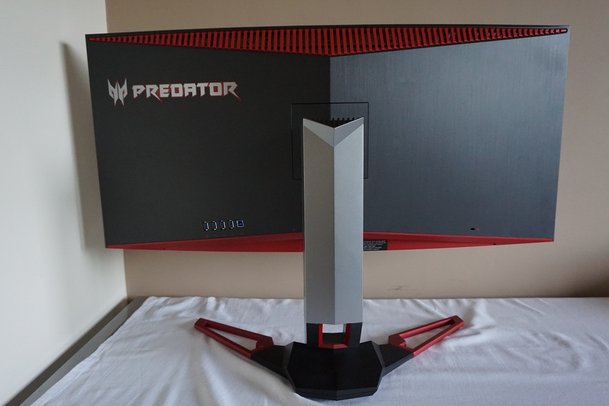
There are also two 9 W DTS speakers integrated into the rear of the monitor. These provide a sound that is quite punchy and bass-rich, certainly fuller than you’d typically expect from integrated speakers. The treble and mid-range isn’t really as pure as you’d expect from a decent set of standalone speakers, although doesn’t sound overly distorted and is still quite reasonable. These speakers probably won’t make users who appreciate a nice clean sound ditch their standalone speakers or headphones, but they do a better job than most integrated solutions.
Note that the included stand cannot easily be removed. You can essentially dismantle the stand at the attachment point by removing the two plastic covers found at this attachment point. This will then allow you to unscrew the stand and reveal 100 x 100mm VESA holes. The manual doesn’t even go into detail about how to do this and it isn’t an advertised feature – you’re essentially ripping the included stand from the monitor and would have to approach this with caution.
Calibration
Subpixel layout and screen surface
The monitor uses a fairly light matte anti-glare screen surface. The surface texture on this is relatively smooth, free from obvious graininess and quite similar in its ‘texture’ to that seen on 29” AH-IPS UltraWides. The surface isn’t quite as light or smooth as that seen on 34” UltraWides, particularly AH-IPS models. However; it provides better clarity and vibrancy than stronger matte screen surfaces, including those typically found on Full HD AH-IPS models and TN models of any resolution. It also retains good glare-handling characteristics.
![]()
The usual RGB (Red, Green and Blue) stripe subpixel layout is used. This is the default layout expected by modern operating systems such as Microsoft Windows and Apple’s MacOS. Windows users needn’t worry about adjusting ClearType settings whilst Apple users needn’t worry about text fringing issues that can occur when non-standard subpixel layouts are used. Windows users may still wish to run through the ClearType wizard and adjust according to preferences, however.
Testing the presets
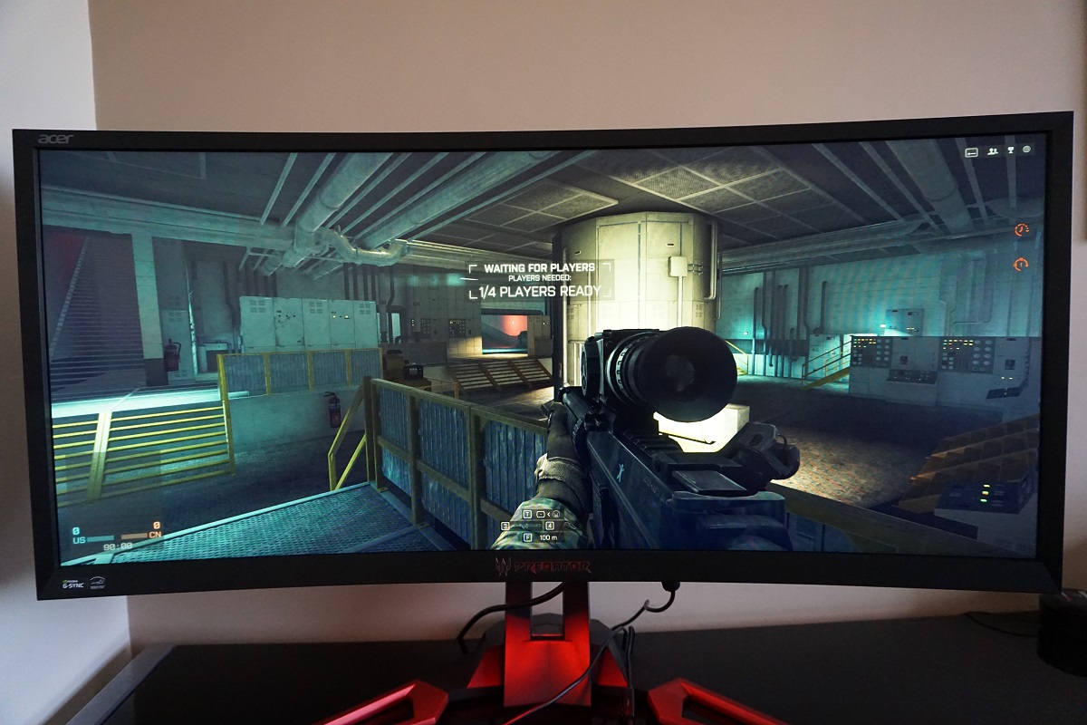
This monitor includes 5 ‘eColor Management’ preset modes, which essentially just adjust the brightness and contrast to various different values. There are also a number of other settings which can be adjusted such as ‘Gamma’, ‘Color Temp’ and a ‘Blue Light’ Low Blue Light (LBL) setting. Some of this extended functionality was highlighted in the video in the previous section. Rather than going through every conceivable combination of settings, which would be tedious to say the list, we will be looking at a selection of different settings which were of interest to us and we feel should also be interesting to a wide user base. We will also be testing the monitor with ‘ULMB’ (Ultra Low Motion Blur) active as that changes the image characteristics – this feature is explored in more detail later on in the review.
The table below shows various readings, including central white point and gamma taken using a Datacolor Spyder5ELITE colorimeter and observations made ‘by eye’ using a variety of applications. The monitor was left to run for over 2 hours before these readings were taken. Our test system used an Nvidia GTX 980 Ti G-SYNC capable GPU and had Microsoft Windows 10 installed. The monitor was left in its ‘Plug and Play’ state with no additional drivers or ICC profiles loaded. Unless otherwise stated, assume that settings were left at default. The exceptions being our ‘Test Settings’ where various adjustments were made and ‘ULMB’ where brightness was set to ‘100’ rather than the default of ‘80’. We also had the monitor running at 144Hz outside of ‘ULMB’ as that’s what we settled on during our testing.
| Monitor Settings | Gamma (central average) | White point (kelvins) | Notes |
| Gamma = 2.2 (Factory Defaults) | 2.2 | 6252K | Aside from being very much on the bright side, the image appears quite well balanced. It is rich overall with good depth to shades and a decent white point (the ideal target here depends on your lighting environment). The viewing angle behaviour of the panel coupled with the sheer size of the screen does sap shades of some depth and saturation towards the edges and bottom of the screen, however. |
| Gamma = 1.8 | 2.0 | 6250K | As above but certain shades appear a fair bit lighter. The representation remains reasonable centrally, but the weakening saturation towards the flanks of the screen in particular makes many shades appear fairly anaemic here. |
| Blue Light = 50% | 2.2 | 4952K | This is a highly effective ‘Low Blue Light’ setting (the strongest that can be quickly selected on this monitor). The image appears warm and the blue channel is weakened significantly. The image is also somewhat dimmer, but brightness can be adjusted according to preferences. This is a good setting for more relaxing night time viewing. |
| Color Temp = User | 2.2 | 6253K | As per factory defaults, but colour channels (R, G and B) can be manually adjusted. |
| ULMB, Pulse Width 100 @ 120Hz | 2.0 | 6224K | The screen is dimmer even at ‘100’ brightness than the factory defaults, although still fairly bright really. Gamma drops a bit and therefore saps a bit of depth from some shades and makes them appear less saturated than they should, particularly towards the flanks and bottom of the screen. The backlight strobing behaviour introduces a mild flickering, like a CRT running at 120Hz. We didn’t find this as restful on the eyes as with the feature disabled at similar recorded brightness but didn’t find the flickering to be particular obtrusive at this refresh rate. |
| ULMB, Pulse Width 100 @ 100Hz | 2.0 | 6237K | As above but marginally brighter with more noticeable flickering. |
| ULMB, Pulse Width 100 @ 85Hz | 2.1 | 6238K | This is brighter still and gamma is raised slightly, but the flickering has now become particularly obvious and actually quite bothersome. Everybody’s eyes are different and sensitivity to this does vary. |
| ULMB, Pulse Width 10 @ 120Hz | 2.0 | 6236K | Extremely dim (unusably so) – this is just to demonstrate the effect of changing the ‘Pulse Width Setting’ here and later on in the review and it can of course be adjusted between 10 and 100 rather than to either extreme tested here. |
| ULMB, Pulse Width 10 @ 100Hz | 2.0 | 6190K | As above, marginally brighter due to increased refresh rate but unusably dim really. |
| ULMB, Pulse Width 10 @ 85Hz | 2.1 | 6216K | A bit brighter again, but still much dimmer than we’d find practical even in the darkest room. |
| Test Settings (modified as below) | 2.2 | 6506K | Quite similar in appearance to the factory defaults, but the brightness has been reduced to far more comfortable levels. The white point has also been corrected to adhere more closely to 6500K and to neutralise a mild green tint as detected by the colorimeter (too mild to be obvious by eye). |
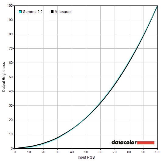
Straight from the box the monitor was very bright but otherwise well balanced overall. Colours looked rich with good depth, particularly towards more central regions of the screen. Due to the viewing angle behaviour of the VA panel there was a fair loss of saturation towards the left and right edges and bottom of the screen. The gamma tracking as measured centrally by our colorimeter was very good, too. For those who prefer lower gamma there is a ‘1.8’ option in the OSD, which we measured as 2.0 rather than 1.8 on average. At any rate, this setting weakened shade depth and exacerbated the already weakened saturation towards the flanks and bottom of the screen. Following the adjustments made to our test settings, which we’ll come onto shortly, the centrally measured gamma tracking remained strong as shown below. There was a useful ‘Blue Light’ setting (a Low Blue Light or LBL function, in other words) which was effective in reducing the intensity of the blue colour channel and hence reducing blue light output from the monitor. You can set this to various intensities or levels, with lower values providing a greater reduction in blue light levels than higher values – 50%, 60%, 70% and 80%. You can adjust brightness after selecting one of these ‘Blue Light’ settings, but confusingly the OSD will then display ‘OFF’ for the ‘Blue Light’ rather than displaying the setting you’re using. This is purely visual on the OSD and is a bug of sorts. If you actually wish to disable the setting, you can change ‘Color Temp’ in the next section of the OSD from ‘Blue Light’ to something else. It’s also worth talking about the ULMB setting. As is usual for monitors with such a feature, ULMB dims the screen a fair bit, but still maintained a brightness we feel many would be comfortable with by default. There is a ‘Pulse Width’ setting which will be explored a little later. On a basic level, reducing this reduces the length of the ‘on’ period of the backlight strobe and increases the length of time the backlight spends in its ‘off’ state. Set to ‘10’, this hugely decreases brightness to what we feel are impractical levels – we also feel it will be a tiny minority of users who find the motion performance benefits of reducing the Pulse Width that much make the trade-off worthwhile. For our ‘Test Settings’ we significantly reduced brightness, adjusted the colour channels manually and set the monitor to 144Hz (with G-SYNC enabled, not that this specifically changes static image quality). Following these adjustments, the screen was more comfortable to look at and slightly better balanced with respect to the 6500K white point target. Note that each individual unit can and likely will vary, so these settings should only be used as a guide. Any setting not mentioned below was left at default. We’ve also included the ‘OD’ (Overdrive) setting used just for reference. Color Temp= User R= 98 G= 96 B= 100 OD= Normal Refresh rate= 144Hz A Konica Minolta CS-200 luminance meter was used to measure the white luminance and black luminance using a range of monitor settings. From these readings, static contrast ratios were calculated. The table below shows this data, with blue highlights indicating the highest white luminance, lowest black luminance and maximum contrast ratio recorded. Black highlights indicate the results under our ‘Test Settings’. Assume any setting not mentioned here was left at default, with the exceptions already mentioned in the calibration section.
Gamma test settings
Test Settings
Brightness= 40 (according to preferences and lighting)
Contrast and brightness
Contrast ratios
Monitor Settings White luminance (cd/m²) Black luminance (cd/m²) Contrast ratio (x:1) 100% brightness 344 0.12 2877 80% brightness (Factory Defaults) 294 0.10 2940 60% brightness 242 0.08 3025 40% brightness 176 0.06 2933 20% brightness 115 0.04 2875 0% brightness 50 <0.02 – Gamma = 1.8 300 0.10 3000 Blue Light = 50% 226 0.08 2825 Color Temp = User 294 0.10 2940 ULMB, Pulse Width 100 @ 120Hz 144 0.06 2400 ULMB, Pulse Width 100 @ 100Hz 159 0.07 2271 ULMB, Pulse Width 100 @ 85Hz 199 0.09 2211 ULMB, Pulse Width 10 @ 120Hz 15 <0.01 – ULMB, Pulse Width 10 @ 100Hz 17 <0.01 – ULMB, Pulse Width 10 @ 85Hz 21 <0.01 – Test Settings 159 0.06 2650
The average static contrast with brightness only adjusted was 2928:1, which excludes ‘0’ brightness as the black luminance could not be accurately read by the instrument. This comfortably exceeds the specified 2000:1 but isn’t as high as we’ve seen on some VA models. Still, it’s high enough to give black text quite a nice bold look and for light elements to contrast nicely amongst darker surroundings. Strong contrast was maintained using the ‘Blue Light = 50%’ setting, which is pleasing as sometimes Low Blue Light settings come at the expense of contrast. The contrast did drop slightly using our ‘Test Settings’, but maintained a still very respectable 2650:1. Further drops were observed with ULMB activated – and you can see just how dim the backlight can go with ‘Pulse Width 10’ under ULMB. The maximum luminance recorded was 344 cd/m² and the minimum under normal backlight operation was 50 cd/m². This provides a 294 cd/m² luminance adjustment range with plenty of useful values.
There is a ‘Dynamic Contrast’ setting called ‘Adaptive Contrast’ (also referred to as ACM or Adaptive Contrast Management). This can be set in intensity between ‘0’ (off) and ‘100’, with 100 supposedly having the greatest effect. This feature is intended to allow the backlight to respond to changes in relative scene brightness, dimming when darker content is displayed and brightening for lighter content. As usual, the backlight is controlled as one individual unit and this is therefore accommodating for the scene as a whole rather than separately working on individual sections. On the plus side, you maintain some control over the brightness (i.e. setting the maximum brightness level you’d like) with this function. On the minus side, it actually seemed to do very little. Even set to its maximum intensity of ‘100’, the backlight didn’t deviate much from its initial level regardless of how light or dark the content was. Given how much we dislike dynamic contrast, particularly on models with decent static contrast, we couldn’t really care less about this though.
PWM (Pulse Width Modulation)
The monitor uses DC (Direct Current) to dim the backlight and does not use PWM (Pulse Width Modulation) regardless of brightness setting. The backlight is therefore considered ‘flicker-free’, which will come as welcome news to those sensitive to its effects. The exception to this is with ULMB active, as this is a strobe backlight mode which by its very nature induces flicker. This flicker is different to that induced by PWM, though, so not everyone who is sensitive to PWM flickering will find it bothersome.
Luminance uniformity
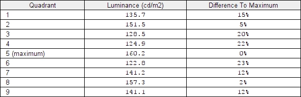
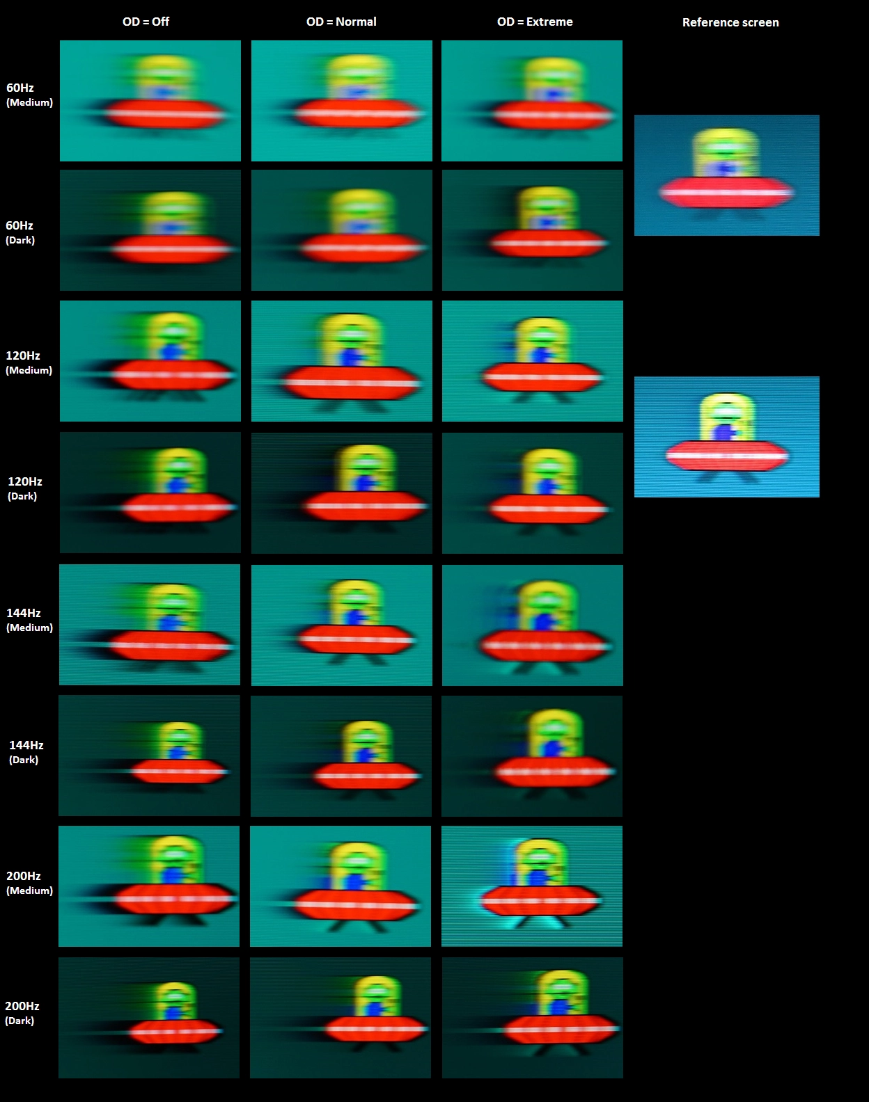
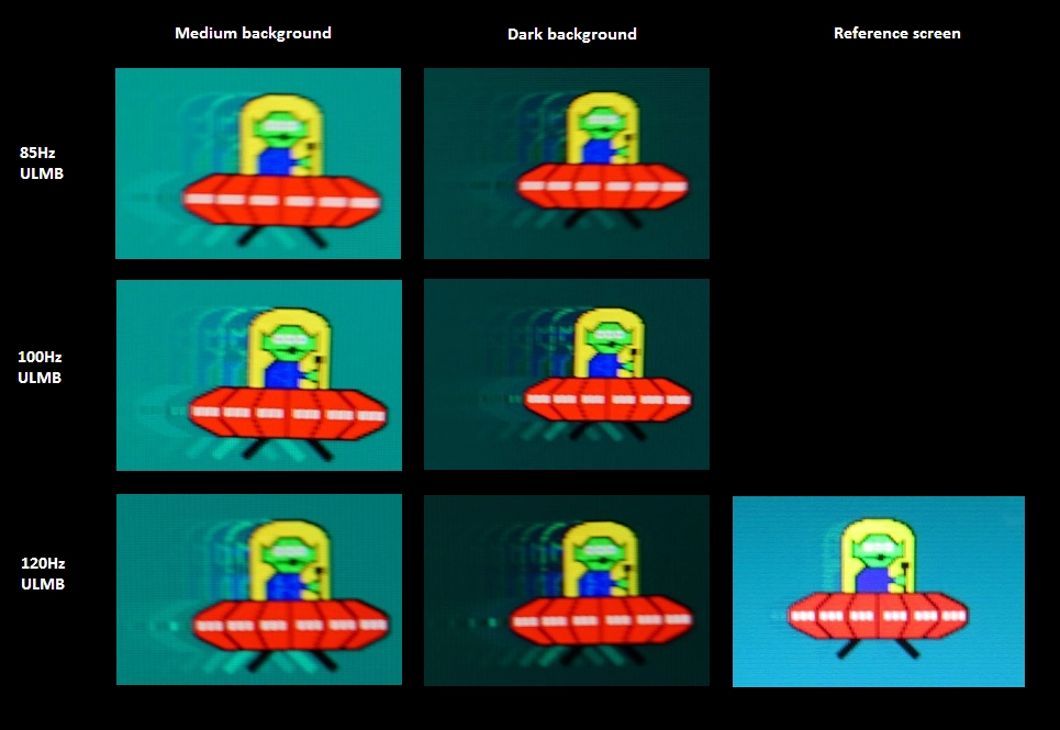
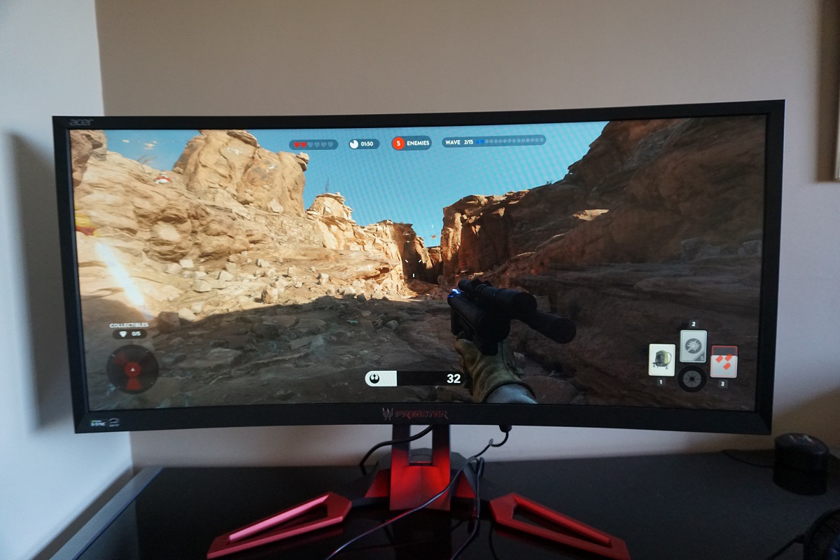
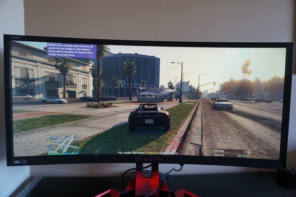
Whilst observing a black screen in a dark room we observed a very small amount of backlight bleed. You can see that this is really rather minor in the image below, perhaps most pronounced but still inconsequential towards the bottom left. This image was taken centrally from a few metres back to eliminate ‘VA glow’. This glow (not shown in the image below) is very subtle compared to ‘IPS glow’ and appears as a slightly purple-grey or golden-grey sheen towards the peripheral sections of the screen when viewing dark content in a dark room. From a normal viewing position this is very weak and only affects the bottom corners, but it blooms out a little more from various angles as shown in the viewing angles video later on in the review. The luminance uniformity was poor really. The maximum luminance was recorded at ‘quadrant 5’ in the centre of the screen (160.2 cd/m²). The greatest deviation from this occurred at ‘quadrant 6’ to the right of centre (122.8 cd/m², which is 23% dimmer). ‘Quadrant 4’ to the left of centre also showed high levels of deviation from the centre (124.9 cd/m², which is 22% dimmer), as did ‘quadrant 3’ towards the top right (128.5 cd/m², which is 20% dimmer). The remaining quadrants showed 2 – 15% deviation from the central point, which is reasonable. It’s important to note that individual units can vary when it comes to uniformity and also that you can expect further deviation beyond the points measured. Below you will find a contour map that represents these deviations graphically. Here, darker greys indicate lower luminance levels and hence greater deviation from the brightest point than lighter greys. The percentage deviation between each quadrant and the brightest recorded point is also given. The Spyder5ELITE was also used to analyse variation in the colour temperature (white point) of the same 9 quadrants. This is shown in the contour map below, where deviation between each quadrant and the 6500K (D65) daylight white point target is given. Deviations here are assigned DeltaE values, with higher values indicating more significant deviation. A Delta E >3 represents significant deviation that most users would readily notice by eye. Darker colours on this map represent higher deviation from 6500K than lighter colours. The results here were pretty decent overall. There was significant deviation towards the top central region and the bottom left, although nothing of huge concern. No significant deviation was recorded elsewhere. Again, note that individual units can vary in this regard and that further deviation beyond the measured points is possible. Additionally, there can be some slight shifts in perceived colour temperature due to the viewing angle related weaknesses of this panel type. On Star Wars Battlefront the contrast performance was strong overall. Dark shades (including black and near-black) had strong depth to them, providing good distinctive shadow details. This meant that vegetation and suchlike had a good ‘3D structure’ to it, with lighter elements standing out nicely and contrasting well with dark areas. There was a degree of ‘black crush’, which is quite normal on VA panels but was a bit stronger on this model than on some other VA models we’ve tested recently. This is essentially where near-black shades appear to blend into a very dark almost black looking ‘oil-slick’ sort of shade and look indistinct as a result. This results from the gamma behaviour of the panel – you can actually reveal the details that are ‘hidden’ by black crush by moving your head to a non-central position. The tree bark texture in shadowy regions, for example, wasn’t as distinct as it ideally would be due to this. Neither were the cracks and pores of rocky walls or various objects in dark caves. Overall, though, the strong dark shades and quite deep blacks helped provide a strong atmosphere here. And indeed bright elements such as blaster fire shone through the darker areas very nicely indeed, standing out well. The screen surface did not give such light elements a grainy look, either, and maintained a rather smooth appearance. On Dirt Rally the contrast was again rather good. This game is quite an interesting test for contrast due to the range of lighting conditions available. Unlike some games, the night on this on some levels is rather dark, particularly if you’ve carelessly smashed out your headlights (oops) are are driving through a forested area. The monitor was able to provide a strong atmosphere here, with good depth to blacks and other dark shades. Blacks were certainly not pitch-black (you won’t get that without a much higher contrast ratio than 3000:1) and there was a little bit of glow towards the edges, but this was quite subtle. And the atmosphere created here was much better than on other LCD panel types – particularly where lighter shades (such as car headlights) pierced through the darkness. These brighter shades were not marred by any real graininess from the screen surface either – perhaps just a touch, but nothing obtrusive and certainly no course or smeary graininess. The ‘black crush’ again sapped some detail at the low-end – for example material textures in dark car interiors and car tyre tread patterns weren’t as distinct as they ideally would be. There was no major loss of detail here, though, and no ‘IPS glow’ or anything of that nature to contend with either. The Blu-ray of Skyfall was also used to assess contrast performance. Here, the monitor did very well. Dark areas were atmospheric with good depth to dark shades. Some fairly minor details were visible, save for some of the subtlest details (such as creases in clothes in dark environments) appearing just a bit less distinct than they should. At the high end the monitor performed admirably, with various light sources such as explosions and candles piercing through the surrounding darkness very nicely. There was also very little in the way of graininess from the screen surface with a fairly smooth look to these bright elements. The Lagom tests for contrast were used to more closely analyse specific strengths and weaknesses in contrast performance. The following observations were made. The colour gamut of the Z35 (red triangle) is compared with the sRGB colour space (green triangle) by the Spyder5ELITE in the image below. The monitor fully covers sRGB (100%) with a bit of extension beyond this. This sort of colour gamut provides a bit of extra vibrancy to the image without normal sRGB content appearing obviously oversaturated (i.e. this is still very much a standard gamut monitor). Given the intended market and the fact game titles are generally designed with the sRGB colour space in mind, this sort of colour gamut works well. On Battlefront colour reproduction was pleasing overall. The in-game environments looked rich and appropriate overall with strong earthy browns and lush deep greens across the central area of the screen. Such shades did lose saturation at the flanks and towards bottom of screen, however. The rich brown soil looked more clay like here, whilst the lush greens of some vegetation appeared a significantly lighter green. There was still a respectable variety of different shades displayed, although the consistency was not really as good as we’ve seen on other AMVA+ panels. That isn’t exactly a fair comparison due to size difference, however. We did note similar consistency issues related to gamma behaviour on the Samsung S34E790C – and would again stress that the areas of the screen your eyes spend most time focusing on do have good depth and full colour richness. There were some very nice ‘stand-out’ vivid shades as well. The bright blue flashes of electricity as the AT-AT walker is in its weakened state, the deep red and yellow in-game markers and bright green and blue energy pulses stood out very nicely with particularly good shade depth. These bright bursts of energy also had a definite ‘pop’ to them that was aided by the strong contrast of the panel. Performance was also quite strong in this respect on Dirt Rally. The rich variety and pleasing depth that covered most of the main focal area of the screen helped give this game an appropriate look. There was a pleasing array of earthy brown shades and a good range of green shades, from lighter pastel colours to much richer and deep greens. Some of these greens had impressive depth, but again there was a loss of saturation towards the side edges and bottom of the screen. This was not really something that struck you when simply playing the game and, again, was most pronounced in peripheral regions which are not in your central cone of vision from a ‘normal’ viewing position. The monitor produced some impressively vibrant-looking colours for some of the car liveries as well. The deep blues, yellows and reds were particularly impressive. And where strong bright colours were combined with much darker shades (for example neon green on a black background) the ‘pop’ there was excellent. The Blu-ray of Skyfall was displayed in a natural and appropriate way. There was some weakening of saturation, as noted earlier, which meant that some shades lost a bit of saturation towards the flanks and bottom of the screen. But overall the environments had a good variety of quite rich-looking greens alongside more subtle greens and good earthy browns. Skin tones were also appropriately saturated for the most part and showed decent variety, but again did lose a little bit of saturation peripherally. This was certainly not extreme, though. There were also some pleasing vibrant colours, such as; glowing orange flames, the intense red of Miss Moneypenny’s dress and bright blue neon lights. We also tested the Blu-ray of Futurama: Into the Wild Green Yonder. There were some excellent vibrant colours displayed on this film, especially noticeable where brighter shades were cast against a darker background. Cosmic neon green and pink radiation with dark space in the background, for example, stood out very nicely. There were also some good strong deep blues, reds oranges and various other colours which certainly help give this animated movie the sort of look it craves. This movie is also an excellent test for colour consistency, with large areas of individual shade filling a decent portion of the screen at times. To that end the monitor was able to display a good range of pastel shades, for example various character skin tones. The loss of saturation towards the side edges and bottom of the screen did reduce this consistency and shade individuality a bit, however. If you consider the red lobster creature ‘Dr Zoidberg’, for example, he looks far too pale (and actually an incorrect shade that verges on pink) at the very bottom of the screen and near the sides of the image area. The 16:9 format of the film actually restricts the more extreme variation at the flanks, though, as you simply get thick black borders at the left and right edges around a 27” diagonal area. These sorts of shades also shift a bit if you move your head even slightly. This variation is more extreme than you’d see on an IPS-type panel and more pronounced than we’ve seen on other AMVA+ panels, but quite typical for VA technology really and improved compared to TN models of anywhere near this size. Lagom’s viewing angle tests were used to more closely analyse the idea of colour consistency and viewing angle limitations. The following observations were made from a normal viewing position, 70-80cm from the screen. A small utility called SMTT 2.0 was used alongside a very sensitive camera to analyse the latency of the Z35. To maximise accuracy, over 30 repeat readings were taken using a range of monitors where input lag is known alongside the Acer. Using this method, we calculated 4.90ms (under 3/4s of a frame at 144Hz) of input lag. This value is influenced by both the signal delay (element you ‘feel’) and pixel responsiveness (element you ‘see’). It indicates a good short signal delay, which was maintained regardless of the refresh rate the monitor was set to. This contributes to the ‘connected feel’ of this monitor, which we explore a little later. In this article we explore the key factors that affect the responsiveness of a monitor. One of these is the notion of ‘perceived blur’, which is caused not just by the pixel responsiveness of the monitor but also the movement of your own eyes as you track motion of the screen. As noted in the article, this can be analysed by using a camera technique called ‘pursuit photography’, which captures not only the response behaviour of the monitor but also the influence of eye (camera) movement. The images below are pursuit photographs taken using the UFO Motion Test for ghosting, set to 960 pixels per second. This is a good practical speed for taking such photos and is also sufficient to highlight the key elements of perceived blur. The monitor is set to various refresh rates (60Hz, 120Hz, 144Hz and 200Hz) and OD (Overdrive) settings (‘OFF’, ‘Normal’ and ‘Extreme’). Both the middle row (medium cyan background) and bottom row (dark cyan background) of the test are used here. The final column of the image below shows a fast 60Hz and 120Hz reference. This is how things should look, more or less, where pixel responses aren’t really hindering things. This is a Samsung S27A750D set to 60Hz and 120Hz with the optimal response time setting for each. At 60Hz, shown in the top two rows, you can see that there is a relatively strong degree of blur. The object itself is soft, relatively wide and blurry and there is also a moderately high degree of trailing behind this object (remember – it’s moving from left to right during these captures). You can also see that this trail is longer for each respective ‘OD’ setting when comparing the dark background to the medium background. This is because the pixel transitions involving the dark background are even slower than for the medium background. Also note that setting the OD to ‘Normal’ cuts down on this trailing a bit compared to ‘Off’. The ‘Extreme’ setting introduces a particularly dirty-looking trail behind the yellow UFO cockpit where the dark background is involved. This is overshoot (inverse ghosting) from overly aggressive pixel overdrive, strong voltage surges which attempt to speed up pixel transition speeds. None of these snapshots are as ‘clean’ as the reference, which shows how things should look on a 60Hz LCD where pixel response times don’t hinder performance. At 120Hz the degree of perceived blur is significantly decreased overall. You can see the UFO itself is somewhat sharper and less wide, indicating a significant reduction in blur that would be attributable to eye movement. You can again see that there is moderate trailing behind the UFO, particularly for the ‘Dark’ background. This is cut down somewhat with the ‘Normal’ OD setting but is still quite a feature for the dark background in particular. With the ‘Extreme’ setting and the medium background there is obvious overshoot, with halo trails behind the UFO and its legs and bright blue trailing behind the cockpit. With the dark background the trailing looks somewhat dirty but it’s fair to say not massively different to the ‘Normal’ setting which is in fact showing a mixture of conventional trailing and overshoot. Again, none of these snapshots are as ‘clean’ as the reference – although it’s clear that the increased refresh rate still provides greater clarity as seen on the UFO itself. At 144Hz the object becomes marginally less wide and perhaps just slightly sharper, again indicative of a slight reduction in perceived blur related to eye movement. The trailing is quite similar to each comparable setting at 120Hz, with the overshoot perhaps intensified a bit for the ‘Extreme’ setting. At 200Hz the UFO appears to get perhaps slightly thinner again with slightly sharper details for the body of the UFO. The trailing is now a bit bolder overall and overshoot is stronger, however. The ‘Extreme’ setting has very obvious bright trails for the medium background and relatively bright trailing for the dark background as well. There is also some noticeable overshoot introduced for some of the transitions with the medium background using the ‘Normal’ OD setting at 200Hz that wasn’t there at lower refresh rates. See the legs of the UFO, for example. In addition to testing these refresh rates, we also tested 85Hz, 100Hz and 120Hz with ULMB enabled. The reference screen here was the same Samsung S27A750D, this time using its ‘Frame Sequential’ strobe backlight mode. The results are shown in the images below. With ULMB you can see the nature of the image has changed completely. Even at 85Hz, the UFO is much sharper and more detailed – with exceptional clarity. Some of the images may appear slightly softer than others due to them being slightly worse images, but in practice it was hard to differentiate between the overall clarity regardless of refresh rate. It was really the flickering, which we come onto in a little bit, that was the noticeable difference there. There is no conventional trailing visible here and the OD setting is not adjustable. Instead, a strong overdrive impulse is used as explored later on. This gives some potentially noticeable overshoot as you can see in the images. It’s actually much more obvious on tests like this than in more complex game environments. You can still see some imperfections if you’ve got keen eyes, but really the it appears far more obvious here than it is in practice. The reference screen on the other hand uses a much softer approach, leaving a bit of conventional trailing behind but not adding any overshoot. Note that this trailing or overshoot occurs anywhere on the screen and isn’t just restricted to certain areas of the image. Before moving onto our more detailed subjective analysis using our preferred refresh rate setting, we’ll consider overall pixel response behaviour over a range of refresh rates (including some not analysed above or below) with ULMB disabled. At 200Hz the artifacts from excessive overshoot were visually very unpleasant and at times distracting to us when gaming. This was particularly evident where fairly bright objects were set against darker backgrounds. Power-ups and energy shields on Star Wars Battlefront, for example, had a very obvious aura around them that was neither the colour of the object (power-up) nor the background. At times this appeared a bold black, other times bright purple and various other colours which stood out like a sore thumb. The overshoot was certainly not restricted to that sort of occasion, either. There were frequent very short trails which were actually formed from overshoot rather than sluggish pixel response times. These trails gave objects a strange overly sharp look that sometimes appeared as a sort of odd glowing effect during even gentle movement. It looked quite artificial and weird. At 180Hz and to an even greater extent 160Hz these issues were cut down somewhat, but did still persist to a degree we found unpleasant. The good news is that at 144Hz and lower refresh rates the strange ‘boldening’ or ‘glowing’ effect was absent and the remaining overshoot proved much less distracting than at these higher refresh rates. It must be stressed that this is very subjective – sensitivity to overshoot does vary and we did feel some positive differences at increased refresh rates. Really we found that the difference in ‘connected feel’ between say 144Hz and 200Hz with a frame rate matching was perceptible but not sufficient to counteract the more obvious visual disturbances. We also felt the difference in overshoot levels at 120Hz and 144Hz to be inconsequential in practice, with the slight edge in connected feel at 144Hz and 144fps slightly outweighing this. Given this, we settled for 144Hz during our testing. Where the frame rate kept pace with the 144Hz refresh rate, the experience was smooth and fluid on Battlefield 4 (BF4). The monitor was very snappy with an excellent ‘connected feel’ to the gaming world. In this respect it felt very much like any fast low-latency 144Hz monitor, which is a good thing. And for the most part it looked like one too as most transitions were very snappy indeed. The level of perceived blur was cut down significantly compared to when running at lower frame rates such as 60fps (or using a 60Hz monitor). Coupled with the responsive and connected feel, it was certainly beneficial from a gameplay perspective – making it easier to track and engage enemies whether on foot or zipping around in a vehicle. There were some weaknesses, which is perhaps unsurprising given the panel type. As observed on the earlier UFO Motion Tests there are some sluggish transitions where dark shades (including ‘pure’ red) move against various background shades. On BF4 if you observe dark objects like a black cash register or vehicle in a shaded place set against a somewhat lighter background (like a grey sky, a road or a lightly coloured bench) you can actually see a sort either an extended ‘smeary’ trail or a ‘break-up’ trail. The ‘break-up’ trail including some dark red or purple elements rather than a seamless blend of the shades involved in the transition. These sorts of transition were much more common on dark or stormy maps such as ‘Zavod Graveyard Shift’ and ‘Paracel Storm’ during the storm itself. There was also some overshoot in places, usually with dark trails appearing that are darker than either the object or background colour. These were few and far between, really, and not something we found distracting. Despite this small amount of overshoot and the sluggish transitions in places the monitor still felt very much like a 144Hz monitor and certainly benefited from the refresh rate, visually. Dirt Rally provided a similar experience and certainly benefited from the high refresh rate in terms of the obvious reduction in perceived blur compared to 60Hz. This helped objects in the environment, the track and other cars appear sharper during rapid motion and arguably improved playability. It certainly didn’t improve our driving skills, though, and we don’t feel the very low latency of the screen had as much of an impact as on our FPS titles such as BF4. There were also some imperfections and as with BF4 they occurred where dark shades were involved in the transition. The video below, for example, shows the Montecarlo rally stage on a foggy night. Notice the smeary trailing as the car moves past the trees to the right, particularly when viewed full screen at full quality settings. There is also a section of the video showing very dark shadowy hills and trees with a dark night sky in the background. Here you can see the ‘break-up’ trailing noted earlier with a purple element. Again this trailing did not impede the overall 144Hz feeling or take anything away from the much faster transitions that occur most of the time on the monitor, but we do like to be thorough. We also tested our Blu-ray movie test titles. For the most part the monitors pixel responsiveness did little to impede performance here. Fluidity was restricted by the ~24fps at which they run. Also, because 24 divides neatly into 144Hz (but doesn’t into 60Hz) there was a reduction in juddering compared to a 60Hz monitor. There was some trailing in places that could be attributed to slower than optimal pixel responses, particularly where dark shades were involved in the transition. This was generally fairly faint and short-lived, so not really obvious or distracting. This sluggish response behaviour in places also caused very brief after-images that were more noticeable (but still faint) on animated content such as Futurama. Here, solid colour blocks and black outlines moved together. In simple terms – as these blocks moved against each other, the transition between a given shade from ‘point A’ to ‘point B’ did not quite happen quickly enough. G-SYNC is a variable refresh rate technology that can be used on certain Nvidia GPUs with specific monitors, such as the Acer Z35. In this article we explore what this technology does and how this benefits the user. On a basic level, ‘G-SYNC monitors’ include a proprietary chip inside them which replaces a traditional scaler and some of the assistive electronics of the monitor. The chip allows the monitor to vary its refresh rate in accordance with the frame rate of the content that is being displayed (i.e. the frame rate of the game). By keeping the refresh rate and frame rate in sync, the traditional issues related to mismatches in both are eliminated. This includes stuttering with VSync on and tearing and juddering when VSync is off. In addition to this, the latency is reduced in the variable refresh rate environment when comared to using VSync – although as explored previously we don’t have the means to empirically measure that difference in an accurate way. This monitor supports G-SYNC over its DP 1.2 (DisplayPort) input, provided a compatible GPU is used on the system. The technology was enabled by default when we first fired up the monitor, but to ensure everything is working as intended take a trip to Nvidia Control Panel. Navigate to ‘Display’ – ‘Set Up G-SYNC’ as shown below. Ensure the ‘Enable G-SYNC’ checkbox is checked and select your preferred operating mode; the technology now works for applications running in windowed mode if you select the second option there. As noted you should also ensure that the G-SYNC capable monitor is set as the primary display. If for whatever reason you don’t see this section of the Nvidia Control Panel, try plugging the monitor into a different DP output on the GPU. Once you’ve done this, go to ‘Manage 3D settings’. There are two settings of interest here. The first of these is ‘Monitor Technology’, which should be set to ‘G-SYNC’ as shown below. The second setting of interest is VSync, which you can choose to have ‘On’, ‘Use the 3D application setting’ or ‘Off’. If you have this ‘On’, the monitor will enable VSync when the frame rate exceeds the variable refresh rate upper limit (i.e. ceiling), which can be up to 200Hz/200fps on this model depending on the refresh rate selected. If you have selected ‘Off’, then the frame rate will be free to climb above the refresh rate of the monitor – introducing tearing but minimising latency. If you choose ‘Use the 3D application setting’ then the VSync control in the game will dictate whether it’s enabled or disabled. It is generally advised that you select either ‘On’ or ‘Off’ here and leave any in-game VSync option disabled. In-game VSync can potentially interfere with the smooth operation of G-SYNC (although this isn’t something we can personally verify and is just general advice initially given to us by Nvidia). Regardless of whether you’ve opted to use VSync or not in the Nvidia Control Panel, the behaviour is the same if the frame rate dips below the lowest supported by the monitor (which is 30hz/30fps). The monitor will try to use a multiple of the frame rate for its refresh rate to reduce or eliminate tearing and stuttering. So if the game is running at 20fps, the monitor will be set to 40Hz which would prove advantageous over either 30Hz or 60Hz in terms of reducing stuttering and tearing. As we explore below, though, low frame rates remain low frame rates regardless of the technology and it isn’t a magic bullet in that respect. Regardless of frame rate, the technology cannot remove stuttering or other issues that results from issues such as network latency, running out of RAM etc. It’s also important to note something else about the refresh rate behaviour when using G-SYNC. The selected refresh rate is important as it dictates the ‘ceiling’ for G-SYNC but also dictates the pixel response behaviour of the monitor. As we noted earlier, we used 144Hz because we disliked the obvious overshoot when using higher refresh rates. Regardless of the frame rate of the game and hence dynamically adjusted refresh rate, the pixel responsiveness behaviour remains as whatever refresh rate you’ve selected. If you wish to use a lower refresh rate than the maximum you have in your resolution list, then you have to select ‘Application-controlled’ for ‘Preferred refresh rate (Acer Z35)’. This must be done after selecting the appropriate ‘Monitor Technology’ setting or activating G-SYNC (not before). You can see this setting in the last two images above, so it is again contained within ‘Manage 3D Settings’ in the Nvidia Control Panel. Battlefront can be moderately taxing, graphically, especially if you have all the visual bells and whistles on and are gaming at a high resolution. In this case, the resolution isn’t particularly high – and certainly not a struggle for our overclocked GTX 980 Ti – but we did like to crank up the graphics settings. Having done this, we were not able to maintain a consistent 144fps on our system to match our preferred refresh rate. There were frequent dips below this – sometimes to around 120 – 130fps and sometimes closer to 100fps. Without G-SYNC such dips were rather jarring, especially to users like ourselves who are sensitive to tearing and stuttering. Without VSync enabled there was obvious tearing – and even where the tear lines themselves weren’t visible, there was obvious juddering of textures during motion as not all of the screen was displaying the same frame. With VSync enabled there was obvious stuttering. Granted this stuttering wasn’t as obvious as at lower frame rates, but it was definitely still there and it simply made the experience feel less fluid and flowing. With G-SYNC enabled these issues were gone and the game was simply more playable and enjoyable. It’s worth noting that although these issues were absent, there was a drop in ‘connected feel’ and an observable increase in motion blur as frame rate dropped. The minimum frame rate we experienced was still around 100fps, though, and things certainly still looked and felt rather smooth at this frame rate and worlds away from a 60fps. Grand Theft Auto V (GTA V) offers quite a range of graphics options and is potentially a rather demanding game, graphically. With the settings we liked to use (not being super-competitive in this game and preferring to enjoy it in more of a scenic way, so to speak) the frame rate was extremely variable. Without G-SYNC this severely affected the playability of the game – needless to say without this technology, we’d be sorely tempted to disgruntledly tone down the graphics settings to ensure a smoother experience. In more closed off areas it tended to stick to triple digits, usually 130fps+. The connected feel here was excellent with G-SYNC enabled and the frame rate dips a bit below 144fps were very difficult if not impossible to notice. In more open areas and with more going on, though, the frame rate dipped further. In some of the most intense situations it actually dropped a bit below 60fps at times, although didn’t generally stay there for too long. Even with G-SYNC the ‘connected feel’ was lost and motion blur significantly higher at the times when the game dropped here, so it was quite relieving when the frame rate picked up again. Without this variable refresh rate technology, though, the level of stuttering or tearing here would verge on unbearable – there is no doubt that G-SYNC is a great asset to the gaming experience on this title. Just for fun we ramped up the graphics settings further to see how the monitor reacted below the 30Hz floor of G-SYNC operation. In short, we could see that the ‘stutter and tear defeating’ ability continued as the monitor tried to maintain a multiple of the frame rate with its refresh rate. But the fluidity and playability at such frame rates was still appalling and not something we could really stand on this title. We actually tested a broad range of other game titles, including but not limited to; Battlefield 4, Warframe, Elder Scrolls Online, Dirt Rally and Call of Duty Black Ops 3. On all of these titles we found G-SYNC beneficial to the experience, allowing us to crank up the graphics settings further than we otherwise would have to if we wanted to ensure the frame rate matched the static 144Hz. And even if the game would seem to run at 144fps quite consistently with these reduced graphics settings there were almost always little blips every now and then – even drops just a few frame below this, momentarily, are disruptive to the experience and are something G-SYNC addresses. Whilst not a magic bullet, in that it doesn’t make low frame rates feel like high frame rates, the benefits it brings to the gaming experience were unquestionable for us. It’s also worth noting that individual sensitivity to tearing and stuttering does vary – so not everyone will find the addition of a variable refresh rate technology as game-changing as others. ULMB (Ultra Low Motion Blur) is another proprietary Nvidia technology which can be enabled instead of G-SYNC on compatible models. Note that a compatible Nvidia GPU is again required and it is not possible to activate ULMB and G-SYNC at the same time. ULMB is a strobe backlight technology which is specifically designed to reduce motion blur. The mechanism of this operation and how it reduces blur is explored in detail in our responsiveness article. In short, the backlight briefly pulses on whilst spending most of its time off at a frequency corresponding to the refresh rate of the display. This reduces the amount of time the eyes spend tracking motion on the screen, which is itself a key contributor to the blur that you perceive when viewing moving images on a monitor. This contrasts with the normal ‘sample and hold’ behaviour of LCDs and essentially mimics how impulse-type displays like CRTs display images. To enable ULMB you must have the monitor running at 85Hz, 100Hz or 120Hz. You can enable ULMB by navigating to ‘Manage 3D settings’ in the Nvidia Control Panel and selecting ‘ULMB’ for ‘Monitor Technology’ as shown above. The monitor should activate the appropriate mode automatically and you should notice the motion and the screen and the nature of the image (i.e. flickering) changes. If you need to activate it manually, the correct setting in the monitor OSD is found under ‘Setting’ (spanner icon) – ‘ULMB’ – ‘ON’. Selecting this in the menu is also required to adjust the ‘Pulse Width’ setting. This is set to ‘100’ by default, affording the highest brightness level due to the relatively long ‘on’ period for the backlight strobe. Lowering this decreases this ‘on’ period, dims the image and potentially offers even greater motion clarity – although most users will probably find the default value sufficient. Note that the OD (Overdrive) control is disabled with ULMB enabled as it is automatically controlled by the monitor. Additionally, when you disable ULMB and want to return to the normal operating mode of the monitor or using G-SYNC, you may need to re-select your preferred OD option. It may be forced ‘OFF’ initially regardless of what the OSD is telling you. When you activate ULMB as noted before, you will notice some changes to the image. It may appear relatively dim, depending on the brightness settings you were using before. It certainly looks different, with colours appearing a bit more muted (but still reasonably rich) and the fact the screen flickers. As noted previously this flickering is most pronounced at 85Hz but is still something we notice quite readily at 100Hz and even 120Hz. Individual sensitivity to this does differ – some of our team sort of get used to the effect whilst others find it quite bothersome. Looking past that, observing motion on the monitor is quite different when ULMB is active. The observations below really apply to 120Hz ULMB as we simply couldn’t stand the flicker at lower refresh rates (especially not 85Hz) – but motion clarity is very good even as low as 85Hz ULMB as you can see from the TestUFO images earlier on. One of the titles we found showcased the potential advantages of this technology particularly well was BF4. Provided the frame rate matched the frame rate exactly, the level of motion blur with ULMB enabled was exceptionally low. You could notice during rapid manoeuvres in vehicles, for example, that the game environment remained surprisingly sharp such that enemies and obstacles could be quite clearly seen and appropriate action taken. To put in a less flowery way – enemies were easier to spot and track. We certainly found the playability absolutely fine without ULMB at refresh rates such as 144Hz, but for particularly competitive gamers or those used to CRTs they might feel more at home with ULMB active. The overall motion clarity really was superb with this enabled. The monitor also uses fairly aggressive pixel overdrive with ULMB enabled as many of the imperfections of this are hidden during the extended ‘off’ period of the strobe. The same goes for a lot of the conventional trailing – much of this is hidden during this ‘off’ period. There are still some remaining issues, though, as was quite clearly demonstrated in the pursuit photographs earlier. When actually in a game these issues were nowhere near as noticeable as on TestUFO, though. During rapid movement in particular many objects had a very faint fragmented trail behind them, which is something we’ve seen on all models which use ULMB. Again this is really very faint and not something all users would notice or care about. There was also some overshoot in places, most noticeably when observing white hot objects through thermal sights with a neutral (grey) background. A fairly obvious black trail was cast behind the object. Equally some obvious bright trails (even with hints of purple in them) were evident where very dark objects were placed against a lighter background. When observing vehicles or other objects in the dark with a gloomy night sky in the background, for example, this becomes rather obvious as the objects appear to have a halo around them. The overshoot here seems to have replaced much of the conventional trailing, which was most pronounced in these situations with ULMB disabled. The final thing to note is that ULMB really does require the frame rate to tally with the refresh rate of the monitor. To reiterate – you cannot run G-SYNC at the same time as ULMB – so this is a static refresh rate of either 120Hz, 100Hz or for those who don’t care about flickering at all 85Hz. Stuttering (VSync on) and tearing (VSync off) becomes painfully obvious where the frame rate departs from the refresh rate. There is very little motion blur to mask this, which is why it sticks out so well. Even microstuttering and other imperfections associated with frame rate limiters and VSync off become very obvious – so generally you will need to use VSync if ULMB is to be used and stomach the latency penalty that comes with this. We feel that most users will prefer to use G-SYNC rather than ULMB, but this is a nice option to have and will perhaps be most useful for competitive gamers. We’ve looked at what the 2560 x 1080 resolution and 21:9 aspect ratio brings to the table in this article. We also posted a follow-up article looking at the larger screen size and higher (3440 x 1440) resolution. Furthermore, we’ve explored the gentle curve introduced on some models in our reviews of the Samsung S34E790C and Dell U3415W. Adding just a touch more depth and potentially enhancing visual comfort. At 2000R rather than 3000R – 3800R, with lower values indicating greater curvature, the Z35 has a significantly steeper curve. It is certainly more of a ‘feature’ of the monitor. We actually found this particular aspect of the monitor fine during desktop tasks, although it did distort straight lines. You could see that the taskbar, for example, followed the curvature of the screen and appeared to rise up a bit in the middle. This sort of thing could be seen on various applications, such as straight lines on Microsoft Excel or various elements on websites. It’s not really represented quite as it looks in person in the images below, which are just there for illustrative purposes really, but it was something we soon grew accustomed to. For design work and suchlike we could certainly see this being an issue, but for general usage we feel most users will find the screen quite comfortable to use. Where the curve really improved the experience, rather than just being something that was there and had to be adapted to, was in games. It really did make them just that bit more engrossing, something that the sheer size of the screen also helped with. Rather than making the game appear distorted or somehow alien, the curve almost seemed to add some extra depth to the experience and helped draw you in. As explored in this article, the advantage that this brings in terms of Field of View (FOV) for most games is certainly an attractive benefit. As also covered, support for the 21:9 aspect ratio (which is of course a pivotal part of the experience) is broader than most would assume, although not universal. Likewise, films that made proper use of the screen space were also engrossing on such a large and fairly steeply curved screen. Although they do little to replicate the actual experience, we’ve included a few shots of the screen in action just to fire up the imagination. Apologies for the moiré (interference patterns) in many of the shots, these are just from the camera and weren’t observable on the monitor itself. One peculiar phenomenon we observed was the presence of apparent interlaced interference patterns during motion or occasionally when scanning your eyes across the screen in a certain way. Unlike on some models these weren’t related to improper voltage control, as far as we could tell, but seemed linked to the pixel density and other attributes of the panel. They occurred regardless of refresh rate or other setting combinations. Certain shades appeared to break up into very thin and faint vertical lines of a lighter or darker shade than intended (note – this is not the moiré shown in the images above). This was particularly noticeable for lighter colours such as smoke or slightly foggy backgrounds – it was inescapable on the snowy landscapes of Hoth on Star Wars Battlefront, for example. This isn’t something everybody will notice and isn’t hugely distracting, but was an observation we felt it was worth sharing. Although it’s of very limited use on the desktop given that it makes things look blurry and essentially very difficult to read, there is a way to get a bit more out of the monitor, visually, when gaming. This does not alter the aforementioned interlaced interference phenomenon, incidentally. DSR (Dynamic Super Resolution) is a technique used to increase the rendering resolution of the GPU above the native resolution of the display. This is then downsampled to the native resolution, in this case 2560 x 1080. This can be accessed in the ‘Manage 3D settings’ section of the Nvidia Control Panel under ‘DSR – Factors’ with an associated setting ‘DSR – Smoothness’ as show in the screenshot below. Once you select the factors you want to add (with 4x being the highest), there will be some new resolutions for you to select in the Nvidia Control Panel or Windows resolution list. We’ve reviewed a number of curved monitors in the past, although usually they are quite coy about their curve. It’s often gentle enough to go largely unnoticed, which may be good or bad depending on your perspective. For an engrossing gaming experience, the 35” and relatively steeply curved screen of the Acer Z35 certainly hit the spot. We definitely felt that the curve helped draw you into the game world a bit more, adding an extra sense of depth. We were also pleased to find that the monitor was set up rather well ‘out of the box’, with a reduction in brightness and some relatively minor colour channel tweaks being all that was required. The known strength of VA panels, such as that used by the Z35, is contrast. In this respect the monitor did very well, exceeding the specified 2000:1 quite comfortably and coming closer to 3000:1 using a range of settings. The monitor was able to give dark scenes in games and movies a good atmosphere, whilst on the desktop text had a fairly bold and inky look. Bright elements in any application stood out nicely with darker surroundings as well. There was a degree of ‘black crush’ which hid some of the most subtle details from a normal viewing position, but no obtrusive immersion-breaking glow. Although not the lightest screen surface we’ve seen on an UltraWide monitor, the surface texture was still quite smooth and did not introduce obtrusive graininess to the image. The generous colour gamut, good gamma handling and overall panel characteristics also combined to give fairly rich colour output overall. There was some loss of saturation towards the side edges and further down the screen, though, which is expected given the panel type and size. The elephant in the room for many users will of course be the 2560 x 1080 resolution. This did not give a huge amount of desktop ‘real-estate’ nor did it provide the sort of crispness or clarity when gaming that we’ve seen on models with significantly higher pixel densities. In fact, we could even see some interlaced interference patterns during motion, particularly where lighter colours were involved. This was not solely down to the pixel density, but it was certainly a key contributor to this. One significant advantage of this resolution, though, is that it does not require the same graphical horsepower or indeed signal bandwidth as higher resolutions at a given refresh rate. And given the high refresh rates supported by the monitor (up to 200Hz), that is quite useful really. Speaking of 200Hz, we certainly wouldn’t say this was a ‘gimmick’ as such on this monitor. We could certainly ‘feel’ the advantages. But at anything above 144Hz, the level of overshoot (inverse ghosting) was frankly unacceptable and rather ugly. Personal sensitivity to this will vary, but we found the responsive look and feel to be best balanced with image quality at 144Hz. And the monitor was certainly able to make good use of this refresh rate, with many pixel transitions occurring fast enough so that perceived motion blur was massively reduced compared to 60Hz. There were some weaknesses in pixel transitions, most notably where dark shades were involved, which did create some fairly obvious ‘smeary’ trailing in places. There was also a degree of overshoot, but as observed this was much reduced at 144Hz compared to higher refresh rates. And this monitor isn’t just about high refresh rates, it also supports Nvidia G-SYNC. That did exactly what it set out to do, smoothing out the stuttering and eliminating tearing that is traditionally caused by refresh rate and frame rate mismatches for static refresh rate displays. This is another area where sensitivity varies, but for us it could be described as ‘game changing’. The accompanying technology, ULMB, also did its thing on this monitor – a strobe backlight mode which massively reduced motion blur. The motion clarity with this setting was excellent. There was a fair degree of overshoot in the background, but this was generally quite faint and didn’t really detract from the very low levels of perceived blur offered here. The negatives of using such a setting include some muting of the image, lower potential brightness, flickering and the fact you need to sustain a frame rate matching the refresh rate of the monitor – quite the opposite of G-SYNC really. Overall this monitor is full of nice gaming features and provides quite an engrossing experience. The image quality was decent and it certainly felt very responsive – with definite visual imperfections during motion, but still taking advantage of high refresh rates. The price of the monitor is rather high, so really it will be up to the user whether the compromises to be made here are worth it. The bottom line; a big screen with a proud curve that provides a very fluid gaming experience. But there are plenty of visual imperfections which could sour the experience for some.

We also used the Spyder5ELITE to assess the uniformity of white. 9 equally spaced white quadrants were analysed, which ran from the top left to the bottom right of the screen. The table below shows the luminance recorded at each quadrant and the deviation between a given quadrant and the brightest recorded point.
Luminance uniformity table
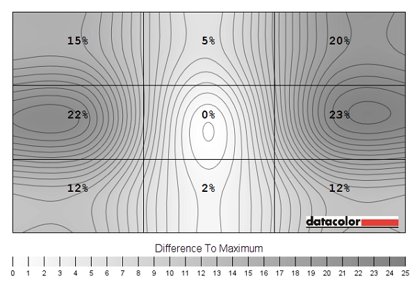
Luminance uniformity map
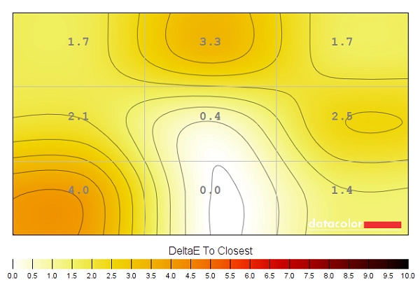
Colour temperature uniformity map
Contrast in games and movies
Lagom contrast tests
Colour reproduction
Colour gamut
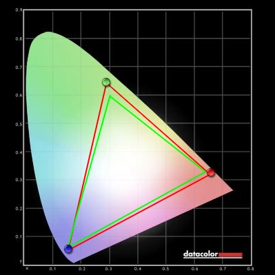
Colour gamut test settings
Colour in games and movies
Viewing angles
The video below shows the results of this test from a variety of viewing angles. It also shows a mixed desktop background and dark desktop background from a range of angles. For the final third of the video, which features a dark background, you can see the aforementioned ‘VA glow’ blooming out slightly as viewing angles are shifted.
Responsiveness
Input lag
Perceived blur (pursuit photography)
Perceived blur with various settings
Perceived blur with various settings (ULMB)
Responsiveness in games and movies
G-SYNC – the technology and activating it
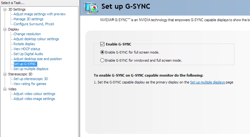
Enable G-SYNC
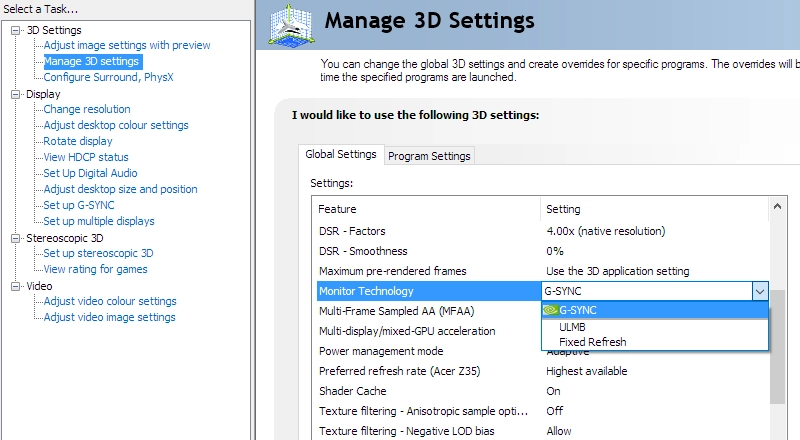
Set Monitor Technology to G-SYNC
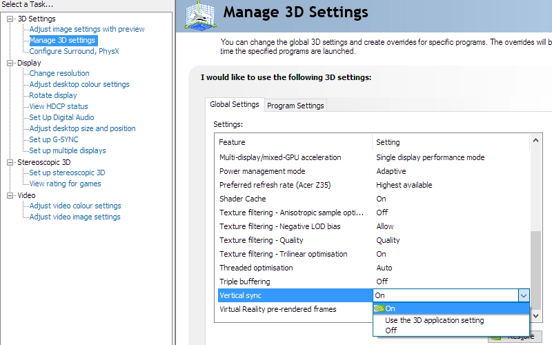
Set VSync according to preferences
G-SYNC – the experience
ULMB – the technology and activating it
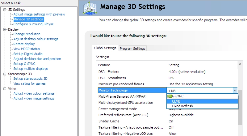
Set Monitor Technology to ULMB
ULMB – the experience
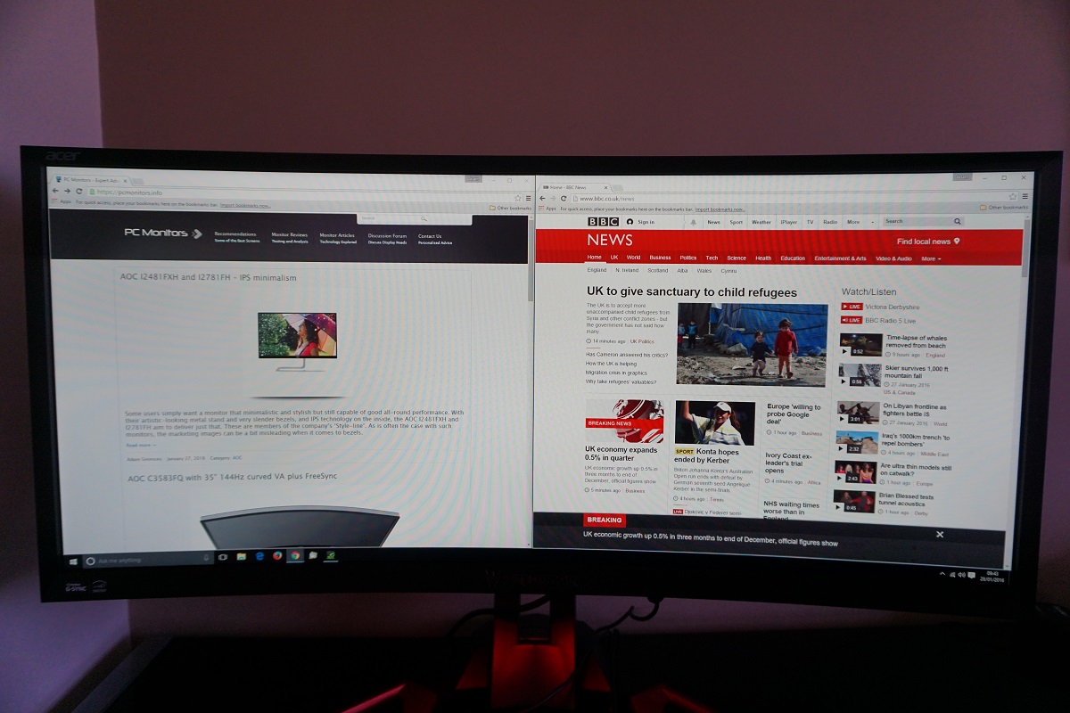
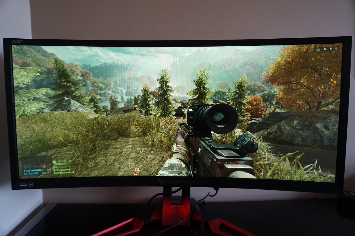
The 35″ 2560 x 1080 curved ‘UltraWide’ experience
What will of course be a sticking point for some is the 2560 x 1080 resolution, which on a 35” screen yields a pixel density of 79.39 PPI (Pixels Per Inch). This is similar to a 27” 1920 x 1080 (Full HD) model and is quite low by modern standards, especially with the push up towards ‘4K’ UHD elsewhere in the monitor market. By comparison, the 3440 x 1440 resolution found on many 34” models yields a pixel density of 109.68 PPI, similar to a 27” 2560 x 1440 (WQHD) model. Whilst you do still gain a reasonable amount of useful screen space for the desktop, it’s certainly nowhere near as fruitful or rewarding as the 3440 x 1440 resolution in that regard. You simply don’t gain the same real-estate and clarity simply isn’t as good. This lack of clarity also carries over to gaming – although given the high refresh rate of the monitor and potential for excellent fluidity at high frame rates, that’s a trade-off that many would find acceptable.
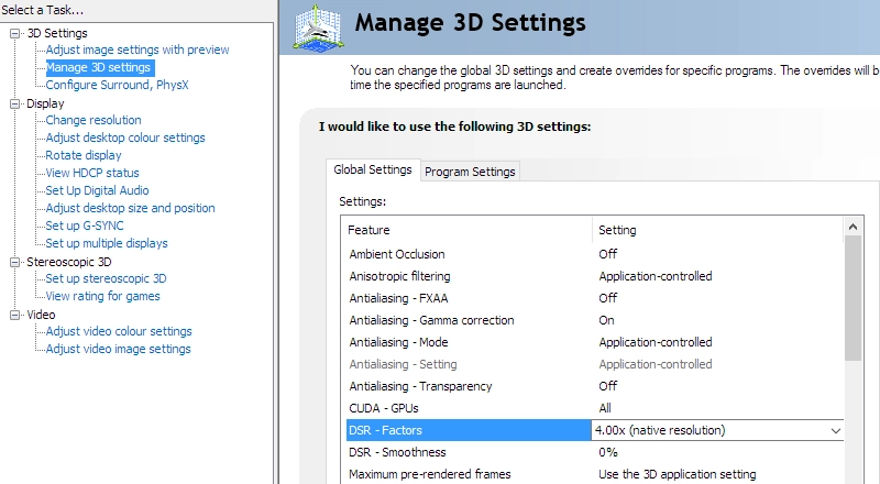
Set some DSR Factors
Increasing the rendering resolution requires significantly increased graphical horsepower, the increase of which is relative to the factor you select. A similar feature can be found in some games, sometimes referred to as something along the lines of ‘resolution scale’ or ‘rendering resolution’. There is no doubt that employing DSR gives quite a decent increase in overall quality and apparent detail over the native resolution, particularly using ‘4x DSR’ (5120 x 2160 rendering resolution). Even with such an extreme setting, though, the detail and clarity is simply not comparable to using a native 3440 x 1440 34” display and the related increase in pixel density that comes with that. This is noticeable when observing the textures themselves, which simply aren’t as detailed or crisp. The edges of objects aren’t as well-defined, either – particularly noticeable if you look at objects in the distance. The fact that this 4x DSR setting provides a 5120 x 2160 rendering resolution, which is essentially the 21:9 equivalents of ‘4K UHD’, also means that it is graphically very taxing indeed. We do recommend users have a play with this setting and see how they find it, particularly if they have a powerful system. But don’t expect miracles and don’t expect it to turn this monitor into something it isn’t (i.e. a model with high pixel density).
Conclusion
Positives Negatives The out-of-the box setup of the VA panel was good (aside from brightness), combining with a generous colour gamut and relatively light screen surface to give some good rich colours
There was some saturation loss (and hence lower richness) towards the side edges and bottom of the screen coupled with viewing angle imperfections – expected for a VA panel, but somewhat more than we’ve seen on other AMVA+ panels
A strong contrast performance overall, with good black depth and no ‘IPS glow’ or obvious screen grain to spoil the experience A moderate degree of ‘black crush’, hiding some of the more subtle details in places The screen had very little input lag and made good use of high refresh rates (up to a point). It coupled this with G-SYNC or ULMB support for greater flexibility on a variety of titles and systems
Some transitions were evidently very sluggish, producing ‘smeary’ trails in places. Any refresh rate >144Hz introduced strong overshoot even using the optimal OD setting
The curve and screen size helped provide a rather engrossing gaming experience – decent ergonomic flexibility and some nice extras on this one as well, such as the ‘Ambient Light’ and ‘Blue Light’ features
The 2560 x 1080 resolution allows for relatively high frame rates, but does not yield an impressive pixel density on such a large screen (performance at the expense of image quality)
![]()

