Author: Adam Simmons
Date published: May 16th 2015
Table of Contents
Introduction
The thought of a high resolution like ‘4K’ UHD (3840 x 2160) can be very tempting. But unless the screen is particularly large, there are some potential scaling issues that can really sour the experience. The Philips BDM4065UC spreads those 3840 x 2160 pixels over a massive 40” screen to give loads of workable space without the potential scaling headaches. We take a look at how this works out in practice, taking into account pixel pitch and the physical presence of the monitor on our humble desk. Other aspects of the monitor are also considered, such as responsiveness, contrast and colour reproduction.
Specifications
This model features a 60Hz VA (Vertical Alignment) panel with true 8-bit colour reproduction. The visible screen size is a whopping 39.56” (hence this is considered a 40” monitor). The response time is specified as 3ms, but we know all too well that you have to take that with a bucket or two of salt when it comes to VA panels. A true 8-bits per subpixel bit depth is used whilst viewing angles of 176 degrees horizontally and vertically are specified.
Key aspects of the specification are highlighted in blue below.

Features and aesthetics
From the front, this monitor looks very much like a modern TV. It is dominated by a very large glossy screen, which has an extremely mild (3-4% haze value) anti-glare treatment. We explore this in a little more detail later, but it is essentially very similar to what you might find on a glossy TV. It doesn’t give the mirror-like reflections of some glossy surfaces (such as untreated glass) and instead gives reflections with softer outlines and a darker look. You will need to make sure light is not hitting the screen surface directly, either from the side or behind the viewer. The following image shows the monitor switched off, placed in a bright room with daylight streaming in from the side.

In dimmer conditions the reflections are reduced, as shown below.

And of course once the monitor is on, particularly when displaying lighter content, the light from the screen itself drowns out a lot of the reflections. The image itself retains a level of vibrancy and clarity beyond what you’d see on even a ‘light matte’ screen surface. The 3-4% haze value does little to upset these aspects, as we explore later.

The monitor is mounted on a fixed metal stand, which offers no ergonomic freedom whatsoever – not even tilt adjustment. The bottom of the screen sits ~73mm (2.87 inches) clear of the desk surface with the top of the screen ~585mm (23.03 inches) above the desk. The bezels are very slender and made from glossy black plastic. They’re around 10mm (0.39 inches) all around, with a bit of extra width in the bottom central region where the Philips logo sits. There is a fairly bright but small white LED power indicator just to the left of this logo, which glows when the monitor is on and blinks when it’s on standby.
The screen has a relatively slender side profile, too. It’s around 18mm (0.71 inches) at thinnest point, protruding further centrally to a peak of around 70mm (2.76 inches). At the left side of the monitor you will find most of its ports. These are, from top to bottom; 3.5mm headphone jack, 3.5mm audio input, VGA (D-Sub), DP 1.2 input, MiniDP 1.2 input, HDMI 1.4 ports (one with MHL) and an RS232 port (for factory servicing etc.) By default the monitor supports up to 60Hz @ 3840 x 2160 over DP 1.2, but will only support up to 30Hz @ 3840 x 2160 over DP 1.1 or HDMI. Note that internal SST (Single Stream Transport) is used on the monitor, meaning that the operating system sees it as a single display. So you needn’t worry about potential MST-related computability issues. A DP cable, HDMI cable, VGA cable, power cable and 3.5mm audio cable is included in the box.

At the right side of the monitor there is a ‘zero watt’ power switch, allowing you to eliminate standby power consumption completely by cutting off power to the monitor. This is in fact the primary means of turning off the monitor, as there isn’t a ‘conventional’ electric power button.

Facing backwards, to the left of the power switch in the image, there is a ‘JOG button’ (joystick) which allows fairly intuitive navigation through the OSD (On Screen Display). Its positioning is a bit awkward and quite a stretch given the size of the monitor, unless you have very long arms or like to have the monitor very close to you. Aside from that the controls proved easy to use, although perhaps no consolation to those that were expecting a monitor that looks so much like a TV to feature a remote control. The video below runs through the control system of the monitor on the OSD itself.
The rear of the monitor features various ventilation slats and screw holes. Some of these central screw holes are 200 x 200mm VESA, allowing an alternative stand or mount to be used instead of the rather basic stand provided. Towards the bottom left (when viewing from the rear) there is an AC power input (internal power converter). To the right of the stand attachment point there is a K-Slot, and up and right from that are 4 USB 3.0 pots (plus upstream). The third one along also supports rapid charging for connected devices. 7W stereo speakers are also included. These produce what can only be described as reasonable sound output. Decent volume, but a lack of clarity in the mid-tones and a lack of bass. Better than most integrated speakers, but certainly not the best we’ve heard nor a match for a decent external speaker set.


Calibration
Subpixel layout and screen surface
As mentioned previously, the screen surface on the monitor is glossy with an extremely mild (3-4% haze) anti-glare surface. This means that the monitor has a smooth outer-polarising layer, allowing direct emission of light without significant diffusion. As a result the monitor is able to maintain relatively good image clarity and superior ‘vibrant pop’ compared to a model with similar pixel pitch but a matte screen surface. As illustrated previously, such a screen surface also reflects ambient light and calls for tighter control of room lighting conditions than with a matte surface. The differences between ‘matte’ and ‘glossy’ surfaces are explored in more detail in this article.
![]()
The image above shows a camera macro photograph of the monitor’s subpixels. This model uses the BGR (Blue, Green and Red) stripe layout, which is less common than RGB (Red, Green and Blue) stripe. This means that operating systems will, by default, provide sub-optimal text clarity as they are configured for RGB output. This is easily remedied on modern versions of Windows by running ‘ClearType’ – it will be extremely obvious which text samples look good and which look completely wrong as you run through the wizard. Other operating systems such as MacOS do not have such functionality built into them, which could cause some issues with text clarity.
Although it isn’t at all obvious from the photograph or indeed when you actually use the monitor, the pixels are not perfectly square on this monitor. They are approximately 1.8% wider than they are tall. This means that the image is ‘stretched’ by a tiny amount horizontally compared to what it should be. If we weren’t aware of this and hadn’t made any measurements of our own we really wouldn’t have noticed and it isn’t something you should worry about at all. To illustrate this, we took a photograph of a 200 x 200 pixel black square on the monitor (shown below). As you can see – a very subtle difference indeed, it looks quite like a square should look really. If absolute precision is required then the graphics program you are using will allow for actual measurements in pixels or other units anyway, so going ‘by eye’ shouldn’t be necessary.
![]()
Testing the presets
The Philips BDM4065UC features a number of ‘SmartImage’ presets as well as a number of user-configurable options like gamma and colour temperature presets. Rather than analyse every conceivable preset and option combination, we will instead pick a few which we feel offer most benefit or should be of most interest to users. The table below shows some key readings and observations using a variety of settings. The readings were made with the aid of a Datacolor Spyder5ELITE colorimeter. Any setting not specifically mentioned in the table was kept at factory default, with the exception of our ‘Test Settings’ where various changes were made.
| Monitor Settings | Gamma (central average) | White point (kelvins) | Notes |
| Gamma = 1.8 | 1.7 | 7208K | Quite bright with a cool look. Many shades look ‘washed out’ (obvious lack of depth). Due to viewing angle limitations explored later the screen appears somewhat dimmer and some colours less saturated towards the peripheral regions of the screen, especially the bottom and sides. |
| Gamma = 2.0 | 1.9 | 7213K | As above but a bit of extra depth (still insufficient). |
| Gamma = 2.2 (Factory Defaults) | 2.0 | 7188K | The image approaches a more pleasing richness, with some shades appearing to have quite a pleasing rich look. Overall though, still a lack of depth. |
| Gamma = 2.4 | 2.2 | 7220K | Shades now have an appropriate depth, at least towards more central regions of the screen. The image still appears a bit cool and bright which upsets overall balance. |
| Gamma = 2.6 | 2.4 | 7220K | Some shades now appear too deep and dark shades blend together even more than usual, intensifying the ‘black crush’ phenomenon explored later. Quite an eye-opening vibrancy to some shades though. |
| Color Temperature = 5000K | 2.0 | 5606K | Although cooler than ‘5000K’, this gives the image a warm appearance and reduces the strength of the blue channel considerably. This is essentially a ‘Low Blue Light’ setting, useful for relaxing evening viewing in particular. |
| Color = sRGB | 2.0 | 7021K | Image remains bright and cool and looks quite washed out overall. You can’t adjust the brightness, contrast, colour temperature or gamma in the OSD – so not an attractive setting at all. |
| Color = User Define | 2.0 | 10633K | Extremely cool look to the image and very bright. This is essentially the entirely ‘unadjusted’ image, maximising contrast at the expense of image balance. |
| SmartImage = SmartUniformity | 1.8 | 7724K | The peripheral regions of the screen seem relatively warm compared to the centre. The viewing angle restrictions still apply as well. Central brightness and gamma is reduced and white point elevated compared to factory defaults. Additionally, the ‘black crush’ explored later is increased. |
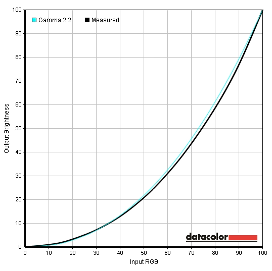
| Test Settings (as below) | 2.2 | 6503K | The image is now more comfortable and better balanced with some excellent vibrant ‘popping’ shades and good depth overall. Some saturation is again lost peripherally, but no amount of calibration will alter this. |
The BDM4065UC provided an image that was a bit bright and cool-looking out of the box, without the sort of vibrancy you’d expect from a glossy VA panel. Fortunately the tools are available to tweak that appropriately in the OSD. Following adjustments to the gamma and colour channels, as per our test settings, things appeared much better balanced and really quite inviting overall. The gamma averaged 2.2 and tracked quite closely to the desirable curve. The deviation here is not worth obsessing about on a panel of this type, as viewing angles alter perceived gamma at different points of the screen anyway. There were also some other useful settings available in the OSD. Firstly there is a ‘5000K’ preset which is essentially a ‘Low Blue Light’ setting even if not marketed as such. Secondly there is a ‘SmartUniformity’ uniformity compensation setting, which gives more even brightness throughout the screen. This comes at the expense of contrast and brightness potential, raises the colour temperature and lowers the gamma. You can actually adjust any setting that you usually can on top of this including colour channels, brightness and gamma – although it may work optimally at the defaults to which it is calibrated. The ‘SmartUniformity’ mode can of course be useful for users who benefit from more even brightness throughout the screen, although the viewing angle restrictions and variability that brings does still apply. It is also useful for users who are sensitive to flickering or the effects of PWM (Pulse Width Modulation), which we explore later. That is because it allows you to set the monitor to a brightness of ‘100’, which avoids the use of PWM, whilst maintaining a lower overall brightness. After you’ve made the sort of adjustments that we explore in our ‘Test Settings’ you can expect a brightness of around 180 cd/m² and a pleasing image overall. Because this brightness is maintained more evenly throughout the screen and the fact that it is quite a high brightness as it is, some users will find this a bit overbearing – especially on such a large screen. If you are sensitive to flickering or other aspects of PWM, though, it’s certainly worth exploring this setting. You could also lower the contrast or make further adjustments to colour channels to lower the brightness output further without re-introducing PWM. For our ‘Test Settings’, we lowered brightness, changed the gamma setting and altered the colour channels. We also changed the ‘DisplayPort’ setting from the default of ‘1.1’ to ‘1.2’ in the OSD to enable the full refresh rate at 3840 x 2160. Please note that individual units can vary and although these settings can be used as a guide, you should feel free to make further adjustments. User feedback and other reviews suggest that having to lower the blue channel somewhat to achieve 6500K or lower is common. There is some variation in gamma setup, though, so the ‘2.4’ setting may not necessarily give you a central average of 2.2 as it did in our case. Due to this variability and what we feel was a pleasing image balance following OSD adjustments alone, we will not be providing any ICC profiles for this monitor. Any setting not mentioned here was left at default. We have also included the ‘SmartResponse’ setting used, just for reference. SmartResponse= Off Gamma= 2.4 Color= User Define R= 100 G= 95 B= 77 DisplayPort= 1.2 We used a KM CS-200 light meter to measure the luminance of white and black using a range of settings. From these readings, static contrast ratios were calculated. This is shown in the table below. Unless stated otherwise, assume that any setting not mentioned was left at default. The exception to this is for our ‘Test Settings’ where various adjustments were made and that ‘DP 1.2’ was enabled through the OSD. Black highlights in the table indicate the highest white luminance, lowest black luminance and peak contrast ratio recorded. Blue highlights indicate the results using our ‘Test Settings’.
Gamma test settings
Test Settings
Brightness= 72 (according to preferences and lighting)
Contrast and brightness
Contrast ratios
Monitor Settings White luminance (cd/m²) Black luminance (cd/m²) Contrast ratio (x:1) 100% brightness (Factory Defaults) 252 0.05 5040 80% brightness 207 0.04 5175 60% brightness 161 0.03 5367 40% brightness 116 0.02 5800 20% brightness 74 <0.02 >3700 0% brightness 29 <0.01 >2900 Gamma = 1.8 257 0.06 4283 Gamma = 2.0 254 0.05 5080 Gamma = 2.4 251 0.05 5020 Gamma = 2.6 250 0.05 5000 Color Temperature = 5000K 211 0.05 4220 Color = sRGB 250 0.06 4167 Color = User Define 295 0.05 5900 SmartImage = SmartUniformity 193 0.05 3860 Test Settings 178 0.04 4450
The BDM4065UC provided excellent static contrast performance, averaging 5345:1 with just brightness adjusted (excluding the readings for ‘20%’ and ‘0%’ which lacked sufficient precision). Dark shades, such as black text, looked deep and inky as a result of this strong contrast whilst brighter shades stood out well. Following the moderate adjustments made to our test settings the contrast remained high at 4450:1. The full contrast potential of the monitor was actually unlocked by setting it to ‘Color = User Define’ and keeping all colour channels at ‘100’. This yielded an outstanding 5900:1 static contrast. The contrast remained quite strong using the ‘5000K’ or ‘Low Blue Light’ style setting as well. The lowest contrast was recorded using the ‘SmartUniformity’ setting; 3860:1, which is still quite good on paper. As mentioned previously, though, ‘black crush’ really took hold when using this setting so the contrast performance was hampered in other ways.
The luminance adjustment range of the monitor was quite decent, with the lowest white luminance recorded as 29 cd/m² and the highest as 295 cd/m². This gave a luminance adjustment range of 266 cd/m². There is also a ‘Dynamic Contrast’ setting called ‘Smart Contrast’, which can be activated regardless of which other settings are used. This allows the backlight brightness to adjust according to the amount of ‘light’ or ‘dark’ in the image. As far as ‘Dynamic Contrast’ implementations go this one is actually quite good in that it respects your brightness setting by using that as a maximum that the backlight will go up to, when bright content is displayed. It therefore serves to dim the backlight when darker content is displayed. It is quite modest in how much it will dim the backlight, though, with the backlight remaining on to a reasonable level even in the darkest scenes. Most scenes are made up of a complex mixture of light and dark, so in many ways it’s quite nice to see a relatively gentle and undistracting Dynamic Contrast implementation. Although we prefer to simply set the backlight to a certain level and for it to remain there – the strong static contrast performance takes care of everything nicely anyway.
PWM (Pulse Width Modulation)
The BDM4065UC uses PWM (Pulse Width Modulation) at a cycling frequency of 240Hz as brightness is reduced at all below 100. Users who are sensitive to flickering may suffer some visual discomfort. Other aspects related to the use of PWM can include visual fatigue in some individuals and it also presents ‘PWM artifacts’ during motion, as we explore later. Not everyone needs to worry about the use of PWM on the monitor, only users who know they have an issue should do so.
Luminance uniformity
Whilst observing a black screen in a dark room we could see no backlight bleed or clouding at all. Please note that individual units can vary in this regard, but VA panels like this with strong contrast tend to also perform well in this area as they are effective light blockers. From a normal viewing position you can observe a slight purple-silver glow towards the bottom corners of the screen and to some extent the extreme left and right edges. This is a subtle characteristic of the panel type that we will affectionately refer to as ‘VA glow’.
Unlike ‘IPS glow’ this really is rather gentle and can only be observed in a very dim room whilst watching dark content. Even then it is not an issue at all, in our opinion and far better than the alternatives presented by other LCD panel types. If you move backwards from the screen but remain central the glow will disappear, but if you move around the glow can become a bit more pronounced as demonstrated in a video deeper into the review. The image below shows the monitor displaying dark content with the camera a few meters back and central, eliminating this ‘VA glow’ from the equation.

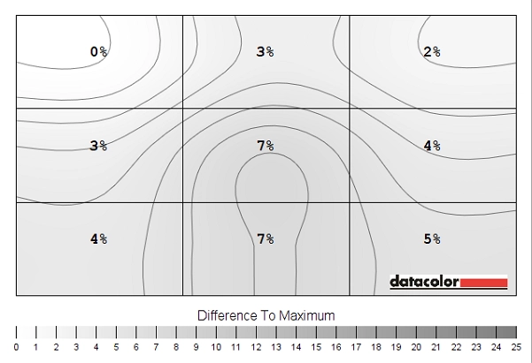
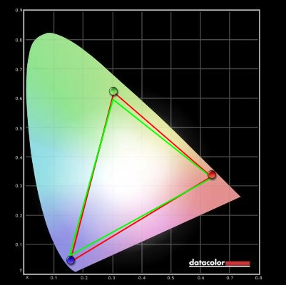
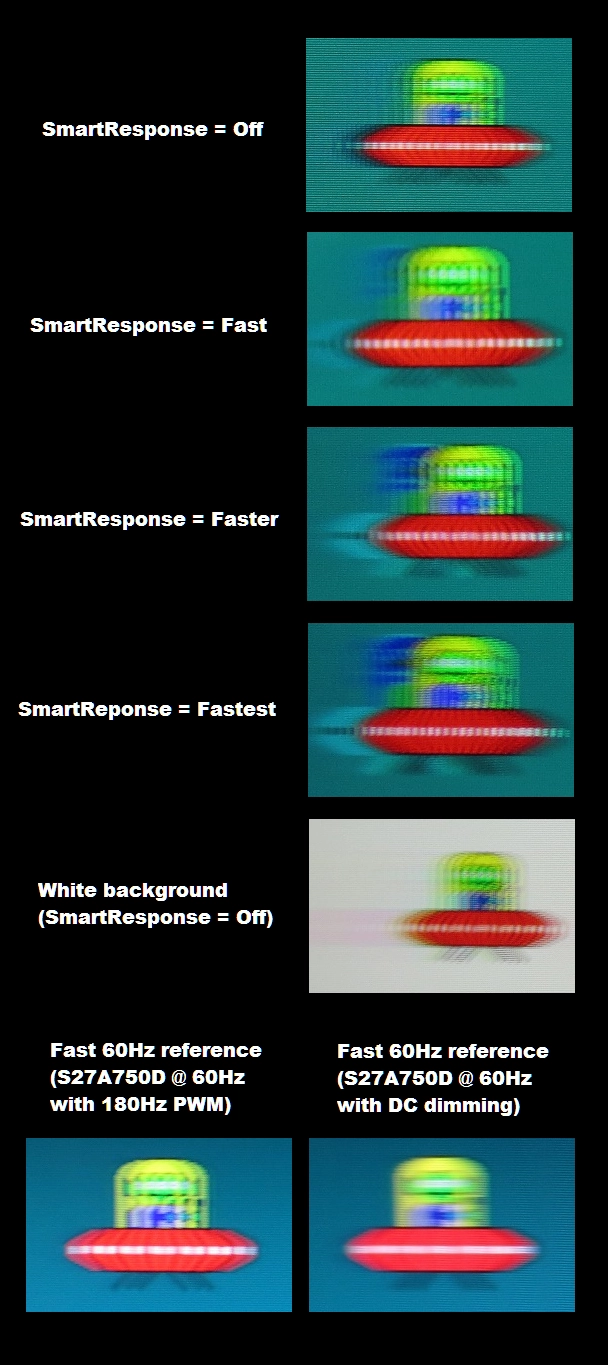
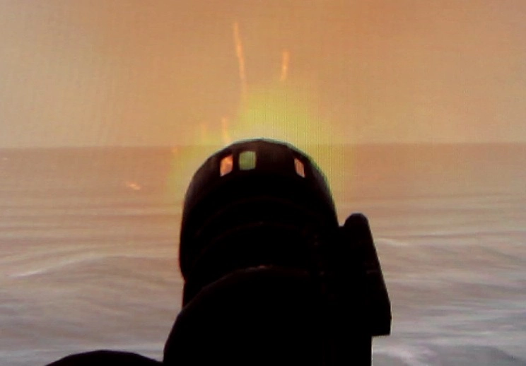
The Datacolor Spyder5ELITE was used to analyse the uniformity of lighter colours. 9 equidistant white quadrants were analysed running from the top left to bottom right of the screen. The tables below show the luminance measured at each quadrant alongside a percentage deviation between a given quadrant and the brightest measured point. The top table shows the results using our test settings, whilst the second table shows the results using ‘SmartImage = SmartUniformity’ (SU). The luminance uniformity was very good using our test settings. The maximum luminance was recorded at ‘quadrant 4’ to the left of centre (178.7.0 cd/m²). The central area (‘quadrant 5’) was recorded at 172 cd/m², which is a mere 4% deviation from this. The greatest deviation from the brightest point was recorded at ‘quadrant 3’ towards the top right of the screen (160.5 cd/m² which is 10% dimmer than ‘quadrant 8’). Elsewhere luminance was between 4% and 9% of the brightest point, which is excellent. Please note that individual units can vary when it comes to uniformity and there can also be deviations beyond the 9 quadrants measured here. Still a good result, nonetheless. Using ‘SmartImage = SmartUniformity’, which is a digital uniformity compensation mode offered by the monitor, the luminance uniformity was improved further. The brightest point on the screen was now ‘quadrant 1’ towards the top left (201.7 cd/m²). Deviation between all other points and this was just 2-7% which is excellent. The contour maps below represent the luminance uniformity graphically, with lighter greys representing lower deviations than darker greys. The first map shows the results under our test settings whereas the second map shows ‘SmartImage = SmartUniformity’. Colour temperature (white point) deviations were also analysed by the Spyder5ELITE, using the same white quadrants. The following contour maps show the deviation between each quadrant and that closest to the 6500K (D65) daylight white point target. Deviations are given DeltaE values, with a DeltaE above 3 considered significant deviation that some users might readily notice by eye. The top graphic shows the results using our test settings and the second with ‘SmartImage = SmartUniformity’. In these maps darker colours represent higher deviation from 6500K than lighter colours (i.e. a higher DeltaE). Under our test settings results are pleasing, with no significant deviations between any quadrant and the point closest to the 6500K target (the central quadrant, ‘quadrant 5’). Using ‘SmartImage = SmartUniformity’ really messed things up here, unfortunately. The point closest to 6500K is now ‘quadrant 3’ at the top right. All but two of the remaining quadrants show significant deviation from this, reaching a peak DeltaE of 5.6 at the bottom right. We could see this deviation using casual observation, as noted in the calibration table. We found the uniformity of our sample pleasing in all respects using our test settings, anyway. The ‘SmartImage = SmartUniformity’ mode is nice to have as an option, but it certainly has several downsides as well. The strong contrast brought great atmosphere to dark scenes in Elder Scrolls Online (ESO). Blacks and other dark shades appeared deep and inky, just a touch lighter in the bottom corners of the screen where the aforementioned ‘VA glow’ can be observed. To reiterate, this was mild and very much a non-issue with this monitor, even in a dark room. This strong contrast helped define the 3D structures of objects nicely as well (distinct shadow and crevice details). There was a degree of ‘black crush’, whereby the darkest shades appeared to blend into black a bit too well in the centre of the screen but were more distinct towards the edges. This was most noticeable inside where shadows engulfed some of the fine details such as the wood grain texture on furniture. The overall level of detail and depth of deep shades still gave such scenes a pleasing look, however. Bright elements such as spell effects and flames stood out superbly well and were also ‘pure’ and smooth thanks to the screen surface. As with ESO the monitor put in a very pleasing contrast performance on Battlefield 4 (BF4). The excellent static contrast helped produce deep and inky-looking dark shades and allowed brighter shades such as lights and explosions to shine through with great vivacity. These bright elements were also very smooth and ‘pure’ thanks to the glossy screen surface. Again there was a bit of ‘black crush’ with some of the darkest shades being a bit indistinct centrally compared to near the edges of the screen, but we felt the overall atmosphere and lack of any IPS glow or suchlike helped create a compelling contrast experience. The contrast performance was excellent on Dirt 3. The darkest shades in the game, such as black, were suitably deep and inky-looking. Even in those bottom corners the black depth was relatively strong. This also helped define elements such as the leaf and branch structures on trees and cracks in rocks, helping breath a bit of extra believability into to racing environments. The level of detail in dark areas was also impressive. Even fairly minor details in dimly lit car interiors were visible, such as carbon fibre and leather textures. The details were a bit more distinct towards the edges of the screen due to the aforementioned gamma behaviour and so-called ‘black-crush’ but still looked respectable in central regions of the screen. Car lights and other bright elements shone through the darkness with a true brilliance and purity that only a glossy monitor with this sort of panel could deliver in LCD form. The strong contrast worked well in the Blu-ray of Skyfall, too. The level of detail in dark the dark areas of various scenes was good, with even some fairly minor details such as creases in clothes visible. The darkest shades (including black) appeared nice and dark whilst bright elements stood out very nicely against them. The night scenes with candles burning in Macau showed this off particularly nicely, as did the night scenes with neon lights in Shanghai. These bright elements had exceptional ‘pop’ to them and really stood out brilliantly. The Lagom tests for contrast allow specific weaknesses in a monitors contrast performance to be identified. The following observations were made. The BDM4065UC features an enhanced phosphor WLED backlight which provides excellent coverage of the sRGB colour space and a bit beyond in some regions. You can see this in the representation of the gamut below, where the red triangle shows the colour gamut of the monitor and the green triangle the sRGB reference. You can see that there is a little bit of under-coverage in some regions and a bit of over-coverage as well but good coverage of sRGB overall. This allows the monitor to produce some fairly vibrant shades without the saturation of wide colour gamuts such as Adobe RGB. The screen delivered a pleasing colour experience on ESO. The environments were lively, with some particularly lush greens of vegetation and quite striking deep purple flowers as well. Due to the gamma behaviour of the VA panel, these did lose some saturation towards the edges and very bottom of the screen. There were also some really nice rich red and orange flames, particularly in more central regions of the screen. The vivid spell effects and roaring flames stood out best in dark areas where they had a very impressive punchy look. The brilliantly vibrant yellows, oranges and reds of flowing lava was exceptionally vibrant as well – perhaps the most vibrant we’ve seen it on this game. BF4 told a similar story to ESO when it came to colour reproduction. Colours were richest (most saturated) centrally, but lost saturation towards the very bottom and sides of the screen. Deep greens of vegetation became a more minty shade and rich earthy browns became a dustier clay-like colour at these extremes. So the colour consistency and subtle shade variety was weaker than you would see on an IPS-type panel, but the saturation loss was not as extreme as you get when comparing the top or central region of a TN panel to the bottom. Overall colours were rich and inviting, with some good strong and lush-looking green plants and very vibrant orange and yellow fires. These fires and various other flashes of brilliance (including the purple and blue flame of the engineer’s blowtorch) had excellent pop in the darkness, standing out very nicely indeed. On Dirt 3 colours appeared rich and vibrant with quite a pleasing shade variety. The same colour consistency issues applied that we observed on our other titles, but for a large portion of the screen (which is really the primary focal zone on this sort of games) things looked stunningly vibrant overall. Greens and golden browns in the environments looked lush, but in a natural rather than oversaturated way. The car paintjobs really stood out as well, with lashings of vibrant colour that looks as if it was painted directly onto the screen. There were some surprisingly rich cherry reds, deep oranges and stunning bright blues and pinks to name but a few stand-out colours. The advertising around the track also stood out in a similar way, with some of the deep blues appearing particularly stunning. From an accuracy standpoint these were actually a bit too vibrant (almost chemically, like copper sulfate) in places, due in large part to the generous colour gamut in this region. But they certainly caught the eye and helped create an engaging colour experience. Colours looked rich and natural on the Blu-ray of Skyfall. Natural environments and skin tones appeared appropriately saturated for the most part, losing a bit of saturation towards the edges and very bottom of the screen but appearing rich overall. There was a nice range of very eye-catching vibrant shades as well. The scenes which we feel show off the vibrancy potential of the monitor off particularly nicely are the Shanghai night scenes. There are some very brilliant and colourful looking neon lights here, with exceptionally deep blues and strong bright cyans displayed. The panel type and screen surface ensured that these elements stood out very nicely and appeared ‘pure’ without unnecessary graininess. To round off this section we observed the colour performance on the Blu-ray of Futurama: Into the Wild Green Yonder. This confirmed a few things that we had observed in our testing on other titles. Firstly, that this monitor is capable of displaying some very vibrant-looking shades. There were some shocking vibrant pinks, electric blues and neon greens which stood out very nicely indeed on this movie. The bright neon-looking colours were particularly appealing where they were surrounded by much darker shades, for example on the scenes set in space. There was also a good variety of more muted pastel shades, which did not appear oversaturated in a way that would detract from their pastel qualities. Our observations regarding colour consistency and specifically weakening saturation towards the edges and bottom of the screen were confirmed on this title, too. Again, performance in this respect was superior to on a TN panel of anything approaching this size but not as strong as on an IPS-type panel. Lagom’s viewing angle tests were used to analyse viewing angle performance and colour consistency in a more specific way. The following observations were made. We measured input lag using a sensitive camera and a small program called SMTT 2.0. We compared the latency of the BDM4065UC to a range of monitors of known latency. Using this method we recorded 21.20ms (over 1 frame) of input lag. Setting ‘SmartImage’ to ‘Game’ does not affect this value. It is influenced both by the element of input lag you feel (signal delay) and also what you see (an element of pixel responsiveness) when using the monitor. This indicates a moderate signal delay that may bother some users but won’t be a problem for others. It’s not something you should worry about unless you know you are sensitive to moderate levels of input lag. Our responsiveness article explores the idea of perceived blur and how it is influenced by the movement of our eyes and not just the pixel response behaviour of the monitor itself. We also explore ‘pursuit photography’ which can accurately represent what the eye sees when viewing motion on a monitor, as influenced by both of these factors. This is an improvement on the usual static photography that can only show the pixel responsiveness without accounting for eye movement. Using the method of pursuit photography explored in the article, just prior to the conclusion, we captured the images below. We used the middle row of the UFO Motion Test for ghosting (medium cyan background) primarily with the test running at 960 pixels per second. The UFO moves across the screen from left to right at a moderate pace, with the camera tracking the movement at an appropriate speed during image capture. The test was also run with a white background for one of the shots, just to demonstrate how pixel responses can vary depending on the shades involved. A range of ‘SmartResponse’ pixel overdrive settings were used on the Philips as noted in the image. A Samsung S27A750D was used, set to 60Hz and using its optimal response time setting, as a reference. The backlight of this model uses PWM at 180Hz when it is set to a brightness below ‘100’ (left reference image) and DC dimming when set to a brightness of ‘100’ (right reference image). The reference images show the motion performance expected of a 60Hz sample and hold LCD where response time is not a limiting factor. The blur shown in the image would be accounted for by eye movement. Where DC dimming is used, this blur is smooth. Where PWM dimming is used the trailing is fragmented. As noted previously the BDM4065UC uses PWM at a cycling frequency of 240Hz at any brightness below ‘100’. That is why all of the images here appear fragmented with a greater number of fragments than the reference screen (4 rather than 3 instances of the UFO per capture). With ‘SmartResponse = Off’ most of the blur captured here would be accounted for by eye movement. There is also a bit of trailing from slower than optimal pixel transitions, shown here as a darker red behind the UFO for example. This is fairly restrained for the medium cyan background, though, and doesn’t represent the sort of smeary trail you would traditionally associate with some of the more sluggish VA pixel transitions that can occur. When the ‘SmartResponse’ setting is enabled this conventional trailing behind the UFO is replaced with a more obvious ‘inky’ inverted trail. This is inverse ghosting (overshoot) as a result of overly aggressive voltage surges, to try to shift the pixels as quickly as possible. The boldness of this inverse ghosting increases as the ‘SmartResponse’ setting is raised to ‘Faster’ and more so when raised again to ‘Fastest’. In practice setting ‘SmartResponse’ to ‘Off’ is clearly optimal as it provides the least obtrusive trailing. Even going one setting up to ‘Fast’ produces some very eye-catching inverse ghosting across a broad range of transitions. This is really rather unsightly, especially compared to what is generally quite faint conventional trailing without the setting enabled. The white background forces the monitor to perform some high-contrast pixel transitions as the UFO moves against it. You can see a fairly pronounced ‘smear’ behind the UFO as a result of some relatively sluggish pixel transitions. This actually occurs on the Philips where a variety of dark shades are set upon a white background. If you have fairly large sized black text on a webpage, for example, and scroll rapidly you will see this sort of smearing effect. The same happens with slightly lighter shades (dark red, dark blue etc.) but the background has to be white. It doesn’t happen if the background is light grey or anything like that. It should also be noted that this occurs regardless of the ‘SmartResponse’ setting, but enabling that also adds inverse ghosting on top which isn’t at all helpful. What is crucially important to note, though, is that we didn’t see this sort of behaviour when gaming. We tested a wide range of game titles (including those detailed in the following section) and fortunately there weren’t instances where these sorts of transitions between dark shades and pure white occurred. We would like to wrap up this section by talking about ‘interlace-pattern artifacts’. These are generally associated with high refresh rate monitors but also occurred on this one. We won’t delve into any real technical details suffice to say that they are linked to imperfections in the voltage control of the monitor during pixel transitions. This is not to be confused with overshoot as the manifestation (i.e. what you see as a result) is very different. These artifacts appear as faint interlace patterns (interleaving) during certain transitions, particularly if moderately rapid motion occurs involving light shades. Spell effects, muzzle flashes and any bright objects moving at speed in games tend to bring out some of the more obvious artifacts. We say ‘obvious’, but really they aren’t something that every user will notice and they don’t tend to catch your eye. We do notice them from time to time but don’t find them bothersome – it just felt it was right to mention them for the sake of completeness. The image below, which is actually a still from a video, shows the interlace pattern of these artifacts on the muzzle flash of a rotating chaingun on Battlefield 4. On BF4 it was quite clear that most of the pixel transitions were occurring quite rapidly. Rapidly enough so that it didn’t feel like you were using a traditional VA panel at all. For most of the pixel transitions it was almost entirely the movement of your eyes rather than the pixel responsiveness that contributed to the observable motion blur. There were some slightly slower pixel transitions which created a little bit of trailing beyond this, in places. Where black mixed in with lighter shades there was a bit of ‘edge bleed trailing’, occuring where very dark shades mixed with certain lighter shades. Rather than the resulting trailing appearing as a blend of the object and background colour it would appear an entirely different colour, such as a very dark red or purple. This was short-lived, only happened during certain transitions and not at all distracting in our view. There was no noticeable overshoot, either, which was really nice to see given how snappy many of the pixel transitions were. We could also observe PWM artifacts in places due to how the backlight is dimmed. This manifested itself as fragmented trailing which was most noticeable when moving in a vehicle and cornering whilst observing fairly straight vertical edges (lamp posts, building edges etc.) This fragmentation actually made driving vehicles even reasonably slowly a bit more dizzying and disorienting than it had to be. Not all users would find this at all bothersome, however. The experience was fairly similar on Dirt 3. That is to say performance was impressive overall, with very few of the hiccups you’d traditionally associate with VA panels. Again there were some PWM artifacts and a small amount of ‘edge bleed’ during a minority of transitions, but these aren’t things that everyone would notice or care about. It was pleasing to see no observable overshoot or obvious ‘smeary’ trails, whilst the monitor made the game very playable within the confines of the 60Hz refresh rate. It was certainly a significant improvement from pretty much every VA model we’ve used, the only exception being the impressive Samsung S34E790C. Responsiveness was also assessed using our Blu-ray movie titles. The monitor did not impose any limitations from sluggish pixel transitions, with the rare exception similar to what we observed on the desktop with white backgrounds. There was a scene in Futurama where playing cards were flicked across the screen. They had a mixture of pure white, black and a few dashes of other dark colours. You could see a sort of afterimage of the dark details appear briefly as the playing cards moved across the screen. Due to the limited framerate at which the films run this wasn’t like the continuous ‘smear’ that we saw on the desktop but was broken up in the way described. It was really the low frame rate that was the key barrier when it came to fluidity of motion in these movies rather than anything that the monitor itself was in control of. There was no observable overshoot, either, which is good. In this article we have explored what the 3840 x 2160 (‘4K’ UHD) resolution brings to the table on a 28” screen. We have also tested a number of other UHD models with screen sizes of 23.8 – 32”, yielding a pixel pitch of 185.12 – 139.87 PPI (Pixels Per Inch). Such pixel densities comfortably exceed the 108.79 PPI offered by 27” 2560 x 1440 (WQHD) models. This brings with it the potential of exceptional detail and clarity in games, movies and images (content-dependent) as well as a great amount of useful desktop real-estate. It also necessitates the use of scaling, for some users, particularly for the smaller UHD models. This is not handled well by all applications as explored in the article and it’s therefore nice to have a pixel pitch which many users would find comfortable using without scaling. The Philips BDM4065UC spreads out its 3840 x 2160 pixels over a 39.56” area, yielding a pixel pitch of 111.36 PPI. This is quite close to the pixel density of a 2560 x 1440 model and means that many users will be able to comfortably run their favourite desktop applications without scaling. The first image below is taken from earlier in the review, giving you an idea of the size of desktop icons and other such elements on the desktop. The second image shows a Microsoft Word document open alongside a website on Google Chrome, showing off the immense amount of real-estate you get with this resolution. This pixel pitch also brings with it a nice level of detail in games, although not at the same level as the tighter pixel pitches offered by smaller models with the same resolution. You don’t get the same sort of clarity whilst looking into the distance on games, nor the same definition on textures as explored in our article. But you certainly gain an improvement in both respects compared to on models with lower pixel densities, such as a 27” (or even 24”) Full HD models. The physical size of the screen really does make for an immensely engrossing gaming experience, filling up your field of vision both vertically and horizontally very nicely and making good use of your peripheral vision from a ‘normal viewing distance’ (<90cm). Furthermore, seeing the sort of texture detail and clarity brought about by a 27” WQHD model but spread across a glossy ~40” screen surface is quite something. It takes a bit of time to get used to the sheer size of the screen and how ‘spread out’ your content appears on the desktop, but we found we adjusted to this quite readily after several days of using the monitor. The images below are simply there to set the scene in some of the game titles we tested on the monitor. They obviously won’t give an accurate representation of what the monitor looks like first-hand. We also tested some ‘4K’ UHD movie content. This sort of content is rather thin on the ground for PC users at the moment, but since this is also a TV resolution standard (like Full HD) this sort of content will undoubtedly become more widespread in the future. ‘Intermediate’ resolutions such as 2560 x 1440 never made their way to TVs and naturally the movie content wasn’t there to show that resolution off. The screenshot below is from a YouTube video of Costa Rica. Again it is just there to set the scene. The level of detail on this movie far exceeded what you would see from a Blu-ray on a screen of anywhere near this size. The sloth’s fur here, for example, had a defined look that was truly excellent when viewed first hand. Again this wasn’t quite the same as viewing such content on a smaller UHD monitor, but was still impressive. The monitor has a native resolution of 3840 x 2160 pixels, also known as UHD (Ultra High Definition) ‘4K’. The monitor looks best at this resolution, but of course some devices you might like to connect to it may not support this resolution – or you may not have the GPU horsepower to run all of your games at this resolution. If you decide to use a non-native resolution, then depending on the resolution there are various settings available to you in the ‘Picture – Picture Format’ section of the OSD. At 1920 x 1080 (Full HD) the useful settings available to you include either ‘Wide Screen’ or ‘1:1’. At some resolutions, such as 2560 x 1440 (WQHD) the 1:1 pixel mapping function does not work through the OSD when using GPU driver defaults. You can enforce it through the GPU driver itself if you need to, however. The following section of the OSD video, which featured earlier in the review, takes a look at these options. When using the ‘Wide Screen’ option and running the monitor at a non-native resolution, an interpolation process is used to ensure all 3840 x 2160 pixels of the monitor are used. Considering the 1920 x 1080 (Full HD) resolution, there is a moderate degree of softening which goes beyond what you would see when running the resolution natively on a screen of similar size. Text has a sort of fringed and soft verging on blurry appearance in places, irrespective of the ‘ClearType’ settings you use in Windows. In games the edges become soft and textures look less defined than they should. Things don’t look as soft as we’ve seen from some interpolation processes used on monitors, but things aren’t handled as well as they could be either. Running the 2560 x 1440 (WQHD) resolution is also less than ideal, although the softening seems a bit less extreme. Obviously the resolution itself is higher and this could go a large way in accounting for this difference – and indeed we didn’t have the luxury of a native WQHD display of this size running alongside for comparison as they don’t exist. We feel that this would be a reasonable resolution to ‘drop down’ to if your system can’t handle the 3840 x 2160 resolution in certain games, despite it still being less than ideal. If you keep the monitor running at its native resolution but display content that is lower resolution (for example playing a 1080p Blu-ray using PC movie software) then upscaling is used rather than interpolation. This is handled by the software itself or the GPU, not the monitor. Things look just marginally softer than when displaying such content on a similarly sized screen with a native Full HD resolution. This really is rather subtle and not something worth worrying about. As we explored in the previous section, native UHD content is very rewarding to watch on this model and certainly something to look forward to in the future as it becomes more widespread. The Philips BDM4065UC is a big, bold and brash screen. A true beast of a monitor that took a bit of getting used to, but that provided a pleasing experience once this ‘adjustment’ process was complete. Its large size is complimented by a 3840 x 2160 (‘4K’ UHD) resolution, which provided a massive amount of screen real-estate. Unlike smaller sized UHD screens you didn’t get quite the same level of intricate detail on games, but you do still get a pleasing level of detail in-line with 27” 2560 x 1440 (WQHD) models. Most users won’t have to worry about scaling, either, due to the less insane pixel density offered here. We found the large screen size provided a very immersive experience when gaming or watching films and really enjoyed having such a huge amount of useful space on the desktop – without feeling the urge to apply any sort of scaling. The image was also quite ‘loud’. The glossy VA panel delivered a very nice ‘clean’ (non-grainy) image with excellent vibrant ‘pop’ in places and good inky-looking dark colours. There were some really impressive vivid shades, particularly where bright shades were cast upon a darker background. Dark scenes had excellent atmosphere, too, without any disruptive glow or pale-looking dark colours. As is usual for this panel type there were some issues with the gamma behaviour. From a normal viewing position there was a degree of ‘black crush’, which drowned out some of the minor details; closely matching dark shades are displayed quite indistinctly. There was also a moderate saturation loss for many shades towards the side edges and bottom of the screen which contrasted with the consistent richness you could expect from an IPS-type panel. In spite of these issues, we felt the monitor provided a rich and engaging visual experience overall with good atmosphere and a good vivid quality to many shades. Responsiveness is often a major drawback of Vertical Alignment panels and monitors which use them, but in this case things were largely impressive. There were some niggles here and there, including some slow transitions between white some dark shades and white as well as some ‘interlace-pattern’ and PWM artifacts. But overall the monitor provided snappy pixel transitions that provided pleasing responsiveness within the confines of its 60Hz refresh rate. In fact when gaming, for the most part, it was very ‘un-VA-like’ in how it handled a very broad range of transitions. You didn’t have to contend with smeary trails nor overshoot and could just focus on enjoying the gameplay instead. The input lag of the screen was moderate but for many perfectly acceptable. Like many things with this monitor it’s not something that most users will find problematic. We would wager that the positive aspects of this screen are far more likely to outweigh the negatives for most users. The bottom line; you get a lot of monitor for your money.
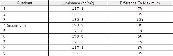
Luminance uniformity table (test settings)
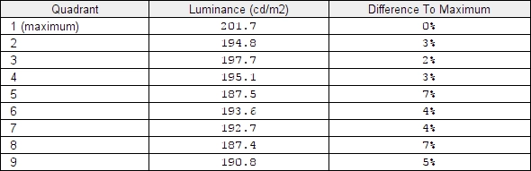
Luminance uniformity table (SU)
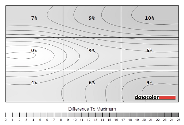
Luminance uniformity map (test settings)
Luminance uniformity map (SU)
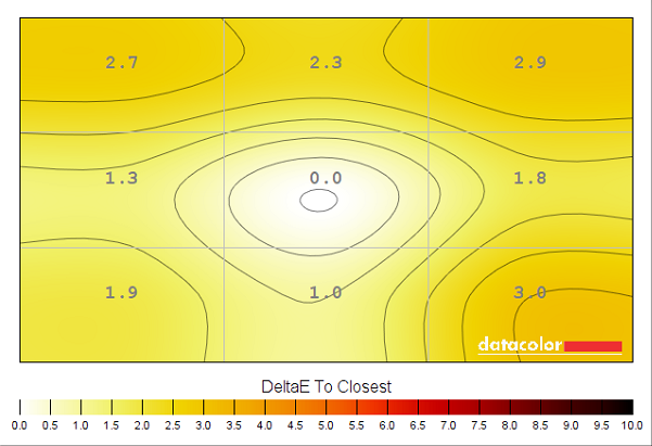
Colour temperature uniformity (test settings)
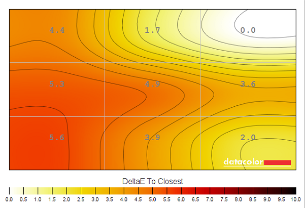
Colour temperature uniformity (SU)
Contrast in games and movies
Lagom contrast tests
Colour reproduction
Colour gamut
Colour gamut 'User Color'
Colour in games and movies
Viewing angles
Responsiveness
Input lag
Perceived blur (pursuit photography)
Perceived blur with various settings
Some 'interlace-pattern' artifacts
Responsiveness in games and movies
The ‘4K’ UHD experience and thoughts on the 40″ screen
![]()


Interpolation and upscaling
Conclusion
Positives Negatives The glossy VA panel delivered some stunningly vivid colours with rich and accurate representation on the whole – with comprehensive sRGB coverage but no support for extended colour spaces
It took a bit of fiddling with settings as the factory defaults were quite off. The glossy screen also requires some extra care is taken with lighting conditions and there are the usual VA gamma shifts which affect colour saturation
Outstanding contrast performance with excellent deep and inky dark shades and bright and pure light shades The backlight uses PWM (is not flicker-free) and there is some ‘black crush’ due to the gamma behaviour of the panel Good pixel responsiveness overall delivered one of the best gaming experience we’ve had from a VA panel without the widespread ‘smeary’ trails in games
Some pixel transitions are slightly slower than optimal, but the most problematic transitions tend to be rare when gaming. A moderate degree of input lag may put some people off
The 3840 x 2160 (‘4K’ UHD) resolution brought excellent desktop real-estate without necessitating scaling and provided good detail to games and supported movie content
Not the same ‘wow factor’ with the level of detail in games and ‘4K’ movies compared to smaller UHD models. No ergonomic freedom with the supported stand and fairly limited retail availability
