Author: Adam Simmons
Date published: April 15th 2016
Table of Contents
Introduction
Recent innovations in LED backlighting have allowed manufacturers to their ageing WCG-CCFL solutions with more efficient LED alternatives. Whilst the colour gamut performance and relative energy efficiency of GB-LED and RB-LED solutions is good, there is considerable additional cost involved in the backlight unit itself. This translates into a fragmented monitor market, where anybody requiring a new model with wide colour gamut will have to pay quite a premium for the privilege. The Philips 276E6ADSS uses a more affordable alternative, using the traditional blue diodes but replacing the usual phosphor with a rail of Quantum Dots. This is QD Vision’s ‘Color IQ’ technology, something that is explored in the article linked to above. We put the monitor through its paces in our usual ‘real-world’ testing regime with a keen interest on whether these Quantum Dots can deliver what’s promised.
Specifications
The monitor uses a 27” BOE IPS-ADS (IPS-type) panel with 1920 x 1080 resolution, 60Hz refresh rate and the aforementioned Color IQ solution. 8-bit colour is supported through use of 6-bit + FRC dithering. The specified response time is 5ms, a figure which you should approach with caution. Some of the key ‘talking points’ for the monitor have been highlighted in blue below.
Features and aesthetics
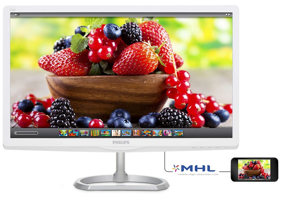
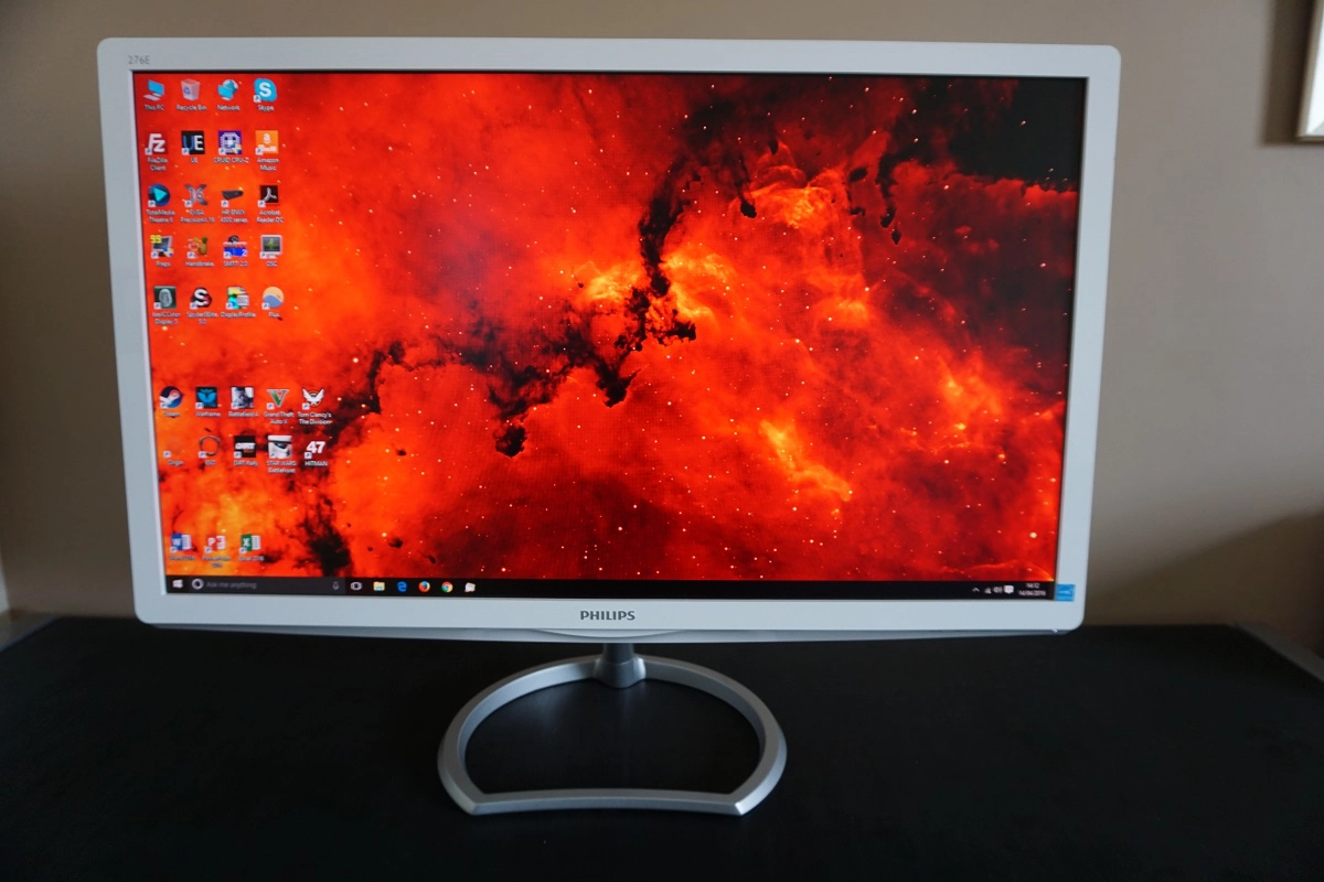
From the front the most striking aspect of the monitor is undoubtedly the fact that it has a white bezel colour, far less common than darker alternatives these days. White glossy plastic is used here, with the bezels moderately thick at ~20mm (0.79 inches). The bottom bezel also has a bit of a lip to it at the bottom, most prominent centrally, taking it to ~31mm (1.22 inches) total maximum thickness. The stand base is a ring of metal, which is itself quite solid. The screen attaches by a fairly slender neck, which means the screen itself is slightly wobbly in the stand. Although not alarmingly so, just compared to models with a sturdier rear-central VESA style attachment. The screen surface is medium matte anti-glare as explored later.
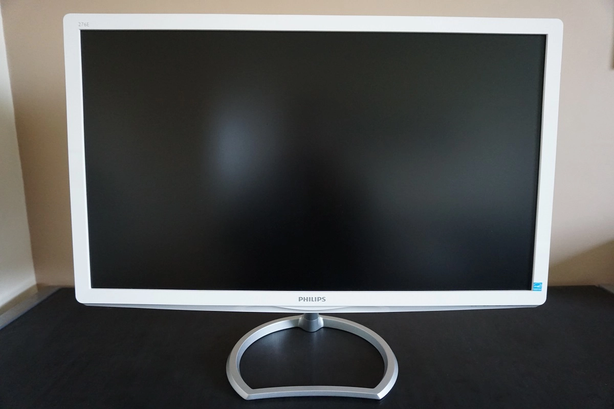
The OSD (On Screen Display) are somewhat awkwardly located on the aforementioned lip at the bottom of the screen, towards the right hand side. They are touch-sensitive and face down and forwards towards the desk, with a diagonal slant. It is actually not possible to see the button labels from a normal viewing position, unless you have your head unusually close to the desk (in which case you should be reconsidering your chair and/or desk height). The buttons themselves also seem overly sensitive at times, making accidental presses fairly common. The one redeeming feature here is the power LED, which is a little unobtrusive white pin-prick style thing which also faces downwards. This glows white if the monitor is on and flashes white if the monitor ceases receiving a signal from the computer.
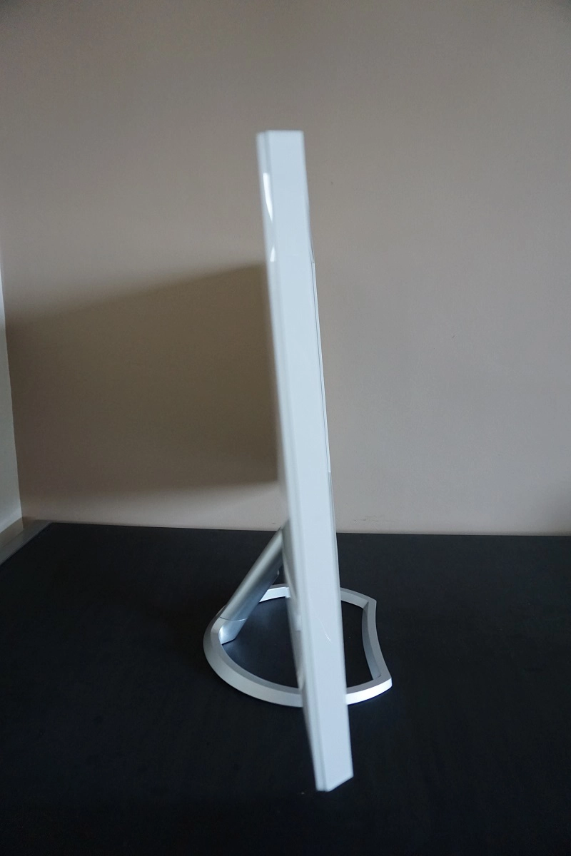
From the side the monitor is quite slender; ~22mm (0.87 inches) at thinnest point with a little bit more bulk towards the centre. The total depth of the monitor including stand base is ~209mm (8.23 inches). The bottom of the screen sits approximately 90mm (3.54 inches) above the desk surface whilst the top of the screen surface sits ~480mm (18.90 inches) above the desk. The stand offers tilt (5° forwards, 20° backwards) as the only ergonomic flexibility.
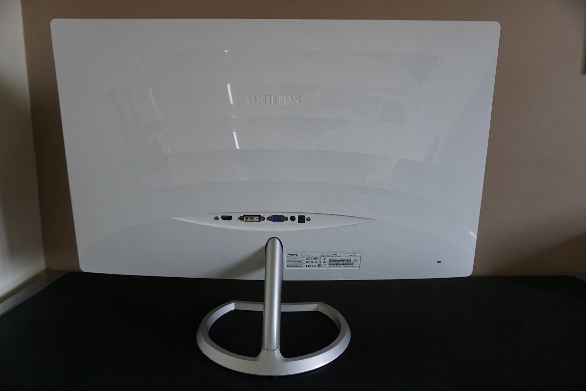
The rear of the monitor uses glossy white plastic with a rippled effect. The ports are backwards-facing and include; HDMI (with MHL), DVI-D, VGA, 3.5mm audio output and a DC power input (external power brick). The included stand attaches towards the bottom of the monitor in a way that is not designed to be easily removed. And due to the absence of VESA holes, there would be little reason to do so. There is also a K-Slot towards the bottom right. The appropriate power adaptor and cabling is included in the box, but the display cables included vary by region.
Calibration
Subpixel layout and screen surface
The monitor uses a medium matte anti-glare screen surface. This gives the monitor strong glare-handling characteristics whilst impeding the clarity and vibrancy potential somewhat compared to ‘lighter’ screen surfaces. The screen surface itself is thankfully relatively smooth, so the image does not have a noticeably grainy appearance. And as we explore, the monitor displays colours with more than enough ‘vibrancy’ as it is.
![]()
The subpixel layout is the standard RGB (Red, Green and Blue) stripe. This is the default expected by modern operating systems such as Microsoft Windows and MacOS. Windows users needn’t worry about adjusting ClearType (although may wish to fine-tune according to preferences) whilst Mac users needn’t worry about text fringing issues.
Correcting the colour signal
As this article explores, Nvidia GPUs use the incorrect ‘Limited Range RGB 16-235’ signal by default if a Full HD monitor is connected via HDMI (and sometimes DisplayPort). AMD GPUs will also use a sub-optimal signal for Full HD monitors connected via HDMI. As the article explains this can easily be corrected for both AMD and Nvidia users. On our Nvidia GTX 980 Ti the colours looked fuller and dark shades a fair bit deeper following correction of the colour signal.
Testing the presets
The monitor has three ‘SmartImage Lite’ presets; ‘Standard’, ‘Internet’ and ‘Game’. A range of other options are also available to tweak in the OSD, including a range of ‘Gamma’ settings and various ‘Color’ settings. We will briefly touch upon the ‘SmartImage Lite’ presets now as we don’t intend to fully analyse them in the table. The ‘Standard’ setting is just that – the factory default setting. The ‘Internet’ mode provides a warmer and marginally dimmer look to the image, by default, than ‘Standard’ and also applies slightly excessive sharpness and a bit of additional oversaturation. The ‘Game’ mode shares this slightly excessive sharpness and combines it with extreme oversaturation – a monitor of this gamut does not need help in that respect. But this isn’t the sort of oversaturation that extending the gamut provides, it’s the sort where everything is pulled closer to the edge of the gamut. As a result, shade range is diminished considerably and the image looks completely unnatural.
The table below shows various other settings (which we deem more useful/interesting), with key readings (gamma and white point) taken using a Datacolor Spyder5ELITE colorimeter and observations made by eye. The monitor was left in its ‘Plug and Play’ state, connected to a Windows 10 system with an Nvidia GTX 980 Ti GPU. The monitor was connected by HDMI with colour signal corrected as above, but observations over DVI and indeed on an AMD GPU were similar. Assume that any setting not mentioned below was left at default.
| Monitor Settings | Gamma (central average) | White point (kelvins) | Notes |
| Gamma = 1.8 | 1.9 | 7363K | Very bright with a cool tint and quite a flooded look overall. Some very strongly saturated shades stand out amongst the generally washed out appearance of the image, overall, and an obvious ‘cool green’ tint (i.e. green and blue channel too strong relative to red). In amongst the otherwise washed out image. |
| Gamma = 2.0 | 2.1 | 7351K | As above with an improvement to depth. Definite oversaturation (of sRGB content) and a richer look overall. |
| Gamma = 2.2 (Factory Defaults) | 2.3 | 7555K | As above but superior depth and richness. Also a bit cooler (the other gamma modes force ‘Color Temperature 6500K’ to be used whereas these factory defaults use ‘Adobe RGB’). There is obvious oversaturation of many shades for non-colour-managed applications designed for ~sRGB output. |
| Gamma = 2.4 | 2.5 | 7338K | As above but even more depth – too much in many respects. Strong saturation is evident throughout the image when viewing ‘sRGB’ content. |
| Gamma = 2.6 | 2.7 | 7325K | As above but far too much depth and extreme saturation. Quite stunning to look at in some respects, but far from a natural or accurate colour representation. |
| Color Temperature = 6500K | 2.3 | 7334K | This misses the ‘6500K’ target by some margin – it is obvious by eye that the image is too cool. Disappointingly there is no ‘5000K’ setting for colour temperature and no alternative that would equate to a Low Blue Light (LBL) setting, either. |
| Color = sRGB | 2.3 | 7549K | This setting is identical to the factory defaults (Adobe RGB), with no effect on saturation levels or colour gamut. This setting therefore seems redundant, possibly a setting that has been included simply as it is there on some other Philips models. |
| Color = User Define | 2.3 | 7546K | As per factory defaults, with minor changes to gamma handling. |
| Test Settings (see below) | 2.2 | 6468K | The brightness is much lower and therefore much more comfortable and the white point is more appropriate for daytime viewing. Very strong saturation levels remain, though. This is very different to oversaturation you can achieve by using a ‘saturation’ slider (Nvidia Digital Vibrance or a similar setting on the monitor OSD) as we explore later, but still affects the accuracy of content designed with the sRGB colour space in mind. |
| Relaxing evening viewing (see below) | 2.2 | 4283K | This is the equivalent of a Low Blue Light (LBL) setting. The blue colour channel is reduced significantly and therefore blue light output from the monitor is also cut. The image remains strongly saturated but appears much warmer and generally more relaxing to the eyes. It cuts out a lot of stimulating blue light, at least. |
Out of the box the 276E6ADSS looks very bright with strong saturation. The brightness is easy to correct, whereas the saturation levels or not. Despite offering an ‘sRGB’ setting, this seems to serve no function whatsoever as it leaves things looking exactly as they do in the default ‘Adobe RGB’ setting. There are no settings on the monitor which will restrict the broad colour gamut (more on that later), so you’re left with strong saturation (and oversaturation of sRGB content) whether you want it or not. The white point was also way off with an obvious cool tint. Better news about the gamma handling, though, which was actually rather close to the desired ‘2.2 curve’. The graph below was taken under our ‘Test Settings’, which provided even closer tracking to the ‘2.2 curve’ with just a little bit of slack in places.
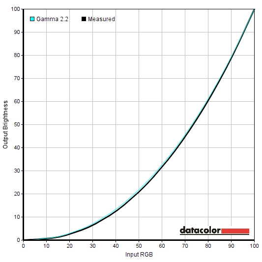
Gamma test settings
The gamma was not as reported in the OSD for any of the ‘Gamma’ settings on the monitor, but there was at least the flexibility to change the gamma so it is slightly or significantly higher or lower than the factory defaults. It’s also worth noting that there is no Low Blue Light (LBL) setting or anything similar, which is a bit disappointing given that a ‘5000K’ colour temperature (LBL) setting is usually included on Philips models. We therefore made some manual adjustments to form such a setting, as we’ll come onto shortly.
Test Settings
Our ‘Test Settings’ involved a significant decrease in brightness and significant changes to the colour temperature, to help overcome obvious imbalances from the factory. Be aware of inter-unit variation, which means that these settings should be considered suggestions and won’t necessarily be optimal for all units. Assume any setting not mentioned below was left at default, the only exception being correcting the colour signal in the graphics driver as detailed previously. We’ve also included the ‘SmartResponse’ setting used in the review, just for reference.
SmartResponse= Off Color= User Define R= 100 G= 83 B= 83
Brightness= 40 (according to preferences and lighting)
Relaxing evening viewing
As noted previously there is no Low Blue (LBL) setting or anything that would constitute one. That is, aside from manually adjusting the colour channels as we have done below. For the sake of simplicity, we kept things as in the ‘Test Settings’, but reduced the blue colour channel significantly. These are just a suggestion; your own adjustments can of course be made. We used these settings for our own viewing pleasure later in the evening but not for any of our testing.
Brightness= 40 (according to preferences and lighting) SmartResponse= Off Color= User Define R= 100 G= 83 B= 23
Contrast and brightness
Contrast ratios
We used a BasICColor SQUID 3 (X-Rite i1 Display Pro) to measure the white luminance and black luminance of the monitor using a range of settings. From these values, static contrast ratios were calculated. Our old Konica Minolta CS-200 hardware was on loan to us and is now required elsewhere, so we are discontinuing use of this. We also took readings on the CS-200 for the sake of comparison and can confirm that values recorded with both devices were very similar. The table below shows this data, where blue highlights indicating the results of our ‘Test Settings’ and ‘Relaxing evening settings’. Black highlights, meanwhile, indicate the highest white luminance, lowest black luminance and peak contrast ratio recorded. Assume any settings not mentioned in the table were left at default, with the exceptions noted in the calibration section.
| Monitor Settings | White luminance (cd/m²) | Black luminance (cd/m²)) | Contrast ratio (x:1) |
| 100% brightness | 358 | 0.40 | 895 |
| 80% brightness | 303 | 0.34 | 892 |
| 60% brightness | 249 | 0.28 | 889 |
| 40% brightness | 194 | 0.22 | 883 |
| 20% brightness | 138 | 0.15 | 922 |
| 0% brightness | 82 | 0.09 | 906 |
| Factory defaults (90% brightness) | 332 | 0.37 | 898 |
| Gamma = 1.8 | 307 | 0.37 | 831 |
| Gamma = 2.0 | 304 | 0.37 | 821 |
| Gamma = 2.4 | 299 | 0.37 | 807 |
| Gamma = 2.6 | 295 | 0.37 | 798 |
| Color Temperature = 6500K | 300 | 0.37 | 812 |
| Color = sRGB | 332 | 0.37 | 812 |
| Color = User Define | 335 | 0.37 | 905 |
| Test Settings | 168 | 0.21 | 799 |
| Relaxing evening viewing | 159 | 0.21 | 759 |
With brightness only adjusted, the static contrast of the 276E6ADSS averaged 898:1, which is fair but somewhat lower than we’ve seen on many recent IPS-type models. Under our ‘Test Settings’ this dropped to 799:1, due to the fairly extensive adjustments made to the colour channels. For our ‘Relaxing evening viewing’ settings, the contrast ratio dropped further to 759:1. The maximum luminance recorded on this table was 358 cd/m², whilst the minimum was 82 cd/m². This gives a 276 cd/m² luminance adjustment range, which is good – although the minimum is slightly higher than we’ve seen on some models we’ve tested recently.
There is a Dynamic Contrast feature called ‘SmartContrast’ which can be activated without locking out other settings adjustments aside from brightness. The brightness setting is not greyed out, but any adjustments are simply overridden when the image changes on the screen and ‘SmartContrast’ does its thing. The brightness tended to be uncomfortably bright even during mixed content, but did dim quite effectively for predominantly darker content. We don’t like this sort of setting at the best of times, but it’s there if you want to use it.
PWM (Pulse Width Modulation)
The Philips 276E6ADSS uses PWM (Pulse Width Modulation) if the brightness is set at all below ‘100’. The cycling frequency is 4 times the vertical refresh rate, so if the monitor is running at the default 60Hz then the cycling frequency is 240Hz. If you were to set the monitor to 80Hz (as we look at later), for example, then the cycling frequency is 320Hz. The monitor is therefore not flicker-free, which can mean that some users will experience increased eye fatigue or visual discomfort as a result of the PWM usage. PWM artifacts are also present during motion, as we explore in the responsiveness section.
Luminance uniformity
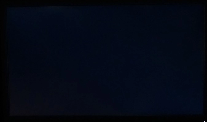
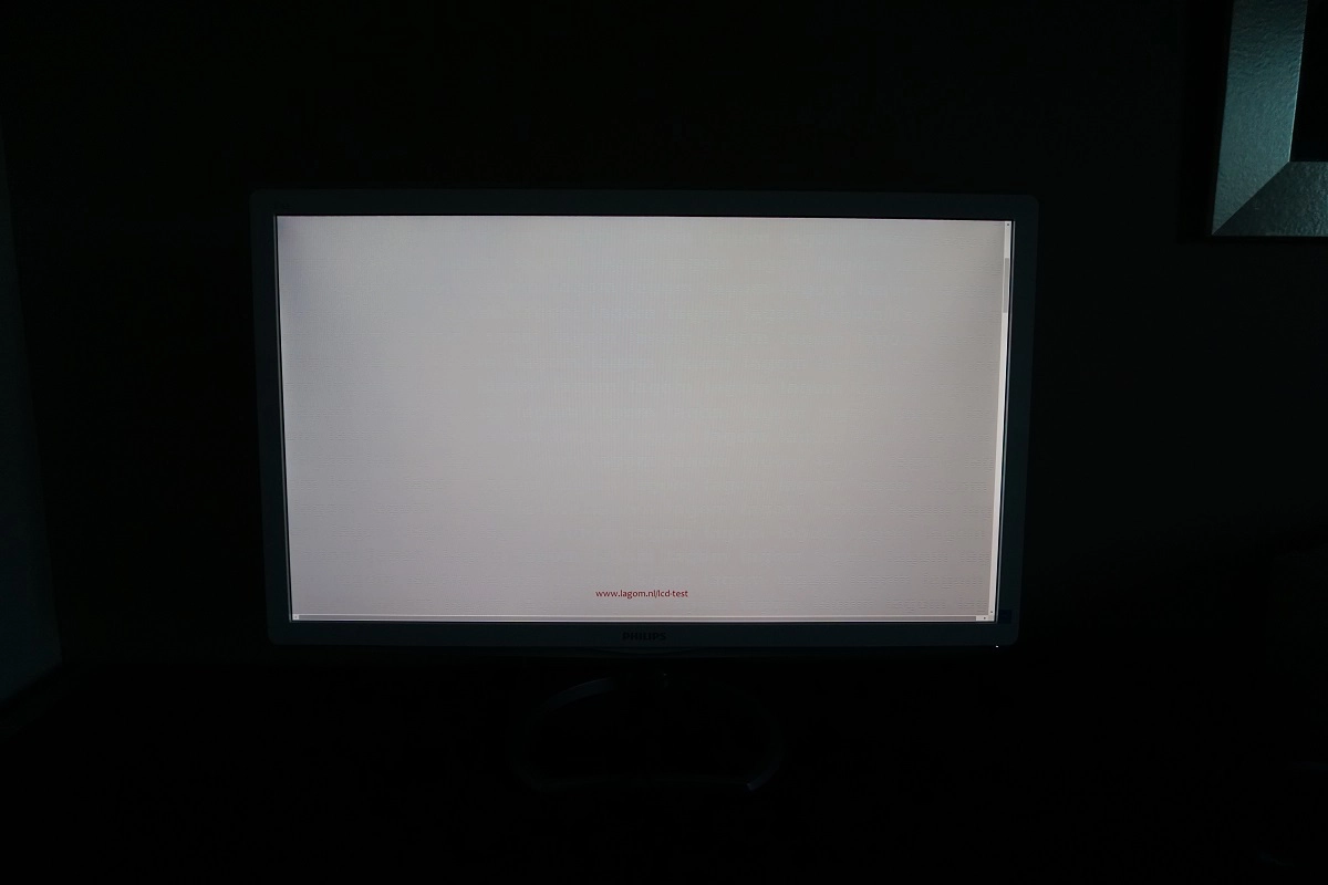
Observing a black screen in a dark room, using our test settings, revealed minor backlight bleed. This is shown in the image below. Note that the image was taken centrally a few metres back from the monitor to eliminate ‘IPS glow’. This effect, not shown in the image, manifests itself from a normal viewing position as a silver or golden glow – with the hue depending on where on the screen you’re observing. It’s particularly prominent towards the bottom corners of the screen from a normal viewing position and ‘blooms out’ if viewing position is changed. This is illustrated in a video later on in the review.
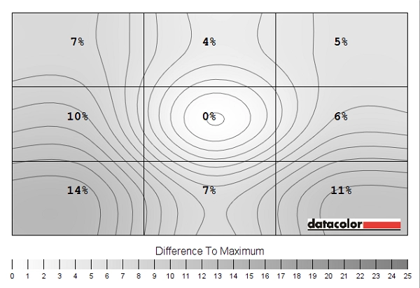
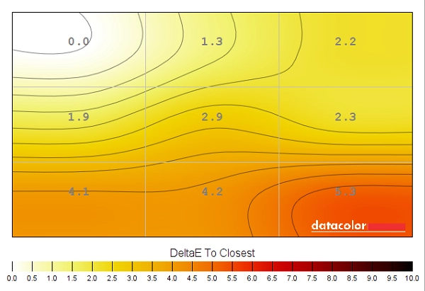
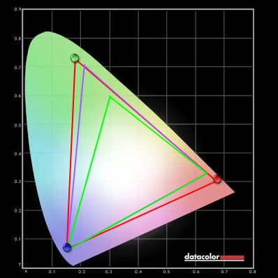
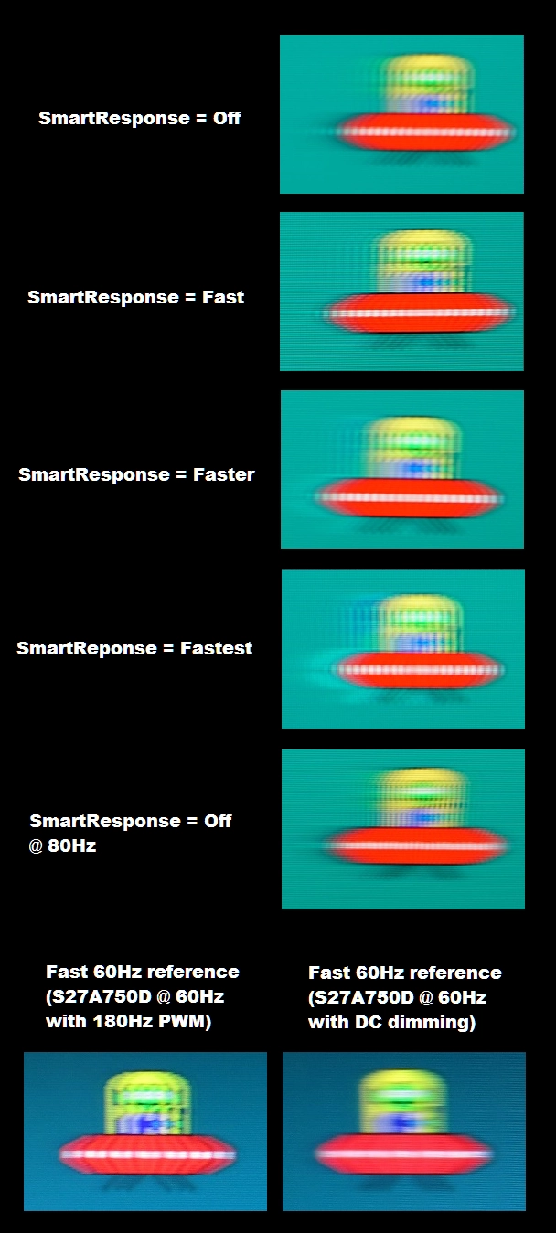
The Spyder5ELITE was used to assess the uniformity of lighter colours, represented by 9 equidistant white quadrants running from the top left to bottom right of the screen. The table below shows the white luminance recorded at each quadrant alongside the percentage deviation between a given quadrant and the brightest point recorded. The luminance uniformity was reasonable. The brightest point recorded was ‘quadrant 5’, the central region (157.9 cd/m²). The greatest deviation from this occurred at ‘quadrant 7’, towards the bottom left of the screen (136.3 cd/m², which is 14% dimmer). The average uniformity deviation between each quadrant and the brightest point was 8%, which is quite respectable. It’s important to remember that uniformity can vary between individual units and that there may be deviation beyond the points measured. The contour map below provides a graphical representation of these deviations, with darker greys representing lower luminance (greater deviation from the brightest point) than lighter greys. The percentage deviation between each quadrant and the brightest point is also given. The Spyder5ELITE was also used to analyse variation in the colour temperature (white point) for these same 9 quadrants. The deviation between each quadrant and the 6500K (D65) daylight white point target was analysed. Deviation here is given a DeltaE value, with a higher value indicating greater deviation from the 6500K target. A DeltaE >3 represents significant deviation that most users would readily notice by eye. Darker shades on the contour map represent higher deviation from 6500K than lighter shades. The colour temperature uniformity was quite variable, with significant deviation towards the bottom of the screen (up to a maximum of DeltaE 5.3 at the bottom right). This is actually one of the highest deviations we’ve come across – it was obvious at a casual glance that the screen was warmer in this region than areas further up and to the left in particular. Recorded deviations towards the centre of the screen and further up were not significant. As with all aspects of uniformity, individual units can vary and there may be further variation beyond the measured points. On Star Wars Battlefront the contrast performance was decent. ‘IPS glow’ caused a degree of detail loss towards the peripheral sections of the screen, particularly the bottom corners from a normal viewing position. This provided a bit of a ‘flooded’ look here, sapping dark scenes of some atmosphere. Elsewhere on the screen respectable detail levels were maintained, with brighter colours such as light sources contrasting nicely with darker surroundings. The screen surface did not impart obvious graininess either, with such elements appearing relatively smooth. Dirt Rally told a similar story, with ‘IPS glow’ eating away at some of the peripheral detail but respectable detail levels for dark or shaded sections of the game elsewhere. Brighter elements such as the lights from other vehicles, lamps and fireworks lighting up the night sky contrasted quite well. Obviously the contrast ratio of the monitor limited the depth of black and how deep near-black colours looked, but in this respect it was much as we’d expect from an IPS-type panel. The screen surface gave a relatively smooth look to these brighter shades, too. Lagom’s tests for contrast were used to more highlight specific weaknesses in contrast performance which may not become obvious during other testing. The following observations were made. A key feature of the 276E6ADSS is its use of quantum dots for the backlight, yielding a much wider colour gamut than standard WLED solutions would provide. The image below shows the colour gamut of the monitor (red triangle) under our Test Settings, compared to the sRGB reference (green triangle) and Adobe RGB reference (purple triangle). Note that the Adobe RGB space overlaps the sRGB space between the red and blue corners of this diagram. As you can see, the colour gamut of the monitor is very wide indeed. It comprehensively covers both the sRGB and Adobe RGB spaces. There is just a smidge of Adobe RGB undercoverage towards the green corner, with 99% Adobe RGB coverage. There is also a fair bit of extension beyond Adobe RGB in the green and red region of the diagram and huge extension beyond sRGB. Although there are ‘sRGB’ and ‘Adobe RGB’ settings on the monitor, they have no effect on the colour gamut – in other words, the monitor lacks any sort of emulation mode and therefore the colour gamut remains more or less as it is here. As noted in this article, specifically in the ‘Making use of those extra colours’ section just before the conclusion, this has potentially undesirable effects on much of the content currently available to consumers. Content such as games and movies is usually designed, at present, with the sRGB colour space in mind. Because this is all most devices are capable of displaying (more or less), this is a limitation that content designers will usually have to work with – even if they want to use broader colour gamuts. The monitor therefore maps this content (sRGB colours) onto its much wider colour gamut, pulling them out further and making them appear far more saturated than is intended. This is not the same as simply increasing saturation digitally (i.e. using ‘Digital Vibrance’ or a ‘Saturation’ setting), as this simply pulls shades closer to the edge of the gamut without widening the gamut itself. Here, the gamut itself is extended and shades maintain good relative distance from each other on the gamut. This means that the distinction between shades is maintained, whilst some shades are more saturated than a standard gamut monitor could physically output regardless of saturation settings. It’s fair to say that some users actually like this extra saturation, but others don’t (to put it lightly). We take a subjective look at the sort of effect it has on a range of game and movie titles in the following section. Star Wars Battlefront had a heavily saturated look. Fire, be it through roaring flames or explosions in the game, had an extremely intense red tint. This looked very vibrant, but drowned out the paler oranges (which themselves appeared too deep). Lava also appeared bright red rather than a more subdued orange-red colour. The reds also overpowered other aspects of the natural environment at times, for example mild red hues mixed into rich brown earth or tree bark stood out with too much intensity. This gave an unintended and rather obvious red hue. The green colours of the forested environments were also expressed in a largely oversaturated way. Some of the dark greens looked suitably lush and vivid, whereas some of the lighter greens appeared almost painted on due to oversaturation and not as subtle as they should look. Another interesting observation was when observing the snow-covered landscape of Hoth during twilight. In reality such lighting gives a slightly cool (mildly icy blue) appearance to the snow, which was intended in the game. The Philips displayed this with too much blue, appearing some way between snow at twilight and a tropical sea in good light. But it isn’t all bad news – the extra vibrancy is something that some gamers actually like, whether colours are displayed accurately or not. The neon greens and eye-piercing reds of blaster fire and the lightsabers seemed quite appropriate and was extremely striking, for example. Colours on Dirt Rally were again strikingly vibrant, due to strong saturation. The same issues with the natural environments cropped up, for example earthy browns appearing to have too much of a red cast rather and lighter greens appearing too ‘loud and proud’. There were some very nice lush-looking deep greens, though, and although not accurately represented in many cases there were some very striking shades used for the car liveries. Electric blues, highlighter yellows, bright cherry reds and almost chemical-looking dark blues were just some shades that really stood out in an unmistakably vivid way. As noted earlier some of these shades are far more saturated than a standard gamut monitor could produce regardless of the saturation settings – and shades are not ‘crushed’ and are still suitably varied even if displayed in a far more saturated way than intended. We also tested the Blu-ray of Futurama: Into the Wild Green Yonder. This again had a highly saturated look, with most shades appearing noticeably deeper than they should. Pastel shades such as character skin tones, for example, appeared quite wrong. The variety of shades was still excellent, with this film highlighting the strong colour consistency of the monitor as well. A given shade was represented much the same regardless of where on the screen it was displayed, helping aid the natural variety of shades. There were some very striking neon colours such as electric blues, bright purples and highlighter greens – this movie certainly didn’t look as it should, but was unmistakably vibrant. We used Lagom’s viewing angle tests to take a closer look at colour consistency and the influence of viewing angles. The following observations were made from a normal viewing position, eyes around 70cm from the screen. A sensitive camera was used alongside a small tool called SMTT 2.0 to measure the 272E6ADSS’s input lag. This method compares the screen with a number of others with known latency, taking 30 repeat readings to try to maximise accuracy. Using this method we calculated 5.15ms (between 1/4 and 1/3 of a frame) of input lag. This value is influenced not only by what you ‘feel’ (the signal delay) but also what you ‘see’ (the pixel responsiveness). It indicates a low signal delay which shouldn’t specifically bother even sensitive users. This article looks at a number of important factors which influence the responsiveness of a monitor. Chief amongst these concepts is ‘perceived blur’, which the movement of your own eyes is a key contributor to. Pixel responsiveness also contributes to this, but is generally the more minor component. A technique called ‘pursuit photography’ is also explored in that article, which uses a moving camera to capture the motion performance on a monitor in a way that reflects blur due to eye movement and also pixel responsiveness. The images below are pursuit photographs taken using the UFO Motion Test for ghosting. The test was run at 960 pixels per second, which is a good practical speed for such photography. The medium cyan background (middle row of the test) was used here with all ‘SmartResponse’ pixel overdrive settings tested; ‘Off’, ‘Fast’, ‘Faster’ and ‘Fastest’. Two reference images are also shown, indicating roughly how things look where pixel responsiveness isn’t a limited factor. The first reference image shows a Samsung S27A750D set to a brightness level lower than ‘100’ so that PWM regulation is used to dim the backlight. The second reference image shows the same Samsung monitor running at ‘100’ brightness, so that DC rather than PWM regulation is used for the backlight. From the images above you can see that the object appears fragmented rather than appearing as a smooth blurred object. This is due to the use of PWM for backlight regulation, which was pointed out previously. The fragments are finer and more numerous than the PWM reference image at the bottom left, as the frequency of the PWM is 240Hz (at 60Hz) rather than 180Hz. In addition to the fragmented appearance of the object you can see a degree of trailing. With ‘SmartResponse’ set to ‘Off’ this is visible as conventional trailing behind the object, but this is not actually particularly extensive and indicates that grey to grey acceleration is still used even with this setting disabled. As the ‘SmartResponse’ setting is turned up, overshoot (inverse ghosting) is introduced. Even at ‘Fast’ you can see this to a degree, but it becomes more pronounced with the ‘Faster’ setting and very obvious with the ‘Fastest’ setting. In practice the ‘Off’ setting was optimal as even at ‘Fast’ the overshoot is obvious and to some would be quite distracting during some transitions. As you can see in the image and our reference to PWM frequency above, the monitor was also tested at 80Hz (with ‘SmartResponse’ set to ‘Off’). You can see that the object itself becomes a bit narrower, particularly the legs and cockpit area. The blur attributable to eye movement is cut down as you’d expect for an increase in refresh rate, but the additional trailing from slower than optimal pixel responses remains. This is not changed by the increase in refresh rate. The object again appears fragmented, but these fragments are even finer at 80Hz compared to 60Hz. That is because the PWM frequency is raised to 320Hz. In addition to perceived blur being reduced, the monitor also feels more responsive at 80Hz compared to 60Hz, increasing the ‘connected feel’. The delay between frames has been reduced, with up to ~1.33 times as much visual information displayed to the user every second. The monitor will comfortably run at up to 80Hz at 1920 x 1080 when connected by HDMI. By ‘comfortably’ we mean that there was no measurable or observable change to image quality (gamma, colour temperature, contrast etc.) and no frame skipping – it is therefore ‘true 80Hz’. This was all achieved by setting a ‘custom resolution’ using default timings. It’s quite a straightforward process with various methods to achieve this highlighted in the video below. As we were using an Nvidia GTX 980 Ti, we simply set the custom resolution up in Nvidia Control Panel. On Battlefield 4 (BF4) there was a moderate degree of blur, with eye movement being the dominant factor here. Things therefore appearing quite similar to LCDs, regardless of response times. There were some weaknesses in pixel responsiveness which gave a bit of trailing beyond this, though, contributing to a bit of extra perceived blur in places. This wasn’t particularly obtrusive or obvious – there was no noticeable overshoot, thankfully. It was clear that fairly effective grey to grey acceleration was being used even with ‘SmartResponse’ set to ‘Off’. More obtrusive to our eyes, though, were artifacts associated with PWM usage. As shown in the TestUFO captures earlier, objects appear to break up into fragments. This was most obvious when driving around in a nippy vehicle such as the ATV – leaves on trees, tree trunks and other objects (particularly with relatively straight vertical lines) appeared duplicated during motion rather than a smooth blur being apparent. This was also evident for thin objects (vertical lines) whilst moving around on foot, including HUD elements if the mouse is moved from side to side. Dirt Rally provided a similar experience in terms of pixel responsiveness. There were some imperfections here and there, but eye movement was by far the most dominant factor when it came to perceived blur. PWM was of course still in use all the same and artifacts were visible in places, but the generally gentler and more predictable movements on this title helped keep these at bay to a large extent. There also weren’t so many thin objects, although if you did observe some (fence posts, certain sign posts etc.) then the fragmentation could be seen. There was no observable overshoot, which is good. We also assessed the motion performance on our Blu-ray test title. The pace of action was limited by the frame rate here (~24fps) and there were no real weaknesses evident that wouldn’t be evident on any other 60Hz LCD. Pixel responses were more than snappy enough for this pace of action, without any observable overshoot. The PWM artifacts could not be readily observed, either, due again to the slower pace of action and the fact that it is already fragmented in some respects by the frame rate being so low. The Philips 276E6ADSS features a new type of backlight that we haven’t come across up until now, combining LEDs with a rail of Quantum Dots rather than the usual phosphor coating. The whole point of this technology is to allow a monitor to yield a wide colour gamut without the relative cost and complexity of competing solutions (such as GB-LED and RB-LED). The colour gamut of the screen was indeed massive, exceeding Adobe RGB in many areas and dwarfing the standard sRGB colour gamut. Unfortunately, the monitor did not provide any means to cut down on this colour gamut as it lacked any sort of emulation mode for the sRGB or Adobe RGB colour space. For users wanting to work with Adobe RGB content, the rather comprehensive coverage should do the trick. sRGB content, though, looked noticeably oversaturated and without any emulation modes this isn’t something that calibration with a colorimeter can fix. Some users do of course like this highly vibrant (if unrealistic) look and the monitor did still benefit from the strong colour consistency and shade variety of its IPS-type panel. Our unit also suffered from issues with white point uniformity, actually being the weakest in this respect that we’ve seen on any model we’ve tested. The contrast performance was quite in-line with what you’d expect from a modern IPS-type panel, with static contrast just a touch weaker than on some we’ve tested recently. The usual ‘IPS glow’ also featured prominently, drowning out some low-end detail peripherally. The screen surface was not as ‘light’ as we’ve seen on some models, including any wide gamut alternatives with GB-LED backlight solutions, but the screen surface remained relatively smooth rather than obtrusively grainy. We were also a bit disappointed to see that the backlight was PWM-regulated, given the prevalence of flicker-free alternatives at the moment. It almost seems a bit of an oversight to launch a new backlight technology and then resort to using a regulation method (PWM) that most in the industry have turned their backs on. In terms of responsiveness the use of PWM was really the main issue that separated this from many other 60Hz models we’ve tested recently. The artifacts this induces during motion are a bit unsightly, although sensitivity to such things does vary. As long as the not-so-aptly-named ‘SmartResponse’ setting was left off, there was no observable overshoot. Meanwhile the level of acceleration used provided only a bit of trailing on top of the blur perceived due to eye movement. So in that respect the monitor was fairly well (although not perfectly) balanced. There was very little input lag to speak of from the monitor, thankfully, and a nice little bonus was that this model (at least the unit we tested, on our system) ran happily at 80Hz as well. The Philips is certainly an interesting model, showing that a wide colour gamut can be achieved without a particularly complex or costly backlight arrangement. But there are certainly some shortcomings when compared to more expensive models with wide gamut capabilities, such as the Dell UP2716D. The use of PWM for backlight regulation, lack of emulation modes to cut down on the native colour gamut are perhaps the most prominent issues. Then there is the relative lack of ports, lower resolution, lack of ergonomic flexibility and VESA mounting. Plus the fact the monitor is white – something that some will admire, but others will find quite off-putting. So it’s not a perfect monitor by any stretch of the imagination, but it’s nice that some users with a limited budget will now find the Adobe RGB colour gamut is within their reach. The bottom line; an interesting showcase of new technology that makes the Adobe RGB colour gamut affordable – but this comes with some compromises along the way.

Luminance uniformity table
Luminance uniformity map
Colour temperature uniformity map
Contrast in games and movies
Lagom contrast tests
Colour reproduction
Colour gamut
Colour gamut sRGB setting
Colour in games and movies
Viewing angles
The video below shows this Lagom text, a mixed desktop background and a dark desktop background from a range of viewing angles. In the final section of the video you can see the aforementioned ‘IPS glow’, blooming out more noticeably as the viewing angle is altered.
Responsiveness
Input lag
Perceived blur (pursuit photography)
Perceived blur with various settings
Running a custom resolution (overclocking)
With this sort of ‘mild’ overclock, as we’d call it, there is minimal risk involved and in all likelihood the monitor will last for its useful life in much the same way as if it was run at its native 60Hz refresh rate. Even so, as with any form of overclocking you’re doing this at your own risk. The risk may well be very low, but we accept no liability should anything happen to the monitor which may or may not be due to running it at an increased refresh rate. It’s also worth noting that we can’t guarantee every unit and every system will reach 80Hz. For the purposes of this review, including the section that follows, the monitor was run at 60Hz as normal.
Responsiveness in games and movies
Conclusion
Positives Negatives An exceptional colour gamut from the Quantum Dot backlight solution and an IPS-type panel which delivers many of these shades with vivacity and variety
Poor colour balance out of the box, no emulation settings to cut down on the native colour gamut and a ‘medium’ matte screen surface which takes away some of the clarity and ‘vibrant pop’ (not that this model is short on vibrancy, however)
The screen surface texture is relatively smooth and there are some useful ‘Gamma’ settings which can be set in the OSD PWM regulation used for the backlight, contrast a bit weaker than some IPS-type models and the usual ‘IPS glow’ which eats away at peripheral dark detail. Plus no ‘Low Blue Light’ setting, despite there usually being one on Philips models (‘5000K’) Fairly decent pixel overdrive implementation (without ‘SmartResponse’ active), low input lag and the ability to run at 80Hz (mileage may vary)
Some trailing in places from slower than optimal pixel responses, unless ‘SmartResponse’ is activated. This induces overshoot and irrespective of this setting there are PWM artifacts during motion
Much more affordable than most wide gamut solutions. Some users will find white to be a welcome change from the usual black bezel colour
The stand is tilt-only and there is no provision for alternative solutions (i.e. no VESA holes). The input selection and resolution is limited compared to other wide gamut models as well
![]()
