Author: Adam Simmons
Date published: Janaury 12th 2019
Table of Contents
Introduction
Many gamers find the immersive experience and enhanced in-game Field of View (FOV) offered by UltraWide resolutions such as 3440 x 1440 to be a very attractive thing. The extra real-estate compared to the narrower 16:9 equivalent resolution is also useful on the desktop and some movie content also benefits. The LG 34GK950F (or 34GK950F-B owing to the black rear) of the ‘UltraGear’ series combines a curved high refresh rate 3440 x 1440 ‘Nano IPS’ panel with support for AMD FreeSync 2 on compatible GPUs and systems. The monitor also offers basic HDR support. We put this monitor through its paces in our usual gauntlet of tests, seeing how it performs at a range of tasks including gaming.
Specifications
This model features a 34” LG ‘Nano IPS’ (In Plane Switching) panel. The ‘Nano’ in this case refers to the use of an enhanced phosphor backlight, specifically a WLED solution with a ‘KSF phosphor’ layer (K2SiF6 doped with Mn4). This enhances the colour gamut but does not change other characteristics of the IPS panel. It also features a 3440 x 1440 resolution and supports 144Hz natively. Some of the key ‘talking points’ have been highlighted in blue below.
Features and aesthetics
The monitor adopts the exterior design seen on some of the company’s other recent gaming monitors, such as the 32GK850G. The screen is of course significantly wider, adopts a 1900R (moderate) curve and has somewhat thicker bezels. The bezels are a dual-stage (‘4-side borderless’) design with very slim hard outer component and a slender panel border surrounding the image. These are ~10.5mm (0.41 inches) at the top and sides and ~14mm (0.55 inches) at the bottom. The monitor has a Y-shaped stand composed predominantly of matte black plastic. There is a matte red stripe at the rear face of the stand base, but this is barely visible from a normal viewing position in front of the monitor. The screen surface is light matte anti-glare, as explored later.
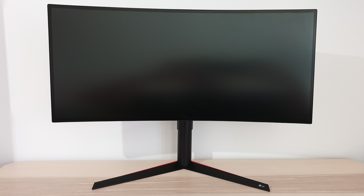
The OSD (On Screen Display) is controlled by a joystick facing downwards in the centre of the bottom bezel, illuminated by a power LED. This can’t be seen from a normal viewing position and can be disabled in the OSD if preferred. If the ‘Power LED’ is set to ‘On’ in the ‘General’ section of the OSD, it glows red when the monitor is on and flashes red when it enters a low power state (signal to the system is lost). To the immediate left of this there is a K-Slot. The OSD explored in the video below.
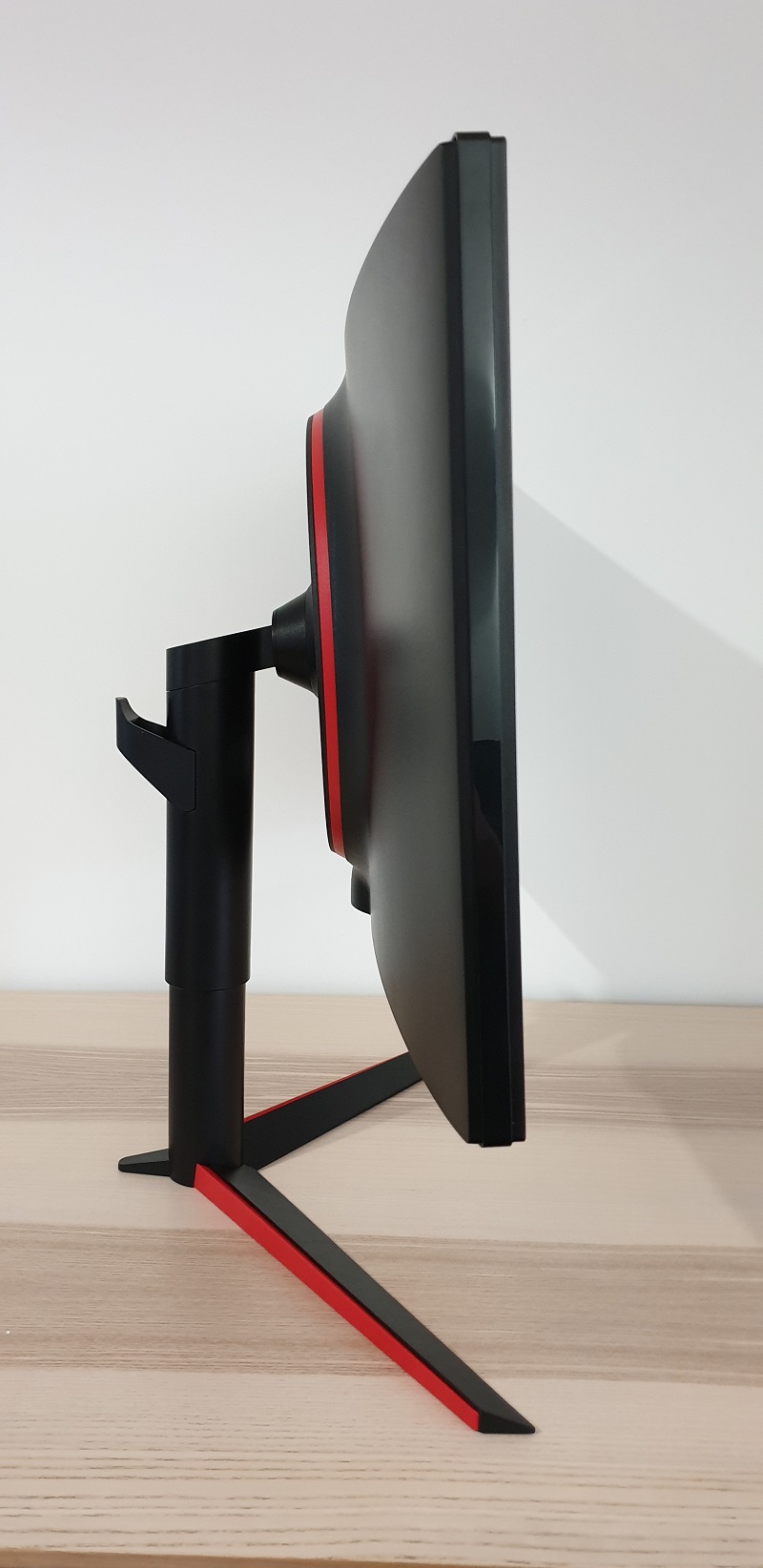
From the side the screen is fairly slim overall – ~23mm (0.91 inches) At thinnest point, lumping out centrally towards the stand attachment point. The monitor is mainly matte black plastic from this angle, with the aforementioned red elements on the base of the stand more noticeable from here. The stand offers good ergonomic flexibility; tilt (5° forwards, 15° backwards), swivel (20° left, 20° right) and height adjustment (110mm or 4.33 inches) . The total depth of monitor including stand is ~295mm (11.61 inches), so it’s somewhat shallower than some displays of this size which will be welcomed by those with relatively little desk depth. At lowest screen height, the bottom edge of the screen clears the desk by ~104mm (4.09 inches), with the top of the screen ~464mm (18.27 inches) clear of the desk.
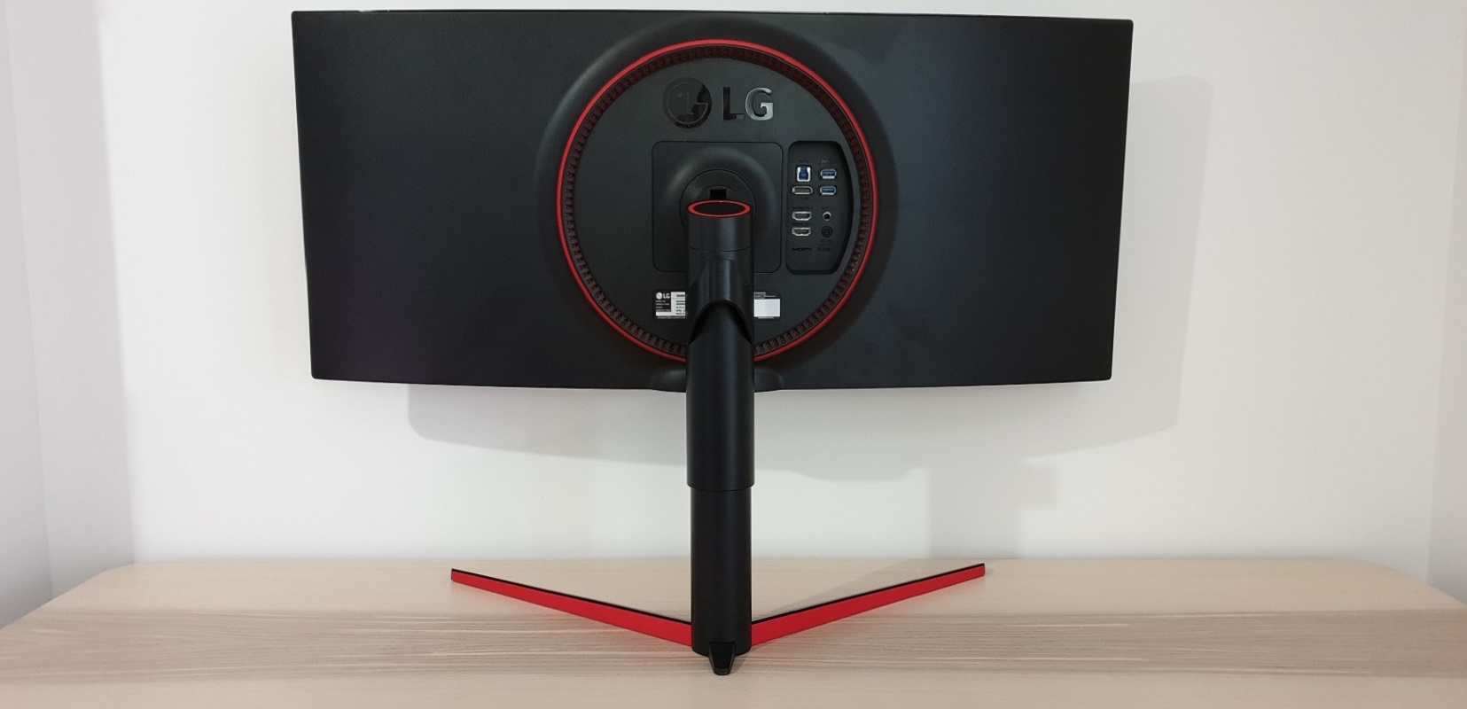
The rear of the screen is again dominated by matte black plastic, with a few red elements. In addition to those already mentioned at the rear faces of the stand base, there’s a red ring at the top of the stand neck and a radial spread of red notches around the stand attachment point and port area. There’s also a red ring surrounding these notches. These notches are decorative and do not house the ‘Sphere Lighting’ system found on the ‘G’ model. There’s a quick-release mechanism to unlatch the screen from the stand, allowing an alternative 100 x 100mm VESA compatible solution to be used for mounting. The port area is located to the right of the stand attachment point, in a recessed area with the ports facing backwards. These are; DP 1.4, 2 HDMI 2.0 ports, 2 USB 3.0 ports (plus upstream), a 3.5mm headphone jack, a service port and a DC power input (external power brick). A clip-on cable tidy is also included, which sits towards the top of the stand neck.
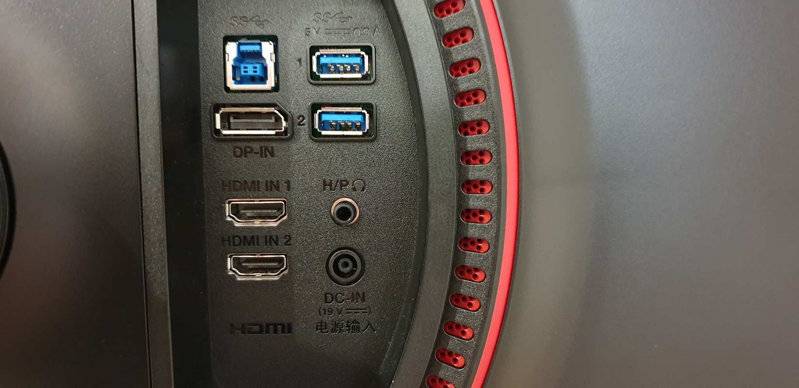
3440 x 1440 @ 144Hz is supported via DP 1.4 on compatible GPUs from both AMD and Nvidia. DP 1.2 is limited to 3440 x 1440 @ 120Hz maximum, whilst HDMI 2.0 is limited to 85Hz maximum on this model. Compatible AMD GPUs and systems also support FreeSync (via Adaptive-Sync) over DP or HDMI. HDR is also supported on compatible GPUs and systems, including those from Nvidia, via DP and HDMI. A power cable, DP cable, HDMI cable and USB 3.0 cable are included as standard.
Calibration
Subpixel layout and screen surface
The image below is a macro photographs taken on Notepad with ClearType disabled. The letters ‘PCM’ are typed out to help highlight any potential text rendering issues related to unusual subpixel structure, whilst the white space more clearly shows the actual subpixel layout alongside a rough indication of screen surface. A light (or ‘very light’, depending on how you choose to classify it) matte anti-glare screen surface is employed, with a smooth surface texture. This gives a relatively smooth look to the image without imparting any real graininess and aids the vibrancy potential of the monitor. Whilst also maintaining decent glare-handling. Regardless of the anti-glare properties, you should always try to position the screen appropriately and control your ambient lighting where possible to avoid unwanted glare.
![]()
As shown above, the monitor uses the usual RGB (Red, Green and Blue) stripe subpixel layout. This is the default ‘expected’ by modern operating systems such as Microsoft Windows and Apple’s MacOS. Apple users needn’t worry about text fringing caused by less common subpixel layouts and Windows users don’t necessarily need to run ClearType. They may still wish to run the ClearType wizard and adjust according to preferences, however. The subpixel layout and arrangement is quite normal and we had no subpixel-related concerns related to sharpness or text clarity on this model.
Testing the presets
The 34GK950F has several ‘Game Mode’ image presets; ‘Gamer 1’, ‘Gamer 2’, ‘FPS’, ‘RTS’, ‘Vivid’, ‘Reader’, ‘HDR Effect’ and ‘sRGB’. ‘Gamer 1’ and ‘Gamer 2’ are fully customisable, allowing access to all OSD settings, whereas the remaining presets lock off various settings such as ‘Sharpness’, ‘Gamma’, ‘Color Temp’ and ‘Response Time’. The table below shows key readings alongside general observations made by eye using familiar images and applications. Gamma readings were taken using a DataColor Spyder5ELITE, whilst a BasICColor SQUID 3 (X-Rite i1Display Pro) was used for white point measurement. The monitor was left in its ‘Plug and Play’ state and left to run for over 2 hours before observations or readings were made. It was connected to a Windows 10 system without additional drivers or ICC profiles specifically loaded. The system primarily used an Nvidia GTX 1080 Ti, although additional testing was performed using an AMD Radeon RX 580. Testing AMD FreeSync, for example, which is not possible on an Nvidia GPU. Unless otherwise stated, assume that settings were left at default (including ‘Contrast’. The exception was that refresh rate was set to 144Hz, but this didn’t affect our observations on this table or static image quality elsewhere in the review. When viewing the figures in this table, note that for most PC users ‘6500K’ for white point and ‘2.2’ for gamma are good targets to aim for.
| Monitor Settings | Gamma (central average) | White point (kelvins) | Notes |
| Gamer 1 (Factory Defaults) | 2.2 | 7445K | The image is bright with a cool tint. It is nicely balanced aside from that, with a highly vibrant and saturated but suitably varied look. |
| Gamma = Mode 1 | 2.0 | 7030K | As above but gamma significantly lower. This saps the image of depth in places, although some strong saturation remains. The image appears slightly warmer as well. |
| Gamma = Mode 3 | 2.4 | 7011K | As above but gamma significantly higher, adding depth and saturation. Quite a striking look. |
| Gamma = Mode 4 | 2.4 | 6983K | Similar to ‘Mode 3’ with a slightly different shape to the gamma curve. Some shades appear somewhat deeper and some somewhat lighter in comparison (overall look is slightly deeper compared to ‘Mode 3’). |
| Gamer 2 | 2.2 | 7442K | As ‘Gamer 1’ (factory defaults). |
| FPS | 2.2 | 9883K | Image has an extreme cool (blue) tint and excessive sharpness (uncorrectable). |
| RTS | 2.2 | 9845K | Similar issues to ‘FPS’ mode but sharpness dialled down slightly (still excessive) |
| Vivid | 2.2 | 8113K | Strong cool tint, quite similar to factory defaults otherwise. |
| Reader | 2.0 | 5557K | A fairly effective ‘Low Blue Light’ (LBL) setting which also minimises contrast. The image appears warm and ‘flooded’. |
| Relaxing evening viewing (see below) | 2.3 | 4439K | An alternative LBL setting with a stronger effect (greater blue light reduction) compared to ‘Reader’, whilst significantly stronger contrast is maintained. The image appears warm and stimulating blue light is reduced, useful for relaxing viewing in the evening (for example). |
| HDR Effect | 2.4 | 7250K | This is an HDR emulation mode, a preset that can be used in conjunction with SDR content only. Generally too cool in tone, overly bright for most content, slightly over-sharpened and significant oversaturation with loss of shade variety. Brightness can be manually adjusted (although some variation around the point set due to ‘Dynamic Contrast’ element). |
| sRGB | 2.2 | 6858K | An sRGB emulation setting which tones down saturation significantly. There’s a fair bit of undercoverage of the sRGB gamut, as we explore later, so the image is undersaturated in places even compared to sRGB. The colour temperature is cooler than the 6500K target and you can’t adjust this through the OSD. ‘Response Time’ is locked at ‘Fast’, but you can at least adjust ‘Brightness’. |
| Test Settings (see below) | 2.2 | 6491K | As factory defaults with much more comfortable brightness and more appropriate white point. The image appears very vibrant with strong saturation and shade variety. |
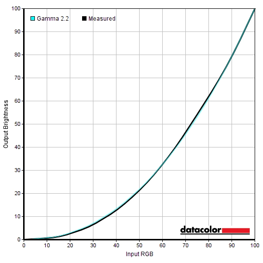
Straight from the box the monitor was very bright with a noticeable cool-tint, but was otherwise well-balanced. The image was unmistakably vibrant, with strong saturation but good shade variety maintained. With some tweaking in the OSD a more comfortable brightness and more appropriate white point could be achieved. The monitor also includes a factory calibration report to show the targets achieved at the factory using factory equipment and measurement conditions. Unfortunately, our factory calibration report was in too poor a state to read or scan properly so we won’t include it in the review. Regardless of this, we can at least agree that the gamma tracking was well-tuned in the factory and indeed following the adjustments made to our ‘Test Settings’. This is shown below, with strong adherence to the desirable ‘2.2’ curve. Given the intended uses of the monitor, inter-unit variation and pleasing performance following OSD tweaking alone we will not be providing any ICC profiles for this model or using them in the review. The monitor also included a fairly effective Low Blue Light (LBL) setting called ‘Reader’. This provided a fair reduction in the blue colour channel (and luminance) compared to the factory defaults. This is useful in the hours leading up towards bed where blue light exposure should be minimised, as it’s disruptive to sleep hormones and keeps the body alert. Some users prefer LBL settings at other times, too. It also significantly reduced contrast, which is intentional as it is supposed to reduce the amount of time your eyes spend adjusting to changing light levels from the monitor. As the changes in light levels are far more subtle. That’s the theory, but of course ambient light levels can also change significantly unless they are very tightly controlled. And we didn’t find any viewing comfort benefits from this approach ourselves. We therefore made our own modified LBL setting. We used our ‘Test Settings’ as a base but changed the colour channels to R= 50, G= 38, B= 25. This achieved more significant blue light reduction than ‘Reader’, without the same drop in contrast. It was also very convenient to switch between this and our regular ‘Test Settings’ as they could both be stored independently using the fully customisable ‘Gamer 1’ and ‘Gamer 2’ presets. These allow you to customise everything on the ‘Game Adjust’ and ‘Picture Adjust’ OSD sections and recall those preferences. For our ‘Test Settings’ we significantly lowered brightness and made some changes to colour channels. This achieved a more comfortable image with more appropriate brightness and white point. As usual, note that individual unit and preferences vary, so these settings should only be used as a guide and not considered optimal for all users. Assume any setting not mentioned, including ‘Contrast’ and ‘Gamma’, was left at default. We also disabled the ‘SMART ENERGY SAVING’ feature as this causes brightness fluctuations according to the content being displayed. We’ve also included the ‘Response Time’ setting and refresh rate used for reference, too. Note that these settings only apply to SDR testing, which is the bulk of our review. HDR has separate settings associated with it – we explore HDR separately in the designated section. We had to make a small GPU driver tweak on our GPU when the monitor was connected via DP and FreeSync was set to ‘Extended’. There is a small colour processing issue by default which means things look noticeably undersaturated. You simply need to open ‘Radeon Settings’, navigate to ‘Display’ – ‘Color’ (little icon towards the top right) and press the ‘Color Temperature’ toggle so it reads ‘6500K’ instead of ‘Automatic’. Brightness= 35 (according to preferences and lighting) R= 50 G= 44 B= 46 FreeSync= Extended (AMD GPU only) Response Time= Faster SMART ENERGY SAVING= Off Refresh rate (Windows setting)= 144Hz A BasICColor SQUID 3 (X-Rite i1Display Pro) was used to measure the luminance of white and black using a range of monitor settings, including those analysed in the calibration section. Static contrast ratios were calculated using these figures, as shown in the table below. Black highlights indicate the highest white luminance, lowest black luminance and peak contrast ratio recorded (HDR and MBR disabled). Blue highlights show the results under our ‘Test Settings’ and also with HDR active. Assume any setting not mentioned was left at default, with the exceptions already noted in the calibration section. Note that refresh rate was set to 144Hz, including for the ‘1ms Motion Blur Reduction’ (1ms MBR) testing, and that ‘SMART ENERGY SAVING’ was disabled in all cases.
Gamma 'Test Settings'
Test Settings
Game Mode= Gamer 1
Contrast and brightness
Contrast ratios
Monitor Settings White luminance (cd/m²) Black luminance (cd/m²) Contrast ratio (x:1) 100% brightness (Factory Defaults) 402 0.4 1005 80% brightness 340 0.34 1000 60% brightness 277 0.28 989 40% brightness 212 0.21 1010 20% brightness 143 0.14 1021 0% brightness 72 0.07 1029 HDR* (100% brightness) 390 0.38 1026 HDR* (50% brightness) 236 0.23 1026 HDR* (0% brightness) 70 0.07 1000 Gamma = Mode 1 448 0.41 1093 Gamma = Mode 3 447 0.41 1090 Gamma = Mode 4 447 0.41 1090 Gamer 2 402 0.4 1005 FPS 349 0.41 851 RTS 349 0.41 851 Vivid 373 0.41 910 Reader 150 0.91 165 Relaxing evening viewing 136 0.2 680 HDR Effect 451 0.41 1100 sRGB 208 0.22 945 1ms MBR (100% brightness) 240 0.24 1000 1ms MBR (50% brightness) 146 0.15 973 1ms MBR (0% brightness) 47 0.05 940 Test Settings 165 0.19 868
*HDR measurements were made using this YouTube HDR brightness test video, running full screen at ‘1440p HDR’ on Google Chrome. The maximum reading from the smallest patch size (measurement area) that comfortably covered the entire sensor area and colorimeter housing was used for the white luminance measurement, which was ‘4% of all pixels’ in this case. The black luminance was taken at the same point of the video with the colorimeter offset to the side of the white test patch, equidistant between the test patch and edge of the monitor bezel.
The average static contrast with only brightness adjusted was 1008:1, with a maximum recorded value of 1100:1. This is much in-line with our expectations given the panel used. The ‘HDR Effect’ setting and changing gamma mode yielded contrast ratios at the upper end of the measurement range. The lowest value recorded was with the ‘Reader’ mode active, which purposefully minimises contrast – to 165:1. Our ‘Relaxing evening viewing’ settings reduced contrast a bit but certainly not as much, hitting 680:1. Our ‘Test Settings’ yielded 868:1, which is quite respectable after the adjustments made. The peak luminance recorded on this table was a rather bright 451 cd/m² (using ‘HDR Effect’), whilst the minimum white luminance recorded (without HDR or MBR active) was 72 cd/m². This yielded a luminance adjustment range of 379 cd/m², with a good bright maximum and a reasonably but not exceptionally dim minimum. The peak luminance recorded with MBR active was 240 cd/m², with a minimum white luminance of 47 cd/m². So a good brightness adjustment range as far as such strobe backlight settings go.
Activating HDR did nothing to enhance contrast. This wasn’t at all unexpected given that it only VESA DisplayHDR 400 certified (as explored later) and lacks any sort of local dimming on the backlight. We tested various presets with HDR active and none yielded any enhancement to contrast, with a significant enhancement there requiring local dimming for the backlight and therefore physically impossible on this model. The experience was consistent whether tested using our AMD or Nvidia GPU and whether HDMI 2.0 or DP 1.4 was used. The monitor also offers a Dynamic Contrast setting called ‘DFC’ (Dynamic Fine Contrast). This allows the backlight to adjust according to the overall brightness levels of the scene being displayed. It can be activated under SDR (Standard Dynamic Range) and more or less mimics the standard behaviour of the monitor’s backlight for HDR content. As we’ve established, there is no local dimming. So this setting adjusts the entire backlight according to the average values of the content brightness. With this setting active you can set your brightness in the OSD, which limits the upper range of operation. That’s a good flexibility to have. In general we found the effect rather subtle as far as Dynamic Contrast settings go. So it wasn’t overly distracting. But we didn’t find it really added anything to the experience, either.
PWM (Pulse Width Modulation)
This monitor does not use PWM (Pulse Width Modulation) at any brightness level. Instead, DC (Direct Current) is used to regulate backlight brightness at all levels. The backlight is therefore flicker-free, which will come as welcome news to those worried about potential side-effects from PWM usage. The exception to this is with the ‘1ms Motion Blur Reduction’ feature active. This is a strobe backlight setting that causes the backlight to flicker at ~144Hz.
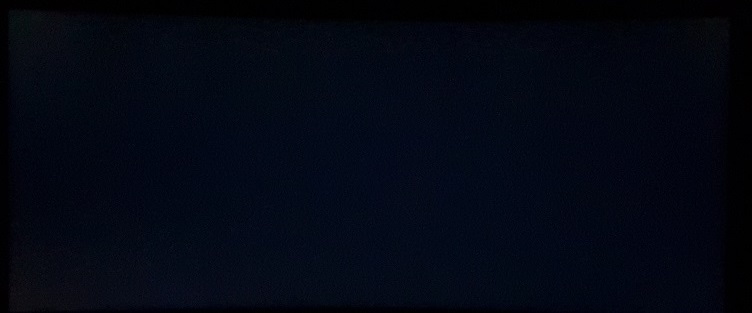
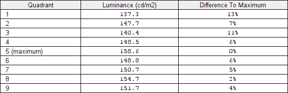
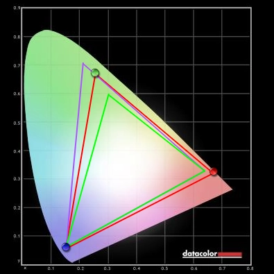
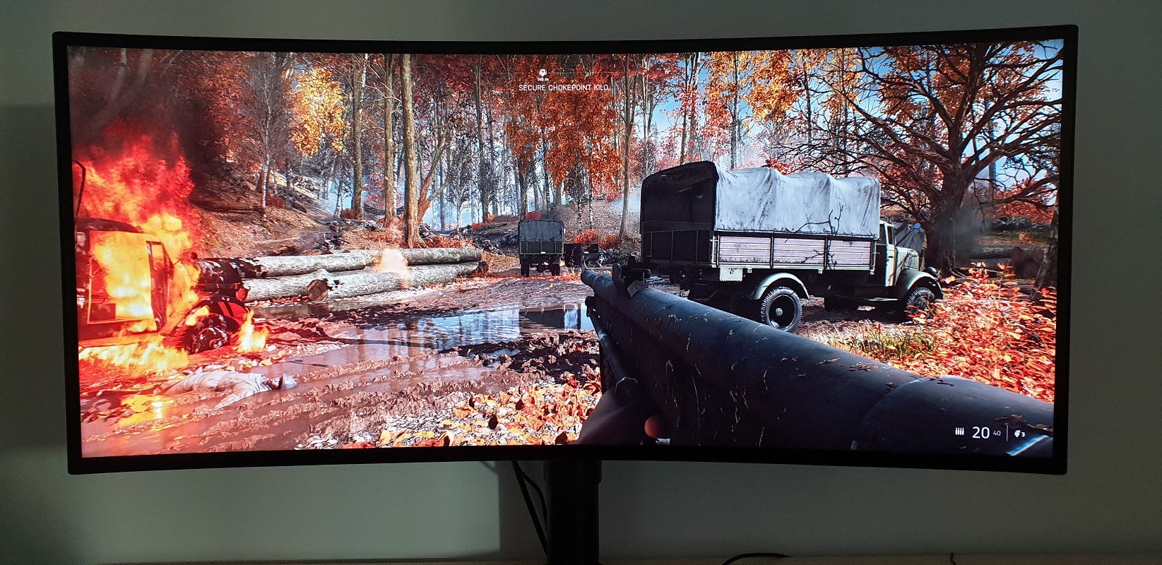
Luminance uniformity
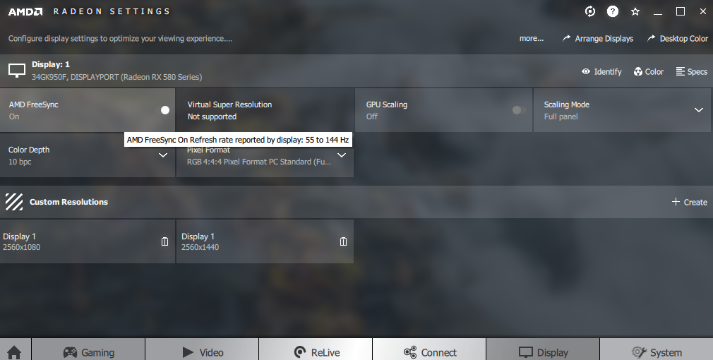
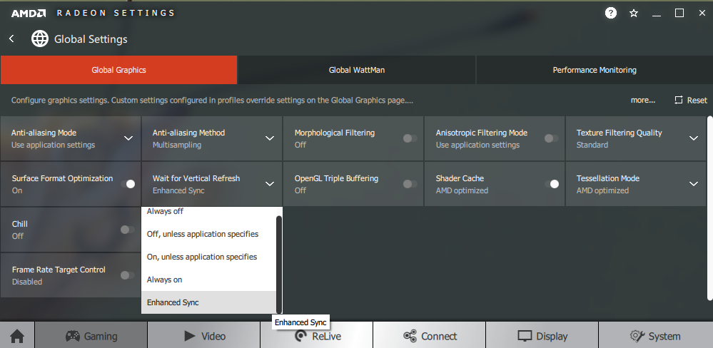
We observed a black background in a dark room and could see slight backlight bleed towards the top and bottom left corners of the screen and a little of clouding as well. This is shown in the image below, which was taken using our ‘Test Settings’ and taken some distance from the screen in order to eliminate ‘IPS glow’. This is a bluish or golden glow (depending on viewing angle) that’s visible towards the bottom corners of the screen in particular from a normal viewing position. As explored shortly, it’s more subdued towards the right side of the screen where it takes on a cooler and more blended appearance. At sharper viewing angles, this glow ‘blooms out’ more noticeably, as demonstrated in a video deeper into the review. The luminance uniformity of the screen was good overall. The brightest point recorded was ‘quadrant 5’ in the centre of the screen (158.6 cd/m²). The greatest deviation from this occurred at ‘quadrant 1’ towards the top left of the screen (137.3 cd/m², which is 13% dimmer). The average deviation between each quadrant and the brightest point was 6.75%, which is pleasing. Note that uniformity varies between individual units and you can expect deviation beyond the measured points. The contour map below represents this information graphically, with darker greys representing lower luminance and hence greater deviation from the central point than lighter greys. We also analysed colour temperature (white point) deviation of the same 9 quadrants. Deviation here is shown in DeltaE values, with higher values and darker shades on the contour map representing greater deviations from 6500K (D65) than lower values and lighter shades. A DeltaE<3 represents deviation that most users would not readily notice by eye. The results here were good. Borderline significant deviation was observed towards the top left of the screen (DeltaE 3.0), with no further significant deviations recorded. Remember again that individual units vary when it comes to colour temperature uniformity and that you can expect further deviation beyond the measured points. On Battlefield V the contrast performance was good overall. The level of detail in dark areas was largely appropriate, with the central mass of the screen showing good but not excessive detail levels (i.e. there wasn’t a blocky or ‘banded’ appearance due to poor gamma handling). As usual for an IPS model, though, there was ‘IPS glow’ peripherally. This was largely as we’ve seen from other models of this sort of size towards the left of the screen, particularly the bottom left corner from a normal viewing position. It ate away it detail here when observing darker content. The glow was far more subdued towards the right side of the monitor, including bottom right. It’s usual for ‘IPS glow’ to appear cooler at one side of the monitor and warmer at the other, but it’s usually a sort of cool white or silverish hue towards the bottom right. On the 34GK950F it was visible as a relatively dim blue sheen here which didn’t bloom out as extensively or affect detail levels as noticeably as usual. The overall distinction between light and dark on the monitor was good and lighter shades appeared quite smooth without obvious graininess, thanks to the light and quite smooth matte screen surface. Similar observations were made on Shadow of the Tomb Raider. This title features many dark areas, including tombs and caves, and it’s therefore a title that benefits from a strong contrast performance. This model didn’t provide the sort of inky depth that models with much stronger contrast could provide or the same distinctions as a decent VA UltraWide for that matter. However; overall distinctions between light and dark were still good and detail levels for dark scenes was appropriate across most of the screen. There was again some detail lost due to ‘IPS glow’, particularly towards the bottom left of the screen. From a normal viewing position, the ‘IPS glow’ didn’t eat away at detail towards the top of the screen in the same way as the massive vertical gamma shifts of TN models do, either. With TN models the top of the screen has such high perceived gamma that you can’t really see wall or rock textures properly, which on this title means it isn’t clear which surfaces are climbable. There were no such frustrations with the LG, thankfully. Brighter shades also appeared smooth rather than grainy thanks again to the light (and relatively smooth-textured) matte screen surface. We also made some observations on the movie Star Wars: The Last Jedi. With many high-contrast scenes, including bright explosions and light sabers (etc.) set against very dim backdrops, this title benefits from a strong monitor contrast performance. Whilst the LG didn’t give this title the same depth and cinematic look as a model with much stronger contrast, it represented things quite well. The ‘IPS glow’ again came into play, but the overall distinctions between bright and dark elements was good. And those light elements weren’t marred by a grainy screen surface. We used Lagom’s contrast tests to further analyse contrast performance and help identify issues that may not have been picked up during other testing. The following observations were made. The colour gamut of the 34GK950F (red triangle) is compared with the sRGB (green triangle) and Adobe RGB (purple triangle) colour spaces in the image below. The monitor comprehensively covers the sRGB colour space (100%) with significant extension beyond this. There is also some extension beyond Adobe RGB in the red region, but the monitor doesn’t fully cover Adobe RGB in the green to blue region (90% Adobe RGB). Note that Adobe RGB overlaps sRGB at the red and blue corners of this representation. The monitor doesn’t target Adobe RGB, though, it targets good DCI-P3 coverage which is appropriate for HDR10 content as it’s the near-term standard for HDR. LG specifies 98% DCI-P3. Our colorimeter software doesn’t support comparison with DCI-P3, but the gamut we measured here does seem to coincide nicely with LG’s DCI-P3 target. Also be aware that the Spyder5 tends to slightly under-report the blue corner of the diagram for gamuts this wide. This sort of colour gamut gives the monitor the potential to output all shades within the sRGB colour space, with quite a bit of extra vibrancy. On Battlefield V the monitor presented a vibrant and varied palette of colours. Environments within the game showcased a good range of lush greens and more muted greens for vegetation as well as some good earthy brown tones. For sRGB content such as this the wide gamut of the monitor presented things with extra saturation than intended by the developers. This meant that many of the more muted greens were lusher and more vibrant than intended and some of the earthy browns had a stronger than ideal red hue and weren’t as neutral in appearance as they should be. Strong shade variety was maintained, though, which is very different to when saturation is digitally enhanced. Where shades are simply pulled closer to the edge of the gamut without expanding the gamut itself (e.g. Nvidia Digital Vibrance). And the extra saturation was more balanced than on models where the gamut is huge in one area but not others (e.g. models that closely track Adobe RGB). There were some very eye-catching vivid oranges and reds displayed for fires and autumnal browns as well. Most users, overall, will like this sort of vibrant shade representation especially when it’s achieved in this sort of way. Shadow of the Tomb Raider also showcased a good array of vibrant shades. The natural environments had some exceptionally rich and lush-looking forest greens (a bit too lush and deep in places) as well as a variety or more muted shades. The strong saturation was apparent when observing Lara’s skin, which appeared as a more tanned version of what it should – but she didn’t look sunburnt or lobster-like, thankfully. Fires were also particularly eye-catching in their vibrancy, with the strong saturation meaning that some yellows appeared slightly orange and some oranges had a stronger than intended red hue. But the overall range and variety was maintained, with various distinct yellow, orange and red hues. There were also some impressively eye-catching purples and reds for some objects in the game such as fruit and flowers, standing out in a way that models that isn’t physically possible on a model with a much less generous colour gamut. We also assessed colour reproduction on Futurama: Into the Wild Green Yonder. We certainly had no complaints about colour consistency on our game test titles as this was well-maintained throughout the screen. But this title is a very unforgiving test for colour consistency, as large areas of individual shade can fill a large section of the screen. Fortunately, the monitor performed well in this area, something we’d hope for given the panel type used. A given shade (such as a character’s skin tone) appears with obvious saturation shifts on other LCD panel types. TN models display this shade in a much less saturated way further down the screen and an excessively deep way lower down the screen, whilst VA models show varying degrees of saturation loss or depth changes comparing peripheral to central regions of the screen. On this model such shades appeared largely the same regardless where on the screen they were displayed, adding to shade variety and individuality and helping maintain a vibrant look throughout the screen. Some of the pastel shades were noticeably more saturated than intended due to the colour gamut, but they still appeared more muted than the neon or deep (non-pastel) shades. These non-pastel shades were displayed in a very eye-catching way, with some impressive deep blues and purples, bright reds and neon greens. Lagom’s tests for viewing angle were used to analyse colour consistency and viewing angle performance in a more specific way. The following observations were made from a normal viewing position, with eyes around 70 – 80cm from the screen. On some monitors, particularly but not exclusively those with high refresh rates, interlace patterns can be seen during certain transitions. We refer to these as ‘interlace pattern artifacts’ but some users refer to them as ‘inversion artifacts’ and others as ‘scan lines’. They may appear as an interference pattern, mesh or interlaced lines which break up a given shade into a darker and lighter version of what is intended. They often catch the eye due to their dynamic nature, on models where they manifest themselves in this way. Alternatively, static interlace patterns may be seen with some shades appearing as faint horizontal or vertical bands of a slightly lighter and slightly darker version of the intended shade. We did not observe any dynamic or static interlace pattern artifacts on this model, however. We used a small tool called SMTT 2.0 and a sensitive camera to measure latency on the 34GK950F, comparing to a screen of known latency. To help maximise accuracy, over 30 repeat readings were taken. Using this method, we measured 12.58ms (~1.75 frames @144Hz) of input lag. This value is influenced by both the element of input lag you ‘feel’ (signal delay) and the element you ‘see’ (pixel responsiveness). It indicates a moderate signal delay which shouldn’t bother most users but could bother some. Unfortunately, we don’t have the means to accurately measure input lag with FreeSync active in a variable refresh rate environment. A firmware update (newer version than we were able to test) has been released, which will be included with newer samples or can be applied via LG’s On Screen Control tool to samples that don’t include it from the factory. TFT Central has confirmed that this reduces input lag to 4.3ms with an extremely low signal delay. In our article on the topic, we explore some key concepts surrounding monitor responsiveness. Chief amongst these is the concept of perceived blur. This is contributed to not only by the pixel responsiveness of the monitor, but also the movement of your eyes as you track movement on this screen. This second factor is the dominant cause of perceived blur on modern monitors. A photography technique called ‘pursuit photography’ is also introduced. This uses a moving camera to capture motion on a monitor in a way that reflects both elements of perceived blur, including eye (camera) movement and not just pixel responsiveness. The images below are pursuit photographs taken using the UFO Motion Test for ghosting. The test is set to run at its default speed of 960 pixels per second, which is a practical speed for such photographs and sufficient to help highlight key weaknesses. The UFOs move from left to right at a frame rate matching the refresh rate of the display. The monitor was tested at 60Hz (directly below), 120Hz and 144Hz with all ‘Response Time’ settings tested; ‘Off’, ‘Normal’, ‘Fast’ and ‘Faster’. Note that the pixel overdrive behaved in the same way whether FreeSync was active or not in the OSD and whether the monitor was connected to an AMD or Nvidia GPU. All rows of the UFO Motion Test were used, with backgrounds of varying shade brightness level to help highlight how this can influence pixel responsiveness. Where possible, the final column shows a reference screen that shows what things look like without pixel responsiveness being a significant limiting factor. This reference screen is a Dell S2417DG (fast TN model) set to its optimal response time setting. At 60Hz, shown above, the UFO appears relatively soft and unfocussed. This indicates a moderate level of perceived blur due to eye (camera movement) and you can see this see this characteristic with the fast TN reference screen, also set to 60Hz. There are various degrees of trailing behind the object, too. With ‘Response Time’ set to ‘Off’, you can see quite a ‘heavy powdery’ trail behind the object. This is boldest for the dark background, top row. The ‘Normal’ setting cuts back on this just slightly, with a further reduction using the ‘Fast’ setting’. This setting also introduces a small amount of faint overshoot (inverse ghosting), with a slight bright trail behind the object in places (particularly for the light background, bottom row). The ‘Faster’ setting significantly speeds up the pixel transitions and gets rid of most of this trailing. The overshoot is somewhat more noticeable, observable as a bright trail behind the medium (middle row) and light backgrounds. But it’s still quite faint. Overall we’d say ‘Faster’ is optimal at this refresh rate. The following image shows how things look with the refresh rate doubled to 120Hz. At 120Hz, above, the UFO is significantly narrower and more sharply focused than at 60Hz. This reflects a significant decrease in perceived blur due to eye movement. There are again varying degrees of trailing behind the object. The trailing behind the object is bold with the ‘Off’ setting and reduced only marginally using the ‘Normal’ setting. With the doubling of the refresh rate and frame rate of the content, the pixel responsiveness requirements increase significantly. And the pixel responses with these settings are simply too slow, hence the obvious trailing behind the UFOs here. The ‘Fast’ setting is far more effective, cutting down on the trailing significantly. It is no longer bold in its appearance, instead having a fainter ‘powdery’ appearance. There is a small amount of overshoot visible for the medium and light backgrounds. The ‘Faster’ setting ramps up the pixel response speeds further, cutting down on the trailing even more. The overshoot for the medium and light backgrounds is now stronger, but still fairly faint in this test. We’d again consider the ‘Faster’ setting optimal here. The image below shows what things look like with a slight nudge up in refresh rate to 144Hz. At 144Hz, above, the UFO appears a bit narrower and slightly more focussed, indicating a further decrease in perceived blur due to eye movement. The trailing behaviour is largely as it was at 120Hz. For the slower response time settings (‘Off’ and ‘Normal’) the bolder trailing is slightly bolder as the increased refresh rate and frame rate increases pixel responsiveness requirements further. And these settings are clearly inadequate for such a refresh rate. The ‘Fast’ setting again removes the bold trailing and replaces it with a finer trailing, whilst the ‘Faster’ setting cuts down further. Again, there’s some overshoot, but nothing extreme. We’d again consider the ‘Faster’ setting to be best balanced here. As handily demonstrated by these pursuit photographs, significantly increasing refresh rate (and frame rate) significantly decreases perceived blur. There is another method to reduce perceived blur, which this monitor can also employ. It has a strobe backlight setting called MBR (Motion Blur Reduction) which, via the mechanisms explored in the linked responsiveness article, massively reduces eye movement and hence massively reduces perceived blur. Using MBR causes the backlight to flicker at a frequency of ~144Hz. You can activate the setting at 120Hz as well, but unfortunately the backlight strobe frequency remains at ~144Hz. You therefore get massive stuttering, rendering the setting uncomfortable and impractical to use (to put it mildly). We’ll therefore just be sticking to 144Hz for this analysis, as we did earlier in the review when we looked at this feature. You can also adjust the ‘Response Time’ setting, but we’re only going to be considering ‘Faster’ here as lower settings simply gave bolder trailing (or strobe crosstalk, which we discuss shortly). The images below are pursuit photographs with the monitor running at 144Hz with MBR active and ‘Response Time’ set to ‘Faster’. Various reference screens are used for comparison with a strobe backlight setting employed. On Battlefield V the monitor put in a solid 144Hz overall, providing good fluidity where the frame rate kept pace with the 144Hz refresh rate (ideally 144fps). The monitor is outputting over twice as much visual information every second as a 60Hz monitor, greatly aiding what we call the ‘connected feel’. This describes the level of precision and continuity between mouse movements and character movements on the screen. It’s separate to input lag, which we’ve already explored. But to reinforce this a bit, we didn’t find the input lag high enough on this monitor to detract from this ‘connected feel’ – although sensitivity to this varies, as we’ve stated. The other important consequence of the significantly increased refresh rate and frame rate is that there’s a significant decrease in perceived blur due to eye movement. Which we’ve explored in the context of the UFO Motion Test for ghosting already. The environment and enemies within it remain more sharply focused during rapid movement of the character, which some users would find significantly more comfortable to look at. It also makes tracking and engaging enemies easier, which along with the nice boost in ‘connected feel’ gives a good competitive edge. There were some imperfections with pixel responsiveness; these were visible at 120Hz and to a large extent 100Hz as well so in no way restricted to 144Hz. These were certainly nothing that would compare to the standout weaknesses you’d observe on competing VA models like the ASUS MX34VQ or AOC AG352UCG6. There were some slightly slower than optimal pixel transitions, giving a light ‘powdery trailing’ similar to that shown in ‘Test UFO’. In practice this was faint enough that most users wouldn’t find it bothersome or even really notice it. It didn’t have a pronounced affect on overall perceived blur levels, either. There were a slim number of transitions with more pronounced weaknesses, giving what we’d term a ‘heavy powdery trail’. This was bolder and extended back from the object a bit further. Transitions affected by this sort of behaviour were few and far between – it was far less common and less extensive than the most pronounced weaknesses you’d see on the VA alternatives. It was mainly confined to transitions where very light shades moved against darker backgrounds. White or near-white markers or text in this game in some dark buildings being a good example of this. There was also some overshoot in places, with the trailing appearing somewhat brighter than the foreground or background colour. Nothing overly bright and ‘disco like’ or strong dark trails, though, so nothing that should catch most users eyes. The section of the video review below demonstrates some of the strengths and weaknesses associated with this monitor, using BFV as an example. Given the extensive analysis above there’s not really much to add from our experience on Shadow of the Tomb Raider. Whilst we wouldn’t say we felt such a competitive edge with the increased refresh rate and frame rate on this title, we certainly noticed an improved ‘connected feel’ and significant decrease in perceived blur. The overall fluidity as we controlled Lara and interacted with the game world both on a ‘felt’ and visual level was good. We again observed some weaknesses in pixel responsiveness, but nothing widespread nor extreme. And nothing that hampered our enjoyment or playability of the game. We also observed various film titles and other video content. There were no standout weaknesses from the monitor there. The frame rate of this content is much more limited than the game content (typically 24fps, 30fps or 60fps) and so the pixel response requirements aren’t as high. The fluidity was largely restricted by the frame rate of the content, and obviously ‘connected feel’ didn’t come into play as these were passive rather than active entertainment sources. We did notice some slight ‘powdery’ trailing in places for some of the higher frame movie rate content, but this was not extreme and not something we found bothersome. It also affected very few pixel transitions, so wasn’t common at all. AMD FreeSync is a variable refresh rate technology, an AMD-specific alternative to Nvidia G-SYNC. Where possible, the monitor dynamically adjusts its refresh rate so that it matches the frame rate being outputted by the GPU. Both our responsiveness article and the G-SYNC article linked to explore the importance of these two elements being synchronised. At a basic level, a mismatch between the frame rate and refresh rate can cause stuttering (VSync on) or tearing and juddering (VSync off). FreeSync also boasts reduced latency compared to running with VSync enabled, in the variable frame rate environment in which it operates. FreeSync requires a compatible AMD GPU such as the Radeon RX 580 used in our test system. There is a list of GPUs which support the technology here, with the expectation that future AMD GPUs will support the feature too. The monitor itself must support ‘VESA Adaptive-Sync’ for at least one of its display connectors, as this is the protocol that FreeSync uses. The 34GK950F supports FreeSync via DP 1.4 and HDMI 2.0 on compatible GPUs and systems. More specifically, ‘FreeSync 2’ is supported by the monitor, encompassing HDR support (this feature is not AMD-specific) and a relatively generous effective range of operation. If fully installed, AMD drivers feature Radeon Settings, which makes activation of the technology very simple and something that usually occurs automatically. First make sure that you have ‘FreeSync’ enabled (set to ‘Extended’ for the full range) in the ‘Game Adjust’ section of the OSD. You should then make sure the GPU driver is setup correctly to use FreeSync, so open ‘AMD Radeon Settings’ and click on ‘Display’. You should then ensure that the first slider, ‘AMD FreeSync’, is set to ‘On’. If you hover over this, it will also report the variable refresh rate display supported by the display. VSync is configured in the ‘Gaming’ section of ‘Radeon Settings’, where it is referred to as ‘Wait for Vertical Refresh’. You can either configure this globally under ‘Global Settings’ or for each game individually. The default is ‘Off, unless application specifies’ which means that VSync will only be active if you enable it within the game itself, if there is such an option. Such an option does usually exist – it may be called ‘sync every frame’ or something along those lines rather than simply ‘VSync’. Most users will probably wish to enable VSync when using FreeSync to ensure that they don’t get any tearing. You’d therefore select either the third or fourth option in the list, shown in the image below. The final option, ‘Enhanced Sync’, is a relatively new addition to the driver. This is an alternative to VSync which allows the frame rate to rise above the refresh rate (no VSync latency penalty) whilst potentially keeping the experience free from tearing or juddering. This requires that the frame rate comfortably exceeds the refresh rate, not just peaks slightly above it. We won’t be going into this in detail as it’s a GPU feature than a monitor feature. Unfortunately we had to give our review sample back to LG before Nvidia released their driver with Adaptive-Sync support, so we couldn’t test it. This monitor is confirmed by multiple users to work with Nvidia Adaptive-Sync (‘G-SYNC compatible’ mode), offering a similar experience to FreeSync on compatible Nvidia GPUs (GTX 10 series and newer) and Windows 10. A firmware update has also been released, which is included with newer samples or can be applied via LG’s On Screen Control tool. This expands the variable refresh rate range to 48 – 144Hz and decreases input lag as noted earlier. We tested a range of game titles with FreeSync active on the monitor and found it worked much the same way on all of them. Rather than repeat our observations for several titles, we’ll simply be focusing on a single title; Battlefield V. This title offers good graphical flexibility, so allows the full range of refresh rates to be tested on the monitor with FreeSync active. Achieving a consistent 144fps with our Radeon RX 580 was challenging and required significant graphical sacrifices to be made. And this was just on single player – intense multiplayer battles can reduce frame rate due to strains on the rest of the systems too, making some dips pretty much inevitable. After making moderate but not extreme visual sacrifices, we were able to keep things ticking over in the triple digits. Comparing the low end of this (~100fps) vs. the high end (~144fps), we certainly noticed a drop off in ‘connected feel’ and an increase in perceived blur. As we’re sensitive to frame rate, it was noticeable (and significant) to us, but individual sensitivity varies. However; FreeSync got rid of the tearing (VSync off) or stuttering (VSync on) that ensued with the technology disabled. As we’re very sensitive to tearing and stuttering, this was very welcome indeed and made the drops in frame rate below 144fps far more palatable. As to sensitivity to frame rate, sensitivity to tearing and stuttering varies. Quite a few users find tearing (and the associated juddering effect) to be minor enough on a 144Hz monitor to be non-distracting. Same with stuttering with VSync on, at relatively high frame rates. But there are many (including us) who do find it distracting or annoying and prefer these distractions to be eliminated by a technology such as FreeSync, where possible. Using more generous graphical settings resulted in further drops in frame rate. As things dropped well below 100fps we noticed further significant increases in perceived blur and an obvious decrease to ‘connected feel’. We did, though, very much appreciate having tearing and stuttering from refresh rate and frame rate mismatches eliminated by FreeSync. It’s worth noting that, at these relatively low frame rates, stuttering can be particularly pronounced and it’s at this sort of range where the benefits can be more widely appreciated. We also noticed a significant increase in overshoot as frame rate dropped and hence refresh rate dropped, with FreeSync active. This is something we commonly observe on FreeSync monitors and it’s something that G-SYNC models generally handle a lot better. Nvidia users something called ‘variable overdrive’ which slackens off the aggressiveness of the pixel overdrive appropriately as refresh rate reduces. FreeSync monitors tend to be tuned with their highest native refresh rate in mind, in this case 144Hz. The issue is tied to the pixel response behaviour at different refresh rates rather than frame rates, so you don’t observe this increased overshoot with FreeSync disabled and running the monitor at a static 144Hz. This is demonstrated towards the end of our responsiveness section of our video review. When frame rate dropped below 55fps, which as at the floor of operation for FreeSync on this model (55Hz), LFC kicked in to ensure the refresh rate stuck to a multiple of the frame rate. This worked as it should. There was a small amount of momentary stuttering at the boundary between normal FreeSync operation and LFC (~55fps/55Hz), but this was not strong or obvious stuttering. Less noticeable than normal stuttering that would occur here with FreeSync disabled (VSync on) and generally a rare occurrence unless your frame rate is fluctuating rapidly above and below 55fps. Overall we quite enjoyed using FreeSync on this model, especially if frame rate remained high – comfortably in the triple digits, so levels of overshoot were relatively low, perceived blur was reasonably low and ‘connected feel’ relatively good. Having said that, we quite enjoyed using our Nvidia GTX 1080 Ti with this monitor. This lacks FreeSync support but is significantly more powerful than our AMD GPU and we still enjoyed the overall 144Hz experience offered by the monitor. So if you’re an Nvidia user and you’re not overly sensitive to tearing and stuttering, certainly don’t discount this model just because you can’t use FreeSync and it lacks G-SYNC. The more expensive LG 34GK950G is obviously an alternative, otherwise, although you’d have to weigh up the reduced maximum refresh rate (120Hz) and somewhat cut down feature set. We’ve already introduced the 1ms MBR (Motion Blur Reduction) feature, its principles of operation and its effect on perceived blur using the UFO Motion Test for ghosting. We’ve also explained that the feature is only usable at 144Hz due to the fixed strobe frequency of the backlight (~144Hz). Furthermore, we identified the ‘Faster’ setting for ‘Response Time’ as the most useful to use with MBR active – and indeed deactivated, at this refresh rate. It’s important to note that, with MBR active or indeed any strobe backlight feature, it’s imperative that your frame rate consistently matches your refresh rate. Otherwise you are greeted with obvious stuttering or juddering, standing out in a particularly obvious way as there’s little perceived blur due to eye movement to mask it. We tested a range of game titles, although the principles of operation and the pros and cons of MBR remain the same regardless of the title. We’ll therefore focus on Battlefield V for this section. There was certainly a noticeable reduction in perceived blur with this setting active, with a dramatic reduction in eye movement to thank for this. During rapid character spins or manoeuvres in vehicles there was a greater level of detail retained in the environment. And enemies were easier to spot against the background as they remained more sharply focused. Having said that, there were some standout imperfections with MBR active. The monitor exhibits rather strong strobe crosstalk, such that the image fragments in an obvious way. We demonstrated this with Test UFO earlier. This effectively adds to perceived blur and just gives a messy appearance to the image, which we found quite distracting at times. The pixel overdrive doesn’t seem to have been sped up sufficiently to really keep pace with the 144Hz strobing, either. So those ‘powdery trailing’ weaknesses we mentioned earlier remain. But they’re more obvious now due to the trailing being fragmented and visible as extreme strobe crosstalk – which we found visually quite uncomfortable. There was also some overshoot evident, again fragmenting and essentially adding to another source of strobe crosstalk – but this overshoot was generally quite faint so one of the more minor complaints we had here. The ‘connected feel’ we enjoyed at 144Hz with MBR deactivated was very much present here as well, which was good. Overall, we see the MBR feature of this monitor as something which has specific utility for competitive gamers who would like every edge they can get in terms of minimising perceived blur. Most users will find the combination of (at times very obvious) strobe crosstalk, slight flickering and needing to constantly hit the refresh rate with the frame rate of the content annoying enough to outweigh any benefit. They’ll prefer the normal operation of the monitor, with FreeSync if their GPU supports it as well. Sensitivity to flickering varies, but we found having MBR enabled accelerated eye fatigue, even if flickering wasn’t directly obvious after using the setting for a little while. Another general observation we had is that we found having MBR enabled accelerated eye fatigue, even if flickering wasn’t obvious to us at 144Hz in particular. A final observation was that we noticed a buzzing/whining noise, the volume of which increases with brightness. At 50% brightness or below it’s quite faint, but at 100% it’s very noticeable by comparison. Bearing in mind that brightness is reduced with MBR active, you might find you’re forced to use a lower brightness than you’d like simply to stop the buzzing noise becoming too obvious either to you or others in the room. HDR (High Dynamic Range) on a monitor describes the ability to distinctly display very deep dark shades and very bright light shades simultaneously. The display also needs to be able to display a large variety of shades in between, ranging from weakly to heavily saturated shades. It is desirable for such a monitor to use a complex backlight solution with hundreds if not more dimming zones –referred to as FALD (Full Array Local Dimming). The ideal capability would be for the monitor to be able to control the illumination of each pixel individually, a capability reserved for backlight-free technologies such as OLED technology. By controlling illumination with high precision, the monitor can correctly display intricate mixtures of dark and light content. Some parts of the screen can be illuminated to high brightness levels so that bright shades have good ‘pop’ and stand out nicely, whilst other sections of the screen displaying darker shades would be illuminated to much lower levels. Keeping the black depth nice and low and the deeper shades appearing suitably ‘inky’. But HDR isn’t just about contrast on a monitor, it’s also about being able to display a huge range of colours. The ultimate goal with this in mind is coverage of a massive colour gamut known as Rec. 2020. A more achievable near-term aim is for a monitor to offer 90% DCI-P3 (a Digital Cinema Initiatives standard colour space). Finally, HDR makes use of 10-bit+ precision per channel, so it’s desirable for the monitor to support (at least) 10-bits per subpixel. For most games and other full screen applications that support HDR, the LG 34GK950F will automatically switch into its HDR operating mode. You will see a small speech bubble towards the top right that says ‘HDR’ when the monitor first enters its HDR mode, and the monitor will state that HDR is on at the top right of its OSD as well. As usual for a monitor, it is specifically the ‘HDR10’ pipeline that is supported. As of the Windows 10 ‘Creator’s update’, HDR support was integrated into the OS with a feature initially called ‘HDR and advanced colour’. This is now referred to as ‘HDR and WCG’ (meaning Wide Colour Gamut). A minority of game titles that support HDR will only run in HDR if this setting is active in Windows and if you wish to view HDR movies on a compatible web browser, for example, you’ll need to activate this setting as well. If you’re not actively viewing HDR content on the desktop then having this enabled can make things appear flooded and washed out, so it’s only supposed to be activated when it’s specifically needed. The setting can be found in ‘Display settings’ (right click the desktop) as shown below. The LG 34GK950F is VESA DisplayHDR 400 certified. This is the most basic level of certification that VESA will give to an HDR capable display and it means that only a rudimentary HDR experience is provided, with some but not all criteria desirable for HDR met. One box that’s certainly ticked is the colour gamut, with LG specifying 98% DCI-P3 coverage. This puts it well beyond the minimum required for VESA DisplayHDR 400 and even exceeds the requirement for DisplayHDR 1000 (on this specific criterion alone). Our colorimeter software doesn’t allow direct comparison with DCI-P3, but as shown below and featured earlier in the review the colour gamut is certainly wide on this model. We have no reason to doubt LG’s claims and in fact the specified value seems a bit conservative if anything. Bear in mind that DCI-P3 is the near-term standard game developers and HDR movie directors have in mind when creating HDR content, so having good coverage of this colour space is important. Although we focused our testing on PC games, our observations apply equally to HDR movie content and also running HDR content on compatible games consoles. The HDR experience was also very similar whether using a compatible AMD or Nvidia GPU. We tested various game titles using the technology, including Battlefield V and Shadow of the Tomb Raider. We’ve tested these titles (and BF1, which is very similar in terms of HDR implementation) on various HDR-capable monitors and know they provide a solid HDR experience on monitors which properly support the technology. Whilst the colour gamut was appropriate and the potential was there for the monitor to display colours in the sort of way the developers intended, the way that HDR was implemented on this monitor traded this in for an image more skewed towards high vibrancy. By default the monitor puts itself into the ‘Vivid’ preset when running in HDR. This did what it said on the tin, providing a vivid image with widespread oversaturation. The ‘Standard’ setting available under HDR was a bit more toned down, but even then there was widespread evidence of oversaturation. Woody brown tones appearing too red, green vegetation appearing too bright and in places yellowish and quite garish in a way that the monitor doesn’t usually present even under SDR. (Standard Dynamic Range). Rather peculiarly, quite a few settings are locked off when using HDR. But if you select either ‘Gamer 1’ or ‘Gamer 2’, the adjustments made there before activating HDR are used as a base and affect the image. The point in HDR is that the image is tightly controlled and can be displayed in a way developers intend, with a good variety of saturated shades but also plenty of more muted and natural-looking shades. The monitor missed the mark in that respect. The monitor also supports 10-bit colour reproduction, which as noted earlier is another good box to tick for HDR. Observing games such as those we tested, with good HDR implementations, did reveal some advantages compared to SDR game content. Precision was improved significantly, with a variety of subtle shades evident in a more distinct and varied way than under SDR. It was really the mid-tones, including fairly (but not very) dark and bright shades that were displayed with superior distinction under HDR. Some shaded areas, for example, were improved in terms of visibility and just generally had a more lifelike appearance – things appeared less ‘flat’ without simply looking flooded. The more extreme ends, including very bright and very dim shades, were not handled so impressively. This was largely down to limitations with the backlighting. A vital ingredient for a ‘proper HDR experience’ and mandatory for the VESA DisplayHDR 600 and 1000 levels is that the backlight supports local dimming. As we’ve explored in the contrast section, the backlight on this model does not feature local dimming and there is no contrast advantage to running HDR. At ~400 cd/m² peak luminance, the monitor was keen to display brighter scenes in particular in quite a bright way. But without local dimming and maximum luminance being more limited in comparison, bright elements such as the sun or moon in the sky and flames in the night didn’t stand out with the brilliance they do on more capable HDR displays. And closely matching very bright shades lacked appropriate distinction. Similarly, for the darkest shades and in particular where mixed brighter content was included (common on games – you’re rarely in a pitch-black area with no lighter shades being displayed) things just appeared quite flooded. There was an obvious lack of depth, with a relatively high black point and relatively weak (for HDR) contrast. The video below runs through the HDR experience on this monitor with some more specific in-game examples. In our article on the topic, we explore the 3440 x 1440 resolution and 21:9 and what it brings to the table to the desktop, movies and games. As with the screen in the article, this one has a 34” diagonal size and a pixel density of 109.68 PPI (Pixels Per Inch). The pixel density is therefore very similar to a 27” 16:9 monitor with 2560 x 1440 (WQHD) resolution – as is the physical vertical height of the screen. The extra horizontal screen space and pixels gives you some more desktop real-estate to work with, too, which is a welcome addition. This model also offers a 1900R (moderate) curve, which appears exaggerated in most photos and videos you’ll see of the monitor but is actually fairly subtle in practice. One you’re sitting in front of the screen and using it normally, you should find you quickly get used to the curve and pretty much forget it’s there. It just draws you into the experience a little bit more and gives and extra feeling of depth, without making things appear obviously distorted or unnatural. There is some evidence that curved screens offer benefits in terms of viewing comfort – we found the screen comfortable, although we find most flat screens quite comfortable to use as well. Some users, such as graphic designers, would prefer the geometric predictability of a flat screen, but most users shouldn’t fear the curve. The images below are for illustrative purposes, demonstrating the real-estate advantages. They exaggerate the curve and make it appear more obvious than it does in practice, when sitting in front of the screen using it. As explored above, the curve is something that just draws you into the experience a bit more. In that sense it’s more effective on UltraWide screens like this than significantly narrower screens. This combination of physical size and curvature creates a nice immersive experience when gaming. The 21:9 aspect ratio also provides a significant Field of View (FOV) advantage in most titles, as explored in our previously linked article on the topic. The article also explains that, provided the software is set up correctly and you’re watching the right sort of content, the screen-filling effect can be really nice for movie content as well. The images below, which again tend to exaggerate the curve, in no way indicate the image quality when observing the screen in person. They’re simply there to illustrate the experience and show the screen in action. You may want to run the monitor at a lower resolution than the native 3440 x 1440, either to improve frame rate or because your hand is forced by what the device itself will support (e.g. using a games console). The monitor provides some scaling functionality via both HDMI and DP. If you wish to make use of the monitor’s scaling rather than the GPU scaling, you need to ensure the GPU driver is correctly configured so that the GPU doesn’t take over the scaling process. For AMD users, the driver is set up correctly by default to allow the monitor to interpolate where possible. Nvidia users should open Nvidia Control Panel and navigate to ‘Display – Adjust desktop size and position’. Ensure that ‘No Scaling’ is selected and ‘Perform scaling on:’ is set to ‘Display’ as shown in the following image. Note that the monitor will only use interpolation at 1920 x 1080 (Full HD) if the refresh rate is set to 75Hz or below. There are 3 ‘Ratio’ settings in the ‘Input’ section of the OSD (only the first 2 are selectable if you have FreeSync active); ‘Full Wide’, ‘Original’, ‘Just Scan’, ‘Cinema 1’ and ‘Cinema 2’. These are explored in the relevant section of the OSD video, which we’ve included below for reference. Basically, ‘Full Wide’ will use an interpolation process to map the image to all of the pixels on the display – if the resolution you’re running at doesn’t have a 21:9 aspect ratio, it is stretched and distorted to fit the screen horizontally. ‘Original’ maintains the aspect ratio of the source resolution but will use interpolation vertically where required whereas ‘Just Scan’ is a 1:1 pixel mapping feature that will only use the pixels called for by the source resolution to display the image, without any distortion or loss of sharpness. The remaining 2 modes zoom and crop the image to varying degrees and may make sense for specific content. The 2560 x 1080 resolution is useful because it can be made to fill the screen without any stretching as the 21:9 aspect ratio is maintained. The interpolation used here gives moderate but not extreme softening – some users might like to counteract this by setting ‘Sharpness’ to ‘60’ in the ‘Picture Adjust’ section of the OSD. This also applies to other resolutions where interpolation is used, including Full HD. Things then take on an oversharpened look, although some users will prefer this to the softer look you get at ‘50’. As usual, if you’re running the monitor at 3440 x 1440 and viewing lower resolution content (such as a 1920 x 1080 Full HD video) then it is the GPU and software that handles the upscaling. That’s got nothing to do with the monitor itself – there is a little bit of softening to the image compared to viewing such content on a native Full HD monitor, but it’s not extreme and shouldn’t bother most users. The video below summarises some of the key points raised in this written review and shows the monitor in action. The video review is designed to complement the written piece and is not nearly as comprehensive. The 21:9 3440 x 1440 experience is certainly enjoyable as it brings a lot to games, movies and indeed the desktop. The monitor delivered this in a colourful and engaging way, without any real issues that detracted from the experience (such as subpixel related sharpness issues or screen surface issues). The 1900R curve to the screen was certainly more of a ‘feature’ than it is on 16:9 models and in many ways it makes more sense on an UltraWide models like this. But whilst noticeable, we felt it remained something that added to the experience rather than being something that got in the way. There was just a subtle additional feeling of depth with potential secondary benefits that some users might find related to viewing comfort //pcmonitors.info/factors-influencing-pc-monitor-viewing-comfort/. The effect was certainly not as pronounced as it may seem from the exaggerated look the curve gives the image in many photos and videos of the monitor. And it’s something you largely forget is even there after using the monitor for a little while – and we mean that in a good way. The contrast performance of the monitor was largely as we’d come to expect from our experiences with other models of the size and panel type. The static contrast was close to 1000:1, a little higher or lower depending on settings used. The light matte screen surface kept the image free from obtrusive graininess and helped retain good vibrancy potential with a ‘clear and unobstructed’ view. There was, as usual, ‘IPS glow’. This appeared warmer towards the left and cooler in tone towards the right, which is usual, and was most pronounced towards the bottom corners from a normal viewing position. The difference in how noticeable this was between the left and right was more pronounced than we’ve seen on some models, but largely because of the relatively subdued look towards the cooler-toned right side. We wouldn’t put this down as a negative, as the left side was largely in line with what we’ve seen on other models of this size and panel type. The monitor was nicely calibrated in terms of gamma handling and providing a very vibrant image. Indeed, one of the key selling points of this model is its ‘Nano IPS’ panel. This refers to the special phosphor coating on the backlight which significantly expands the colour gamut and allows stronger vibrancy and saturation. The look this gave to normal ‘SDR’ content was certainly highly saturated – but suitably varied and very different to what you’d get on a traditional wide gamut Adobe RGB monitor. Or indeed by simply increasing digital saturation without touching the colour gamut itself. It’s the sort of look that many users crave and indeed have become accustomed to, with those little screens in our pockets increasingly providing colour gamuts way in excess of sRGB. The monitor provided almost complete coverage of the DCI-P3 colour space and leveraged support for VESA DisplayHDR 400. As the weakest and unfortunately most common form of HDR supported, we weren’t expecting any miracles. And the monitor didn’t really surprise us there. With no local dimming on the backlight and a colour setup which edged towards a more vibrant than intended look for this HDR content (even with an appropriate colour gamut), things appeared quite lively in places but quite ‘flooded’ and universally bright. The more careful shade display of HDR helped bring out some better shade distinctions and smoother gradients, though, so it’s a look that some users might quite like. The responsiveness of this monitor is another headline feature as it’s thus far the first monitor to support 3440 x 1440 @ 144Hz. And for the most part it provided a solid 144Hz performance. Overall, pixel responsiveness was good enough for a strong 144Hz performance. The ‘connected feel’ was aided by the high refresh rate and lack of high input lag. The signal delay was moderate; low enough that most users won’t take issue with it, although some will. This has been addressed in the latest firmware, with a significant reduction in input lag. The perceived blur levels were also reduced significantly at this increased refresh rate, where frame rate was suitably high. There were some weaknesses here and there, with some ‘powdery trailing’ and overshoot in places, but nothing extreme and certainly no weaknesses as pronounced as on competing VA models. The monitor also supports FreeSync (or more specifically, FreeSync 2) which it put to quite good use. The range of operation was good, with LFC support included, and it did its thing to get rid of tearing and stuttering from frame rate and refresh rate mismatches. As usual for FreeSync models, though, the pixel overdrive was optimised more for refresh rates at the higher end rather than lower end of operation. As frame rate dropped and so did refresh rate, with the technology activated, some rather noticeable overshoot crept in. We got most of our enjoyment from this monitor at triple digit frame rates and this is certainly something we’d strive for when considering a 144Hz model of any type. And this included gaming with our Nvidia GPU, which supported all features of this monitor apart from FreeSync. Overall, this is a feature-rich monitor that provides an immersive and engaging experience. Colours were highly vibrant and varied, contrast was decent and the screen surface very agreeable. Responsiveness was also good, overall, with the 144Hz refresh rate put to good use. We wouldn’t really rate the MBR feature as there was too much strobe crosstalk and the HDR capabilities were questionable as well. Regardless, the 34GK950F provided a very nice way to enjoy the 21:9 experience whilst gaming, watching movies or simply browsing the internet. It may not be the cheapest UltraWide out there, but it’s certainly one of the most accomplished. The bottom line; a monitor that provides a very enjoyable 21:9 experience, with highly vibrant colour output and quite solid 144Hz responsiveness.
The Spyder5ELITE was used to analyse the uniformity of white, by measuring the luminance of 9 equidistant white quadrants running from the top left to bottom right of the screen. The table below shows the luminance recorded at each quadrant alongside the percentage deviation between each quadrant and the brightest point recorded.
Luminance uniformity table
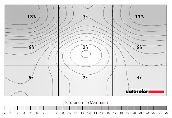
Luminance uniformity map
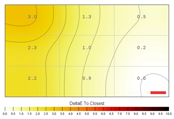
Colour temperature uniformity map
Contrast in games and movies
Lagom contrast tests
Colour reproduction
Colour gamut
Colour gamut 'Test Settings'
The monitor also offers an sRGB emulation mode (setting ‘Game Mode’ to ‘sRGB’ activates this). This significantly cuts back the colour gamut so that it comes closer to sRGB. As shown in the gamut representation below, though, there is a fair bit of under-coverage as well (91% sRGB). This setting can be useful if you require an output closer to sRGB for non colour-managed applications. But if you’re calibrating the monitor with your own colorimeter or similar device, stick to the native gamut. This provides Full sRGB coverage or good DCI-P3 coverage depending on your target for profiling, with overextension of the gamut accounted for colour-managed applications.

Colour gamut 'sRGB'
Colour in games and movies
Viewing angles
The video below shows the Lagom text, a mixed and a dark desktop background from a range of viewing angles. There are some shifts in contrast and colour at sharper viewing angles, but these are far less pronounced than observed on VA and TN models. The final section of the video, with the dark background, highlights ‘IPS glow’ which blooms out from more extreme angles and is described elsewhere in the review. Note the pronounced differences in the hue for this glow towards the left vs. right of the screen.
Interlace pattern artifacts
Responsiveness
Input lag
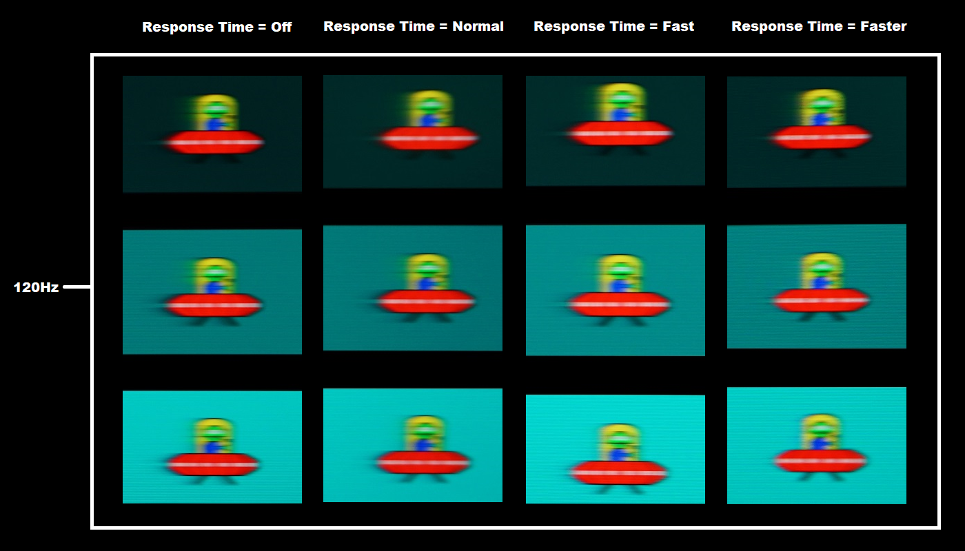
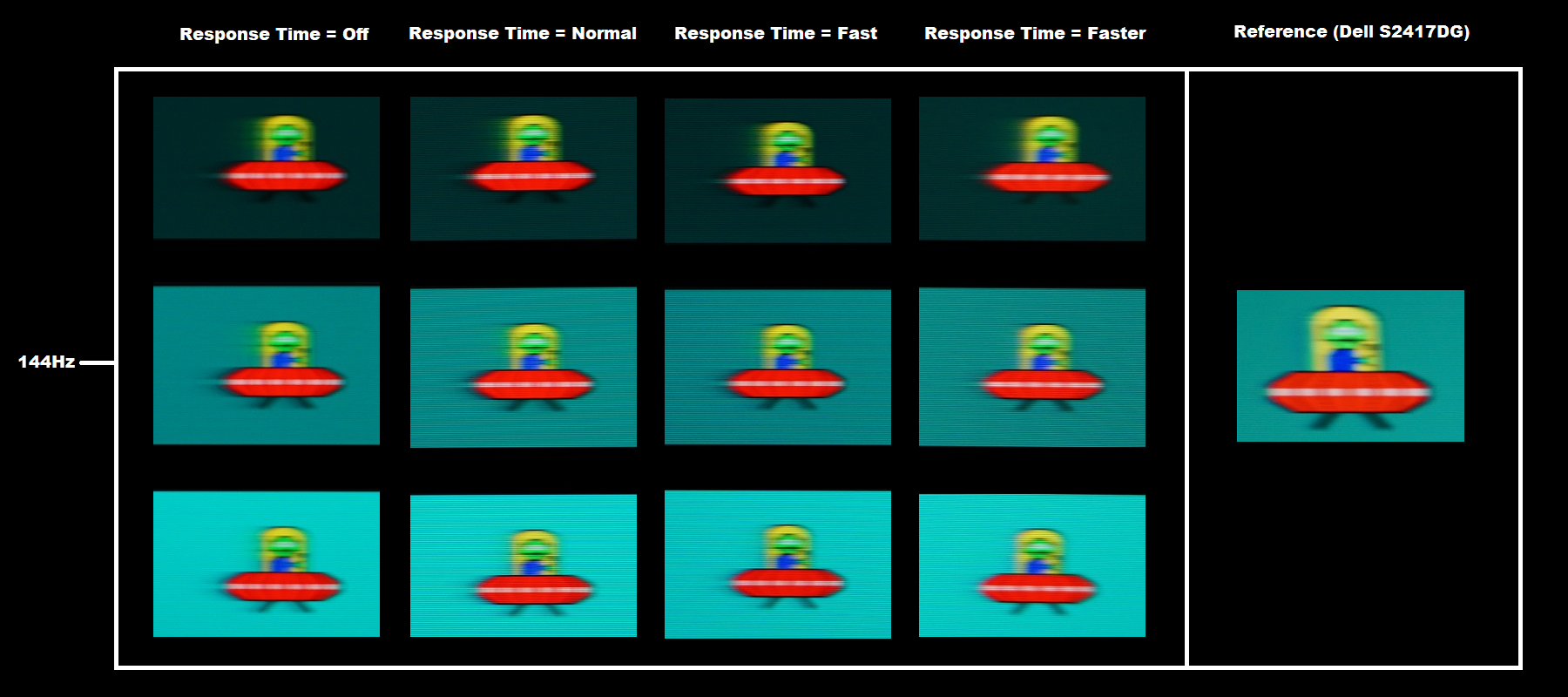
Perceived blur (pursuit photography)
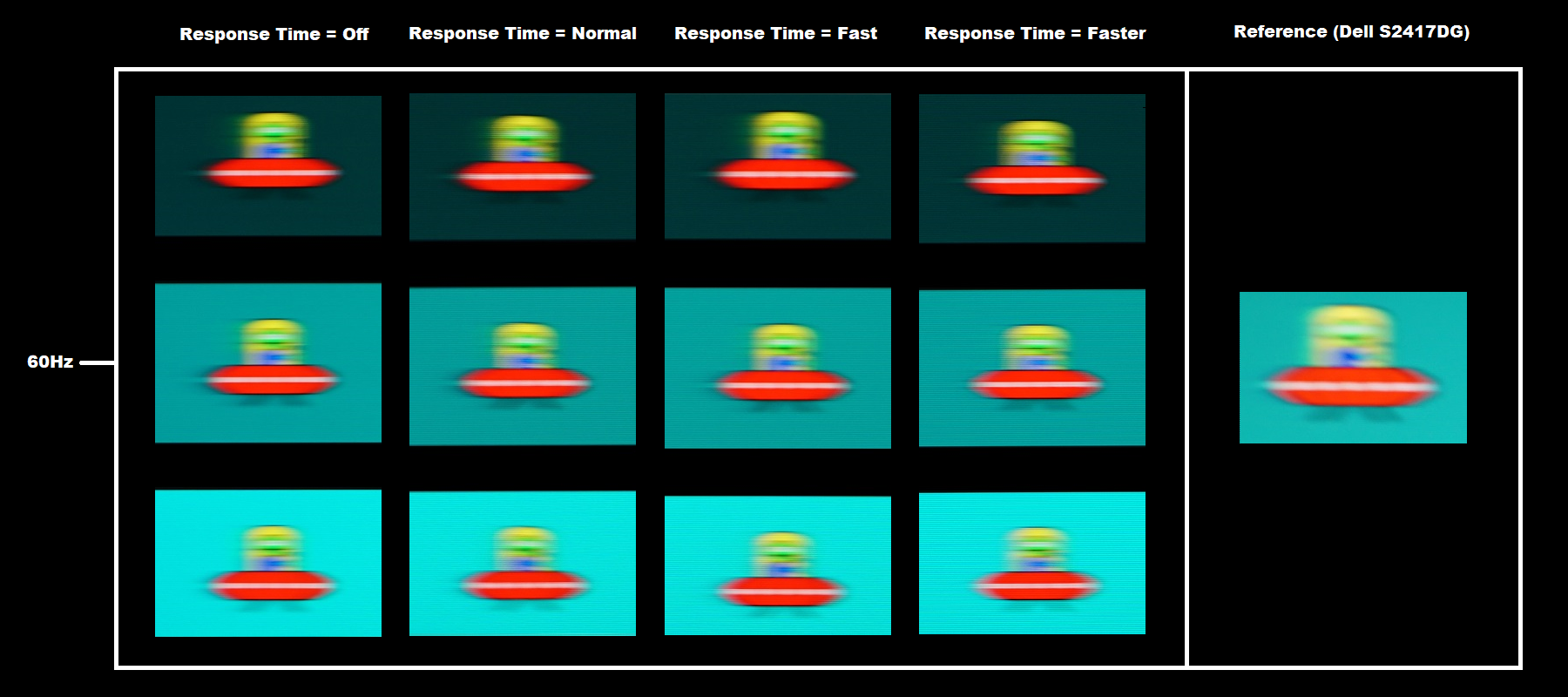
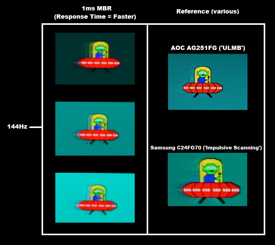
Here you can see that the clarity of the object itself and distinctiveness of fine details on the UFO is significantly increased, indicating a significant decrease of perceived blur due to eye movement. There is also bold trailing behind the object, though, which is fragmented due to the strobing of the backlight. The initial trail directly behind the object is in some cases not too much fainter than the object itself. This fragmented trailing is caused by weaknesses in pixel responsiveness, with the pixel transitions not keeping up with the strobe cycle of the display. Such imperfections are termed ‘strobe crosstalk’ and are usually visible to varying extents on models which use strobe backlight technologies. Depending on how the technology is implemented, this strobe crosstalk can be stronger or weaker at different sections of the screen (vertically) with the central region affected more mildly. On this model there was quite strong strobe crosstalk throughout the screen. If you compare to the AOC AG251FG ULMB (Ultra Low Motion Blur) reference, you can see that this also has strobe crosstalk but it’s not as bold and is instead fragmented overshoot rather than fragmented conventional trailing. The C24FG70 ‘Impulsive Scanning’ reference shows a fair amount of strobe crosstalk with a mixture of conventional trailing and overshoot, but it’s not really as extensive as seen on the LG (or as eye-catching in practice). We explore this setting using some in-game examples shortly.
Responsiveness in games and movies
FreeSync – the technology and activating it
The LG supports a variable refresh rate range of 55 – 144Hz (48 – 144Hz with updated firmware, see note at end of section). That means that if the game is running between 55fps and 144fps, the monitor will adjust its refresh rate to match. When the frame rate rises above 144fps, the monitor will stay at 144Hz and the GPU will respect your selection of ‘VSync on’ or ‘VSync off’ in the graphics driver. With ‘VSync on’ the frame rate will not be allowed to rise above 144fps, at which point VSync activates and imposes the usual associated latency penalty. With ‘VSync off’ the frame rate is free to climb as high as the GPU will output (potentially >144fps). AMD LFC (Low Framerate Compensation) is also supported by this model, which means that the refresh rate will stick to multiples of the frame rate where it falls below the 55Hz (55fps) floor of operation for FreeSync. If a game ran at 32fps, for example, the refresh rate would be 64Hz to help keep tearing and stuttering at bay. This feature is used regardless of VSync setting, so it’s only above the ceiling of operation where the VSync setting makes a difference.
Some users prefer to leave VSync enabled but use a frame rate limiter set a few frames below the maximum supported (e.g. 141fps) instead, avoiding any VSync latency penalty at frame rates near the ceiling of operation or tearing from frame rates rising above the refresh rate. Note that if you enter the OSD the frame rate displayed at the top will update in near enough real-time to reflect changes in the frame rate if FreeSync is active and things are within the FreeSync window of operation. Also note that FreeSync only removes stuttering or juddering related to mismatches between frame rate and refresh rate. It can’t compensate for other interruptions to smooth game play, for example network latency or insufficient system memory.
FreeSync – the experience
Motion Blur Reduction
HDR (High Dynamic Range)

Colour gamut 'Test Settings'
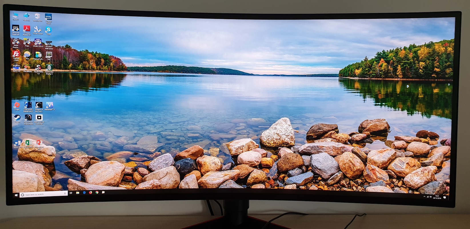
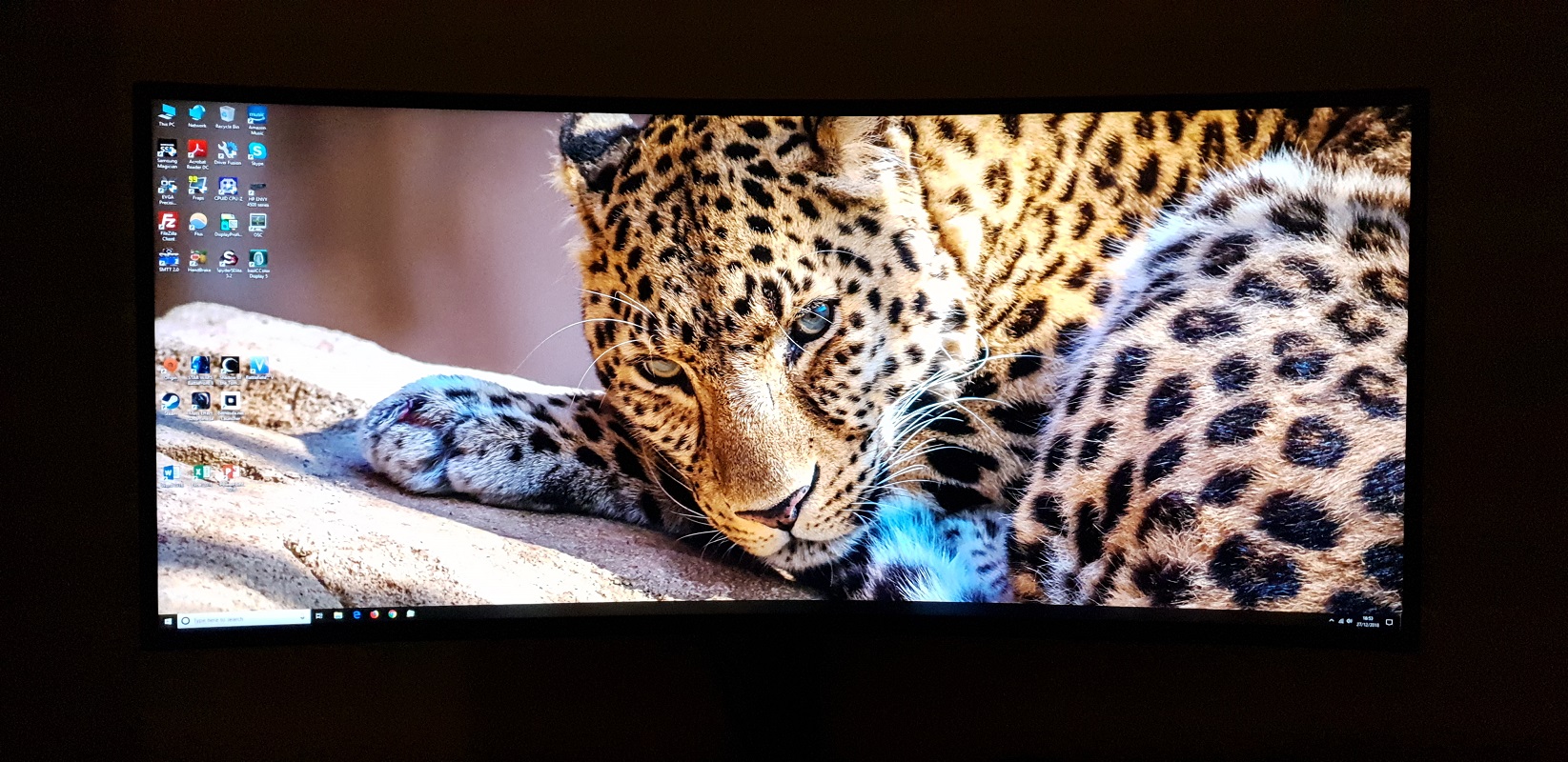
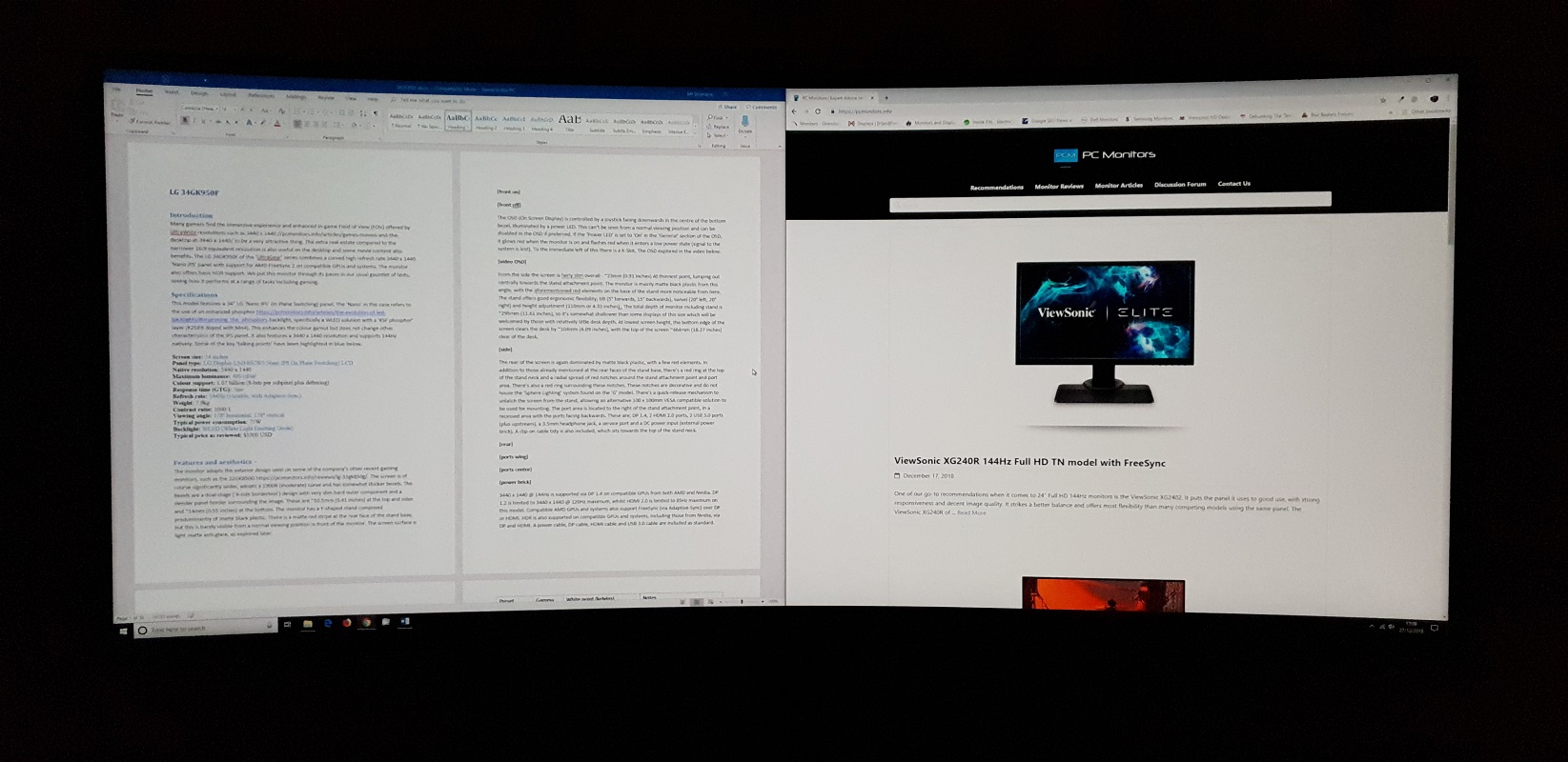
The 34″ 3440 x 1440 curved ‘UltraWide’ experience
Interpolation and upscaling

The interpolation process used by the monitor, for example to display 1920 x 1080 under the ‘Original’ setting (vertical but not horizontal interpolation with black bars at the sides) is quite good as far as monitor interpolation processes go. A moderate but not extreme degree of softening compared to viewing that resolution natively (on a 27” screen). If you’re a PC user you can also create custom resolutions which will allow you to use higher resolutions and make better use of the screen space. We were able to create custom resolutions for 2560 x 1440 @ 144Hz and 2560 x 1080 @ 144Hz via either Nvidia Control Panel or AMD Radeon Settings (both with CVT timing standard, no further manual adjustments required). The monitor only supported scaling for us with 2560 x 1080 at 75Hz or lower, however. GPU scaling needed to be used for 2560 x 1440 regardless of refresh rate and for 2560 x 1080 at higher refresh rates than 75Hz.
Video review
Timestamps:
Features & Aesthetics
Contrast
Colour reproduction
HDR (High Dynamic Range)
Responsiveness
Conclusion
Positives Negatives A highly vibrant and consistent image with good ‘out of the box’ gamma tracking and strong OSD flexibility, a generous colour gamut with almost complete DCI-P3 coverage
The sRGB emulation mode provided quite a bit of under-coverage and the monitor lacks Adobe RGB support – so it’s not necessarily ideal for colour-critical work
Decent static contrast and a very agreeable screen surface, providing a smooth and unimpeded look to the image ‘IPS glow’ eats away at detail, particularly towards the bottom left region of the screen. Limited HDR support, without local dimming and which could’ve put the colour gamut to better use A solid 144Hz performance overall, with FreeSync doing its thing to rid the experience of tearing and stuttering
Some imperfections with pixel responsiveness in places, moderate input lag will put some users off (significantly lower with latest firmware)
A good pixel density and practical resolution, good ergonomics and a smart but fairly robust stand design. The curve provides a slight edge to depth without feeling unnatural
The ‘Sphere Lighting’ feature of the G-SYNC model would’ve been a nice although admittedly non-essential addition
![]()

