Author: Adam Simmons
Date published: April 22nd 2022
Table of Contents
Introduction
The enhanced ‘connected feel’ and fluidity provided by the combination of high refresh rate and frame rate is very attractive to a wide range of gamers. The AOC AG254FG of the AGON PRO series is built with this in mind, with an IPS-type panel running at 360Hz for competitive play. And a G-SYNC module for a ‘full fat’ VRR experience, including support for Nvidia’s Reflex Latency Analyzer technology. We put this monitor through its paces to see how it performs under our usual suite of tests, with our usual focus on gaming, movies and desktop usage.
Specifications
The monitor adopts a 24.5” AUO AHVA (Advanced Hyper-Viewing Angle) IPS-type panel. This supports true 8-bit colour, a 360Hz refresh rate and 1920 x 1080 resolution. A 1ms grey to grey and 0.5ms MPRT response time is specified, but as usual don’t pay too much attention to these figures. Some of the key ‘talking points’ for this monitor have been highlighted in blue below, for your reading convenience.
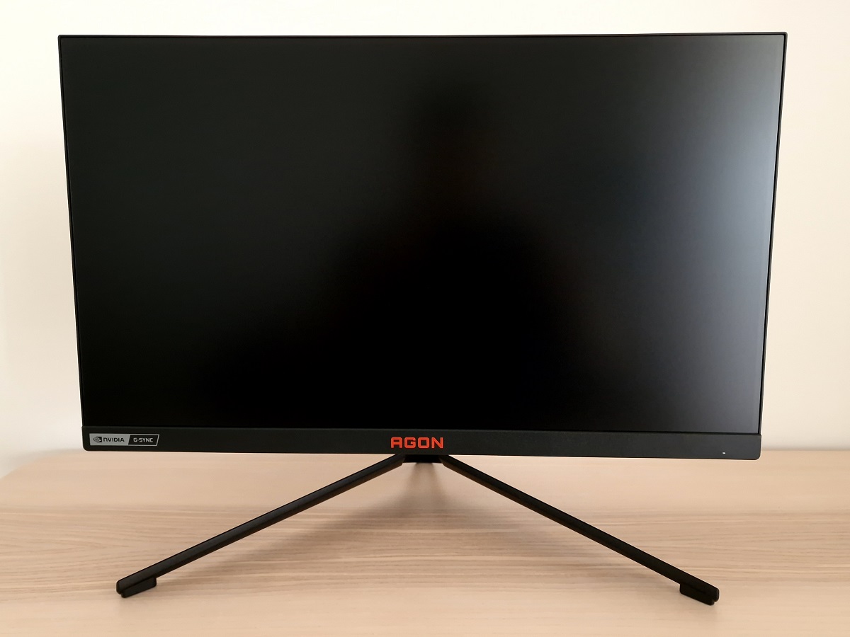
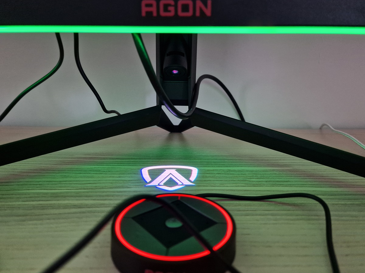
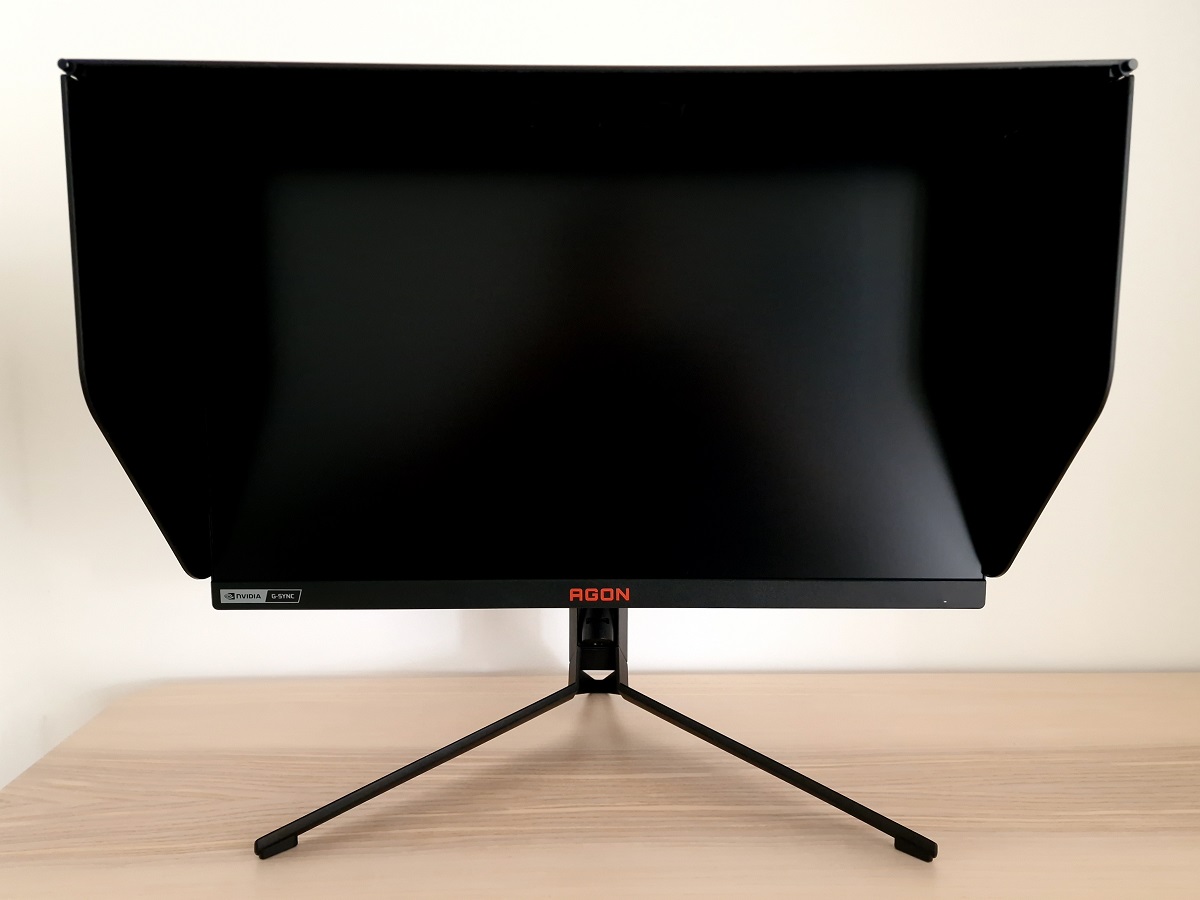
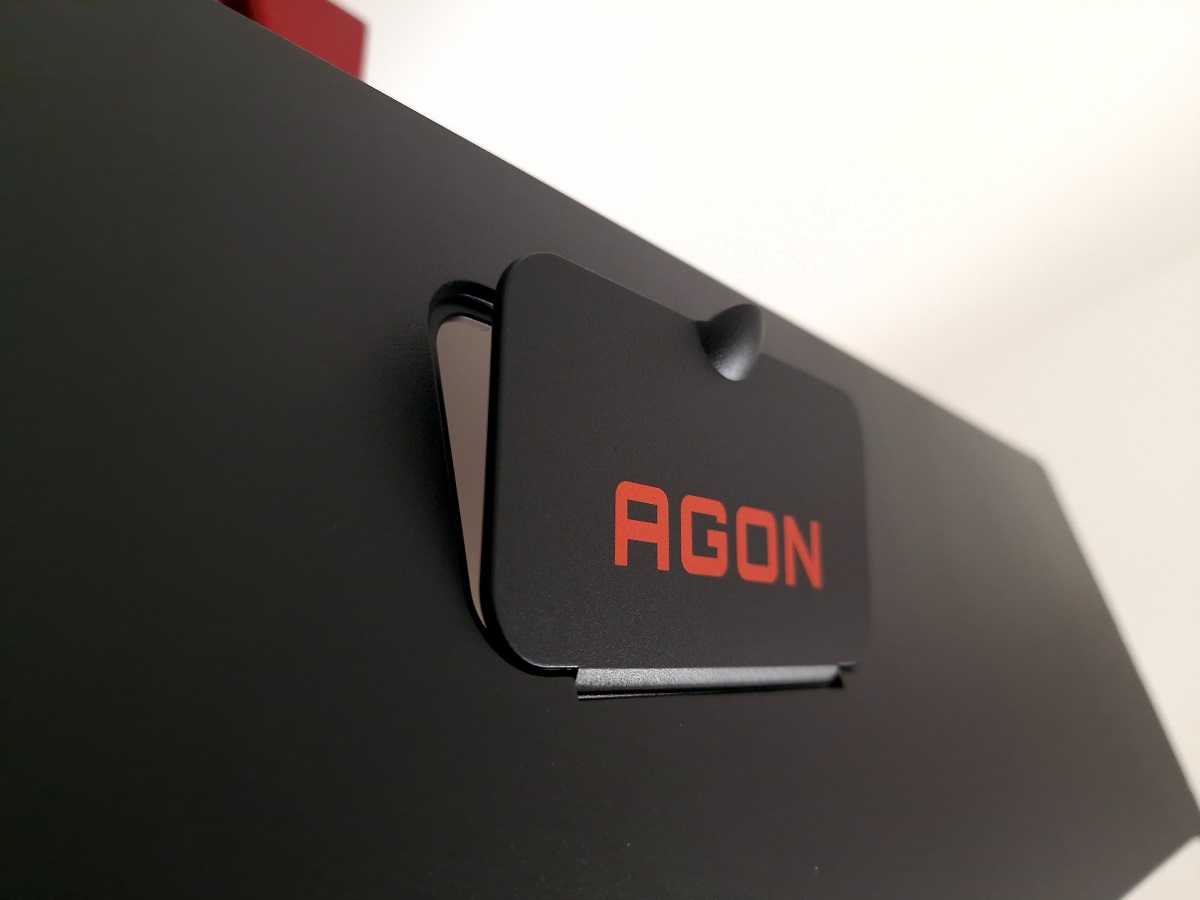
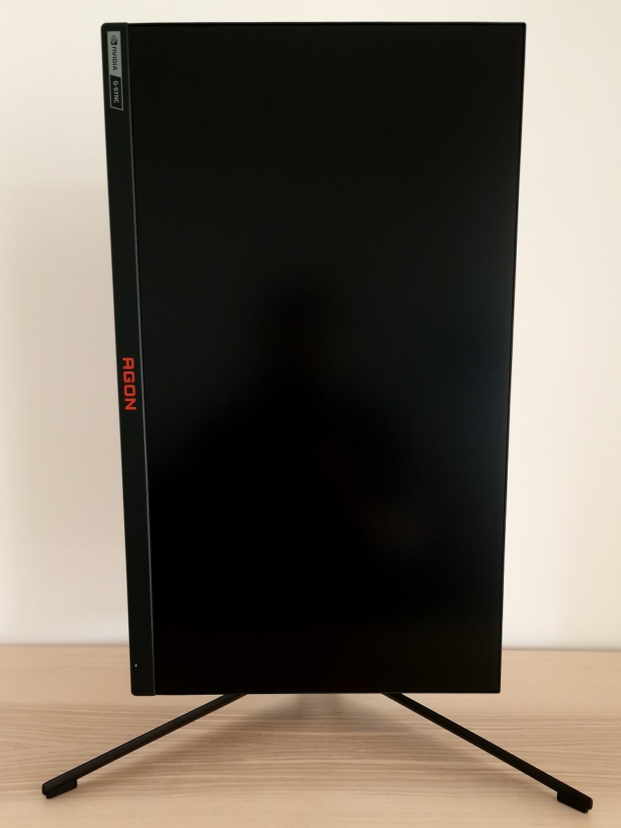
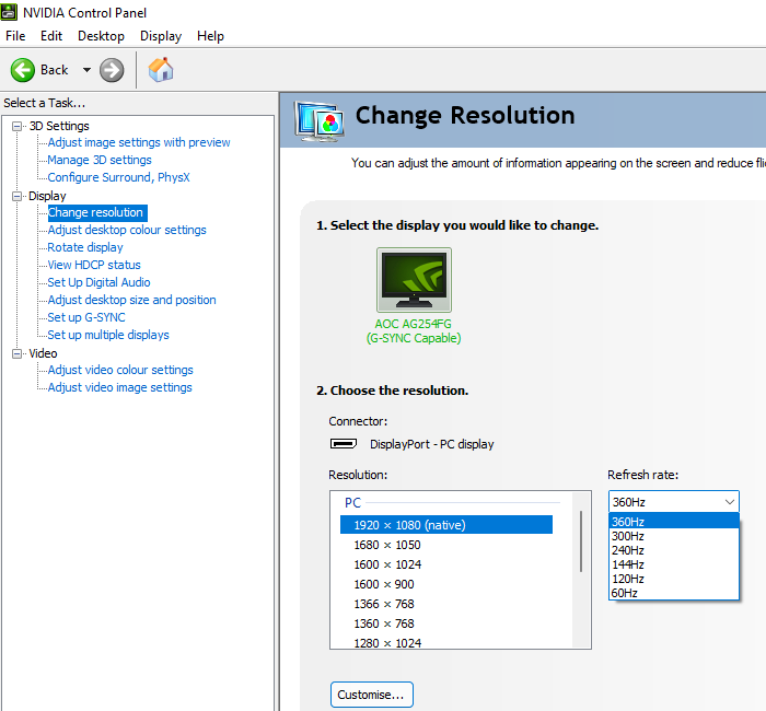
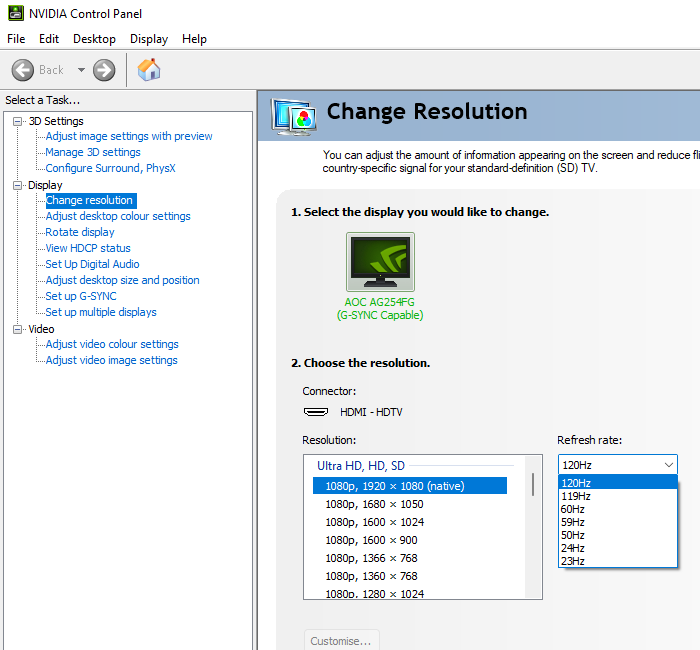
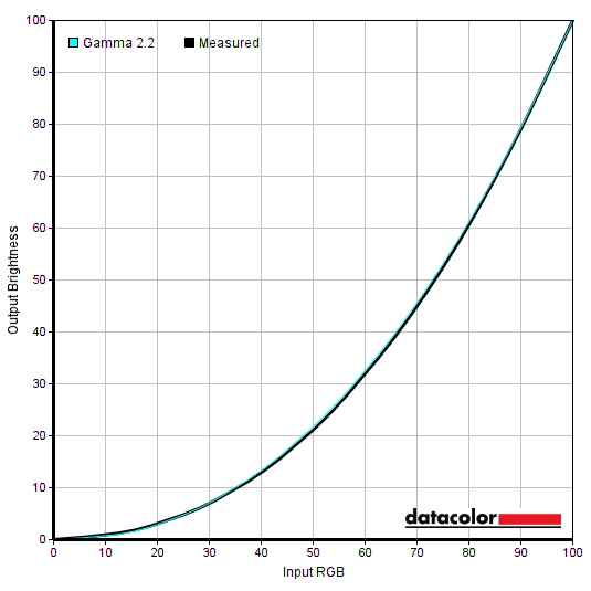
The monitor has what we’d describe as ‘gamery’ styling. Matte black plastic is used extensively, but some colourful features are included. There’s a dark red AGON logo central to the bottom bezel and a grey Nvidia G-SYNC logo to the left. A strip of customisable ‘Light FX’ RGB LEDs are found on the underside of the bottom bezel, alongside a down-firing ‘Logo Projector’ which projects an AGON logo or lettering onto the desk. A small switch next to the projector element allows you to choose either the logo or lettering. You can configure or disable these lighting features individually. The bottom bezel is ~21mm (0.83 inches) thick, whilst the top and side bezels are slimmer. They have a dual-stage design with very slender panel border flush with the rest of the screen plus a thin hard plastic outer part. Including both components the bezels are ~6mm (0.24 inches) thick at the top and sides. The tripod-style stand has a metal coating for the base and sides of the neck, which help give it a reasonably weighty and premium feel. A detachable ‘shadow shield’ hood is included for glare reduction at the top and sides, with black plastic outer surface and inner felt lining. This also has a ‘calibration hatch’ at the top to allow you to feed a calibration device through. The screen itself has a medium matte anti-glare finish, as explored a bit later. 2 x 5W DTS speakers are also included, with an up-firing design located either side of the AGON logo at the rear. Whilst they don’t deliver the most breathtaking audio experience we’ve had from a monitor, they’re far from being the worst and a good step up over most integrated speakers you’ll find on a monitor. They produce fairly rich sound output with an excellent volume adjustment range. There’s a ‘DTS’ option in the OSD which produces a cleaner and crisper sound, with things sounding a bit crushed together and bass-heavy without. Personal preferences will come into play here, though either way don’t expect thumping bass and amazingly crisp trebles from these. A pretty decent set of speakers if you need to use them or want to use them, but not a definite replacement for a good set of standalone speakers or headphones. The images below show the refresh rates supported for the native 1920 x 1080 (Full HD or 1080p) resolution. The first image shows the refresh rates supported via DP, with the resolutions categorised in the EDID of the monitor and listed here as ‘PC’ resolutions. The second image shows some of the refresh rates supported via HDMI, categorised in the EDID as ‘TV’ resolutions and listed here under ‘Ultra HD, HD, SD’. The third image shows the remaining refresh rates supported via HDMI, categorised as ‘PC’ resolutions. Note that a ‘4k x 2k, 3840 x 2160’ downsampling mode is not included, so the monitor will not accept a 3840 x 2160 (‘4K’ UHD) signal. The image below is a macro photograph taken on Notepad with ClearType disabled. The letters ‘PCM’ are typed out to help highlight any potential text rendering issues related to unusual subpixel structure, whilst the white space more clearly shows the actual subpixel layout alongside a rough indication of screen surface. This model uses a ‘regular’ (medium) matte anti-glare screen surface. This provides strong glare handling, whilst diffusing the light emitted from the monitor relatively strongly as well. This affects the vibrancy and clarity of the image, with a bit of a layered appearance in front of the image and a grainy (or ‘sandy’) appearance to lighter content. Whilst glare handling characteristics are strong, bright environments can ‘flood’ the image due to light being heavily diffused by the screen surface, so this is still best avoided if possible. The AOC AG254FG includes various ‘Game Mode’ presets; ‘FPS’, ‘RTS’, ‘Racing’, ‘G-SYNC Esports’, ‘Gamer 1’, ‘Gamer 2’ and ‘Gamer 3’. These change various settings in the OSD and lock off access to certain settings. The ‘FPS’, ‘RTS’, ‘Racing’ and ‘G-SYNC Esports’ presets restrict options in the ‘Color Setup’ menu and lock off the ‘Luminance’ menu, which means brightness is locked at a moderate level (equivalent to ‘145 nits’ setting in OSD) and can’t be adjusted. The numbered ‘Gamer’ presets allow access to the ‘Luminance’ menu, but the ‘Color Setup’ menu remains greyed out and various changes are made to colour reproduction which can’t be counteracted. We explore the ‘Game Mode’ presets briefly in the OSD video, but for this section we’ll focus on various manual adjustments instead. The default Color Temp. setting of ‘Warm’ was the same as ‘User’ and all channels at ‘50’ on our unit. The table below includes white point and gamma readings taken using a Datacolor SpyderX Elite colorimeter, alongside general observations on the image. Our test system uses Windows 11 with an Nvidia RTX 3090 connected using the supplied DP cable. Additional testing was performed using an AMD Radeon RX 580 and using HDMI, although observations for this table didn’t vary significantly between GPUs or inputs. The monitor was left to run for over 2 hours before data was collected and no additional monitor drivers or ICC profiles were specifically loaded. Aside from for our ‘Test Settings’, where various adjustments were made, assume factory defaults were used. The exception was that the ‘SDR Variable Backlight’ setting was disabled for consistency – this is explored separately later. The refresh rate was set to 360Hz in Windows, although this didn’t affect the readings or observations in this table. When viewing the figures in this table, note that for most PC users ‘6500K’ for white point and ‘2.2’ for gamma are good targets to aim for. Individual targets depend on individual uses, tastes and the lighting environment, however. Straight from the box the monitor provided an image that was a touch cool-tinted but otherwise well-balanced. Regular content designed for the sRGB colour space was given a look we’d describe as quite rich and natural, with good consistency from the IPS-type panel but without the oversaturation provided by a wide gamut monitor. Gamma tracked the ‘2.2’ curve tightly, as shown below. This graph shows the results under our ‘Test Settings’, but gamma tracking using factory defaults was very similar. The monitor’s gamma offsets also worked as advertised in the OSD, giving an appropriate plus or minus in increments of ‘0.2’. Given the intended uses for the monitor, inter-unit variation and pleasing performance on our unit with OSD tweaking alone we won’t be using any ICC profiles in this review or including any measurements or graphs using them. We wouldn’t recommend using them unless created for your specific unit using your own calibration device. But we appreciate some users still like to use profiles for any potential corrections they can make that may also apply to their unit. You can download our ICC profile for this model, which was created using our ‘Test Settings’ as a base. Be aware of inter-unit variation and note again that this ICC profile is not used in the review. The monitor includes some ‘LowBlue Mode’ Low Blue Light (LBL) settings, found in the ‘Color Setup’ section of the OSD. From weakest to strongest effect these are; ‘Multimedia’, ‘Internet’, ‘Office’ and ‘Reading’. Our unit’s white point was a touch on the high side out of the box and these settings slightly reduced it. But even the most effective setting, ‘Reading’, only acted as a rather mild LBL setting. The image was slightly warm and was quite well-balanced in terms of the green channel as well. Blue light reduction can be further minimised by reducing monitor brightness. Reducing exposure to blue light is particularly important in the hours leading up to sleep as blue light affects sleep hormones. Increasing alertness and making it more difficult for the body to shut off. Whilst the ‘Reading’ setting (especially with reduced brightness) may work for some people, we’d advise taking alternative measures with this monitor. Some alternatives are discussed in this thread and include manually reducing the blue colour channel, using software such as f.lux or the integrated ‘Night light’ feature found on Windows 10 upwards. When using the menu system we came across a number of quirks. Whilst not all are unique to this monitor, some are and we’d consider them ‘unexpected’ and undesirable. It’s worth being aware of them and in some cases we’ve included some possible remedies. The manufacturer has been made aware of these issues and it’s possible some of them have already been addressed or could be addressed in newer revisions of the monitor than our unit (manufactured August 2021): For our ‘Test Settings’ we reduced brightness and made some colour channel adjustments. We had ‘Game Mode’ set to ‘Gamer 1’ – but ‘Off, ‘Gamer 2’ or ‘Gamer 3’ can be used as a base if preferred. Note that individual units and preferences vary, so these settings are simply a suggestion and won’t be optimal for all users or units. We’ve also included our preferred ‘Overdrive’ setting used for most of the review and the refresh rate used in Windows, just for reference. These settings only apply to SDR, HDR has separate settings associated with it (is far more restrictive) and is explored in the relevant section of the review. Game Mode = Gamer 1 Peak white (nits) = 150 nits (according to preferences and lighting) SDR Variable Backlight = Off Color Temp. = User R = 50 G = 48 B = 36 Overdrive = Weak Refresh rate (Windows setting) = 360Hz An X-Rite i1Display Pro Plus (Calibrite ColorChecker Display Plus) was used to measure the luminance of white and black using various settings, including those found in the calibration section. From these values, static contrast ratios were calculated. The table below shows these results, with blue highlights indicating the results with HDR active and under our ‘Test Settings’. Black highlights indicate the highest white luminance, lowest black luminance and highest contrast ratio recorded (ULMB deactivated). Assume any setting not mentioned was left at default, with the exceptions already noted here or in the calibration section. This includes ‘Variable Backlight’ being disabled unless stated otherwise. The monitor has a ‘Max Brightness’ setting, but this simply changes default brightness to ‘200 nits’ (vs. ‘105 nits’) and turns on the logo projector. You can achieve the same results with either setting and the brightness adjustment range is the same. Measurements using ULMB were taken at 144Hz at maximum OSD brightness level of ‘Peak white (nits) = 225’ – brightness levels were similar at 240Hz, so we didn’t feel it was worthwhile documenting these observations on the table.
*10-bit can be selected in the graphics driver up to 300Hz and 12-bit up to 240Hz, using DP 1.4 under SDR or HDR at the native resolution. 10-bit and 12-bit can be selected up to 120Hz plus 12-bit (but not 10-bit) at 144Hz, using HDMI 2.0 under SDR or HDR at the native resolution. The panel used is only an 8-bit panel, but the monitor’s scaler can add a dithering stage to facilitate work with higher bit depth content.
As an Amazon Associate I earn from qualifying purchases made using the below link. Where possible, you’ll be redirected to your nearest store. Further information on supporting our work.

Features and aesthetics
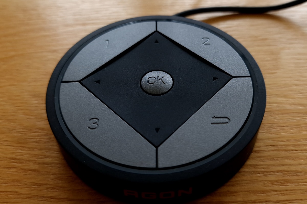
The OSD (On Screen Display) is controlled by a joystick at the rear, towards the right side as viewed from the front. Or alternatively using the included wired ‘QuickSwitch’ OSD remote. A small forwards-facing power LED is located towards the right side of the bottom bezel, which glows white when the monitor is on or orange when it enters a low power state. The following video runs through the menu system including the ‘Light FX’ and ‘Logo Projector’ lighting features.
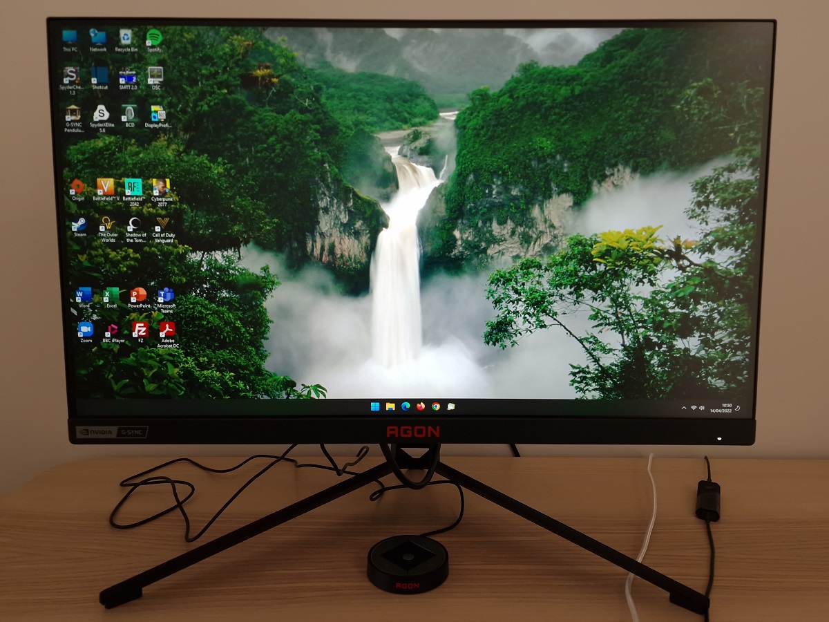
The screen is reasonably slim at thinnest point (~19mm or 0.75 inches), bulking out more centrally towards the stand attachment point. The stand is fully adjustable including; tilt (3° forwards, 21° backwards), swivel (30° left and right), height adjustment (130mm or 5.12 inches) and 90° clockwise rotation into portrait. The height adjustment is a bit grabby and the screen wobbles a fair bit if tapped (or using the OSD joystick), but it feels fairly solid otherwise. At lowest stand height the bottom of the screen clears the desk by ~63mm (2.48 inches) with the top of the screen ~395mm (15.56 inches) above the desk. The total depth of the monitor including stand is ~308mm (12.13 inches) with the screen sitting ~30mm (1.18 inches) back from the frontmost point of the stand. So this is a fairly chunky design for a relatively small monitor using the included stand.
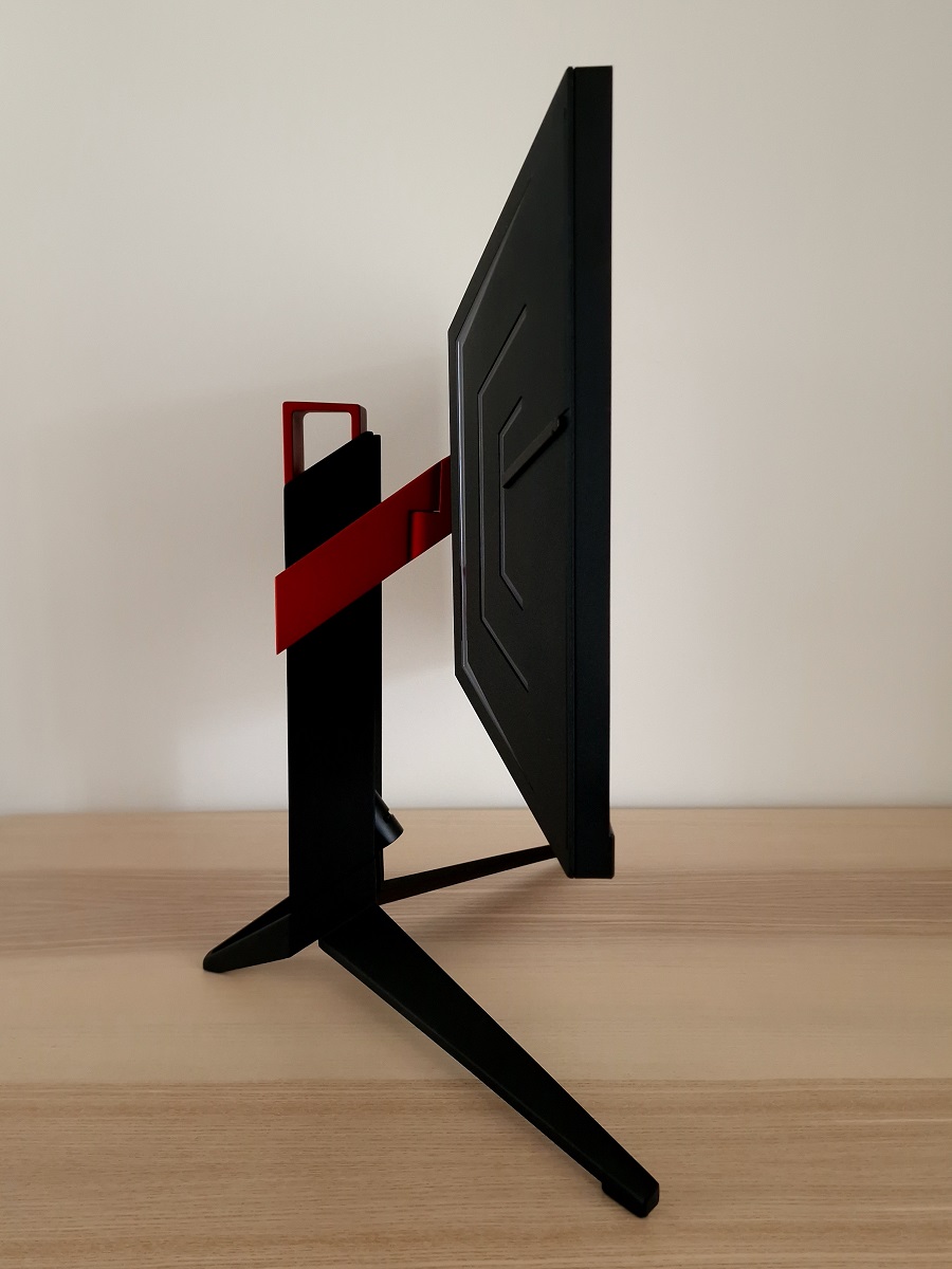
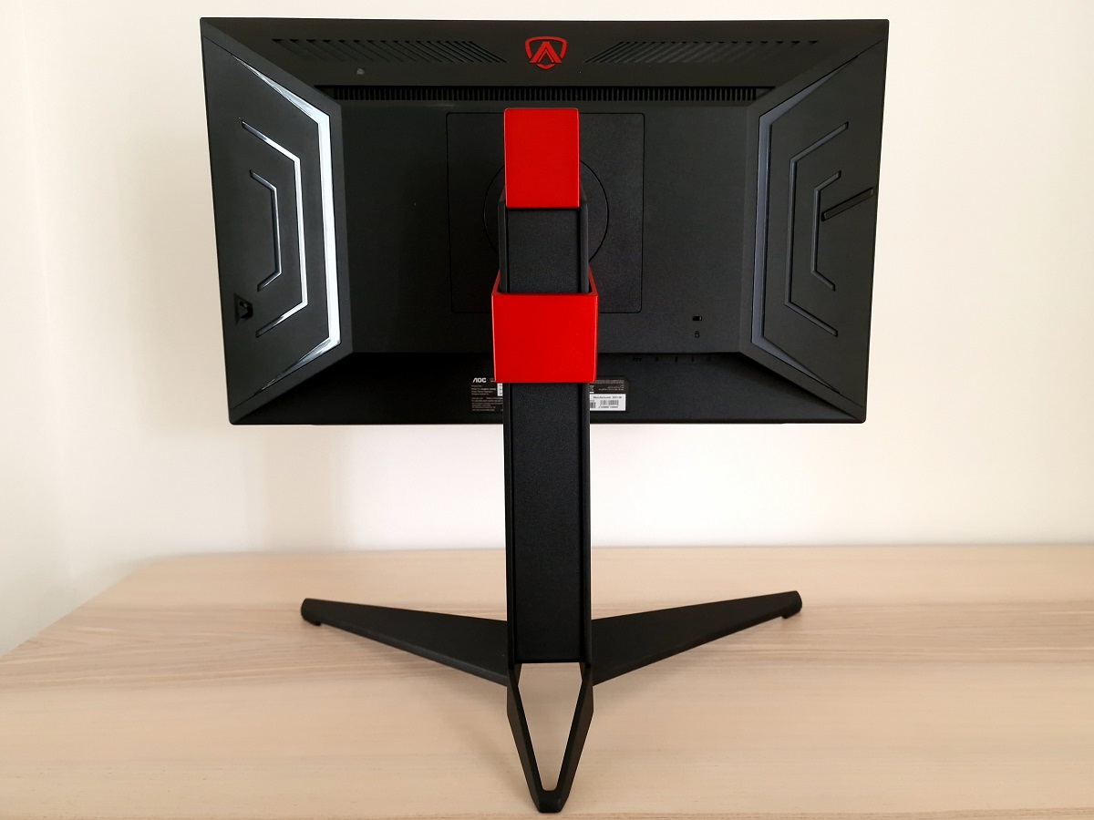
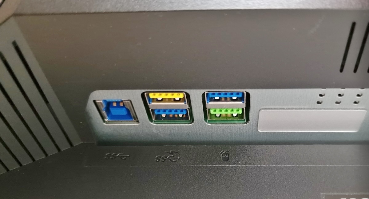
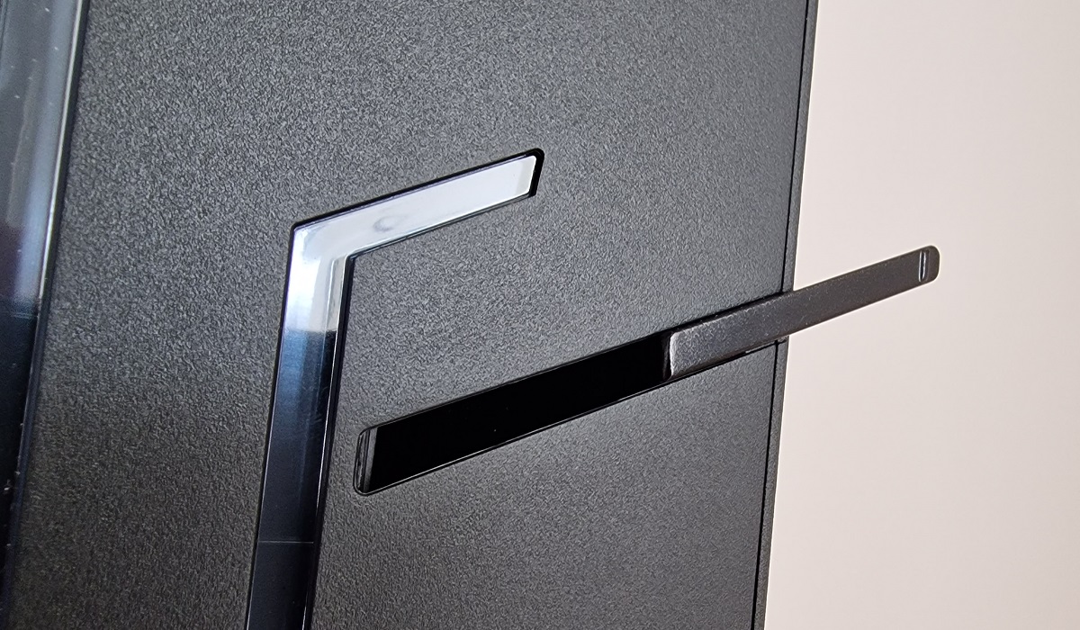
The rear of the monitor is a mixture of matte black plastic with some metallic red elements on the stand and a red-coloured logo towards the top of the screen. These are a darker red than they tend to appear in pictures (including the one below). There are also transparent glossy plastic ‘cheek’ lines which house ‘Light FX’ LEDs, allowing them to be illuminated with various colours and flashing patterns as explored in the OSD video. Also touched upon in the OSD video is the ‘Auto Brightness’ feature of the monitor, facilitated by the light sensor located towards the top left, beneath the lower ventilation slats. A slide-out headphone hook is located at the left side, as viewed from the front. The stand attaches centrally via a quick-release mechanism with a switch beneath the attachment point. Removing this reveals 100 x 100mm VESA holes for alternative mounting. The ports face downwards and include; 3 USB 3.2 Gen1 ports (yellow-coloured with fast charging), a Reflex Latency Analyzer port (green coloured USB port), USB 3.2 Gen1 upstream, 2 HDMI 2.0 ports, DP 1.4, DC power input (external ‘power brick’), a ‘QuickSwitch’ port, 3.5mm microphone out (connects to PC), 3.5mm microphone in and a 3.5mm headphone jack.
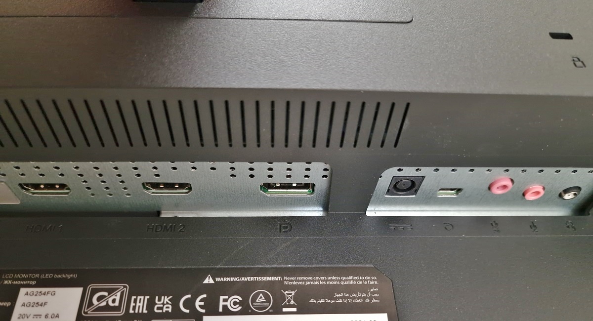
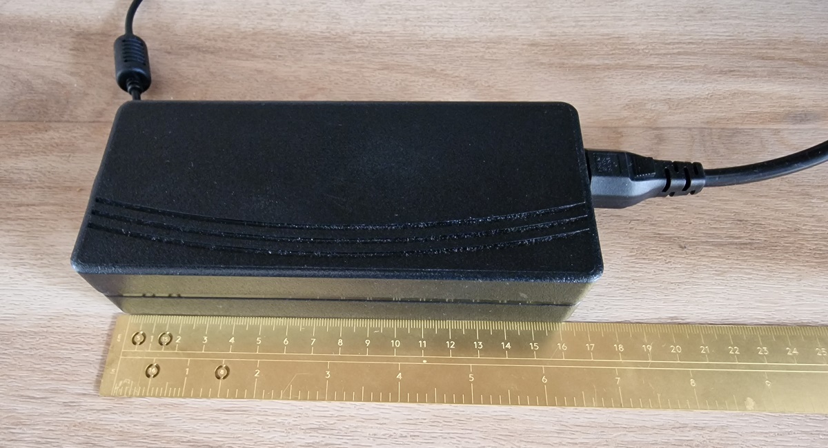
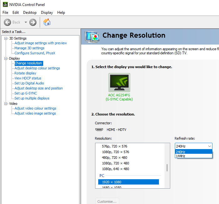
A power cable and adaptor is included as standard, whereas additional accessories vary regional but may include; a DP cable, HDMI cable, USB cable and microphone cable. The full capability of the monitor including 1920 x 1080 @360Hz plus HDR and G-SYNC (or FreeSync via Adaptive-Sync) can be leveraged using DP 1.4. Compatible Intel graphics hardware should also be able to use VRR (i.e. access the G-SYNC module) via DP Adaptive-Sync. The monitor is limited to 240Hz maximum over HDMI and can leverage HDR plus G-SYNC.
If you’re intending to use the monitor with the PS5 or Xbox Series X/S, be aware that a small settings tweak may be required to ensure 120Hz is selectable. Details can be found in this article.
Calibration
Subpixel layout and screen surface
![]()
As shown above the standard RGB (Red, Green and Blue) stripe subpixel layout is used. This is the default expected by modern operating systems such as Microsoft Windows. Apple’s MacOS no longer uses subpixel rendering and therefore doesn’t optimise text for one particular subpixel layout to the detriment of another. You needn’t worry about text fringing from non-standard subpixel layouts and won’t need to change the defaults in the ‘ClearType Text Tuner’ as a Windows user. You may still wish to run through the ClearType wizard and adjust according to preferences, however. The subpixel layout and arrangement is normal and we had no subpixel-related concerns related to sharpness or text clarity on this model.
Testing the presets
Monitor Settings Gamma (central average) White point (kelvins) Notes Color Temp. Warm (Factory Defaults) 2.2 7071K Quite a rich and varied appearance, slightly cool-tinted but otherwise well-balanced for content within the sRGB colour space. Relative Gamma -0.4 1.8 7071K As above but a flooded appearance introduced due to low gamma. Relative Gamma -0.2 2.0 7069K As above, slight increase in depth. Relative Gamma +0.2 2.4 7070K Factory defaults with a touch of extra depth and ‘punch’ from the raised gamma. Notable detail loss for darker shades. Relative Gamma +0.4 2.6 7071K As above but a further increase. Quite a cinematic look, overly blended with huge amount of dark detail loss. LowBlue Mode = Multimedia 2.2 6963K Very slightly warmer than factory defaults, with a corresponding very slight reduction in blue channel. Blue light output from the monitor is only reduced by a very small amount. LowBlue Mode = Internet 2.2 6825K As above, a very slight further reduction. LowBlue Mode = Office 2.2 6536K As above, further reduction. In-line with 6500K target rather than a ‘Low Blue Light’ (LBL) setting. LowBlue Mode = Reading 2.2 6190K A mild LBL setting, slightly reducing blue channel and blue light output from the screen. It remains quite high and this certainly isn’t a very effective LBL setting. Test Settings (see below) 2.2 6495K A fairly rich, natural and well-balanced look overall.
Gamma 'Test Settings'
Test Settings
Contrast and brightness
Contrast ratios
Monitor Settings White luminance (cd/m²) Black luminance (cd/m²) Contrast ratio (x:1) Peak white (nits) = 450 / max 433 0.39 1110 Peak white (nits) = 350 386 0.35 1103 Peak white (nits) = 250 274 0.25 1096 Peak white (nits) = 150 162 0.15 1080 Peak white (nits) = 100 106 0.10 1060 Peak white (nits) = 40 / min 40 <0.04 >1000 Peak white (nits) = 105 (Factory Defaults) 112 0.11 1018 HDR – Variable Backlight = Off 433 0.39 1110 HDR – Variable Backlight Mode = Gaming 440 0.39 1128 HDR – Variable Backlight Mode = Hybrid 440 0.39 1128 HDR – Variable Backlight Mode = Desktop 439 0.39 1126 Variable Backlight Mode = Gaming** 439 0.39 1126 Variable Backlight Mode = Hybrid** 439 0.39 1126 Variable Backlight Mode = Desktop** 439 0.39 1126 Relative Gamma -0.4 113 0.11 1027 Relative Gamma -0.2 113 0.11 1027 Relative Gamma +0.2 112 0.11 1018 Relative Gamma +0.4 112 0.11 1018 LowBlue Mode = Multimedia 112 0.11 1018 LowBlue Mode = Internet 112 0.11 1018 LowBlue Mode = Office 111 0.11 1009 LowBlue Mode = Reading 111 0.11 1009 ULMB, Pulse Width = 10 20 >0.02 <1000 ULMB, Pulse Width = 50 100 0.11 909 ULMB, Pulse Width = 100 198 0.21 943 Test Settings 158 0.15 1053
*HDR measurements were made using this YouTube HDR brightness test video, running full screen at ‘1080p HDR’ on Google Chrome. The maximum reading from the smallest patch size (measurement area) that comfortably covered the entire sensor area and colorimeter housing was used for the white luminance measurement, which was ‘4% of all pixels’ in this case. The black luminance was taken at the same point of the video with the colorimeter offset to the side of the white test patch, equidistant between the test patch and edge of the monitor bezel.
**These readings were taken in the same way as the HDR reading, except the monitor is running in SDR. ‘Peak white (nits)’ was set to the maximum value of ‘450’.
The average static contrast with only brightness adjusted was 1090:1, just edging beyond the specified 1000:1. The maximum contrast recorded under SDR (‘Variable Backlight’ disabled) was 1103:1. We recorded 1053:1 under our ‘Test Settings’, which is respectable given the colour channel rebalancing. Contrast dropped below 1000:1 using ULMB, whilst the ‘Pulse Width’ setting provided a decent brightness adjustment range. Though some will prefer a brighter level than 198 cd/m², which as usual for strobe backlight settings is also perceived as slightly dimmer than a similar value with normal operation. The maximum white luminance recorded (‘Variable Backlight’ disabled) was 433 cd/m², whilst the minimum white luminance (‘ULMB’ disabled) was 40 cd/m². This gives a luminance adjustment range of 393 cd/m² with quite a bright maximum and quite a dim minimum. The luminance levels claimed in the OSD didn’t correspond exactly with our measured values and don’t account for additional changes to colour channels and suchlike that can also affect brightness. But they provided a decent guide, particularly at moderate and lower brightness levels.
The monitor includes a setting called ‘Variable Backlight’, which on some models would mean local dimming is employed. On this model only global dimming is used, with this setting simply offering a ‘Dynamic Contrast’ experience. It’s most reactive and likely the backlight will change brightness as the scene brightness levels change when set to ‘Gaming’ or ‘Hybrid’ and less so for ‘Desktop’. But we didn’t find it made particularly dramatic changes in most cases, even if set to ‘Gaming’ and regardless of brightness setting used. It provides a similar experience for HDR, though brightness can’t be manually adjusted. The lack of local dimming meant there was no real contrast advantage with the setting enabled in this test, so not HDR-like at all in that respect. Brightness was marginally higher due to slight differences in image setup (‘looser’ calibration), but the black depth was not improved and contrast remained very similar. We explore the setting subjectively in the HDR section shortly, but we certainly didn’t appreciate it for SDR usage and even for a Dynamic Contrast setting it wasn’t particularly useful.
PWM (Pulse Width Modulation)
The AG254FG does not use PWM (Pulse Width Modulation) to regulate backlight brightness at any level. Instead, DC (Direct Current) is used to moderate brightness. The backlight is therefore considered ‘flicker-free’, which will come as welcome news to those sensitive to flickering or worried about side-effects from PWM usage. The exception to this is with ‘ULMB’ active, a strobe backlight setting which causes the backlight to flicker in sync with the refresh rate of the display (either 144Hz or 240Hz).
Luminance uniformity
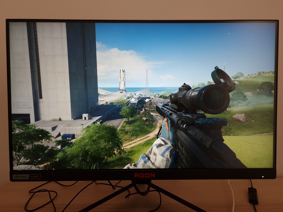
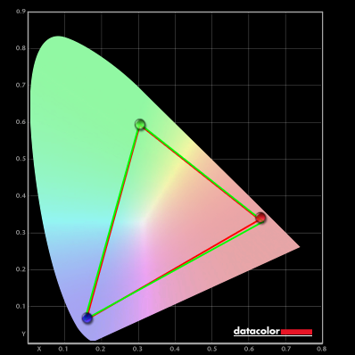
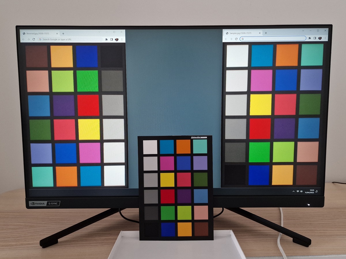
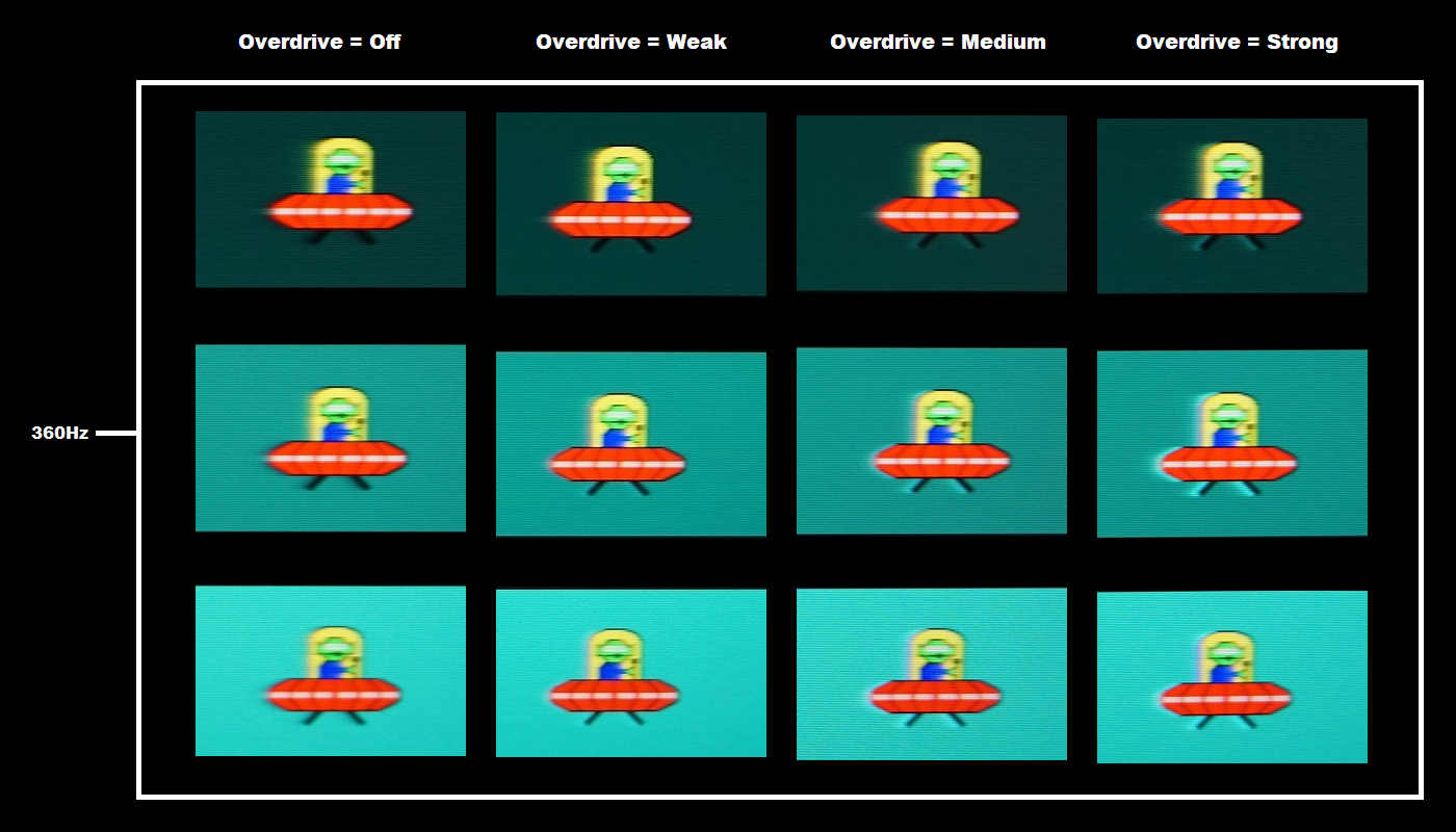
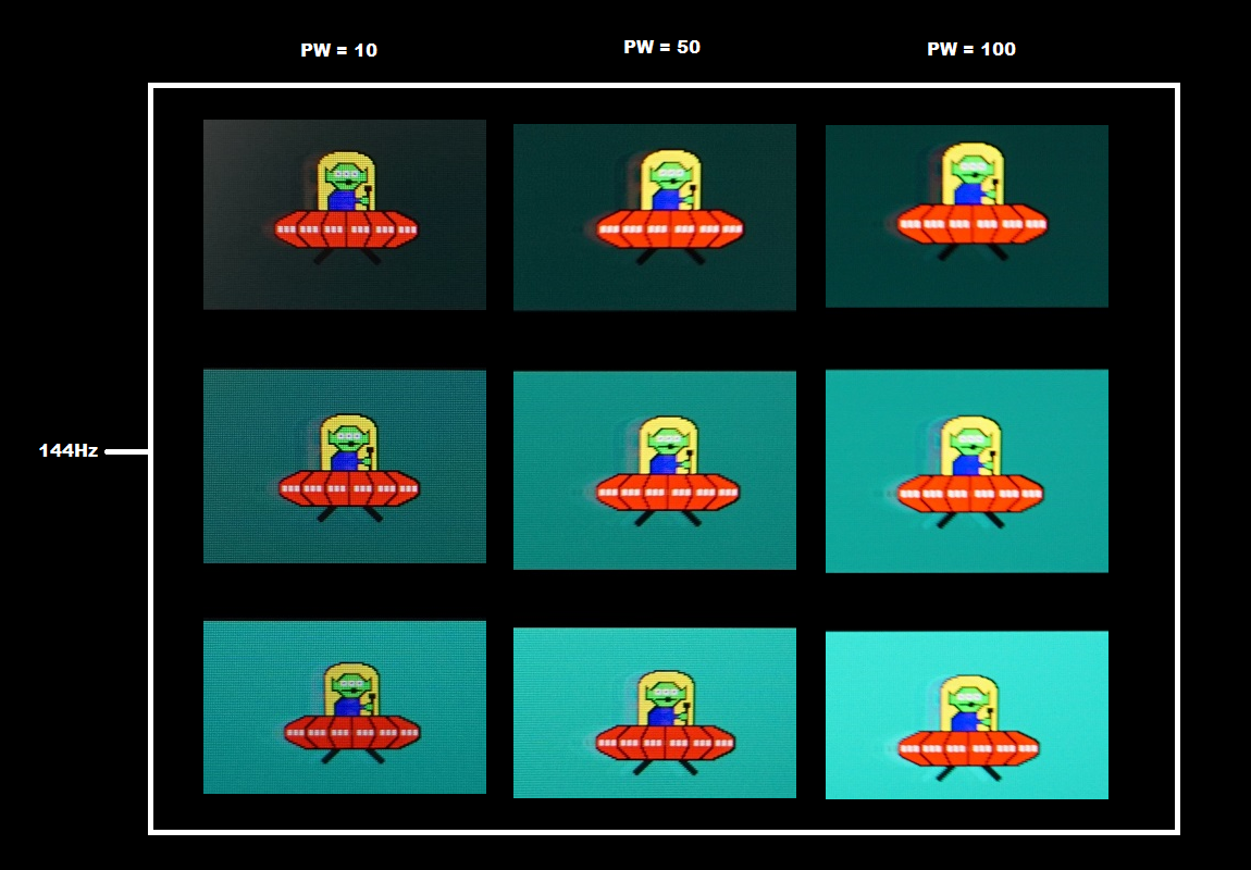
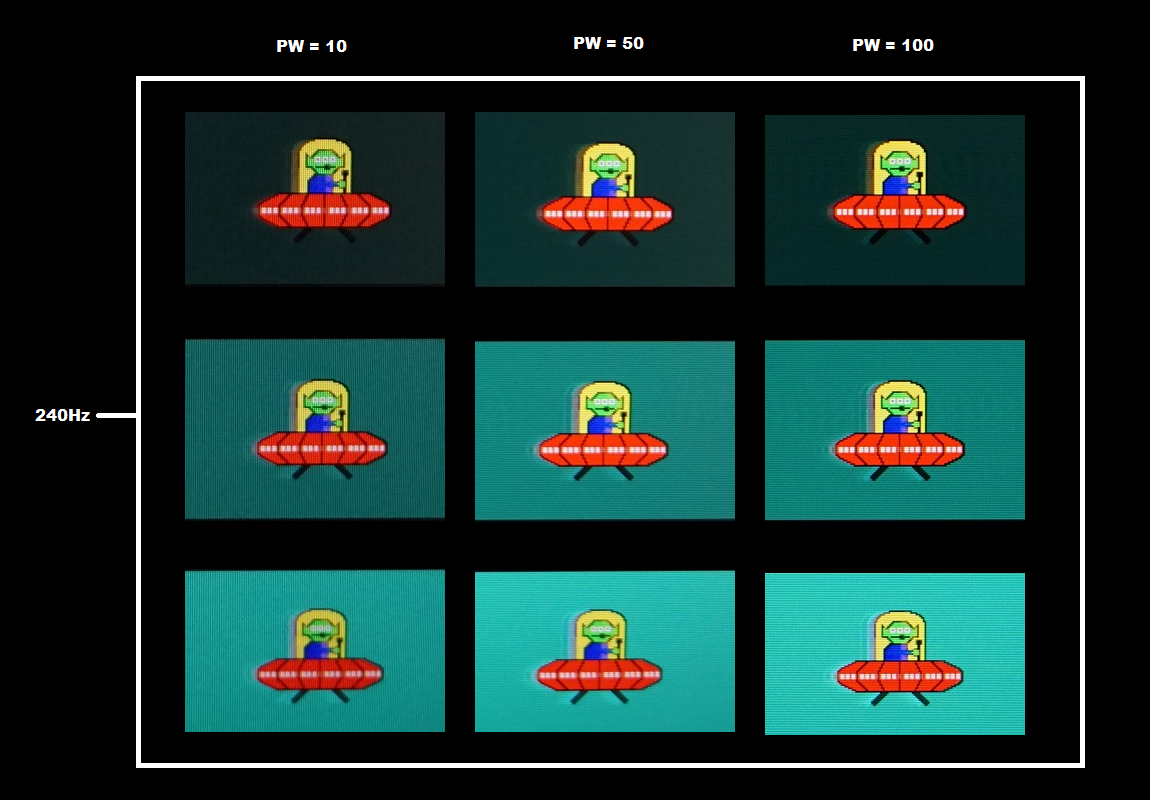
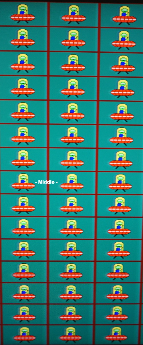
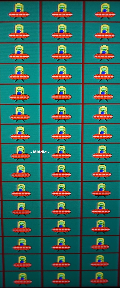
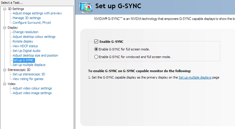
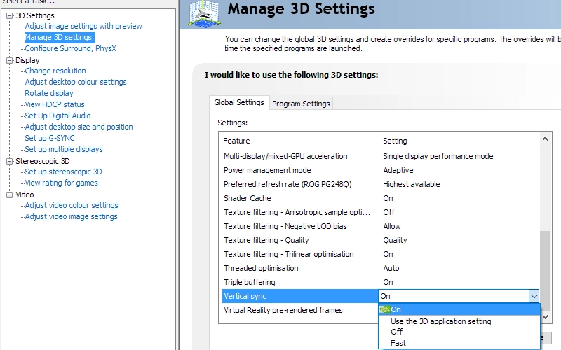
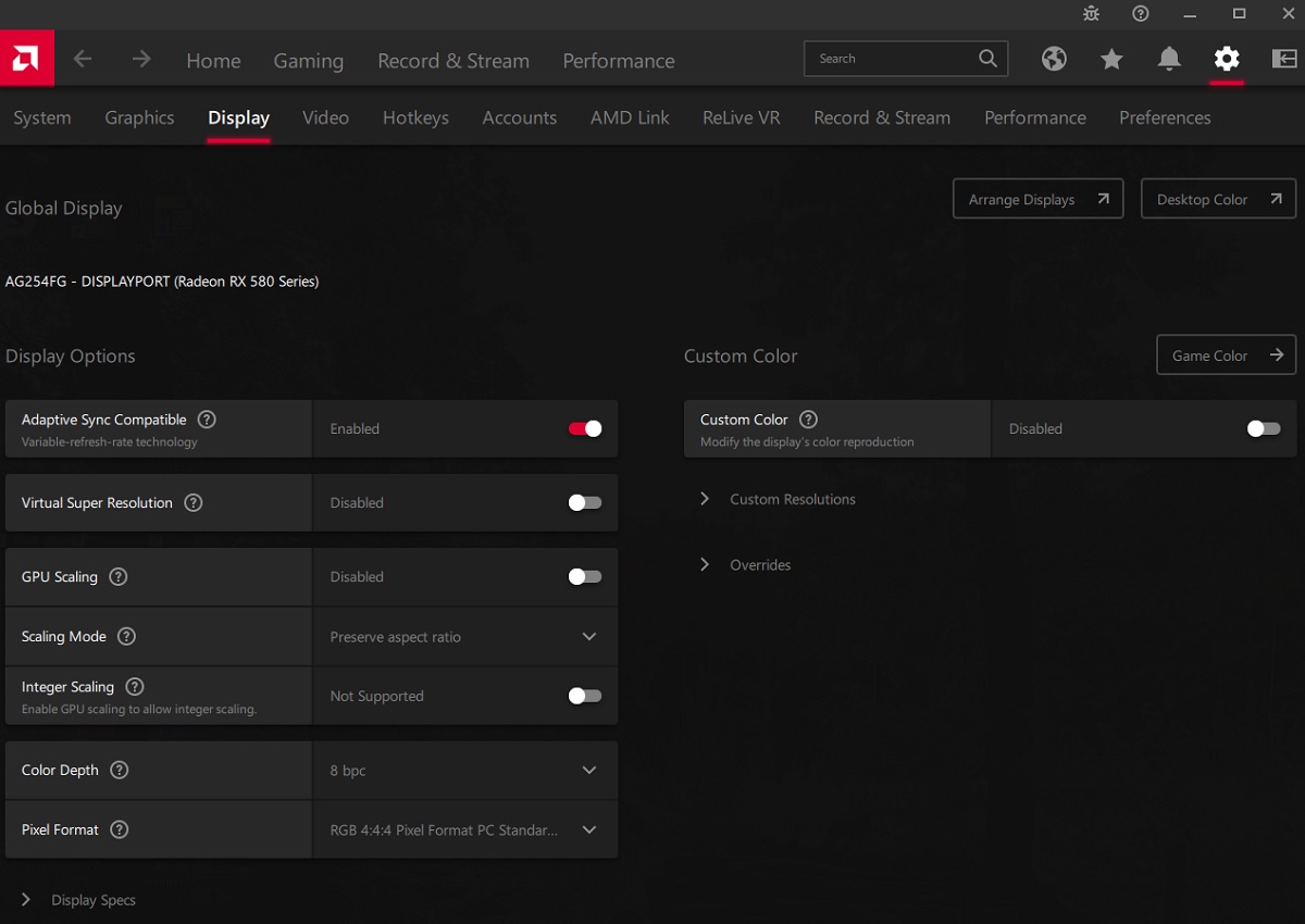
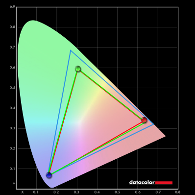
Whilst observing a black background in a dark room, using our ‘Test Settings’, we noticed some backlight bleed and clouding, particularly lower down the screen. It’s important to remember that individual units vary when it comes to all aspects of uniformity, including backlight bleed and clouding. The following image was taken a few metres back to eliminate ‘IPS glow’. This was observed as a cool or warm grey haze, depending on angle, which emanates from the corners of the screen. This ‘IPS glow’ blooms out more strongly from steeper angles, as demonstrated in the viewing angles video later. The luminance uniformity was quite good overall. The maximum luminance was recorded at ‘quadrant 5’ in the centre of the screen (157.1 cd/m²). The greatest deviation from this occurred at ‘quadrant 7’ towards the bottom left (140.2 cd/m², which is 11% dimmer). The average deviation between each quadrant and the brightest recorded point was 8.25%, which is moderate. Remember that individual units vary when it comes to uniformity and you can expect further deviation beyond the points measured. The contour map below shows these deviations graphically, with darker greys representing lower luminance (greater deviation from brightest point) than lighter greys. The percentage deviation between each quadrant and the brightest point recorded is also given. The SpyderX Elite was also used to analyse variation in the colour temperature (white point) for the same 9 quadrants. The deviation between each quadrant and the quadrant closest to the 6500K (D65) daylight white point target was analysed and a DeltaE value assigned. Darker shades are also used on this map to represent greater deviation from 6500K. A DeltaE >3 represents significant deviation that may be readily noticed by eye. Results here were reasonable. The central point was recorded as the closest to 6500K, with significant (but not extreme) deviation from this recorded to the left of centre (DeltaE 3.1) and borderline significant deviation above that (DeltaE 3.0). Note again that individual units vary when it comes to uniformity and that you can expect deviation beyond the measured points. On Battlefield 2042 the monitor provided a reasonable contrast experience. The contrast ratio sits at 1053:1 under our ‘Test Settings’, so pretty average for the panel type. A touch higher than some, a touch lower than others. This is not sufficient to provide an atmospheric look and strong depth to darker scenes or darker shades within them. There was also ‘IPS glow’ to contend with, a moderate but expected amount for an IPS-type panel of this size. This is a grey haze that emanates from the corners of the screen, particularly the bottom corners from a normal viewing position. It appeared a cool-tinted grey towards the bottom left and slightly golden towards the bottom right. It’s brought out more strongly at higher brightness settings, if sitting closer to the screen and on units with significant backlight bleed or clouding. As with the relatively weak static contrast, the effects are noticed most readily when sitting in a dimly lit environment. For brighter shades the screen surface imparted a bit of a grainy and layered look to the image. We also observed the contrast performance using Shadow of the Tomb Raider. This is a title that demands a strong contrast performance to look its best, with plenty of dark passageways, tombs and suchlike illuminated by a few point sources or light. The contrast performance of the monitor didn’t provide an atmospheric look to such scenes and didn’t provide strong definition to intricate darker detail elsewhere. Moderate ‘IPS glow’ was also observed – most noticeable, again, in a dim room. On the plus side, IPS models like this provide relatively strong gamma consistency. Whilst detail is lost peripherally due to ‘IPS glow’, you don’t get the same distinct shifts you can see on other LCD panel types. This avoids some areas of the image appearing with excessive dark detail and a potentially blocky or banded look due to lower than ideal perceived gamma, too. The screen surface again provided a bit of layering and a slightly grainy appearance, easiest to observe for brighter shades. We also made contrast observations using the film Star Wars: The Rise of Skywalker. High contrast scenes are abundant on this title, with bright elements such as fires and pulses of energy shrouded in darkness. The monitor didn’t give the film a cinematic look or provide a deep and inky look to dark shades, especially in a dim room. Whilst not quite as weak as some IPS models in that respect, the limited static contrast and ‘IPS glow’ were significant factors. This film also has black bars above and below the image due to the ‘letterboxed’ format, which brings out such weaknesses in a particularly obvious way there. These black bars wouldn’t be apparent on most content on platforms such as Netflix and YouTube, though. The content there is mainly but not exclusively provided in a 16:9 aspect ratio, which matches the monitor. The screen surface again gave a slightly grainy and layered appearance rather than allowing the direct emission of light and smoother appearance of some matte (and certainly glossy) surfaces. The Lagom tests for contrast allow specific weaknesses in contrast performance to be identified. The following observations were made in a dark room. The colour gamut of the AG254FG (red triangle) was compared with the sRGB (green triangle) reference colour space using our ‘Test Settings’, as shown below. The monitor offers decent sRGB coverage (96%), with the undercoverage mainly in the red region, along the red to blue edge. There’s no real overextension to speak of, so the tracking of the sRGB gamut is quite tight. As noted earlier the ‘SDR Colors sRGB’ setting has no effect on this model, it’s a setting reserved for wide gamut models and wouldn’t make sense in this case where sRGB emulation isn’t required. Although not shown in the graphic, we measured 71% DCI-P3 and 71% Adobe RGB coverage. This isn’t sufficient to give HDR content the intended look in terms of colour output, where strong DCI-P3 coverage is desirable and good coverage of the very wide Rec. 2020 gamut is aspirational. The measured gamut gives the monitor the potential to output most shades within the sRGB colour space, without oversaturating standard sRGB content like a wider gamut would. This gamut combined with good gamma calibration (may vary between units) and strong colour consistency provides good potential for accurate output within the sRGB colour space. Though more complete sRGB coverage would’ve been ideal. And to maximise colour accuracy within the sRGB colour space, for colour-managed workflows, we’d still recommend full calibration and profiling with a colorimeter or similar device if possible. The monitor provided a look we’d describe as fairly ‘rich and natural’ on Battlefield 2042. With close tracking of the sRGB colour space (plus appropriate OSD adjustments, as achieved with our ‘Test Settings), the monitor presents shades in a way that closely aligns with the developers’ intentions. As this is the colour space most content (including games running under SDR) is designed around. Unlike on a monitor with a wider colour gamut, you don’t get that more saturated than intended look to things. There was a nice variety of reasonably lush-looking deep green shades, appropriately displayed skin tones and good neutral woody and earthy browns. Whilst some like the extra saturation and vibrancy of a wider gamut, others will prefer the more toned down and ‘as intended’ look delivered by the AOC here. Similar observations were made on Shadow of the Tomb Raider, with appropriate saturation and that ‘as intended’ look. On an untamed wide gamut model Lara’s skin and woody tones often appear a bit rich with a red push on wide gamut models, some natural greens of vegetation verge on neon and sky blues can also have an unintended ‘pop’. In this case such issues didn’t present themselves. Whilst vibrancy was limited due to the gamut, there was still quite a rich look overall that we certainly don’t consider ‘washed out’ by any means. The strong consistency of the panel type helped the monitor maintain this richness and saturation levels throughout the screen. In contrast with VA models where there is peripheral saturation loss or TN models where you can observe a vertical saturation gradient. We also observed the TV series Futurama with colour reproduction in mind. This title has large areas of individual shade so is a particularly unforgiving test for colour consistency. The monitor performed well here, without significant shifts in saturation or colour representation. Some minor shifts could be attributed to slight uniformity imperfections rather than being viewing angle related weaknesses, from our normal viewing position with eyes ~70cm from the screen. The deep and neon shades didn’t look as eye-catching or vibrant as on models with a more generous gamut. But they appeared as they’re intended to look, within the confines of the sRGB colour space. Pastel shades were appropriately muted and with excellent ‘subtle shade variety’ aided by the strong consistency. The image below shows a printed reference sheet of 24 ‘sRGB’ shades, included as part of the Datacolor SpyderCHECKR 24 package. The screen is displaying reference photographs of this printed sheet, in both the same order as printed (right side) and reverse order (left side). The camera is mounted slightly above centre so that the image is representative of what the eye sees from an ergonomically correct viewing position. This, coupled with the inclusion of a flipped version of the shade sheet, allows both accuracy and colour consistency to be visually assessed. Bracketed numbers in our analysis refer to shades on the printed sheet or right side of the screen if they’re ordered consecutively from top left to bottom right. Note that there is always some disparity between how emissive objects (monitor) and non-emissive objects (printed sheet) appear. The monitor is set to a very low brightness to help minimise this disparity. The representation of shades in this image depends on the camera and your own screen, it’s not designed to show exactly how the shades appear in person. It still helps demonstrate some of the relative differences between the original intended sRGB shade and what the monitor outputs, however. Full profiling and appropriate colour management on the application would provide a tighter match, our intention here is to show what can be expected in a non colour-managed environment. Interlaced lines in this image are moiré from the camera, not from the monitor itself. Overall, the monitor provides faithful shade reproduction here. It avoids the oversaturated and at times ‘neon’ look to some shades which wide gamut models provide here. Some shades appear slightly undersaturated, such as medium orange (3) and Persian pink (6). These differences are exaggerated slightly in the image, with a closer match by eye but still a touch of undersaturation. Gamboge (23) also verges a bit too much towards a yellowish version of the shade whilst lemon yellow (10) appears a touch brighter and not as rich as it should. The slight sRGB undercoverage in the gamut, mainly in the red region, could account for some of this undersaturation. Colour consistency is strong, free from the clear saturation shifts observed on VA or TN models depending on the on-screen position of the shade. There were some slight differences due to the uniformity of our sample, for example making aquamarine (4) appear a slightly brighter and less saturated aqua shade towards the bottom left. As usual, we’d recommend profiling the monitor with your own calibration device if you require the strongest level of colour accuracy. This won’t correct uniformity issues nor can it correct the slight undercoverage of the gamut. But it can assist elsewhere and help tighten things up, whilst also guiding appropriate OSD adjustment to colour channels. Lagom’s tests for viewing angle tests help explore the idea of colour consistency and viewing angle performance. The following observations were made from a normal viewing position, eyes ~70cm from the screen. On some monitors, particularly but not exclusively those with high refresh rates, interlace patterns can be seen during certain transitions. We refer to these as ‘interlace pattern artifacts’ but some users refer to them as ‘inversion artifacts’ and others as ‘scan lines’. They may appear as an interference pattern, mesh or interlaced lines which break up a given shade into a darker and lighter version of what is intended. They often catch the eye due to their dynamic nature, on models where they manifest themselves in this way. Alternatively, static interlace patterns may be seen with some shades appearing as faint horizontal or vertical bands of a slightly lighter and slightly darker version of the intended shade. We observed some faint dynamic interlace pattern artifacts in the form of vertical lines when observing movement or at times when scanning our eyes across the screen. These were only really observable below ~200Hz and even at relatively low refresh rates such as ~60Hz, where they were strongest, they were pretty faint. The ‘Overdrive’ setting and whether VRR was active didn’t affect these, though they were more distinct with ULMB active. They’re too faint for most people to notice or find bothersome. A sensitive camera and a utility called SMTT 2.0 was used to analyse the latency of the AOC AG254FG. Over 30 repeat readings were taken to help maximise accuracy. Using this method, we calculated 2.13ms (under one frame at 360Hz) of input lag. This is influenced by both the element of input lag you ‘see’ (pixel responsiveness) and the main element you ‘feel’ (signal delay). It indicates a very low signal delay which even sensitive users shouldn’t find bothersome. Note that we don’t have the means to accurately measure input lag with VRR technology active in a VRR environment or HDR active in an HDR environment. Our responsiveness article covers the key factors related to the monitor responsiveness. An important concept explored in the article is ‘perceived blur’, contributed to by both the pixel responses of the monitor and the movement of your eyes as you track motion on the screen. This second factor dominates on modern monitors, though both factors play an important role. A photography technique called ‘pursuit photography’ is also explored, which uses a moving rather than stationary camera to capture motion in a way that reflects both elements of perceived blur, not just the pixel response element. The images below are pursuit photographs taken using the UFO Motion Test for ghosting, with the test running at its default speed of 960 pixels per second. This is a good practical speed to take such photographs at and highlights both elements of perceived blur well. The UFOs move across the screen from left to right at a frame rate matching the refresh rate of the display. All three rows of the test are analysed to highlight a range of pixel transitions. The monitor was tested at 60Hz (directly below), 144Hz, 240Hz, 300Hz and 360Hz using various ‘Overdrive’ setting; ‘Off’, ‘Weak’, ‘Medium’ and ‘Strong’. The final column shows the Dell Alienware AW2521HF for reference, where possible, with its optimal setup for responsiveness at each individual refresh rate. This is quite a competent IPS performer at up to 240Hz, when set up optimally (as shown). 120Hz was also tested though not documented here – pixel response behaviour was very similar to 144Hz and there was just a touch of extra perceived blur due to eye movement. At 60Hz, above, the UFO appears soft and unfocused without clear internal detailing. This reflects a moderate amount of perceived blur due to eye movement. With ‘Overdrive = Off’ there’s just a little conventional ‘powdery’ trailing, particularly for the dark background (top row) and a little for the medium background (middle row). The light background (bottom row) shows a ‘clean’ performance with the ‘Off’ setting. The next setting, ‘Weak’ (perhaps a misnomer) provides a good dose of acceleration and removes pretty much all ‘powdery trailing’ in this test. Just a little remains behind the yellow cockpit area with the dark background. Some overshoot (inverse ghosting) is visible for all transitions, particularly the light background where some ‘halo’ trailing that’s brighter than the background is visible. Overshoot is quite similar if a touch lower here compared to the reference screen. This isn’t particularly strong overshoot – it becomes stronger with the ‘Medium’ setting and stronger again with the ‘Strong’ setting. Based on this analysis and broader observations we consider ‘Weak’ optimal. If you’re particularly sensitive to overshoot ‘Off’ may be worth exploring for relatively low refresh rates like this. Below you can see how things with a significant boost in refresh rate to 144Hz. At 144Hz, above, the UFO appears significantly narrower with clearer internal detail. This reflects a significant decrease in perceived blur due to eye movement. The demands for a strong performance when it comes to pixel responsiveness are raised significantly now. The ‘Off’ setting provides relatively pronounced ‘powdery’ trailing, reasonably bold for the dark background and still a fair bit for the medium background. The ‘Weak’ setting again provides a significant boost in acceleration, cutting out the ‘powdery’ trailing and replacing it with overshoot. This is a bit more noticeable than at 60Hz, which will reflect the stronger level of acceleration required to speed up the pixel responses at this increased refresh rate. It’s similar to the reference screen overall. The ‘Medium’ setting ramps this overshoot up significantly, with an inky look in places and very bright elsewhere. The ‘Strong’ setting strengthens this further. We consider ‘Weak’ the optimal setting here and feel the overshoot is preferable to the significant conventional trailing with the ‘Off’ setting. Below you can see how things appear with another boost in refresh rate, to 240Hz. At 240Hz, above, the UFO again appears slightly narrower with better internal detailing. In practice the segmentation is more distinct than it appears in the photos. This reflects a further significant reduction in perceived blur due to eye movement. The pixel response demands have increased significantly now. The ‘Off’ setting is again too slow with widespread conventional trailing. The ‘Weak’ setting cuts down on this effectively, though a bit of ‘powdery’ trailing remains for the dark background. For the medium and light background some overshoot is observed. Overall the reference screen leans towards more widespread ‘powdery’ trailing and lower overshoot. The ‘Medium’ setting ramps up the overshoot levels significantly, bringing it up to clearly distracting levels. The ‘Strong’ setting ramps the overshoot up further. We again consider ‘Weak’ the optimal setting here. Below you can see things with a bit of a bump up to 300Hz. At 300Hz, above, there’s a further narrowing of the UFO and slight improvement to internal detailing. The segmentation is again more distinct than it appears in the photo, but there is still a slight relative improvement compared to 240Hz as well. This reflects a further reduction in perceived blur due to eye movement. Trailing and overshoot behaviour is quite similar here to 240Hz, though some of the weaknesses are a touch more pronounced due to the increased demands of the refresh rate. The ‘Off’ setting is really too slow to keep up here. The ‘Weak’ setting is optimal, with higher settings than that introducing far too much overshoot. Whilst some stubborn conventional trailing remains behind the UFO cockpit for the dark background. The image below shows a further boost to 360Hz. At 360Hz, above, there’s a very slight narrowing of the UFO. Though there’s certainly a case to be made of diminishing returns when comparing to the earlier boosts in refresh rate we showed. There’s also a very slightly crisper look to the UFO, at least by eye. These internal differences are not readily apparent in photographs, where the brightness of the screen causes some blending and bleaching of internal details. Even at 360Hz the white notches aren’t distinct and can’t be reliably counted, but the segments of the UFO are certainly distinct with more pronounced segmentation than seen in the photos. The trailing and overshoot behaviour is quite comparable to 300Hz – some of the ‘powdery’ trailing is slightly more pronounced due to the increased pixel response requirements. The ‘Weak’ setting is again optimal, with stronger settings ramping up overshoot far too much and ‘Off’ simply being too slow for a solid 360Hz performance. There are still weaknesses using the ‘Weak’ setting and for some transitions we found the overshoot more eye-catching than it might appear in the photos. We explore this subjectively shortly. The monitor also includes ULMB which can be activated at 144Hz or 240Hz when the monitor is connected to a compatible Nvidia GPU and running under SDR with G-SYNC disabled in the graphics driver. The setting is found in the ‘G-SYNC Processor’ section of the OSD. This is a strobe backlight setting which forces the backlight to flicker in sync with the refresh rate of the monitor. Sensitivity to this flickering of the backlight varies and some will find it bothersome whilst others may notice accelerated eye fatigue, even if the flickering isn’t actively bothersome to them. The pursuit photographs below were taken with the monitor set to 144Hz using ULMB. ’PW’ here refers to ‘Pulse Width’, which is configurable on the monitor and controls the length of time the backlight spends in its ‘on’ phase. A higher setting here equates to a higher brightness at the expense of motion clarity. It can be adjusted in single unit increments from ‘10’ to ‘100’. The ‘Overdrive’ setting can’t be changed when ULMB is active. Odd colouration in the background for ‘PW = 10’ is slight glare on the screen amplified by the camera – the monitor brightness is exceptionally low using this setting. With ULMB active at 144Hz, above, the main object is significantly narrower with clearer internal detailing compared to with the setting deactivated – even if you compare to the maximum 360Hz refresh rate of the screen. The white notches are clear and countable, particularly for lower ‘PW’ settings. In practice, the notches and segmentation is slightly more distinct than it appears in the photos at ‘PW = 50’ and ‘PW = 100’ with the camera bleaching things a bit. Though there is still a slight edge in that respect as you lower ‘PW’, which the photos also reflect. There’s a faint repetition of the object for the dark background, which is broadly termed ‘Strobe Crosstalk’. There’s also overshoot due to the strong acceleration used, with multiple fragments due to the strobe nature of the backlight. The strobe crosstalk and overshoot are both significantly fainter than the main object, so doesn’t have a significant impact on perceived blur and doesn’t tend to detract from the excellent motion clarity improvement ULMB can provide. The image below shows ULMB active at 240Hz. Wavy patterns surrounding some UFOs in the background are slight image retention. This was only observed during this test and is something we’ve seen on various monitors before. It soon disappeared when using monitor normally. With ULMB active at 240Hz, above, there’s a further improvement to the ‘crispiness’ of the internal details. This can be noticed by eye to an extent and the ‘PW’ setting appears to have even less impact. Again, the actual clarity of the object and distinctness of segments is improved in person compared to the photos. For example, you can even see the aliasing at the edges of the UFO. ‘PW = 100’ was captured particularly well here and gives a good indication of clarity. In practice lower ‘PW’ settings don’t become less distinct as they appear here, though they don’t really become more distinct at this point either. It’s really the brightness change that you’ll notice by eye. The strobe crosstalk is now quite a bit stronger, quite bold for the dark background and overlapping with overshoot for the initial trailing fragment elsewhere. Overshoot is more distinct as well, with the 240Hz refresh rate significantly more demanding than 144Hz and a higher level of acceleration required. What these photos don’t reflect is the improved ‘connected feel’ that 240Hz provides or the reduced flickering, but all in all we actually prefer the ‘cleaner’ experience at 144Hz with ULMB. It’s important to be aware that strobe crosstalk varies at different areas of the screen. Not all areas refresh simultaneously, so its appearance can differ depending on how high up or low down on the screen movement is being observed. The image below is a pursuit photo with the UFO shown at various positions of the screen, from top to bottom, at a refresh rate of 144Hz and ULMB active. The ‘- Middle -‘ marker denotes the central region of the screen. You can see that the strobe crosstalk becomes a bit stronger lower down the screen, but is always significantly fainter than the object. Overshoot and strobe crosstalk levels are quite tame towards the central rows, where your eyes mainly focus during competitive gameplay. This indicates quite a good and relatively well-optimised strobe backlight performance. Note that the images below do not accurately show the clarity of the object itself, but allows analysis of strobe crosstalk and other imperfections such as overshoot. The image below shows the results at 240Hz with ULMB active. The strobe crosstalk is more distinct now. It is displaced in front of the UFO further up the screen and melds into the object lower down. It isn’t too strong centrally, but is still stronger than it was at 144Hz. And the overshoot is more distinct and eye-catching. We do notice these differences in practice so will mainly be focusing our subjective thoughts on the 144Hz ULMB experience. Another advantage is that it’s easier to maintain 144fps solidly than 240fps solidly, making the 144Hz mode more accessible when ULMB is used as VRR can’t be used at the same time. On various Battlefield titles, at a frame rate keeping pace with the 360Hz refresh rate, the monitor provided a fluid experience. Compared to a 60Hz model or indeed this monitor running at 60Hz (or 60fps), six times as much visual information is presented every second. This massively improves the ‘connected feel’, which describes the precision and fluidity as you interact with the game world. The very low signal delay of the monitor also aids this. The high refresh and frame rate combination also greatly decreases perceived blur, which was demonstrated earlier using Test UFO. For competitive play this combination of exceptional ‘connected feel’ and greatly reduced perceived blur can deliver a nice edge. Making it easier to track enemies and line up shots. We’d stress that this is quite subjective, but we find the initial boost from 60Hz to ~144Hz extremely significant and noticeable. The bump up from there to 240Hz is a nice bonus as well and something we can notice quite readily. The boost to 360Hz from there is less significant in our view, but is still something we noticed and sensitive users could find a welcome thing to have. Pixel responsiveness is also important when it comes to perceived blur. Many transitions were performed very rapidly and made good use of the 360Hz refresh rate. As demonstrated with Test UFO earlier, though, there are some transitions where the monitor is unable to keep up with the rigorous demands of the 360Hz refresh rate – or indeed lower refresh rates in some cases. Particularly where bright (or strongly saturated) shades are presented against a medium to dark background, there is some reasonably distinct ‘powdery’ trailing. Not ‘smeary’ in appearance, but certainly sufficient to add an extra layer of perceived blur. We also observed quite widespread overshoot, typically as moderately bright ‘halo’ trailing where medium-dark shades moved against medium-bright backgrounds. Or vice-versa, which would produce some dark ‘shadowy’ trailing instead. This wasn’t extreme overshoot, but it still caught our eye in places as it was noticeably brighter or darker than the background and sometimes stood out fairly clearly. Sensitive users could potentially find it bothersome. Although this is the only 360Hz model we’ve tested to date, we have analysed data from a range of other displays (including pursuit photos and measurements). Similar and in some cases more distinct weaknesses can be observed on directly competing models. We’d normally share observations using Shadow of the Tomb Raider at this point. But even looking at very specific ‘undemanding’ scenes on that title, it was very difficult to reach suitably high frame rates to assess 360Hz performance. Analysing this title doesn’t typically introduce additional issues that wouldn’t be seen on Battlefield, but it does feature a lot of high-contrast scenes. And these same scenes can bring out some of the slower pixel responses performed by this monitor much as they did with Battlefield. We also observed video content at a range of refresh rates, including ~24 – 30fps content on platforms such as Netflix and 60fps YouTube content. We observed a touch of overshoot for 60fps content and slight traces in places at 24fps, but we didn’t find any of this as eye-catching as for higher frame rate gaming. For the ~60fps and ~24 – 30fps content the main barrier to fluidity is the content itself and its low frame rate rather than weaknesses from the monitors pixel responses. As an Amazon Associate I earn from qualifying purchases made using the below link. Where possible, you’ll be redirected to your nearest store. Further information on supporting our work. Earlier in the review we covered ULMB, including its principles of operation and how it performs using specific tests. As with most strobe backlight features, you can’t use this in a VRR environment so can’t activate G-SYNC at the same time. You can’t use HDR at the same time, either. Your frame rate must match the refresh rate precisely, or you’re left with extremely obvious stuttering or juddering. This stands out in such a clear way due to there being very little perceived blur due to eye movement to mask it. For simplicity we’ll focus on our use of this feature on various Battlefield titles at 144Hz and a solid 144fps. As explored, we found the ‘cleaner’ performance here preferable to using the setting at 240Hz where strobe crosstalk and overshoot was both a fair bit more noticeable. Its also easier to maintain a solid 144fps than 240fps. On the flip-side, 240Hz at matching frame rate improves ‘connected feel’ and flickering is reduced. The monitor delivered a good low level of perceived blur, with a significant decrease in perceived blur due to eye movement much as explored earlier. Even when turning rapidly or zipping around in an agile vehicle or aircraft, details in the environment maintained good clarity. This included any enemies you might be keeping tabs on. Whilst there was some overshoot and a touch of strobe crosstalk in places, it remained significantly fainter than the main objects which are moving around (or you’re moving your character relative to). So it didn’t significantly impact perceived blur and isn’t something most should find distracting. Because KSF phosphors aren’t used for the backlight, you don’t get clear colourful fringes or flashes with strobe backlight settings like this active. There are other limitations to be aware such as more limited brightness (<200 cd/m² and appearing slightly dimmer due to the nature of strobe backlights). And flickering of the backlight at a frequency matching the refresh rate of the display, which can accelerate visual fatigue even if you’re not consciously aware of it. Overall most will prefer the flexible and flicker-free experience that the ‘normal’ operation of the monitor provides, with G-SYNC available as an option during fluctuations and the ability to use the 360Hz refresh rate. But for those who like strobe backlight settings, at 144Hz at least, this is one of the better ones we’ve come across. Nvidia G-SYNC is a variable refresh rate technology that can be activated when a compatible Nvidia GPU is connected to a compatible monitor (such as the AOC AG254FG). Our article on the technology explores the principles behind the technology and its benefits, so we won’t be repeating too much of that. Essentially the technology allows the monitor to dynamically adjust its refresh rate to match, where possible, the frame rate outputted by the GPU. When the two are in sync it gets rid of the tearing (VSync off) and stuttering (VSync on) that occurs when the two are desynchronised. An additional benefit for those who hate tearing and usually like to use VSync is a reduction in latency compared to ‘VSync on’ in the variable frame rate environment. This model is a ‘G-SYNC Esports’ model and supports Nvidia’s Reflex Latency Analyzer which was briefly covered in the OSD video. This monitor supports G-SYNC via DP and HDMI, when connected to a compatible Nvidia GPU such as the RTX 3090 used in our test system. Note that HDR can be activated at the same time as G-SYNC. Once connected up, G-SYNC should be automatically configured and ready to use. There’s usually even a little notification icon in the system tray telling you that a G-SYNC capable display is detected. To check everything is configured correctly, open Nvidia Control Panel and navigate to ‘Display – Set Up G-SYNC’. Ensure that the checkbox for ‘Enable G-SYNC’ is checked, then select your preferred operating mode. As the image below shows, this technology works in both ‘Full Screen’ and ‘Window’ modes, provided the correct option is selected for this. If the G-SYNC options seem to be missing from Nvidia Control Panel, this may be remedied by reconnecting the GPU or possibly connecting the monitor to a different DP output if there’s one available. If the options are still missing, reinstalling the GPU driver or updating this is recommended. The AOC supports a variable refresh rate range of 1 – 360Hz (1-240Hz via HDMI). That means that if the game is running up to 360fps, the monitor will adjust its refresh rate to match. When the frame rate rises above 360fps, the monitor will stay at 360Hz and the GPU will respect your VSync in the graphics driver. With ‘VSync on’ the frame rate will not be allowed to rise above 360fps, at which point VSync activates and imposes the usual associated latency penalty. With ‘VSync off’ the frame rate is free to climb as high as the GPU will output (potentially >360fps). Technically it appeared that the monitor stuck to a multiple of the frame rate with its refresh rate if frame rate dipped below 15fps. But this did the trick to remove tearing and stuttering and was essentially seamlessly integrated – we wouldn’t have known it was doing this if not indicated by the ‘Frame Counter’ feature of the display. VSync behaviour is configured in the ‘Manage 3D settings’ section of Nvidia Control Panel. It’s labelled ‘Vertical sync’ and can be set to one of the following; ‘On’, ‘Use the 3D application setting’, ‘Off’ or ‘Fast’ (GPU dependent). The ‘Use the 3D application setting’ largely works as you’d expect, but the general recommendation is to set VSync in the graphics driver if you wish to use it as in-game implementations can interfere with the smooth operation of G-SYNC. The ‘Fast’ option enables a technology called ‘Fast Sync’, which only applies above the refresh rate and frame rate ceiling (>360Hz / 360fps). Below this G-SYNC operates as normal, whereas above this a special version of VSync called ‘Fast Sync’ is activated. This is a GPU rather than monitor feature so isn’t something we will explain in detail, but it is designed to reduce tearing at frame rates well above the refresh rate of the monitor. If you’re interested in this technology, which may be the case if you play older or less graphically demanding games at very high frame rates, you should watch this section of a video by Tom Petersen. Some users prefer to leave VSync enabled but use a frame rate limiter set a few frames below the maximum supported (e.g. 357fps) instead, avoiding any VSync latency penalty at frame rates near the ceiling of operation or tearing from frame rates rising above the refresh rate. If you activate the ‘Frame Counter’ feature in the ‘Game Setting’ section of the OSD, this will indicate the frame rate of your content if G-SYNC is active. If G-SYNC isn’t active it will simply show the static refresh rate the monitor is running at. The final point to note is that G-SYNC only removes stuttering or juddering related to mismatches between frame rate and refresh rate. It can’t compensate for other interruptions to smooth game play, for example network latency or insufficient system memory. Some game engines will also show stuttering (or ‘hitching’) for various other reasons which won’t be eliminated by the technology. As usual we tested various game titles using G-SYNC and found the experience similar in all cases. Any issues affecting one title but not another suggests a game or GPU driver issue rather than a monitor issue. For simplicity we’ll just focus on our experience across various Battlefield titles in this section. There’s sufficient flexibility there with graphics options and a nice range of scenes available to assess a broad range of refresh rates using our RTX 3090. Where the frame rate dipped at all below 360fps, you’d observe tearing (VSync off) or stuttering (VSync on) without a VRR technology like G-SYNC. With the technology active the refresh rate appropriately synchronised with the frame rate, removing these interruptions. Sensitivity to tearing and stuttering is subjective so not everyone will find the technology as ‘game-changing’ as others. And it’s generally more difficult to notice at high refresh rates and frame rates. It’s still something sensitive users will notice, making the VRR experience attractive to them. Regardless of how much the frame rate dipped, the technology worked as intended to remove tearing and stuttering from what would otherwise be frame and refresh rate mismatches. Unlike with your typical Adaptive-Sync monitor, effective and tightly-tuned variable overdrive is employed. This loosens off the grey to grey acceleration as refresh rate dips, avoiding overshoot becoming stronger. There was still fairly widespread overshoot, but this is observed even at a solid 360Hz using our preferred ‘Weak’ setting and didn’t become significantly stronger as refresh rate dipped. In fact it appeared slightly reduced at relatively low refresh rates, likely due to the pixel overdrive being slackened off. Another advantage compared to Adaptive-Sync is that the operation is seamless throughout the entire refresh rate range. There isn’t a defined LFC (Low Framerate Compensation) boundary, which is typically 48Hz (48fps), where slight stuttering is introduced as it’s passed in either direction. Although it’s difficult to quantify and isolate, we’ve also experienced a reduction in issues such as micro stuttering if a G-SYNC module is used. And we’ve had others share similar experiences with us. In addition to supporting G-SYNC on compatible Nvidia GPUs, AMD FreeSync can be used. The monitor includes Adaptive-Sync support via DP, which allows compatible GPUs and systems to use FreeSync. To enable FreeSync as a PC user open ‘AMD Software’. Then click ‘Settings’ (cog icon towards top right) and click on ‘Display’. You should then ensure that the first slider is set to ‘Enabled’. The setting is referred to as ‘Adaptive Sync Compatible’ here, although the exact wording may depend on the driver version you’re using. With our Radeon RX 580, we were able to activate the technology via DP (first image) but not HDMI (second image). On an ideal monitor, HDR (High Dynamic Range) includes very deep dark shades and stunningly bright shades being displayed simultaneously. With the ability to display a broad gamut of shades between these extremes, including more muted pastel shades alongside eye-catching and strongly saturated shades. Ideally, per-pixel illumination would be offered (e.g. self-emissive displays such as OLED), or for LCDs a very large number of precisely controlled dimming zones provided. A solution such as FALD (Full Array Local Dimming) with a generous number of dimming zones, for example. Such solutions allow some areas of the screen to remain very dim whilst others are very bright. Colour reproduction is also an important aspect, with the ultimate goal being support for a huge colour gamut, Rec. 2020. A more achievable near-term goal is support for at least 90% DCI-P3 (Digital Cinema Initiatives standard colour space) coverage. Finally, HDR makes use of at least 10-bit precision per colour channel, so its desirable that the monitor supports at least 10-bits per subpixel. HDR10 is the most widely supported standard used in HDR games and movies and what is supported here. For games and other full screen applications that support HDR, the AOC AG254FG automatically switches to its HDR operating mode if an HDR signal is provided. Some game titles will activate HDR correctly when the appropriate in-game setting is selected. Others that support HDR will only run in HDR if ‘Use HDR’ is turned on in Windows, too. Related Windows HDR settings are found in the ‘Windows HD Color settings’ (Windows 10) or ‘HDR’ (Windows 11) section of ‘Display settings’ (right click the desktop). If you want to view HDR movie content, ensure ‘Stream HDR Video’ (Windows 10) or ‘Play streaming HDR video’ (Windows 11) is active. Also note that there’s an ‘HDR/SDR brightness balance’ (Windows 10) or ‘SDR content brightness’ (Windows 11) slider that allows you to adjust the overall balance of SDR content if HDR is active in Windows. This is really just a digital brightness slider that only makes changes for SDR content, and you lose contrast by adjusting it. The settings in the OSD are greatly restricted under HDR, even though the image balance is better than some models when viewing SDR content under HDR. We’d recommend only activating HDR in Windows if you’re about to use an HDR application that specifically requires it. For simplicity we’ll just focus on Shadow of the Tomb Raider for this section. This is a title we’ve tested extensively on a wide range of monitors under HDR and we know it offers a good HDR implementation which highlights strengths and weaknesses well. Weaknesses highlighted here will apply to other HDR content, too. Although our testing focuses on HDR PC gaming using DisplayPort on an RTX 3090, similar observations were made when viewing HDR video content on the Netflix app. There are some additional points to bear in mind if you wish to view such content. We also made similar observations using HDMI, which would be used when viewing HDR content on an HDR compatible games console for example. Testing on both our Nvidia and AMD GPUs showed that the HDR implementation was similar in both cases, too. We were unable to use HDR above 300Hz on our Radeon RX 580, but this could be a limitation with that GPU and its older DP controller hardware. As is often the case under HDR, you can’t access all of the settings that are available to you under SDR. Settings such as ‘Gamma’ and brightness can’t be adjusted. The brightness setting is referred to as “Peak white (nits)” under HDR but is greyed out and set to ‘80’ (ignore this). If you make changes to colour channels with either control, under SDR, they carry over to HDR as well. Usually the colour channels are locked off under HDR to maximise contrast and allow the monitor to more accurately follow metadata without ‘unexpected’ changes. If you’re not making extreme adjustments here, it’s unlikely to dramatically change your experience either way. We simply used the factory defaults under HDR to maximise contrast and to keep things in-line with our usual testing procedure. As covered earlier the monitor includes a Dynamic Contrast setting called ‘Variable Backlight’ – which is not a local dimming setting despite the name being used for local dimming on some other models. Under HDR our preference is to set this to ‘Gaming’. The adjustments made are quite tame with this setting, but on the plus side they shouldn’t prove too distracting as it might be if the backlight is constantly adjusting by significant amounts. The ‘Hybrid’ setting seemed to bounce around very rapidly between different brightness levels even when just moving slightly in a scene with mixed content (some dark areas, some lighter areas) – we found this distracting. In some scenes this can happen with the ‘Gaming’ setting, but the adjustments were gentler and less jarring overall. The ‘Desktop’ setting was really very unreactive and we felt the setting might as well be disabled instead at that point. Without the setting active, the monitor simply keeps the backlight at its maximum level and doesn’t deviate from that even if the scene is dominated by darker shades. This lifts up the black depth and depth of dark shades far more than is necessary, just like if you’re viewing dark content under SDR with brightness set to maximum. The AOC AG254FG is VESA DisplayHDR 400 certified. This is the lowest level of VESA DisplayHDR certification, so only a basic HDR experience is offered here. For the colour gamut this HDR level isn’t at all strict – in this case we measured 73% DCI-P3, which is far too limited for appropriate HDR colour reproduction. This is shown in the representation below, where the red triangle shows the monitor’s colour gamut, the blue triangle DCI-P3 and green triangle sRGB. With the colour gamut sitting much closer to sRGB than the appropriate wider gamuts (DCI-P3 or ideally Rec. 2020), saturation levels are limited for the more vibrant elements such as fires, painted pottery, colourful flowers and some of Lara Croft’s colourful attire. As under SDR, we wouldn’t describe such elements as ‘washed out’, but certainly much less vivid and eye-catching than they could be. And as with SDR, we didn’t observe any obvious issues with oversaturation for more muted shades such as skin tones, vegetation or earthy browns. In places it seemed a bit of ‘artistic licence’ was used to enhance the saturation of some shades, for example some yellowish greens were perhaps brought out a touch too strongly. But this didn’t give a clearly oversaturated look (nor did it overcome the limitations of the gamut). Greater dimming precision for the backlight would also add extra depth to some of the dark and medium shades which is certainly lacking here overall. This scene was good at highlighting the advantages of the 10-bit precision, with a good mixture or lighter and darker shades. As noted earlier this monitor doesn’t offer local dimming and just offers a Dynamic Contrast setting (‘Variable Backlight’) which we preferred setting to ‘Gaming’. Even with predominantly dark shades displayed on the screen, the black depth and depth of dark shades is nowhere near as deep as you’d expect for a ‘proper’ HDR performance. It does dim a bit compared to with the setting active so gives a less ‘flooded’ look overall, but it could still be described as ‘flooded’ with plenty of ‘IPS glow’ and a far from deep and atmospheric look. The peak luminance we recorded (440 cd/m²) was pretty limited as far as HDR goes, so these bright elements we referred to such as the light glint on the water or bright areas of daylight sky didn’t stand out in the way they could. There should really be an array of bright to very bright shades displayed with excellent precision and with very bright peaks – that isn’t offered here. The lack of local dimming for the backlight also meant surrounding dark and even medium shades lacked the depth they should have. Not only does this limit the relative ‘pop’ to bright shades, it also saps appropriate depth and atmosphere from areas where darker shades dominate. And it gives things a generally less well-defined look than you’d ideally get, with shadow details simply appearing less ‘inky’ than they could with much stronger contrast. The section of video review below runs through the HDR experience using various scenes in Shadow of the Tomb Raider. The video below shows the monitor in action. The camera, processing done and your own screen all affect the output – so it doesn’t accurately represent what you’d see when viewing the monitor in person. It still provides useful visual demonstrations and explanations which help reinforce some of the key points raised in the written piece. The 24.5” screen size provides a relatively compact way to consume the 1920 x 1080 (Full HD) resolution, keeping to a reasonable but not particularly high pixel density. The resolution is relatively easy to drive at high frame rates which is what this monitor is all about. You certainly don’t get the same ‘desktop real estate’, clarity or detail of various higher resolution offerings. The monitor has quite a ‘gamery’ appearance, with a solid-feeling coated metal stand that stretches out unapologetically across the desk. There are plenty of RGB LEDs to enjoy, though many of these are located at the rear and produce little more than a gentle glow even in a dark room. And a logo projector with this AGON PRO model for a little extra visual flair beneath the monitor. These may be viewed as quite gimmicky features, but we did find the ‘QuickSwitch’ OSD controller to be a nice addition for intuitive navigation through the menu system. The OSD itself had quite a few odd quirks, but also a decent array of features such as gamma settings and a very flexible brightness control with a rough indication of brightness rather than just a percentage. The IPS-type panel and quite strict sRGB coverage provided a look we’d describe as quite ‘rich and natural’. Faithfully producing content within the sRGB colour space, with just a touch of undercoverage but no real over-extension to speak of. This kept content looking largely as the developers intend rather than providing clear oversaturation. Consistency was strong as well. In terms of contrast the monitor aligned closely with our expectations, a touch above the specified 1000:1 even after a bit of tweaking to colour channels. And a moderate but expected level of ‘IPS glow’. The HDR performance of the monitor was really rather lacklustre, though this was to be expected from the specifications. The colour gamut and peak luminance simply isn’t where it needs to be for HDR. Whilst the ‘Variable Backlight’ setting which offers local dimming on some models simply acts as a (fairly tame) Dynamic Contrast setting in this case. The main reason to buy this monitor is the 360Hz refresh rate. And it did provide a pretty solid 360Hz experience overall, provided you’re tolerant to fairly widespread (though not extreme) overshoot and a small number of transitions providing reasonably distinct ‘powdery’ trailing. Input lag was very low and G-SYNC did its thing with the module (accessible via Adaptive-Sync as well) providing variable overdrive and a seamless experience throughout the very generous range of operation. ULMB provided a pretty good strobe backlight experience in this case as well, particularly at 144Hz where it performed relatively ‘cleanly’ with low strobe crosstalk and overshoot kept in check. This is the only 360Hz model we’ve reviewed to date so we won’t be drawing any detailed technical comparisons here. But we find it tough to outright recommend this or indeed any Full HD monitor at such a high asking price. If you like the sound of this model but just feel it’s too expensive you could also consider the Dell Alienware AW2521H. It lacks the Reflex Latency Analyzer feature, ‘QuickSwitch’ remote and anti-glare hood. But it’s priced significantly lower in some regions, particularly US (~$400 USD vs. ~$750 USD) and still offers a 360Hz experience with G-SYNC module. As an Amazon Associate I earn from qualifying purchases made using the below link. Where possible, you’ll be redirected to your nearest store. Further information on supporting our work.

The SpyderX Elite was used to assess the uniformity of lighter shades, represented by 9 equally spaced white quadrants running from the top left to bottom right of the screen. The table below shows the luminance recorded at each quadrant as well as the percentage deviation between each quadrant and the brightest recorded point.
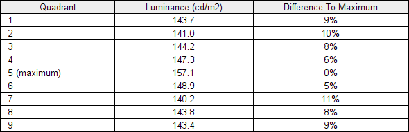
Luminance uniformity table
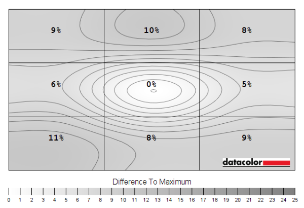
Luminance uniformity map
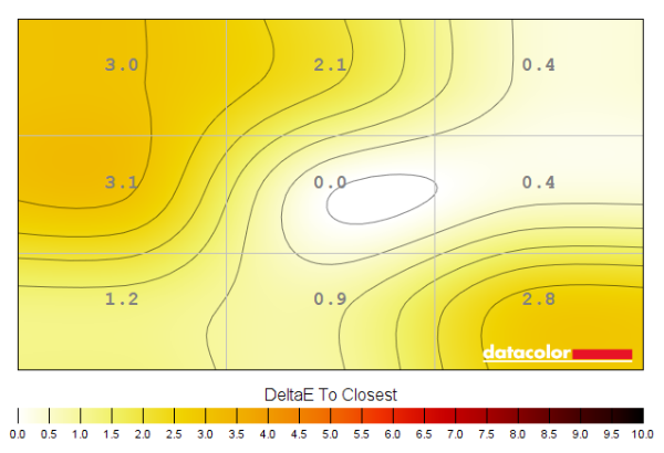
Colour temperature uniformity map
Contrast in games and movies
Lagom contrast tests
Colour reproduction
Colour gamut
Colour gamut 'Test Settings'
Colour in games and movies
Shade representation using SpyderCHECKR 24
Viewing angles
The video below shows the Lagom text test, a mixed desktop background, game scene and dark desktop background from various viewing angles. There are minor shifts in colour for mixed desktop background and game scene, with much stronger performance in that respect than VA or TN models. You can observe ‘hazing’ (contrast loss) from sharper angles, but this is at a normal level for a model with IPS-type panel. The dark desktop shows ‘IPS glow’, which blooms out as viewing angle increases. This appears as a generally cool-tinted grey, or slightly warm tinted depending on angle.
Interlace pattern artifacts
Responsiveness
Input lag
Perceived blur (pursuit photography)
Responsiveness in games and movies
ULMB (Ultra Low Motion Blur)
VRR (Variable Refresh Rate) technology
G-SYNC – the technology and activating it
Enable G-SYNC
Set VSync according to preferences
G-SYNC – the experience
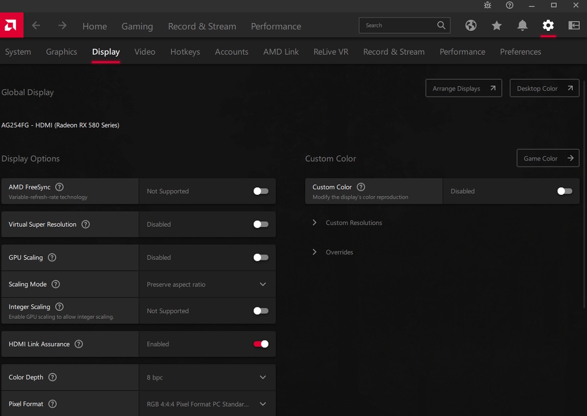
FreeSync
The experience was very much the same as it was with G-SYNC. The key features of the G-SYNC module are accessible, with Adaptive-Sync simply being an alternative way to access the module for compatible AMD hardware. This included variable overdrive and seamless operation throughout the very generous VRR range. Our suggestions regarding use of VSync also apply, but you’re using AMD Software rather than Nvidia Control Panel to control this. Open up AMD Software and click ‘Settings’ (cog icon towards top right), then ‘Graphics’. The setting is listed as ‘Wait for Vertical Refresh’. This configures it globally, but if you wish to configure it for individual games click ‘Game Graphics’ towards the top right. Above this dropdown list there’s a toggle for ‘Radeon Enhanced Sync’ which is AMD’s version of Nvidia’s ‘Fast Sync’.

The ‘Frame Counter’ feature in the ‘Game Setting’ section of the OSD doesn’t work with Adaptive-Sync and will simply show the static refresh rate selected instead. HDR can be used at the same time as Adaptive-Sync, too.
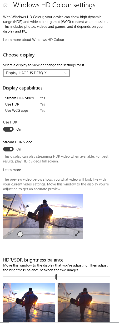
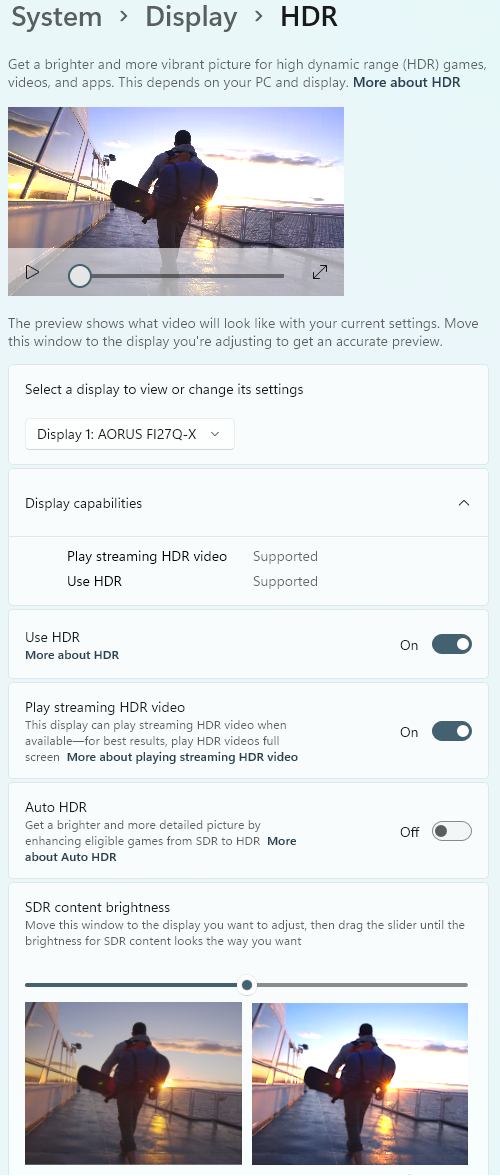
HDR (High Dynamic Range)
Colour gamut 'Test Settings'
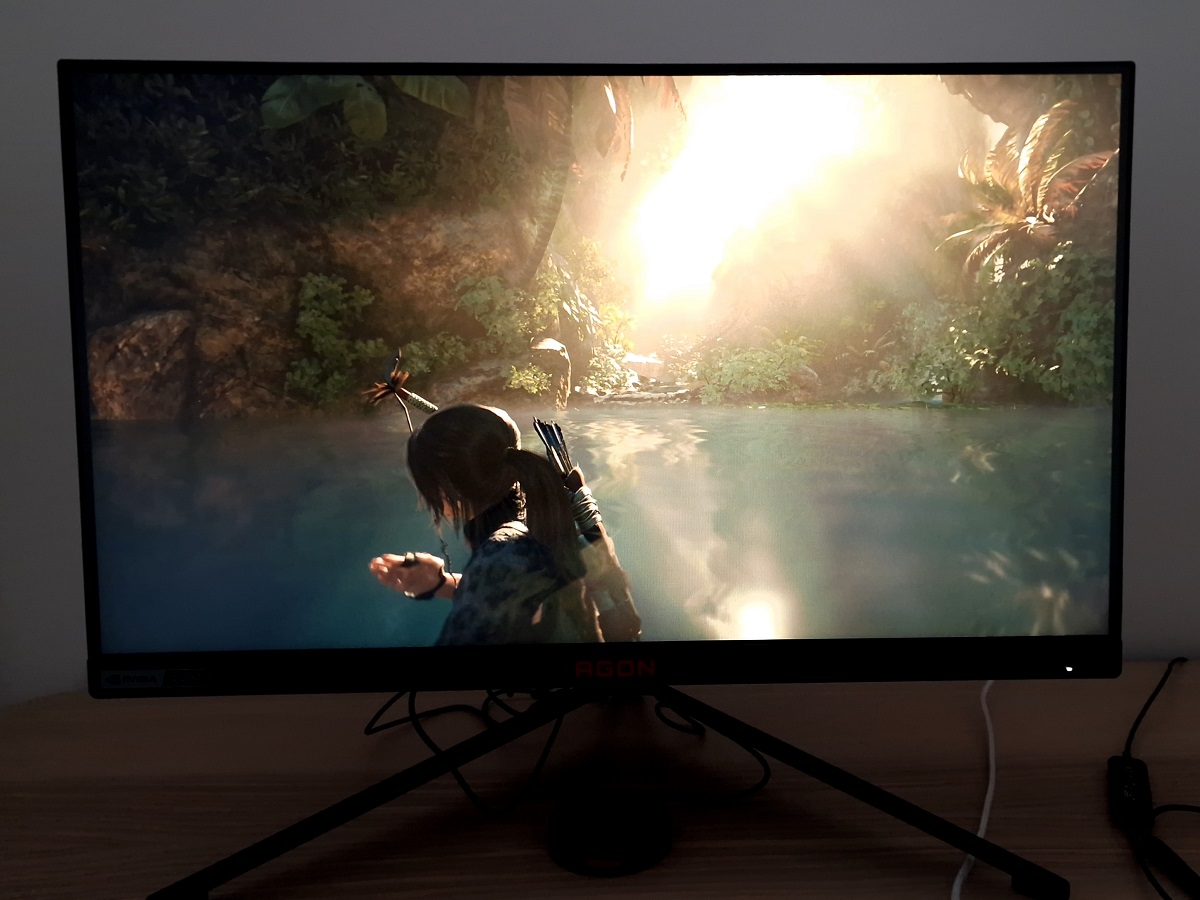
The HDR10 pipeline makes use of 10-bits per colour channel, which the monitor supports with additional dithering applied by the GPU (360Hz) or scaler of the monitor (up to 300Hz). We’ve carefully observed a range of content, including fine gradients, on a broad range of monitors where 10-bit is supported monitor side (usually 8-bit + FRC) and where the GPU handles the dithering under HDR. Including comparisons with a given model where the monitor handles the dithering at some refresh rates and the GPU handles it at others. Regardless of how ’10-bit’ is achieved, the resulting image is essentially identical. The enhanced precision of 10-bit enhances the nuanced shade variety, with subtler variations of shade apparent. You can see this for darker shades, for example, where there’s a natural uplift of detail that looks far more natural (and less ‘blocky-looking’) than what a gamma enhancement would provide under SDR. For brighter shades the enhanced nuanced variety helps provide a smoother look to weather effects, smoke and other fine gradients. Whether observing darker or brighter shades, a high level of luminance precision can really help accentuate things – that certainly isn’t offered in this case. The image below shows one of our favourite scenes from Shadow of the Tomb Raider for HDR. Bear in mind this photo is purely for illustrative purposes and in no way represents how the monitor appeared running HDR in person.
Video review
Timestamps:
Features & Aesthetics
Contrast
Colour reproduction
HDR (High Dynamic Range)
Responsiveness (General)
Responsiveness (VRR)
Conclusion
Positives Negatives Strong colour consistency and close sRGB tracking providing a fairly rich and natural look to things
No support for wide gamuts and slight sRGB undercoverage limit its vibrancy, HDR performance and flexibility Decent static contrast and basic HDR to provide a different look to things – for a bit of variety Moderate ‘IPS glow’, screen surface a bit grainy and not particularly ‘light’, unconvincing HDR Very low input lag, fast pixel responses overall to support the 360Hz refresh rate and solid VRR provided via G-SYNC module Widespread and in places fairly eye-catching overshoot plus some ‘powdery’ trailing Excellent ergonomics with a solid feel to the stand, convenient OSD control via ‘QuickSwitch’ remote Very expensive for a Full HD monitor, quirky OSD, Reflex Latency Analyzer and some of the lighting features could be considered ‘gimmicky’
