Author: Adam Simmons
Date published: December 31st 2015
Table of Contents
Introduction
For users after an excellent pixel density from a display of modest size, the Dell P2415Q is one of the favourites. With its 23.8” ‘4K’ UHD (3840 x 2160) IPS panel, it’s a well-rounded and highly capable screen. The ViewSonic VX2475Smhl-4K is another alternative, with a 23.6” UHD Samsung PLS panel. It certainly looks rather different to the Dell on the outside, with its glossy look in place of ergonomically adjustable modern home-office aesthetic of the Dell. We’ll be putting this screen through its paces to find out how it performs in a range of tasks and seeing how the PLS panel holds up against the IPS alternative.
Specifications
The monitor uses a 23.6” ‘4K’ UHD panel, which makes use of a Samsung PLS (Plane-to-Line Switching) panel. This supports true 8-bit colour without dithering, in contrast to the IPS alternative which uses 8-bits per subpixel plus dithering. The specified response time, to be taken with a pinch of salt, is 4ms. Some of the key ‘talking points’ of the monitor have been highlighted in blue below.
The key ‘talking points’ of the specification have been highlighted in blue below.
Features and aesthetics
From the front the monitor has a look akin to what was quite common on monitors several years back. There are copious amounts of piano black glossy plastic used on both the bezels and stand. The bezels are thick, at 20mm (0.79 inches) at the top and sides. At the bottom the black area of the bezel is ~27mm (1.06 inches) with an additional clear plastic lip protruding downwards a further 13mm (0.51 inches) maximum. This certainly doesn’t have the sleek slender-bezel look favoured by most modern monitors. The screen surface is light matte anti-glare, explored a little later on. The included stand provides tilt (5° forwards and 22° backwards) as the only ergonomic flexibility. The screen is a bit wobbly and the overall construction feels fairly inexpensive and unashamedly plasticy, it has to be said.
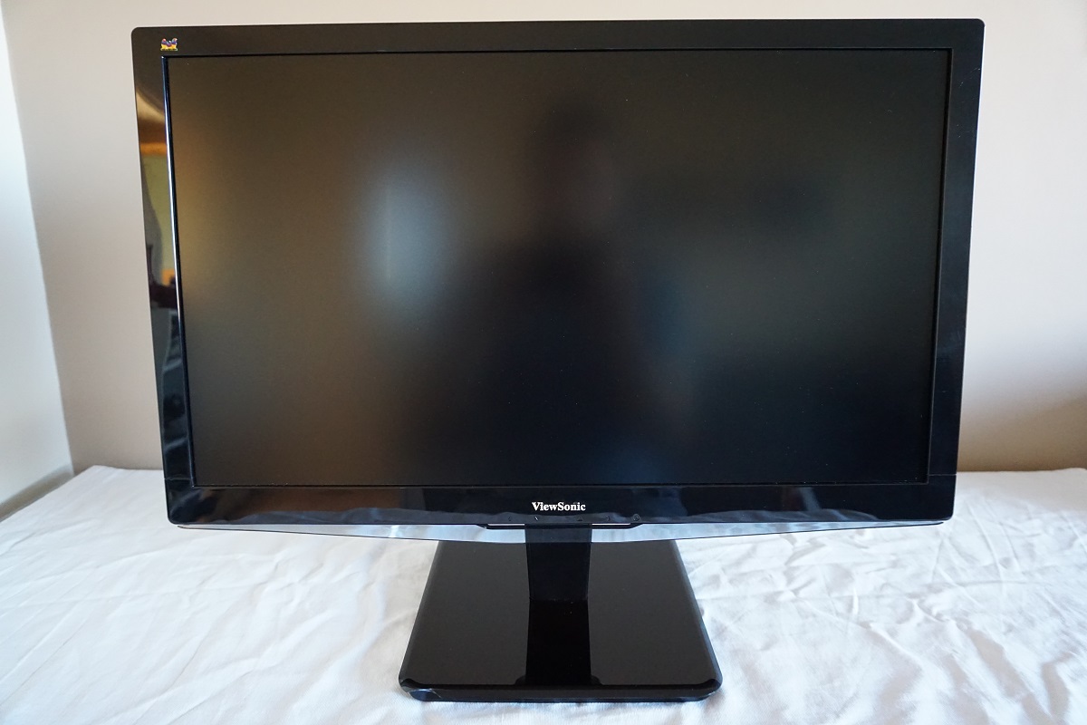
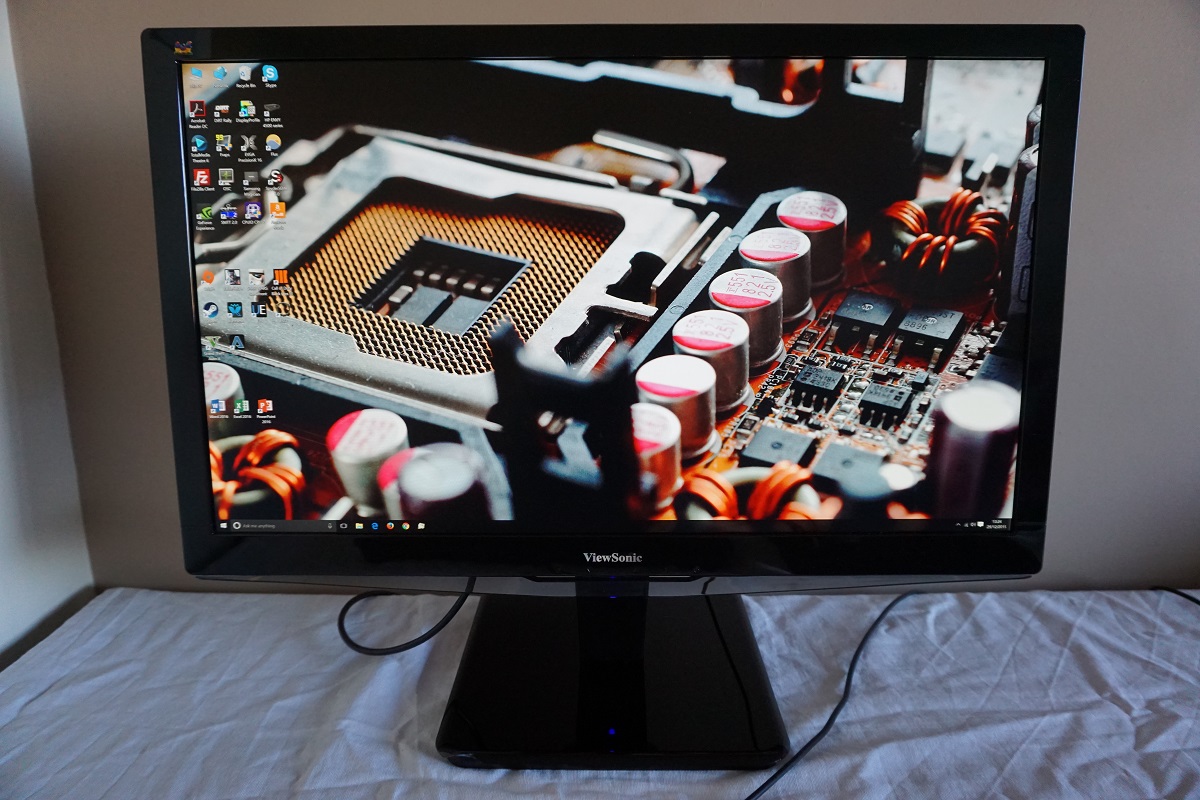
The OSD (On Screen Display) controls are tactile, awkwardly placed behind the plastic lip, facing downwards. The placement of these really is rather poor and one of the reviewers here with small hands found them physically painful to use. Those with larger hands will find that they are simply difficult to access – in short, these are some of the worst OSD controls we’ve come across on a monitor. It’s quite a relief once you’ve set everything up to your liking and don’t have to access them too frequently. The power LED shines fairly dark blue when the monitor is on, but can be disabled in the OSD if you prefer. When the monitor is on standby the power LED changes to blue and is disabled entirely if the monitor is switched ‘off’ using the power button.
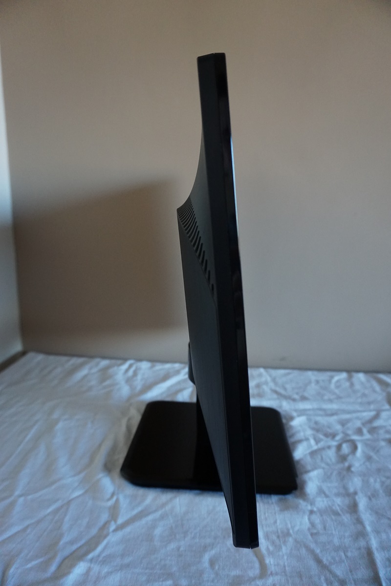
From the side the monitor is rather slender; 17mm (0.67 inches) at thinnest point, lumping out a bit further centrally. The total depth of monitor including stand base is 231.50mm (9.11 inches) and the total height is 440mm (7.32 inches), according to our measurements.
The rear of the monitor uses matte black plastic quite extensively, with brushed metal textured black plastic in the middle. There are 100 x 100mm VESA holes provided for alternative mounting – the included stand mounts towards the bottom and can be removed to make way for an alternative VESA-compatible stand or mount. There is a K-Slot towards the bottom left. The ports are down-firing, found beneath the VESA holes and above the included stand connection points. To the left of the stand there is a DC power input (external power brick). The remaining ports are; HDMI 1.4 (with MHL 2.0), DP 1.2, HDMI 2.0 and 3.5mm headphone jack.
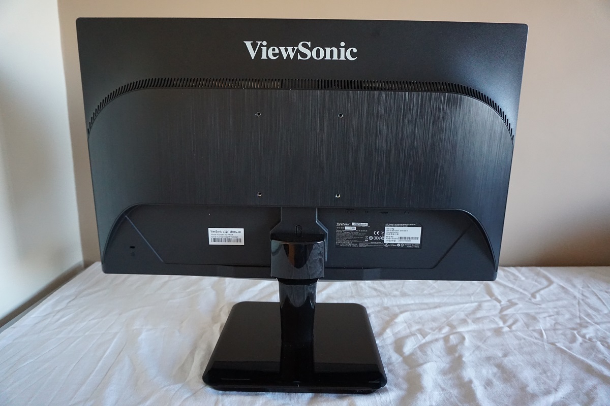
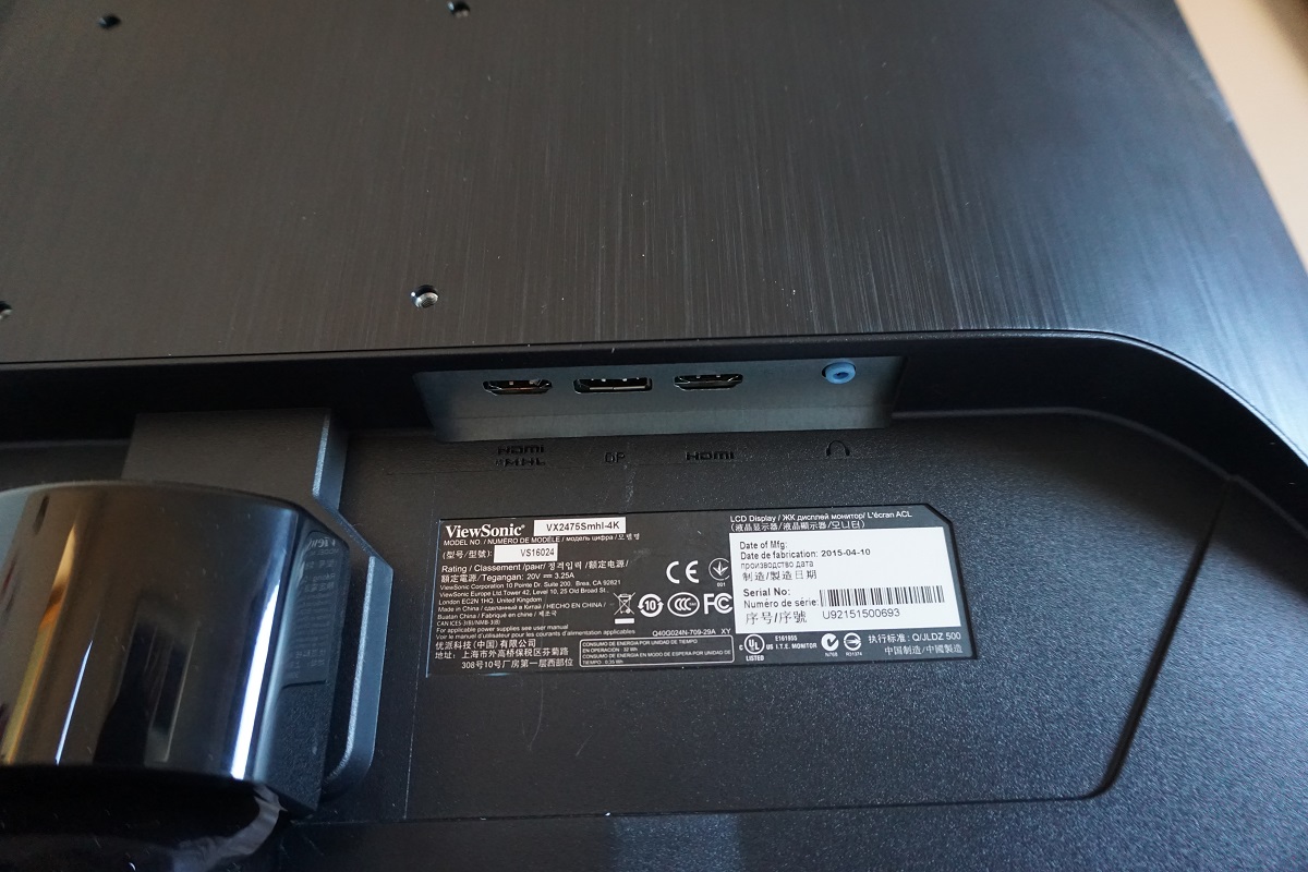
There are also two integrated 2W speakers for basic and fairly low quality sound output. An HDMI cable and the necessary power cable are included with the monitor. Note that 3840 x 2160 @ 60Hz is only supported via HDMI 2.0 and DP 1.2. Earlier revisions of each port are limited to 30Hz at the native UHD resolution.
Calibration
Subpixel layout and screen surface
A light matte anti-glare screen surface is used on the monitor, which provides good glare handling characteristics without affecting the vibrancy or clarity as much as some matte screen surfaces. The overall texture of the screen surface (which is actually a 3D structure with many layers to it) is such that it gives a bit of graininess to the image. This is fairly light and certainly not the sort of smeary or course graininess you get with some matte screen surfaces, but it isn’t as smooth as we’ve seen on some monitors (for example 32” UHD models). It’s quite comparable to what we saw on the Dell P2415Q really – perhaps a bit less grainy, but it’s difficult to say as we last saw a P2415Q quite some time ago.
![]()
The image above shows the subpixel layout of the monitor, which is standard RGB (Red, Green and Blue) stripe. This is the most common layout and the default expected by modern operating systems such as Microsoft Windows and MacOS. Mac users needn’t worry about text fringing issues, whilst Windows users don’t need to worry about ClearType. Although you may still wish to run through the wizard to fine-tune according to preferences. The image below shows the subpixels of the monitor individually lit, to allow us to discuss a few differences between each of the subpixels and the slight impact that has on the image.
![]()
The green subpixels of the monitor are equally spaced, arranged as you might expect really. The red subpixels, on the other hand, are arranged in groups two subpixels high. Between each group there is a relatively thick gap (black line on the image), whereas to the left and right of each subpixel there is not much of a gap at all. The blue subpixels are some way between this, arranged in groups two subpixels high with fair gaps all around the grouped subpixels. This has very little impact on the image from a normal viewing position. However; if you look particularly closely (exact distance will depend on eyesight – but generally closer than we’d advise anybody sit to a monitor) you can see a very faint horizontal interlacing pattern on shades where the red subpixels are dominant. Reds, yellows, magentas and oranges for example. These horizontal bands are due to the aforementioned grouping (and gaps) for the red subpixels. This isn’t something most users will notice or be bothered by, but interesting to note anyway.
Testing the presets
The VX2475Smhl-4K features a range of ‘Viewmode’ presets; ‘Standard’, ‘Game’, ‘Movie’, ‘Web’, ‘Text’ and ‘Mono’. A few extra presets are also available in the ‘Color Adjust’ menu; ‘sRGB’, ‘Bluish’, ‘Cool’, ‘Native’, ‘Warm’ and ‘User Color’. If you wish to use any of these ‘Color Adjust’ settings, then the ‘Viewmode’ is automatically set to ‘Standard’ – in other words, these sets of presets override one another.
In the table below we show the white point and gamma readings taken using a Datacolor Spyder5ELITE colorimeter, for a selection of different settings. There are also some general observations on image characteristics and a list of the preset-specific OSD features available for the user to control. Our test system used an Nvidia GeForce GTX 970 connected via DP 1.2 to the monitor. Windows 10 was the operating system used, with no additional drivers or ICC profiles loaded (i.e. with the monitor in its ‘plug and play’ state). Aside from for our ‘Test Settings’, assume any setting not mentioned here was left at default.
| Monitor Settings | Gamma (central average) | White point (kelvins) | Extra OSD features | Notes |
| Color Adjust = sRGB | 2.2 | 7531K | Brightness, Contrast | Dim with a cool tint, but a nice balance otherwise with pleasing shade variety and depth. |
| Color Adjust = Warm | 2.2 | 5224K | Brightness, Contrast, Dynamic Contrast, Gamma, Blue Light Filter | This is essentially a ‘Low Blue Light’ setting with a warm tint and significantly reduced blue light output. Gamma remains strong. |
| Color Adjust = User Color | 2.2 | 7202K | Brightness, Contrast, Dynamic Contrast, Blue Light Filter, Colour Channels | As per factory defaults but even brighter and marginally less blue. The gamma still averages ‘2.2’ but deviates just a little from the curve in places (not worryingly so). |
| Blue Light Filter = 0 | 2.2 | 4813K | Brightness, Contrast, Dynamic Contrast, Gamma, Blue Light Filter | This is the strongest ‘Low Blue Light’ setting available on the monitor (also adjustable in increments of 1). It gives a warm look to the image and is suitable for relaxing evening viewing. |
| Viewmode = Standard (Factory Defaults) | 2.2 | 7520K | Brightness, Contrast, Dynamic Contrast, Gamma, Blue Light Filter | As above but much brighter. A good vibrant but natural look to shades overall. |
| Viewmode = Game | 1.9 | 6914K | Brightness, Contrast, Dynamic Contrast, Gamma, Blue Light Filter | A cool and slightly green tint with a bit of a washed out look overall. Still one of the better balanced game modes we’ve seen, although that’s not saying much really. |
| Viewmode = Text | 2.4 | 5553K | Yet another ‘Low Blue Light’ setting. This one gives excessive depth to some shades (high gamma) but is quite relaxing on the eyes still. | |
| Viewmode = Mono | 2.8 | 7711K | This makes the image black and white or greyscale. The distinction between shades of grey are poorer than in any other mode we’ve tested, though. | |
| Test Settings (as below) | 2.2 | 6484K | Brightness, Contrast, Dynamic Contrast, Gamma, Blue Light Filter, Colour Channels | As per ‘Custom Color’ with improved white point for better balance. A nice vivid and varied look to the image. |
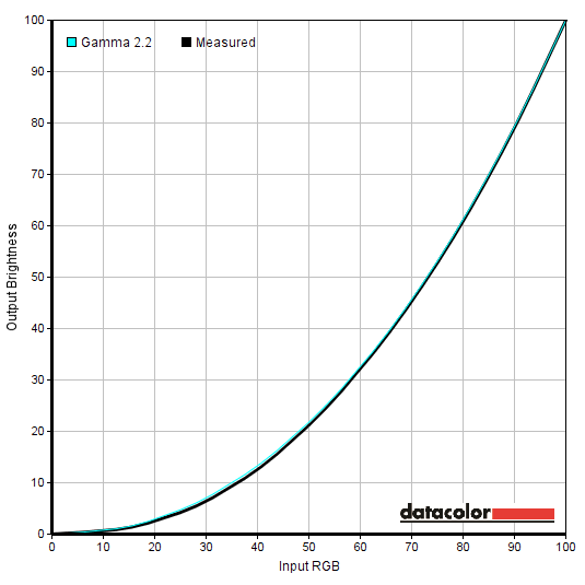
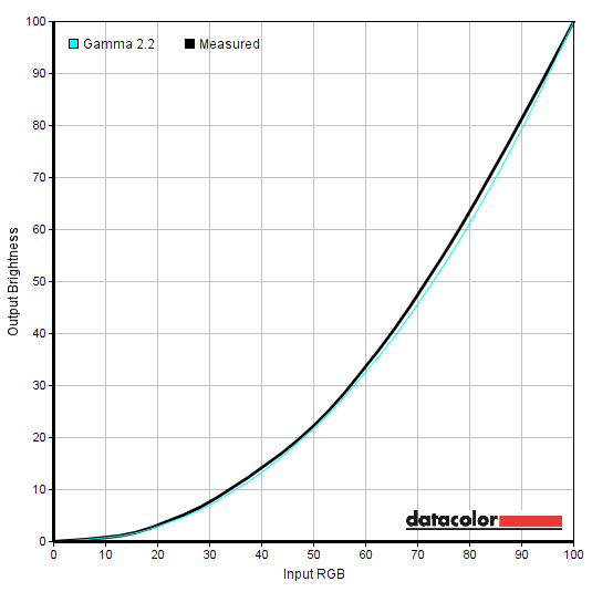
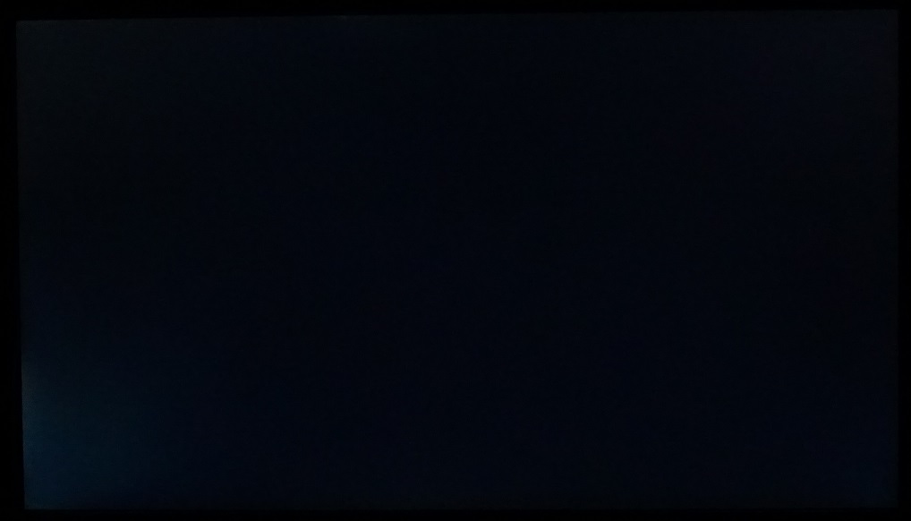
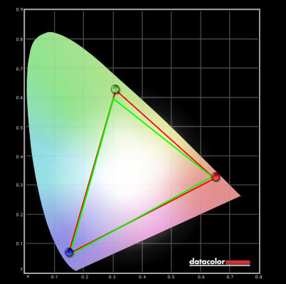
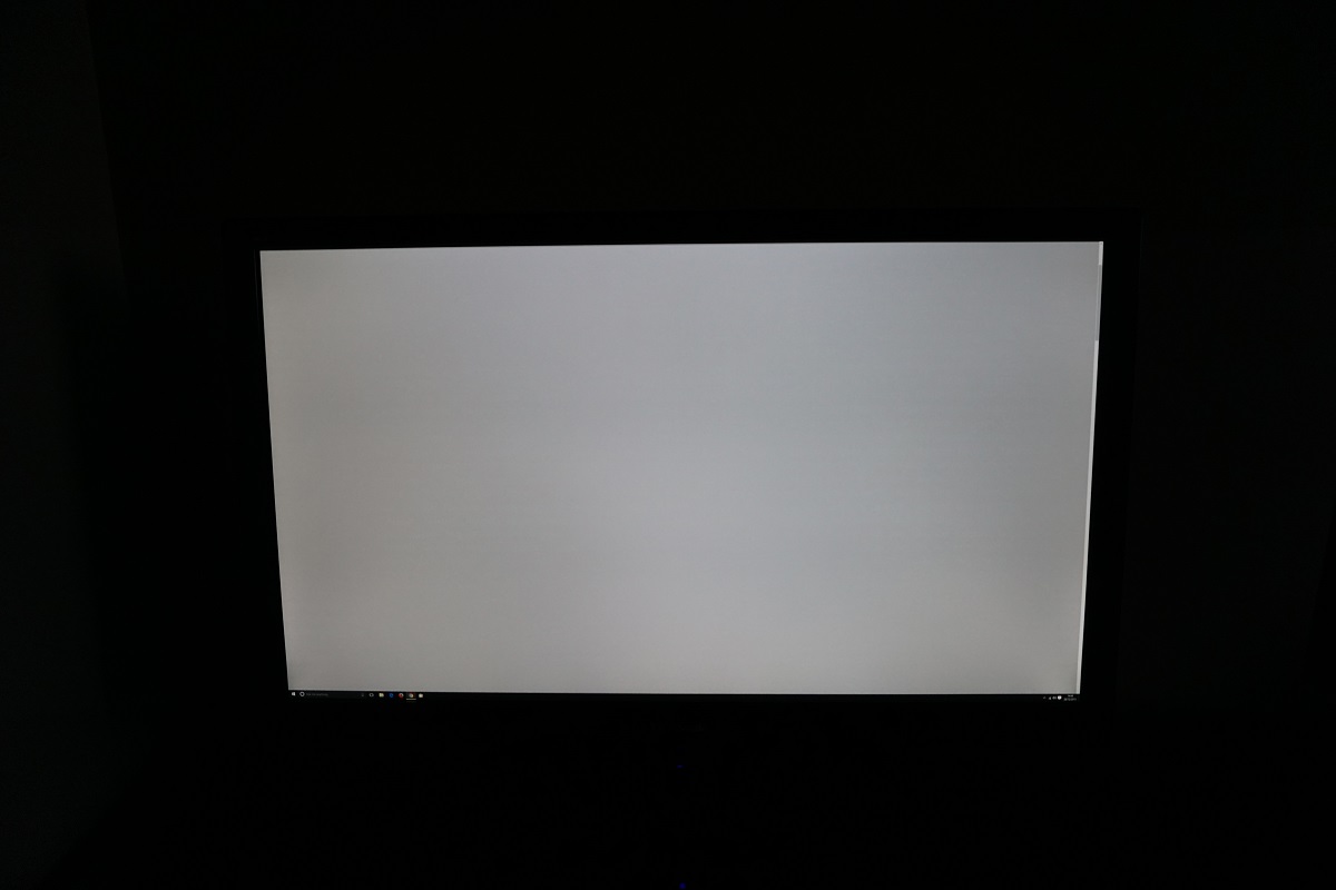
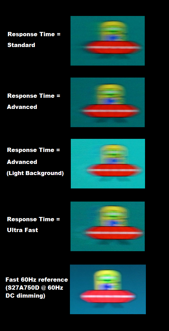
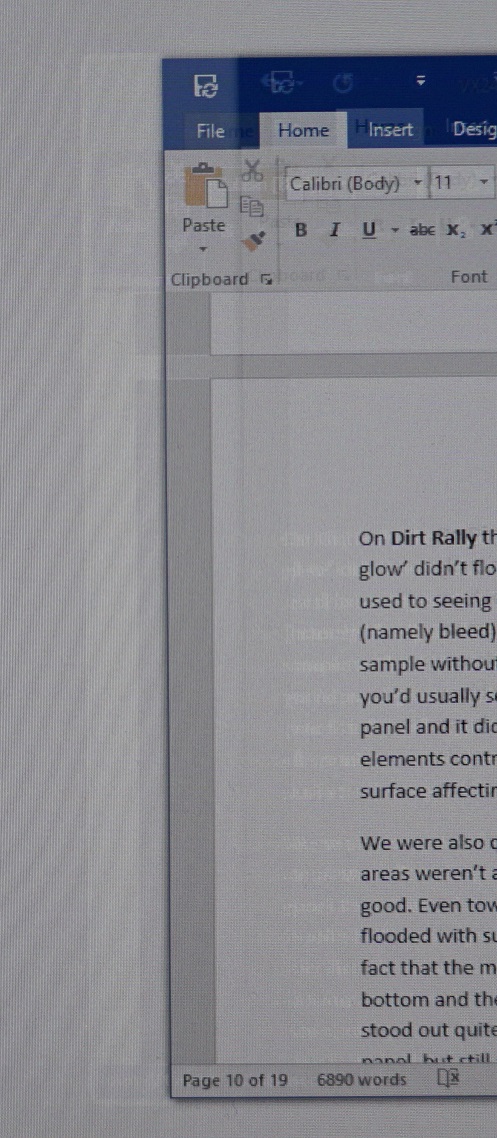
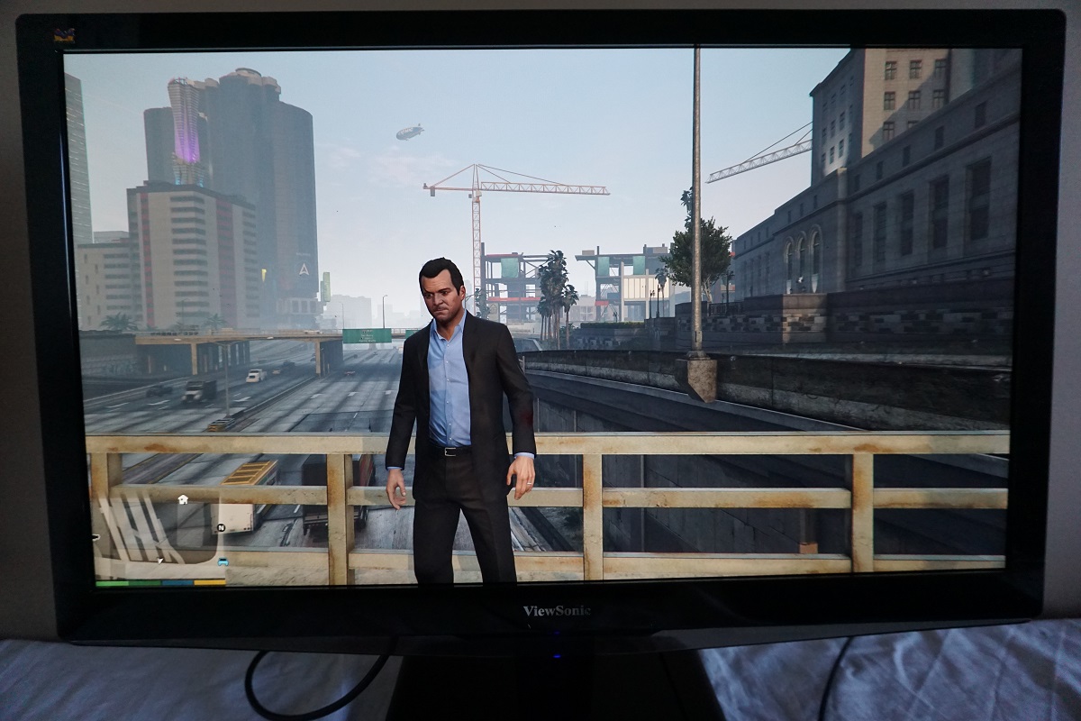
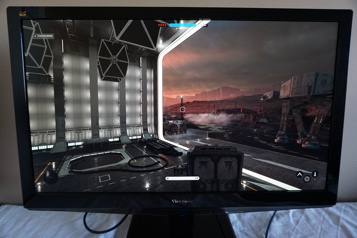
Straight from the box the VX2475Smhl-4K was rather bright with a cool tint, but showcased a strong and faithfully reproduced shade range. Gamma tracking was pretty much spot on for the usual ‘2.2 curve’ as shown below. The ‘User Color’ mode provided the necessary flexibility to correct the white point. The gamma tracking remained good, although deviated slightly more from the ‘2.2 curve’ than the factory defaults. The gamma tracking for our test settings is shown below. The deviation here is not at all worrying for general purpose use or even a bit of photo editing. It should only really concern those with particularly stringent colour accuracy demands who should be performing their own calibration using a colorimeter or similar device anyway. There were three different ‘Low Blue Light’ settings, the most flexible of which is the aptly named ‘Blue Light Filter’. This can be adjusted in single unit increments from ‘0’ (full effect) to ‘100’ (off completely – normal monitor settings). We liked to set this to ‘0’ for our own viewing pleasure later on in the evening (before bed) when stimulating blue light output should be reduced as much as possible. Note that the ‘Blue Light Filter’ overrides any adjustments made to colour channels (or indeed any ‘Color Adjust’ presets). Likewise, it can be quickly deactivated by making such adjustments. Our ‘Test Settings’ involved the use of ‘User Color’ with some manual adjustments to the colour channels and brightness. This provided a well-balanced image with appropriate white point for our typical viewing environment. Note that each individual unit varies and so does lighting. You should therefore use these settings as a guide only and be prepared to make different adjustments to suit. Any settings not mentioned below were left at default. We also include the ‘Response Time’ setting here just for reference. Color Adjust= User Color R= 100 G= 100 B= 93 Response Time= Standard A Konica Minolta CS-200 luminance meter was used to measure the luminance of white and black using a range of settings. From this, contrast ratios could be calculated. This data is shown in the table below, with black highlights indicating the results of our test settings and blue highlights indicating the highest white luminance, lowest black luminance and highest contrast ratio recorded. Assume any setting not mentioned in the table was left at default, with the exception of our ‘Test Settings’. With only brightness adjusted, the static contrast of the VX2475Smhl-4K averaged a pretty decent 996:1. This level of contrast was maintained when activating the full ‘Blue Light Filter’, which is pleasing. The peak contrast was measured with all colour channels left at ‘100’ in the ‘User Color’ mode – an impressive 1276:1. This dropped to a still very good 1231:1 using our ‘Test Settings’. The peak luminance recorded in the table was 268 cd/m² whilst the minimum white luminance recorded was 33 cd/m². This gives a 235 cd/m² luminance adjustment range with some good useable values. There is also a ‘Dynamic Contrast’ setting on the monitor, which can be enabled in certain presets (as noted in the calibration table). This setting allows the backlight level (brightness) to adjust according to the level of light or dark on the screen. As usual the backlight is controlled as one unit, so this can’t account for intricate mixtures of light and dark on a scene and works on average levels. This setting responded very rapidly to changes of scene brightness and dimmed very effectively for darker content. It did provide what we feel was a slightly uncomfortable level of brightness for some mixed scenes. At any rate, we’re not a fan of this sort of setting and prefer manual brightness control. But this dynamic contrast mode certainly does what it says on the tin. The monitor does not use PWM (Pulse Width Modulation) to regulate backlight brightness and instead uses DC (Direct Current) modulation. The monitor is therefore considered to be ‘flicker-free’, as advertised, which will come as welcome news to those who are sensitive to flickering or other aspects of PWM usage. Observing a black screen in a dark room, using our test settings, revealed some backlight bleed. This was most pronounced as a sort of spotlighting towards the bottom left corner of the screen. The image below shows this bleed. It was taken a few metres back from the monitor to eliminate ‘PLS glow’, which can be seen towards the bottom corners of the screen in particular as a sort of silver haze from a normal viewing position. ‘PLS glow’, not shown in the image above, is quite subdued compared to what you would usually observe on IPS-type panels of this sort of size and doesn’t have the same intensity or widespread nature. As we explore later, this also means that it doesn’t have quite as much impact on image detail in dark scenes as you’d usually expect. This glow blooms out more noticeably if the screen is viewed from an angle, appearing as a silver or slightly warm grey sheen depending on the angle. This is shown in the viewing angles video later on in the review. We used the Spyder5ELITE to assess the uniformity of white on the screen, measuring the brightness of 9 equidistant white quadrants running from top left to bottom right of the screen. The following table shows the luminance recorded at each quadrant alongside the brightness deviation between a given quadrant and the brightest point recorded. The luminance uniformity was fair. The brightest point recorded was ‘quadrant 9’ towards the bottom left of the screen (169.5 cd/m²). The greatest deviation from this occurred at ‘quadrant 4’, to the left of the central region (146.6 cd/m², 13% dimmer than maximum). The central region of the screen (‘quadrant 5’) showed 4% deviation from the brightest point (162.7 cd/m²). Note that individual units vary when it comes to uniformity and that further deviations can be expected beyond the points measured. For those who prefer a graphical representation, the contour map below shows these deviations with darker greys representing lower luminance (and hence greater deviation from the brightest point) than lighter greys. The percentage deviation between each quadrant and the brightest point is also shown. The Spyder5ELITE was also used to analyse variation in the colour temperature (white point) for the same 9 quadrants analysed previously. The following contour map shows deviation between each quadrant and the 6500K (D65) daylight white point target. Deviations here are assigned DeltaE values, with a DeltaE >3 representing deviation that most users could readily notice by eye. Darker colours on the contour map represent higher deviations from 6500K than lighter colours. The results here are fairly good. The point closest to 6500K is the central region of the screen. There is significant deviation in colour temperature towards the bottom right (DeltaE 3.7) but no significant deviation recorded elsewhere. As above, individual units can vary when it comes to uniformity and you can expect variation beyond the measured points. On Star Wars Battlefront the contrast performance was quite pleasing. The level of detail in dark scenes was very good overall, with relatively minor loss of detail in the areas of the screen affected by ‘PLS glow’. This was quite a bit more subdued from a normal viewing position than we’ve seen on PLS or IPS screens of this size in the past. There were some fairly minor details such as cracks in rocks in dark caves that were visible rather than lost in the usual flood of glow. There was certainly some glow, but it was less intense and widespread that we’d expect. The backlight bleed towards the bottom left of our unit actually affected the contrast in this region more than this glow. At the high-end the screen surface gave a bit of a grainy look to whites and light colours, but this was a fine rather than smeary grain. Such elements stood out nicely in their darker surroundings. On Dirt Rally the contrast performance was again quite pleasing. Whilst it was still there, the ‘PLS glow’ didn’t flood the screen as you might expect. It was not as intensive nor as intense as we’re used to seeing on ~24” IPS-type screens. The areas of our unit affected by backlight uniformity issues (namely bleed) did have quite a bit of the detail sapped from them in dark areas. If we/you have a sample without this issue, then you’d notice much stronger perceived contrast peripherally than you’d usually see for this size and panel type. The depth was certainly not up to the levels of a VA panel and it didn’t give the same depth and atmosphere when driving at night, however. Bright elements contrasted well with the darker surroundings, with a light graininess from the screen surface affecting white and other light colours (car headlights, areas of bright sky etc.) We were also quite pleased with the contrast performance on the Blu-ray of Skyfall. Whilst dark areas weren’t as deep and atmospheric as on VA models, the distinction of fairly subtle details was good. Even towards the edges where IPS/PLS/AHVA glow could take hold and make things appear flooded with subsequent loss of detail, the detail levels were pretty good. This was also aided by the fact that the movie is presented in a 2.40:1 aspect ratio, giving thick black bars at the top and bottom and therefore keeping the picture in central regions less affected by glow. Bright elements stood out quite well in the surrounding darkness – not popping out as they would on a good VA panel, but still appearing quite distinct from their darker surroundings. Lagom’s tests for contrast were used to more closely analyse contrast performance, highlighting weaknesses which may not be readily apparent during other testing. The following observations were made. The colour gamut of the VX2475Smhl-4K (red triangle) was compared with the sRGB colour space (green triangle), as shown in the image below. The monitor fully covers sRGB with a little extension beyond this. This slight overextension can be readily compensated for by full calibration with a colorimeter, if required, and for general purpose use is nice as it provides a rich but accurate look to the image with just a hint of extra vibrancy. On Star Wars Battlefront the colour reproduction was pleasing. There was plenty of depth and vibrancy but also a very pleasing shade range. This helped the environments look distinct and believable. On the forested regions (Endor) there were some nice lush deep greens combined with a pleasing palette of more muted green shades. The consistently rich soil colours were also pleasing, maintained throughout the screen rather than appearing a weaker ‘clay like’ shade in some regions as it would on some other panel types. The blues, greens and reds of ‘energy bursts’ from the blasters and light sabers on the game had a pleasing vivid intensity as well. Fires also had an excellent warming quality with a pleasing variety of orange and yellow shades, as appropriate. Colour reproduction was excellent on Dirt Rally. The strong consistency of shades really helped give environments the natural look that they craved. There were many closely matching shades of green and brown displayed in an appropriate way, with the monitor showing appropriate subtle distinctions regardless of where on the screen the shade was displayed. There were also some pleasingly deep and lush looking greens. Where appropriate, colours also had a healthy dose of vibrancy. The car liveries, for example, had a good vivid look to them. Shade range was again strong here but it was perhaps the intensity of certain shades (such as deep blues, reds and oranges) that was most appealing. This was aided by the light matte screen surface, quite generous colour gamut and panel type which combined to give such shades a good level of ‘pizazz’ throughout the screen. The Blu-ray of Skyfall appeared much as it should. Skin tones were appropriately saturated and showed strong subtle shade variety, whilst environments and objects within looked natural and in-place. Glowing orange fires and bright blue and red lights had good depth and intensity to them. We also tested the Blu-ray of Futurama: Into the Wild Green Yonder. An excellent array of shades was displayed with strong consistency on this film. Many closely matching but still subtly different pastel shades were displayed appropriately throughout the screen, giving objects and character skin colours their own correct and unique ‘identity’. There were also some impressive deep colours and bright neon colours, for example bright cyans, deep purples and neon greens. We used Lagom’s tests for viewing angle to explore the idea of colour consistency and viewing angle performance in a more focused way. The following observations were made from a normal viewing position, around 70cm from the screen. A sensitive camera and a utility called SMTT 2.0 was used to assess the input lag of the VX2475Smhl-4K. The monitor was compared to various monitors of known latency. Using this method, we calculated 5.23ms (under 1/3 of a frame) of input lag. This value is influenced both by the signal delay (element you ‘feel’) and pixel responsiveness (element you ‘see’) and indicates that the monitor has a very low signal delay that shouldn’t specifically bother even sensitive users. In this article we introduce the concepts of ‘pursuit photography’ and ‘perceived blur’. Unlike traditional static photographs, pursuit photography uses a moving camera to capture movement on a screen in a way that more accurately reflects what the eye actually sees. Not only is the pixel response behaviour captured (including trailing, inverse ghosting and any additional artifacts), the movement of the camera simulates the natural pursuit tracking movement of our eyes as we observe motion on the screen. These factors combine to produce what is known as ‘perceived blur’ – and eye movement generally contributes to this more significantly than pixel responsiveness. The following images are pursuit photographs taken on the UFO Motion Test for ghosting, with the test running at 960 pixels per second. This is a practical speed for this sort of photography and highlights the key aspects of perceived blur nicely. The monitor was set to its three ‘Response Time’ settings; ‘Standard’, ‘Advanced’ and ‘Ultra Fast’, respectively. The medium cyan background (middle row of the test) was used in all cases, with an additional capture with the light cyan background (bottom row of the test) for the ‘Advanced’ setting. The final photograph shows a fast 60Hz reference – a Samsung S27A750D set to full brightness (to eliminate PWM) and 60Hz, using the ‘Faster’ response time setting. Using the ‘Standard’ setting there is a bit of trailing on top of the blur that is observed due to eye movement alone (i.e. the fast 60Hz reference). This trailing is caused by slower than optimal pixel responses for the transitions shown here, being boldest for the main red UFO body. The ‘Advanced’ setting cuts this down significantly, introducing just a hint of overshoot (inverse ghosting) with a little conventional trailing as well but coming closer to the fast 60Hz reference. With the light cyan background, the overshoot becomes quite a bit more pronounced. It actually looks less noticeable on the photograph than it does when you observe the UFO in motion first hand. The ‘Ultra Fast’ setting produces very obvious overshoot. From this analysis you may be forgiven for thinking that ‘Advanced’ could be the setting to go for. However; the overshoot is rather obvious during certain transitions which aren’t necessarily explored here. These transitions crop up during game play and are painfully obvious, so will be quite bothersome to many users we feel. The higher contrast transitions tend to show this more clearly. In the example below you can see obvious overshoot as a window (Word Document) is moved at a moderate pace from left to right. This is a normal static photograph so doesn’t represent quite what the eye sees, but it does highlight the intensity of overshoot rather nicely. On Battlefield 4 there was a moderate degree of blur. This was mainly but not entirely caused by eye movement and linked to the 60Hz sample and hold nature of the display. There was a fair degree of trailing on top of this, in places. This was most readily observed where medium-dark shades moved against slightly lighter backgrounds. Dark grey painted jets or vehicles moving against an overcast sky, for example. Here you could see a fairly short-lived and reasonably faint (but still quite readily observable) trail behind the moving object. This extra trailing meant that moving rapidly in a vehicle, for example, created a bit more of a blurring of the environment than you might ideally expect from a 60Hz LCD. Not everyone will notice this and we’ve certainly seen worse cases of trailing (mainly from VA models and older IPS models), but it’s worth noting if you’re sensitive to that sort of thing. There was no observable overshoot, which is good. The experience was similar on Dirt Rally. Even during gentle cornering there was a moderate degree of blur, intensifying even more as the pace was picked up. The overall level of blur was a bit greater than you would ideally see on a 60Hz LCD, so was not entirely attributable to eye movement. There was certainly an extra degree of trailing in places, but this wasn’t as noticeable as the additional overshoot using the ‘Advanced’ setting. In the ‘Standard’ setting, which we used, there was no observable overshoot. We don’t really feel the playability of the game was affected by the slight extra trailing and hence somewhat higher level of perceived blur than on faster 60Hz LCDs, but sensitivity to this varies and it’s worth bearing in mind nonetheless. We also tested our Blu-ray movie test titles and didn’t find the pixel responsiveness impeded the performance here. Things were much as you’d see on any fast to moderately fast 60Hz LCD, with the ~24fps at which the frames run being a key limitation to their fluidity. There was no observable overshoot, either. As we explore in this article, the ‘4K’ UHD resolution (3840 x 2160) can bring with it significant benefits for both work and play. But as far as having to rely on scaling goes, things aren’t always plain sailing depending on the applications you use. In our review of the Dell P2415Q, in this same section, we take a look at how things work out with the UHD resolution on a 23.8” screen. As this screen is 23.6”, the experience is as good as identical in that regard – so we won’t be repeating a lot of that here. The pixel density of this one is 186.69 PPI (Pixels Per Inch), which is very high indeed. Again, we found 150% scaling in Windows provided a good balance between readability and real-estate. Running the monitor at its native 100% setting (i.e. no scaling) made text, icons, buttons and other elements completely tiny. On applications with independent zoom control (Microsoft Word, web browsers etc.) this could be overcome for the main body of text but really we found scaling something of a necessity on such a small screen. The photos below show the desktop without scaling (top photo) and with our preferred 150% setting (bottom photo, taken from earlier in the review). As noted in the relevant section on the P2415Q review, the 150% setting still gives you a good amount of useful desktop real-estate. And indeed when gaming, where scaling settings like this don’t apply, the excellent pixel density has the potential to bring a great amount of detail and clarity. To reiterate, we don’t actually find the extra pixel density compared to 27”, 28” or even 31.5” – 32” UHD screens to be beneficial when gaming. Things really look rather similar in terms of detail and clarity, but just smaller. So the advantage in that respect isn’t really there, it’s more that some people prefer slightly smaller (~24”) screens or don’t have the budget or desk space for anything larger. We’ll round off this section with a few photos taken with the monitor ‘in action’ on a few game titles. This in no way represents what you actually see first-hand when using the monitor, it’s purely for illustrative purposes. The native UHD resolution of 3840 x 2160 brings with it excellent clarity on this screen. It is also very demanding to run for certain graphically demanding applications such as some modern game titles. Some systems (games consoles, for example) also simply don’t support this resolution. It may therefore be tempting or indeed necessary to reduce the resolution to 1920 x 1080 (Full HD), or perhaps 2560 x 1440 (WQHD) as a PC user. When you do this, the monitor uses an interpolation (scaling) process to map the lower resolution content onto its greater number of pixels to ensure that the whole screen is used. This is best handled by the monitor itself rather than the GPU. AMD GPU users needn’t worry about this as it’s automatically handled by the monitor when gaming, by default. Nvidia users should open their Nvidia Control Panel and navigate to ‘Display – Adjust desktop size and position’. They should ensure that ‘No Scaling’ is selected and ‘Perform scaling on:’ is set to ‘Display’ as shown below. Contrary to popular belief, the fact that 1920 x 1080 could theoretically be displayed ‘perfectly’ without a loss of clarity compared to a native Full HD display doesn’t mean that it actually is in practice. Indeed the same sort of interpolation process is used whether you’re trying to display 1920 x 1080 or a resolution without such a neat division, like 2560 x 1440. It isn’t all bad news, though. The interpolation process used by the ViewSonic VX2475Smhl-4K is one of the better ones we’ve come across. There is a loss of sharpness when compared to running the resolution (1920 x 1080 or 2560 x 1440) on a screen of similar size. Things look somewhat softer and less clearly defined. This softening is not severe, though, and is far more subtle than we’ve seen on quite a few other monitors (including several ‘4K’ ones). We therefore feel that, whilst not ideal for the task, the monitor is certainly quite useable and does a pretty decent job at running such non-native resolutions. Note that if you’re running 1920 x 1080 (Full HD) content using movie software or a web browser on the PC and have the monitor running at its native 3840 x 2160 resolution, the GPU or software handles the upscaling. The monitor itself has no influence over this – there is a slight degree of softening that’s quite comparable to the monitors own interpolation when running 1920 x 1080. Another interesting point to note is that the monitor can be set to the ‘4096 x 2160’ (‘True 4K’ or DCI 4K) resolution. It doesn’t magically sprout extra pixels and instead uses an interpolation process of sorts. The end result is an image with roughly similar clarity to the native resolution, but slightly compressed horizontally. It’s designed to simulate a DCI 4K environment for editing purposes. The ViewSonic VX2475Smhl-4K is designed as a relatively inexpensive entrance into the world of ‘4K’ UHD computing. The low price is reflected by the less than stellar build quality and lack of ergonomic flexibility with the included stand. And although low price is no excuse for this, the OSD controls were some of the worst we’ve come across on a monitor. However; the low price is not reflected by the image performance, which was quite impressive overall. Static contrast was much as you’d expect given the panel type, but the overall experience was enhanced by the somewhat reduced level of ‘PLS glow’. The screen surface also helped invite more vibrancy and clarity compared to some matte surfaces, although the surface texture was still slightly grainy rather than completely smooth looking. It wasn’t too obtrusive, even if we would have preferred to see a smoother texture used. The colour quality was pleasing, with strong gamma tracking straight from the box. The white point did require some rebalancing, necessitating switching the ‘User Color’ which had slightly slacker gamma tracking but slightly stronger contrast. The gamma tracking was still more than adequate for general use. The subpixel layout of the monitor also introduced some faint interlacing where the red subpixel was dominant, but we could not see this from a normal viewing distance and don’t suspect most users will even notice it. The monitor fully covered the sRGB colour space and extended a bit beyond. Not troublingly so and certainly not into wide gamut territory, but just enough to invite a bit of extra vibrancy which most users will welcome. The 3840 x 2160 resolution is, of course, a headline feature. And the real-estate, clarity and detail benefits that this brings for both work and play were certainly appreciated. When it came to responsiveness things were a bit mixed really. The ‘Standard’ setting was free from observable overshoot and did quite a decent job within the confines of the 60Hz refresh rate, but there were some underlying weaknesses in pixel responsiveness here and there. The ‘Advanced’ setting sped up some of these slightly slower pixel transitions, but brought with it a level of overshoot that we found quite obvious in places and less tolerable than the slightly higher trailing in ‘Standard’ mode. The input lag was very good on this model, too, with no real signal delay to speak of. Overall then, this monitor put in a pretty strong performance and hits a good sweet spot between price and performance. As with any model it does have its weaknesses and for some users the greater ergonomic flexibility and pixel responsiveness of the Dell P2415Q could prove more attractive. The bottom line; a keenly priced monitor with a no-frills appearance and lack of ergonomic flexibility, but strong image performance overall.
Gamma 'Standard'
Gamma Test Settings
Test Settings
Brightness= 50 (according to preferences and lighting)
Contrast and brightness
Contrast ratios
Monitor Settings White luminance (cd/m²) Black luminance (cd/m²) Contrast ratio (x:1) 100% brightness (Factory Defaults) 214 0.22 973 80% brightness 179 0.18 994 60% brightness 146 0.15 973 40% brightness 110 0.11 100 20% brightness 73 0.08 913 0% brightness 33 0.03 1100 Color Adjust = sRGB 82 0.08 1025 Color Adjust = Warm 206 0.22 936 Color Adjust = User Color 268 0.21 1276 Blue Light Filter = 0 202 0.21 962 Viewmode = Game 246 0.22 1118 Viewmode = Text 214 0.21 1019 Viewmode = Mono 200 0.21 952 Test Settings 160 0.13 1231
PWM (Pulse Width Modulation)
Luminance uniformity
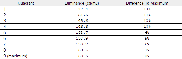
Luminance uniformity table
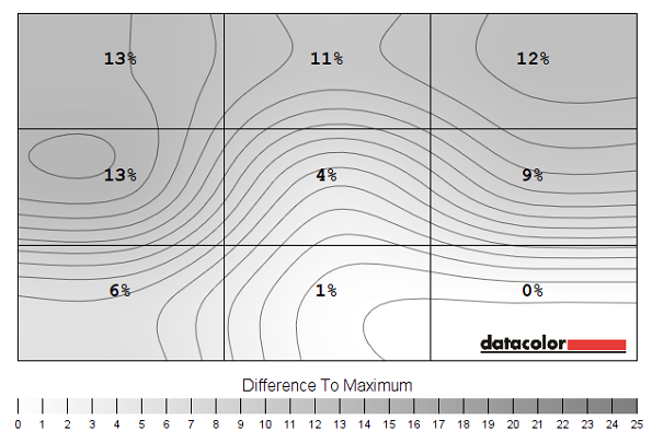
Luminance uniformity map
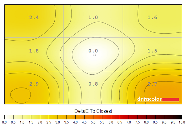
Colour temperature uniformity map
Contrast in games and movies
Lagom contrast tests
Colour reproduction
Colour gamut
Colour gamut 'User Color'
Colour in games and movies
Viewing angles
The following video shows the results of the Lagom text test, a mixed desktop background and a dark desktop background from a variety of different viewing angles. Note the ‘PLS glow’ appearing to bloom out in the final section of the video, as mentioned previously. This is not as intense as you’d usually see for a PLS panel as noted earlier.
Responsiveness
Input lag
Perceived blur (pursuit photography)
Perceived blur with various settings
We therefore preferred the ‘Standard’ setting, despite some transitions being a fair bit slower than optimal. Our analysis below shows how the additional trailing from these slower than optimal pixel responses manifests itself. Note that there will not be a section on ‘overclocking’ as the monitor could only be set to 66Hz before it went out of range. This was the case whether using DP 1.2 or HDMI 2.0 and it did not provide a noticeable benefit over 60Hz.
Responsiveness in games and movies
The ‘4K’ UHD experience

Interpolation and upscaling

Conclusion
Positives Negatives The PLS panel delivered a strong variety of rich-looking shades, with strong consistency, good sRGB coverage and pleasing gamma tracking out of the box
Minor deviation from the usual ‘2.2’ curve in the ‘User Color’ mode, which was necessary to correct the cool tint out of the box
Good static contrast, a light matte screen surface to preserve clarity and vibrancy and relatively low levels of ‘PLS glow’ Some ‘PLS glow’ did persist and the screen surface didn’t give as smooth an appearance to the image as some matte surfaces Very little input lag and decent responsiveness for a fairly convincing 60Hz performance. The inclusion of HDMI 2.0 and DP 1.2 gives a bit of extra flexibility for running the monitor with its full capabilities
Some weaknesses in pixel responsiveness and the 60Hz refresh rate will limit appeal to some users. As will the limited ergonomic flexibility – and the less said about the OSD controls the better
The 3840 x 2160 ‘4K’ UHD resolution provided plenty of useful screen space and provided strong detail and clarity in games – interpolation performance was also quite strong for the Full HD and WQHD resolutions
The UHD resolution requires a lot of graphical horsepower for some games and other applications, whilst the very high pixel density pretty much necessitates scaling – this comes with its own potential issues
![]()

