Author: Adam Simmons
Date published: 26th November 2017
Table of Contents
Introduction
VA (Vertical Alignment) panels are favoured by some users for their superior contrast performance and lack of ‘IPS glow’. Despite some weaknesses persisting, great strides have been made over the years to improve pixel responsiveness and make these models more suitable for gaming. High refresh rate VA panels are becoming increasingly ubiquitous, too. The Samsung C27HG70 (LC27HG70Q with various regional suffixes) is a 27” member of the CHG70 series, adopting a high refresh rate VA panel and a 2560 x 1440 (WQHD) resolution. The screen size and resolution combination, alone, is unusual in the current market as most VA models with that resolution are ~32”. Some additional features of interest include HDR capability and support for AMD FreeSync (via Adaptive-Sync). More specifically, the monitor supports ‘FreeSync 2’ due to it combining these features and the refresh rate range supported – although, as we explore, the HDR capability also works with Nvidia GPUs. We look at these features and indeed the whole package, testing the monitor with our usual collection of tests.
Specifications
This monitor uses a 144Hz SVA (‘Super’ Vertical Alignment) panel, with a resolution of 2560 x 1440 and a 1800R curve. More specifically the LSM270DP01 cell (i.e. panel without backlight integration), with a custom Nanosys Quantum Dot backlight solution. 10-bit colour is supported, achieved using 8-bit + FRC dithering. A ‘1ms MRPT’ (Moving Picture Response Time) is specified, achieved using the ‘Impulsive Scanning’ strobe backlight mode. Some key ‘talking points’ of the specification have been highlighted in blue below, for your reading convenience.
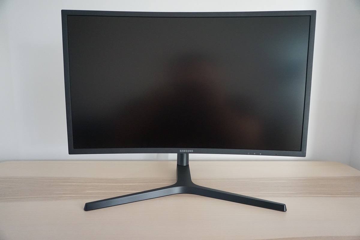
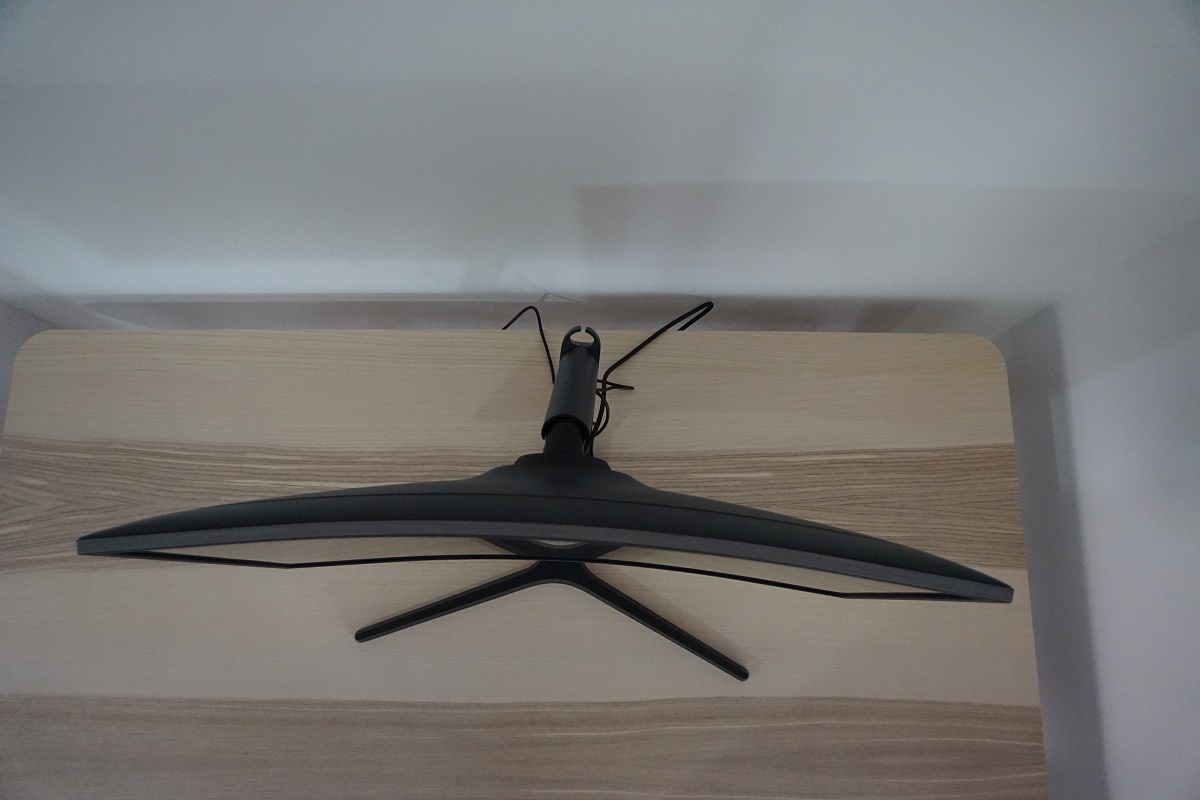
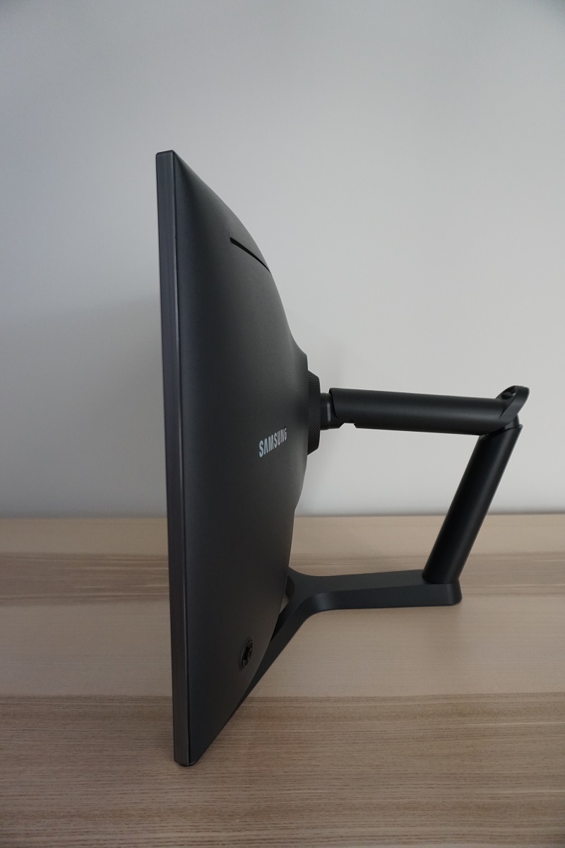
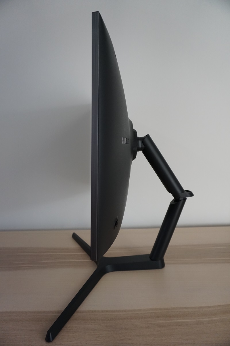
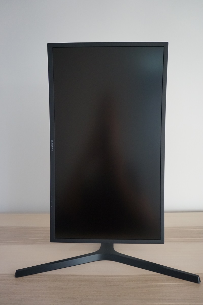
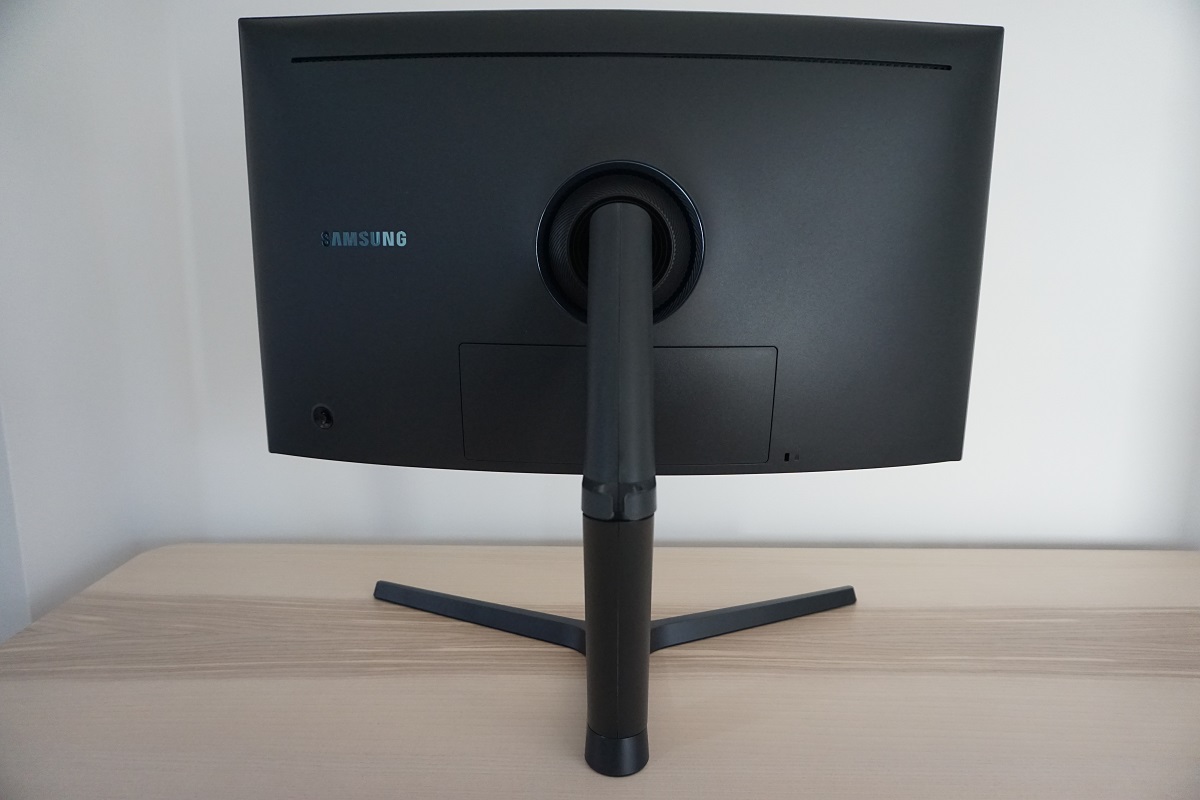
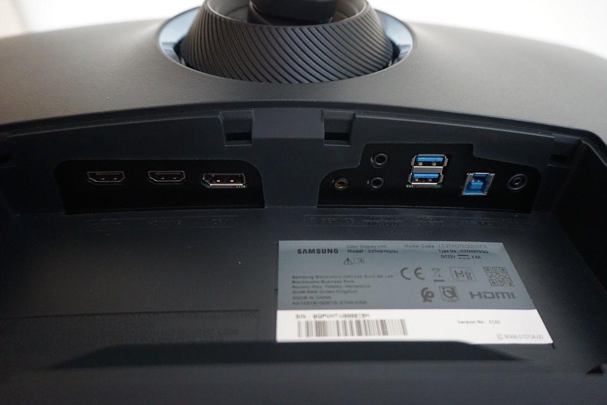
From the front the monitor looks quite subdued for a gaming monitor, with simple matte black plastic bezels. The bezels are single-stage, covering the panel border, with a thickness of ~14mm (0.55 inches) at the top and sides and ~15.5mm (0.61 inches) at the bottom. The stand has a wide Y-shaped stance, which users generally seem to favour over the ‘pointless disc’ found on the likes of the C24FG70. The screen has a 1800R curve and uses a light matte anti-glare screen surface, both of which are explored later on. The OSD (On Screen Display) is controlled primarily by a joystick (‘JOG button’) at the rear of the monitor, towards the bottom right. There are also 3 ‘Game Setting’ shortcut key buttons towards the bottom right, facing downwards. You can customise three sets of ‘Game’ and ‘Picture’ settings in the OSD and recall them using these buttons. There is also a front-facing power LED, which is off by default when the monitor is switched on. It glows blue when the monitor is ‘off’ (using the power button) and blinks when the monitor is in a low power state due to losing signal to the computer. In the OSD, you can set it so that it illuminates when the monitor is on and goes out when you turn the monitor ‘off’, which is more conventional. The video below gives a run-through of the OSD. From the side the monitor appears rather robust with plenty of matte black plastic. At thinnest point it’s ~15mm (0.59 inches), but it uses a dual-hinged flexible arm neck design. The stand provides good ergonomic flexibility; tilt (-5° to 15°), height (145mm or 5.71 inches), swivel (15° left, 15° right) and pivot (90° clockwise rotation into portrait). This stand design does add some depth to the screen, especially if you wish to have the screen at a low height which pushes the elbow joint of the stand further back. At lowest height the screen clears the desk by ~45mm (1.77 inches), with the top of the screen ~411mm (16.18 inches) above the desk surface. The total depth of the monitor is ~360mm (14.17 inches) with the monitor in this position. If you raise the monitor to its maximum height (i.e. 145mm above this), the depth increases slightly due to the cable tidy loop at the elbow protruding backwards, to ~385mm (15.16 inches). At the rear, the screen again makes extensive use of matte black plastic. The stand attaches centrally and can be removed alongside the plastic surrounding it. This reveals 100 x 100mm VESA holes, for alternative mounting as per the user manual. This area also has a ring of cool white LEDs surrounding the stand attachment point, which acts as an ambient light of sorts. This ‘Arena Lighting’ isn’t particularly bright so can’t be considered a bias light, although it does give off a gentle glow that can be seen against light-coloured walls directly behind the screen in a dim room. If you have audio passing through the monitor, the light pulses and becomes brighter as the audio intensifies. It can be disabled in the OSD, if preferred. The following section of the OSD video shows this LED ring in action. To the left of this there is a shiny silver-coloured Samsung logo and to the right there is a K-Slot. There is a cable-tidy loop at the elbow joint of the stand and the JOG button visible towards the bottom left. The ports are concealed behind a removable plastic port cover. They face downwards include; 2 HDMI 2.0b ports, DP 1.4, 3.5mm headphone jack, 3.5mm microphone in/out jacks (top/bottom), 2 USB 3.0 ports (bottom one with fast-charging), USB upstream and a DC power input (external ‘power brick’). Bottom in this case refers to the photo, on the monitor itself it means the port closest to the front of the screen. Note that the ‘power brick’ (adaptor) used to aid power supply to the monitor has a ‘zero watt’ power switch included, allowing users to completely shut off power supply to the monitor. This is technically more energy efficient than turning the monitor ‘off’ using the power button of the monitor, as that still maintains a standby state with the monitor and provides a trickle of power. The HDMI and DP ports support AMD FreeSync on compatible AMD GPUs and support HDR on compatible Nvidia and AMD GPUs. FreeSync and HDR are also supported on compatible games consoles via HDMI 2.0 – Samsung has also informed us that the scaler fully supports a ‘4K’ UHD signal from such devices, although the monitor itself would only run at up to 2560 x 1440. Compatible GPUs from either Nvidia and AMD support 2560 x 1440 @ 144Hz via either DP 1.2(+) or HDMI 2.0(b). A power cable and adaptor is included as standard. Additional cables depend on region and retailer, but usually a compatible DP or HDMI cable (or possibly both) will be included alongside a USB 3.0 upstream cable. The image below is a macro photograph taken on Notepad with ClearType disabled. The letters ‘PCM’ are typed out to help highlight any potential text rendering issues related to unusual subpixel structure, whilst the white space more clearly shows the actual subpixel layout alongside a rough indication of screen surface. A light matte anti-glare screen surface is used here, which handles glare effectively whilst keeping the image fairly clear and free from obvious ‘smeary’ graininess. The screen surface texture isn’t quite as smooth as some VA models, including the ~34” UltraWides – it’s a little bit ‘rougher’ than the 31.5” version of this panel as well. That means that whites and other light colours have a bit of a slightly grainy look to them, but we don’t feel most users would find this bothersome. The benefits of the light matte screen surface (with the image appearing ‘close to the surface’ rather than as if you’re looking through a dirty window) are still very much apparent. This monitor features numerous ‘Picture Mode’ image presets; ‘Custom’, ‘High-Brightness’, ‘FPS,’ ‘RTS’, ‘RPG’, ‘AOS’, ‘sRGB’ and ‘Cinema’. There are also a number of other settings that can be configured, including 3 ‘Gamma’ settings, an ‘Eye Saver’ mode and various ‘Color Tone’ settings. We will focus on some of the presets, those we feel have the most real-world utility or are otherwise particularly interesting, as well as a selection of other settings. The following table shows some key readings taken using a Datacolor Spyder5ELITE colorimeter, alongside general observations. The monitor was left to run for at least 2 hours before readings were taken. It was connected to a Windows 10 system with a Club3D Radeon R9 290 royalAce FreeSync-compatible GPU. It was connected using DisplayPort, with the supplied DP cable. We performed additional testing on an Nvidia GTX 1070, again connected via DP. For the sake of this table, our observations were very similar using GPUs from either vendor. The monitor was left in its ‘plug and play’ state, without additional drivers or ICC profiles specifically loaded. Unless otherwise stated, assume factory defaults were used. Note that we upgraded the monitor’s firmware using the method described in the user manual. The most notable improvement in newer firmware versions is an improvement to the FreeSync range supported. This process involves downloading a file, placing it on a USB stick and plugging the stick into the USB port of the monitor furthest from the screen itself. You then open up the quick menu by pressing the JOG button, hold the joystick down for 5 seconds or so and follow the prompts. We used the latest available version of the firmware (here, under ‘downloads’ – ‘see more’), which was version 1016.2 or to give its full title ‘Upgrade File(USB type) (m-HG727CCAA-1011.2.zip) ver 1016.2, All Windows (ENGLISH)’. When viewing the figures in this table, note that for most PC users ‘6500K’ for white point and ‘2.2’ for gamma are good targets to aim for. Individual targets depend on individual uses, tastes and the lighting environment, however.
As an Amazon Associate I earn from qualifying purchases made using the below link. Where possible, you’ll be redirected to your nearest store. Further information on supporting our work.

Features and aesthetics
Calibration
Subpixel layout and screen surface
![]()
As shown above, the monitor uses the standard RGB (Red, Green and Blue) stripe subpixel layout. This is the default expected by modern operating systems such as Microsoft Windows and Apple MacOS. You needn’t worry about text fringing from non-standard subpixel layouts as a Mac user and don’t need to run ClearType as a Windows user – although you may wish to adjust this according to preferences. As is usual for a panel of this type, the subpixels are slightly squat with relatively ‘thick’ black spaces above and below each row. However; the pixel density of this monitor is sufficient so that these black spaces are still tiny. The lettering also shows partial subpixel illumination, whereby some subpixels have the top or bottom half completely ‘on’ whilst the other half is ‘off’. This creates small ‘gaps’ rather than a blended appearance for the letters, which slightly affects text and fine-edge clarity. This is far milder than the effect you get on some VA models, where the partial subpixel illumination is observed at the top and bottom edges of letters as well. It’s not something most users will notice or find bothersome, but some will find it suboptimal.
Testing the presets
Monitor Settings Gamma (central average) White point (kelvins) Notes Gamma = Mode1 (Factory Defaults) 2.2 6495K The image is vibrant and very bright, with some shades appearing exceptionally intense. The saturation levels are certainly strong, although not to the extent seen on a wide gamut model (Adobe RGB+ colour space). The shade variety is good and the white point is well balanced, with just a slight excess in the green channel. A bit of saturation is lost towards the edges and bottom of the screen, which is a typical VA characteristic related to the viewing angle dependency of the gamma curve. Gamma= Mode2 2.0 6484K As above, but saturation and overall depth reduced a bit by the lower gamma. The low end (i.e. dark) shades appear brighter than they should, enhancing visibility in dark areas and giving a potential competitive advantage for gaming. The ‘Black Equalizer’ setting is a more flexible and potentially superior way of achieving this, however. Gamma = Mode3 2.3 6443K Like factory defaults with some alterations to the gamma curve. Average gamma is raised slightly, to ‘2.3’, giving some shades extra depth and richness. Not something they were in need of on this model, but some users may prefer this mode for the ‘wow factor’. Color Tone = Warm2 2.1 4461K A highly effective Low Blue Light (LBL) setting, providing a warm look to the image with a significant reduction in the blue colour channel. This setting is appropriate for more relaxing viewing in the evening, or other times when you wish to restrict blue light output. This is particularly important in the hours leading up to bed, as too much blue light keeps the body alert and is disruptive to sleep. Eye Saver Mode 1.8 4663K An alternative LBL setting, which reduces the blue colour channel significantly and creates a warmer look to the image. It also purposefully minimises contrast, flooded look to the image. This reduces the amount of time your eyes spend accommodating to changing light levels from the monitor, so some sensitive individuals may find this more restful to use. It’s very easy to activate or deactivate this setting if you assign it to one of the 3 ‘Game Setting’ hotkeys. Picture Mode = High-Brightness 2.2 6722K Fairly similar to factory defaults, but image slightly brighter with a cool green tint. Picture Mode = sRGB 2.2 6469K This is an effective sRGB emulation mode. It purposefully restricts the colour gamut to bring it much closer to the sRGB reference colour space. The image appears less saturated, as you would expect. But it still has reasonable vibrancy – helped by the fact strong contrast levels are maintained. Because things more closely fit with the sRGB reference colour space, this is a useful mode for those who need to work within these confines or prefer accuracy over vibrancy. Be aware of VA colour consistency limitations, however. Response Time = Faster @144Hz 2.1 6561K This setting activates the ‘Impulsive Scanning’ strobe backlight feature. The screen flickers at a frequency matching the refresh rate (144Hz in this case). The mild flicker may bother some users, but others wouldn’t find it bothersome – it all depends on personal sensitivity to flickering. The image is rather bright and the brightness control is locked. Brightness can be reduced using the ‘Contrast’ setting, although this does reduce static contrast as the black point isn’t reduced at the same time. Response Time = Fastest @144Hz 2.1 6549K As above. Response Time = Faster @120Hz 2.1 6541K The screen strobes at 120Hz, with the flickering therefore becoming slightly more apparent. Response Time = Fastest @120Hz 2.1 6539K As above. Response Time = Faster @100Hz 2.1 6542K The screen now strobes at 100Hz, with flickering becoming more apparent again. Response Time = Fastest @100Hz 2.1 6550K As above. Test Settings (modified as below) 2.2 6482K The brightness is much more comfortable now and shades have less ‘in your face’ intensity. The image retains strong vibrancy and saturation in many areas, however. The overall balance to the image with respect to white point and gamma handling is good – the apparent shade variety is pleasing.
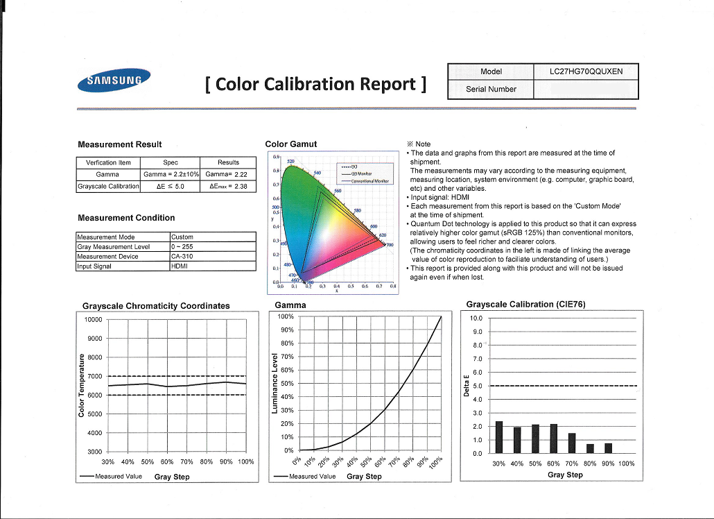
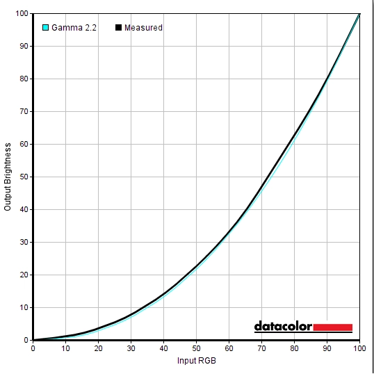
Out of the box the C27HG70 produced a very bright and vibrant image, with respectable white point balance (aside from a minor green push). The monitor comes factory calibrated in its default ‘Custom Color’ setting, with a factory calibration report issued individually to each unit. This is shown in the first image below. The second image shows the gamma curve as measured using our Spyder5ELITE, confirming close tracking the the ‘2.2’ curve that’s often desired. The monitor also included an effective sRGB emulation mode, producing a more subdued (less saturated) image with more accurate sRGB shade representation.
Gamma 'Test Settings'
There were also a couple of useful Low Blue Light (LBL) settings, one of which (‘Warm2’) provided a warmer image with decent contrast preserved. The other, ‘Eye Saver Mode’, purposefully reduced contrast so that it was a fraction of its original value. The image looked flooded, but this was all intentional; some users would find this more comfortable, although we prefer the alternative ‘Warm2’ setting with stronger contrast. We also appreciated having the 3 hotkey buttons on the underside of the monitor, which made it very easy to switch between settings you’d use normally and those you’d use just before bed. In our case, ‘Test Settings’ and an LBL setting based on ‘Warm2’.
Test Settings
Our ‘Test Settings’ involved significantly reducing brightness and making some slight colour channel adjustments. White point was quite well balanced out of the box, although there was a minor green tint. The balance was thrown off slightly more when brightness was reduced, hence the need for adjustment. Note that individual units and indeed preferences vary, so these settings aren’t necessarily going to be optimal for all units and users. We’ve also included the ‘Response Time’ setting used for most of the testing (except the strobe backlight mode, explored separately) and the ‘FreeSync’ setting used. As noted we also did some testing using our Nvidia GPU, which does not support FreeSync. Any settings not mentioned here were left at default, including ‘Contrast’ and ‘Gamma’. The exception was a small driver tweak that had to be made with ‘FreeSync’ set to ‘Ultimate Engine’ and the monitor connected up via DP. There is a small colour processing issue by default which means things look noticeably undersaturated. You simply need to open ‘Radeon Settings’, navigate to ‘Display’ – ‘Color’ (little icon towards the top right) and press the ‘Color Temperature’ toggle so it reads ‘6500K’ instead of ‘Automatic’.
Note that we’ve included the brightness setting used for HDR content. We preferred to use a significantly higher brightness setting when viewing HDR content, as it tended to look too ‘dull’ otherwise and didn’t really deliver the intended experience. Higher brightness settings do increase power consumption and heat output from the monitor, although neither of these reaches extreme levels on this model. The ‘Color’ menu and ‘Response Time’ settings are greyed out in HDR mode. The way that the monitor maps shades and the way the backlight behaves is quite strictly controlled for such content, so full manual adjustment on the monitor is not possible. You can still use ‘FreeSync’ (GPU dependent) and up to 144Hz with HDR on this monitor, however. Aside from the HDR section, all of our testing was performed with applications and the monitor running in their normal SDR state. Brightness for HDR content= 100 (according to preferences and lighting) R= 48 G= 45 B= 52 Response Time= Standard FreeSync= Ultimate Engine (AMD GPU only) Refresh rate= 144Hz
Brightness= 20 (according to preferences and lighting)
Contrast and brightness
Contrast ratios
We used a BasICColor SQUID 3 (X-Rite i1Display Pro) to measure white and black luminance levels, from which static contrast ratios could be calculated. The table below shows this data with a range of settings used, including those covered in the calibration section and a few extras. Assume any setting not mentioned was left at default, except for the changes already mentioned in the calibration section. Black highlights indicate the highest white luminance, lowest black luminance and maximum contrast ratio recorded (with and without ‘Local Dimming’). Blue highlights show the results under our ‘Test Settings’.
| Monitor Settings | White luminance (cd/m²) | Black luminance (cd/m²) | Contrast ratio (x:1) |
| 100% brightness (Factory Defaults) | 405 | 0.17 | 2382 |
| 80% brightness | 368 | 0.15 | 2453 |
| 60% brightness | 332 | 0.14 | 2371 |
| 40% brightness | 296 | 0.12 | 2467 |
| 20% brightness | 195 | 0.08 | 2438 |
| 0% brightness | 43 | 0.02 | 2150 |
| Local Dimming = On (black background) | 612 | 0.17 | 3600 |
| Local Dimming = On (white background) | 408 | 0.17 | 2400 |
| Gamma = Mode2 | 402 | 0.17 | 2365 |
| Gamma = Mode3 | 393 | 0.16 | 2456 |
| Color Tone = Warm2 | 252 | 0.16 | 1575 |
| Eye Saver Mode | 106 | 1.84 | 58 |
| High-Brightness | 440 | 0.16 | 2750 |
| sRGB | 397 | 0.16 | 2481 |
| Response Time = Faster @ 144Hz | 239 | 0.1 | 2390 |
| Response Time = Fastest @ 144Hz | 235 | 0.1 | 2350 |
| Response Time = Faster @ 120Hz | 236 | 0.1 | 2360 |
| Response Time = Fastest @ 120Hz | 235 | 0.1 | 2350 |
| Response Time = Faster @ 100Hz | 235 | 0.1 | 2350 |
| Response Time = Fastest @ 100Hz | 232 | 0.1 | 2320 |
| Test Settings | 174 | 0.08 | 2175 |
The average contrast ratio with only brightness adjusted was 2377:1. This is a bit below the specified 3000:1, but still firmly in ‘VA only’ territory as far as LCDs are concerned. A contrast ratio of 2750:1 was recorded using ‘High Brightness’, which uses a looser calibration and maximises static contrast. The ‘sRGB’ setting retained strong contrast (2481:1). Contrast dropped slightly using our ‘Test Settings’, due to the adjustments made to colour channels – but at 2175:1 remained quite strong. The monitor also maintained pleasing contrast with the various strobe backlight modes (‘Faster’ and ‘Fastest’). It was reduced by a fair margin under the ‘Warm2’ setting (1575:1) which makes significant adjustments to colour channels but also reduces the contrast slider. The ‘Eye Saver Mode’ intentionally reduces contrast so that it is extremely low (58:1). The highest white luminance recorded on this table, with ‘Local Dimming’ disabled, was a bright 440 cd/m² whilst the minimum white luminance recorded was a fairly dim 43 cd/m². This provided a 397 cd/m² luminance adjustment range, which is excellent.
The monitor also features a ‘Local Dimming’ setting, which can be thought of as a sort of Dynamic Contrast mode on steroids. The monitor is split up into 8 dimming zones, each with independent control of illumination. That means that the backlight can be set to a high level if a zone contains predominantly light content, or a low level if it contains predominantly dark content. We explore this in its full glory in the ‘HDR (High Dynamic Range)’ section of the review, but the setting can also be activated when viewing regular (SDR or Standard Dynamic Range) content. The measurement process for this was a bit different as it involved using a small test patch (i.e. measurement region) of either ‘pure white’ or ‘pure black’ surrounded by a white or black background. The test patch we used was as small as we could make it whilst properly covering the colorimeter’s sensor and contact area (60mm² or 2.36 inches²). We tested a range of different background patterns and test patch sizes, but found the tests documented in the table to be quite representative of how the monitor performs in this mode when viewing normal SDR content.
Regardless of the background being black or white, or how long we waited before measuring, the black luminance level remained fairly high at 0.17 cd/m². The white luminance recorded for the black background was 612 cd/m², which exceeds any value measured with the feature disabled. The white luminance recorded for the white background was 408 cd/m², which is in-line with the monitor running at full brightness with the feature disabled. It’s important to note that the 612 cd/m² was a pulse of brightness, which the monitor only sustained for around 10 seconds. It then fell back to a more usual value of ~400 – 410 cd/m². Basically, the monitor didn’t appear to sustain such a high brightness level continuously in one area– but if the square were to move between zones, the next zone would pulse to a similar brightness level (~612 cd/m²). The other thing to note is that both the black luminance and white luminance levels, including the brightness the monitor pulses to, are dictated by the brightness level you have the monitor set to. So if you were to set the monitor to a lower brightness, both values would reduce. The net effect of this is that the setting does give a slightly increased contrast, with 3600:1 being recorded in this somewhat artificial test. The mode is better suited to HDR content, as we explore later, which brings more extreme luminance changes with the zones becoming more lively and reactive. And indeed, the black point drops more effectively at times. Unfortunately, we didn’t have a reliable method to accurately record luminance levels using the colorimeter in an HDR environment. We did spend a lot of time subjectively testing the ‘Local Dimming’ setting in both HDR and SDR environments, however.
PWM (Pulse Width Modulation)
The Samsung C27HG70 does not use PWM (Pulse Width Modulation) to regulate backlight brightness at any level. DC (Direct Current) is used to regulate backlight brightness, meaning that the monitor is considered ‘flicker-free’. Users who are sensitive to flickering or other side-effects of PWM usage will appreciate this. The exception to this is with the monitor set to its ‘Faster’ or ‘Fastest’ response time setting. This activates the ‘Impulsive Scanning’ strobe backlight mode, which induces flickering at a refresh rate corresponding to that of the display.
Luminance uniformity
Observing a black screen in a dark room revealed moderate backlight bleed and some clouding, particularly towards the bottom of the screen to the left of centre. This is shown in the image below, taken in a dark room using our ‘Test Settings’ and using camera settings that properly represent what the eyes see when observing the screen. The image was taken a sufficient distance back to eliminate so-called ‘VA glow’. This silver-purple glow is visible towards the bottom of the screen, in particular, from a normal viewing position. It blooms out more noticeably if you shift to a sharper viewing angle. It is not as obtrusive as the ‘IPS glow’ on some models and doesn’t have the same impact on detail levels. But it’s stronger on this model than on some VA models we’ve tested. Note that individual units vary when it comes to backlight bleed. The luminance uniformity of the screen was strong. The brightness point recorded was ‘quadrant 4’ to the left of centre (169.0 cd/m²). The greatest deviation from this occurred at ‘quadrant 8’ below centre (154.8 cd/m², which is 8% dimmer). Elsewhere deviation was 2 – 7%, which is excellent. Note that individual units vary when it comes to uniformity and there can be further deviation beyond the points measured. Still, it was good to see a strong performance in this test on our unit. The contour map below gives a graphical representation of the deviations. Darker greys represent lower luminance and therefore greater deviation from the central point than lighter greys. Deviations in colour temperature (white point) were also assessed, using the same 9 quadrants. Deviations here are assigned DeltaE values, with higher values representing greater deviation from the D65 (6500K) daylight white point target than lower values. The contour map below shows this, with stronger shades indicating greater deviation from the 6500K target. A DeltaE of >3 here is considered significant deviation that most users could notice quite readily by eye. The results here were good, with no significant deviations recorded. As with all aspects of uniformity, though, you can expect inter-unit variation. Furthermore, deviations beyond the measured points can be expected. Furthermore, with VA models such as this you can notice perceived shifts due to viewing angle weaknesses. On our unit, as observed from a normal viewing position, we noticed the extreme side edges of the screen appeared significantly cooler than the rest of the screen. This appeared to be a combination of uniformity issue from the backlight arrangement and an exaggeration of the effect due to viewing angle. On Battlefield 1 (BF1) the contrast performance was very good overall. Dark shades appeared with good depth, whilst interleaved bright shades appeared quite eye-catching and stood out well. These lighter shades appeared slightly grainy due to the screen surface, although they were free from an obvious ‘layer’ of smeary graininess fortunately. The overall detail levels for dark content were good as well. Some of the finer details were less distinct than they ideally would be, due to ‘black crush’. This is a common phenomenon associated with perceived gamma on VA panels such as the ones used here, whereby very dark (near black) shades appear darker than intended and essentially meld together into a dark mass. This hides some details, which are revealed if you observe the screen at a sharp enough angle or if the shades are shown towards peripheral sections of the screen rather than the centre. The level of ‘black crush’ on this monitor was as low as we’ve seen on a model with a VA panel of this size, though, which was pleasing. There was also some ‘VA glow’ lower down the screen, which caused dark shades including black to appear lighter than the rest of the screen. We maintain that the overall contrast performance and dark shade representation for the central bulk of the screen far outclasses models with other panel types. Although ‘VA glow’ is somewhat higher on this model than is ideal. Dirt Rally highlighted similar strengths and weaknesses. The game engine used here provides a lot of scope for testing contrast as the night time stages appear very dark indeed. The monitor provided a good atmosphere here, with good depth overall (save for the section of the screen affected by ‘VA glow’). The level of detail was also pleasing, with some fairly minor details such as car tyre tread patterns and creases in interior materials visible. Not as distinct as they could be when viewed in central regions of the screen, but still visible nonetheless. Brighter elements stood out nicely, such as the moon in the sky and the lights of other vehicles. There was again a bit of graininess from the screen surface, but nothing too distracting or unpleasant in our view. To wrap up our subjective testing of contrast, we spun up the Blu-ray of Star Wars: The Force Awakens. This title is brimming with high-contrast scenes, featuring bright elements set against much darker backdrops. The monitor gave such scenes an appropriate look, with good depth to the eerie darkness and good ‘pop’ to the bright elements – explosions and light sabers, most notably. Because this title was presented in a 16:9 letterbox format, with black bars at the top and bottom, the effect of ‘VA glow’ had less effect on the image itself. Even considering this ‘VA glow’ the alternative panel types simply don’t serve this title as well as the CHG70 did. The Lagom tests for contrast allow specific weaknesses in contrast performance to be identified. The following observations were made. The Samsung C27HG70’s colour gamut (red triangle) was compared to the sRGB reference colour space (green triangle), as shown below. This shows the colour gamut using our ‘Test Settings’, which uses the full native gamut of the monitor. Here you can see that the monitor offers full sRGB coverage (100% sRGB) with a moderate amount of extension beyond this, particularly in the green and red regions of this particular diagram. This allows the monitor to reproduce all shades within the sRGB colour space, with an extra dose of vibrancy. Samsung specifies a 95% DCI-P3 (Digital Cinema Initiative standard) colour space for the monitor. We have no reason to doubt this, given what we’ve measured here and the fact the Spyder5ELITE tends to slightly under-report the gamut when it’s this wide. The near-term target for HDR-capable displays such as this is to offer 90% DCI-P3 coverage, so this display exceeds that target. The longer-term target, Rec. 2020, is a significantly wider gamut than this but not something that can be achieved with current commercially viable backlights. The image below shows the colour gamut of the monitor whilst running with its ‘sRGB’ preset; an sRGB emulation mode. This cuts down the colour gamut so that it corresponds more closely to the sRGB reference space, with just a sliver of under-coverage (98% sRGB) and a very small amount of extension beyond This provides potentially more accurate shade reproduction at the expense of vibrancy, but be aware of the VA panel colour consistency limitations raised elsewhere in the review if you’re interested in colour accuracy. On Battlefield 1 (BF1) colours were vibrant with pleasing variety and good ‘pop’. The environments appeared quite natural with good earthy browns and good lush rich greens. Some shades appeared a bit more saturated than they ideally would. Desert sands appeared with a slight red hue rather than appearing more of a sandy colour and some of the more muted greens of vegetation were a little more eye-catching than they should be. Some excellent vibrant yellows, reds and oranges were visible for more lively elements in the game, such as fires, sparks and explosions. Fortunately, the monitor was free from the sort of garish oversaturation associated with viewing content like this on a monitor with an even wider colour gamut (Adobe RGB+). There was a degree of saturation lost towards the peripheral sections of the screen, which is typical for a VA panel and associated with perceived gamma changes as you view different sections of the screen. Most shades still maintained good saturation even at the extreme edges and bottom of the screen, though, so the overall image was far from ‘washed out’. This title also features an HDR mode which this monitor supports, allowing colours to be mapped more accurately. Retaining vibrant shades, where appropriate, but keeping more muted shades from appearing with such strong saturation. This is explored separately a little later on in the review. We made similar observations on Dirt Rally. Things looked undeniably vivid, losing a bit of saturation towards the edges and bottom of the screen but nothing too severe. Shades were again free from the sort of garish (cartoon-like) oversaturation associated with traditional wide gamut models. There was a pleasing array of greens, including some deep and lush forest vegetation and some more muted and dusty-looking shades in other locales. There were also some impressively rich deep browns, which appeared just a touch too red in places (some tree trucks, for example) but not overwhelmingly so. The environments appeared quite natural and believable overall. The monitor also displayed some pleasingly vibrant paint colours, including neon pinks and punchy bright reds and greens for car liveries. Again, thinking of these more vibrant shades for car liveries, the fairly strong saturation levels meant that some yellow shades appeared a bit more of a golden-orange colour than intended and some oranges appeared slightly red. The shade variety was still maintained very nicely, though, which is something that doesn’t happen if you increase saturation levels using software (Nvidia ‘Digital Vibrance’ or a saturation slider, for example). That’s because such a method just pushes shades closer to the edge of the colour gamut, without expanding the gamut itself. It crushes things together and is limited in its saturation potential anyway– on this monitor, shades retain good ‘spacing’ on the gamut, can be potentially more saturated and aren’t crushed together like that. Finally, we tested the Blu-ray of Futurama: Into the Wild Green Yonder. This is a particularly unforgiving test of colour consistency, as with most animations. That’s because large areas of individual shade will sometimes fill the screen, highlighting changes in saturation levels etc. Some shades did lose a bit of saturation lower down the screen and at the sides. Shades were as consistent as we’ve seen from a VA model of this size, though, and retained sufficient saturation all across the screen to appear far from washed out. The monitor was able to display neon shades with excellent pizazz, whilst keeping pastel shades appearing more muted. Some of these shades were somewhat more saturated than they should be, but a strong variety was maintained. The viewing angle restrictions (perceived gamma and saturation changes at different points of the screen) did mean that subtle variations in some shades, such as skin tones, were not as distinct as they ideally would be. But overall shades retained a decent degree of individuality and the overall variety was pleasing. Lagom’s tests for viewing angle tests help explore the idea of colour consistency and viewing angle performance. The following observations were made from a normal viewing position, eyes around 70cm from the screen. On some monitors faint interlace patterns can be seen during certain transitions, particularly noticeable where light shades (muzzle flashes, explosions etc.) briefly pop up on the screen. These are sometimes referred to as ‘pixel inversion artifacts’. Alternatively, static interlace patterns can be seen with some shades appearing as faint horizontal bands of a slightly lighter and slightly darker version of the intended shade. We observed a faint ‘mesh’ effect during motion on the monitor, whereby some shades would appear with a faint grid of small polygons in the background. This was not something everyone would notice or find bothersome, especially if the screen is placed a reasonable distance from the viewer. We also observed faint static interlacing on some shades, particularly some oranges and reds. These bands were very faint, most users wouldn’t notice and some would struggle to see them even if they were pointed out; we’re just mentioning for completeness. Note that they occur regardless of FreeSync being active and are independent of refresh rate. A small utility called SMTT 2.0 was used alongside a sensitive camera to analyse the latency of the C27HG70, with over 30 repeat readings taken to maximise accuracy. Using this method, we calculated 3.88ms (just over half a frame at 144Hz) of input lag. This value was recorded with ‘Low Input Lag’ set to ‘On’ in the OSD. The measured value was very similar when connected to a FreeSync-compatible GPU with FreeSync enabled in the OSD and was similar with the monitor set to 60Hz. Enabling FreeSync actually forces ‘Low Input Lag’ on, even though it’s greyed out. We have no way to accurately measure input lag in the variable refresh rate and frame range environment under which FreeSync would be active, however. We don’t have the means to accurately measure the input lag in an HDR environment, either, but enabling ‘Local Dimming’ alone had no significant effect on the measured value. Note that the input lag value is influenced by the element you ‘see’ (pixel responsiveness) and also the element you ‘feel’ (signal delay). It indicates a very low signal delay, which contributed to an excellent ‘connected feel’ as we explore shortly. In our article on responsiveness, we explore key concepts related to monitor responsiveness. One of the most important concepts explored here is ‘perceived blur’, contributed to in part by the pixel responsiveness of the monitor but generally in larger part by eye movement as you track motion on the screen. We discuss a photography method called ‘pursuit photography’, which uses a moving rather than static camera to capture snapshots of motion on a monitor in a way that reflects both elements of perceived blur. So not just pixel responsiveness but also eye movement. The images below are pursuit photographs taken using the UFO Motion Test for ghosting, with the test running at 960 pixels per second. This is a practical speed for capturing such photographs and highlights both elements of perceived blur nicely. The UFOs move across the screen from left to right at a frame rate matching the refresh rate of the display. All background shade levels (dark, medium and light) were used with the monitor set to 60Hz. Only the ‘Standard’ response time setting was tested as the other settings are greyed out at 60Hz. The final image shows a 60Hz reference monitor, a Dell S2417DG, which gives an idea of how things should look where pixel responsiveness isn’t really a limiting factor. You can see in the 60Hz images above that the object itself appears soft and poorly focussed, indicating significant perceived blur due to eye movement. This aspect is the same as he reference image, which shows an equally soft main image without crisp detail. The CHG70 exhibits noticeable overshoot (inverse ghosting) behind the object, visible as a bright and colourful trail that’s most pronounced on the dark and medium backgrounds. This is caused by excessive levels of pixel overdrive (grey to grey acceleration). The image below shows performance at 100Hz and 144Hz, with all ‘Response Time’ settings considered. The reference column includes a range of screens set up as noted; the Dell S2417DG, AOC AG251FG and Samsung C24FG70. At 100Hz using the ‘Standard’ response time setting, the level of perceived blur due to eye movement is reduced compared to 60Hz. You can see that the object itself appears narrower and more focused. There is a degree of trailing behind this, strongest with the dark background, due to slower than optimal pixel response times. There is a bit of overshoot visible for the lightest background, but this is quite faint. The reference image from the S2417DG actually looks reasonably close to the comparable medium cyan background (middle row) for the C27HG70. The ‘Faster’ and ‘Fastest’ settings look very similar to one another. The image appears significantly sharper, reflecting a large and readily noticeable reduction in perceived blur. That is because these response time settings activate the ‘Impulsive Scanning’ strobe backlight mode, explored shortly. There is a fair bit of trailing behind, appearing as quite a bold repetition of the object that’s most noticeable for the dark and medium backgrounds. This is due again to slower than optimal pixel transitions; they’re not keeping up with the 100Hz strobing. The reference shot for the S2417DG uses ULMB, an alternative strobe backlight mode, which isn’t perfect either as it produces some overshoot. The details on the main object are a somewhat crisper on this reference shot due in part to superior pixel responsiveness. At 144Hz with the ‘Standard’ setting, you can see a further sharpening of the image compared to ‘Standard’ at lower refresh rates. It also appears slightly narrower. This is, again, due to reduced perceived blur from reduced eye movement. The trailing behind the object is not bad for the light background, a bit bolder for the medium background (compared to 100Hz) and a fair bit bolder for the dark background. This may be partly due to the pixel response times slackening off a bit, but will be more heavily influenced by the fact the pixel responses simply aren’t keeping up with the responsiveness demands of the elevated frame rate and refresh rate. The ‘Faster’ and ‘Fastest’ settings are again very similar to one another –slight differences for the dark background are down to the camera, not picked up in this way by eye. The image appears a bit sharper with superior details compared to 100Hz with similar response time settings. The details aren’t as sharp as the ULMB reference shot, however. The trailing is fairly similar to under the ‘Standard’ setting, due to similar pixel response time weaknesses, with the fragmented nature associated with strobe backlight operation making the trailing for the dark background appear particularly pronounced. Although not included in this analysis, we did make observations at other refresh rates. 120Hz offered similar performance to 144Hz in terms of pixel responsiveness, with the object itself appearing between 100Hz and 144Hz in terms of how focused it appeared. It is also interesting to compare 144Hz pixel response performance to the AOC AG322QCX, which uses a larger variant of the same panel. This wasn’t included in the reference images simply as we didn’t want to cram too much in there. However; performance on this Samsung appears mostly similar to the AOC using its ‘Weak’ response time setting. Except for the light background which appeared some way between the ‘Medium’ and ‘Strong’ settings of the AOC (which is good). This suggests that, overall, the AOC has slightly better tuned pixel overdrive under using its optimal ‘Medium’ setting. And it offers more flexibility than the Samsung does, with the Samsung offering only one ‘Response Time’ setting without activating the strobe backlight function. Nonetheless, these TestUFO shots only analyse a select range of pixel transitions – we make a much broader assessment below. On Battlefield 1, at suitably high frame rates (the higher the better, up to 144fps), it was clear that this was a 144Hz monitor we were using. There are two main benefits, both of which this monitor encapsulated. Because the monitor is displaying up to 2.4 times as much information every second as a 60Hz monitor (60fps), interactions with the game world were more fluid. This was particularly noticeable when using the mouse, which aided precision and what we like to call the ‘connected feel’ when gaming. The other benefit of this high refresh rate and high frame rate is that the overall level of perceived blur was significantly reduced. Objects retained sharper focus and more detail as you move about in the game world, making it easier to track and engage enemies. For the most part the pixel transitions made good use of this refresh rate and were fast enough for an optimal or near-optimal performance. Some of the transitions that were quite common on this title (between various ‘medium’ shade brightness levels) did show some signs of weaknesses in the form of a bit of powdery trailing. This was fairly faint, but sufficient to slightly increase perceived blur particularly during rapid movement. There was also some overshoot here and there, with some semi-transparent (‘snail-slime’) trails; these were again faint, we did not observe any obvious bright or dirty-looking dark overshoot trailing. As is always the case with VA panels, to varying extents, there were some notable weaknesses in pixel responsiveness. The most significant of which occurred where dark shades were involved in the transition, particularly where significantly lighter shades were present in the background. On this title these are most common on the darker maps but also occur in places on the brighter maps, for example in darker interiors or where there are dark metal objects case against a bright sky. On some titles such transitions are actually much more common (Mass Effect Andromeda being an example). You could see a more extended ‘smeary’ trailing in these instances. This was not as pronounced as we’ve seen on some VA models where might appear almost like smoke billowing off the object, but it is something some users would notice and be bothered by. There was also some ‘break-up trailing’ we observed, whereby dark shades would have subtle hints of certain colour such as red or blue that aren’t visible in the object itself. But which appeared to separate out from the object as a slightly colourful trail, a bit like wetting fountain pen ink on paper. These weaknesses would not be enough to distract or bother all users, it must be remembered. And the monitor still performs well at 144Hz in other respects and makes good use of the refresh rate. Overall we’d say it’s on par with the likes of the AOC AG322QCX and ASUS XG32VQ for some transitions, a bit slower for some and a bit faster for others. The tighter pixel density helps keep some of the trailing more contained and compact and thus less noticeable, however. The section of our video review below highlights some of the weaknesses in pixel responsiveness on the CHG70. Given our fairly extensive observations above on BF1, we don’t have much to add with our experience on Dirt Rally. This title, again, had a good mixture of pixel transitions. And for the most part the 144Hz was beneficial at high frame rates in terms of connected feel (although less so in our case as we’re keyboard rookies on this game) and in terms of reducing perceived blur. The weaknesses highlighted on BF1 and TestUFO were present, particularly when driving at night. There was a bit of ‘powdery’ trailing in places and some of the ‘smeary’ plus ‘break-up’ trailing in others. Observing trees or hilltops at night with the somewhat brighter sky as a backdrop highlighted these weaknesses. And, depending on the tone of the sky (a slightly purple hue on some courses) there was a bit of overshoot present as well. Not really bright and eye-catching, but still there. When focusing on racing we weren’t distracted by any of this trailing, but it’s subjective and again some users would find it bothersome. We also tested our Blu-ray film titles, which are limited to ~24fps and noticed no obvious weaknesses related to the pixel responses. The level of fluidity and requirements for pixel response speed are limited by the ‘broken up’ action at such low frame rates. The monitor can be run at 24Hz if preferred, reducing judder for such content. Or you can stick to a multiple of this (144Hz, for example) for decent performance in that respect as well. If you watch higher frame rate content (for example 60fps), some of the weaker pixel transitions do crop up here and there. But never to levels we feel were particularly bothersome – unless you’re running the monitor at 60Hz, which as noted in the FreeSync section and highlighted by TestUFO can become problematic in terms of overshoot. AMD FreeSync is a variable refresh rate technology, an AMD-specific alternative to Nvidia G-SYNC. Both of the articles linked to explore the principles behind variable refresh rate technologies and the benefits that they bring to the experience, so we won’t be repeating everything here. On a basic level, the monitor dynamically adjusts its refresh rate so that it matches the frame rate of the content, where possible. This avoids the stuttering (VSync on) or tearing and juddering (VSync off) that is associated with mismatches between refresh rate and frame rate. In the variable frame rate environment under which the technology is active, FreeSync also promises decreased latency compared to running with VSync enabled. FreeSync requires a compatible AMD GPU, such as the Club3D Radeon R9 290 royalAce used in our test system. A list of current GPUs which support the technology can be here, with the expectation that future AMD GPUs will support the feature too. The monitor itself must also support ‘VESA Adaptive-Sync’ for FreeSync to be usable. The C27HG70 supports this via DP 1.2+ and HDMI 1.4a+. More specifically, ‘FreeSync 2’ is supported by the monitor, encompassing HDR support and a relatively generous variable refresh rate range. You need to ensure ‘FreeSync’ is set to ‘Standard Engine’ or ‘Ultimate Engine’ in the ‘Game’ section of the OSD. The main difference between these is that ‘Ultimate Engine’ offers a broader variable refresh rate range for FreeSync. Samsung notes that users may experience some flickering with ‘Ultimate Engine’ and should try ‘Standard Engine’ if so. In our testing we didn’t find there to be flickering issues specific to ‘Ultimate Engine’. After enabling the setting in the OSD, you need to make sure the display driver is setup appropriately as well. AMD’s recent drivers include Radeon Software Crimson, which makes activation of the technology very simple – in fact it should be enabled automatically if a compatible GPU is connected to the monitor and the monitor is in its ‘FreeSync mode’. You can check its status by opening ‘AMD Radeon Settings’ and clicking on ‘Display’. You should then ensure that the first slider, ‘AMD FreeSync’, is set to ‘On’. If you hover over this, it will also report the variable refresh rate display supported by the display. Note that the image below is for a different monitor and is just used as an example here. VSync is configured in the ‘Gaming’ section of ‘Radeon Settings’, where it is referred to as ‘Wait for Vertical Refresh’. You can either configure this globally under ‘Global Settings’ or for each game individually. The default is ‘Off, unless application specifies’ which means that VSync will only activate if you enable it within the game itself, if such an option exists. This option may be called ‘sync every frame’ or something similar rather than just ‘VSync’. We tested a range of game titles to test out the FreeSync capabilities of the C27HG70, including; Hitman, Star Wars Battlefront II, Call of Duty WW2 and Dirt Rally. We found the experience to be rather homogeneous across these titles, so will instead be focusing on just one title; is Battlefield 1 (BF1). This is a good title to use not just because we spend a fair amount of time playing it, but because it offers good flexibility with graphics settings. This allows the full range of FreeSync refresh rates and frame rates to be tested. With our Radeon R9 290, we had to use fairly conservative graphics settings to ensure triple digit frame rates. At the upper end of that, near at ideally reaching 144fps, the full responsiveness benefits of the monitor could be felt. Perceived blur was relatively low and ‘connected feel’ relatively high. There were frequent fluctuations in frame rate and rarely did it stay at the FreeSync ceiling of 144fps (144Hz). Without FreeSync enabled, that would mean that the frame rate and refresh rate would frequently mismatch. Obvious (to us) tearing and juddering ensues in such situations, with VSync off, or obvious stuttering with VSync on. With FreeSync there were no such interruptions to the gaming experience. As the frame rate dropped, for example closer to 100fps, there was an increase in perceived blur and decrease in ‘connected feel’. However, we felt the experience remained fairly strong in both respects. When it comes to frame rates it’s always a case of ‘the higher the better’, regardless of FreeSync. But these drops in frame rate are easier to stomach with the technology enabled – far less jarring. Having said that, if we increased our graphics settings so the frame rate dropped further (sometimes a lot further), we did start to feel too much of the monitor’s potential drain away. With the ‘connected feel’ being inversely proportional to frame rate and perceived blur levels increasing markedly, even with FreeSync active we found low frame rates an uncomfortable place to be. As frame rate dropped we also observed more obvious and in places quite ‘in your face’ changes to the pixel response behaviour. Tuning of pixel overdrive to a broad range of refresh rates is often something we find FreeSync models weak at compared to models with G-SYNC. And even with ‘FreeSync 2’ employed here, it seems that trend remained. Below about 80fps there was some obvious overshoot introduced, with bright trailing in places that we found rather eye-catching. Not everybody would be bothered by it and it isn’t as intense as we’ve seen on some models, but it is something that simply wasn’t there at significantly higher frame rates. The section of our video review below shows this and also confirms that the monitor’s LFC (Low Frame Rate Compensation) feature, as we described earlier, works as intended to keep tearing and stuttering at bay. The monitor neatly sticks to multiples of the frame rate for its refresh rate, once the frame rate drops below 45fps. This monitor features a strobe backlight feature called ‘Impulsive Scanning’ that is activated by setting the monitors ‘Response Time’ to either ‘Faster’ or ‘Fastest’. This causes the backlight to strobe on and off at a frequency matching the refresh rate of the monitor, reducing eye movement and hence reducing perceived blur via the mechanisms explained in this article. If you refer back to the UFO Motion Test for ghosting pursuit photographs featured earlier, you’ll see the visual benefit of this in terms of perceived blur reduction. You can activate this feature at 100Hz, 120Hz or 144Hz. As usual for strobe backlight technologies such as this, you can’t activate it and use FreeSync at the same time. It can be used irrespective of the GPU vendor as well, as it is a Samsung feature that is not specifically associated with AMD or Nvidia (‘ULMB’). As mentioned previously, once you’ve activated this feature you will see the screen flicker in sync with the refresh rate – much like a CRT monitor. Individual sensitivity to flickering varies, not everyone will find this bothersome, but some will (particularly at 100Hz). We’ve also mentioned previously that the brightness control is locked off, although you can reduce brightness at the expense of contrast using the ‘Contrast’ setting if you must. The monitor appears quite bright with this setting active. We tested a range of game titles using this feature, but as usual we feel it is appropriate to focus on just one to save us repeating ourselves unnecessarily. That title will be Battlefield 1 (BF1), which as you’ll notice by this point of the review has been tested extensively to assess all elements of the CHG70’s performance. We didn’t notice any significant difference between the ‘Faster’ and ‘Fastest’ setting, so this subjective testing can be associated with either mode. Echoing what we observed using TestUFO, the perceived blur is drastically cut down with this setting active. Soldiers, objects and the game environment all retains superior clarity and detail levels even during rapid movements on the game. For example, cornering quickly in a vehicle or simply running about on foot and using quick snappy movements of the mouse. One significant drawback, which applies more to graphically demanding titles such as this (depending on settings and system), is that the frame rate really needs to match the refresh rate precisely for the mode to work correctly. Because there is very little motion blur to mask stuttering or juddering where these depart, such issues stand out like a sore thumb with the strobe backlight mode active. Whilst overall perceived blur is hugely reduced, and objects retain superior detail levels in motion, the performance wasn’t particularly ‘clean’. As demonstrated in TestUFO, there was a fair degree of overshoot. This manifested itself as distinctive semi-transparent repetitions of the object, behind the actual thing. They were generally more faint than the main object but appeared as a sort of dulled down grey version of the shades involved in the transition. There were occasional bursts of more colourful (purple) overshoot as well. The fragmented nature of the trailing is due to the strobe backlight operation. In addition to this, some of the pixel transitions were slow enough to provide a sort of ‘smear’ similar to what is observed without the strobe backlight setting active. These weaknesses existed regardless of the refresh rate, although as refresh rate was reduced (as low as 100Hz), the distance between the object and the fragmented trails increased. We found this made the fragmented trailing more noticeable. This monitor is certainly not unique in showing signs of weakness (particularly the overshoot) with its strobe backlight function active. Although we felt these weaknesses were more pronounced when compared to other monitors that use this sort of technology, including the C24FG70. For some users, the imperfections associated with the strobe backlight setting will still be outweighed by the benefits in terms of perceived blur reduction. Others would find the flickering, lack of FreeSync, lack of HDR, locked brightness, overshoot and fact you need to keep the frame rate matching the refresh rate a bit restrictive. HDR (High Dynamic Range) as it applies to monitors describes the ability to distinctly display very deep dark shades and very bright light shades simultaneously. It is also a requirement to display a huge variety of shades in between, from weakly saturated to heavily saturated shades. The ideal monitor would have hundreds if not more dimming zones on the backlight, something referred to as FALD (Full Array Local Dimming). Even better, it would use a per-pixel light source (OLED technology, for example). This would allow the monitor to correctly display intricate mixtures of bright and dark content, dimming the backlight appropriately for dark content whilst displaying brighter areas of the image with higher backlight luminance. On the colour side the ultimate goal is for HDR monitors to offer a huge colour gamut (Rec. 2020). The more realistic near-term aim, as proposed by the UHD Alliance, is to cover 90% DCI-P3 (a Digital Cinema Initiatives standard colour space). It is a requirement that the display offers (at least) 10-bits per channel for colour processing, giving it the precision required to appropriately map shades for HDR content. We’ve already explored how some HDR solutions merely respond to HDR content sort of like a Dynamic Contrast mode on a regular monitor. Something we’d dub ‘fake HDR’. They control the backlight as a single unit, don’t have a noteworthy maximum luminance and fall short of the DCI-P3 colour space by some margin. We’ve also noted that Windows 10 users with the ‘Creator’s update’ need to be wary of a Windows feature called ‘HDR and advanced colour’. As a quick reminder, this is a feature found in ‘Display settings’ (right click the desktop) and it may be enabled by default. It might make everything look highly flooded on the desktop and you’ll think the monitor is malfunctioning. Simply turn this feature ‘Off’ if it’s enabled and you notice the desktop looking odd – the monitor will whack itself into HDR mode for fullscreen applications that support an HDR signal regardless of what this feature is set to. This toggle is shown in the image below. We’ve also previously highlighted how software support for HDR is quite variable on the PC. Many titles don’t support it at all and some (such as Mass Effect Andromeda) support it poorly. Back to the hardware side, the Samsung C27HG70 responds to HDR content with both compatible AMD and Nvidia GPUs. In fact we tested the feature with our Nvidia GTX 1070 via DP 1.4 as our AMD Radeon R9 290 doesn’t support HDR due to older HDMI and DP revisions being used. This model doesn’t offer an FALD backlight solution or similar, but it does split the backlight into multiple dimming zones. You have to make sure ‘Local Dimming’ is set to ‘On’ or ‘Auto’ in the ‘System’ section of the OSD. Samsung doesn’t officially specify how many, but our testing and testing done by others suggests that there are 8 dimming zones for the backlight. Some of these zones can be very bright and others very dark (or in between). We’ve already covered, in the contrast section, that the maximum luminance with ‘Local Dimming’ active is just over 600 cd/m² which exceeds the usual maximum luminance of the display. If the feature is enabled and you’re viewing SDR (‘normal’) content, the backlight zones never dim effectively. In HDR the zones become more reactive and dim to lower levels, fortunately. So how does this work out in practice? The image below, from Battlefield 1 with HDR10 (current PC standard for HDR), gives an example of the sort of scenario that was enhanced by the HDR capability of the monitor. This is just to set the scene and fire up your imagination; it in no way demonstrates what this scene looks like whilst viewing it first person of the CHG70. Also note that we tested a few other titles which we feel implemented HDR quite well, with Hitman being particularly impressive. To keep things as succinct as possible, we’ll just be focusing on BF1 as our specific example for this section. Note that we used our Nvidia GTX 1070 to test HDR on this monitor, connected via DP. Even with a relatively low number of dimming zones, we found the shifts in brightness of the different zones to be quite natural and not jarring like a normal Dynamic Contrast setting. The dark areas of the image also remained significantly dimmer than the monitor running at ‘100’ brightness without HDR active. As such subtle details on the rocks appeared more clearly than with HDR disabled, where everything is just flooded by an excessively bright backlight. Ideally the stars would appear as quite bright pin-pricks in the sky, whilst the sky itself would appear fairly deep. That isn’t how things played out, as it would require many more dimming zones to simulate effectively – ideally per-pixel lighting. The monitor therefore balances things out based on the average luminance in those regions. The moon appeared very bright and in some ways akin to staring at the real moon, almost retina-piercing if you’re sitting staring at it in a darkened room. This contrasted very nicely with those dark rocks to the immediate right of the character, which covered a different dimming zone. If you preferred bright elements like the moon not being so piercing, you can limit the effect by simply lowering the brightness. We used ‘100’ just for the full effect. We wouldn’t generally recommend keeping the brightness that high if you’re gaming in a dark room, unless you really want that kind of dazzling experience. We carried out most of our testing with at least some ambient light from the room itself. What was in some ways more impressive than these situational improvements was the fact that we didn’t actively notice that the backlight was split into zones. Nor that it was continuously adjusting the brightness of those zones. We find traditional Dynamic Contrast modes, where the whole screen reacts, quite distracting whilst adding little if any positive benefit to the experience. This solution seemed to be integrated in a way that was subtle enough to add something to the experience without the jarring side-effects. This could be considered subjective and we’re sure not everybody would agree with this assessment, but we do find the addition of even a mere 8 dimming zones to be welcome. And if you don’t agree, of course, you can simply request that the monitor doesn’t use them by disabling the ‘Local Dimming’ feature in the OSD. Regardless of whether ‘Local Dimming’ is active, there are other benefits beyond this. The distinctions between closely matching bright and dim shades was aided by 10-bits per channel precision. HDR works with this at the software level to make use of this level of precision, whilst the monitor supports such a bit depth as well. This bit depth allows shades to be more precisely mapped across its fairly generous colour gamut. As a reminder, the native colour gamut (under our ‘Test Settings’) is shown below. If anything, it’s slightly under-represented in this diagram due to limitations with the Spyder5ELITE sensor. The monitor offers good DCI-P3 coverage, with Samsung specifying 95% – exceeding the 90% DCI-P3 coverage currently targeted by the UHD Alliance. Remember that the monitor supports this large gamut with 10-bits per subpixel precision. As we’ve explored in the ‘Colour Reproduction’ section of the review, the gamut leads to some oversaturation with normal SDR content. With HDR content, such as BF1 with HDR10 active, shade saturation is mapped more appropriately. The greens of vegetation appear more natural, with more muted shades appearing appropriately dusty and ‘pastel’ rather than overly bright or saturated. There remains an excellent variety and there are plenty of lush shades, where appropriate, with some shades far deeper than would be displayed within the confines of the sRGB colour space. There is also a more believable representation of more Khaki shades. The sands of the desert loose the slightly overdone reddish hue as well – it retained in places, where the developers intend, but isn’t as widespread or as intense. Meanwhile, excellent vibrancy and strong saturation is retained where it is wanted. The orange, reds and yellows of flames and brilliant reds of poppy flowers, for example. Overall, we certainly enjoyed experiencing HDR content on the CHG70 and feel that the monitor supported this content quite well. It certainly wasn’t a ‘full fat’ experience, as the limited number of dimming zones and good but not extreme colour gamut restricted the contrast and colour reproduction, respectively. But it was a lot more enjoyable than the ‘fake HDR’ employed by some monitors and it gave a nice taste of what we can expect from HDR content in the future. It’s certainly a trend we feel manufacturers will push more into the future, with more widespread support on both the software and hardware side. This will only be a good thing for gamers. We’ve used various curved monitors of various sizes and steepness of curvature and commented on what the curve brings to the experience. The C27HG70 brandishes a 27” screen with 1800R curve and 2560 x 1440 (WQHD) resolution. Users are generally quite familiar with the advantages of this resolution over the Full HD (1920 x 1080) resolution. It works nicely with a screen of this size, providing a good but not extreme pixel density and providing a level of clarity in games, movies, images and text that most people would find quite pleasing. Without needing to reach for the scaling slider in Windows as the first thing they do. If users think about a curve, especially one of 1800R (which is relatively steep – especially compared to earlier models that were 3000R – 4000R) they are often put off by the thought of it. They think things are going to look heavily distorted, unnatural and simply wrong. Sometimes these preconceived notions are reinforced when they look at images of the screen, where the curve may sometimes appear as quite a prominent feature. We were guilty of having similar thoughts ourselves, before we had ‘on the desk’ experience with curved monitors. We find the 1800R curve on the 27” CFG70 to be quite a subtle addition and one that is very easy to adapt to and get used to. Samsung would claim that viewing comfort is a big advantage of the curve and possibly cite some studies as proof of this. After all, the edges of the screen are brought closer to the eyes so that the experience is more uniform. And our eyes are curved rather than flat. We certainly found this monitor comfortable to use, but how much of that is down to the curve is difficult to say. The images below tend to exaggerate the curve, but are included for illustrative purposes. You can also see the WQHD in action, giving you a nice amount of useful desktop ‘real-estate’. In terms of overall clarity, we prefer the tighter pixel density of this model (108.79 PPI – Pixels Per Inch) over the 31.5” variant (93.24 PPI). That’s a personal thing, though, and we can also see the attraction of the physically more imposing 31.5” screen. When it came to gaming, the curve brought with it a slight extra feeling of depth. It’s something that’s quite difficult to describe and again quite subtle, but it just draws you into the game environment that little bit more. This effect is certainly more subtle than it is on wider screens, particularly curved UltraWides of a similar or steeper curvature. But it’s still there. Some would also argue that the more uniform viewing distance of different points of the screen and reduced eye movement required when scanning peripheral sections of the screen is advantageous. The images below are again just for illustrative purposes and tend to exaggerate the curve somewhat. Not all users will want to or be able to use the native 2560 x 1440 (WQHD) resolution all the time. They may be running a system, such as a games console, that doesn’t support the resolution. Or perhaps they are finding it too demanding for games or other intensive applications. If you set the monitor to a lower resolution, such as 1920 x 1080 (Full HD or ‘1080p’), the monitor uses an interpolation process to output an image. Note that this requires that the monitor is connected via HDMI and running at 60Hz max, as no scaling capability on the monitor itself is provided via DP or for higher refresh rates. For optimal quality you need to ensure it is the monitor rather than GPU handling the HDMI interpolation. For AMD GPU users this is automatically handled by the monitor when gaming, by default. Nvidia users should open the Nvidia Control Panel and navigate to ‘Display – Adjust desktop size and position’. They should ensure that ‘No Scaling’ is selected and ‘Perform scaling on:’ is set to ‘Display’ as shown below. The interpolation process provides a somewhat softer look to the image compared to a native Full HD display of similar size. Some finer texture detail is lost, edges appear softer and particularly if you look into the distance things just aren’t quite as sharply defined as they should be. This is less severe that we’ve seen on some models, though, as things don’t look extremely blurry or as if some sort of soft-focus filter has been applied. Some users may prefer to increase the sharpness level in the OSD, perhaps to ‘64’ for example. This gives a somewhat artificial overly-sharp (but still lacking definition) look in our view but it would come down to personal preferences. We feel that the interpolation mode is decent if you need to use it (on a non-UHD games console perhaps), especially if you’re sitting back a bit from the screen so that the imperfections are more difficult to notice. As usual, If you’re running the monitor at 2560 x 1440 and viewing 1920 x 1080 content (for example a video over the internet or a Blu-ray, using movie software) then it is the GPU and software that handles the upscaling. That’s got nothing to do with the monitor itself – there is a little bit of softening to the image compared to viewing such content on a native Full HD monitor, but it’s not extreme and shouldn’t bother most users. The video below summarises some of the key points raised in this written review and shows the monitor in action. The video review is designed to complement the written piece and is not nearly as comprehensive. The Samsung C27HG70 was always an interesting monitor on paper, featuring a 27” 2560 x 1440 (WQHD) VA panel. That alone is a rarity, but it is also coupled this with a 144Hz refresh rate. The 1800R curve to the screen is something we’ve experienced a fair bit on monitors of various sizes and our experience here reinforced our feeling that it’s a nice but relatively subtle addition. The monitor was comfortable and natural to use (how much of that was down to the curve is debatable), with the curve drawing you into the image a little bit more. The WQHD resolution on a 27” screen is certainly nothing new, but it yielded a pixel density that we preferred to its 31.5” brother. That’s a personal preference, however. The screen surface was a bit grainier than we would have liked, though, affecting the smoothness of lighter shades. We’ve certainly seen a lot worse when it comes to grainy matte screen surfaces, but we’ve seen better as well. The contrast performance of the monitor was quite strong, as you’d expect from a VA panel. It fell slightly short of the specifications in our measurements, but it certainly felt like a VA model. It had a depth to dark shades and contrast between dark and light shades that other LCD panel types just can’t match. The lack of ‘IPS glow’ was a nice addition, although it was replaced by ‘VA glow’ which was a bit higher in this case than on some VA models. There was a bit of ‘black crush’, although nothing substantial and about as little as we’ve seen from a VA model of this size really. The colour performance was pleasing overall, especially in terms of vibrancy. The generous colour gamut (well beyond sRGB) really helped in that respect, particularly coupled with the fairly strong contrast and the light matte screen surface. This allowed more direct emission of light than ‘stronger’ matte screen surfaces, without a layer of smeary grain between your eyes and the image. Colour consistency was good for the panel type, but there were still shifts in perceived gamma and saturation depending on which part of the screen you’re observing. That issue generally makes this sort of model less suitable than IPS-type panels for colour critical work. The C27HG70’s HDR capabilities helped put the colour gamut, which falls just short of DCI-P3, to good use. When consuming most content, which is designed with the sRGB colour space in mind, the native gamut of the monitor gives a bit of oversaturation. It isn’t extreme as it is when viewing such content on a monitor with a traditional wide gamut, such as Adobe RGB. But it’s still there. HDR content is potentially mapped more accurately to the gamut, complete with 10-bit precision. This content can be and often is specifically engineered to fit that sort of >sRGB gamut. So things appear more natural, but you get some really nice vibrant elements where the creators intend them – or they can just go all out and make everything vibrant, if they so desire. We found the local dimming aspect of HDR to be surprisingly decent. Whilst it would have been much better to have hundreds if not more local dimming zones or ideally per-pixel lighting, we still feel splitting the backlight up into a mere 8 zones was beneficial compared to having a single backlight unit. It couldn’t account for intricate mixtures of light and dark, of course, but did enhance the overall in many scenarios. It’s clear that the HDR experience can be made superior by that sort of thing, plus an even more generous colour gamut (Rec. 2020, perhaps), but this was a decent attempt and better than the ‘fake HDR’ found on many models out there. Responsiveness was quite good, overall. There was very little input lag to speak of and the monitor put its 144Hz refresh rate to good use. The ‘connected feel’ was greatly enhanced compared to lower refresh rates and lower frame rates, with a similarly pleasing reduction in perceived blur. There were some notable weaknesses in pixel responsiveness, though, which always occur to some degree with VA panels. There was some ‘smeary’ trailing, some ‘break-up’ trailing and some overshoot in places. These issues were most pronounced where dark shades were involved in the transition. This was far from being the worst VA model we’ve seen in any of those respects, even amongst high refresh rate models. But it wasn’t the best, either. We feel the overdrive could have been a bit better tuned and a bit more flexible, taking the edge of this a little bit in places. FreeSync was a nice addition and did its usual thing, taking tearing and stuttering from frame rate and refresh rate mismatches out of the equation. It also offered a good range of operation and full support for LFC, part of the requirements for ‘FreeSync 2’ (alongside HDR support) as this model features. However; we noticed some quite obnoxious overshoot as the frame rate dropped into the double digits, particularly below about 80fps. If you leave the monitor at a static refresh rate that isn’t an issue, but with FreeSync the refresh rate is lowered at the same time. The monitor had similar issues at a static refresh rate of 60Hz, which could potentially cause issues for users who are forced to use that (games console, for example). We often see some imperfections in that respect when it comes to FreeSync – things are usually better tuned for lower refresh rates on G-SYNC displays. We were hoping FreeSync 2 might improve that aspect, but that wasn’t the case. A more flexible pixel overdrive solution would have been helpful, with the ‘Faster’ and ‘Fastest’ settings instead reserved for the ‘Impulsive Scanning’ strobe backlight setting of the monitor. This worked as intended to decrease perceived blur, but it wasn’t without its imperfections. The flickering (unavoidable – it’s how it works), greyed out brightness setting and pixel responsiveness imperfections that were retained won’t appeal to everyone. Anybody who is used to reading our reviews will know that all monitors have distinct strengths and weaknesses. Some of the weaknesses we like to highlight aren’t even going to be noticed by some users or they simply won’t be things they mind. After all, no monitor is perfect and this is no exception. On balance, though, we feel that this monitor offered an enjoyable gaming and general computing experience. Its combination of panel type, resolution, size, refresh rate plus support for HDR (any compatible GPU) and FreeSync (any compatible AMD GPU) are sure to please many users. It certainly ticks a lot more boxes than it misses out on ticking. If you’re keen on a high refresh rate monitor, like a rich and colourful gaming experience and fancy taking advantage of HDR then this monitor is strongly worth considering. If you’re looking for super-consistent colours or a ‘clean’ high refresh rate motion performance, then you might want to look elsewhere. The bottom line; a monitor with an appealing feature-set for gaming in particular, delivering a rich and responsive gaming experience in SDR and HDR.
We also used the Spyder5ELITE colorimeter to assess the uniformity of lighter colours, represented by 9 equidistant white quadrants running from top left to bottom right. The table below shows the luminance recorded at each quadrant and the deviation between a given quadrant and the brightest quadrant.
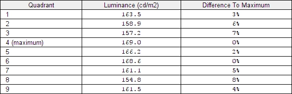
Luminance uniformity table
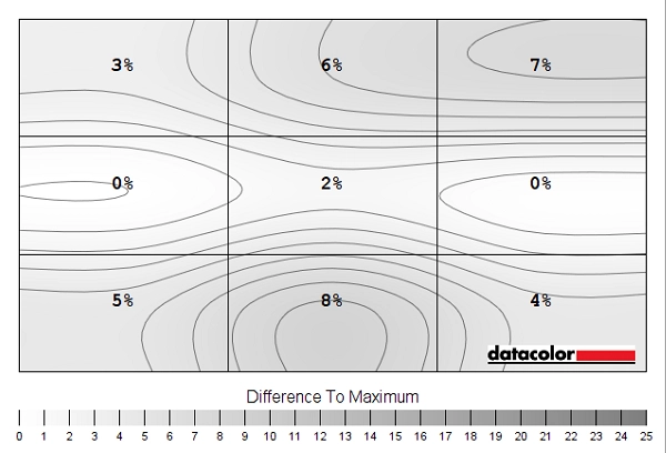
Luminance uniformity map
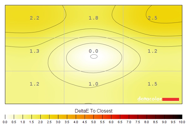
Colour temperature uniformity map
Contrast in games and movies
Lagom contrast tests
Colour reproduction
Colour gamut

Colour gamut 'Test Settings'
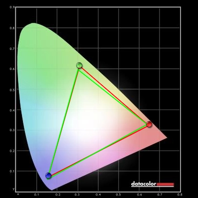
Colour gamut 'sRGB'
Colour in games and movies
Viewing angles
The following video shows the Lagom text test, a mixed desktop background and dark desktop background from various viewing angles. For the mixed image the monitor maintains its contrast quite well until steep angles are reached. There is certainly some loss of contrast and changes to colour as you go off centre. Although you don’t get ‘colour inversion’ vertically as you would on a TN panel. For the final section of the video you can see ‘VA glow’ as mentioned elsewhere in the review, blooming out more noticeably as you shift to sharper viewing angles. If you compare this to the Samsung C34F791, for example, you’ll see that the ‘VA glow’ is more noticeable on this model.
Interlace pattern artifacts
Responsiveness
Input lag
Perceived blur (pursuit photography)
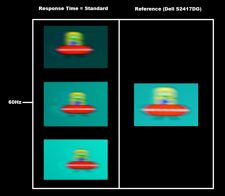
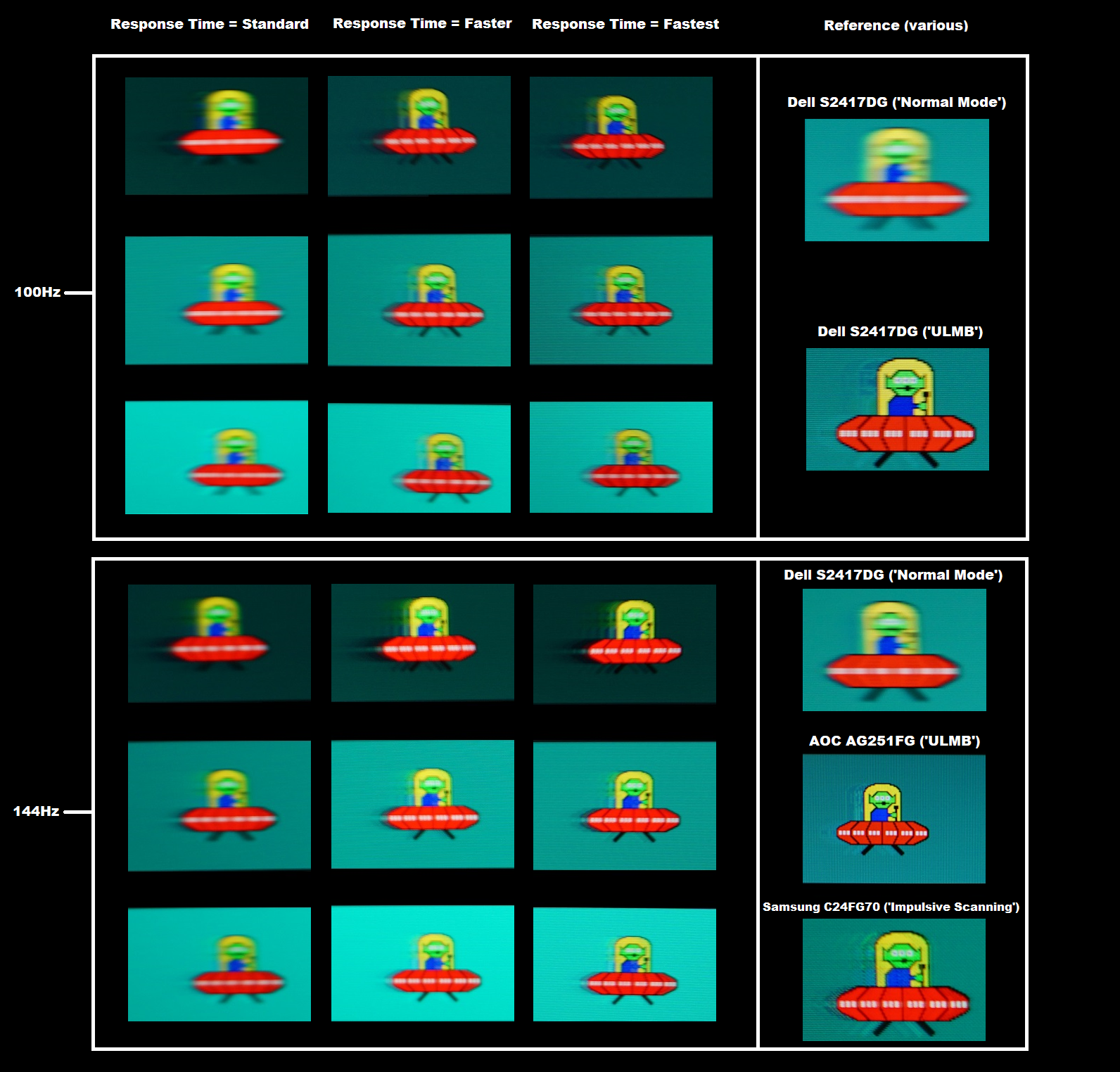
Responsiveness in games and movies
FreeSync – the technology and activating it

If you don’t see this option and you have followed these steps correctly, with a FreeSync compatible GPU, try reinstalling the graphics driver. The Samsung supports a variable refresh rate range of 48 – 144Hz via DP with a lower 100Hz ceiling via HDMI. That means that if the game is running between 48fps and 144fps, the monitor dynamically adjusts its refresh rate to match the frame rate. When the frame rate rises above 144fps, the monitor will stay at 144Hz and the GPU will respect your selection of ‘VSync on’ or ‘VSync off’ in the graphics driver. With ‘VSync on’ the frame rate will not be allowed to rise above 144fps, at which point VSync activates and imposes the usual associated latency penalty. With ‘VSync off’ the frame rate is free to climb as high as the GPU will output (potentially >144fps). With ‘Ultimate Engine’ selected, AMD LFC (Low Framerate Compensation) is supported by this model. This is actually a requirement of FreeSync 2 and means that the refresh rate will stick to multiples of the frame rate when things fall below the 48Hz (48fps) floor of operation for FreeSync. So if the game was running at 32Hz, for example, the monitor would run at 64Hz to keep tearing and stuttering in check. LFC is used regardless of the VSync setting – so the VSync setting only makes a difference above the ceiling of operation (144fps in this case).
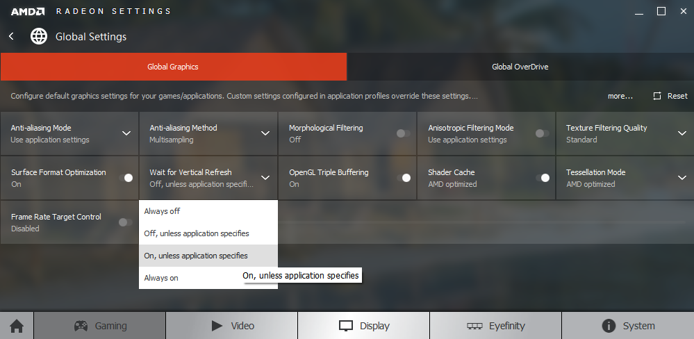
There are a couple of final points to note. Firstly, the application must be running in fullscreen mode, not a window (borderless or otherwise). The monitor lists ‘FreeSync’ at the bottom of the ‘Information’ section of the OSD if it’s connected up to a compatible GPU and the option is enabled in the OSD. It also displays a ‘FreeSync 2’ logo inside a monitor. That does not indicate that FreeSync is active at a given moment in time, simply that everything is set up and that it should work when a valid fullscreen 3D application is running. If you observe the refresh rate listed, though, that changes in ‘real time’ if FreeSync is active and the frame rate is fluctuating. It’s a good indication that the technology is doing its thing. The final point to remember is that FreeSync only removes stuttering or juddering related to mismatches between frame rate and refresh rate. It can’t compensate for other interruptions to smooth game play, for example network latency or insufficient system memory.
FreeSync – the experience
Impulsive Scanning (strobe backlight)
HDR (High Dynamic Range)
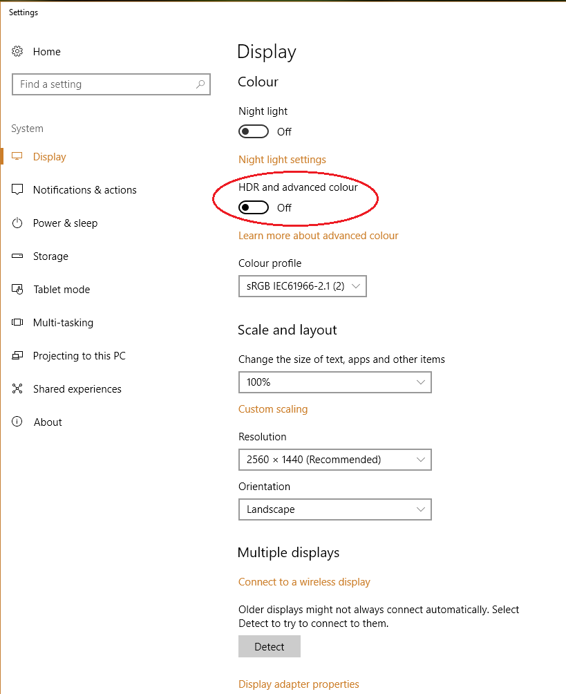
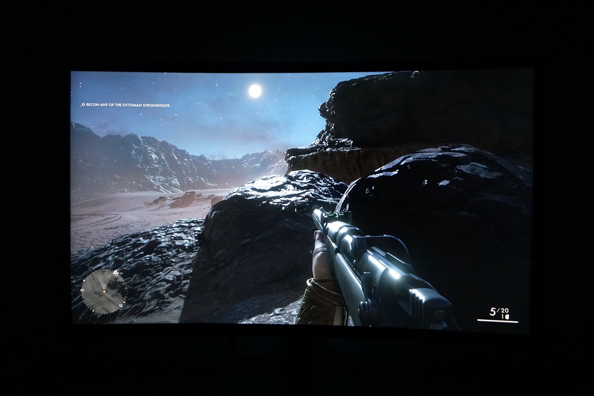
Colour gamut 'Test Settings'
The 27″ 2560 x 1440 curved experience
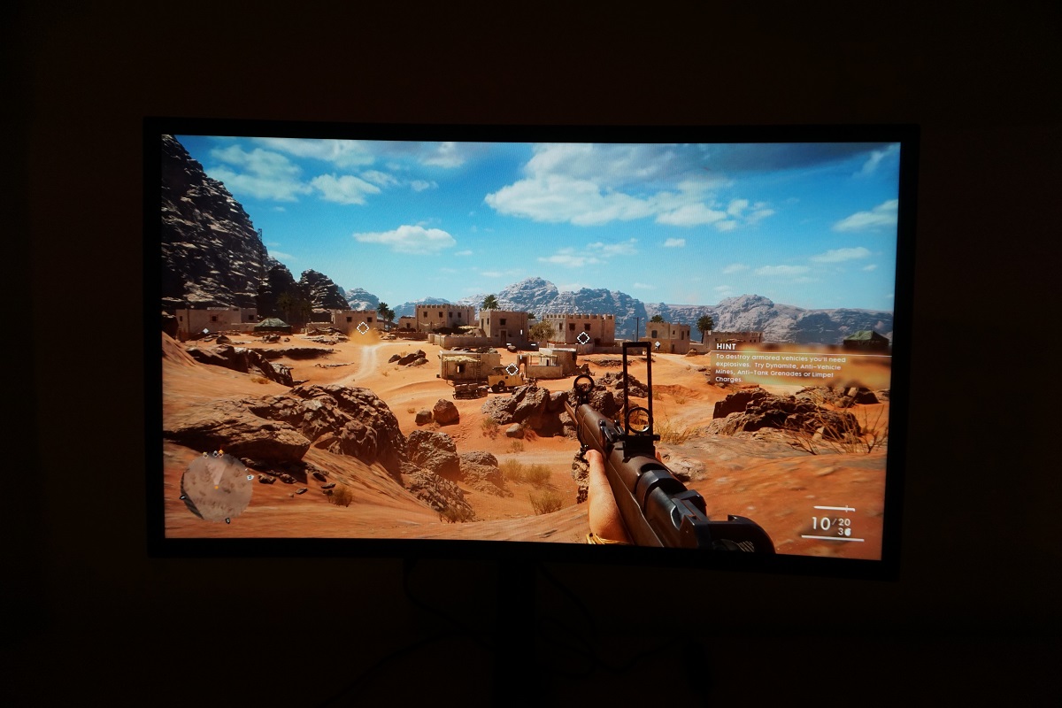
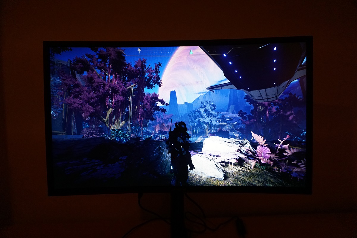
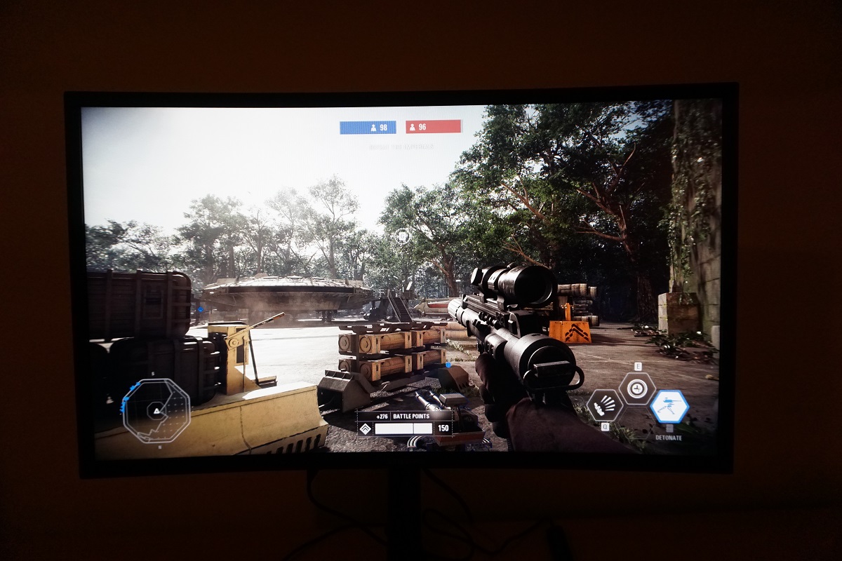
Interpolation and upscaling

Video review
Conclusion
Positives Negatives Good factory calibration and a generous but not excessive (for its intended uses) colour gamut, with good colour consistency for the panel type
Not up to the level of consistency that IPS-type models deliver
Good static contrast performance and a light matte screen surface, free from an obvious layering of smeary graininess A bit of graininess to the screen surface, a small amount of ‘black crush’ and a moderate amount of ‘VA glow’ Very low input lag and a good 144Hz performance overall, with most pixel transitions fast enough to keep up properly. FreeSync worked as intended and a strobe backlight option is there as well
Some weaknesses in pixel responsiveness, particularly where dark shades were involved. Obvious overshoot at lower refresh rates (inflexible pixel overdrive didn’t help) and not the most polished strobe backlight mode we’ve seen
The HDR capability of the screen is decent, for most users a practical resolution and pixel density for gaming and productivity. Plus, a subtle but in our view welcome addition in the form of a 1800R curve
Room for improvement in terms of HDR capability, due to relatively few dimming zones (Rec. 2020 support will be nice as well, one day). Fairly deep stand base could be impractical as well
As an Amazon Associate I earn from qualifying purchases made using the below link. Where possible, you’ll be redirected to your nearest store. Further information on supporting our work.
