Author: Adam Simmons
Date published: June 26th 2016
Table of Contents
Introduction
24” 144Hz monitors remain something of a sweet spot for many gamers when it comes to the combination of affordability and performance. Many competitive gamers will shy away from larger displays, even if they can afford them, for the competitive edge. But for your regular players who ‘play for fun’ (but still like to play well) it is more the case of what features are available for the price. The ViewSonic XG2401 combines a trusty 144Hz Full HD TN panel with Adaptive-Sync (support for AMD FreeSync). We test out this feature and the monitor itself to see how everything holds up when gaming, watching movies and performing a variety of desktop tasks.
Specifications
The monitor uses a 24” 144Hz TN panel from AUO, a panel that has seen action in many screens over the years. This supports 8-bit colour (6-bit + FRC) and features a Full HD resolution. A 1ms grey to grey response time is specified, a figure to be approached with caution. Some of the key ‘talking points’ of the monitor have been highlighted in blue below.
Features and aesthetics
The monitor identifies itself as a gaming monitor from the front, as manufacturers seem to think that requires a two-tone look of some sort. In this case the monitor is mostly matte black plastic, but there are some hints of red on the stand as you can see below. The side of the stand also uses glossy rather than matte black plastic. The bezels are moderately thick at ~17mm (0.67 inches) at the top and sides and between 20-29mm (0.79-1.14 inches) at the bottom, being thicker centrally than near the sides. The screen surface is regular (medium) matte antiglare, as explored later.
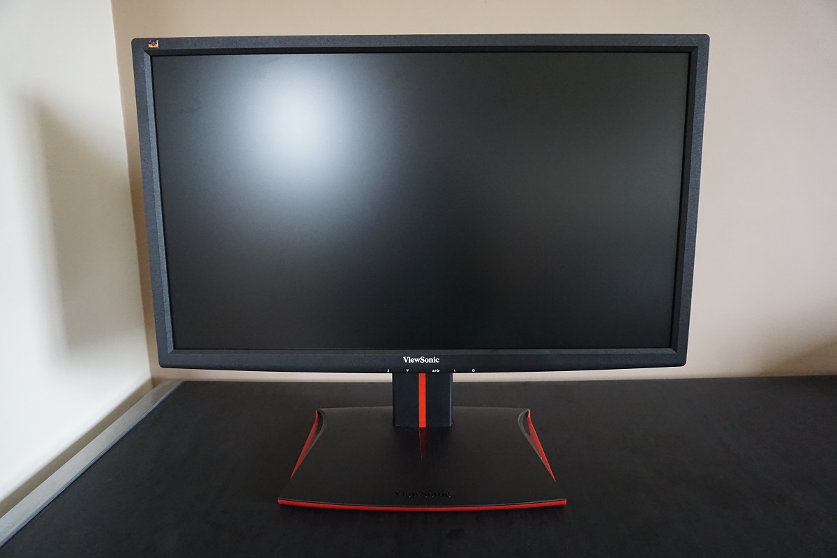
The OSD (On Screen Display) controls are tactile, facing downwards in the middle of the bottom bezel. They are well spaced out and fairly easy to use, although we do find the button order a little odd. That’s because the first button is numbered ‘2’ and is used as ‘Enter’ in the menu system, whereas the fourth button along is numbered ‘1’ and is used as a ‘Back’ button. Quite counter-intuitive, but certainly possible to get used to. The video below takes a look at the OSD menu system – apologies for the wonky camera holding. Note that the power LED on this monitor is neatly tucked away quite deep under the monitor so it isn’t at all distracting and not even visible when you sit at the desk normally. You have to lower your head and look under the monitor to actually see this. It glows blue when the monitor is on and amber if it enters a low power state (i.e. loses signal to the computer). If you push the power button to turn the monitor ‘off’ then the LED goes out.
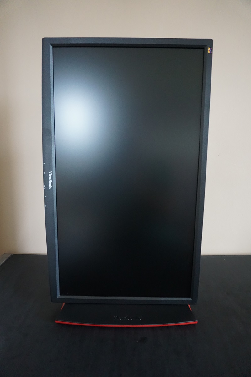
From the side the monitor is reasonably svelte; ~21mm (0.83 inches) at thinnest point, lumping out further centrally. The total depth of monitor including stand base is ~230mm (9.06 inches). At lowest stand height the bottom of the monitor clears the desk by ~78mm (3.07 inches) with the top of the screen ~414mm (16.30 inches) above the desk. There is also around an inch of ‘stand neck’ poking out at the top if you have the screen at its lowest height. The included stand is robust, as you can see, keeping the monitor well-grounded with a solid feel but also offering full ergonomic flexibility. This includes; tilt (22° backwards, 5° forwards), swivel (175°/175° left/right using turntable underneath stand base), height (120mm or 4.72 inches) and pivot (90° clockwise rotation into portrait). For pivoting the monitor, be aware of the viewing angle limitations which now manifest as an obvious gamma change from left to right in this orientation.
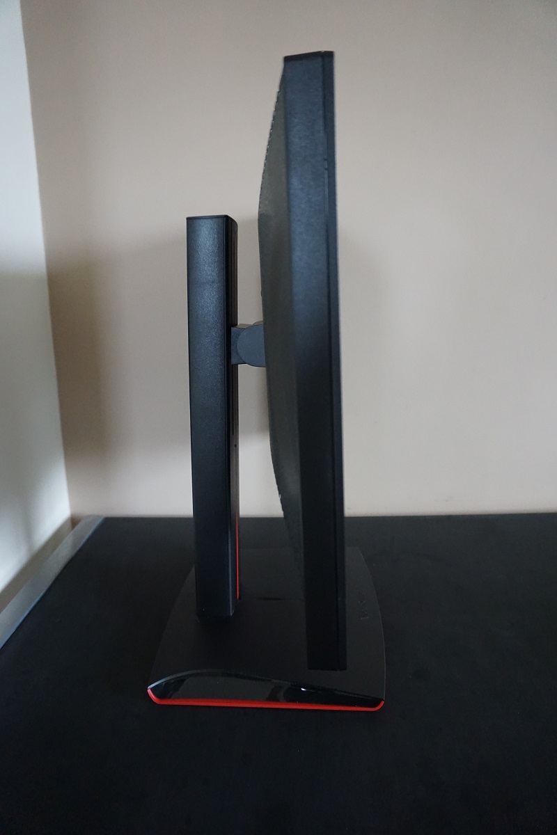
The rear of the monitor uses lashings of matte black plastic, with various textures. There are also various red markings on the stand visible from this perspective. At the very top of the stand neck is a retractable headphone hook – although this only extends out around 20mm so is not very useful for most gaming headsets. The top of the stand can be used as extra space for thicker sets such as this, though, and holds them quite nicely. There is a K-Slot towards the bottom left. The ports of the monitor are down-firing. To the left of the stand when viewed from the rear is an AC input (internal power converter). To the right are the ports; 2 HDMI 1.4 ports (up to 120Hz @ 1920 x 1080), DP 1.2a (up to 144Hz @ 1920 x 1080 plus Adaptive-Sync support), 2 USB 3.0 ports (plus upstream) and a 3.5mm headphone jack.
There are also 2 x 5W up-firing speakers for basic sound output. The sound from these has a decent amount of volume, but lacks bass and in clarity – certainly not a replacement for a decent standalone speaker or headphone set. The included monitor stand can be removed to reveal 100 x 100mm VESA holes if you wish to use an alternative VESA-compatible solution.
Calibration
Subpixel layout and screen surface
A ‘regular’ (medium) matte anti-glare surface is used on this screen, as mentioned in the previous section. This surface has a moderately high degree of surface roughening, designed to offer fairly strong diffusion of ambient light. This cuts down on glare, but light emitted from the monitor undergoes the same diffusion. The clarity and vibrancy potential is therefore affected to a greater degree than some matte screen surfaces, but less so than others. You can notice a bit of a grainy look to whites and light shades, although there isn’t that heavy ‘smeary’ look you get with some matte surfaces.
![]()
As shown in the image above, the monitor uses the standard RGB (Red, Green and Blue) stripe subpixel layout. Being the default expected by modern operating systems such as Microsoft Windows and Apple MacOS, things just ‘work’ without having to fiddle around with ClearType or worrying about text fringing. Windows users may still wish to run the ClearType wizard just to fine-tune according to preferences, however.
Testing the presets
The XG2401 features a range of ‘Viewmode’ presets (found in ‘Advanced Image Adjust’ on the OSD); ‘Standard’, ‘Game’, ‘Movie’, ‘Web’, ‘Text’ and ‘Mono’. Within ‘Game’ there are a number of sub-presets as explored in the OSD video. Some additional presets are available in the ‘Color Adjust’ menu; ‘sRGB’, ‘Bluish’, ‘Cool’, ‘Native’, ‘Warm’ and ‘User Color’. The ‘Color Adjust’ settings can only be changed if the ‘Viewmode’ is set to ‘Standard’ or ‘Game’. If you set the ‘Viewmode’ to anything else and change the ‘Color Adjust’ settings, it simply reverts to ‘Standard’.
The table below shows some key readings taken using a Datacolor Spyder5ELITE colorimeter, for a range of settings. General observations on image characteristics are also included alongside some of the preset-specific adjustments that can also be made. Our test system used a Club3D Radeon R9 290 royalAce FreeSync-compatible GPU connected via DisplayPort. Windows 10 was used on the system with the monitor set to its ‘plug and play’ state with no additional drivers or ICC profiles loaded. The monitor was left to run for over 2 hours before readings were taken. Aside from for our ‘Test Settings’, assume any settings not mentioned here were left at default with the exception of the refresh rate being set to 144Hz (unless otherwise stated). Note that we could only briefly test using an Nvidia GPU, but image characteristics looked very similar indeed.
| Monitor Settings | Gamma (central average) | White point (kelvins) | Extra OSD features | Notes |
| Color Adjust = sRGB | 2.3 | 5994K | Brightness, Contrast | Dim with a slightly warm look to the image, but much richer than most 24” 144Hz monitors appear without ICC profiles. Perceived gamma is lower further down the screen – the ‘2.3’ average gamma here helps counteract the saturation loss further down the screen a bit. There are definite differences when comparing the top and bottom of screen, but a nicer level of vibrancy than you’d usually see on such models. |
| Color Adjust = Warm | 2.3 | 5016K | Brightness, Contrast, Dynamic Contrast, Blue Light Filter | This is essentially a ‘Low Blue Light’ setting with a warm tint and significantly reduced blue light output. Gamma tracking as above. |
| Color Adjust = User Color | 2.3 | 6421K | Brightness, Contrast, Dynamic Contrast, Blue Light Filter, Colour Channels | Very bright (adjustable) with a fairly well balanced white point, but a bit of a green push. The image appears rich overall. |
| Blue Light Filter = 0 | 2.2 | 4653K | Brightness, Contrast, Dynamic Contrast, Blue Light Filter | The most effective ‘Low Blue Light’ setting available on the monitor (adjustable in single unit increments). The blue colour channel is reduced massively, cutting out blue light output from the monitor significantly and providing a warm look. This is a setting that some users would consider more relaxing and is more suitable for viewing before bed time. |
| Viewmode = Standard (Factory Defaults @144Hz) | 2.3 | 6024K | Brightness, Contrast, Dynamic Contrast, Blue Light Filter | Similar to the sRGB setting, but significantly brighter with more control over OSD settings. |
| Viewmode = Standard (Factory Defaults @120Hz) | 2.4 | 6115K | Brightness, Contrast, Dynamic Contrast, Blue Light Filter | As above but gamma a touch higher, giving a bit of extra depth in places. The shades further up the screen (where perceived gamma is even higher) look noticeably too deep overall. |
| Viewmode = Standard (Factory Defaults @60Hz) | 2.6* | 6066K | Brightness, Contrast, Dynamic Contrast, Blue Light Filter | Some severe issues with oversaturation, bleaching (shade crushing at high end) – but only over DP and possibly linked to a graphics driver bug. See note below*. |
| Viewmode = Text | 2.6 | 4921K | A third ‘Low Blue Light’ setting, but with elevated gamma. Very effective blue light reduction, but excessive depth due to gamma. | |
| Viewmode = Mono | 3.0 | 6265K | A specialist mode which makes the image black and white. The greyscale distinctions are poor (note very high gamma). | |
| Test Settings (as below) | 2.3 | 6596K | Brightness, Contrast, Dynamic Contrast, Blue Light Filter, Colour Channels | As per ‘User Color’ with improved white point for better balance. Quite a vivid and varied look to the image. |
Out of the box the monitor provided an image that was very bright and slightly warm, but actually looked considerably richer than most 24” 144Hz models. Whilst the panel used is exactly the same as seen in the likes of the BenQ XL series, the gamma handling seemed to be much better. Whereas shades would usually look washed out (sometimes significantly) due to gamma being far too low, that wasn’t the case here. There were also a number of other useful settings, including various ‘Low Blue Light’ modes. Once we reduced the brightness and made some adjustments to the colour channels, things became nicely balanced and retained a rich look with a good deal more depth than you’d usually see. Under our ‘Test Settings’, below, you can see that the gamma tracks fairly close to the ‘2.2 curve’. It actually averages 2.3, but as we note in the table and elsewhere in the review the perceived gamma decreases further down the screen and increases further up the screen. So this actually helped counteract the ‘desaturated’ look further down the screen a bit. As mentioned there are various ‘Low Blue Light’ settings. The most flexible of these is the ‘Blue Light Filter’, which can be adjusted in single unit increments from ‘0’ (full effect) to ‘100’ (off completely – normal monitor settings). For our own viewing pleasure later on in the evening (before bed) when stimulating blue light output should be reduced as much as possible, we liked to use ‘0’ for full effect. It’s important to note that the ‘Blue Light Filter’ overrides any adjustments made to colour channels (or indeed any ‘Color Adjust’ presets). Likewise, it can be quickly deactivated by making such adjustments. For our ‘Test Settings’ we used ‘User Color’ and made manual adjustments to the colour channels. We also reduced brightness quite significantly and adjusted a number of other settings related to AMD FreeSync and input lag – these did not have an observable impact on image quality and are just included here for reference. Also included for reference is the fact that the ‘Response Time’ setting was kept at ‘Standard’, which is the factory default. Any setting not mentioned here was kept at default. Note that individual units can vary and so do personal tastes, so these settings won’t necessarily be optimal and are just intended to be used as a guide. Due to this inter-unit variation, other drawbacks mentioned here and the fact that performance was pleasing without, no ICC profiles have been provided or used in our testing. Color Adjust= User Color R= 100 G= 94 B= 98 Response Time= Standard Low Input Lag= Ultra Fast AMD FreeSync= On Displayport 1.2= Yes Refresh rate= 144Hz A BasICColor SQUID3 (X-Rite i1Display Pro) was used to measure the luminance of black and white using a range of settings, from which contrast ratios were calculated. The table below shows this data, with blue highlights indicating the results under our test settings. Black highlights indicate the highest white luminance, lowest black luminance and highest contrast ratio recorded. Assume that any setting not mentioned was left at default, with the exceptions mentioned in the calibration section.
Gamma optimal OSD settings
Test Settings
Brightness= 38 (according to preferences and lighting)
Contrast and brightness
Contrast ratios
Monitor Settings White luminance (cd/m²) Black luminance (cd/m²) Contrast ratio (x:1) 100% brightness (Factory Defaults) 378 0.37 1022 80% brightness 310 0.31 1000 60% brightness 244 0.24 1017 40% brightness 175 0.18 972 20% brightness 103 0.10 1030 0% brightness 29 0.03 967 Color Adjust = Standard @120Hz 377 0.37 1019 Color Adjust = Standard @60Hz 387 0.38 1018 Color Adjust = sRGB 121 0.12 1008 Color Adjust = Warm 326 0.38 858 Color Adjust = User Color 400 0.38 1053 Blue Light Filter = 0 301 0.38 792 Viewmode = Text 317 0.38 734 Viewmode = Mono 392 0.38 1032 Test Settings 169 0.17 994
With only brightness adjusted an average contrast ratio recorded on the XG2401 was 997:1, right where you’d expect it to be given the specifications. The measured contrast dropped to between 792:1 and 858:1 in the ‘Low Blue Light’ settings tested. The peak contrast was measured in ‘User Color’ with all colour channels at their default ‘100’ position; 1053:1. Under our ‘Test Settings’ a contrast ratio of 994:1 was recorded, which is good. The highest luminance recorded was 400 cd/m² whilst the minimum white luminance recorded was 29 cd/m². This gives the monitor an impressive 371 cd/m² luminance adjustment range.
There is also a ‘Dynamic Contrast’ setting found in ‘Advanced Image Adjust’ called ‘Advanced DCR’ (Advanced Dynamic Contrast Ratio). This allows the backlight to change brightness, as a single unit, according to the level of light and dark being shown in the screen. You can set this to various values; ‘0’ (off), ‘25’, ‘50’, ‘75’ and ‘100’ (max). Increasing the value seems to have limited effect on either the speed at which the backlight adjusts to brightness changes in the scene and also on the maximum and minimum brightness used. The more noticeable impact, though, is that higher values increase the ‘sharpness filter’ associated with this feature. Even when enabled but set to its lowest value (’25’) the monitor tended to be uncomfortably bright during mixed scenes, even with plenty of dark elements. Furthermore there was excessive sharpness applied, which can’t be counteracted with the ‘Sharpness’ setting of the OSD. At least you can alter the ‘Color Adjust’ settings and indeed ‘Viewmode’ with this setting active, so there’s a bit of flexibility in that respect.
PWM (Pulse Width Modulation)
The XG2401 does not use PWM (Pulse Width Modulation) at any brightness level. Instead, DC (Direct Current) modulation is used. This means the backlight is considered ‘flicker-free’, which will come as welcome news to those who dislike the effects of PWM such as potential visual discomfort and PWM artifacts during motion.
Luminance uniformity
Whilst observing a black screen in a dark room, using our test settings, we noticed minor backlight bleed and a small amount of clouding. The backlight bleed was present near the bottom right corner and left central region of the screen as shown in the image below. It’s important to remember that individual units vary with respect to all uniformity issues, including backlight bleed. There is no ‘IPS glow’ or anything of that nature from a normal viewing position. If you view dark content from a sharper angle, though, there is a slight silver or golden sheen (depending on viewing angle). This is shown in a video later on in the review and is clearly not as pronounced as IPS glow, nor is it observed from a normal viewing position.
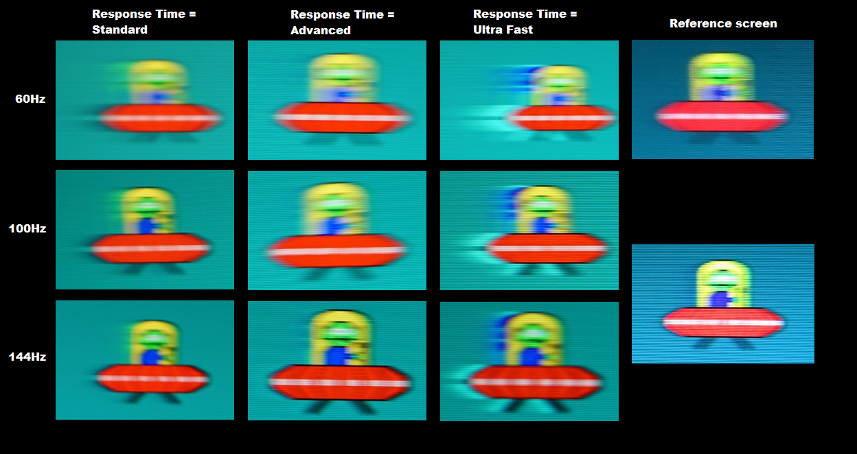
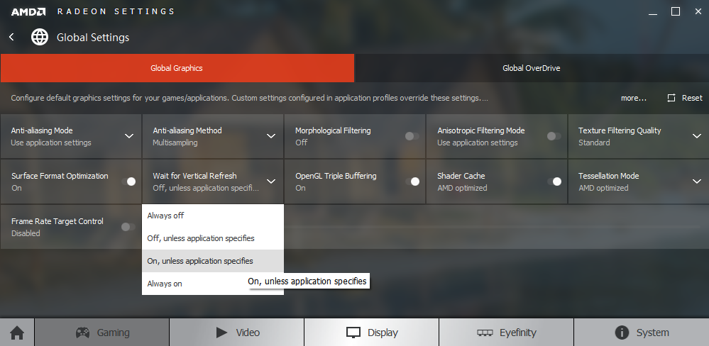
We also used the Spyder5ELITE to assess the white uniformity of the monitor, represented by 9 equidistant quadrants running from the top left to bottom right of the screen. The table below shows the deviation between each point and the brightest recorded point. The luminance uniformity was pleasing. The brightest point recorded was ‘quadrant 5’ in the centre of the screen (160.3 cd/m²). The greatest deviation from this occurred at ‘quadrant 8’ below the central region (143.6 cd/m²). The remaining quadrants showed deviations of between 7% and 11%. Note that individual units vary when it comes to uniformity and that further deviation beyond the measured points is possible. Additionally, the viewing angle limitation of the panel means that perceived luminance varies somewhat depending on which part of the screen you’re observing. For those who prefer a graphical representation, the contour map below shows these deviations with darker greys representing lower luminance (and hence greater deviation from the brightest point) than lighter greys. The percentage deviation between each quadrant and the brightest point is also shown. Due to the viewing angle limitations mentioned above, we will not be providing quantitative analysis of the colour temperature uniformity of the monitor. The perceived colour temperature can vary significantly depending on which part of the screen you’re observing, from a normal viewing position. Any readings provided here could therefore be quite misleading. On Battlefield 4 (BF4) the contrast performance was good overall. The level of detail in dark areas was mostly good, although that depended on which part of the screen you’re observing. As noted earlier, viewing angle restrictions affect the perceived gamma on TN models such as this even from a normal viewing position. Detail towards the centre was good and largely appropriate, whereas further down the screen some extra (unintended) detail was revealed and further up the level of detail was perhaps a bit worse than it should be. Especially right at the top of the screen. Due to a lack of ‘IPS glow’ or anything of that nature, though, there wasn’t a flooded ‘bloom’ sort of look towards the corners so the visibility there remained good. Brighter elements stood out quite well, although the screen surface imparted a bit of a grainy look to such elements. This was not as pronounced as on some models, but was certainly more noticeable than on some lighter matte surfaces. On Dirt Rally the contrast performance was again quite pleasing. There was no ‘IPS glow’ or anything of that nature to give the screen a hazy look towards the corners. The visibility in dark areas was good overall, although affected by the perceived gamma changes noted earlier. Brighter elements looked slightly grainy due to the screen surface, but still stood out quite well and were free from heavy ‘smeary’ grain. Lagom’s tests for contrast were used to more closely analyse contrast performance, highlighting weaknesses which may not be readily apparent during other testing. The following observations were made from a normal viewing position, around 70cm from the screen. The colour gamut of the XG2401 (red triangle) was compared with the sRGB colour space (green triangle), as shown in the image below. The monitor fairly comprehensively covers sRGB, with just a sliver of under-coverage (99% measured) and also a little bit of over-coverage in the green region of the diagram. The monitor is therefore largely faithful to the sRGB colour space, with the potential for a little extra vibrancy for some shades. On BF4 the colour reproduction was quite good, particularly compared to competing models that use this panel but suffer from much lower than intended gamma. There were plenty of rich colours such as some nice strong deep greens for vegetation, earthy browns and bright oranges and yellows from the obligatory fire and explosions. Due to the aforementioned viewing angle restrictions some saturation was lost lower down the screen, so some shades appeared more muted down here than they ideally would. And towards the very top of the screen there was a bit of extra depth. It was nice to see this monitor output largely appropriate richness without requiring the intervention of an ICC profile, which can be a bit of hassle for gaming and are really tailored only to one specific unit. Colour reproduction was also quite pleasing on Dirt Rally. The saturation was again stronger further up the screen and weaker lower down. Overall, though, the game looked more vibrant than it did ‘washed out’, with the average gamma helping in that respect. There were some nice vibrant neon greens, bright pinks and reds (amongst other shades) which helped give the car paint jobs quite a lively look. Environments looked quite natural, although subtle shade variety suffered a bit from the gamma inconsistencies. There were still some nice rich browns and greens, particularly near the centre of the screen where you will mainly focus when playing this game. We also tested the Blu-ray of Star Wars: The Force Awakens. The screen surface, colour gamut and contrast performance of the monitor weren’t really sufficient to provide the sort of ‘vibrant pop’ we’ve seen on some monitors on this movie – although the bright blue and red lightsabers were still fairly eye-catching. Skin tones on this film looked appropriately saturated on the whole, again with a bit of deviation depending on where on the screen you’re observing. Finally we took a look at the Blu-ray of Futurama: Into the Wild Green Yonder, which is an excellent test for colour consistency due to large areas of individual shade being shown. In this respect things were as you’d expect from a 24” TN panel, particularly given the fact we’ve tested several models with this exact panel. You can clearly see saturation differences depending on where on the screen you’re looking, more noticeable for some shades than others. This meant that a given shade (say a character skin tone) appeared different depending on the position on screen and therefore such shades lost their unique identifies to a degree. The monitor was still able to give distinct classes of shades their appropriate look, though, with good neon and deep shades appearing with nice intensity. Pastel shades, meanwhile, appeared more muted without so much deviation in saturation levels that they lost that aesthetic. We used Lagom’s tests for viewing angle to explore the idea of colour consistency and viewing angle performance in a more focused way. The following observations were made from a normal viewing position, around 70cm from the screen. A sensitive camera and a utility called SMTT 2.0 was used to assess the input lag of the XG2401, by comparison with various monitors of known latency. Using this method, we calculated 3.38ms (under ½ a frame at 144Hz) of input lag. This was with the monitor set up as per our test settings, so note the ‘Low Input Lag’ mode and ‘Response Time’ settings used. This figure reflects both the element you ‘see’ (pixel responsiveness) and the element you ‘feel’ (signal delay). In terms of signal delay, which is the component of input lag most people are interested in, this monitor is clearly extremely snappy. Note that we do not have the means to accurate assess input lag with FreeSync in operation, but things felt just as snappy to us with it enabled when gaming. In our responsiveness article we explore the factors which affect the responsiveness of a monitor and how these factors interact. One of the key concepts explored is ‘perceived blur’, which is affected not only by the pixel responses of the monitor but also more significantly by the movement of your own eyes as you track motion on the screen. We also explore a method of photography called ‘pursuit photography’, which allows motion to be captured on a monitor in a way that not only reflects the pixel response behaviour of the monitor, but also accounts for eye (in this case camera) movement. The images below are pursuit photographs taken using the UFO Motion Test for ghosting. The test is set to run at its default speed of 960 pixels per second, a practical speed for such photography and one which highlights the key components of perceived blur nicely. The middle row (medium cyan) background of the test was used for this analysis. The monitor was set to 60Hz (top row), 100Hz (middle row) and 144Hz (bottom row). It was also tested with its three different ‘Response Time’ settings as shown in different columns; ‘Standard’, ‘Advanced’ and ‘Ultra Fast’. The final column shows a reference screen which is able to perform at both 60Hz (top photo) and 120Hz (bottom photo) without significant additional trailing in these transitions. In other words, representing what things should look like where pixel responsiveness isn’t really a limiting factor. This is a Samsung S27A750D set to full brightness (eliminates PWM) and set to its optimal response time setting for each refresh rate. Note that any interlacing shown in these photos is moiré from the camera, not artifacts present on the monitor itself. At 60Hz you can see that the object itself appears quite blurred (influence of eye movement). There is also a fair bit of trailing behind the object (influence of pixel responses) using the ‘Standard’ setting. With the ‘Advanced’ setting, the trailing is cut down significantly but replaced by a bit of overshoot (inverse ghosting) due to overly aggressive pixel overdrive. The ‘Ultra Fast’ setting introduces extreme overshoot, with an unmistakable bright inverted trail behind the object. Moving up to 100Hz, the object in all cases appears less blurred (more sharply focused) which indicates perceived blur due to eye movement decreasing substantially. With the ‘Standard’ response time setting the trail is now a lot shorter than at 60Hz – it is also a lot less noticeable when observing movement on the monitor first hand. With the ‘Advanced’ setting there is again a bit of overshoot, although this is fairly tame for the transitions being shown here. The ‘Ultra Fast’ setting again shows extreme overshoot – and although the overshoot trail is shorter as you might expect given the increased refresh rate, it still unmistakable and very eye-catching. At 144Hz the object is sharper and more detailed once again, with some of the details on the UFO becoming a bit more distinctive. This reflects another nice step up in motion clarity due to a significant decrease in perceived blur. With the ‘Standard’ setting the trailing is now just a faint whiff behind the UFO – behind the red body in particular, it’s barely there now and appears less bold. It is certainly a lot less noticeable to the eye when compared to 60Hz and a bit of a step up when compared to 100Hz as well. With the ‘Advanced’ setting the overshoot now appears a bit bolder, particularly behind the yellow cockpit. The ‘Ultra Fast’ setting shares the usual issues – extreme and very eye-catching overshoot. If you observe the monitor under a broader range of pixel transitions, as we do in the subsequent section, there are some transitions which show different behaviour. The most critical difference is that there is more noticeable overshoot than demonstrated here using the ‘Advanced’ setting, for some transitions. This is particularly true at 144Hz and to some extent 100Hz, but less so at 60Hz. We found the ‘Standard’ setting to be our favourite at higher refresh rates. As we explore below the hints of extra trailing here were quite faint, depending on the transition. We found this generally less eye-catching than the overshoot using faster response time settings. And indeed far less noticeable that the overshoot that graces most 144Hz monitors once their pixel overdrive solution is active (BenQ’s AMA, for example). The ‘Standard’ setting still employs effective grey to grey acceleration, but is not more aggressive than it needs to be. The ‘Advanced’ setting provides only relatively minor overshoot at 60Hz, whereas the conventional trailing in ‘Standard’ is more noticeable here. So users who are forced to use 60Hz (games console users, perhaps) might consider using this mode for that, but for higher refresh rates the ‘Standard’ setting is preferable in our view. On Battlefield 4 the gameplay was extremely fluid where the frame rate kept up with the 144Hz refresh rate. There was an excellent ‘connected feel’ that is exactly what many gamers, competitive or otherwise, will appreciate. A seemingly instantaneous reaction and flow between user interaction translating to movement or actions carried out on the game itself. This came from the combination of negligible signal delay and the fact that the screen is pumping out up to 2.4 times as much information every second compared to a 60Hz model. The pixel responses were also clearly very snappy, with some faint trailing during some transitions such as those involving darker objects. There was no observable overshoot to get in the way of the experience. You were therefore left with a relatively low level of perceived blur that made zipping around in vehicles or running about on foot much less dizzying than at 60Hz. The level of detail maintained even during rapid movements was simply much better, making it easier to track an engage enemies and aiding that ‘connected feel’ which gamers crave. We also fired up Dirt Rally. With this title, we didn’t find the exceptionally low latency to be as beneficial or potentially game-changing as on BF4. Although hardcore racing fans might argue that seemingly instantaneous response to controller input is fantastically helpful on such titles. We certainly appreciated the relatively low levels of perceived blur at high frame rates, though, and the overall visual fluidity that presented itself when racing around the beautiful courses on this game. Being able to appreciate little details in the environment and being able to remain quite focused on the tracks during rapid manoeuvres is certainly something to be appreciated. There was again no observable overshoot nor any disturbing trailing from slower than optimal pixel responses, which was pleasing. Those familiar with our reviews will know what we’re going to say here as we round off our testing with the Blu-ray movie titles. The monitor certainly doesn’t have a chance to shine here as it did when gaming. The low input lag does it no favours as you don’t interact with such movies and they’re limited to around 24fps anyway. Even so, motion was handled here by the XG2401 as well as we’ve seen. The experience was not impeded by sluggish pixel responses or noticeable overshoot. Compared to running a monitor at 60Hz and watching such films, there was also less judder due to the ~24fps dividing nicely into 144Hz (6*24fps = 144Hz vs. 2.5*24fps = 60Hz). Often when we review models using this panel and indeed high refresh rate models more generally (and sometimes 60-72Hz models for that matter) there are certain visual disturbances that can be observed during motion. We tend to refer to these as ‘interlace pattern artifacts’, which is quite descriptive. They’re generally quite faint and manifest themselves in different ways on different monitors. On the XG2401 these were present as a sort of faint woven appearance to some lighter textures during motion at certain speeds. This is shown in the image below. We didn’t find this distracting or eye-catching and some users wouldn’t even notice it at all, but sensitivity to this varies. This occurs regardless of response time setting, refresh rate, input lag settings or FreeSync status. AMD FreeSync is a variable refresh rate technology that aims to eliminate the tearing and stuttering associated with frame rate and refresh rate mismatches. The technology is supported by certain AMD GPUs (including these and future models). It is similar in its operating principles to Nvidia G-SYNC, which uses a proprietary ‘G-SYNC board’ to allow the GPU to communicate to the monitor so that the refresh rate can be adjusted according to the frame rate of the content. Rather than using a special board inside the monitor, AMD FreeSync requires support of VESA Adaptive-Sync which is an optional extension of certain HDMI and DP standards. Specifically, Adaptive-Sync is a capability integrated into the DP 1.2a or HDMI 1.4a port controllers of certain monitors, including the DisplayPort input of the ViewSonic XG2401. To understand the benefits of the technology and why it’s important to match the refresh rate of the monitor with the frame rate of the content, we advise reading either the relevant section of our monitor responsiveness article. Alternatively, a good summary is provided in our G-SYNC article. As noted above the XG2401 supports Adaptive-Sync and therefore AMD FreeSync via DP 1.2a. Our test system uses a Club3D Radeon R9 290 royalAce, a GPU that is compatible with FreeSync. AMD’s recent drivers include Radeon Software Crimson, which makes activation of the technology very straightforward. It should be automatically enabled by default, but you can check this by opening ‘AMD Radeon Settings’ and clicking ‘Display’. You should then ensure that the first slider, ‘AMD FreeSync’, is set to ‘On’. If you hover over this, it will also report the variable refresh rate display supported by the display. Note that the image below is for a different monitor and is purely provided for reference. There are is a setting on the monitor itself that must be enabled for FreeSync to work. You need to go to ‘Advanced Image Adjust’ and ensure the ‘AMD FreeSync’ checkbox is checked. If you go to ‘Setup Menu’ you’ll notice that there is a ‘DisplayPort 1.2’ checkbox that is not checked by default. If you enable FreeSync then this setting is bypassed – FreeSync requires the use of DP 1.2a and works regardless of whether the DP 1.2 option is checked or not. The XG2401 supports a variable refresh rate range of 48 – 144Hz. Because the upper value is at least 2.5 times the lower value, LFC (Low Framerate Compensation) is also supported. This allows the monitor to use multiples of the frame rate for its refresh rate once the frame rate dips below 48fps (for example 20 fps = 60Hz). This helps keep tearing and stuttering in check even below the hardware floor of operation (48fps/48Hz). At frame rates beyond 144fps, the GPU respects your selection of ‘VSync on’ or ‘VSync off’ in the graphics driver. With ‘VSync on’ the frame rate will not be allowed go above 144fps, with VSync activating automatically at this point and imposing the usual latency penalty when it does so. With ‘VSync off’ the frame rate is unlocked and will rise above 144fps. Because this is above the 144Hz refresh rate ceiling of the monitor, FreeSync is deactivated and you get tearing and juddering which some users may find troublesome. Others will prefer this option for minimal latency. VSync is configured in the ‘Gaming’ section of ‘Radeon Settings’, where it is referred to as ‘Wait for Vertical Refresh’. You can set this for each game individually, or alternatively set it as a global attribute under ‘Global Settings’. The default setting is is ‘Off, unless application specifies’ which means that VSync is only active if you enable it within the game itself. Most games have such an option, but it could be referred to as something along the lines of ‘sync every frame’ rather than simply ‘VSync’. Most users will probably want to enable VSync when using FreeSync to ensure that they don’t get any tearing. One of the final two options in the list, shown in the image below, would therefore be preferable. There are a few final points to note. Firstly, for FreeSync to work, the application must be running full screen rather than in a window (borderless or otherwise). Secondly, this monitor offers no obvious indication that FreeSync is actually active. The power LED does not change colour and there are no on-screen notifications. However; if you go to the ‘Information’ section of the OSD, you will see the ‘V. Frequency’ rapidly changing in response to fluctuating frame rates if FreeSync is enabled. If it is disabled, this will remain static regardless of frame rate fluctuation. The first title we tested with FreeSync was Star Wars Battlefront. Using the settings we like to use, with our Radeon 290, the frame rate on this title fluctuated quite considerably. It generally stayed above 100fps, but spent little time meeting the maximum supported by the monitor (i.e. 144fps). With FreeSync disabled, these fluctuations were quite disturbing to our eyes. Without VSync disabled, we found the tearing and associated juddering to be quite obvious – just like the stuttering with VSync enabled. With FreeSync, though, the flow of the game was not interrupted with such things. Although there was an increase in perceived blur and a somewhat weakened ‘connected feel’ at closer to 100fps than 144fps (which FreeSync can’t fix), the overall visual fluidity and responsive feel was still excellent. Sensitivity to stuttering, tearing and associated effects does vary and it is something that’s more obvious at lower frame rates (and refresh rates). But for sensitive users the difference that variable refresh rate technologies such as FreeSync make, even at these high frame rates, is quite a game-changer. The second title we tested was Tom Clancy’s The Division. This is fairly taxing, graphically, especially with the eye candy turned up a bit. Using the settings we liked to use, the frame rate fluctuated wildly. Typically it was between 70 – 130fps. At the lower end of this the experience was noticeably less fluid – the connected feel that you get at higher frame rates simply wasn’t there and perceived blur was increased significantly. This part didn’t change whether or not FreeSync was active; relatively low frame rates remain relatively low frame rates. With this technology enabled, though, the lack of stuttering and tearing made the gaming experience that bit more pleasant and ‘flowing’. We did notice that the pixel responses provided more noticeable trailing as the frame rate dropped into double digits. This was especially noticeable closer to 60fps. This extra trailing reflected what we observed on TestUFO. The monitor seems nicely optimised for higher refresh rates but less so for lower refresh rates. This is certainly a distinction we have seen in the past when comparing G-SYNC and FreeSync-compatible displays. G-SYNC displays adapt their pixel overdrive appropriately for lower frame rates and refresh rates, whereas FreeSync-compatible displays use a ‘one size fits all’ that’s usually designed with the upper end in mind. There was no noticeable overshoot regardless of frame rate, though, which is good and contrasts with what we’ve seen on the AOC G2460PF for example. We also ramped up the detail on The Division to see what happened when the frame rate dropped below the 48fps hardware floor of operation (48Hz). LFC kicked in seamlessly and we noticed no stuttering or tearing as we’d see with the technology disabled. There was no abrupt change that we could perceive in either motion handling or responsive feeling above and below the LFC threshold, either. So this technology certainly seemed to work as advertised and increased the effective range of FreeSync. Nevertheless, we would again like to stress that low frame rates remain low frame rates. The overall fluidity and perceived blur is much better on this monitor at higher frame rates, ideally into triple digits. The video below summarises some of the key points raised in this written review and shows the monitor in action. The video review is designed to complement the written piece and is not nearly as comprehensive. The ViewSonic XG2401 uses a panel we’ve seen on dozens of monitors already. So we had a fair idea of what to expect. But there is more to a monitor than just a panel, with a lot also coming down to how everything is tuned by the monitor manufacturer. In that respect ViewSonic did an impressive job. Out of the box the image could certainly do with a bit of adjustment, particularly with respect to brightness, but gamma handling was actually pleasing. This gave the image quite a rich look overall, which was far beyond what most 24” 144Hz models produce without deeper and potentially problematic corrections (i.e. ICC profiles). The usual TN weaknesses related to viewing angle and gamma handling applied, with weakening saturation lower down the screen and stronger saturation higher up. Having everything balanced around a ~2.2-2.3 gamma helped the end result tremendously, however. There were no surprises when it came to contrast. Static contrast was exactly as we’d expect, very close to the 1000:1 specified. The gamma handling meant that perceived detail levels in dark scenes changed depending on where on the screen you’re observing, but the absence of any ‘IPS glow’ or anything of that nature was certainly attractive. The screen surface also influenced the performance in this area, giving a bit of a grainy look to whites and other light shades. This was not heavy and smeary, but still more noticeable than on some smoother matte surfaces. Where this monitor really shone was its responsiveness. This is an area where you can expect strong performance, but usually the rapid pixel responses come at the expense of potentially obvious overshoot (inverse ghosting). Instead, the XG2401 provided a very ‘clean’ performance with no observable overshoot and relatively faint conventional trailing. This was certainly the case at higher refresh rates, at least. The monitor supports AMD FreeSync and that worked exactly as you would hope – getting rid of the tearing, juddering and stuttering associated with the usual refresh rate and frame rate mismatches. There were some weaknesses in pixel responsiveness apparent at lower refresh rates, particularly closer to or below 60Hz. The screen remained free of overshoot, though, and the lack of stuttering or tearing here (with FreeSync enabled) was pleasant. It was also nice to see next to no input lag, with exceptionally low signal delay – the responsive feeling this gave, coupled with high refresh rates and frame rates, was excellent. The design of the monitor won’t appeal to everyone, but is fairly ‘safe’ in our view. Nothing immensely bold – a bit of red here and there but a fairly subtle look compared to some of the more ostentatious gaming monitor designs we’ve seen. The full ergonomic flexibility and solid build quality was pleasing, too, but less so was the confusing button placement. ViewSonic really need to show some consistency between the physical order of their ‘1’ and ‘2’ buttons and what is shown on-screen in the menu system. This is surely a minor quibble, though, and we feel the important aspects of the monitor (performance, in particular) have been well thought-out. This is quite possibly the best use of the now ubiquitous 144Hz AUO panel that we’ve seen. FreeSync is certainly a nice bonus, if you have a compatible GPU, but even being a little more expensive than competing models we feel Nvidia users should seriously consider it too. The bottom line; an exceptionally responsive gaming monitor with respectable image quality – putting the panel it uses to very good use.
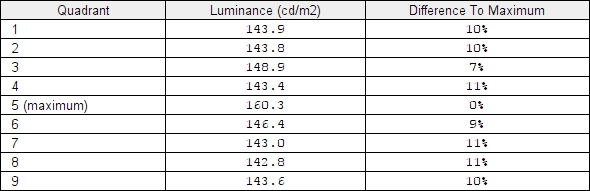
Luminance uniformity table
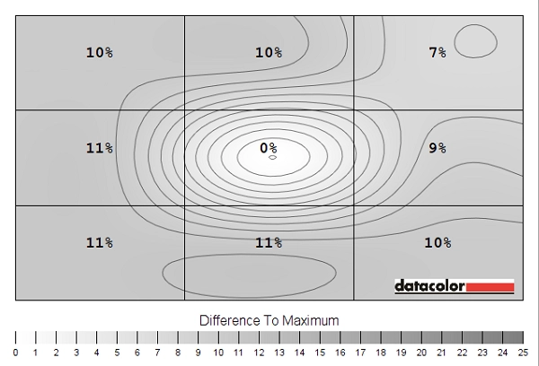
Luminance uniformity map
Contrast in games and movies
Lagom contrast tests
Colour reproduction
Colour gamut
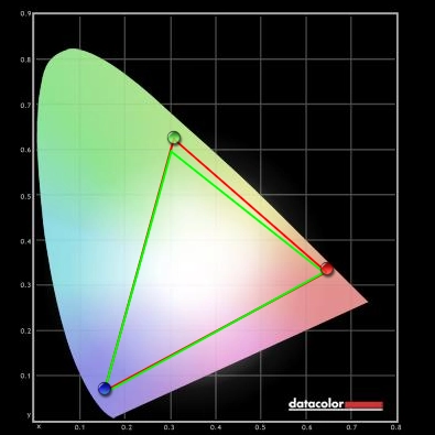
Colour gamut test settings
Colour in games and movies
Viewing angles
The video below shows the results of the Lagom text test, a mixed desktop background and dark desktop background from a range of viewing angles. Note the silver or golden sheen that blooms out more noticeably from sharp angles, as noted earlier on in the review. This is in no way as intense as ‘IPS glow’ or anything similar.
Responsiveness
Input lag
Perceived blur (pursuit photography)
Responsiveness in games and movies
Interlace pattern artifacts

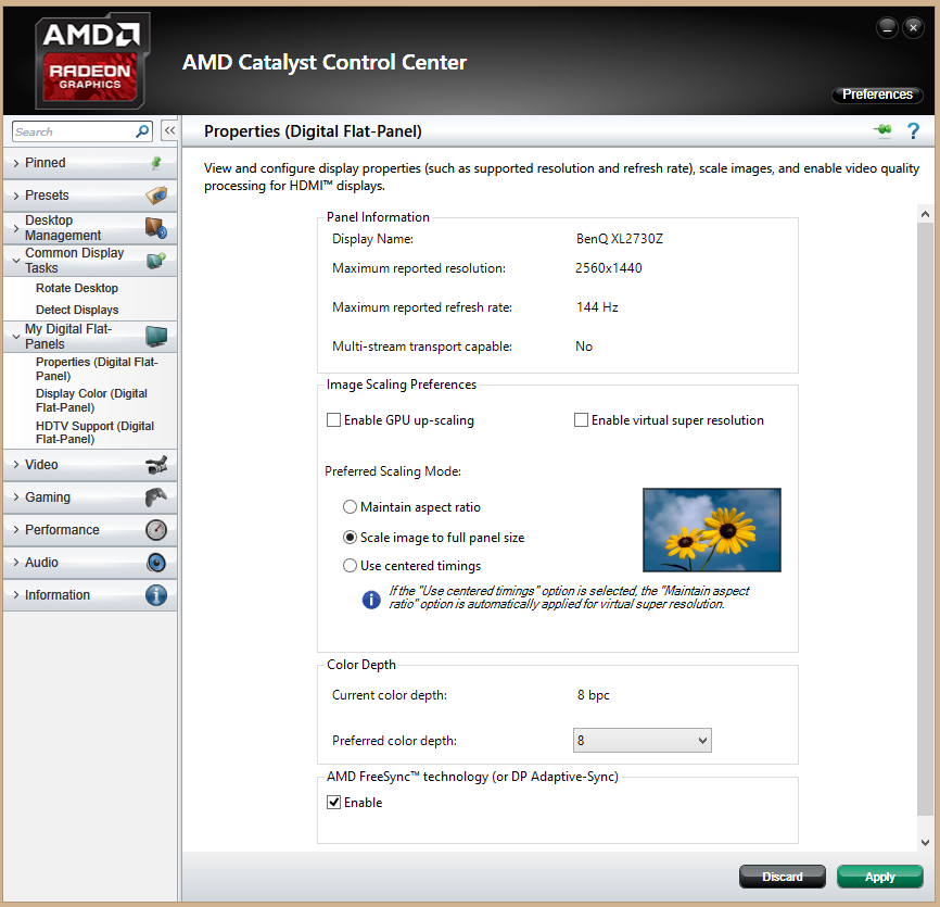
FreeSync – the technology and activating it
As noted above the XG2401 supports Adaptive-Sync and therefore AMD FreeSync via DP 1.2a. Our test system uses a Club3D Radeon R9 290 royalAce, a GPU that is compatible with FreeSync. AMD’s recent drivers include Radeon Software Crimson, which makes activation of the technology very straightforward. It should be automatically enabled by default, but you can check this by opening ‘AMD Radeon Settings’ and clicking ‘Display’. You should then ensure that the first slider, ‘AMD FreeSync’, is set to ‘On’. If you hover over this, it will also report the variable refresh rate display supported by the display. Note that the image below is for a different monitor and is purely provided for reference.
FreeSync – the experience
Video review
Conclusion
Positives Negatives Respectable richness given the panel used, aided by good gamma handling – plenty of good vibrant elements without the ‘washed out’ look accompanying many models using this panel
The usual TN viewing angle limitations, affecting perceived gamma and saturation levels vertically. Some tweaking to colour channels required in the OSD required for the best results
Decent static contrast, as specified, and no ‘IPS glow’ or anything of that nature to sap detail from the image towards the corners Perceived gamma changes affect visibility in dark areas, depending on where on the screen you’re looking. The screen surface also provided a bit of a grainy look to light shades Very low input lag and exceptionally low signal delay, with decent pixel responsiveness for 144Hz – plus AMD FreeSync support. Many boxes ticked for a fluid, enjoyable and connected gaming experience
Some weaknesses in pixel responsiveness apparent at lower refresh rates in particular, although if you’re stuck with 60Hz (console use, perhaps) then the ‘Advanced’ response time setting may offer a better balance here
Full ergonomic flexibility, solid construction and a well-rounded package for the price
The button order for the OSD controls is counter-intuitive
![]()

