Author: Adam Simmons
Date published: November 5th 2015
Table of Contents
Introduction
In our considerable experience with ‘4K’ UHD (Ultra High Definition) monitors, it’s the moderately large screens (around 32”) that seem to give the most balanced and well-rounded experience. The Samsung U32E850R features a 31.5” panel, which we feel is something of an ideal size to take good advantage of the resolution without forcing users to turn on scaling as an absolute necessity. The other headline feature of this model is its support for Adaptive-Sync and hence AMD FreeSync variable refresh rate technology. We put this monitor through its paces in a range of ‘real-world’ scenarios, including tests using game and movie titles.
Specifications
The monitor uses a 31.5” ‘4K’ UHD panel by Samsung, with 60Hz refresh rate PLS (Plane to Line Switching) technology. 10-bit colour is supported by way of 8-bits per subpixel plus 2-bit FRC dithering. A 4ms grey to grey response time is specified, which as usual should be taken with a pinch of salt. Some of the key ‘talking points’ of this monitor have been highlighted in blue below.
*Samsung have specified this as a monitor that supports ‘16.7 million colours’, suggesting 8-bits per subpixel. Our testing clearly showed this to use FRC dithering on top of this for 1.07 billion colours (as above). This is also confirmed by the EDID of the monitor, so it appears a mistake has been made in the official specifications.
Features and aesthetics
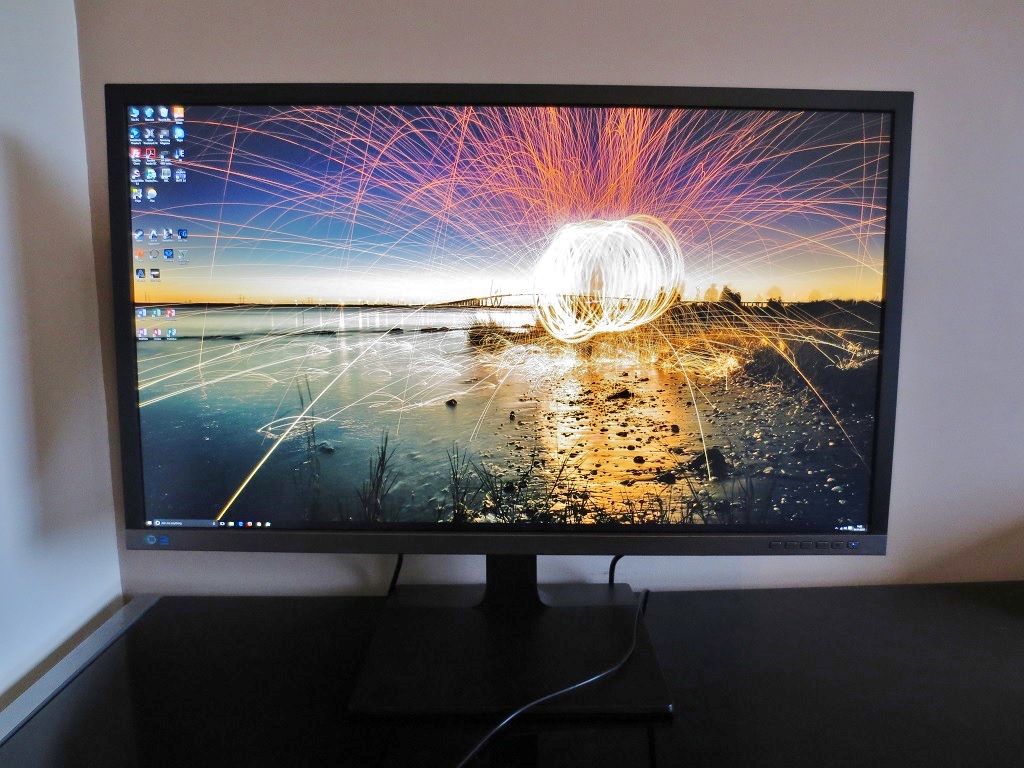
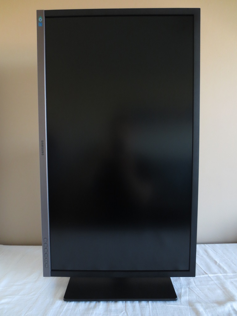
From the front you are greeted by a large (31.5”) screen. This has a very light matte anti-glare screen surface, explored a little later. In a bright room with the screen off (top image) you can see something of a blurry reflection of the cameraman and some objects in the room. Once the monitor is switched on and displaying an image (particularly brighter colours) or is placed in a more appropriate lighting environment, this ceases to be an issue. The bezels are matte black and 18mm (0.71 inches) at the top and sides. At the bottom a titanium silver (matte plastic) bezel is employed, with a thickness of 21mm (0.83 inches).
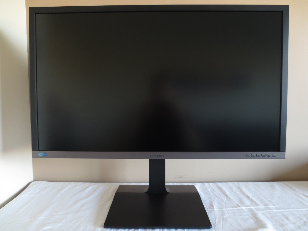
The right side of the bottom bezel has well-spaced and labelled tactile buttons. These control the OSD (On Screen Display) and power state of the monitor. The power button at the far right has a small pinprick power LED just above the power symbol. This glows blue when the monitor is on and flashes blue when on standby (low power state), unless the button is pressed to turn the monitor off in which case the LED will also switch off. The following video highlights the functionality of the OSD.
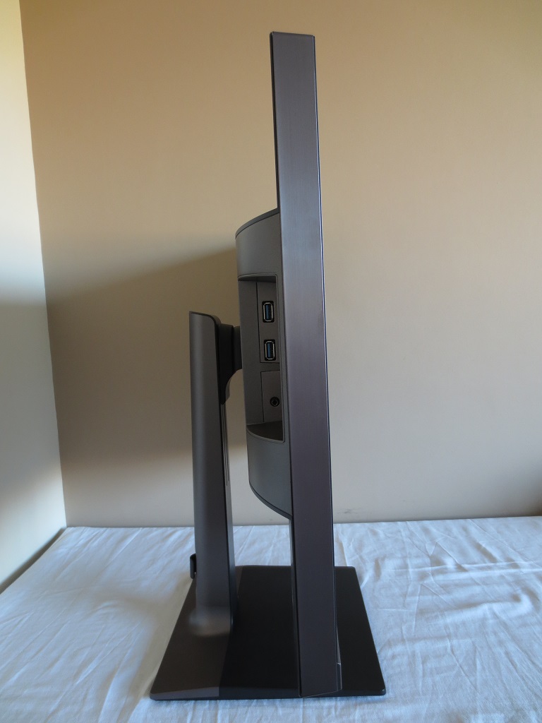
From the side the monitor is fairly slim at the thinnest point – 0.28mm (1.10 inches), lumping out centrally. The side of the screen area (‘thin part’) has a brushed metal coating. At the left side there are 2 USB 3.0 ports (with ’Super Charging’) and a 3.5mm headphone jack. The fairly robust and fully adjustable stand can also be seen. This offers good ergonomic freedom; screen tilt (5° forwards, 25° backwards), swivel (25° left, 25° right), height (130mm or 5.12 inches) and pivot (90° rotation into portrait). At the lowest height he bottom of the screen clears the desk by ~50.80 (2.00 inches) and the top of the screen clears it by ~484mm (19.06 inches).
The stand is quite deep, with the screen sitting >9 inches (>229mm) in front of the rear of the stand base. If you have your desk pushed up against the wall like we do or simply don’t want the base overhanging the rear of your desk then this may bring the screen a little closer than you’d like. At first the screen seemed very much ‘in your face’, coming from a 24” 16:9 model that we had become accustomed to immediately prior to testing this one. This was from a combination of the physical size difference and the fact the screen was brought a bit closer to our eyes than we’d like, unless we adopted a more relaxed posture on the chair than is usual. After some time we got quite used to this and it did allow the exceptional detail brought out by the pixel density (and the real-estate without using scaling) to be admired. So perhaps it’s not such a bad thing really.
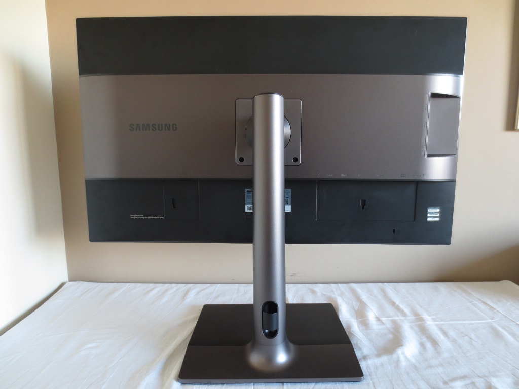
At the rear the central area, stand neck and rear section of the stand base uses titanium silver coloured matte plastic. Matte black plastic with a subtle brushed metal texture is used elsewhere. Towards the bottom of the stand neck is a cable tidy. The included stand can be unscrewed and an alternative VESA 100mm solution used in its place. There is a K-Slot towards the bottom right, too.
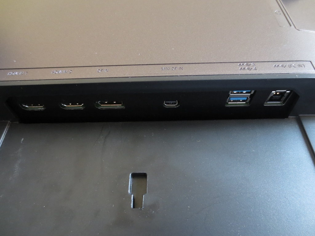
The ports are down-firing. To the left of the stand neck there is an AC power input (internal power converter). To the right there is; HDMI 1.4, HDMI 2.0, DP 1.2a (with Adaptive-Sync), MiniDP 1.2a (with Adaptive-Sync), 2 further USB 3.0 ports (4 total) and USB 3.0 upstream. Note that HDMI 1.4 is limited to 30Hz @ 3840 x 2160 (or 60Hz @ 1920 x 1080), with HDMI 2.0 and the DP inputs supporting 60Hz @ 3840 x 2160. An HDMI cable, MiniDP – DP cable, USB 3.0 upstream cable and power cable are included (may vary in some regions).
Calibration
Subpixel layout and screen surface
A very light matte screen surface is employed by the monitor (some users might refer to it as ‘semi-glossy’). This has a very smooth finish, which is to say it is one of the least grainy-looking matte surfaces you’ll see. It therefore preserves vibrancy and clarity a lot better than some matte screen surfaces, which is certainly appropriate for a monitor of this pixel density. The anti-glare properties of the matte surface also offer good glare handling in moderately bright conditions.
![]()
The typical RGB (Red, Green and Blue) stripe subpixel layout is used, which is the default expected by modern operating systems such as Microsoft Windows and Apple MacOS. Apple users needn’t worry about fringing of text whilst Windows users needn’t worry about running ClearType to optimise sharpness. Users may still wish to run through the ClearType wizard simply to adjust according to preferences, however.
Testing the presets
This monitor has a few ‘MagicBright’ presets as well as a range of other settings that users can tweak. We explore the more interesting preset options as well as some other options such as different ‘Gamma’ modes and ‘Color Tone’ settings. The table below shows our observations using various different setting combinations as well as gamma and white point readings provided by a Datacolor Spyder5ELITE colorimeter. The monitor was connected to a system running Windows 10, via DisplayPort, to a Club3D Radeon R9 290 royalAce FreeSync-capable GPU. The monitor driver included with the monitor was loaded as sometimes this is required to unlock the appropriate FreeSync refresh rate range – although in this case it seemed no difference to the default ‘Plug and Play’ driver. Unless otherwise stated assume anything not mentioned in the table below was left at default.
| Monitor Settings | Gamma (central average) | White point (kelvins) | Notes |
| Gamma = Mode1 (Factory Defaults) | 2.1 | 5867K | The image appears quite well balanced overall, aside from the uncomfortably high brightness. The white point is a bit on the warm side if you’re targeting 6500K, although that isn’t obvious by eye in most typical home/office lighting conditions. Some dark shades appear slightly lighter than they should. |
| Gamma = Mode2 | 2.3 | 5844K | As ‘Mode1’ with a bit of extra depth in places and a more balanced look to darker shades. |
| Gamma = Mode3 | 2.5 | 5847K | As ‘Mode2’ with extra depth. Many shades appear too deep and the distinction between closely matching dark shades is poor. |
| Color Tone = Warm2 | 2.2 | 4410K | This is a highly effective ‘Low Blue Light’ setting, with a huge reduction in blue light output (and corresponding reduction in colour temperature). The brightness is also reduced fairly significantly, with independent control of brightness maintained for further reduction. |
| Eye Saver Mode | 1.9 | 4697K | This is an alternative ‘Low Blue Light’ setting, which not only reduces the colour temperature but also limits the brightness to a much dimmer (but still reasonable) value. In addition, contrast is reduced significantly, making things appear ‘flooded’ – this is intentional as it arguably improves viewing comfort. |
| Game Mode | 2.1 | 5915K | As usual this mode is insulting to the capabilities of the monitor, to put it bluntly. The image is overly sharp and significantly over-saturated, which is uncorrectable. It does not present a natural look to games or one that the creators will have intended. |
| Test Settings (modified as below) | 2.2 | 6510K | The image is very nicely balanced with a vibrant, varied and accurate representation of shades. |
Out of the box the monitor was exceptionally bright but reasonably well balanced really. The white point was some way off the 6500K target (if that’s what you’re targeting) and gamma a bit below the 2.2 target, but aside from some dark shades appearing lighter than they should things were quite well represented. There are two further gamma settings; ‘Mode2’ which helped improve low end shade representation and ‘Mode3’ which made things very deep and quite striking at the expense of accuracy. We preferred the representation of ‘Mode2’ and adopted this for our test settings, with the gamma curve for these shown below. As you can see tracking strays a little from the ‘2.2 curve’ at the mid-low end. The deviation is not to a troublesome degree, perhaps only to users who should really be performing their own individual calibration anyway. There were two very effective ‘Low Blue Light’ settings. The first was the ‘Warm2’ setting for ‘Color Tone’, which significantly reduces the blue light output by lowering the blue colour channel significantly and hence reducing the white point. There is also a relatively recent addition to Samsung monitors, the ‘Eye Saver Mode’. This not only significantly reduces the white point by chopping away at the blue colour channel, it also locks the brightness to a low but in our opinion quite practical level for evening viewing where this mode would be most useful. The contrast is also hugely restricted, which is intentional as it could potentially reduce the fluctuation in light levels entering the eye and hence reduce the eye’s need to adapt to such changes. In practice we did find this mode comfortable, but no more so than using ‘Warm2’ with appropriate lighting in the room. Also note that the fixed brightness level in the ‘Eye Saver’ is so low that PWM (Pulse Width Modulation) is used and therefore the backlight flickers – refer to the relevant section later on in the review. For our ‘Test Settings’ we significantly reduced brightness, adjusted the colour channels manually and switched over to ‘Mode2’ for ‘gamma’. With this the image appeared rich and nicely balanced with a good subtle shade variety. Any setting not mentioned below was left at default. We’ve also included the ‘Response Time’ setting we used just for reference. Response Time= Faster R= 37 G= 43 B= 50 Gamma= Mode2 A Konica Minolta CS-200 luminance meter was used to measure the white luminance and black luminance using a range of monitor settings. From these readings, static contrast ratios were calculated. This data is presented in the table below, with blue highlights indicating the highest white luminance, lowest black luminance and peak contrast ratio recorded. Black highlights indicate the results under our ‘Test Settings’. Except for these ‘Test Settings’ and any setting listed in the table, assume settings were left at default.

Gamma test settings
Test Settings
Brightness= 30 (according to preferences and lighting)
Contrast and brightness
Contrast ratios
Monitor Profile White luminance (cd/m²) Black luminance (cd/m²) Contrast ratio (x:1) 100% brightness 368 0.32 1150 80% brightness 317 0.28 1133 60% brightness 265 0.23 1152 40% brightness 209 0.18 1161 20% brightness 123 0.11 1118 0% brightness 16 <0.02 >800 Gamma = Mode2 371 0.32 1230 Gamma = Mode3 368 0.32 1150 Color Tone = Warm2 312 0.32 975 Eye Saver Mode 110 0.96 115 Game Mode 368 0.34 1082 Test Settings 169 0.16 1056
The average static contrast on the Samsung U32E850R with only brightness adjusted was a very respectable 1143:1. This excluded results at ‘0’ brightness, due to lack of black luminance measurement accuracy for such low values. The contrast dropped slightly to a still decent 1056:1 following the adjustments made to our test settings and to 975:1 using the ‘Warm2’ mode. The most noticeable reduction, of course, occurred when ‘Eye Saver Mode’ was active – 115:1, intentionally low contrast as explained previously. With a maximum luminance of 368 cd/m² and minimum white luminance of a very dim 16 cd/m² recorded in this table, the luminance adjustment range is an exceptional 352 cd/m².
There is a dedicated ‘Dynamic Contrast’ mode (‘MagicBright’ preset) which takes control of the monitor backlight and allows it to dim or brighten in accordance with the relative lightness or darkness of the image on screen at a given time. As usual for a Samsung ‘Dynamic Contrast’ implementation, the mode works effectively with a broad luminance adjustment range. Due to the powerful nature of the backlight, though, the brightness tended to be uncomfortably bright even during mixed content with a fair bit of dark. It did dim effectively for the darkest content, but given that the backlight dims as one unit (BLU or Backlight Unit) it can’t compensate for complex mixtures of bright and dark properly. This is the case with all LCD monitor ‘Dynamic Contrast’ settings. It isn’t something we’re a fan of, but it’s there if you want to use it.
PWM (Pulse Width Modulation)
The monitor uses a hybrid dimming solution. It does not use PWM (Pulse Width Modulation) as long as the brightness is kept at ‘30’ or above in the OSD, with DC (Direct Current) being used for brightness control instead. It is therefore flicker-free under such conditions, which will come as welcome news to some users. At brightness levels of ‘29’ or lower, PWM is used with a cycling frequency of 240Hz. As noted previously, this means that the ‘Eye Saver’ setting actually forces the use of PWM. If you’re after a ‘Low Blue Light’ setting without backlight flicker then we’d recommend ‘Warm2’ with appropriate brightness (30 or above) instead.
Luminance uniformity
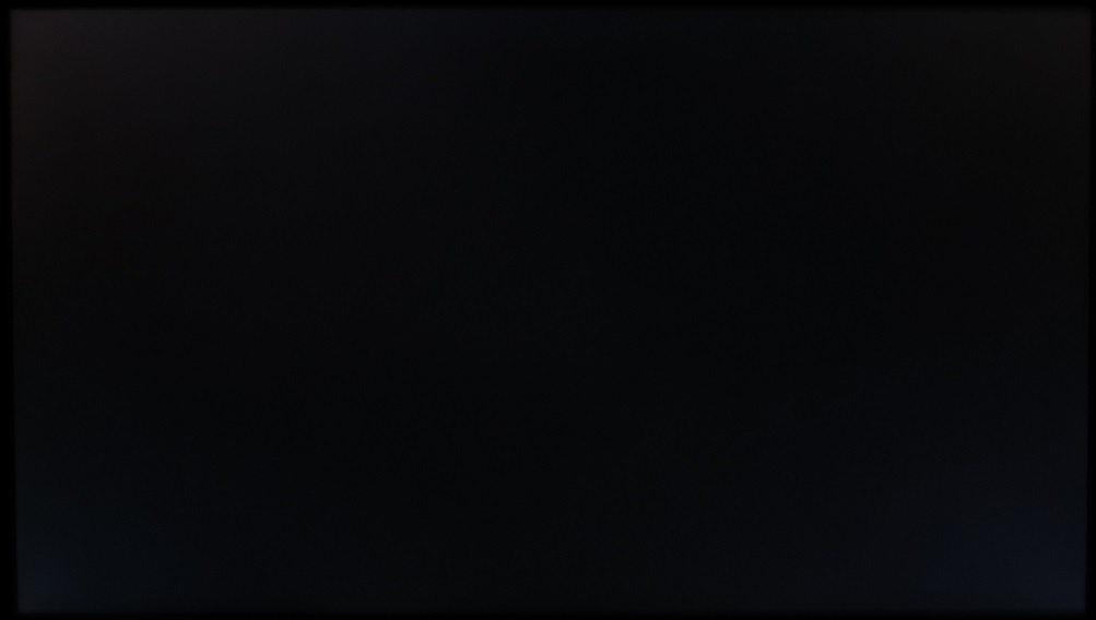
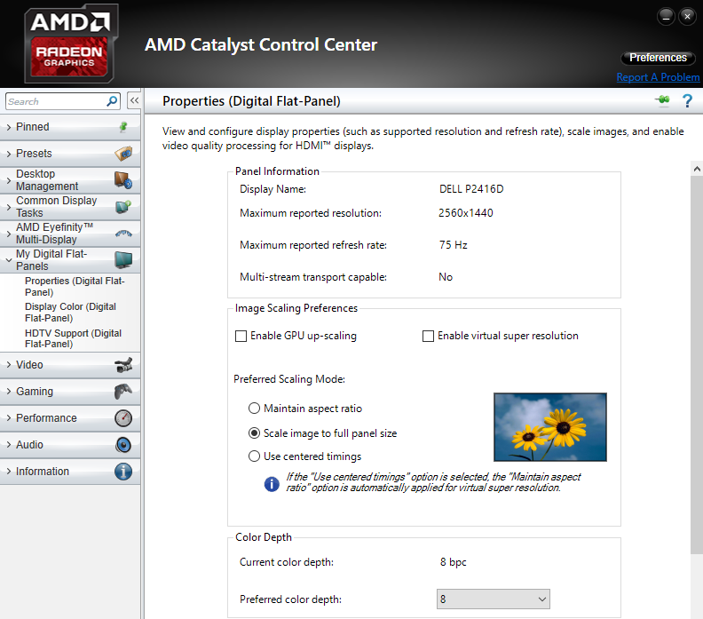
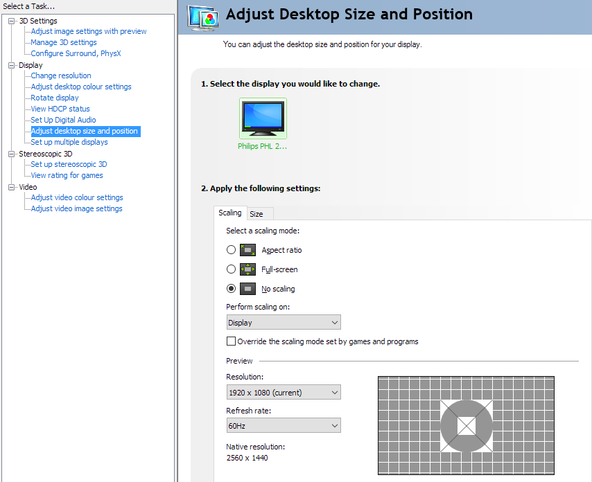
Whilst observing a black screen in a dark room we observed a very small amount of backlight bleed towards the top right corner. The image below shows this, taken from a few metres back to eliminate ‘PLS glow’. This glow (not shown in the image) can be seen from a normal viewing position as a cool silver or golden glow towards the corners of the screen. Given the size of the screen this is actually fairly pronounced and was much as we’d expect from an IPS-type panel of this size. The glow was not subdued in the same way as we’d seen on the BenQ BL3201PT/PH, but still isn’t something that will bother all users. This glow blooms out more noticeably if you move your head, shown a video later on in the review. The luminance uniformity was quite variable. The maximum luminance was recorded at ‘quadrant 9’ towards the bottom right of the screen (171 cd/m²). The greatest deviation from this occurred at ‘quadrant 1’ towards the top left of the screen (137.8 cd/m², which is 19% dimmer). ‘Quadrant 3’ towards the top right also showed quite some deviation from the brightest point (143.1 cd/m², which is 16% dimmer). The quadrants in the bottom and central region showed much lower deviation, from 1% at ‘Quadrant 5’ (centre) to 11% at ‘Quadrant 4’ (to the left of centre). Note that individual units can vary when it comes to uniformity and also that there may be further deviation beyond the points measured. For those who prefer a graphical representation, the contour map below shows these deviations with darker greys showing lower luminance and hence greater deviation from the brightest point than lighter greys. The percentage deviation between each quadrant and the brightest recorded point is also given. The Spyder5ELITE was also used to analyse variation in the colour temperature (white point) of the same 9 quadrants. Below is a contour map showing the deviation between each quadrant and the 6500K (D65) daylight white point target. Deviations here are given DeltaE values, with a Delta E <3 representing deviation that most users wouldn’t readily notice by eye and a Delta E >3 representing significant deviation which most users would notice by eye. Lighter colours on this map represent lower deviation from 6500K than darker colours. The results here were strong with no significant deviation. The point measured closest to 6500K was towards the top left, whereas the maximum deviation was DeltaE 2.4 at the bottom left. As with other aspects of uniformity, there may be variation beyond the recorded points and also between individual units of the same model. On Battlefield 4 (BF4) the contrast performance was pleasing overall. There was some detail lost in dark areas peripherally, due to the aforementioned ‘PLS glow’. This was particularly prevalent towards the bottom corners from our normal viewing position. More central areas and indeed the majority of the screen exhibited good detail levels in dark areas. They didn’t look flooded or patchy with obvious unintended detail, either, so maintained a good atmosphere overall. The high end was bright and ‘clean’ (with very little graininess from the screen surface), allowing lighter shades to stand out nicely whilst looking smooth. On Dirt Rally the contrast performance was also pleasing overall. There was again some weakness in dark visibility towards the bottom two corners of the screen in particular, due to ‘PLS glow’. This was most noticeable on the night stages where the darkness was penetrated by quite obvious ‘glow’ in these areas. Elsewhere the detail levels in dark areas were good, with even subtle details such as car tyre tread patterns coming through. Bright elements contrasted well, appearing bright and ‘smooth’ (with only a very light misty grain from the screen surface). We also used the Blu-ray of Skyfall to aid our assessment of contrast. Due to the format of the film (’16:9 letterbox’) there were fairly sizeable black borders at the top and bottom which ‘absorbed’ a fair bit of the ‘PLS glow’. There was a bit of glow penetrating into the image itself, but for the most part detail levels in dark areas and the overall atmosphere of the screen was decent. Bright elements such as explosions and neon lights penetrated the surrounding darkness nicely, appearing to ‘pop’ quite nicely thanks to the non-grainy screen surface. This smoothness and ‘brilliance’ for the brighter shades was not on par with a decent monitor with glossy screen surface, but was much better than most matte surfaces. The Lagom tests for contrast were used to more closely analyse specific strengths and weaknesses in contrast performance. The following observations were made. In the following image, the colour gamut of the U32E850R (red triangle) is compared with the sRGB colour space (green triangle). The monitor covers the sRGB space fairly comprehensively, with just a little bit of under-coverage in the red region of this diagram. There is also some extension beyond sRGB, most noticeably in the green region of this diagram. This does not extend to the boundaries of wide colour gamuts such as Adobe RGB and serves to offer some extra saturation and vibrancy without introducing potentially obnoxious oversaturation for standard gamut (sRGB) content. This works nicely for gaming and general purpose use and can be counteracted quite effectively with a colorimeter or similar device if higher levels of colour accuracy are desired. As you can see, the monitor fully covers the sRGB colour space with some extension beyond this in the green and red regions of the diagram. The colour space is very similar regardless of the preset mode used. This allows the monitor to represent all shades within the sRGB colour space, with a bit of extra vibrancy in places. If colour accuracy is critically important then a decent colorimeter will be able to compensate for this over-extension quite effectively. The colour representation on BF4 was impressive both in terms of vividness and shade variety. Shades that should stand out well did so – for example glowing orange fires, bright yellow and blue painted objects and the piercing violet and blue flame of the engineer’s blowtorch. Meanwhile more muted shades exhibited excellent pastel qualities with pleasing consistency. This allowed the in-game environments to look natural and appropriate – with good earthy browns and an excellent palette of greens, for example. Distinctions between closely matching shades were strong due to the consistency at various points of the screen. This helped bring out richness and individuality, which is lost on panel types with weaker viewing angles on screens that are anywhere near this size. There was also a pleasing variety and depth to shades on Dirt Rally. This helped the various racing environments look natural and individual – in other words, much as they should look. The consistency of shades across the screen brought out an excellent range of subtly different green and brown hues, for example. The monitor also represented more vivid colours with appropriate flair, most noticeably the deep reds and blues on some of the car liveries. Highlighter greens and yellows were also impressive – most shades had decent vibrancy where it was intended, in fact. The fairly generous colour gamut, very light matte screen surface and panel type all helped contribute towards this. Shades looked in-place and natural on the Blu-ray of Skyfall. Skin tones and natural environments appeared with appropriate saturation and showed good subtle distinction between closely matching changes. There were also some good vibrant colours such as a fairly striking red dress worn by Miss Moneypenny, rich orange candles in the Macau scenes and some good deep blue (and bright cyan) neon lights in the Shanghai scenes. To round off this section we tested the Blu-ray of Futurama: Into the Wild Green Yonder. This is a good test for colour consistency, featuring large areas of individual shades. In this respect the monitor performed well. There was just the slightest lightening towards the edges for some shade, but this was much more subtle than the gamma shifts you’d see on VA or TN panels and was largely a slight uniformity issue with our unit for certain shades (explored a little more in the subsequent section). This strong consistency allowed a strong variety of pastel shades to be displayed, with various characters having their own identity for clothes and skin tone even though some differ only slightly from those of some of the other characters. There were plenty of impressive neon shades such as greens, pinks and yellows and various good deep shades as well. These were presented in a vivid way. Lagom’s viewing angle tests were used to more closely analyse colour consistency and possible viewing angle limitations of the monitor. The following observations were made from a normal viewing position, around 70cm from the screen. A small utility called SMTT 2.0 was used alongside a very sensitive camera to analyse the latency of the U32E850R. A range of monitors of known latency were used to compare with, taking over 30 repeat readings to aid accuracy. The monitor was compared to a range of screens of known latencies by using this method of side-by-side comparative testing. We calculated 5.13ms (under 1/3 of a frame) of input lag. This value is influenced both by the signal delay (the element you ‘see’) and pixel responsiveness (the element you ‘feel’) and indicates a very low signal delay. As with the BL3201PT/PH, the signal delay is essentially negligible and as low as we’ve seen from UHD models. Even sensitive users shouldn’t find this aspect of the monitor troubling. In this article we explore various factors which affect the responsiveness of monitors. Key amongst them is the idea of ‘perceived blur’, which is contributed to most significantly by the movement of your own eye when tracking motion on a screen. We also introduce the concept of ‘pursuit photography’, which is designed to capture motion on a monitor in a way that is quite representative of what the eye sees. By using a moving rather than static camera, it is possible to capture the elements that contribute to perceived blur. Not only the pixel responsiveness of the monitor and any artifacts (overshoot, for example), but importantly the influence of camera (eye) movement as well. The following images are pursuit photographs captured using the UFO Motion Test for ghosting. The test is running at 960 pixels per second, which is a practical speed for such photographs and reflects what your eye actually sees during the test very nicely. The first three photographs show the results with the medium cyan background (middle row of the test) and the monitor set to each of its respective ‘Response Time’ settings; ‘Standard’, ‘Faster’ and ‘Fastest’. The fourth photo shows results with the light cyan background (bottom row of the test) and the ‘Faster’ response time setting. The fifth and final photo shows a fast 60Hz reference whereby pixel responsiveness isn’t a limiting factor. This is a Samsung S27A750D set to full brightness (eliminates PWM) and 60Hz, using its ‘Faster’ response time setting. With the ‘Normal’ setting, you can see that there is a significant degree of blur on top of what you would ideally see at 60Hz (i.e. the 60Hz reference). This is caused by far slower than optimal pixel transitions. Using the ‘Faster’ setting cuts this down significantly. There is still some blur (trailing from slower than optimal pixel responses) with the ‘Medium’ background but this is much weaker compared to the ‘Standard’ setting. With the ‘Light’ background there is some very light overshoot (inverse ghosting) visible, but very little in the way of conventional trailing. There is therefore very little additional overall perceived blur on top of that expected (60Hz reference). Using the ‘Fastest’ setting introduces obvious and unsightly overshoot from grey to grey acceleration that’s far too aggressive. This is extremely obvious and widespread during normal use. From this analysis and indeed general use it’s quite clear that the ‘Faster’ setting, which is default, is optimal. In our subsequent analysis we look at a much broader range of transitions using this setting, during gameplay. Note that we will not be including a section on ‘overclocking’ as the monitor could only be set to an astounding 61Hz before significant frame skipping was observed. Needless to say the benefit of this compared to 60Hz is as good as nil. On BF4 there was a moderate degree of blur, but this was largely as you’d see on even the fastest 60Hz sample and hold monitors. For the most part the pixel responsiveness was not a limiting factor, so the blur you observe would be similar regardless of how fast and cleanly the pixel transitions could theoretically be performed. There was a bit of trailing from slower than optimal pixel responses here and there, particularly where transitions occurred between various medium-dark shades. When strafing past a gun metal grey turret with dark and gloomy sky in the background, you could see a somewhat exaggerated trail. It didn’t appear as an obvious ‘smoky’ trail like on some VA panels nor did it stick out like a sore thumb. It is unlikely to bother most users, unless said users take issue with 60Hz monitors in general. Still, it’s important to note that there were some weaknesses in pixel responsiveness evident for such transitions. There was also some light overshoot in places, particularly where medium-dark and medium-light shades move against one another. When strafing past some rocks or tree trucks with a bright blue sky in the background, for example, you can see a slight trail that is brighter than either shade involved in the transition. In some cases this appears a bit stronger than in the Test UFO demonstration with the light cyan background, but it is still quite light and not something most users would notice or find obtrusive in our opinion. Our observations were similar on Dirt Rally. Overall things were much as you’d see on even the fastest 60Hz LCDs, with eye movement causing most of the perceived blur. There was again some trailing on top of this from slower than optimal pixel transitions, particularly between closely matching medium-dark shades. Whilst driving past darker areas of vegetation, for example, there would be a little extra blur on top of what you might see on some 60Hz models. This was fairly minor and would escape the notice of most users, however. Also minor and to most something that will be either unnoticeable or not at all irksome is the small amount of overshoot here and there, particularly between lighter shades. When observing lighter areas of sky whilst driving past bright green tree tops, for example, there was a hint of this. We are highlighting these issues just for completeness, the take home message is really that performance was much as you can hope for from a 60Hz LCD. We also tested the Blu-ray movie titles used for our review and observed for any weaknesses attributable to pixel response behaviour. There were no issues to report, without any observable overshoot or trailing from sluggish pixel responses. The pace of action here is limited by the low frame rate at which these titles run, at around 24fps. AMD FreeSync is a variable refresh rate technology, which is introduced in the ‘Variable refresh rate’ section of our responsiveness article. As with Nvidia’s G-SYNC technology, the aim is to dynamically adjust the monitor’s refresh rate so that it matches the frame rate outputted by the GPU. Both of the articles we’ve just linked to explain why this is important, so we won’t repeat those technical intricacies here. Suffice to say that having the frame rate and refresh rate synchronised is important to eliminate the stuttering (VSync on) and tearing or juddering (VSync off) caused by frame rate departing from the refresh rate. There is also a reduction in latency compared to enabling VSync, although as explored previously we don’t have the means to empirically measure that difference in an accurate way. Although the end goal of both AMD FreeSync and Nvidia G-SYNC is the same, the process of achieving this is somewhat different. G-SYNC requires the use of a proprietary ‘G-SYNC chip’ which is integrated into the screen and replaces the traditional scaler and assistive electronics of the monitor. One of the advantages of this is that it allows Nvidia to regulate some aspects of calibration and responsiveness (pixel overdrive implementation) to try to ensure an optimal experience. The key benefit of FreeSync is that it doesn’t require additional hardware and instead relies on the ‘Adaptive-Sync’ protocol which is an optional extension of the DP 1.2a standard. The original scaler and assistive electronics are used and you retain the usual manufacturer-specific OSD options and port selection. The end product usually ends up a fair bit cheaper as there isn’t a ‘G-SYNC premium’ attached to it from the use of additional proprietary hardware within the monitor. The Samsung U32E850R uses DP 1.2a+ and therefore supports the Adaptive-Sync protocol and hence AMD FreeSync via DisplayPort. You need a compatible AMD GPU to use FreeSync, such as the Club3D Radeon R9 290 royalAce that we’re using. There is a list of compatible models here and in addition it’s expected that most if not all future GPUs from AMD will be compatible. Upon connecting the monitor for the first time, assuming you have AMD’s Catalyst Control Centre (CCC) installed, you will be given a notification that you’ve got a FreeSync-capable display and should enable the technology. To do this you simply open CCC and navigate to ‘My Digital Flat-Panels – Properties (Digital Flat-Panel)’, ensure the checkbox at the bottom of the page is ticked and then press ‘Apply’. This page and checkbox is shown in the image below. There are a few important things to note which are specific to FreeSync and this monitor: 1) There are some options related to FreeSync in the monitor menu, which are explored in the ‘OSD video’ featured earlier. They found in the ‘System’ part of the menu under ‘FreeSync’. There are basically two options that can be used for FreeSync; ‘Standard Engine’ and ‘Ultimate Engine’. The former provides a 50Hz – 60Hz variable refresh rate range, whereas the latter allows a broader 40Hz – 60Hz range. There were no downsides observed to enabling ‘Ultimate’ rather than ‘Standard’. This second option seems a bit redundant, so we’d just recommend sticking to ‘Ultimate Engine’. 2) Outside of the operating range (40 – 60Hz) the GPU will respect your selection of ‘VSync on’ or ‘VSync off’ in the graphics driver. If you’re using ‘VSync on’ you will get stuttering if the frame rate dips below 40fps and the usual VSync latency penalty if it tries to rise above 60fps. With ‘VSync off’ you get tearing or juddering both below 40fps and above 60fps. GTA V is a graphically demanding game, which becomes readily apparent if you try to run it at 3840 x 2160 with some of the nice bells and whistles enabled in the graphics options. Unless you have a monstrously powerful system, of course. With our single Radeon 290 we’d have to make monumental sacrifices in image quality to be able to sustain 60fps reliably at the native resolution (and even then, there would be no guarantees). By making more modest changes to the graphics options, we were able to keep the game looking very pleasant whilst also running within the FreeSync window of 40-60fps pretty much all of the time. Whereas these dips below 60fps would cause obnoxious stuttering or palpable tearing without using a variable refresh rate technology, the experience is now free from such annoyances. It is worth saying that 40fps is not the same as 60fps, as there is additional motion blur and a somewhat less connected feel to the game world. It is worlds away from the stuttery or juddery tear-ridden mess that presents itself when the technology is disabled, though, and really does make the difference between the game being playable and enjoyable or not. BF4 was similar in many respects. Although somewhat less demanding in general, there are certainly plenty of options there that can bring pretty much any system to its knees when trying to run at the 3840 x 2160 ‘4K’ UHD resolution. High levels of MSAA (Multisample Anti-Aliasing), for example, can be a real killer. And of course there is that wonderful ‘resolution scale’ slider that some users might like to play around with that is essentially like a sort of supreme AA filter. With our system we obviously couldn’t crank up the settings quite that much without killing the frame rate such that it consistently fell below the 40fps FreeSync floor. We were able to use settings which gave a nice balance of image quality and performance at this resolution, though, and which also maintained a frame rate within the FreeSync operating window quite consistently. There were some momentary drops below 40fps when the action really intensified, but generally things stayed above that. As with GTA V it’s important to say that ‘the higher the frame rate the better’ does still apply with regards to motion blur and connected feel. But being able to dip below 60fps without everything basically grinding to a halt or becoming intolerable to look at and interact with makes a world of difference. We could of course go on and talk about experiences in other games such as Titanfall, ESO, Dirt Rally and Warframe which all benefited in some way from FreeSync. But we think you get the picture. The UHD resolution is demanding and frame rates can be unpredictable in games. Being able to game at such a resolution without worrying that even the slightest dips below 60fps will destroy the experience is really a very nice thing indeed. We’ve tested a broad range of ‘4K’ UHD (Ultra High Definition – 3840 x 2160) monitors of various sizes, ranging from around 24” to 40”. In this article we explore some key points to bear in mind when considering UHD monitors. The main article is written from the perspective of a 28” screen (which by connection gives a very similar experience to the more ubiquitous 27” screens) but also links to models we’ve tested of various other sizes. With its 31.5” screen, the Samsung U32E850R yields a pixel density of 139.87 PPI (Pixels Per Inch). We’ve explored the sort of experience this pixel density provides in the section of our BL3201PT/PH review entitled “The ‘4K’ UHD experience”, around three quarters of the way through the review. Given that the practical difference between the 32” screen of the BenQ and 31.5” screen of the Samsung is negligible in this respect, we won’t be repeating a lot of this information. The take home message is essentially that we find the ~32” screen size to be something of a sweet spot for the UHD resolution. It provides a comfortable viewing experience without scaling for us from our preferred viewing distance of ~70cm – although mileage may vary according to preferences, eyesight and preferred viewing distance. This provides a large working area both in terms of physical space but also, importantly, useful work area. Text and image clarity is excellent and you can fit a lot on the screen at once, as demonstrated by the images below. The monitor runs natively at 3840 x 2160 – that is how many pixels it has horizontally by vertically. If you wish to run the monitor at a lower resolution than this, such as 2560 x 1440 or 1920 x 1080, an interpolation scaling process is used. You may wish to connect up a games console, for example, or drop the resolution on games which are too demanding to run at the 3840 x 2160 ‘4K’ UHD resolution on your system. As a PC users, you need to ensure that the monitor is handling the interpolation rather than the GPU for optimal results. AMD users can simply leave everything as it is by default, as the factory defaults will allow the monitor to handle the scaling. To double check things are correct, open Catalyst Control Centre and navigate to ‘My Digital Flat-Panels – Properties (Digital Flat-Panel)’. Ensure ‘Enable GPU scaling’ is unchecked (not ticked) and hit apply if this box was originally checked and you have unchecked it. Things should be setup in a similar way to the below image on modern AMD drivers with the Catalyst Control Centre. Nvidia users should open Nvidia Control Panel and navigate to ‘Display – Adjust desktop size and position’. Ensure ‘No scaling’ is selected and ‘Perform scaling on:’ is set to ‘Display’ as shown in the image below. When running the monitor non-natively at 1920 x 1080 (Full HD) there is a moderately high degree of softening compared to running Full HD natively on a screen of similar size. Whilst things don’t look as soft as we’ve seen on some models, there is a definite loss of detail and ‘blurring’ on textures and object edges in games. So whilst you could run a games console as a secondary use for the monitor, for example, it really isn’t ideal for that purpose. As a PC user you have the flexibility to drop down to 2560 x 1440 (WQHD) rather than 1920 x 1080 if you are finding your system is struggling a bit. Again, things simply aren’t as sharp as when viewing 2560 x 1440 natively on a screen of similar size. The softening is less jarring than at 1920 x 1080, however. Things actually still look fairly respectable in terms of detail and just the overall clarity. We certainly feel this is useable as a fall back, even if not ideal. As a PC user watching native 1920 x 1080 content such as Blu-ray movies through software, you would generally leave the monitor at its native resolution of 3840 x 2160. By doing this the monitor does not handle the scaling and instead the GPU or movie software ‘upscales’ the content to fit the native resolution of the screen. This leads to a relatively minor softening of the image compared to viewing this content on a native 1920 x 1080 screen. It is worlds away from the softening that occurs when the monitor interpolates 1920 x 1080. Having tested another UHD monitor of very similar size, the BenQ BL3201PT/PH, it was no surprise to feel right at home with the U32E850R. The thought of a 31.5” or 32” monitor may have seemed rather strange a few years backs, as until relatively recently it was a size reserved for TVs rather than monitors. With the 3840 x 2160 ‘4K’ UHD resolution, though, it starts to make a lot more sense. Not only does it provide a strong pixel density for excellent clarity and detail when gaming, it provides a large screen area to make for an engrossing experience. With that many pixels, the monitor can also make good use of the screen space from a productivity perspective – giving users an excellent workspace without forcing them to reach for the scaling bar. But what about the U32E850R itself? Overall, the performance was pleasing and it was enjoyable to use and review. Out of the box the image was very bright, but fairly rich and well balanced really. With the OSD options afforded by Samsung, including a variety of gamma settings, it was quite straightforward to add that edge in richness and improve the overall balance further. And of course reduce that searing brightness. Whilst the gamma tracking wasn’t perfectly adherent to the standard ‘2.2’ curve, it did come close enough to provide a good experience for all-round use and give quite accurate shade representation. The slight modifications to the curve also allowed the monitor to show marginally enhanced visibility in dark scenes, but not to an extent that affected the gaming atmosphere. There was no patchy, artificial ‘oil slick’ look as you get with stronger low-end gamma enhancements. Contrast was quite as you’d expect overall, with the usual ‘PLS glow’ and a fairly standard contrast ratio for the panel type. This glow was somewhat stronger than we’d seen on the BenQ model, but was really no stronger than we’d expect from an IPS-type panel of this size. Really, this aspect was a bonus on the BenQ and ‘as expected’ on the Samsung. We were particularly pleased by the screen surface used, which was very light matte (similar to the BenQ). This provided an image free from obvious graininess and helped preserve clarity and vibrancy better than most matte surfaces. The luminance adjustment range of the monitor was also exceptional, with a useful ‘Eye Saver’ Low Blue Light (LBL) setting as well. The monitor uses a hybrid solution to dim its backlight, though, which means that it only remains ‘flicker-free’ above a brightness of ‘30’ in the OSD. The ‘Eye Saver’ mode actually forces brightness below this threshold – we found the alternative LBL setting of ‘Warm2’ to be preferable anyway, and this was flicker-free at the right brightness setting. What many will no doubt be particularly interested in, though, is the responsiveness of the monitor. The long and short of it is that it was, overall, pleasing. There were some ‘imperfections’ such as some slower than optimal pixel responses here and there and a touch of light overshoot, but nothing that should really hamper the experience. Even if you’re moderately sensitive to such issues. There was no input lag to speak of, with our testing indicating very little if any signal delay. The monitor also implemented FreeSync very nicely, allowing it to provide a much smoother experience than a monitor without variable refresh rate technology when the frame rate dipped below 60fps. And indeed, this is something of an inevitability on most systems running at the UHD resolution. The lower price and lower glow of the BL3201PT/PH might make it a more compelling choice for some users. And indeed it too supports AMD FreeSync. The variable refresh rate range on the BenQ is only 48 – 60Hz, however. On the U32E850R it is 40 – 60Hz. Whether that extra 8Hz of variable refresh rate range is enough to sway you or not is quite a personal choice and will likely depend on the power of your system and how often you expect to drop below 48fps but stay above 40fps when gaming. The bottom line; if you are drawn in by the Samsung, you’re in for one of the best UHD gaming experiences on the market. And it’s not a bad choice for other uses, either.
The Spyder5ELITE was used to analyse the uniformity of lighter colours, represented by 9 equidistant white quadrants running from top left to bottom right of the screen. The following table shows the luminance recorded at each quadrant and the percentage deviation between each quadrant and the brightest point on the screen.

Luminance uniformity table

Luminance uniformity map

Colour temperature uniformity map
Contrast in games and movies
Lagom contrast tests
Colour reproduction
Colour gamut

Colour gamut test settings
Colour in games and movies
Viewing angles
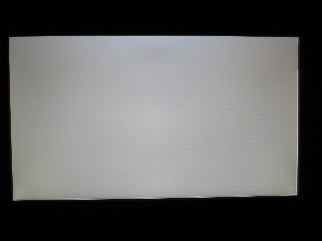
The video below shows the results of this test from a variety of viewing angles. It also shows a mixed desktop background and dark desktop background from a range of angles. With the dark background, you can see the aforementioned ‘PLS glow’ as it blooms out from sharper viewing angles.
Responsiveness
Input lag
Perceived blur (pursuit photography)
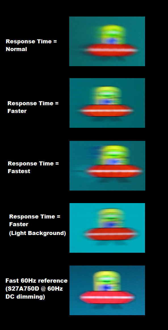
Perceived blur with various settings
Responsiveness in games and movies
FreeSync – the technology and activating it
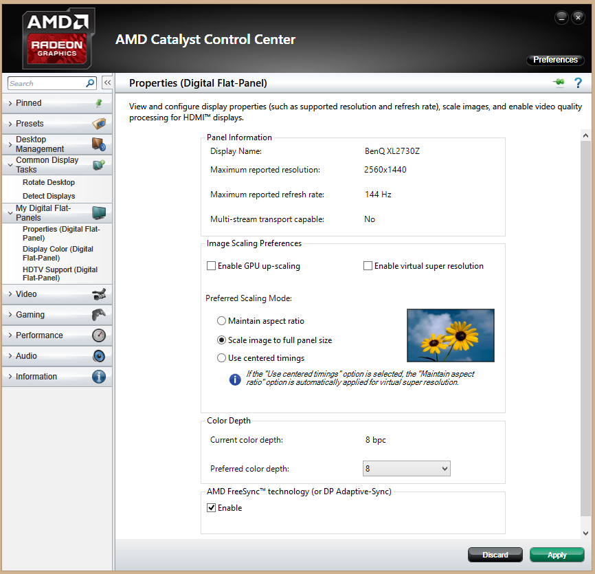
FreeSync – the experience
The ‘4K’ UHD experience
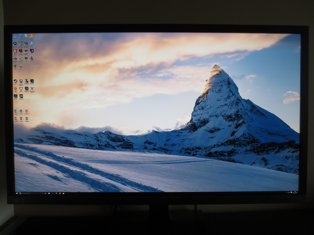
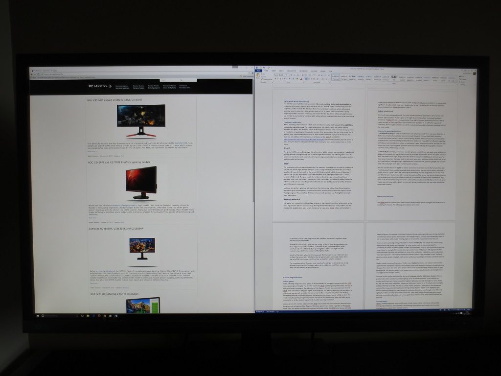
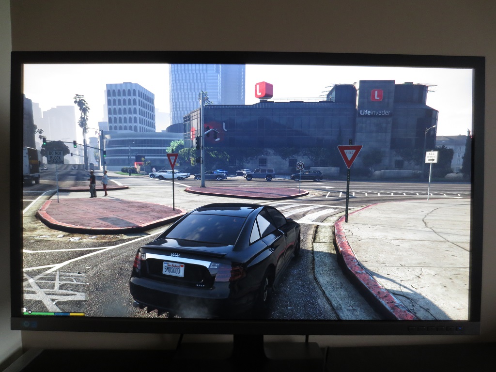
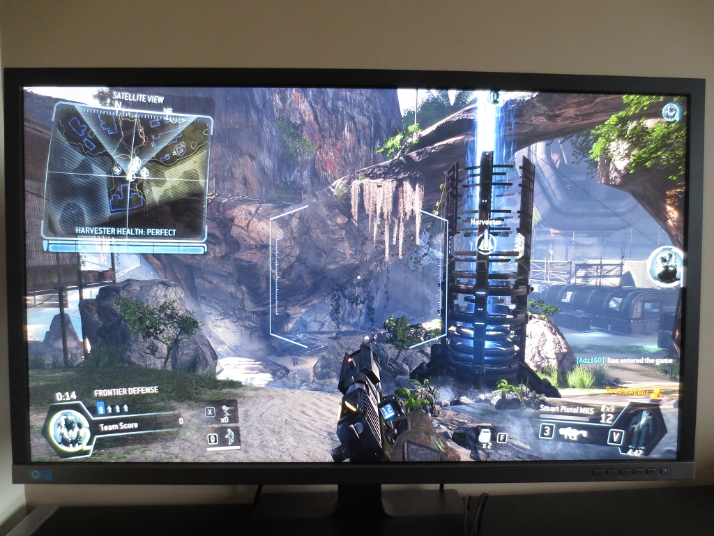
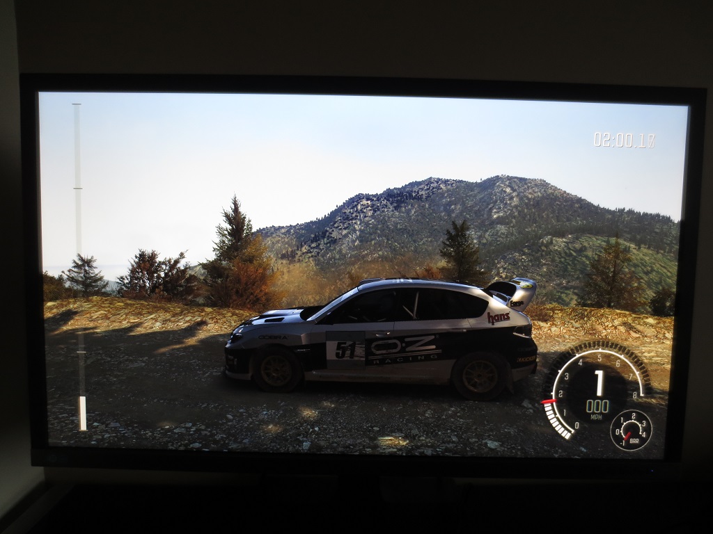
It also gives a distinctly ‘UHD’ quality to games and the currently fairly scant movie content that supports it. There is of course a fair difference in pixel density between this (139.87 PPI) and smaller UHD models (particularly if you consider a 23.8” model with a pixel density of 185.12 PPI). From a normal viewing distance, though, we feel that this difference is quite unsubstantial. Less so than the numbers would suggest. And we feel the level of detail and clarity potentially offered by the screen is very nice when coupled with the large 31.5” screen. It provides a very immersive gaming experience, drawing you into games in quite an impressive way. It certainly feels different to using smaller screens where you feel like you’re observing through a small window – a far less engrossing experience, in other words. The images below show various games running on the monitor. They of course give no indication whatsoever of what the monitor looks like first hand and are simply there to aid your visualisation of the monitor.
Interpolation and upscaling
Conclusion
Positives Negatives The PLS panel with very light matte screen surface and generous colour gamut offers a smooth and crisp image with rich, varied and consistent colours
A little tweaking in the OSD was required to get the best out of the monitor, there is a little deviation from the standard ‘2.2’ gamma curve and a smidge or sRGB under-coverage – but nothing that should cause issues for most users
Respectable static contrast performance, an outstanding luminance adjustment range and some useful ‘Low Blue Light’ settings The backlight is only flicker free above a brightness of ‘30’, so users who are particularly light-sensitive and also sensitive to flicker may struggle to achieve the right balance. The usual ‘PLS glow’ is present Low input lag, a good balance to the pixel overdrive overall and an excellent FreeSync implementation with 40 – 60Hz variable refresh rate range
Some transitions were slower than optimal and there was some light overshoot in places, but both issues were on the ‘not noticeable or bothersome to most users’ side of things
A good screen size for the UHD resolution, giving an engrossing experience with plenty of work space – a definite ‘UHD’ look and a comfortable experience without scaling (mileage may vary)
Some users would still want to use scaling, which is hit and miss depending on the applications you use. The resolution is also graphically demanding and the interpolation process is not great, particularly at 1920 x 1080
![]()


