Author: Adam Simmons
Date published: July 7th 2018
Table of Contents
Introduction
There has been a growing number of high refresh rate monitors featuring VA panels. Whilst they can’t keep pace with faster panel types such as TN in terms of pixel responsiveness, they touch the sweet spot for some users when it comes to their blend of image quality and responsiveness. We’ve reviewed a few ~32” VA models with 144Hz refresh rates and support for AMD FreeSync; specifically, the ASUS XG32VQ and AOC AG322QCX. The LG 32GK850G (32GK850G-B extended designation, owing to its black back) instead uses a flat VA panel that combines support for Nvidia G-SYNC and a 165Hz refresh rate. We take a detailed look at this model and see how it fairs in our usual testing regime.
Specifications
The monitor employs a 31.5” AU Optronics AMVA (Advanced Multi-Domain Vertical Alignment) panel with support for a 165Hz refresh rate and true 8-bit colour support (without dithering). A 5ms grey to grey response time is specified, but as usual this shouldn’t be taken at face value. Some of the key ‘talking points’ for this monitor have been highlighted in blue below, for your reading convenience.
Features and aesthetics
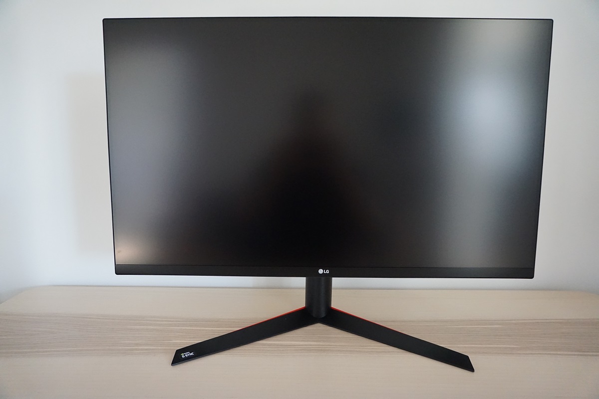
The monitor maintains a modern and smart appearance, free from obvious and (potentially) visually offensive ‘gaming touches’. It uses matte black throughout, with a dual-stage bezel design. This comprises a very slender hard outer bezel as well as a slim panel border that blends in seamlessly when the monitor is switched off. Including both components, the bezel is ~9.5mm (0.37 inches) at the top and sides. The bottom bezel is thicker without as much panel border on show, ~24mm (0.94 inches) in total. The most prominent feature is the 31.5” screen, which employs a light matte anti-glare screen surface as explored shortly.
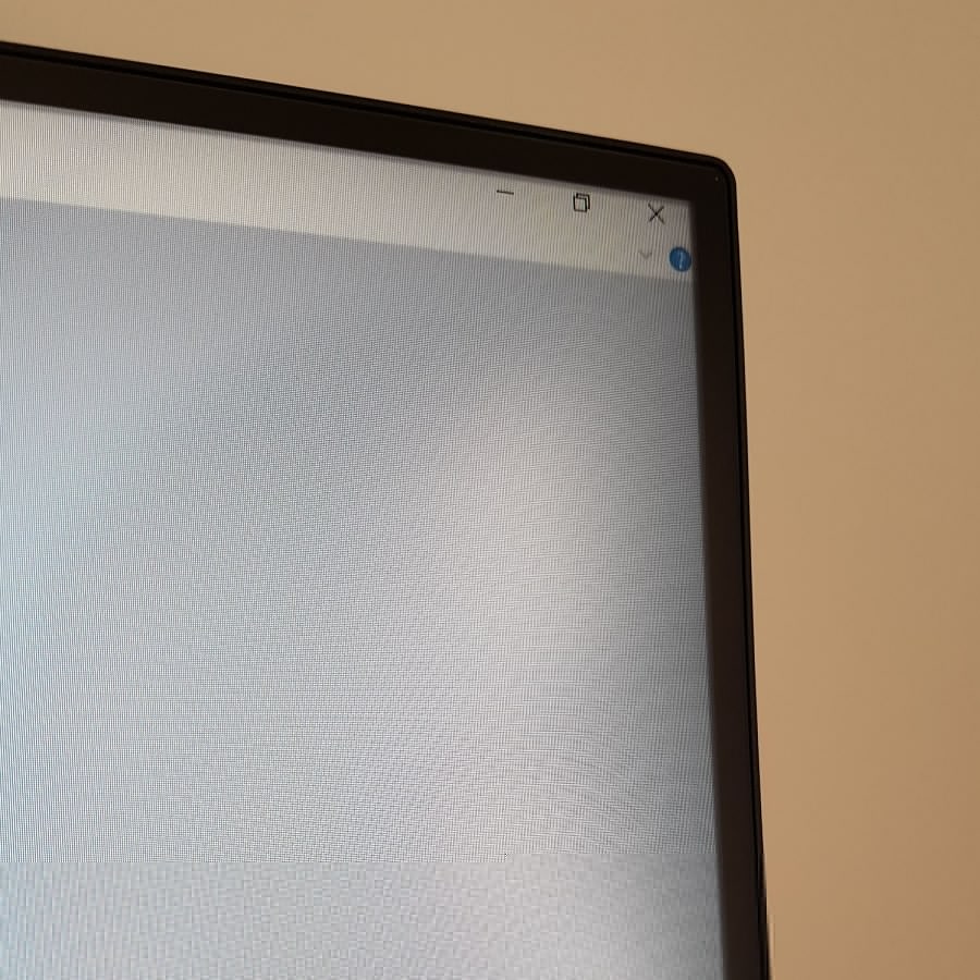
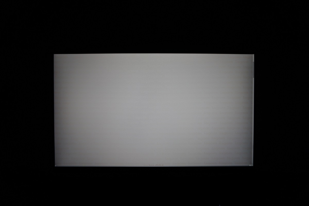
Note that the image appears recessed slightly compared to the panel border, so if you’re sitting quite close to the screen or depending on viewing angle you may notice a ‘shadowy border’ at the extreme edges of the image. This is actually a reflection of the panel border that’s visible and is by no means unique to this monitor and is something quite a few models with this sort of bezel design will have. Sitting 70cm+ away and centrally you won’t really notice it, but sitting closer or adjusting your head even slightly off-centre will reveal the effect. You might notice this when looking at the vertical scroll bar in an application, for example. We didn’t find this annoying during normal use, but it did slightly obscure image content at the very edge (i.e. <1mm from the panel border) at times. The image shows roughly this effect (ignore the interlacing lines - they're moiré from the camera).
The OSD (On Screen Display) is controlled by a joystick on the underside of the bottom bezel, in the central region. Beside this there is a button that allows control of the ‘Sphere Lighting’ feature that we’ll come onto shortly. The joystick has an integrated power LED, which can’t be seen from a normal viewing position and is off by default although can be enabled in the OSD. If enabled, it glows red when the monitor is on and flashes red when the monitor enters a low power state. The video below runs through the OSD and the ‘Sphere Lighting’ feature.
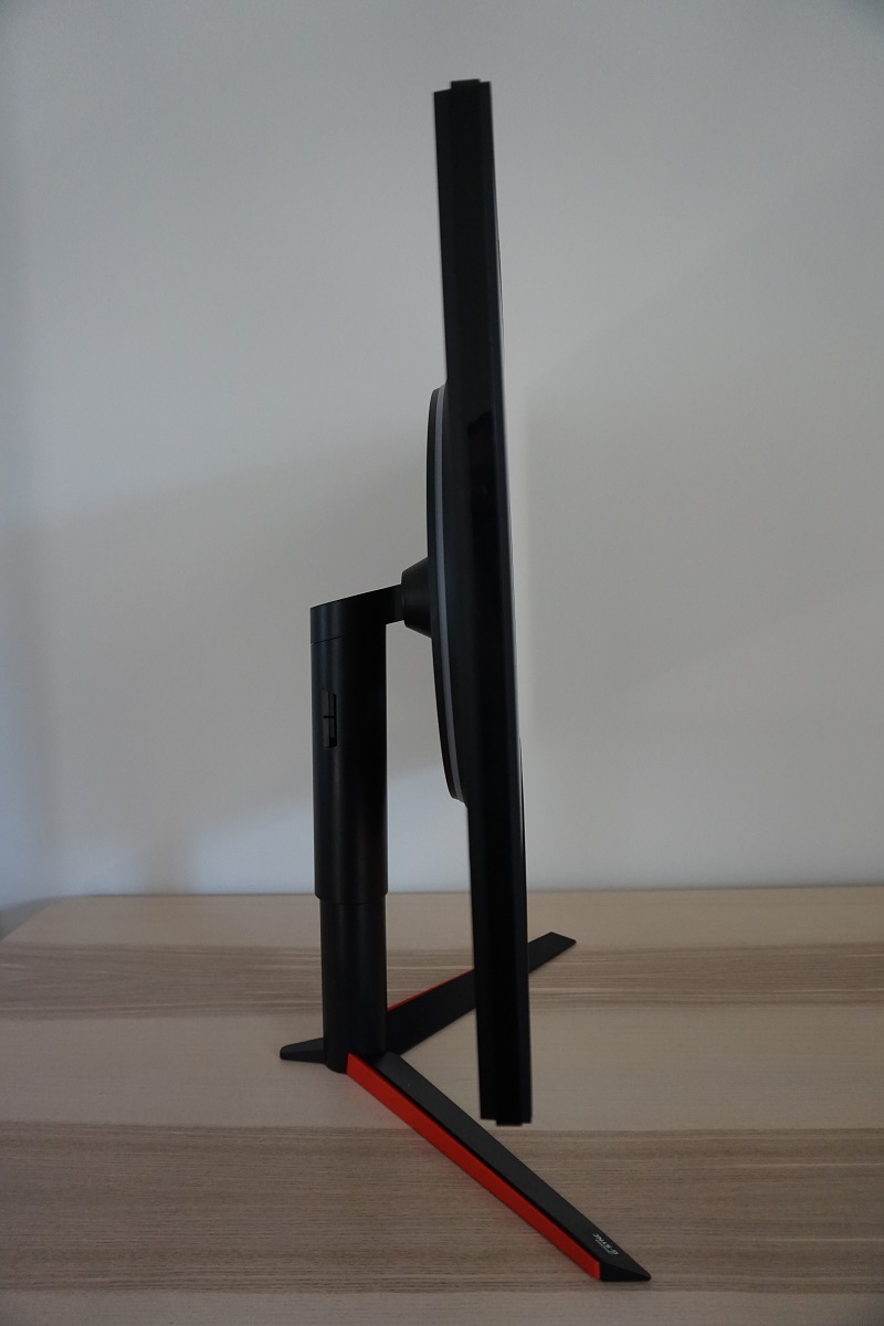
From the side the screen is ~23.5mm (0.93 inches) at thinnest point, extending back further in the central region. The monitor is predominantly black plastic with a matte finish from this angle, although there are a few matte red elements on the feet at the base of the stand. Because of how these are angled, this isn’t a prominent or obvious feature, especially when viewing the monitor from the front. The rather robust fully adjustable stand is visible from this position. It offers good ergonomic freedom; tilt (5° forwards, 15° backwards), swivel (20° left, 20° right), height adjustment (110mm or 4.33 inches) and pivot (90° clockwise rotation into portrait). At lowest height, the screen clears the desk surface by ~75mm (2.95 inches) with the top ~496mm (19.53 inches) above the desk surface. The total depth of the monitor and stand is 290mm (11.42 inches) with the screen quite close to the nearest points of the stand.
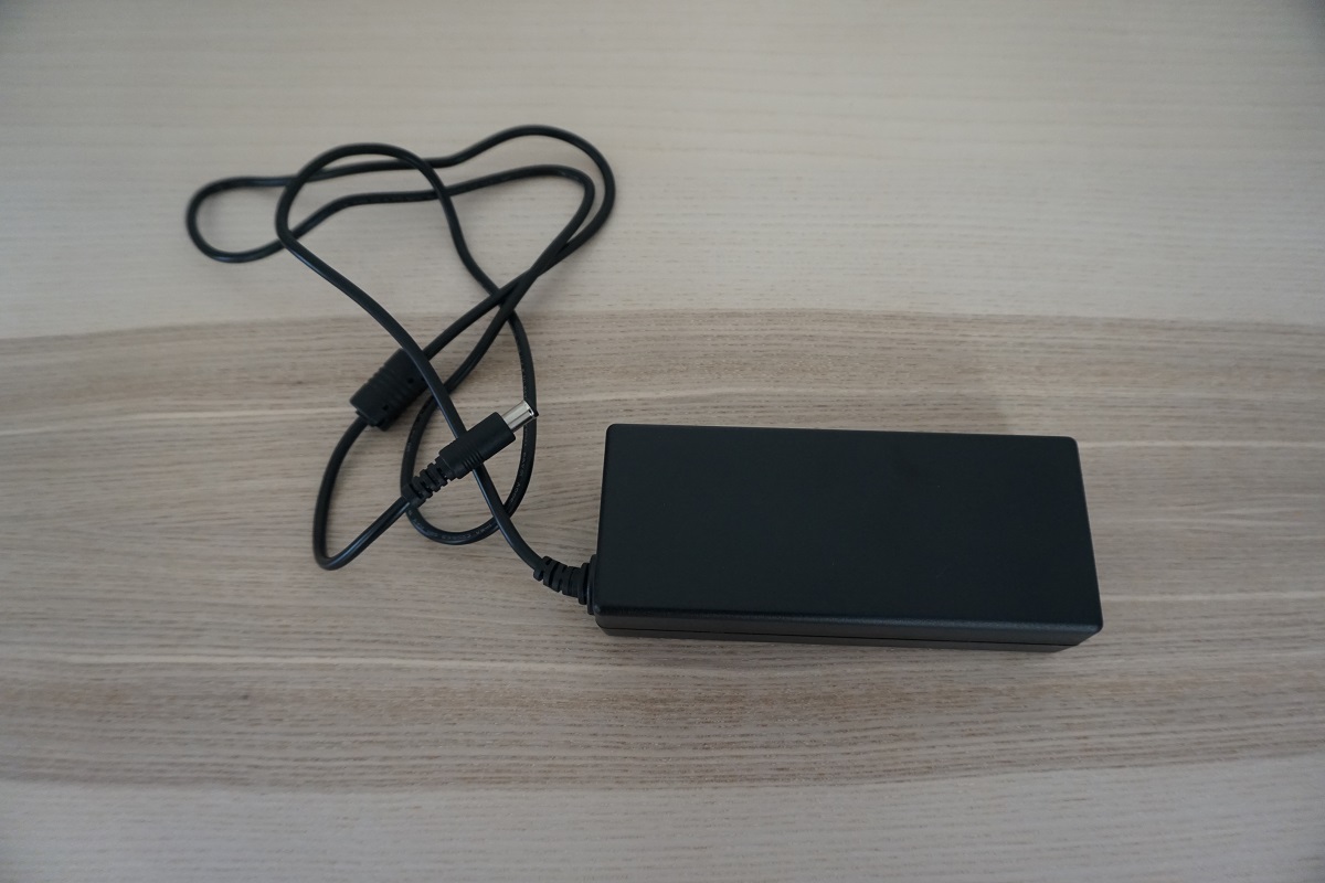
The rear of the monitor is mainly matte black plastic, but there are some red elements as well. The red ring that surrounds the stand attachment area is the ‘Sphere Lighting’ feature mentioned earlier and shown in the OSD video. The included stand attaches centrally using a quick release mechanism, with a button releasing the stand from the screen. Doing so will allow mounting to an alternative 100 x 100mm solution. The port area is located to the right of the stand attachment point, with the ports facing backwards. These are, from top left to bottom right; 2 USB 3.0 ports (with fast-charging), DP 1.2 (supports G-SYNC), USB 3.0 upstream, HDMI 1.4, 3.5mm headphone jack, service port and a DC power input (external power brick, shown below). A black plastic clip-on cable tidy that can be attached to the rear of the stand neck is also included (not shown).
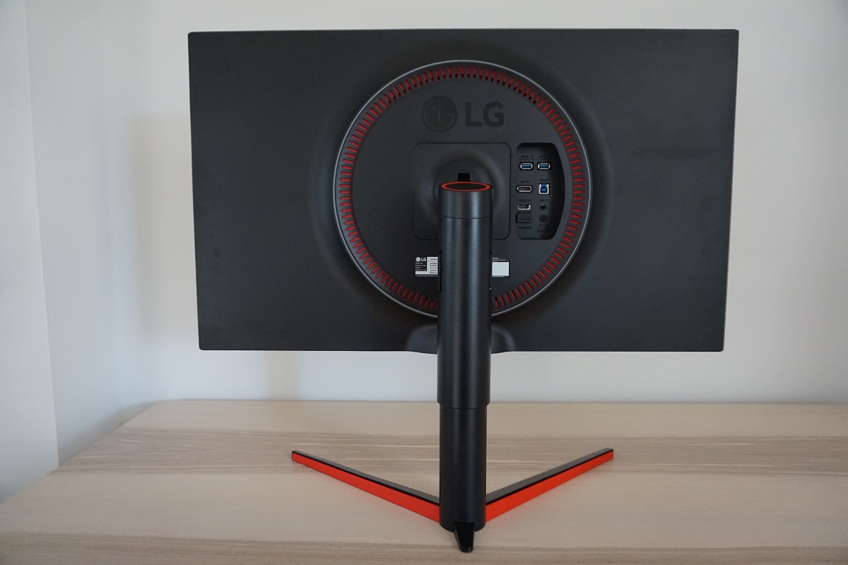
The monitor will run at up to 165Hz at the native resolution via DP 1.2. G-SYNC is also supported on compatible Nvidia GPUs. HDMI is limited to 60Hz at the native resolution. Standard accessories include a DP cable, HDMI cable, USB 3.0 cable and a power cable and adaptor.
Calibration
Subpixel layout and screen surface
The images below are macro photographs taken on Notepad with ClearType disabled. The letters ‘PCM’ are typed out to help highlight any potential text rendering issues related to unusual subpixel structure, whilst the white space more clearly shows the actual subpixel layout alongside a rough indication of screen surface. The top image shows the 32GK850G, whilst the bottom image shows the AOC AG251FG for comparison. As explored later, this model uses a light matte anti-glare screen surface. This handles glare effectively whilst keeping the image free from obvious graininess and better preserving vibrancy than some matte surfaces. Rather than an obvious ‘smeary’ graininess, there was a very light ‘misty’ graininess in places so a smooth appearance to the image overall.
![]()
![]()
As shown above, the monitor uses the usual RGB (Red, Green and Blue) stripe subpixel layout. This is the typical layout expected by modern operating systems such as Microsoft Windows and Apple MacOS. You needn’t worry about text fringing from non-standard subpixel layouts as a Mac user and don’t need to run ClearType as a Windows user – although you may wish to run through the ClearType wizard and adjust according to preferences. You can see from the top image, taken from this monitor, that the subpixels are slightly squat with relatively ‘thick’ black spaces above and below each row. You can also see that some areas of text are shown with only half of each subpixel illuminated, with fairly distinct gaps in the middle and at the ends of letters where there is no subpixel illumination. Compare this to the bottom image, which shows a more blended appearance without the same half subpixel illumination or abrupt gaps. This subpixel arrangement is not uncommon on VA models and can cause issues with text clarity, particularly if (as in this case) the pixel density is not particularly high. Text on this model appears somewhat softer than it ideally would. It appears with a slight ‘shadowy’ fringe around it in places, with the fringe a lighter shade than the text itself. Most users will not take issue or even notice that text appears different to usual on this model vs. a model of similar pixel density and normal subpixel arrangement. Some users would notice and potentially find this bothersome, however.
Testing the presets
The 32GK850G features various ‘Game Mode’ presets; ‘Gamer 1’, ‘Gamer 2’, ‘FPS 1’, ‘FPS 2’, ‘RTS’ and ‘Reader’. The first two presets are fully customisable, whereas the remaining presets lock off various settings such as ‘Gamma’, ‘Color Temp’ and ‘Black Stabilizer’. The table below shows key readings taken using a DataColor Spyder5ELITE colorimeter alongside some general observations. The monitor was left in its ‘Plug and Play’ state, connected to a Windows 10 machine without additional drivers or ICC profiles specifically loaded. The screen was connected to an Nvidia GTX 1070 via DP 1.2 and was left to run for over 2 hours before observations made or readings taken. Unless otherwise stated, assume that settings were left at default but with the refresh rate set to 165Hz. The refresh rate did not affect our observations on this table or have any noticeable impact on the static image quality of the monitor, only during motion as explored later. When viewing the figures in this table, note that for most PC users ‘6500K’ for white point and ‘2.2’ for gamma are good targets to aim for.
| Preset Mode | Gamma (central average) | White point (kelvins) | Notes |
| Gamer 1 (Factory Defaults) | 2.0 | 6366K | Bright with a green and slightly warm tint. Some rich shades are displayed, but in general things appear more muted than they should due to low average gamma. As is typical for a VA panel, there is some saturation loss towards the edges and bottom of the screen from a normal viewing position. This is related to the viewing angle dependency of the gamma curve, but for a VA panel of this size these shifts were not extreme. |
| Gamma = Mode 1 | 1.8 | 6365K | As above but gamma even lower, giving a ‘washed out’ (flooded) appearance. |
| Gamma = Mode 3 | 2.2 | 6364K | As factory defaults but a good dose of extra richness due to more appropriate gamma handling. |
| FPS 1 | 2.0 | 6721K | Similar to factory defaults but cooler in tone. Also, dark shades appear lighter than they should. This is due to ‘Black Stabilizer’ being active – although gamma averages 2.0, it dips significantly below for darker shades. |
| FPS 2 | 2.0 | 6724K | As above but ‘Black Stabilizer’ increased, lifting darker shades so they’re significantly lighter than intended. Image appears washed out, but visibility in dark areas is increased as intended with this setting. |
| RTS | 2.0 | 6731K | Some way between the two ‘FPS’ modes, with ‘Black Stabilizer’ set to the middle value. |
| Reader | 2.0 | 4582K | An effective ‘Low Blue Light’ (LBL) setting. The image appears significantly dimmer and warmer. Blue light output from the monitor is reduced significantly, making this suitable for relaxing viewing at times where blue light exposure should be minimised. For example for the few hours before sleeping. |
| Test Settings (see below) | 2.2 | 6505K | As ‘Gamma Mode = 3’ with reduced brightness and some colour channel corrections. A well-balanced image with a rich and natural look overall. |
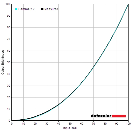
Out of the box the monitor was bright with a green and slightly warm tint. Some shades appeared more muted and lacking in depth compared to what they should, but other areas of the image were fairly well balanced. It was easy to bring things in-line with our targets using simple OSD adjustments. The image above shows the gamma tracking under our ‘Test Settings’, with little deviance from the desired ‘2.2’ curve. Given the intended uses of the monitor, inter-unit variation and pleasing performance following OSD tweaking alone we will not be providing any ICC profiles for this model or using them in the review. The monitor also included an effective Low Blue Light (LBL) preset called ‘Reader’. This provided a significant reduction in both the blue channel and luminance compared to the factory defaults, making it suitable for comfortable evening viewing. Or viewing at other times where you wish to minimise your exposure to stimulating blue light. With this preset active you can’t adjust things like the colour channels or gamma settings, but you do retain control over brightness. We made use of this for our own viewing comfort later on in the evening (with increased brightness) but not for most testing purposes. For our ‘Test Settings’ we lowered brightness significantly, changed the ‘Gamma’ mode and made some adjustments to the green colour channel. This eliminated the green tint we noticed with the factory default settings and also improved gamma tracking over the default settings. Note that individual units vary, so these settings should only be used as a guide and not automatically considered optimal in all cases. Assume any setting not mentioned, including contrast, was left at default. We’ve included the ‘Response Time’ setting and refresh rate used as well, just for reference. Note that the ‘Overclock’ setting was enabled in ‘Game Adjust’ to unlock this refresh rate. Brightness= 50 (according to preferences and lighting) Gamma= Mode 3 R= 50 G= 42 B= 50 Overclock= On Response Time= Fastest Refresh rate (Windows setting)= 165Hz A BasICColor SQUID 3 (X-Rite i1Display Pro) was used to measure the luminance of white and black using a range of monitor settings, including those analysed in the calibration section. From these values, static contrast ratios were calculated. Results are show in the table below. Blue highlights indicate the results under our ‘Test Settings’, whilst black highlights indicate the highest white luminance, lowest black luminance and highest contrast ratio recorded. Assume any setting not mentioned was left at default, with the exceptions already noted in the calibration section.
Gamma 'Test Settings'
Test Settings
Game Mode= Gamer 1
Contrast and brightness
Contrast ratios
Monitor Settings White luminance (cd/m²) Black luminance (cd/m²) Contrast ratio (x:1) 100% brightness (Factory Defaults) 350 0.12 2917 80% brightness 298 0.1 2980 60% brightness 244 0.09 2711 40% brightness 189 0.07 2700 20% brightness 132 0.05 2640 0% brightness 72 <0.03 >2400 Gamma = Mode 1 352 0.12 2933 Gamma = Mode 3 349 0.12 2908 FPS 1 331 0.12 2758 FPS 2 331 0.12 2758 RTS 331 0.12 2758 Reader 93 0.04 2325 Test Settings 182 0.07 2600
The average static contrast with only brightness adjusted was 2790:1, with a maximum recorded value of 2933:1. This is very close to the specified 3000:1 and gives a good depth to dark shades, with brighter elements standing out nicely against darker surroundings. The contrast isn’t as extreme as on some VA models (with contrast that’s closer to 5000:1) and dark shades don’t have quite the same inky depth, but the depth is far greater than any SDR non-VA LCD panel. A static contrast of 2600:1 was recorded following the adjustments made to our ‘Test Settings’, which is quite strong. The lowest static contrast recorded on this table was using ‘Reader’ mode (2325:1), due to the significant colour channel adjustments made there. The highest white luminance was a fairly bright 350 cd/m² whilst the minimum was a reasonably but not extremely dim 72 cd/m². This gave a 278 cd/m² luminance adjustment range.
PWM (Pulse Width Modulation)
The monitor uses DC (Direct Current) to dim the backlight and does not use PWM (Pulse Width Modulation) at any brightness setting. The backlight is therefore considered ‘flicker-free’, which will be welcomed by users who are sensitive to flickering or worried about the side-effects of PWM usage.
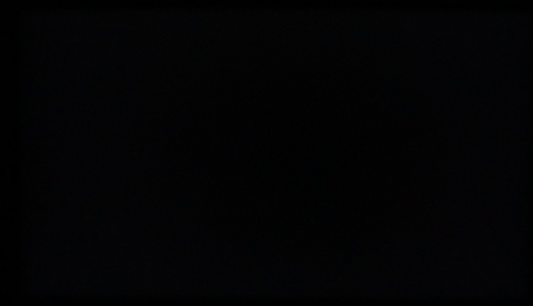
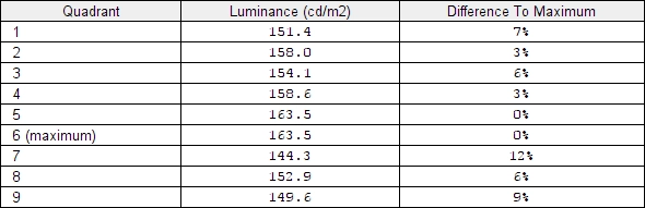
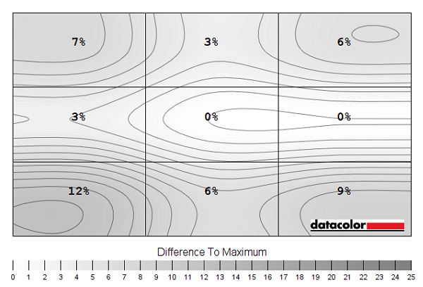
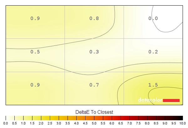
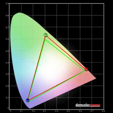
Luminance uniformity
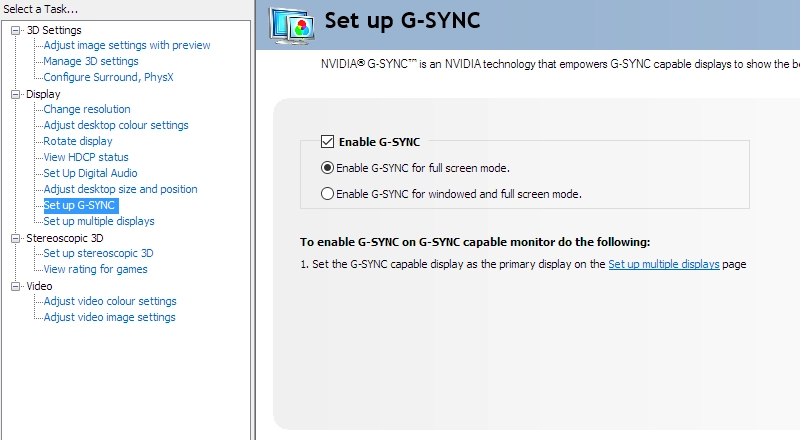
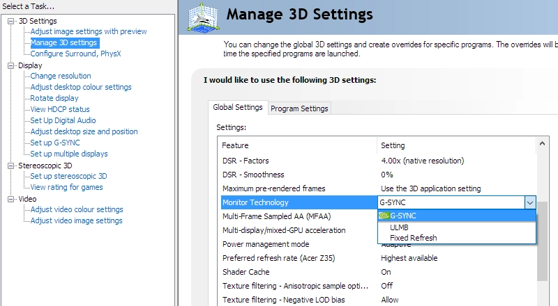
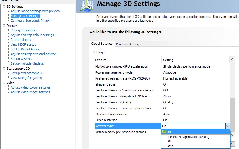
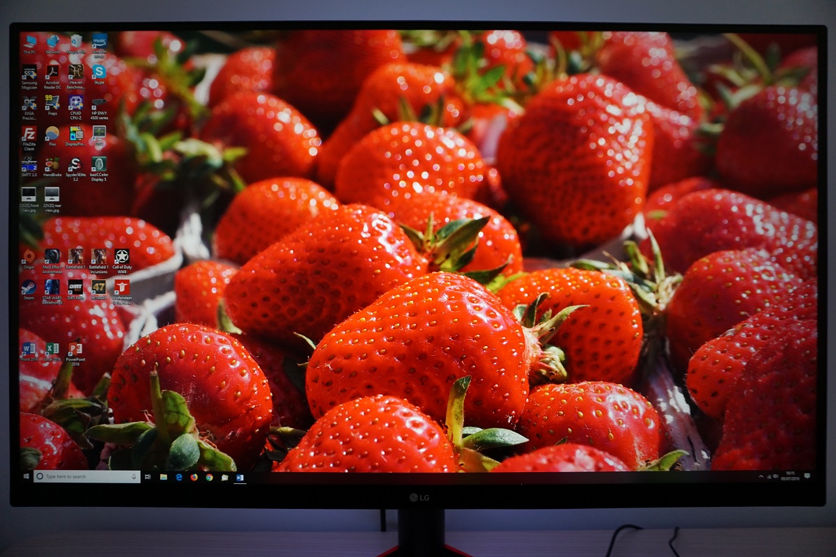
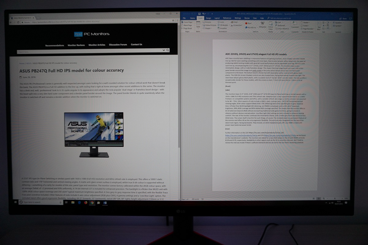
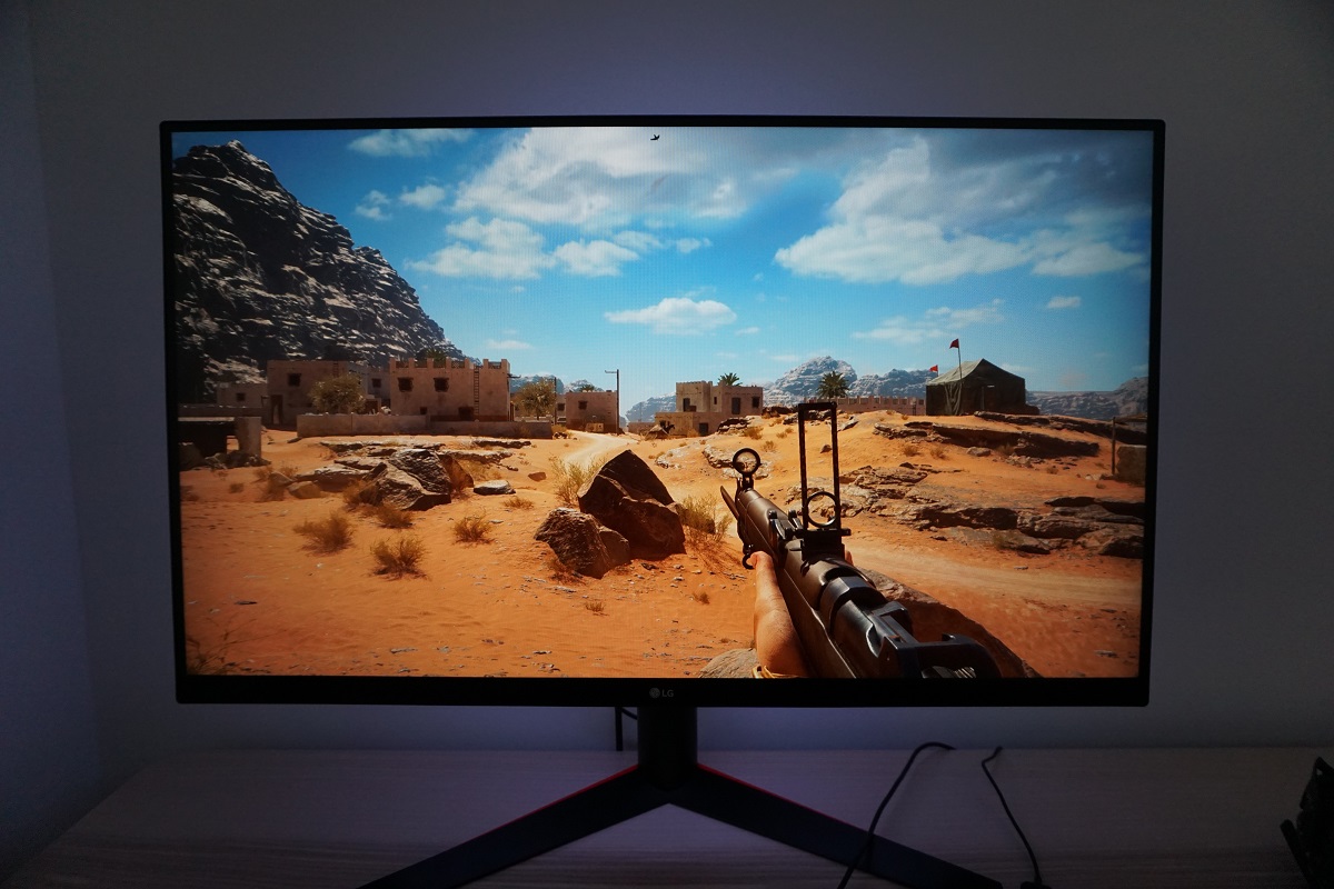
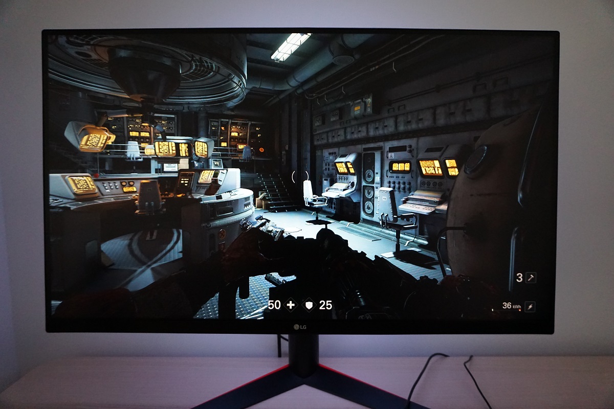
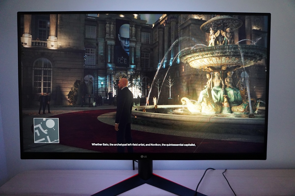
Whilst observing a black screen in a dark room we observed no noticeable backlight bleed or clouding. This is shown in the image below, which was taken in a dark room using our ‘Test Settings’ and camera settings which are representative of what the eye sees when observing the screen. Note that individual units vary when it comes to uniformity issues such as backlight bleed and clouding, although VA models like this tend to be relatively strong in this respect. The image was taken a sufficient distance back from the screen to eliminate so-called ‘VA glow’. This is a silverish-purple glow that appears from a normal viewing position towards the bottom of the monitor, particularly near the corners. It blooms out more noticeably ‘off-angle’ as demonstrated in the viewing angles video later on. As explored later it’s only a minor issue on this model, even amongst VA models and it is nowhere near as obtrusive as ‘IPS glow’. The luminance uniformity was strong overall in this test. The maximum luminance was recorded jointly at ‘quadrant 5’ in the centre of the screen and at ‘quadrant 6’ to the right of centre (163.5 cd/m²). The greatest deviation from this occurred at ‘quadrant 7’ towards the bottom right of the screen (149.6 cd/m², which is 12% dimmer). The average deviation between each quadrant and the brightest recorded point was 5.75%, which is pleasing. Note that individual units vary when it comes to uniformity and you can expect further deviation beyond the points measured. The contour map below gives a graphical representation of these deviations, with darker greys representing lower luminance (greater deviation from brightest point) than lighter greys. The percentage deviation between each quadrant and the brightest point recorded is also given. We also measured colour temperature (white point) uniformity for these same white quadrants. Deviations here are shown in the contour map below and are assigned DeltaE values. A higher value indicates greater deviation from the 6500K (D65) daylight white point target than lower values. Here, a DeltaE >3 is considered significant deviation that most users could readily notice by eye. Greater deviations are also shown using stronger (deeper) yellow shades. Results here were very pleasing, with no significant deviations recorded. The highest deviation recorded was DeltaE 1.5, which is very good. Note again that individual units vary when it comes to uniformity and that you can again expect deviation beyond the measured points. It’s also important to remember that VA models such as this have perceived shifts in colour temperature and to a lesser extent brightness due to viewing angle weaknesses. These aren’t accounted for by such readings. We also subjectively assessed the uniformity of a variety of ‘medium’ shades, including 50% grey. Some VA models in particular exhibit uniformity issues such as splotches or striations when such shades are displayed, giving an inconsistent appearance that some users refer to as ‘DSE’ (‘Dirty Screen Effect’). We did not observe any such issues with our 32GK850G sample. The monitor provided a convincing contrast performance on Battlefield 1 (BF1). The relatively strong static contrast provided good 3D structure to objects, with shadows appearing quite deep and surrounding brighter shades standing out nicely. Bright shades appeared fairly smooth without obvious graininess, owing to the light matte anti-glare screen surface. As is usual for a VA panel, there is a degree of ‘black crush’ whereby dark shades appear even darker than intended from a normal viewing position. They blend into one another, so some subtle details aren’t as distinct as they should be. You can see this when observing the central screen area whilst sitting directly in front of the screen – viewing these shades from an angle or observing them near the edges of the screen will reveal these subtle details and, in some cases, extra (unintended) detail. This ‘black crush’ was only a minor issue on this model, with much less of a detail masking effect than we’ve seen on the likes of the AOC Q3279VWF. And about as little as we’ve ever seen on any VA model, in fact. The monitor also provided quite a nice atmosphere in dark scenes, as the relatively strong static contrast and lack of ‘IPS glow’ came into play. There was some ‘VA glow’ which lightened up these dark scenes just a little at the edges of the screen and in particular near the bottom corners, but this was about as subtle as we’ve seen from a VA model. More subdued than on its current curved competitors by some margin. Dirt Rally also reflected this, with a very respectable contrast performance. Bright elements such as car headlights and the moon in the night sky appeared fairly smooth, without obvious graininess from the screen surface. They also stood out nicely against darker surroundings, with the strong static contrast lifting them out nicely. The dark nights on this game appeared quite rich and atmospheric, without troublesome ‘glow’ or weak static contrast hampering the experience. Some subtle details such as car tire treads were less distinct than they could be due to ‘black crush’, but they were still visible to a degree and there was no major detail loss due to this. We made similar observations on the Blu-ray of Star Wars: The Force Awakens. High-contrast scenes where light and dark collide are prevalent in this film, and they were delivered with a pleasing cinematic atmosphere. Bright elements such as light sabers stood out nicely against their darker backgrounds. They didn’t have the same ‘pop’ that they might on a model with glossy screen surface or stronger static contrast (e.g. VA panel with ~5000:1 static contrast), but still had the sort of look that non-VA LCD panels fail to deliver. Lagom’s contrast tests were used analyse specific strengths and weaknesses in contrast performance. The following observations were made. The colour gamut of the 32GK850G (red triangle) is compared with the sRGB colour space (green triangle) in the image below. The monitor offers fairly comprehensive sRGB coverage, with slight under-coverage (98% sRGB) in the blue region of this diagram and a little over-coverage for some green and red shades. This gives the monitor the potential to accurately output most shades within the sRGB colour space, with a touch of extra vibrancy in places. It doesn’t have the same vibrancy potential as models with more generous colour gamuts, however. On Battlefield 1 (BF1) the monitor provided a rich and natural palette of colours. Whilst not as vibrant or saturated as models with more generous colour gamuts would provide, things still looked far from ‘washed out’ in our view. There were some nice rich greens and browns alongside more muted khaki shades and a nice variety of shades between. This helped the environments within the game appear believable and ‘in-place’. There were some decent licks of more vibrant shades here and there, such as oranges and yellows for flames, embers and explosions. Arguably the most important elements on a game like this. As typical for a VA model, some saturation was lost towards the edges of the screen and shades. Some of the richer greens became duller and others a bit more pastel looking towards the bottom and sides of the screen. Earthy browns that were quite rich centrally appeared a slightly more of a clay-like colour. The shifts in saturation depend on viewing distance, but from our preferred viewing distance of around 65 – 80cm were quite subtle for a VA model of this size. Far less pronounced than on the AOC Q3279VWF, for example, and not far off the curved VA models of this size we’ve tested. Dirt Rally provided a similar experience, with a natural and fairly vivid look to the environments. There was a nice variety of earthy browns, minty and pastel greens and some decent lush green shades thrown into the mix as well. This helped provide a varied and believable look to the racing environments, even if some of the lush forest greens could have done with a bit more pizazz. The car liveries didn’t ‘pop’ in the same way they would on models with a more generous colour gamut, but they still showcased some fairly lively shades. Neon pinks, deep purples and some nice bright cyans stood out well, for example. There were again some saturation losses and a slightly more muted look to shades towards the edges and bottom of the screen, but nothing extreme. On a screen this large your main area of focus will be around the central mass of the screen where shades appear deeper, and even at the extremes of the we wouldn’t go as far as to describe things as ‘washed out’. It’s all relative to expectation and what you’re comparing it to, though. On the Blu-ray of Futurama: Into the Wild Green Yonder, these changes in saturation were highlighted more distinctly. This is because there are large areas of individual shades filling a large part of the screen. If you look at the skin tone of a given character, for example, it looks pretty much correct centrally but a bit duller than intended if the character appears near the edge or bottom of the screen. Because of this, shades also lose a bit of individuality and identity. Nonetheless, these changes were less extreme than we’ve seen on some VA models and a far cry from TN models of anywhere near this size (especially vertically). The overall look was one we’d describe more rich than dull and lifeless. There were some good neon shades (pinks and greens) and decent deep shades, with a nice range of pastel shades intertwined. This essentially gave this movie the sort of look it needs, with distinct ‘classes’ of shades (bright and neon, more muted pastel and deep) appearing more or less as they should. Lagom’s tests for viewing angle tests were used to more closely analyse colour consistency and viewing angle performance in. The following observations were made from a normal viewing position, eyes around 70-80cm from the screen. On some monitors, particularly but not exclusively those with high refresh rates, interlace patterns can be seen during certain transitions. We refer to these as ‘interlace pattern artifacts’ but some users refer to them as ‘inversion artifacts’ and others as ‘scan lines’. They may appear as an interference pattern or mesh or interlaced lines which break up a given shade into a darker and lighter version of what is intended. They often catch the eye due to their dynamic nature, on models where they manifest themselves in this way. Alternatively, static interlace patterns may be seen with some shades appearing as faint horizontal bands of a slightly lighter and slightly darker version of the intended shade. We did not observe any static interlace pattern artifacts, although we did observe some dynamic interlacing patterns in places. These would come and go as we scanned large patches of light texture such as daylight sky, smoke or fog. We found them to be generally undistracting – noticeable in places but not annoying to us. They were less noticeable and widespread than on the curved Samsung SVA alternatives in our view. Most users shouldn’t find them bothersome and some won’t really notice them. We used a small tool called SMTT 2.0 and a sensitive camera to compare the 32GK850G’s latency with a range of screens of known latency. To help maximise accuracy, over 30 repeat readings were taken. Using the method, we measured 4.06ms (~ 2/3rds of a frame @165Hz) of input lag. This value is influenced by the element of input lag you ‘feel’ (signal delay) and that which you ‘see’ (pixel responsiveness). It indicates a low signal delay which shouldn’t bother even sensitive users. Unfortunately, we don’t have the means to accurately measure input lag with G-SYNC active in a variable refresh rate environment, but input lag did feel low to us with G-SYNC doing its thing. In this article we explore the factors affecting PC monitor responsiveness. One of the key concepts explored is perceived blur, which is contributed to not only by the monitor’s pixel responsiveness, but also the movement of our eyes as we track motion on the screen. It’s actually the second factor (eye movement) that is the dominant contributor to perceived blur on modern monitors, although pixel responsiveness still plays an important role. A method of photography called pursuit photography is also explored, which uses a moving camera to simulate eye movement and capture pixel responsiveness. This gives a much more accurate representation of motion on a monitor than static photographs or videos which only reflect pixel responsiveness. The following images are pursuit photographs taken using the UFO Motion Test for ghosting. The test was set to run at its default speed of 960 pixels per second, which is a good practical speed for taking such photographs. The UFOs move across the screen from left to right at a frame rate matching the refresh rate of the display. All three rows of the test are looked at (dark, medium and light background) to help highlight how different shades (grey levels) affect the pixel responsiveness of the monitor. The monitor was tested at 60Hz (directly below), 120Hz, 144Hz and 165Hz using all of the available ‘Response Time’ settings. We’ve also included results at 165Hz with G-SYNC off. This is because having G-SYNC disabled in Nvidia Control Panel significantly slowed down pixel responses on this model – it didn’t matter whether G-SYNC was actively being used or not at the time, just if the option was enabled in the graphics driver. It made the steps up in acceleration (i.e. faster ‘Response Time’ settings) much less pronounced than with G-SYNC active. Although 165Hz and the ‘Faster’ setting was used to demonstrate these differences, they were present at all refresh rates. The differences were most noticeable at higher refresh rates (120Hz+). Where possible we’ve also included pursuit photographs from a Dell S2417DG, used here as a reference to show how things look where pixel responsiveness isn’t really a limiting factor. At 60Hz (above) the object itself appears soft and unfocused, reflecting a significant level of perceived blur due to eye (camera) movement. Varying amounts of trailing can be seen behind the object, reflecting weaknesses in pixel responsiveness. With ‘Response Time’ set to ‘Off’ there is a fairly bold trail behind the object for the dark and medium backgrounds (top and middle row), whereas the light background shows relatively little trailing. The ‘Normal’ setting slightly reduces trailing in all cases, with the ‘Fast’ setting offering a further reduction. At this point there is a moderate trail for the dark background, a slight trail for the medium background and no real trail for the light background. The ‘Faster’ setting slightly reduces the trailing in all cases. The image below shows how things look at the significantly higher refresh rate of 120Hz. At 120Hz (above), the object is significantly narrower and more sharply focused. This reflects a significant decrease in perceived blur due to eye movement. There are again varying degrees of trailing behind the object. With ‘Off’ there is significant trailing all cases, quite extended for the dark background and fairly extensive and also bold for the medium background. The light background shows the least trailing, but there’s still a bold fringe behind the UFO body. The ‘Normal’ setting decreases trailing for all transitions shown here, but some bold trailing remains for the medium background in particular. The ‘Fast’ setting improves this significantly, making the trailing rather faint for the dark background, but also introducing a little overshoot (note the change in colour of the trailing). The medium background also has trailing reduced, with just a hint of overshoot, whilst the light background shows very little trailing and just a hint of overshoot. The ‘Faster’ setting pretty much eliminates any conventional trailing, all that remains is a slight overshoot trail for all rows. The image below shows a slight increase in refresh rate, to 144Hz. At 144Hz (above) things look quite similar to 120Hz, although there are some slight differences. The UFO is slightly narrower now, indicating a reduction in perceived blur due to eye movement. The trailing is quite similar to at 120Hz, with significant conventional trailing up until the ‘Fast’ response time setting. There is a bit of overshoot introduced at that point, which is marginally stronger with the ‘Faster’ setting, but nothing extreme. The ‘Faster’ setting slightly reduces trailing compared to ‘Fast’ if you look at the dark background. The final image, below, shows things at 165Hz. On Battlefield 1 (BF1) the monitor delivered a fluid experience, where the frame rate kept pace with the 165Hz refresh rate. The low input lag coupled with the fact the monitor was outputting up to 2.75 times the visual information every second as a 60Hz model provided an excellent ‘connected feel’. This describes the feeling you get when moving your character around and interacting with the game world; there’s a certain precision and fluidity that’s lacking on models with much lower refresh rates, regardless of how low their input lag might be. The high frame rate and refresh rate combination greatly reduced perceived blur due to eye movement, too, as demonstrated earlier with Test UFO. Objects and the game environment remained more sharply focused, making it significantly easier to spot, track and indeed engage enemies during faster paced combat. Pixel responsiveness is another important aspect of perceived blur and just generally how enjoyable the gaming experience is. VA models will usually exhibit distinct weaknesses in pixel responsiveness, leading to some ‘smeary’ trailing in places. Particularly where dark shades are involved in the transitions. The more obnoxious form of this even on most modern VA models is so-called ‘break-up’ trailing, whereby very dark shades will appear to ‘break-up’ into their constituent hues. So although the shade of an object may appear close to black when static, once it starts moving you get smears of colour such as red, brown and purple leach out into the background. Another distinct weakness common on VA models is ‘heavy powdery trailing’. Not quite enough to cause a smear, but enough to significantly increase perceived blur and catch the eye. This model was refreshingly different, however. It used very effective but not completely excessive pixel overdrive in our favoured ‘Faster’ setting, which eliminated most of the obvious ‘smeary’ trailing and got rid of most ‘break-up’ trailing or ‘heavy powdery trailing’. There was some lighter ‘powdery’ trailing for a slim number of transitions, but this was generally even lighter than what we’ve observed on 165Hz IPS-type models like the ViewSonic XG2703-GS. Sometimes this was extended a bit, but not to the extent typically observed on VA models. As usual with a stronger pixel overdrive impulse, you were left with some overshoot (inverse ghosting) instead. This wasn’t too extreme or eye-catching in our view and slightly less noticeable in most cases than on the Dell S2716DG which we use as a reference for responsiveness. Sensitivity to overshoot varies, though, and some users would find it bothersome. It is reduced slightly using the ‘Fast’ setting, but there are some more distinct weaknesses introduced such as more widespread heavy ‘powdery’ trailing and some transitions taking on more of a smeary appearance where they didn’t before – a bit of an increase in perceived blur, overall. Back to our preferred ‘Faster’ setting, this was one of those rare VA models where we didn’t feel competitively disadvantaged compared to using a fast TN model like the Dell S2716DG. This is of course subjective and we’ve highlighted that there are still some weaknesses, a mixture of some slower than optimal pixel responses and some overshoot. But the LG clearly made good use of its 165Hz refresh rate overall (especially if G-SYNC is enabled in the Nvidia Control panel, whether used or not) and delivered an impressively low level of perceived blur for a VA model. The section of the video review below highlights some of the strengths and weaknesses in terms of responsiveness on the monitor, using BF1 as a primary reference. Given the extensive analysis above, we don’t have much to add from our experiences on Dirt Rally. We again found the experience very fluid at 165Hz and 165fps, with strong ‘connected feel’ and a good low level of perceived blur. We didn’t find this as competitively advantageous or as noticeable on this title, but players who are more adept racers and who use proper controllers (i.e. a steering wheel) may enjoy this experience. There was some ‘powdery’ trailing was present, indicating some slower than optimal pixel responses. But there was no obvious ‘smeary’ trailing or the sort of clear widespread weakensses typically seen on VA models. Even when driving at night, so that dark shades were prevent. There was a fair amount of overshoot, including some darker trails and semi-transparent ‘snail-slime’ trails that appeared like a slightly brighter semi-transparent mixture of the object and background colour. We did not find this annoying or eye-catching, but sensitivity varies. When driving in foggy environments and there were transitions between lighter and medium shades, this introduced some slightly bright ‘halo’ trailing in places. This was not overly bright and isn’t what we’d consider extreme overshoot, although it was some of the more easily observable overshoot you might see on this model. You could see this sort of overshoot on BF1 when playing in foggy environments, too. Finally, we made some observations using our Blu-ray film test titles (and for that matter various Netflix shows). We did not observe any obvious overshoot or weaknesses in pixel responsiveness. The pace of action was limited by the low frame rate at which this content runs, generally around 24fps. For higher frame rate content (such as 60fps video content) there were some slight weaknesses exposed as there would be when gaming, but nothing we found particularly bothersome. Nvidia G-SYNC is a variable refresh rate technology that can be activated when a compatible Nvidia GPU is connected to a compatible monitor (such as the LG 32GK850G). Our article on the technology explores the principles behind the technology and its benefits, so we won’t be repeating too much of that. Essentially the technology allows the monitor to dynamically adjust its refresh rate to match, where possible, the frame rate outputted by the GPU. When the two are in sync it gets rid of the tearing (VSync off) and stuttering (VSync on) that occurs when the two are unsynchronised. An additional benefit for those who hate tearing and usually like to use VSync is a reduction in latency compared to ‘VSync on’ in the variable frame rate environment. As noted in the responsiveness section, though, we don’t have a way to accurately measure this. This monitor supports G-SYNC via DP 1.2 (DisplayPort), once connected to a compatible Nvidia GPU such as the GTX 1070 on our test system. Once connected up, G-SYNC should be automatically configured and ready to use. There’s usually even a little notification icon in the system tray telling you that a G-SYNC compatible display is detected. To check everything is configured correctly, open Nvidia Control Panel and navigate to ‘Display – Set Up G-SYNC’. Ensure that the checkbox for ‘Enable G-SYNC’ is checked, then select your preferred operating mode. As the image below shows, this technology works in both ‘Full Screen’ and ‘Window’ modes, provided the correct option is selected for this. If the G-SYNC options seem to be missing from Nvidia Control Panel, this may be remedied by reconnecting the GPU or possibly connecting the monitor to a different DP output if there’s one available. If the options are still missing, reinstalling the GPU driver or updating this is recommended. Next you should navigate to ‘Manage 3D settings’. Here there are a few settings of interest, the first of which is ‘Monitor Technology’. This should be set to ‘G-SYNC’ as shown below. Assuming this is all set up correctly, you should also see ‘G-SYNC’ listed as ‘On’ at the top of the main OSD menu or the ’Game Mode’ quick menu. You will also notice that the refresh rate listed there will correspond to the frame rate at the time you entered that section of the menu, provided it’s within the variable refresh rate range. The second setting of interest is VSync, which can be set to one of the following; ‘On’, ‘Use the 3D application setting’, ‘Off’ or ‘Fast’ (GPU dependent). The LG supports a variable refresh rate range of 30 – 165Hz, with the maximum value (ceiling) corresponding to the refresh rate you’ve selected for the monitor in Windows. That means that if the game is running between 30fps and 165fps, the monitor will adjust its refresh rate to match. When the frame rate rises above 165fps, the monitor will stay at 165Hz and the GPU will respect your VSync setting in the graphics driver. If you select ‘On’, VSync activates if the frame rate exceeds the static refresh rate that you’ve selected (e.g. 165Hz / 165fps) and the usual VSync latency penalty applies. If you select ‘Off’ then the frame rate is free to rise in an unrestricted way, but the monitor will only go as high as 165Hz – tearing and juddering will ensue if the frame rate rises above this. The ‘Use the 3D application setting’ largely works as you’d expect, but the general recommendation is to set VSync in the graphics driver if you wish to use it as in-game implementations can interfere with the smooth operation of G-SYNC. Some users prefer to leave VSync enabled but use a frame rate limiter set several frames below the maximum supported (e.g. 161fps) instead, avoiding any VSync latency penalty at frame rates near the ceiling of operation or tearing from frame rates rising above the refresh rate. The ‘Fast’ option is available on some newer GPUs, such as the GTX 1070 used in our test system. This enables a technology called ‘Fast Sync’, which only applies above the refresh rate and frame rate ceiling (>165Hz / 165fps). Below this G-SYNC operates as normal, whereas above this a special version of VSync called ‘Fast Sync’ is activated. This is a GPU rather than monitor feature so isn’t something we will explain in detail, but it is designed to reduce tearing at frame rates well above the refresh rate of the monitor. If you’re interested in this technology, which may be the case if you play older or less graphically demanding games at very high frame rates, you should watch this section of a video by Tom Petersen. If the frame rate drops below the lowest refresh rate supported by the monitor (i.e. the G-SYNC floor of 30Hz / 30fps) then the monitor sets its refresh rate to a multiple of the frame rate. This occurs regardless of VSync setting. If for example the game ran at 20fps, the monitor would set itself to 40Hz. This keeps stuttering and tearing from the usual frame and refresh rate mismatches at bay. As we explore shortly, though, low frame rates are low frame rates regardless of the technology. So whilst it is always beneficial to have stuttering and tearing removed, it’s also beneficial to have an elevated frame rate where possible. It’s also worth remembering that G-SYNC can’t eliminate stuttering caused by other issues on the system or game environment such as insufficient RAM or network latency. We tested G-SYNC on a range of titles including Tom Clancy’s The Division, Star Wars Battlefront and Dirt Rally. The technology worked flawlessly on titles we tested and did exactly what it set out to do. Instead of repeating observations over a range of titles, which would be similar, we will be focusing on Battlefield 1 (BF1). This offers a suitable range of graphics options to allow G-SYNC to be tested over its full range of frame rates and refresh rates. Using settings we are happy to use there was a fair bit of fluctuation in frame rate, but it generally kept to triple digits (between 100fps and 165fps). Without G-SYNC active and a static 165Hz refresh rate used, these fluctuations and departures from the refresh rate would cause obvious (to us) tearing and juddering with VSync off and obvious (to us) stuttering with VSync on. With G-SYNC active these interruptions were not present and the overall experience was significantly smoother and more enjoyable. There was still benefit where the framerate was at the upper end of the range, though, as this decreased perceived blur by a fair bit. It also improved the ‘connected feel’ and as far as framerate goes it was still a case of ‘the higher the better’ in that respect, regardless of G-SYNC. If we increased the eye candy by enabling the ‘Ultra’ preset, the frame rate dropped to around 80fps on our GTX 1070, with fluctuations typically between around 60 – 100fps. Without G-SYNC this again caused tearing and juddering (VSync off) or stuttering (VSync on), both of which were somewhat more noticeable at these reduced frame rates and something we found quite jarring. The perceived blur and connected feel was again impacted by these reduced frame rates in a negative way, but playability was certainly improved compared to with G-SYNC disabled. By increasing ‘Resolution Scale’ beyond 100% the demand on the GPU was increased significantly and unsurprisingly framerate took a hit. As framerate fell away the ‘connected feel’ became more of a ‘disconnected feel’ and perceived blur increased to new levels, but the lack of stuttering and tearing was maintained regardless. This was even the case below the 30fps minimum that G-SYNC could handle by direct refresh rate matching (30Hz), with the monitor keeping tearing and stuttering in check by settings its refresh rate to multiples of the frame rate. We certainly felt that G-SYNC was beneficial to the gaming experience. Low frame rates were low frame rates regardless and we preferred the frame rate to be as high as possible, but the slight mismatches that were pretty much inevitable on titles like BF1 were far more palatable with G-SYNC. It’s worth remembering that individual sensitivity to tearing and stuttering varies. Whilst some users are quite sensitive to it and therefore find it noticeable and bothersome, others don’t really mind it so much. In our experience most users do find a degree of benefit from G-SYNC, sometimes a significant one, and find it difficult to go back to gaming on monitors without such a variable refresh rate technology. A final note, unlike what we generally observe on FreeSync models, the pixel overdrive was well-tuned across the full range of refresh rates. So the level of acceleration slackened off a bit as the refresh rate dropped – after all, pixel response requirements aren’t as stringent at lower refresh rates and frame rates. So unlike on most FreeSync models, you don’t get overshoot which became increasingly pronounced as refresh rate (in-game frame rate) dropped. Some slight weaknesses such as powdery trailing became more apparent as the frame rate dropped, where darker shades were involved in the transitions. This was much as you might observe in the ‘Test UFO’ shots at 60Hz. Still, this would be pretty low down our list of reasons to aim for a higher frame rate when gaming on this monitor. With a 2560 x 1440 (WQHD) resolution and 31.5” screen size, the LG 32GK850G has a pixel density of 93.24 PPI (Pixels Per Inch). This is significantly lower than the pixel density of a 27” 2560 x 1440 model (108.79 PPI) and similar to the pixel density of a 23 – 24” Full HD monitor. You don’t get the same clarity or detail as models with a higher pixel density, including 27” WQHD models or any UHD models currently on the market. But you do get a large physical screen size, a pixel density that is reasonable and a decent amount of real-estate for work purposes. With a similar text and icon size without scaling to a 23 – 24” Full HD monitor, many users will find this monitor quite comfortable to use for general-purpose use. The images below show the sort of ‘desktop real-estate’ that is offered and gives an idea of some of the space you have for multi-tasking. These images are just for illustrative purposes and don’t reflect how the monitor is to use or indeed how the relatively large size ‘feels’ on the desk. The size of the screen makes for an immersive gaming experience when used as a normal desktop monitor. For a screen of any size, the preferred viewing distance is very much down to personal preference. And also how deep your desk is. For us, we carried out most of our testing from 65 – 80cm and from this distance found the screen size impactful but not overwhelming. The images below show the monitor running some games. As with the images above, they’re not a good indication of how it feels when you’re on your desk using it. And they don’t accurately reflect the image quality, but they’re nice to look at anyway and we know people like seeing the monitor in action. You may wish to run the monitor at a non-native resolution, especially if you’re connecting to a device such as a games console which doesn’t support the full 2560 x 1440 (WQHD) resolution of the display. As is usual for a G-SYNC monitor, there is no scaling functionality from the monitor itself when connected via DP – although the GPU can handle this instead. The monitor itself provides some basic scaling functionality via HDMI, however. The monitor can use an interpolation process to display a non-native resolution (such as 1920 x 1080 Full HD) using all its pixels. This is primarily designed for connecting devices such as games consoles or Blu-ray players that are limited to resolutions such as 1920 x 1080 (Full HD or ‘1080p’). As such, the monitor only supports interpolation at 60Hz, 59Hz or 50Hz. If you wish to make use of the monitor’s scaling rather than the GPU scaling, via HDMI, you need to ensure the GPU driver is correctly configured so that the GPU doesn’t take over the scaling process. For those rare AMD users that are using this monitor, the driver is set up correctly by default to allow the monitor to interpolate where possible. Nvidia users should open Nvidia Control Panel and navigate to ‘Display – Adjust desktop size and position’. Ensure that ‘No Scaling’ is selected and ‘Perform scaling on:’ is set to ‘Display’ as shown in the following image. Once running at a non-native resolution via HDMI, you can access some ‘Aspect Ratio’ settings in the ‘Input’ section of the OSD, where there are 3 options. The first is ‘Full Wide’ which will use an interpolation process so that all 2560 x 1440 pixels of the screen are used. There is ‘Original’ which will respect the source resolution aspect ratio but fill up the screen as much as possible (for example, using interpolation vertically but displaying black bars either side for a 4:3 resolution). And finally there is 1:1, a pixel mapping feature that will only use the pixels called for in the source resolution and keep remaining pixels black. For 1920 x 1080, for example, the image will cover a 23.5” diagonal space in the middle of the screen with a big black border all around it. The image itself appears undistorted, a perfect 1920 x 1080. If you’re using one of the settings that uses interpolation, the 1920 x 1080 resolution fills the whole screen but there is moderate softening compared to running a 1920 x 1080 on a native Full HD screen of this size. The softening isn’t as extreme as we’ve seen on some screens and is passable if you’re sitting a decent distance away from the screen (well over a metre), but textures and edges certainly don’t have the sharpness or clarity they should. It looks only slightly sharper than where GPU scaling is used. If you’re running the monitor at 2560 x 1440 and viewing 1920 x 1080 content (for example a video over the internet or a Blu-ray, using movie software) then it is the GPU and software that handles the upscaling. That’s got nothing to do with the monitor itself – there is a little bit of softening to the image compared to viewing such content on a native Full HD monitor, but it’s not extreme and shouldn’t bother most users. The video below summarises some of the key points raised in this written review and shows the monitor in action. The video review is designed to complement the written piece and is not nearly as comprehensive. For users who want an immersive experience without a screen that’s truly hulking on the desk, ~32” is a nice size to aim for. The LG 32GK850G delivers this, with its 31.5” screen, and combines it with a 2560 x 1440 (WQHD) resolution). This provides a good level of desktop real-estate and a decent pixel density for gaming and images. This was put together in a package that looked quite smart, mainly black with sleek dual-stage bezels and only subtle red accents that easily escape your notice from the front. For those who like something a bit flashier, the ‘Sphere Lighting’ feature provided a nice bit of extra colour to the wall behind the monitor. We’ve seen these sorts of lights on many monitors before, and they’re often too dim to really be appreciated except from if viewed directly. The LG system had enough brightness to be considered a bias light, helping create a more relaxing viewing experience. Or creating some nice colourful effects, depending on the setting selected. Following some minor tweaking using the flexible OSD, the monitor provided colour output that was rich and natural. The colour gamut was certainly not as generous as some models, but the overall colour delivery was far from washed out. Being a large VA panel, there were some losses of saturation and a slight ‘dulling’ towards the extreme edges and bottom of the screen. But consistency was about as good as we’ve seen from a large VA model, even comparing to curved models, so a decent amount of richness was maintained throughout. The light matte anti-glare screen surface also aided vibrancy potential, giving a cleaner and more ‘directly emitted’ look to the image that was free from obvious graininess. Even when observing the lightest shades. As is usual for a VA model, contrast was a key strength. Static contrast didn’t reach the dizzying heights of some VA models, so dark elements didn’t have the same inky depth or bright elements with surrounding darkness the same ‘pop’ as on some screens. But it was much in line with the panel specifications and still provided a distinctly ‘VA’ experience. With superior depth to dark shades and brighter shades standing out in surrounding darkness better than on other LCD panel types. The typical VA contrast weaknesses, namely ‘VA glow’ and ‘black crush’ were minor on this model and did not really impede the experience. The ‘VA glow’ was a fair bit lower than on the curved alternatives we’ve tested, such as the ASUS XG32VQ and AOC AG322QCX. Responsiveness is the traditional Achilles heel of VA models. This one, though, was relatively impressive in that respect. The monitor was able to put its 165Hz refresh rate to pretty good use. Coupled with low input lag, the ‘connected feel’ was very good. And by employing effective but not extreme pixel overdrive, the monitor was able to perform many pixel transitions in a snappy way that delivered the sort of low level of perceived blur you’d hope for from a high refresh rate and frame rate experience. The obvious ‘smeary’ trailing, heavy ‘powdery’ trailing and ‘break-up’ trailing that is generally par for the course with VA models was not such a problem on this model. There was a fair bit of overshoot, as the levels of acceleration needed to boost some pixel transitions was quite considerable. But this is a monitor that delivers for users interested in a 165Hz look and feel, as long as they aren’t overly sensitive to overshoot. G-SYNC also worked nicely to help with the dips below 165fps that are quite difficult to avoid at times, even with a powerful GPU like a GTX 1080 Ti. Going back and forth between this model and a snappy 144Hz TN model (Dell S2716DG), we tended to notice the superior image quality of this model without feeling competitively disadvantaged when gaming. Overall this monitor provided a well-rounded gaming experience, combining pleasant image quality with a convincing 165Hz performance. On one hand it might have been nice to see a curve to the screen. We don’t feel having a curved screen should put users off, as we find curved models to be perfectly natural and comfortable to use with some subtle benefits in terms of immersion. But for whatever reason not everybody likes a curved screen, and this model delivered better overall uniformity and lower ‘VA glow’ than we’ve seen from the competing curved models. The addition of G-SYNC and tighter pixel response times will also be welcomed by Nvidia gamers. As usual a bit of a premium is put on the product due to the inclusion of G-SYNC, but in this case we feel it’s well worth it. The bottom line; a solid gaming monitor combining pleasing image quality with a competent 165Hz performance – plus the ability to turn your wall into a rainbow.
The Spyder5ELITE was used to assess the uniformity of lighter colours, represented by 9 equally spaced white quadrants running from the top left to bottom right of the screen. The table below shows the luminance recorded at each quadrant as well as the percentage deviation between each quadrant and the brightest recorded point.
Luminance uniformity table
Luminance uniformity map
Colour temperature uniformity map
Contrast in games and movies
Lagom contrast tests
Colour reproduction
Colour gamut
Colour gamut 'Test Settings'
Colour in games and movies
Viewing angles
The following video shows how this test appeared from a variety of viewing angles, as well as mixed and dark desktop backgrounds. You can see a loss of contrast and saturation as viewing angles become more extreme, for the mixed desktop background. For the dark background you can see a purple and silver ‘VA glow’ which blooms out from more extreme angles, as noted earlier.
Interlace pattern artifacts
Responsiveness
Input lag
Perceived blur (pursuit photography)
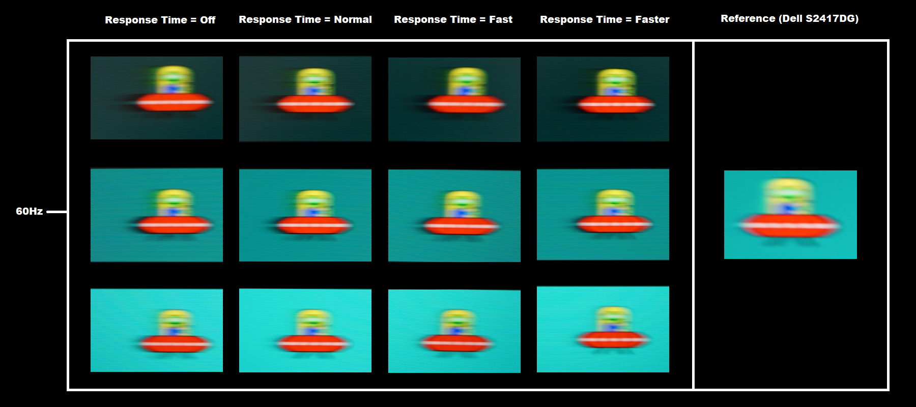
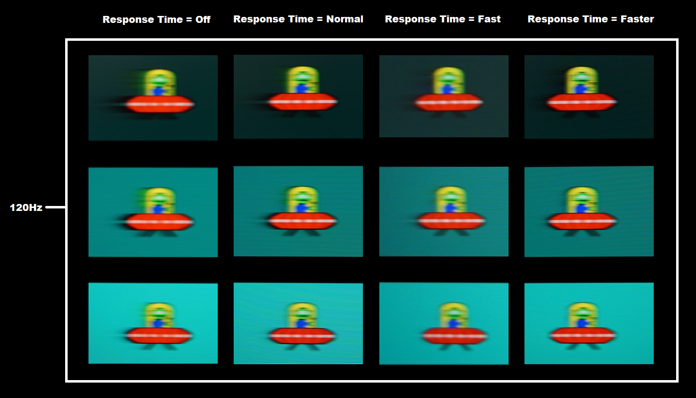
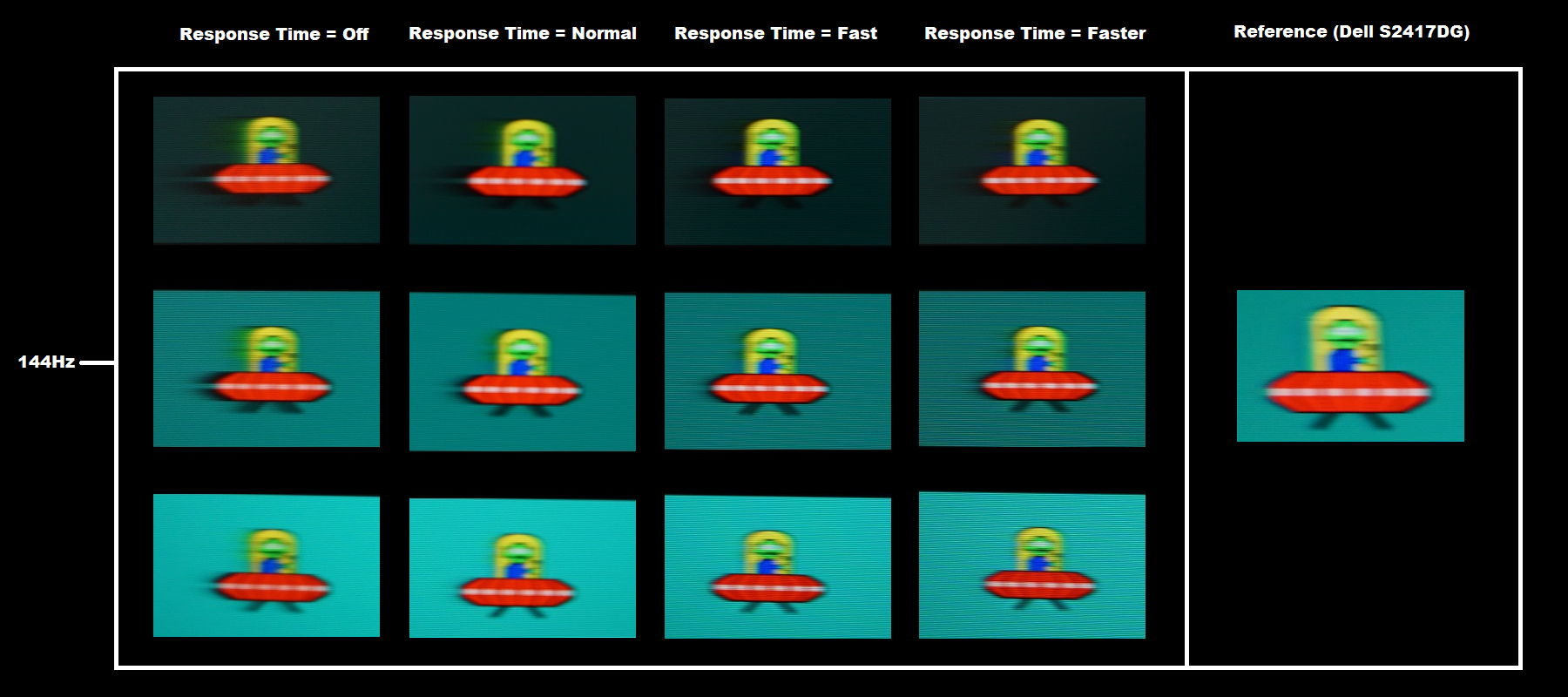
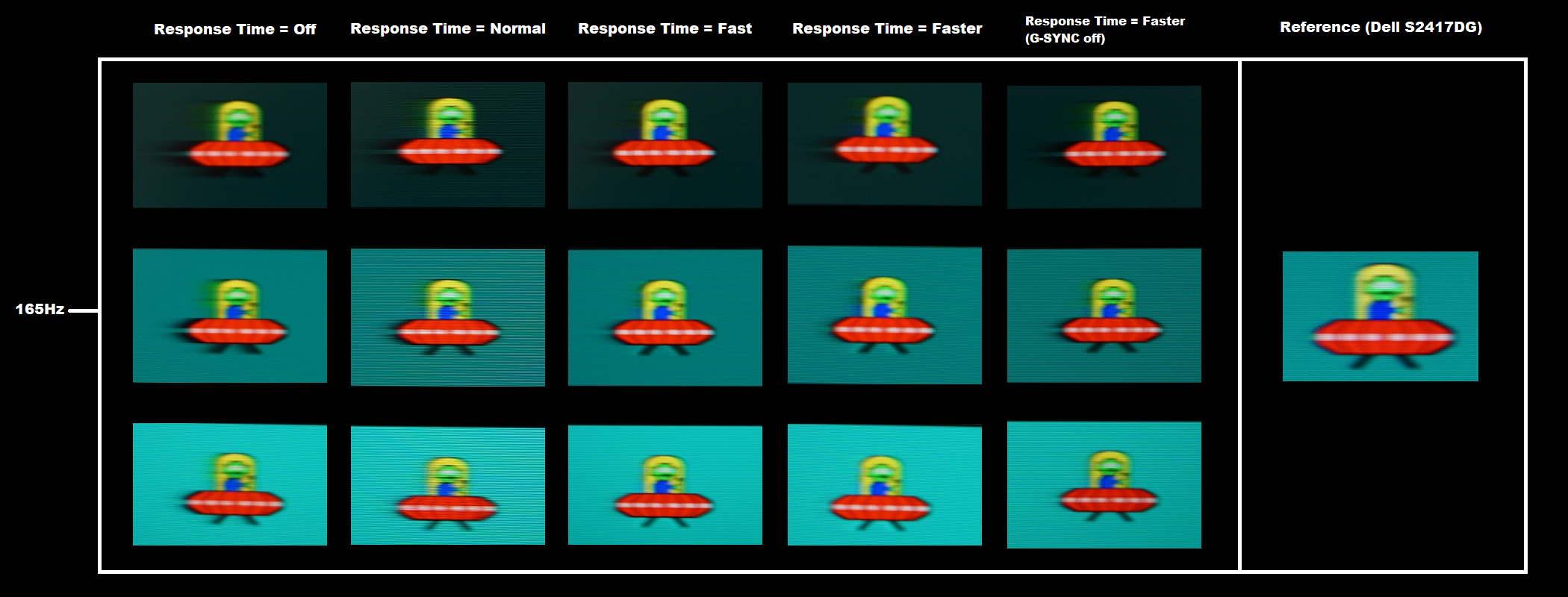
At 165Hz (above), the UFO appears marginally narrower again and details on the UFO slightly sharper, reflecting a slight reduction in perceived blur due to eye movement. The trailing is pretty similar to at 120Hz and 144Hz overall. The ‘Faster’ setting shows more overshoot than ‘Fast’, but also has very little if any conventional trailing (replacing the ‘powdery’ trailing of ‘Fast’ with a bit of extra overshoot). Note that the pixel response behaviour is quite different if G-SYNC is off in Nvidia Control Panel. There is significantly more conventional trailing for the dark background and medium background but no noticeable overshoot. See for example the area behind the main UFO body with the dark and medium background, with bolder and more extensive trailing with G-SYNC disabled. The acceleration level with ‘Faster’ (G-SYNC disabled) appears some way between ‘Normal’ and ‘Fast’ with G-SYNC enabled. Considering a broader range of pixel transitions than tested here, for example when gaming, we observed significant differences in pixel responsiveness depending on whether G-SYNC was on or off in Nvidia Control Panel (whether it was actively being used was irrelevant). We also found the ‘Faster’ setting optimal, because although it introduced a little more overshoot than with ‘Fast’, it also cut down on some instances of ‘powdery’ trailing and overall made very good use of the 165Hz refresh rate.
Responsiveness in games and movies
G-SYNC – the technology and activating it
Enable G-SYNC
Set Monitor Technology to G-SYNC
Set VSync according to preferences
G-SYNC – the experience
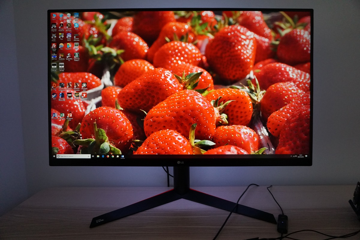
The 31.5″ 2560 x 1440 experience
Interpolation and upscaling

Video review
Timestamps:
Features & Aesthetics
Contrast
Colour reproduction
Responsiveness
Conclusion
![]()
Positives Negatives A rich and natural image following appropriate tweaking, with good ‘2.2’ gamma tracking and decent sRGB colour space coverage
Weaknesses in colour consistency compared to IPS-type panels and a less generous colour gamut than some alternatives
Strong static contrast, low ‘VA glow’ and little ‘black crush’ – plus a light matte screen surface to keep the image free from obvious graininess Static contrast not as strong as some VA models Low input lag and a convincing 165Hz performance with many conventional VA weaknesses greatly reduced. G-SYNC did its thing to combat tearing and stuttering
Some slower than optimal pixel responses and a fair degree of overshoot due to the level of pixel overdrive needed to speed things up appropriately
A decent pixel density and resolution, a solid and ergonomically flexible design and a ‘Sphere Lighting’ system that actually has some practical use rather than being a total gimmick
Some touches of metal might have improved the ‘premium look and feel’ of the product, matching the reasonably steep price tag
![]()

