Author: Adam Simmons
Date published: January 31st 2013
Table of Contents
Introduction
LED (Light Emitting Diode) backlighting has enabled monitor manufacturers to make their displays thinner, lighter and more energy efficient. The typical white LED (WLED) design has traditionally been quite restrictive when it comes to colour gamut, supporting the sRGB colour space and little else. Some recent and ongoing developments are starting to break down this colour space barrier, however.
The Dell U2713H is the first monitor on the market to use a new GB-LED backlight. This design from panel manufacturer LG combines blue and green diodes with special red phosphors to enhance the spectrum of light produced. In doing so the monitor is able to yield an impressive colour gamut of 99% Adobe RGB and 103% NTSC. To deliver these colours accurately the backlight compliments an AH-IPS (Advanced High-performance In-Plane Switching) panel with 10-bit colour support and enhanced viewing angles. This is certainly one of the more exciting models released in recent times and it will be interesting to see how it performs.
Specifications
The basic specifications reveal the use of a 27” AH-IPS panel with a WQHD (2560 x 1440) resolution, 6ms grey to grey response time and 14-bit LUT with 12-bit colour processing (8-bit native plus FRC dithering). This model also features the aforementioned GB-LED backlight which is essentially a modified W-LED design. Compared with conventional W-LED such as that used on the U2713HM this does require a bit more power. The U2713H has a typical power consumption of 60W specified which is 18W higher than that of the U2713HM. The panel type and luminance specification is similar for both so the backlight must be the main culprit here. This is still considerably more energy efficient than WCG-CCFL backlights such as that used on the U2711 (113W typical).
The key ‘talking points’ of the specification have been highlighted in blue.
Features and aesthetics
From the front the U2713H takes on Dell’s usual smart ‘business-like’ look with some modern homely additions, such as gently rounded corners. The screen surface is light matte anti-glare (semi glossy) similar to that used on the U2713HM. This provides much improved clarity and improves vibrancy compared to heavier (high haze value) matte anti-glare surfaces. This is certainly an improvement over this model’s predecessor, the U2711.
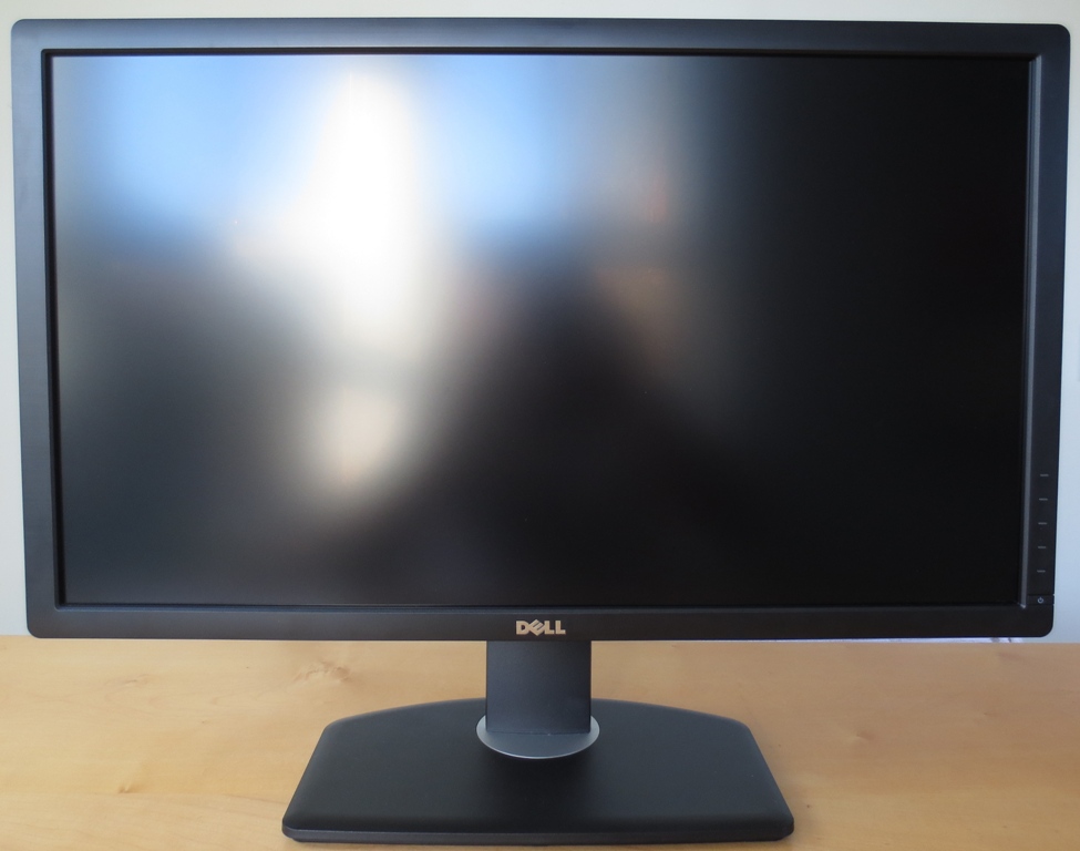
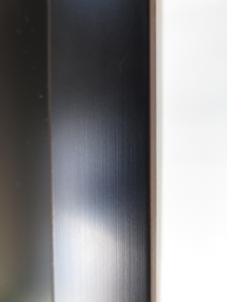
Some more subtle refinements have also been made, such as the bezel which is still matte plastic but now has a brushed metal texture. At 20mm thick the bezels aren’t as thin as they come by modern standards but aren’t supremely wide, either.
This ‘invisible bezel design’ was quite controversial and caused panel manufacturer LG and their partners to rightfully receive a fair bit of flak for their misleading marketing. In particular they angered consumers by showing images superimposed onto the screen so that the panel border is covered with the image and only the ‘outer bezel component’ is visible. Regardless of this controversy; the bezel is only 12mm at the top and sides (including both elements of the bezel) so is still on the slender side. The bottom of the monitor has a silver brushed metal effect lip which, like the stand, is actually made of plastic. It does look quite attractive and is apparently quite scratch resistant to help keep it that way.
The stand is fully adjustable and allows tilt (4° forward, 21° backwards), swivel (45° left and right), height (115mm or 4.5 inches) and rotation (90° into portrait). These adjustments are all nice and smooth and fairly effortless, with the exception of the rotation into portrait. This adjustment is ‘all or nothing’, though, so if anything is going to be a bit stiff it might as well be that. It was left off the U2711 entirely so it’s good to see it on this model.

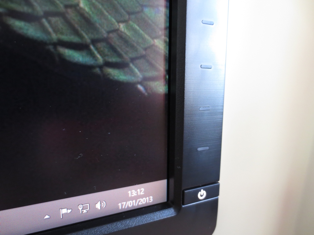
The OSD (On Screen Display) control buttons can also be found at the front, towards the bottom right. These are touch-sensitive and are activated initially by proximity sensor. As your finger approaches the control area you are greeted by a gentle white glow from the bottom button. After activating this button by touching it the ‘quick menu’ is displayed and all of the buttons become illuminated and receptive. This arrangement was fairly responsive but may take some getting used to if you’re used to physically pressing buttons. The power button, at least, can be pressed physically. A small power symbol in the middle glows white to indicate the monitor is on and orange to indicate standby. We didn’t find this too bright or obtrusive even when using the monitor in the dark, but you can’t adjust its brightness or deactivate it in the OSD.
The OSD is fairly feature-rich, well laid out and easy to navigate. The video below runs through the OSD and shows many of the options that are available. Some features are pretty self-explanatory. There are others which we will be exploring later on in the review. It is important to note that certain features are specific to certain presets, something that is explored in the proceeding ‘Calibration’ section.
A full run-through of the OSD can be found in the user manual (page 35 onwards of the online version). An interesting note – the ‘Menu Button Sound’ is described in the manual as a ‘beep’. It’s more of a painful high-pitched squeal and it’s fortunate that it’s disabled by default.
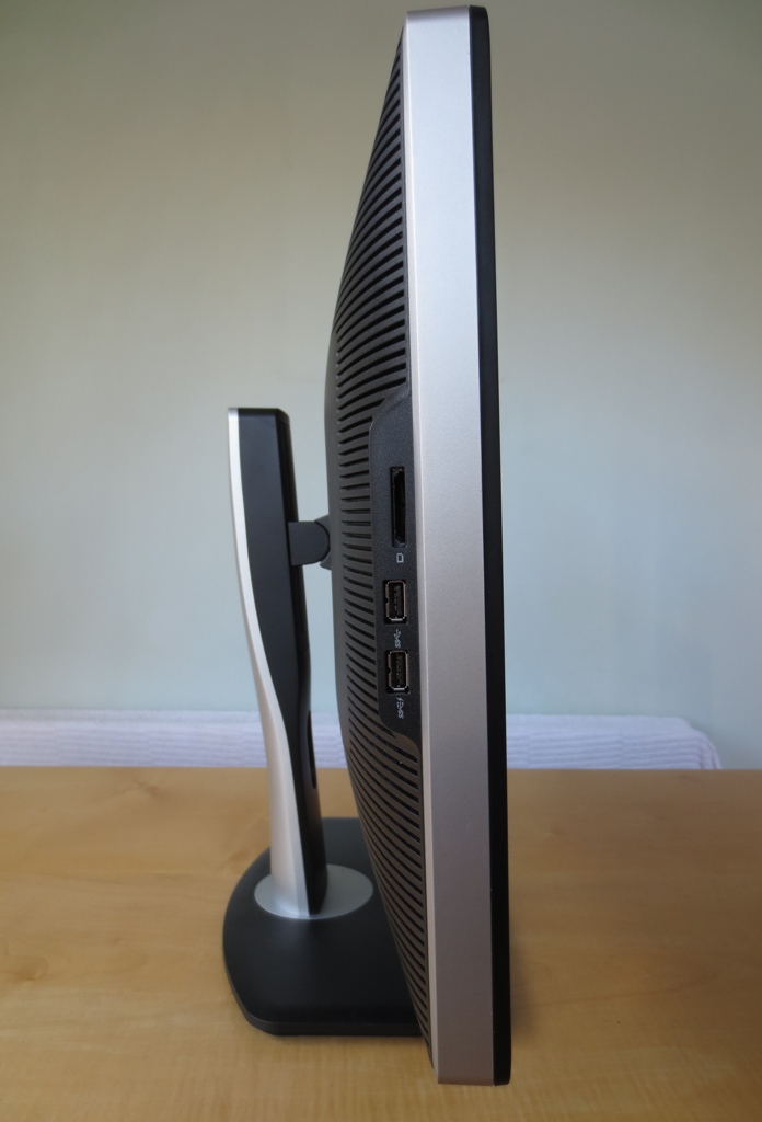
From the side the U2713H is much thinner than its predecessor. This is thanks to a GB-LED backlight (explored in the ‘Colour reproduction’ section) in place of the much thicker WCF-CCFL bulbs of the U2711. When the monitor is running it also produces noticeably less heat due to the relative efficiency of the LEDs at converting power into light. There is an internal power adaptor and full VESA mountability – Dell haven’t done overboard with the thin look and have kept things solid and functional.
Also from the side you can see the solidly-built stand. Like the screen itself this uses a combination of silver and black matte plastics. Dell have also put 2 USB 3.0 ports and a multifunction flash memory card reader at the left side where it can be easily accessed. The card reader supports several formats including; Memory Stick PRO (MSPRO), Secure Digital (plus SDHC) and MultiMediaCard (MMC). Several other standards including Memory Stick Duo and Mini-SD are supported with an appropriate adaptor. 32GB is the maximum supported capacity per card.
The rear of the monitor features a liberal array of cooling slates, a shiny Dell logo at the top and a central 100 x 100mm VESA attachment. You can either use the stand supplied or remove this to use an alternative VESA-compliant solution.
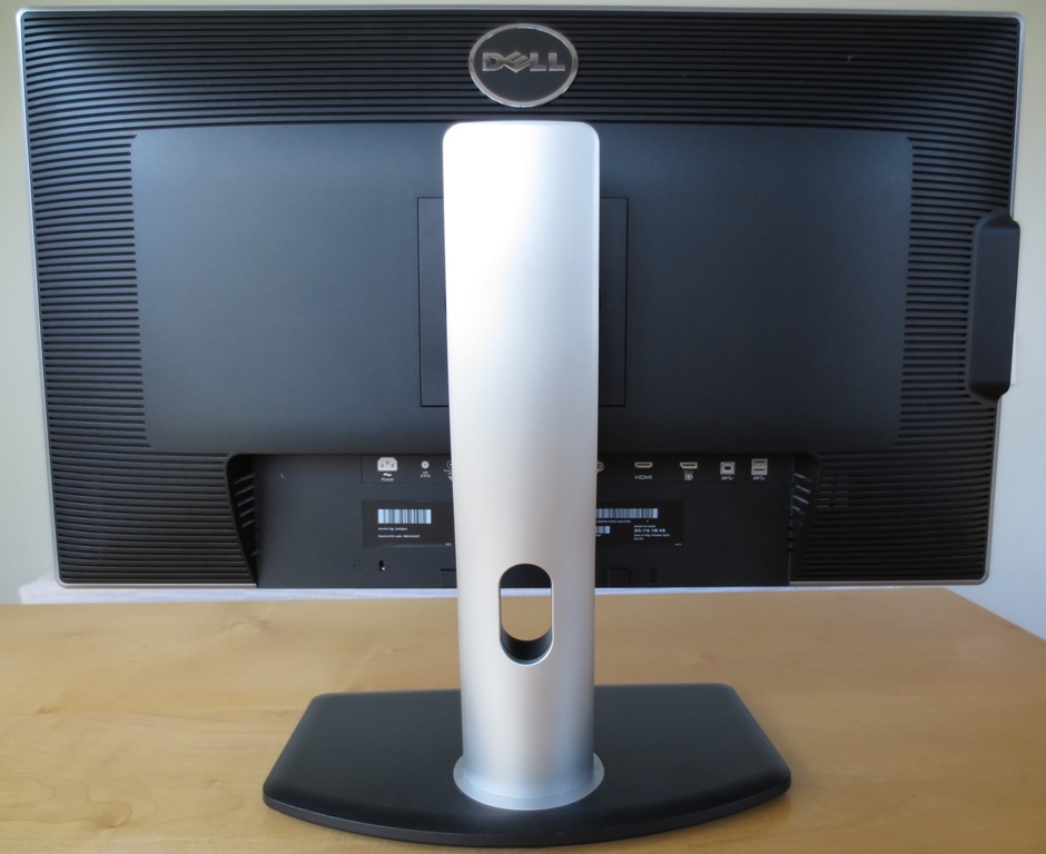
The many ports of the monitor are found at the rear, facing downwards beneath the stand attachment. From left to right; AC power input, DC power output (for Dell AX510 SoundBar), audio out, DP 1.2 in, Mini DP 1.2 in, DVI-D Dual-Link, HDMI, DP 1.2 out (for ‘daisy chaining’), USB 3.0 up and 2 USB 3.0 down ports (making 4 in total). Beneath the ports you will found a Kensington lock as well as useful information about the monitor such as the serial number, service tag, date of manufacture and revision.

Dell includes a Mini DP-DP cable, Dual-Link DVI-D cable, power cable and USB 3.0 upstream cable in the box. The Mini DP-DP cable can be used to connect the monitor directly to GPUs with either full size DP or Mini DP connections, which is useful. The USB upstream cable is required to use the remaining USB ports and flash card reader.
Calibration
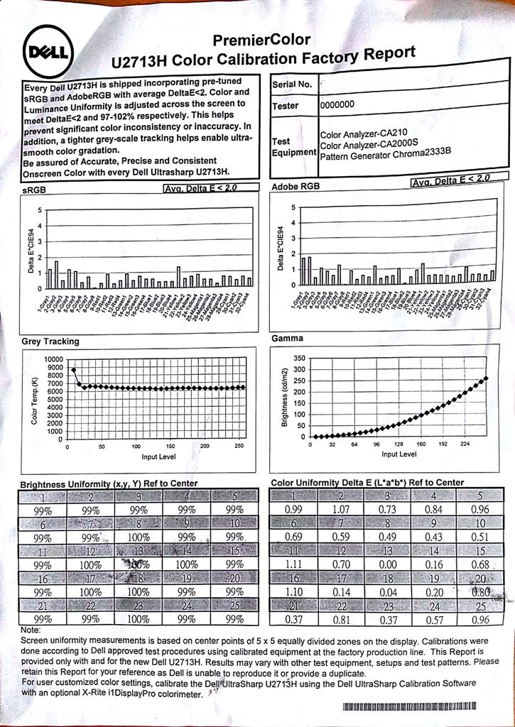
Dell provides a ‘Color Calibration Factory Report’ which is unique to each U2713H. This shows that the monitor has been calibrated to provide accurate colours and greys within both the sRGB and Adobe RGB colour spaces. Dell have created two separate factory calibrated profiles, one for each colour space, which can be activated in the ‘Color Space’ preset mode. According to the report the colours meet a DeltaE of <2, the gamma corresponds with the 2.2 standard and the white point is set to a suitable value of ~6500K (slightly under according to the graph). Factory calibration of colour and brightness uniformity has also been carried out to ensure that each of the 24 non-central sample zones lies within 3% of the central value.
To make proper use of the wide colour gamut and Adobe RGB coverage the user must be working with or viewing content that is designed for this extended colour palette. As we conclude in this article, it is only really a matter of time before this sort of extended colour space becomes the new standard. At the moment most content that you find on the internet, in movies, games and other applications has been designed within the confines of sRGB. When viewing this content using the full native colour gamut of the monitor (i.e. any preset other than ‘Color Space – -> sRGB’) some colours will appear intensely saturated. Some users may like this look and in some instances it can breathe life and richness into scenes. In other cases it can make things simply look out of place.
We used a variety of familiar images and applications, the Lagom website and a Spyder4Elite to assess various ‘Preset Modes’ on the Dell U2713H. The following table describes the overall look to images using those presets and includes a measurement of white point and average gamma. For the purposes of this review and the table below the monitor was connected to a Radeon 7950 using DisplayPort. We also assessed the image on an Nvidia 6-series GPU using DisplayPort to look for any inconsistencies and found the image very much comparable.
| Color Mode (Preset) | Gamma (central average) | White point (kelvins) | Extra OSD features | Notes |
| Standard (Gamma PC) | 2.5 | 6183K | Uniformity Compensation (Off/User/Calibrated), Smart Video Enhance (Movie/Advance/Off). | Image is exceptionally bright and vibrant with some eye-popping colours. When viewing ‘standard gamut content’ there is significant oversaturation of reds and oranges most noticeably which crushes some bright shades. Greens appear very deep. |
| Standard (Gamma MAC) | 2.1 | 6198K | Uniformity Compensation (Off/User/Calibrated), Smart Video Enhance (Movie/Advance/Off). | Gamma reduced from 2.5 to 2.1 alleviating some problems with deep saturated shades. Image still very vibrant with some crushing of reds in particular. |
| Multimedia | 2.6 | 6292K | Smart Video Enhance (Movie/Advance/Off). | Still very bright with some strong vibrant shades. Slightly less intense saturation of reds and greens. |
| Movie | 2.4 | 8119K | Noise Reduction (Off/Low/Medium/High/Adaptive), Dynamic Contrast (On/Off), Hue and Saturation (0-100). | Image has plenty of brightness but is hazed with blue. Strong saturation of reds in particular persisting. White point too high for any earthly lighting conditions. |
| Game | 2.4 | 6229K | Noise Reduction (Off/Low/Medium/High/Adaptive), Dynamic Contrast (On/Off), Hue and Saturation (0-100). | Outstanding vibrancy and brightness with some truly brilliant shades. Comparable to ‘Standard’ but with different OSD options available. |
| Paper | 2.5 | 5347K | None. | This mode still uses the huge native colour gamut but is more restful on the eyes with a weakened blue channel, reduced brightness by default and reduced white point. Similar to using ‘F.lux’ for night time viewing. |
| Color Temp. (6500K) | 2.5 | 6193K | Colour temperature can be set to 5000K, 5700K, 6500K, 7500K, 9300K and 10,000K. Uniformity Compensation (Off/User/Calibrated). | Similar to the ‘Standard’ preset. White point falls short of expected/ideal value but can be easily increased and decreased in this mode. If a very specific white point is required then a hardware calibration device is recommended. |
| Color Space (Adobe RGB) | 2.2 | 6457K | Smart Video Enhance (Movie/Advance/Off). | Still very bright but colour gamut is reduced somewhat, particularly in red region. Image looks very lively and vibrant but reds are somewhat less piercing and oversaturated. Gamma and gradation performance is exceptional and white point is very close to the 6500K daylight white point target. |
| Color Space (sRGB) | 2.2 | 6237K | Smart Video Enhance (Movie/Advance/Off). | Colour space restricted greatly giving a much more muted look. Still good richness and excellent shade variety with excellent gamma and gradient handling. White point in good range but falling a bit short of 6500K daylight target. |
| Custom Color | 2.6 | 6009K | Basic RGB control for ‘Gain’ and ‘Offset’, 6-axis control over ‘Hue’ and ‘Saturation’. Uniformity Compensation (Off/User/Calibrated). | Eye-piercing vibrancy and brightness with reds again extremely saturated. This mode gives you excellent control over colour channels and related adjustments. |
| Test Settings 1 (Adobe RGB, 33 brightness) | 2.2 | 6475K | Smart Video Enhance (Movie/Advance/Off). | Adobe RGB with lower brightness. |
| Test Settings 2 (sRGB, 33 brightness) | 2.2 | 6254K | Smart Video Enhance (Movie/Advance/Off). | sRGB with lower brightness. |
There are a wide range of presets available. They give a slightly different image, but with the exception of the ‘Color Space’ presets use the full native colour gamut of the monitor and give a strongly saturated image. Certain features in the OSD, such as ‘Smart Video Enhance’ and ‘Noise Reduction’ are only available in certain presets. These are essentially post-processing filters that do the sorts of things modern GPUs are able to do anyway – so you’re not missing out on much without these features.
The most flexible preset on the U2713H is ‘Custom Color’ as this allows you to modify the colour channels with great precision. You are able to adjust the usual and useful ‘Gain’ control for red, green and blue colour channels but also adjust the ‘Offset’ for more precise tuning. Furthermore you have 6-axis control over ‘Hue’ and ‘Saturation’; meaning channel adjustment of red, green, blue, cyan, magenta and yellow. This can be particularly useful for print matching. It also allows users to turn down the dial on specific colours that they are perhaps finding too intense or heavily saturated in their sRGB applications due to the extended colour gamut.
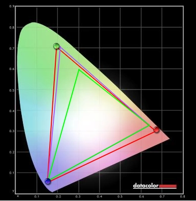
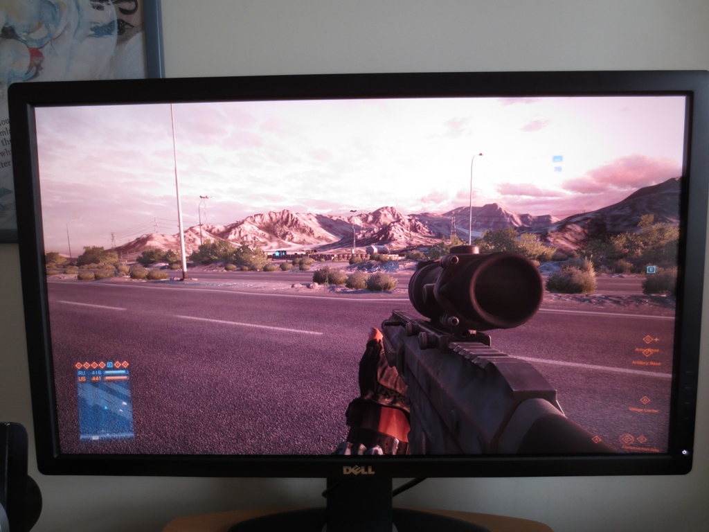
Users requiring specific criteria (such as a gamma of 2.2, white point of 6500K and a specific colour space) to be met will probably find the ‘Color Space’ presets the most useful. These are the Dell factory-calibrated presets and help users meet these specific requirements. The gamma curve, for example, sits far more closely to ‘2.2’ in these presets than in any other. The white point is also very close to 6500K in the Adobe RGB preset but a little further away in the sRGB preset. If users require absolute colour accuracy then they really should be making use of a hardware calibration device. This allows them to build an ICC (or similar) profile specific to their monitor and system which will make corrections to the GPU’s (LUT) Look-Up Table. It also allows them to create additional profiles with respect to changes in colour as the monitor ages and taking into account the effect of different lighting conditions on perception and ideal white point. Users with an i1DisplayPro colorimeter can actually program the monitor’s own LUT directly which gives very specific control over colour space, gamma, white point and colours that will stick regardless of application. This fills in the two remaining ‘Color Space’ presets; ‘Cal 1’ and ‘Cal 2’. It was initially intended that users could perform their own Uniformity Compensation adjustments (‘Uniformity ‘Compensation –> ‘User’) and despite this feature being listed in the OSD it is not actually supported in current revisions (A00 and A01). If hardware calibration appeals to you and it is something that you would like to make use of then be sure to check out the ‘Hardware Calibration’ section of TFT Central’s review. For the purposes of this review we will be focusing our assessment around the two ‘Color Space’ presets. First is the Adobe RGB ‘Color Space’ preset with the brightness turned down (‘Test Settings 1’). This will be used as the primary settings for the review – so unless otherwise stated assume this is being used. When we assess the colour performance of the U2713H we will also be using the sRGB ‘Color space’ preset with brightness reduced (‘Test Settings 2’). This should give users a flavour of the differences that the extended colour space will make to content designed within the more restrictive sRGB colour space. Even with reduced brightness gamma remained very tight to the 2.2 curve as it did using the default brightness in these presets. We used a highly sensitive luminance meter (Konica Minolta CS-200 ‘Chroma Meter’) to measure the brightness of white and black using a range of monitor settings. From this the contrast ratio was calculated. Unless otherwise stated assume that default settings were used, including the default brightness for the preset. The highest white luminance, lowest black luminance and highest contrast ratio are highlighted in black. The results from our two sets of test settings are highlighted in blue. The ‘Custom Color’ preset is the most flexible in its image adjustment options and also provides the highest contrast ratios using default settings. The Dell U2713H achieved a pleasing average contrast ratio of 1044:1 under this preset. The remaining presets make various adjustments to the image, changing the colour channels and gamma and reducing contrast as a result. In most cases contrast remained quite strong, often above 900:1. Some presets made huge changes to white balance, resulting in more significant drops in static contrast. 806:1 was recorded in the ‘Paper’ preset, 797:1 in ‘Multimedia’ and a dismal 674:1 in ‘Movie’. The ‘Color Space’ presets, as used for our test settings, use Dell’s full factory calibration. These corrections are fairly extensive and there is a reduction in contrast to 865:1 as a result. This isn’t too severe really and is better than more significant drops you sometimes see when non-native colour spaces are emulated. There is also a Dynamic Contrast mode that can be enabled in the ‘Game’ and ‘Movie’ presets. This wasn’t very dynamic, though, seeming very slow to react to even dramatic changes in scene brightness and not really changing the luminance much. If users would like to make use of this type of feature then they would be better suited using the ‘Energy Smart’ feature that Dell have included, found in ‘Other Settings’ on the OSD. This can be activated in any preset and is much more responsive to changes in scene brightness. It isn’t too ‘extreme’ in its adjustment range and actually works quite well as a Dynamic Contrast feature. The Dell U2713H does not use PWM dimming for the backlight, even at a brightness of ‘0’. This will be welcome news for users who are sensitive to the rapid ‘on-off’ pulses that are used by some monitor backlights. Observing the monitor displaying a black screen in a darkened room revealed no excess backlight bleed. This is something that can vary between individual units but is encouraging to see nonetheless. There was a small amount of clouding evident in the upper right corner but this was difficult to see in normal circumstances and not as obtrusive as ‘backlight bleed’ would have been. As usual for monitors of this panel type the characteristic ‘IPS glow’ was visible. For those who aren’t familiar with this term, it describes a sort of dynamic sheen of silvery blue and red that appears to move in relation to viewer position. It masks some of the underlying ‘dark detail’ and reduces perceived contrast in affected areas. On a screen of this size it is also evident towards the edges and in particular the bottom corners of the screen from a normal seated position. It is readily observed in a dark room but in brighter conditions can’t be seen so much – but its effect on the image still remains regardless. You would have to move over a meter from the screen whilst remaining perfectly central for the effect to disappear completely, so it’s something you generally just have to live with. It is also important to consider the uniformity of lighter colours, as people don’t tend to stare at black screens all day. To do this Spyder4Elite was used to measure the luminance of 9 white ‘quadrants’ laid out across the screen from top left to bottom right. The table below shows the luminance at each quadrant as well as a percentage difference between a given quadrant and the brightest point on the screen. Our primary test settings were used. The luminance uniformity was reasonable. The highest deviation from the brightest point (197 cd/m2, ‘quadrant 5’ at the centre) was recorded at ‘quadrant 8’ below centre (170.3 cd/m2). Although each region around the centre deviated by ≥10% from the central value, these other values were mostly within 2% of each other. The white point also seemed very consistent even to the trained eye. This wasn’t something that could be conveniently measured using the Spyder4Elite’s software, unfortunately. For general use this performance was absolutely fine, but some users may want to see improvements in this area. There is also a Uniformity Compensation (UC) mode that can be activated in the ‘Standard’, ‘Color Temp’ or ‘Custom Color’ presets. This makes factory-predetermined changes to luminance and colour to try to make things as consistent as possible at various points of the screen. The table below shows the uniformity results with this mode activated in the ‘Color Temp preset’. Brightness was adjusted to closely match our test settings in the centre. The UC feature is designed to work best at the default brightness (50), which is much too bright for most situations. Even with the brightness reduced the UC mode worked as intended. The uniformity was now between 2% and 4% of the central value which is excellent. The contour maps below give a visual representation of the luminance uniformity without UC active and with UC active, respectively. Lighter greys represent higher luminance and darker greys represent darker luminance. You can see that neither graphic appears particularly ‘patchy’ but that the overall variation is much reduced with Uniformity Compensation enabled. To tie everything together we tested the monitor with some game and movie titles and recorded our observations. The first game title tested was the popular title Battlefield 3. Some detail loss was evident towards the edges of the screen (and the corners in particular) as a result of IPS glow. The level of detail in dark areas elsewhere on the screen was pretty good really, with all major detail visible. Some minor details such as materials on guns and the undersides of vehicles were not clearly visible – but they never are on IPS panels with 2.2 gamma. At the high end there was plenty of brightness. Fires, lights and gunfire all stood out very nicely and had a fairly pure look thanks to the low-haze screen surface. The second game title tested was Dirt 3 where similar observations were made. Bright elements within the game (such as lights from cards and lamps around the track) looked reasonably pure and stood out nicely. The screen surface gave a very light misty look to light colours rather than a grainy appearance, which is good. At the low end some minor details were lacking, such as some material textures inside the car and the dark undersides of bridges. With the exception of some detail right in the corners (IPS glow once again) everything else looked pretty much as it should. The U2713H gave a mostly good contrast performance in the Blu-ray of The Girl with the Dragon Tattoo. There was some loss of detail in sections of the screen affected by IPS glow, but this wasn’t too severe. There was also a bit of indistinctness in very dark detail in more central regions, such as the main characters dark brown iris and black pupil. Bright elements were brought out well with no ‘shade crushing’ or bleaching evident. Finally we used the Lagom tests for contrast and noted down any particular strengths and weaknesses in each individual test. The following observations were made: The Dell U2713H uses a new type of LED backlight called ‘GB-LED’. As explored here, this uses a combination of blue and green diodes with red phosphor coatings to achieve enhanced spectral output and colour gamut. The specifications for the monitor clearly advertise its wide colour gamut capabilities, specifically that it covers 99% of AdobeRGB. The panel specifics go on to claim ~103% NTSC coverage which is very broad indeed. The images below show our respective measurements of the monitor’s native colour gamut (‘Custom Color’ preset) and the colour gamut in the Adobe RGB and sRGB ‘Color Space’ presets (our test settings). In these images the red triangle represents the measured gamut, the green triangle represents the sRGB colour space and the purple triangle Adobe RGB. The native colour gamut extends beyond Adobe RGB in the red region in this representation of the colour gamut and tracks quite closely elsewhere. The Adobe RGB preset does an excellent job at emulating the correct colour space whilst sRGB does the same. It is important to note that these simple 2D diagrams don’t tell the whole story. In the red and blue region, for example, Adobe RGB and sRGB appear to coincide very closely. If you look at a 3D gamut model you will notice that reds and combined shades of all colours show significantly greater extension in Adobe RGB. As a result you will not simply notice more saturation in green shades but other shades as well. The differences between our two ‘test settings’ sets (and hence Adobe RGB and sRGB) becomes very clear once you see them in action. We subjectively assessed colour performance in our game and movie test titles using both the sRGB and Adobe RGB gamuts. Like most current titles these are specifically written for sRGB which is the present standard for such media. As mentioned in the calibration section such content appears more saturated and vibrant under wider colour gamuts rather than being represented as intended. Under sRGB Battlefield 3 looked much as it should. The game engine is natural a bit restrictive in its colour palette but the monitor did well with what it had. Colours were consistent with a good variety of muted earthy browns and greens. Brighter colours such as green and orange in-game markers, aircraft HUD elements and roaring flames exhibited a good degree of vibrancy. Switching over to Adobe RGB really brought out the vibrant elements within the game. Orange, red, blue and green markets in the game and on the map had the ‘neon’ look they crave. Blues, reds and yellows on road signs and vehicle HUDs were superbly solid. Roaring flames had a warming, rich and very vibrant orange glow to them whilst the sparks and blue flames of the engineer repair tool looked like a firework display. In some ways it was nice to have a saturation injection – after all, many people feel that Battlefield 3 looks too drab, undersaturated and washed out normally. Some elements looked a bit out of place, though. Certain objects in the background that would usually blend in and peacefully exist became almost distracting and ‘loud’ in their vivid appearance. Some of the orange container crates, for example, became very bright and creeping towards neon in their appearance. They also took on more of a bit more of red than orange hue. Some patches of grass looked slightly neon in a way, too, standing out a bit too well with the much darker greens surrounding. On the second game title, Dirt 3, the Dell U2713H showcased an excellent range of shades under sRGB. The racing environments looked very natural with a good range of minty and pastel greens and appropriate earthy hues. Our only minor criticism here is that some of the deeper greens could have done with a little more depth and lushness. The car paints relished in the superb colour handling and shade range of the monitor. They weren’t as vibrant as we’ve seen but were still reasonably vivid and showed good depth. Under Adobe RGB there were some superbly lush, strong and deep greens in the environment. Although there was still a good variety of greens, some of the lighter and minty shades looked a bit ‘off’ with their not so subtle and natural appearance. Some of the reds exhibited similar properties, with certain brown tree trunks looking a little rich in red compared to brown. The Kenyan rally tracks which ‘suffered’ most from this really had a lovely and appropriate rich ‘red earth’ look brought out in the landscapes. The hue wasn’t too strong as to look out of place – everything still had a good earthy quality to it rather than looking like somebody had spray-painted it red. What was particularly impressive was the new world of vividness given to the car paintjobs and advertising around the track. There were some superbly deep and solid-looking reds, greens and blues standing alongside electric-looking light blues, bright greens and neon pinks. There was still an excellent range of more subtle shades in the mix, too. These were more saturated than before but retained their individuality and ‘quieter’ look. Our first Blu-ray movie title, The Girl with the Dragon Tattoo, had a good natural look to it under sRGB with appropriately saturated skin tones and strong shade variety. Thing essentially looked as they should if slightly muted in places. Using the Adobe RGB mode the pleasing shade variety was maintained but with everything becoming more saturated. Skin tones took on a slightly more red hue; this was quite subtle and didn’t give any characters unintended sunburn. Some objects in the environment, characters’ clothing and household ornaments become more striking in their appearance. The environments looked a tad richer but still natural. One interesting point to note is that the red rear lights of cars in the film became a more vibrant red, one that seems to better represent their real world counterparts. Futurama: Into the Wild Green Yonder was the second Blu-ray movie tested. Using sRGB the U2713H displayed an excellent range of colours, including impressive deep pinks and purples, pastel blues and bright neon colours such as greens, yellows and pinks. Some subtle distinctions in shades (such as very slight differences in character skin tone) were really shown off nicely. To the eye the consistency of colours was also exceptional; large areas of a given colour looked solid and a given shade appeared correct regardless of on-screen position. Adobe RGB really ramped up the vibrancy with some truly stunning colours on display. It is difficult to pinpoint ones that stood out, but some of the more striking shades included; deep blues and greens, shocking bright pinks and highlighter yellows. Although the more muted shades were distinctly ‘un-vibrant’ in comparison they sort of lost their pastel qualities. Given that this is an animated film set in a fictional universe that isn’t necessarily a huge problem, but it does represent a wider issue. As with all instances of representing sRGB content in the Adobe RGB colour space, a lot comes down to personal preferences. Some really like the saturation and stunning vibrancy whilst others like to know the colours are being represented accurately. The good consistency we’d seen in colours on our game and movie test titles was reflected Lagom’s test for viewing angles. This is a good quality to have for general use as it enhances the distinctness and individuality of shades. It’s particularly important for users who do colour-critical work. The following observations were made: The U2713H’s 2560 x 1440 (WQHD) resolution delivers an excellent level of detail and is great for general desktop tasks. The low haze matte screen surface helps ensure that these pixels can be seen much more clearly than on the older high have matte screen surface of the U2711. The detail this brings to textures and special effects in games is also nice. With more than 1.77 times as many pixels as a 1920 x 1080 the demand on the system and GPU in particular is also increased. Some users may be considering running games on this monitor at a lower resolution, such as 1920 x 1080, to improve performance. The monitor has an internal scaler whose behaviour can be altered in ‘Display Settings’ –> ‘Aspect Ratio’ on the OSD. It is possible to run things in a 1:1 pixel mapping mode, which gives you a small centered image using only 1920 x 1080 pixels as shown below. Obviously there is a lot of wasted screen space here, but the image itself is mapped correctly so that it is shown in a ‘Full HD’ resolution. No interpolation is used. If you want to use the full screen then the image you see above is essentially stretched out (interpolated) to fit all 2560 x 1440 pixels. This is the default setting and is shown below. It is not obvious in the image and difficult to capture on camera but this essentially makes everything look soft and a bit fuzzy. The game lacks the relatively crisp and detailed look of running the 1920 x 1080 resolution on a native Full HD display and is worlds away from running 2560 x 1440 natively. When you are running the monitor in its native WQHD resolution but are viewing Full HD content (such as Blu-rays) everything is automatically upscaled by the GPU. This doesn’t degrade and blur things to the same extent as running a non-native resolution. Sharpness is degraded slightly but the Blu-rays we tested still had a crisp and detailed look on the U2713H. From a normal viewing distance you would be hard pushed to notice you weren’t viewing the Blu-ray in its native resolution, really. In order to get a representative value for input lag we used a similar ‘camera and stopwatch’ method to that used in our other recent reviews. To help maximise accuracy we took an average value of over 120 readings. We also compared the U2713H with several reference monitors of known input lag, ranging from ‘zero’ to 30ms with a number of intermediate values. We measured ~24ms (1.5 frames) of input lag which will be fine for some users but not others. Dell also provides a ‘Game’ preset which seems to bypass some of the processing done by the monitor. On the revision we tested (A00) the screen blanks out momentarily as this mode is activated to indicate such a change is taking place. Using the ‘Game’ preset we recorded a reduced input lag of ~14ms (< 1 frame). This will be welcome news for some users. To give a visual indication of the pixel performance on a typical range of rapid grey to grey transitions we used a tool called PixPerAn (Pixel Persistence Analyser). The tool is set to the fastest motion speed and a camera is used at high-sensitivity to capture the resulting trailing. You can see a fairly strong first trail but no obvious additional tails or overdrive trails in this test. The trail is somewhat bolder than on the U2713HM, shown below for comparison. This is not just due to the obvious differences in colour balance in these photos and goes to show how misleading quoted response time values are (6ms G2G for the ‘H’ vs. 8ms for the ‘HM’). You can also see subtle overdrive artifacts on the ‘H’ photo above, an inverted ‘OR’ on the trail itself from the word ‘MORE’. This is not visible for the ‘HM’ model. Delving deeper into the pixel responsiveness and trailing on the U2713H, we used our game and movie test titles to assess a broad range and speed of pixel transitions. On Battlefield 3 there was a light to moderate blur when on foot. This was a bit more pronounced than on models such as the U2713H with stronger pixel overdrive but noticeably weaker than on models with overdrive disabled or absent. Interestingly there were some signs of overdrive trailing (inverse ghosting) despite the grey to grey acceleration seeming relatively weak. This was not too obtrusive in most situations when fighting on foot. The most noticeable instances were the cyan or violet trails visible when moving past dark objects set against bright blue sky. This is shown in the video below. The nature of this trailing isn’t quite as obvious on the video as it is when seeing it in person. The freeze-frame below gives a clearer view of how it’s manifesting itself. The fastest paced action on Battlefield 3 comes when inside quick vehicles such as aircraft, jeeps and ATVs. In such situations the trailing (or blur) became more pronounced but wasn’t too extended or ‘smeary’ as you may see on non-overdriven IPS models. There were some noticeable instances of fairly bright and pronounced overdrive artifacts, particularly when zipping around in aircraft. Clouds sometimes had an unusual murky blue-green outline as you moved past them, particularly when they were next to bright blue sky. On some maps a similar effect could be observed around landscape features such as sand dunes and mountains with colourful sky in the background. As with other trailing it was fairly short-lived and compact so not overly distracting – some people may find it bothersome and others won’t really notice. It isn’t just during games that this sort of colourful trailing can be observed. When rapidly scrolling webpages, for example, it can sometimes be seen as well. On Dirt 3 trailing was moderate and fairly consistent. Objects in the background became quite blurry even during gentle cornering. This was never excessive enough to mask the contours of the track during the race modes, which is a positive attribute of the grey to grey acceleration. There was mild overshoot in some places, such as the tops of trees with sky in the background. This was faint enough to escape your peripheral vision so if you’re concentrating on the road ahead you wouldn’t even register it. There wasn’t any obvious inverse ghosting in the usual places, such as when passing lights or bright and reflective orange barrier tape at night. The rapid spins of gymkhana caused the usual dizzying blur. Despite the heavy blur objects remained distinct enough to be maneuvered around. In our Blu-ray movie test titles the low frame rate (~24fps) at which the movies run essentially broke up the image so that this rather than pixel responsiveness became the limiting factor. There was no additional ‘conventional’ trailing from the monitor itself and no overly conspicuous overdrive artifacts either. There were overdrive artifacts in some scenes but they generally weren’t as obvious as those observed when gaming. The Dell U2713H is an intriguing and thus far unique monitor, being the first model to make use of LG’s new ‘GB-LED’ backlight design. This allows the monitor to remain relatively slender and energy efficient whilst also sporting a wide colour gamut. Such functionality essentially makes this the U2711 replacement that the U2713H never really was. It’s also the sort of technology that should drive a resurgence in wide- gamut monitors. And in time facilitate similar evolution in the content itself, too. When it comes to colour reproduction the monitor put in an excellent performance. Dell included some nicely setup factory-calibrated presets which emulated both the Adobe RGB and sRGB colour spaces successfully. Gamma tracking and white point under these presets was pleasing and colours looked very much as they should with exceptional consistency across the screen. In our testing we had an opportunity to test both of these presets (with brightness lowered somewhat) and compare the look they gave to a range of game and movie titles. The U2713H exhibited excellent shade variety and portrayed things in the intended way under its sRGB preset. Because this content is specifically designed for the sRGB, using Adobe RGB increases the saturated and vivid look. Some people will like this look and be pleased to see the monitor outputting some of the more vivid colours that our eyes see in the real world but can’t be captured in sRGB. For those that prefer a balance some way between these two colour spaces the monitor also offers a highly flexible ‘Custom Color’ preset. This allows individual control of the colour channels and includes 6-axis saturation control. If you own (or intend to own) an X-rite i1Display Pro colorimeter then you can create your own custom-calibrated presets which includes user-specified colour gamut coordinates. The ‘Custom Color’ preset really allowed the monitor to roam free and produced the best contrast performance, rising above 1000:1 which is impressive for an IPS. Some of the other presets made significant changes to the image and as such reduced contrast by varying degrees. The ‘Color Space’ presets used as our test settings reduced the contrast to around 840:1 which is still respectable. Regardless of preset, there was that niggling issue of ‘IPS glow’ which crushes some detail peripherally. This puts some users off IPS technology entirely whereas other users won’t raise an eyebrow – at any rate this isn’t an issue specific to the U2713H. Responsiveness was a bit of a mixed bag really. The input lag was much in-line with what you’d expect from Dell’s 27” UltraSharps, so higher than some would like but fine for others. On the unit we tested there was also an input lag reducing ‘Game’ preset that was good to see. It was clear from its performance in games that grey to grey acceleration was being used to boost response times. Conventional trailing was reduced and there were also signs of overdrive artifacts. Overall the pixel responsiveness was not really as strong as on the U2713HM which seemed to produce less conventional trailing whilst remaining free from observable overdrive artifacts. The U2711 on the other hand had some quite heavy overdrive artifacts which really bothered some people. So this illusive U2711 replacement was a long-time coming and we definitely feel this is a worthy successor. If we were to name one particular aspect that we are most glad to have seen Dell improve on this model it wouldn’t be the energy efficiency, lower heat output, improved contrast or vastly superior colour space emulation. It would be the screen surface. This is light matte anti-glare, giving a clearer and more vibrant image than that used on the U2711 and many other older IPS monitors. Good riddance to the dirty and crystalline look from the heavy, grainy high-haze matte anti-glare surface.
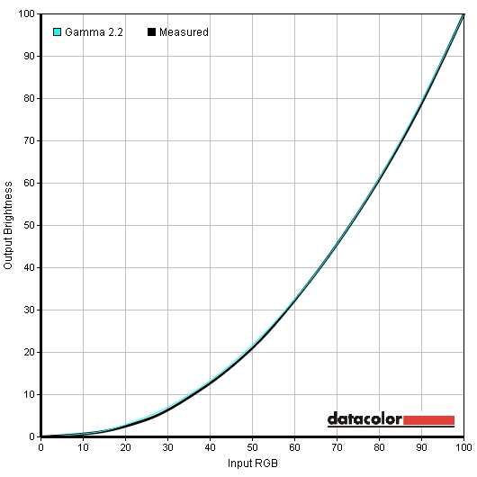
Gamma curve Adobe RGB
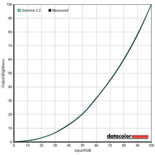
Gamma curve sRGB
Contrast and brightness
Contrast ratios
Monitor Profile White luminance (cd/m2) Black luminance (cd/m2) Contrast ratio (x:1) Custom Color, 100% brightness 358 0.35 1023 Custom Color, 80% brightness 331 0.32 1034 Custom Color, 60% brightness 317 0.31 1023 Custom Color, 40% brightness 262 0.26 1008 Custom Color, 20% brightness 148 0.14 1057 Custom Color, 0% brightness 56 0.05 1120 Test Settings 1, 33% brightness, 50% contrast (Color Space – Adobe RGB) 199 0.23 865 Test Settings 2, 33% brightness, 50% contrast (Color Space – sRGB) 199 0.23 865 Standard 282 0.30 940 Multimedia 239 0.30 797 Movie 182 0.27 674 Game 272 0.29 938 Paper 137 0.17 806 Color Temperature (6500K)
281 0.31 906
PWM (Pulse Width Modulation)
Luminance uniformity
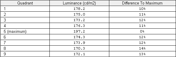
Luminance uniformity table

Luminance uniformity table (UC on)
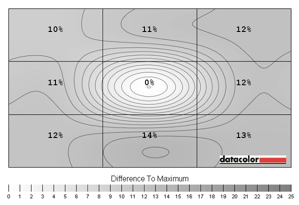
Luminance uniformity map
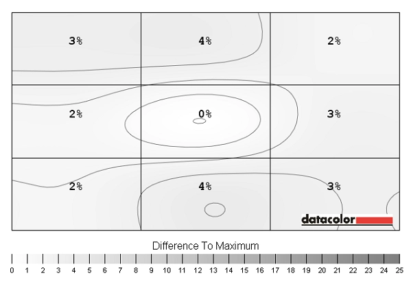
Luminance uniformity map (UC on)
Contrast in games and movies
Lagom contrast tests
Colour reproduction
Colour gamut
Native colour gamut
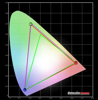
Adobe RGB emulation

sRGB emulation
Colour in games and movies
Viewing angles
We also observed off-centre viewing angle performance on the Lagom text, a mixed desktop background and dark desktop background. The video below highlights the relatively strong performance in this area with very little shift in colour and shifts in contrast that are relatively gradual and minor. The dark desktop background reveals ‘IPS glow’ which has been discussed previously.
Interpolation
![]()
1:1 pixel mapping
16:9 wide
Response times
Input lag
Pixel responsiveness
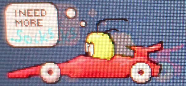
U2713H PixPerAn
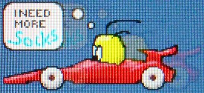
U2713HM PixPerAn
Purple trailing on BF3
Green trailing on BF3
Conclusion
Positives Negatives Good static contrast for IPS, particularly in the ‘Custom Color’ preset. The image has a relatively clean look thanks to the light matte screen surface
Contrast reduction in some presets whilst IPS glow universally causes some loss of detail peripherally. Image not completely ‘clean’ like a glossy display
Preset variety is good with excellent factory-calibrated sRGB and Adobe RGB preset. Hardware calibration also supported Uniformity Compensation can’t be activated in the factory-calibrated presets and hardware calibration is restricted to one specific colorimeter Excellent colour reproduction with wide colour gamut support, strong shade variety and consistency. Some of the shades produced by the monitor are truly stunning
Most games, movies and images are designed around the sRGB colour space and become oversaturated when viewed with a broader gamut
Grey to grey acceleration provides a moderate reduction to trailing and improves the monitor’s gaming performance
Input lag could be too high for some users. Overdrive artifacts could also prove an unwelcome distraction
A solid build with fully adjustable stand, VESA mounting and an excellent range of inputs and outputs. The price is very agreeable given the performance and features on offer The ‘business-like’ styling won’t appeal to everyone and several revisions are likely to come out which could change some performance aspects and cause confusion
![]()

