Author: Adam Simmons
Date published: September 30th 2014
Table of Contents
Introduction
Preference for matte or glossy monitors is a very individual thing, indeed each have distinct advantages and disadvantages. There is a recent trend for higher end models towards much lighter matte screen surfaces, so called ‘semi-glossy’ ones which provide a good middle ground between traditional ‘matte’ and ‘glossy’. But some people prefer the fully glossy surfaces and unfortunately the choice of such models is very limited. The Dell S2415H features a modern AH-IPS (Advanced High-Performance In-Plane Switching) with very slender bezels. One particular feature that distinguishes this one from the girth of other ~23 models with IPS-type panels is its glossy screen. We take a look at how this monitor performs in a range of games, movies and other applications.
Specifications
This model features a 60Hz 23.8” AH-IPS panel which employs the usual 6-bit+ FRC (Frame Rate Control) dithering. Given how well such panels handle this it isn’t really something that most users should worry about. A 6ms grey to grey response time is specified, but as this review demonstrates you need to look beyond this figure as it gives a poor indication of what to expect in practice. At time of writing the monitor has not reached full retail availability. The UK price in particular reflects this.
The key ‘talking points’ of the specification have been highlighted in blue below.
Features and aesthetics
The front of the monitor reveals a smooth, glossy face with barely visible bezels. The design is ‘edge-to-edge’ at the top and sides but there is no glass-cover, unlike on the S2440L and S2740L. This reduces reflections from light sources external to the monitor and eliminates internal reflection.
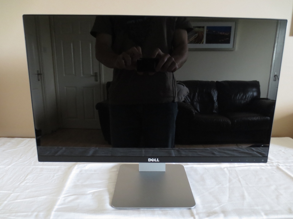
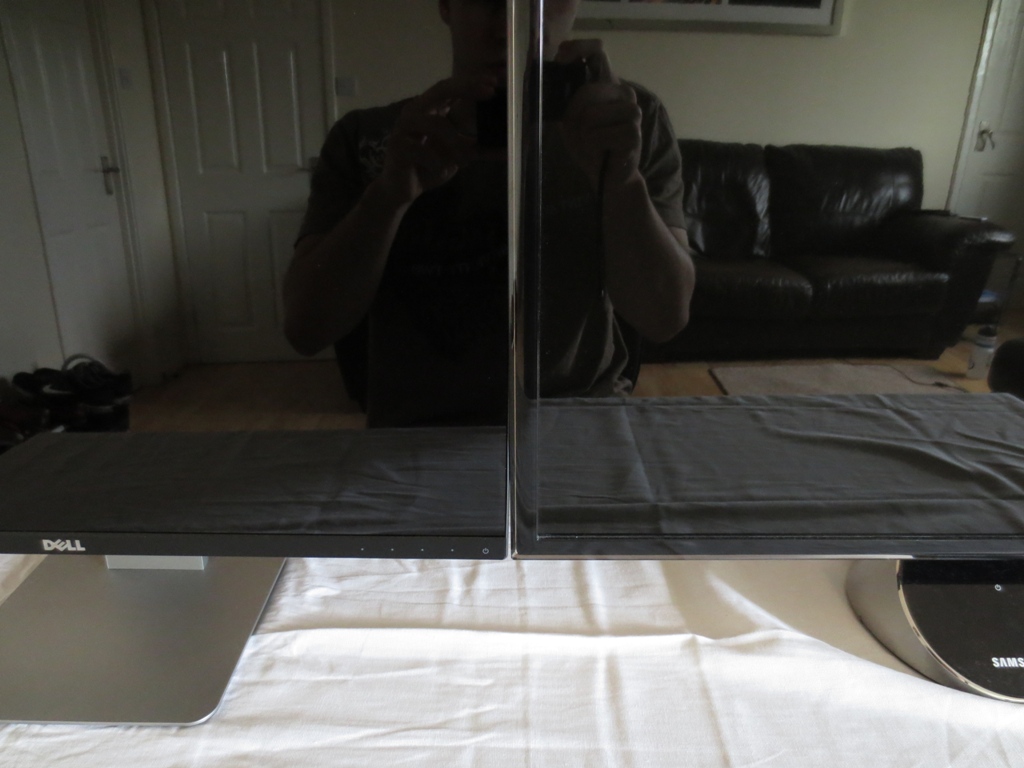
As you can see above, this is very much a glossy monitor. The screen surface has a mild anti-reflective treatment but has an entirely smooth outer polarising layer. The image below, taken in a bright room like the image above, shows that the reflectivity of the S2415H’s surface (left) is fairly similar to the ‘Ultra Clear’ surface on the Samsung S27A750D (right). Although not clear in the image, it’s actually slightly less reflective, giving a slightly darker tint to the reflection.
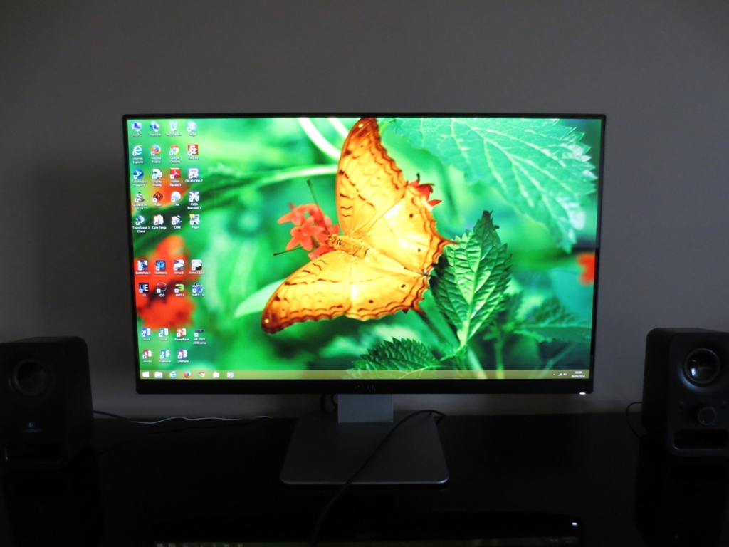
As explored in this article there are definite advantages to using a glossy screen surface when it comes to vibrancy and clarity. Such a surface calls for careful moderation of lighting in the room – avoid direct light sources striking the screen surface where possible and try to avoid bright ambient light. Once the monitor is switched on its own light competes with the reflected light, significantly reducing reflections on lighter content in particular. The image below shows the monitor displaying mixed content in a bright room (brighter than it looks in the image). You can see reflections are reduced, particularly on lighter areas.
Another thing you notice when the monitor is switched on is the border around the screen – but barely. The total screen border includes a thin black border from the panel as well as the outer rim of the monitor (bezel). With a total width of 6.05mm (0.24 inches) they’re exceptionally slender. The bottom bezel is thicker as it offers support – around 17mm (0.67 inches). This is particularly useful in multi-monitor setups where you want to minimise ‘distractions’ between screens but also had quite a nice look on a single monitor.
It also features touch-sensitive areas at the right to control the OSD (On Screen Display). These are (left to right); ‘Shortcut Key 1 (Preset Modes by default)/Up’, Shortcut Key 2 (Volume by default)/Down’, ‘Menu/Enter’ and ‘Exit/Return’. There is a rectangular white power LED which is illuminated when the monitor is switched on and blinks when the monitor is in a low power state, by default. It can be configured to remain off when the monitor is on if you prefer, but we don’t feel this power LED was at all obtrusive. We found the control buttons to be fairly responsive and didn’t have any major issues using them, although can understand why some would prefer buttons you physically press. The OSD is laid out in Dell’s usual modern style and includes a number of useful features beyond the basics. The video below gives a run-through of the OSD.
The monitor is fairly slender at the side – 21mm (0.83 inches) at thinnest point, lumping out centrally where the stand attaches. There is also a 3.5mm headphone jack at the left side. The stand is tilt-only, but is quite solid (wobble-free) thanks to the central attachment point and quite robust stand construction.
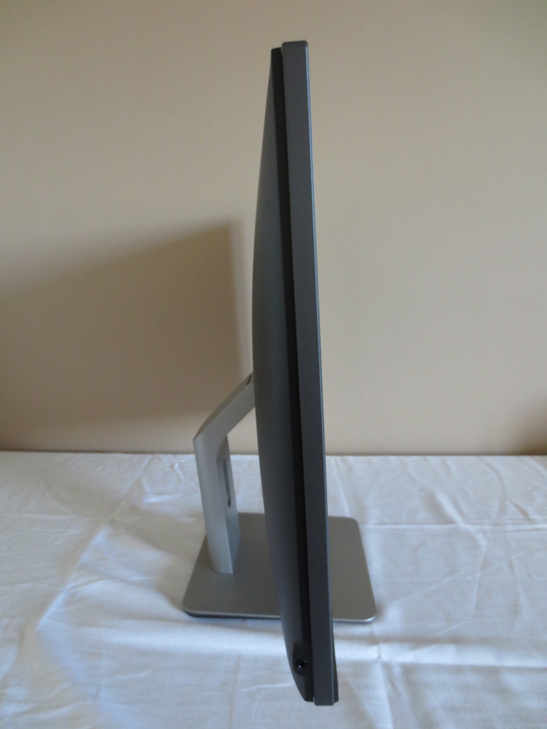
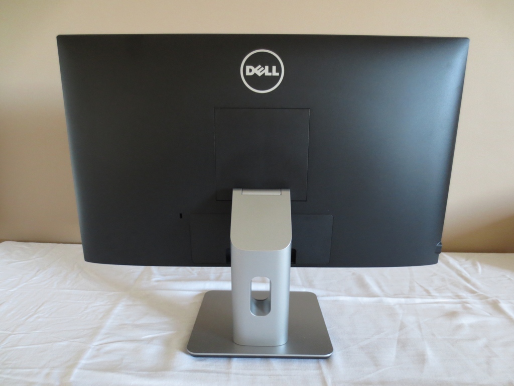
At the rear of the monitor things are quite minimalistic. The stand can be removed by using the quick-release button beneath the attachment point. This allows an alternative VESA 100 x 100mm stand or mount to be employed. The ports are found beneath a detachable port cover, central and near the bottom. To the right of this there is a K-Slot.
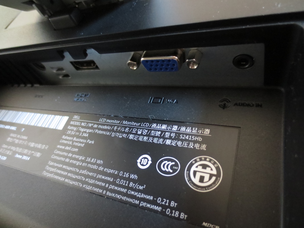
The ports are also fairly minimal – DC power input (external ‘power brick’), HDMI (with MHL), VGA and 3.5mm audio input. They face downwards in a recessed area, in front of the stand neck. They’re therefore fairly tricky to access – not a problem once everything is connected, but hardly convenient if you want to use MHL briefly. It’s also worth mentioning the speakers found on the underside of the screen. These are 3W stereo speakers and are some of the better speakers we’ve heard on a monitor. Whilst these speakers didn’t really give the dynamic and bass-packed sound that a decent standalone pair can provide, the depth to the sound exceeded what we would expect from the 3W rating. They gave a surprisingly full and clear sound. The volume control was also excellent, allowing you to choose anything from very quiet to quite loud without obvious distortion.
Calibration
Correcting the colour signal
For this review an Nvidia GTX 780 was used connected by the only digital connection available on the monitor; HDMI. The GPU treats the monitor as an HDTV and sends out a ‘Limited Range RGB 16-235’ signal. This didn’t cause the completely washed-out look that often greets you on a PC monitor under such circumstances, but it did negatively affect colours to some degree and had a significant impact on contrast. This article explores various methods that can be used to correct this issue. We opted for the third Nvidia solution, which involves using a small utility to enforce the correct ‘Full Range RGB 0-255’ signal. AMD GPU users should follow the advice on that article to help optimise their signal, too.
Subpixel layout and screen surface
As mentioned in the previous section, this monitor employs a glossy screen surface. It has a smooth outer polarising layer that allows direct emission of light without significant diffusion. This allows the monitor to display text with good crispness and images with good clarity. It also allows colours to ‘pop’ off the screen with a smooth and grain-free look where appropriate. This screen surface also reflects ambient light as illustrated previously.
![]()
The subpixel layout on this monitor, at least on the sample we tested, is RGB (Red, Green and Blue) stripe as shown above. This is the default and most common subpixel layout which operating systems including Windows and MacOS are configured to handle correctly by default. There is no need to run Windows ClearType, unless you’ve configured this for another monitor or are otherwise unhappy with default text handling.
Testing the presets
The Dell S2415H has a number of different ‘Preset Modes’ available; ‘Standard’, ‘Multimedia’, ‘Movie’, ‘Game’, ‘Paper’, ‘Warm’, ‘Cool’ and ‘Custom Color’. The table below gives a general impression of the image as well as the range of preset-specific options available. Key readings (gamma and white point) are also provided courtesy of a Spyder4Elite colorimeter. For this table we have picked some presets that we feel will be most appealing to users. The ones we haven’t analysed simply have a negative impact on image quality and we don’t see any practical use for them.
| Preset Mode | Gamma (central average) | White point (kelvins) | Extra OSD features | Notes |
| Standard (Factory Defaults) | 2.1 | 7214K | Sharpness | Bright (not obnoxiously so) with a significant cool tint. Some dark shades (including near-blacks) appear a little lighter than they should but plenty of richness and vibrancy. |
| Multimedia | 2.2 | 6515K | Sharpness | Surprisingly well-balanced both in terms of white point and overall colour characteristics. Brightness is also quite comfortable. A good rich, varied and natural look to the image. |
| Game | 2.3 | 6631K | Hue, Saturation, Sharpness, Dynamic Contrast | Quite well balanced for white point, but some dark shades are too deep and there is a little bit of a ‘crushed’ look in places as a result. Brightness is slightly lower than ‘Standard’. |
| Paper | 2.0 | 5471K | Sharpness | Dim with a warm and somewhat green tint – essentially a ‘Low Blue Light’ mode which is good for relaxing evening viewing. |
| Warm | 2.0 | 6105K | Sharpness | Relative weakness of blue channel provided a slightly warm tint, as promised. Similar brightness to ‘Game’ mode. |
| Custom Color | 2.1 | 7108K | Sharpness (plus colour channel adjustments – R, G, B) | Similar to standard with a slightly green tint. |
| Test Settings (as below) | 2.2 | 6508K | Sharpness | A very inviting look to the image with plenty of depth and vibrancy and pleasing balance. |
| Calibrated Settings (ICC profile applied, see below) | 2.2 | 6508K | Sharpness | Similar to ‘Test Settings’ with slight additional corrections (for example, to the gamma curve). These corrections had a relatively subtle effect on the image. |
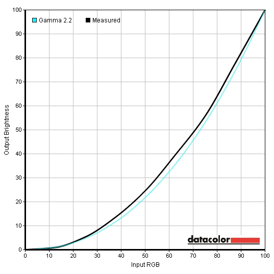
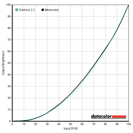
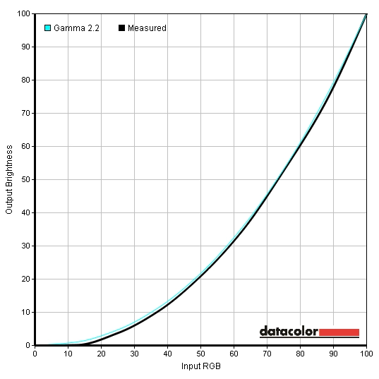
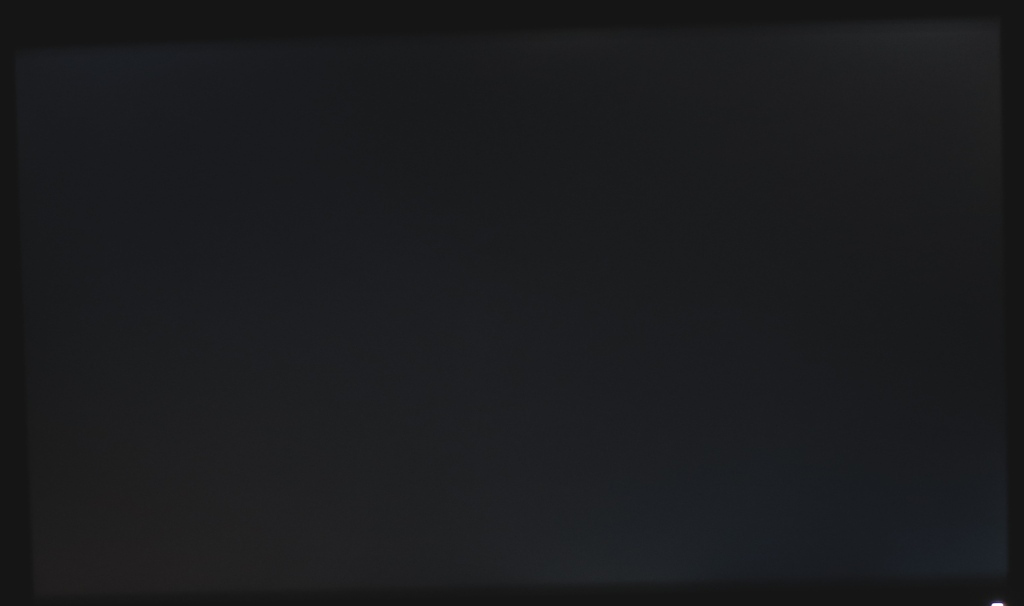
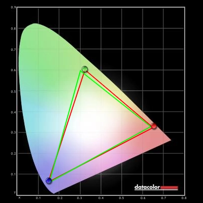
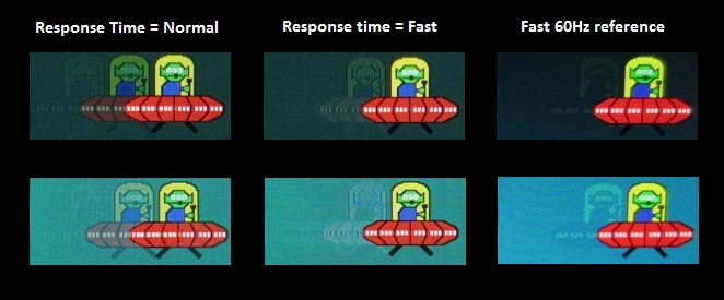
The S2415H provided an image that was fairly inviting out of the box. Bright, without being retina-scorching and with a noticeable cool tint that upset overall balance. The gamma averaged 2.1 out of the box and as you can see below deviated fairly significantly for certain mid-grey shades in particular. Rather surprisingly, the ‘Multimedia’ preset provided a much better balance to white point and the overall image. White point was now very close to the desired 6500K without any significant tint of any particular colour and gamma averaged 2.2 with better tracking close to the curve. We found the brightness quite comfortable in this mode at the default of ‘75’, but lowered this slightly for our test settings. The gamma curve now looked as follows. As you can see the gamma tracking was quite good really, but could still be improved further by calibration with a colorimeter. This brought things even closer to the desired 2.2 curve as shown below. We also liked the inclusion, albeit not a unique one, of ‘Paper’ mode. This greatly reduced blue light output from the monitor and provided a more restful image for evening viewing in particular. Although Dell don’t tout this as a ‘Blue Light Reduction’ mode or anything like that, it has exactly the same effect – no need for fancy marketing. For our test settings we simply used ‘Multimedia’ mode with a slight reduction in brightness. Although it has no bearing on the static image quality, we have also include our ‘Response Time’ preference here for reference. The gamma behaviour in ‘Multimedia’ was more desirable than in any other preset (including ‘Custom Color’) and given the well balanced colour channels there was no need to adjust things. It’s worth noting that individual units can vary and we can’t guarantee that these settings will be optimal for everyone. They’re certainly worth trying, but if you feel there is a certain tint on your unit when using the ‘Multimedia’ preset, we’d recommend manual adjustments in ‘Custom Color’ instead. This doesn’t have to be anything too severe, just something like ‘100’, ‘97’, ‘96’ (R,G,B) if you notice your unit has a slight cool and somewhat green tint, for example. Brightness= 63 (according to preferences and lighting) Contrast= 75 Response Time= Normal As noted the differences that the ICC profile made to the image were rather unsubstantial on our unit. Nonetheless we like to provide users with this option on monitors where the gamma doesn’t track quite as close to the desired 2.2 curve as some users might like. Please note again that individual units can and do vary, so using this ICC profile may be detrimental to image quality and may not have the desired effect. Due to this inter-unit variation, the fact that the image was appealing without an ICC profile and the fact that most of our testing was with applications that don’t fully use ICC data (games, movies etc.) we will not be using this ICC profile for our testing. These limitations aside, if you would like to try our ICC profile please do the following: We used a KM CS-200 light meter to measure white and black luminance levels. From these static contrast ratios could be calculated. The table below shows these readings and calculations using a variety of settings, including those looked at in the calibration section. Unless otherwise stated and with the exception of our ‘Test Settings’ and ‘Calibrated Settings’ assume any setting not mentioned was left at default. Black highlights indicate the highest white luminance, lowest black luminance and peak contrast ratio recorded. Blue highlights indicate the results for our ‘Test Settings’ and ‘Calibrated Settings’. The S2415H gave a pleasing static contrast performance, with an average static contrast ratio of 1192:1 in ‘Custom Color’ with brightness only adjusted. Contrast dropped slightly in certain presets, for example ‘Multimedia, ‘Game’ and ‘Paper’. It still remained above 1000:1, which is pleasing. Under our test settings contrast was, unsurprisingly, very similar to ‘Multimedia’ at 1060:1. This dropped just slightly to 1040:1 following the adjustments made in the ICC profile. The highest luminance recorded was 260 cd/m² and the lowest white luminance a rather low 39 cd/m². This gives a luminance adjustment range of 221 cd/m² with plenty of useable values. The monitor features a ‘Dynamic Contrast’ mode which can be activated in the ‘Game’ and ‘Movie’ presets. This mode was effective, as far as such modes go, in that the backlight reacted rapidly to changes in the balance of light and dark on-screen. The monitor tended to provide a little more brightness than we’d like during mixed images with this setting enabled but did dim very effectively for darker content. As with all modern LCDs the backlight is controlled as one single unit, so this mode cannot simultaneously brighten some areas of the image whilst darkening others. The S2415H does not use PWM (Pulse Width Modulation) to moderate backlight brightness to any brightness level and instead uses DC (Direct Current) modulation. This is another way of saying that the monitor uses a ‘flicker-free’ backlight, which will please users sensitive to flickering or who want to reduce eye fatigue when using a monitor. Observing a black screen in a dark room revealed a minor degree of backlight bleed towards the left corners of the screen in particular. As you can see in the image below, this was not a significant issue on our sample. This image was taken from a central position a few metres back from the monitor to eliminate so-called ‘IPS glow’. IPS glow is a common characteristic on many IPS and related panels and appears as a greyish blue or golden haze, depending on viewing angle. It can also be seen from a normal viewing position, with its effects described in this review. A Spyder4Elite was used to analyse the uniformity of lighter colours. To do this, 9 equidistant white quadrants were analysed. These run from top left to bottom right. The table below shows the luminance measured at each quadrant alongside a percentage deviation between a given quadrant and the brightest measured point. The luminance uniformity of the screen was variable but mostly quite good. The brightest point was ‘quadrant 4’ to the left of centre (161 cd/m²). The central region, ‘quadrant 5’ fell 2% short of this at 157.4 cd/m². The greatest deviation occurred at the bottom left corner, ‘quadrant 9’ (134.6 cd/m² which is 16% dimmer than the brightest point). 12-13% deviation was observed at the bottom central region (‘quadrant 8’, 141.5 cd/m²) and top right (‘quadrant 3’, 140.3 cd/m²). Elsewhere deviation was 6-9% which is good. The graphic below represents these deviations as a contour map with darker greys representing greater deviation than lighter greys. We also analysed the consistency of colour temperature for the same 9 white quadrants. Deviations are given in the graphic below, represented as DeltaE values. These DeltaE numbers represent the deviation between each quadrant and the 6500K (D65) target, with a higher number and darker colour on the map indicating greater deviation. Anything below DeltaE 3 is considered to be deviation that can’t be readily noticed by the eyes of most users. The results here were pleasing, without any significant deviation on the points recorded. The top right corner (‘quadrant 3’) was closest to 6500K with the bottom central region (‘quadrant 8’) showing the greatest deviation from this (DeltaE 1.7). It’s worth remembering that there can be deviation beyond the 9 points analysed and that each individual unit can also vary in this regard and indeed other areas of uniformity. On Battlefield 4 there was strong contrast between striking bright colours and darker colours. There was a degree of detail lost in dark areas towards the edges of the screen, due to IPS glow. Elsewhere detail levels were pleasing. Brighter colours, including lights in the game, had excellent purity and ‘pop’ to them and stood out brilliantly. Detail levels were good in dark areas on Dirt 3, with the exception of those peripheral parts affected by IPS glow. Meanwhile, bright elements stood out in a brilliant and lifelike way thanks to the smooth glossy screen surface. We also assessed the contrast performance using the Blu-ray of Skyfall. There was a pleasing contrast performance here with all but the most subtle details appearing quite distinct. Bright shades really jumped out from darker surroundings, too. The roaring flames ripping through the night sky towards the end of the film and candles in some of the earlier Macau night scenes were particularly impressive. The pure, smooth look of light sources was also excellent. The Lagom tests for contrast allow specific weaknesses in a monitors contrast performance to be identified. The following observations were made. The Dell S2415H features a standard WLED backlight and as such offers approximate coverage of the sRGB colour space. You can see a bit of under-coverage and some under coverage in the green region of this 2D diagram in particular, but fairly close sRGB tracking overall. This shouldn’t be of concern to most users. On Battlefield 4 colours were pleasingly vibrant without looking unnatural. The consistency and variety of shades was also very strong. There were some particularly lush-looking greens but also a nice mixture of mute muted green and brown vegetation. Golden browns and autumnal reds had a very inviting look. Roaring orange flames and the bright blue-purple flame of the engineer repair tool also showed quite an eye-catching vividness. Colours on Dirt 3 showed excellent natural variety and vivacity. The greens and golden browns of vegetation were lush and varied whilst some fairly striking colours could be seen on car liveries. Deep reds and blues, rich golden yellows and bright greens to name but a few. Overall the monitor really gave this title the look that it craves in the colour department. Colours looked rich and natural on the Blu-ray of Skyfall. Skin tones appeared appropriately saturated with excellent variety (‘individual shade identity’). Earthy browns and the greens of vegetation also looked appropriate. There were some superbly vibrant shades and well – most notably bright cyan, blue and red neon lights in the Shanghai night scenes. Flames also had a wonderfully warming and vivid orange glow to them. There was an excellent variety of colours on Futurama: Into the Wild Green Yonder, the second Blu-ray we tested. This included some striking neon greens and pinks, deep purples and bright blues. These colours really popped off the screen. At the same time, a pleasing array of pastel shades was also evident. The strong colour consistency helped closely matching shades remain distinct and individual regardless of on-screen position – a real strength of IPS and related panel types. Lagom’s viewing angle tests were used to analyse viewing angle performance and colour consistency more specifically. The following observations were made. We measured input lag using a sensitive camera and a program called SMTT 2.0. We compared the latency of the S2415H to a range of monitors of known input lag. We recorded 4.8ms (just over ¼ of a frame) of input lag. This value is influenced both by the component of input lag you feel when using the monitor (signal delay) and also what you see (an element of pixel responsiveness). This figure is really too low to worry about and indicates a very low signal delay. The UFO Motion Test for ghosting was used alongside a highly sensitive camera to assess the monitor’s pixel responsiveness. The test was set to run at ‘1920 Pixels Per Sec’, meaning that the UFO crossed the screen in 1 second. The snapshots below show the results for the dark cyan background (top row) and medium cyan background (middle row on test, bottom row on image). The results are given with ‘Response Time’ set to ‘Normal’ and ‘Fast’ with comparison to a Fast 60Hz reference. This is a Samsung S27A750D set to 60Hz with its ‘Faster’ setting and brightness cranked up fully to eliminate PWM and related artifacts. With the ‘Normal’ setting you can see a bold primary trail and faint secondary trail for the darker background, typical for an IPS-type panel with relatively weak acceleration. For the medium background the pixel response is a bit faster, weakening both trails. With the ‘Fast’ setting there is a degree of overshoot on the darker background, but this is more obvious and severe with the medium background. Here you can see a bright trail (inverse ghosting) behind the UFO in place of a conventional trail as the grey to grey acceleration is too strong. The fast 60Hz reference has a comparably weak trail with very little overshoot, indicating faster response times without overly aggressive pixel overdrive. In broader testing we preferred the ‘Normal’ setting on the 15H as we’re not too fond of inverse ghosting. Even with the ‘Fast’ setting the inverse ghosting was less problematic than with the older S Series models, but we were happier to eliminate it entirely. It is of course important to consider things in a broader context. As this article highlights the movement of your own eyes causes a significant degree of motion blur, which to some extent can mask ‘trailing’ from slightly slow pixel responses. This is particularly true on a 60Hz ‘sample and hold’ monitor such as this. We consider how our eyes perceive motion on this monitor in a range of game and movie titles that we tested. The test above highlighted that some pixel transitions occur faster than others, depending on the shades involved. Testing games is also useful as it introduces a broader range of pixel transitions, between many different shades and at different speeds. On Battlefield 4 there was a moderate degree of blur. This was primarily linked to eye movement and tied to the 60Hz refresh rate of the monitor. There was an extra bit of trailing in places caused by slower than optimal pixel response times, however. This was most apparent where dark and medium greys (shades) moved past one another – when running through shaded areas of vegetation, for example. This was really fairly subtle, though, and if a user is sensitive enough to take issue with this then they’re very unlikely to be satisfied with any 60Hz LCD. There was no observable overshoot (inverse ghosting), which is good. On Dirt 3 there was a fair degree of blur, again caused primarily but not entirely by eye movement. There was definitely a degree of trailing in places attributable to some slower than ideal pixel response times. This was certainly the more minor component of ‘blur’ on the screen and it’s fair to say that if you find this slight additional trailing bothersome then you would be quite unhappy with any 60Hz LCD really. There was no noticeable overshoot on this title, which is good. We actually tested a number of other game titles not mentioned here (Warframe, ArmA 3 and ESO, amongst others) and couldn’t observe any inverse ghosting. We also assessed the responsiveness on our Blu-ray movie test titles. The monitor performed admirably here. There were no issues (trailing or inverse ghosting) caused by either sluggish or ‘over-accelerated’ pixel responses. The fluidity of action is limited by the 24fps or so at which the titles run but not impeded at all by the pixel response behaviour of the monitor. The Dell S2415H offers a refreshing change from the slew of monitors with matte screens that are now rather ubiquitous. With its super-slim bezels and fairly minimalistic appearance, the design has taken a leaf out of the popular U2414H’s book. But the ‘edge-to-edge’ matte screen surface has been replaced by an ‘edge-to-edge’ glossy one. The obvious downside to this is the potential for more reflections and the call for more careful moderation of room lighting. Dell avoided the temptation to use a tempered glass cover and instead opted for a glossy anti-reflective outer layer, which cuts down on the reflectivity a little by comparison. The upside to a glossy surface like this is a clearer and more vibrant image, something we sometimes refer to as a ‘smooth painted-on’ look or ‘glossy pop’. The monitor wasn’t exactly set up brilliantly out of the box, nor atrociously. We actually found the ‘Multimedia’ mode surprisingly good and really just had to lower brightness slightly to get a very pleasing image. We’re also happy to see Dell retain their ‘Paper’ mode, which is to all intents and purposes a ‘Low Blue Light’ setting designed for more relaxing viewing. This is particularly useful in the evening. When it came to the contrast performance things which much as you’d expect from a modern AH-IPS panel. Static contrast was fairly strong, but some detail was lost towards the edges and when viewing off-centre due to ‘IPS glow’. The glossy screen surface provided a lovely smooth and ‘clean’ look to light colours and helped them ‘pop’ in a nice natural way. The colours themselves were rich, natural and nicely varied – with a good dose of vibrancy where it was needed. Responsiveness was, simply put, much improved compared to Dell’s older S Series models. These were notorious for their overly aggressive and non-adjustable pixel overdrive which provided fairly obvious inverse ghosting. Dell kindly allowed a degree of adjustment to the response time. Inverse ghosting (overshoot) did occur to an extent with the ‘Fast’ response time setting and this was an extent we weren’t personally happy with – but some users didn’t really have an issue with this on the older models so shouldn’t take issue with these. Thankfully there was no inverse ghosting that even our sensitive eyes could notice with the ‘Normal’ response time setting and really things were almost as responsive as you can expect from a 60Hz ‘sample and hold’ monitor. We say almost as there was a little trailing in places from slightly slower than optimal pixel transitions, but nothing we’d consider problematic. Despite looking a bit like a glossy version of the U2414H from the outside, there were some differences to consider. The stand on this model is tilt-only, so you don’t have the same ergonomic flexibility. The port selection is also fairly limited compared to the UltraSharp models. Users do have the option to use an alternative 100 x 100mm VESA solution for mounting, however. We were also quite impressed by the integrated speakers on this monitor. Nothing earth-shattering, but certainly some of the better integrated speakers we’ve come across. For those looking for a glossy monitor with strong all-round performance there aren’t really an awful lot of options out there at the moment, but this is definitely a key contender.
Gamma factory defaults
Gamma test settings
Gamma ICC profile
Test Settings
Preset Mode= Multimedia
ICC profile
2) Set the monitor up according to the ‘Test Settings’, but feel free to adjust the brightness if desired. Using a brightness of ‘63’ provided 156 cd/m² on our unit.
3) This article provides instructions on how to activate the profile as well as some limitations to be aware of when gaming in particular.
Contrast and brightness
Contrast ratios
Monitor Profile White luminance (cd/m²) Black luminance (cd/m²) Contrast ratio (x:1) Custom Color, 100% brightness 260 0.22 1182 Custom Color, 80% brightness 242 0.21 1152 Custom Color, 60% brightness 197 0.17 1159 Custom Color, 40% brightness 149 0.13 1146 Custom Color, 20% brightness 97 0.08 1213 Custom Color, 0% brightness 39 0.03 1300 Factory Defaults (75% brightness, standard) 238 0.20 1190 Multimedia 159 0.15 1060 Game 183 0.17 1076 Paper 108 0.10 1080 Warm 205 0.18 1139 Test Settings 159 0.15 1060 Calibrated Settings (ICC profile) 156 0.15 1040
PWM (Pulse Width Modulation)
Luminance uniformity
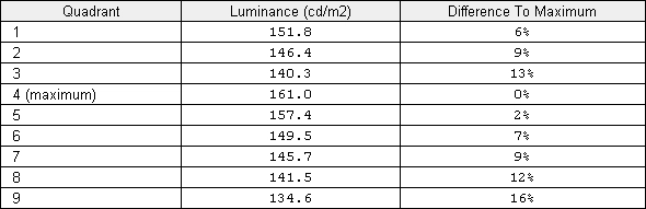
Luminance uniformity table
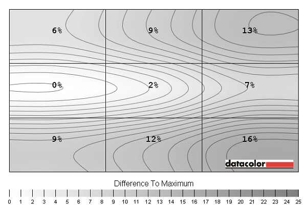
Luminance uniformity map
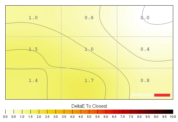
Colour temperature uniformity map
Contrast in games and movies
Lagom contrast tests
Colour reproduction
Colour gamut
Colour gamut test settings
Colour in games and movies
Viewing angles
Responsiveness
Input lag
Pixel responsiveness
Trailing (various 'Response Time' settings)
Responsiveness in games and movies
Conclusion
Positives Negatives Pleasing colour performance, particularly in the ‘Multimedia’ preset. Strong clarity and vibrancy thanks partly to the glossy screen surface and an excellent variety and consistency of colours thanks to the AH-IPS panel
Gamma wasn’t quite as close to the desirable 2.2 curve as it could be and the glossy screen surface means room lighting must be considered more carefully than with matte surfaces
Strong static contrast and a good smooth look and ‘pop’ to bright colours IPS glow is present as with most IPS and related panels 60Hz LCDs don’t really get much more responsive than this and it’s nice to see a bit of flexibility with the pixel overdrive solution – a definite improvement over older S Series models
The 60Hz refresh rate will limit the appeal for some users and there was a little extra trailing in places due to some slower than optimal pixel transitions
The combination of glossy screen surface and minimalistic design with extremely thin bezels gives this monitor a certain unique appeal for some users
Limited array of ports and a tilt-only stand – although VESA mounting is an option
![]()

