Author: Adam Simmons
Date published: October 18th 2015
Table of Contents
Introduction
With the spread of monitors with the ‘4K’ UHD (3840 x 2160) resolution, it’s easy to forget those who want something a little more practical for their system or something that is more budget-friendly. The WQHD (2560 x 1440) resolution has now spread to monitors that are smaller (and indeed larger) than 27”. The Dell U2515H and AOC Q2577PWQ, for example, place those pixels onto a 25” panel. Aside from the physical size difference and somewhat increased pixel density, the overall experience is very similar to their 27” counterparts – at a significantly lower price.
The Dell P2416D crams these pixels into an even smaller space, a 23.8” screen. This makes it one of the most affordable WQHD models on the market and also brings with it a significantly tighter pixel density than a 27” WQHD model. We assess how the resolution works out on a screen of this size and also look at the image performance of the monitor on a range of games and other applications.
Specifications
This model features a 23.8” AHVA (Advanced Hyper-Viewing Angle) panel from AUO. Although true 8-bit colour reproduction was initially suspected, our testing reveals 6-bit + AFRC dithering. A 2560 x 1440 resolution is used alongside a 60Hz refresh rate. A 6ms grey to grey response time is specified, not a figure you should look too much into. Key ‘talking points’ of the specification have been highlighted in blue below.
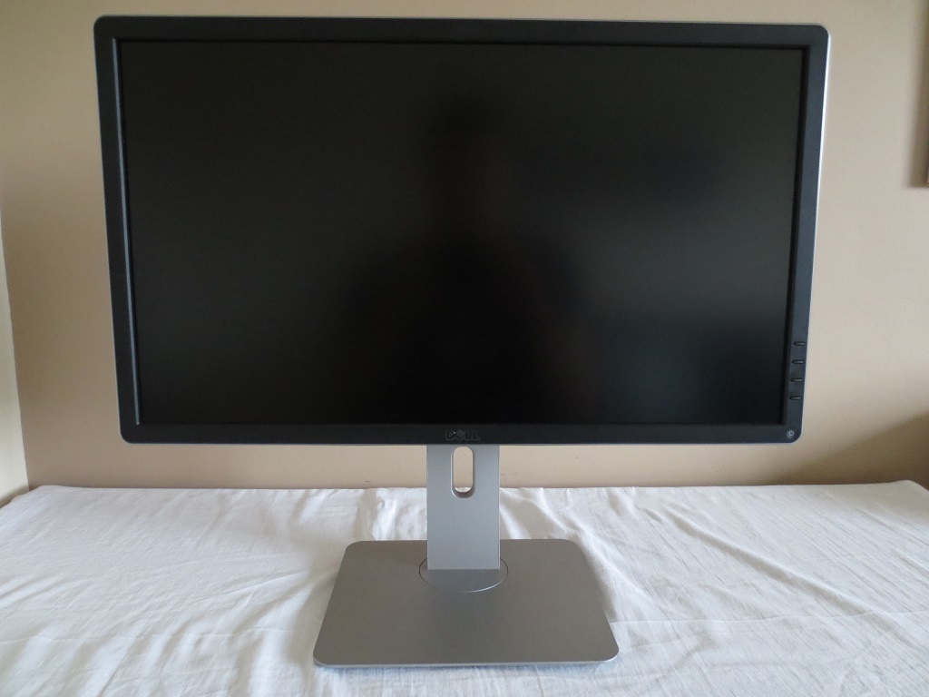
Features and aesthetics
The monitor has a modern home-office appearance, from the front, shared by other Dell models such as the P2415Q. The matte black plastic bezels are of modest thickness by today’s standards; around 19mm (0.75 inches) on all sides. The monitor uses a light matte anti-glare screen surface, as explored later.
Towards the bottom of the right bezel there are pressible buttons to control the OSD (On Screen Display), with a power button at the bottom right corner of the screen. This has an illuminated power symbol that glows white if the monitor is on and flashes white if it’s in a low power state. It is off when the monitor is off. The following video gives a run-through of the P2416D’s OSD menu system.
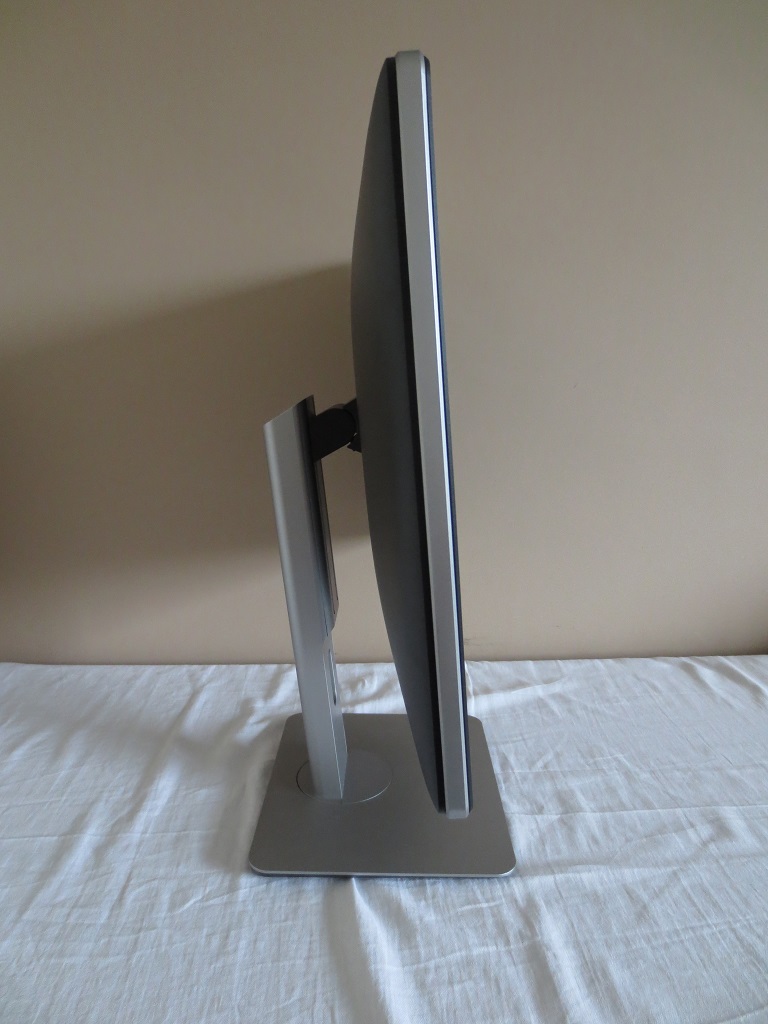
At then side the monitor is reasonably slender, lumping out centrally to a maximum of around 40mm (1.57 inches) excluding stand. The stand offers full ergonomic flexibility; tilt (21° backwards, 5° forwards), height adjustment (140mm or 5.5 inches), swivel (45° left, 45° right) and pivot (90° clockwise rotation into portrait). At its lowest height the bottom edge of the screen sits around 40mm (1.57 inches) above the desk surface, whilst the top of the screen sits around 365mm (14.37 inches) above the desk.
The rear of the monitor is dominated by matte black plastic – aside from the silver plastic of the stand and the Dell logo. There is a K-Slot towards the bottom left and a USB 2.0 port towards the bottom right. Between these is a detachable port cover, concealing the down-firing ports. Above the port area is the stand attachment point. The stand attaches using a proprietary bracket mechanism and can be quickly released using the quick-release button just under the attachment point. You are then left with 100mm VESA holes for alternative mounting.
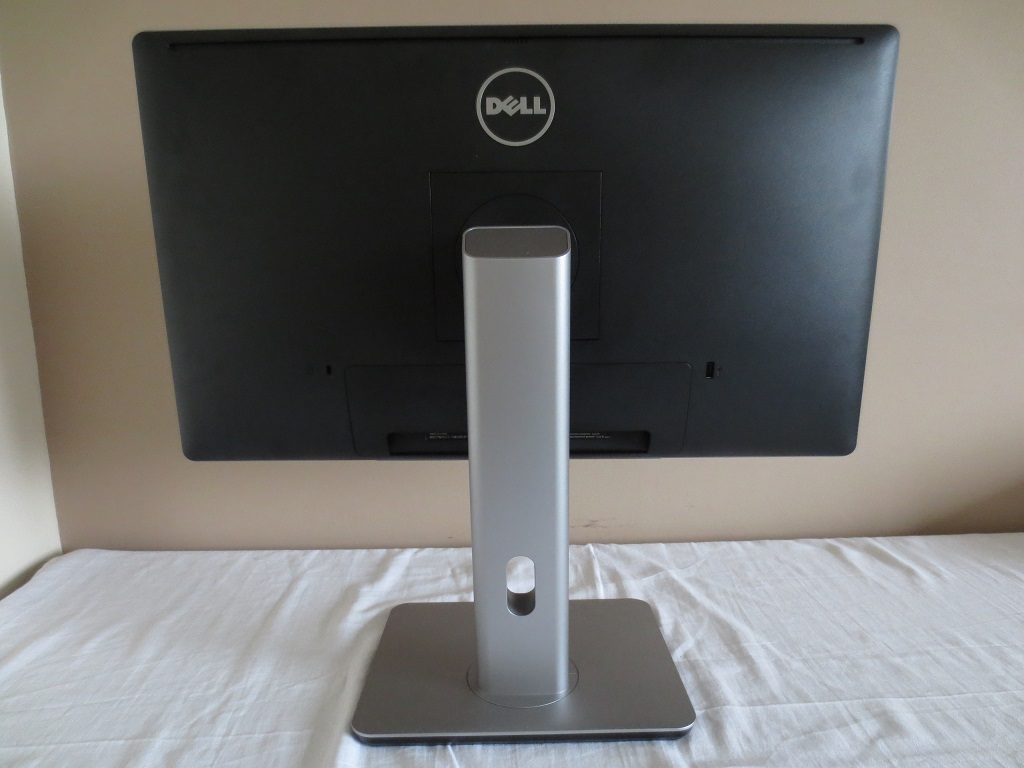
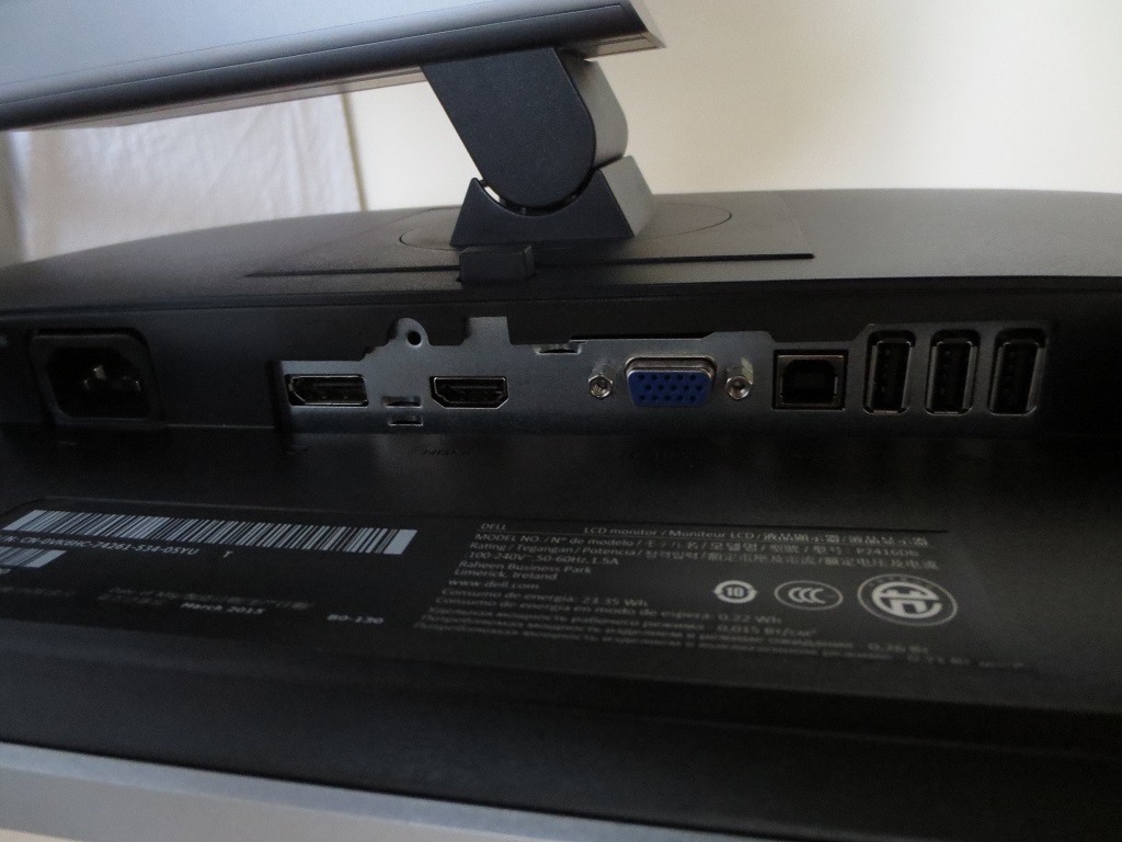
The main ports of the monitor are; AC power input (internal power converter), DP 1.2, HDMI 1.4, VGA, USB 2.0 upstream and 3 further USB 2.0 downstream ports (4 total). Standard cables included are; power, DP and USB 3.0 upstream cables.
Calibration
Subpixel layout and screen surface
As aforementioned, this model uses a light matte anti-glare screen surface. Such a surface provides a good balance between glare-handling and image vibrancy and clarity. Although the haze value is similar to that of the 25” WQHD models (such as the AOC Q2577PWQ), the surface doesn’t seem quite as smooth with respect to viewing lighter content. There is a little bit more graininess to it – although it remains light and fairly ‘misty’ in its appearance rather than ‘heavy’ or ‘smeary’. It’s certainly an improvement over the typical ‘medium’ screen surfaces used on many TN (and some IPS-type) models.
![]()
The monitor uses the usual RGB (Red, Green and Blue) stripe subpixel layout, as shown above. This is the default layout expected by modern operating systems such as Microsoft Windows and Apple’s MacOS. You needn’t worry about fringing on text or having to mess around with ‘ClearType’ as a Windows user. If you wish to fine-tune this according to preferences, by all means do. But text should look good ‘out of the box’, so to speak.
Testing the presets
The P2416D comes with a range of ‘Preset Mode’ image presets; ‘Standard’, ‘Multimedia’, ‘Movie’, ‘Game’, ‘Paper’, ‘Warm’, ‘Cool’ and ‘Custom Color’. We tested a select few of these presets (the ones we feel provide respectable image quality). The table below shows some key readings (gamma and white point) taken using a Datacolor Spyder5ELITE colorimeter. It also shows some general observations and mentions settings that are specific to certain presets rather than available universally. Any monitor setting not mentioned was left at default, with the exception of our ‘Test Settings’ where various adjustments noted later were made. Where applicable Dynamic Contrast was also disabled. The monitor was left in its ‘plug and play’ state without any additional drivers or ICC profiles loaded, on a Windows 10 system. This system was running a Club3D Radeon R9 290 royalAce GPU, connected using DisplayPort. We made similar observations using an Nvidia GTX 970 and on either GPU when connected via HDMI.
| Monitor Settings | Gamma (central average) | White point (kelvins) | Extra OSD settings | Notes |
| Standard (Factory Defaults) | 2.2 | 7191K | Rather bright with a noticeable cool tint to the image. The overall balance is otherwise good, with a nice rich and varied look to the image. | |
| Multimedia | 2.2 | 7197K | As ‘Standard’, but marginally dimmer. | |
| Game | 2.2 | 7208K | Hue, Saturation, Dynamic Contrast | As above, but additional options available. |
| Paper | 2.1 | 5523K | This is a reasonably effective ‘Low Blue Light’ setting. The image is a lot dimmer (‘75’ brightness as with other presets, adjustable) and has a warm but rather green look to it. This is better than the other presets for relaxing viewing in the evening. We prefer a lower white point and less of a green tint, though; so using ‘Custom Color’ and setting to ‘R= 100, G= 80, B=70’ was preferable. This gave a ~4000K white point with no green tint. | |
| Warm | 2.2 | 6193K | This mode is ‘Warm’ when compared to 6500K, although certainly not when compared to ‘Paper’. To the naked eye the image looks quite neutral and actually preferable to the cool tint offered by several of the other presets. | |
| Custom Color (Factory Defaults) | 2.2 | 6517K | Colour channel adjustments – R, G, B | This preset is rather bright but has a well-balanced white point for the 6500K target. There is a minor but easily correctable green tint. The gamma, although averaging 2.2, tracks in a rather unconventional fashion and is weaker in that respect than the other modes as explored below. |
| Test Settings (as below) | 2.2 | 6225K | The image appears well-balanced with a rich and inviting look. The gamma tracking in this mode is very close to where it should be, with the lower brightness making for more comfortable viewing as well. |
Straight from the box the P2416D was bright and cool-tinted, but otherwise quite well balanced. It was clear by eye that the gamma tracking was very good, and indeed colours were consistent as you’d hope for from an IPS-type panel. The ‘Multimedia’ and ‘Game’ modes appeared similar to one another, and in turn similar to the ‘Standard’ setting, although marginally dimmer according to the colorimeter. The image was again rather cool in its appearance and there was no way to counteract this in these presets using the OSD. The ‘Paper’ setting acted as a fairly effective ‘Low Blue Light’ setting, although it had a slightly off-putting green tint and wasn’t quite as effective at blocking out blue light as we’d like. We actually preferred using the ‘Custom Color’ setting and dialling in colour settings manually to create our own ‘Low Blue Light’ mode.
Unfortunately the ‘Custom Color’ mode, which is the only preset under which manual adjustment of the colour channels is allowed, did not offer the same strong gamma tracking as most of the remaining presets. The graphs below show gamma tracking in ‘Standard’ (out of the box) and ‘Custom Color’, respectively. Note that although the gamma averages 2.2 in each case, there is quite unconventional tracking in the ‘Custom Color’ mode which has an adverse effect on the image. Essentially many shades appear too bright and the image essentially looks ‘washed out’ in places as a result. Fortunately we found the ‘Warm’ setting offered a nice balance to the image. There was no cool tint, whilst gamma tracking was strong. This was therefore the mode we opted for in our ‘Test Settings’, with reduced brightness but no further adjustment required. The graph below shows gamma tracking for our ‘Test Settings’ (and by association the ‘Warm’ preset). The aforementioned ‘Warm’ setting was adopted for our ‘Test Settings’, with reduced brightness. Although the white point was not right at the ‘6500K’ daylight target, the ~6200K colour temperature is just as suitable if not more so depending on lighting conditions. The perceived differences between the two are readily accommodated by the eye, so obsessing over this is pointless. More importantly, gamma tracking was excellent here as was the overall balance to the image. Shades were rich and consistent, represented in a vivid but accurate way. Note that individual units can vary with regards to colour temperature in particular, so if these settings don’t look right to you feel free to experiment with others. Any setting not mentioned here was left at default, ‘Response Time’ is given just for reference. Brightness= 54 (according to preferences and lighting) Response Time= Normal A highly accurate light meter (KM CS-200) was used to measure the luminance of white and black on the screen using a range of settings. From these readings, static contrast ratios were calculated. This data is shown in the following table. Unless otherwise stated assume settings were left at default, with the exception of the ‘Test Settings’, ‘Relaxing evening viewing’ and ‘Calibrated Settings’. Blue highlights on the table indicate the results of these, whilst black highlights on the table indicate the highest white luminance, lowest black luminance and highest static contrast ratio recorded.

Gamma factory defaults

Gamma 'Custom Color'

Gamma test settings
Test Settings
Preset Mode= Warm
Contrast and brightness
Contrast ratios
Monitor Settings White luminance (cd/m²) Black luminance (cd/m²) Contrast ratio (x:1) 100% brightness 263 0.24 1096 80% brightness 215 0.20 1075 60% brightness 167 0.16 1044 40% brightness 117 0.11 1064 20% brightness 67 0.06 1117 0% brightness 15 <0.02 >750 Factory Defaults (75% brightness, Standard) 204 0.19 1074 Multimedia 189 0.18 1050 Game 203 0.19 1068 Paper 117 0.11 1064 Warm 217 0.19 1142 Custom Color 228 0.20 1190 Test Settings 162 0.14 1157
With only brightness adjusted, ignoring ‘0’ brightness where the rounding affected accuracy too much, the contrast ratio averaged a fairly good 1079:1. The highest contrast ratio was measured in ‘Custom Color’, a rather pleasing 1190:1. The ‘Paper’ and moreover ‘Warm’ settings also provided quite strong contrast; 1064:1 and 1142:1, respectively. Given that our ‘Test Settings’ were based on this ‘Warm’ preset, a very respectable 1157:1 was recorded there. The highest white luminance recorded on this table was 263 cd/m², although the monitor actually reached 288 cd/m² at ‘100 brightness’ in ‘Custom Color’ (not included in the table). The lowest luminance recorded on the table was an exceptionally dim 15 cd/m², giving a very respectable 273 cd/m² luminance adjustment range and an excellent minimum.
A ‘Dynamic Contrast’ setting is included on the monitor. This can be activated in the ‘Game’ and ‘Movie’ presets. This allows the backlight to adjust its brightness according to the relative levels of ‘dark’ and light’ on screen at any given time. With this mode activated, the monitor did dim effectively and fairly rapidly for predominantly dark content. Where lighter or mixed but mainly light content was displayed, though, the brightness tended to be rather high. We prefer manual control of the backlight brightness, at any rate, but this mode does work and is there if you wish to use it.
PWM (Pulse Width Modulation)
The P2416D does not use PWM (Pulse Width Modulation) to regulate backlight brightness at any brightness level. Alternatively, DC (Direct Current) is used to modulate the backlight brightness level. This is therefore considered a ‘flicker-free’ monitor, which is mentioned in the manual but not something Dell make a habit of actively advertising. This will come as welcome news to users who are sensitive to flickering, find such backlight fatiguing on the eyes or simply dislike PWM artifacts.
Luminance uniformity
Whilst observing a black screen fill in a dark room under our test settings, we could observe a small degree of backlight bleed. This was most noticeable but still not particularly obtrusive towards the top left of the screen. The image below was taken centrally a few metres back from the screen to eliminate ‘AHVA glow’. This glow can be seen from a normal viewing position as a silvery or gold glow (depending on which section of the screen you’re viewing) towards the edges of the screen. It is particularly prevalent in the bottom two corners of the screen from a normal viewing position. As you move off-angle it ‘blooms out’ to become more obvious as the angle becomes sharper. This is illustrated in a video deeper into the review.
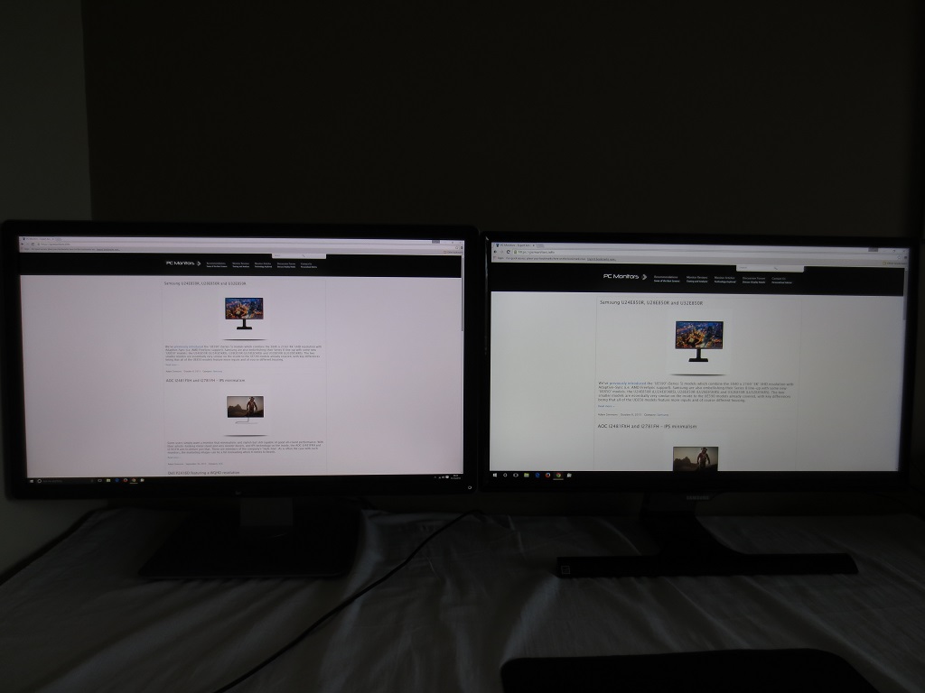
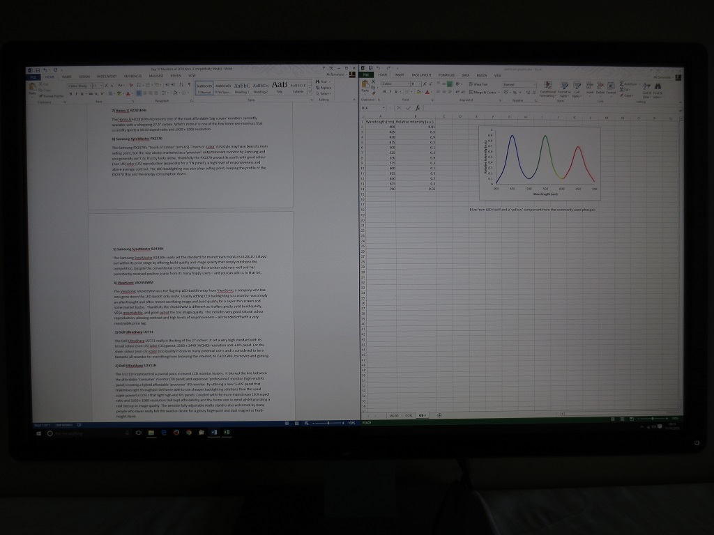
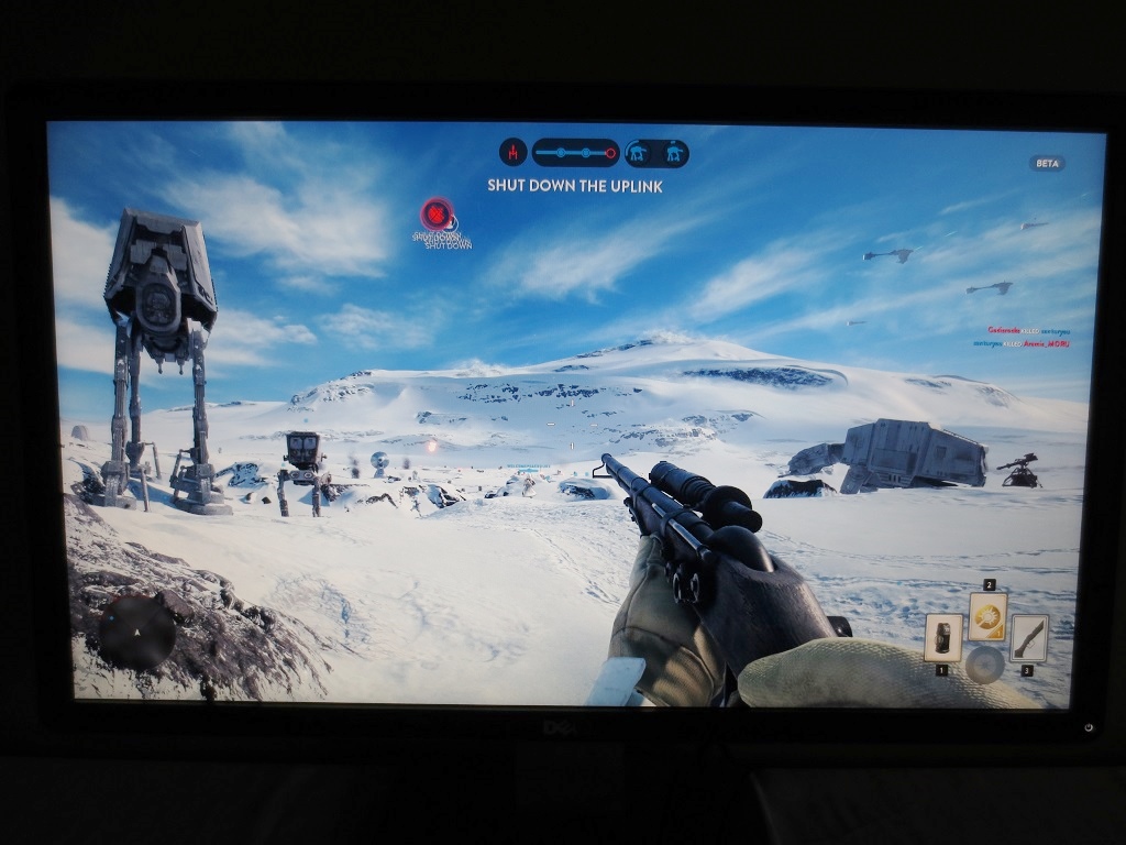
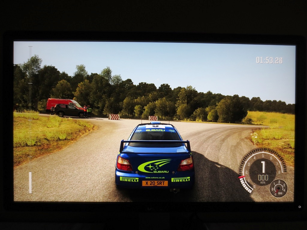
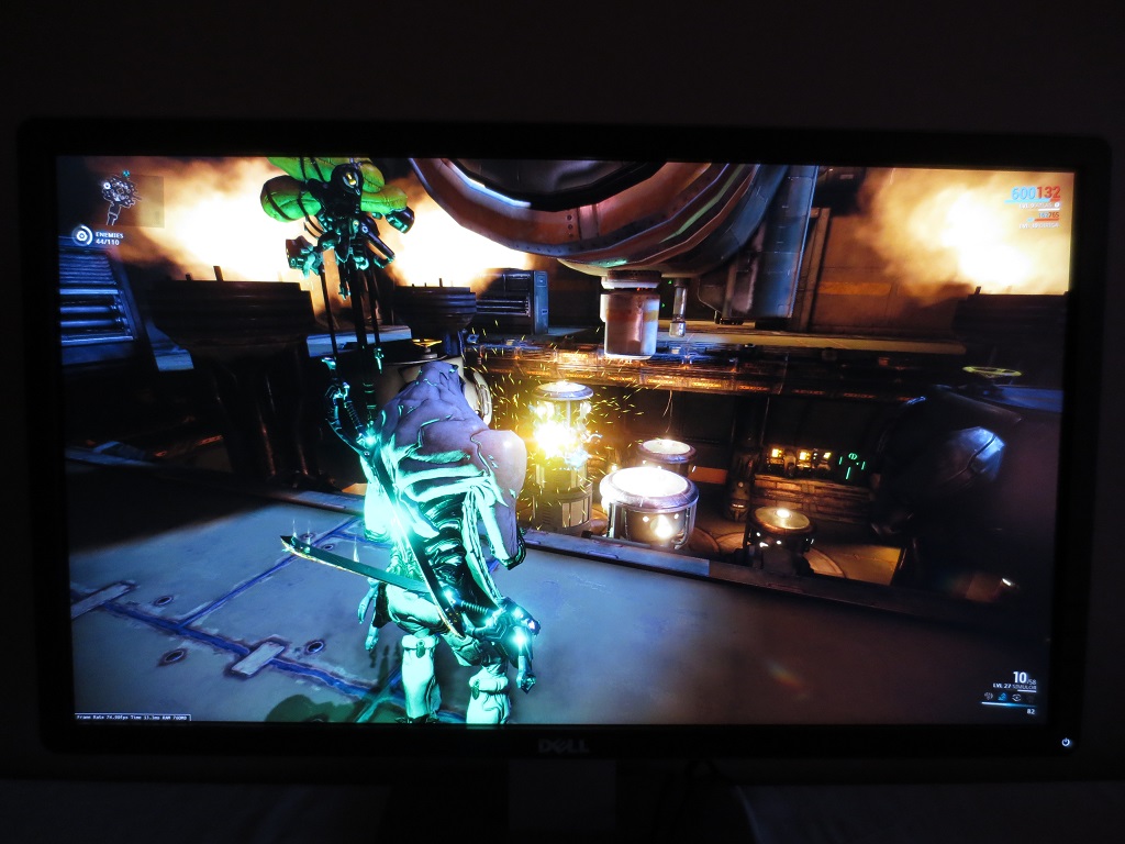
We used the Spyder5ELITE to analyse the luminance uniformity of the monitor, represented by 9 equidistant white quadrants running from the top left to bottom right of the screen. The below table gives the luminance recorded at every quadrant and the deviation between each quadrant and the brightest recorded value. The luminance uniformity of our screen was fairly poor (note that this varies between individual units). The brightest point recorded was ‘quadrant 5‘, towards the centre of the screen (162 cd/m²). The maximum deviation was recorded at ‘quadrant 3’, towards the top right (130 cd/m², which is 20% dimmer). Elsewhere the screen was 11% – 18% dimmer than centre. In other words, the centre of the screen was significantly brighter than the rest of the screen. To the eye this wasn’t particularly pronounced, as it wasn’t really a small spot in the centre of the screen that was significantly brighter, but rather a gradual dimming of the screen from a central maximum. The contour map below shows these deviations graphically, with darker greys showing higher deviation from the brightest point than lighter greys. Percentage deviations between each quadrant and the brightest point are also provided. The colour temperature deviations for the same 9 quadrants were also analysed using the colorimeter. Deviations here are assigned DeltaE values, with higher values representing the greatest deviation from the D65 (6500K) daylight white point target than lower values. The contour map below shows these deviations, with a stronger colour indicating greater deviation from 6500K than lighter colours. A DeltaE of <3 here is considered deviation that most users would not readily notice by eye and therefore not considered significant. The results here were quite good overall. The point closest to 6500K was the bottom central region. The top right region showed significant deviation from this; DeltaE 3.7. Elsewhere the DeltaE was <3 and therefore not considered significant. Note that, as with all aspects of uniformity, individual units can vary. There may also be deviation beyond the 9 measured points. The contrast performance was good overall on Battlefield 4 (BF4). The level of detail in dark areas was much as it should be, although there was some loss of detail peripherally (particularly those bottom corners from a normal viewing position) due to the aforementioned ‘IPS glow’. Bright elements stood out nicely, with only a fairly light graininess to them from the screen surface rather than any ‘heavy’ or smeary grain. These elements didn’t have the same purity or smoothness as a glossy screen surface, but as far as matte screen surfaces go they appeared reasonably smooth really. On Dirt Rally the monitor also put in quite a good contrast performance. Aside from the regions affected by ‘IPS glow’, detail was good (and appropriate) in dark and shaded areas such as car interiors, the underside of bridges and shadows surrounding trees and other vegetation. Bright elements such as daylight sky and car headlights at night appeared fairly smooth with a light graininess to them. The contrast between bright elements such as those headlights and the surrounding darkness was also very good, particularly centrally where IPS glow did not affect the dark areas. The Blu-ray of Skyfall was also used to help analyse the strengths and weaknesses of the monitor’s contrast performance. On this film the level of detail was good throughout pretty much the entire viewable area, with the black bars at the top (2.40:1 aspect ratio film) absorbing much of the ‘IPS glow’. Bright elements stood out quite well against the darker backgrounds, for example flames lighting up the night in Macau. The Lagom tests for contrast allow specific weaknesses in a monitors contrast performance to be identified. The following observations were made. The Dell P2416D’s colour gamut (red triangle) was compared to the sRGB reference colour space (green triangle), as shown below. You can see that the monitor comprehensively covers the sRGB colour space (100%) with a bit of extension beyond this, particularly in the green corner of this diagram. This allows the monitor to accurately reproduce shades within the sRGB colour space (responding well to calibration) but also give a little extra vibrancy which is generally appreciated for general-purpose use. On BF4 colours appeared fairly vivid with a nice variety of distinct shades. The environments appeared much as they should, with a good natural aesthetic. Earthy browns were consistent in their richness throughout the screen, whilst subtly different shades of green vegetation could be seen as well. The brilliant cyan of the engineer’s repair tool (as well as the bright orange sparks from this and elsewhere in the game) appeared quite lively. Roaring flames shared this vibrant (and warming) look, which helps explosions and other such fiery havoc feel all the more satisfying. On Dirt Rally the strong colour reproduction also worked well. Different racing environments were given the appropriate aesthetic. The Greek rally tracks, for example, showcased an excellent variety of predominantly dusty and muted khaki greens and browns. Other stages such as those in Finland showcased an equally impressive palette of richer colours, including quite lush greens and deep golden browns. The car liveries also benefited from this richness and variety. Bright cyans, dark blues and rich cherry reds stood out particularly nicely. Such shades did not have quite the same ‘pop’ that you might see on a model with a glossy screen surface, but were still had a nice intensity to them. The Blu-ray of Skyfall looked very much as it should, with appropriately saturated skin tones and natural looking (and varied) environments. The ability of the monitor to reproduce a good range of shades with subtle variations worked nicely here. There were also some fairly vibrant-looking colours, such as the neon lights of the Shanghai night scene and a nice rich look to roaring flames. We also used the Blu-ray of Futurama: Into the Wild Green Yonder to assess the colour reproduction of the monitor. This title is animated with large areas of individual shade filling a large section of the screen. It is therefore an excellent test for colour consistency, which is definitely a strength of this monitor. The consistency of individual shades allowed the monitor to display a wide variety of subtle shade variations, appearing pretty much as they should regardless of on-screen position. There were also some rather vibrant-looking neon greens, yellows and pinks showcased on this title, standing out rather nicely. Lagom’s tests for viewing angle were used to examine the colour consistency and viewing angle performance of the monitor in a more specific way. The following observations were made from a normal viewing position, with eyes around 70cm from the screen. A small tool called SMTT 2.0 was used alongside a sensitive camera to compare the latency of the P2416D with a number of monitors with known input lag values. Using this method and taking over 30 repeat readings, we calculated 4.85ms (under 1/3 of a frame) of input lag. This value reflects both the element of input lag that you see (pixel responsiveness) and that which you feel (signal delay). This is indicative of a very low signal delay which shouldn’t cause a bottleneck for any user. Our article on responsiveness takes a look at various factors affecting the responsiveness of a monitor. One of the key concept explored is perceived blur, and how the movement of your own eyes is actually a significant contributor to that. One which, in fact, masks a lot of what the pixel responses of the monitor are doing. By using what’s known as ‘pursuit’ photography, mentioned in the article, it’s possible to accurately capture motion on a monitor in a way that reflects what the eye would see when tracking motion. A moving camera is used to capture static images, revealing the perceived blur that would be caused by eye movement as well as any trailing or inverse ghosting (overshoot) on top of that. The following images are pursuit photographs taken using the UFO Motion Test for ghosting. The test is running at 960 pixels per second, which is a good practical speed for such photography that shows what it needs to. The middle row of the test (medium cyan background) was used here, with the monitor set to both ‘Normal’ and ‘Fast’ for its ‘Response Time’. We also captured the performance at 75Hz, which the monitor will do comfortably at its native resolution as we’ll come onto a little later. The bottom image shows a fast 60Hz reference, a Samsung S27A750D set to full brightness (to eliminate PWM and associated artifacts) and using its ‘Faster’ response time setting, optimal for 60Hz. This reference screen essentially shows what things should look like at 60Hz where pixel responses are not a limiting factor. With ‘Response Time’ set to ‘Normal’ you can see a little bit of trailing from slower than optimal pixel response times, but this is certainly a minor factor compared to the blur caused by eye (camera) movement). Using the ‘Fast’ setting replaces this additional trailing with a bright inverted trail (inverse ghosting or overshoot), due to the grey to grey acceleration being overly aggressive. It is clear from this analysis and when actually using the monitor that ‘Normal’ provides the best balance, as ‘Fast’ introduces obvious and unsightly artifacts that are widespread and will irritate some users. In our subsequent analysis, we keep the monitor in its ‘Normal’ (default) state for ‘Response Time’ and analyse perceived blur over a broad range of pixel transitions. We also tested the monitor at 75Hz using the optimal ‘Normal’ setting. This reduced the perceived blur compared to running the monitor at its default 60Hz. There is still that little bit of trailing from slower than optimal pixel transitions, but you can see that the object is a bit more clearly defined (less of a broad smear) even compared to the 60Hz reference. This is particularly noticeable on the alien’s head and the legs of the UFO. In addition to the perceived blur being reduced, where the frame rate exceeds 60fps and ideally matches the 75Hz refresh rate (i.e. 75fps), there is an increased ‘connected feeling’ with the display. There is due to the delay between frames being reduced and the fact that more content (up to 1.25 times that at 60Hz) is being displayed every second. Whilst this won’t give the same experience as a 120Hz+ monitor, it does give a bit of an edge over 60Hz which some users will like. The monitor will comfortably run at up to 75Hz at 2560 x 1440 when connected by DP 1.2. By ‘comfortably’, we mean there is no change in image quality (gamma, colour balance, contrast etc.) and no frame skipping. The monitor is also left at its default timings, it’s purely the refresh rate value that is altered by the user. This is therefore ‘true 75Hz’. We also tested the monitor at 80Hz with standard timings, but frame skipping was introduced. There was little point in testing values between these, as we like to keep a bit of a buffer and the actual perceived differences between say 75Hz and 78Hz (which may not even be doable) would be negligible. Other users have reported receiving units that do not run at 75Hz without frame skipping, so there may be some inter-unit variation going on. To run the monitor at 2560 x 1440 @ 75Hz you need to create a ‘custom resolution’. You don’t need to mess around with timings and suchlike, so the process is rather straightforward. The following video runs through how to create a custom resolution to ‘overclock’ the monitor using either the Nvidia Control Panel, or for AMD users in particular, a tool called CRU (Custom Resolution Utility). On BF4 there was a moderate degree of blur. This was predominantly caused by eye movement and in-line with what you’d see on even the fastest 60Hz LCDs. There was some trailing from slower than optimal pixel transitions here and there. This was most pronounced where there were dark objects set against a medium background – for example gunmetal greys from gun turrets on vehicles or aircraft moving against a rich blue sky. You could see a reasonably faint trail on top of the perceived blur from eye movement. This was not particularly widespread and not something most users would likely notice. There was no observable overshoot, which is good. On Dirt Rally things were again much as you’d see on even the fastest 60Hz LCDs, with eye movement and perceived blur being the predominant factor. There were some slower than optimal pixel transitions, most notably between dark and somewhat lighter (‘medium’) shades. Dark shaded vegetation against lighter sandy soils, for example, had a little bit of an extra blurry appearance to them as you raced past them. This was quite subtle really, and likely something most users would fail to notice or care about – not really something that catches the eye when passively observing. There was no obvious extended trailing as you get on some slower models nor any observable overshoot, so overall a decent balance to the pixel overdrive. We also tested our Blu-ray movie test titles, and here there were no particular issues caused by the monitor’s pixel responsiveness. There was no observable overshoot nor any trailing from sluggish pixel responses. The frame rate at which these films run (~24fps) is the main factor limiting the fluidity – the monitor didn’t impose any additional limitations on top of that. The typical size for a monitor with the 2560 x 1440 (WQHD) resolution is 27”, giving a pixel density of 108.79 PPI (Pixels Per Inch). We’ve also tested a 25” WQHD screen and commented on how the slightly tighter (8% higher) pixel density of 117.49 PPI changes things just a little bit. With its 23.8” screen and WQHD resolution, the Dell P2416D further increases the pixel density to 123.41 PPI (13.4% higher than the 27” WQHD models). Rather than give you a visual comparison of the differences between this 23.8” WQHD screen and a 27” WQHD screen, we’ve gone for a slightly different and perhaps more striking comparison. The following images show the Dell alongside a screen of similar size but with a 1920 x 1080 (Full HD) resolution (namely the 23.6” Samsung S24E390HL). The Samsung has a pixel density of 93.34 PPI – the pixel density of the Dell is over 32% higher than this. The image below is a ‘mashup’ to compare the two monitors displaying the desktop in their respective native resolution, without any scaling employed. Here the Dell is referred to as the ’16D’ for short. You can see that desktop elements such as various icons, the clock, start button and the wonderful Cortana search box are significantly smaller on the Dell. When comparing to a 27” WQHD model the difference is obviously not as stark – there certainly is a noticeable difference, though. Unfortunately we don’t have images comparing the two due to our camera dying on us when we were testing such a model, but just bear that 13.4% difference in pixel density in mind. Icons and other desktop elements on a 27” WQHD model are therefore some way between the two monitors shown above, but a bit closer to the WQHD Dell than the Full HD Samsung. Going back to the comparison with a Full HD screen of similar size, the images below give you an idea of how much ‘real-estate’ (useful work space) you get on the P2416D. The top image shows our website running on this monitor (left) and Samsung S24E390HL (right). You can see that you get a lot more content on the screen at once. The second image shows the multi-tasking potential that this gives you on the Dell, with a Microsoft Word document and Microsoft Excel Spreadsheet opened side by side. Despite the pixel density being rather tight on the Dell, we didn’t have to use any scaling and found text and other elements perfectly readable from our normal viewing distance (around 70cm), but some users may prefer to use scaling. If you do, just be aware of the potential pitfalls which are touched upon in our article on the ‘4K’ UHD experience. When it comes to gaming; compared to a similar sized model with Full HD resolution (S24E390HL), the difference in detail and clarity is rather profound. Textures look sharper and more detailed, maintaining a good clarity well into the distance that is lacking at 1920 x 1080. Linked to this is the fact that the need for anti-aliasing (AA) is reduced – not eliminated by any means, but things certainly look better with lower levels of AA than at Full HD. In short; things just look better. But this can also be said to a large extent when comparing a 27” WQHD model to a ~24” Full HD model. So a more interesting comparison is with a 27” WQHD model as well as 32” or smaller ‘4K’ UHD models with a 3840 x 2160 resolution. As we explored in the ‘2560 x 1440 (WQHD) experience’ section of this review, having the WQHD resolution applied to a 25” screen gives you a bit of a bump up in clarity and detail compared to 27” WQHD – but nothing dramatic. The 23.8” WQHD screen of the Dell provides yet another boost in this area. Things still don’t look like they do on a ‘4K’ UHD (3840 x 2160) screen that is 32” or smaller, but that’s perhaps not surprising given that you’re comparing a pixel density of 123.41 PPI to one of <137.68. The experience is really a nice ‘happy medium’ between these UHD models and a 27” WQHD screen. The relative strengths are particularly easy to assess on good textures, such as many featured on the Star Wars Battlefront beta. These textures simply look extremely crisp and detailed when viewed on a 32” or smaller UHD screen, whereas on a 27” WQHD screen they look less so but still decent. On this 23.8” WQHD screen they look quite impressive really – some way between the two. Where low levels of anti-aliasing are used or it’s entirely absent, the ‘shimmering look’ and jagged edges in places are again somewhat less pronounced than on a 27” WQHD screen but more so than these pixel-dense UHD screens. Of course this extra detail and clarity you get at 23.8” compared to 27” at 2560 x 1440 is essentially a bonus you’re getting ‘for free’, because the resolution and hence power requirements for the system remain the same. This is undoubtedly an interesting alternative for those looking for a crisp and detailed experience in their games without needing the horsepower to push 3840 x 2160 pixels. Although it by no means represents what you’d actually see first-hand on the monitor, we’ve included a couple of images below of the monitor running various games. As with any LCD monitor, the screen has pixels of fixed dimensions. It is designed to run at its native resolution, which in this case is 2560 x 1440 – corresponding to the number of pixels on the screen. Users may wish to connect an external device such as a games console to the monitor or may not have the graphical horsepower to run at 2560 x 1440 in certain games. You can instead run the monitor in 1920 x 1080 by allowing the monitor to use interpolation to display this lower than native resolution. Doing this on a monitor almost always results in a certain loss of sharpness compared to a screen on similar size running 1920 x 1080 natively. To gain optimal results and make sure the monitor rather than GPU is handling the necessary interpolation process it is necessary to configure the graphics driver (if using a PC) to allow the monitor to handle the scaling rather than the GPU. AMD users needn’t do anything in particular, as the factory defaults for the Catalyst Control Centre will allow the monitor rather than GPU to handle the interpolation. To double check things are correct, open Catalyst Control Centre and navigate to ‘My Digital Flat-Panels – Properties (Digital Flat-Panel)’. Ensure ‘Enable GPU up-scaling’ is unchecked (not ticked) and hit apply if this box was originally checked and you have unchecked it. Things should be setup in a similar way to the below image on modern AMD drivers. Nvidia users should open Nvidia Control Panel and navigate to ‘Display – Adjust desktop size and position’. Ensure ‘No scaling’ is selected and ‘Perform scaling on:’ is set to ‘Display’. This is shown in the image below. When gaming and allowing the monitor to handle the scaling in this way, things were significantly sharper than we’ve seen on some WQHD monitors using interpolation. There was a bit of softening compared to running Full HD natively on a similarly sized screen but it was quite useable and actually rather good as far as interpolation processes go. When gaming you lost a little clarity in the distance and a bit of texture detail, but things did not look like a ‘soft focus’ lens was being used – a far cry from where the GPU handles the scaling or when using a monitor with poorer interpolation handling. If you keep the monitor at 2560 x 1440 but are viewing 1920 x 1080 content such as movies, the softening is much less pronounced. Rather than the monitor using interpolation or doing anything different at all, the GPU or movie software upscales the image. When compared to viewing such content on a native 1920 x 1080 screen there is a minor degree of sharpness lost, but this is rather subtle really. The Dell P2416D is one of the most aggressively priced WQHD (2560 x 1440) models out there. But don’t let that low price fool you, there is still a lot to like about this monitor. The pixel density of 123.41 PPI provides a nice medium between the usual 27” WQHD models and similar sized or somewhat larger (~32”) UHD (3840 x 2160) models. This provides strong clarity and detail whilst gaming without the same GPU horsepower requirements as ‘4K’. Despite a few (possibly inconsequential) corners being cut, such as the presence of 6-bit + FRC dithering in place of the usual ‘true 8-bit’ colour reproduction, the overall image quality is much like on this model’s larger and more expensive counterparts. A generous sRGB colour gamut, light matte screen surface and strong colour consistency help provide a rich and varied image with accurate shade representation. From a contrast perspective there were no nasty surprises, with the static contrast largely as specified and a decent performance in that respect overall. The usual ‘AHVA glow’ that is commonly associated with IPS-type panels did eat away at some peripheral detail, but overall distinctions between even closely matching shades were good. The gamma tracking was also excellent in all but one mode – ‘Custom Color’ – where colour channels can be manually adjusted. Fortunately our unit could go without manual tweaks to the colour channels, but it would have been nice to have this strong gamma performance maintained in the ‘Custom Color’ image mode as well. Especially as there are no guarantees when it comes to colour balance in various image modes. When it came to pixel responsiveness things were also quite as we’ve seen from some recent IPS-type models we’ve tested. The 60Hz refresh rate is really the main barrier when it comes to perceived blur on this monitor, with just a bit of additional trailing in places from slower than optimal pixel responses. Input lag is quite often a problem for sensitive users on WQHD models, with weaker performance in that respect than most Full HD models. This wasn’t an issue with this model at all – with a surprisingly low level indicating a negligible signal delay. Overall this monitor is certainly a compelling package, well worth considering if you’re after an affordable WQHD model that’s a pleasure to use for both work and play.

Luminance uniformity table

Luminance uniformity map

Colour temperature uniformity map
Contrast in games and movies
Lagom contrast tests
Colour reproduction
Colour gamut

Colour gamut test settings
Colour in games and movies
Viewing angles
Responsiveness
Input lag
Perceived blur (pursuit photography)

Perceived blur with various settings
Running a custom resolution (overclocking)
This is what we consider a ‘mild’ overclock for a monitor, a slight bump in refresh rate that the monitor handles very comfortably. With this, there is minimal risk involved and it’s fair to assume that the monitor will last for its useful lifetime much as it would running at its native 60Hz refresh rate. Even so, as with any form of overclocking you’re doing this at your own risk. The risk may well be very low, but we accept no liability should anything happen to the monitor which may or may not be due to running it at an increased refresh rate. For the sake of this review, including the section that follows, the monitor was run at 60Hz as normal.
Responsiveness in games and movies
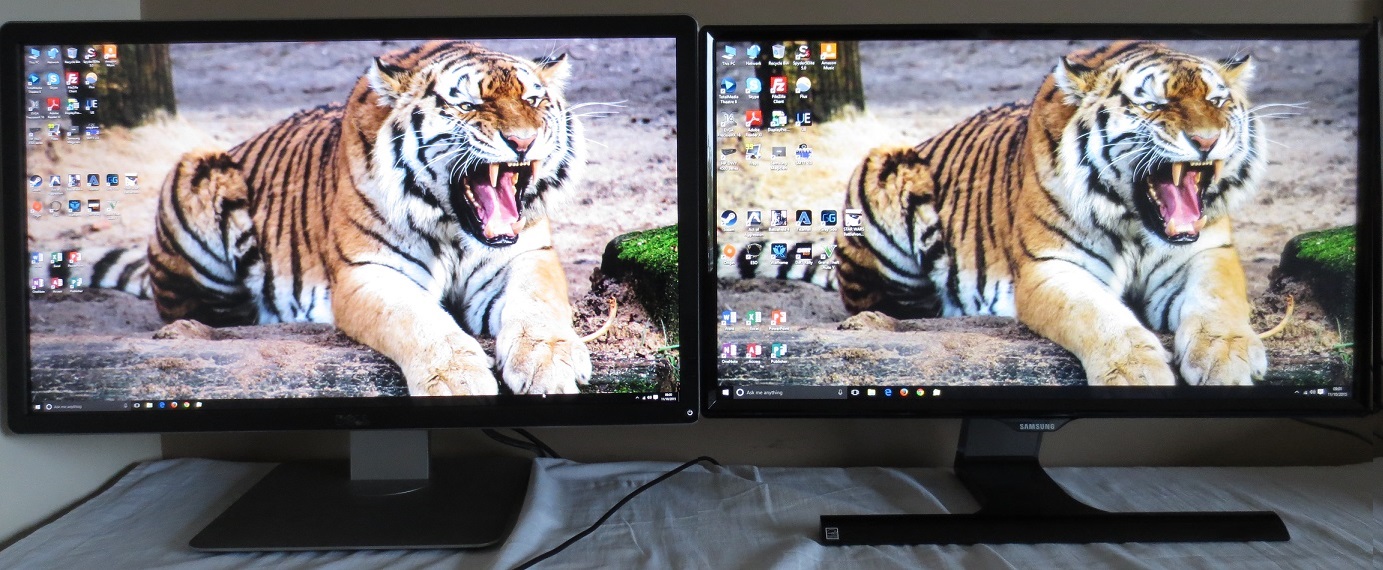
The 2560 x 1440 (WQHD) experience on a 23.8” screen
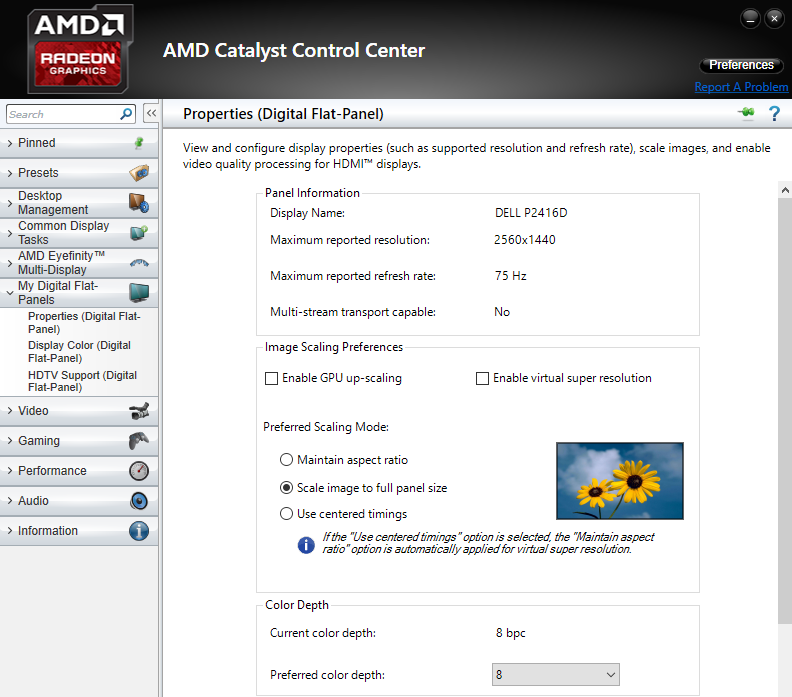
Interpolation and upscaling

Conclusion
Positives Negatives Excellent sRGB coverage, good gamma tracking in most presets and pleasing colour consistency from the AHVA panel helped give a rich and varied image
Gamma tracking is off in the ‘Custom Color’ preset and dithering is used (6-bit + FRC)
A fairly smooth ‘light matte’ screen surface avoids obtrusive graininess. Static contrast was as expected from the panel type, providing a respectable performance with good distinctions between light, dark and closely matching shades between As usual ‘AHVA glow’ is present, which eats away at some of the detail for dark shades towards the edges of the monitor. The luminance uniformity of our sample wasn’t exactly great, either. No particularly bothersome weaknesses in pixel responses and very little input lag make this a decent choice for 60Hz gaming – plus it happily runs at 75Hz in the native resolution
Some slight weaknesses in pixel responsiveness in places and of course no additional ‘gaming capabilities’ like G-SYNC, FreeSync or three-figure refresh rate.
A very competitive price and a pixel density which provides a nice medium between 27” WQHD models and 32” or smaller UHD models – plus good ergonomic flexibility with the stand
Not quite the same ‘wow’ factor as <32” ‘4K’ UHD (3840 x 2160) screens provide when gaming but certainly a nice bonus over larger WQHD screens
![]()

