Author: Adam Simmons
Date published: October 17th 2014
Table of Contents
Introduction
Every now and then a monitor is released which offers something unique, something special. The ASUS PG278Q, nicknamed the ROG (Republic of Gamers) SWIFT, is one such monitor. This screen is designed for gaming, with responsiveness being a key consideration. The monitor combines a 144Hz refresh rate, Nvidia G-SYNC variable refresh rate technology and ULMB (Ultra Low Motion Blur) strobe backlight capability. Nvidia’s 3D Vision 2 stereoscopic system is also supported, but requires a separate emitter and glasses to be purchased. As well as a fluid experience, many gamers also appreciate good image quality. That is aided in particular by the 2560 x 1440 (WQHD) resolution of this monitor. The ROG Swift certainly boasts some exciting features, but how does this all shape the gaming and all-round experience in practice? That is what we shall find out.
Specifications
The panel used is a 27” TN (Twisted Nematic) panel manufactured by AU Optronics; the M270Q002 V0. This combines a 2560 x 1440 resolution, which is itself unusual for a TN panel, with a G-SYNC aided variable refresh rate of up to 144Hz. Another interesting aspect is native support for 8-bit colour per channel, which is something that is previously unheard of for a TN panel. This helps the monitor produce smooth gradients without needing to use dithering. Although modern dithering algorithms seen on some IPS-type panels are so effective that most users wouldn’t notice a difference, those used on TN panels tend to be inferior. Potentially obvious banding and temporal dithering (mild flickering) are both negative consequences suffered to some degree by most TN panels, but kept at bay here by the native 8-bit colour support. A 1ms response time is quoted indicating aggressive grey to grey acceleration is used, although this is adjustable (OD or Overdrive settings).
Key talking points of the specifications are highlighted in blue below.
Features and aesthetics
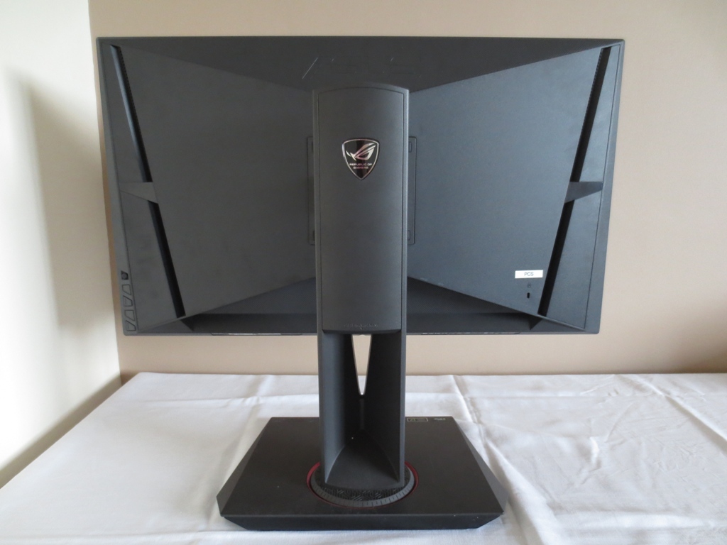
As you can see from the front, the PG278Q is a uniquely styled monitor. The bezels are very thin – around 8mm (0.31 inches) at the top and sides and 13mm (0.51 inches) at the bottom. There is also a very thin panel border of around 2mm (0.079 inches) at the sides and bottom and 3mm (0.12 inches). The panel border is only visible when the monitor is switched on. This brings the total bezel width to around 10mm (0.39 inches) at the side which is still nice and slender. The screen surface is regular (‘medium’) matte anti-glare, similar to other current 144Hz models.
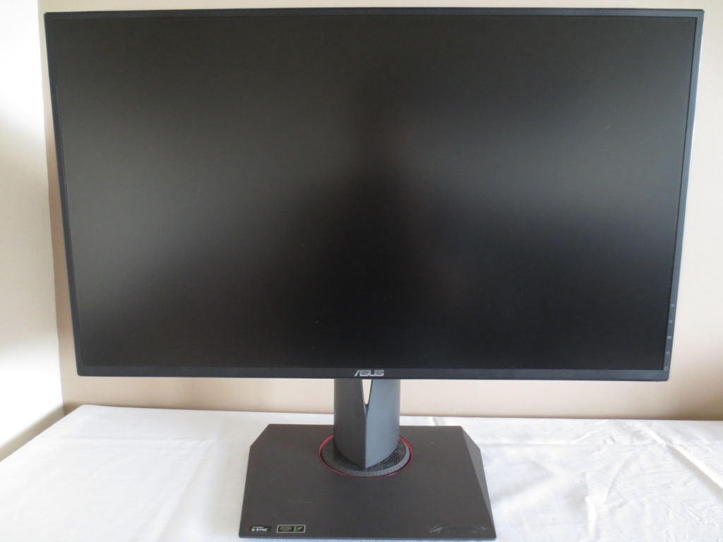
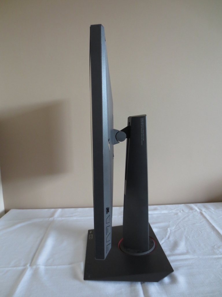
Other aspects to note include the interesting angular stand base. This is quite solid (along with the rest of the monitor in general) but also a little deeper than we’d like. The screen hangs around 200mm (8 inches) from the back of the stand base, bringing the screen a bit closer to the eyes than some users would like. This can be circumvented by a deep desk, but on our 70cm deep desk the screen was a little close to the eyes for our liking.
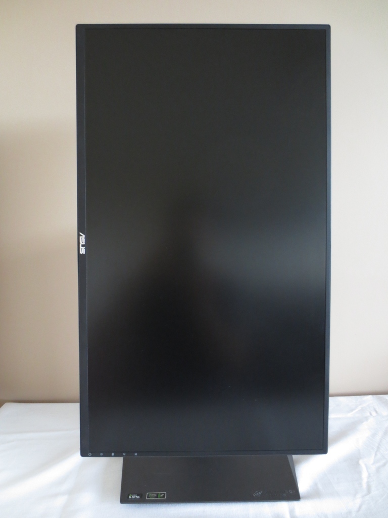
The stand neck is attached with a turntable mechanism that allows you to swivel the monitor 60° left and right. You can also tilt the screen (5° forwards, 20° backwards), adjust its height by 120mm (4.72 inches) and pivot it into portrait as show below. In this orientation the viewing angle limitations translate into obvious colour shift from left to right, so be aware of this limitation. Also note that at its lowest height the bottom of the monitor sits around 74mm (2.91 inches) off the desk with the top of the monitor 433mm (17.05 inches) above the desk surface.
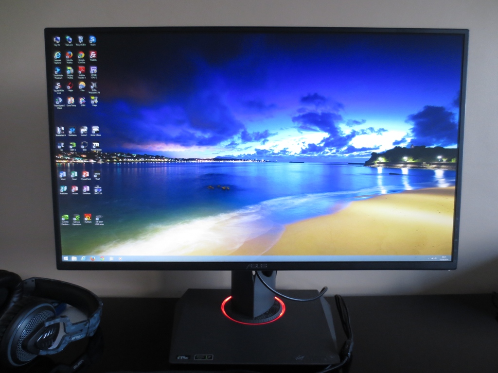
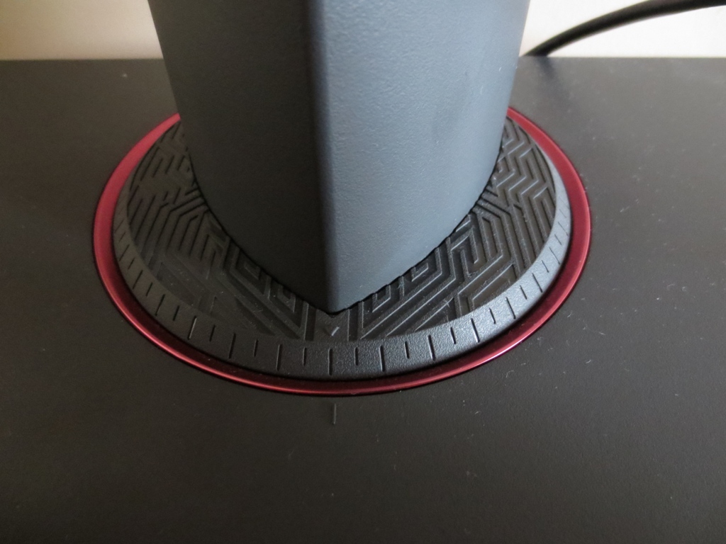
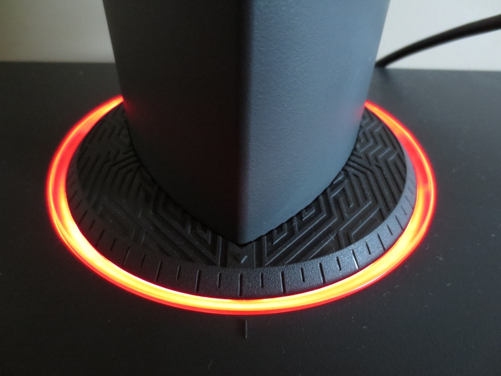
Around the stand neck turntable there is a red metallic-looking ring. This area can be optionally illuminated by red LEDs when the monitor is on – something called ‘Light in Motion’. This looks a fairly deep (ROG) red in real life, not orange as it will appear on this image on a calibrated standard gamut monitor.
The monitor’s OSD (On Screen Display) is controlled by pressable buttons at the rear, towards the bottom right when viewed from the front. These are, from top to bottom; ‘Menu/Directional joystick (JOG button)’, ‘Exit’, ‘GamePlus’, ‘Turbo’ and ‘Power’. The ‘Turbo’ button allows you to switch the refresh rate of the monitor ‘on the fly’ between 60Hz, 120Hz and 144Hz. If you’re on the desktop you have to move your mouse over a desktop icon or cause another Windows animation to play for the refresh rate to switch. If an application is running, such as a game, it will switch pretty much immediately without such intervention. We would have liked to see an easy way to switch to 100Hz and 85Hz (for the ULMB mode which we explore later), but that would make switching between the other refresh rates take a little longer.
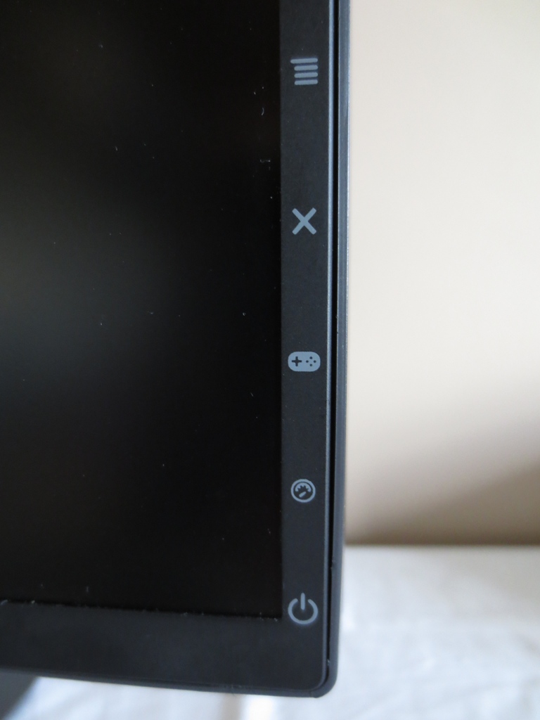
The buttons are labelled with small icons at the front, although these are not illuminated to aid navigation in the dark. The buttons themselves are nicely laid out and the second (‘GamePlus’) and fourth (‘Power’) have small nobbles on them to aid touch navigation. We found the joystick very intuitive as well, even in a dimly lit room. Below the button labels is a fairly small and unobtrusive power LED. This remains off if the monitor is off but otherwise glows a specific colour depending on the operating mode of the monitor:
White = Monitor on
Amber = Standby
Deep (ROG) red = G-SYNC
Yellow = ULMB (Ultra Low Motion Blur)
Green = 3D Vision
The main menu is fairly simple and sticks to quite basic features. The following video gives a run-through of the menu system and the monitor controls:
From the side the monitor is quite slender. It’s 20mm (0.79 inches) at thinnest point but is angled towards the middle where it protrudes further.
The rear of the monitor again highlights the unique angular design, possibly inspired by a stealth aircraft of some description. Various vents can be seen (or gaps where they sit, in the image) at the top and sides of the central region. These help keep the panel cool, which is important as it’s essentially overclocked to run beyond 60Hz. The area around the vents can get just slightly warm at times, but we didn’t find the monitor put out too much heat really. The stand is attached with 100 x 100mm VESA. If you remove this you can fit your own 100 x 100mm VESA stand or mount. You lose the ‘Light in Motion’ feature, though, which connects via metal contacts where the neck of the standard stand attaches to the screen.
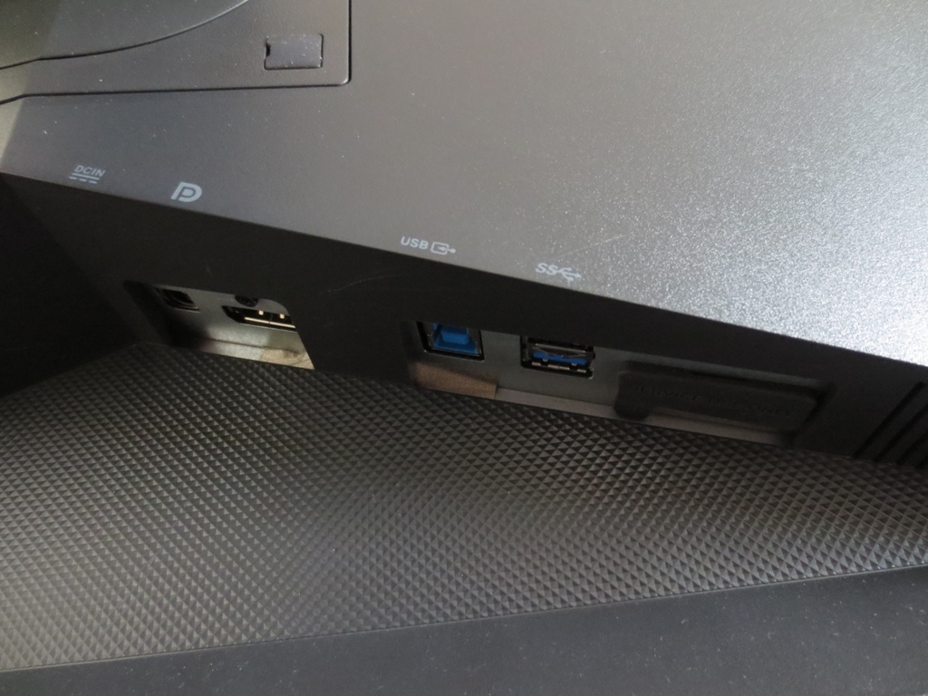
Angled down and to the right, from underneath the VESA attachment point, are the limited ports offered by the monitor; DC power input (external ‘power brick’), DisplayPort (DP) 1.2 and a single USB 3.0 downstream port (plus upstream). G-SYNC technology relies on the packet data transfer capabilities of DP and DP (1.2+) is the only widely used port to support the native resolution and refresh rate of the monitor. There is also a simple cable management system included, basically a gap in the stand neck. A 6ft DisplayPort cable and USB 3.0 cable is included with the monitor, alongside a power cable and adaptor.
Calibration
Subpixel layout and screen surface
As mentioned in the previous section, this monitor uses a medium matte screen surface. It has a roughened outer polarising layer that causes a degree of diffusion of light emitted from the monitor. As noted in this article that has a knock-on effect on both the clarity and vibrancy of the image. Most WQHD models use IPS, PLS or AHVA panels with very light matte (so-called ‘semi-glossy’) screen surfaces which offer superior clarity and bring out more vibrancy. In particular there isn’t the same degree of ‘graininess’ to the image when viewing light content. Some users are not particularly sensitive to this and it doesn’t bother them, but that can’t be said for every user. Fortunately there isn’t quite the same ‘smeary’ look that accompanied some older IPS panels, but rather something comparable to most other TN panels (including the VG248QE).
![]()
The subpixel layout of this monitor is RGB (Red, Green and Blue) stripe as shown above. This is the default and most common subpixel layout which operating systems including Windows and MacOS are configured to handle correctly by default. That means ClearType does not have to be run, unless you have done so for a different monitor or are unhappy with the default handling of text.
Testing the presets
The PG278Q doesn’t provide any traditional presets. There are some ‘Color Temp.’ options but little else in that respect. Most presets seen on monitors are quite poor and users are misled into using them for specific uses just due to their name (for example ‘Game’ or ‘Movie’) so we don’t really see this as a bad thing. Our test system uses an Nvidia GTX 970 connected by the monitor’s sole video input – DisplayPort. Windows 8.1 was used and no additional drivers or ICC profiles were used, just for reference. This is a ‘plug and play’ monitors like all modern consumer displays so everything works as intended using the integrated firmware.
The observations below were based on our test system with the monitor running at 144Hz and with G-SYNC enabled, although neither setting had a noticeable impact on image quality (motion aside). With the exception of our ‘Test Settings’ any settings not explicitly mentioned mentioned in the table were left at default. Although this monitor is squarely aimed at Nvidia GPU users, we did try it on an AMD Radeon R9 270X. The image characteristics were quite comparable to on our Nvidia system. We couldn’t get our AMD GPU to run at 144Hz with this monitor, but it did run at 120Hz (and lower refresh rates) quite happily. It’s worth noting that AMD users can’t use Nvidia-specific features such as G-SYNC, ULMB (Ultra Low Motion Blur) or 3D Vision.
| Monitor Settings | Gamma (central average) | White point (kelvins) | Notes |
| Color Temp. = User Mode (Factory Defaults) | 2.2 | 6310K | Extremely bright, giving a somewhat bleached look in places. There is a reasonable degree of undersaturation towards the bottom of the screen, which is a side-effect of restrictive TN viewing angles that is noticeable from a normal viewing position. The image is impressively well-balanced otherwise. |
| Color Temp. = Normal | 2.2 | 7063K | The image is a bit less bright, but still on the bright side. A cool green tint is introduced, things are otherwise similar to factory defaults. |
| Color Temp. = Warm | 2.2 | 6230K | Introduces a mild warm tint, but not to the extent of a ‘Low Blue Light’ setting (or typical ‘Reading’ or ‘Paper’ mode). Image otherwise remains bright and as factory defaults. |
| Color Temp. = Cool | 2.0 | 8251K | As you may guess from the name, this introduces a noticeable cool tint. It’s very cool in fact – like a sort of ‘High Blue Light’ setting. Of little practical use we feel. |
| ULMB, Pulse Width 100 @ 120Hz | 2.2 | 6058K | Due to backlight strobing, the screen becomes relatively dim despite being at ‘100’ brightness. Despite a slight drop in colour temperature, the image maintains similar key characteristics to ULMB disabled, which is good. A mild flickering is induced like a CRT running at 120Hz. This is generally something your eyes adjust to, but every user is different. |
| ULMB, Pulse Width 100 @ 100Hz | 2.2 | 6058K | Slightly brighter than at 120Hz with marginally more flickering. Image again maintains its overall quality, which is pleasing. |
| ULMB, Pulse Width 100 @ 85Hz | 2.2 | 6050K | Surprisingly bright (we’d actually be tempted to turn the brightness or Pulse Width down a bit). Flickering is more noticeable, however. |
| ULMB, Pulse Width 50 @120Hz | 2.2 | 6030K | Significantly dimmer than with Pulse Width 100, otherwise similar. |
| ULMB, Pulse Width 50 @100Hz | 2.2 | 6064K | Significantly dimmer than Pulse Width 100, slightly brighter than Pulse Width 50 at 120Hz though. |
| ULMB, Pulse Width 50 @85Hz | 2.2 | 6068K | As above, with an edge in brightness making this perhaps more appealing to some users than this Pulse Width at higher refresh rates. |
| ULMB, Pulse Width 10 @120Hz | 2.2 | 5918K | Extremely dim and of little practical use really, even in a pitch-black room. |
| ULMB, Pulse Width 10 @100Hz | 2.2 | 5967K | As above, still extremely dim. |
| ULMB, Pulse Width 10 @85Hz | 2.2 | 5958K | Despite a slight edge in brightness compared to higher refresh rates, we still feel this is too dim to be useable for most users. |
| Test Settings (as below) | 2.2 | 6497K | The image is nicely balanced with a good variety of rich shades and a particularly vibrant look where contrasting dark and light shades mix together. |
Usually when you turn on a 144Hz monitor, you are greeted by an extremely bright image with some bleached areas and obvious oversaturation. Overall balance is usually very poor and you have to spend a lot of time fiddling with various settings, finally ending up with an image that is reasonable but not all that pleasing. The ROG SWIFT is quite a different beast. ASUS have done an excellent job at balancing things in the factory, such that most users will be very satisfied with the image after just nudging down the brightness. Given that the monitor didn’t have any presets or ‘Gamma’ settings to play with, it was pleasing to see this sort of ‘out of the box’ performance’.
Slight improvements could be made to the overall balance as the colour temperature was a little off the 6500K daylight target – and brightness had to be lowered for comfort. After such corrections things were nicely balanced and quite rich-looking overall. The usual ‘TN’ issues applied, specifically saturation was lower towards the bottom of the screen compared to the top, but that isn’t something ASUS could have changed with the panel technology that had to be used here. One thing that they are in control of is gamma in the centre of the screen, which as you can see from the graph below was very close to where it should be on our unit. There are no funky ‘low-end’ gamma enhancements going on as you usually see on 144Hz models and some gaming monitors more broadly. It’s worth noting at this point that some users have reported their units coming with gamma closer to 2.0 than 2.2 as a central average. This has been verified on some units using a colorimeter, in one case a Spyder4Elite just like ours. We have seen this sort of variation in gamma attributes on pretty much every other 144Hz monitor but were hoping that the SWIFT may somehow be immune to such variation from careful factory calibration. Reliable user reports suggest otherwise. If you do notice things looking a bit less saturated than you’d like, even towards the centre and top of the screen, we’ve created an ICC profile as detailed below. This gave a gamma of above 2.4 (> 2.2 target) on our unit so should help if your unit is one that hovers around 2.0. We did not use this ICC profile in our testing, it is just there if you feel the colours on your ROG SWIFT are generally undersaturated. It can be combined with our ‘Test Settings’ below, if you like, but beware of inter-unit variation. Moving on from that… It was nice to see that the ULMB mode, which we explore later on in the review, did little to upset the overall balance of the image. The most obvious change there was in the brightness of the image. Brightness is maximised by using a greater ‘Pulse Width’ (‘on period’ for the backlight) or lowering the refresh rate. One small complaint we have pertains to the ‘Warm’ setting, which was only slightly warmer than the factory defaults on our unit. It would have been nice to see a proper ‘Warm’ setting equivalent to a ‘Low Blue Light’/’Reading’/’Paper’ mode. Such modes typically have a white point of 3500-5500K which greatly reduces blue light output and is more restful on the eyes, particularly in the evening. We are users of F.lux which simulates this sort of thing using software, but it’s definitely nice to have a quick hardware toggle instead. We made a few simple adjustments to brightness and colour channels for our ‘Test Settings’. It’s important to remember that individual units do vary, so don’t expect these settings to necessarily be optimal. We’ve also included the ‘OD’ (Overdrive) setting used in the review just for reference. Brightness= 31 (according to preferences and lighting) Contrast= 50 R= 96 G= 97 B= 100 OD= Normal We used a KM CS-200 luminance meter to measure the brightness of white and black using a range of monitor settings. From these values a static contrast ratio was calculated. The table below shows these results and calculations with the highest white luminance, lowest black luminance and peak contrast ratio highlighted in black. The results where our test settings were employed are highlighted in blue. With the exception of our test settings, any settings not specifically noted in the table were left at default.

Gamma test settings
2) Apply it by following the instructions contained on this article. Also be aware of the limitations highlighted there.
Test Settings
Picture Mode= User
Contrast and brightness
Contrast ratios
Monitor Settings White luminance (cd/m²) Black luminance (cd/m²) Contrast ratio (x:1) 100% brightness 402 0.39 1031 80% brightness 338 0.33 1024 60% brightness 271 0.27 1004 40% brightness 202 0.20 1010 20% brightness 130 0.13 1000 0% brightness 53 0.05 1060 Color Temp. = Normal 318 0.32 994 Color Temp. = Warm 324 0.32 1013 Color Temp. = Cool 283 0.32 884 ULMB, Pulse Width 100 @ 120Hz 142 0.15 947 ULMB, Pulse Width 100 @ 100Hz 154 0.17 906 ULMB, Pulse Width 100 @ 85Hz 193 0.21 919 ULMB, Pulse Width 50 @ 120Hz 71 0.08 888 ULMB, Pulse Width 50 @ 100Hz 78 0.09 867 ULMB, Pulse Width 50 @ 85Hz 98 0.11 891 ULMB, Pulse Width 10 @ 120Hz 15 <0.02 >750 ULMB, Pulse Width 10 @ 100Hz 16 <0.02 >750 ULMB, Pulse Width 10 @ 85Hz 20 <0.02 >750 Test Settings 158 0.17 929
The contrast ratio with brightness only adjusted averaged 1021:1 on the PG278Q, which is very close to the specified 1000:1 and respectable for a TN panel. The fairly unsubstantial changes made to colour channels for our test settings dropped the contrast to a still respectable 929:1. The alternative ‘Colour Temp.’ settings also caused a slight drop in contrast due to the changes they made to colour channels, most notably for the ‘Cool’ setting where contrast dropped to 884:1. A slight drop in contrast was also observed when ULMB mode was activated, although this remained around 900:1 for the most part which is pleasing. The brightness with a ‘Pulse Width’ of ‘100’, at 120Hz, was 142 cd/m² on our unit which is quite decent. This increased as refresh rate was increased, reaching 193 cd/m² at 85Hz which is actually quite bright. Conversely, decreasing ‘Pulse Width’ dimmed the backlight as it spent a longer in its ‘off’ state if this setting is decreased.
The brightness adjustment range of the monitor was excellent. In its normal constantly illuminated setting, the backlight outputted a white luminance of 53 cd/m² at ‘0% brightness’, which is nice and low. With ULMB enabled it was possible to achieve an extremely low brightness of 15 cd/m², at 120Hz. In contrast the backlight was able to reach a retina-singing 402 cd/m² on our unit. This gave an excellent luminance adjustment range of 387 cd/m². The ROG SWIFT doesn’t have any sort of dynamic contrast setting. This isn’t something we will lament the loss of as we prefer a stable and manually controlled backlight brightness.
PWM (Pulse Width Modulation)
As promised by ASUS, the PG278Q ROG SWIFT does not use PWM (Pulse Width Modulation) to regulate its backlight brightness. Instead, Direct Current (DC) is used to modulate the backlight brightness. The monitor is therefore considered flicker-free, which is good from a visual comfort perspective and good news for those sensitive to flicker. The exception to this is when the ULMB mode is used on the monitor, as the strobe behaviour is by its very nature a form of flickering. The nature of this flickering is different to PWM, though, so not everyone who is sensitive to traditional PWM will find it bothersome.
Luminance uniformity
Whilst observing a black screen in a dark room, we could see minor backlight bleed at the flanks of the screen. There was also a small amount of clouding. It’s worth remembering that our review sample has taken a fair bit of abuse, more than most retail units will undergo, and such issues are perhaps more likely to arise. Regardless of this, we didn’t find this fairly small amount of backlight bleed or clouding problematic during normal use. The image below shows how the monitor appeared in a dark room.
This photograph was taken at around 70cm from the monitor to represent a typical viewing distance. Unless you are extremely close to the monitor (<30cm, which we don’t recommend) you can’t see any ‘glow’ as you might associate with your typical IPS-type model from a normal viewing position. There is a golden and silver-grey glow that appears if you view the monitor from different viewing angles, though, which is shown in the viewing angles video deeper into our testing.
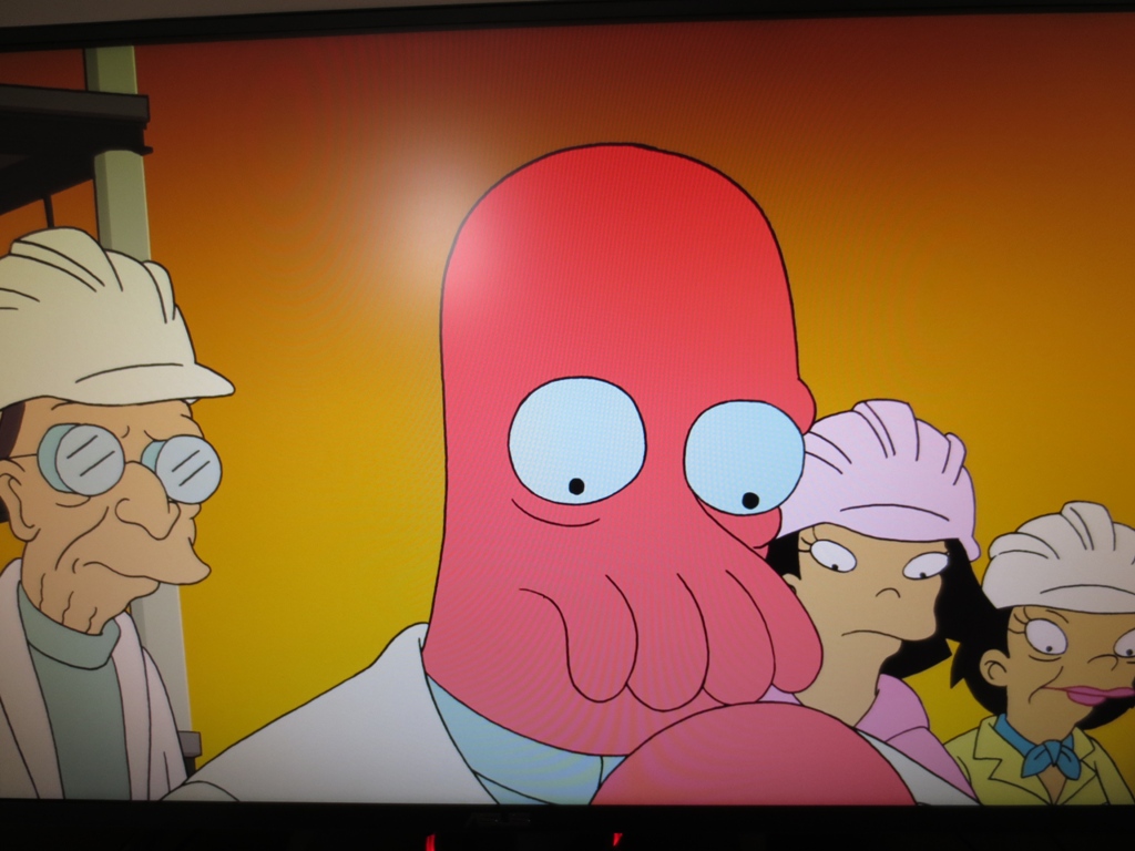
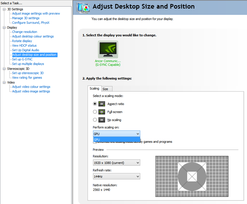
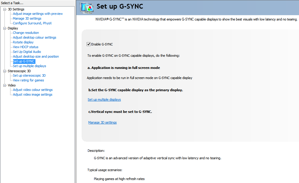
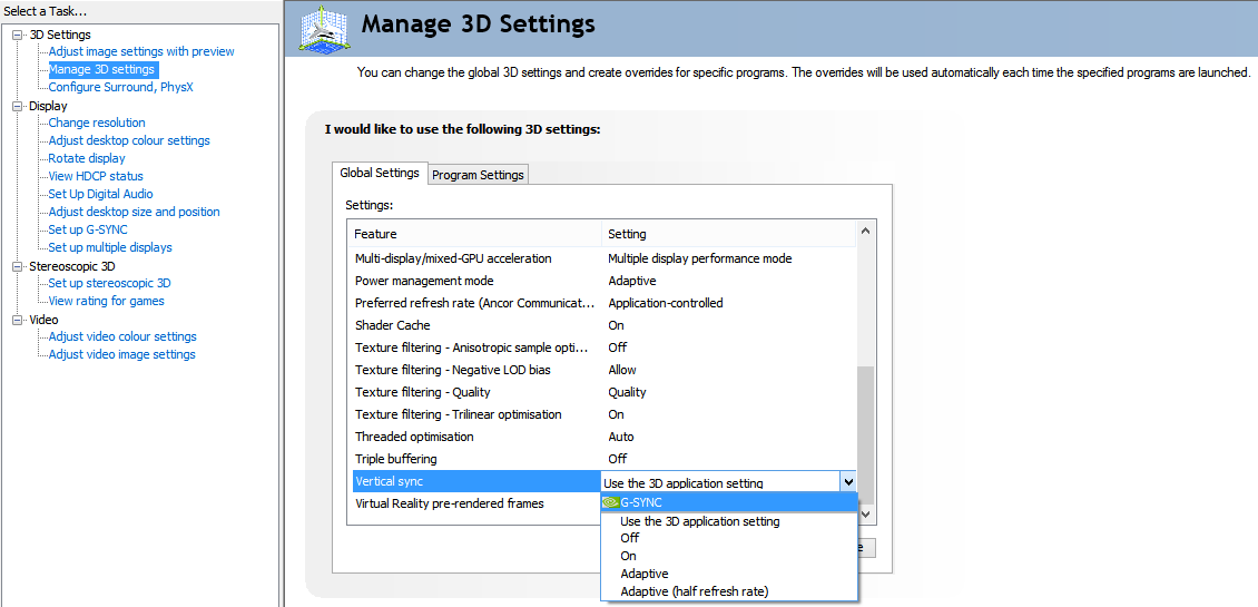
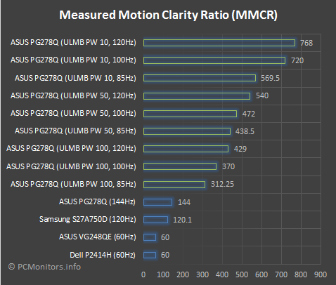
We used a Spyder4Elite to assess the luminance uniformity of 9 equidistant white quadrants running from the top left to the bottom right of the screen. This indicates the brightness uniformity of lighter colours displayed by the screen. The following table shows the percentage deviation between each quadrant and the brightest point recorded as well as the luminance at each quadrant. The uniformity of the monitor was quite poor really. The brightest point on the screen was ‘quadrant 5’ in the centre (163.1 cd/m²). The maximum deviation occurred at ‘quadrant 3’ and ‘quadrant 9’ at the top right and bottom right of the screen, respectively. Here the values recorded were 20% lower than the central maximum, at 129.9 cd/m². For 5 of the remaining 6 quadrants the deviation was 10-15% which is reasonable. The closest match to the central point was recorded just left of centre at ‘quadrant 4’ (154.1 cd/m², which is a 6% deviation). It’s worth noting a couple of things. Firstly, this is a TN panel, which means that viewing angle affects perceived brightness at different points of the screen. In particular the bottom of the screen appears lighter than the top of the screen, even from a normal central viewing position. Secondly, our review sample has been banded around at various shows and other events across the globe and probed, prodded and probably knocked over along the way. It is subject to more abuse than your average ROG SWIFT brought from a retailer will undergo (courier dependent) and as such can be expected to suffer a bit more from these uniformity issues. In short; don’t read too much into this table. And for those that prefer to see (and perhaps ignore) a graphical representation instead, the contour map below shows the deviations in a different way. Here lighter greys represent high luminance and therefore lower deviation from the central maximum than darker greys. Analysing colour temperature variation on a TN monitor using a colorimeter facing perfectly perpendicular to the screen surface from zero distance is particularly misleading due to the viewing angle related shifts that occur but aren’t reflected in the readings. To that end we will not be providing such analysis in this review. The contrast performance was pleasing overall on Battlefield 4. Detail levels in dark areas were appropriate and not impeded by ’IPS glow’ or artificial gamma enhancements. Such areas didn’t have the ‘flooded’ look that usually comes with the territory on 144Hz models, which is good. Bright details contrasted well, although there was a bit of graininess to such elements due to the screen surface. This was not the dirty and smeary mess seen on some older IPS models (like the U2711), however. Dirt 3 told a similar story when it came to contrast. Detail at the low-end was appropriate, without artificial visibility enhancements of ‘glow’ issues near the screen edges. Some minor details were not quite as distinct as they could be (undersides of wheel arches, for example), but that’s an area that only well-configured VA panels with 3000:1+ static contrast can really excel at. Light colours again had a bit of a graininess to them, lacking the smoothness or purity of a lighter matte or moreover a glossy screen surface. The screen gave a good contrast performance on the Blu-ray movie Skyfall. Detail in dark areas was appropriate, without the ‘flooded’ look accompanying most 144Hz models. Bright elements contrasted nicely with this, despite lacking the ‘pop’ of lighter screen surfaces. Various Lagom tests were used to aid our assessment of the contrast performance of the monitor, highlighting weaknesses that may not be obvious during other testing. The following observations were made. The ASUS PG278Q’s colour gamut covers sRGB very well. There is a very slim amount of under-coverage on the green area of this 2D representation of the gamut and some extension beyond sRGB, particularly for the green and yellow region of this diagram. This is still a standard gamut model but has a colour gamut which allows it to produce a good range of shades within the sRGB shades and give some a little bit more of a vibrant look than if the colour gamut stuck to or below the sRGB boundaries. Colours on Battlefield 4 had a fairly rich appearance. Shade depth was much better than most 144Hz models, giving things a more natural and appropriate look. Autumnal brown leaves and dark green foliage looked quite deep and lush for the most part, but was a little undersaturated further down the screen (TN viewing angle issue). Fires and explosions showcased some good strong reds and oranges, although such elements lacked the ‘pop’ and smoothness of monitors with lighter screen surfaces. Colours were also pleasing on Dirt 3. There was a nice variety of lush greens and earthy brows. The variety of subtly different shades was limited somewhat by the weakening saturation towards the bottom of the screen (TN issue). But the overall depth and look was good and far from washed out. The car liveries also showcased this good depth to colours with some nice deep blues and reds and good bright pinks and yellows. The colour performance on the Skyfall Blu-ray was good overall. Skin tones and natural environments appeared appropriately saturated. The apparent shade variety was also good, helped in part by large black bars on the top of bottom of this 2.40:1 (‘UltraWide’) film which cut off the areas where the most pronounced viewing angle related variations occur. Some fairly subtle skin tone variations could be seen, with each having its own identity. A given skin colour did appear slightly less saturated further down the screen, but as above the most extreme variation here was kept at bay. The neon lights of the Shanghai night scenes didn’t have the same vivacity we’ve seen on some monitors (including modern IPS-type models with 2560 x 1440 resolutions) but still had good depth. We also tested the Blu-ray of Futurama: Into the Wild Green Yonder. This is a superb test for colour reproduction, with large areas of solid colours highlighting colour consistency weaknesses very nicely. There were no surprises here – the monitor is bound by the same TN viewing angle restrictions as other models using the technology. The most noteworthy aspect of this, from a normal ergonomically sound viewing position (sitting fairly central in a chair, typically 60-100cm from the screen) is the tendency of shades to become darker (more saturated) further up the screen and lighter (less saturated) further down the screen. The scenes where the red lobster-like creature Dr Zoidberg filled the screen highlighted this nicely. So nicely that it could even be captured in a fairly representative way on a camera, as shown below. This variation (inconsistency) caused closely matching pastel shades to lose their individuality – a given skin tone, for example, may appear like another character’s skin tone depending on where on the screen it’s displayed. For those that see such fine details as nothing but fripperies, the deep colours in the film were handled nicely. There were some really strong blues and purples, good bright oranges and a range of nice vivid neon shades. We won’t bore you by commenting once again on the screen surface, you probably get the idea and are itching to move onto the responsiveness section by now. To analyse the concept of colour consistency and the influence of viewing angle on the colour reproduction of the monitor we used Lagom’s tests for viewing angle. We made the following observations from a viewing distance of 70cm. Some people will be sitting closer, others further away and that can impact what is seen to a degree. For most ‘normal’ viewing distances (50-100cm) you will observe fairly similar behaviour. The video below shows the results of the Lagom text test, a light desktop background and dark desktop background as viewed from a variety of viewing angles. You can see fairly pronounced shifts and gamma and colour, particularly where vertical viewing angle is altered. For the dark desktop background you can see a slight ‘glow’ off angle as noted previously. This glow is much milder than ‘IPS’ glow or anything similar and isn’t observed from a normal viewing position. One more formality to endure before that all-important responsiveness section is interpolation and upscaling. The PG278Q doesn’t offer any built-in scaling support for non-native resolutions. It is designed to run at its native 2560 x 1440 resolution over its lone DisplayPort connection. Anything else must be handled by the graphics card, or possibly by the G-SYNC module in some way as dictated by the graphics card. If you have a less powerful system or are playing a game that is particularly taxing graphically, then you may be tempted to run at the 1920 x 1080 resolution. Users with poor eyesight or other visual conditions at their normal viewing distance may also prefer the extra visibility of this. There are two main scaling behaviours for the 1920 x 1080 resolution, as handled by the GPU. If you open Nvidia Control Panel and navigate to ‘Display’ – ‘Adjust desktop size and position’ you’ll see three options as shown below. Selecting ‘Aspect ratio’ or ‘Full-screen’ will cause the monitor to use all its pixels at the 1920 x 1080 resolution, so the image fills the entire screen. This gives the image a softer look than running the same resolution on a 27” monitor with native 1920 x 1080 resolution. The loss in sharpness is fair but not awful – if anything it’s one of the better 2560 x 1440 models we’ve tested at handling the 1920 x 1080 resolution in fact. Desktop icons and text does appear somewhat softer by comparison to a native Full HD display of the size but it’s all still quite readable. Games appear softer than they should, but not to the extent that you see on some WQHD models running Full HD where everything looks like it’s being viewed through soft-focus lens. It is almost like applying some sort of FXAA-based anti-aliasing filter to the game on top of the native 1920 x 1080 resolution. Edges in particular look softer and the effects of any aliasing is reduced. It’s quite useable in our opinion, although not matching the sharpness of a native Full HD display of equivalent size and certainly a downgrade from the native 2560 x 1440 resolution of the monitor. The other option, if you refer back to the scaling image above, is to select ‘No scaling’, which will basically force the GPU to use 1:1 pixel mapping. You’ll get a 1920 x 1080 image presented in the middle of the screen. It is surrounded by large black borders on all sides as shown in the image below. We don’t personally like this mode as it wastes so much of the screen space available on the monitor – the image is essentially the same size as on a 20” 16:9 monitor. As usual for a 2560 x 1440 monitor, the clarity of Blu-ray content played using movie software on the PC was very good. During this upscaling process there was very little softening to the image and Blu-rays essentially looked every bit as good as on a native 1920 x 1080 screen. Online video content from sites such as YouTube and Netflix also looked appropriate. Input lag was calculated on the ROG SWIFT using a small utility called SMTT 2.0. A sensitive camera was used to compare the latency of the screen with a range of other monitors of known latency. Using this method 3.6ms (1/2 a frame at 144Hz) of input lag was recorded. This value is influenced by both signal delay (the element of input lag you feel) and a degree pixel response time (the element you see). This is a very low value and indicates an extremely low signal delay of the monitor – not one that any gamer really needs to lose sleep over. ULMB mode did not significantly impact the latency – the recorded values obtained using this test did not change after activating this. It was not possible to activate G-SYNC as none of the comparison monitors supported this and they have to run in ‘clone mode’ during the test. Unfortunately we don’t have the appropriate equipment to accurately measure latency during G-SYNC, but as explored a little later the overall fluid feeling is really improved with this mode rather than hindered by it. We used the UFO Motion Test for ghosting and a highly sensitive camera to assess the pixel responsiveness of the monitor. This test was set to run at a speed of ‘2400 Pixels Per Sec’ so that the UFO crossed the screen width in around 1 second. We used the middle row of the test (medium cyan background) but did not include results from the other rows (darker and lighter cyan backgrounds) as the trailing characteristics were similar on each. The image below shows the results of this test at 60Hz, 120Hz and 144Hz with OD (Overdrive) set to ‘Off’, ‘Normal’ and ‘Extreme’. The refresh rate had little effect on the pixel responsiveness of the monitor, which is quite usual. The nature of the trailing does not really change with refresh rate, with the possible exception of ‘60Hz’ using the default ‘Normal’ OD setting. You can see that the separation between the original object and each trail is decreased as refresh rate increases. That is because frames are displayed more rapidly (the screen updates its image more frequently) which if reflected in these static photographs. As explored later – it is also reflected, in a different way, by our eyes. With OD ‘Off’ (or ‘OFF’ in the menu – as if it’s saying what are you doing turning me OFF?) you can see a bold primary trail and faint secondary trail, indicating relatively slow pixel response times. With the ‘Normal’ setting, which is the factory default, the secondary trail essentially disappears. The primary trail changes in nature somewhat, becoming fainter and taken on a slight woven appearance which is most obvious at 60Hz but decreasingly so as refresh rate increases. This is a sign of mild overshoot, not something that’s generally noticed by the eye in practice but can be picked up by the camera. The ‘Extreme’ setting introduces obvious overshoot (inverse ghosting) as the pixel overdrive is too aggressive. It goes without saying really, but we found the ‘Normal’ setting optimal and used that for our testing. Something else to note here is that ‘interlace-pattern artifacts’ become apparent during fast motion, particularly where certain lighter shades are involved. These appear as vertical pinstripes of a lighter and darker version of the shade in question, like a sort of interlacing pattern. These were actually most apparent in some of the test titles haven’t documented our experiences with below. In Warframe, for example, there are lots of in-your-face explosions where this issue can be noticed. It’s generally not an issue and is actually quite common in some form on 144Hz models. The 27” screen and deep stand which brings the screen naturally closer to your eyes (unless you have a deep desk) perhaps makes these issues easier to spot on this model. Most users won’t actually notice this and many that do should be able to accept the issue and just enjoy using the monitor. It’s important to appreciate that our eyes respond to motion differently to a stationary camera. This article is worth reading if you’re interested in some technical background behind this. On a very basic level, though, an increased refresh rate accompanied by an increased frame rate in a game reduces perceived blur. As we’ve demonstrated above, the pixel response behaviour of the monitor is not really changed significantly by increasing refresh rate. It isn’t the pixel response behaviour that accounts for this reduction in perceived blur at higher refresh rate, but rather a reduction in our eye movement (which itself causes a significant degree of blur on a ‘sample and hold’ monitor). In addition to accounting for this eye movement, observing actual gameplay is important as it introduces a broad range of pixel transitions between many different shades and at different shades. Pixel responses occur at different speeds depending on the shades involved in the transition – overdrive behaviour is also altered by this. You can forget the ‘1ms’ response time ASUS quotes. That’s for one of the fastest pixel transitions the monitor will perform using its ‘Extreme’ overdrive setting and gives a very poor indication of real-world performance. However; as our testing below reveals, the monitor does a good job at providing an optimal 144Hz performance with its ‘Normal’ OD setting. Where the frame rate matched the refresh rate of the monitor (144fps) on Battlefield 4, the level of motion blur was very low. The fluidity was also very good, with the monitor pumping out more than twice as much visual information every second as a 60Hz monitor. The low levels of input lag, combined with this high refresh rate and frame rate, gave a really connected feel with the game environment. There wasn’t any noticeable tailing on top of the motion blur caused by eye movement and no obvious overshoot (inverse ghosting) either. There were faint hints of inverse ghosting here and there, but this was so short-lived and faint that it was difficult to pick up. When the frame rate dropped below or rose above 144fps, which happens a lot on this title, tearing was produced if VSync was disabled. Even if distinct tear lines weren’t obvious, textures appeared to wobble or ‘judder’ as you move which looked very unnatural. Even with triple buffering enabled, enabling VSync induced stuttering as frame rate dipped even at all below 144fps. VSync also adds a little extra latency which some users dislike. We still felt anything well above 60fps on this title was a bonus compared to on a 60Hz monitor, but things weren’t as smooth and flowing as they could be in this variable frame rate environment. The excellent pixel responsiveness of the monitor and high refresh rate really enhanced the visual fluidity of Dirt 3, too. Scenery flowed past the car smoothly and textures in the environments maintained respectable sharpness. Even in the fast-paced Gymkhana mode there was no trailing attributable to slow pixel responses – only blur from eye movement and in-game filters. There was no obvious overshoot, either. There were again some traces here and there, but nothing that stood out. Where frame rate diverged from the refresh rate, the same tearing or stuttering issues as on Battlefield 4 ensued. The Blu-ray film titles we tested really don’t make such good use of the monitor’s fluidity, as they’re fixed to around 24fps and you don’t interact with them as you do with games. Because 144Hz is a multiple of 24, each frame is duplicated 5 times by the monitor. This reduces ‘judder’ compared to on a 60Hz monitor where the frames don’t divide evenly (60/24 = 2.5). The overriding fluidity was still very much limited by the 24fps frame rate, though. As you’d hope the pixel responsiveness didn’t hold things back and there was no noticeable overshoot, either. Most monitors operate at a fixed input refresh rate, often 60Hz but sometimes 120Hz or 144Hz for fast gaming monitors. The GPU, meanwhile, outputs whatever frame rate it is capable of at any given time. This can be limited by a frame rate limit of the use of VSync, but on modern games drops below the refresh rate are often unavoidable (unless you have a huge surplus of GPU horsepower at your disposal). As we’ve explored above, this variable frame rate causes tearing and ‘juddering’ (‘VSync off’) or stuttering (‘VSync on’). The use of VSync is also associated with an additional latency penalty due to the buffering behaviour of the GPU. G-SYNC is a technology developed by Nvidia which allows the monitor to adjust its refresh rate dynamically (a so-called variable refresh rate technology) to reflect the frame rate of the game. There is still an upper and lower limit of operation, which on this monitor is 30-144Hz, but complete freedom within that range. By synchronising the refresh rate of the monitor with the frame rate outputted by the GPU you avoid the tearing and juddering associated with ‘VSync off’ and the stuttering associated with ‘VSync on’. The latency penalty is also very slight in this variable refresh rate environment, with the use of what Nvidia term a ‘lookaside buffer’ as a very low-latency solution adding perhaps a couple of ms of latency at most compared to VSync off on a conventional monitor. Further details on G-SYNC can be found in our dedicated article on the topic. To activate G-SYNC you simply need a capable monitor, such as the ROG SWIFT, and a compatible graphics card. There is a list of currently supported GPUs here, but it’s not entirely up to date. Any newer GPUs, such as the GTX 970 (which we’re using) and GTX 980 also support the technology. The feature was enabled by default for us when we fired up the monitor, but if it isn’t enabled (i.e. the power light doesn’t go red when running a full screen game) then a trip to the Nvidia Control Panel should do the trick. Navigate to ‘Display’ – ‘Set Up G-SYNC’ and follow the instructions given, as shown in the screenshot below. Note that the application must be running in full screen mode, the G-SYNC display must be set as the primary screen and VSync should be set appropriately. To make sure it is, navigate to ‘3D Settings – ‘Manage 3D settings’ and select ‘G-SYNC’ from the ‘Vertical sync’ list as shown below. Nvidia and ASUS also advise disabling any VSync setting in the game itself as some implementations may cause compatibility issues and stop G-SYNC working as efficiently as it could (possibly adding a bit of latency). Because movie software is generally not a true full screen application and movies generally run at around 24fps, which is below the 30fps G-SYNC floor of the monitor, you can’t use G-SYNC for them. We don’t feel it would really do much good compared to running at a solid 144Hz anyway in that scenario. If you’re interested in further technical details on what G-SYNC is and what it does, please read our dedicated article on the topic. If you’re more interested in what it was like using the technology on the ROG SWIFT, then read on. To kick off our subjective analysis of G-SYNC on this monitor, we went off-piste with a game title we haven’t tested elsewhere in the review: ESO (Elder Scrolls Online). This is an interesting title to test a G-SYNC monitor with as the game is capped at 100fps by default. Most of the time the frame rate sat at around 80-100fps and it felt very smooth. There was no stuttering or tearing, so the technology was doing exactly what it should be. It’s important to appreciate that G-SYNC is not a silver bullet, however. Low frame rates are still low frame rates – don’t be fooled into thinking that this variable refresh rate technology will do anything to change that. As the frame rate drops the amount of visual information presented to you every second is decreased and things both look and feel less fluid as a result. Levels of motion blur increases and the ‘connected feeling’ starts to evaporate. We found that anything below 70fps or so on this title felt relatively sluggish, although as long as the frame rate stayed above the 30fps floor of G-SYNC there was no stuttering or tearing caused by the GPU. There was occasional stuttering, likely related to network latency issues. As with SLI microstuttering (we have a single GPU, so didn’t experience that) that isn’t something that G-SYNC addresses. The second title we fired up was Battlefield 4. The technology did its thing once again, but on this title there was no 100fps cap, which opens up the maximum refresh rate of the monitor (144Hz). On our system the title tended to run at 100-144fps with the settings we like to use. With VSync on these drops below 144fps resulted in (for us) obvious stuttering. Disabling VSync induced unsightly tearing or ‘juddering’ under such conditions. With G-SYNC there was no such tearing or stuttering, and an exceptionally ‘connected feel’ as you interact with the game world. We must again point out that low frame rates are still low frame rates. The level of motion blur increases and the connected feel decreases, but stuttering and tearing are kept at bay. Onto our third test title, which was Dirt 3. This is perhaps not the best test for G-SYNC as our system is generally able to sustain very high frame rates (144fps) even with all graphical settings turned up very high. Smooth interaction isn’t really as important in this title as one where movement is controlled by the mouse, either. Nonetheless there were times where the frame rate dropped to 110-130fps. Things remained smooth, stutter and tear-free under such circumstances. To wrap up our game testing we fired up ArmA 3. This title really hammered home the notion that low frame rates are still low frame rates, regardless of G-SYNC. With our preferred settings this title frequently dipped below 60fps. Whilst there wasn’t GPU-related stuttering or tearing, the ‘connected feeling’ and overall fluidity of high frame rates was lost. At times the game fell below 30fps, a frame rate below which G-SYNC can’t operate on this monitor. Such low frame rates are really painfully sluggish anyway – this isn’t something G-SYNC would really improve much anyway. We would like to wrap up our testing of this technology by stating that we really did enjoy using G-SYNC. Low frame rates are still low frame rates and it was still best to try to keep frame rates as high as possible. But it’s really nice to maintain an experience without tearing or stuttering even if the frame rate drops a bit. On a moderately powerful system like ours there are times when frame rates does dip just a bit, even if it’s just to 110-130fps. On a regular 144Hz monitor that would provide a much less fluid and ‘connected’ experience than what we had here. ULMB (Ultra Low Motion Blur) is another Nvidia-specific technology, requiring an Nvidia GPU to be activated. The GPUs that support G-SYNC will also support ULMB, but you cannot activate both ULMB and G-SYNC at the same time. This technology is specifically designed to reduce motion blur by causing the backlight to strobe in sync with the refresh rate of the display, much like old CRT monitors used to do. The backlight only lights up very briefly and spends most of its time in an ‘off’ state. This strobe behaviour reduces the movement of your eyes as you track movement on the screen compared to the constant illumination of the backlight which is standard on technologies such as LCD. To enable ULMB you must ensure that the monitor is set to either 85Hz, 100Hz or 120Hz. You can then navigate to ‘Image’ in the OSD and enable the feature from there. Because ULMB cannot be used at the same time as G-SYNC, you must also ensure that G-SYNC is disabled in the Nvidia Control Panel. There is a ‘Pulse Width’ feature associated with ULMB. As we’ve explored previously, this affects the brightness of the display – with a lower value leading to a lower output brightness. That’s because a lower pulse width gives the backlight an even shorter ‘on’ period, so it spends longer ‘off’ and the perceived brightness is lower. This also improves the clarity of motion further, as we explore below. There are further technical details on strobe backlight technologies such as ULMB in our responsiveness article, otherwise read on to find how we found it on the PG278Q in the real world. Provided your frame rate matched the refresh rate, the visual fluidity with ULMB enabled was exceptional. Even the exceptionally fast-paced Gymkhana mode on Dirt 3 gained an extra layer of clarity, with the course remaining surprisingly clear even during rapid spins and manoeuvres. The clarity during the race modes was also excellent, not that we usually have an issue with how things are at regular 144Hz on that title though. On Battlefield 4 the clarity was excellent even whilst zipping around in a nimble vehicle such as the ATV or flying a chopper around. The game world remained sharp, allowing you to track your enemies during rapid manoeuvres. Unlike with G-SYNC, the refresh rate remains static regardless of frame rate. Because the visual clarity is so good any stuttering (or tearing and texture displacement if you disable VSync) is very obvious and not masked by motion blur. If you’re unable to maintain 120fps you could perhaps consider lowering the refresh rate to 100Hz or even 85Hz. As noted in the calibration section, this increases the potential brightness of the screen but also increases flickering. The ‘connected feeling’ is also best at 120Hz, but alongside motion clarity is actually respectable even at 85Hz. As we explore numerically later, the reduction in motion blur at 85Hz, compared to normal 144Hz (ULMB off) is still significant. As with refresh rate, ‘Pulse Width’ is something that is set to according to personal preferences. We personally found clarity absolute fine at a ‘Pulse Width’ of 100 and preferred 120Hz where frame rate allowed due to lower flickering (although 100Hz was also tolerable). At these refresh rates we found the screen too dim if ‘Pulse Width’ was lowered much. We should also mention that with ULMB enabled, the overdrive (OD) feature is fixed to a fairly aggressive value and can’t be adjusted. This gives inverse ghosting in places that is more pronounced than with ULMB disabled and OD set to ‘Normal’ but far less than with OD set to ‘Extreme’. As an example of this, if you move rapidly past a dark object with a medium or lighter shade in the background (a dark metal pole with blue sky in the background, for example) you can see a faint repetition of the object beside it. This often appears quite transparent and with multiple repetitions due to the strobe behaviour of the backlight – not a smooth blur. If the object is lighter than the background some dark trails can appear in the same fashion. Some users won’t notice this and we don’t personally feel it detracted from the overall experience. But it’s worth noting nonetheless. We also tested ULMB with our film titles, but didn’t find it added anything to the experience (except a bit of flickering). The low frame rate at which these run really causes a disjointed appearance to motion and limits your eye movement anyway. Some users may prefer watching films with ULMB enabled, and it can be done so feel free to experiment. We must stress again that ULMB requires the frame rate to match the refresh rate to really work its magic. In variable refresh environments G-SYNC is the better option to use. It really depends on personal preferences and the game titles you play as to whether you’ll want to use ULMB or G-SYNC. If you refer to the section of our responsiveness article entitled ‘The numbers approach’, just above the conclusion, you’ll see that it’s possible to measure and quantify the level of motion blur you see when viewing moving content on a monitor. There is a number referred to as the ‘Moving Picture Response Time (MPRT)’ which is a useful measure that’s widely referred to in relevant scientific literature. As explained in the article, on a ‘sample and hold monitor’ (such as this one when ULMB is disabled), this value typically corresponds to the number of milliseconds between frames. So on a 144Hz model, that’s 6.94ms. Regardless of how fast the pixel response time is, this value can’t be improved without either raising refresh rate and frame rate or using a strobe backlight approach such as ULMB. The graph below shows the MPRT of the ASUS PG278Q using a range of settings, measured using the UFO Motion tests. In this graph, green bars represent values where ULMB is activated. Blue bars represent both this monitor and a selection of others (for reference) where the backlight is constantly illuminated (normal ‘sample and hold’ behaviour). ‘PW’ stands for ‘Pulse Width’, a setting discussed previously. In this graph you can see that enabling ULMB decreases the MPRT values and therefore improves motion clarity. The greatest clarity is achieved with the PW set to 10 at 120Hz, the dimmest but ‘clearest’ setting on the monitor (1.3ms MPRT). As the refresh rate is decreased, the MPRT value rises and motion clarity worsens. Likewise, raising the PW decreases motion clarity. Even with the PW set to 100 and the refresh rate at 85Hz, the MPRT (3.2ms) is less than half that of the monitor running 144Hz with ULMB disabled (6.94ms). That means that there is under half the level of motion blur which is a significant improvement. Several years back there was something of a resurgent interest in stereoscopic (3D) technology. The film ‘Avatar’ shown in glorious 3D in cinemas marked something of a turning point in the market. There was a good deal of enthusiasm amongst consumers for 3D content both in the cinema and in the home. There was a plethora of 3D TVs and monitors released in the years that followed. Whilst such devices are still being released and 3D films are still being shown at the cinema, consumer interest in 3D displays are dwindling. The 2D viewing experience is just more natural and convenient, at least for the moment. It may well take something like autostereoscopic (glasses-free) technologies to really reignite consumer interest in such technologies. Nvidia 3D Vision is a technology launched by GPU vendor Nvidia that allows users to experience games and movies in 3D, provided they have a compatible GPU and monitor. And aren’t afraid to don a pair of ‘stylish’ stereoscopic glasses. The ROG SWIFT is compatible with this system, but requires that the user purchases the official ‘3D emitter’ and glasses separately. We tested the monitor out with the Nvidia 3D Vision 2 system on a range of game titles and a 3D Blu-ray. Rather than boring you with details on how to set it up (such instructions are included with the product itself) we’ll jump straight into our experiences. The first thing you notice when you put the glasses on is that they are quite chunky and ‘masculine’ looking. Wearing them over a gaming headset, such as our ASUS Echelon, is not at all comfortable or practical – stick to speakers or in-ear headphones. The lenses are large to optimise the field of view and let in more light. We also found that there was a fair bit of glare from light sources behind the viewer, which necessitates careful modulation of room lighting. Another thing you notice and that requires room light is regulated is that the image becomes a fair bit dimmer with the glasses on, especially once the shutters themselves are active. Finally, you do notice quite a lot of flickering from external light sources. Not so much the monitor itself, but light from windows and some room lights – again, something you have to consider regulating for the most comfortable experience. Compared to other active shutter systems we’ve used the image through the 3D Vision 2 glasses remained relatively bright. In 3D mode you are presented with different OSD settings on the ROG SWIFT as summarised below. Some other general observations we made include that, as usual for 3D systems such as this, the image just doesn’t look as natural as when viewing in 2D. What we mean by that is that the eyes are having to work in a way they’re not used to – usually we see things through both eyes simultaneously, not one then the other as active shutter glasses require. It is in some ways comparable to ULMB, as indeed the backlight is strobing as are the lens shutters. So you don’t get the sort of motion blur you’d usually see at 60Hz or indeed 120Hz+, without ULMB enabled. But because of how the system works (so-called ‘frame sequential’) each eye perceives 60fps at most, at different times. This fatigues the visual system and also induces a bit of flickering, mainly from ambient lights as mentioned previously. There was a little flickering from the screen, particularly when moving quickly on a game, but we soon got used to that. It also increases the latency and things feel a bit ‘heavier’ than during normal 2D operation. Another limitation to be aware of is that G-SYNC can’t be activated in 3D mode. Even the slightest drops in frame rate create a noticeable disconnect in the fluidity and induces noticeable stuttering. The graphics card must basically be pumping out 120fps (60fps per eye) constantly to avoid this. The final point we’d like to raise is that we noticed those ‘interlace-pattern artifacts’ that we touched upon earlier. But in 3D they were much more prevalent and stood out more clearly. Even when no movement was involved some shades appeared to have a bit of an ‘interlaced’ look, with thin vertical stripes a few shades off the desired shade. You might think after reading this and indeed our initial impressions of Nvidia 3D Vision 2 that we didn’t enjoy the experience. But as you will hopefully see by reading on, about our specific experiences on certain game titles, there is a lot of enjoyment to be had. There are certainly flaws with the system but this is something that some people will still really enjoy. We had hoped to test at least one 3D Blu-ray with this stereoscopic system. 3D Vision does support 3D Blu-rays, provided you are using movie software which also supports it. Unfortunately the only 3D Blu-ray disc we had to hand was ‘Life of Pi’ and for whatever reason our Blu-ray drive refused to read it. Quite disappointing really, but not the fault of the monitor or Nvidia’s 3D system. Although we didn’t have time to test out a huge range of game titles, we found the 3D experience most impressive on Elder Scrolls Online (ESO). Before moving onto why we enjoyed it, we’ll talk about a few things that weren’t as polished as they could be. We not only noticed the ‘interlace-pattern artifacts’ on some textures, but also as a sort of faint shadow beside some objects. These shadows were made a bit more noticeable than they should be by the vertical stripe artifacts – a sort of mixture of a convergence issue and ‘interlace-pattern artifact’ which is difficult not to notice. The image below shows these artifacts, particularly on the sky to the left of the character’s head and on the ‘shadow’ to the right of the character (from the user’s perspective). Having said that and pointed it out with a static image, this wasn’t overly distracting once you accepted that it was there and just enjoyed the overall experience instead. The same can be said for the grain of the screen surface, which was evident just as it was in ‘2D’ when viewing light colours. Fortunately it wasn’t as distracting as you might suspect and didn’t appear as a sort of floating fog as you might think it would. There were also some elements that were rendered at the wrong depth, which is quite a common thing on various game titles. In-game cursors and dialogues as you interacted with characters were hard to focus on sometimes and some effects like rain and some shadows appeared to strike slightly above the ground surface. It’s clear if you browse the internet that 3D Vision doesn’t really get the same enthusiastic support from Nvidia as the normal 2D experience with games. Some third party solutions exist to correct some of these issues, but we didn’t have time to play around with those. Now onto why we found the 3D experience on ESO impressive. Despite the flaws mentioned above, there were certain elements that really stood out (quite literally) on this title. On some games things appear either in-line with the screen surface or appear to go into the screen. On ESO there are plenty of objects and other aspects of the game that literally pop out of the screen in quite a wonderful way, with 3D Vision 2. We actually had to dial down the depth a little bit for visual comfort, putting it to 3 or 4 bars using the scroll wheel on the emitter. Even with this slightly reduced setting, characters in the game and many objects were quite literally in your face as you got close. What’s more, the 2560 x 1440 resolution of the PG278Q helped give the textures on these objects a more detailed look then you’d typically see on a 3D display at home. Water on the game was really impressive, just looking that bit more lifelike in full 3D. The most impressive object we saw pop out in this way was the ‘High Hrothgar Wraith’ vanity pet. A strange ghostly floating skeletal fish-like thing (for non ESO-educated folk). The transparent textures looked quite fantastic on this, in full 3D, on the ROG SWIFT. The 3D experience on Battlefield 4 was a bit different. It added an extra dimension to the gameplay (duh) which made for a really enjoyable re-playthrough of the single player campaign. The artifacts we noted on ESO and other issues noted previously were again present, but once we were immersed in the game we didn’t really mind. Especially when walking up to characters and getting close to objects, the extra perspective did make the game feel more engrossing in a way. The 2560 x 1440 resolution again helped make textures more detailed, which complimented their extra depth nicely. Aiming down weapon optics also gave a great sense of depth and felt quite different to usual on this game. One critical thing we felt let down the experience is that none of the objects actually popped out of the screen, only into it. Increasing the 3D depth setting simply made things sink further into the screen. As a result, there weren’t any of those ‘wow’ moments as we saw on ESO. So we enjoyed the 3D experience on single player, but not as much as we did on ESO. As for multiplayer, we didn’t find this extra depth really helped much and prefer the enhanced fluidity of normal 2D. Some somewhat lazily rendered objects (like vegetation) might escape your notice in regular 2D gameplay, too, but in glorious 3D they look like cardboard cut-outs – and it’s not great to look at to be honest. The ASUS PG278Q (ROG SWIFT) offers the unique combination of 144Hz refresh rate and 2560 x 1440 resolution on a highly responsive TN panel. To ice the cake, this is also a G-SYNC monitor which can adapt its refresh rate on the fly to maximise visual fluidity. Putting the uniqueness to one side for the moment, we have to compare it to other models available on the market. Compared to other 144Hz models we’ve seen, this monitor offers superior image quality. It isn’t the usual mixture of highlighter pens and Domestos (oversaturated and bleached) colours you usually see but something all the more richer and pleasing. Out of the box our unit was set up rather nicely, with just a few minor tweaks to colour channels and of course brightness yielding pleasing results. Gamma was spot on where it should be, at the centre of the screen. And more importantly the overall image was quite inviting with a good range of vibrant but on the whole quite accurately represented colours. Contrast performance was also good but quite what you’d expect from a capable TN panel. But the comparison also has to be drawn with existing 2560 x 1440 models. This model is different because it offers that TN panel whereas others offer IPS-type or VA panels. As we explored extensively in the review, the SWIFT is still bound by the same restrictions as other Twisted Nematic technology. Viewing angle restrictions are such that, from a normal viewing position, a given shade appears lighter at the bottom of the screen than the top. This didn’t exactly jump out and whack you in the face when gaming, although the effect it had on subtle shade variety was apparent to those with keen eyes. The screen surface was perhaps a larger culprit in sapping the screen of potential vibrancy (and indeed clarity) and inducing a dissatisfying graininess to whites and other lighter shades. ULMB was also enjoyable, provided the frame rate and fixed refresh rate (85Hz/100Hz/120Hz) matched. The level of motion clarity was absolutely exceptional with ULMB and the image retained much the same characteristics. Due to how the strobe backlight mode operates there is a mild flickering (much like a CRT at the same refresh rate) and a potential drop in brightness. We even found 85Hz perfectly useable with ULMB and enjoyed the motion clarity benefits even at the ‘required’ 85fps. The brightness was actually very strong at this refresh rate with ULMB, but the flickering a little more noticeable and something that may bother some users compared to 100Hz or 120Hz. Finally we tested the 3D capabilities of the monitors, which were again unique due to the 2560 x 1440 resolution not currently offered on any other 3D monitor. We experiences some excellent 3D effects on games like ESO in particular and experienced some 3D moments there that were unlike anything we’ve seen on a game (in a good way). It was a bit of a shame to see ‘interlace-pattern artifacts’, which were much more noticeable than in normal 2D, really pop out in 3D. We didn’t really find them bothersome once we got used to them but we can’t speak for everyone. There were definitely some drawbacks to 3D that stemmed beyond the chunky glasses, but we still see at as a nice option to have. So what’s the bottom line? The price of the PG278Q is high, availability soon after launch has been patchy and the performance was, as with any monitor, a bit mixed. But really, there are no two ways about it. At time of writing this is a completely unique monitor that offers a gaming experience unlike any other. And it’s an enjoyable one.

Luminance uniformity table

Luminance uniformity map
Contrast in games and movies
Lagom contrast tests
Colour reproduction
Colour gamut

Colour gamut test settings
Colour in games and movies
Viewing angles
Interpolation and upscaling
![]()
Responsiveness
Input lag
Pixel responsiveness

Trailing (various 'Response Time' settings)
Responsiveness in games and movies
G-SYNC – the technology
G-SYNC – activating it
G-SYNC – the experience
ULMB – the technology and how to enable it
ULMB – the experience
ULMB – the numbers
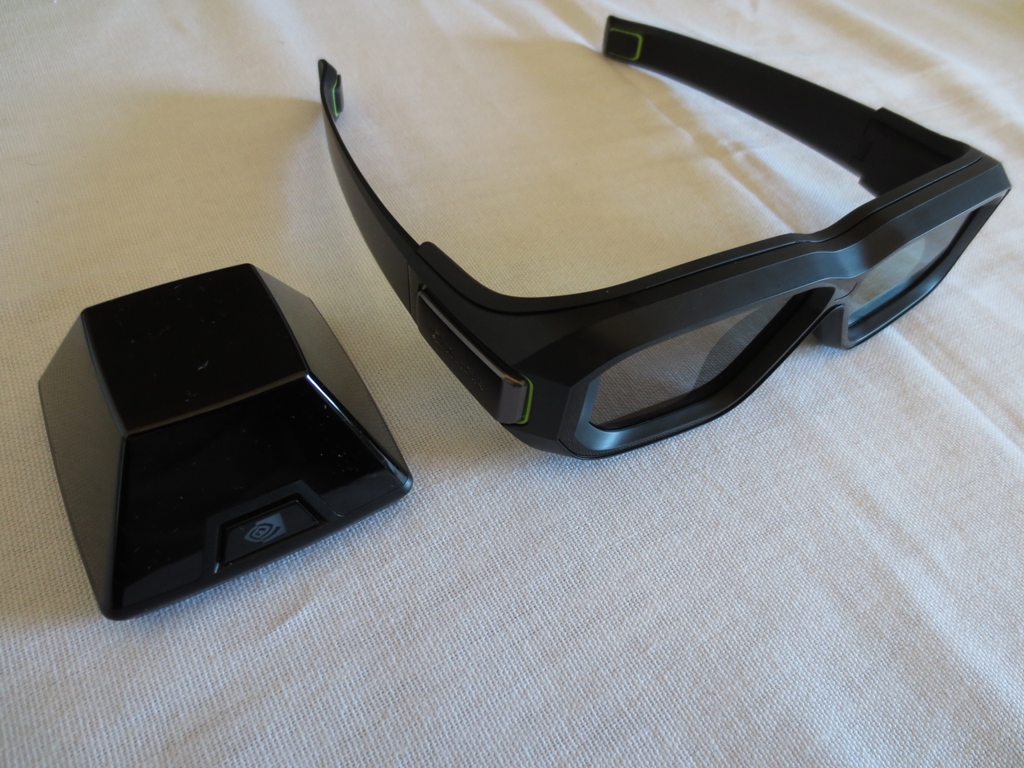
Nvidia 3D Vision 2 – the technology
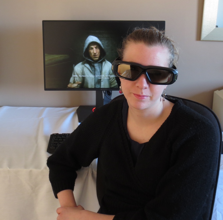
Nvidia 3D Vision 2 – general observations
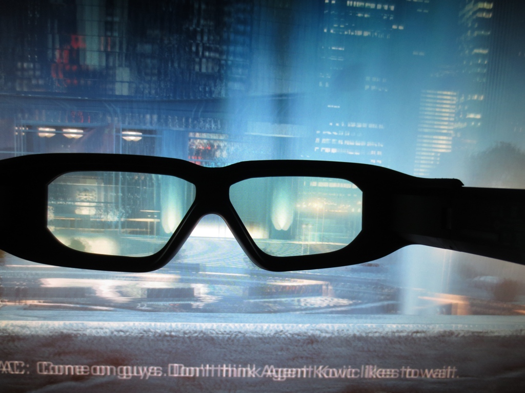
Nvidia 3D Vision 2 – the game experience


Conclusion
Positives Negatives Pleasing out of the box performance, particularly with respect to gamma. Colours were rich and inviting after a little tweaking, the most important ‘tweak’ being to lower brightness
Some colour channel corrections needed to reach the desired 6500K white point on our unit. Vibrancy held back a little by screen surface and further down the screen due to TN viewing angle limitations
A good contrast performance free from peripheral ‘glow’ (e.g. IPS glow) and a decent static contrast ratio recorded which is very close to the specified value The screen surface provided a grainy look in places and sapped the image of a bit of vibrancy and clarity – a lighter matte (‘semi glossy’) surface as common on IPS-type WQHD models would be preferable Outstanding responsiveness with well-balanced pixel overdrive, little input lag, support for G-SYNC, ULMB and 3D Vision. These modes all worked quite nicely and did what they should – and were complimented by the 2560 x 1440 resolution
Some ‘interlace pattern artifacts’ were evident, particularly when viewing with 3D Vision 2. ULMB mode also used a stronger and fixed pixel overdrive level that produces some inverse ghosting. These imperfections won’t bother everyone but it would be better if they weren’t there
A unique and appealing design with a solid construction, slim bezels and a unique ‘Light in Motion’ feature that some users will appreciate
A high price tag, limited availability and lack of ports (no console connectivity) will put some users off. We found the deep stand base took the monitor a bit closer to our eyes than we’d like as well
![]()

