Author: Adam Simmons
Date published: August 2nd 2016
Table of Contents
Introduction
For gamers, particularly those who favour fast-paced games, having a monitor with increased refresh rate is hugely advantageous. Indeed, it is one of the key factors that aids both a responsive look and feel to the gaming experience. The ASUS VG248QE was one of the first models to support a 144Hz refresh rate and to this day remains a popular choice for its combination of price and gaming performance. The ASUS PG248Q can be thought of as an evolution of this product, bumping up the refresh rate to 180Hz and including Nvidia G-SYNC variable refresh rate technology. We put this monitor through its paces, seeing how the monitor performs in a range of tests and also taking a look at these new features.
Specifications
The monitor uses a 24” TN (Twisted Nematic) panel from AU Optronics, supporting a 180Hz refresh rate and using 6-bits per subpixel plus FRC dithering. A 1ms grey to grey response time is specified, which as usual should not be taken at face value. Some of the key talking points of the specification have been highlighted in blue below.
Key talking points of the specifications are highlighted in blue below.
Features and aesthetics
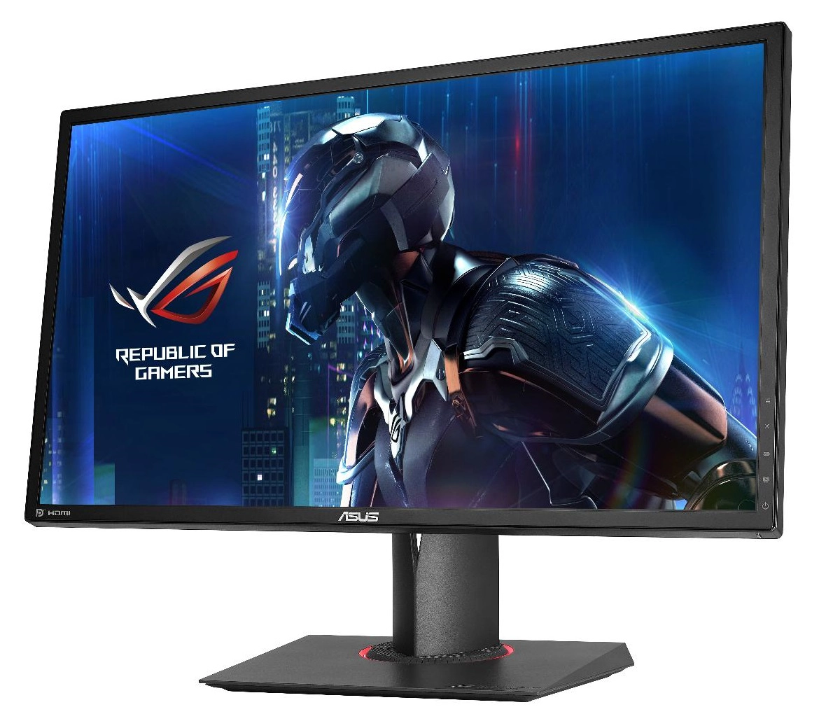
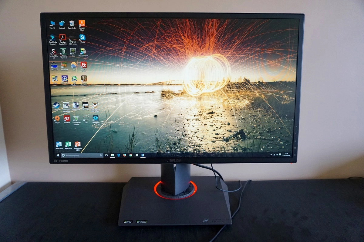
From the front the monitor shares many of the aesthetic ROG refinements seen on its larger brother, the PG278Q. The bezels are the notable exception, as they don’t feature the ‘dual-stage’ design of the PG27 series. There is just a single hard matte plastic outer component to the bezel, which covers the panel border almost entirely – this design is dictated by the panel used, which has a thicker panel border. The total bezel width including the sliver of panel border is ~13mm (0.51 inches) at the top and sides and ~14mm (0.55 inches) at the bottom. The screen surface is medium matte anti-glare as explored later on in the review. You will also notice the ‘Light In Motion’ feature (red ring about the stand base), which is more of a deep red than the somewhat orange hue it should appear on these photos. As explored in the OSD (On Screen Display) video a little later, this can be disabled if preferred. There is no illuminated ROG motif as seen on models like the PG27AQ.
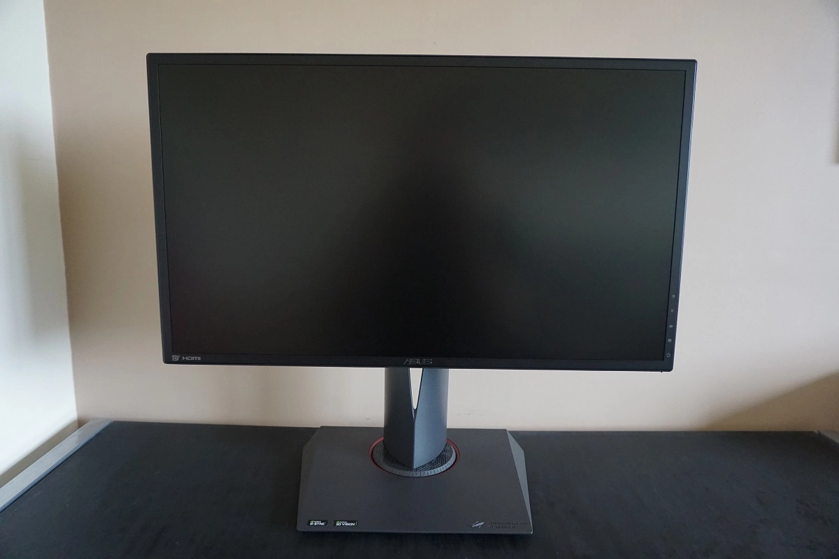
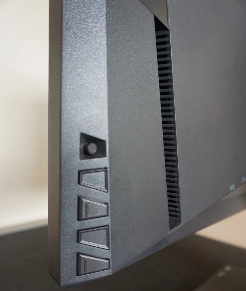
Towards the bottom of the right bezel, running vertically down, you will see button labels for the OSD (On Screen Display) functions. This is controlled by a combination of buttons and a JOG button (joystick) which are found on the rear of the monitor, in-line with the respective labels at the front.
At the bottom left corner, facing downwards, there is a small power LED with various colours to indicate the power state of the monitor. These are as follows:
White = Monitor on
Flashing Amber = Standby
Deep (ROG) red = G-SYNC
Yellow = ULMB (Ultra Low Motion Blur)
Green = 3D Vision
The control system itself is one we are quite comfortable with, having used it on other ROG Swift models. Really it’s quite intuitive and frustration-free. The video below runs through the OSD menu system.
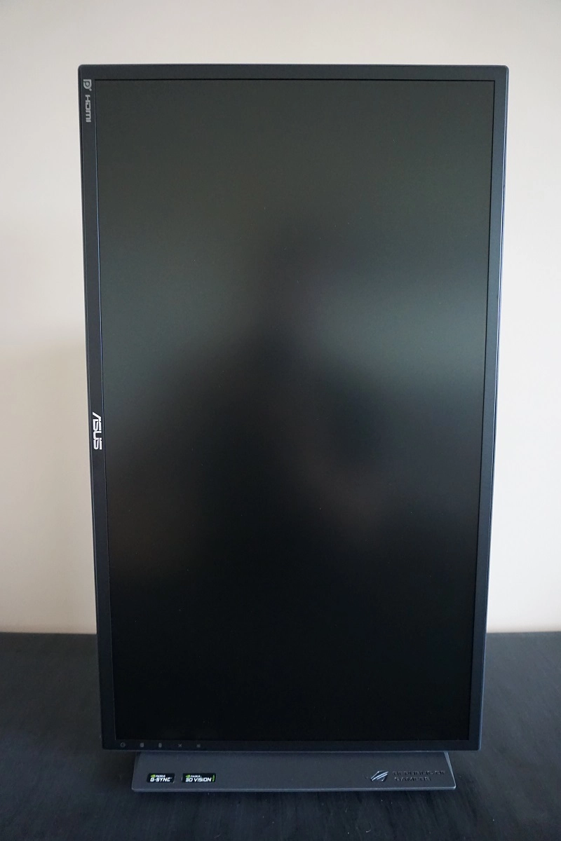
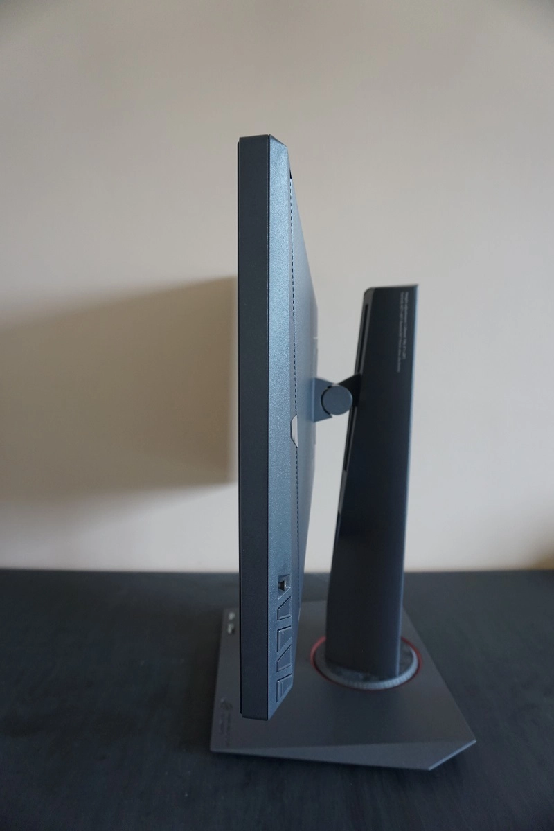
From the side the monitor is fairly slender, at ~26mm (1.02 inches) at thinnest point, lumping out towards the centre. The fairly substantial stand, which both looks and feels nice and solid, can be seen from this angle. This affords full ergonomic flexibility to the screen; tilt (5° forwards, 20° backwards), swivel (60° left, 60° right), height (120mm or 4.72 inches) and pivot (90° clockwise rotation into portrait). The practicalities of portrait viewing on any TN model, this included, are limited by vertical come horizontal viewing angle limitations. The total depth of the monitor including the stand is 235mm (9.25 inches) and the screen hangs around 215mm (8.46 inches) from the rear of the stand base. This brings the screen quite far forward compared to the rear of the stand. We found this acceptable given the size of screen but would have preferred a shallower base footprint and the screen itself a bit further back on the stand. At lowest screen height the bottom edge of the monitor clears the desk by ~96mm (3.78 inches) whilst the top sits ~425mm (16.73 inches) above the desk.
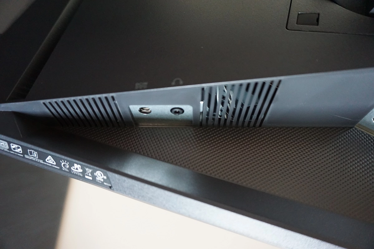
The rear of the screen is again styled very similarly to the big brother, with an angular appearance but the use of matte black plastic throughout. The gaps, or shadowy areas of the image, show where some vents are housed which aid cooling of the monitor. This monitor doesn’t specifically require any additional cooling beyond what other 24” 144Hz models provide and the system is passive, but ASUS certainly makes a ‘thing’ about their cooling prowess on this model. The included stand attaches by 100 x 100mm VESA and can be removed to make way for an alternative VESA-compatible solution. The included stand includes a small cable-tidy gap near the bottom as well. There is a K-Slot towards the bottom right when the monitor is viewed from the rear.
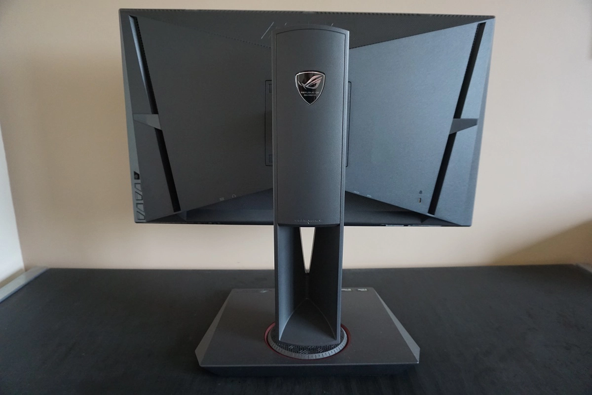
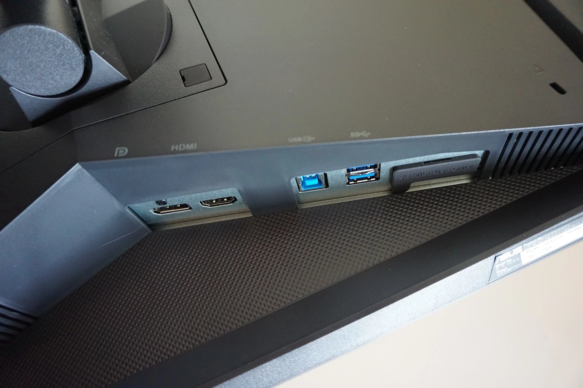
The ports are angled with a slight diagonal slope and are downwards facing. To the left of the stand when neck when viewed from the rear there is a DC power input (external power brick) and 3.5mm headphone jack. Behind the stand neck there is a DP 1.2 input, which supports Nvidia G-SYNC and the full capabilities of the display. To the right there is an HDMI 1.4 port and 2 USB 3.0 ports (plus upstream). The HDMI port is something that has been added to so-called ‘G-SYNC V2’ monitors and was lacking on the PG278Q. Refresh rate is limited to 60Hz via HDMI, but it allows you to connect devices such as games consoles where their capabilities match. Standard accessories include a power adaptor and cable plus a DP cable.
Calibration
Subpixel layout and screen surface
The monitor uses a medium matte anti-glare screen surface, which offers strong glare handling characteristics. This is typical of the type of surface found on 24” 144Hz+ TN panels. As explored in this article, the strong diffusion characteristics, which help minimise glare, also affects light emitted from the monitor. There is a slightly grainy look to lighter shades with the overall clarity and vibrancy potential of the monitor reduced. Fortunately, though, the screen surface does not have the same heavy ‘smeary’ look of some screen surfaces..
![]()
An RGB (Red, Green and Blue) stripe subpixel layout is used. This is the standard layout and the default expected by modern operating systems such as Microsoft Windows and Apple’s Mac OS. This means that there is no need to run ClearType as a Windows user or worry about text fringing issues as an Apple user. Windows users may still wish to run ClearType and tweak according to preferences, however.
Testing the presets
The PG248Q features a number of ‘GameVisual’ presets; ‘Scenery Mode’, ‘Racing Mode’, ‘Cinema Mode’, ‘RTS/RPG Mode’, ‘FPS Mode’ and ‘sRGB Mode’. With the exception of ‘Racing Mode’, which is the factory default, and ‘sRGB Mode’, these presets leave a lot to be desired for those who admire well-represented colours. They offer various levels of oversaturation or in the case of ‘Cinema Mode’ an extremely high (cool-looking) colour temperature. The oversaturation is a bit more selective on some (FPS Mode) but more widespread and even less desirable on others (‘Scenery Mode’ and ‘RTS/RPG Mode’). Needless to say we won’t be spending too long analysing these and will instead test a range of other settings available in the OSD.
The table below shows observations using a range of different settings. Readings for central white point and gamma are also included, taken using a Datacolor Spyder5ELITE colorimeter. The monitor was left to run for over 2 hours before these readings were taken and was connected to an Nvidia GTX 1070 G-SYNC compatible GPU via DP 1.2. The system used Windows 10 and the monitor was left in its ‘Plug and Play’ state without additional drivers or ICC profile specifically loaded. Unless otherwise stated assume default settings were used, with the exception of our ‘Test Settings’ where various adjustments were made. Unless otherwise started, assume the monitor was set to 144Hz as well. For ‘ULMB’ brightness was set to ‘100’, which it sometimes defaulted to when using this mode anyway.
| Monitor Settings | Gamma (central average) | White point (kelvins) | Notes |
| Racing Mode (Factory Defaults) | 2.5 | 6485K | The image appears rich and bright, with strong shade depth overall (too much in places) and a decent balance to the white point with just a minor green push. The TN panel technology means that perceived gamma changes depending on the part of the screen you’re observing, even from a normal viewing position. The 2.5 central average is too high, making shades appear too deep. Shades further down the screen look more or less correct whilst shades further up the screen appear extremely deep and quite dull. Overall this is already preferable to the overly ‘washed out’ appearance of many 24” 144Hz monitors, which may offer a central gamma <2.0 without means to correct via the OSD. |
| 160Hz | 2.5 | 6470K | Much as above really, with no obvious impact on gamma or colour temperature. As analysed later there is a slight drop in contrast. Furthermore, certain artifacts (including interlace patterns) become more pronounced as we explore later in the review. |
| 170Hz | 2.6 | 6401K | As above, but very slight changes to gamma that tip the central average to 2.6 and slightly lower white point. There is a more noticeable weakening of contrast which can be noticed during normal use. Interlace patterns more pronounced as explored later. |
| 180Hz | 2.6 | 6395K | As 170Hz with further weakening of contrast and interlace patterns becoming even more pronounced. |
| Gamma = 1.8 | 2.1 | 6491K | As per factory defaults, but the central gamma is now better balanced to counteract the slightly excessive depth to many shades. Again, perceived gamma varies even from a normal viewing position due to viewing angle restrictions of TN panel technology. |
| Gamma = 2.5 | 2.8 | 6498K | Excessive depth overall with things looking quite dull for the most part higher up the screen and only really ‘correct’ towards the very bottom of the screen. |
| sRGB Mode | 2.5 | 6537K | Similar to factory defaults, but brightness is much lower and more comfortable (can’t be manually adjusted) and white point is raised just slightly. |
| Blue Light Filter = Level 1 | 2.6 | 5437K | The white point is lowered quite considerably due to weakening of the blue colour channel. The image appears warm with a slight green tint. This is a fairly effective Low Blue Light (LBL) setting, suitable for more relaxing viewing before bed. |
| Blue Light Filter = Level 2 | 2.6 | 5292K | As above but further weakening of blue colour channel. |
| Blue Light Filter = Level 3 | 2.6 | 5147K | Another step down in colour temperature and hence lower blue light output from the monitor. |
| Blue Light Filter = Level 4 | 2.6 | 4932K | This setting not only drops the blue colour channel down a bit more, it locks brightness to a fairly low level. Brightness has a significant effect on light emission of all colours from the monitor – including blue. Note that the other levels of the filter allow brightness to be manually adjusted. In combination, this creates a very effective LBL mode which is suitable for relaxing viewing. |
| ULMB, Pulse Width 100 @ 120Hz | 2.8 (2.4 @ Gamma = 1.8) | 6257K | The most obvious change from the factory defaults is that the screen appears much dimmer and also strobes, inducing a mild flickering like a 120Hz CRT. There is also a fair increase in gamma, which can again be offset to a good degree using the gamma control in the OSD. The image does appear relatively dim, especially at first, but your eyes will compensate for this quite effectively. You can’t make the image brighter without lowering refresh rate (as below), but you can certainly make it dimmer if preferred. |
| ULMB, Pulse Width 100 @ 100Hz | 2.7 (2.4 @ Gamma = 1.8) | 6270K | As above with a bit more flicker due to reduced refresh rate (like a 100Hz CRT). The image appears just a little brighter, but again can be dimmed if required. |
| ULMB, Pulse Width 100 @ 85Hz | 2.6 (2.3 @ Gamma = 1.8) | 7239K | As above, but quite a bit brighter at default. There is also much more noticeable flickering – sensitivity to this varies, but we found it quite uncomfortable to use. |
| ULMB, Pulse Width 10 @ 120Hz | 2.8 (2.4 @ Gamma = 1.8) | 6198K | The image appears extremely dim with this setting. The ‘Pulse Width’ setting is explored a bit later on. |
| ULMB, Pulse Width 10 @ 100Hz | 2.7 (2.4 @ Gamma = 1.8) | 6225K | As above but more slightly more flickering due to refresh rate decrease. |
| ULMB, Pulse Width 10 @ 85Hz | 2.6 (2.3 @ Gamma = 1.8) | 6246K | A little brighter but still very dim and again flickering is quite obtrusive at this refresh rate, in our view. |
| Test Settings (see below) | 2.1 | 6490K | The brightness is much more comfortable and overall balance to the image good with the minor green tint corrected. Obviously we can’t change the viewing angle dependency of the monitor’s gamma curve, so shades lose saturation lower down the screen and appear more saturated higher up. But the central gamma is now within good range and the overall look to the image is rich – much better than the majority of 24” 144Hz+ models will produce. |
Out of the box the monitor was bright with a mild green tint. The image was rich overall, a far cry from the washed-out look that graces many 24” 144Hz+ models. In fact this monitor had the opposite problem – gamma being too high centrally, making some shades appear too deep. Fortunately, ASUS provide some ‘Gamma’ settings, and although the numbers listed here didn’t correspond at all to our readings, we were able to achieve a respectable balance there with the ‘1.8’ setting. The gamma curve under out ‘Test Settings’ is shown below. There is a little bit of sagging in places, meaning that it averages 2.1, but as we noted in the table perceived gamma changes anyway. From a normal viewing position, shades appear less saturated (lower gamma) below this central measured point and more saturated (higher gamma) above it. Upping the refresh rate had limited effect on gamma or white point, but did reduce contrast somewhat as we explore later. This was most pronounced at 170Hz and more so at 180Hz. There were also some useful ‘Blue Light Filter’ Low Blue Light (LBL) settings, which worked exactly as intended. They reduced blue light output, to 4 different levels, and were easy to activate. These settings can be useful if, like us, you only really like to use these settings for relaxing viewing before sleep – where stimulating blue light should be minimised. Unfortunately, any changes you make manually to the colour channels (as we do with our ‘Test Settings’) are wiped out when any of these LBL settings are active. This makes deactivating these settings potentially a lot less convenient than activating them in the first place. We were able to achieve a nice balance to the image using OSD settings alone, so didn’t need to rely on ICC profiles to make additional corrections. Some slight adjustments were made to colour channels, the ‘Gamma’ setting was changed and brightness was reduced significantly. The monitor was also set to 144Hz. Be aware that each individual unit is different and people have different preferences. These settings won’t necessarily be optimal for all units and some users may prefer the deeper and punchier overall look of the default gamma setting. Any setting not mentioned here was left at default, including contrast. We’ve included the ‘OD’ (Overdrive) setting used just for reference, even though it was left at default. Brightness= 35 (according to preferences and lighting) Gamma= 1.8 R= 100 G= 92 B= 99 OD= Normal Refresh rate= 144Hz A BasICColor SQUID3 (X-Rite i1Display Pro) was used to measure the white luminance and black luminance using a range of settings. From these values, the resulting static contrast ratios were recorded as per the table below. Black highlights in the table indicate the highest white luminance, lowest black luminance (without ULMB active) and peak contrast ratio recorded. Blue highlights indicate the results under our ‘Test Settings’. Assume any setting not mentioned here was left at default, aside from the exceptions mentioned in the calibration section.
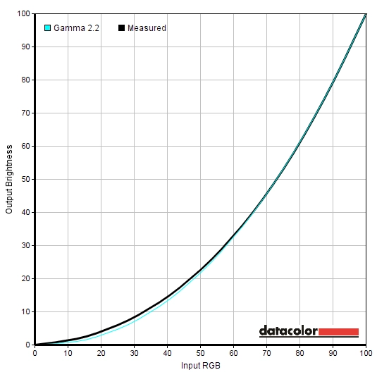
Gamma 'Test Settings'
Test Settings
GamePlus= Racing Mode
Contrast and brightness
Contrast ratios
Monitor Settings White luminance (cd/m²) Black luminance (cd/m²) Contrast ratio (x:1) 100% brightness 359 0.37 970 80% brightness (Factory Defaults) 308 0.31 994 60% brightness 196 0.20 980 40% brightness 196 0.20 980 20% brightness 138 0.14 986 0% brightness 79 0.08 988 160Hz 306 0.36 850 170Hz 305 0.40 763 180Hz 305 0.48 636 Gamma = 1.8 308 0.31 994 Gamma = 2.5 306 0.31 987 sRGB Mode 160 0.16 1000 Blue Light Filter = Level 1 299 0.31 965 Blue Light Filter = Level 2 297 0.31 958 Blue Light Filter = Level 3 295 0.31 952 Blue Light Filter = Level 4 121 0.13 931 ULMB, Pulse Width 100 @ 120Hz 125 0.17 735 ULMB, Pulse Width 100 @ 100Hz 138 0.19 726 ULMB, Pulse Width 100 @ 85Hz 169 0.23 734 ULMB, Pulse Width 10 @ 120Hz 13.2 <0.02 >660 ULMB, Pulse Width 10 @ 100Hz 14.24 <0.02 >712 ULMB, Pulse Width 10 @ 85Hz 17.36 <0.03 >579 Test Settings 168 0.18 933
The average static contrast with only brightness adjusted was 982:1, which is much as expected given the 1000:1 specified. The contrast ratio did drop as refresh rate was increased, to 850:1 at 160Hz, 763:1 at 170Hz and 635:1 at 180Hz. This did affect the image, particularly for the more dramatic drop at 180Hz, by taking away some of the depth. Blacks and other dark shades didn’t look as rich as they did at 144Hz. The monitor was still very much usable at these refresh rates, though, and the image didn’t look ‘washed out’ as it might if gamma was far too low. The contrast dropped only slightly with the ‘Blue Light Filter’ modes active, with 931:1 still achieved using the strongest setting. ULMB affected contrast more strongly, dropping it to around 730:1 based on the more accurately measured values at ‘Pulse Width 100’. The contrast remained good under our ‘Test Settings’, at 933:1.
The maximum luminance recorded in this table was 359 cd/m². and the lowest white luminance (with ULMB disabled) was 79 cd/m². This yielded a 280 cd/m² luminance adjustment range, which is good. There is also a Dynamic Contrast setting on the monitor called ‘Adaptive Contrast Control’. This setting allows the backlight of the monitor to adjust itself according to the overall levels of ‘light’ and ‘dark’ on the screen. The backlight is controlled as a single unit, so some of the screen can’t have a high backlight brightness whilst others have a low brightness. So as usual this mode is a bit of a compromise. The flexibility offered by this solution is excellent, though, as you can specify both the ‘Strength’ and ‘Limit’. The ‘Strength’ dictates how reactive the monitor is to these changes in brightness, with a higher strength meaning it responds more readily to changes in scene brightness. The ‘Limit’ dictates the highest brightness level that will be used regardless of how bright the scene may be, so you can keep things within your preferred brightness level for the sake of viewing comfort. We’re not fans of Dynamic Contrast settings in general, but this is one of the better implementations we’ve seen.
PWM (Pulse Width Modulation)
The monitor does not use PWM (Pulse Width Modulation) at any brightness level and instead uses DC (Direct Current) modulation. This means that the backlight is considered ‘flicker-free’, which is good news for users concerned about possible visual fatigue or discomfort caused by flickering backlights. Or those users that dislike PWM artifacts, which adversely affect motion performance.
Luminance uniformity
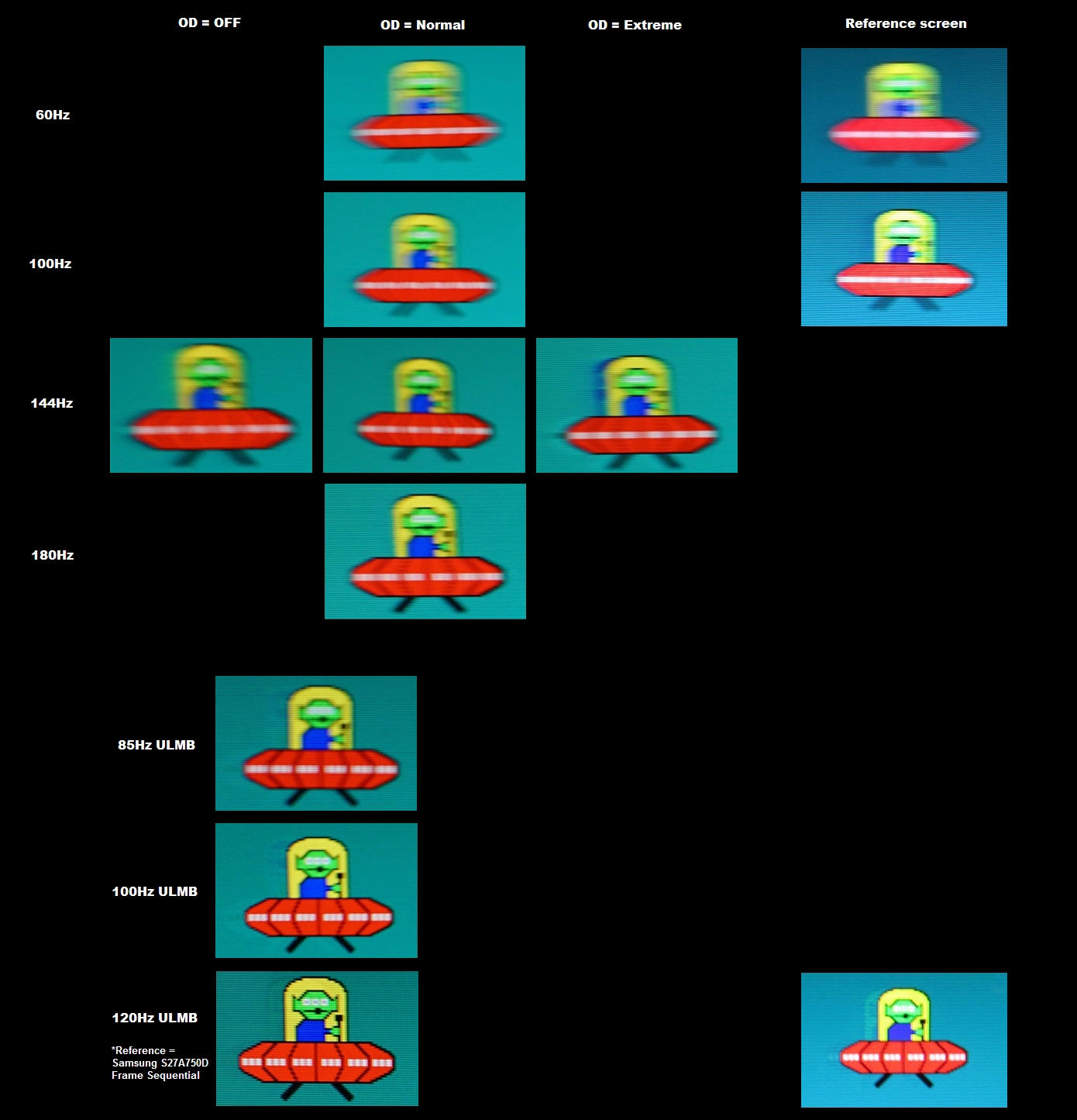
Whilst observing a black screen in a dark room we observed a small amount of backlight bleed at the bottom of the monitor. There was also a little bit of clouding in this region, but nothing obtrusive during normal usage. The image below shows how the monitor looked when displaying black in a dark room, under our test settings. Individual units can vary when it comes to issues such as backlight bleed and clouding. If you view the screen ‘off-angle’ you can also see a slight golden sheen in places, which you could perhaps call ‘TN glow’. This is not like ‘IPS glow’ as it isn’t something you can notice from a normal viewing position and isn’t as intense from sharper viewing angles. The video later on in the review shows how this appears from a variety of angles. The luminance uniformity was good overall. The brightest point recorded was ‘quadrant 5’ in the centre of the screen (155.5 cd/m²). The maximum deviation from this occurred at ‘quadrant 1’ towards the top left of the screen (129.3 cd/m², which is 17% dimmer). Elsewhere deviation from the central bright point was 3 – 11%, which is pleasing. It’s important to note that the viewing angle limitations of TN panels such as this mean that, even from a normal viewing position, there are perceived brightness changes that aren’t measured here. You can also expect some deviation beyond the measured points and also variation between different units of the same model. The contour map below represents these deviations graphically, with lighter greys representing higher luminance and hence lower deviation from the brightest point than darker greys. The percentage deviation between each quadrant and the brightest quadrant is also provided. Due to the viewing limitations of the panel technology, we won’t be providing analysis of colour temperature uniformity using a colorimeter. Perceived changes in this respect can make measured values particularly misleading and are often a far more significant factor in this respect that actual measurable uniformity weaknesses. On Battlefield 4 (BF4) the contrast performance was good overall. The level of detail in dark areas was generally very good, for example the underground metro tunnels and dark building interiors. Due to the aforementioned gamma inconsistencies (i.e. higher perceived gamma higher up vs. lower down the screen) there was some extra detail lower down the screen and a loss of detail further up the screen. The central region of the screen showed things more or less as they should appear in terms of detail levels. There was no ‘IPS glow’ or anything or that nature, however. Lighter elements stood out quite nicely in darker surroundings, with lighter shades (particularly white) appearing slightly grainy due to the screen surface. This was not as pronounced as on some matte screen surfaces, although there wasn’t the smoothness associated with some others either. On Dirt Rally the contrast performance was again respectable overall. The perceived gamma changes again meant that there was a loss of detail further up the screen and more detail than intended revealed lower down the screen, but the overall atmosphere in dark scenes was quite good and central detail levels largely appropriate. It was again nice to have the corners of the screen appear quite ‘solid’ without a bloom of IPS glow or anything of that nature. Lighter elements, for example car headlights, appeared with a bit of graininess from the screen surface. This was not excessive, though, and is something that all 24” 144Hz+ models currently on the market share. Finally, we assessed the Blu-ray of Star Wars: The Force Awakens. The overall contrast performance here was good with a fairly good atmosphere created for the film. The gamma inconsistencies and overall static contrast ratio did limit the screen’s ability to present this film with the same ‘wow’ factor as we’ve seen on some models with VA (Vertical Alignment) panels. But the lack of ‘IPS glow’ was nice and overall contrast performance decent. We used Lagom’s tests for contrast to more closely analyse specific strengths and weaknesses in contrast performance. The following observations were made. The colour gamut of the PG248Q (red triangle) was compared to the sRGB reference colour space (green triangle) using the Spyder5ELITE, as shown in the image below. The monitor offers comprehensive coverage of the sRGB colour space, with the tiniest bit of under-coverage (99% sRGB) in the blue region of the diagram. There was also a little over-coverage in the green section of the diagram. Overall gives the monitor the potential to produce pretty much any shade within the sRGB colour space and gives some shades just a little bit of extra vibrancy. On BF4 colours were represented in a rich and natural way – a definite improvement over many 144Hz models with obvious measurable gamma issues. For the central section of the screen, which is where the eyes mainly focus when playing a game like this, the shade representation was very good. There was a nice variety of rich greens and earthy browns, providing a natural look to the in-game environments. There was also a nice warmth and depth to orange flames with some decent vibrancy shown where it is warranted (HUD elements, certain painted containers in the game etc.) Due to the perceived gamma changes from a normal viewing position, shades lost saturation further down the screen and appeared a bit oversaturated towards the top of the screen. This affected the subtle shade variety (i.e. closely matching shades became indistinct or were shown incorrectly at some parts of the screen) and give a slightly muted look lower down the screen. Again, the overall richness with OSD tweaks alone was significantly improved over many 24” 144Hz models including the previous VG248QE. On Dirt Rally colours were again rich and natural overall. There was some quite vibrant-looking pinks, greens and reds showcased in various car liveries. These looked more striking further up the screen, again losing some saturation lower down. Deep reds became a more burnt red, for example, whilst vibrant purples had more of a pink hue further down the screen. A good range of earthy browns and khaki pastel shades were showcased for the racing environments, keeping them looking natural but not dull. Some of the richer browns and lush greens appeared more muted than they should lower down the screen, but for the main focal point in the centre appeared with decent vividness. Star Wars: The Force Awakens showcased some fairly vibrant shades, particularly noticeable for the satanic red and icy blue light sabers. The screen surface, colour gamut and to some extent contrast prevented such elements having the same ‘pop’ we’ve seen on some screens but they were fairly vivid nonetheless. There was also a decent variety of natural-looking shades, but again the vertical saturation shifts were evident. The large expanses of desert, for example, looked much richer further up the screen than lower down in a way that didn’t just reflect different lighting on the scene. To round off our subjective analysis, we tested the Blu-ray of Futurama: Into the Wild Green Yonder. With its large areas of individual shade, this film is excellent for highlighting weaknesses in colour consistency. It is no surprise, given what we’ve already explored, that many of the shades in here appeared less saturated lower down the screen and more saturated further up. Dr Zoidberg (the red lobster-like creature) showcased these shifts particularly well, when he filled up much of the screen. The red appeared much as it should centrally, but too deep higher up and quite anaemic lower down. These shifts also meant that closely matching shades, such as subtly different character skin colours, lost their individuality to an extent. The overall colour representation was still considerably nicer than the washed out mess associated with some 144Hz models, however. We used Lagom’s tests for viewing angle to take a more focussed look at colour consistency and viewing angle performance. The following observations were made from a normal viewing position, eyes around 70cm from the screen. We used a tool called SMTT 2.0 and a sensitive camera to analyse the latency of the PG248Q. We compared it to a number of monitors of known latency, taking over 30 repeat readings to help maximise accuracy. Using this method, we calculated 2.46 ms (just over 1/3 a frame at 144Hz) of input lag. Overclocking the refresh rate to any value including 180Hz had no measurable effect. This value reflects both the element of input lag that you ‘see’ (pixel responsiveness) and the element you ‘feel’ (signal delay). It indicates an exceptionally low signal delay which won’t interfere with the experience even for sensitive user. When combined with high frame rates, it delivers an impressive ‘connected feel’ to the gaming environment. We were not able to accurately measure input lag with G-SYNC active, to the feeling to us was very much the same when this was active during gameplay. As noted in the OSD video earlier, there is an ‘Overclocking’ feature in the OSD which lets you set the monitor to 160Hz, 170Hz or 180Hz. Most of the time, compromises in image quality aside, this feature simply works and the monitor will quite happily run at up to 180Hz. However; when connected to our GTX 1070 (and a GTX 980 Ti we also tested) the display sometimes lost signal when trying to run at one of these refresh rates. This was the case with 3 different DP cables that we tried, of varying length and quality. The only remedy we could find was a hard reset of the PC – turning the monitor off, unplugging the DP cable or unplugging the monitor from the power supply and reconnecting had no effect. It sometimes occurred when the GPU was simply trying to re-establish signal, for example when a game is changing maps. This was obviously a particular annoyance, but one that could be circumvented by setting the game to run in a ‘Borderless Window’ rather than ‘Fullscreen’. Most titles will have an option to this effect. As noted later on, G-SYNC does still work in ‘Borderless Window’. Additionally, we never had this issue when Windows started up – the monitor always seemed to run at 180Hz or another overclocked refresh rate just fine, if it was already selected. In this article we explore the key factors that affect the responsiveness of a monitor. One of the chief concepts is ‘perceived blur’, which is caused mainly by the movement of our eyes as we track movement on the screen. Slower than optimal pixel responsiveness is also a factor, although generally the more minor factor. We also introduce the idea of ‘pursuit photography’, which is a method of capturing motion performance on a monitor in a way that reflects not only the pixel responses of the monitor but also the perceived blur due to eye movement. The images below are pursuit photographs taken using the UFO Motion Test for ghosting. The middle row (medium cyan background) was used and the test was set to run at 960 pixels per second, which is a good practical speed for such photography. The monitor was set to a range of refresh rates; 60Hz, 100Hz, 144Hz and 180Hz (so roughly 40Hz between each setting, to help show the benefits of increased refresh rate). We also tested the various ‘OD’ settings (‘OFF’, ‘Normal’ and ‘Extreme’) but to save time only captured these at 144Hz. The general characteristics and indeed optimal setting to use was always the same regardless of refresh rate. In addition, the monitor was tested with ULMB active at 85Hz, 100Hz and 120Hz using the default Pulse Width setting of ‘100’. A reference screen has also been included, which is a Samsung S27A750D set to both 60Hz and 120Hz. It was set to use its optimal response time setting for each refresh rate and had the brightness turned up to ‘100’ to eliminate PWM. This reference represents more or less how things should look at a given refresh rate where pixel responsiveness isn’t a limiting factor. The Samsung was also set to its frame sequential 3D setting to compare with 120Hz ULMB – both are backlight strobing options that operate at up to 120Hz. A key difference you’ll notice here between this and our usual recent testing methodology for this section is that the ‘OD’ (Overdrive) settings are only varied at 144Hz. That’s because the characteristics of the three ‘OD’ settings were very similar regardless of refresh rate. ‘Off’ always gave a slight trail behind the object, which became somewhat longer as refresh rate was decreased but remained as at 144Hz in terms of distinctiveness. The ‘Extreme’ setting always produced a very obvious and colourful inverse ghosting trail (‘extreme’ overshoot) as you can see in the 144Hz example. Again, the trail length varied according to refresh rate. For ULMB the ‘OD’ option was not available and a fairly strong level of acceleration is always used. For the remainder of this section we will therefore be focusing on default behaviour at various refresh rates and ULMB settings. At 60Hz you can see that the object appears noticeably blurred, quite similar to the reference screen overall in the extent of the blurring really. There is no obvious trailing behind the object. There is just the faintest hint of overshoot in this example, which is barely visible both on the image and in practice. At 100Hz the object (UFO) appears sharper and less blurred, with another step up in clarity at 144Hz. There is no observable trailing or obvious overshoot behind the UFO, either, which is good. What may surprise some readers is that stepping the refresh rate up again to 180Hz provided a decent bump up in image clarity, even compared to 144Hz. There is again no obvious overshoot or trailing, whilst the image itself appears sharper – note in particular the detail shown on the UFO body itself and the legs of the UFO. This reflects the lower level of eye movement that occurs when you observe movement on the monitor at this refresh rate and hence the lower level of perceived blur. The level of perceived blur is further decreased with ULMB enabled (Ultra Low Motion Blur – the clue being in the name). At 85Hz there is a bit of a step up in clarity compared to 180Hz with the setting disabled. This is further boosted at 100Hz and then again at 120Hz, with the UFO now looking very sharp and all key details distinctly visible. You will also notice a slight overdrive trail behind the object, which is actually weakest in this example at 120Hz. This is due to the strong acceleration being employed here. This was actually a bit bolder further down the screen (not shown here) as we explore later, but never particularly troubling. From our analysis here it was clear that upping refresh rate was of great benefit to reducing perceived blur and improving motion clarity. ULMB stepped things up further, with higher refresh rates again being beneficial. Observing things under a broader range of transitions also revealed that ‘OD = Normal’ was by far the best setting. It avoided the conventional trailing of ‘OFF’, which in some instances was far more noticeable than shown in the example above. It also avoided the obvious overshoot of the ‘Extreme’ setting, which is really only there so ASUS can specify a 1ms response time – something pretty much all manufacturers are guilty of. Usually when we review monitors with high refresh rates (and even, sometimes, those with lower refresh rates) we encounter certain visual artifacts when observing motion on the screen. We group these together as ‘interlace pattern artifacts’, which can take several different forms but fit that description nicely. On the PG248Q there was a very faint interference pattern of interlacing that could be observed when scanning your eyes across the screen or observing motion at certain speeds. These were a lot fainter than on some models and didn’t appear as obvious lines as you would see on some models, for example when observing muzzle flashes or explosions. The phenomenon was also observed, perhaps more clearly in fact, when ULMB was active. The image below, taken from our review of the ViewSonic XG2401, demonstrates these patterns. There were also static interlace patterns, whereby a given shade had horizontal lines of a marginally lighter shade running through it. These were only observable at the leftmost third of the screen and were as good as invisible at 120Hz and very faint at 144Hz. At 160Hz they became slightly more pronounced, even more so at 170Hz until eventually at 180Hz they were more clearly visible. It was also quite pronounced in places when ULMB was active at any refresh rate, particularly when observing fairly solid patches of darker shades such as dark grey sky. It was not possible to capture these particular interlace pattern artifacts on camera, in a way that accurately represented what we were seeing. Many users will either not notice them at all or not find them distracting, especially at 144Hz or lower refresh rates without ULMB active. Finally, we noticed some wave-like artifacts. Sort of moving interlacing patterns that appeared like waves in motion, flowing down the screen on some solid colours. These only appeared for the first few days when we first used the monitor and set it to 180Hz, occasionally appearing more faintly after that. After using the monitor for several days, they seemed to disappear. We can’t say exactly how or why they disappeared and whether it was due to a factory reset, changing the monitor from 180Hz to another refresh rate and back again or simply that the monitor ‘settled’ in some way. On BF4, where the frame rate matched the 144Hz frame rate of the monitor, the ASUS proved to be exceptionally responsive. With seemingly instantaneous responses to mouse movement and the screen updating 144 times per second, the ‘connected feel’ was excellent. Our experience with perceived blur and the visual feedback we got from the monitor very much reflected what was observed with Test UFO. Regardless of the transition being performed (many different shades are featured on this title), the pixel responsiveness was excellent and the overdrive well-tuned. There was no visible trailing nor any readily observable overshoot. Just the faintest trace here and there, at the sort of level shown in Test UFO (i.e. virtually invisible). The ‘connected feel’ and low level of perceived blur was further improved by increasing the refresh rate, provided the frame rate kept pace. This was particularly noticeable at 180Hz and 180fps. Whilst the difference between 60Hz and 144Hz, for example, is a rather profound difference, the bump up again is something less earth-shattering. But setting the monitor to 180Hz really did give an extra edge in how sharp things appeared during movement, particularly noticeable when manoeuvring nippy vehicles like the ATV around but also when just looking around as a solider. It also enhanced the ‘connected feel’ from an already excellent level to something even better. Individual sensitivity to these both of these elements does vary and we feel that the monitor already provides very pleasing responsiveness at 144Hz and 144fps. But it was nice to see that 180Hz isn’t just a gimmick on this model and that the pixel responses can keep pace without any troubling overshoot or noticeable trailing being introduced. On Dirt Rally the experience was really quite similar in terms of the perceived blur being nice and low at 144Hz (@144fps) and even lower at 180fps (@180fps). The monitor again had no trouble with pixel transitions and was therefore free from noticeable trailing or overshoot. The ‘connected feel’ was less noticeable to us on this title, but we did still feel that the car was responding extremely quickly in response to inputs. In a way it was nice being able to admire the in-game environments without them becoming a blurry mess, too. That probably says a lot about the low level at which we play this game, though. We also tested our Blu-ray movie test titles and are happy to report that the monitor did as well as you could expect. We observed no trailing, overshoot or other weaknesses in responsiveness. Obviously ‘connected feel’ is not a factor or benefit here and the frame rate at which the films run (~24fps) is a significant limiting factor. Because 24 divides evenly into the 144Hz refresh rate there was reduced juddering compared to refresh rates such as 60Hz (and indeed 180Hz). The fluidity was nonetheless severely limited by the low frame rate of the content. G-SYNC is a variable refresh rate technology that can be activated on certain Nvidia GPUs in conjunction with monitors that specifically support the technology, such as the ASUS PG248Q. This article explores the mechanics of G-SYNC – what it does and how it can benefit gamers. On a basic level, G-SYNC monitors have a ‘G-SYNC board’ inside them that replaces the traditional scaler and some of the assistive electronics of the monitor. A compatible GPU can then communicate with the monitor, specifically allowing the monitor to dynamically adjust its refresh rate according to the frame rate being outputted by the GPU. In doing so, the stuttering (VSync enabled) or tearing and juddering (VSync disabled) associated with the traditional frame rate and refresh rate mismatches are eliminated. An additional benefit in variable frame rate environments is a reduction in latency compared to VSync on. Not something we can accurately measure using our equipment, as noted earlier. This monitor supports G-SYNC via DP 1.2 (DisplayPort), when hooked up to a compatible GPU. The technology worked and was correctly set up on our system straight out of the box. You can see whether it is active at a glance as the power button will be red if it is enabled. But to make sure everything is set up correctly, you just need to open Nvidia Control Panel. Then navigate to ‘Display – Set Up G-SYNC’ and ensure the checkbox for ‘Enable G-SYNC’ is checked and your preferred operating mode is selected. As per the image below, the technology can work in both ‘Full Screen’ and Window’ modes if the second option is selected. We found that even if the first option was selected, though, ‘Borderless Window’ in games still worked with G-SYNC anyway. If you can’t find a G-SYNC section in your Nvidia Control Panel, try unplugging the monitor and plugging it into a different DP output on the GPU. Or if that doesn’t seem to help, reinstall the GPU driver. Next you should navigate to ‘Manage 3D settings’, where you will see two settings of interest. The first of these is ‘Monitor Technology’, which should be set to ‘G-SYNC’ as shown below. The second setting to configure is VSync. For this you can choose three main settings; ‘On’, ‘Use the 3D application setting’ or ‘Off’. With ‘On’ selected, the GPU will simply enable G-SYNC when the refresh rate ceiling of G-SYNC is reached (up to 180Hz/180fps on this model, if overclocked). With ‘Off’ selected the frame rate will rise above the refresh rate, introducing tearing but also minimising latency. ‘Use the 3D application setting’ in theory allows you to set VSync status in the game itself and use different settings for different games. But in practice Nvidia advises that you set the VSync up in NVCP rather than relying on in-game implementations which could potentially interfere with the smooth operation of G-SYNC. On newer graphics drivers, at least on the Pascal (GTX 1070) GPU we tested, there is also a ‘Fast’ option which will enable a technology called ‘Fast Sync’. This only applies above the G-SYNC ceiling, as G-SYNC is an entirely separate technology that works nicely at frame rates that the refresh rate of the monitor can match. ‘Fast Sync’ comes into play at higher frame rates, comfortably clearing the refresh rate ceiling, and is designed to combine the minimal latency of ‘VSync off’ without the same tearing associated with it. We didn’t have time to test this in detail and it’s really more of a GPU feature than anything to do with a monitor, but it is explored in a press conference presented by Nvidia’s Tom Petersen. This section of the video is particularly relevant when considering how this setting applies with G-SYNC. Regardless of VSync setting, the refresh rate of the monitor behaves in exactly the same way where the frame rate dips below the floor of operation (lowest frame/refresh rate supported by the technology). The floor of operation is 30Hz/30fps, below which the monitor will strive to set its refresh rate to a multiple of the frame rate to minimise or eliminate stuttering and tearing. If for example the game is running at 23fps, then the monitor is unable to set itself to 23Hz (it is below the floor of operation). It would therefore set itself to 46Hz rather than just staying at 30Hz. As we explore in the proceeding section, low frame rates are still low frame rates regardless of G-SYNC and any associated technologies. It’s also worth remembering that stuttering caused by other issues, such as network latency or lack of RAM are not corrected by the technology. BF4 can involve sudden changes from little to no action to an explosion of on-screen activity. With the graphics setting ramped up, in particular, this can mean that a create deal more particles, textures and other visual entities have to be rendered. As a result of this, frame rate fluctuations are common on this title. With graphics settings ramped up rather high, the frame rate still tended to stay in the triple digits and generally at 130fps+. But without G-SYNC, if you have the refresh rate set to 144Hz or higher to accommodate the upper end of the frame rate, you would be greeted by tearing and juddering (VSync off) or stuttering (VSync on). It’s important to note that sensitivity to both issues does vary and they are less prominent on higher refresh rate monitors at high frame rates compared to lower refresh rates and frame rates. But the issues certainly persist, and for sensitive users such as ourselves they can be quite jarring and mar the overall gaming experience. With G-SYNC enabled, the game just ‘flowed’ nicely without such rude interruptions. Even though the frame rate fluctuated fairly wildly. Regardless of this technology, there was still benefit to be had when running at higher frame rates and refresh rates. Even when comparing 130fps to 180fps, we felt a difference in ‘connectedness’ to the game world and perceived blur – the higher the better. We still felt, though, that as long as frame rates remained relatively high, as they did in this title (triple digits) then the experience was quite enjoyable and the overall ‘connectedness’ and fluidity quite pleasing. The same couldn’t be said where the frame rate dropped further, as it did on more demanding titles such as Tom Clancy’s The Division. Here, with settings cranked up a fair bit, the frame rate sometimes dipped well below 100fps and sometimes came closer to 60fps. With G-SYNC disabled this provided very obvious stuttering or tearing, which was not nice at all. So definite improvement with the technology enabled, eliminating such distractions. However; the difference in perceived blur and connectedness when compared to higher refresh rates and frame rates (144Hz/144fps and more so 180Hz/180Hz) was quite extreme. Another observation as frame rates dropped well below 100fps, was that there was a little bit of overshoot in places in the form of ‘snail slime’ (transparent) trails that wasn’t visible at higher refresh rates. These could be seen without G-SYNC on and the monitor set to a lower refresh rate, too. They were not too obtrusive, either way. We also turned up the ‘Resolution Scale’ feature or enabled Nvidia DSR (Dynamic Super Resolution) on various titles to see how things were handled at even lower frame rates. With this, we got dips below the 30fps (30Hz) floor of operation, meaning that the refresh rate multiplication ‘magic’ came into play. The experience was free from stuttering or tearing caused by refresh rate and frame rate mismatches, as even multiples were used there. So that is good. But the experience was extremely choppy and lacked the fluidity of higher frame rates anyway – so it is absolutely not where you want to be on a monitor that can run at up to 180Hz. In summary; even with G-SYNC, it’s certainly advantageous to maintain relatively high frame rates where possible. The technology does help iron out those hitches where frame rate drops just a bit very nicely indeed. It is quite ‘game changing’ in that respect. But it isn’t a substitute for true high frame rates. ULMB (Ultra Low Motion Blur) is another proprietary Nvidia technology which can be enabled instead of G-SYNC on monitors such as the PG248Q, where a G-SYNC compatible GPU is also used. This is a strobe backlight technology which rapidly pulses the backlight at a frequency matching the refresh rate of the display; either 85Hz, 100Hz or 120Hz. It reduces eye movement by ensuring that the backlight pulses on only very briefly (‘on phase’) but spends most of its time off (‘off phase’). This is explored in more detail in this article. At a basic level, the backlight pulses on very briefly (‘on phase’) but spends most of its time off (‘off phase’). This reduces the amount of time the eyes spend tracking motion on the screen and hence reduces perceived blur. ULMB can be enabled by setting the monitor to 85Hz, 100Hz or 120Hz via Windows or the Nvidia Control Panel. You should then navigate to ‘Manage 3D settings’ in the Nvidia Control Panel and select ‘ULMB’ for ‘Monitor Technology’ as shown below. The monitor should automatically initiate the appropriate mode, but if not you will find the appropriate setting (‘ULMB’) in the ‘Image’ section of the OSD. There will be a marked change in the image when this setting is active. Specifically, you will note that the display begins to flicker at a frequency matching the refresh rate. It will look similar to a CRT operating at the same refresh rate in this sense and you’ll notice this effect most noticeably at 85Hz. You will also see that the power light has gone yellow. There is also a setting associated with ULMB called ‘ULMB Pulse Width’ which you can now change in the OSD. A higher setting here provides a longer ‘on phase’ and hence higher brightness output than lower settings. Lower settings provide a shorter ‘on phase’ and hence longer ‘off phase’, decreasing brightness but potentially increasing motion clarity. We say potentially as most users will find the motion clarity even with this set to ‘100’ to be exceptional and will prefer the higher brightness. As explored previously you’ll notice that the image starts flickering, most noticeably and quite obtrusively at 85Hz, less so but to us still noticeably so at 100Hz and a little better but to us still noticeable at 120Hz. Depending on the brightness settings you were using before, you may also find that the image looks a bit dimmer than it did before. Due to measured and perceived changes in brightness and the gamma behaviour you may notice it looks a bit more muted in general, too. Individual sensitivity to both aspects of ‘image change’ varies, with some users finding the flickering in particular a bit bothersome whilst others don’t really mind and adapt quite readily. Unlike with ULMB active, you can’t change the ‘OD’ (Overdrive) setting and it is locked to a ‘pre-optimised’ (quite highly accelerated) value. The overall motion clarity with this mode active is excellent – even moving the mouse or Windows around on the desktop is a different experience. And indeed, even at 85Hz we found the motion clarity to be excellent. This echoes our findings on ‘Test UFO’ earlier. We did find the flickering too bothersome at this refresh rate, though, so for the subjective assessment below used 120Hz for the sake of comfort and the fact we feel most will prefer this setting for maximum responsiveness. Speaking of responsiveness, there are really two key areas to focus on. First off is how the monitor feels – and with ULMB active at 120Hz, it felt very responsive with excellent ‘connectedness’ to the game world. The feeling was a bit different to running the monitor with ULMB disabled. And it’s fair to say that it compares more closely to running the monitor with ULMB disabled at 120Hz rather than higher refresh rates. Particularly when comparing to 180Hz, the felt latency was somewhat higher with ULMB enabled – things just didn’t feel quite as snappy, although still good. In terms of motion clarity, though, there was a marked improvement. The motion clarity is certainly good if you’re running the monitor at 180Hz with ULMB disabled, but running with ULMB enabled (at up to 120Hz) reduced perceived motion blur considerably. This should be obvious from the previous analysis, using Test UFO, but it certainly all came together when testing games. A number of titles were tested and benefited from ULMB in terms of motion clarity, but we will just focus on BF4 to keep things simple. Provided that the frame rate exactly matched the refresh rate of the monitor (so 120fps @ 120Hz), the motion clarity was exceptional. Regardless of the pace of action, whether it be sprinting about on foot or zipping around in a helicopter, there was a level of clarity that was simply beyond what was achieved without the mode active. Even when comparing to 180Hz. This was most obvious when manoeuvring quickly in a vehicle such as a helicopter as you were able to clearly see your target and any obstacles in your way. It almost felt like some kind of cheat at times – although that’s the sort of feeling you get coming from a 60Hz monitor to one with a significantly higher refresh rate, too. As mentioned previously, the ‘OD’ control is greyed out and a rather high level of acceleration is used. This is to ensure that pixel transitions are snappy enough to try to avoid overlap between frames or any obvious trailing that might hamper the experience. We didn’t actually notice any particularly obvious overshoot as we sometimes do when testing monitors with ULMB, which is nice. There was a little bit for some transitions where certain medium-dark transitions were involved (stormy skies, for example) as you could see a bit of a dark trail that was darker than either the object or background. In places there were also very faint repetitions behind objects, most noticeably so (but still very faint) towards the bottom of the screen. This is caused in part by the pixel responsiveness not being perfect, with some trailing or indeed overshoot not being hidden entirely by the strobe. It’s typical for monitors with ULMB or other strobe backlight technologies to have this effect to a degree, with it being more noticeable at certain sections of the screen. This is often referred to as ‘strobe crosstalk’ and it’s best kept to a minimum centrally where the eyes spend most of their time. As is the case here. A final but crucially important point to note is that ULMB requires the frame rate matches the refresh rate exactly to work properly. If there is any departure from this then the stuttering (VSync on) or tearing and juddering (VSync off) is inescapably obvious. There is very little motion blur to mask these imperfections. Even microstuttering and more minor imperfections associated with frame rate limiters becomes quite obvious, so it’s generally the case that VSync must be enabled in association with ULMB. Complete with the latency penalty. Because G-SYNC and ULMB or any other strobe backlight technology are entirely separate and can’t be used in conjunction with one another, it’s really for the user to choose which they prefer. Most will find G-SYNC preferable as it is designed for frame rate environments, is ‘flicker-free’ and provides maximum brightness and vibrancy potential. It also provides minimal latency at refresh rates of up to 180Hz. Others will find the ‘CRT-like’ experience of ULMB to be worthwhile, perhaps if they’re particularly competitive gamers or those who are used to CRTs. This monitor is compatible with Nvidia 3D Vision 1 and 2. There is no integrated emitter, so you need the full kit of emitter and glasses for this to work. We did not have time to test this in detail, but found the experience largely as we remember it being on the AOC G2460PG. We’d therefore advise users refer to the relevant section of that review, just prior to the conclusion, if they’re interested in this technology. The video below summarises some of the key points raised in this written review and shows the monitor in action. The video review is designed to complement the written piece and is not nearly as comprehensive. Having now reviewed several high refresh rate monitors with 24” panels, we certainly know that the panel is not the be all and end all of their performance. The ASUS PG248Q put its panel to good use, offering good flexibility in the OSD to change gamma and various other settings. With a little tweaking, an image was achieved that was far richer (less ‘washed out’) than some competing models such as the ASUS VG248QE and BenQ XL2420Z could achieve through OSD tweaking. The panel characteristics still meant that there was some loss of saturation further down the screen, due to perceived gamma changes, but the overall colour representation was quite vivid and natural. With respect to contrast, the monitor performed as you would expect. Static contrast was around 1000:1 out of the box with decent results under our ‘Test Settings’ and even with various ‘Blue Light Filter’ (Low Blue Light) settings active. The contrast did take a hit when the monitor was overclocked, most noticeably to 180Hz, and also suffered from some more obvious ‘interlace pattern artifacts’ than at lower refresh rates such as 144Hz. The responsiveness was really a key strength of the monitor, though. And in that respect it put in an exceptional performance not only at 144Hz and lower refresh rates, but also when overclocked as high as 180Hz. There was no real overshoot to speak of, nor trailing from sluggish pixel responses – so you were left with a ‘clean’ performance that really made fast-paced gameplay enjoyable. The monitor also performed well in terms of input lag, as there was next to no signal delay. When coupled with high frame rates and refresh rates, this delivered a superb ‘connected feel’. This was particularly true at 180Hz @180fps, which lowered perceived blur and increased the ‘connected feel’ even further from the already impressive 144Hz @144fps. The monitor also features G-SYNC and the associated (but alternative) operating mode ULMB. Both features worked as expected, with G-SYNC helping get rid of tearing and stuttering in variable frame rate environments and ULMB being the mode to use instead where you can maintain a full 85fps, 100fps or 120fps to match the refresh rate perfectly. Even with G-SYNC, though, low frame rates remained low frame rates – and to get the most out of this monitor definitely demands frame rates that are as high as possible. G-SYNC is a nice bonus at any frame rate, but perceived blur and ‘connected feel’ is still tied to frame rate and hence refresh rate. With this all said, the monitor is certainly not cheap for a Full HD monitor at time of writing. The ViewSonic XG2401 put in an equally competent performance at 144Hz but lacks the feature set. FreeSync support instead of G-SYNC support, no strobe backlight mode (like ULMB) and no support for overclocked refresh rates such as 180Hz. Then there is the ‘ROG styling’ which some users will surely find endearing – a good combination of form and function on this model, in our view, which is sleek but doesn’t go overboard. The PG248Q certainly has some features that can be used to justify its price premium, but cheaper alternatives should be carefully considered. The bottom line; a solid performer with respectable image quality, exceptional responsiveness and an excellent gaming-oriented feature set. But this all commands quite a premium, especially for a 24” Full HD monitor.

We used the Spyder5ELITE to assess the uniformity of lighter colours, specifically 9 equidistant white quadrants running from the top left to bottom right of the screen. The table below shows the luminance recorded at each quadrant, alongside the percentage deviation between a given quadrant and the brightest quadrant.

Luminance uniformity table
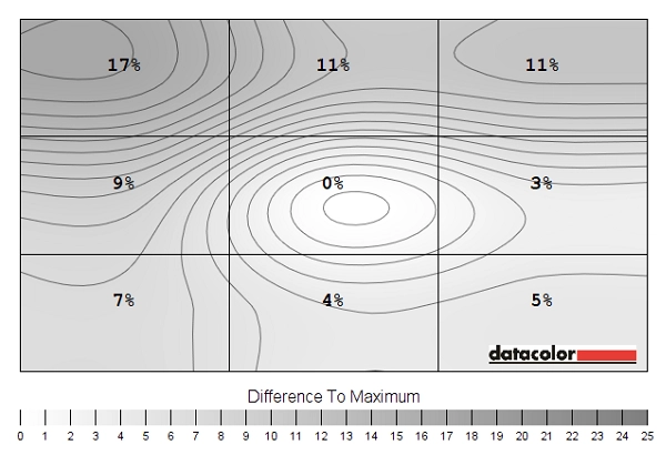
Luminance uniformity map
Contrast in games and movies
Lagom contrast tests
Colour reproduction
Colour gamut
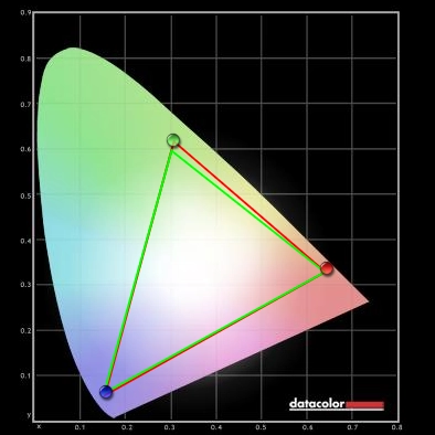
Colour gamut test settings
Colour in games and movies
Viewing angles
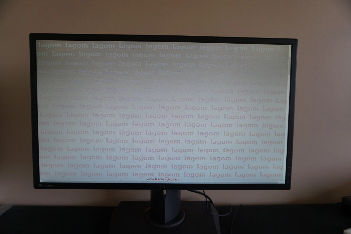
The video below shows this test, a mixed desktop and dark desktop from a variety of viewing angles. You can see the Lagom stripe colours shift quite readily as viewing angle is changes and see shifts in contrast (and even colour inversion) most noticeably vertically for the mixed desktop background. This is typical for a TN panel.
Responsiveness
Input lag
A note on overclocking
Perceived blur (pursuit photography)
Interlace pattern artifacts

Responsiveness in games and movies
G-SYNC – the technology and activating it
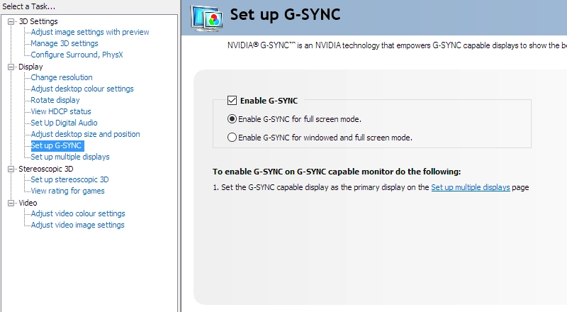
Enable G-SYNC
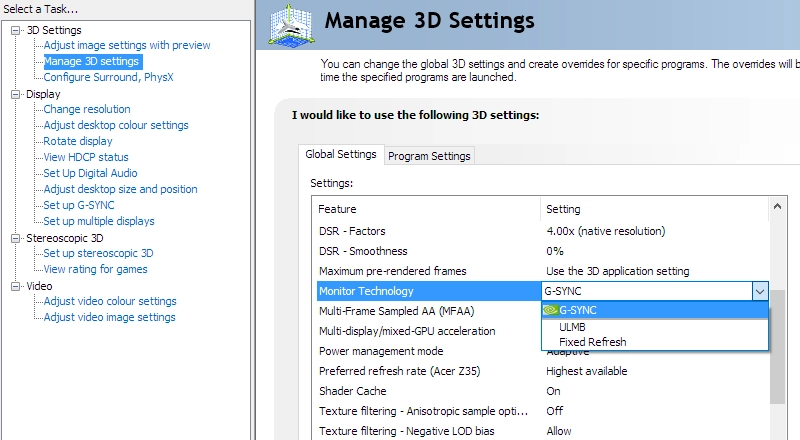
Set Monitor Technology to G-SYNC
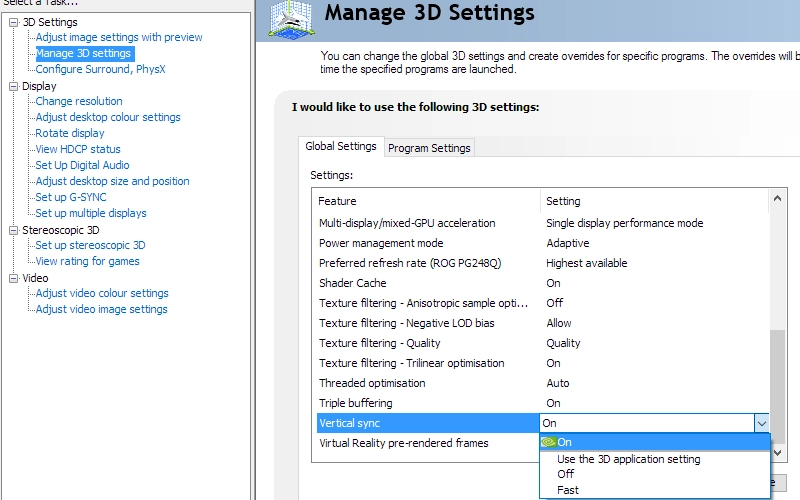
Set VSync according to preferences
G-SYNC – the experience
ULMB – the technology and activating it
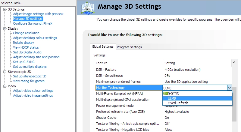
Set Monitor Technology to ULMB
ULMB – the experience
3D Vision 2
Video review
Conclusion
Positives Negatives Quite a pleasing balance and richness to the image following OSD tweaking, certainly more so than most 144Hz+ gaming monitors
Gamma didn’t quite hit ‘2.2’ in any setting (although came pretty close) and there are perceived gamma and saturation differences vertically due to the typical TN weaknesses
Static contrast was decent overall, largely as expected and maintained even with the ‘Blue Light Filter’ active. The absence of ‘IPS glow’ will please some users, too The screen surface imparted a bit of graininess when viewing lighter content, whilst perceived gamma changes affected visibility in dark areas. Contrast was also weakened when the refresh rate was overclocked Exceptionally low input lag, nicely tuned pixel overdrive with no real weaknesses at high refresh rates and a 180Hz setting that actually brings benefits. Plus a useful trio of Nvidia-specific features; G-SYNC, ULMB and 3D Vision
Some overshoot evident at lower refresh rates, but nothing particularly worrying. The monitor sometimes lost signal (necessitating system restart) when switching to an overclocked refresh rate and there were more obvious ‘inversion patterns’ at 180Hz in particular
A pleasing combination of form and function, with full ergonomic flexibility and a well thought-out design that is in our opinion stylish rather than garish
Quite a premium given that it is a 24” Full HD (1920 x 1080) model, at time of review
![]()
