Author: Adam Simmons
Date published: January 27th 2015
Table of Contents
Introduction
The first generation of IPS-type (IGZO) 4K monitors were expensive things with sub-standard contrast and responsiveness. They also managed to skip out the ~27” size, leaving that to the 28” TN (Twisted Nematic) displays with their inferior colour consistency. The ASUS PB279Q uses a new breed of AHVA (Advanced Hyper Viewing Angle) IPS-type panel, combining the 27” screen size many are fond of with characteristic IPS (In Plane Switching) colour reproduction. We put this monitor through its paces in our gauntlet of tests, to see how it performs in a range of movies, games and other applications.
Specifications
The monitor uses a 27” ‘4K’ UHD panel, using AU Optronics AHVA (Advanced Hyper Viewing Angle) IPS-type technology. The colour processing is 8-bit + FRC dithering, bringing it up to 10-bits per subpixel. A 5ms grey to grey response time is specified, with adjustable ‘TraceFree’ pixel overdrive included. We have highlighted some key points of interest in blue, for your reading convenience.
The key ‘talking points’ of the specification have been highlighted in blue below.
Features and aesthetics
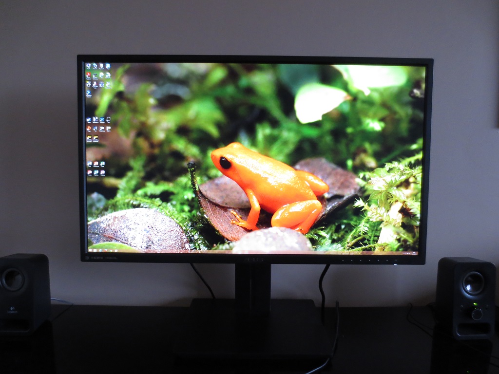
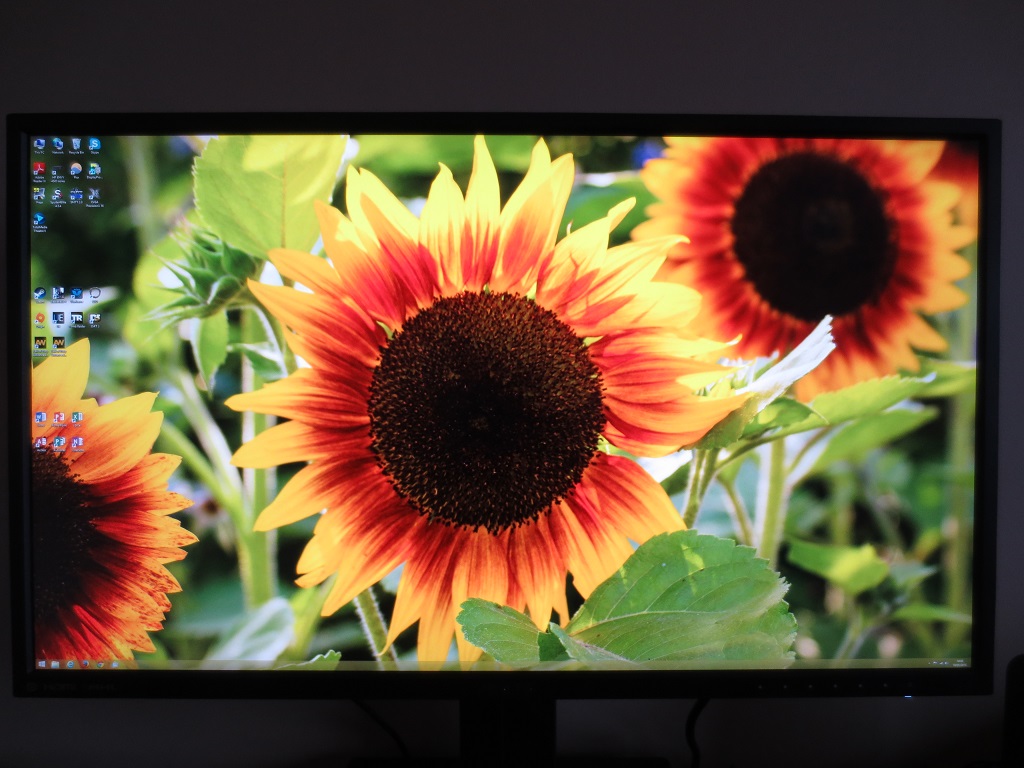
From the front, the monitor has a smart business-like appearance with black matte plastic featuring heavily. The bezels are very slender at the top and sides, at around 13mm (0.51 inches). There is a 1mm or so (i.e. completely negligible) panel border at the top and sides a well. The bottom bezel is thicker, at around 18mm (0.71 inches). The right side of the bottom bezel has small silvery-white painted blobs to mark out the OSD (On Screen Display) buttons. The buttons themselves are found on the rear of the monitor. The button furthest right is the power button, marked out with a power symbol at the front and a raised spot on the button itself. The power LED hangs beneath the power symbol and glows white when on and dark orange when in a low power state. Also note the screen surface of the monitor, which is very light matte (‘semi-glossy’) as described in more detail later. The first photo was taken in an exceptionally bright room, so you can see vague ‘ghostly’ outlines of objects but not glossy ‘mirror-like’ reflections. When switched on and ideally placed in more moderate lighting, the matte anti-glare characteristics (good glare handling) is evident as in the second image.
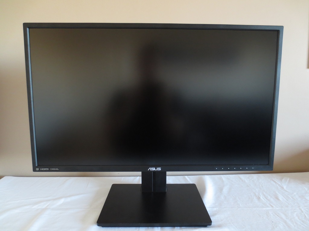
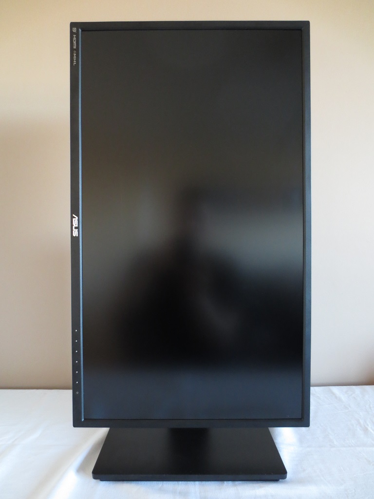
The monitor includes a robust and fully adjustable stand, offering tilt (5° forwards, 20° backwards), height (150mm or 5.91 inches), swivel (60° left and right) and pivot (90° rotation clockwise into portrait). The swivel mechanism uses a turntable mechanism underneath the stand base. At lowest height the button of the screen sits around 43mm (1.69 inches) off the desk surface with the top of the screen around 410mm (16.14 inches) above the desk.
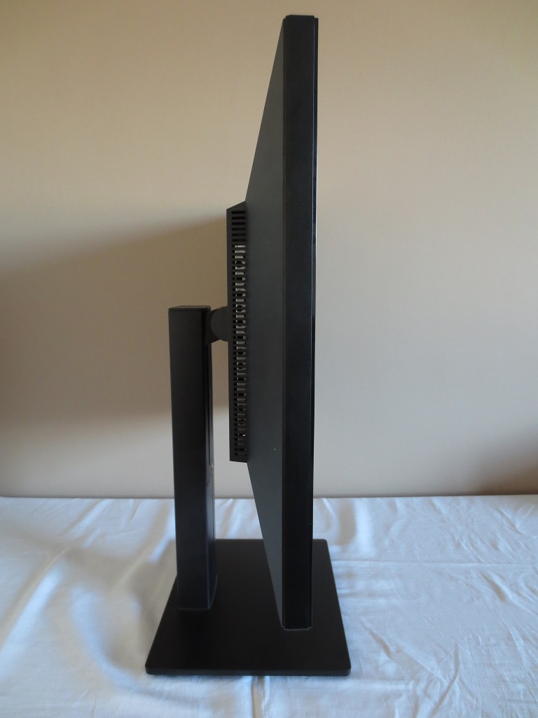
From the side the monitor is reasonably slender, around 50.80mm (2 inches) at thinnest point, protruding back further towards the centre. The fully adjustable stand has a solid neck which the screen itself is attached to.
At the bottom left of the screen, from this orientation, there are the 7 control buttons. These are; ‘Shortcut 1 (Splendid preset select by default)’, ‘Shortcut 2 (Brightness by default)’, ‘Close’, ‘Input Select/Enter’, ‘QuickFit Virtual scale/Up’, Menu/Down’. The following video goes through the functionality of the OSD.
The stand attaches by 100 x 100mm VESA, to the rear of the monitor. It can be unscrewed and an alternative VESA 100 stand or mount used instead. The ports of the monitor face downwards (are down-firing) with an AC power input (internal power converter) at the left of the stand neck and the remaining ports to the right. At the bottom right there is a K-Slot.
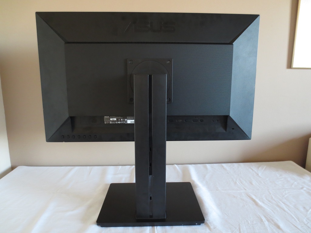
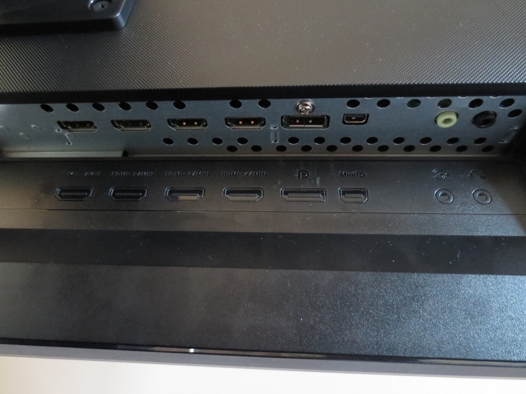
The main ports include; 4 HDMI 1.4 ports (MHL compatible), DP 1.2 and MiniDP 1.2, 3.5mm audio input an 3.5mm headphone jack. DP 1.2 (or MiniDP 1.2) is required for 3840 x 2160 @ 60Hz on this monitor, for which it uses SST (Single Stream Transport) and acts as a single screen. DP 1.1 and HDMI is limited to 3840 x 2160 @ 30Hz by default. A DP cable, HDMI cable and MHL cable are optional extras included with the monitor (depending on region and retailer).
A final point to note is that there are integrated 2W stereo speakers, facing upwards from the ‘central bulk’ of the screen. These provide a basic and somewhat tinny sound output, lacking the ‘punch’ of the screen itself. The volume is decent and can be adjusted between fairly soft and rather loud, although bass is lacking from the sound output.
Calibration
Subpixel layout and screen surface
The monitor uses a very light matte (some would refer to this as ‘semi-glossy’) screen surface. Such a screen surface provides effective glare handling in moderate lighting conditions whilst providing potentially greater vibrancy and clarity than stronger/heavier matte surfaces. The screen is free from obvious ‘smeary’ grain, although it isn’t quite as ‘smooth’ as we’ve seen on some comparable matte surfaces.
![]()
The subpixel layout is RGB (Red, Green and Blue) stripe, which is the most common. This is the layout expected by Operating Systems such as Microsoft Windows and Apple’s Mac OS, by default. Apple users can therefore expect good text clarity without the ‘fringing’ issues caused by other subpixel layouts. Windows users are able to run ‘ClearType’ to optimise the text-viewing experience, but there will be no major issues if you don’t unless you have previously run the wizard and optimised it for a monitor with alternative subpixel layout.
Testing the presets
The PB279Q features several ‘Splendid’ image presets; ‘Scenery’, ‘Standard’, ‘Theater’, ‘Game’, ‘Night View’, ‘sRGB’, ‘Reading’ and ‘Darkroom’ modes. Certain features are tied to certain presets. In the table below, we have included these features, key readings and observations using each of the ‘Splendid’ settings. For reference, our test system used an Nvidia GTX 970 connected using a MiniDP to DP cable. Our operating system was Windows 8.1 and the monitor was left in its ‘plug and play’ state with no additional drivers or ICC profiles installed. We also hooked up the monitor to an AMD GPU and looked at both that and our Nvidia GPU using HDMI. The image characteristics were very similar, but as aforementioned DP 1.2 is required for the full 60Hz at 3840 x 2160.
We did make a couple of changes in the OSD from the factory defaults. Namely in ‘System Setup’ we changed ‘DisplayPort Stream’ to ‘DP 1.2’ (default ‘DP 1.1’) to enable the 60Hz refresh rate at the native resolution. We also set ‘VividPixel’ to ‘0’ (default is ‘25’). They made some subtle differences to the image, taking away a small amount of fringing in places. Even higher VividPixel settings introduced excessive sharpness and weren’t desirable, at least at the native resolution. Aside from settings mentioned above or in the table below, everything was left at default. Our ‘Test Settings’, which are explored later, involved specific additional changes.
| Preset Mode | Gamma (central average) | White point (kelvins) | Extra OSD features | Notes |
| Scenery | 2.5 | 6167K | Brightness, Contrast, Saturation, Color Temp., Skin Tone, Sharpness, ASCR | Very bright with excessive sharpness, shade depth and saturation. Sharpness and saturation are adjustable but high gamma can’t be effectively counteracted. |
| Standard (Factory Defaults) | 2.2 | 6146K | Brightness, Contrast, Color Temp. | Very bright but a nice balance to the image otherwise. Slightly warmer than 6500K target, not necessarily obvious by eye (depends on lighting). |
| Theater | 2.4 | 10032K | Brightness, Contrast, Saturation, Color Temp., Skin Tone, Sharpness, ASCR | Very bright, oversaturated with a very strong blue tint – like a sort of ‘High Blue Light’ setting. |
| Game | 2.3 | 6178K | Brightness, Contrast, Saturation, Color Temp., Skin Tone, Sharpness, ASCR | Image is again very bright with excessive sharpness and saturation. The sharpness and saturation can be turned down, but some gamma issues remain after this. |
| Night View | 2.3 | 6200K | Brightness, Contrast, Saturation, Color Temp., Skin Tone, Sharpness, ASCR | A bit like ‘Game’ without such widespread excessive saturation or excessive sharpness. Blues look less saturated (lighter) and somewhat more ‘electric’ than they should. |
| sRGB | 2.2 | 6664K | Pleasing balance overall and brightness quite comfortable. Some users would prefer a slightly lower brightness, but it isn’t adjustable in this setting. | |
| Reading | 2.2 | 5020K | Brightness, Sharpness | An effective ‘Low Blue Light’ setting with an obvious warm tint and low brightness. The image has a very soft look which we feel is excessive and actually makes it difficult to focus on text, not relaxing. You can fortunately adjust this easily and also change brightness if desired. |
| Darkroom | 2.2 | 6118K | Brightness, Contrast, Saturation, Color Temp., Skin Tone, Sharpness, ASCR | Simply ‘Standard’ with reduced brightness. |
| Test Settings (as below) | 2.2 | 6484K | Brightness, Contrast, Color Temp. | As ‘Standard’ with better daylight colour balance and lower brightness. Good vibrant and varied look to the image. |
The monitor comes set to the ‘Standard Mode’ Splendid preset by default. This provides good flexibility when it comes to important image adjustment options and also strong overall balance and gamma performance. The colour temperature was a bit below the 6500K target (correctable) but gamma was right where it should be for the common 2.2 curve. We used this for the basis of our ‘Test Settings’, which are described below. Following these adjustments gamma tracking remained excellent, as shown in the graph below. The remaining Splendid presets were a little mixed, but mainly poor. The ‘Reading’ mode is one of the new ‘Low Blue Light’ settings and we feel has good utility, once you manually adjust the sharpness and perhaps brightness so you don’t strain your eyes trying in vain to focus on text. The ‘Darkroom’ preset also has some utility for users who simply want a quick very low-brightness preset, but doesn’t really achieve ‘Low Blue Light’ in the same way as ‘Reading’ does. The ‘sRGB’ preset was decent, although with a locked brightness setting that some users may find doesn’t suit their preferences or lighting. The remaining presets are quite poor really, for various reasons highlighted in the table above. For our ‘Test Settings’, we used the ‘Standard’ setting with substantially reduced brightness and moderate colour channel adjustments. Please note that although the settings below were suitable for our unit, you can expect a degree of variation between individual units. These settings should therefore be approached as a suggestion rather than something that must be used and not altered in any way. Any settings not mentioned here were left at default. We have included other alterations we made in the OSD just for reference, including the ‘Trace Free’ overdrive setting. Brightness= 51 (according to preferences and lighting) Color Temp.= User Mode R= 44 G= 44 B= 50 Trace Free= 40 VividPixel= 0 DisplayPort Stream= DP 1.2 A Konica Minolta CS-200 luminance meter was used to measure the luminance of white and black using various monitor settings. From these figures a static contrast ratio was calculated. The table below shows the values and calculated ratios with blue highlights indicating the highest white luminance, lowest black luminance and peak contrast ratio recorded. The results using our test settings are highlighted in black. With the exception of our test settings and the universal modifications mentioned in the calibration section, any settings not mentioned in the table were left at default.

Gamma test settings
Test Settings
Splendid Mode= Standard
Contrast and brightness
Contrast ratios
Monitor Profile White luminance (cd/m²) Black luminance (cd/m²) Contrast ratio (x:1) 100% brightness 304 0.27 1126 80% brightness 253 0.22 1150 60% brightness 199 0.17 1171 40% brightness 146 0.13 1123 20% brightness 96 0.08 1200 0% brightness 41 0.03 1367 Factory Defaults (90% brightness, Standard) 282 0.24 1175 Scenery 275 0.26 1058 Theater 175 0.20 875 Game 279 0.25 1116 Night View 280 0.27 1037 sRGB 169 0.19 889 Reading 62 0.06 1017 Darkroom 45 0.04 1125 Test Settings 158 0.15 1053
The PB279Q yielded an average static contrast of 1189:1 which was pleasing. The contrast ratio dropped a bit to a still respectable 1053:1 following the modifications made to our test settings. The drop in contrast was more significant using the ‘sRGB’ and ‘Theater’ modes, where 889:1 and 875:1 was recorded, respectively. The other Splendid presets provided a static contrast ratio above the specified 1000:1. According to the testing done in the table above, the maximum luminance recorded was 304 cd/m² whilst the minimum was a fairly low 41 cd/m². This gave the monitor a luminance adjustment range of 263 cd/m² which is fairly good.
There is a ‘Dynamic Contrast’ setting called ‘ASCR’ (ASUS Smart Contrast Ratio) which can be activated in the following Splendid presets; ‘Scenery’, ‘Theater’, ‘Game’, ‘Night View’ and ‘Darkroom’. This setting works as intended, with the backlight dimming and brightening in accordance with the overall level of ‘light’ and ‘dark’ on the screen. As usual on a monitor, the backlight is controlled as a single unit (BLU or Backlight Unit) so there is no accounting for the subtle mixture of light and dark elements contained in most scenes. One thing we particularly like about the ASCR implementation on this monitor is that you can actually still control the brightness, allowing you to limit the maximum brightness of the monitor. Dynamic Contrast modes typically provide overly bright output during fairly bright and in some cases mixed darker scenes, so it’s good that this effect can be limited.
PWM (Pulse Width Modulation)
The monitor uses DC (Direct Current) to regulate the backlight to any brightness level and does not use PWM (Pulse Width Modulation). You can therefore consider the monitor to be ‘flicker-free’, which can help reduce visual fatigue and in some individuals discomfort when using the monitor.
Luminance uniformity
We observed a black screen in a dark room, using our test settings and could see no significant backlight bleed or clouding. The picture below was taken from a distance of a few metres back to eliminate ‘AHVA glow’ and ensure only unit-specific uniformity issues remained.
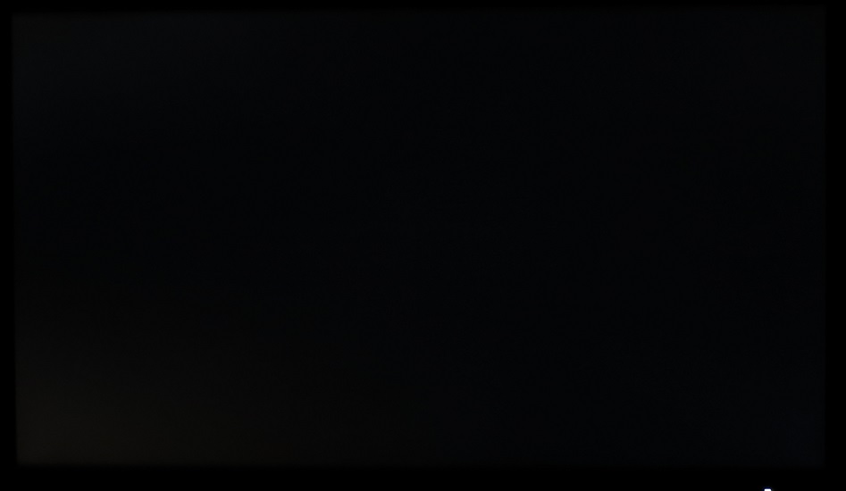
You can see that the backlight is rather even when displaying dark content and nothing really jumps out. The aforementioned ‘AHVA’ glow’, which can’t be seen in the image, is very similar to ‘IPS glow’. It appears as a slight golden or silvery-blue sheen towards the corners of the screen from a normal viewing position. If you move off-centre it flares up and becomes very distinct across much of the screen. We explore the impact of this glow from a normal viewing position in our subjective testing below and also illustrate it from a range of viewing angles in the ‘viewing angles’ video.
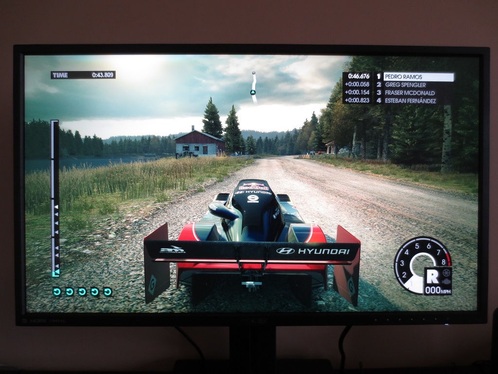
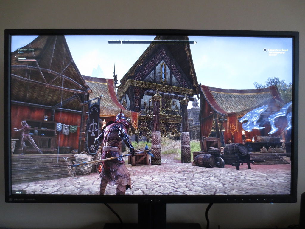
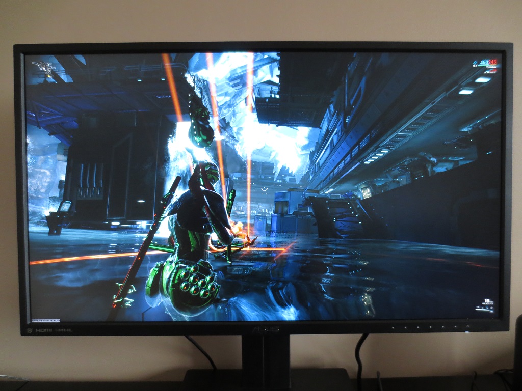
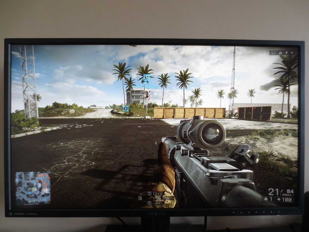
We also assessed the uniformity of lighter colours using the Spyder4Elite, analysing 9 equally spaced white quadrants running from the top left to bottom right of the screen. The table below shows the percentage deviation between each quadrant and the brightest point of the screen, as well as the luminance recorded at each quadrant. The luminance uniformity was pleasing overall. The maximum luminance was recorded at ‘quadrant 1’ towards the top left of the screen (160.4 cd/m²). The highest deviation from this occurred at ‘quadrant 6’ towards the right of centre (141.4 cd/m² which is 12% dimmer than centre). The remaining quadrants analysed deviated just 1-8% from the brightest point, with that very low 1% deviation occurring at ‘quadrant 5’ in the centre of the screen (158.1 cd/m²). It’s worth noting that uniformity can vary between individual units of the same model and indeed deviations on a finer scale (i.e. points of the screen not analysed) can also exist. Nonetheless, the results here were pleasing. The contour map below gives a graphical representation of these differences, with darker greys representing lower luminance than lighter greys. The percentage deviations between each quadrant and the brightest recorded point are also given. The Spyder4Elite was also used to analyse the colour temperature (white point) of the quadrants. The following contour map represents deviation between each quadrant and the 6500K (D65) daylight white point target. Deviations are shown as DeltaE values, where a DeltaE >3 represents deviation that could readily be noticed by most users by eye. On this map darker colours represent higher deviations from 6500K than lighter colours. The results here are a bit mixed. ‘Quadrant 4’ to the left of centre showed significant (but not extreme) deviation from 6500K, with a DeltaE of 3.1. The left side of the screen in general showed the greatest deviation from 6500K, with a DeltaE of 2.5 and 2.3 recorded at ‘Quadrant 1’ (top left) and ‘Quadrant 7’ (bottom left), respectively. ‘Quadrant 9’ at the bottom left was closest to 6500K with no further significant deviations recorded above or to the immediate left of this. Some inter-unit variation can again be expected in this respect and you should also be aware of further deviation beyond the points analysed. On Battlefield 4 there was some loss of detail towards the bottom corners in particular, due to ‘AHVA glow’. Aside from that, and for most of the screen, visibility was appropriate in dark areas. Overall contrast was good between dark and light areas with good distinctions between lighter shades in particular. Whites and other light colours (for example lights in dimly lit train carriages) had a mild graininess to them, but not the sort of smeary or ‘heavy’ grain seen on some matte surfaces. Aside from the regions affected by ‘AHVA glow’, such as the bottom corners of the screen, the contrast performance was quite pleasing on Dirt 3. The level of detail in dark and shaded areas was good with subtle details such as fins, grills and leather textures visible. Bright elements such as headlights pierced the darkness nicely, although lacked the purity seen on some screen surfaces with a slight graininess to them. The monitor performed well on the Blu-ray of Skyfall, from a contrast perspective. All major detail and most monitor detail was visible throughout the screen, with the brunt of the ‘AHVA glow’ absorbed by the black bars on top and bottom (UltraWide aspect ratio) of the movie. Bright elements stood out well and there was good distinction between closely matching shades, particularly brighter ones. Lagom’s tests for contrast were used to help analyse specific weaknesses in contrast performance which may not necessarily become obvious during other testing. We observed the following. The PB279Q’s colour gamut (red triangle) follows the sRGB space (green triangle) quite closely. It comprehensively covers sRGB and offers just a little extension beyond this. It provides potentially accurately represented colours, which it useful for colour-critical work. It also allows just a little hint of extra vibrancy without overblown shades, which works nicely for general use. Colours looked vibrant, natural and nicely varied on Battlefield 4. There were some good rich greens and browns with plenty of more muted shades thrown into the mix as well, giving vegetation and natural environments a pleasing look. Roaring flames had a pleasing orange glow to them whilst brightly coloured paints and in-game markers had an appropriately vivid look, too. Overall this title looked much as it should with richness and variety maintained throughout the image. The rich, varied and natural look to colours also worked well on Dirt 3. The car liveries showcased an excellent range of vibrant colours, with impressive deep reds, strong greens and deep blues (amongst others). The natural environments also looked, well, natural – whether it was the muted khaki palette of the Kenyan rally tracks or the lush greens of the Finnish forests. The screen surface aided the vibrant look, although not to the extent of a glossy monitor with the purity and ‘pop’ that comes with that. The colour performance was also pleasing on Elder Scrolls Online (ESO). The buildings in the game looked much as they should (and consistently so thanks to good range of browns and greys). These had nice neutral tones with very subtle additional hues where appropriate. Meanwhile excellent earthy browns and a broad palette of greens gave environments a good natural look. There were plenty of vibrant elements throughout the game, too, most notably with spell effects. Bright greens, deep reds and bright electric blues stood out nicely. The strong colour reproduction characteristics were also evident on the Blu-ray of Skyfall. Appropriate saturation brought a good natural look to the film, with vegetation and screen tones appearing much as it should without either a washed out or too heavily saturated aesthetic. The monitor also produced some pleasing vibrant shades, such as bright painted reds and intense orange flames. The neon lights of Shanghai at night were displayed with a pleasing depth, giving them an appealing look. Some very deep blues and reds were evident. Colours were displayed nicely on Futurama: Into the Wild Green Yonder, too. This title features a dazzling array of shades, with large areas of individual colour commonly found. This allows not only the extreme end of colour reproduction (strongly saturated) shades to be assessed but also the consistency and subtle variety. In both respects the monitor performed admirably. There were some very vivid-looking neon shades and nice strong deep shades as well. There were also subtle variations in pastel shades which were displayed consistently throughout the screen. On panels with weaker viewing angle performance you can expect to see a weakening of saturation at certain points of the screen. On TN, colours lose saturation further down the screen from a normal viewing position. On the PG278Q colours remained rich throughout, giving shades a strong individual identity. We used Lagom’s tests for viewing angle to further analyse the concept of colour consistency and the influence of viewing angle on the image. The following observations were made from a normal viewing position, sitting at a desk in front of the monitor with eyes around 70cm from the screen. A sensitive camera and small utility called SMTT 2.0 was used to assess the latency of the ASUS PB279Q, by comparing with a range of monitors of known latency. Using this method we calculated 7.4ms (under ½ a frame) of input lag. This is influenced by both the pixel responsiveness of the monitor (element you ‘see’) and the signal delay of the monitor (element you ‘feel’). This indicates a very low signal delay, particularly for a high resolution monitor, which shouldn’t get in the way of the experience even for sensitive users. Within the confines of the 60Hz refresh rate, the monitor felt snappy and responsive. We used the UFO Motion Test for ghosting and a highly sensitive camera to assess the pixel responsiveness of the monitor. The middle row of the test, which has a medium cyan background, was used. The UFO traversed the screen rapidly (in 1 second), with the test set to run at a speed of ‘3840 Pixels Per Sec’. The images below show the results of this test, as captured by the camera, using all of the ‘Trace Free’ (TF) pixel overdrive settings of the monitor from 0 (weakest acceleration) to 100 (strongest acceleration). You can see that the TF setting generally had a significant impact on the pixel response behaviour of the monitor on the pixel transitions analysed. At ‘TF= 0’ you can see a bold primary trail and faint secondary trail. Using ‘TF= 20’ had little effect on the primary trail, although it did appear remove or significantly weaken the secondary trail. The ‘TF= 40’ setting, in contrast, had a significant effect on the primary trail. This was weakened significantly, appearing much fainter and therefore indicating a more rapid pixel transition speed. ‘TF= 60’ changed the nature of the trailing, which now took on a slightly bright (inverted) look in places. This is a sign of the overdrive being a little too aggressive, inducing mild overshoot (inverse ghosting) in this instance. This overshoot became far more pronounced at ‘TF= 80’, with an almost neon-looking trail. At ‘TF= 100’ there was a highly defined inverted primary trail and an additional bright secondary trail. In this test it appeared that using a ‘Trace Free’ setting of ‘40’ was optimal. This was confirmed in broader testing. Although the default setting, ‘60’, provided a good performance overall, there was some inverse ghosting in places. Lowering this to ‘40’ eliminated this and didn’t have an observable negative impact on overall motion blur from the monitor. It is important to note that pixel response times vary depending on the shades involved in the transition, with some being a slower and some faster. As noted in this article, the movement of your own eyes is actually the most significant contributor to motion blur on a monitor. This means that, regardless of how fast the pixel transitions occur, there are certain restrictions to how smooth motion will appear. Most notably; refresh rate. To take both of these factors into account, we observed the visible response performance of the monitor in ‘real-world’ scenarios using a range of game and movie titles. On Battlefield 4 there was a moderate degree of blur. This was not caused by weaknesses in pixel responsiveness, but rather linked to eye movement (as noted previously) and the 60Hz refresh rate of the monitor. There was a very small amount of additional trailing in places, particularly during certain dark-medium shade transitions during rapid movement. When turning sharply in the ATV (All-Terrain Vehicle) with dark green (shaded) foliage mixed in with lighter foliage you could see just a hint of additional trailing from some slower than optimal pixel transitions. This really was very subtle and not worth worrying about, though, and still dwarfed by the overall motion blur which occurs regardless. In this respect the monitor was more impressive than the 28” TN panel models which showed clear weaknesses in some pixel responses. Another real bonus was the lack of any observable overshoot (inverse ghosting). On Dirt 3 there was, again, a moderate blur. You could see during the race modes when turning even fairly gently – and in the fast-paced Gymkhana mode it become somewhat dizzying. This was almost all down to eye movement and the 60Hz refresh rate, however. Across the broad range of transitions observed on this title (light, medium and dark shades moving against each other at various speeds) there were no obvious weaknesses in pixel responsiveness. As with Battlefield 4 there was a very small degree of additional trailing in places, but nothing to write home about. The lack of overshoot (inverse ghosting) was also very pleasing. We also tested out our Blu-ray movie titles and found no weaknesses that could be attributed to the pixel responsiveness of the monitor. There was no trailing from sluggish pixel transitions nor any overshoot from overly aggressive pixel overdrive. The fluidity of the film titles we observed was limited by their frame rate, which is about 24fps – but that’s not something the monitor can change. We’ve written an extensive article exploring the benefits and drawbacks of the 3840 x 2160 ‘4K’ UHD resolution. This article was based on experiences with a 28” model. Given that this model is 27”, the experience was extremely similar. We would therefore advise reading the article to get a decent idea of what to expect from the resolution in Windows, including whilst playing games and watching movies. We again found the ‘Medium – 125%’ scaling setting struck the best balance between readability and high-resolution goodness. The images below show the desktop displayed natively (‘Small – 100%’) and using the ‘Medium – 125’ setting, respectively. You can see that key elements such as buttons and icons go from being ‘absolutely minuscule’ to ‘rather small’. As noted in the article, scaling can be hit and miss depending on the software you’re running. Not all programs scale cleanly and some don’t scale at all. Regardless of the scaling setting you choose to use in Windows, many applications have an independent zoom level control for the main content. The ‘4K’ resolution gives you a tremendous amount of useful work space. The images below highlight this fact. The first shows two websites open side by side and the second shows a PDF file open in Adobe Reader (left) beside a Microsoft Word document (right). The content is all very compact, allowing a lot of information to be displayed at once. But it remains crisp and clear. Our experience in games and movies was, again, very similar to on the 28” model observed in the aforementioned article. The following images obviously don’t accurately represent what you’d actually see on the monitor, but we know that users like to see monitors ‘in action’ anyway. So here are some images of the monitor running a selection of games. Despite the limitations addressed in the article, we still got a lot of enjoyment and useful productivity from the ‘4K’ UHD resolution of the ASUS. As our experience with monitors of this resolution grows, we still enjoy the ‘wow’ moments and huge expanse of useful desktop space just as much as when we first started using such technology. The UHD resolution of 3840 x 2160 resolution makes use of 8.29 million pixels, and is such requires a great deal of graphical horsepower when gaming or using other graphics-intensive applications. For that reason some users may wish to use a lower resolution, such as 1920 x 1080. Games consoles and other AV devices use 1920 x 1080 natively and that is in many cases the maximum resolution they will support, so it’s important to consider how this non-native resolution will look on the monitor. The screen uses an interpolation process to run at a non-native resolution such as 1920 x 1080 – and for this Full HD resolution, there are two methods of display. If you navigate to ‘Image’ – ‘Aspect Control’ you will see that the default option is ‘Full’. This essentially stretches the image so that all of the pixels of the display are used. The image below illustrates this, but in no way provides an indication of what the image looks like first hand. The image appears noticeably soft, much softer in fact than running 1920 x 1080 natively on your typical 27” Full HD LCD. Text appears to have a soft fringe and games look like they are being viewed through some sort of soft-focus lens. If you’re expecting things to look like they would on a native ‘1080p’ display, think again. The same applies to other resolutions such as 2560 x 1440 – they simply lack the sharpness of running the resolution natively on a display of similar size. And this isn’t something that can really be improved by adjusting settings on the monitor such as sharpness or ‘VividPixel’. The alternative is not really any more attractive. That is to run the monitor with 1:1 pixel mapping, found again in ‘Image’ – ‘Aspect Control’ as ‘1:1’. This forces the monitor to use a quarter of its available pixels and display the image with 1920 x 1080 pixels in the centre of the screen. The area is 13.5”, so it’s like looking at a 13.5” Full HD display with a large black area around it, as shown below. It is unfortunate to see that interpolation is handled so poorly by the monitor. It’s not entirely surprising, as we saw similar performance from the 28” ‘4K’ models. The Dell P2415Q, on the other hand, handled non-native resolutions surprisingly well. Some relief is found when displaying lower than native resolution content on the screen, for example looking at a 1920 x 1080 Blu-ray movie using PC movie software. The monitor remains running at 3840 x 2160 whilst the GPU or movie software upscales the content. There was an insignificant loss of sharpness when compared to running such content on a native Full HD display, so things looked much as they should in that respect. As we explore in this article, the ‘4K’ UHD resolution brings a lot to the table. There are also notable drawbacks, some of which include software-dependent factors which will hopefully be ironed out in time. Although weighing up the pros and cons of the resolution itself can be challenging, we can at least say that we found the resolution very useable and got a lot of enjoyment out of the monitor. It isn’t fair to say that this enjoyment was entirely down to the resolution, of course. The ASUS PB279Q proved itself to be a capable all-rounder with pleasing image quality overall. The factory defaults offered a bright but otherwise fairly well balanced image. Adjusting the ‘Splendid’ mode did not really bring much to the table, with the exception of some of the ‘Low Blue Light’ style settings (such as ‘Reading’) which we feel have real utility. The colour channels did need a bit of rebalancing on our unit, but gamma was right where you’d expect it to be for normal PC use. Coupled with the very light matte (‘semi glossy’) screen surface >100% sRGB coverage, the image was vibrant and very nicely varied. The AHVA panel technology also ensured strong colour consistency, maintaining appropriate shade depth throughout the screen. Contrast performance was also pleasing, with readings that were as good as you can hope to see on this sort of panel. Another factor which is common to this panel type is ‘AHVA glow’ (a form of IPS glow, essentially) which eats away at some peripheral detail. Despite this glow, the overall distinctions between ‘bright’ and ‘dark’ and subtleties between were pleasing. Despite being very light matte, the screen surface did provide a slight graininess to whites and light colours. Nothing approaching the levels seen on older IPS panels in particular, but still something our keen and perhaps overly fussy eyes noticed. To round things off, responsiveness was also good on the PB279Q. There was surprisingly little input lag, particularly for a high resolution display where this can often be an issue. The pixel overdrive was also well implemented to provide about as little motion blur as you can hope for from a 60Hz LCD, using the appropriate ‘Trace Free’ setting. And this was done without any traces of ghastly inverse ghosting. The monitor’s performance was also complimented by the solid and smart aesthetic of the monitor. It wasn’t a case of form over function, either, with high levels of ergonomic flexibility, slender bezels and a decent selection of ports. If you’re in the market for a ‘4K’ UHD monitor and want strong overall performance without spending a fortune, this is certainly one to consider.

Luminance uniformity table UC off

Luminance uniformity map UC off

Colour temperature uniformity map UC off
Contrast in games and movies
Lagom contrast tests
Colour reproduction
Colour gamut

Colour gamut test settings
Colour in games and movies
Viewing angles
Responsiveness
Input lag
Pixel responsiveness

Trailing (various 'Trace Free' settings)
Responsiveness in games and movies
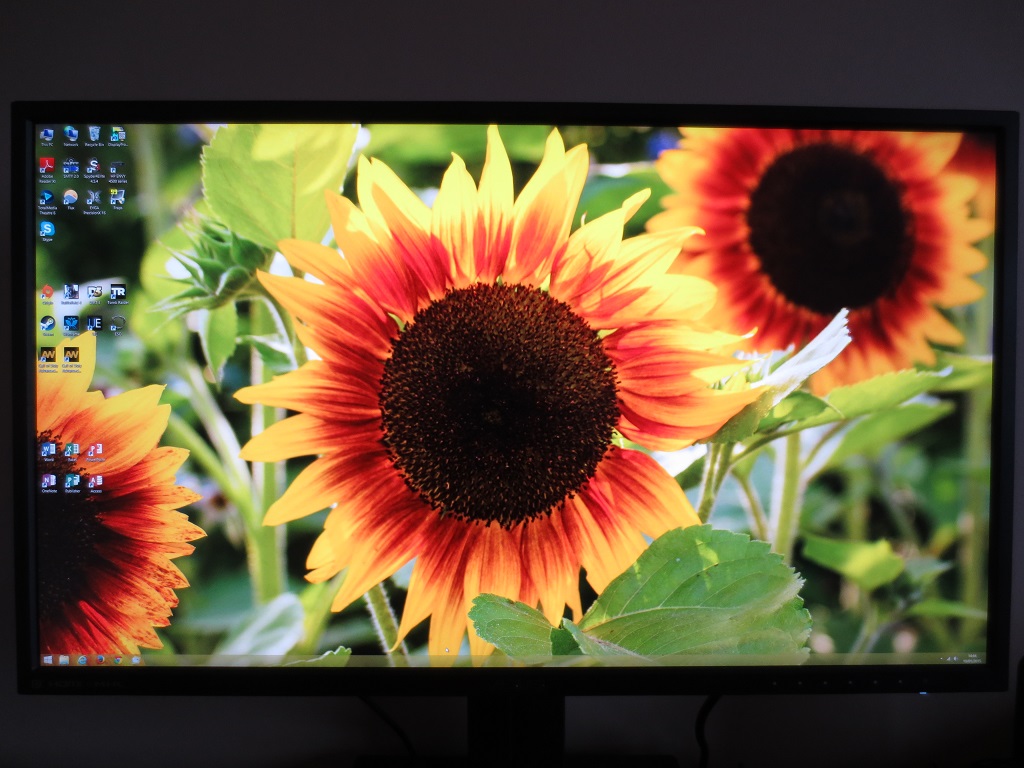
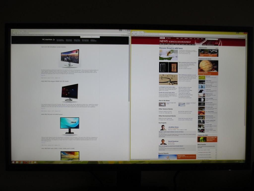
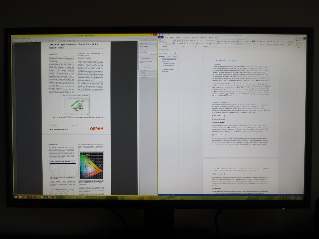
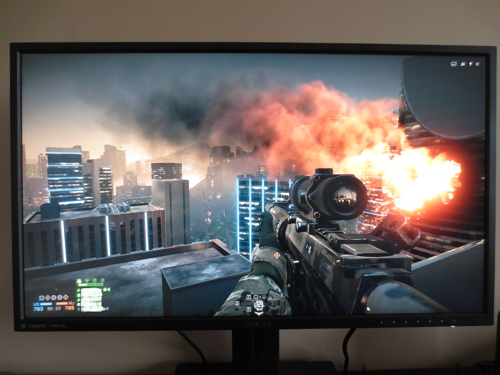
The ‘4K’ UHD experience
Interpolation and upscaling
![]()
Conclusion
Positives Negatives Good factory setup with just a few tweaks required to yield a pleasing image with excellent shade variety and a vivid, accurate look
Some colour channel re-balancing was required. The sRGB colour gamut supported falls way short of the ‘Rec. 2020’ standard proposed for UHD – as do all current displays
Strong static contrast for a panel of this type and a very light matte screen surface to help bring a bit of ‘pop’ to the image There was ‘AHVA glow’, as expected. And despite the very light matte screen surface there was a bit of graininess in places Responsiveness is about as good as you could hope for from a 60Hz LCD – little input lag and well balanced and flexible pixel overdrive
Some users would prefer a higher refresh rate (they’ll have to wait unless they wish to compromise elsewhere). Some pixel responses were just a little slower than optimal in places, but nothing to worry about
The 3840 x 2160 resolution provided an excellent level of clarity and real-estate, providing an advantage for both work and play
The resolution is highly demanding, graphically and non-native resolutions were handled poorly. Application support is also a bit variable, with some scaling issues, lack of movies supporting the resolution and some elements in games not taking full advantage
![]()

