Author: Adam Simmons
Date published: October 26th 2018
Table of Contents
Introduction
The AOC Q3279VWF attracted a lot of attention as a large and surprisingly affordable monitor with relatively high (WQHD) resolution and a strong contrast VA panel. The updated Q3279VWFD8 encapsulates this affordability, resolution and screen size but instead offers an IPS-type panel. On paper and considering models using this panel type more broadly, this is expected to address some of the shortcomings of the original model such as responsiveness and colour consistency. We put this monitor through its paces in our usual series of ‘real world’ tests.
Specifications
The monitor uses a 31.5” BOE IPS-ADS (In Plane Switching type) panel with support for a 75Hz refresh rate at the native WQHD resolution, for both AMD and Nvidia GPU users. Users with compatible AMD GPUs and systems can also leverage FreeSync capability. 10-bit colour is supported via 8-bit + FRC dithering, whilst a 5ms grey to grey response time is specified. Whilst this is the same as specified for the original model, you need to be very wary of how misleading specified response times can be – and that’s why we test elements such as pixel responsiveness rather thoroughly. Some of the key ‘talking points’ of this monitor have been highlighted in blue below.
The monitor features the same simple exterior design as its predecessor. There is a rectangular stand base with a brushed-effect silver matte plastic outer surface and a fairly square construction to the screen itself. The bezels are glossy black plastic, of moderate thickness and are of a single-stage design (i.e. there is very little panel border visible, the bezel covers it almost entirely). The total thickness of each bezel is ~14mm (0.55 inches). The screen surface is medium matte anti-glare, a notable change from the glossy (low haze) screen surface used on the previous model. We explore this a little later, along with the experience of using a relatively large screen of this resolution on the desktop. The OSD (On Screen Display) is controlled by pressable buttons on the underside of the bottom bezel, to the right of the central AOC logo. There is also a power LED that faces towards the front, a small rectangle which glows a very dim white when the monitor is on or amber when it enters a low power state (e.g. signal the system is lost). The video below gives a run-through of the OSD menu system. From the side the monitor is fairly slim at ~18mm (0.71 inches) at thinnest point, bulking out towards the stand attachment point. The only ergonomic freedom offered by the stand is tilt (2° forwards, 21.5° backwards). The bottom of the screen sits ~110mm (4.33 inches) above the desk surface, with the top ~535mm (21.06 inches) clear of the desk. The total depth of the monitor including stand is ~153mm (6.02 inches), so it’s certainly less of a desk space hog than some models and can be pushed up fairly close to the wall. Useful, given the size of the screen. The rear of the monitor is matte black plastic with a brushed texture for the majority of the screen. The lower region uses glossy matte black plastic, whilst the stand neck uses a mixture of glossy black plastic and silver semi-matte (satin) plastic. There are no VESA holes on this model, so you can’t simply mount the monitor to another stand or mount if you don’t find the limited included stand appealing. A 3rd party VESA adaptor by HumanCentric (B074JSJSF3) can be purchased on Amazon, if required. A Kensington lock slot is located towards the bottom right. The ports face backwards, in the bottom central region and include; AC power input (internal power converter), Dual-Link DVI, HDMI 1.4a, DP 1.2a (supports FreeSync), VGA and a 3.5mm headphone jack. So the same as this model’s predecessor. The full capabilities of the monitor including 2560 x 1440 @ 75Hz can be leveraged via DP 1.2(a) and HDMI 1.4(a). Compatible AMD GPUs and systems can use FreeSync via either DP or HDMI. An HDMI cable and power cable is included as a standard accessory, with additional cables included by some retailers and in some regions. The image below is a macro photograph taken on Notepad with ClearType disabled. The letters ‘PCM’ are typed out to help highlight any potential text rendering issues related to unusual subpixel structure, whilst the white space surrounding the text more clearly shows the actual subpixel layout alongside a rough indication of screen surface. This model uses a medium matte anti-glare screen surface. This provides effective glare handling in a range of lighting conditions by offering moderately strong diffusion of ambient light. It also diffuses light emitted from the monitor in a similar way, giving a slightly grainy appearance to lighter shades and reducing vibrancy potential somewhat. As described later this is not a heavy or ‘smeary’ graininess, thankfully, and the monitor is not lacking in vibrancy overall. This is a significant change from the glossy screen surface of the previous model, which gave a smoother appearance to the image with more direct light emission but also gave reflections from ambient lighting. The monitor has a number of ‘Game Mode’ presets; ‘FPS’, ‘RTS’, ‘Racing’, ‘Gamer 1’, ‘Gamer 2’ and ‘Gamer 3’. These lock off some of the OSD options, such as ‘Color’ and ‘Gamma’ settings and in some cases the entire ‘Luminance’ menu as well. They also oversaturated the image, alter gamma and contrast. The numbered ‘Gamer’ presets give the most flexibility of these as they allow you to access most of the ‘Luminance’ menu, but they lock off the ‘Color’ menu. We will leave our exploration of these to the brief section of the OSD video earlier in the review as we don’t feel these offer any real practical benefit over manual adjustment. We will therefore be spending our time looking at some of the more useful and practical settings offered in the OSD for this section. Note that an important additional step also had to be performed in the graphics driver on our Nvidia GPU if DisplayPort was used. With the driver defaults the image appeared bleached with oversaturation and crushing at the high end, affecting light shade range and visibility. The solution was to open the Nvidia Control Panel (NVCP) and navigate to ‘Display – Adjust desktop colour settings’. Then select ‘Use NVIDIA settings’ rather than the default option of ‘Other applications control colour settings’. For some reason the default option was equivalent to having brightness set to ‘57%’ in NVCP which is obviously wrong and causes the over-brightening of shades as we observed. We haven’t come across this on other models before and it could be a driver issue of some sort (we didn’t have any ICC profiles or other programs active that would cause such changes). This is shown in the image below. No equivalent correction was required when using HDMI, or in the AMD driver when using our AMD GPU. The following table gives key readings (central gamma and white point) taken using a DataColor Spyder5ELITE colorimeter. General image observations are also provided. The monitor was left in its ‘Plug and Play’ state without any additional drivers or ICC profiles specifically loaded and left to run for over 2 hours before readings were taken or observations made. It was connected to a Windows 10 system using an Nvidia GTX 1080 Ti. Additional testing was performed with an AMD Radeon R9 290 FreeSync-compatible GPU. Unless otherwise stated (including for our ‘Test Settings’), assume default settings were used in the OSD. Note that the refresh rate was set to 75Hz in Windows in all cases, although this had no impact for the purposes of this table. When viewing the figures in this table, note that for most PC users ‘6500K’ for white point and ‘2.2’ for gamma are good targets to aim for. Individual targets depend on individual uses, tastes and the lighting environment, however.
As an Amazon Associate I earn from qualifying purchases made using the below link. Where possible, you’ll be redirected to your nearest store. Further information on supporting our work.

Features and aesthetics


Calibration
Subpixel layout and screen surface
![]()
The usual RGB (Red, Green and Blue) stripe subpixel layout is used, the standard layout expected by modern operating systems such as Microsoft Windows and MacOS. Apple don’t need to worry about text fringing from non-standard subpixel layouts, whilst Windows users don’t need to run ClearType. Although they may still wish to run through the ClearType wizard and adjust according to preferences. The subpixel layout and arrangement is quite normal and we had no subpixel-related concerns related to sharpness or text clarity on this model.
Testing the presets

Monitor Settings Gamma (central average) White point (kelvins) Notes Gamma1 (Factory Defaults) 2.2 7122K The monitor displays colours in a vibrant and saturated but varied way. There is a cool-green tint overall but gamma balance is good. Colour consistency is also strong overall, without the sort of gamma or colour shifts associated with VA or TN panels. Gamma2 1.9 7094K As above but the reduced gamma saps depth and saturation from the image. Gamma3 2.3 7084K Similar to factory defaults with gamma pulled up slightly. Some shades have a bit more depth – some users might find this appealing, others will prefer the default setting. Color Temp. sRGB 2.3 7064K An effective sRGB emulation setting. The colour gamut and hence saturation is significantly restricted. The image maintains a cool-green tint and gamma is somewhat higher than the ‘2.2’ target on average. Brightness is locked at a relatively high setting. Low Blue Light = Weak 2.1 6422K A weak ‘Low Blue Light’ (LBL) setting. The image is a bit warmer than default and has a bit of a green cast. There is only a marginal reduction in blue light output using this setting. Low Blue Light = Medium 2.1 5985K A stronger LBL setting, making the image appear warmer and further reducing blue light output from the monitor. Low Blue Light = Strong 2.1 5622K The strongest LBL preset available on the monitor. This further reduces blue light output, with the image appearing warmer again. The green tint remains as the green channel is not reduced and remains relatively strong. This setting is effective, although it would’ve been nice to see an even stronger setting that brings the white point down below 5000K. Test Settings (see below) 2.2 6508K The image is nicely balanced in terms of colour temperature and gamma. Shades appear vibrant and saturated, with good variety and consistency. Brightness is also more suitable for our lighting environment, although the monitor under its default settings is not as obnoxiously bright as some models are ‘out of the box’.
Out of the box the monitor was reasonably bright, although not obnoxiously so compared to some models. There was a cool-green tint to the image. Average gamma tracking was good and the image appeared vibrant with strong saturation and variety. The image below shows the gamma tracking under our ‘Test Settings’. You can see good adherence to the ‘2.2’ target curve.
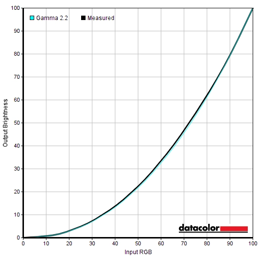
Gamma 'Test Settings'
The monitor also includes three ‘Low Blue Light’ settings of varying strength; ‘Weak’, ‘Medium’ and ‘Strong’. These are fairly easy to access once you enter the OSD, although we would’ve preferred them to be assigned to a hotkey so they are even easier to enable or disable. The ‘Strong’ setting proved to be an effective LBL setting and did the trick for us in terms of limiting blue light exposure in the evening and preventing disruption to sleep. It’s important to reduce exposure to blue light in the hours leading up towards sleep as it is disruptive to sleep hormones and acts as an important alertness signal for the body. We used this setting for our own viewing comfort in the evening, but not for any specific testing beyond that involving the setting itself.
Test Settings
We lowered brightness and made some changes to the colour channels to form our ‘Test Settings’. Note that these settings are just a suggestion and not going to be optimal in all cases due to inter-unit variation and personal preferences. Given the good gamma tracking and taking into account inter-unit variation and other points raised in our ICC profile article, we won’t be providing any for this monitor. They’re unnecessary and likely to be counter-productive when applied on other systems and with other units of the same monitor model. Assume any setting not mentioned, including contrast and ‘Gamma’, was left at default. Also note the driver tweak for Nvidia users noted earlier (above the table), which was applied when using our Nvidia GPU. We’ve also included the ‘Overdrive’ setting and refresh rate set in Windows, just for reference. Although this didn’t have a noteworthy impact on static image quality. Color Temp= User R= 50 G= 44 B= 45 Overdrive= Off Refresh rate (Windows setting)= 75Hz
Brightness= 60 (according to preferences and lighting)
Contrast and brightness
Contrast ratios
A BasICColor SQUID 3 (X-Rite i1Display Pro) was used to measure the luminance of white and black using a range of monitor settings. From these values, static contrast ratios were calculated. Results are show in the table below, with blue highlights indicating the results using our ‘Test Settings’. Black highlights indicate the highest white luminance, lowest black luminance and highest contrast ratio recorded. Assume any setting not mentioned was left at default, with the exceptions already noted in the calibration section.
| Monitor Settings | White luminance (cd/m²) | Black luminance (cd/m²) | Contrast ratio (x:1) |
| 100% brightness | 285 | 0.21 | 1357 |
| 80% brightness | 233 | 0.17 | 1371 |
| 60% brightness | 180 | 0.13 | 1385 |
| 40% brightness | 130 | 0.1 | 1300 |
| 20% brightness | 83 | 0.06 | 1383 |
| 0% brightness | 34 | <0.03 | >1133 |
| Factory defaults (90% brightness) | 259 | 0.19 | 1363 |
| Gamma2 | 261 | 0.2 | 1305 |
| Gamma3 | 260 | 0.19 | 1368 |
| Color Temp. sRGB | 256 | 0.19 | 1347 |
| Low Blue Light = Weak | 257 | 0.19 | 1353 |
| Low Blue Light = Medium | 255 | 0.19 | 1342 |
| Low Blue Light = Strong | 254 | 0.19 | 1337 |
| Test Settings | 166 | 0.13 | 1277 |
The average static contrast with only brightness adjusted was 1359:1 with only brightness adjusted, excluding the result at ‘0%’ brightness which lacks sufficient precision due to rounding. Whilst it doesn’t reach the black depth of VA models such as this model’s predecessor, it’s still exceptional for the panel type. The specified 1200:1 contrast ratio looked somewhat suspect and optimistic on paper given the usual 1000:1 specified for IPS-type panels, but the actual monitor exceeded this specification quite comfortably. Good contrast was maintained with the ‘Low Blue Light’ setting active, even at the ‘Strong’ level. And only dropped a bit under our ‘Test Settings’ but remained pleasing for a non-VA LCD panel at 1277:1. The maximum white luminance recorded was 285 cd/m² whilst the minimum white luminance recorded was 34 cd/m², yielding a 251 cd/m² luminance adjustment range.
The monitor also features a Dynamic Contrast setting called ‘DCR’, which gives the backlight the freedom to adjust itself based on the overall level of light vs. dark in the image. This locks off control of all other settings in the ‘Luminance’ section of the menu (‘Brightness’, ‘Contrast’, ‘Eco Mode’ and ‘Gamma’). The backlight is dimmed as a single unit (BLU – Backlight Unit), so it works on the screen as a whole rather than accounting properly for intricate mixtures of shades. The mode did work in that the backlight adjusted rapidly to changes in scene brightness. It also dimmed quite effectively for very dark content, but tended towards a perhaps inappropriately bright level for mixed content. We prefer manual control over the backlight on models where it is all controlled as an individual unit, more so when the static contrast performance is as strong as it is here.
PWM (Pulse Width Modulation)
The monitor does not use PWM (Pulse Width Modulation) to regulate brightness using any brightness setting. Instead, DC (Direct Current) is used to dim the backlight. The backlight is therefore considered ‘flicker-free’, which will come as welcome news to those who are worried about side-effects from PWM usage.
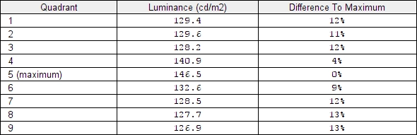
Luminance uniformity
Whilst observing a black screen in a dark room we observed some backlight bleed and clouding, particularly towards the top left corner. Note that individual units vary when it comes to backlight bleed. The black uniformity of our sample is shown in the image below, which was taken in a dark room using our ‘Test Settings’ and camera settings which are representative of what the eye sees when observing the screen. The image was taken a sufficient distance back from the screen to eliminate ‘IPS glow’. This is a white or golden glow (depending on viewing angle) that’s visible towards the bottom corner of the screen in particular from a normal viewing position. At sharper viewing angles it ‘blooms out’ more noticeably, as demonstrated in a video later on. The luminance uniformity was reasonable overall. The maximum luminance was recorded at ‘quadrant 5’ in the centre of the screen (146.5 cd/m²). The greatest deviation from this occurred at ‘quadrant 9’ towards the bottom right corner of the screen (126.9 cd/m², which is 13% dimmer). The average deviation between each quadrant and the brightest point is 10.75%. Note that individual units vary when it comes to uniformity and you can expect further deviation beyond the points measured. The following graphic is a contour map which shows these deviations using a colour-coding system. Darker greys represent lower luminance levels and hence greater deviation from the brightest point than lighter greys. The percentage deviation between each quadrant and the brightest point recorded is also provided. We also measured colour temperature (white point) uniformity for these same quadrants. Deviations here are shown in the contour map below and are assigned DeltaE values. A higher value indicates greater deviation from the 6500K (D65) daylight white point target than lower values. Here, a DeltaE <3 is considered non-significant deviation that most users wouldn’t readily notice by eye. Greater deviations are also displayed with stronger (deeper) yellow shades in the graph. Results here are reasonable overall. The point nearest 6500K was recorded above centre, with a maximum deviation of DeltaE 3.9 recorded towards the bottom right. Borderline significant deviation was also recorded to the left of that quadrant. Remember that the DeltaE values and corresponding shades on the contour map show deviation either way from 6500K. By eye the bottom right region appeared somewhat cooler than surrounding regions, not warmer as you may think if you misinterpret the graphic. As above, it’s important to remember that individual units vary when it comes to uniformity and that you can expect further deviations beyond the measured point. On Battlefield 1 (BF1) the monitor provided a good contrast performance overall. As usual for the panel type there was some ‘IPS glow’ which ate away at detail towards the edges of the screen. But in particular the bottom corners, from a normal ergonomically sound viewing position. More centrally detail levels were appropriate when observing details in darker scenes, with quite good distinctions of even subtle elements such as cracks in rocks. The overall atmosphere was certainly not in-line with VA models, particularly those with strong contrast for their panel type. But the stronger than average static contrast did seem to pull things up a bit compared to many IPS models, giving better distinction between brighter and dark shades. For example fires burning at night. These brighter shades contrasted nicely with the darker surroundings, although they didn’t appear as smooth or ‘pure’ as on models with glossy screen surfaces. And not as smooth as some lighter matte surfaces. They were free from the obvious heavy and smeary graininess associated with some matte screen surface, however. Shadow of the Tomb Raider reinforced these findings. The central mass of the screen had appropriate detail levels for dark scenes. And such scenes are prevalent on this game, with dark tombs and caves the keystone of this title. The atmosphere here was not up to the standards of decent VA models, but better than your typical IPS or in some respects TN models as well. On TN models the vertical gamma shifts lighten things up significantly for dark shades at all lighter than black, whilst detail is masked further up the screen. This model did not have this issue, although ‘IPS glow’ was again a feature. Particularly towards the bottom corners of the screen, where a fair amount of detail was lost and particularly when observed in a dark room there was a clear ‘bloom’ where dark shades appeared significantly lighter than intended. Brighter elements contrasted nicely with these darker surroundings, across most of the screen, and appeared without strong ‘smeary’ graininess. We also assessed contrast performance in the film title Star Wars: The Last Jedi. There are plenty of high-contrast scenes in this film, with colourful and explosive battles in deep space, bright burning flames at night and light saber duels. This monitor gave a reasonable cinematic look to the image. We do feel this model had a slight edge over most other models of the same panel type, although this isn’t as significant as the difference observed between this model and its predecessor. The contrast level of this model does not provide ‘deep’ or ‘inky’ deep shades, particularly when observed in a dimly lit room. VA models with strong contrast, such as the predecessor to this model, give a better ‘cinematic look’ to films like this. That shouldn’t come as a surprise when even on paper you’re comparing ~1300:1 with the VWFD8 vs. ~4600:1 on the VWF. Plus there’s ‘IPS glow’ to contend with here. Lagom’s contrast tests were used analyse specific strengths and weaknesses in contrast performance. The following observations were made. The colour gamut of the Q3279VWFD8 (red triangle) was compared with the reference sRGB (green triangle) and Adobe RGB (purple triangle). This is shown in the first image below. The second image shows the native gamut of the older Q3279VWF against sRGB, for comparison. The monitor comprehensively covers sRGB (100%) and offers reasonable Adobe RGB coverage (89%). Note that the sRGB and Adobe RGB colour spaces are identical in the red and blue corners of this diagram. There is significant extension beyond sRGB in the green region and extension beyond both colour spaces for some red and blue regions of the gamut. This gamut allows the monitor to reproduce all shades within the sRGB gamut with an extra dose of saturation (higher vibrancy). The monitor also provides an sRGB emulation mode (‘Color Temp. sRGB’) which restricts the colour gamut so that it more closely follows the sRGB reference space. This does a very good job at emulating the sRGB gamut (99%) with little under or over coverage. Given the high native white point and ‘2.3’ average gamma using this setting, plus the restrictions it imposes, we’d recommend a full calibration (and frequent re-calibration) using the native gamut for colour critical work. On Battlefield 1 (BF1) the monitor outputted shades in a varied and vibrant way. The colour gamut injected a good dose of extra saturation, without making things look as excessively saturated or skewed as traditional wide gamut (Adobe RGB colour space) models. You could see a slightly stronger than ideal red hue for some character skin tones and for some of the reddish earthy-brown hues, but nothing extreme. There was a pleasing palette of vivid greens, more muted greens and golden browns which gave the environments a vivid (but not garish) appearance, maintaining quite a natural look. There were some good strong vibrant reds and oranges visible for explosions and suchlike, helping keeping things looking lively. Colour consistency was strong overall. There was a slight dimming of some shades towards the extreme edges of the screen, more noticeable if you’re sitting quite close to the screen (<60cm). But consistency was still far beyond what you’d see on VA or TN panels and it was quite clear to us from even casual glance that this was an IPS-type panel. We also assessed colour output on Shadow of the Tomb Raider. The vibrant and consistent colour output again gave this title a lively but still natural appearance. There was a pleasing array of lush greens, more muted greens and earthy browns which breathed life into vegetation and the natural environments. Some of the reddish-brown hues had a slight red push due to the colour gamut and Lara’s skin tended to look a little well-tanned at times – but not sunburnt or obviously wrong in tone. The fires in the game showcased a nice range of rich and at time eye-catching yellows, oranges and reds. Some of the oranges appeared somewhat redder than intended and some of the reds extra intense, but variety was maintained nicely as things were not crushed together. So there wasn’t a garish or cartoonish look, rather things looking to be a somewhat more saturated version of their true selves. To most users this would be an appealing aesthetic as it gives a clearly vibrant rather than ‘washed out’ appearance, without going overboard. The strong consistency also helped, with shades maintaining good richness throughout the screen and no strong shifts in saturation or gamma from a sensible viewing position. We also assessed colour reproduction using the Blu-ray of Futurama: Into the Wild Green Yonder. This is a good (and unforgiving) test for colour consistency, with large areas of individual shade covering significant portions of the screen. The monitor performed well here, clearly identifying itself as an IPS-type model. There was a little bit of dulling for some shades towards the extreme edges of the screen, particularly if you sit quite close to the screen. But this was far more subtle than the clear shifts observed on TN or VA panels. There was a pleasing range of vibrant neon shades and good deep shades, such as purples and greens. The pastel shades in the film also looked relatively muted in comparison, even if somewhat more saturated than intended at times. The strong consistency helped with subtle shade variations, with distinctions between different character skin tones (for example) being correctly maintained throughout the screen. Lagom’s tests for viewing angle tests were used to analyse colour consistency and viewing angle performance in a more specific way. The following observations were made from a normal viewing position, eyes around 70-80cm from the screen. On some monitors, particularly but not exclusively those with high refresh rates, interlace patterns can be seen during certain transitions. We refer to these as ‘interlace pattern artifacts’ but some users refer to them as ‘inversion artifacts’ and others as ‘scan lines’. They may appear as an interference pattern or mesh or interlaced lines which break up a given shade into a darker and lighter version of what is intended. They often catch the eye due to their dynamic nature, on models where they manifest themselves in this way. Alternatively, static interlace patterns may be seen with some shades appearing as faint horizontal bands of a slightly lighter and slightly darker version of the intended shade. We did not observe either artifact type on this monitor. A small utility called SMTT 2.0 was used alongside a sensitive camera to analyse the latency of the Q3279VWFD8, with over 30 repeat readings taken to improve accuracy. Using this method, we calculated 2.81ms (under 1/4 of a frame at 75Hz) of input lag. We have no way to accurately measure input lag in the variable refresh rate and frame range environment under which FreeSync would be active, however. This value is influenced by both the element you ‘see’ (pixel responsiveness) and the element you ‘feel’ (signal delay). It indicates a very low signal delay, which even sensitive users shouldn’t find bothersome. In our responsiveness article we explore the key factors affecting monitor responsiveness. One of the key concepts explored here is ‘perceived blur’, which is caused predominantly by the movement of your eyes as you track motion on the screen. It is also influenced by pixel responsiveness, although this is generally a less significant (but still important) factor on modern monitors. We also explore ‘pursuit photography’, a technique which uses a moving camera to capture motion on a monitor in a way that reflects both of these elements of perceived blur. This is something that normal static photography or video can’t capture. The following images are pursuit photographs taken using the UFO Motion Test for ghosting, with the test running at its default speed of 960 pixels per second. This is a practical speed for taking such photographs and highlights both key elements of perceived blur. The UFOs move across the screen from left to right at a frame rate matching the refresh rate of the display. The monitor was tested at 60Hz (directly below) and 75Hz using all ‘Overdrive’ settings; ‘Off’, ‘Weak’, ‘Medium’ and ‘Strong’. All rows of the test were used, with the backgrounds showing various shade levels (dark, medium and light). The final column shows a fast TN reference screen (Dell S2417DG) set to 60Hz, showing how things look where pixel responsiveness isn’t really a limiting factor. At 60Hz, shown above, the UFO appears relatively soft and unfocused. This reflects a moderate level of perceived blur due to eye (camera) movement, with this element also shown on the fast TN reference. There is also some trailing behind the UFOs in some cases. With ‘Overdrive = Off’ it’s clear that the name is misleading, as effective pixel overdrive is used – it just happened to be the lowest level of this available on the monitor. There is no conventional trailing visible behind the object, there is instead a small amount of overshoot (inverse ghosting). You can see a slight bright fringe (halo trail) behind the UFO, but this blends in well. The ‘Weak’ setting ramps up the pixel overdrive and slightly increases the overshoot levels, although this remains quite weak. The ‘Medium’ setting strengthens the overdrive further and overshoot becomes more noticeable, whilst the ‘Strong’ setting provides strong, colourful and obvious overshoot. From this analysis and our broader analysis outside of this test, we consider ‘Off’ to be optimal at 60Hz. Although ‘Weak’ is also very usable, making limited difference to the pixel response behaviour. Below you can see what happens when the refresh rate is increased to 75Hz. At 75Hz, shown above, the UFO remains relatively soft and unfocussed although is somewhat narrower than at 60Hz. This reflects a slight reduction in perceived blur attributable to eye movement. There is again some trailing behind the object in some cases. The ‘Off’ setting now has no visible overshoot. There is just a faint whiff of powdery trailing for the dark background (top row), virtually none for the medium background and nothing to speak of for the light background. The ‘Weak’ setting makes little difference to this, perhaps reducing the powdery trailing a tiny bit and also introducing a little overshoot for the light background. But this is very faint. The ‘Medium’ setting increases overshoot and introduces a slight dark trail behind for the medium and light backgrounds as well as a slight dirty overshoot trail for the dark background. The ‘Strong’ setting ramps up the pixel overdrive and introduces obvious overshoot. Again, as with 60Hz, we consider the default ‘Off’ setting optimal but ‘Weak’ a very close second. We didn’t really observe clear differences between the two modes in broader testing, although did see just a tiny bit of extra overshoot in places using the ‘Weak’ setting. There’s really no need to use anything stronger as it just strengthens overshoot without bringing benefits. Even the ‘Off’ setting clearly provides a solid 75Hz performance – this model’s in a completely different league to this its predecessor in terms of pixel responsiveness. Note that we will not be including a section on overclocking. The monitor could not be set much beyond 75Hz without the monitor refusing to display an image. There was a moderate level of perceived blur on Battlefield 1 (BF1), but this was almost entirely attributable to eye movement and limited by the refresh rate of the display rather than pixel responses. Compared to 60Hz (at 60fps), the 75Hz refresh rate (at 75fps) gave a slight decrease in perceived blur which helped keep things just a bit sharper during rapid movements. There was also an edge in ‘connected feel’, which describes the fluidity and precision as you interact with the game world. There was very little to complain about in terms of pixel responsiveness, in stark contrast with the older Q3279VWF. There was a very small amount of faint powdery trailing in places, for example where dark objects such as tree trunks in a shaded area moved against brighter objects such as the sky. This was not eye-catching, not widespread and was only a very minor contributor to perceived blur. Likewise, there was a very small amount of overshoot in places. What we like to call ‘snail slime trails’ with the trailing appearing like a slightly lighter semi-transparent variant of normal trailing. Most prevalent but still very faint where brighter shades moved against medium shades (a white painted wall against the sky, for example). Even users sensitive to overshoot shouldn’t find this bothersome and most users wouldn’t even notice it even if actively looking out for it. Shadow of the Tomb Raider told a similar story. And this was again one of a solid 75Hz performance with only minor weaknesses in places. Again, slight traces of overshoot and faint powdery trailing for select transitions, but very little to complain about. The edge in refresh rate and frame rate comparing to a 60Hz monitor at 60fps was again welcome due to the slight decrease in perceived blur and increase in ‘connected feel’. Obviously, this was not at the level of higher refresh rate models with triple-digit refresh rates running at suitable frame rates, but it was a nice edge nonetheless. We also observed a variety of movie content, including ~24fps Blu rays, ~30fps Netflix content and ~60fps YouTube content. The content at the lower end of that frame rate range in particular was limited in its fluidity by the frame rate itself and the pixel response requirements for good performance are not as stringent as for higher frame rate content. None of this content revealed clear weaknesses in terms of pixel responsiveness from the monitor, however. AMD FreeSync is a variable refresh rate technology, an AMD-specific alternative to Nvidia G-SYNC. Where possible, the monitor dynamically adjusts its refresh rate so that it matches the frame rate being outputted by the GPU. Both our responsiveness article and the G-SYNC article linked to explore the importance of these two elements being synchronised. At a basic level, a mismatch between the frame rate and refresh rate can cause stuttering (VSync on) or tearing and juddering (VSync off). FreeSync also boasts reduced latency compared to running with VSync enabled, in the variable frame rate environment in which it operates. FreeSync requires a compatible AMD GPU such as the AMD R9 290 used in our test system. There is a list of GPUs which support the technology here, with the expectation that future AMD GPUs will support the feature too. The monitor itself must support ‘VESA Adaptive-Sync’ for at least one of its display connectors, as this is the protocol that FreeSync uses. The Q3279VWFD8 supports FreeSync via DP 1.2a (‘DP 1.2a+’) and HDMI 1.4a on compatible GPUs and systems. If fully installed, AMD drivers feature Radeon Settings, which makes activation of the technology very simple and something that usually occurs automatically. To ensure the GPU driver is setup correctly to use FreeSync, open ‘AMD Radeon Settings’ and click on ‘Display’. You should then ensure that the first slider, ‘AMD FreeSync’, is set to ‘On’. If you hover over this, it will also report the variable refresh rate display supported by the display. This is shown below for this display – note the monitor is reported in the driver and device manager as Q3279WG5B, this is normal and not something to be concerned about. VSync is configured in the ‘Gaming’ section of ‘Radeon Settings’, where it is referred to as ‘Wait for Vertical Refresh’. You can either configure this globally under ‘Global Settings’ or for each game individually. The default is ‘Off, unless application specifies’ which means that VSync will only be active if you enable it within the game itself, if there is such an option. Such an option does usually exist – it may be called ‘sync every frame’ or something along those lines rather than simply ‘VSync’. Most users will probably wish to enable VSync when using FreeSync to ensure that they don’t get any tearing. You’d therefore select either the third or fourth option in the list, shown in the image below. The fourth and final option, ‘Enhanced Sync’, is a relatively new addition to the driver. This is an alternative to VSync which allows the frame rate to rise above the refresh rate (no VSync latency penalty) whilst potentially keeping the experience free from tearing or juddering. This requires that the frame rate comfortably exceeds the refresh rate, not just peaks slightly above it. We won’t be going into this in detail as it’s a GPU feature than a monitor feature. FreeSync was tested on a variety of titles and it behaved in much the same way on all of them. Differences on specific titles or in particular scenarios would be down to the graphics driver, system or software rather than the monitor. We’ll simply focus on Battlefield 1 (BF1) for this section, which offers sufficient flexibility with its graphics options for the entire FreeSync range to be tested. With everything set to ‘Ultra’, our lowly Radeon R9 290 could not always sustain a solid 75fps. There were frequent dips below that, even if only by a few fps. Even these slight dips with FreeSync disabled resulted in tearing (VSync off) or stuttering (VSync on) which we found jarring. Sensitivity to such factors does vary, but at these reasonably low frame rates (vs. triple digit frame and refresh rates) it’s relatively easy to notice such issues. If we increased the graphics settings further, by upping the ‘resolution scale’ (rendering resolution of the game), frame rate dropped further. As things fell way below 75fps and dipped well below 60fps even, we noticed quite a decrease in ‘connected feel’ and an increase in perceived blur. These are linked to frame rate rather than refresh rate. It was still nice to have the experience free from tearing or stuttering from frame rate and refresh rate mismatches, however. At times, with these somewhat extreme graphics settings, the frame rate dropped below 48fps and hence below the 48Hz floor of FreeSync operation for the monitor. As LFC is not supported (this would require a significantly lower floor or higher ceiling), the technology simply deactivated and tearing or stuttering ensued. We didn’t observe any particular issues with flickering or anything of that nature during our testing. There may be isolated examples in some game titles, but again that’s not going to be a monitor-specific issue and would be related more to the game or graphics driver. Finally, note that overshoot was somewhat more noticeable as frame rate (and hence refresh rate) dropped compared to at ~75fps (~75Hz) but never extreme. Having a 2560 x 1440 (WQHD) resolution spread out across a 31.5” screen area gives this model a pixel density of 93.24 PPI (Pixels Per Inch). This is lower than a 27” WQHD model (108.79 PPI) and certainly lower than ‘4K’ UHD models of this kind of size. So you don’t get the same clarity or detail as offered by those higher pixel density models. But the pixel density is by no means poor, it’s similar to a 23” – 24” 1920 x 1080 (Full HD) monitor. Many users find this sort of pixel density comfortable to use from a sensible viewing distance – nice and readable. The combination of screen size and resolution also provides a good amount of useful work space. The images below give an impression of the sizing of various elements on the desktop and some of the productivity potential of the monitor. Naturally, the photographs in no way represent what things look like first hand and are just there for illustrative purposes. The above images don’t really convey the size of the monitor and how it is to look at it whilst sitting at your desk. We found the monitor large but comfortable to use from ~70cm, without feeling overwhelming. This comes down to personal preference, of course. The size also provided an immersive experience for gaming and watching movies, with good coverage of the main visual field and good peripheral vision engagement both horizontally and vertically. As noted in the previous paragraph, the pixel density is decent but not overly high – so the level of detail and clarity when gaming is decent but not spectacular. The images below show various game titles running on the monitor, but again are there for illustrative purposes and do not accurately represent how the monitor looks first-hand. Some users may wish to run the monitor at a non-native resolution such as 1920 x 1080 (Full HD or 1080p) due to the graphical demands of the native 2560 x 1440 (WQHD) resolution. Alternatively, you may be using a games console or other device which doesn’t support WQHD. If you run the monitor at a non-native resolution, it uses an interpolation (scaling) process to map that resolution onto all of its 2560 x 1440 pixels. If you’re using a PC and want to make sure the monitor rather than GPU is handling the scaling, you’ll need to ensure the GPU driver is setup correctly for this. Nvidia users should open Nvidia Control Panel and navigate to ‘Display – Adjust desktop size and position’. Ensure that ‘No Scaling’ is selected and ‘Perform scaling on:’ is set to ‘Display’ as shown in the following image. With our AMD GPU we were unable to use the monitor’s scaling process and our system instead insisted on always using GPU scaling. As covered towards the end of the OSD video, we were also unable to use the ‘Image Ratio’ settings described shortly on our AMD GPU. This may have been a driver issue or something specific to our GPU but it persisted on both DP and HDMI. Observing the Full HD resolution (with our Nvidia GPU), the interpolation process used by the Q3279VWFD8 provides a moderate amount of softening. It retains the original texture sharpness and clarity and edge definition better than some models, but there isn’t the same sharpness or overall look that you’d get from running a native Full HD monitor of this size. If you’re sitting some distance from the monitor then you will probably find this softening difficult to notice and the monitor would be quite usable. For console gaming this might be natural. If you’re a PC gamer then we’d strongly advise reducing graphics settings other than resolution before touching the resolution – we always recommend that regardless of how good the interpolation process is, though. A few final notes related to this. The monitor has an ‘Image Ratio’ setting in the ‘Extra’ section of the OSD. This can be set to various setting when running the monitor at a non-native resolution, FreeSync disabled. The default (‘Wide’) uses the interpolation process, whereas ‘1:1’ is a pixel mapping feature that will only use the pixels called for in the source resolution. Displaying things without any loss of sharpness or distortion and keeping the extra unused pixels ‘unlit’ (black). The monitor supports 50Hz, 59Hz and 60Hz refresh rates natively at Full HD. Finally, if you’re running the monitor at 2560 x 1440 and viewing 1920 x 1080 content (for example a video over the internet or a Blu-ray, using movie software) then it is the GPU and software that handles the upscaling. That’s got nothing to do with the monitor itself – there is a little bit of softening to the image compared to viewing such content on a native Full HD monitor, but it’s not extreme and shouldn’t bother most users. The video below summarises some of the key points raised in this written review and shows the monitor in action. The video review is designed to complement the written piece and is not nearly as comprehensive. The original Q3279VWF impressed in terms of value for money, offering a large screen with relatively high resolution and coupling it with very high contrast. Many users were less impressed by responsiveness, some found the screen surface too reflective and colour consistency was less than perfect. By switching to an IPS panel with a matte screen surface, the Q3279VWFD8 addressed these criticisms. The screen surface did indeed cut down on reflections and handle glare effectively. Although the medium matte anti-glare finish provided a bit of a grainy look to lighter shades. And you don’t get that same ‘pop’ in the right lighting. Thankfully that wasn’t a heavy or smeary graininess, but as something we’re quite sensitive to we would’ve preferred a lighter and smoother screen surface. The same 2560 x 1440 (WQHD) resolution was retained, offering a comfortable pixel density and good amount of desktop real-estate. The contrast performance certainly wasn’t in the same league as the older model, but that is entirely expected given the panel types used. Static contrast was strong for an IPS-type panel, though. The specified 1200:1 could easily be written off as overly ambitious without testing), but as it happened it proved an under-estimate of our sample even after tweaking the OSD settings. There were no dramatic tweaks required and out of the box the image was certainly decent, but we found better balance was achieved with reduced brightness and some colour channel changes. The gamma tracking was good, though, and colour consistency was noticeably better than the predecessor. The overall image was consistently vibrant throughout the screen, with the generous but not extreme colour providing a good dose of saturation. There were some weaknesses in colour consistency which stemmed from the size of the screen and viewing angle weaknesses compared to some IPS models, but it was still abundantly clear this was an IPS-type panel rather than a TN or VA variant. Responsiveness was another area where this model distanced itself from its predecessor. In a very good way. There was very little input lag to speak of and pixel responsiveness was well-tuned for the 75Hz refresh rate. There were only very minor weaknesses such as a small amount of powdery trailing and faint overshoot in places. A far cry from this model’s predecessor, which suffered from some obvious ‘smeary’ trailing from clearly slower than optimal pixel transitions. Slow even when compared to many other VA models we’ve reviewed recently. FreeSync is also present on the AOC and it did its thing to rid the experience of tearing and stuttering from frame rate and refresh rate mismatches. If we’re being picky we’d say it would’ve been nice to have a lower floor of operation than 48fps (48Hz), but that would be extremely unusual for a FreeSync model with a 75Hz maximum. This model shares the aesthetics (chassis and stand design) with its predecessor. This is quite basic, with tilt being the only ergonomic flexibility afforded and no provision for VESA mounting. A 3rd party VESA adaptor by HumanCentric (B074JSJSF3) can be purchased on Amazon, if required. The glossy black bezels weren’t to our taste, either, but they were far from a game-breaker. Especially when you consider the impressive all-round performance of the monitor and its almost curiously low asking price. In terms of bang for your buck, this monitor really delivers. Whilst the same could also be said about the older model, there’s something altogether more solid about the performance here. With clear positives which outweigh the negatives, especially once price is factored in. The bottom line; a monitor that delivers an immersive experience, vibrant colours and a refined 75Hz experience – at an impressively low price.

The Spyder5ELITE was used to assess the uniformity of lighter colours, represented by 9 equidistant white quadrants running from the top left to bottom right of the screen. The table below shows the luminance recorded at each quadrant and the percentage deviation between a given quadrant and the brightest point recorded.
Luminance uniformity table
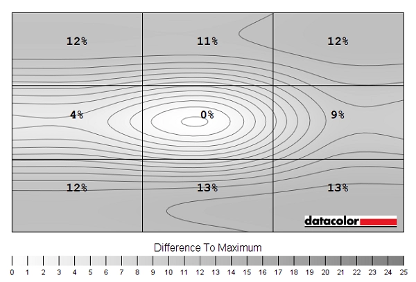
Luminance uniformity map
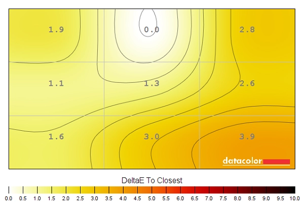
Colour temperature uniformity map
Contrast in games and movies
Lagom contrast tests
Colour reproduction
Colour gamut

Colour gamut 'Test Settings'
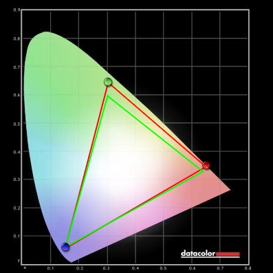
Q3279VWF colour gamut (for comparison)

Colour gamut 'sRGB'
Colour in games and movies
Viewing angles

The following video shows how this test appeared from a variety of viewing angles, as well as mixed and dark desktop backgrounds. The shifts in contrast and colour are less pronounced than you’d see on VA or IPS technologies from the sharper viewing angles displayed in the videos. The shifts are somewhat more pronounced than on some IPS-type models, however. There is a hazing (significant contrast reduction) from more gentle viewing angle changes than you’d typically see on an IPS-type model. You can also see the aforementioned ‘IPS glow’ which blooms out noticeably as viewing angle is adjusted, in the final third of the video.
Interlace pattern artifacts
Responsiveness
Input lag
Perceived blur (pursuit photography)


Responsiveness in games and movies
FreeSync – the technology and activating it

The AOC supports a variable refresh rate range of 48 – 75Hz. This means that if the game is running between 48fps and 75fps, the monitor will adjust its refresh rate to match. When the frame rate rises above 75fps, the monitor will stay at 75Hz and the GPU will respect your selection of ‘VSync on’ or ‘VSync off’ in the graphics driver. With ‘VSync on’ the frame rate will not be allowed to rise above 75fps, at which point VSync activates and imposes the usual associated latency penalty. With ‘VSync off’ the frame rate is free to climb as high as the GPU will output (potentially >144fps). LFC (Low Frame Rate Compensation) is not supported by this monitor, as that requires the upper limit (ceiling) to be at least 2x the lower limit (floor) of FreeSync operation. FreeSync is therefore deactivated if the frame rate falls below 40fps, with the monitor then respecting your choice of VSync and presenting you with either stuttering (VSync on) or juddering and tearing (VSync off).
Some users prefer to leave VSync enabled but use a frame rate limiter set a few frames below the maximum supported (e.g. 72fps) instead, avoiding any VSync latency penalty at frame rates near the ceiling of operation or tearing from frame rates rising above the refresh rate. Note that in the ‘Extra’ section of the OSD it will have ‘FreeSync’ listed as the ‘V. Frequency’ if the technology is enabled in the graphics driver, but this does not tell you whether it is currently being used by an application or not. Also note that FreeSync only removes stuttering or juddering related to mismatches between frame rate and refresh rate. It can’t compensate for other interruptions to smooth game play, for example network latency or insufficient system memory.
FreeSync – the experience
The 31.5″ 2560 x 1440 experience


Interpolation and upscaling

Video review
Timestamps:
Features & Aesthetics
Contrast
Colour reproduction
Responsiveness
Conclusion
![]()
Positives Negatives A vibrant and varied image with good ‘out of the box’ gamma tracking, a generous colour gamut and decent colour consistency
No support for wide gamuts (DCI-P3, Adobe RGB etc.)
Strong static contrast for the panel type, delivering decent distinctions between bright and dark Some graininess from the medium matte screen surface and the usual ‘IPS glow’ Very low input lag, a solid 75Hz pixel response performance and FreeSync working as we’d expect
A greater FreeSync range might have been nice, although that would be atypical
A large screen with fairly good resolution – and a product which offers exceptional value for money overall
A basic design with very little ergonomic flexibility and no VESA mounting provision
As an Amazon Associate I earn from qualifying purchases made using the below link. Where possible, you’ll be redirected to your nearest store. Further information on supporting our work.
