Author: Adam Simmons
Date published: February 11th 2018
Table of Contents
Introduction
We have tested or reviewed dozens of 24” 144Hz TN models. Pretty much without exception, these all use the same panel or a close variant of it – a panel first released back in 2011. The AOC G2590PX uses a newer panel, with marginally larger 24.5” screen size. We feel this refresh is long overdue and never would have thought the older panel would have seen action for this long. We put this monitor and novel panel through its paces in our usual gauntlet of tests, to see how it stacks up against models using the older panel variant.
Specifications
The monitor uses a 24.5” 144Hz TN panel from AUO. A slight difference compared to the older panel is that this is native 144Hz rather than 120Hz overclocked to reach 144Hz. The panel supports 8-bit colour via the usual 6-bit + FRC dithering. The specified grey to grey response time is (6-bit + FRC dithering) and has a specified grey to grey response time of 1ms specified response time. As usual, don’t take this figure too seriously. Some of the key ‘talking points’ of the monitor have been highlighted in blue below.
The monitor looks noticeably sleeker than most ~24” 144Hz monitors. The new panel design features a dual-bezel composition (or ‘3-sides frameless’ as AOC puts it), with a hard-outer component as well as an exceptionally slender panel border. The panel border is not readily visible when the monitor is switch off and blends in seamlessly. Including both components, the bezels are ~7.5mm (0.30 inches) thick at the top and sides. The bottom bezel features a thicker bezel in a slightly metallic dark matte red colour, with no real panel border visible – this is ~18mm (0.71 inches) thick. Another red element can be seen in the middle of the stand neck in the form of a dark red semi-matte plastic cable tidy loop. We didn’t find these red elements too gaudy or eye-catching when using the monitor and felt they looked quite pleasant really, but personal preferences differ. From the side the monitor appears quite slender at ~16mm at thinnest point and lumping out further towards the middle. You can also see the fully adjustable stand from this angle, which offers good ergonomic flexibility; tilt (19.5° backwards, 3.5° forwards), swivel (20° left, 20° right with a turntable beneath the stand base), height (130mm or 5.12 inches) and pivot (90° clockwise rotation into portrait). At minimum height the bottom edge of the stand clears the desk by ~64mm (2.52 inches) with the top ~390mm (15.35 inches) clear of the desk. The total depth of the monitor including stand is only ~190mm (7.48 inches), given the fairly conservative stand base design. This means you can push the monitor quite close to the wall if you wish, particularly useful if you have a smaller desk. The image below is a macro photograph taken on Notepad with ClearType disabled. The letters ‘PCM’ are typed out to help highlight any potential text rendering issues related to unusual subpixel structure, whilst the white space more clearly shows the actual subpixel layout alongside a rough indication of screen surface. A ‘regular’ (medium) matte anti-glare surface is used, providing good glare handling characteristics. It also offers quite strong diffusion of light emitted from the monitor, affecting the clarity and vibrancy potential more than ‘lighter’ screen surfaces. This also imparts a slightly grainy look to lighter shades, as explored in the review, although this is not the heavy or ‘smeary’ graininess that some matte surfaces provide. As shown in the image above, the monitor uses the standard RGB (Red, Green and Blue) stripe subpixel layout. This is the default expected by modern operating systems such as Microsoft Windows and Apple’s MacOS. There is therefore no need to run through the ClearType wizard as a Windows user, although you may want to adjust this according to preferences. As a Mac user there is no need to worry about text fringing from non-standard subpixel layouts, either. The subpixel spacing and shape is normal and no issues were identified in terms of text rendering. The monitor includes a range of ‘Game Mode’ presets; ‘FPS’, ‘RTS’, ‘Racing, ‘Gamer1’, ‘Gamer2’ and ‘Gamer3’. These lock off certain settings and set these to predefined values. The numbered ‘Gamer’ presets offer the most flexibility, although still don’t give you as much flexibility as with the ‘Game Mode’ set to ‘Off’. For example, the ‘Color Setup’ section of the OSD is inaccessible. It may be possible to tweak some of the greyed out settings in the ‘Color Setup’ menu (RGB channels, for example) by using AOC’s i-Menu software, according to user feedback. Ordinarily we wouldn’t pay too much attention to these less flexible ‘Game Mode’ presets, but as we explore later in the review they have a positive effect on the pixel response behaviour compared to setting this to ‘Off’. There are also various other settings which can be tweaked, with various combinations shown in the table below. The table gives key readings taken using a DataColor Spyder5ELITE colorimeter alongside general observations on the image characteristics. The monitor was left in its ‘Plug and Play’ state, connected to a Windows 10 machine without additional drivers or ICC profiles specifically loaded. It was connected to a Club3D Radeon R9 290 royalAce AMD FreeSync-compatible GPU via DP 1.2. We performed additional testing using an Nvidia GTX 1070 and found it performed much the same, aside from lacking support for FreeSync. The monitor was left running for over 2 hours before readings were taken. Unless otherwise stated, assume that default settings were used. The key exception being that refresh rate was set to 144Hz in Windows, although this did not affect the readings or observations specific to this table. When viewing the figures in this table, note that for most PC users ‘6500K’ for white point and ‘2.2’ for gamma are good targets to aim for.
Features and aesthetics


The OSD (On Screen Display) is controlled by a small joystick at the rear of the monitor, towards the bottom right. There is also a small front-facing pinprick power LED that glows a gentle white when the monitor is on and amber when it enters a low power state (loses signal to the PC). To turn the monitor off (low power state), you need to hold the joystick down for a couple of seconds. A brief single press will turn it back on. The video below runs through the OSD menu system.


The rear of the monitor features matte black plastic extensively, with the cable-tidy loop towards the bottom of the stand base being a notable exception. The stand attaches using a quick-release mechanism and can be detached by pressing a button beneath the attachment point. You can then mount the screen to an alternative 100 x 100mm VESA compatible stand or mount. The ports of the monitor are located near the bottom and are mainly down-firing; AC power input (internal power converter), 2 HDMI 1.4 ports, DP 1.2a, VGA, 3.5mm audio input and a 3.5mm headphone jack. There are also 4 rear-facing USB 3.0 ports (plus upstream), with the top downstream port also supporting fast-charging for compatible devices. Towards the left of the port area the OSD joystick and a 2W speaker is located, whilst towards the right the other 2W speaker and a K-Slot can be found. The speakers provide basic and rather tinny and low-quality sound output (with reasonable volume, at least). Note that the G2590FX is the same as this model, but has a tilt-only stand and lacks the USB ports.


The full 1920 x 1080 @ 144Hz is supported by either DP 1.2 or HDMI 1.4 on both Nvidia and AMD GPUs. Some GPUs will be restricted to 120Hz maximum via HDMI due to their port controller. Compatible AMD GPUs also support FreeSync, via DP 1.2a or HDMI. A DisplayPort cable, HDMI cable, VGA cable, 3.5mm audio cable and power cable is included as standard in the box. For users preferring more of an artistic aesthetic, there is an alternative variant of the monitor called the G2590PX/G2 (‘G2 Esports Signature edition’). The monitor itself is identical, but the chassis has an alternative design which is unique and eye-catching.

Calibration
Subpixel layout and screen surface
![]()
Testing the presets
Monitor Settings Gamma (central average) White point (kelvins) Notes Gamma1 (Factory Defaults) 2.1 6446K Very bright but otherwise well balanced overall. Much more appealing and richer than the usual ‘out of the box’ (or even ‘post-OSD-tweaking’) image presented by most 144Hz models of this sort of size. The usual TN caveats apply, with perceived gamma being higher further up the screen and lower further down the screen. This leads to a gradient of saturation, with shades appearing more saturated further up the screen and less saturated lower down the screen. Some variation (although less) comparing the centre to the sides as well. Gamma2 1.9 6443K As above with lower gamma, making the image look ‘washed out’. Gamma3 2.3 6441K As ‘Factory Defaults’ with slightly raised gamma. Some shades appear deeper, which some users might like. Saturation levels are particularly deep (too deep) further up the screen for some shades. The perceived differences aren’t as great as the average gamma values might suggest; there is plenty of central cross-over between the two curves so many shades appear largely the same. Game Mode = Gamer1 2.1 9119K Very bright with an extreme cool-tint to the image. Game Mode = Gamer2 2.1 7235K As above but a bit warmer (still cool-looking). Game Mode = Gamer3 2.1 7238K Identical to ‘Gamer2’. Color Temp. User 2.1 6452K Identical to ‘Factory Defaults’. LowBlue Mode = Weak 2.1 5832K This is a mild Low Blue Light (LBL) setting. The image appears warmer and the blue colour channel is weakened. Blue light output from the monitor is reduced. LowBlue Mode = Medium 2.2 5459K As above but a greater reduction in blue light output and a warmer look to the image. Quite an effective LBL setting. LowBlue Mode = Strong 2.2 5165K As above, with the blue colour channel now weakened significantly. This setting is appropriate for relaxing evening viewing and other times when you might like to minimise blue light exposure. This is most effective when combined with a reduction in brightness. Test Settings (see below) 2.2 6327K The image appears fairly similar to the factory defaults, but is marginally warmer in tone when initially compared. Your eyes quickly adapt to this minor change. The brightness is also significantly reduced and gamma averages ‘2.2’ following these tweaks.
Out of the box the image was very bright but otherwise well-balanced. The usual TN caveats applied, namely perceived gamma and saturation changes at different points of the screen. But the image was a lot richer and more appealing than you’d generally find on ~24” 144Hz monitors. As explored later, there are slight improvements in colour gamut and the perceived gamma and saturation changes are a bit less pronounced than on the older versions of this panel (AUO M240HW01). For our ‘Test Settings’ we got a bit crafty, because the monitor’s pixel responsiveness was better tuned once a ‘Game Mode’ preset was activated. Because the ‘Color Setup’ menu and therefore colour channels are blocked off when using any of these, you need to make use of the ‘LowBlue Mode’ settings to warm the image up. And as per the table, the image tends to be far too cool-tinted otherwise, so that’s highly desirable. As you can see below, the gamma curve tracked pretty close to the desirable ‘2.2’ curve following the tweaks we made. Given the perceived gamma changes of the panel, inter-unit variation and other drawbacks associated with ICC profiles we won’t be providing any for this model. Using somebody else’s profile is likely going to be counter-productive in this case. The ‘LowBlue Mode’ LBL settings included were effective in cutting blue light output from the monitor and something we personally made use of. Not only for ‘relaxing evening viewing’ (our own viewing comfort in the evening, but not for testing) but also for part of our ‘Test Settings’. Note that these modes are applied over the top of other settings, so they will yield a greater reduction in blue light output under some presets than others. It’s also important to reduce brightness to minimise blue light output from a monitor and these settings don’t specifically reduce that. Although manual control of brightness can be maintained, unless you set ‘Game Mode’ to ‘FPS’, ‘RTS’ or ‘Racing’ or set ‘Color Temp.’ to ‘sRGB’. For our ‘Test Settings’ we set ‘Game Mode’ to ‘Gamer2’ and used this as a base (‘Gamer3’ is identical and would have been equally appropriate). It was necessary to activate a ‘Game Mode’ to get the most out of the pixel responsiveness of the monitor, as explored later on. This locked off the colour channels, but a degree of control was still offered by the ‘LowBlue Mode’ settings. Slight adjustments to this and various other settings, as listed below, provided good results on our unit. Note that individual units and preferences vary, so these settings aren’t necessarily going to be optimal in all cases. Anything not mentioned was left as default – we’ve also included the refresh rate used in Windows just for reference. LowBlue Mode= Weak Overdrive= Medium Brightness= 38 (according to preferences and lighting) Refresh rate (Windows setting)= 144Hz We used a BasICColor SQUID3 (X-Rite i1Display Pro) to measure the luminance of black and white using a range of settings. From these values, static contrast ratios were calculated. The table below shows this data, with blue highlights indicating the results under our ‘Test Settings’. Black highlights indicate the highest white luminance, lowest black luminance and highest contrast ratio recorded. Assume that any setting not mentioned was left at default, with the exceptions already mentioned in the calibration section.

Gamma 'Test Settings'
Test Settings
Game Mode= Gamer2
Contrast and brightness
Contrast ratios
Monitor Settings White luminance (cd/m²) Black luminance (cd/m²) Contrast ratio (x:1) 100% brightness 464 0.44 1055 80% brightness 377 0.37 1019 60% brightness 289 0.28 1032 40% brightness 206 0.2 1030 20% brightness 126 0.12 1050 0% brightness 44 0.04 1100 Gamma1 (90% brightness, Factory Defaults) 421 0.41 1027 Gamma2 421 0.41 1027 Gamma3 421 0.41 1024 Game Mode = Gamer1 334 0.44 759 Game Mode = Gamer2 405 0.44 920 Game Mode = Gamer3 405 0.44 920 Color Temp. User 421 0.41 1027 LowBlueMode = Weak 408 0.41 995 LowBlueMode = Medium 403 0.41 983 LowBlueMode = Strong 399 0.41 973 Test Settings 167 0.18 928
The average contrast ratio with only brightness adjusted on the G2590PX was 1048:1, which is where we’d expect it to be given the panel specifications. The minimum contrast ratio recorded was for ‘Gamer1’, where the white point is way out of whack. The ‘LowBlueMode’ settings had minimal impact on the contrast ratio, with good values maintained even under the ‘Strong’ setting. There was a slight reduction following the adjustments made for our ‘Test Settings’, but at 928:1 the static contrast remained respectable. The peak white luminance recorded on this table was an exceptionally bright 463 cd/m², whilst the minimum white luminance was a fairly dim 44 cd/m². This gives the monitor an excellent luminance adjustment range of 419 cd/m² (without loss of contrast), which is pleasing.
If you have the ‘GameMode’ disabled, you can activate a Dynamic Contrast setting called ‘DCR’ (Dynamic Contrast Ratio). This allows the backlight brightness to adjust according to the overall level of light and dark being displayed on the screen. As usual, the backlight adjusts as a single unit and doesn’t support any sort of local dimming. The backlight adjusted at a fairly gradual pace to changes in screen brightness, dimming well for predominantly dark content but staying rather bright otherwise. As usual we prefer manual brightness control over a gimmicky ‘Dynamic Contrast’ setting.
PWM (Pulse Width Modulation)
The monitor does not use PWM (Pulse Width Modulation) at any brightness level. Instead, DC (Direct Current) dimming is used to regulate backlight brightness. The backlight is therefore considered ‘flicker-free’, which will come as welcome news to those sensitive to the side-effects of PWM or who simply prefer to know a flicker-free backlight is used.
Luminance uniformity
Whilst observing a black screen in a dark room, using our ‘Test Settings’, we observed very little backlight bleed and just a touch of clouding, towards the bottom left in particular. The image below shows this. It’s important to remember that individual units vary when it comes to uniformity issues, including backlight bleed and clouding. Nonetheless, when compared to your average model that use the older panel, the clouding here was more constrained. You can also observe a slight silver or golden sheen (depending on viewing angle) which ‘blooms out’ when you view the monitor from a sharper viewing angle. This is very different to ‘IPS glow’ as it isn’t readily observed from a normal viewing position and isn’t as obvious from a given angle. It’s shown in the viewing angles video later on.

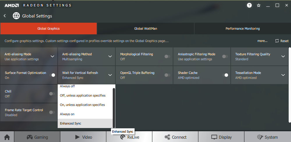
The Spyder5ELITE was used to assess the white uniformity of the monitor, represented by 9 equally spaced white quadrants running from the top left to bottom right of the screen. The table below shows the deviation between each point and the brightest recorded point as well as the percentage deviation between each quadrant and the brightest recorded point. The luminance uniformity was reasonable. The brightest point recorded was ‘quadrant 9’ towards the bottom right of the screen (163.1 cd/m²). The greatest deviation from this occurred at ‘quadrant 1’ towards the top left of the screen (142.1 cd/m², which is 13% dimmer than centre). Elsewhere deviation was between 3 – 12% compared to the brightest point, with an overall average deviation between the brightest point and each quadrant of 8.25%. Note that individual units vary in terms of uniformity and that further deviations can be expected beyond the points measured. Also note that the viewing angle limitations of the panel introduce differences in perceived luminance that aren’t accounted for in these measurements, with variation depending on which part of the screen you’re observing. For those who prefer a graphical representation of the deviations, the contour map below delivers this. Here, darker greys represent lower luminance and hence greater deviation from the brightest point than lighter greys. The percentage deviation between each quadrant and the brightest point is also given. Due to the aforementioned viewing angle limitations, we will not be providing colorimeter-based analysis of the colour temperature uniformity of the monitor. The perceived colour temperature can vary significantly depending on which part of the screen you’re observing, from a normal viewing position. Any readings provided here have the potential to be highly misleading. On Battlefield 1 (BF1) the contrast performance was good overall. Dark shades appeared fairly deep and there was a good level of detail in darker areas for most of the screen. Due to perceived gamma shifts, dark shades appeared somewhat lighter than intended lower down the screen which added ‘unintended detail’. For example, little imperfections with textures etc. that should be masked or appear blended were more visible here. The central bulk of the screen had largely appropriate detail levels, whilst the top of the screen appeared with higher than desirable perceived gamma. This made dark shades appear deeper than intended, masking some detail. There was no ‘IPS glow’ or anything of that nature, whilst lighter shades stood out nicely against darker backgrounds. The screen surface imparted a slight graininess to lighter shades but nothing that we’d consider ‘heavy’ or ‘smeary’ really. Dirt Rally showcased similar strengths and weaknesses in contrast performance. The level of detail in dark areas was again largely as it should be, but some detail was masked further up and extra detail visible lower down. The dark materials of a shaded car interior, for example, looked somewhat brighter than it should when observing elements near the bottom of the screen. The night environments on this game are designed to be pitch dark in places and, overall, this monitor did a reasonable job at representing them. The lack of ‘IPS glow’ and reasonable static contrast helped ensure these areas didn’t look flooded, although the ‘atmosphere’ was not the same as on models with much stronger static contrast and more consistent dark shade reproduction. Some VA models, for example. Brighter elements such as car headlights lacked the purity of some ‘lighter’ matte or glossy screen surfaces, but were free from heavy graininess and free from a thick layer of ‘smearing’ over the image. We also observed the Blu-ray of Star Wars: The Force Awakens, with contrast in mind. This reflected our observations on the game titles, really, with the film being quite watchable but not as atmospheric as on models with much stronger contrast. Lagom’s tests for contrast were used to more closely analyse contrast performance, highlighting weaknesses in quite a specific way. The following observations were made from a normal viewing position, eyes around 70cm from the screen. The colour gamut of the G2590PX (red triangle) was compared with the sRGB colour space (green triangle), as shown in the top image below. The bottom image shows the typical colour gamut of a model using the older version of the panel, in this case the ViewSonic XG2402. The monitor offers decent sRGB coverage (98% measured – similar to the older model), with just a little under-coverage in some regions and slight over-coverage in others. The over-coverage in the green and red region of the diagram is more extensive than on the older model. This allows the monitor to reproduce shades with a touch of extra vibrancy. The colour gamut is by no means as generous as on some models, even those that don’t reach for traditional wide gamuts such as Adobe RGB. But the slight edge compared to models using the older panel will still be welcomed by many. On Battlefield 1 (BF1) shades appeared with decent depth and a fairly rich but natural look overall. Things certainly didn’t look ‘washed out’ as they might on some 144Hz models with poor gamma calibration. Nor do they have the vibrant ‘pop’ of some models with wider colour gamuts. The most flattering comparison to make would be with competing models with good gamma calibration, such as some of the ViewSonic models. The slightly wider colour gamut of this model helped add a touch of extra vibrancy on top of this, without any obvious oversaturation. There were shifts in saturation depending on which section of the screen, however. Perceived gamma is higher further up the screen (extra saturation and a deeper look) and lower further down the screen (weaker saturation and a more muted look). Although these shifts were still undeniably there, they were a bit less pronounced than on the older panel used on pretty much every competing model currently. This all helped give some shades such as rich greens and vibrant yellow and orange flames a decent lick of vibrancy, more so higher up the screen but to a decent degree centrally as well. Our experience on Dirt Rally echoed these findings, with natural and reasonably vivid-looking racing environments. The subtle variety of shades was not up to the level of models with more consistent colour reproduction, notably IPS-type models – due to the aforementioned saturation changes. But there were still some good rich greens and earthy browns. The bottom of the screen appeared less saturated and these shades lost their edge, but they didn’t look quite as muted as usual here. The car liveries showcased some decent vibrant shades, such as bright blues and fairly deep reds and purples. These lacked the ‘pop’ of some screens and weren’t as striking, but were still quite eye-catching in places. We also made some observations on the Blu-ray of Futurama: Into the Wild Green Yonder. Because there are large areas of individual shade shown on this movie, it’s a notoriously unforgiving test for colour consistency and weaknesses here are quite obvious. The same applies to other ‘2D’ animated movies in general. As expected, the saturation changes were readily apparent here. Character skin tones, for example, changed depending on where on the screen the character appeared. The monitor did a decent job and showcasing some fairly vivid-looking neon shades and decent deep shades, though, with some neon purples and deep blues that appeared quite eye-catching even lower down the screen. We used Lagom’s tests for viewing angle to analyse colour consistency and viewing angle performance in a more specific way. The following observations were made from a normal viewing position, eyes around 70cm from the screen. Some models exhibit what we refer to as ‘interlace pattern artifacts’, particularly but by no means exclusively those with high refresh rates. These artifacts can also be referred to as ‘inversion artifacts’ or ‘scan lines’. Sometimes static interlacing patterns are visible, whereby shades are broken up into thin (usually vertical) lines that alternate between a slightly lighter and slightly darker than intended variant of the shade. Dynamic interlacing patterns may also be observed, which take many forms and sometimes appear as a sort of mesh, grid or lines or ‘interference’ when you observe motion on the monitor. The G2590PX did not show obvious static interlace pattern artifacts, but we did observe quite strong dynamic interlace patterns. When movement was observed on the screen, the image sometimes appeared to break up into an interference pattern composed of vertical pinstripes. We found it quite noticeable, even from a viewing distance of well over 70cm. Although we noticed the effect and would much prefer it wasn’t there, we wouldn’t say it was too distracting when focusing on gameplay. At lower refresh rates this effect became more pronounced, being quite obtrusive at 60Hz to our eyes. It’s worth remembering that how obvious a user finds these patterns depends on the viewing distance, their eyesight and sensitivity to such things. A sensitive camera and a small tool called SMTT 2.0 was used to assess the input lag of the G2590PX, comparing with a number of monitors of known latency. Over 30 repeat readings were taken to try to maximise accuracy. Using this method we calculated 3.48ms (~ ½ a frame at 144Hz) of input lag. This value takes into account both the element of input lag you ‘see’ (pixel responsiveness) and the element you ‘feel’ (signal delay). It indicates a very low signal delay, which even sensitive users shouldn’t have a problem with. Note that we have no way to accurately measure input lag when FreeSync is doing its thing. The measured values for input lag were similar with ‘Low Input Lag’ enabled and with FreeSync enabled on the GPU, which greys the setting out. Our responsiveness article explores the factors which affect responsiveness of a monitor. One of the most important factors explored is the notion of ‘perceived blur’, contributed to by both the pixel responsiveness of the monitor and the movement of your eyes as you track motion on the screen. The second factor is generally the predominant contributor to perceived blur on modern monitors. The article also explores a photography method called ‘pursuit photography’, which motion on a monitor in a way that reflects both elements of perceived blur. A moving camera is used rather than a static one to capture a snapshot of motion on the screen, giving a good idea of what the eye actually sees at that given moment in time when observing motion on the screen. The images below are pursuit photographs taken using the UFO Motion Test for ghosting, with the test running at its default speed of 960 pixels per second. This is a good practical speed for taking such photographs at and demonstrates both elements of perceived blur nicely. The UFOs move across the screen from left to right at a frame rate matching the refresh rate of the display. The first set of photos shows the results with the monitor set at 60Hz and the second with the monitor set at 144Hz. All three rows of the test (dark, medium and light background) are used to showcase a range of different pixel transitions. All of the ‘Overdrive’ settings were tested under our ‘Test Settings’; ‘Off’, ‘Weak’, ‘Medium’ and ‘Strong’. We’ve also included some reference shots, including a Dell S2417DG (144Hz and 60Hz) and ViewSonic XG2401 (144Hz). The Dell performs its pixel responses very rapidly and indicates how things should look without pixel responses being a significant limiting factor. The ViewSonic is a useful reference as many users find its performance to be satisfactory, even though the pixel responsiveness is slightly weaker than optimal for the transitions shown. Note: Rather strangely, the pixel overdrive worked more effectively with a ‘Game Mode’ active (as it was under our ‘Test Settings’). For that reason, we’ve included ‘Medium’ without any game mode active for comparison. The differences are not accounted for in differences in image setup and persisted even if the monitor was calibrated in the same way. The other response time settings also worked more effectively with a game mode active – ‘Strong’ provided a lot of overshoot regardless. Note that use of an Nvidia GPU or an AMD GPU with FreeSync enabled or disabled did not change this behaviour. The images above were captured with the monitor set to 60Hz. The UFO appears broad and blurred without distinct details, indicating a moderate amount of perceived blur due to camera (eye) movement. Varying amounts of trailing can be seen behind the UFOs due to sub-optimal pixel responses. With ‘OD’ set to ‘Off’ the trailing is most significant, is quite bold and extends quite far behind the object. The ‘Weak’ setting cuts this down significantly, although a faint powdery trail remains. The ‘Medium’ setting removes all conventional trailing but replaces it with some overshoot (inverse ghosting) with the trailing appearing darker than the shades involved in the transition. Setting ‘OD’ to ‘Strong’ provides very strong overshoot, a with a veritable disco of bright and garish trailing appearing on the screen. With ‘OD’ set to ‘Medium’ and ‘Game Mode’ set to ‘Off’, the trailing appears more pronounced than with a game mode enabled at the same setting. There is actually some overshoot as well as conventional trailing that’s quite noticeable for the dark background. The medium background also shows this to a degree, although the light background is free from any obvious weaknesses. From this you could conclude that ‘Weak’ or ‘Medium’ (with a game mode active) is optimal at 60Hz, depending on preferences for a little bit of conventional trailing vs. some overshoot. The ideal result would really be some way between these. With the refresh rate bumped up to 144Hz, as shown above, the perceived blur is significantly reduced. The UFO appears narrower and more detailed, indicating a significant reduction in perceived blur due to eye movement. There is also varying degrees of tailing behind this due to sub-optimal pixel responses. With ‘OD’ set to ‘Off’ the trailing is quite bold and appears like a sort of dark flare behind the object for the red UFO body. The ‘Weak’ setting cuts this down significantly, but some powdery trailing still remains. The ‘Medium’ setting yields further improvement, with a small amount of overshoot for the medium and light backgrounds in particular. The ‘Strong’ setting gives very obnoxious and painfully obvious overshoot, with distracting bright trailing behind the UFO. The ‘Medium’ setting with ‘Game Mode’ set to ‘Off’ has a fair bit of trailing. This is strongest for the dark background where it appears to actually extend the object due to its intensity – it’s short and sharp but very saturated. Overall, trailing there is more noticeable than the ‘Weak’ setting or arguably ‘Off’ with a game mode active. We deem ‘Medium’ (with a game mode active) to be the optimal setting at 144Hz and settled with that for our subjective testing. The cutting down of conventional trailing vs. ‘Weak’ with the introduction of only minor overshoot delivered the best experience in our view. On Battlefield 1 (BF1) the monitor provided strong responsiveness, with a fluid experience at frame rates keeping up with the 144Hz refresh rate. The monitor displays up to 2.4 times as much visual data every second as a 60Hz monitor, which notably improves the gaming experience in two ways. Firstly, it improves the ‘connected feel’ – as you interact with the character and your game world, you feel a certain precision and responsiveness with the mouse in particular that is lacking at lower refresh rates. This is also aided by the low input lag of the AOC. Secondly, the high frame rate and refresh rate combination significantly reduces perceived blur as demonstrated earlier with the pursuit photographs. When running about, quickly turning the character or driving about in a vehicle, the game world remains more sharply focused and it’s easier to track and engage enemies. The ‘connected feel’ then helps your precision when you aim – overall, a winning combination. As explained earlier, pixel responsiveness also influences perceived blur. On this model most pixel responses were very rapid and it certainly felt and looked like a highly responsive 144Hz TN model should, overall. There were some minor weaknesses, which our trained eyes could spot but that most users wouldn’t notice or find bothersome. Firstly, there were some slightly slower than optimal pixel transitions. There were no pixel transitions that were obnoxiously slow, but some that were slow enough to give just a little hint of trailing in places. This was always faint and short-lived, even where the monitor was performing its slowest transitions. Where dark objects such as gun emplacements were set against medium shades (a grey-blue sky, for example) you could see a little bit of trailing behind the object. There was also a little bit of overshoot in places, but this was again faint and, in our view, entirely undistracting. There were no bright ‘halo’ trails, obvious dark trails or anything we found eye-catching. Just some semi-transparent (‘snail slime’) or slightly darker than intended trailing in places. The overall performance remained very good even with these weaknesses in mind. By way of comparison, the ViewSonic XG2401 which many users find perfectly responsive and that we used as a reference earlier has more extensive trailing. And the infamous BenQ XL series models have significantly stronger overshoot using their optimal response time (AMA – Advanced Motion Acceleration) setting. Dirt Rally provided a similar experience. The perceived blur was greatly reduced by the increased frame rate and refresh rate supported by the G2590PX. This gave the environments and objects within a sharper look whilst racing on the tracks and is provided an experience which some users would find more comfortable (especially if they suffer from motion sickness). The ‘connected feel’ also enhanced the interactions with the game world. This factor was less beneficial to us compared to on FPS titles like BF1, although more serious racing fans with proper gaming controllers (a steering wheel rather than keyboard, perhaps) would certainly appreciate this. There were again some weaknesses in terms of a small amount of trailing and a little overshoot here and there, but nothing that caught our eyes – even when were specifically aware of what we were looking for. Finally, we tested our Blu-ray test titles. The monitor exhibited no weaknesses in terms of pixel responsiveness and these titles looked very much as they should in terms of motion performance. Their pace and fluidity was limited by the low frame rate (~24fps) at which they run. The fact that this frame rate divides neatly into the refresh rate (144Hz) helped reduce juddering compared to running such titles at 60Hz, too. AMD FreeSync is a variable refresh rate technology, an AMD-specific alternative to Nvidia G-SYNC. With this technology, the monitor adjusts its refresh rate dynamically, where possible, to match the frame rate being outputted by the GPU. Both the responsiveness article and the G-SYNC article linked to previously explore the importance of these two elements being synchronised. Essentially, a mismatch between the frame rate and refresh rate can cause stuttering (VSync on) or tearing and juddering (VSync off). An additional benefit of FreeSync is reduced latency compared to running with VSync on, within the variable frame rate environment in which it operates. FreeSync requires a compatible AMD GPU such as the Club3D Radeon R9 290 royalAce used in our test system. There is a list of GPUs which support the technology here, with the expectation that future AMD GPUs will also support the feature. The monitor must support ‘VESA Adaptive-Sync’ for at least one of its display connectors, as this is the protocol that FreeSync uses. The G2590PX supports FreeSync via DP 1.2a (‘DP 1.2a+’) as well as HDMI on compatible GPUs. AMD’s recent drivers include Radeon Settings, which makes activation of the technology very simple. It should be automatically enabled once the monitor is connected, but you can check its status by opening ‘AMD Radeon Settings’ and clicking on ‘Display’. You should then ensure that the first slider, ‘AMD FreeSync’, is set to ‘On’. If you hover over this, it will also report the variable refresh rate display supported by the display. Note that the image below is for a different monitor and is just used as an example here. VSync is configured in the ‘Gaming’ section of ‘Radeon Settings’, where it is referred to as ‘Wait for Vertical Refresh’. You can either configure this globally under ‘Global Settings’ or for each game individually. The default is ‘Off, unless application specifies’ which means that VSync will only be active if you enable it within the game itself, if there is such an option. Such an option does usually exist – it may be called ‘sync every frame’ or something along those lines rather than simply ‘VSync’. Most users will probably wish to enable VSync when using FreeSync to ensure that they don’t get any tearing. You’d therefore select either the third or fourth option in the list, shown in the image below. The fifth and final option, ‘Enhanced Sync’, is an alternative to VSync which allows the frame rate to rise above the refresh rate (no VSync latency penalty) whilst potentially keeping the experience free from tearing or juddering. This requires that the frame rate comfortably exceeds the refresh rate (e.g 200fps +) rather than just rising slightly above it. We ran a number of game titles on the monitor to test its FreeSync capabilities. Given that the experience was similar on all of them, we’ll instead focus on a single title for this section; Battlefield 1 (BF1). The flexible graphics options on this title also allowed the full range of refresh rates to be tested. Using settings that provided a good balance of performance and image quality, our Radeon 290 was able to put in a decent performance and output fairly high frame rates overall. Despite this, it was rare that the frame rate would consistently stay as high as 144fps. Without FreeSync active, even slight dips below this would cause tearing and juddering (VSync off) or stuttering (VSync on). Although these imperfections aren’t as jarring as at lower frame rates and refresh rates, they are certainly still noticeable to sensitive users. Increasing the graphics settings, for example using the ‘Ultra’ preset, would cause more significant drops in frame rate. Frequently into the double-digits, occasionally close to 100fps. There was an increase in perceived blur and decrease in ‘connected feel’, unavoidable with a decrease in frame rate, regardless of FreeSync being active. But things remained decent in that respect and the reduction in tearing and stuttering was a very nice bonus for sensitive users such as ourselves. By further increasing graphics settings, for example increasing the ‘Resolution Scale’ setting, more dramatic losses in frame rate were observed. As things dropped further, at times well below 60fps even, it was certainly nice to have tearing and stuttering kept in check by FreeSync. Indeed, such imperfections are very noticeable to us at such low frame rates. We also found the lack of ‘connected feel’ and increase in perceived blur to be very unattractive at these relatively low frame rates. The experience was certainly very different to at much higher frame rates, a stark contrast to 144fps. Below 30fps, LFC kicked in as expected and kept tearing and stuttering at bay. Such low frame rates give a very uncomfortable gaming experience, though, and there is a perceived juddering due to the very low frame rate. Regardless of the lack of tearing and stuttering, things are far from fluid and not at all what this monitor is all about. A waste of potential, to put it mildly. There were a few other observations worth making in relation to decreased frame rates and hence refresh rates with FreeSync active. Firstly, there was a slight increase in overshoot. We still found it to be minor and far less noticeable than on most FreeSync models, including AOC’s G2460PF. As noted earlier, there were some quite noticeable interlace pattern artifacts at a static 60Hz refresh rate. These occurred where FreeSync was active and the frame rate dropped to ~60fps or below. They didn’t suddenly kick in or anything like that, they just gradually became more noticeable as refresh rate dropped and were at their most pronounced by ~60fps. Finally, we tested FreeSync whilst watching some video content. If viewing full screen using video software or certain web browsers, the monitor will set its refresh rate to either match or conform to a multiple of the frame rate of the content. This helps smooth out the juddering (stuttering) that results from the two not aligning in this way. You don’t need to keep manually adjusting your refresh rate depending on whether the content was 24fps, 30fps, 50fps or 60fps etc. to minimise juddering. We can confirm that this worked with Microsoft Edge and Google Chrome, but not on Mozilla Firefox. This could be dependent on the version of the web browsers used, however. Given our observations regarding interlace patterns becoming more noticeable at these lower refresh rates, you’d have to decide whether you find these too noticeable to offset any potential benefit from reduced juddering. ~24” 144Hz monitors nearly always use the same AUO TN panel and have done for several years now. The AOC G2590PX offered a refreshing change, using a newer 24.5” AUO TN panel with thinner bezels. Aesthetically speaking the monitor was quite pleasant and more modern-looking than many of its thicker-bezelled counterparts using the older panel. But we were more interested in the image performance. Out of the box the monitor offered a very bright but overall well-balanced image. Unlike the majority of competing models, it didn’t look ‘washed out’ by completely out of whack average gamma. And even compared to models without the average gamma problem, the image appeared slightly richer. The colour gamut was a touch wider, bringing a bit of extra saturation. And the colour consistency was a bit better, limiting the perceived gamma and saturation shifts. These were certainly still there, though, and to our eyes there was no mistaking this was a TN panel. Expecting any dramatic differences in that respect would be a setup for disappointment – but seeing slight improvement was still nice. Static contrast was quite in-line with our expectations given the specifications of the panel. But that isn’t always something you can take for granted, as the ViewSonic XG2402 we reviewed just prior to this demonstrated. Whilst we don’t like to put too much weight on uniformity, as it can vary between individual units of the same model, we were quite happy with the dark uniformity of our unit. Clouding in particular was more subdued that we usually see from competing models. The screen surface was very similar to that used on the older panel. It would have been nice for a lighter/smoother matte surface to have been employed as seen on some higher resolution panels. But there was not an obtrusive layer of obvious graininess, even if light shades could have looked smoother. For monitors like this, much of their appeal comes from their responsiveness. In that respect the monitor performed quite well, but not perfectly. There was very little input lag to speak of and, overall, pixel responses were very snappy. It had the sort of look and feel we’d expect from a highly responsive 144Hz TN model. There were some weaknesses in pixel responsiveness, but they were pretty minor. A little but of overshoot and trailing in places – but we stress the little, it’s not something we feel most users would notice. AMD FreeSync also worked well on this model, with a full range of 30 – 144Hz (plus LFC) supported. As usual low frame rates remained low frame rates regardless of the technology, but the lack of tearing and stuttering from frame rate and refresh rate mismatches was something we always welcomed. One element we were less welcoming of was the ‘interlace pattern artifacts’. We found these quite obvious at 144Hz and increasingly obvious at lower refresh rates, particularly around or below 60Hz. This is significant when using FreeSync, because reduced frame rates drag down the refresh rate as well and introduce these more noticeable interlace patterns. We should stress that individual sensitivity to these varies and they are common, in some form, on most high refresh rate monitors and some 60Hz monitors as well. Still, we would have much preferred that they weren’t there in the first place and found this manifestation of them quite obvious. Another interesting (but potentially annoying) quirk with this monitor is that the pixel response behaviour is slightly better with a ‘Game Mode’ active. We were able to set the monitor up in a perfectly satisfactory way by using one of the custom game mode settings. But you have to remember that individual units vary and this level of tweaking can put some users off. Furthermore, the fact that you never have access to the colour channels with a ‘Game Mode’ active could prove problematic on some units or according to some user preferences. You need to rely on ‘LowBlue Mode’ settings if you wish to adjust the white point, but the steps there are quite dramatic and you have no control over the green channel. Overall, then, the monitor delivers an experience with a few bonuses compared to the sea of models using the older AUO panel. But there are a few niggles as well, which users will have to weigh up for themselves. If they are deemed only minor annoyances or not at all problematic, then this model is worth careful consideration. The bottom line; a highly responsive monitor with respectable image quality, a step above models using ‘the older panel’ in some respects. But some minor niggles to go with it – because no monitor is perfect.

Luminance uniformity table

Luminance uniformity map
Contrast in games and movies
Lagom contrast tests
Colour reproduction
Colour gamut

Colour gamut test settings

Colour gamut ViewSonic XG2402
Colour in games and movies
Viewing angles

The video below shows the results of the Lagom text test, a mixed desktop background and dark desktop background from a variety of viewing angles. Significant colour and contrast shifts can be observed for the mixed desktop background, particularly vertically. Colour inversion can be seen at a sharp enough angle. For the dark desktop background you can see a slight silver or golden sheen, particularly at the sharpest angles shown in the video. This is something we’d call ‘TN glow’, but it’s very different to ‘IPS glow’ as it isn’t as intense nor is it readily visible from a normal viewing position.
Interlace pattern artifacts
Responsiveness
Input lag
Perceived blur (pursuit photography)


Responsiveness in games and movies
FreeSync – the technology and activating it

The AOC supports a variable refresh rate range of 30 – 144Hz via DP (ceiling varies via HDMI, depending on GPU, and may be limited to 120Hz). That means that if the game is running between 30fps and 144fps, the monitor will adjust its refresh rate to match. When the frame rate rises above 144fps, the monitor will stay at 144Hz and the GPU will respect your selection of ‘VSync on’ or ‘VSync off’ in the graphics driver. With ‘VSync on’ the frame rate will not be allowed to rise above 144fps, at which point VSync activates and imposes the usual associated latency penalty. With ‘VSync off’ the frame rate is free to climb as high as the GPU will output (potentially >144fps). AMD LFC (Low Framerate Compensation) is also supported by this model, which means that the refresh rate will stick to multiples of the frame rate where it falls below the 30Hz (30fps) floor of operation for FreeSync. If a game ran at 22fps, for example, the refresh rate would be 44Hz to help keep tearing and stuttering at bay. This feature is used regardless of VSync setting, so it’s only above the ceiling of operation where the VSync setting makes a difference.
If the monitor is connected to a compatible GPU and the driver is configured correctly, you will see ‘FreeSync’ listed as the ‘V.Frequency’ in the ‘Extra’ section of the OSD. This will not indicate whether or not FreeSync is actively being used, simply that your system supports it. Finally, it’s worth remembering FreeSync only removes stuttering or juddering related to mismatches between frame rate and refresh rate. It can’t compensate for other interruptions to smooth game play, for example network latency or insufficient system memory.
FreeSync – the experience
Conclusion
Positives Negatives Quite pleasing ‘out of the box’ performance, richer colour output than competing models using the older panel Colour consistency slightly improved compared to the older panel, but shifts in perceived gamma and saturation still clearly identify this as a TN model
Good static contrast (on par with specifications) and less clouding on our unit than we typically see on competing models Slight graininess from medium matte screen surface and gamma inconsistencies affect perceived detail levels at different sections of the screen Strong pixel responsiveness and very low input lag deliver a convincing and fluid 144Hz performance. AMD FreeSync works as intended, with a good variable refresh rate range
Optimal pixel response behaviour requires you to have a ‘Game Mode’ active, which is more restrictive with image settings. Minor weaknesses in terms of pixel responsiveness and overshoot and some noticeable (to our eyes) interlace pattern artifacts Quite a stylish appearance in our view, with slimmer bezels than competing models and a touch of colour without looking gaudy. Good ergonomic flexibility as well
1920 x 1080 (Full HD) resolution won’t cut it for some users in terms of pixel density or screen real-estate
