Author: Adam Simmons
Date published: June 16th 2022
Table of Contents
Introduction
Whilst a number of large screens with high resolutions and refresh rates are now available, some seek something a bit smaller and less expensive. The AOC 24G2SPU (24G2SP) of the G2 series offers this as a follow-up to the popular 24G2U (24G2). The monitor may look the same on the outside, but it features a refreshed version of the panel with slight bump up in maximum refresh rate to 165Hz and higher specified maximum luminance. We take a look at this model in our usual suite of tests which spans desktop usage, video watching and gaming.
Specifications
The monitor is based on a 23.8” IPS (In-Plane Switching) type panel from BOE-acquired company Panda. This supports a 165Hz refresh rate, 1920 x 1080 (Full HD or 1080p) resolution and 8-bit colour. A 4ms grey to grey response time, alongside a 1ms MPRT response time using the included strobe backlight setting – but as usual, pay little attention to such specified response times. Some of the key ‘talking points’ for this monitor have been highlighted in blue below, for your reading convenience.
The monitor has slightly ‘gamery’ styling, with extensive use of matte black plastic with a few dark metallic-look red plastic elements. These red elements are better blended by eye than they appear in pictures so don’t really jump out at you. The stand base has a star-shaped design with 2 longer front legs and 2 shorter rear legs. This is black matte plastic on the ‘SPU’ and satin silver-coloured plastic on the ‘SP’. The top and side bezels are dual-stage, with a very slim panel border flush with the rest of the screen plus a thin hard plastic outer part. Including both components the bezels are ~4.5mm (0.18 inches) at the top and sides. The bottom bezel is ~18mm (0.71 inches) thick, black matte plastic with a light grey AOC logo printed centrally and a dark red metallic-effect bottom lip. The screen itself is the main focal point from the front, with a medium matte anti-glare screen surface which is explored later. The images below show the refresh rates supported for the native 1920 x 1080 (Full HD or 1080p) resolution. The first image shows some of the refresh rates supported via DP and HDMI, with the resolutions categorised in the EDID of the monitor as ‘TV’ resolutions and listed here under ‘Ultra HD, HD, SD’. The second and third images show the remaining refresh rates supported via DP and HDMI, respectively – categorised in the EDID of the monitor and listed here as ‘PC’ resolutions. Note that a ‘4k x 2k, 3840 x 2160’ downsampling mode is not included, so the monitor will not accept a 3840 x 2160 (‘4K’ UHD) signal. The image below is a macro photograph taken on Notepad with ClearType disabled. The letters ‘PCM’ are typed out to help highlight any potential text rendering issues related to unusual subpixel structure, whilst the white space more clearly shows the actual subpixel layout alongside a rough indication of screen surface. This model uses a ‘regular’ (medium) matte anti-glare screen surface. This provides strong glare handling, whilst diffusing the light emitted from the monitor relatively strongly as well. This affects the vibrancy and clarity of the image, with a bit of a layered appearance in front of the image. The screen surface provides a light misty graininess to the image which is less noticeable than on many competing models. Including 24” TN models and models using 24.5” AUO AHVA (IPS-type) panels. It should be noted that whilst glare handling characteristics are strong, bright environments can still ‘flood’ the image. Light is quite heavily diffused by the screen surface, so it’s best to avoid direct light striking the screen surface or particularly strong ambient lighting if possible. The AOC 24G2SPU includes various ‘Game Mode’ presets; ‘FPS’, ‘RTS’, ‘Racing’, ‘Gamer 1’, ‘Gamer 2’ and ‘Gamer 3’. These change various settings in the OSD and lock off access to certain settings. The ‘FPS’, ‘RTS’ and ‘Racing’ presets restrict options in the ‘Color Setup’ menu and grey out adjustments on the ‘Luminance’ menu, which means brightness is locked at a fairly high level and can’t be adjusted. The numbered ‘Gamer’ presets allow access to the ‘Luminance’ menu, but the ‘Color Setup’ menu remains greyed out and various changes are made to colour reproduction which can’t be counteracted. We explore the ‘Game Mode’ presets briefly in the OSD video, but for this section we’ll focus on various manual adjustments instead. The table below includes white point and gamma readings taken using a Datacolor SpyderX Elite colorimeter, alongside general observations on the image. Our test system uses Windows 11 with an Nvidia RTX 3090 connected using the supplied DP cable. Additional testing was performed using an AMD Radeon RX 580 and using HDMI, although observations for this table didn’t vary significantly between GPUs or inputs. The monitor was left to run for over 2 hours before data was collected and no additional monitor drivers or ICC profiles were specifically loaded. Aside from for our ‘Test Settings’, where various adjustments were made, assume factory defaults were used. The refresh rate was set to 165Hz in Windows, although this didn’t affect the readings or observations in this table. When viewing the figures in this table, note that for most PC users ‘6500K’ for white point and ‘2.2’ for gamma are good targets to aim for. Individual targets depend on individual uses, tastes and the lighting environment, however. Straight from the box the monitor provided quite a vibrant image with a noticeable cool tint. Gamma tracked the ‘2.2’ curve well, with OSD controls allowing this to be adjusted if you wish. The image below shows the gamma curve under our ‘Test Settings’, very similar in this respect to the factory defaults. Given the intended uses for the monitor, inter-unit variation and pleasing performance on our unit with OSD tweaking alone we won’t be using any ICC profiles in this review or including any measurements or graphs using them. We wouldn’t recommend using them unless created for your specific unit using your own calibration device. But we appreciate some users still like to use profiles and some aspects such as gamut mapping for colour-aware applications can be useful. You can download our ICC profile for this model, which was created using our ‘Test Settings’ as a base. You can also download our sRGB profile which was created using and designed for the ‘Color Temp. = sRGB’ setting. Note again that these ICC profiles are not used in the review. The monitor also includes some ‘LowBlue Mode’ Low Blue Light (LBL) settings, accessible in the ‘Game Setting’ section of the OSD. It would’ve been nice if these could be quickly cycled or enabled and disabled without entering the main menu, but they’re still quite easy to access. The ‘Reading’ mode was quite effective, significantly reducing blue light output. Reducing exposure to blue light can aid viewing comfort, whilst the resulting warmer look to the image can be useful for relaxing viewing. Something that could be particularly beneficial in the hours leading up to sleep. The green channel remains relatively strong with these settings as this reduces contrast loss. The ‘Office’ and ‘Reading’ settings in particular provide a bit of a green tint to the image, though not as extreme as on some models we’ve used. We found our eyes adjusted to this to a fair extent over time. We used ‘LowBlue Mode = Reading’ for our own viewing pleasure in the evenings (applied over our ‘Test Settings’, which further reduced the blue channel), although not for specific testing beyond that involving this particular setting. For our ‘Test Settings’ we significantly reduced brightness and made some colour channel adjustments with ‘Color Temp.’ set to ‘User’. Note that individual units and preferences vary, so these settings are simply a suggestion and won’t be optimal for all users or units. We’ve also included the refresh rate used in Windows and our preferred ‘Overdrive’ setting used for most of the review, just for reference. Brightness = 20 (according to preferences and lighting) Color Temp. = User R = 50 G = 46 B = 43 Overdrive = Medium Adaptive-Sync = On Refresh rate (Windows setting) = 165Hz An X-Rite i1Display Pro Plus (Calibrite ColorChecker Display Plus) was used to measure the luminance of white and black using various settings, including those found in the calibration section. From these values, static contrast ratios were calculated. The table below shows the results, with blue highlights indicating the results under our ‘Test Settings’. Black highlights indicate the highest white luminance, lowest black luminance and highest contrast ratio recorded. Assume any setting not mentioned was left at default, aside from the exceptions noted here or in the calibration section. Measurements using ‘MBR’ were taken at 165Hz – brightness levels were similar at lower refresh rates, so we didn’t feel it was worthwhile documenting these observations on the table. We noticed that occasionally if we enabled ‘MBR’ the brightness was set unusually high and the setting was not as effective as it should be even at ‘MBR = 20’. This was corrected by switching the monitor off then on again. This model starts up quickly, which helps, and this bug occurred rarely for us anyway.
As an Amazon Associate I earn from qualifying purchases made using the below link. Where possible, you’ll be redirected to your nearest store. Further information on supporting our work.
")
Features and aesthetics


The OSD (On Screen Display) is controlled by pressable buttons on the underside of the bottom bezel, towards the right side. A small forwards-facing power LED is also included in this region, to the right of the buttons. This glows white when the monitor is on and orange when it enters a low power state. The video below explores this menu system and the accompanying ‘G-Menu’ software which can be used to control it.
From the side the screen is fairly slender; ~10mm (0.39 inches) at thinnest point but lumping out centrally towards the stand attachment point. The stand is fully adjustable including; tilt (4° forwards, 21.5° backwards), height (130mm or 5.12 inches), swivel (30° left and 30° right) and pivot (90° clockwise rotation into portrait). Whilst the screen doesn’t have the same ‘premium’ feel of some, usually with metal stands, it still feels quite solid overall for a budget offering. At lowest stand height the bottom of the screen sits ~60mm (2.36 inches) above the desk with the top of the screen ~380mm (14.96 inches) above the desk. The total depth of the monitor including stand is ~227mm (8.94 inches), with the screen sitting ~45mm (1.77 inches) back from the front edge of the stand. So it’s a reasonably compact design which will come as welcome news to those without a particularly deep desk.


The rear of the monitor is mainly matte black plastic, with some more dark red metallic-looking plastic elements. Including chevron ‘cheeks’ at the side, a stripe down the centre of the stand neck and a ring at the join between stand neck and base. A cable tidy loop (elongated hexagon) is found towards the bottom of the stand neck. The stand attaches centrally using a quick-release mechanism, with stand released by pressing a switch upwards. Removing the stand will reveal provision for 100 x 100mm VESA mounting, opening up a wide range of alternative stand and mount solutions. The ‘SPU’ features 4 USB 3.2 Gen 1 ports (yellow one supports fast charging) plus upstream running diagonally down the left side. It also includes up-firing 2 x 2W speakers, which offer basic and not particularly rich or high-quality sound output. The remaining ports are the same on the ‘SPU’ and ‘SP’ and include; 2 HDMI 1.4 ports, DP 1.2a, VGA, 3.5mm audio input, a 3.5mm headphone jack and AC power input (internal power converter). Beneath and slightly to the right of the port area there’s a K-Slot. A variant with a tilt-only stand plus speakers but no USB ports is also available in some regions, the 24G2SPAE.


The full capability of the monitor including 1920 x 1080 (Full HD or 1080p) @165Hz can be leveraged via DisplayPort, whilst HDMI is limited to a maximum of 144Hz on this model. AMD FreeSync Premium and Nvidia’s ‘G-SYNC Compatible Mode’ is supported on compatible GPUs and systems via suitable versions of DP – HDMI. Compatible Intel graphics hardware can also leverage Adaptive-Sync via DP. Standard accessories include a power cable, HDMI cable and DP cable but may vary regionally.


If you’re intending to use the monitor with the PS5 or Xbox Series X/S, be aware that a small settings tweak may be required to ensure 120Hz is selectable. Details can be found in this article.
Calibration
Subpixel layout and screen surface
![]()
As shown above the standard RGB (Red, Green and Blue) stripe subpixel layout is used. This is the default expected by modern operating systems such as Microsoft Windows. Apple’s MacOS no longer uses subpixel rendering and therefore doesn’t optimise text for one particular subpixel layout to the detriment of another. You needn’t worry about text fringing from non-standard subpixel layouts and won’t need to change the defaults in the ‘ClearType Text Tuner’ as a Windows user. You may still wish to run through the ClearType wizard and adjust according to preferences, however. The subpixel layout and arrangement is normal and we had no subpixel-related concerns related to sharpness or text clarity on this model.
Testing the presets
Monitor Settings Gamma (central average) White point (kelvins) Notes Gamma1 (Factory Defaults) 2.2 7301K A noticeable cool tint, otherwise quite vibrant with oversaturation from the gamut but good gamma handling providing appropriate shade depth. Gamma2 2.0 7416K As above with reduced gamma sapping the image of depth and raising dark shade visibility. Gamma3 2.5 7403K As defaults with a significant boost in gamma. Appears quite ‘contrasty’ and cinematic, with significant crushing together of darker shades in particular. Color Temp. User 2.2 7862K As factory defaults with an even cooler tint (high colour temperature). Color Temp. sRGB 2.2 7821K An sRGB emulation setting, clamping the gamut close to sRGB which reduces saturation. The image is very cool-looking (high white point) and also bright – with brightness, colour channels and various other controls inaccessible. LowBlue Mode = Multimedia 2.2 6999K Though white point is slightly lower than factory defaults and blue light output is marginally reduced, this does not have the effect that a Low Blue Light (LBL) setting should. LowBlue Mode = Internet 2.2 6722K As above, marginally more effective but still not really ‘Low Blue Light’. LowBlue Mode = Office 2.2 6230K A mild LBL setting, reducing the blue channel a fair bit from factory defaults whilst maintaining a strong green channel. Image appears warmer with a bit of a green tint, which our eyes adjusted to in time. LowBlue Mode = Reading 2.2 5710K A fairly effective LBL setting, with the blue channel now weakened significantly and a corresponding reduction in blue light output. The image appears warm and somewhat green, though our eyes adjusted to an extent over time. Test Settings (see below) 2.2 6490K Quite vibrant with well-balanced colour channels and gamma.
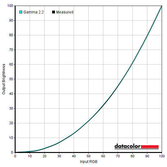
Gamma 'Test Settings'
Test Settings
Contrast and brightness
Contrast ratios
Monitor Settings White luminance (cd/m²) Black luminance (cd/m²) Contrast ratio (x:1) 100% brightness 401 0.30 1337 80% brightness 338 0.25 1352 60% brightness 279 0.21 1329 40% brightness 227 0.17 1335 20% brightness 170 0.13 1308 0% brightness 108 0.08 1350 Gamma1 (70% brightness, Factory Defaults) 304 0.23 1322 Gamma2 309 0.23 1343 Gamma3 306 0.22 1391 Color Temp. User 341 0.23 1483 Color Temp. User (100% brightness) 422 0.29 1455 Color Temp. sRGB 373 0.29 1286 LowBlue Mode = Multimedia 302 0.23 1313 LowBlue Mode = Internet 301 0.23 1309 LowBlue Mode = Office 299 0.23 1300 LowBlue Mode = Reading 297 0.23 1291 MBR = 1 303 0.24 1263 MBR = 10 214 0.17 1259 MBR = 20 115 0.09 1278 Test Settings 169 0.13 1300
The average static contrast with only brightness adjusted was 1332:1, comfortably exceeding the specified 1000:1. Just a touch weaker than we recorded on our older 24G2(U) unit, but very respectable for an IPS-type panel. The maximum contrast recorded was a rather impressive 1483:1, whilst 1300:1 was recorded under our ‘Test Settings’ which is pleasing. Even with the strongest LBL setting (‘LowBlue Mode = Reading’) contrast didn’t fall much below that. The highest white luminance recorded was 422 cd/m² whilst the lowest white luminance recorded was 108 cd/m². The maximum here is rather bright and comfortably exceeds the specified 350 cd/m², but the minimum is rather high and will be too much for some users particularly in dimmer conditions. It will hit the ‘sweet spot’ for most people in a range of lighting conditions as it’s usual for monitors to be set somewhere between 100 – 200 cd/m², but a lower minimum would’ve been preferred.
The monitor also has a ‘Dynamic Contrast’ (DCR – Dynamic Contrast Ratio) setting which allows the backlight to adjust according to the content, with some additional gamma changes applied. As usual we found this a compromised setting as the backlight is adjusting as a single unit and can’t account for the mixtures of light and dark that grace most scenes. The backlight responded at a fairly relaxed pace to changes in scene brightness. It dimmed quite effectively for predominantly dark content, but usually stayed rather bright for mixed content even with plenty of darker areas. As usual, we prefer manual brightness control – but this setting is there if you want to use it.
PWM (Pulse Width Modulation)
The 24G2SPU (24G2SP) does not use PWM (Pulse Width Modulation) to regulate backlight brightness at any level. Instead, DC (Direct Current) is used to moderate brightness. The backlight is therefore considered ‘flicker-free’, which will come as welcome news to those sensitive to flickering or worried about side-effects from PWM usage. The exception to this is with ‘MBR’ (Motion Blur Reduction) active, a strobe backlight setting which causes the backlight to flicker in sync with the refresh rate of the display.
Luminance uniformity
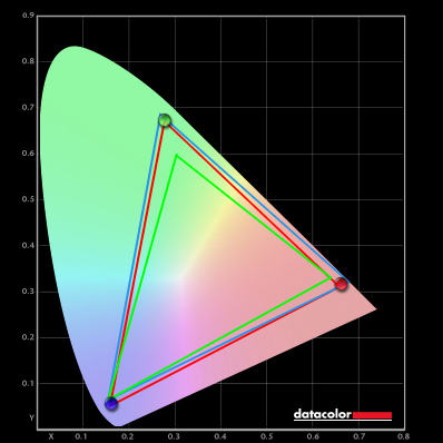
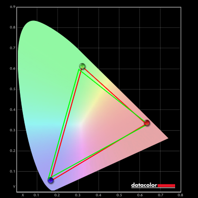
Whilst observing a black background in a dark room, using our ‘Test Settings’, we noticed some backlight bleed and clouding, particularly towards the top left of the screen. It’s important to remember that individual units vary when it comes to all aspects of uniformity, including backlight bleed and clouding. The following image was taken a few metres back to eliminate ‘IPS glow’. This was observed as a generally cool grey haze, but can take on a warmer look depending on angle. It emanates from the corners of the screen and blooms out more strongly from steeper angles, as demonstrated in the viewing angles video later. The luminance uniformity was variable. The maximum luminance was recorded at ‘quadrant 1’ towards the top left of the screen (167.1 cd/m²). The greatest deviation from this occurred at ‘quadrant 9’ towards the bottom right (137.4 cd/m², which is 18% dimmer). The average deviation between each quadrant and the brightest recorded point was 8.88%, which is reasonable. Remember that individual units vary when it comes to uniformity and you can expect further deviation beyond the points measured. For example, some shades appeared slightly brighter if observing the very edge of the image beside the panel border at the top or sides. This is due to the bezel design with very slim panel border, which causes pressure from a bit of ‘pinching’ in that region. It was not extreme and isn’t unique to this model, but we felt it was worth noting in this case. The contour map below shows these deviations graphically, with darker greys representing lower luminance (greater deviation from brightest point) than lighter greys. The percentage deviation between each quadrant and the brightest point recorded is also given. The SpyderX Elite was also used to analyse variation in the colour temperature (white point) for the same 9 quadrants. The deviation between each quadrant and the quadrant closest to the 6500K (D65) daylight white point target was analysed and a DeltaE value assigned. Darker shades are also used on this map to represent greater deviation from 6500K. A DeltaE >3 represents significant deviation that may be readily noticed by eye. Results here were quite good. The central point was recorded as closest to 6500K, with significant but not extreme deviation recorded towards the top left (DeltaE 3.1). No further significant deviation was recorded. Note again that individual units vary when it comes to uniformity and that you can expect deviation beyond the measured points. On Battlefield 2042 the monitor put in a decent contrast performance. With a static contrast of 1300:1 recorded under our test settings, it’s quite strong for the panel type in that respect. This is still quite some way shy of what VA technology can achieve and certainly no match for OLED. So it doesn’t give strong depth to dark shades or an atmospheric look to darker content – particularly if observed in a dim room. There was also ‘IPS glow’ to contend with, a haze emanating from the corners of the screen which eats away at darker shade detail and atmosphere. This was generally observed lower down the screen as a cool grey haze, though can appear slightly warmer for some sections of the screen and depending on viewing angle. This ‘IPS glow’ was at a moderate if slightly below average level for a screen of this size but is brought out more strongly if you sit closer to the screen, use a higher brightness setting or have a unit with significant dark uniformity issues such as backlight bleed and clouding. The medium matte anti-glare screen surface gave some layering in front of the image rather than allowing more direct emission of light, but the finish was free from strong graininess. This meant lighter shades had a misty graininess to them, less noticeable than the more pronounced graininess of many competing models. Shadow of the Tomb Raider told a similar story. There’s plenty of darker content on this title with dark tunnels, passageways and building interiors sometimes illuminated by just a few small light sources. Whilst the static contrast certainly allowed the monitor to ‘outperform’ many other IPS models on paper – and visually there was a bit of extra depth in comparison – the static contrast was still very much in ‘IPS’ territory. Coupled with ‘IPS glow’, the depth and atmosphere could certainly have been better than it was – shortcomings which are naturally more noticeable in a dim room than a brighter one. An important benefit to IPS panels which was evident on both titles and indeed more broadly is relatively strong gamma consistency. You get some dark detail eaten away by ‘IPS glow’ and the contrast isn’t really high enough to provide amazing distinctions there. But you don’t get obvious shifts in gamma and hence dark detail levels vertically as you’d see on TN models or comparing the centre to edges of the screen as you’d get with VA models. This helped prevent an unintended ‘blocky’ or banded appearance and also meant compression artifacts for heavily compressed streamed content were properly masked. The screen surface again provided a light misty graininess. We also made contrast observations using the film Star Wars: The Rise of Skywalker. This title has plenty of scenes which crave a strong contrast performance, with lots of bursts of light or bright objects such as light sabers illuminating dark surroundings. The monitor didn’t give a particularly atmospheric look here, even if its contrast was above average for the panel type. ‘IPS glow’ was also observed, as expected, particularly in a dimmer viewing environment. The film also has black bars at the top and bottom as it is presented in a ‘letterboxed’ format, where these weaknesses can be quite apparent. Most content on platforms such as Netflix and YouTube in particular is designed around the 16:9 aspect ratio of this monitor and wouldn’t have black bars when viewed full screen. The screen surface again provided some layering and misty graininess, less of a grainy appearance than many competing models. The Lagom tests for contrast allow specific weaknesses in contrast performance to be identified. The following observations were made in a dark room. The colour gamut of the 24G2SPU (24G2S) is shown as a red triangle below. It was compared with the sRGB (green triangle) and DCI-P3 (blue triangle) reference colour spaces using our ‘Test Settings’. The gamut fully covers sRGB (100%) with some extension beyond – we recorded 92% DCI-P3 coverage. You can see significant extension beyond sRGB for green shades and some cyans as well as for the red to blue edge of the gamut. Quite a bit of DCI-P3 coverage is missing towards the red corner of the green to red edge, covering oranges and yellows for example. There’s a touch of extension beyond DCI-P3 in the blue, purple and pink region of the gamut. Although not shown in the graphic, we recorded 85% Adobe RGB coverage. This DCI-P3 and Adobe RGB coverage isn’t high enough for accurate reproduction within those colour spaces. For standard sRGB content outside a colour-managed environment, the moderate extension beyond sRGB provides extra saturation and vibrancy without the strongly oversaturated look of models with an even more generous gamut. The monitor offers an sRGB emulation setting – switching ‘Color Temp.’ to ‘sRGB’ in the ‘Color Setup’ section of the OSD. This clamps the colour gamut closer to sRGB and as explored previously you can’t adjust brightness – it’s locked to a high level (373 cd/m² recorded). Various other settings are also locked off, including ‘Gamma’ and colour channels. Using this setting we recorded 96% sRGB coverage without noteworthy extension beyond sRGB. The under-coverage is quite spread out across the gamut rather than clustered in one particular region, reducing the perceived impact of this on the image and only mildly affecting highly saturated sRGB shades. To maximise colour accuracy within the sRGB colour space, for colour-managed workflows, full calibration and profiling with a colorimeter or similar device using the full native gamut is recommended. You may try the ICC profile featured in the calibration section which includes gamut mapping for colour-aware applications, but best results are always obtained by calibrating your own unit with your own hardware. Instead of using this ‘sRGB’ setting and putting up with the associated restrictions, AMD users can activate a flexible sRGB emulation setting via the graphics driver. This is done by opening ‘AMD Software’, clicking ‘Settings’ (cog icon towards top right) and clicking on ‘Display’. You should then ensure that the ‘Custom Color’ slider to the right is set to ‘Enabled’ and ‘Color Temperature Control’ set to ‘Disabled’. It may appear to be set this way by default, but the native rather than restricted gamut is likely in play. If that’s the case, simply switch the ‘Color Temperature Control’ slider to ‘Enabled’ then back to ‘Disabled’ to leverage the sRGB emulation behaviour. This setting is shown in the image below. The gamut below shows results using our ‘Test Settings’ with this driver tweak applied. The colour gamut now covers 94% sRGB, with the under-coverage focused on the red to blue edge and some over-coverage in the green and blue region (including for pink and purple shades). Whilst the gamut is a bit ‘wonky’, with the EDID data not lining up properly with the actual measured gamut of the monitor, the over-coverage is certainly reduced compared to natively. This setting therefore helps to cut down on the colour gamut without profiling, including in applications that aren’t colour managed – but does so with some inaccuracies. You don’t have to put up with restrictions associated with the monitor’s sRGB emulation setting such as locked colour channels. Whilst Nvidia doesn’t have a similar option in their graphics driver, a third party tool called ‘novideo_srgb’ can be used. This provides a similarly effective GPU-side gamut clamp to the AMD driver option. The resulting gamut was very similar to that shown above with the AMD tweak – this is expected given it uses the same data from the EDID of the monitor. The tool and its usage is covered in our sRGB emulation article. The monitor provided quite a vibrant look to things on Battlefield 2042. As with most content, which is designed around the sRGB colour space, a wider gamut than sRGB on a monitor provides extra saturation and vibrancy. In this case the monitor certainly provided extension beyond sRGB in some regions of the gamut, so the natural environments in the game were presented with more ‘pop’ than intended by the developers. Some greens were brought out quite strongly, particularly yellowish greens which appeared more yellow. And more generally, some vegetation just appeared a livelier than intended shade – though not to the eye-catching and perhaps ‘neon’ extent that some models with more generous Adobe RGB coverage might show. Some patches of earth, tree trunks and woody tones had a bit of a red push rather than appearing more of a neutral brown – though this was not extreme. There were some good licks of vibrancy, such as for roaring orange fires and brightly painted objects. The sky blues in the game appeared a bit more saturated than intended as well, though not to a ‘cartoonish’ degree. Similar observations were made on Shadow of the Tomb Raider. There was certainly extra vibrancy and saturation overall, though it was not as extreme as on models with an even more generous gamut. The reddish push to earthy browns was also apparent on some skin tones, such as that of the lady herself Lara Croft. She appeared a bit too tanned or perhaps a little ‘sun kissed’, but this was fairly constrained oversaturation compared to what we sometimes see. There was extra vividness to some green shades as well, so some patches of vegetation appeared livelier than intended. Though there were some quite lush-looking forest green shades as well which fitted the aesthetic of some scenes well. On both titles the monitor demonstrated good colour consistency, with shades appearing fairly similar regardless of where on the screen they’re displayed. It was certainly stronger in this respect than non-IPS LCD panels, with only minor saturation shifts in comparison. It was also superior in this respect to the older 24G2(U) we tested, which could’ve been partly due to uniformity issues on that sample – but perhaps also some improvements made to the newer panel. We also made observations using TV series Futurama. This is a particularly unforgiving test for colour consistency, highlighting weaknesses there very prominently due to many large patches of individual shade. The monitor provided a good performance in that respect. There were shifts for some shades, such as the red of Dr Zoidberg and also some pastel shades appearing slightly darker towards the extreme side edges. And some shades such as certain purples appeared more pinkish towards the extreme edges. But these shifts were quite minor really and certainly less apparent than the saturation shifts observed on TN or VA models. They were also less noticeable than on the predecessor to this model, as noted with respect to the game titles just above. Our observations in games were echoed here with respect to saturation levels. Extra vibrancy and saturation, which made pastel shades look somewhat deeper or more eye-catching than intended for example. But which also made for some rather eye-catching neon shades, such as bright pinks, greens and purples. The deviations from the developers intentions and what was presented weren’t as great here as with models with even more generous colour gamuts, but clearly ‘beyond sRGB’. We will not be including our usual ‘Shade representation using SpyderCHECKR 24’ visual shade assessment. The minimum brightness of this screen was too high for appropriate capture and comparison of the screen with a printed sheet of shades. Lagom’s viewing angle tests help explore the idea of colour consistency and viewing angle performance. Note that the blocks also appeared brighter at the very edge just beside the inner edge of the panel border. This is related to the very slim bezel design and isn’t unique to this model. The following observations were made from a normal viewing position, eyes ~70cm from the screen. The shifts observed are more readily apparent if sitting closer and less apparent if sitting further away. On some monitors, particularly but not exclusively those with high refresh rates, interlace patterns can be seen during certain transitions. We refer to these as ‘interlace pattern artifacts’ but some users refer to them as ‘inversion artifacts’ and others as ‘scan lines’. They may appear as an interference pattern, mesh or interlaced lines which break up a given shade into a darker and lighter version of what is intended. They often catch the eye due to their dynamic nature, on models where they manifest themselves in this way. Alternatively, static interlace patterns may be seen with some shades appearing as faint horizontal or vertical bands of a slightly lighter and slightly darker version of the intended shade. We did not observe either artifact type on this monitor. A sensitive camera and a utility called SMTT 2.0 was used to analyse the latency of the 24G2SPU (24G2SP). Over 30 repeat readings were taken to help maximise accuracy. Using this method, we calculated 3.37ms (slightly over ½ a frame at 165Hz) of input lag. Similar values were recorded at lower refresh rates, including 60Hz. These figures are influenced by both the element of input lag you ‘see’ (pixel responsiveness) and the main element you ‘feel’ (signal delay). They indicate a low signal delay which most users should find acceptable. Note that we don’t have the means to accurately measure input lag with Adaptive-Sync active in a VRR environment. Our article on responsiveness takes a look at the key factors related to the responsiveness of monitors. A key concept explored in the article is ‘perceived blur’, which is contributed to by both the pixel responses of the monitor and the movement of your eyes as you track on-screen motion. Both factors are important, but the second factor is dominant on modern monitors. A photography technique called ‘pursuit photography’ is also explored, which uses a moving rather than stationary camera to capture motion in a way that reflects both elements of perceived blur, not just the pixel response element. The images below are pursuit photographs taken using the UFO Motion Test for ghosting, with the test running at its default speed of 960 pixels per second. This is a good practical speed to take such photographs at and highlights both elements of perceived blur well. The UFOs move across the screen from left to right at a frame rate matching the refresh rate of the display. All three rows of the test are analysed to highlight a range of pixel transitions. The monitor was tested at 60Hz (directly below), 120Hz, 144Hz and 165Hz using various ‘Overdrive’ settings; ‘Off’, ‘Weak’, ‘Medium’ and ‘Strong’. The two final columns show reference screens, where possible, set to what we consider their optimal response time setting for a given refresh rate. The AOC 24G2(U), which is the predecessor to this model, and the Acer XB253Q GP which is a fast IPS model tuned for a fluid 144Hz experience. At 60Hz, above, the UFO appears soft and unfocused without clear internal detailing. This reflects a moderate amount of perceived blur due to eye movement. Some conventional trailing and overshoot (inverse ghosting) is observed in places behind the UFOs due to pixel response time weaknesses and aggressive tuning, respectively. With the ‘Off’ setting there’s a moderate amount of ‘powdery’ trailing due to some pixel response time weaknesses – this isn’t as bold or extended as the ‘smeary’ trailing you’d typically see on VA models. The ‘Weak’ setting cuts through this. A bit remains for the dark background (top row), whilst for the medium background (middle row) and light background (bottom row) overshoot is visible. This is ‘halo’ trailing that’s brighter than the background and stands out a bit for this reason. The ‘Medium’ setting introduces this with an inky appearance for the dark background and strengthens it elsewhere whilst ‘Strong’ provides even stronger overshoot for the dark background. Overall we consider ‘Off’ or ‘Weak’ optimal, depending on overshoot sensitivity. In practice we didn’t find the overshoot using the ‘Weak’ setting to be as eye-catching or widespread as you might think based on the pursuit images. But the reference screens were better tuned at 60Hz in our opinion, providing just a touch of ‘powdery’ trailing and very little overshoot. Below you can see how things appear with refresh rate doubled to 120Hz. At 120Hz, above, the UFO appears significantly narrower with clearer internal detail. This reflects a significant decrease in perceived blur due to eye movement. The pixel response requirements for a solid performance here have increased significantly. The ‘Off’ setting shows quite distinct and bold ‘powdery’ trailing due to significantly slower than optimal pixel responses. The ‘Weak’ setting cuts down on this reasonably effectively and introduces slight overshoot for the light background. The ‘Medium’ setting provides a further cut in the ‘powdery’ trailing. A bit remains for the dark background, whilst it’s replaced with some overshoot elsewhere. ‘Strong’ provides a further reduction in the ‘powdery’ trailing for the dark background whilst only slightly strengthening the overshoot elsewhere. The reference Acer screen, in comparison, provides stronger overshoot than even the ‘Strong’ setting of the AOC – but is free from ‘powdery’ trailing. Based on the photos, you may feel ‘Strong’ appears optimal. But as we explore in a bit more detail at 165Hz shortly, there are some transitions not shown here which show significantly higher overshoot using the ‘Strong’ setting. Our preference therefore goes to ‘Medium’ at 120Hz, but the optimal setting to use depends on overshoot tolerance and that could be ‘Strong’ or potentially even ‘Weak’ depending on that. It’s also worth noting that overdrive artifacts were observed at 120Hz and also higher refresh rates. They were particularly faint at lower refresh rates, but still faintly visible upon close inspection. The overshoot appeared with interlaced horizontal lines of alternating slightly lighter and darker version of the shade, both of which are brighter than the background as expected from bright overshoot trailing. This isn’t obvious when using the monitor normally, including for gaming or on the desktop, rather than specifically focusing in on the trailing on simplified tests such as this. These artifacts are masked on the image by the horizontal lines that are seen in the background – your eyes don’t see these lines in the background, they’re due to how the images are captured. Below you can see things bumped up slightly, to 144Hz. At 144Hz, above, the UFO appears very slightly narrower with slightly better definition. This reflects a slight reduction in perceived blur to eye movement, but it’s only an extra 24Hz so this difference is minor compared to the initial doubling from 60Hz to 120Hz. The relative behaviour of the various overdrive settings is similar to at 120Hz. There’s a slight move towards just a touch more ‘powdery’ (conventional) trailing but lower overshoot now. The older AOC reference shows slightly more conventional trailing, with a bolder initial section to the trailing and longer overall trail behind the red UFO body for the medium background. It shows lower overshoot levels for the light background, albeit with extra conventional trailing. The Acer reference is well-tuned here with a mere whiff of ‘powdery’ trailing and a touch of overshoot. The ‘Strong’ setting could again be considered optimal based on the photos, though ‘Medium’ appears fairly similar. And again, for transitions not shown here some more noticeable overshoot is introduced with the ‘Strong’ setting – so ‘Medium’ is our preference at 144Hz. Below you can see things bumped up just a touch more, to 165Hz. At 165Hz, above, the UFO appears very slightly narrower with slightly better definition. It’s difficult to see from the photos, but to the eye the segmentation of the UFOs is more distinct and internal details slightly sharper at 165Hz compared to 144Hz. It’s a subtle difference, with only an extra 21Hz – so nothing like that initial doubling from 60Hz to 120Hz. The pixel response behaviour is similar to 144Hz, with the slight increase in pixel response requirements meaning some weaknesses are just a touch more pronounced. For example, there’s a slightly longer ‘powdery’ trail for the dark background. ‘Strong’ and ‘Medium’ appear similar at this point, so it may be tempting to simply use the highest setting (‘Strong’). This setting introduces stronger overshoot for some transitions involving bright to medium-bright shades, producing a bright bluish overshoot trailing which we found quite distracting at times. ‘Medium’ toned this down significantly – some overshoot remained but it wasn’t as eye-catching in our view. And the weaker pixel responses that provided more pronounced ‘powdery’ trailing remained fairly similar with both settings. So our preference went to ‘Medium’. As well as increasing refresh rate to minimise perceived blur due to eye movement, the monitor offers an alternative in the form of ‘MBR’ (Motion Blur Reduction). This is a strobe backlight setting that causes the backlight to pulse at a frequency matching the refresh rate of the display – 120Hz, 144Hz or 165Hz. Sensitivity to this flickering varies and some may find it bothersome whilst others will notice accelerated eye fatigue when using the setting, even if the flickering isn’t actively bothersome to them. The pursuit photographs below were taken with the monitor set to 120Hz using MBR. A few reference screens are also shown for comparison, using their respective strobe backlight settings at 120Hz. The AOC C24G1 using MBR (Motion Blur Reduction) and set to what we consider its optimal setting for that. And the Dell S2417DG using ULMB (‘Ultra Low Motion Blur’). Note that the ‘Overdrive’ setting can be adjusted under MBR. Our preference was for ‘Medium’ for similar reasons to with ‘MBR’ disabled and that’s what we use for this analysis. ‘Strong’ didn’t provide a significant improvement in our view but introduced some rather eye-catching bright overshoot in places. ‘Weak’ and ‘Off’ were too slow overall, adding some conventional trailing and ‘strobe crosstalk’. Also be aware that setting the ‘Overdrive’ to ‘Boost’ is equivalent to using the ‘Strong’ setting and setting ‘MBR’ to ‘20’. With MBR active at 120Hz, above, the main object appears significantly narrower with clearer internal detailing. This is certainly the case for ‘MBR = 20’ where segmentation is quite distinct and the white notches can be counted. By eye the black lines which separate the segments are bolder than they appear in the photos at ‘MBR = 20’ – the segments are just a bit less distinct than for the photo of the ULMB reference screen. This more focused look to the object with more distinct and clear internal detailing indicates a significant decrease in perceived blur due to eye movement, the main goal of a strobe backlight setting like this. Although intermediate steps aren’t included in this analysis, we found main object and internal detail clarity to be particularly strong at a setting of ‘MBR = 15’ and above. Some trailing is visible behind and in some cases in front of the object, fragmented due to the strobe nature of the backlight. The all-encompassing term ‘strobe crosstalk’ is used to describe this fragmented trailing around the object. Because not all areas of the screen refresh simultaneously, the appearance of strobe crosstalk can differ depending on how high up or low down on the screen the movement is being observed. For ‘MBR = 1’ the strobe crosstalk basically melds into the object for the dark and medium background – it looks quite messy, really and it looks like there are multiple overlapping objects instead of a single distinct UFO with fragmented trailing around it. For ‘MBR = 20’ the strobe crosstalk is moderate but weaker than and distinct from the main object in these photos. Some overshoot is also visible in places, though this is largely absorbed by the strobe crosstalk for ‘MBR = 20’. You can see a magenta to red fringe directly behind the UFO body, clearest at a higher MBR setting. It’s also visible quite noticeably in front of the UFO cockpit for the dark background. This is due to the slow decay of the red KSF phosphors used for the backlight and is very commonly observed with strobe backlight modes on wide gamut models. The reference screens are standard gamut screens and don’t show this – they also show quite distinct overshoot with little to no strobe crosstalk for the images shown. The images below show results with MBR active at 144Hz. With MBR active at 144Hz, above, there’s a slight boost to object clarity. Most noticeable for ‘MBR = 20’. In both cases (120Hz and 144Hz) remember that the segmentation is a bit more distinct than it appears in the photos, but there’s still a slight relative improvement at 144Hz vs. 120Hz. The strobe crosstalk is just a touch bolder now and the fragments are slightly narrower due to the increased refresh rate and overshoot levels are lower. The secondary trail of strobe crosstalk is more visible as well, for the dark and medium backgrounds. The C24G1 reference also shows this strobe crosstalk, whilst for the AG254FG used as a reference here this is replaced with overshoot. This is significantly less bold than the main object and doesn’t significantly impact motion clarity in practice. Below you can see things bumped up again to 165Hz. With MBR active at 165Hz, above, there’s a further increase to the clarity of the main object. At this point, with a higher MBR setting at least, the segmentation is rather distinct (a bit more so by eye) and white notches easy to count. The aliasing at the edges of the UFOs can also be clearly seen due to the very strong motion clarity. Overshoot levels are further reduced, not just for the transitions shown but more broadly. The strobe crosstalk is a touch bolder now, quite distinct for all rows really but more so for the dark and medium backgrounds. As noted earlier, it’s important to note that strobe crosstalk varies at different areas of the screen. Not all areas refresh simultaneously, so its appearance can differ depending on how high up or low down on the screen movement is being observed. The images below show pursuit photographs running from the top to bottom regions of the screen, with the screen set to 120Hz, ‘Overdrive = Medium’ and ‘MBR = 20’. Strobe crosstalk variation at different points of the screen was similar at lower MBR settings so we didn’t feel it was worthwhile documenting these observations. Note that these images are designed to show strobe crosstalk behaviour and don’t accurately show how distinct details on the main object appear. Further up the screen you can see a bit of overshoot behind the object and quite bold strobe crosstalk in front. Strobe crosstalk is displaced behind the UFOs lower down the screen, masking any overshoot. In the centre of the screen you can see moderate but not extreme strobe crosstalk behind the UFO, becoming stronger lower down the screen where it eventually appears as bold as the object itself. Overall strobe crosstalk is moderate towards the central rows of the screen, which is where your eyes mainly focus when playing games such as fast-paced FPS titles that see most potential benefit from such a setting. Below you can see how things appeared with refresh rate increased to 165Hz. Although images aren’t included, 144Hz was also assessed and appeared some way between 120Hz and 165Hz for strobe crosstalk as you might expect. At 165Hz with MBR active, above, strobe crosstalk position is similar. It’s also a bit bolder and just below centre it’s almost as bold as the object itself. Some may prefer to run at a lower refresh rate, particularly 120Hz, due to the somewhat fainter strobe crosstalk. Though we found the moderate strobe crosstalk ‘noticeable’ regardless and there are some other factors to consider, as explored shortly. On various Battlefield titles, at a frame rate keeping up with the 165Hz refresh rate, the monitor provided decent fluidity. Compared to a 60Hz monitor or the AOC running at 60Hz (or 60fps), 2.75 times as much visual information is displayed every second. This significantly enhances the ‘connected feel’, describing the precision and fluidity felt when interacting with your character on the game. The low input lag of the monitor is also beneficial in this respect and complements the high frame and high refresh rate combination nicely. The high frame rate and high refresh rate combination also decreases perceived blur due to eye movement, as demonstrated earlier using Test UFO. As also demonstrated, the bump up from 144Hz to 165Hz is hardly dramatic in that respect – though the extra refresh rate is still a bonus, if you have the frame rate to match. The other important area to consider when it comes to perceived blur is pixel responsiveness. The pursuit photographs indicated that the monitor performed reasonably well here, but not perfectly. This was observed over a broader range of pixel transitions as well. The weakest pixel responses occur where very dark or very bright shades are involved. Even then the weaknesses are not massive, but it produces some ‘powdery’ trailing that is a bit bolder and therefore has a more significant impact on perceived blur compared to transitions confined to medium shades. Even these weak transitions are significantly faster than those performed in similar places by competing VA models and for most people they shouldn’t prove bothersome or necessarily all that noticeable. The monitor performs many other transitions more rapidly and it certainly makes better use of its 165Hz refresh rate than competing VA models, overall. There’s also some overshoot in places, mainly as a ‘halo’ trailing that’s a bit brighter than the background shade. As with sensitivity to weaknesses in pixel responsiveness, sensitivity to overshoot varies. We didn’t find this particularly eye-catching or strong overshoot using our preferred ‘Medium’ overdrive setting and it shouldn’t prove bothersome to most users. Similar observations were made on Shadow of the Tomb Raider, so a pretty fluid 165Hz experience overall. The weaknesses were again not too pronounced, even though this title contains many ‘high contrast’ scenes with intertwined dark and bright elements that cover some of the weakest transitions. There was again some overshoot in places, but nothing overly eye-catching or bothersome in our view. We also observed movie content at a range of frame rates, including ~24 – 30fps content on platforms such as Netflix and 60fps YouTube content. There were no clear weaknesses from the monitor. There were some minor weaknesses for some ‘high contrast’ pixel transitions, but for the lower frame rate movie content in particular these were not distinct. Most pixel responses were performed suitably rapidly for movie content, without obvious or eye-catching overshoot either. The frame rate of the content itself rather than weaknesses related to the pixel responses of the monitor are really the key barrier to visual fluidity here. As an Amazon Associate I earn from qualifying purchases made using the below link. Where possible, you’ll be redirected to your nearest store. Further information on supporting our work. Earlier in the review we covered ‘MBR’, including its principles of operation and how it performs using specific tests. When using a strobe backlight feature such as this, your frame rate must match the refresh rate precisely. Otherwise you’re left with extremely obvious stuttering or juddering. Standing out in such a clear way due to there being very little perceived blur due to eye movement to mask it. You can’t use Adaptive-Sync at the same time, so you’re at the mercy of potential frame rate fluctuations. We tested a range of titles using the technology but will simply focus on Battlefield titles for this section as they provide a suitable test bed. Our observations here are based on our preferred setting of ‘20’ for MBR, but we felt clarity was strong above a setting of ‘15’ or so and you should experiment to find your own sweet spot for brightness and clarity. The main refresh rate we used this feature at was 165Hz, though our observations at lower refresh rates (such as 120Hz) are broadly similar. Strobe crosstalk becomes somewhat weaker at reduced refresh rates but is certainly still noticeable, as covered earlier. Overshoot levels are increased at lower refresh rates but aren’t really extreme either way. And flickering becomes a bit more noticeable whilst the ‘connected feel’ also takes a slight hit at reduced refresh rates, too. The technology did its thing to significantly reduce perceived blur due to eye movement, with the clarity of the main object and most texture detail remaining sharper and more distinct during movement than with MBR disabled. This can provide a competitive edge when gaming by making it easier to track and engage enemies and spot people and other important in-game assets against the background, even during rapid movement. There was a bit of overshoot for some transitions, but more noticeable in general was the strobe crosstalk which was covered earlier using Test UFO. Even in the central region this was moderately strong for some transitions, introducing some quite distinct repetitions of objects during motion. This was far from the strongest strobe crosstalk we’ve seen, but it still impacted the overall clarity of motion and we felt made the setting more uncomfortable to use at times than it could be. Even at reduced refresh rates, such as 120Hz, there was moderate strobe crosstalk centrally or a bit below centre. We also observed some red or magenta fringes in places, usually easiest to observe where medium to light shades were included in the transition (object or background) and there were straight lines. Colourful flashes were also noticed in similar places, including not just magenta to red but also other colours such as blue and green. These issues (fringes and colourful flashes) are linked to the KSF phosphor backlights and weren’t as distinct here as on models with even wider gamut KSF backlights. As with the flickering of a strobe backlight setting, sensitivity to such issues varies. Overall we feel this setting will have utility for some users and they’ll feel it provides a competitive edge whilst not finding the issues we’ve highlighted too distracting. The brightness adjustment range is relatively good for a strobe backlight setting, too. For others, the visual disturbances such as flickering, colourful flashes, fringing and strobe crosstalk might be quite unpleasant. For some game titles the lack of VRR capability alongside MBR and requirement to keep your frame rate matching the refresh rate will limit its appeal. Though generally such settings are most beneficial for competitive play at relatively high frame rates, either way. AMD FreeSync is a variable refresh rate technology, an AMD-specific alternative to Nvidia G-SYNC. Where possible, the monitor dynamically adjusts its refresh rate so that it matches the frame rate being outputted by the GPU. Both our responsiveness article and the G-SYNC article linked to explore the importance of these two elements being synchronised. At a basic level, a mismatch between the frame rate and refresh rate can cause stuttering (VSync on) or tearing and juddering (VSync off). FreeSync also boasts reduced latency compared to running with VSync enabled, in the variable frame rate environment in which it operates. FreeSync requires a compatible AMD GPU such as the Radeon RX 580 used in our test system. The monitor itself must support ‘VESA Adaptive-Sync’ for at least one of its display connectors, as this is the protocol that FreeSync uses. The 24G2SPU (24G2SP) supports FreeSync Premium via DP and HDMI on compatible GPUs and systems. You need to make sure ‘Adaptive-Sync’ is enabled in the ‘Game Setting’ section of the OSD. On the GPU driver side recent AMD drivers make activation of the technology very simple. You should ensure the GPU driver is setup correctly to use FreeSync, so open ‘AMD Software’, click ‘Settings’ (cog icon towards top right) and click on ‘Display’. You should then ensure that the first slider is set to ‘Enabled’ as shown below. The top image shows the monitor connected by DP, where the setting is referred to as ‘Adaptive Sync Compatible’. The bottom image shows the monitor connected using HDMI, with the setting referred to as ‘VRR’. Note that the exact wording may depend on the driver version you’re using – at time of review the monitor hadn’t been officially FreeSync Premium certified, though that is the ‘level’ supported. *This is the claimed VRR range for the monitor, also reported in the EDID. In our testing we often observed LFC kicking in at 55Hz or very slightly below, providing a ~55Hz floor of operation. This was the case regardless of the static refresh rate selected (120Hz, 144Hz or 165Hz) and also via HDMI at up to 144Hz. In most cases this makes little difference in practice compared to a 48Hz floor. To configure VSync, open ‘AMD Software’. Click ‘Settings’ (cog icon towards top right) and click ‘Graphics’. The setting is listed as ‘Wait for Vertical Refresh’. This configures it globally, but if you wish to configure it for individual games click ‘Game Graphics’ towards the top right. The default is ‘Off, unless application specifies’ which means that VSync will only be active if you enable it within the game itself, if there is such an option. Such an option does usually exist – it may be called ‘sync every frame’ or something along those lines rather than simply ‘VSync’. Most users will probably wish to enable VSync when using FreeSync to ensure that they don’t get any tearing. You’d therefore select either the third or fourth option in the list, shown in the image below. Above this dropdown list there’s a toggle for ‘Radeon Enhanced Sync’. This is an alternative to VSync which allows the frame rate to rise above the refresh rate (no VSync latency penalty) whilst potentially keeping the experience free from tearing or juddering. This requires that the frame rate comfortably exceeds the refresh rate, not just peaks slightly above it. We won’t be going into this in detail as it’s a GPU feature rather than a monitor feature. As usual, we tested various titles using AMD FreeSync and experienced similar things across all of these. Any issues affecting one title points towards a game or GPU driver issue rather than a monitor issue. For simplicity we’ll just focus on Battlefield titles here which allow the full VRR range to be analysed on our Radeon RX 580. As this isn’t a particularly powerful GPU, there were some dips below 165fps with high graphics settings. Without VRR technologies such as FreeSync, you’d observe tearing (VSync off) or stuttering (VSync on). If you’re sensitive to such things, as we are, having these visual distractions removed can be very welcome. As frame rate dropped there was a loss of ‘connected feel’ and increase in perceived blur due to eye movement. Both are linked to the frame rate, with a high frame rate being favourable for both elements. The monitor doesn’t use variable overdrive, so there’s no re-tuning as refresh rate decreases. Overshoot becomes more noticeable as the frame rate dips, but didn’t ever become extreme using our preferred ‘Medium’ setting. It did become moderately strong as things dipped well into the double digits, though, so some will prefer to switch over to the ‘Weak’ setting if a lot of time is spent <100Hz. This setting still performs quite well there overall, where the pixel response requirements for a strong performance are slackened off compared to higher refresh rates. If you’re particularly sensitive to overshoot and want to eliminate it entirely, the ‘Off’ setting will provide that. FreeSync worked down to the floor of operation for the monitor, which seemed to be 55Hz (55fps) or just a touch below in our testing. Below this point, LFC (Low Framerate Compensation) kicked in with the monitor sticking to a multiple of the frame rate with its refresh rate. This helped keep tearing and stuttering at bay, though there was a subtle momentary stuttering when LFC activated or deactivated. This is something we always observe and not specific to this model. It was much less noticeable than traditional stuttering from frame and refresh rate mismatches, but if you’re sensitive to it and frequently passing the boundary it could be annoying. As noted earlier, AMD FreeSync makes use of Adaptive-Sync technology on a compatible monitor. As of driver version 417.71, users with Nvidia GPUs (GTX 10 series and newer) and Windows 10 or later can also make use of this Variable Refresh Rate (VRR) technology. When a monitor is used in this way, it is something which Nvidia refers to as ‘G-SYNC Compatible’. The AOC is amongst models which are specifically validated as ‘G-SYNC Compatible’, which means it has been tested by Nvidia and passes specific quality checks. With the 24G2SPU (24G2SP) you must connect the monitor up via DisplayPort to use ‘G-SYNC Compatible Mode’. You need to make sure ‘Adaptive-Sync’ is set to ‘On’ in the ‘Game Setting’ section of the OSD to use the technology. When you open up Nvidia Control Panel, you should then see ‘Set up G-SYNC’ listed in the ‘Display’ section. Ensure the ‘Enable G-SYNC, G-SYNC Compatible’ checkbox and ‘Enable settings for the selected display model’ is checked as shown below and press ‘OK’. If you’ve enabled ‘G-SYNC Compatible’ and it was previously disabled, the monitor should re-establish its connection with the system and the technology should now be active. The video below shows the monitor in action. The camera, processing done and your own screen all affect the output – so it doesn’t accurately represent what you’d see when viewing the monitor in person. It still provides useful visual demonstrations and explanations which help reinforce some of the key points raised in the written piece. The 1920 x 1080 (Full HD) resolution and ~24” screen size represents a relatively affordable and compact way to game on a PC or console. And it provides a reasonable but not particularly high pixel density, without the same sort of ‘desktop real estate’, clarity or detail provided by various higher resolution offerings. The monitor offers slightly ‘gamery’ styling, but nothing too flashy with mainly matte black plastic and a touch of dark metallic-looking red. Good ergonomic flexibility is offered by the stand and the monitor has a reasonably solid feel to it for a budget offering. Whilst the OSD isn’t the most intuitively controlled nor does it have the most modern design, it still offers a decent array of image adjustment options. The IPS-type panel with extended colour gamut provided quite vibrant colour output. Consistency was also good – and though not up there with the best IPS offerings in that respect, it was superior to TN and VA options and also a touch better than its predecessor. An sRGB emulation setting provided a more muted look to things, closer to the developer’s intentions. The setting lacked flexibility, not just locked in terms of colour channels and other controls such as gamma but also locked to a rather high brightness. The contrast was relatively strong for the panel type, sitting at 1300:1 under our ‘Test Settings’. Not a scratch on what VA models would offer and there’s still a moderate amount of ‘IPS glow’ to contend with, but it still provides a bit of extra depth compared to many IPS offerings. The screen surface was also a bit smoother (less grainy) than many competing models, though still a ‘medium’ matte anti-glare surface providing relatively strong glare-handling. The monitor provided quite a competent performance when it came to responsiveness. Not class-leading by any means – so not up there with the likes of the XB253Q GP or BenQ EX2510S for pixel responsiveness. But similar and for some transitions a touch faster than its predecessor (24G2/24G2U) in that respect. And that’s a level which many will be happy with, even with a bit of competitive gaming mixed in. This was coupled with low input lag, complementing the 165Hz refresh rate well. Adaptive-Sync also worked well, providing the usual VRR benefits via AMD FreeSync and Nvidia ‘G-SYNC Compatible’ – without unexpected issues with flickering, screen blanking or stuttering. A strobe backlight setting was also offered. This certainly minimised perceived blur, but it wasn’t the ‘cleanest’ performance we’ve seen from such a setting. Whilst no revolutionary changes were made compared to its predecessor, that’s not necessarily a bad thing. It also offers a slight boost in maximum refresh rate and slightly more aggressive pixel response tuning – arguably better for higher refresh rates but a touch worse for relatively low refresh rates. The refreshed panel also seemed to offer improved colour consistency, as noted earlier. With this screen we feel you get a nice overall package for an attractive price. As an Amazon Associate I earn from qualifying purchases made using the below link. Where possible, you’ll be redirected to your nearest store. Further information on supporting our work.

The SpyderX Elite was also used to analyse variation in the colour temperature (white point) for the same 9 quadrants. The deviation between each quadrant and the quadrant closest to the 6500K (D65) daylight white point target was analysed and a DeltaE value assigned. Darker shades are also used on this map to represent greater deviation from 6500K. A DeltaE >3 represents significant deviation that may be readily noticed by eye.
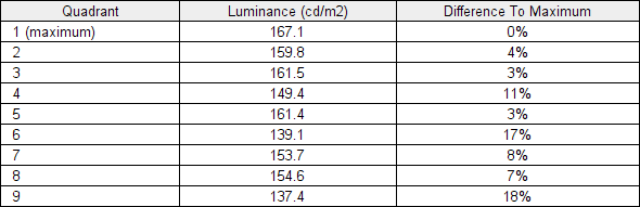
Luminance uniformity table
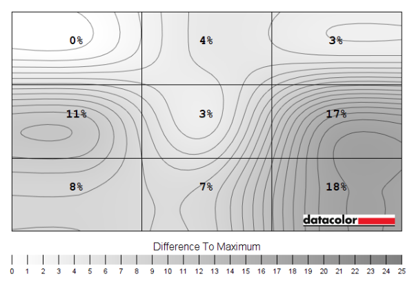
Luminance uniformity map
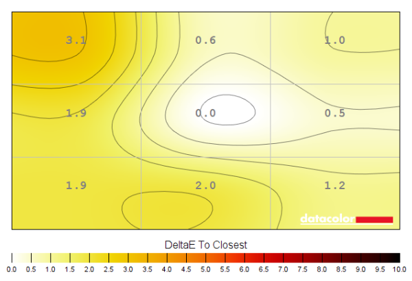
Colour temperature uniformity map
Contrast in games and movies
Lagom contrast tests
Colour reproduction
Colour gamut
Colour gamut 'Test Settings'

Colour gamut 'sRGB'

Colour gamut AMD 'CTC disabled' setting
Colour in games and movies
Viewing angles

The video below shows the Lagom text test, a mixed desktop background, game scene and dark desktop background from various viewing angles. The colour shifts for the mixed desktop background and game scene are reduced compared to what you’d observe on VA or TN models. But there is a quite a sudden drop off in contrast off-angle, kicking in sooner and more noticeably than with some IPS models both vertically and horizontally. The dark desktop background highlights ‘IPS glow’, which blooms out as viewing angle increases. This generally appears as a cool silver sheen, but has a slightly warmer quality from some angles.
Interlace pattern artifacts
Responsiveness
Input lag
Perceived blur (pursuit photography)


Responsiveness in games and movies
MBR (Motion Blur Reduction)
VRR (Variable Refresh Rate) technology
FreeSync – the technology and activating it


The AOC supports a variable refresh rate range of 48 – 165Hz (48 – 144Hz via HDMI)*. That means that if the game is running between 48fps and 165fps, the monitor will adjust its refresh rate to match. When the frame rate rises above 165fps, the monitor will stay at 165Hz and the GPU will respect your selection of ‘VSync on’ or ‘VSync off’ in the graphics driver. With ‘VSync on’ the frame rate will not be allowed to rise above 165fps, at which point VSync activates and imposes the usual associated latency penalty. With ‘VSync off’ the frame rate is free to climb as high as the GPU will output (potentially >165fps). AMD LFC (Low Framerate Compensation) is also supported by this model, which means that the refresh rate will stick to multiples of the frame rate where it falls below the 48Hz (48fps) floor of operation for FreeSync. If a game ran at 38fps, for example, the refresh rate would be 76Hz to help keep tearing and stuttering at bay. This feature is used regardless of VSync setting, so it’s only above the ceiling of operation where the VSync setting makes a difference.

Some users prefer to leave VSync enabled but use a frame rate limiter set a few frames below the maximum supported (e.g. 162fps) instead, avoiding any VSync latency penalty at frame rates near the ceiling of operation or tearing from frame rates rising above the refresh rate. If you go to the ‘Game Setting’ section of the OSD and enable the ‘Frame Counter’ feature, it will display the refresh rate of the display. This will reflect the frame rate if it’s within the main VRR window. Finally, it’s worth noting that FreeSync only removes stuttering or juddering related to mismatches between frame rate and refresh rate. It can’t compensate for other interruptions to smooth game play, for example network latency or insufficient system memory. Some game engines will also show stuttering (or ‘hitching’) for various other reasons which won’t be eliminated by the technology.
FreeSync – the experience
Nvidia Adaptive-Sync (‘G-SYNC Compatible’)

As noted previously and as highlighted in Nvidia Control Panel, this model has been specifically tested and validated as ‘G-SYNC Compatible’ by Nvidia. On our RTX 3090 the experience was very similar to what we described with FreeSync. With the technology getting rid of tearing and stuttering from what would otherwise be frame and refresh rate mismatches, within the VRR range. The floor of operation again seemed to be 55Hz or slightly below. An LFC-like frame to refresh multiplication technology was employed below that to keep tearing and stuttering from frame and refresh rate mismatches at bay. There was again a subtle momentary stuttering as the boundary was crossed, as we observed with our AMD GPU as well. Our suggestions regarding use of VSync also apply, but you’re using Nvidia Control Panel rather than AMD Software to control this. The setting is found in ‘Manage 3D settings’ under ‘Vertical sync’, where the final option (‘Fast’) is equivalent to AMD’s ‘Enhanced Sync’ setting. You’ll also notice ‘G-SYNC Compatible’ listed under ‘Monitor Technology’ in this section, as shown below. Make sure this is selected (it should be if you’ve set everything up correctly in ‘Set up G-SYNC’.

Note again that you can use the ‘Frame Counter’ feature in the ‘Game Setting’ section of the OSD to display the current refresh rate of the monitor. This will reflect the frame rate if it’s within the main VRR window of the monitor.
Video review
Timestamps:
Features & Aesthetics
Contrast
Colour reproduction
Responsiveness (General)
Responsiveness (VRR)
Conclusion
![]()
Positives Negatives Good colour consistency and a boost in vibrancy and saturation from the wide gamut
Gamut not wide enough for work with extended colour spaces, ‘sRGB’ mode very restrictive, colour consistency and viewing angles not up there with the best IPS offerings Strong static contrast for the panel type, good maximum luminance and screen surface less grainy than many competing models Moderate ‘IPS glow’ (perhaps a touch lower than average), fairly high minimum luminance and no HDR support A decent 165Hz experience with reasonable pixel responsiveness, low input lag and VRR working as expected on both the AMD and Nvidia side Some pixel responses quite a bit slower than the fastest IPS models and not the best-tuned experience for lower refresh rates such as 60Hz Well-priced with decent build quality for a budget offering, good ergonomic flexibility and decent range of OSD adjustments OSD controls a bit fiddly and Full HD resolution quite limiting
