Author: Adam Simmons
Date published: May 13th 2016
Table of Contents
Introduction
The Philips BDM4065UC was a striking monitor, not least due to its huge ‘4K’ UHD screen. Whilst the high-contrast VA (Vertical Alignment) panel provided the sort of experience some users were after, others craved the more accurate and consistent colour reproduction of an IPS panel. The BDM4350UC is the follow-up, adding a few extra inches to what was already a mammoth display and crucially employing an IPS (In-Plane Switching) rather than VA panel. We put this behemoth through its paces in our testing gauntlet, to see whether it’s big and brilliant or just simply big.
Specifications
The monitor employs a 42.51” screen, a TPV IPS-type (In-Plane Switching type) panel with 3840 x 2160 (‘4K’ UHD) resolution. This supports 10-bit colour processing, achieved with native 8-bits per subpixel plus FRC dithering. A 5ms grey to grey response time and 1200:1 contrast ratio is specified, which are both elements we’ll test in more detail later on. Some of the key ‘talking points’ of the monitor have been highlighted in blue below.
Key aspects of the specification are highlighted in blue below.
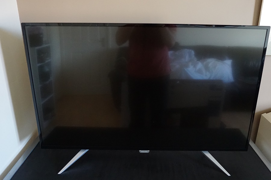
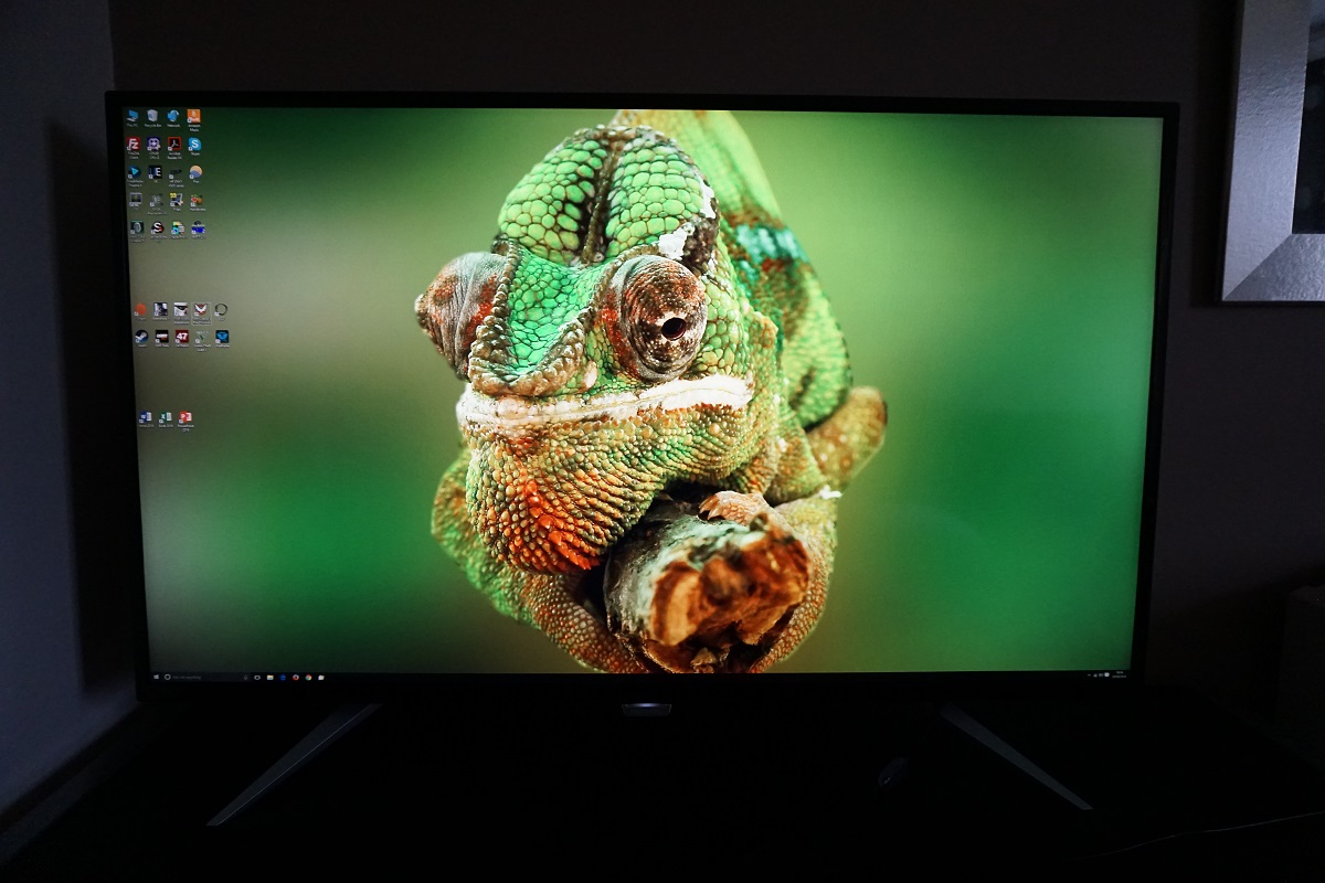
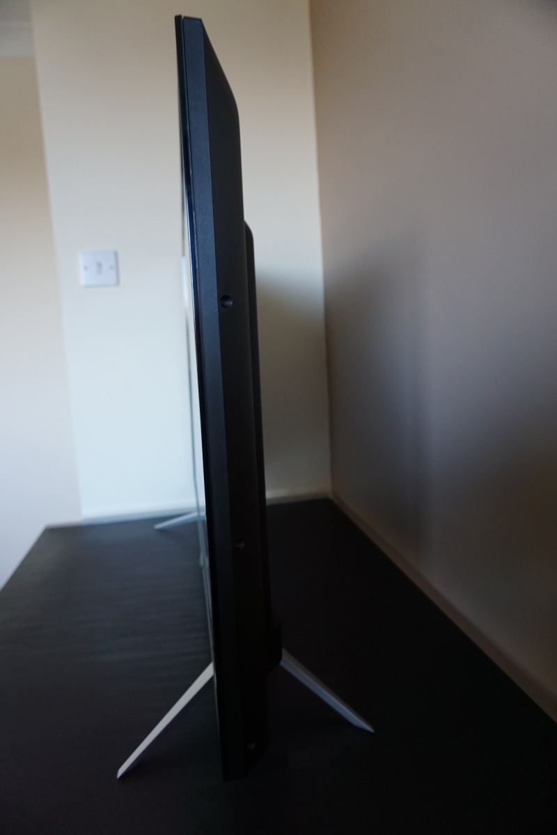
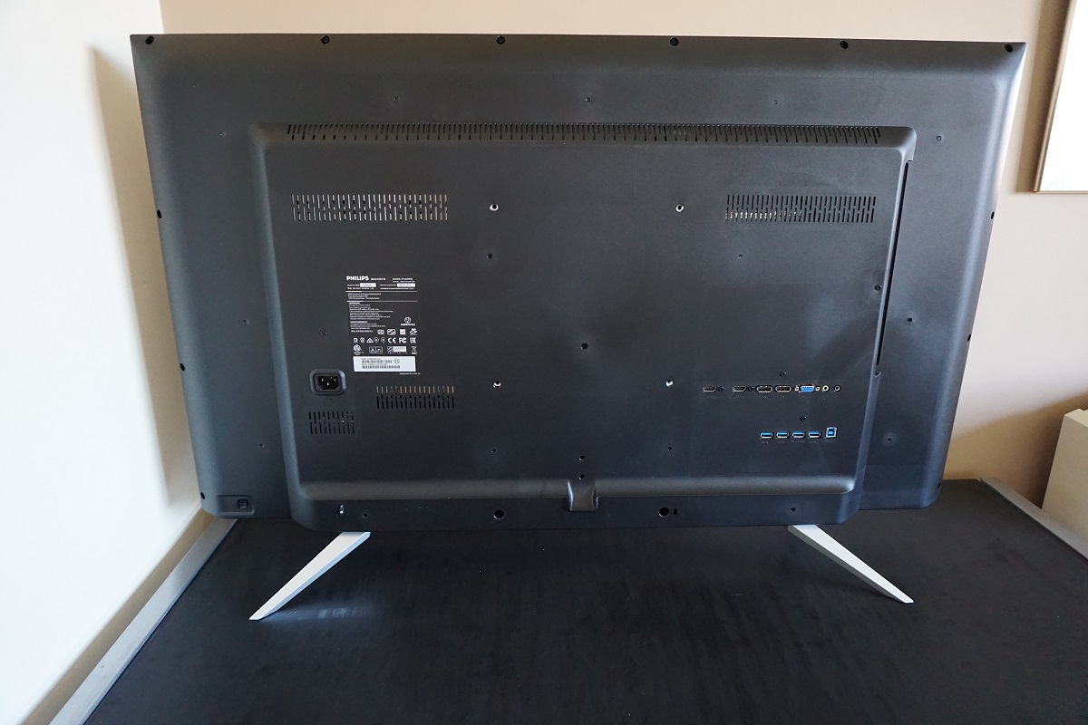
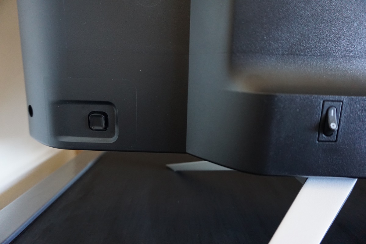
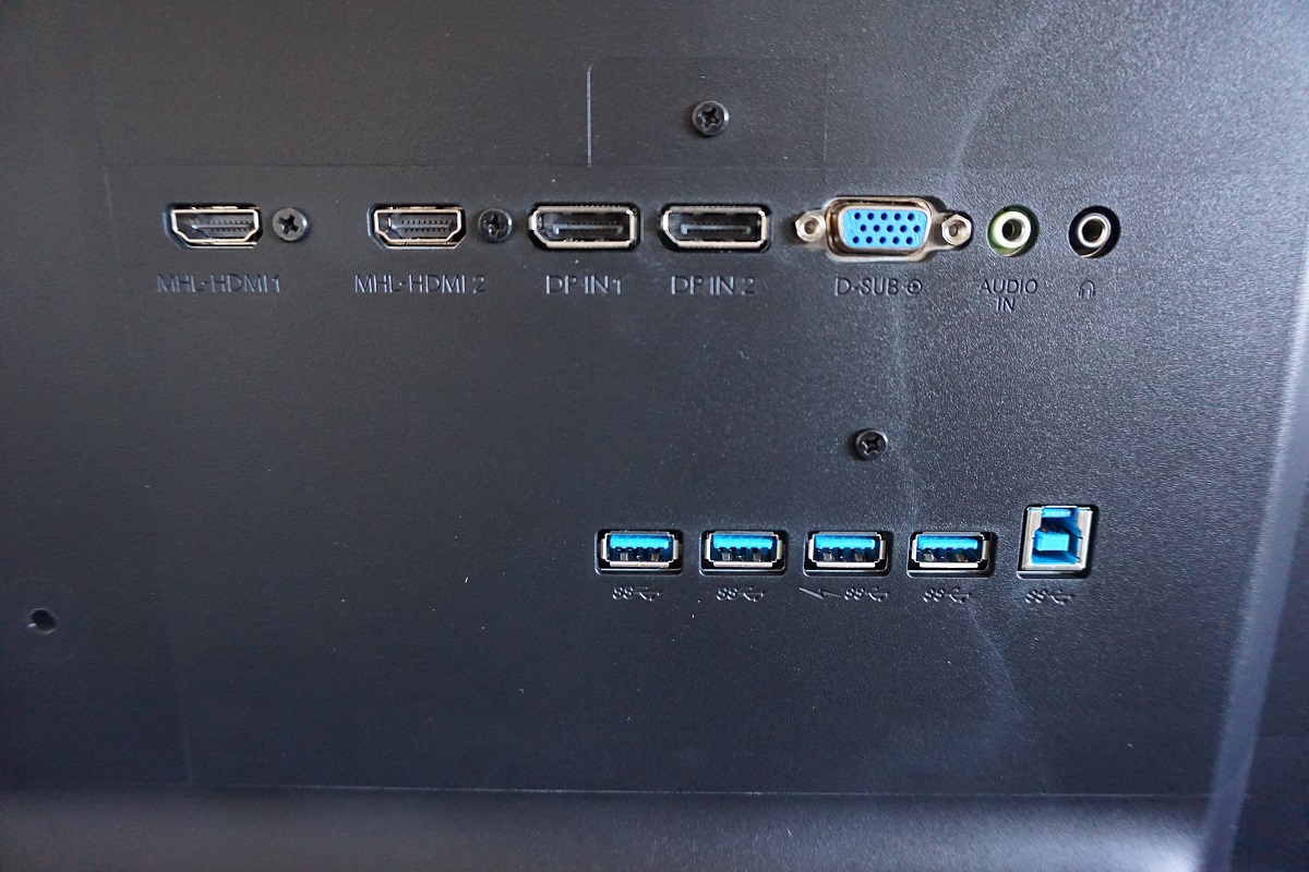
From the front the monitor is dominated by a large glossy screen. This screen surface has a very mild (3-4% haze) anti-glare treatment, cutting down on reflection just slightly compared to an untreated glossy surface without noticeably impeding the image. This is explored deeper into the review. The large screen is bordered by a slender bezel – ~14mm (0.55 inches) at the top and sides and ~20mm (0.79 inches) at the bottom or ~32mm (1.26 inches) if you include the central Philips logo. This logo also houses the power LED, appearing as a horizontal strip that glows a dim white if the monitor is on and flashes if signal to the PC is lost. There is also a small sliver of panel border around the screen, which is included in the measurements above. The included stand is quite basic, with metal feet, and certainly makes the screen itself look more like a TV than a monitor. It does not afford any ergonomic flexibility to the screen, but it is remarkably solid without the slight wobble that accompanied the older model. With this stand the monitor clears the desk by ~65mm (2.56 inches) or ~12mm (0.47 inches) including logo, with the top of the screen ~627mm (24.69 inches) above the desk. The OSD (On Screen Display) is controlled by a joystick (JOG button) at the rear of the monitor, towards the right side of the monitor as viewed from the front. Due to the size of the screen, the fact it sits quite low to the desk and the position of this joystick it is a bit awkward to use. Once you’ve sorted out the logistics of this and stretched off your arm a bit, navigating through the menu itself is quite straightforward. The video below highlights the functionality and control of the OSD. Note that there is a ‘Zero Watt’ power switch to shut off the monitor completely, but you can also turn it ‘off’ by pressing the joystick in for a few seconds. Pressing the joystick in again will then bring it back to life. Also note that we mentioned that there was no ‘burn-in’ (or more accurately any temporary image retention) on our unit. This was the case despite correct despite performing a wide variety of tasks with static content displayed on the screen for quite some time. Some users have reported temporary image retention on their units, something which may affect some units but not others. We don’t feel users should let this put them off trying this model, especially if their retailer offers an efficient returns service for peace of mind. From the side the monitor is reasonably svelte at around 45mm (1.77 inches) excluding the bulkier central protrusion and stand. The total depth of the monitor including stand is ~260mm (10.24 inches) and without this attached stand the monitor has ~80mm (3.15 inches) total depth. The rear of the monitor is matte black plastic. There are 200 x 200mm VESA holes centrally, should you wish to make use of an alternative stand or mount. At the bottom left (as viewed from the rear) the OSD control joystick (JOB button) is found. To the right of this is a ‘Zero Watt’ power switch, to cut off any power drain from the monitor itself. Above this is an AC power input, which means that the monitor has an internal AC -DC converter rather than an external power brick. The ports are backwards-facing and found to the right; 2 HDMI 2.0 (with MHL) ports, 2 DP 1.2 ports, VGA, 3.5mm audio input, 3.5mm headphone jack, 4 USB 3.0 pots (the third one along supports fast-charging) and a USB 3.0 upstream port. A glossy screen surface with an extremely mild anti-glare treatment (1-4% haze) is used on the monitor. The smooth and shiny outer-polarising layer of the monitor allows direct light emission without significant diffusion. As a result, the image is crisp and clear without obvious graininess and has a good ‘vibrant pop’ to it. If you can look closely you can see a very faint mist of ‘graininess’ from the screen surface, but this is very subtle indeed. As shown previously the monitor does reflect light due to the level of diffusion from the screen surface being very low. The extremely mild anti-glare treatment makes this reflection darker and less pronounced, so it blends into the image better than on an untreated glossy surface. When the monitor is displaying lighter shades, light from the monitor effectively out-competes much of the reflections. When darker content is displayed the reflections are more pronounced. Compared to matte screen surfaces you do have to be more careful with light levels in the room, but regardless of screen surface direct light hitting the screen should be avoided where possible. There is further analysis on the difference between matte and glossy screen surfaces in this article. A BGR (Blue, Green and Red) stripe subpixel layout is used. This is a less conventional subpixel than RGB (Red, Green and Blue) as ‘expected’ by operating systems including Microsoft Windows and Apple’s MacOS. Windows users should therefore run ClearType to optimise text clarity, whilst Mac users should generally avoid this monitor due to likely text fringing issues caused by this less conventional subpixel layout. The Philips BDM4350UC includes a range of ‘SmartImage’ presets; ‘Office’, ‘Photo’, ‘Movie’, ‘Game’, ‘Economy’ and ‘SmartUniformity’ (plus ‘Off’). There is also good scope for manual adjustments for things like gamma and colour temperature in the OSD. Rather than go through every single setting or combination of settings, we will instead focus on those which we feel are most appealing or interesting. The table below shows general observations made by eye and readings (gamma and white point) assessed using a Datacolor Spyder5ELITE colorimeter, using a range of settings. The monitor was left in its ‘Plug and Play’ state without any additional drivers or ICC profiles loaded. It was connected to an Nvidia GTX 980 Ti on a system running Windows 10 and left to run for over 2 hours before readings were taken. Similar observations were made using HDMI and when connecting to a modern AMD GPU. Unless specifically noted, assume default settings were used. The exception was that the monitor was set to ‘DP 1.2’ and 60Hz, although this doesn’t actually impact the static image quality as assessed here. 
Features and aesthetics
The monitor supports 3840 x 2160 @ 60Hz when using HDMI 2.0 or DP 1.2 (with the appropriate OSD setting selected, as noted previously). Earlier revisions are limited to 30Hz at the native resolution but support 60Hz at lower resolutions such as 1920 x 1080. Two integrated 7W speakers are also found at the back, above and the VESA holes. These offer more than enough volume, even if you wish to disturb the neighbours – but they also go down nice and quiet for more private listening experiences. The sound quality is also fairly good, with quite crisp trebles and good overall clarity. The bass was not as powerful as you’d get from a set of decent standalone speakers, but was sufficient to give body to the sound and prevent it sounding ‘tinny’. Overall these are usable speakers that are much better than most integrated solutions.
Calibration
Subpixel layout and screen surface
![]()
Testing the presets
Monitor Settings Gamma (central average) White point (kelvins) Notes Gamma = 1.8 1.8 7448K Bright and very cool-looking (not in a good way) with obvious lack of shade depth in places. In some respects the image looks quite vibrant, aided by the glossy screen surface and reasonable colour gamut. Gamma = 2.0 2.0 7081K As above but the depth is better and the image somewhat less cool-looking. Gamma = 2.2 (Factory Defaults) 2.2 6794K The depth is now good and the image looks rather vibrant overall with good ‘pop’ but accurate shade representation. The white point is better balanced now as well, with a less obvious cool tint. Gamma = 2.4 2.4 6687K As above but even more depth, with some shades appearing far too deep and dark. The white point is slightly warmer, too. Gamma = 2.6 2.6 6469K As above but even more depth, with some shades appearing far too deep and dark. The white point is slightly warmer, too. Color Temperature = 5000K 2.2 5271K This is just a touch above the 5000K target according to our measurements, but gives an unmistakably warm look to the image. The blue colour channel has been weakened significantly. This is an effective ‘Low Blue Light’ setting. Color = sRGB 2.2 6795K Indistinguishable from factory defaults. Color = User Define 2.4* 12528K A very strong blue tint and slightly too much depth in places (due to gamma, but see note below table). SmartImage = SmartUniformity 2.2 12312K** This mode appears extremely blue by default, but as noted below the table this is easily rectified. Once this is done the white point and overall image balance is good, but there are clear uniformity issues present despite that being what this mode is designed to correct. The maximum brightness and contrast is weakened significantly, too. Test Settings (see below) 2.2 6497K Very pleasing balance to the image with much more comfortable brightness. Excellent vibrant but varied look with a good white point balance.
* Although ‘2.2’ is reported in the OSD, the monitor actually switches to ‘2.4’ for the gamma setting if ‘User Define’ is selected for ‘Color’. If you cycle to a different gamma setting and then back to ‘2.2’, the monitor will use ‘2.2’ as reported. If the monitor is switched off and the ‘User Define’ setting is being used, gamma will again revert to ‘2.4’ even if ‘2.2’ is displayed. In other words, you have to cycle the gamma setting to something else and then back to ‘2.2’ if you wish to customise the colour channels and also have correct tracking of the ‘2.2’ curve.
** Although ‘6500K’ is reported, the monitor actually uses ‘User Define’ with its extremely high white point if ‘SmartUniformity’ is used. If you cycle to a different colour setting and then back to ‘6500K’, this setting is used as reported and the colour temperature drops to around 6300K (as measured by our colorimeter).
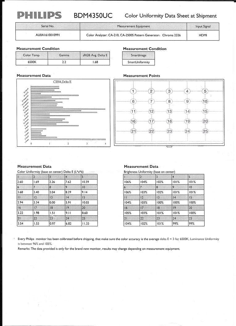
Out of the box the BDM4350UC had a bright and vibrant look to the image, with a slight but not overbearing cool tint. Gamma handling was good, too. For those who require strong uniformity across the screen, at the expense of contrast and brightness, a ‘SmartUniformity’ setting is included. This is calibrated in the factory, with a calibration report included. As noted above there is a bit of a bug with default white point handling, but this is easily corrected.
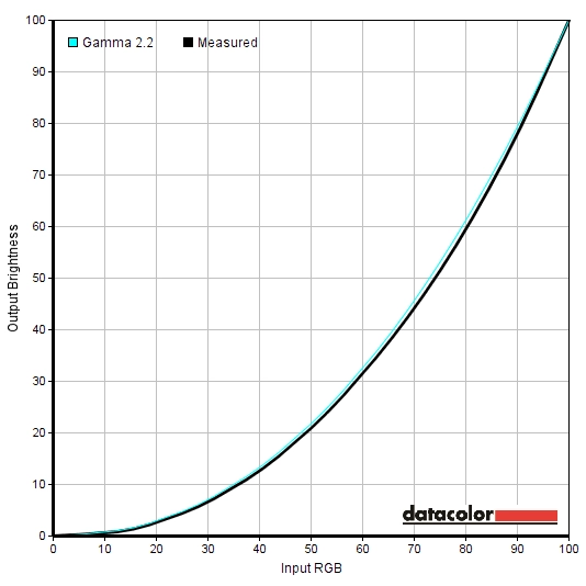
After simply reducing brightness, the image was actually very pleasing on our unit. The white point was a touch on the cool side, but not uncomfortably so. Obsessive and thorough as we are, though, we decided to make manual adjustments to the colour channels for our ‘Test Settings’. Unfortunately, this meant putting up with the need to manually re-select the ‘2.2’ gamma setting when turning the monitor on, as above. But that became part of the routine and was only a slight inconvenience really. Following these adjustments, the gamma tracking was good, tracking quite close to the desirable ‘2.2 curve’ as shown below.
Gamma test settings
Test Settings
As mentioned above we reduced brightness and made (significant) adjustments on the ‘User Define’ ‘Color’ setting. Be aware that individual units can vary, so these settings aren’t necessarily going to be optimal. Also be aware that we had to re-select ‘2.2’ for the gamma every time the monitor was switched on, as noted previously. If the monitor lost signal for any reason it was not necessary to re-apply this – if you don’t want the hassle of this, the default ‘6500K’ setting was actually pretty decent on our unit and will hopefully be quite usable on most units. Assume any setting not mentioned here was left at default.
SmartResponse= Fast Color= User Define R= 100 G= 84 B= 52
Brightness= 40 (according to preferences and lighting)
Contrast and brightness
Contrast ratios
A BasICColor SQUID 3 (X-Rite i1Display Pro) was used to measure the white and black luminance using a range of settings. From these values static contrast ratios were calculated, as shown in the table below. In this table blue highlights indicate the results under our ‘Test Settings’ and black highlights indicate the highest white luminance, lowest black luminance and highest contrast ratio. Assume any settings not mentioned in the table were left at default, with the exceptions noted in the calibration section. This includes the gamma of ‘2.2’ being re-selected and a colour temperature of ‘6500K’ re-selected where appropriate.
| Monitor Settings | White luminance (cd/m²) | Black luminance (cd/m²) | Contrast ratio (x:1) |
| 100% brightness (Factory Defaults) | 272 | 0.36 | 756 |
| 80% brightness | 238 | 0.32 | 744 |
| 60% brightness | 204 | 0.27 | 756 |
| 40% brightness | 165 | 0.22 | 750 |
| 20% brightness | 122 | 0.16 | 763 |
| 0% brightness | 73 | 0.10 | 730 |
| Gamma = 1.8 | 278 | 0.37 | 751 |
| Gamma = 2.0 | 264 | 0.36 | 733 |
| Gamma = 2.4 | 255 | 0.36 | 708 |
| Gamma = 2.6 | 250 | 0.36 | 694 |
| Color Temperature = 5000K | 223 | 0.36 | 619 |
| Color = sRGB | 272 | 0.36 | 756 |
| Color = User Define | 317 | 0.36 | 881 |
| SmartImage = SmartUniformity | 117 | 0.36 | 325 |
| Test Settings | 161 | 0.22 | 732 |
With only brightness adjusted the average static contrast was 750:1, which falls some way short of the specified 1200:1. The maximum static contrast recorded, using ‘Color = User Define’, was 881:1. These are certainly lower static contrast ratios than we’ve seen on quite a few IPS-type models recently and falls short of the specified value. The good news is that the glossy screen surface aids perceived contrast and black depth in all but dark rooms. It certainly doesn’t look noticeably weaker in that respect than typical IPS models with matte surfaces and higher measured contrast ratios and if anything tends to look better. Following the significant adjustments made for our ‘Test Settings’ a contrast ratio of 732:1 was recorded, which is reasonable. Using the ‘SmartUniformity’ setting decimated contrast, dropping the static contrast ration to 325:1. The highest luminance recorded was 317 cd/m² whilst the lowest white luminance was 73 cd/m², yielding a brightness adjustment range of 244 cd/m².
A Dynamic Contrast mode called ‘SmartContrast’ features. This can be activated alongside changes to other settings, aside from brightness. The brightness setting is not greyed out, but when the scene changes this is automatically overridden regardless of any adjustments you may make here. The brightness tended towards an uncomfortably bright value where there was mixed or brighter content on the screen. Where most of the content was dark, the monitor did dim fairly effectively.
PWM (Pulse Width Modulation)
The Philips BDM4350UC does not use PWM (Pulse Width Modulation) at any brightness level and instead uses DC (Direct Current) to regulate brightness. The backlight is therefore considered flicker-free, as advertised by Philips. This will come as welcome news to those worried about visual fatigue or other side-effects of PWM usage or are otherwise sensitive to flicker.
Luminance uniformity
Observing a black screen in a dark room, using our test settings, revealed some backlight bleed. There was a bit of clouding in places but nothing severe – this is shown in the image below. Note that this image was taken a few metres back from the monitor to eliminate ‘IPS glow’. This ‘glow’ is visible if you’re sitting in front of the monitor and using it normally (i.e. not sitting a few metres back). It manifests itself as a sort of silver sheen towards the corners of the screen. From in an ergonomically correct viewing position the glow is most intense towards the bottom corners. Given the size of the screen it is certainly visible, but not actually as extreme as some people might fear. As usual the ‘IPS glow’ blooms out if the screen is viewed from sharper angles, as demonstrated in the viewing angles video later on in the review.
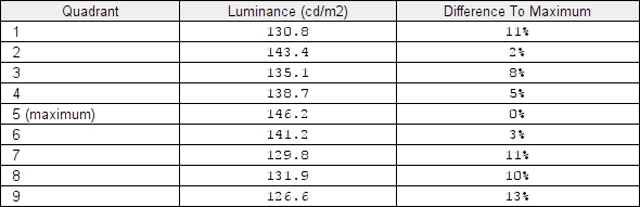
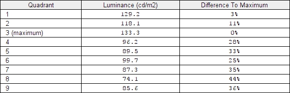
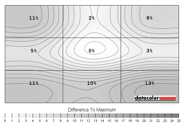
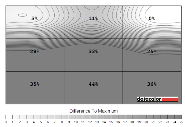
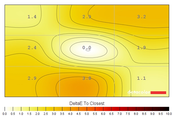
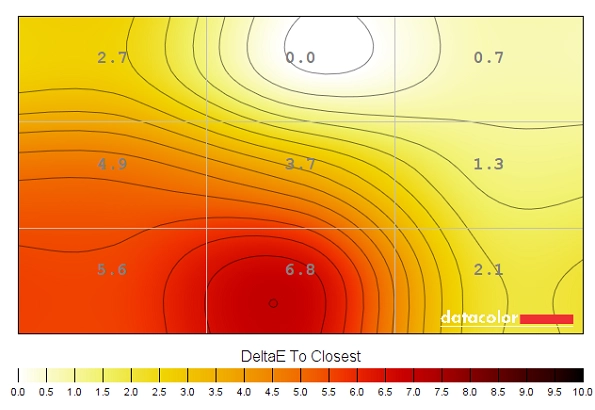
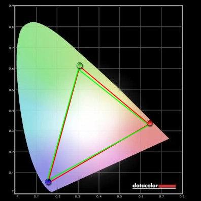
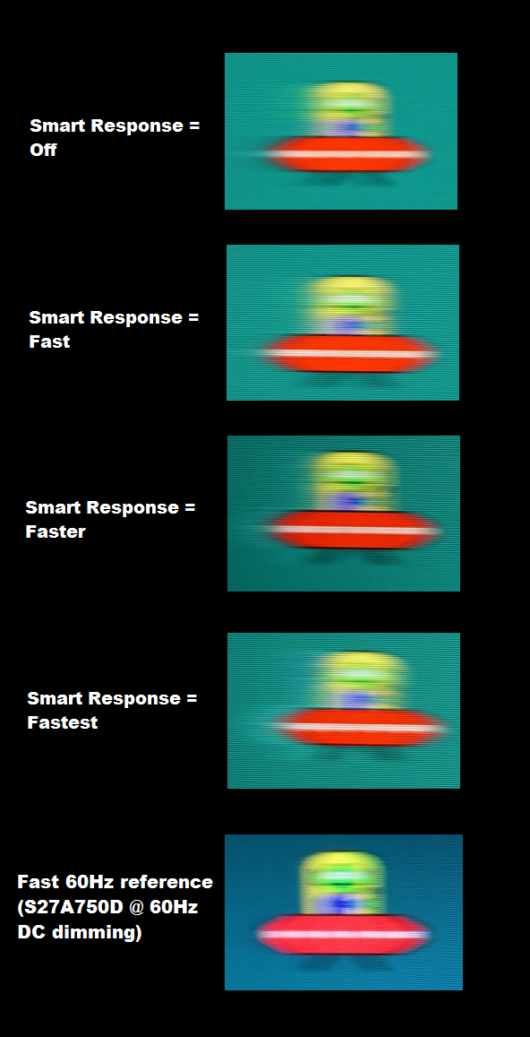
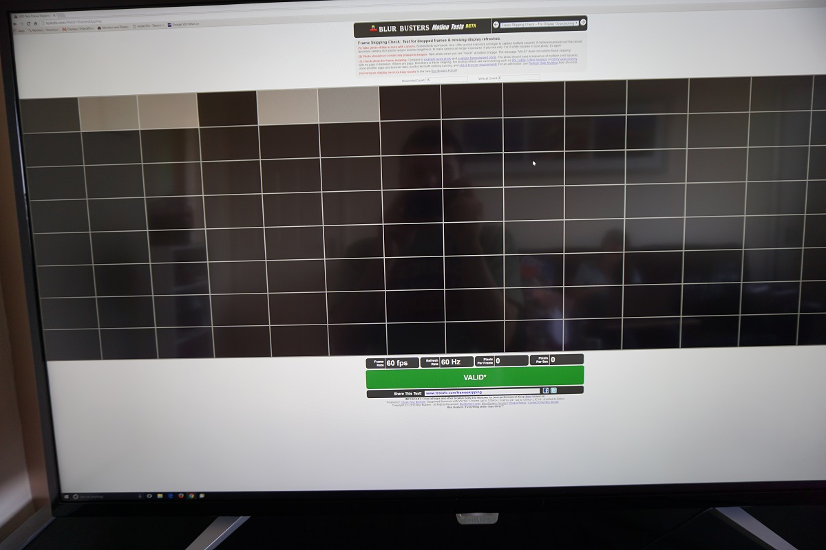
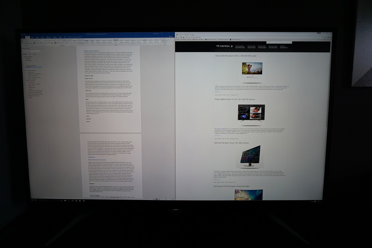
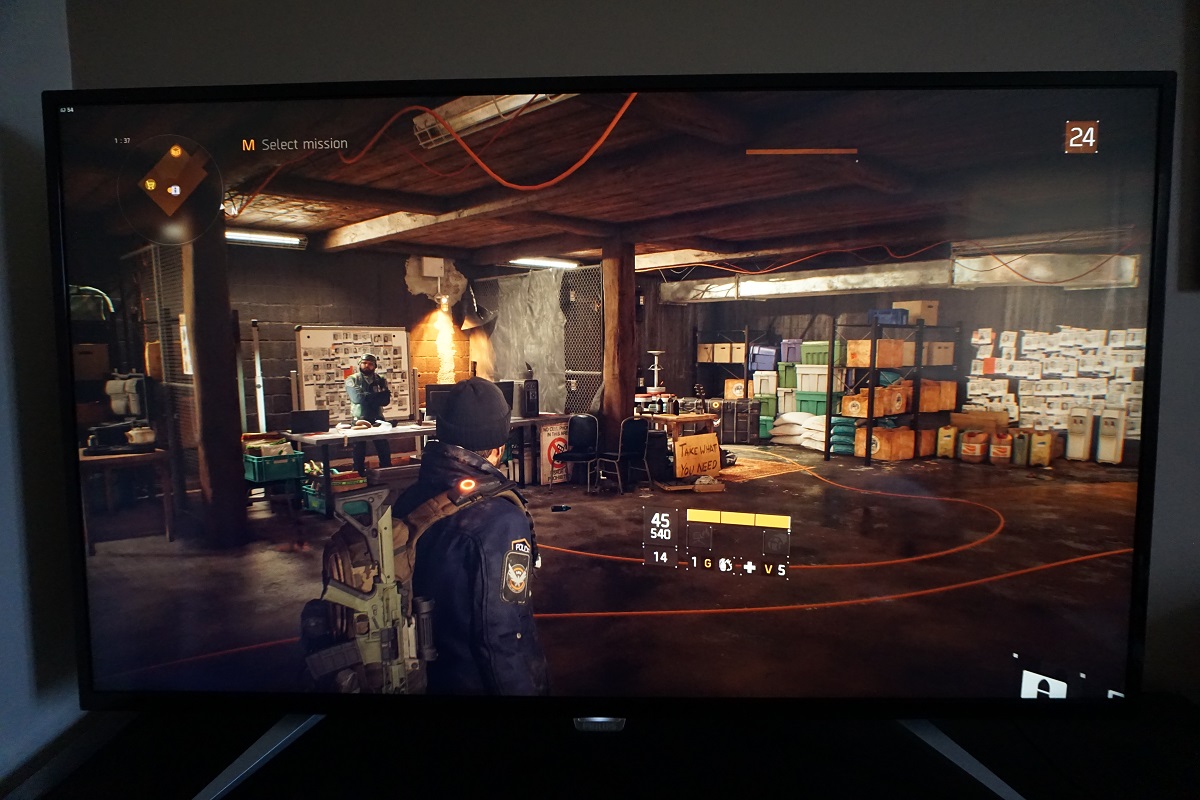
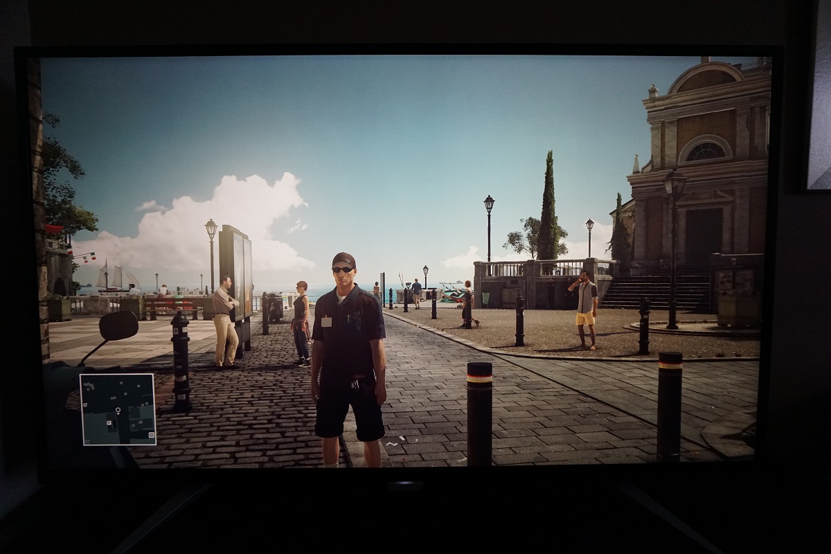
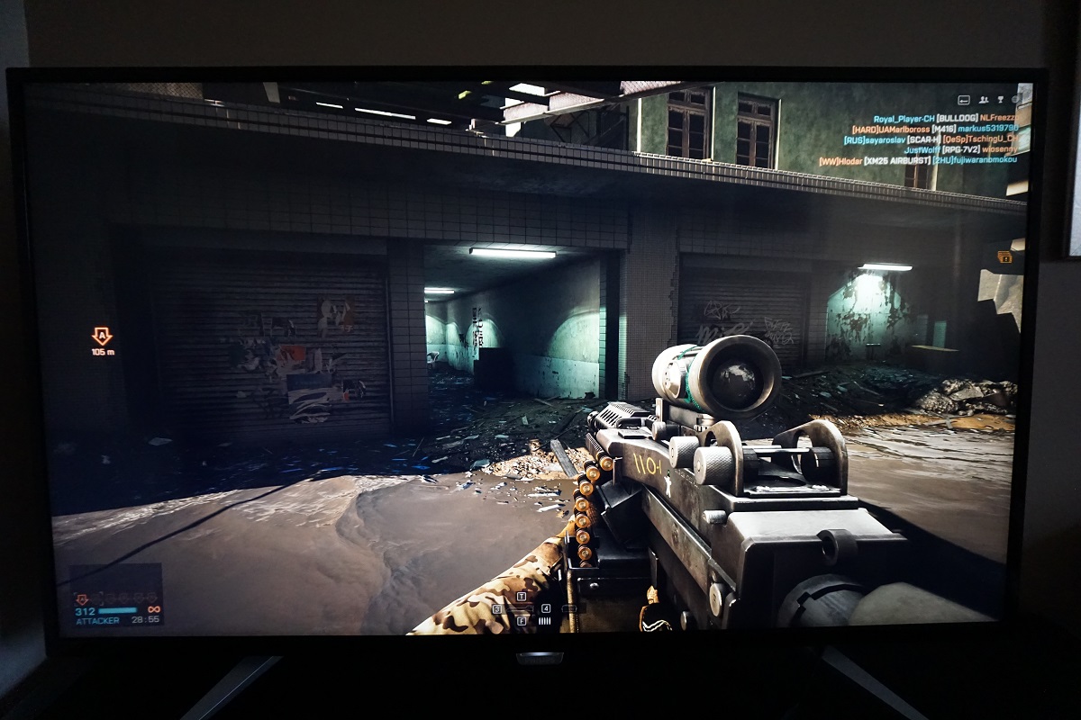
The Spyder5ELITE was used to assess the uniformity of lighter colours, represented by 9 equidistant white quadrants. The luminance of each quadrant was measured and compared to the brightest measured quadrant. The tables below show these values as well as the percentage deviation between each quadrant and the brightest point measured. The top table shows the results under our ‘Test Settings’, whereas the bottom table shows the results with ‘SmartImage’ set to ‘SmartUniformity’. This is the factory-calibrated uniformity compensation mode mentioned previously. The white point of ‘6500K’ was re-selected to correct the bug with incorrect default white point mentioned earlier. Under our ‘Test Settings’, the luminance uniformity was good. The brightest point recorded was ‘quadrant 5’ at the centre of the screen (146.2 cd/m²). The maximum deviation occurred at ‘quadrant 9’, towards the bottom right (126.6 cd/m², which is 13% dimmer). The average uniformity deviation between each quadrant and the brightest point was 7.88%. Using the ‘SmartUniformity’ setting created massive problems. The table above was taken with the ‘Color’ setting of ‘6500K’ reselected as detailed earlier. However; we also tested using the ‘sRGB’ and ‘User Define settings’ and also using HDMI instead of DP, but nothing provided even remotely decent uniformity. The average uniformity deviation using this setting was 26.88%. For those that prefer these deviations to be shown graphically, we’ve included some contour maps. Here darker greys represent lower luminance (greater deviation from brightest point) than lighter greys. The top map uses our ‘Test Settings’ whereas the bottom map uses ‘SmartUniformity’ as before. The percentage deviation between each quadrant and the brightest point is also shown. You can clearly see a major issue with the ‘SmartUniformity’ setting on our unit. Note that individual units can vary when it comes to uniformity both with and without this mode – and this was clearly not the intended behaviour for this uniformity compensation setting nor did it tally up with the included factory calibration report. The Spyder5ELITE was also used to analyse variation in the colour temperature (white point) for the same 9 quadrants previously analysed. The deviation between a given quadrant and the 6500K (D65) daylight white point was assessed, with deviations assigned a DeltaE value. A DeltaE >3 represents significant deviation that most users would be able to see quite readily by eye. Again, the top map shows the results under our ‘Test Settings’ and the second using the ‘SmartUniformity’ setting. Darker shades on this map represent higher deviation from 6500K than lighter shades. Using the ‘Test Settings’ showed significant but not worrying deviations towards the top left and bottom central area of the screen. No further significant deviations were recorded. With ‘SmartUniformity’ enabled, there were some severe uniformity issues towards the bottom central and left regions of the screen and to some extent a bit higher up as well. Note again that uniformity can vary between individual units and that there may be further deviation beyond the measured points. Either way, it’s clear that the ‘SmartUniformity’ setting was anything but ‘Smart’ on our review sample and simply made things a lot worse. Despite a weaker than average measured contrast ratio, the perceived contrast was good overall on Battlefield 4 (BF4). There was a good level of detail in dark areas towards more central areas of the screen, but the aforementioned IPS glow did drown out some detail towards the bottom and lesser extent top corners of the screen. The perceived black depth was quite good provided there was some ambient light in the room, thanks to the glossy screen surface. Lighter shades such as lights, sparks, gunfire and flames stood out very nicely against darker surroundings with an excellent ‘pop’ to them. The contrast performance was also decent on Dirt Rally. Again, some detail was lost due to IPS glow and towards the bottom corners in particular dark maps appeared somewhat less atmospheric than they should. Provided there was decent lighting in the room, though, this was not really evident and the perceived black depth was actually decent. Brighter shades contrasted very nicely and pierced through darker surroundings – fireworks in the sky and car headlights at night, for example, had a fairly dazzling quality to them. It was primarily the glossy screen surface that should be thanked for this quality. We also assessed contrast performance on the Blu-ray of Star Wars: The Force Awakens. This again highlights the effect of perceived contrast from the glossy screen surface. Even with just a bit of ambient light, the perceived black depth is far beyond what you might expect given the contrast ratio. And the distinction between the dark and lighter shades that intertwine was very strong. That is of course a good thing given how vital such elements are to the atmosphere of this film. Lightsabers and explosions contrasted brilliantly with the deep dark depths of space, whilst bright elements appeared smooth rather than grainy. It is fair to say that the distinctions and overall depth of the dark areas was not the same as on a model with much stronger contrast (for example the BDM4065UC), but still beyond what you might expect given the measured contrast ratios. In dimmer lighting the glossy screen surface became less advantageous in terms of perceived contrast benefit. And indeed in moderately dim to dim lighting the IPS glow also ate away at some of the detail, particularly towards the bottom corners of the screen. We used Lagom’s contrast tests to analyse contrast performance, helping to highlight issues which may not be apparent during other testing. The following observations were made. The colour gamut of the BDM4350UC (red triangle) was compared with the sRGB colour space (green triangle). The monitor offers fairly comprehensive sRGB coverage, with just a smidge of under-coverage in the blue region of this diagram. There is also a sliver of over-coverage in places, but really the colour gamut corresponds to sRGB closely. This gives the monitor the potential for very accurate sRGB output – the glossy screen surface helps aid the vibrancy even without a bit more overextension of the gamut, as we explore. The colour reproduction was strong on BF4. There was an abundance of vibrant-looking shades with pleasing variety displayed. The colour consistency strengths of the IPS-type panel allowed closely matching minty green shades and earthy browns to be displayed in a distinct and accurate fashion. Meanwhile there were some much lusher greens, which the colour gamut gave quite pleasing depth without causing oversaturation. Some users would prefer the deeper saturation provided by a more generous colour gamut, but regardless of this, the screen surface helped these more vibrant-looking shades ‘pop’ and stand out. The warming orange glow of fires, the neon intensity of various brightly coloured HUD elements (yellows, reds, greens and blues) and the brilliant icy white of the engineer repair tool were examples of elements that really benefited from the ‘glossy pop’ of the screen. Colour reproduction was equally pleasing on Dirt Rally. The racing environments looked in-place with an excellent natural variety of leafy greens and earthy browns. In amongst these were some nice lush-looking green shades and deep autumnal reddish-browns, where appropriate. The paintjobs on the cars showcased some impressively vibrant shades, including exceptional bright reds, rich golden yellows, deep blues and piercing cyans. In appropriate lighting, the glossy screen surface gave these shades (and indeed all shades) a sort of wet ‘painted-on’ look. And a level of smoothness simply not captured on matte displays. To more closely analyse colour reproduction, in something of an unforgiving environment, we also tested the Blu-ray of Futurama: Into the Wild Green Yonder. This features large areas of individual shade and helps highlight weaknesses in colour consistency very nicely. In this respect the BDM4350UC performed nicely; it was clearly an IPS-type panel. There were some variations in brightness of certain shades, for example the red of Dr Zoidberg appeared slightly deeper towards the edges than centrally. But you didn’t get the sort of pronounced variation seen from other panel types. This allowed a great variety of closely matching pastel shades to be displayed, giving characters their own unique identity (with distinct skin tones etc.) There were some very nice vibrant colours throughout the film, too, such as bright neon pinks and purples and some decent deep reds and blues. Finally, we took a look at the Blu-ray of Star Wars: The Force Awakens. This film was given the look it craved by the monitor. The fancy visual effects such as explosions, brilliant red and blue lightsabers and the brilliantly evil imperial red lighting all looked suitably vibrant in a ‘jump off the screen’ kind of way. The strengths in colour consistency of the IPS panel were also evident. Characters had distinctly different skin tones, with even some more subtle variations displayed appropriately. The vast areas of desert sand also highlighted the consistent richness – on panel types where viewing angle performance is weaker, this sand would noticeably lose saturation towards the bottom or edges of the screen. Although not perfect from a normal viewing position, with some variation pretty much inevitable given the sheer size of the screen, the colour consistency on this was beyond what non-IPS-type LCDs are capable of. Lagom’s tests for viewing angles were used to further explore the idea of colour consistency and viewing angles. The following observations were made from a normal viewing position, around 70cm from the screen. A sensitive camera and a small tool called SMTT 2.0 was used to measure input lag for the BDM4350UC. The monitor was compared to various screens of known latency, taking over 30 repeat readings to maximise accuracy. Using this method, we calculated 27.86ms (over 1.5 frames) of input lag. This value is influenced both by the signal delay (element you ‘feel’) and pixel responsiveness (element you ‘see’). It indicates a moderately high signal delay, which may be troublesome for some gamers but will be fine for others. Note that changing ‘SmartImage’ to ‘Game’ has no effect on this as it is purely a colour preset which does not alter pixel responsiveness or signal delay. Our responsiveness article takes a detailed look at the factors which affect a monitor’s responsiveness. Chief amongst these is the concept of ‘perceived blur’, which is contributed to most significantly by the movement of our own eyes. The pixel responsiveness of the monitor plays a more minor (but potentially still significant) role. The concept of ‘pursuit photography’ is also explored, which is basically a technique using a moving camera to capture motion on a screen in a way which reflects not only the pixel responses but also reflects blur due to eye (camera) movement. The following images are pursuit photographs taken using the UFO Motion Test for ghosting, with the test running at 960 pixels per second. This is a practical speed for such photographs and is sufficient to show the key contributors of perceived blur. The monitor was set to its various ‘SmartResponse’ pixel overdrive settings; ‘Off’, ‘Fast’, ‘Faster’ and ‘Fastest’, respectively. The middle row of the test (medium cyan background) was used here. The final image shows a 60Hz reference, specifically a Samsung S27A750D set to full brightness (ensures DC backlight control), using its optimal ‘Faster’ response time setting. This essentially shows what things should look like on a 60Hz sample and hold LCD where pixel responsiveness isn’t a limiting factor. Note that the horizontal interlacing patterns on these photos are moiré from the camera, not artifacts from the monitor. With ‘SmartResponse’ set to ‘Off’, there was a fair amount of blurring of the object itself, which was similar to the 60Hz reference. This reflects the 60Hz refresh rate and level of eye movement associated with that on a sample and hold display. There was also some trailing behind the object (it moves from left to right) which is caused by slower than optimal pixel response times. Using the ‘Fast’ setting cut back on this trailing but introduced just a faint trace of overshoot (inverse ghosting). This can be seen as a slightly lighter trail behind the object. With the ‘Faster’ setting the overshoot became more intense and noticeable as a sort of colourful halo behind the object. With the ‘Fastest’ setting this was particularly bold and distracting. In practice, considering a broader range of transitions than shown here, we found ‘SmartResponse = Fast’ to be optimal. It cut down on most of the conventional trailing observed without the feature enabled but didn’t introduce distracting levels of overshoot. We would like to round off this section by discussing a ‘juddering’ issue that occurs on this monitor. Every 2.5 seconds or so, the monitor appears to skip a frame. This is highlighted in the image below, which is the Test UFO frame-skipping test. If you observe other tests on that website, you can see that the UFO (or whatever other object is being shown) moves smoothly from left to right for the most part. But this is interrupted every 2.5s or so by a judder or skip, as a frame of motion is missed out. The issue persisted regardless of the refresh rate of the monitor and was actually more frequent for most frequencies, including 50Hz and 30Hz. No setting on the monitor influences this, including ‘Pixel Orbiting’ or ‘SmartResponse’. We have spoken with Philips Product Manager Albert Ulfman about the issue. He confirms that there may be a juddering issue, but that in their fairly extensive testing they did not see it as a problem during normal usage. Due to this and the fact the issue is really intrinsic to the panel, this isn’t something that will be fixed by a firmware update or anything like that. The monitor was never specifically designed for gaming (although it can be used for such uses) and the panel used was actually designed for use in TVs where tolerance for such issues is slacker. If a similar panel was designed from the ground up for the rather niche 40”+ monitor market it would add significant cost to the end product. We do agree with their assessment that this is really a non-issue for most users. We are just highlighting this issue here for completeness. In actual use, although the juddering is there, it isn’t as obvious as it is in constrained viewing environments such as TestUFO tests. We didn’t notice it whilst using the monitor on the desktop or watching movies. Whilst we did notice it in game, if they were running at a solid 60fps, we didn’t find it overly distracting and it didn’t impede our inputs or the playability of the game. It is also far less obvious than any stuttering or juddering you would experience if the frame rate drops at all below 60fps. Note that the monitor can’t be set any higher than 60Hz without extreme frame skipping or simply losing signal – so we won’t be discussing ‘overclocking’ in this review. On BF4 there was a moderate degree of blur, with eye movement being the key contributor here. Compared to the best 60Hz LCD performers out there, there were no obvious weaknesses from pixel responsiveness. There were some imperfections, but they were really quite minor. Some pixel responses were slower than optimal, giving a fairly faint trace of additional trailing here and there – too faint to really catch your eye. There was also a hint of overshoot in places, but nothing that really stood out. There most obvious example of this was where certain medium and slightly lighter shades combined, for example a dark tree trunk with bright blue sky in the background. You could see evidence of overshoot here as a sort of semi-transparent trail that was brighter than either the object (tree) or background (sky) colour. But it was only marginally brighter and blended it quite well – so it’s not something most users would notice or should be at all worried about. There was again a moderate degree of blur on Dirt Rally, predominantly caused by eye movement and therefore much as you would see on even the most responsive 60Hz LCDs. There was again a bit of trailing from slower than optimal pixel responses and some faint overshoot here and there. This didn’t stand out and shouldn’t bother the vast majority of users. Unlike on the BDM4065UC, there weren’t obvious weaknesses for some (generally high-contrast) pixel transitions whilst others remained rather snappy. Pixel transitions were universally quite decent, with the ‘Fast’ setting providing a respectable level of acceleration without introducing obvious overshoot. Our Blu-ray movie test titles were also observed for weaknesses in pixel responsiveness. There were no issues highlighted here, with things looking as good as we’ve seen in this respect really. The ~24fps at which the films run did limit the fluidity somewhat, but that is not the monitor’s fault. In our article on the UHD experience, we look at the benefits and drawbacks of running the ‘4K’ UHD resolution of 3840 x 2160 on a 28” screen. There are also links at the bottom to reviews where we share our experiences with running the resolution on monitors of various sizes. With a 42.51” screen, this model spreads those pixels out across quite a vast area. The pixel density is therefore 103.64 PPI (Pixels Per Inch); similar to a 21.5” Full HD (1920 x 1080) monitor. Although you don’t get the same detail and clarity as the tighter pixel densities of many UHD screens, the pixel density is still decent. Furthermore, the relative size of the desktop icons, text and various UI elements is sufficient that many users will find the monitor very usable without scaling. Given the imperfect nature of scaling on many programs, if it is even supported at all, that’s a good thing. The images below give you an idea of the real-estate that is afforded to users on the desktop and some of the multi-tasking potential offered by the screen. With a pixel density that’s similar to a 21.5” Full HD monitor and only a little lower than a 27” WQHD (2560 x 1440) model, there is certainly a decent level of detail when gaming. It’s also impressive to see these fairly detailed gaming environments spread across such a large glossy screen – an undeniably engrossing experience. Some users would argue that a screen this size is wasted or not optimal due to it engaging peripheral rather than the central visual field from a normal viewing position (in our case 70-80cm). However; it’s this enveloping of the visual field that makes for such an immersive viewing experience. It really does draw you into the gaming environment, although we wouldn’t say the extra 3” made a whole lot of difference in that respect compared to the BDM4065UC. Then again; we did test that model a year before this one with plenty of smaller screens in between. The level of detail when gaming was also respectable – lacking the ‘wow factor’ of smaller UHD screens, but having a nice level of detail comparable to a 27″ 2560 x 1440 model. Seeing this detail spread out across a glossy screen of just under 43″ diagonal was also rather impressive. The images below do a very poor job of replicating what it is actually like to game on a screen of this size. The image quality can’t be judged in these images either; it is influenced too heavily by the colour capabilities of your own monitor and of our camera, not this particular monitor. Although these are all games rather than movies, we did test a few movies (Blu-rays and a few shorter ‘4K’ UHD movies) and found the experience to be just as engrossing. We certainly consider this an enjoyable monitor for movie-watching, even if you like to sit back and relax rather than stay bolt-upright at a computer desk. If you wish to run the monitor at a lower resolution, such as 1920 x 1080, or are forced to do so because you wish to use something like a games console, then it’s important to consider how the monitor will handle this. An interpolation (scaling) process is used to map the resolution onto the 3840 x 2160 pixels of the screen, unless the ‘1:1’ option is selected as per the OSD video. As a PC user you should make sure that the monitor rather than graphics card is handling this, too. AMD GPU users don’t need to worry as the default settings mean that the monitor handles the interpolation when gaming at lower than native resolutions. Users of Nvidia GPUs should open Nvidia Control Panel and navigate to ‘Display – Adjust desktop size and position’. They should then ensure that ‘No Scaling’ is selected and ‘Perform scaling on:’ is set to ‘Display’ as illustrated below. It is a common misconception that 1920 x 1080 will be displayed ‘perfectly’ on a 3840 x 2160 monitor due to the equal divisions (i.e. using 1:4 pixel mapping). In reality that is rarely the case and generally the same interpolation process is used here as is used to display other non-native resolutions. This was exactly what we observed on the Philips. There was a bit of a soft look to the image when comparing with a native 1920 x 1080 display of similar size, but it wasn’t too drastic really. On a screen of this size the Full HD resolution is never going to look amazing from a normal sitting distance. The same could be said for the 2560 x 1440 (WQHD) resolution, although there aren’t any ~42” WQHD displays out there to compare with. It did appear to us that there was a bit of softening from the interpolation, but this resolution did remain usable as a fall-back and looked superior to 1920 x 1080 on this display or indeed a native Full HD display of similar size. The video below summarises some of the key points raised in this written review and shows the monitor in action. This review is designed to complement the written piece and is not nearly as comprehensive. The Philips ‘Brilliance’ BDM4350UC is the largest monitor we’ve tested, with a screen size of just under 43”. This makes it marginally larger than its predecessor, at an already impressive size of just under 40” (BDM4065UC). It is the sheer size of this dominant desk centrepiece that goes a large way to defining the experience of the monitor and indeed whether a user will deem it at all suitable for them. It certainly took some getting used to, as it dwarfed the 23.6” and 27” monitors we were using just prior and indeed during this review. But we did adjust to the size, after which we found it perfectly comfortable to use for a range of tasks. The size is accompanied by a 3840 x 2160 ‘4K’ UHD resolution, which gave a lot of useful ‘pixel real estate’ without necessitating the use of scaling for most users. The pixel density was quite respectable – it certainly didn’t have the ‘wow’ factor of some smaller UHD screens in that respect, but it did bring with it a nice level of detail and clarity overall. The glossy IPS-type panel used a similar very low haze screen surface to its predecessor, but of course used ‘IPS’ rather than VA technology. The specified contrast ratio of 1200:1 was not achievable in our testing, with 700 – 800:1 being a more representative figure. This is of course a far cry from the ~5000:1 both specified and measured on its predecessor. Thankfully the perceived contrast was quite pleasing, with the glossy screen surface providing a good perceived depth to dark shades in most lighting conditions and also allowing lighter colours to ‘pop out’ amongst darker surroundings. We were also pleased to see these light elements appear smooth and ‘pure’, rather than shrouded in a sort of mist or haze from the screen surface. The responsiveness of the monitor was quite pleasing in other respects, too. There was just a hint of overshoot and trailing on top of what you might ideally see on a 60Hz sample and hold LCD. This compares favourably to the obvious weaknesses bequeathed by some pixel transitions on the older model. The input lag was moderately high, which could cause issues for some users but shouldn’t really bother most users who are happy enough with a 60Hz monitor. We did come across some ‘juddering’ that occurred every 2.5s or so, but tested this extensively and discussed this with Philips to come to the same conclusion. It’s not something most users will notice, even when gaming, but it would be an injustice to users not to mention it for completeness. All things considered, we enjoyed using and reviewing the Philips BDM4350UC. We feel it is a nice upgrade to the older model in many respects, but obviously can’t better it in every way. Despite weaknesses in static contrast, we found the overall image to be appealing for a wide variety of tasks. The massive screen also proved particularly engrossing for gaming, despite the monstrous size taking some getting used to. As with its predecessor a fixed stand solution is included, which doesn’t even allow tilt adjustment of the screen. On the plus side the metal feet included kept the screen remarkably stable on the desk – and there are always VESA holes for alternative attachment to a compatible stand or mount of your choice. Overall this big monitor with moderate street price is definitely one to shortlist if you’re after an engrossing (but not necessarily overly competitive) gaming experience. It’s also a compelling choice for movies and general desktop work, with its strengths in accurate shade production lending itself to image editing and suchlike as well. The bottom line; a large and shiny monitor that delivers a diverse and engrossing computing experience, at a reasonable price.
Luminance uniformity table ('Test Settings')
Luminance uniformity table ('SmartUniformity')
Luminance uniformity map ('Test Settings')
Luminance uniformity map ('SmartUniformity')
Colour temperature uniformity map ('Test Settings')
Colour temperature uniformity map ('SmartUniformity')
Contrast in games and movies
Lagom contrast tests
Colour reproduction
Colour gamut
Colour gamut 'Test Settings'
Colour in games and movies
Viewing angles
The following video shows the results of the Lagom text test, a mixed desktop background and a dark desktop background from a variety of different viewing angles. You can see how the ‘IPS glow’ mentioned earlier blooms out from steeper viewing angles, in the final section of the video.
Responsiveness
Input lag
Perceived blur (pursuit photography)
Perceived blur with various settings
Responsiveness in games and movies
The ‘4K’ UHD experience and thoughts on the 43″ screen
Interpolation and upscaling

Video review
Conclusion
Positives Negatives A glossy IPS-type panel with pleasing gamma tracking straight from the box, strong sRGB colour accuracy and a decent range of image adjustment options in the OSD including a useful Low Blue Light (LBL) 5000K setting
The image took a fair bit of adjustment to achieve 6500K on our unit and there were some odd quirks in the OSD such as the gamma resetting to ‘2.4’ initially despite ‘2.2’ being displayed
The glossy screen surface helped deliver a vibrant image with pleasing ‘pop’ and strong perceived contrast well beyond what you might expect from measured static contrast ratios Static contrast was weaker than specified, the glossy surface means lighting must be more tightly controlled and the ‘SmartUniformity’ uniformity compensation setting on our unit was, in a word, broken A flicker-free backlight, as promised, and quite well-tuned pixel overdrive with the appropriate ‘SmartResponse’ setting, delivering a competent 60Hz performance
Traces of overshoot and trailing here and there (nothing substantial), moderately high input lag and a bit of a ‘juddering’ issue that sounds worse than it is (don’t let this put you off)
The massive screen and 3840 x 2160 ‘4K’ UHD resolution combined to give excellent usable space and a very engrossing experience for a range of computing tasks, including gaming
Limited adjustability with the included stand and the 3840 x 2160 resolution is quite demanding – interpolation performance was fairly decent, but lower resolutions on a screen of this size aren’t exactly ideal anyway
