Author: Adam Simmons
Date published: March 1st 2016
Table of Contents
Introduction
There are a growing number of high refresh rate ‘gaming’ monitors, but quite often these feature some fairly bold design choices and have additional features which some users simply don’t care about. The Dell S2716DG offers something more simple – a nice solid ‘Dell’ monitor without those additional fripperies. But it certainly doesn’t cut back on those more appealing gaming features, with a potentially very responsive TN panel, 144Hz refresh rate and support for a trio of Nvidia technologies; G-SYNC, ULMB (Ultra Low Motion Blur) and 3D Vision. It’s really the G-SYNC variable refresh rate technology that’s the key selling point as it aims to ensure a smoother experience free from the tearing or stuttering caused by frame rate and refresh rate mismatch. We look at how these technologies are implemented on the monitor and take a broader look at the responsiveness and image quality of the screen.
Specifications
The monitor uses a 27” TN (Twisted Nematic) panel from AU Optronics with support for a refresh rate of up to 144Hz and 8-bit colour support without dithering. A 1ms grey to grey response time is specified, which should of course be taken with a handful of salt. Key talking points of the specification have been highlighted in blue below.
Key talking points of the specifications are highlighted in blue below.
Features and aesthetics
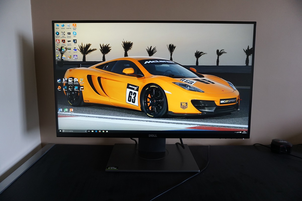
Unlike some competing models, the monitor looks modern but minimalistic from the front. There are no loud and proud ‘gaming’ fashion statements, bright colours or flashing lights. Instead things look quite refined and rather like many other modern Dell monitors. The bezels have the now common ‘dual-stage’ design, with a very slender hard plastic outer component and a fairly thin panel border. The panel border blends in quite seamlessly when the monitor is switched off (although is still there, all the same) but becomes visible when the monitor is switched on. Even considering both components the bezels remain rather slender; ~8mm (0.31 inches) at the top and sides and ~17.5mm (0.30 inches) at the bottom. The screen surface is regular (‘medium’) matte anti-glare on the initial revision tested here and light matte anti-glare on more recent revisions, as explored a little later.
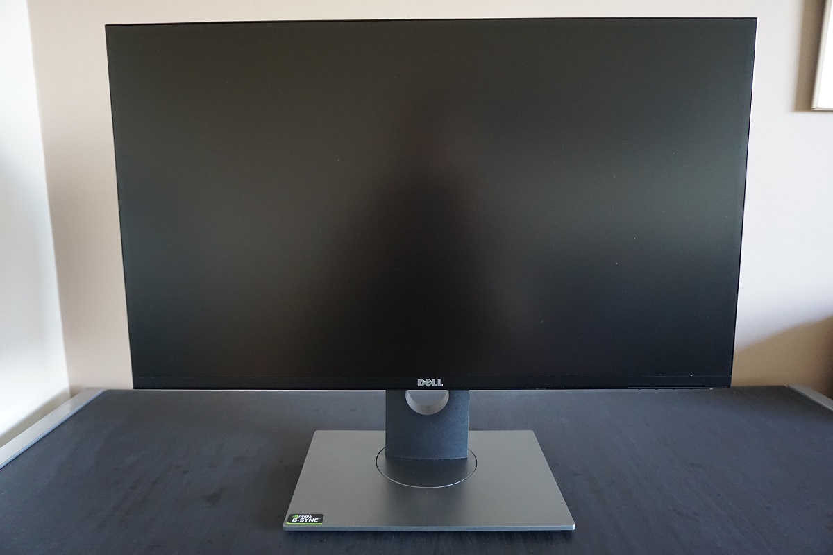
The bottom bezel also houses pressable OSD (On Screen Display) control buttons, facing downwards towards the right side. The power LED runs from centre to front of the button, glowing an unobtrusive cool white colour when the monitor is on and flashing in this same colour when the monitor is on standby (‘active-off’). If you press the power button, which turns the monitor ‘off’ (although is still technically standby) then the power LED goes off. The video below shows the functionality of the OSD.
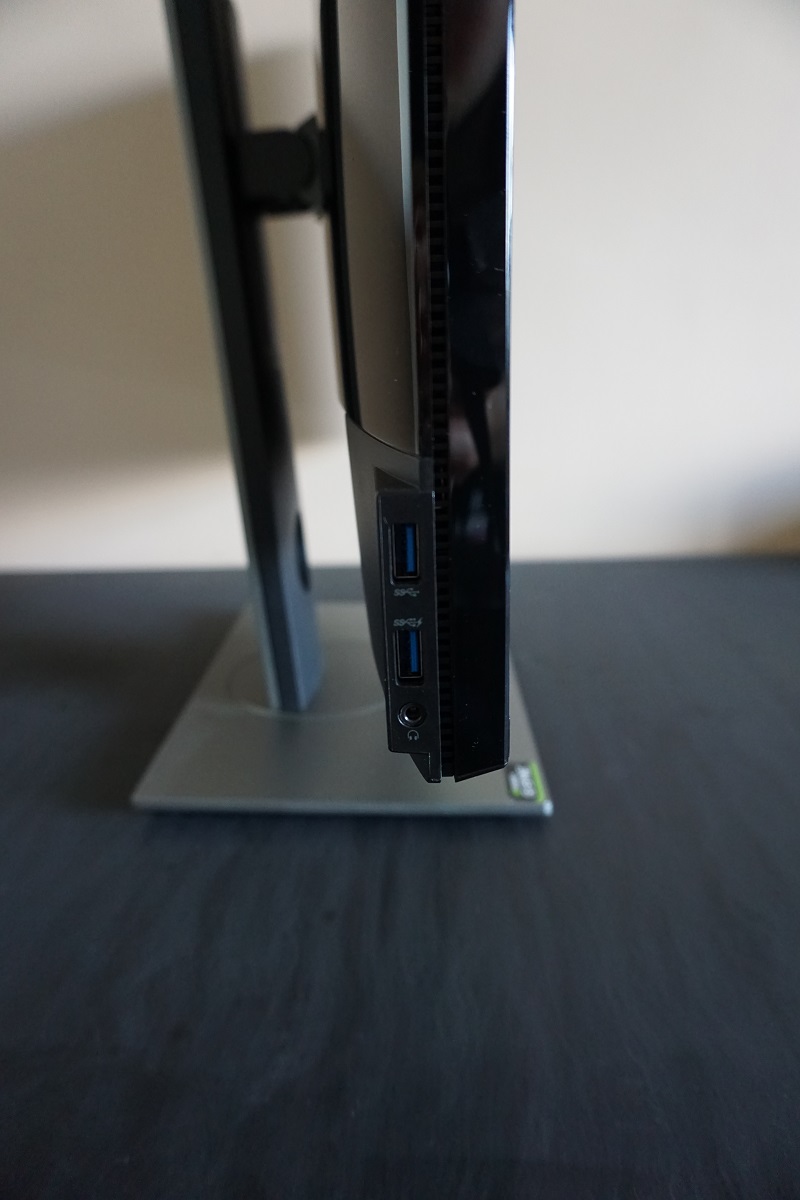
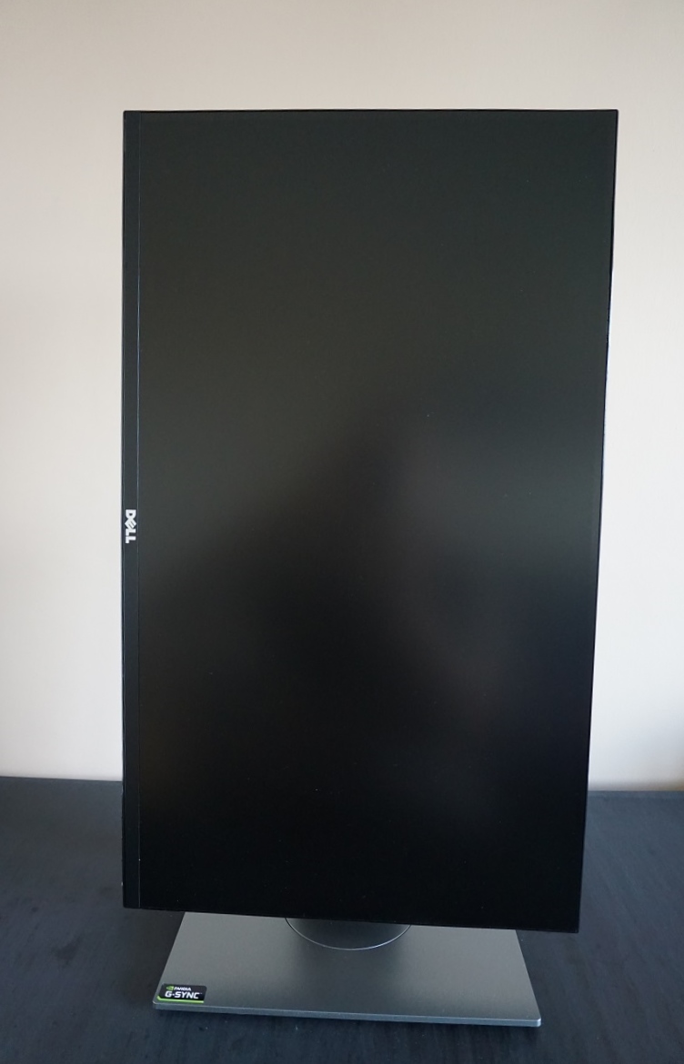
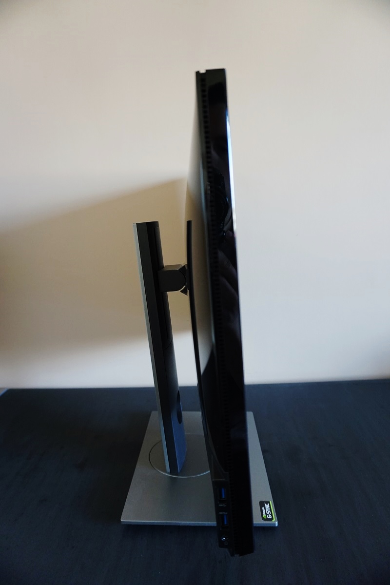
From the side the monitor is reasonably thin, around 20mm (0.79 inches) at thinnest point but bulking out towards the centre. Black glossy plastic features extensively and there are also a few ports on the left side of the screen – namely 2 USB 3.0 ports (bottom one with rapid charging for connected devices) and a 3.5mm headphone jack. The total depth of the monitor including stand is 200mm (7.87 inches) with the surface of the screen sitting around 34mm (1.34 inches) back from the front edge of the stand. This gives the screen a relatively small footprint and allows it to be pushed up against a wall without the screen being brought too close to your eyes. This can be an issue with some of the deeper monitor designs, unless you have a fairly deep desk. The included stand provides full ergonomic flexibility; tilt (5° forwards, 21° backwards), swivel (45° left, 45° right), height (130mm or 5.12 inches) and pivot (90° clockwise rotation into portrait). The practicality of portrait viewing is severely limited by poor viewing angles which become horizontal in this orientation, causing obvious colour shifts from a normal viewing position. At lowest height the bottom edge of the monitor sits ~50mm (1.97 inches) above the desk whilst the top of the screen clears the desk by ~420mm (16.54 inches).
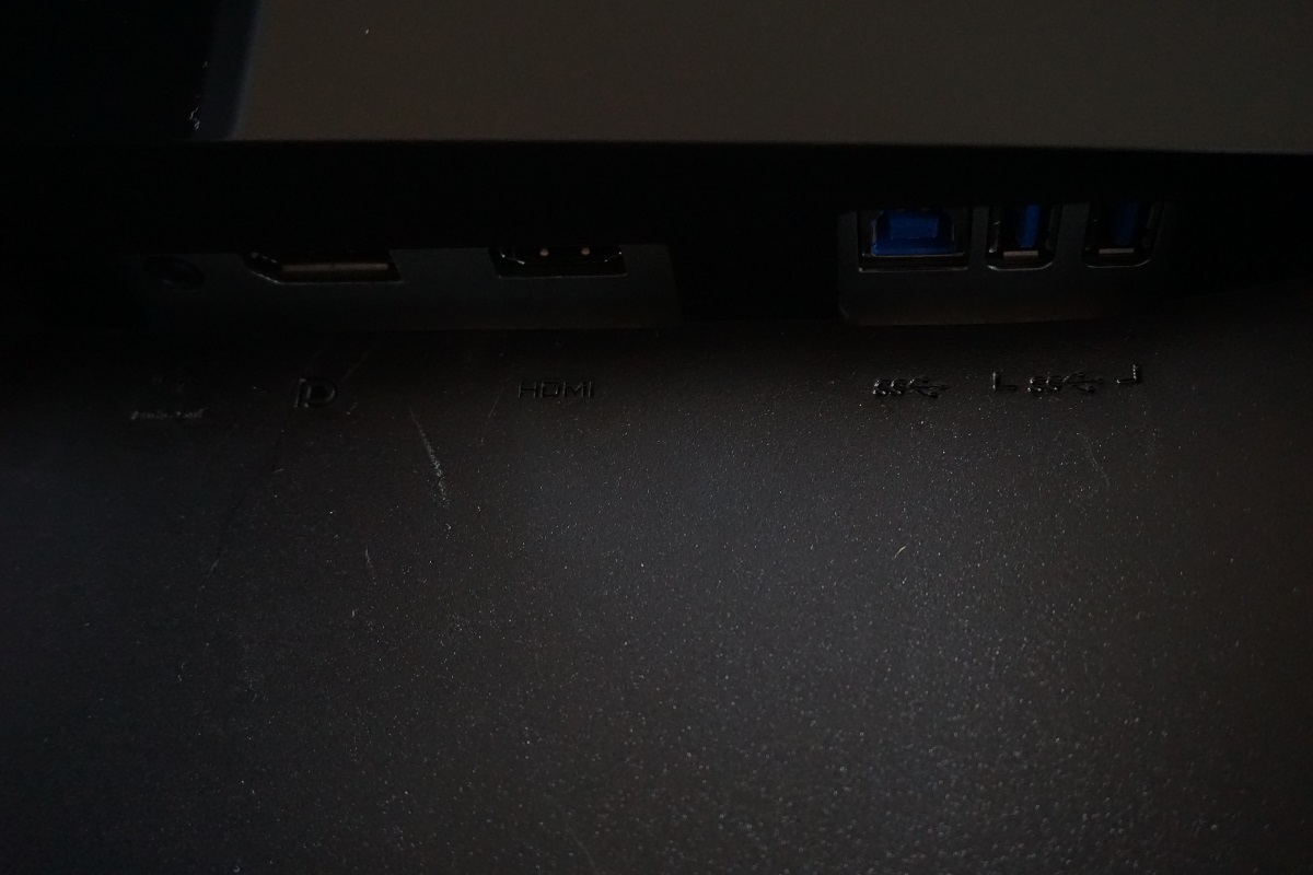
The rear of the screen continues the use of glossy plastic, which we must admit is not as nice in our eyes as the matte finishes (in black or silver) more common on many recent Dell monitors. Nonetheless, it faces a wall most of the time so we won’t hold that against the monitor. The rear of the stand neck and the stand base itself is a medium-dark matte silver coloured plastic. Matte black plastic is used towards the bottom of the monitor, where the down-firing ports reside. There is also a K-Slot to the far left (facing backwards). To the immediate left of the stand neck is an AC power input (internal power converter), with the remaining ports to the right of the stand neck when viewed from the rear; DP 1.2a (supports G-SYNC), HDMI 1.4, USB 3.0 upstream and 2 further USB 3.0 downstream ports (4 total). 2560 x 1440 @ 144Hz and indeed G-SYNC functionality requires the use of the DisplayPort input – HDMI supports 2560 x 1440 and of course lower resolutions at 60Hz. AMD GPU users can run the monitor at 2560 x 1440 @ 144Hz, but will of course not be able to use G-SYNC or associated features such as ULMB or 3D Vision.
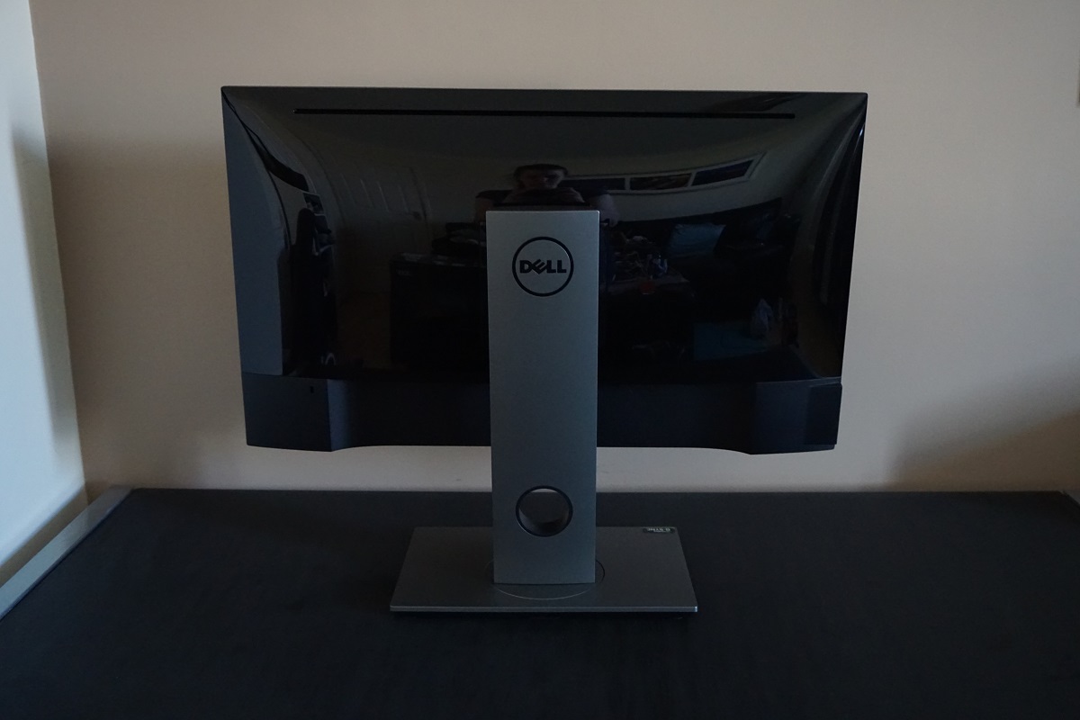
Note that the included stand can be removed using a quick-release button behind the stand neck, above the port area but below the attachment point. Once you’ve done this 100 x 100mm VESA holes are revealed, so you can use an alternative stand or mount if desired. A USB 3.0 cable and DP cable is included in the box.
Calibration
Subpixel layout and screen surface
Initial revisions of the monitor (A00/A01) used a medium matte anti-glare screen surface. This is typical for the screen surface found on 144Hz TN panels. Such a screen surface offers fairly strong diffusion of ambient light, for strong glare handling properties. As noted in this article, it also affects the light emitted from the monitor and affects the vibrancy and clarity potential. There is a fair bit of ‘graininess’ when observing lighter content, although not to the same thick and smeary extent as seen on some older IPS models in particular. This contrasts with the lighter matte screen surfaces found on competing AHVA models (and 60Hz IPS-types with this resolution), which provide a smoother look to the image with more direct light emission. More recent revisions of the monitor, including A02 and A03 (manufacturing dates of January 2016 onwards, perhaps slightly earlier) instead employ a light matte anti-glare screen surface similar to that used on the AHVA panels. You can see the difference between the haze values of these screen surfaces in the image below, with a new revision on the left and an earlier revision (the review sample) on the right.
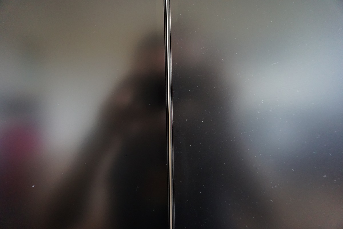
The new screen surface aids vibrancy and provides a much smoother look to light shades including white. Any comments on graininess and suchlike in this review apply to the A01 revision reviewed here, but not later revisions as these issues have been addressed with the new screen surface. Note that the image below is taken from our A01 review sample – the subpixel layout itself remains the same.
![]()
The usual RGB (Red, Green and Blue) stripe subpixel layout is used, which is the default layout for modern operating systems such as Microsoft Windows and Apple’s MacOS. As such Mac users needn’t worry about text fringing issues from unusual subpixel layouts, whilst Windows users needn’t worry about adjusting ClearType settings. They may still wish to do so simply to fine-tune according to preferences, however.
Testing the presets
The presets of the monitor are rather thin on the ground, with just 4 options to choose from which really just offer different colour temperature; ‘Standard’, ‘Warm’, ‘Cool’ and ‘Custom Colour’. The ‘Custom Color’ preset also offers users the flexibility to manually configure the red, green and blue colour channels. We will be focusing on all of these presets except for ‘Cool’, simply because we don’t see the utility in this very cool-tinted preset. We will also be testing the monitor with ‘ULMB’ (Ultra Low Motion Blur) enabled which changes image characteristics. This feature is explored in more detail further into the review.
The table below shows various readings, including central white point and gamma taken using a Datacolor Spyder5ELITE colorimeter and observations made ‘by eye’ using a variety of applications. The monitor was left to run for over 2 hours before these readings were taken. Our test system used an Nvidia GTX 980 Ti G-SYNC capable GPU and had Microsoft Windows 10 installed. The monitor was left in its ‘Plug and Play’ state with no additional drivers or ICC profiles loaded. Unless otherwise stated, assume that settings were left at default. The exceptions being our ‘Test Settings’ where various adjustments were made and ‘ULMB’ where brightness was set to ‘100’ rather than the default of ‘80’. We also had the monitor running at 144Hz outside of ‘ULMB’ as that’s what we settled on during our testing.
| Monitor Settings | Gamma (central average) | White point (kelvins) | Notes |
| Standard (Factory Defaults) | 1.9 | 7062K | The image is rather bright and cool – and there is some notable lack of depth in places. This is most obvious further down the screen, where perceived gamma (and hence saturation) is lower compared to further up the screen. The central regions of the screen are also lacking in depth a bit compared to the upper regions – this is all a drawback related to the viewing limitations of TN (Twisted Nematic) technology. The image is not really ‘washed out’ overall, though, and is considerably richer and better balanced than many 144Hz TN monitors. |
| Warm | 1.9 | 6194K | As above but a significantly warmer look to the image, as the preset name suggests. The white point is still ~6200K so this would not be classified as a ‘Low Blue Light’ setting. |
| Custom Color | 1.9 | 6652K | The white point is quite well balanced in this preset really, but it’s otherwise comparable to the factory defaults. |
| ULMB, Pulse Width 100 @ 120Hz | 2.0 | 7349K | The most obvious change from the factory defaults is that the screen appears dimmer and also strobes, inducing a mild flickering like a 120Hz CRT. The gamma is also increased slightly, although this change is quite subtle. Brightness is actually more comfortable than the factory defaults even at ‘100’ as tested here, although some users would prefer it brighter and some dimmer. You can of course lower brightness quite easily, but can’t raise it further with than ‘100’, of course. |
| ULMB, Pulse Width 100 @ 100Hz | 2.0 | 7239K | As above with slightly more obvious flickering. Brightness is quite similar – perhaps perceived brightness is a little higher due to the longer ‘on’ period for the backlight strobe. |
| ULMB, Pulse Width 100 @ 85Hz | 2.0 | 7239K | As above, but flickering is now very obvious to us, making the monitor quite uncomfortable to use. Brightness is also increased by a decent amount. |
| ULMB, Pulse Width 10 @ 120Hz | 2.0 | 7324K | Extremely dim, too dim for our eyes even in a dark room. This is just to demonstrate the effect of changing the ‘Pulse Width Setting’ here which we talk about a bit later on. You can set it to other values aside from the extremes of ‘10’ and ‘100’, of course. |
| ULMB, Pulse Width 10 @ 100Hz | 2.0 | 7229K | As above really, but marginally more flickering due to decreased refresh rate. |
| ULMB, Pulse Width 10 @ 85Hz | 2.0 | 7172K | A bit of extra brightness but still very much on the dim side. Due to the refresh rate, flickering is again bothersome and obvious to us. |
| Optimal OSD settings (see below) | 1.9 | 6455K | Significantly lower (more comfortable) brightness levels and some minor corrections to the colour channels. There is still a noteable lack of depth in places with many shades appearing lighter than they should. Nonetheless plenty of shades have respectable richness and the shade range is quite decent without obvious crushing at either the high or low end. |
| Test Settings (ICC profile applied, see below) | 2.2 | 6476K | An ICC profile has been applied over the ‘Optimal OSD settings’ which corrects gamma handling whilst maintaining a 6500K white point target centrally. The image is richer overall with better depth, although still bound by the aforementioned variation in gamma and saturation levels depending on the section of the screen you’re observing. |
| Relaxing evening viewing (ICC profile applied, see below) | 2.2 | 4064K | This uses an ICC profile we created on top of the ‘Optimal OSD settings’ which targets a low ~4000K white point. As a result, blue light output from the monitor is significantly reduced – beneficial for relaxing evening viewing. This is sort of like using F.lux or a ‘Low Blue Light’ mode, but it maintains specific corrections of the ICC profile (including gamma corrections) as well as lowering white point. |
Out of the box the monitor was rather bright with quite a cool tint. Shades lacked a bit of depth overall, but certainly looked better than many 144Hz models look using factory defaults. After significantly reducing brightness in the OSD and making very minor corrections to the colour channels in the ‘Custom Color’ preset, things were better balanced. There remained a want for more richness overall thanks to the gamma curve tracking at ‘1.9’ on average, as shown in the first image. Again, things looked generally a lot better than on many TN models even after tweaking – but there was room for improvement. An ICC profile was applied on top of these ‘Optimal OSD settings’ and was adopted for our ‘Test Settings’ – this is all explored later. The second image shows gamma tracking following said correction with the ICC profile. The monitor included a ‘Warm’ preset, but the white point was still measured as ~6200K centrally, which whilst warm compared to the factory defaults doesn’t come close to being a ‘Low Blue Light’ setting. We therefore created an ICC profile with all relevant corrections plus a target white point of ~4000K, which acts as ‘Low Blue Light’ settings. The OSD doesn’t really provide much freedom when it comes to settings. Only minor adjustments were required to colour channels in the ‘Custom Color’ preset, on our unit, and of course a reduction in brightness. Be aware of inter-unit variation and the fact that different colour channel adjustments may be required. Any settings not mentioned here were left at default in the OSD. We’ve included the ‘Response Time’ setting and refresh rate used in Windows, just for reference. Response Time= Normal Preset Mode= Custom Color R= 100 G= 98 B= 98 Refresh rate= 144Hz As mentioned previously, the ‘Optimal OSD settings’ above were combined with an ICC profile, created using a Spyder5ELITE colorimeter, to form our ‘Test Settings’. The most important adjustment made here was to correct the gamma behaviour of the monitor and add a bit of richness. Note that this ICC profile is specific to our unit it won’t necessarily be optimal for all units. Feel free to accompany this profile with manual adjustments to the colour channels if required, this profile is primarily to correct the gamma behaviour of the monitor. To make use of our profile do the following: As noted above we created an additional ICC profile that acts as a ‘Low Blue Light’ (LBL) mode. The monitor lacks a hardware setting which does this sort of thing and you can’t apply the ICC profile above and also run something like f.lux at the same time. This profile both corrects gamma and acts as a ‘Low Blue Light’ setting. Simply follow the instructions above, but instead apply our LBL profile. This is again designed to be used in conjunction with the ‘Optimal OSD settings’, although further adjustments can be made if desired. We would recommend making use of the ‘Display Profile’ utility mentioned at the bottom of our ICC article as well as it makes it a lot easier to quickly activate and de-active this profile. A KM CS-200 (accurate luminance meter) was used to measure the white luminance, black luminance and resulting contrast ratio using a range of settings. The table below shows this data, with blue highlights indicating results under the ‘Optimal OSD settings’, ‘Test Settings’ and ‘Relaxing evening viewing’ settings. Black highlights indicate the highest white luminance, lowest black luminance and maximum contrast ratio recorded. You can assume any setting not mentioned here was left at default, with the exceptions already noted in the calibration section.

Gamma 'Optimal OSD settings'

Gamma 'Test Settings'
Optimal OSD settings
Brightness= 43 (according to preferences and lighting)
Test Settings (ICC profile)
2) Set the monitor up according to the ‘Optimal ‘OSD settings’, although further adjustments can be made if desired. Using a brightness of ‘43’ provided 161 cd/m² on our unit with the ICC profile applied.
3) This article provides instructions on activating the profile as well as some limitations to be aware of when gaming in particular. Games do generally respond to the profile or at least apply the gamma correction – plus, the image is not completely washed out even without the profile.
Relaxing evening viewing (ICC profile)
Contrast and brightness
Contrast ratios
Monitor Settings White luminance (cd/m²) Black luminance (cd/m²) Contrast ratio (x:1) 100% brightness 312 0.31 1006 80% brightness (Factory Defaults) 251 0.25 1004 60% brightness 199 0.20 995 40% brightness 147 0.15 980 20% brightness 94 0.09 925 0% brightness 37 0.04 925 Standard (Factory Defaults) 237 0.24 988 Warm 239 0.24 996 Custom Color 256 0.23 1113 ULMB, Pulse Width 100 @ 120Hz 114 0.13 877 ULMB, Pulse Width 100 @ 100Hz 119 0.14 850 ULMB, Pulse Width 100 @ 85Hz 142 0.16 888 ULMB, Pulse Width 10 @ 120Hz 12 <0.02 – ULMB, Pulse Width 10 @ 100Hz 13 <0.02 – ULMB, Pulse Width 10 @ 85Hz 15 <0.02 – Optimal OSD settings 163 0.16 1019 Test Settings (ICC profile) 161 0.16 1006 Relaxing evening viewing (ICC profile) 118 0.16 738
The average static contrast with only brightness adjusted (i.e. the first 6 rows of the table) was 992:1, which comes very close to the 1000:1 specified. The adjustments made for the ‘Optimal OSD settings’ and indeed the ICC profile applies for our ‘Test Settings’ made little difference to contrast – it remained just above 1000:1 in both cases. The more extreme adjustments made in the ICC profile used for ‘Relaxing evening viewing’ had a more pronounced impact, dropping contrast to a still reasonable 738:1. The contrast also dropped slightly when using ULMB, but remained at 850 – 888:1 which is respectable. The highest luminance recorded on the table was 312 cd/m². The lowest luminance recorded with the monitor set to its normal operating mode (i.e. ULMB disabled) was 37 cd/m². This provided good flexibility in monitor brightness, with a range of 275 cd/m². No ‘Dynamic Contrast’ mode is included with this monitor, but we shall not lament the loss of such a feature.
PWM (Pulse Width Modulation)
The monitor does not use PWM (Pulse Width Modulation) at any brightness level. Instead, DC (Direct Current) is used to control backlight brightness. The backlight is therefore considered ‘flicker-free’, which will come as welcome news to those sensitive to PWM or its associated effects. The exception to this ‘flicker-free’ status is with ULMB active. This is a strobe backlight mode which by its very nature flickers. This flicker is different to that induced by PWM, though, so not everyone who is sensitive to PWM flickering will find it bothersome.
Luminance uniformity
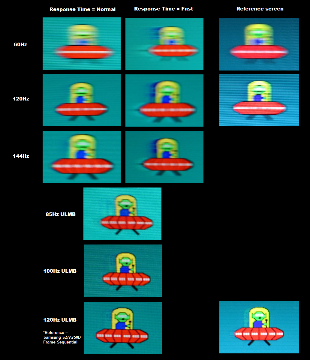
Whilst observing a black screen in a dark room we observed a no obvious backlight bleed. There was a touch of clouding towards the bottom, particularly towards the left side, but this was minor and blended in readily during normal use. You can see this in the image below. There was also a thin strip of backlight bleed at the very bottom, not visible in the image due to the distance and angle. Individual units vary when it comes to backlight bleed, but note that ours was just a random retail unit and wasn’t specially selected in any way. If you move to more extreme viewing angles, whilst viewing darker content in a dim room, you can also observe a golden sheen in places. This could be called ‘TN glow’, if you’re that way inclined, but is not at all the same as ‘IPS glow’ in its intensity nor is it visible from a normal viewing position. This is shown in the viewing angles video later on in the review. The luminance uniformity was strong. The brightest point was recorded at ‘quadrant 6’ to the right of centre (162.4 cd/m²). The maximum deviation from this was recorded at ‘quadrant 7’ which is towards the bottom left of the screen (150.6 cd/m², which is only 8% dimmer). Elsewhere measured luminance deviated just 1-7% from the central point, which is very pleasing. Note that luminance uniformity can vary between individual units. You can also expect some deviation beyond the measured points and should note that perceived brightness can also deviate from measured brightness due to the viewing angle restrictions of the TN panel technology. Nonetheless, it’s encouraging to see such a strong performance on our unit – and this unit is not specially selected in any way, it’s essentially a random retail unit. The contour map below represents these deviations graphically, with lighter greys representing higher luminance and hence lower deviation from the brightest point than darker greys. Percentage deviation between each quadrant and the brightest quadrant is also provided. Due to the previously mentioned viewing angle limitations, we will not be providing analysis of measured colour temperature variation using the colorimeter. Even from a normal viewing position on a monitor of this size and panel type, there is variation in colour temperature due to viewing angle weaknesses that can counteract any measured deviation. This would not be reflected by the readings themselves and therefore any readings here would be highly misleading. On Battlefield 4 (BF4) the contrast performance was quite pleasing. The level of detail in dark areas was good overall, although did vary depending on which part of the screen you’re observing. Due to the viewing angle restrictions the perceived gamma is higher further up the screen and lower further down the screen from a normal viewing position. This meant that a bit of detail was lost higher up, whereas some extra detail was presented lower down. The central area of the screen also showed more detail than was intended in dark areas. This revealing of unintended detail was linked to near black shades appearing somewhat lighter than they should be and creating a bit of an ‘oil slick’ look in places where details that should really blend in were actually visible. This was less pronounced than the sort of purposeful gamma enhancement presented by options such as BenQ’s ‘Black eQualizer’, though. Dark scenes were unimpeded by ‘IPS glow’, so visibility remained good towards the flanks of the screen. Brighter elements such as fires and explosions pierced the darkness quite nicely, although appeared somewhat grainy due to the screen surface texture. On Dirt Rally the contrast was quite pleasing overall, with the same strengths and weaknesses as observed on BF4. Whilst driving at night or through dark areas in the daytime, things did look quite atmospheric overall. And there was no ‘IPS glow’ or anything of that nature to tarnish the experience. The level of detail was also impressive overall, with minor details visible for most of the screen (including vegetation leaf structures and tire tread patterns). These elements become far less distinct towards the top of the screen, whilst centrally and moreover further down the screen the level of detail observable was more than intended. Ventilation fan grills inside the car were generally displayed quite low down on the screen, for example, and had a somewhat ‘flooded’ look to them due to the near-black shades appearing lighter than intended. Still, it was certainly nice not having to content with the ‘brilliance’ of IPS (or AHVA) glow that is most troublesome towards the bottom two corners of the screen and is quite an issue for some users with the competing AHVA models. The Blu-ray of Skyfall was also used to assess contrast performance. The monitor performed well here, displaying good detail in dark areas. Fairly minor detail such as hair strands and material textures could be distinguished, whilst the deepest colours looked reasonably deep. Although the aforementioned gamma changes applied here, the 16:9 letterbox aspect ratio of the film meant that the extremes at the top and bottom were not visible and were instead replaced with black bars. Brighter shades such as candles floating down a river at night contrasted nicely, but appeared somewhat grainy due to the screen surface. This wasn’t the thick and smeary grain associated with older IPS models in particular, but certainly wasn’t the smoothest matte surface we’ve seen recently. We used Lagom’s tests for contrast to more closely analyse specific strengths and weaknesses in contrast performance. The following observations were made. The colour gamut of the S2716DG (red triangle) is compared with the sRGB colour space (green triangle) using the Spyder5ELITE in the image below. The monitor offers quite comprehensive sRGB coverage, with just a tiny sliver of under-coverage towards the red corner of this representation. There is also a bit of extension beyond sRGB, particularly towards the green and to a lesser extent red region of this diagram. This provides just a touch of extra vibrancy potential to the monitor, which is welcome given its intended uses. On BF4 colours were rich and varied overall. As we noted earlier, in the calibration section, colours do lose a bit of saturation further down the screen and appear deeper than intended further up the screen (even from a normal viewing position). This means that shades don’t have the same unique ‘identity’ and individuality as on IPS-type models in particular. Earthy browns appeared more of a clay like colour towards the bottom of the screen, whilst green that were lush centrally and further up the screen appeared quite pale. Nonetheless, colours did appear quite rich overall and also quite varied following the corrections and application of ICC profile made for our ‘Test Settings’. There were some good strong and quite vivid looking oranges and yellows from roaring flames and explosions. There were also some nice deep greens alongside some more muted khaki colours. Despite the saturation and gamma changes noted previously, the environments did have quite a natural look to them and the overall experience was more on the vivid than ‘washed out’ side of the spectrum. Dirt Rally provided a similar experience. Although the saturation loss further down the screen sapped some depth in places and the excessive depth further up made things look somewhat oversaturated, the in-game environments still looked quite natural. There was a good variety of natural-looking green shades, including some quite lush deep greens alongside a palette of more muted pastel shades. Again these didn’t have the same distinction and individuality as on IPS-type screens, but were well represented overall. There were also some quite vibrant-looking shades shown off on the car liveries and advertising around the tracks. The screen surface meant that these didn’t have the same ‘pop’ that you get on some screens, but they still had respectable depth overall. Deep pinks, purples, yellows and blues stood out particularly nicely. Bright reds and greens appeared quite striking further up the screen, but become more of a faded and somewhat anaemic shade lower down. Again things were more on the vibrant than ‘washed out’ side, on balance. Colours on the Blu-ray of Skyfall appeared quite appropriate overall, although a bit under-saturated in places due to our movie player software refusing to use the ICC profile. The 16:9 letterbox format meant that black bars were displayed at the top and bottom, hiding the more pronounced changes in saturation. Shades appeared reasonably rich and varied overall, with decent saturation for skin tones and the natural environments. There was again some variation, particularly vertically, but it wasn’t particularly pronounced due to those black bars. The movie certainly remained enjoyable and there were some good vivid-looking shades to liven things up as well. Rich roaring orange flames, bright cyan neon lights and a rather striking and fairly deep looking red dress were amongst them. We also tested the Blu-ray of Futurama: Into the Wild Green Yonder. This is a particularly good test for colour consistency due to its fairly large areas of individual shade that might be visible at any one time. There was a significant change in saturation for a given shade when comparing the top of the screen to the bottom, more noticeable for some shades than others. The red lobster-like monster Dr Zoidberg looked roughly the correct shade some way up the screen, but looked a bit pale centrally (remember – the ICC profile was ignored) and very pale further down the screen. This also reduced the variety of closely matching pastel shades, including character skin tones which changed depending on where on the screen the character was displayed. There were still some quite rich and deep looking shades, though, for example some good deep purples and blues. The neon shades were also represented fairly well, for example bright neon pinks and greens. Lagom’s viewing angle tests were used to more closely analyse the idea of colour consistency and viewing angle limitations. The following observations were made from a normal viewing position, around 70cm from the screen. We used a tool called SMTT 2.0 and a sensitive camera to analyse the latency of the S2716DG, by comparing with a number of monitors of known latency. Over 30 repeat readings were taken to help improve accuracy. Using this method, we calculated 3.68 ms (just over 1/2 a frame at 144Hz) of input lag. This value reflects both the element of input lag that you ‘see’ (pixel responsiveness) and the element you ‘feel’ (signal delay). It indicates a very low signal delay which when combined with high frame rate content at a high refresh rate creates an excellent ‘connected feel’ when gaming. To us this feeling remained whilst using G-SYNC, although we don’t have the means to accurately measure this. In this article we explore the main factors that affect the responsiveness of a monitor. Key amongst these is ‘perceived blur’, which is contributed to not only by the pixel responsiveness but also (and more significantly) by eye movement as you track motion on the screen. We also cover a technique called ‘pursuit photography’ in that article, which allows you to capture the motion performance of a monitor in a way that reflects both elements. The following images are pursuit photographs taken using the UFO Motion Test for ghosting, with the middle row (medium cyan background) used. The test was run at a speed of 960 pixels per second, the default speed, as this is a good practical speed for taking such photos and shows the necessary elements nicely. The monitor was set to a range of refresh rates (60Hz, 120Hz and 144Hz) with both the ‘Normal’ and ‘Fast’ settings tested for ‘Response Time’ in the OSD. The monitor was also tested with its ULMB mode active at 85Hz, 100Hz and 120Hz set to the default Pulse Width of ‘100’. The reference screen used in the final column is a Samsung S27A750D set to its optimal response time setting and with full brightness to eliminate PWM usage. To compare with 120Hz ULMB, the Samsung was set to use its frame sequential 3D setting, which causes the backlight to strobe. At least with the strobe mode disabled, the reference screen gives a reasonable indication of how things look where perceived blur is caused mainly by eye movement and not held back by pixel responses. At 60Hz the UFO is noticeably blurry. Using the ‘Normal’ setting this appears to be caused primarily by eye movement and linked to the refresh rate itself (compare to the reference image) but there is also an element of trailing on top of this. Although not clear on the image it’s actually inverse ghosting (overshoot) that is causing this effect. With the ‘Fast’ setting the overshoot becomes extremely obvious due to overly aggressive grey to grey acceleration, giving a brightly coloured trail behind the object. At 120Hz the perceived blur is cut down significantly, with the object itself looking sharper and narrower. With the ‘Normal’ response time setting there is a little bit of overshoot, but things actually look quite like the reference. Using the ‘Fast’ setting again introduces obvious inverse ghosting. At 144Hz things appear very similar in these snapshots. There is perhaps a little more inverse ghosting with the ‘Normal’ setting, but it remains rather light. Considering a broader range of transitions and how responsive the monitor actually felt during use, we felt that 144Hz was optimal using the ‘Normal’ setting, so this is what we settled on for our testing. With ULMB active you can see that the UFO is far sharper. It’s already far more ‘in focus’ even at 85Hz, with the details on the UFO much more distinct. This is improved slightly at 100Hz and further improved at 120Hz, according to these snapshots. You can clearly see this difference when simply observing the monitor first hand. You can also see some overshoot from aggressive overdrive impulses, which are used to try to speed up the pixel transitions as much as possible so that conventional trailing or even frame overlap doesn’t become an issue. What isn’t captured here is the flickering, which is the inescapable reality of how strobe backlight modes such as ULMB work. We look at the overall experience both without and with the ULMB setting in detail in the following sections. We’d like to end this section by mentioning something that isn’t specifically to do with responsiveness but that we feel fits best into this section of the review. Particularly during fast motion on the monitor, certain shades appear to break up into faint vertical bands which alternate between the actual shade and a shade that is slightly lighter or darker than intended. This is an interlacing pattern and something we refer to descriptively as ‘interlace-pattern artifacts’. Some users may refer to this as ‘pixel inversion’, but this isn’t something that appears on specific test patterns for ‘pixel inversion’ (including those on Lagom). And indeed the presence or absence of any artifacts on such tests has no bearing on whether the interlacing effect may be seen in-game or elsewhere on the desktop. They were easiest to observe where lighter shades were involved, for example in the image below taken when strafing through an icy cavern on Hoth in Star Wars Battlefront. Although this image captures the effect nicely, it isn’t really quite as obvious or doesn’t manifest itself in quite the way that it does on a static photograph. It appears as something more dynamic – a sort of interference pattern that may only be visible fairly briefly and is usually quite faint. This isn’t something most users will notice and for those that do it won’t necessarily be bothersome. It’s something we like to raise awareness for simply for the sake of completeness. Note as well that this occurs regardless of refresh rate, G-SYNC or ULMB status. We will not be including a section on ‘overclocking’ this monitor, as setting the refresh rate at all above 144Hz causes the screen to lose signal regardless of timings. Where the frame rate kept up with the 144Hz refresh rate (i.e 144fps) on BF4, the ‘connected feel’ to the gaming world was excellent and everything was very fluid, visually. You could easily tell that the pixel responses were snappy enough to take full advantage of the high refresh rate and that the signal delay was nice and low as well, making your interactions with the game world feel seamless. The much lower perceived blur and far greater ‘connectedness’ over 60fps (or a 60Hz monitor) was palpable whether running about on foot or zipping around in a vehicle. It made keeping tabs on enemy movement much easier even when manoeuvring your own character rapidly. Although there were no observable weaknesses in pixel responsiveness (i.e. they were snappy enough for optimal 144Hz performance), there was a moderate degree of overshoot in places. This was perhaps most obvious where medium-dark shades moved against a lighter background. Observing the leaves of a palm tree against a bright blue sky, for example, you could see some hints of colours that didn’t appear in either the background or object colour (brighter blue, for example). In general, this isn’t something most users will find too bothersome when gaming. Dirt Rally also benefited from the exceptional fluidity afforded by the monitor where frame rate matched the 144Hz refresh rate. Whilst we don’t play this game at such a level where the ‘connected feel’ or instantaneous input response is particularly important we could still feel a degree of benefit in this respect from the low latency and high refresh rate. The significant reduction in perceived blur was certainly palpable, though, with the racing environments and other cars remaining much more focused whilst zipping around the track. There was again moderate overshoot in places, but it’s not something all users would find problematic. The more obvious examples were colourful inverse ghosting trails in places, for example where medium-dark objects were cast against a bright blue sky. But we only really noticed this when looking out for it on this title, it wasn’t sufficient to distract us when racing. It is of course subjective and sensitivity does vary, but from user feedback we’ve received about this model it doesn’t really seem to be a major cause for concern when gaming. We also tested our Blu-ray movie test titles where no weaknesses attributable to the pixel responses could be detected. There was no noticeable overshoot nor trailing from poorly optimised pixel responsiveness. The fluidity of these titles was restricted by the ~24fps at which they run – but because 24 divides evenly into the 144Hz refresh rate, juddering was reduced compared to a 60Hz model. G-SYNC is a variable refresh rate technology that can be activated on certain Nvidia GPUs when used with specific monitors that support the technology (such as the Dell S2716DG). We have written this article which explores the technology and the benefits that it brings. We won’t be repeating too much of that here, just a few basics. G-SYNC monitors include a proprietary ‘G-SYNC board’ inside the monitor that replaces the transitional scaler and some of the assistive electronics of the monitor. This technology allows the monitor to vary its refresh rate to correspond to the frame rate of the content (for example a game). By doing this, there is an elimination of the stuttering that traditionally occurs from frame rate and refresh rate mismatches with VSync enabled. There is also an elimination of the tearing and juddering that traditionally comes in variable frame rate environments with VSync disabled. An additional benefit compared to VSync enabled is that latency is reduced in the variable frame rate environments. As mentioned earlier, though, we don’t have the means to support this with accurate measurements. The monitor supports G-SYNC over its DP 1.2a (DisplayPort) input, provided a compatible GPU is used on the system. The technology was supported for us straight from the box, but is easy to enable if for whatever reason that isn’t the case. Simply open Nvidia Control Panel and navigate to ‘Display – Set Up G-SYNC’. Ensure that the checkbox for ‘Enable G-SYNC’ is checked and then select your preferred operating mode. As shown in the image below, the technology will work both in ‘Full Screen’ and ‘Window’ modes, depending on the option you select. If there doesn’t seem to be a G-SYNC section in your Nvidia Control Panel, try unplugging the monitor and plugging it into a different DP output on the GPU. Or failing that, reinstall the GPU driver. The next step after enabling the technology is to navigate to ‘Manage 3D settings’, where you will see two particular settings of interest. The first of these is ‘Monitor Technology’, which should be set to ‘G-SYNC’ as shown below. The second noteworthy setting is VSync. For this you can choose; ‘On’, ‘Use the 3D application setting’ or ‘Off’. If ‘On’ is selected, the GPU will enable VSync when the frame rate exceeds the variable refresh rate upper limit (i.e. ceiling), which can be up to 144Hz/144fps on this model depending on the refresh rate selected. If ‘Off’ is selected then the frame rate is free to rise above the refresh rate, introducing tearing but also minimising latency. Nvidia advises that users either select ‘On’ or ‘Off’ here rather than relying on the ‘Use the 3D application setting’. This is simply because VSync implementations in-game may potentially interfere with the smooth operation of G-SYNC. Regardless of VSync setting, the refresh rate of the monitor behaves in exactly the same way where the frame rate dips below the floor of operation (lowest frame/refresh rate supported by the technology). The floor of operation is 30Hz/30fps, below which the monitor will strive to set its refresh rate to a multiple of the frame rate to minimise or eliminate stuttering and tearing. Say for example the game is running at 25fps, then the monitor would set itself to 50Hz rather than just staying at 30Hz. As explored shortly, though, low frame rates remain low frame rates regardless of any G-magic. And it’s also worth noting that stuttering from issues outside of the refresh rate and frame rate mismatch (latency, low RAM etc.) will not be rectified either. On BF4, using the settings we like to use, the frame rate often remained rather high but still fluctuated a fair bit. It usually stayed >100fps, but fluctuated a fair bit between 100fps and 144fps. Without G-SYNC enabled, this induced obvious stuttering or tearing (and juddering). It was like everything clicked into place when it was running at 144fps (to match the 144Hz of the monitor), but even a slight drop below and everything fell apart. With G-SYNC these drops were far more palatable, with a sort of smooth flowing nature to the gameplay that simply wasn’t there without the technology active. Optimal fluidity (greatest connected feeling and lowest perceived blur) was still achieved with the highest possible frame rates, but playability and overall fluidity still remained very strong even if that dipped a bit. Rise of the Tomb Raider is a graphically demanding title and as with BF4 certainly benefited from G-SYNC. The frame rate on this title were generally considerably lower, fluctuating fairly freely between 40 – 100fps depending on how much action was going on and whether in a small indoors area or a larger and more open area. This really reinforced the fact that higher frame rates are preferably, as the connected feel just wasn’t there on the lower end of the frame rate scale. Perceived blur was also significantly higher. However; the playability of the game was still enhanced owing to the fact that there wasn’t jarring stuttering or tearing from frame rate and refresh rate mismatches. We also bumped up the graphics further and did observe occasional dips below the 30fps floor of G-SYNC operation. There wasn’t observable tearing or stuttering from frame rate and refresh rate mismatches and it seems the technology was compensating for this appropriate. However; the fluidity and playability at such frame rates was very poor. We tested various other titles including Star Wars Battlefront, Elder Scrolls Online and GTA V. There is no doubt that G-SYNC did its job on all of these titles, enhancing playability and allowing graphics to be turned up a bit without fearing even slight drops in frame rate below the refresh rate. Again it was a case of the higher the better as far as frame rates went, but even fairly significant drops were much more palatable with the technology active. It’s also important to remember that individual sensitivity to tearing and stuttering does vary. Some will find the technology truly game-changing, whereas others won’t really benefit so much. ULMB (Ultra Low Motion Blur) is another proprietary Nvidia technology which can be enabled instead of G-SYNC on compatible models. This is a strobe backlight technology specifically designed to reduce motion blur using the mechanism described here. At a basic level, the backlight pulses on very briefly (‘on phase’) but spends most of its time off (‘off phase’). This reduces the amount of time the eyes spend tracking motion on the screen and hence reduces perceived blur. Note that ULMB requires a compatible Nvidia GPU and cannot be activated at the same time as G-SYNC. ULMB can be enabled by first setting the monitor to 85Hz, 100Hz or 120Hz via Windows or the Nvidia Control Panel. Then navigate to ‘Manage 3D settings’ in the Nvidia Control Panel and select ‘ULMB’ for ‘Monitor Technology’ as shown below. The monitor should automatically initiate the appropriate mode, but if not you will find the appropriate setting (‘ULMB’) in the ‘Display’ section of the OSD. You will be able to tell that ULMB is active due to the fact the image will begin to flicker at a frequency matching the refresh rate of the display. It will look much like a CRT operating at the same refresh rate in that respect, should you be old enough to remember such things. You can also adjust the ‘Pulse Width’ setting in the ‘Display’ section of the OSD, which is set to ‘100’ by default. The higher this setting, the longer the ‘on phase’ and hence brighter the image. Lower settings decrease the length of the ‘on phase’ for the backlight strobe which decreases brightness but potentially improves motion clarity. Most users should find motion clarity excellent at the default setting, however. Upon activating ULMB you will notice the aforementioned flickering, which is very obvious at 85Hz but still something we noticed quite readily at 100Hz or 120Hz. The image also looks somewhat dimmer and a bit more muted as both recorded and perceived brightness is decreased. Individual sensitivity to the flickering and indeed brightness levels varies, with some people finding it quite bothersome and others either not finding it bothersome or adapting to it quite readily. The motion itself on the screen is clearly quite different with this mode active as well, with the clarity benefits already explored photographically earlier on in the review. Note that ‘Response Time’ can’t be adjusted with ULMB active (it is set automatically). Although we found the motion clarity to be excellent even at 85Hz, we certainly appreciated as little flicker as possible so opted for 120Hz during the subjective assessment below. We looked at a range of titles using this mode and the main principles and overall experience was similar in all, at a given frame rate. For this section we will focus on BF4, which we found showcased the technology quite nicely. As long as the frame rate matched the refresh rate of the monitor (i.e. 120fps, to match 120Hz), the motion clarity with this mode active was exceptional. This was noticeable even when running about on foot, but really came into its own when manoeuvring nimble vehicles. The UCAV (Unmanned Combat Arial Vehicle), which is a drone that can be set to explode, for example, was a fair bit easier to use with ULMB active. Even at 144Hz, with ULMB disabled, there is a fair degree of blur which can make it just that little bit more difficult to track enemy movement and manoeuvre the drone towards the intended target. With ULMB active, the game world remained sharply focus regardless of how manic the manoeuvring was and even small targets such as enemy soldiers could be spotted, tracked and disposed of with ease. One perhaps quite minor issue with ULMB is that it causes the monitor to use a fairly aggressive pixel overdrive algorithm, which gives moderate overshoot. This is masked to a degree by the strobe behaviour and as you can see from the pursuit photography shots earlier wasn’t as ‘in your face’ as some overshoot can be. In-game it was actually much less obvious than this simple UFO Motion test for ghosting demonstration. It manifests itself as a fairly faint semi-transparent or shadowy trail (a bit darker during some transitions) behind some objects. It isn’t really sufficiently obvious to catch the eye and is there seemingly instantly rather than trailing or blurring behind the object like conventional trailing or overshoot would. It would of course be nicer if this wasn’t there, but we feel the sort of user who will really benefit from ULMB will not find this distracting enough to warrant turning the feature off. And indeed all monitors that use ULMB have this to some degree (and so do alternatives such as BenQ’s ‘Blur Reduction’). This is probably the least conspicuous inverse ghosting we’ve from a modern strobe backlight implementation. A potentially more significant issue with ULMB, aside from the aforementioned flickering that some would find problematic, is that it really requires the frame rate to match the refresh rate exactly to work properly. If the frame rate departed from this at all, the tearing (VSync off) or stuttering (VSync on) become extremely obvious. This is because there is very little motion blur to help mask such imperfections. Even microstuttering and other imperfections associated with frame rate limiters and VSync off become very obvious – so generally you will need to use VSync if ULMB is to be used and stomach the latency penalty that comes with this. As noted earlier, you can’t enable G-SYNC at the same time as ULMB either – so the choice really does have to be made based on your own motion clarity preferences and whether you can actually match the frame rate with the refresh rate consistently or not. Most users will probably prefer to use G-SYNC over ULMB, but it’s a nice option to have particularly for competitive gamers and/or those used to CRT monitors. Although not a specifically advertised feature of the monitor, the Dell does support Nvidia 3D Vision (1 and 2) stereoscopic 3D technology. There is no emitter built into the monitor, but it will work provided you have the full kit (emitter + glasses). We tested on a Windows 10 system using the GeForce 361.91 drivers and Nvidia 3D Vision 2 kit. The monitor was appropriately detected and installed as a 3D Vision capable display by following the setup procedure. This is accessed in Nvidia Control Panel – ‘Stereoscopic 3D – Set up stereoscopic 3D’. If you select the ‘Enable stereoscopic 3D’ checkbox you can then run through the setup procedure. 3D performance was very similar indeed to what we saw on the ASUS PG278Q, so we will not be running through this here. Instead we’d recommend reading the penultimate sections of that review if you’re interested in this. What we will say is that when using 3D Vision the contrast on the monitor lowered itself to ‘65’ from the default of ‘75’. Increasing this to ‘75’ seemed to have little negative effect and provided a bit of extra brightness, although if you’re happy with the brightness or prefer the screen dimmer than ‘65’ seemed to work nicely as well. An interesting addition to the S2716DG that is missing from older models such as the PG278Q is an HDMI port. This allows users to connect up devices such as games consoles. If you’re connected to a PC using DisplayPort, the G-SYNC module is always used and there is no additional scaler. The scaling capabilities are handled by the GPU. This gives an obvious softening to the image, as if you’re looking at things through a soft-focus lens of some description. If you’re using the HDMI port, though, a separate scaler is available for you to use which means that the monitor can handle the scaling rather than the GPU. This will always be the case on games console, but to ensure that the monitor rather than GPU is handling things when gaming as an Nvidia GPU user you may need to make a few changes. Open the Nvidia Control Panel and navigate to ‘Display – Adjust desktop size and position’. Ensure that ‘No Scaling’ is selected and ‘Perform scaling on:’ is set to ‘Display’ as shown below. The few AMD GPU users out there that may have opted for this monitor don’t need to worry as the monitor will automatically handle the scaling when gaming, by default. Unlike using DP, where GPU scaling is the only option, the monitor uses an interpolation process to display the 1920 x 1080 Full HD resolution and extrapolate this across its 2560 x 1440 actual pixels. This does lead to a degree of softening compared to a native 27” Full HD display, which is unavoidable when going from 2560 x 1440 to 1920 x 1080 – but this softening is much less pronounced than with GPU scaling. You can certainly notice it when looking at objects in the distance on games in particular, and certain textures when closer. Things just aren’t as crisp or clearly defined. But they don’t look awful either and the overall experience is far removed from the GPU scaling experience. This monitor can therefore provide a reasonable experience to console gamers as a secondary use. Not the best experience out there, but a decent one. If you’re running 1920 x 1080 (Full HD) content using movie software or via a web browser on the PC and have the monitor running at its native 2560 x 1440 resolution, the GPU or software handles everything. An upscaling process is used that has nothing to do with the monitor. There is a little bit of softening from this, but it’s not too dissimilar to the monitors own interpolation process when running 1920 x 1080 over HDMI. In other words it’s not a massive issue and not worth worrying about really. A little while ago we reviewed the ASUS PG278Q, which was the first 144Hz model to support 2560 x 1440 and also one of the first G-SYNC models on the scene. The Dell S2716DG is fundamentally rather similar to the ASUS, using a very similar panel. There are some differences, one of which is of course the manufacturer – with Dell being one of those manufacturers many will turn to where possible due to their exceptional customer support. This monitor also has a simpler style without the ‘loud and proud’ style features, blending in with many other modern monitors that aren’t specifically aimed at gamers. There is also the addition of an HDMI port, making this monitor suitable as a secondary screen for console gaming. As explored in the review it also uses a pretty decent interpolation process so is certainly practical for such purposes. Out of the box the image left a bit to be desired, yet it was still far removed from the image that greets you on some 144Hz models with horrendously washed out colours and a bleached look. Still, there was a certain lack of depth in places that was caused primarily by the gamma being a bit low on average. Once this was corrected with an ICC profile and some minor tweaks were made in the OSD, the image was quite nicely balanced. It was fairly vivid and varied, notwithstanding the usual TN limitations such as variable saturation levels when comparing the upper and lower sections of the screen. The screen surface on this model is quite typical for 144Hz TN models and indeed TN panels more broadly – medium matte anti-glare. This imparted a fairly grainy look to whites and light shades but did not give that heavy ‘smeary’ grain associated with some older IPS panels in particular. Alongside the weaker colour consistency, this is an unfortunate disadvantage when compared to the IPS-type (AHVA) alternatives such as the ASUS PG279Q and Acer XB271HU. On newer revisions (A02 onwards) a light matte screen surface is employed which is similar to these AHVA alternatives. The contrast performance was decent overall, much as expected from the panel. The level of detail in dark scenes was strong overall, with a bit too much detail revealed centrally and lower down the screen and a bit too little towards the very top. Fortunately there was no ‘IPS glow’ to contend with. Although mileage may vary in this regard, we were also pleased with the black uniformity of our unit with no real issues to note in terms of backlight bleed and only minor clouding. This contrasts (pun intended) with the AHVA alternatives which often suffer from moderate levels of backlight bleed and regardless of that will always have ‘AHVA glow’, something that really puts some users off. Where this monitor really shone, though, was its responsiveness. The pixel responsiveness was outstanding, allowing the monitor to run at its maximum (144Hz) refresh rate without any trailing from sluggish pixel transitions. There was some overshoot in places, but we must stress again that it likely won’t bother most users when gaming (if they even notice it in the first place). There were also some ‘interlace-pattern artifacts’ that were most readily observed during fast motion – something that again will not bother everyone or that not everyone will necessarily notice. The monitor also employed G-SYNC, which as usual did its thing to get rid of tearing, stuttering and juddering caused by the traditional frame rate and refresh rate mismatches. Another Nvidia-specific technology, ULMB, was also employed to good effect – and in fact was probably the best implementation of that technology that we’ve seen due to the relative lack of obvious overshoot or strobe crosstalk. Despite not being an advertised feature, 3D Vision was also supported and provided an interesting alternative way of playing games. So as a gaming monitor, this model certainly provided a good experience. It is responsive enough to keep competitive gamers happy whilst offering pretty good image quality, more so after calibration. The 2560 x 1440 resolution worked nicely as well, with G-SYNC offering a welcome helping hand for those times when things got a bit demanding for the frame rate to keep up with the maximum 144Hz refresh rate. At time of writing it’s slightly cheaper than the PG278Q and significantly cheaper than the AHVA alternatives. We’re also sure that some users will turn to this based on the qualities of the manufacturer itself and the more refined styling. It’s definitely not a perfect monitor, but there is no such thing on the market. There is plenty of enjoyment to be had and once you weigh up the pros and cons you may find the Dell S2716DG a compelling choice. The bottom line; an exceptionally responsive monitor with a nice gaming feature set, decent all-round performance and sensible styling.
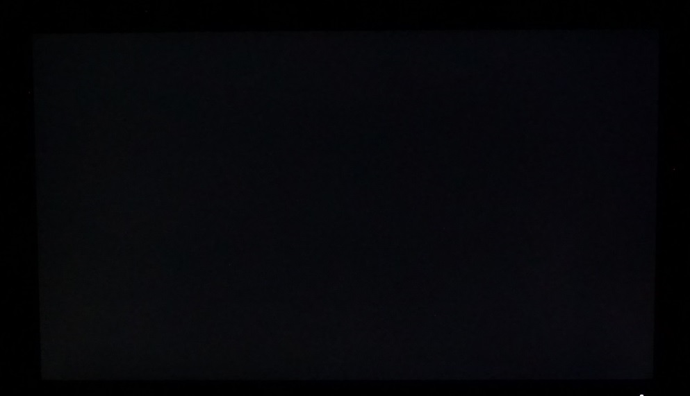
The Spyder5ELITE was also used to assess the uniformity of lighter colours, represented in this case by 9 equally spaced white quadrants. These quadrants were laid out from the top left to bottom right of the screen. The table below shows the luminance recorded at each quadrant as well as the percentage deviation between a given quadrant and the brightest point recorded.

Luminance uniformity table

Luminance uniformity map
Contrast in games and movies
Lagom contrast tests
Colour reproduction
Colour gamut

Colour gamut test settings
Colour in games and movies
Viewing angles
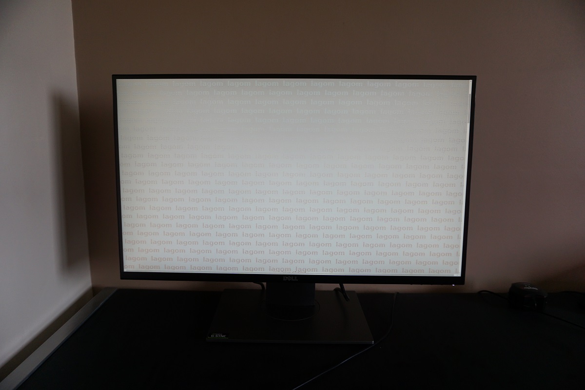
The video below shows this test from a variety of viewing angles, alongside a mixed and dark desktop background from various angles. Note how readily the Lagom stripe colours on the text shift and that there is even some ‘colour inversion’ beyond a certain point vertically for the desktop background. Again this is typical for a TN model and not a specific weakness of this monitor only.
Responsiveness
Input lag
Perceived blur (pursuit photography)

Interlace-pattern artifacts
Responsiveness in games and movies
G-SYNC – the technology and activating it
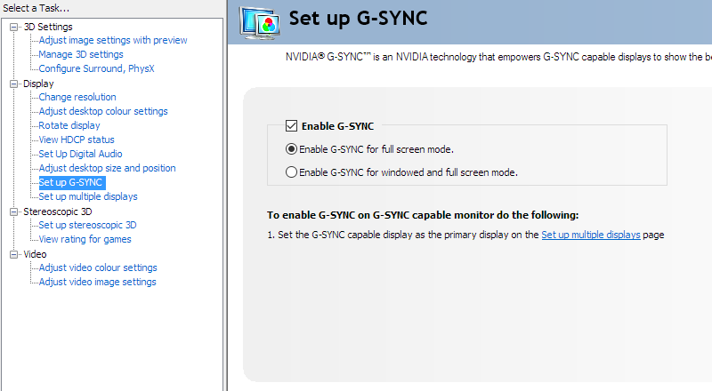
Enable G-SYNC
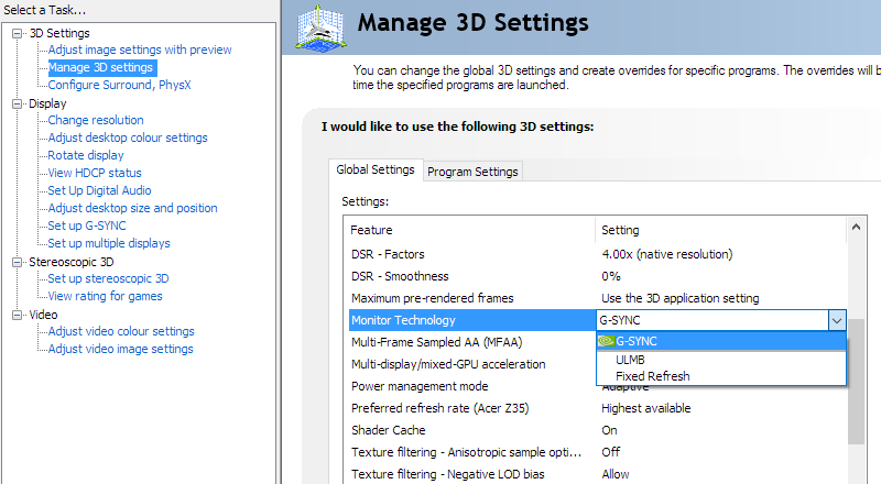
Set Monitor Technology to G-SYNC

Set VSync according to preferences
G-SYNC – the experience
ULMB – the technology and activating it
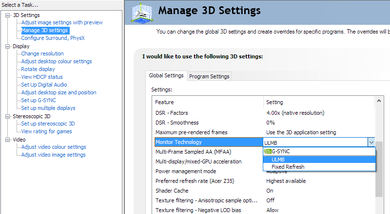
Set Monitor Technology to ULMB
ULMB – the experience
3D Vision 2

Activate 3D Vision
Interpolation and upscaling
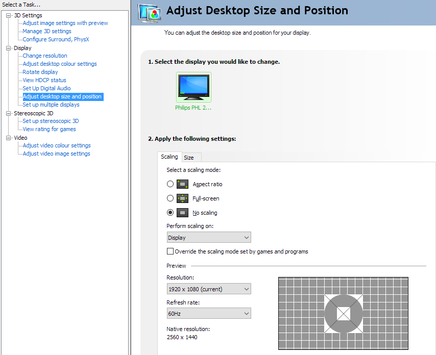
Conclusion
Positives Negatives A fairly rich and varied image following calibration and a superior ‘out of the box’ experience to some 144Hz models
Tweaks in the OSD and correction with an ICC profile was required to achieve a pleasing balance to the image and good ‘2.2’ gamma tracking. Gamma and hence saturation was affected by viewing angle and colour consistency limitations even from a normal viewing position, typical for a TN panel of this size
Decent contrast overall without ‘IPS glow’ and static contrast meeting expectation, providing a decent atmosphere in dark scenes A moderately grainy screen surface sapped the image of some vibrancy and clarity (corrected for newer revisions), whilst the viewing-angle related gamma inconsistencies affected detail in dark scenes, even from a normal viewing position Very low input lag, excellent and fairly well-tuned pixel responsiveness and a good gaming feature-set for Nvidia users including G-SYNC, one of the best ULMB implementations we’ve seen and 3D Vision
Moderate overshoot in places and ‘interlace pattern artifacts’ which some users will dislike – others either won’t mind or won’t notice
Sensible styling, full ergonomic flexibility and the addition of an HDMI port with quite good interpolation performance for the Full HD resolution. The native WQHD resolution offers a good mixture of quality, performance and real-estate
Moderately expensive with a fairly ‘cut-down’ OSD, although not shocking in either respect for a G-SYNC model
![]()


