Author: Adam Simmons
Date published: April 6th 2018
Table of Contents
Introduction
The WQHD (2560 x 1440) resolution is one that many users are very comfortable with on 27” monitors. The respectable pixel density and decent screen size provide a good usable work area and good levels of detail and clarity for images and gaming. The range of models available with this resolution and screen size combination is now rather broad, especially where 60Hz models are considered. A few areas where models can separate themselves from the sea of competition is with unique and compelling aesthetics, good ergonomics, a good selection of ports and extra features such as HDR (High Dynamic Range) capability. Whilst the Dell S2719DM doesn’t tick all those boxes, it certainly goes after the first and last point. We take a detailed look at this monitor to see if it is as interesting to look at when it’s switched on as when it’s switched off.
Specifications
This model features a 60Hz 27” IPS-type (In-Plane Switching type) panel. This offers true 8-bit colour per channel, without dithering, and sports a 2560 x 1440 (WQHD) resolution. A 5ms grey to grey response time is specified, but as usual you shouldn’t pay too much attention to that figure. Some key ‘talking points’ of the specification have been highlighted in blue below, for your reading convenience.
*The panel itself is 60Hz, but 75Hz is included as an ‘out of the box’ option for refresh rate for both Nvidia and AMD GPU users. As explored later we could only run the monitor at 74Hz or below on our Nvidia GPU without frame skipping, 75Hz worked properly on our AMD GPU. There is limited practical difference between 74Hz and 75Hz, aside from the fact 74Hz requires that a ‘custom resolution’ is created.
Features and aesthetics
From the front the monitor has a minimalistic design. The bezels are ‘dual-stage’ with a hard black plastic outer component as well as a slim panel border that surrounds the image. The panel border blends in quite seamlessly when the monitor is switched off. Including both components, the bezels are ~9mm (0.35 inches) at all sides. The bottom bezel is slightly thicker if you account for the backwards slope at the bottom and buttons, but it remains very slim even so. The stand is made from powder-coated silver-coloured metal, giving it a nice look and feel. The screen itself, dominant from the front, features a ‘medium’ matte anti-glare surface as explored shortly.


The OSD (On Screen Display) is controlled by pressable buttons on the underside of the bottom bezel, towards the right. The power button has a vertical slit power indicator now common on Dell monitors, which glows a gentle white when the monitor is on or blinks when signal to the PC is lost (low power state). The video below gives a run-through of the OSD.
From the side the minimalistic design again screams out, with a very slender side profile. The monitor is just ~6.5mm (0.26 inches) thick at thinnest point but lumps out a bit more where the stand attaches. It remains a surprisingly slender screen, which is achieved in part by a special backlight design that makes use of a ‘Corning Iris Glass Light-Guide Plate’. It also needs to make a few sacrifices in terms of features, including a ‘simple’ stand attachment point and lack of VESA holes. The stand offers tilt (-5° to 21°) as the only ergonomic flexibility. The bottom of the screen clears the desk by ~101mm (3.98 inches) with the top of the screen sitting ~454mm (17.87 inches) above the desk surface. Including the stand, the total depth of the monitor is ~158mm (6.22 inches) which complements the compact overall design.

The S2719DM has a minimalistic and almost Apple-like (not the fruit) rear. It is smooth silver plastic with a shiny silver-coloured Dell logo. The smoothness is interrupted at the bottom by the ports, which are arranged vertically behind an oval-shaped cable-tidy gap in the stand neck. These are, from top to bottom; 3.5mm audio output, 2 HDMI 2.0 ports and DC power (external ‘power brick’). There are no VESA holes as these would sacrifice too much of the slender look that Dell were going for here, nor is there a K-Slot. Again, because the monitor doesn’t have sufficient depth. Adaptive-Sync (and hence AMD FreeSync) is supported via HDMI on compatible AMD GPUs and systems. An HDMI cable and the necessary power adaptor is included as standard.


We’re fully aware that the lack of height adjustment or VESA mounting will annoy some users. It’s a case of style over substance in that respect. The screen is mounted a reasonable height on the stand (i.e. the stand neck is reasonably long). But even then, you may find yourself looking down at the monitor with your eyes nearly in line with the top of the monitor. Ergonomics aside, a slight issue with that is that the very bottom of the screen becomes (as in, the bottom few rows of pixels) appears to be obscured. For pretty much everything you’d do on a screen this is a non-issue and not something you’d notice. However; it masks the underlines on the Windows taskbar which are used to identify open programs. This is illustrated below with the top image depicting what they should look like and the bottom image showing what they look like when they’re masked due to be looked at from slightly higher up than ideal. We don’t like to leave shorter users out either – it goes without saying that having to look up at the monitor and viewing it from lower down than you’d like is uncomfortable.


Calibration
Subpixel layout and screen surface
The image below is a macro photograph taken on Notepad with ClearType disabled. The letters ‘PCM’ are typed out to help highlight any potential text rendering issues related to unusual subpixel structure, whilst the white space more clearly shows the actual subpixel layout alongside a rough indication of screen surface. A medium (or ‘relatively light’, depending on how you classify it) matte anti-glare screen surface is used here. This handles glare effectively and has a slight ‘misty’ graininess to it when viewing lighter content – the surface isn’t as smooth or as ‘light’ as typical surfaces found on WQHD IPS-type panels. It is free from obvious ‘smeary’ graininess and is similar to some recent Full HD IPS-type panels in terms of screen surface.
![]()
As shown above, the monitor uses the standard RGB (Red, Green and Blue) stripe subpixel layout. This is the default expected by modern operating systems such as Microsoft Windows and Apple MacOS. You needn’t worry about text fringing from non-standard subpixel layouts as a Mac user and don’t need to run ClearType as a Windows user – although you may wish to adjust this according to preferences. The subpixel layout is normal for a modern IPS-type panel, with no issues identified related to text rendering.
Testing the presets
The S2719DM features a number of Preset Modes; ‘Standard’, ‘ComfortView’, ‘Movie’, ‘Game’, ‘Warm’, ‘Cool’ and ‘Custom Color’. The table below details our observations and some key readings taken using a Datacolor Spyder5ELITE colorimeter, using a range of settings on the monitor. No drivers were specifically loaded and the monitor was left in its plug and play state – we did test the Dell driver for the monitor and it made no difference to its operation. No ICC profiles were specifically loaded; an ICC profile is included on the disk, but this is the same as the Windows default and is simply there to reset the profile or override any other profiles you may have active.
The monitor was connected to a Windows 10 system using an Nvidia GTX 1070, via HDMI 2.0. Additional testing, for some of the responsiveness section, was performed using a Club 3D Radeon R9 290 royalAce Free-Sync compatible GPU. Unless otherwise stated assume default settings were used elsewhere in the OSD – the exception being that ‘Dynamic Contrast’ was disabled in the ‘Game’ setting (it is enabled by default). Note that changing the refresh rate (to ~75Hz vs. the default 60Hz) did not have a significant impact for the purposes of this table. When viewing the figures in this table, note that for most PC users ‘6500K’ for white point and ‘2.2’ for gamma are good targets to aim for. Individual targets depend on individual uses, tastes and the lighting environment, however.
| Monitor Settings | Gamma (central average) | White point (kelvins) | Notes |
| Standard (Factory Defaults) | 2.2 | 6165K | The image is very bright and has a somewhat warm tint, but is otherwise well-balanced with a fairly vivid and varied look. |
| ComfortView | 2.2 | 5349K | This is quite an effective Low Blue Light (LBL) setting, which significantly decreases colour temperature and gives a warm and fairly green tint to the image. with quite high default This setting is suitable for relaxing evening viewing in the viewing, particularly when brightness is reduced as well. We’d prefer that the green tint was reduced. It is less severe than we saw on the U2518D using the same setting, however. |
| Game | 2.2 | 6173K | This setting is similar to the factory defaults, on the face of it, although the image appears oversaturated in places. This is not achieved by extending the colour gamut but rather by artificially pushing some shades (predominantly blue and orange shades) closer to the edge of the gamut. This reduces shade variety. You have access to ‘Saturation’ and ‘Hue’ sliders using this mode, but you can’t selectively reduce saturation of the blue and orange shades without affecting others. |
| Warm | 2.2 | 5670K | An alternative LBL setting. The colour temperature is slightly cooler than under ‘ComfortView’ and blue light output a bit higher for a given brightness. It is still reduced significantly compared to factory defaults, however. This setting doesn’t provide the same green push as ‘ComfortView’ as the green channel is also weakened. |
| Custom Color | 2.2 | 6967K | A significantly cooler look compared to factory defaults and marginally brighter, otherwise similar. |
| Test Settings | 2.2 | 6478K | ‘Custom Color’ with significantly reduced brightness and some changes to colour channels. The image is well-balanced with a consistent and fairly vivid look to it. |
The factory defaults provide slightly warm-looking but otherwise well-balanced image, with the monitor set to its ‘Standard’ preset mode. The colour channels can be modified under ‘Custom Color’, to bring things more in-line with a given target (such as 6500K). Fortunately, the monitor maintains good gamma handling in this and indeed all of the other preset modes we tested. The gamma curve for our ‘Test Settings’ are shown below, with very good tracking of the ‘2.2’ curve. The monitor includes a few LBL settings; ‘ComfortView’ and ‘Warm’. The former is slightly more effective in reducing blue light, although it comes with a fair green tint. The ‘Warm’ setting is more neutral in that respect. Neither setting is as effective as the LBL settings you’ll find on some screens, which bring the colour temperature well below 5000K. But the reductions compared to the factory defaults are still significant, especially when combined with a low screen brightness. You can achieve further blue light reduction (without the intervention of software or a screen filter) by simply reducing the blue colour channel significantly in the ‘Custom Color’ preset. This is nowhere near as convenient if you’re wanting to make use of that preset for your normal daytime viewing, however. And most users should find the LBL presets such as ‘ComfortView’ effective enough as it is. It’s difficult to generalise as everybody is different, but we found ‘ComfortView’ relaxing and beneficial to a restful night’s sleep compared to just using the factory defaults in the evening. For our ‘Test Settings’ we switched over to ‘Custom Color’ and made significant changes to brightness and slight colour channel adjustments. Anything not mentioned here, including ‘Contrast’, was left at the default value. We’ve also included the ‘Response Time’ setting used in the review, just for reference. R= 100% G= 98% B= 96% Brightness= 20 (according to preferences and lighting) Response Time= Normal We used a BasICColor SQUID 3 (X-Rite i1Display Pro) to measure white and black luminance levels, from which static contrast ratios could be calculated. The table below shows this data with a range of settings used. Assume any setting not mentioned was left at default, with exceptions already mentioned in the calibration section. Black highlights indicate the highest white luminance, lowest black luminance and maximum contrast ratio recorded under normal SDR (Standard Dynamic Range) operation. Blue highlights show the results with HDR active and also under our ‘Test Settings’.

Gamma 'Test Settings'
Test Settings
Preset Mode= Custom Color
Contrast and brightness
Contrast ratios
Monitor Settings White luminance (cd/m²) Black luminance (cd/m²) Contrast ratio (x:1) 100% brightness 475 0.47 1011 80% brightness 385 0.38 1013 60% brightness 316 0.31 1019 40% brightness 255 0.25 1020 20% brightness 165 0.16 1031 0% brightness 38 0.04 950 Factory defaults (75% brightness, ‘Standard’) 363 0.36 1008 ComfortView 387 0.36 1075 Smart HDR Desktop* 481 0.43 1119 Smart HDR Movie HDR* 789 0.5 1578 Smart HDR Game HDR* 741 0.48 1544 Smart HDR Reference* 822 0.63 1305 Game 363 0.36 1008 Warm 351 0.36 975 Custom Color 394 0.36 1094 Custom Color (100% brightness) 514 0.47 1094 Test Settings 171 0.16 1069
*HDR measurements were made using this YouTube HDR brightness test video, running full screen at ‘1440p HDR’ on Google Chrome. The maximum reading from the smallest patch size (measurement area) that covered the entire sensor area was used for the white luminance measurement, which was ‘4% of all pixels’ in this case. The black luminance was taken at the same point of the video with the colorimeter offset to the side of the white test patch, equidistant between the test patch and edge of the monitor bezel.
With only brightness adjusted, the contrast ratio averaged 1007:1 which is in-line with expectations for the panel. The highest contrast ratio recorded in an SDR (Standard Dynamic Range) environment was 1094:1 using the ‘Custom Color’ preset. Following the slight adjustments made to that preset through our ‘Test Settings’, contrast dropped just slightly to a still respectable 1069:1. Respectable contrast was maintained using the ‘ComfortView’ setting (1075:1), with a bit more of a drop using the ‘Warm’ setting (975:1). The highest white luminance recorded (excluding HDR) was an impressively bright 514 cd/m², whilst the minimum was a rather dim 38 cd/m². This yielded an excellent luminance adjustment range of 476 cd/m².
With the monitor and PC running in an HDR environment, the highest luminance recorded was 822 cd/m² (‘Smart HDR Reference’). The ‘Game HDR’ and ‘Movie HDR’ settings also yielded exceptionally bright white luminance values of 741 cd/m² and 789 cd/m cd/m², respectively. The ‘Desktop HDR’ setting provided 481 cd/m² which is lower than the maximum recorded with HDR disabled. There was a modest boost in contrast, with over 1500:1 recorded using the ‘Game HDR’ and ‘Movie HDR’ settings. The black point remained rather high when this peak luminance was achieved, preventing any further boost to contrast. This is inescapable when the backlight only has 4 independently controllable dimming zones. There is also a ‘Dynamic Contrast’ setting that can be activated in the ‘Game’ and ‘Movie’ presets in a normal SDR environment. This controls the backlight as a single unit, allowing it to dim or brighten according to the overall level of light or dark on the screen. As usual we found this mode impractical with brightness tending to be too high even when mixed content with lots of dark elements was displayed, giving things a flooded look.
PWM (Pulse Width Modulation)
The monitor does not use PWM (Pulse Width Modulation) to regulate backlight brightness at any level. Instead, DC (Direct Current) is used to regulate backlight brightness. This means that the backlight is considered ‘flicker-free’, which will come as welcome news to users who are sensitive to flickering or other side-effects of PWM usage.
Luminance uniformity
Observing a black screen in a dark room revealed some backlight bleed, particularly towards the bottom left. Note that individual units vary when it comes to backlight bleed and that the intensity depends on the brightness setting used on the monitor. The image below, taken using our ‘Test Settings’, shows the backlight bleed on our unit. The photo was taken from a central position a few metres back to eliminate ‘IPS glow’ and only show remaining uniformity issues such as backlight bleed. ‘IPS glow’ can be observed when viewing the screen from a normal position, as a silver or golden sheen (depending on angle) that is most noticeable towards the bottom corners of the screen. This glow appears to ‘bloom out’ if you view the screen from a steeper viewing angle, which is demonstrated in the viewing angles video deeper into the review.

The Spyder5ELITE colorimeter was used to analyse the uniformity of lighter colours, represented by 9 equally spaced white quadrants running from top left to bottom right. The table below shows the luminance recorded at each quadrant and the deviation between a given quadrant and the brightest quadrant. The luminance uniformity of the screen was quite poor overall. The brightness point recorded was ‘quadrant 9’ towards the bottom right of the screen (166.4 cd/m²). The greatest deviation from this occurred at ‘quadrant 3’ towards the top right (134.3 cd/m², which is 19% dimmer). The remaining upper and central quadrants showed 14 – 18% deviation, which is quite poor. Elsewhere (i.e. at the bottom central and left regions) deviation was 1 – 2% from the brightest point. Note that individual units vary when it comes to uniformity and there can be further deviation beyond the points measured. At the very bottom of the screen, for example, we observed a ‘crinkled foil’ effect (shown below) whereby lighter shades had some darker regions mixed in. This was hidden by the task bar and not generally noticeable for mixed content, but it appears to be caused by pressure (pinching). It’s likely a compromise related to the very slim bottom bezel and screen itself, with most of the backlight elements also located at this region. For those preferring a graphical representation, the contour map below shows these deviations and extrapolated intermediates. Darker greys represent lower luminance and therefore greater deviation from the central point than lighter greys. The colour temperature deviations for the same 9 quadrants were also analysed using the colorimeter. Deviations are assigned DeltaE values, with higher values representing greater deviation from the D65 (6500K) daylight white point target than lower values. The contour map below shows this, with stronger shades indicating greater deviation from the 6500K target. A DeltaE of >3 is considered significant deviation that most users could readily notice by eye. The results here were variable. The bottom central region was recorded as having the closest white point to 6500K. No significant deviations were recorded in the immediately surrounding quadrants, to the side of directly above this zone. Significant deviations (DeltaE 4.1 – 4.4) were recorded in the top regions, however. By eye this region appeared somewhat warmer than the rest of the screen. As with other aspects of uniformity, note that there can be deviation beyond the points measured. And individual units can vary when it comes to uniformity. The monitor provided a reasonable contrast performance on Battlefield 1 (BF1). The level of detail in dark areas, such as dark building interiors and covered forest areas, was mostly appropriate for the central mass of the screen. There was some masking of detail and a ‘bloom’ of ‘IPS glow’ peripherally, particularly near the bottom corners of the screen. This was in-line with our expectations for models of this size and panel type. Brighter elements contrasted quite well with darker surroundings, with light (rather than heavy or ‘smeary’) grain upsetting the smoothness of these bright shades a bit. Dirt Rally provided a similar experience, with ‘IPS glow’ masking some detail and upsetting the atmosphere in dark scenes but the screen providing decent central detail in dark areas. Lighter elements such as car headlights lacked the smoothness and ‘pop’ of some screens (with smoother screen surfaces or significantly better contrast), but it didn’t look like you were observing them through a dirty window of graininess either. On the Blu-ray of Star Wars: The Force Awakens, the monitor provided a decent contrast performance with good overall levels of detail in dark scenes. There was some loss towards the bottom corners of the screen in particular, due to the ‘IPS glow’, but the 16:9 letterbox format kept the image a bit further away from where this was most intense. Bright elements such as light sabers and explosions contrasted quite well in darker surroundings, although the overall atmosphere and ‘contrasty-look’ was not up to the level of a good VA model. There was again a bit of ‘misty’ graininess from the screen surface, nothing too obnoxious. The Lagom tests for contrast allow specific weaknesses in contrast performance to be identified. The following observations were made. The Dell S2719DM’s colour gamut (red triangle) was compared to the sRGB reference colour space (green triangle), as shown below. The monitor offers full sRGB coverage (100%) and a bit of extension beyond this. This allows the monitor to output all shades within the sRGB colour space with a touch of extra vibrancy in places. Note that we tested the gamut using various other settings (including with the monitor in HDR mode) and did not get any more extension than this. On Battlefield 1 (BF1) colours appeared rich and natural. There was a pleasing array of green shades, including some quite deep and lush shades and a spectrum of more muted shades. Earthy brown tones appeared with good tone and neutrality, not tending too much towards red as you might see on a model with a significantly wider colour gamut. Some of these earthy browns and also some orange and red shades (fire, for example) appeared slightly deeper near the top of the screen. This appeared to be linked to the uniformity issue rather than a viewing angle weakness as it didn’t really change much with moderate head movement. It was by no means an extreme difference, either, and overall consistency was strong – significantly stronger than any non IPS-type LCD we’ve tested. Dirt Rally reflected these experiences, with a good natural look to the racing environments. Some of the lush forest greens weren’t as vibrant as we’ve seen on some models (generally with a wider colour gamut) but certainly stood out compared to the palette of more muted shades. Car paintjobs looked quite vivid as well, within the constraints of the colour gamut and screen surface. The overall look of this title was certainly more on the ‘vivid’ than ‘washed out’ end of the spectrum. We also tested the Blu-ray of Futurama: Into the Wild Green Yonder. Our observations regarding reasonable but not outstanding vibrancy were reflected here. Some of the neon shades (pinks, purples and greens for example) didn’t have the same ‘pop’ we’ve seen on some displays, but they still stood out well and appeared quite bold. This title is a particularly good test for colour consistency, too, with large areas of individual shade covering a large amount of screen space. The monitor performed much as we’ve expect in this respect, given our experience with IPS-type panels vs. other panel types. Colours maintained their richness and saturation well throughout the screen, with only a minor increase in shade depth at the top of the screen. The red of Dr. Zoidberg and some of the character skin tones highlighted this, but also looked far more consistent than they would on TN panels in particular. This helped give shades their own ‘identify’ that remained quite uniform throughout the screen. Lagom’s tests for viewing angle tests help explore the idea of colour consistency and viewing angle performance. The following observations were made from a normal viewing position, eyes around 70cm from the screen. On some monitors faint interlace patterns can be seen during certain transitions, particularly noticeable where light shades (muzzle flashes, explosions etc.) briefly pop up on the screen. These are sometimes referred to as ‘inversions artifacts’. Alternatively, static interlace patterns can be seen with some shades appearing as faint horizontal bands of a slightly lighter and slightly darker version of the intended shade. On this model we observed static interlace pattern artifacts. These were very faint at 60Hz but quite a bit more noticeable at higher refresh rates, for example 75Hz. Some users wouldn’t notice these, even at higher refresh rates, but some users would and could find them bothersome. They’re generally less noticeable when gaming than when on the desktop as it’s static content that brings them out most clearly. We used a small program called SMTT 2.0 alongside a sensitive camera to compare the latency of the S2719DM with a range of monitors of known input lag. We took over 30 repeat readings to maximise accuracy. Using this method, we measured 9.68ms (just over 1/2 a frame @ 60Hz) of input lag. There was no significant difference at 75Hz nor if ‘Preset Mode’ was changed. This value is influenced both by the element you see (pixel responsiveness) and that which you feel (signal delay). It indicates a reasonably low signal delay that shouldn’t bother most users. Note that we do not have a way to accurately measure input lag with FreeSync active in a variable refresh rate environment nor with HDR active in an HDR environment. If we turned ‘Smart HDR’ on, though, input lag dropped slightly to 4.55ms with SDR content (such as SMTT 2.0) displayed. Bear in mind that you can’t run the monitor much above 60Hz with ‘Smart HDR’ enabled without severe frame skipping, however. Most users would find 75Hz with ‘Smart HDR’ disabled ‘feels’ better despite marginally higher input lag. In our responsiveness article, we explore the key concepts relevant to monitor responsiveness. One of the key concepts explored is ‘perceived blur’, which is contributed to not just by the pixel responsiveness of the monitor but also the movement of your eyes as you view motion on the screen. This second factor is generally dominant on modern monitors. A technique called ‘pursuit photography’ is also explored, which uses a moving rather than stationary camera to capture motion on a monitor in a way that more accurately reflects what the eye sees. With both elements of perceived blur (pixel responsiveness and eye/camera movement) reflected. The images below are pursuit photographs taken using the UFO Motion Test for ghosting, with the test running at 960 pixels per second. This is a practical speed for capturing such photographs and highlights both elements of perceived blur nicely. The UFOs move across the screen from left to right at a frame rate matching the refresh rate of the display, which is 60Hz (60fps) in this case. All background shade levels (dark, medium and light) were used and both ‘Response Time’ settings on the monitor were tested. The final image shows a 60Hz reference monitor, a Dell S2417DG, which gives an idea of how things should look where pixel responsiveness isn’t really a limiting factor. Note that you may be able to see a mottled effect on the background for some of these images. That is a small amount of image retention (burn-in) which we observed whilst running this test for extended periods of time. We didn’t observe this in any other testing, including gaming and image editing, and it disappeared on its own within 20 minutes of using the monitor normally. The first column shows ‘Response Time’ set to ‘Normal’ on our AMD GPU. The UFO appears soft and unfocused, just as in the reference image. This reflects a moderate level of perceived blur attributable to eye movement and linked to the 60Hz refresh rate. There is also a little bit of trailing behind the object, although nothing severe, caused by slightly slower than optimal pixel responsiveness. In the case of the dark background the trailing appears darker than either the object or background shade – this is overshoot (inverse ghosting) caused by strong pixel overdrive. The second column shows the ‘Fast’ setting on the same AMD GPU. This appears identical to the ‘Normal’ setting – it appears that, if connected to an AMD FreeSync GPU, the monitor will ignore this setting and use its default ‘Normal’ setting. That’s not really a bad thing – the final column shows the monitor connected to an Nvidia GPU where the ‘Fast’ setting works as intended. It’s an ugly mess of obvious overshoot. This monitor can also be set to run at 75Hz, in fact it’s listed as a resolution and was the default used on our system for both our Nvidia and AMD GPUs. On our AMD GPU this works just fine. On our Nvidia GPU there was obvious frame skipping. We had to set a custom resolution of 74Hz or below, which worked just fine without frame skipping. The easiest way to do this is through Nvidia Control panel, as covered in the first part of the video we just linked to. The image below provides pursuit photographs from the monitor running at 75Hz on our AMD GPU. The UFO body is slightly narrower and the details within it marginally sharper, reflecting a decrease in perceived blur – less eye movement from the extra 15Hz and 15fps. There is some trailing behind the object, with the nature of this trailing slightly changed from 60Hz for the dark background (top row). The overshoot is no longer visible, instead there is a bit of conventional trailing that’s bolder than for the other background shades. The ‘Fast’ setting is again identical on our AMD GPU. We didn’t include any images from our Nvidia GPU, because as covered in the previous paragraph it couldn’t be set to 75Hz without issues. We can confirm that it appeared very similar to this when set to 74Hz – except that the ‘Fast’ introduced the same sort of strong overshoot observed at 60Hz. On Battlefield 1 (BF1) there was a moderate degree of perceived blur, caused predominantly by eye movement and linked to the 75Hz refresh rate. In this respect, the extra 15Hz (provided the frame rate kept up) provided an advantage compared to 60Hz. The other advantage of this is in the ‘connected feel’, with interactions with the game world feeling slightly more fluid in comparison. There were no obvious weaknesses in pixel responsiveness that added any obvious trailing, only minor weaknesses as highlighted with Test UFO earlier. The weakest pixel responses we observed occurred where dark objects were cast against slightly lighter backgrounds – for example a dark metal gun emplacement against a twilight sky. There was no ‘smeary’ trailing as you’d typically see from a VA panel for some transitions, just a slight trail that was fairly faint and short-lived. Not something most users would notice or be bothered by. There was no eye-catching overshoot either, just a little bit of inverse ghosting affecting a few transitions. Where medium shades were presented against a lighter background, for example, there was a little bit of trailing that was brighter than the background. We didn’t find this distracting or particularly obvious when playing the game. Dirt Rally provided a similar experience, with the 75Hz refresh rate (at 75fps) providing a nice little boost in terms of ‘connected feel’ and slightly decreasing perceived blur. There were no issues with pixel responsiveness that really stood out. Nothing that distracted from our expert (ahem) skills on the track. There was a little extra trailing for some transitions, for example when moving past dark trees or mountains silhouetting the night sky. But this trailing was much fainter and more short-lived than any of the ‘smeary’ trailing presented by some slower monitors. There was no obvious overshoot, just some traces of it in places. We also observed responsiveness on our Blu-ray test titles. These run at ~24fps, which is the main restriction in terms of fluidity there. There were no additional restrictions related to pixel responsiveness – no observable trailing or overshoot from weaknesses there. AMD FreeSync is a variable refresh rate technology, an AMD-specific alternative to Nvidia G-SYNC. The monitor dynamically adjusts its refresh rate so that it matches the frame rate being outputted by the GPU, where possible. Both our responsiveness article and the G-SYNC article linked to explore the importance of these two elements being synchronised. At a basic level, a mismatch between the frame rate and refresh rate can cause stuttering (VSync on) or tearing and juddering (VSync off). FreeSync also boasts reduced latency compared to running with VSync enabled, in the variable frame rate environment in which it operates. FreeSync requires a compatible AMD GPU such as the Club3D Radeon R9 290 royalAce used in our test system. There is a list of GPUs which support the technology here, with the expectation that future AMD GPUs will support the feature too. The monitor itself must support ‘VESA Adaptive-Sync’ for at least one of its display connectors, as this is the protocol that FreeSync uses. The S2719DM supports FreeSync via HDMI on compatible GPUs and systems. Note that you can’t use FreeSync when the monitor is running with ‘Smart HDR’ enabled. If fully installed, AMD drivers feature Radeon Settings, which makes activation of the technology very simple and something that usually occurs automatically. To double-check the GPU driver is setup correctly to use FreeSync, open ‘AMD Radeon Settings’ and click on ‘Display’. You should then ensure that the first slider, ‘AMD FreeSync’, is set to ‘On’. If you hover over this, it will also report the variable refresh rate display supported by the display. Note that the image below is for a different monitor and is just used as an example here. VSync is configured in the ‘Gaming’ section of ‘Radeon Settings’, where it is referred to as ‘Wait for Vertical Refresh’. You can either configure this globally under ‘Global Settings’ or for each game individually. The default is ‘Off, unless application specifies’ which means that VSync will only be active if you enable it within the game itself, if there is such an option. Such an option does usually exist – it may be called ‘sync every frame’ or something along those lines rather than simply ‘VSync’. Most users will probably wish to enable VSync when using FreeSync to ensure that they don’t get any tearing. You’d therefore select either the third or fourth option in the list, shown in the image below. The fourth and final option is ‘Enhanced Sync’. This is an alternative to VSync which allows the frame rate to rise above the refresh rate (no VSync latency penalty) whilst potentially keeping the experience free from tearing or juddering. This requires that the frame rate comfortably exceeds the refresh rate, not just peaks slightly above it. We won’t be going into this in detail as it’s a GPU feature than a monitor feature. We tested FreeSync on the monitor using various game titles, but the experience was much the same regardless. We will therefore simply be focusing on a single title; Battlefield 1 (BF1). This offers sufficient flexibility in its graphics options to allow a full range of frame rates (and hence monitor refresh rates) to be tested. Using the ‘Ultra’ preset, our Radeon 290 was able to pump out frame rates that either match or come close to matching 75fps. Without FreeSync enabled, even slight dips of as little as a single FPS below that results in obvious tearing (VSync off) or stuttering (VSync on). It’s worth bearing in mind that these imperfections are obvious to us, but individual sensitivity varies and not everybody will find the tearing or stuttering as jarring as others. In our opinion it’s quite easy to notice at these sort of frame rates (which are not super-high, in the grand scheme of things) – especially once you see how things look with such elements removed. With FreeSync active, in other words. These slight drops were difficult to sense when FreeSync was active, keeping things much smoother than without. There were times when the frame rate dropped further, however. Sometimes the frame rate dropped far below 70fps and closer to 60fps. Again, FreeSync kept tearing and stuttering at bay which was very nice to see. But it can’t account for the drop in frame rate and its effect on perceived blur (which increases) or ‘connected feel’ (which gets worse). In certain scenarios in the game, or more commonly if the ‘Resolution Scale’ slider was increased to up the rendering resolution, the frame rate dipped further. As things approached the 48fps floor of operation for FreeSync, things remained free from tearing or stuttering caused by frame rate and refresh rate mismatches. But the ‘connected feel’ and perceived blur were noticeably worse than they were at significantly higher frame rates. Where the frame rate dipped below 48fps, FreeSync deactivated as the monitor was at its floor of operation for the technology (48Hz). The monitor ran at a static 75Hz and obvious tearing and stuttering returned. Regardless of these low frame rates not being ideal due to the relatively poor ‘connected feel’ and relatively high levels of perceived blur, the transition between FreeSync being on and off was something we found very noticeable. Another issue to be aware of where the frame rate drops, particularly below 60fps, is that overshoot becomes more noticeable. There were instances of fairly distinct dark trailing behind bright objects that were cast against a medium-dark background. The moon in the night sky, for example. There was also some fairly bright overshoot trailing. None of this was particularly obnoxious and was far from the worst overshoot we’ve seen, but it was certainly more noticeable than it was with the monitor running at 75Hz. It’s also not something you notice when the frame rate alone drops and the monitor stays at 75Hz (i.e. where FreeSync is deactivated). Due to our sensitivity to low frame rates in general, we’d stay away from the sort of frame rates that cause such issues anyway. But if you’re a sucker for setting graphics options as high as they go, play more graphically demanding games or have a less powerful GPU then you need to be aware of these shortcomings. And they are by no means unique to this monitor. When it comes to monitors, HDR (High Dynamic Range) describes the capability to simultaneously display very bright light shades and very dark deep shades. In addition, it describes accurate rendition of shades between these extremes. To achieve this, the ideal monitor will have a per-pixel lighting solution, allowing one pixel to be very bright whilst one next to it could be very dark. This would allow the monitor to correctly display the intricate mixtures of light and dark that are common in many game and movie scenes. Failing this, the monitor will have many ‘dimming zones’ on the backlight; referred to as FALD (Full Array Local Dimming). The ideal monitor would also be able to display the brightest shades with strong luminance. Furthermore, it would natively support at least 10-bit colour output per subpixel, allowing it to accurately map shades to its colour gamut. The gamut itself would also be noticeably wider than the common ‘sRGB’ reference used for most SDR (Standard Dynamic Range) content; Rec. 2020 is the long-term goal and DCI-P3 the short-term goal for HDR-capable displays. We’ve tested a few HDR displays now, ranging from models which merely respond to HDR content without really matching any of the desirable criteria we’ve just mentioned (e.g. the Dell U2518D). Others, which are far more expensive, tick a lot of the boxes and provide quite a convincing and enjoyable HDR experience (e.g. the ASUS PA32UC). The Dell S2719DM sits some way between these in terms of its HDR capabilities, although is closer to the U2518D due to missing ticks in a lot of boxes. The colour gamut, for example, extends a bit beyond sRGB but falls far short of the DCI-P3 near-term target favoured for HDR content. The top image shows the colour gamut of the S2719DM (red triangle) compared to the sRGB reference space (green triangle). The bottom image shows the native colour gamut of the ASUS PA32UC (red triangle) compared to the sRGB (green triangle) and Adobe RGB (purple triangle) reference spaces. This model has been used as a comparison here because it offers excellent DCI-P3 coverage. You can see that the Dell’s colour gamut falls quite a way short of the sort of gamut offered by the ASUS –85% DCI-P3 is specified for the Dell, so that isn’t a surprise. The monitor also lacks any higher than 8-bits per subpixel colour output. Given its relatively restricted gamut, this isn’t as much of an issue as it could be, in isolation. But it is another capability that it lacks. When it’s running in HDR, a 12-bit colour signal is used as this is the sort of thing the content itself demands. But this is mapped (compressed) to an 8-bit output stream on the monitor. We tested the monitor with various HDR movie and game titles, including Battlefield 1 (BF1) and Hitman which we know provide decent HDR performance on some screens. On BF1 in particular, you usually noticed a pronounced difference in the appearance of various shades on the game on a monitor with HDR active and a generous colour gamut to match. The environments actually appear more muted in places, fitting with the gritty aesthetic that the developers are going for. There are some standout ‘vibrant’ elements such as fire and some very deep lush greens – in other words, the vibrancy is usually far more selective. On this model, though, there isn’t such a wide colour gamut to work with and things looks quite similar under HDR and SDR in terms of saturation. At first we thought things looked oversaturated in places, but it’s more to do with the fact the brightness was generally much higher with HDR active vs. our ‘Test Settings’ that we were used to. What we found more noticeable with HDR active, though, was an increase in sharpness under the ‘Movie HDR’ and ‘Game HDR’ settings. This was a bit excessive in our opinion and couldn’t be counteracted using the sharpness setting in the OSD. We’re used to HDR increasing sharpness on most monitors, but we feel it is a bit overdone here. Not so extreme we wanted to scream, but we’d prefer some flexibility to lower that for all HDR settings. The ‘Desktop’ and ‘Reference’ settings don’t have this effect, although the ‘Desktop’ setting focuses on a much lower brightness and doesn’t really bring much to the ‘HDR experience’ anyway. Speaking of brightness, this is one area where the monitor does score some ‘HDR points’. As we’ve already discussed in the contrast and brightness section, HDR massively increases the peak luminance of the display. The ‘Movie HDR’ and ‘Game HDR’ seemed to make particularly good use of this, but we found things uncomfortably bright at times particularly if viewing in anything less than a bright room. This wasn’t just where bright elements were being displayed, but for mixed images as well. As with all of the ‘Smart HDR’ settings, you have no manual control over brightness. We also pointed out earlier that the backlight is comprises 4 individually controlled clusters of LEDs at the bottom of the screen. These provide 4 dimming zones across the screen, with the backlight brightness independently controlled for each zone. This is illustrated in the image below. This is not meant to be a supremely accurate depiction of the dimming zones but is purely to help roughly demonstrate the zones. A few final things to note. The HDR type supported by this and other current HDR monitors is ‘HDR10’ and some titles make better use of the technology than others. The two we’ve focused on for our observations above (BF1 and Hitman) are titles that we know can provide a convincing experience and really puts the ball in the court of the monitor itself to deliver on that. There will not be any titles that provide a ‘better’ experience than what we’ve described here for this monitor, in other words. That includes PC titles and titles played on HDR-capable games consoles such as the Xbox One X and PS4 Pro. Also note that Windows 10 ‘Creator’s Update’ added a feature called ‘HDR and advanced colour’. Refer to the Dell U2518D HDR section for information about how to enable or disable this feature. For most games, as long as you have a ‘Smart HDR’ setting active on the monitor you only need to enable the in-game HDR setting. You will see ‘HDR+’ in the top right corner of the OSD if the feature has activated successfully. On some titles you need to toggle ‘HDR and advanced colour’ on in Windows – and also when watching HDR video content, which we were able to do on Google Chrome. Finally, note that due to bandwidth restrictions, the monitor will not run above 60Hz under HDR. Some users may wish to use lower resolutions than the native 2560 x 1440 (WQHD) of this model. They might do this because their system doesn’t run a particular game or application well at 2560 x 1440, or they’re using a games console that doesn’t support that resolution. The monitor uses an interpolation (scaling) process if set to a lower resolution than native, such as 1920 x 1080 (Full HD or ‘1080p’). For optimal performance as a PC user, you need to ensure the monitor is handling this process rather than the GPU. If you’re an AMD GPU user this should all be handled automatically when gaming, by default. Nvidia users should open the Nvidia Control Panel and navigate to ‘Display – Adjust desktop size and position’. They should ensure that ‘No Scaling’ is selected and ‘Perform scaling on:’ is set to ‘Display’ as shown below. The interpolation process used by the monitor is very good. When running the monitor at 1920 x 1080 (Full HD), the image is presented with only slight softening compared to running on a native 27” Full HD display. Edges of object and textures in games look quite similar to how they do on the native Full HD display. This will come as welcome news to users who wish to use this monitor at lower resolutions such as this, for example games console users. As is usual, if you keep the monitor at 2560 x 1440 and are viewing lower resolution content (such as a movie), then it is the GPU or movie software that handles the scaling rather than the monitor. This gives a slight softening when compared to running the content on a native Full HD display, although this is not something most users should find bothersome. We’ve now tested numerous of ‘HDR’ monitors and know from both experience and our understanding of the underlying technology that the experience can vary massively from monitor to monitor. Some models merely ‘support’ it with a sort of emulation mode but lack the hardware and specifications necessary to bring anything approaching a ‘real’ HDR experience. The Dell S2719DM certainly missed out on a lot of these boxes and was unable to bring convincing black depth to the table whilst bright content is being displayed. Having said that, the brightness that this pumped out (in both HDR and non-HDR) was quite something. Some users really like bright elements in games or films to stand out with a lifelike brilliance – and that, at least, this monitor does deliver. HDR and peak luminance aside, the contrast was largely as expected for an IPS-type panel. Static contrast ratios were decent, but there was moderate ‘IPS glow’ which ate away at dark detail peripherally. Out unit also suffered from poor uniformity both in terms of brightness and colour temperature. As noted in the relevant section, this varies between individual units. But we can’t help feeling that some compromises have to be made to make a monitor quite this thin. And really, it’s the design of the monitor that’s one of its most endearing features. The slim bezels all around, powder-coated metal on the stand and exceptionally slim screen will appeal to some uses. The lack of ergonomic flexibility and lack of VESA holes (the monitor is too thin for that) will disappoint or annoy others. Elsewhere the monitor put in quite a respectable performance really. The image was vivid and varied, with accurate gamma tracking and a slightly low but correctable white point. If 6500K is your target, at least, which it commonly is for most users. The ‘ComfortView’ Low Blue Light setting also proved effective and it was easy to switch between this and alternative settings by assigning appropriate shortcut keys. One element of the monitor that surprised us, in a slightly negative way, is the screen surface. Pretty much all IPS-type models with this resolution feature a ‘light’ or ‘very light’ matte anti-glare screen surface. This model features a medium matte anti-glare surface – marginally better at handling glare, but a bit of a grainier look to the image and slightly lower vibrancy potential. The colour gamut was slightly narrower than most models of this panel type and resolution as well and certainly fell short of the DCI-P3 target for HDR in the near-term. Nonetheless, 100% sRGB coverage was offered and the image looked pretty vivid and far from ‘washed out’. The responsiveness of the monitor was good overall, within the confines of the refresh rates supported. We had to create a custom resolution of 74Hz for our Nvidia GPU to avoid frame skipping, as the 75Hz resolution listed did not work without this. It worked correctly on our AMD GPU, though, and for all intents and purposes 74Hz is very much equivalent. The monitor had only minor weaknesses in pixel responsiveness, with perceived blur due to eye movement being by far the dominant factor. Input lag was also quite low and FreeSync worked as it should to eliminate tearing and stuttering from frame rate and refresh rate mismatches, on supported graphics hardware. Overall, we feel this monitor could appeal to users who want something stylish on their desks and are happy with some (but limited) HDR support. It will also appeal to those whom enjoy the superior ‘connected feel’ and reduced perceived blur that potentially comes with a nudge up from 60Hz to ~75Hz. Most models of this resolution simply skip frames at such refresh rate. If a user is more concerned about the best core image performance for their money, they may dislike the ‘style over substance’ approach taken here.

Luminance uniformity table


Luminance uniformity map

Colour temperature uniformity map
Contrast in games and movies
Lagom contrast tests
Colour reproduction
Colour gamut

Colour gamut 'Test Settings'
Colour in games and movies
Viewing angles

The following video shows the Lagom text test, a mixed desktop background and dark desktop background from various viewing angles. You can see that the image maintains its contrast and colour characteristics relatively well even from moderately sharp viewing angles. In the final section of the video you can see the ‘IPS glow’, which appears to bloom out from steeper viewing angles.
Interlace pattern artifacts
Responsiveness
Input lag
Perceived blur (pursuit photography)


Responsiveness in games and movies
FreeSync – the technology and activating it

The Dell supports a variable refresh rate range of 48 – 75Hz. That means that if the game is running between 48fps and 75fps, the monitor will adjust its refresh rate to match. When the frame rate rises above 75fps, the monitor will stay at 75Hz and the GPU will respect your selection of ‘VSync on’ or ‘VSync off’ in the graphics driver. With ‘VSync on’ the frame rate will not be allowed to rise above 75fps, at which point VSync activates and imposes the usual associated latency penalty. With ‘VSync off’ the frame rate is free to climb as high as the GPU will output (potentially >75fps). LFC (Low Frame Rate Compensation) is not supported by this monitor, as that requires the upper limit (ceiling) to be at least 2x the lower limit (floor) of FreeSync operation. FreeSync is therefore deactivated if the frame rate falls below 48fps, with the monitor then respecting your choice of VSync and presenting you with either stuttering (VSync on) or juddering and tearing (VSync off).
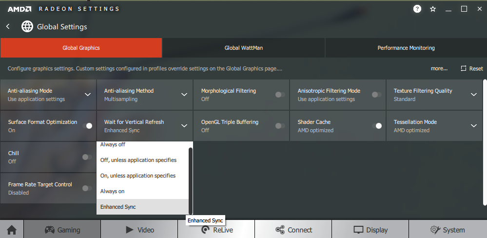
There is no obvious indication that FreeSync is active on the monitor itself. If you navigate in the OSD to ‘Others’ – ‘Display Info’, you will see the refresh rate change according to the frame rate of the content. The monitor will only display the refresh rate it’s running at when you first entered the ‘Display Info’ screen, though, it doesn’t update in real time. This still gives an indication that FreeSync is active if you’re running the game between 48fps and 74fps and you see a refresh rate matching that listed. Finally, it’s worth remembering FreeSync only removes stuttering or juddering related to mismatches between frame rate and refresh rate. It can’t compensate for other interruptions to smooth game play, for example network latency or insufficient system memory.
FreeSync – the experience
HDR (High Dynamic Range)
Colour gamut Dell S2719DM
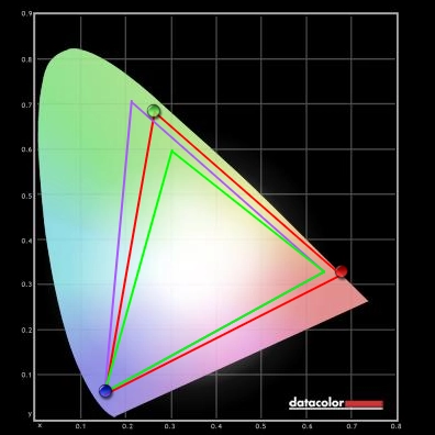
Colour gamut ASUS PA32UC, 'DCI-P3' setting

This provides a bit of enhancement to contrast, depending on how it is measured (refer again to the contrast and brightness section). But it provides an experience that feels more like a Dynamic Contrast setting on steroids than a true HDR experience. The changes in brightness for the dimming zones is quite noticeable as the zones are quite large. We didn’t find this particularly bothersome, but some might and it depends on content – either way, it’s certainly more noticeable than where a much greater number of dimming zones is used. The monitor also has no ability to account for intricate mixtures of bright and dark. Even where the scene is favourable the shortcomings of this approach are apparent. In a scenario where the edges of the screen are very dark and the central content is much brighter (e.g. a candle in the middle of the screen surrounded by the darkness of an unlit building), the dark elements still look quite flooded. The black point is elevated beyond the level that gives a convincing dark atmosphere, even if you’re viewing the monitor in a well-lit room. The bright elements still stand out very nicely, though, and are in places exceptionally bright. This is particularly true when using the ‘Reference’ setting – although that is designed to be particularly extreme and ‘overbakes’ a lot of lighter shades so they appear oversaturated and brighter than they really should appear. The ‘Game HDR’ and ‘Movie HDR’ settings strike a better balance. Looking at the moon in a dark sky, for example, you see a certain brilliance to it that is simply lacking with HDR disabled. In that respect this monitor provided an advancement over the likes of the U2518D that purely simulate an HDR experience. Nonetheless, high peak brightness is really the only box that’s properly ticked here – so it does feel a bit like a one-trick pony when it comes to HDR.
Interpolation and upscaling

Conclusion
The bottom line; a stylish and remarkably slender screen with good performance in some areas, but a bit of ‘style over substance’ in others
Positives Negatives Rich, varied and well-balanced colours following minor adjustment with good sRGB coverage
Colour gamut falls a bit short of most WQHD IPS-type models and far short of the DCI-P3 near-term target for HDR
Good static contrast and excellent peak brightness, particularly for HDR content. Luminance adjustment range is also very good and easily accessible Low Blue Light (LBL) settings are present Although bright elements are impressive under HDR, dark elements are not. Typical ‘IPS glow’ for this model and poor uniformity on our unit. The screen surface was not as ‘light’ and a bit grainier than is typical for IPS-type WQHD models Good pixel responsiveness overall, support for ~75Hz, fairly low input lag and a decent FreeSync implementation – it worked as we’d expect
A custom resolution of 74Hz maximum to prevent frame-skipping was required on our Nvidia GPU. FreeSync floor of operation not as low as some users would like and no LFC support
The resolution and screen size provided good ‘real-estate’ and a pleasing pixel density. Very slim bezels and screen with some touches of metal on the stand
Many boxes left unticked for a convincing HDR performance, very limited ergonomic flexibility and no VESA mounting provision (no room for the screws)
![]()

