Author: Adam Simmons
Date published: December 6th 2013
Table of Contents
Introduction
VA (Vertical Alignment) panels have been somewhat overshadowed recently by far more common alternatives such as TN (Twisted Nematic) and IPS (In-Plane Switching). With vastly superior contrast, though, there is still a bit of a craving for the VA flavour. The BenQ EW2740L is a recent release from a company who pumps out VA monitors like no other. As a new addition to their ‘Eye-Care’ range a key feature is the use of a flicker-free backlight to promote greater visual comfort. Their continued interest in these unique panels should come as no surprise given that they are the parent company of the main VA panel manufacturer, AUO. We put this 27” VA model through its paces in our ruthless gauntlet of ‘real world’ tests to find out what it’s made of.
Specifications
The monitor uses a 27” AU Optronics AMVA panel which is capable of outputting ‘true 8-bit’ colour per subpixel and pumping out a respectable 3000:1 static contrast. As standard for such a monitor there is a ‘Full HD’ resolution and a specified grey to grey response time of 4ms. As no doubt our testing will reveal, this response time figure shouldn’t be taken at face value as a point of reliable comparison with other monitors.
For your reading convenience the key ‘talking points’ of the specification have been highlighted in blue below.
Features and aesthetics
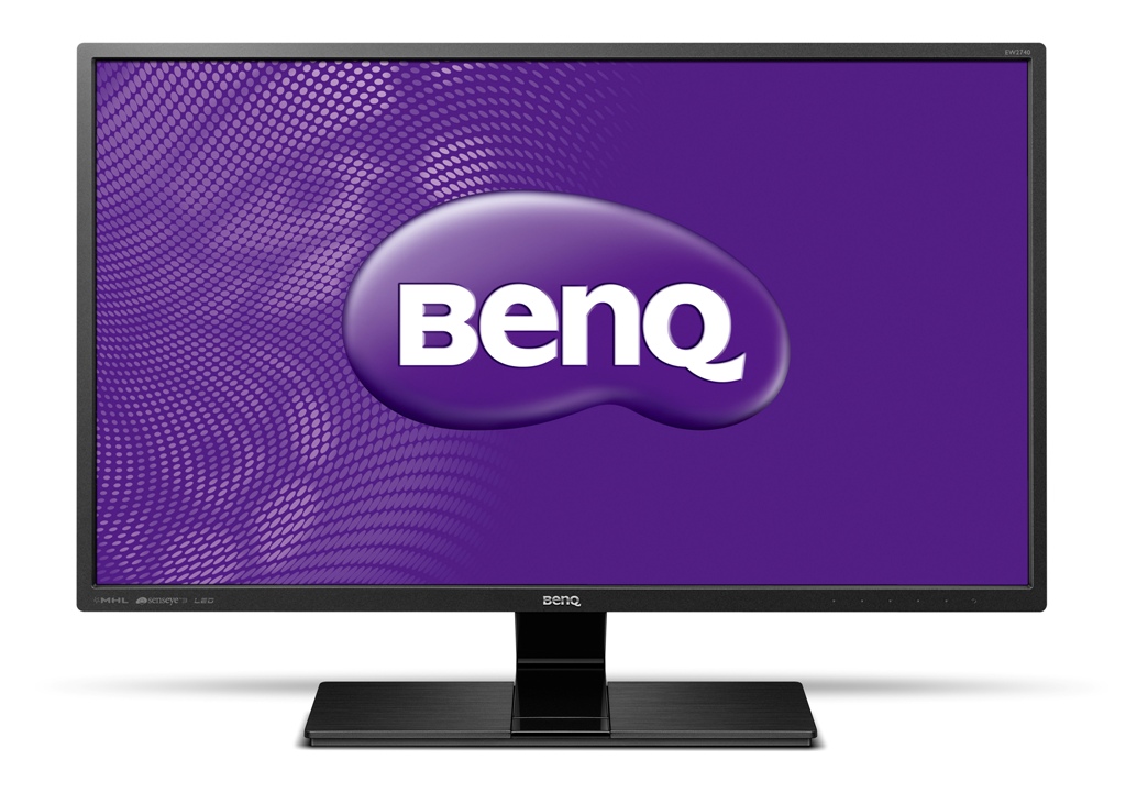
The front of the monitor reveals a few (in our opinion) attractive design features. The bezels are matte black plastic and very thin – 11mm (0.43 inches) at the top and sides and 16mm (0.63 inches) at the bottom. The stand neck is glossy black plastic at the front, running forwards down the centre of the stand. Either side of this the stand is matte black plastic with a brushed metal texture. The screen surface is very light matte (‘semi glossy’). This provides good anti-glare properties without imparting obvious graininess or sapping too much vibrancy from the image.
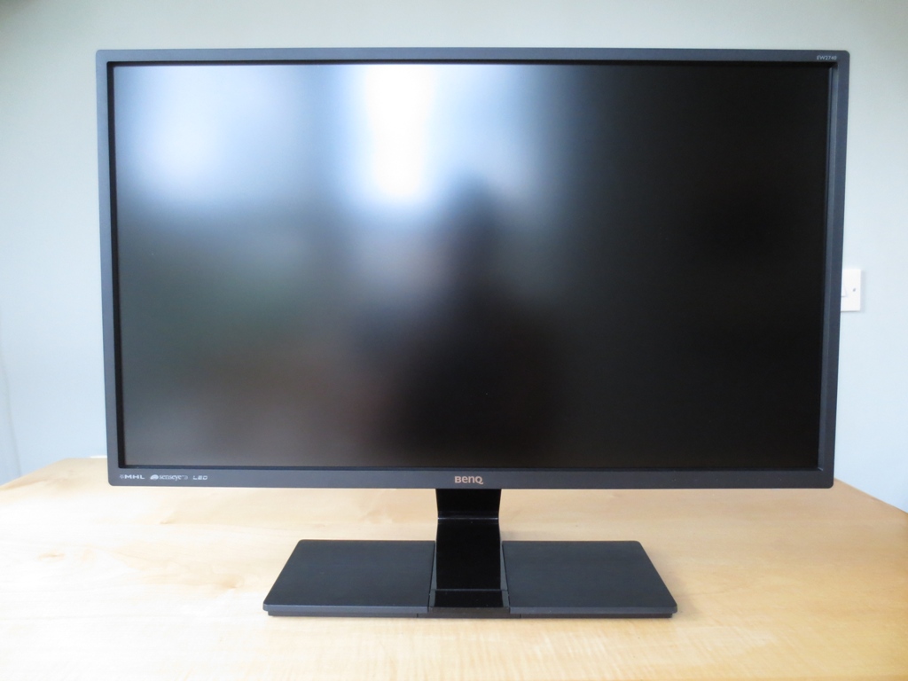
In the above photo you can make out the outlines of the windows and some other objects in the room in a way that is clearer than on ‘regular’ matte surfaces but without the distinct reflections of glossy. Once the monitor was switched on and placed in more sensible lighting conditions without strong direct light hitting the screen, the image was not impaired by glare or reflections. The OSD (On Screen Display) is controlled by touch sensitive areas at the front of the screen. The functions are as follows; ‘Custom Key 1’ (Low Blue Light mode by default), ‘Custom Key 2’ (input select by default), ‘Custom key 3’ (volume by default), ‘Menu’ and ‘Exit’. The buttons are reasonably sensitive, more so than touch-sensitive buttons on glossy surfaces tend to be. Aside from the dim green power LED hanging down beneath the power button, there is no illumination here. This can make operation tricky in the dark, unless you are quite used to the button layout. Functions are labelled on-screen, at least.
The main menu uses BenQ’s ‘Intuitive UI’ style and is fairly straightforward with a good selection of features. Once in the main menu the buttons are used for navigation; ‘Up’, ‘Down’, ‘Right’, ‘Left’ and ‘Exit’. Most features are self-explanatory or are covered in various parts of the review. The main new feature is the selection of ‘Low Blue Light’ modes. Some relatively new features include ‘Super Resolution’ which really just increases sharpness. This makes things look overly sharp and is designed for low resolution content primarily. ‘Smart Focus’ also features as demonstrated briefly in the video below, alongside a run-through of the rest of the OSD.
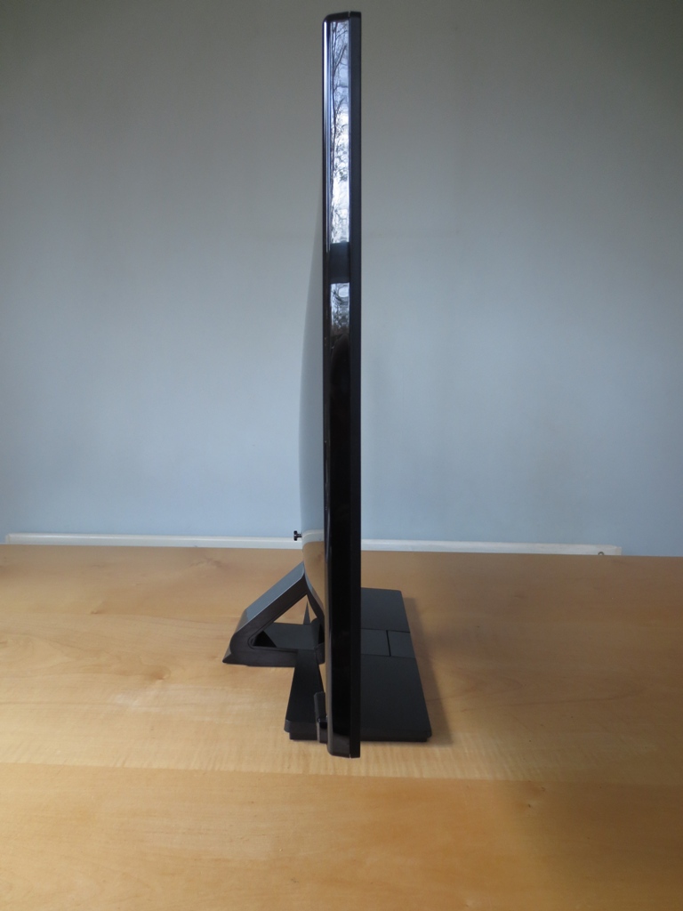
At the side the monitor is fairly thin and features glossy black plastic (aside from where the front bezel attaches). It is 18mm (0.71 inches) at thinnest point but bulks out centrally to around 50mm (1.97 inches).
The rear of the monitor is dominated by glossy black plastic, making it difficult to photograph in decent light without a lot of reflected clutter. There is no VESA mounting on this model and a rather unique vertical port arrangement. There are two speaker grills either side of the ports housing stereo speakers. The sound quality is quite reasonable for integrated monitor speakers. The sound was not particularly dynamic and had fairly weak base. At the same time it didn’t sound overly tinny or distorted and had fairly crisp treble in places. The sound maintained these qualities even at maximum volume, which is reasonably loud given the small speaker size.
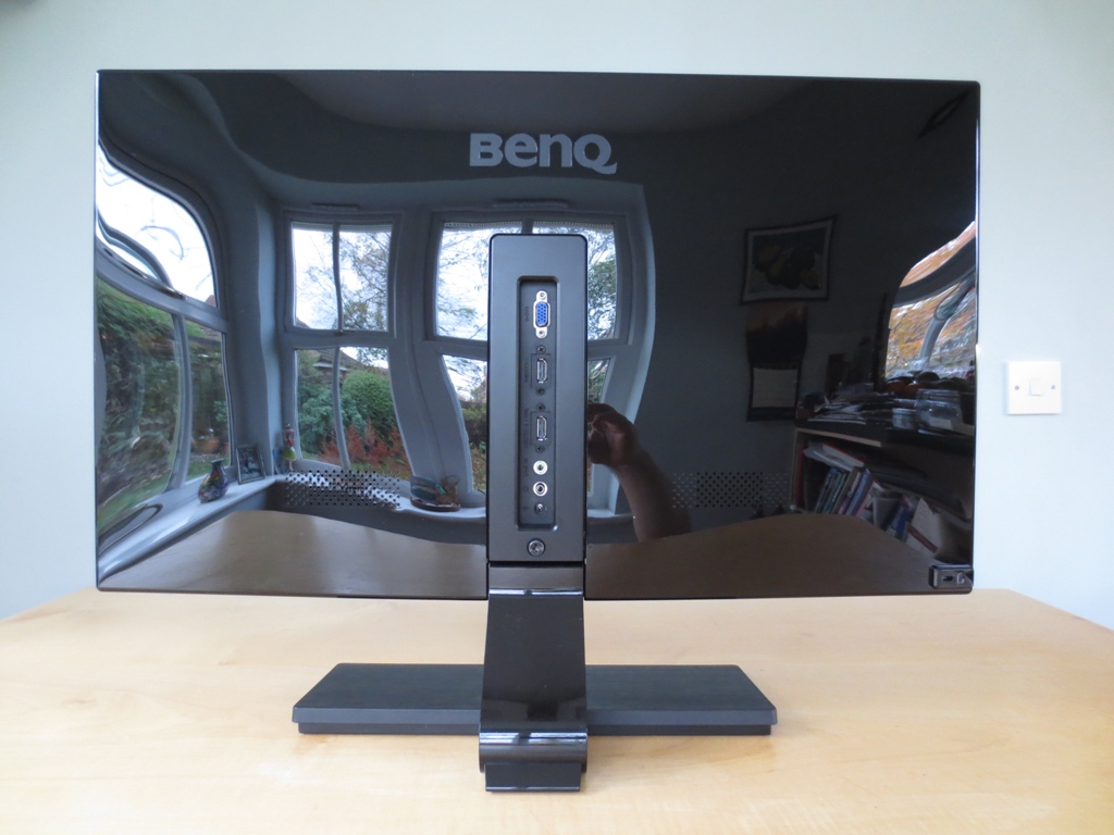
The ports, from top to bottom are; VGA, 2 HDMI ports, 3.5mm line-in, 3.5mm headphone jack and DC power input to attach the included power brick to. The lower HDMI port features MHL (Mobile High-definition Link) which will allow the monitor to display the contents of and output audio from a compatible smartphone and also charge it. Samsung Galaxy phones require an additional adaptor to use MHL, although charging is supported. A VGA cable and HDMI cable is included in the box.
Calibration
Correcting the HDMI colour signal
Our test system used an Nvidia GTX 780 connected via HDMI. By default Nvidia GPUs send out a limited range colour signal over HDMI designed for HDTVs and monitors configured in a specific way. The image looks somewhat flooded and it is clearly missing the black depth and contrast you’d expect from a decent VA panel. If you go onto the OSD main menu and go to ‘Picture Advanced’ -> ‘HDMI RGB PC Range’ then cycle to ‘RGB(0~255)’ and back to ‘RGB(16~235)’ it vastly improves things. You have to do this every time you switch preset, which is rather inconvenient unless you settle on some specific settings and leave it at that. Things do look, at least on the surface, very nice with the monitor set to ‘RGB(16~235)’ on Nvidia graphics cards.
If you want to unlock slightly more contrast and not have to worry about toggling this ‘RGB’ setting every time you switch presets you can instead ensure the GPU is sending a Full Range RGB signal designed to bring out the full potential of the monitor. The easiest way to do this is to download this utility. You just run the .exe file included in the .zip and click the button at the top right which is labelled ‘Set Full Range (0-255)’, as shown below.

This utility modifies the graphics driver registry entries controlling the HDMI colour signal to ensure the correct Full Range RGB signal is sent out to the monitor. You must restart your computer for the changes to take effect. You should then go back to ‘Picture Advanced’ -> ‘HDMI RGB PC Range’ in the OSD and cycle to ‘RGB(0~255)’ to ensure the monitor picks up and uses the Full Range RGB signal. If you install a new graphics driver you should re-run the utility, although with the modern Nvidia upgrade process integrated into the driver that isn’t always necessary. AMD GPU users should find that the ‘HDMI RGB PC Range’ option is greyed out and the image looks nice out of the box. If you are an AMD GPU user and like to fiddle about with graphics driver settings you may be able to improve the contrast or general image just slightly. See the ‘Calibration’ section of our BenQ GW2760HS review for details on how to do this.
Testing the presets
The BenQ EW2740L has a broad range of ‘Picture Mode’ Senseye 3 presets available; ‘Standard’, 4 ‘Low Blue Light’ presets (‘Multimedia’, ‘Web Surfing’, ‘Office’ and ‘Reading’), ‘Cinema’, ‘Game’, ‘Photo’, ‘sRGB’, ‘Eco’, ‘M-book’ and ‘User’. Rather than going through each preset and in many cases saying why we don’t like the image in said preset and don’t recommend using them we will instead focus on those we do find appealing. In addition we will be taking a look at the effect on the image of applying the 5 different ‘Gamma’ settings available in the OSD. The table below gives the white point, average gamma, preset-specific OSD features available and general observations about the image using a range of settings. The readings and observations in this table were based on testing using a Spyder4Elite colorimeter alongside some familiar games, desktop images and other applications. We corrected the HDMI colour signal to Full Range RGB as detailed above but used default settings elsewhere, unless otherwise specified.
| Picture Mode (Preset) | Gamma (central average) | White point (kelvins) | Extra OSD features | Notes |
| ‘Standard (Gamma 1)’ | 2.0 | 7274K | Gamma, Color Temperature | Bright with a slightly flooded and cool look, but some good rich shades and a pleasing shade variety. |
| ‘Standard (Gamma 2)’ | 2.2 | 7290K | Gamma, Color Temperature | Again bright and cool but greater depth without a flooded look. Good shade variety and largely appropriate saturation. |
| Factory default. ‘Standard (Gamma 3)’ | 2.4 | 7345K | Gamma, Color Temperature | As ‘Gamma 2’ but deeper again with some shades appearing somewhat darker than they should. |
| ‘Standard (Gamma 4)’ | 2.6 | 7292K | Gamma, Color Temperature | As ‘Gamma 3’ but even more depth, some shades far too dark. |
| ‘Standard (Gamma 5)’ | 2.8 | 7294K | Gamma, Color Temperature | As ‘Gamma 4’ with some shades appearing very dark and noticeable oversaturation in places. Quite a striking but not particularly accurate look to the image. |
| ‘Low Blue Light: Multimedia -30%’ | 2.0 | 5189K | Image is softer, warmer and a more comfortable brightness than ‘Standard’ mode. A comfortable viewing mode for evening viewing in particular. Sharpness control can be accessed if you want to retain the default sharpness of ‘5’ rather than ‘3’. | |
| ‘Low Blue Light: Web Surfing -50%’ | 2.0 | 5014K | As ‘Multimedia’ but somewhat dimmer and a slightly warmer tint. | |
| ‘Low Blue Light: Office -60%’ | 2.0 | 4698K | As ‘Web Surfing’ but dimmer and warmer. | |
| ‘Low Blue Light: Reading -70%’ | 2.0 | 4447K | As ‘Office’ but dimmer and warmer still. Very restful on the eyes in a dark room –similar to enabling f.lux at a low screen brightness. | |
| ‘User: Color Temperature= User Define’ | 2.4 | 5596K | Gamma, Color Temperature, Hue, Saturation | Very high brightness with a warm green tint but deep and varied colours. This is the ‘unlocked’ setting without any modifications at all to colour channels, maximising contrast. |
| Test Settings (‘User’ modified as below) | 2.2 | 6496K | Gamma, Color Temperature, Hue, Saturation | A comfortable brightness with good colour balance and a vivid and varied look overall. |
The EW2740L provided a decent image straight from the box. It was fairly satisfying visually with (correctable) brightness, gamma and white point issues which caused the image to appear cool and some shades to appear deeper than they should. This blue tint to the ‘Standard’ preset was a bit strange given that when the colour channels were completely unaltered in the ‘User’ preset there was a warm and green tint instead. We suspect this may be to try to accentuate the differences between this and the range of ‘Low Blue Light’ settings available on the monitor. These settings provide lower brightness and a warmer, softer look to the image. This can be achieved manually by altering brightness, sharpness and the colour channels. HEVL (High Energy Visible Light), such as blue light from monitor backlights isn’t something you generally have to worry about from an eye health perspective, but for comfort and other reasons it can be important. Eye health aside, we don’t want to take too much away from the ‘Low Blue Light’ modes, as we feel it is nice to have a range of easily accessible presets for this sort of thing. We personally like to make use of such settings in the evening, for example, where blue light can interfere with sleep and make you feel more awake than you’d like.
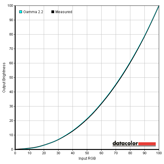
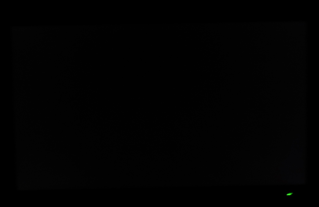
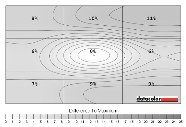
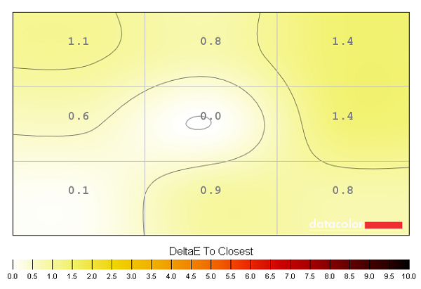
For our test settings, covered in the following section, we used the ‘User’ mode and manually adjusted the colour channels. We also used ‘Gamma 2’ rather than the default of ‘Gamma 3’ as this gave the closest fit to the 2.2 curve that many users find desirable. We adopted the following for our test settings. It should be noted that individual units can and likely will vary, in particular when it comes to colour temperature. You should therefore feel free to make your own adjustments instead. The default ‘Gamma’ setting also provides a slightly deeper image which isn’t necessarily desirable for accurately represented colours but may be preferred by some users. It’s nice to have this sort of flexibility, of course. Brightness= 58 (according to preferences and lighting) Contrast= 50 Gamma= 2 Red= 89 Green= 92 Blue= 100 We used a KM CS-200 luminance meter to accurately measure white and black levels using a range of monitor settings. From these values contrast ratios were calculated, which are shown in the table below alongside the other readings. The highest white luminance, lowest black luminance and highest static contrast ratio recorded has been highlighted in black. The readings and contrast ratio for our test settings are highlighted in blue. The static contrast readings on the EW2740L were strong. You could see the result of this on the desktop. Black text was deep and inky and images had a really defined look with excellent distinction between dark and light shades. On standard mode the average contrast ratio recorded was 3269:1, excluding ‘0% brightness’ where the black luminance was too low to be accurately recorded by our luminance meter. This is quite close to the 3000:1 specified for the panel. ‘Standard’ mode makes significant adjustments to the colour channels, not necessarily ideal ones at that. When the colour channels were left completely alone (‘User: Color Temperature= User Define’) a very impressive contrast ratio of 5114:1 was recorded, far exceeding the panel specifications. Following the changes made for our ‘Test Settings’ a contrast ratio of 3660:1 was recorded which is still very pleasing. More good news came from the various ‘Low Blue Light’ settings which actually used colour channels closer to the native warm tone of the panel and yielded contrast ratios of 4000:1-4625:1. The luminance range of the monitor was also exceptional, ranging from an extremely low 11 cd/m2 to a maximum of 358 cd/m2 based on the readings we took. This gives a 347 cd/m2 luminance adjustment range – and a lot of flexibility, allowing a comfortable brightness to be achieved for pretty much any user. There is a ‘Dynamic Contrast’ setting that can be activated in the ‘Game’, ‘Cinema’ and ‘Photo’ presets. You can choose how broad the brightness range is (from 1-5) for this setting. Even at the lowest setting the monitor tended to produce rather high brightness at its dimmest. Using a higher setting simply produces brightness that ranges from high to very high. The backlight didn’t seem to dim appropriately when very dark images were displayed – even an entire black screen. Considering that this mode can only be activated in some of the poorer image presets and that the static contrast is very high on this model it seems a waste of the monitors capability to use it. So we won’t get hung up over this poor Dynamic Contrast implementation. As the marketing for this model suggests, being part of BenQ’s ‘Eye-care’ initiative, it’s designed to promote the best possible visual comfort for the user. One aspect of this is the ‘Low Blue Light’ modes which we explored previously. The other is the claim of a ‘flicker free’ backlight, which we can confirm from our testing is correct. This model does not use PWM (Pulse Width Modulation) to modulate backlight brightness. Instead it uses a DC (Direct Current) method to control backlight brightness at any brightness setting – even ‘0’ where 11 cd/m2 was recorded. Some users are sensitive to or suffer visual discomfort from the flickering that is associated with the use of PWM, so it’s nice to see BenQ continue their drive to banish PWM-regulation for their monitor backlights. Observing a black screen in a dark room using our test settings revealed no noticeable backlight bleed. There was a small amount of clouding, particularly at the bottom two corners. This was very faint even in a dark room (shown in the picture below) and was not noticeable during normal use. There was also a mild silver-purple glow, something we dub ‘VA glow’, visible from de-centralised viewing angles. This was visible to some degree from a ‘normal’ viewing position, in a dark room, at the very edges of the screen but was very faint and nothing like ‘IPS’ or ‘PLS’ glow in its intensity. The video in the ‘Viewing angles’ section shows how this manifests itself from varied viewing angles. A Spyder4Elite was used to assess the luminance uniformity of ‘pure white’ at various points of the screen. This is a good indicator for potential brightness deviations when displaying various lighter colours and not just white. 9 ‘quadrants’ were analysed running from top left to bottom right. The table below gives these readings as well as the percentage deviation between each quadrant and the brightest recorded point on the screen. The luminance uniformity of the monitor was good. The brightest point was ‘quadrant 5’ at the centre of the screen (189.8 cd/m2). The greatest deviation from this, 11%, occurred at ‘quadrant 3’ at the top right of the screen (168.3 cd/m2). There was a 10% deviation at ‘quadrant 2’, the top central region, with single-digit deviation elsewhere. This is a pleasing result from our unit. The graphic below gives a visual representation of these deviations as a contour map with percentage deviation between each quadrant and the brightest point. Darker greys here represent greater deviations than lighter greys. It is important for some users not just to consider deviation in brightness at various points of the screen, but also colour temperature. Using the same 9 quadrants the Spyder4Elite also assessed deviation in white point (colour temperature). The graph below shows deviations in DeltaE between each quadrant and the quadrant that’s closest to the 6500K (D65) target white point. Darker colours on this graph again signify greater deviations than lighter colours. Anything above a DeltaE of 3 is generally considered to be significant deviation that some users will see quite readily by eye. The central point (‘quadrant 5’) is closest to the 6500K target. With a maximum deviation of 1.4 DeltaE (‘quadrant 3’ and ‘quadrant 6’ at the top right and centre right, respectively) the deviations from in colour temperature compared to this central point are minor. As with all uniformity issues, including backlight bleed and variations in luminance and white point, it’s important to remember that individual units of the same model can vary. Our unit performed consistently well here which is always good to see. It’s also important to remember that none of these tests take into account variations due to viewing angle, such as ‘gamma shift’, which is explored subjectively later on. This doesn’t affect the appearance of white or black but can affect shades between this. The contrast performance was excellent overall on Battlefield 4. Dark and shaded areas showed very good levels of detail. There was a degree of so-called ‘black crush’ where some of the darkest non-black shades would blend into the black somewhat with visibility improving if you look at the screen from an angle. This is due to the gamma shift behaviour typical for a VA panel and actually seemed less pronounced than on many AMVA panels. The EW2740L performed similarly to the GW2760HS in this regard which features something dubbed ‘Color-shift Free’. Such marketing wasn’t used on this model, but the capabilities seem intrinsic to its new ‘AMVA+’ panel anyway. It isn’t only the level of detail that’s important but how this is achieved. IPS and TN panels can use gamma modifications to selectively enhance low-end visibility at the expense of a somewhat ‘flooded’ look to the image. On this monitor dark shades were deep and bold and it didn’t have this flooded look. This is not only desirable in dark areas but also mixed scenes where shadow detail was particularly bold. If you consider vegetation, for example, there was a definite structure that would be lacking somewhat on other panel types. It also helped bring out strong highlights and lighter colours. Bright elements such as neon in-game markets, fires and explosions contrasted beautifully with darker surroundings and really stood out. The screen surface didn’t impart an obvious graininess to such elements, either, so they appeared relatively ‘clean’. As with Battlefield 4 detail in dark areas on Dirt 3 was very good with even fairly minor detail visible. Some of this was lost due to the aforementioned gamma shifting. However; the overall depth of dark shades and maintenance of detail even near the corners and edges of the screen more than made up for this. The structure and detail levels brought out by these strong distinctions between ‘light’ and ‘dark’ really added something to the game. Vegetation, tire treads, cracks in the road and the materials of buildings highlighted this nicely. Bright elements such as car headlights and interior lights in the dark really ‘popped’ and contrasted very well with their darker surroundings. Such elements didn’t have the absolute smoothness and purity that they would on a glossy screen but weren’t too far off really. On the Blu-ray movie Skyfall detail levels were excellent in the darkest scenes with even minor detail (such as smooth creases in fabric) visible. Blacks and dark colours in the film also looked very deep and inky at every point of the screen. Bright elements, most notably the neon lights of Shanghai at night, pierced the darkness very well. They had good pop and didn’t appear to be muted too much by the screen surface. The Lagom tests for contrast allow specific weaknesses to be identified, even those that may not be readily apparent during other testing. The following observations were made. The BenQ EW2740L offers quite comprehensive sRGB coverage, particularly good for a modern VA monitor. The image below shows that the monitor’s colour gamut in our test settings follows sRGB closely without any real under-coverage and only slight over-coverage in places. This helps keep the image rich with nicely saturated (but not excessively saturated) colours. The colour experience on Battlefield 4 was rich, varied and rewarding. The variety of greens (from khaki shades to much deeper and more vibrant shades) was good with pleasing richness throughout the range. The variety and appropriate shade representations helped environments look natural and as they should. Some of the more vibrant colours in the game were quite striking, particularly the red, green and blue ‘neon’ markers. These stood out superbly, especially against darker backgrounds. Reds and oranges from glowing fires and various neon lights on the multiplayer map ‘Operation Dawnbreaker’ also showed good depth and intensity. The colour performance was also pleasing on Dirt 3. The variety of rich but appropriately saturated colours gave all of the racing environments in the game the look they craved. The distinctions between closely matched ‘dusty’ greens and browns on the Kenyan rally tracks and the variety of lush greens in the Finnish forests were particularly impressive. The monitor also did justice to the vibrant lashings of colour found on the car paint jobs, advertising around the track and game menus. Some stand-out colours here included very rich and deep reds and oranges as well as strong dark blues. Thanks to the semi glossy screen surface colours looked fairly smooth and pure which was nice to see. On the Skyfall Blu-ray colours had a natural and appropriate look. Skin tones and elements in the environment looked in-place and appropriately saturated. There was good depth and richness to the colours, where it was called for, and a good range of impressively vivid shades. Dark reds and intense blues from some of the lights during the Shanghai night scenes were particularly striking. The Blu-ray movie Futurama: Into the Wild Green Yonder had the vibrant but varied look that it craves. There were some bold neon yellows, purples and greens with dark star fields in the background that really highlighted how vivid and ‘in your face’ some of the colours could be on this monitor. Even where the contrast was less stark, with bright shades cast around medium shades, the bright shades had plenty of pop. Dark shades had really good depth, too. The variety of subtly different pastel shades was also very good. Although the consistency and therefore ‘distinction’ and ‘identity’ of different shades was not up to IPS levels, the shifts in colour across the screen were less pronounced than on older generation AMVA panels. There were instances where a single solid colour filled much of the screen – the red of Dr Zoidberg, for example. This appeared a marginally lighter red towards the edges of the screen but didn’t have an obvious gradient-like appearance as you’d see on a TN panel. Overall this was an impressive colour performance, giving this title the look it hankers for. We took a closer look at colour consistency using Lagom’s tests for viewing angle, where the following observations were made. Using the method described in our review of the AOC g2460Pqu we measured just over 4ms (1/4 of a frame) of input lag on the EW2740L. The signal delay on the monitor is therefore very low and won’t get in the way of the gaming experience. We used PixPerAn (Pixel Persistence Analyser), a small piece of software designed to help analyse pixel response performance. Images were captured using a sensitive camera to highlight any trailing (ghosting) resulting from the monitor’s pixel response behaviour. PixPerAn’s speed was set to maximum so that these image represent the worst case scenario for this test. The images below show the results using the three different AMA (Advanced Motion Acceleration) pixel overdrive settings of the monitor; ‘Off’, ‘High’ and ‘Premium’, respectively. With AMA ‘Off’ you can see a fairly strong primary trail and a faint secondary trail, fairly typical behaviour from a modern AMVA panel on this test with no pixel overdrive enabled. With AMA set to ‘High’ a strong pixel overdrive impulse is activated, eliminating the conventional trailing but introducing a slight overdrive trail (also known as overshoot). Using AMA ‘Premium’ uses a very strong level of grey to grey acceleration and makes the overshoot far bolder and much more palpable. By eye the default ‘High’ setting certainly gave the best compromise, introducing a bit of overshoot but providing a good degree of acceleration to reduce conventional trailing at the same time. With VA panels in particular there is a great deal of variation in pixel response times depending on the shades involved in the transition. Because PixPerAn only deals with a fairly limited range of pixel transitions it’s important to assess things more broadly as well. In addition one should appreciate the influence of our eye movements as we watch motion on a screen, which is itself a source of motion blur. In some cases this is more significant than any trailing or blur resulting from the monitor’s own pixel responses and becomes the dominant factor. To help tie this all together in an easy to understand fashion we fired up a range of familiar game and movie test titles. Battlefield 4 showed a bit of a mixed picture when it came to responsiveness. For most of the typical pixel transitions on this title the speed was as good as it needed to be for optimal 60Hz performance. In contrast to older models, such as the EW30 series (EW2430 and EW2730), the majority of blur was attributable to eye movement. Your eyes continuously move to follow motion on the screen and this movement is itself a major cause of blur. There were some transitions where pixel responses were evidently slower, particularly where medium greys (or colours) and dark greys (or colours) were involved. This caused some trailing beyond that attributable to eye movement. This was somewhat extended in places and could perhaps be described as ‘smeary’, but nowhere could you see the exaggerated ‘smoke-like’ trails seen on some slower VA panels. It was clear that there was a decent degree of grey to grey acceleration affecting a broad range of pixel transitions. Further evidence of strong grey to grey acceleration came in the form of overshoot or inverse ghosting. This seemed most noticeable where dark and lighter shades mix. Sometimes a slightly dark trail manifested itself which was most noticeable (the extreme case) when moving the FLIR (thermal optics) with ‘white hot’ objects against a dark grey background. There were also some ‘bright trails’ in places, also referred to as halos, but these were quite faint. In the video below you can see some of this trailing behaviour. The first part of the video shows some of the more ‘smeary’ trailing that VA panels are renowned for. The blend of grey and black in this transition actually gave a red hue to the trail – it appears slightly purple in the video. It’s shorter-lived and less extensive than on many slower models (such as the EW2430). The second part of the video highlights some inverse ghosting visible whilst strafing past the Phalanx CIWS (anti-aircraft gun) on the USS Essex aircraft carrier, particularly noticeable on the left edge. The third part shows some inverse ghosting when moving a tank turret from side to side whilst using its thermal optics, although it isn’t all that clear on the video. Compared to the GW2760HS, another recent BenQ VA model, the overdrive is stronger using the optimal ‘AMA High’ setting on both. There is less conventional trailing as a result and the pixel responses seen are faster on the whole. There is overshoot in places, something not seen on the GW2760HS using ‘AMA High’. Some users will prefer this and won’t notice the overshoot. Others will notice the overshoot from time to time but won’t be bothered by it. Then there are those users who will find the overshoot bothersome – it’s all subjective. Given our fairly detailed assessment of the monitor’s responsiveness above we don’t have too much to add from our experiences on Dirt 3. The 60Hz refresh rate was again a key limitation when it came to motion blur. Some transitions (again involving darker and lighter colours) were slightly slower and produced a degree of trailing on top of this blur. These sorts of transitions were slightly more common on Dirt 3 with pretty much all tracks having areas where such transitions occur. When racing at night these slightly slower transitions were particularly common, but again didn’t give the pronounced ‘smoke-like’ trails seen on some older VA models. As with Battlefield 4 there were some instances of overdrive trailing. Finally we tested the responsiveness of the monitor using our Blu-ray movie titles. There were no obvious issues from slow or overly aggressive pixel transitions. The fluidity was limited by the 24 or so fps at which the films run and this was really the overriding limitation. IPS and ‘IPS-like’ panels are all the rage at the moment. The colour performance and responsiveness has reached a level where, at 60Hz, there really isn’t any reason for most people to opt for a TN panel. But there is another oft-forgotten panel type, one which some users aren’t even aware of; the VA panel. The BenQ EW2740L makes use of one of the latest generation of VA panels dubbed ‘AMVA+’ which really showcases what the technology is capable of. The contrast performance, which is really the highlight of VA panels, was very pleasing. Static contrast readings were high and the result in the ‘real world’ was solid and inky dark colours and a really dynamic look to the image. There was a degree of gamma shift, so visibility in dark areas wasn’t perfect. But the overall depth was excellent and there weren’t any nasty surprises like ‘IPS glow’ near the corners of the screen. Granted this doesn’t bother everyone anyway, but it’s nicer not to have that sort of issue. The colours were pretty decent ‘straight from the box’, but as is usual for such monitors could be improved following a bit of tweaking through the OSD. Following this colours had a rich, vibrant and varied look and weren’t held back by the usual VA curse of a restricted colour gamut – there was pretty comprehensive coverage of the sRGB cover space without significant under-coverage or over-coverage. We were also pleased with the overall design of the monitor, with bezels that were very slender but not in a pretentious way (no panel border). We also approve of the use of textured matte plastics rather than finger-print magnet glossy plastics for the bezel and most of the stand area. The OSD control buttons were also fairly good as far as touch sensitive buttons go and there were some useful menu features there as well. The ‘Low Blue Light’ settings were easy to activate and did what they said on the tin. Whilst we don’t feel users should be put off using ‘normal’ settings during the daytime (you’d be receiving far more ‘blue light’ by going outside in fact) these settings are particularly restful on the eyes in the evening. Responsiveness was, as is always the case for a VA panel, not perfect. We get the feeling that each generation BenQ tweaks their ‘AMA’ (Advanced Motion Acceleration) algorithms a bit. There was clearly stronger acceleration than we’ve seen on other VA panels in the past, including the GW2760HS, which is both good and bad. In many cases the monitor gave a level of motion blur quite comparable to much faster 60Hz monitors (those with IPS, PLS or TN panels). There were some transitions that were noticeably slower, but still much improved from the prolonged ‘smoke like’ trails seen on some older VA models. The strong acceleration came at the price of some overshoot in places which as we’ve noted will bother some users but not others. The signal delay of the monitor, a core component of ‘input lag’, was very low on this model as well. Overall then the monitor has a lot to offer at a quite attractive price. The image was pleasing and the monitor lends itself well to a wide range of tasks. It excels for watching movies in particular but is good for general desktop work and a bit of gaming as well. VA monitors are unique things that many people have yet to explore and this is one of the better ones out there.
Gamma Test Settings
Test Settings
Picture Mode= User
Contrast and brightness
Contrast ratios
Monitor Profile White luminance (cd/m2) Black luminance (cd/m2) Contrast ratio (x:1) ‘Standard’ 100% brightness 265 0.08 3313 ‘Standard‘ 80% brightness 220 0.07 3143 ‘Standard’ 60% brightness 172 0.05 3440 ‘Standard’ 40% brightness 122 0.04 3050 ‘Standard’ 20% brightness 68 0.02 3400 ‘Standard’ 0% brightness 11 <0.01 – Test settings
183 0.05 3660 ‘User: Color Temperature= User Define’
358 0.07 5114 ‘Low Blue Light: Multimedia -30%’
185 0.04 4625 ‘Low Blue Light: Web Surfing -50%’ 169 0.04 4225 ‘Low Blue Light: Office -60%’ 138 0.03 4600 ‘Low Blue Light: Reading -70%’ 120 0.03 4000
PWM (Pulse Width Modulation)
Luminance uniformity

Luminance uniformity table
Luminance uniformity map
Colour temperature uniformity map
Contrast in games and movies
Lagom contrast tests
Colour reproduction
Colour gamut
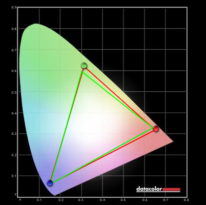
Colour gamut test settings
Colour in games and movies
Viewing angles
In the following video we take a look at the viewing angle performance in the Lagom text test, a typical desktop background and a dark desktop background. Here the camera is moved around the desk to show how the monitor may appear when viewed from different viewing angles. The final part of the video shows a slight purple glow in places, the aforementioned ‘VA glow’ that is nowhere near as obvious as IPS or PLS glow.
Responsiveness
Input lag
Pixel responsiveness

PixPerAn 'AMA Off'

PixPerAn 'AMA High'

PixPerAn 'AMA Premium'
Responsiveness in games and movies
Conclusion
Positives Negatives A rich and varied look to the image with good colour gamut for a VA model. The semi-glossy screen surface helped preserve a good amount of vibrancy and clarity
Out of the box the image was decent but not ‘ideal’, so some tweaking was required. This is particularly common for VA panels, however
A strong contrast performance with good inky blacks, strong dark colours and excellent distinction between them and lighter shades Colours were not as consistent as on IPS models and there was the usual ‘gamma shift’; but in both cases the ‘AMVA+’ panel performed better than older 27” AMVA panels Low input lag and strong pixel overdrive gives the monitor some potential when it comes to gaming
There was some overshoot from the strong grey to grey acceleration and some slower transitions that couldn’t be fully accelerated
A nice design with slender matte bezels, useful ‘Low Blue Light’ modes and an intriguing vertical port arrangement that is easily accessible from above the monitor
Only HDMI ports for digital output (requires some tweaking on Nvidia GPUs), a tilt only stand and no VESA holes
![]()
