Author: Adam Simmons
Date published: December 9th 2015
Table of Contents
Introduction
The 3840 x 2160 ‘4K’ UHD (Ultra High Definition) resolution can provide a visually stunning gaming experience and is very useful as far as productivity is concerned. But unless you have a monstrously powerful system, maintaining a solid 60fps is very difficult indeed on modern games titles. For UHD monitors with a static 60Hz refresh rate, this means the user will experience stuttering or tearing as the frame rate of the content departs from the refresh rate of the game. The ASUS ROG (Republic Of Gamers) SWIFT PG27AQ has an ace up its sleeve in the form of Nvidia G-SYNC, a technology that allows the refresh rate of the monitor to dynamically adjust to match the frame rate of the content. We see what this addition brings to the table and also how the monitor itself performs in a range of ‘real world’ scenarios.
Specifications
The monitor uses a 27” ‘4K’ UHD panel from AU Optronics. This makes use of AHVA (Advanced Hyper Viewing Angle) technology and is therefore an IPS-type panel. The monitor supports 10-bit colour by means of 8-bits per channel + FRC dithering. A 4ms grey to grey response time is specified and as usual this is adjustable with various ‘TraceFree’ pixel overdrive settings. We have highlighted some key talking points in blue below.
Features and aesthetics
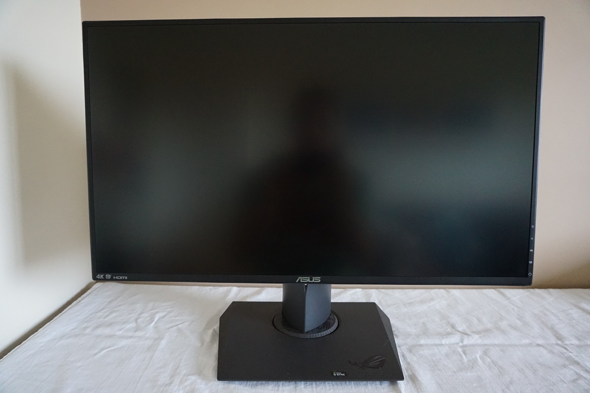
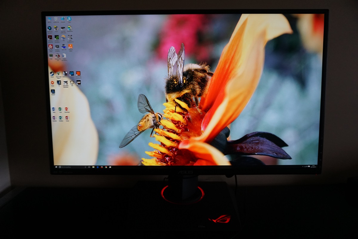
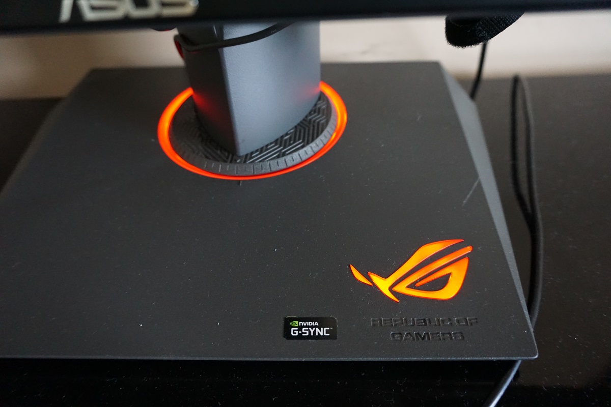
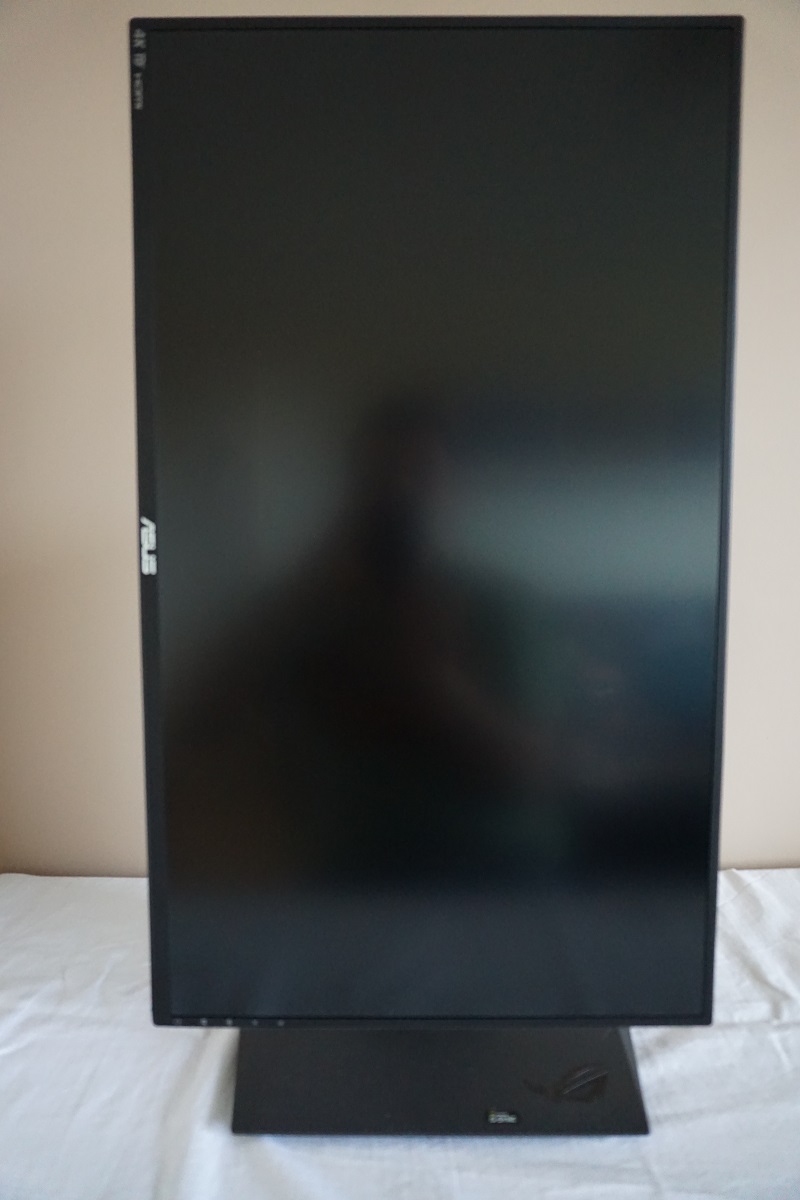
From the front this monitor has a sleek and angular design. The bezels are very thin, despite having the ‘2-stage’ design seen on quite a few modern monitors. When the screen is switched off all you can really see in the way of bezel is the hard outer component of around 8mm at the top and sides, made from matte plastic. This includes the very thin ‘rim’ that surrounds it. Once the screen is switched on, it becomes apparent that there is also a very thin panel border of around 2mm (if that) at the top and sides that blends in seamlessly when the monitor is switched off but is visible around the image when it is switched on. Of course, this panel border is very thin and hardly worth sweating over – and the total bezel thickness counting both components is at most 10mm (0.39 inches). The bottom bezel is thicker but still rather slender, especially for a bottom bezel, at around 15mm (0.59 inches) including both bezel components. Other interesting points to note at the front include the ‘very light matte’ screen surface, explored later and the ‘Light in Motion’ feature. This includes a red LED rim around the base of the stand neck and also a red ROG cloak motif logo, again illuminated by LEDs. When fully lit up, the monitor looks sort of evil and as if it is trying to identify itself as a monitor of the ‘Dark side’. It’s a fairly intense red rather than orange as it appears on the photo. These ‘Light in Motion’ LEDs can be switched off in the OSD (On Screen Display) if preferred.
The OSD is controlled by a 5-way (4 directions plus click) joystick and some additional buttons which run down the rear side of the right bezel, near the bottom. There is also a power LED to indicate the power status of the monitor, which is a thin rectangle that runs from front to back along the underside of the bottom bezel. Only a small section is therefore visible from the front. This glows red when G-SYNC is active (even if you’re just on the desktop), white when the monitor is working at a fixed refresh rate with G-SYNC disabled and amber when the monitor is on standby (low power state). When you switch the monitor ‘off’ using the power button, the LED also turns off. The video below runs through the functionality of this OSD.
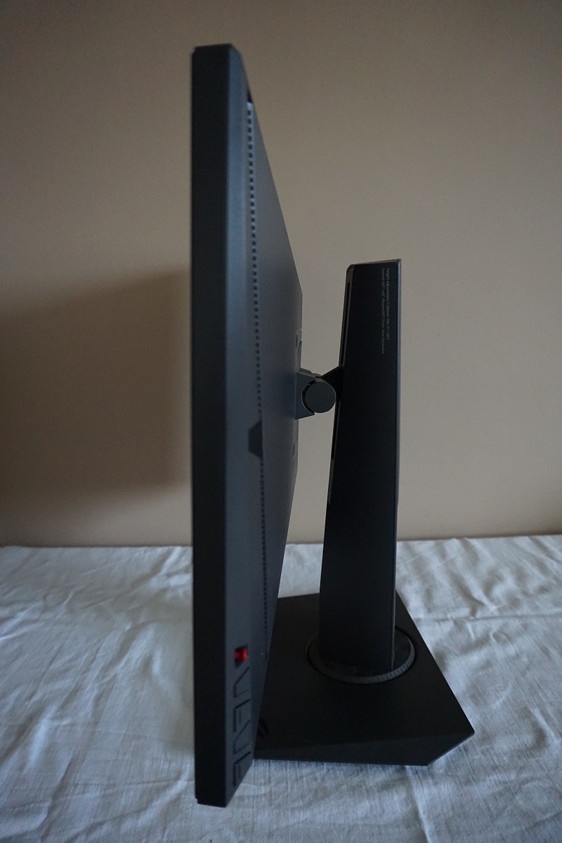
From the side the monitor is quite slender, around 22mm (0.87 inches) at thinnest point but lumping out towards the centre where the stand attaches. The stand offers full ergonomic flexibility; tilt (5° forwards, 20° backwards), height adjustment (120mm or 4.72 inches), swivel (60° left and right) and pivot (90° rotation clockwise into portrait). The overall build quality of the stand and product itself is certainly nice – it feels rather solid and well-built as you would hope given the asking price. For reference the stand base is ~240mm (9.45 inches) deep. At the lowest height, the bottom edge of the screen clears the desk by ~78mm (3.07 inches) with the top of the screen ~437mm (17.20 inches) above the desk.
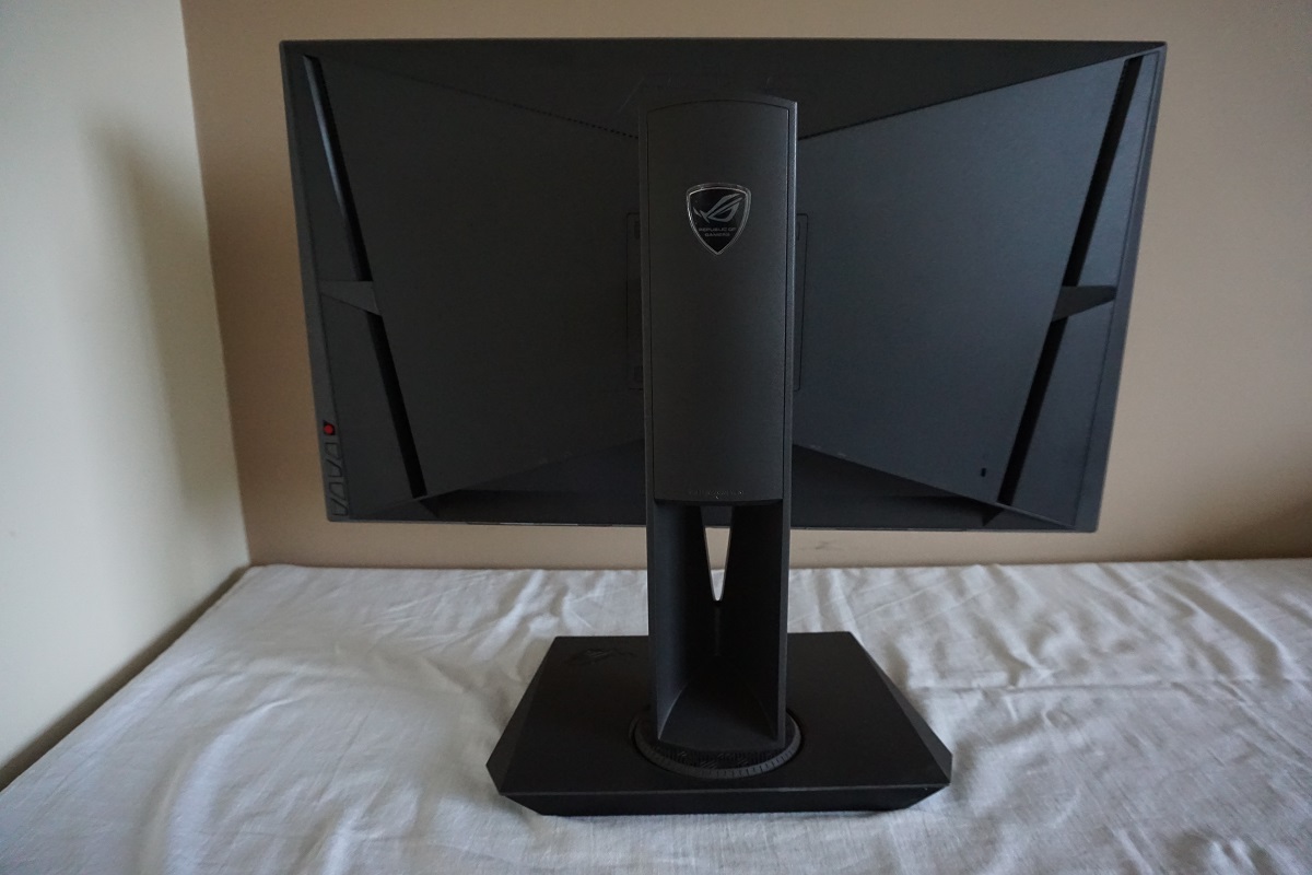
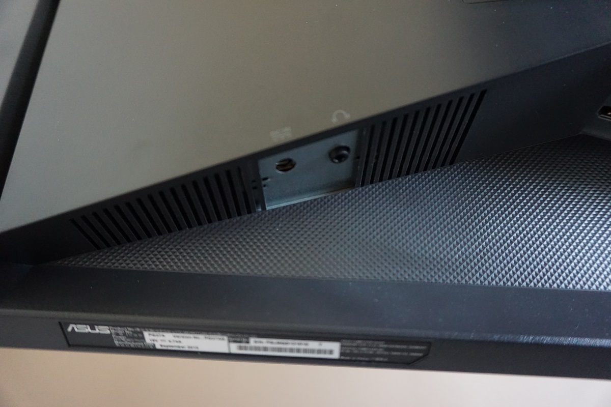
The rear of the stand has an interesting angular design with matte black plastic used in favour of glossy plastics. This matte black plastic is used on the bezels and stand as well. The top and bottom areas of the screen, at the rear, are textured with a sort of triangle pattern. The stand attaches by 100 x 100mm VESA and can be removed by taking off the rubber screw covers and removing the screws beneath. An alternative VESA 100 stand or mount can then be used. There is a cable-tidy mechanism towards the bottom of the stand neck and an interesting arrangements of down-firing ports running up and then down the top sides of the bottom triangular area of the stand.
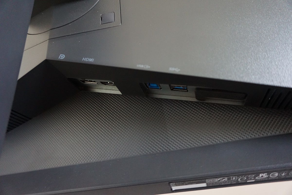
From left to right the ports are; DC power input (external power brick), 3.5mm headphone jack, DP 1.2 input, HDMI, USB 3.0 upstream, 2 USB 3.0 downstream ports, a service port (for ASUS service centre use) and a Kensington lock slot. Standard cables include; a DP cable, HDMI cable, USB 3.0 upstream cable, and a power cable (and adaptor). There are also 2 x 2W stereo speakers which provide basic sound output. The clarity of these speakers is fairly good for 2W stereo speakers, with fairly clear treble and mid-tones. The ‘bassiness’ is reasonable in places too – they provide a generally less ‘tinny’ sound than integrated monitor speakers usually do. Whilst they aren’t going to get the pulses of audiophiles racing, they are certainly useable. Good for those moments where you don’t want to don that pair of headphones you have connected to the PC, for whatever reason.
Calibration
Subpixel layout and screen surface
The monitor uses a very light matte screen surface, with a fairly low haze value. This sort of screen surface preserves vibrancy and clarity better than stronger/heavier matte surfaces. The screen surface does not have the strong ‘smeary’ layered grain of some matte surfaces, although there is a bit of a grainy look to white and other light colours. In other words, the surface texture is not as smooth as we’ve seen on some other ‘very light’ matte screen surfaces despite the low haze value. The low haze value does in itself still improve the potential vibrancy and overall clarity regardless of this.
![]()
The usual RGB (Red, Green and Blue) stripe subpixel layout is used by this monitor. This is the most common subpixel layout and the default expected by modern Operating Systems such as Microsoft Windows and Apple’s MacOS. There is therefore no need to worry about ‘fringing text’ as a Mac user or having to run ‘ClearType’ as a Windows user. Still, you may still want to run ‘ClearType’ to fine-tune according to preferences.
Testing the presets
The PG27AQ features a number of ‘GameVisual’ presets; ‘Scenery Mode’, ‘Racing Mode’, ‘Cinema Mode’, ‘RTS/RPG Mode’, ‘FPS Mode’ and ‘sRGB Mode’. There are also a number of other interesting options in the OSD, including a ‘Blue Light Filter’, a ‘Low Blue Light’ setting which allows the user to set the monitor to one of 4 levels of increased blue light reduction. In the table below we look at a range of different settings in the OSD and how they affect the general image characteristics. Readings for the white point and central gamma are also provided, as recorded using a Spyder5ELITE colorimeter. We also list some of the OSD settings that are available with some of these settings but not others.
Our test system uses Windows 10 and an Nvidia GTX 970, with the monitor installed in its ‘plug and play’ state without any additional drivers or ICC profiles loaded. The screen was connected via DP 1.2. Note that DP 1.2 is required to run the monitor at its full native resolution, at 60Hz. It’s also required (alongside a compatible Nvidia GPU) to make use of G-SYNC. DP 1.1 is limited to 3840 x 2160 @30Hz, whilst HDMI (version 1.4 used by the monitor) is technically limited to 3840 x 2160 @30Hz – although 24Hz is actually listed in the resolution list instead. 1920 x 1080 @ 60Hz is also supported via HDMI. Unless otherwise stated assume default settings were used, with the exception of our ‘Test Settings’ with certain changes made as explored later.
| Monitor Settings | Gamma (central average) | White point (kelvins) | Extra OSD features | Notes |
| Racing Mode (Factory Defaults) | 2.2 | 6954K | Brightness, Contrast, Color Temp. | Quite bright (although not overwhelmingly so) and a bit of a cool look, but rich with good balance otherwise. |
| RTS/RPG Mode | 2.2 | 6953K | Brightness, Contrast, Saturation, Color Temp. | As above, but selective oversaturation of certain shades such as light blues and greens. This greatly diminishes the shade range for such colours but increases the intensity of some shades. |
| FPS Mode | 2.2 | 6956K | Brightness, Contrast, Saturation Color Temp. | This mode does not oversaturate greens and light blues as extensively as ‘RTS/RPG’ but causes more general and widespread oversaturation. Again, some shades appear more intense but shade variety is significantly reduced as a result. |
| sRGB Mode | 2.2 | 6908K | Essentially similar to the factory defaults but with a much lower brightness. The brightness control and various other controls in the OSD are greyed out. | |
| Blue Light Filter = Level 1 | 2.2 | 5687K | Brightness, Contrast, Color Temp. Note that only ‘Racing Mode’ can be used in conjunction with any ‘Blue Light Filter’ settings. | The image appears significantly ‘warmer’ in appearance and also has a bit of a green tint. This mode is a fairly effective ‘Low Blue Light’ setting, reducing blue light output from the monitor and making it potentially more relaxing. More so if brightness is also redued. This is particularly important for most people in the evening as blue light is stimulating and should be reduced as much as possible to aid a restful night’s sleep. |
| Blue Light Filter = Level 2 | 2.2 | 5509K | Brightness, Contrast, Color Temp. | As above but a slight reduction in blue light output (warmer colour temperature). |
| Blue Light Filter = Level 3 | 2.2 | 5368K | Brightness, Contrast, Color Temp. | A further slight reduction in colour temperature. |
| Blue Light Filter = Level 4 | 2.2 | 5327K | Brightness, Contrast, Color Temp. | This mode has little effect on the colour temperature compared to ‘Level 4’, but it also forces a low brightness level. Assuming you leave brightness at default for the other settings, this is the most effective ‘Low Blue Light’ setting. |
| Test Settings (as below) | 2.2 | 6476K | Brightness, Contrast, Saturation, Color Temp. | As factory defaults but a more comfortable brightness with the cool tint neutralised. Excellent balance and strong shade variety. |
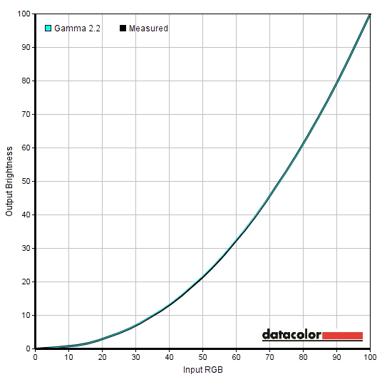
Out of the box this monitor was quite bright, although not overwhelmingly so as the brightness control in the OSD is set to ‘80’ rather than ‘100’. ASUS have included a number of ‘GameVisual’ presets rather than ‘Splendid’ modes with this monitor. By default it comes set to ‘Racing’ mode. Aside from the brightness and the colour temperature being a bit high and therefore things looking a bit ‘cool’ with a slight blue dominance, things are nicely balanced. We therefore used this as a basis for our ‘Test Settings’, but made a few tweaks as explored later. The image below shows gamma tracking under our ‘Test Settings’ – as you can see, things track very closely to the curve in this representation. Impressively, the gamma tracking clings tightly to the standard ‘2.2’ curve regardless of the ‘GameVisual’ preset used. These alternative ‘GameVisual’ modes are not really as desirable as the standard ‘Racing Mode’ default, though, as they selectively oversaturate colours or dull the image whilst locking off access to brightness and other basic image controls. In the ‘Racing Mode’ you also have access to ‘Blue Light Filter’ settings which are applied on top. These allow you to enforce various levels of blue light reduction and work as you’d hope – effectively reducing blue light output. As usual, they do this by lowering the blue colour channel to lower colour temperature and give the image a warmer appearance. The strongest setting (‘Level 4’) also enforces a lower brightness, which reduces overall light output including that in the blue region. You can manually adjust the brightness levels to suit for ‘Level 1’ to ‘Level 3’. Note that you can also adjust the colour channels after enforcing one of these ‘Blue Light Filter’ settings, but such changes can enhance or nullify the effect. If you then select one of the ‘Blue Light Filter’ settings again it will overwrite any changes you’ve made to the colour channels. ‘Level 0’ means the ‘Blue Light Filter’ setting is deactivated. Rather annoyingly, any manual adjustment you make to the colour channels are reset once any ‘Blue Light Filter’ setting is used. So you can’t activate one of these settings for relaxing evening viewing and then quickly return to your manual adjustments for a 6500K white point (or whatever you’re targeting) in the daytime. You’d have to dial in your manual adjustments again. These settings are still nice to have, but having them as a separate thing that doesn’t overwrite colour channel adjustments would have been preferable. For our ‘Test Settings’, we used the factory default ‘Racing Mode’ but significantly reduced the brightness. We also slightly reduced the green and blue colour channels to counteract the cool tint (without introducing a green tint instead). The settings below were suitable for our unit and should be used as a guide, but be aware that individual units vary. Any settings not mentioned here were left at default. We’ve also included the ‘OD’ setting used in the review, just for reference. R= 100 G= 98 B= 97 OD= OFF We used a highly accurate light meter (Konica Minolta CS-200) to measure the luminance of white and black using various monitor settings. From these readings static contrast ratios were calculated, as shown in the table below. Values for the highest white luminance, lowest black luminance and highest contrast ratio recorded are highlighted in blue. The results under our ‘Test Settings’ are highlighted in black. With the exception of the ‘Test Settings’, assume anything not mentioned was left at default.
Gamma test settings
Test Settings
Brightness= 53 (according to preferences and lighting)
Contrast and brightness
Contrast ratios
Monitor Settings White luminance (cd/m²) Black luminance (cd/m²) Contrast ratio (x:1) 100% brightness 263 0.23 1143 80% brightness (Factory Defaults) 223 0.20 1115 60% brightness 183 0.16 1144 40% brightness 138 0.12 1150 20% brightness 90 0.08 1125 0% brightness 37 0.03 1233 RTS/RPG Mode 225 0.20 1125 FPS Mode 224 0.20 1120 Game 279 0.25 1116 sRGB Mode 107 0.10 1070 Blue Light Filter = Level 1 221 0.19 1163 Blue Light Filter = Level 2 219 0.19 1153 Blue Light Filter = Level 3 219 0.19 1153 Blue Light Filter = Level 4 77 0.07 1100 Test Settings 160 0.15 1067
The PG27AQ produced an average static contrast of 1152:1 with only brightness adjusted, which is good. Impressively, it maintained strong contrast with all of the setting combinations we tested. Even the ‘Blue Light Filter’ settings, which do usually reduce contrast, had a negligible effect here. The adjustment made to our test settings dropped the contrast slightly to a still respectable 1070:1. The lowest white luminance recorded on this table was a fairly low 37cd/m² whilst the maximum was 263 cd/m², falling a bit short of the specified 300 cd/m². Very few users would require a brightness anywhere near this high, though. The luminance adjustment range for the monitor based on these figures is 226 cd/m².
PWM (Pulse Width Modulation)
The monitor uses DC (Direct Current) and does not use PWM (Pulse Width Modulation) at any brightness level. The backlight is therefore ‘flicker-free’, as advertised, which will come as welcome news to those sensitive to flickering or other side-effects of PWM usage such as PWM artifacts.
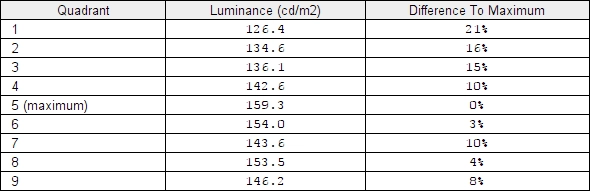
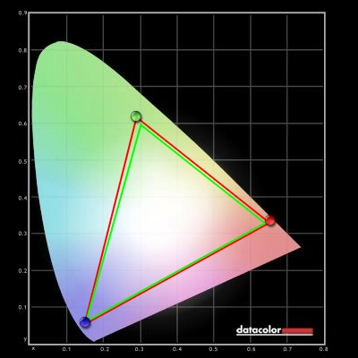
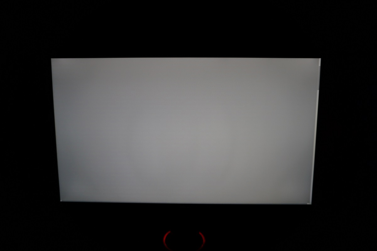
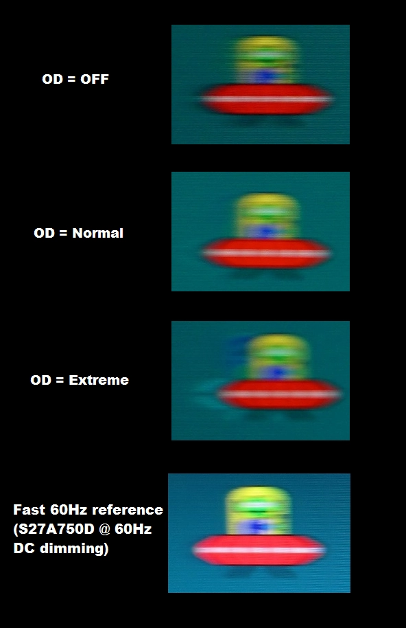
Luminance uniformity
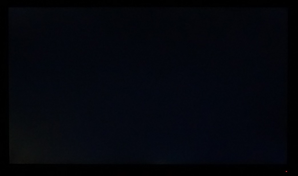
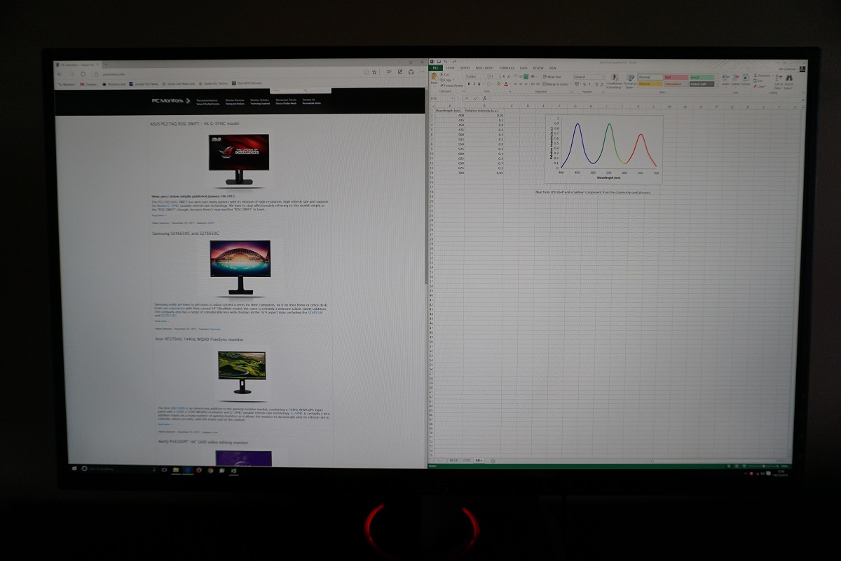
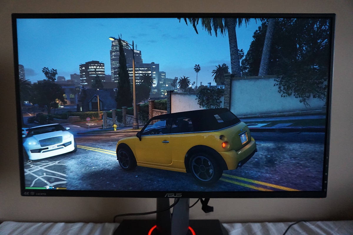
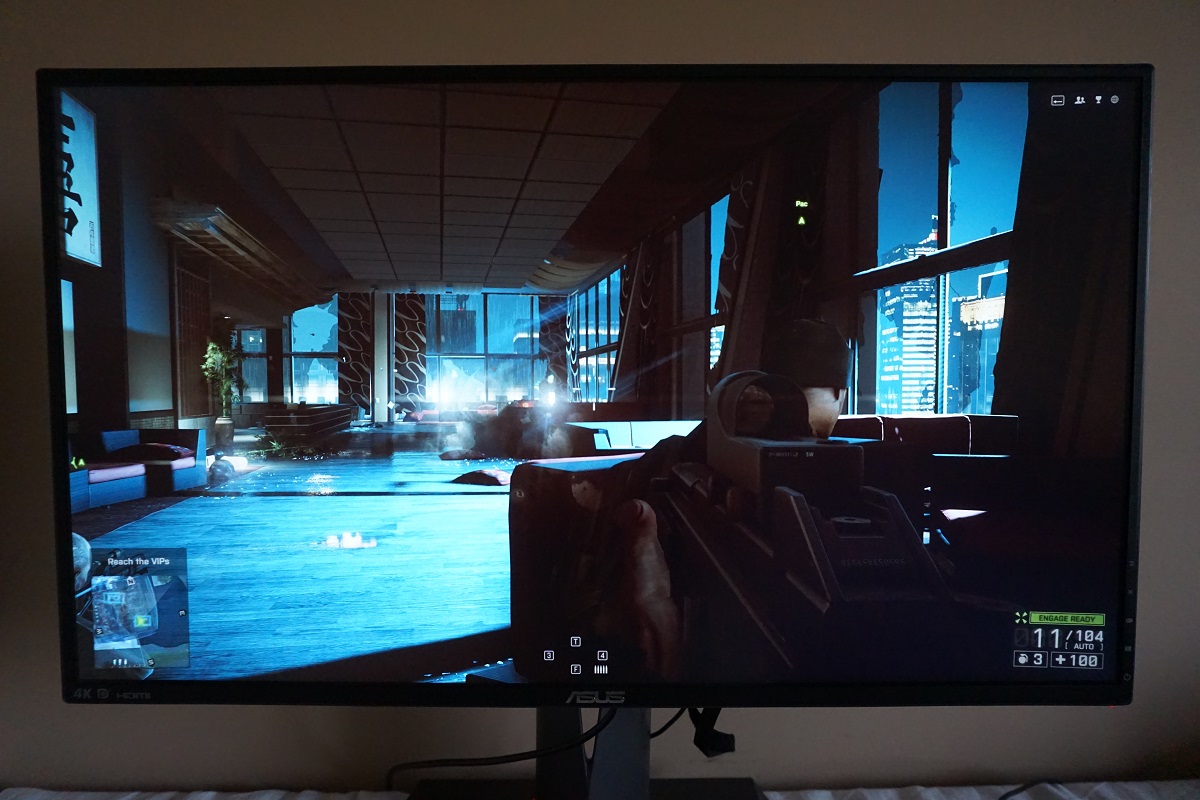
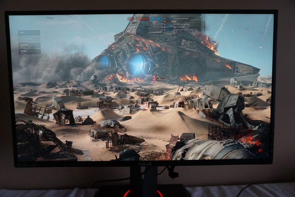
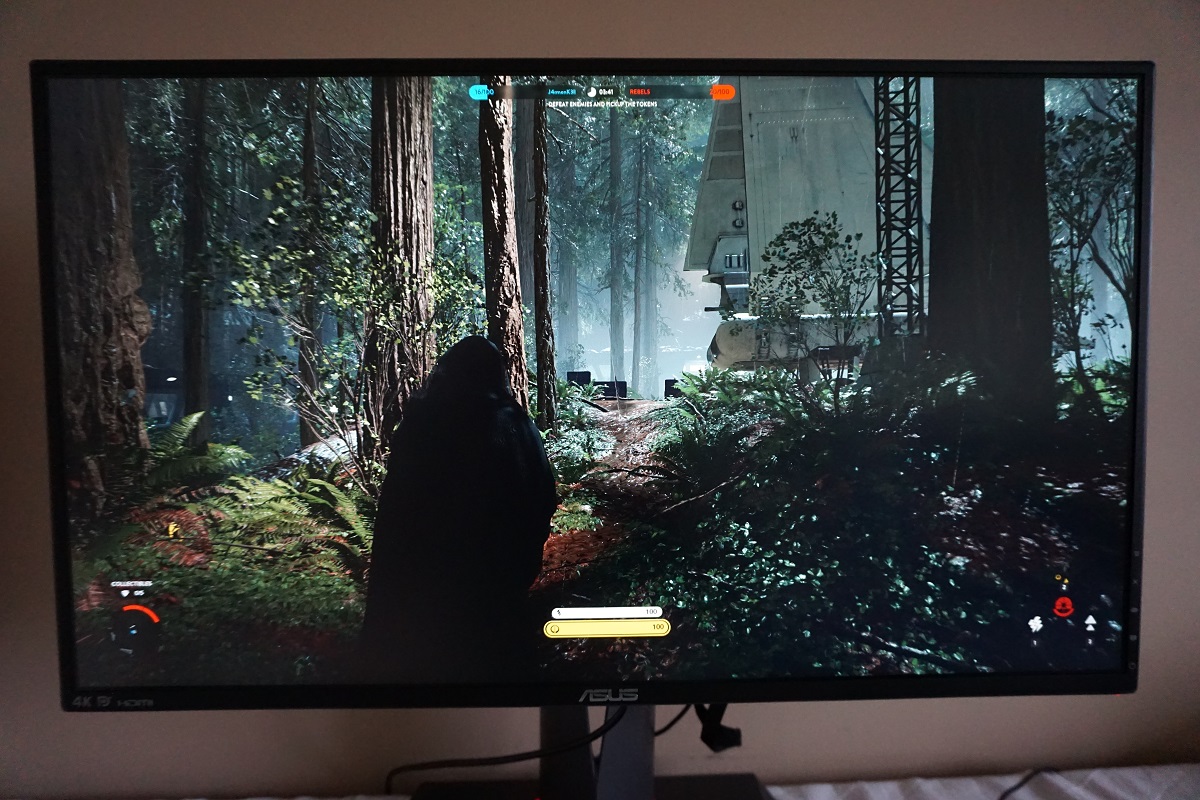
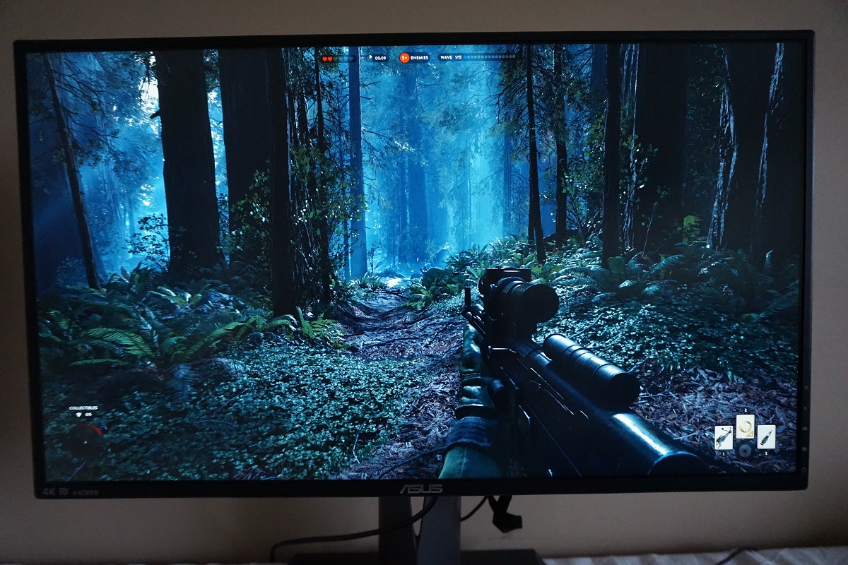
Whilst observing a black screen in a dark room, using our test settings, we could see slight backlight bleed towards the bottom left corner most notably. This is shown in the image below, which was taken a few metres back from the monitor to eliminate ‘AHVA glow’. Note that the backlight bleed will vary between individual units, but the ‘glow’ (not shown in the image) does not. This glow is similar to ‘IPS glow’ and can be observed from a normal viewing position as a slightly golden or silver sheen towards the bottom corners of the screen in particular. If you move off-centre this ‘blooms out’ to become more noticeable as illustrated in the ‘viewing angles’ video later on in the review. The luminance uniformity was quite variable. The maximum luminance was recorded at ‘quadrant 5’ in the centre of the screen (159.3 cd/m²). The greatest deviation from this occurred at ‘quadrant 1’ towards the top left of the screen (126.4 cd/m² which is 21% dimmer than centre). There was a 16% deviation (134.6 cd/m²) at ‘quadrant 2’ above centre and 15% deviation (136.1 cd/m²) at ‘quadrant 3’ towards the top right. The brightness of the remaining quadrants was within 10% of the brightest point. It’s worth remembering that individual units vary when it comes to uniformity and also that further deviation beyond the points measured can be expected. Our unit also had some pressure marks, most notably a ring in the centre of the screen, which can be seen in the ‘Lagom text test’ and viewing angles video later on in the review. This was likely down to the rough treatment of our review sample, as it gets shipped around the world going to various events and probably gets prodded a lot by over-enthusiastic gamers. For those who prefer a graphical representation, the contour map below shows the deviations with darker greys representing lower luminance than lighter greys. The percentage deviation between each and the brightest recorded quadrant is also given. The Spyder5ELITE was also used to analyse deviations in colour temperature (white point), using the same white quadrants. The graphic below shows the deviation between each quadrant and the quadrant measured closest to the 6500K (D65) daylight white point. Deviations here are given as DeltaE values, with higher values indicating greater deviation and a DeltaE >3 considered significant deviation that some users would notice quite readily by eye. On this graphic darker colours represent higher deviations from 6500K than lighter colours. The results here were excellent, with no significant deviations in white point recorded. The point closest to 6500K was recorded towards the left of centre, with the greatest deviation from that a DeltaE of 1.6 towards the right of centre. As above individual units can vary in this regard and there can also be variation beyond the points measured. To the eye the colour temperature of white was quite consistent on the screen as you’d expect from these results, with the areas of reduced brightness not being accompanied by a noticeable shift in colour temperature. On Star Wars Battlefront the contrast performance was quite pleasing overall. There was good distinction between light and dark shades, with shadowy interiors showing quite good depth overall. There was some loss of detail here towards the bottom corners of the screen in particular, due primarily to ‘AHVA glow’. Bright shades stood out very nicely here, for example sparks, projectiles from weapons and various glowing power-ups in the game. Bright shades had a bit of a grainy look to them, although were free from the heavy ‘smeary’ grain seen on some models. On Dirt Rally bright shades stood out nicely in the surrounding darkness. Reflective materials lit up by car headlights and the lights of other vehicles, for example, were quite eye-catching. There was a definite loss of detail towards the bottom corners in particular, primarily due to ‘AHVA glow’ and to a lesser extent by a bit of backlight bleed on our unit towards the bottom left. On other regions of the screen there was quite good subtle detail, for example in car interiors and for shaded areas of vegetation. Light colours such as car headlights and bright areas of sky had a bit of graininess to them, but nothing too extreme. The contrast was pleasing overall in the Blu-ray of Skyfall. The thick black borders at the top and bottom, due to the 2:40:1 aspect ratio, meant that the image itself was displayed on areas of the screen only slightly if at all affected by ‘AHVA glow’. The detail leaving in dark scenes was quite pleasing, with even fairly minor details such as creases in clothes visible in dark scenes. Bright elements contrasted well, not standing out as well as we’ve seen on models with good VA panels but still with decent distinction from the darker backgrounds. Lagom’s tests for contrast were used to help analyse specific weaknesses in contrast performance which may not be readily apparent during other testing. We observed the following. The PG27AQ’s colour gamut (red triangle) follows the sRGB space (green triangle) quite closely. There is 100% sRGB coverage with a touch of extension beyond this. As a result, the monitor can provide potentially very accurate shade representation, which is useful for colour critical work in particular. It can also provide just a touch of extra vibrancy without introducing troubling oversaturation, for games and other general usage. The monitor gave Star Wars Battlefront an appropriate look when it came to colours. Things looked much as they should, with intense neon colours (red, orange and green primarily) for the tracer-like projectiles fired from various weapons on the game. The forests of Endor also showcased a rich variety of green and brown shades, with some pleasing lush greens coupled with a range of more muted ‘minty’ shades. Browns here had varying red hues and saturation levels. These shades were shown consistently regardless of where they appeared on the screen, a real strength of this IPS-type panel. This also helped the already quite subtle sandy shades on some of the other areas of the game (such as the deserts of Tattoine) appear as they should rather than oversaturated and undersaturated depending on where on the screen the shades are displayed. On Dirt Rally the range, consistency and overall vividness of colours helped create a suitable look for the game. The racing environments showcased an excellent variety of natural green and brown shades, which were appropriate to the various geographical locations of the tracks. The car paint jobs and advertising around the track showed off some of the more vibrant colours the monitor could output, with some quite striking deep reds, strong light blues and nice neon pinks (and who doesn’t love a bit of neon pink?) These colours had decent ‘pop’ to them thanks to the screen surface, although lacked the same purity and ‘pop’ of some glossy monitors in particular. And as noted in the contrast section lighter colours weren’t quite as smooth as they ideally would be due to a touch of graininess from the screen surface. The Blu-ray of Skyfall appeared natural and as it should from a colour perspective. Skin tones and natural environments appeared appropriately saturated throughout the screen and therefore looked ‘in place’. There were some quite vibrant oranges from glowing fires and a fairly striking deep red for one of the dresses worn by Miss Moneypenny. The neon lights in the Shanghai night scene, meanwhile, showcased some good bright cyans. Appearing quite intense without being too much of a dark blue or a faded light blue. The Blu-ray of Futurama: Into the Wild Green Yonder is an excellent test of colour reproduction, particularly colour consistency. Large areas of an individual shade will fill the screen during some scenes, allowing variation in how this shade is displayed throughout the screen to be analysed. In this respect IPS-type panels are the strongest LCD performers, and with its AHVA panel the PG27AQ was no exception in this regard. There was only slight brightness variation in places, but no noticeable changes in gamma or saturation. This allowed a strong variety of subtly different pastel shades to be displayed with their own correct ‘identity’. There were also some strong deep purples, blues and reds and a range of vibrant-looking neon shades. Lagom’s tests for viewing angle were used to more closely explore the idea of colour consistency and viewing angle performance. The following observations were made from a normal viewing position, with eyes around 70cm from the screen. A sensitive camera and tool called SMTT 2.0 was used to compare the latency of the PG27AQ with a range of monitors of known latency. By taking over 30 repeat readings to enhance accuracy, we calculated 5.9ms (just over 1/3 of a frame) of input lag. This value is influenced by the pixel responsiveness (element you see) and signal delay (element you feel). It indicates a very low signal delay which shouldn’t hamper the experience even for sensitive users. In our responsiveness article we explore the key factors that influence how responsive a monitor looks and feels when we use it. The notion that eye movement is usually the predominant contributing factor to perceived blur on a monitor, with pixel responsiveness of secondary importance, is chief amongst these factors. It is possible to capture motion on a monitor in a way that demonstrates the influence of this eye movement as well as pixel responsiveness. This is called ‘pursuit photography’, explored in the article, whereby a moving rather than stationary camera is used to capture motion on the monitor. Pursuit photographs were taken using the UFO Motion Test for ghosting, using a sensitive camera. The test was set to run at 960 pixels per second, which is a practical speed for such photographs and helps highlight the key influencers of perceived blur. The middle row of the test (light cyan background) was used with the monitor set to its three different ‘OD’ (Overdrive) settings; ‘OFF’, ‘Normal’ and ‘Extreme’. The results are shown in the image below, alongside the results of a ‘Fast 60Hz reference’. This is a Samsung S27A750D set to full brightness (prevents PWM usage), at 60Hz, using its ‘Faster’ response time setting. This shows how things will look where motion blur due to eye (camera) movement is the only real limiting factor. With ‘OD = OFF’ you can see a slight trail behind the object as a result of slower than optimal pixel responsiveness. This is far from obtrusive and is much more constrained than you’d expect to see from a monitor of any panel type if the pixel overdrive feature is disabled. Really ‘OFF’ is a bit of a misnomer as it’s quite clear that the monitor is using quite a well-balanced level of grey to grey acceleration here and it is not entirely absent as the name would suggest. With ‘OD = Normal’ the trailing is reduced but has instead been replaced by a mild to moderate degree of ‘inverse ghosting’ (overshoot). This brightly coloured trail behind the object is caused by overly aggressive pixel overdrive, with the monitor surging extra voltage to try to speed up pixel transitions but actually causing them to ‘overshoot’ the desired end point for the transition. The ‘OD = Extreme’ setting shows intense inverse ghosting, with strong overshoot indicative of extremely over-aggressive pixel overdrive. From this analysis and moreover general use of the monitor we preferred to use ‘OFF’ for the ‘OD’ setting’. If this was actually a setting where pixel overdrive was entirely absent, we would most likely have stuck with the default ‘Normal’ setting instead’. However; this mode provided only a faint whiff of trailing on top of the perceived blur from eye movement and this was far less distracting in our eyes than the overshoot under the ‘Normal’ and ‘Extreme’ settings. In the following analysis we note our observations whilst gaming, where a much broader pixel transition range and more complex scenes are involved compared to this test. Note that there will not be a section on ‘overclocking’ as the monitor could only be set a couple of Hz above 60Hz before it went out of range. This provided no noticeable benefit over 60Hz. On Battlefield 4 (BF4) there was little weakness beyond the moderate degree of motion blur attributed to eye movement. The pixel responsiveness was pretty much right where it needs to be for optimal 60Hz performance. There was a small degree of trailing on top of the blur from eye movement, but it was really rather faint and didn’t catch the eye in the same way as the overshoot with ‘OD’ set to ‘Normal’ sometimes would. Even for medium-dark shades moving against one another, seen for example moving quickly amongst shaded areas of vegetation, there was not the degree of trailing you would see on some ‘4K’ UHD models (particularly, rather ironically, those with TN panels). Dirt Rally again highlighted that this monitor is quite a capable 60Hz performer. There was a moderate degree of blur even when cornering quite generally, but this was attributable to eye movement and tied to the 60Hz refresh rate rather than sluggish pixel responsiveness. The slight additional trailing on top of this, from some slightly slower than optimal pixel responses, was preferable and less noticeable than the overshoot that replaced it with the other ‘OD’ settings. It was quite clear that this monitor has effective and well-balanced grey to grey acceleration levels for 60Hz, but only with the appropriate setting which is rather misleadingly labelled ‘OFF’. We also tested out our Blu-ray movie test titles to observe for weaknesses in pixel response performance. There were no weaknesses whatsoever attributable to the pixel responsiveness of the monitor – nor any observable overshoot. The overall fluidity of the motion here was limited by the ~24fps frame rate of these film titles. Nvidia G-SYNC is a variable refresh rate technology which is explored in our dedicated article on the topic. In a nutshell, its aim is to adjust the refresh rate of the monitor ‘on the fly’ to match the frame rate of the content being displayed. As explained in the article, this eliminates both the stuttering you get with VSync on and the tearing and juddering you get with VSync off. In the variable frame rate (and hence variable refresh rate) environment, latency is also significantly reduced compared to VSync on. Unfortunately, we do not have the means to empirically and accurately measure this latency difference. To enable G-SYNC, you need a compatible monitor (such as the PG27AQ) which has a dedicated ‘G-SYNC board’ that replaces the traditional scaler and many of the assistive electronics of the monitor. You also need a compatible GPU, such as the Nvidia GTX 970 that we’re using, connected via DisplayPort (version 1.2 or higher). This feature was enabled automatically when we connected up this monitor, but if it isn’t then enabling it is a simple case of visiting the Nvidia Control Panel. Navigate to ‘Display’ – ‘Set up G-SYNC’ and ensure the ‘Enable G-SYNC’ checkbox is ticked as shown below. You can also use the technology when an application (such as a game) is running in windowed mode and not just full screen by selecting the appropriate option on this page. In ‘Manage 3D settings’ you can either enable or disable VSync. Nvidia advises using this to control VSync and making sure it is set to ‘off’ in any game as in-game VSync can apparently upset things. The monitor has a variable refresh rate range of 30 – 60Hz, outside of which the GPU will respect your choice of ‘VSync on’ or ‘VSync off’. If you choose ‘VSync on’, the maximum frame rate of the content will be capped to 60fps and if it reaches this VSync is enabled. If you choose ‘VSync off’ then the GPU will use G-SYNC as before, but will exceed 60fps and introduce tearing as the monitor will be set to a 60Hz refresh rate but no higher. If the content dips below the 30Hz (30fps) floor, the monitor will try to set its refresh rate to a multiple of the refresh rate to minimise or eliminate stuttering and tearing as well. As noted below, low frame rates are still low frame rates – but it’s nice to have things as smooth as they can be for a given frame rate. Star Wars Battlefront is a rather well-optimised game, but still very demanding when running at 3840 x 2160 – especially with some of the detail settings turned up a bit. Without a variable refresh rate technology such as G-SYNC, even the slightest dips below 60fps would lead to rather jarring stuttering (VSync on) or obvious tearing and associated juddering (VSync off). With our single GTX 970, we’d have to make considerable sacrifices to visual quality if we wanted to maintain a fairly consistent 60fps. And even then, there would be some inevitable dips. On this monitor, with G-SYNC, we were able to set the monitor to more visually appealing settings. The slight dips below 60fps were frequent, with the monitor generally maintaining >50fps most of the time. Unlike with the variable refresh rate technology disabled, this was free from stuttering, tearing or juddering and just generally felt more fluid and was more enjoyable as a result. There were times when the game dipped closer to 40fps and when the action was extremely intense on certain interior areas, even dropped slightly below 30fps. The experience was again free from stuttering or tearing and therefore preferable to the experience of hitting such frame rates without G-SYNC. And indeed the technology was able to effectively compensate for frame rates below the floor of operation (30Hz or 30fps) by setting the refresh rate to a multiple of the refresh rate. However; it was nothing like gaming at higher frame rates, particularly close to 60fps. The level of motion blur was considerably higher and you simply felt more disconnected from the game world with an increased delay between frames translating to a poorer gameplay experience. BF4 enforced similar points. Again, the frame rates on this title are highly variable. With frequent dips below 60fps with settings we like to use, it was very nice indeed being able to maintain a stuttering and tearing free gaming experience. These dips were far less jarring than without the technology enabled. Again, there were times when the frame rate dropped even lower and there is no pretending that this couldn’t be felt. G-SYNC certainly makes such drops a lot more palatable, as you aren’t hit by horrendous levels of stuttering or tearing. However; low frame rates are still low frame rates. The technology is not a magic bullet that can change that. It’s still a sub-optimal experience, but it’s certainly superior to the static 60Hz alternative. We tested a number of other titles including The Elder Scrolls Online, Dirt Rally and Titanfall. All of these titles saw benefit from G-SYNC and it made these games more playable at decent graphics settings than they would be otherwise. Again, low frame rates are low frame rates. But regardless of frame rate, it was nice having an experience free from the stuttering, tearing or juddering caused by frame rate and refresh rate mismatch. In this article we explore the benefits and drawbacks of the 3840 x 2160 ‘4K’ UHD resolution. The piece was written with respect to the experience of using a 28” UHD model – but needless to say, 27” UHD models such as this ROG SWIFT offer a very similar experience. We’d therefore advise reading the article to familiarise yourself with some key points such as how scaling is handled (and generally required) on modern versions of Windows with a monitor of this pixel 163.18 PPI (Pixels Per Inch) pixel density. Our preferred scaling level for this was ‘125%’, which still retained significant real-estate benefit from the resolution whilst ensuring things were comfortably readable for us. Obviously personal preferences for scaling level will vary. The top image below shows how the desktop appeared using ‘125%’ scaling, the same image used earlier on in the review. The bottom image shows the multi-tasking potential using this setting with a website open on the left and a Microsoft Excel Spreadsheet on the left. Everything was crisp and readable with plenty of detail on the images – and of course, lots of content on the screen at the same time. The take home message is essentially that we find the ~32” screen size to be something of a sweet spot for the UHD resolution. It provides a comfortable viewing experience without scaling for us from our preferred viewing distance of ~70cm – although mileage may vary according to preferences, eyesight and preferred viewing distance. This provides a large working area both in terms of physical space but also, importantly, useful work area. Text and image clarity is excellent and you can fit a lot on the screen at once, as demonstrated by the images below. As the article points out, scaling can be a bit hit and miss depending on the software you’re using with some handling it better than others. Regardless of which scaling setting you choose to use, many applications offer you independent zoom control for their main content area. The scaling setting will generally change the default zoom level used, but you can zoom in or out regardless of this. Most people are familiar with how this works on web browsers, for example. Our experience running games and movies in the UHD resolution was much as we observed on the 28” screen featured in the article. The following images are simply for illustrative purposes and do not in any way represent how things looked on the monitor first-hand. You will likely notice that most of these images are of Star Wars Battlefront, which we didn’t test in the original article as it wasn’t released at the time. This made excellent use of the UHD resolution, with very high quality textures used extensively. Although clearly set in a fantasy world, the environments on the game are actually based on real world locations. The lush forests of Endor, for example, are based on Muir Woods in California. The resolution of the monitor really helped give a life-like quality to the vegetation – it appeared extremely crisp, sharp and detailed (especially with the graphics quality cranked up a bit) in a way that just isn’t captured on models with lower resolutions such as 2560 x 1440. Even decomposing foliage on the forest floor had a realistic crispness and detail to it, as did the boggy areas of squelchy mud. The exceptional lighting quality and realistic shadows in the game helped intensify this experience. But it wasn’t just on Endor where the resolution helped create an impressively realistic look. The inhospitable snow-covered planet of Hoth (based on the landscapes of Finse in Norway) had an appropriately grainy look to the snow, with a certain structural quality of it that simply isn’t captured well at lower resolutions. The rough rocky surface of Sullust (based on Iceland) were equally impressive, with their subtle pores and imperfections captured and displayed beautifully. But it wasn’t just the environments that took advantage of the excellent pixel density of the monitor. The textures used on character models were also good, especially on the ‘heroes’. The tarnished paint and specular highlights on Boba Fett’s apparel and the material texture of Emperor Palatine’s cloak were particularly impressive. And indeed the extra detail and sharp look to things helped the ‘special effects’ (explosions, sparks, weapon fire and other energy pulses) to stand out in a rather satisfying way. Really there were no textures in the game that looked poor or out of place – they all seemed to take good advantage of the UHD resolution, provided the texture resolution setting of the game was set to a suitably high level. The 3840 x 2160 ‘4K’ UHD resolution requires considerable graphical grunt to run on demanding applications, such as some games. Users may therefore consider running a lower resolution such as 1920 x 1080 – and indeed if they are connected to a modern games console, this sort of lower resolution will be all they can use. If you connect the monitor up to a PC via DP 1.2, the interpolation (scaling) process is handled exclusively by the GPU. There is significant softening to the image compared to running the resolution natively, whether you select 1920 x 1080 (Full HD), 2560 x 1440 (WQHD) or something else. Whilst gaming, it looks as if you’re looking at the game world through a soft-focus lens. If you’re connected using HDMI, either to a PC or games console, the monitor does have scaling features and will be able to use its own interpolation processing to handle non-native resolutions. As a PC user you should ensure that the monitor rather than GPU is handling this. If you’re using an Nvidia GPU (more likely with this monitor) you should open the Nvidia Control Panel and navigate to ‘Display – Adjust desktop size and position’. Ensure ‘No Scaling’ is selected and ‘Perform scaling on:’ is set to ‘Display’ as shown below. AMD GPU users shouldn’t need to change anything as the drivers are set up so that the monitor will handle interpolation, where possible, in games. When the monitor uses interpolation, over HDMI, there is less softening than when the GPU handles the interpolation. There is still a moderate degree of softening – the 1920 x 1080 resolution isn’t mapped ‘perfectly’ as some users might expect given the even division of pixels into the native resolution (1:4). We’d say it’s usable, and more so than using GPU scaling, but it is far from ideal and really isn’t close to the sharpness of a native Full HD display of similar size. The 2560 x 1440 resolution works a bit better in terms of its ‘visual closeness’ to native 27” WQHD displays, but is pretty much unbearable to use due to the 24Hz refresh rate that is enforced with this over HDMI. Getting this resolution to display correctly at anything much over this was impossible even with a custom resolution as the monitor employed interlacing and introduced various artifacts. There are certainly advantages to the ‘4K’ UHD resolution, but it also comes with its drawbacks. One of the key drawbacks, for gamers, is that it requires an immense amount of graphical horsepower to run with decent settings on modern titles. Unless, of course, you’re happy to let the frame rate drop well below the refresh rate of the monitor and suffer through the stuttering or tearing that comes with that. With support for Nvidia G-SYNC, the PG27AQ cuts out the tearing and stuttering that would otherwise occur by ensuring the frame rate matched the refresh rate of the game (as far as possible). In doing so, it certainly made drops below 60fps far more palatable. Although it smoothed out the experience in the variable refresh rate environment, it isn’t a magic bullet. Low frame rates are still low frame rates regardless of G-SYNC – and the optimal experience was gained with the frame rate as high as possible. On the topic of frame rate and refresh rate, the 60Hz maximum refresh rate won’t necessarily appeal to some gamers who prefer the fluidity offered by higher refresh rates. Unfortunately, the connectivity options to bring about higher refresh rates aren’t currently out there in the open. And even if they were it would only be those blessed with stellar systems that could really take proper advantage of them. Within the confines of the 60Hz maximum, though, the PG27AQ put in a good performance. Using the optimal pixel overdrive setting, which is rather misleadingly labelled ‘OFF’, there was little weakness on top of what you would see on even the fastest artifact-free LCDs. Pixel responses were snappy enough so that you didn’t get obvious trailing on top of the perceived blur you’ll always get on a 60Hz sample and hold monitor. And input lag was about as low as we’ve seen on a UHD display and was indicative of a very low signal delay. The colour reproduction of the screen was also pleasing, overall. The gamma tracking was excellent straight from the box, which is just as well as you have no flexibility over this on the OSD. The new ‘GameVisual’ presets tended to mess up the image with unnecessary and shade-range-killing levels of saturation or various other image imbalances. The exception to this was the default ‘Racing Mode’, which certainly optimal for appealing natural colours and helped make the most out of the AHVA panel. Colours were consistently rich throughout the screen. The full sRGB coverage with a little extension beyond plus the very light matte screen surface aided the apparent vibrancy, too. It has to be said, though, that the screen surface texture wasn’t quite as smooth as we would have liked and that did provide a bit of a grainy look to white and other light shades. The contrast performance was very much as you’d expect from a modern IPS-type panel. Decent static contrast and the ability to display a good range of distinct dark shades in the centre of the screen, but some weaknesses peripherally due to ‘AHVA glow’. We also have to step back a bit from the panel and the monitor’s image performance and say that we certainly liked the construction of the monitor. It was solid and in our opinion not ‘tacky’ in the way some gaming monitors are. Overall this monitor put in quite a solid performance, as you’d hope for given the price. It certainly had its weaknesses, but we have yet to use a monitor that’s perfect. The bottom line; a solid but pricey gaming monitor for those who like to admire the eye-candy whilst gaming and are content with a 60Hz maximum refresh rate.
We also assessed the uniformity of lighter colours using the Spyder5ELITE to analyse 9 equidistant quadrants running from the top left to the bottom right of the screen. The following table shows the percentage deviation between a given quadrant and the brightest quadrant measured.
Luminance uniformity table
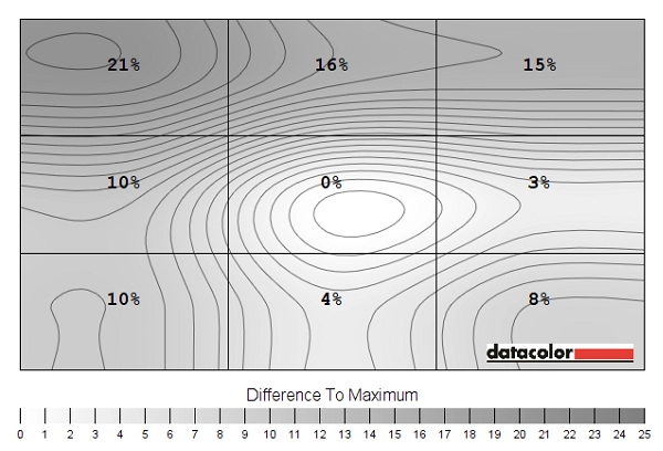
Luminance uniformity map
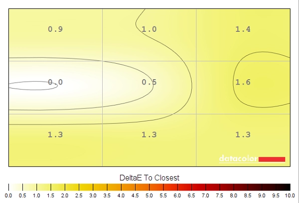
Colour temperature uniformity map
Contrast in games and movies
Lagom contrast tests
Colour reproduction
Colour gamut
Colour gamut test settings
Colour in games and movies
Viewing angles
The video below shows the results of the Lagom test test as well as a mixed and dark desktop background from a range of viewing angles. For the lighter content you can see that the monitor maintains a good level of contrast and displays shades well from a range of viewing angles. In the final section of the video, with the dark desktop background, you can see the aforementioned ‘AHVA glow’.
Responsiveness
Input lag
Perceived blur (pursuit photography)
Perceived blur with various settings
Responsiveness in games and movies
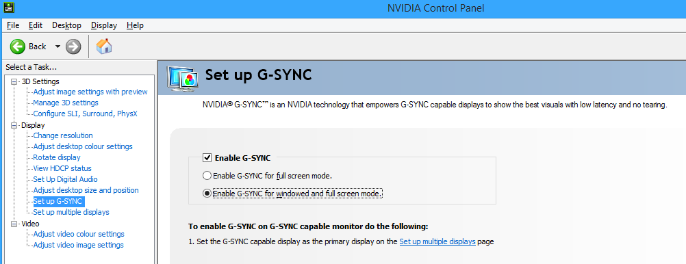
G-SYNC – the technology and activating it
G-SYNC – the experience
The ‘4K’ UHD experience
Interpolation and upscaling

Conclusion
Positives Negatives Excellent gamma tracking out of the box with the AHVA panel, screen surface and colour gamut providing an excellent variety of rich but accurate-looking shades
Colour channel tweaks were required and the ‘GameVisual’ presets other than the default ‘Racing Mode’ left a lot to be desired
Good static contrast and some useful ‘Blue Light Filter’ options that managed to maintain strong contrast whilst significantly reducing blue light output
The usual ‘AHVA glow’ was present. Despite having a very light matte screen surface, a less than optimal surface texture was used with gave a bit of a grainy look to white and other light shades There was very little input lag to speak of, whilst the optimal ‘OD’ setting allowed the monitor to provide a level of blur that’s about as good as you can hope for from a 60Hz LCD. G-SYNC worked very nicely as well
There was a little bit of extra trailing in places using the optimal ‘OD = OFF’ setting, whilst the higher modes introduced moderate to strong overshoot. The 60Hz maximum refresh rate won’t appeal to everyone
The 3840 x 2160 ‘4K’ UHD resolution provided strong clarity and excellent detail levels whilst providing a great amount of useful work space
On a screen of this size most users will need to use scaling whilst working, which isn’t handled properly by all applications. The interpolation process was less than perfect regardless of the connection used and completely absent on the monitor itself when using DP
![]()

