Author: Adam Simmons
Date published: March 11th 2016
Table of Contents
Introduction
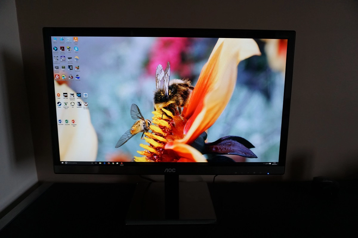
The ‘4K’ UHD resolution certainly has the potential to provide an exceptionally detailed experience when gaming and watching compatible movies. It also brings you a lot of potential ‘real-estate’, making it an attractive choice for enhanced productivity or just general computing tasks. The AOC U2477PWQ packs these 8.29 million pixels into a 23.6” IPS-type screen, providing exceptional pixel density and providing a relatively low cost solution compared to larger models of a similar panel type. Despite its low cost, many would agree that it is an attractive-looking monitor. In this review we discover whether its performance matches the aesthetics and its ‘on paper’ appeal.
Specifications
The monitor uses a 23.6” ‘4K’ UHD IPS-type panel, or more specifically a Samsung PLS (Plane-to-Line Switching) panel. This supports true 8-bit colour without dithering rather than supporting 8-bit colour with dithering on top, a different approach to competing IPS models such as the Dell P2415Q. The specified response time is 4ms, although that isn’t to be taken at face value. Some of the key ‘talking points’ of the monitor have been highlighted in blue below.
The key ‘talking points’ of the specification have been highlighted in blue below.
Features and aesthetics
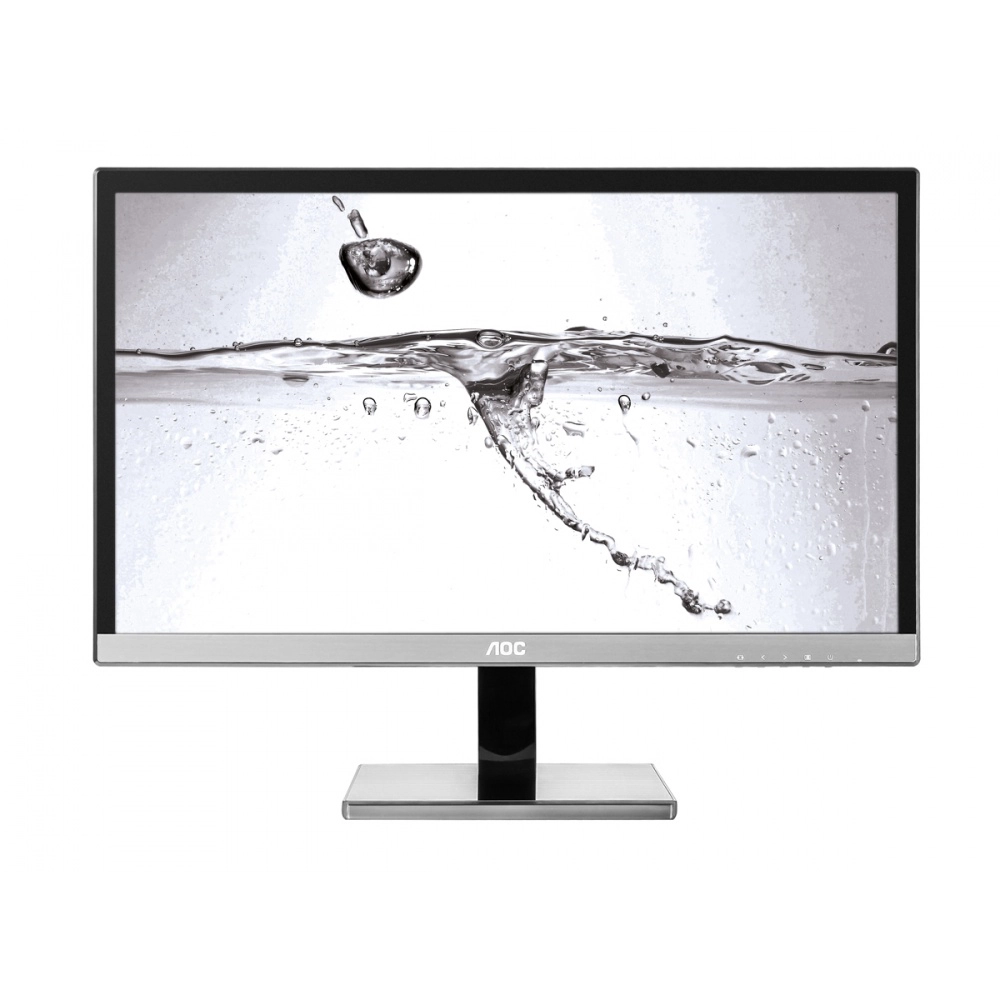
The monitor has a modern look from the front, with a combination of glossy black plastics and brushed metal. The monitor does not have bezels that are as slender as some recently released screens and there is no ‘dual-stage’ design here – the bezels as good as cover the entire panel border. The side bezels are ~15mm (0.59 inches) and the top bezel is ~18mm, both glossy black plastic. The rear bezel is ~21mm (inches) and coated with a rather fetching brushed metal. The top of the stand base also has a layer of this brushed metal. The screen surface used on the monitor is a light matte anti-glare solution, explored a little later on.
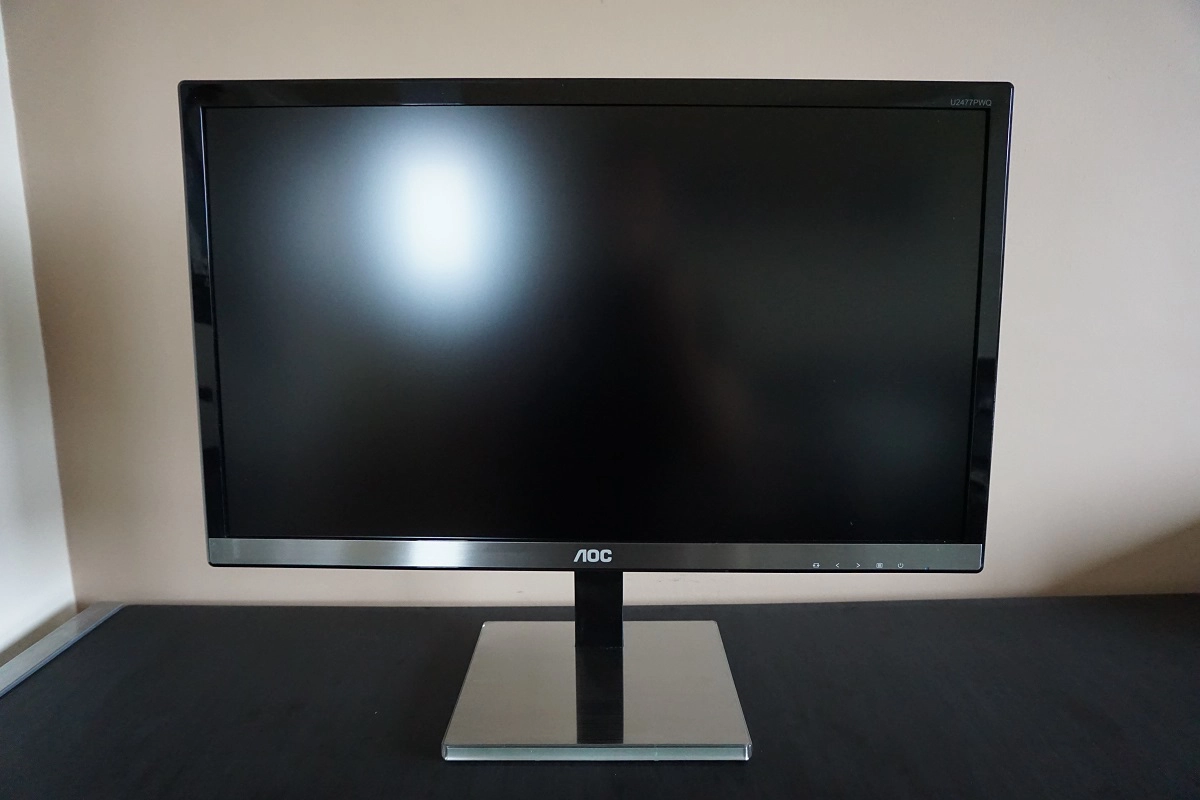
The OSD (On Screen Display) controls are found on the underside of the bottom bezel, towards the right. These are pressable buttons that are fairly well spaced out, rather than touch sensitive control areas. There is a forward-facing small rectangular power LED as well, which glows a medium blue colour when the monitor is on and red when the monitor enters a low power state (i.e. standby). If the monitor is switched ‘off’ using the power button, the LED is not illuminated. The video below runs through the OSD menu system.
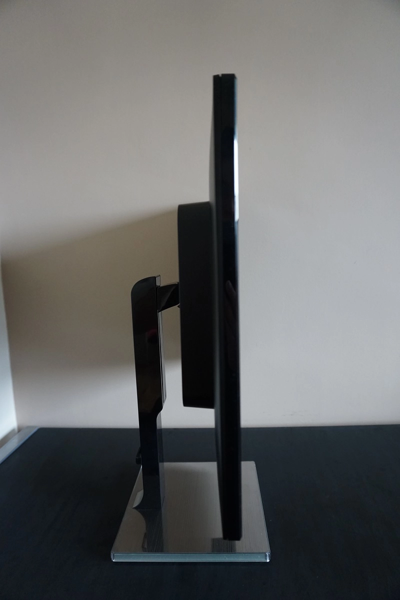
From the side the monitor is quite slender; ~17mm (0.67 inches) at thinnest point with more bulk centrally. The total depth of monitor including stand base is ~199mm (7.83 inches) with the screen face in-line with the front edge of the stand base. The stand is fully adjustable; tilt (5° backwards, 23° forwards), height (130mm or 5.12 inches), swivel (~360° field using turntable beneath the stand base) and pivot (90° clockwise rotation into portrait). At lowest height the bottom of the monitor clears the desk by ~46mm (1.81 inches) whilst the top of the screen sits ~380mm (14.96 inches) above the desk. Note that the height adjustment on our unit was very stiff, but it was a brand new unit and would probably loosen up over time.
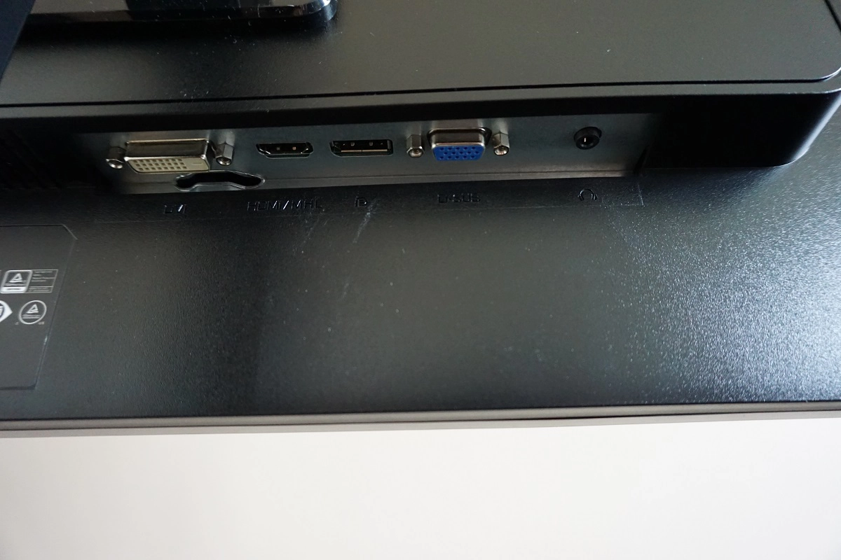
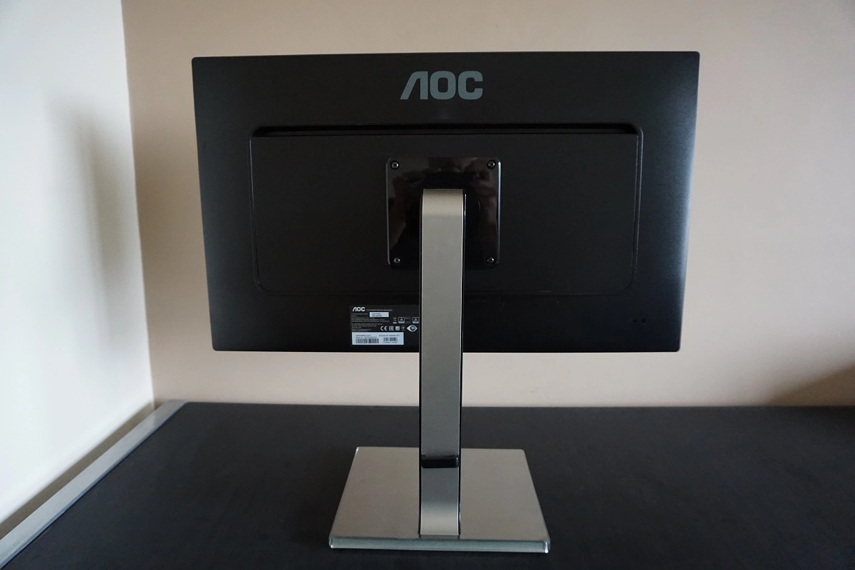
The rear of the monitor uses matte black plastic throughout, with the exception of the stand’s sides and attachment point to the screen which uses glossy black plastic. The stand attaches by 100 x 100mm VESA and can be removed (or not attached in the first place – you have to screw it in yourself using the supplied screws) to make way for an alternative VESA 100 stand or mount. There is a K-Slot towards the bottom right and some down-firing ports; DC power input (external power brick), DVI-D, HDMI 2.0, DP 1.2, VGA and a 3.5mm headphone jack. The strange smile-shaped hole behind the DVI port is for tool-based access in the service centre. The full capabilities of the monitor (3840 x 2160 @ 60Hz) require HDMI 2.0 or DP 1.2 to be used. Earlier revisions of each port are limited to 30Hz at the native UHD resolution or can be run at higher refresh rates at lower resolutions such as 1920 x 1080. The same restriction applies to DVI. Standard cables in the box include VGA, HDMI, DisplayPort and the relevant power adaptor and cabling.
Calibration
Subpixel layout and screen surface
The monitor has a light matte anti-glare screen surface. This provides a decent balance between glare handling and clarity and vibrancy preservation. The texture of the screen does give a light graininess to the image, but fortunately not the sort of course or ‘smeary’ grain seen from some matte screen surfaces. This is a fairly light and misty grain is very different to what you will see on some matte surfaces. There aren’t obvious ‘patches’ that have to be ‘focused through’ like some sort of dirty window, thankfully, and the image appears more in-line with the screen surface itself. The image below shows the subpixel layout of the panel.
![]()
The subpixel layout is the usual RGB (Red, Green and Blue) stripe, the default expected by modern operating systems such as Microsoft Windows and MacOS. Mac users needn’t worry about text fringing issues, whilst Windows users needn’t worry about ClearType. They may still wish to run through the ClearType wizard according to preferences, however.
Testing the presets
This monitor offers a setting we haven’t seen before called ‘Uniformity’ – a uniformity compensation setting which we explore later on. This is hidden in amongst the ‘Eco Mode’ settings – the rest of these simply set the brightness to various predefined values. There are various other settings such as ‘Gamma’ modes and a number of ‘Color Temp.’ settings. In the table below we give key readings (gamma and white point) taken using a DataColor Spyder5ELITE colorimeter and provide some observations using a range of monitor settings. The monitor was kept in its ‘Plug and Play’ state on a Windows 10 PC without additional monitor drivers or ICC profiles loaded up. The screen was connected to an Nvidia GTX 980 Ti with DP 1.2 – although we tested the other digital connections and found that our observations were very similar. We also briefly tested using an AMD GPU and noted similar image characteristics.
| Monitor Settings | Gamma (central average) | White point (kelvins) | Notes |
| Gamma1 (Factory Defaults) | 2.2 | 5864K | The image is bright and warm (the default ‘Warm’ preset actually lives up to its name, for a change) but nicely balanced aside from that. Colours are rich and varied with strong consistency and appropriate gamma handling. |
| Gamma2 | 2.0 | 5868K | As ‘Gamma1’ but a bit of shade depth lacking in places due to lower gamma. |
| Gamma3 | 2.4 | 5867K | As ‘Gamma1’ but extra depth in places and some ‘crushing’ of shades at the low end due to gamma averaging ‘2.4’. |
| Color Temp. Normal | 2.2 | 6445K | As per factory defaults but a more neutral rather than warm-looking white point. There is a slight green tint due to a bit of an overpowered green channel, however. |
| Color Temp. sRGB | 2.3 | 6803K | This mode has a cool tint and remains very bright the brightness, contrast and gamma controls greyed out. The gamma averages ‘2.3’ and there is noticeable crushing of certain shades at the low end. |
| Eco Mode Uniformity, Gamma3 | 2.2 | 6398K | The white point is quite well balanced, but the image is rather bright and the control for this is greyed out. Gamma tracking is excellent and overall balance to the image quite good, aside from the slightly weakened contrast as explored a bit later. The default ‘Gamma1’ setting here actually yields ‘2.0’ average gamma and looks a bit washed out, but fortunately the control is unlocked even with this mode active. |
| Color Temp. User | 2.2 | 6808K | As factory defaults but a cool tint to the image. |
| Test Settings (see below) | 2.2 | 6502K | The white point is now better balanced and brightness more comfortable. The richness, shade variety and consistency is all excellent giving a pleasing look to the image overall. |
| Relaxing evening viewing (see below) | 2.1 | 5003K | Although the default ‘Warm’ setting actually provides a weak Low Blue Light (LBL) setting of sorts, manual adjustments to the colour channel can yield a greater effect. The blue channel is significantly weakened, the image is now very warm and relaxing to our eyes. |
The U2477PWQ includes a factory calibration report, showing how the monitor conforms to certain standards with ‘Color Temp.’ set to ‘sRGB’. An analysis of uniformity is also shown with the monitor’s ‘Eco Mode’ set to ‘Uniformity’. This is a uniformity compensation setting that we explore later on in this review. It is incorrectly labelled ‘SmartUniformity’ on the report, which is of course a feature found on certain Philips monitors. Regardless of what the factory calibration report (below) says, we found the ‘sRGB’ setting to be rather lacklustre. The gamma was clearly off both according to our measurements and analysis using our trained eyes – this was the case regardless of whether DP or HDMI was used.
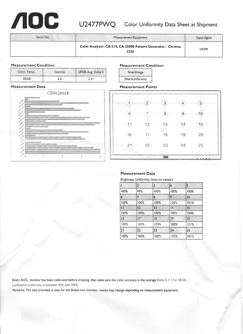
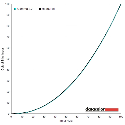
The good news, though, is that the gamma tracking was excellent out of the box and remained excellent if ‘Color Temp.’ was set to anything other than ‘sRGB’. Rather surprisingly, the ‘Warm’ setting which is the default used by AOC in all of their recent screens we’ve tested actually lives up to its name. The image does indeed appear warm with a fairly warm white point – essentially a Low Blue Light (LBL) setting of sorts. The ‘Normal’ setting brings this up close to 6500K, although also introduces a bit of a grain tint. We therefore used the ‘User’ setting and manually adjusted colour channels and brightness to form our ‘Test Settings’. Gamma tracking remained nice and close to the desirable ‘2.2’ curve, as shown below.
Gamma Test Settings
There were three different ‘Low Blue Light’ settings, the most flexible of which is the aptly named ‘Blue Light Filter’. This can be adjusted in single unit increments from ‘0’ (full effect) to ‘100’ (off completely – normal monitor settings). We liked to set this to ‘0’ for our own viewing pleasure later on in the evening (before bed) when stimulating blue light output should be reduced as much as possible. Note that the ‘Blue Light Filter’ overrides any adjustments made to colour channels (or indeed any ‘Color Adjust’ presets). Likewise, it can be quickly deactivated by making such adjustments.
Test Settings
As mentioned earlier we set ‘Color Temp’ to ‘User’ for our test settings and made adjustments to both the brightness and colour temperature. Be aware of inter-unit variation – these are just a suggestion for settings and won’t necessarily be optimal for all users. Any setting not mentioned below was left at default. We’ve also included the ‘Overdrive’ setting used in the review, just for reference.
Brightness= 52 (according to preferences and lighting)
Overdrive= Medium
Color Temp.= User
R= 50
G= 50
B= 46
Relaxing evening viewing
Although the default ‘Warm’ setting is a sort of mild Low Blue Light (LBL) setting, we prefer to take things a bit further with blue light reduction for our own viewing comfort in the evening. As such as made further tweaks to the colour channels to form our ‘Relaxing evening viewing’ settings, as shown below. For simplicity everything was kept as per the ‘Test Settings’, apart from the more major changes to colour channels that were required here. We used these settings for our own viewing pleasure later in the evening but not for any of our testing.
Brightness= 52 (according to preferences and lighting)
Overdrive= Medium
Color Temp.= User
R= 50
G= 35
B= 25
Contrast and brightness
Contrast ratios
A Konica Minolta CS-200 luminance meter was used to measure the luminance of white and black using a range of settings. From these values static contrast ratios were calculated. The following table shows this data, with black highlights indicating the results of our ‘Test Settings’ and ‘Relaxing evening settings’. Black highlights on this table show the highest white luminance, lowest black luminance and peak contrast ratio recorded. Assume any settings not mentioned in the table were left at default, with the exceptions noted in the calibration section.
| Monitor Settings | White luminance (cd/m²) | Black luminance (cd/m²) | Contrast ratio (x:1) |
| 100% brightness | 269 | 0.24 | 1121 |
| 80% brightness | 222 | 0.20 | 1110 |
| 60% brightness | 172 | 0.16 | 1075 |
| 40% brightness | 124 | 0.11 | 1127 |
| 20% brightness | 80 | 0.07 | 1143 |
| 0% brightness | 33 | 0.03 | 1100 |
| Factory defaults (90% brightness) | 247 | 0.22 | 1123 |
| Gamma2 | 247 | 0.22 | 1123 |
| Gamma3 | 246 | 0.21 | 1171 |
| Color Temp. Normal | 245 | 0.22 | 1114 |
| Color Temp. sRGB | 255 | 0.21 | 1214 |
| Eco Mode Uniformity, Gamma3 | 195 | 0.22 | 886 |
| Color Temp. User | 256 | 0.21 | 1219 |
| Test Settings | 156 | 0.14 | 1114 |
| Relaxing evening viewing | 129 | 0.14 | 921 |
With brightness only adjusted (first 6 rows) the static contrast of the U2477PWQ averaged 1113:1, which is good. The various colour temperature settings didn’t have a particularly pronounced effect on the contrast ratio, although the peak was recorded at 1219:1 with ‘Color Temp.’ set to ‘User’ and all colour channels left at their default of ‘50’. The lowest contrast ratio was recorded using the ‘Uniformity’ setting, although at 886:1 this isn’t as much of a drop as you sometimes get with uniformity compensation settings such as this. The significant alterations made to the colour channels for our ‘Relaxing evening settings’ dropped the contrast ratio to 921:1, whereas under our ‘Test Settings’ contrast remained quite pleasing at 1114:1. The minimum white luminance recorded in this table was 33 cd/m² whilst the peak was 269 cd/m², giving a 236 cd/m² luminance adjustment range with good usable values.
There is a Dynamic Contrast setting called ‘DCR’ (Dynamic Contrast Ratio). At first this seems to lack a bit of flexibility, in that enabling the setting locks off user control of contrast, brightness and the gamma setting. However; whatever you set these to before activating ‘DCR’ influences the image you get with ‘DCR’ active. The backlight adjusts its intensity based on the relative levels of bright and dark on the screen and will respect the brightness setting you set before activating the mode. The backlight dims or brightens as one unit, so this can’t properly account for intricate mixtures of light and dark on the screen. Interestingly, the screen won’t go significantly brighter than whatever brightness you’ve set before activation, but will still dim quite effectively. Brightness is adjusted at a moderate pace with adjustments that are a bit more subtle, in general, than some Dynamic Contrast implementations. This is good in the sense that the changes are less jarring, although it won’t account for rapid changes in scene brightness quite as effectively. This is quite a usable Dynamic Contrast mode if you like that sort of thing, but we still prefer manual brightness control.
PWM (Pulse Width Modulation)
The monitor does not use PWM (Pulse Width Modulation) at any brightness level and instead uses DC (Direct Current) to regulate brightness. The backlight is therefore flicker-free, as advertised, which will be welcome news to those who are worried about possible side-effects from backlight flicker.
Luminance uniformity
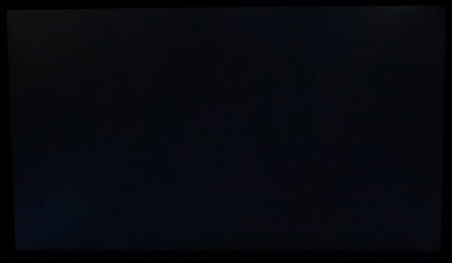
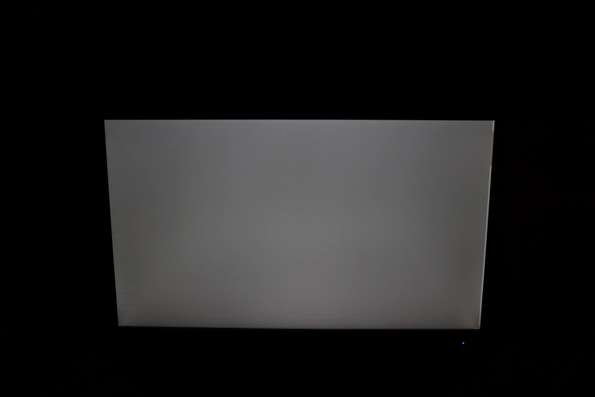
Observing a black screen in a dark room, using our test settings, revealed slight backlight bleed. This was most pronounced but still fairly minor towards the bottom left corner, as shown in the image below. Note that this image was taken a few metres back from the monitor to eliminate ‘PLS glow’, which can be seen towards the bottom corners of the screen in particular. It manifests itself from a normal viewing position as a sort of silver haze.
The ‘PLS glow’ (not shown above) is less extensive and less obvious than you’d expect from an IPS-type panel of this sort of size. It is not as widespread nor as intense at a given brightness setting. We explore the effect that it has on the image later on in the review. It blooms out more noticeably if you observe the monitor from a decentralised viewing angle as demonstrated in a video later on in the review and appears silver from some viewing angles and golden from others.
The Spyder5ELITE was used to assess the uniformity of lighter colours, represented by 9 equally spaced white quadrants. The luminance of each quadrant was measured and compared to the brightest measured quadrant. The tables below show these values as well as the percentage deviation between each quadrant and the brightest point measured. The top table shows the results under our ‘Test Settings’, whereas the bottom table shows the results with ‘Eco Mode’ set to ‘Uniformity’ – the uniformity compensation mode introduced earlier. ‘Gamma3’ was used in conjunction with this setting, as it was earlier in the review, although this did not significantly affect the uniformity.

Luminance uniformity table UC off

Luminance uniformity table UC on
Under our ‘Test Settings’, the luminance uniformity was very good. The brightest point recorded was ‘quadrant 8′, below the central region (156.1 cd/m²). The greatest deviation from this occurred at ‘quadrant 1’, towards the top left of the screen (141.4 cd/m², which is 9% dimmer). The average uniformity deviation between each quadrant and the brightest point was just 5.25%. Using the ‘Uniformity’ setting reduced the maximum deviation to 7% and average deviation between each quadrant and the brightest point to 4.63%. The uniformity of our sample was strong both with and without this setting. Note that the uniformity of individual samples can vary and there may also be deviation beyond the points measured. Assuming the ‘Uniformity’ setting works as it should on all units it’s a nice addition that could prove useful to some users.
For those who prefer a graphical representation, the contour maps below shows these deviations with darker greys representing lower luminance (and hence greater deviation from the brightest point) than lighter greys. The percentage deviation between each quadrant and the brightest point is also shown.
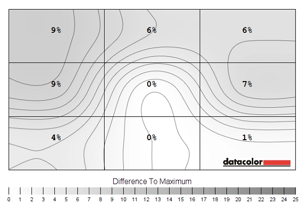
Luminance uniformity map UC off
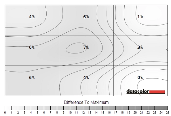
Luminance uniformity map UC on
The Spyder5ELITE was also used to analyse variation in the colour temperature (white point) for the same 9 quadrants analysed previously. The deviation between each quadrant and the 6500K (D65) daylight white point target was analysed. Deviation here is assigned a DeltaE value, where a DeltaE <3 represents deviation that most users wouldn’t readily notice by eye. There are again two contour maps, where the first shows the results under our ‘Test Settings’ and the second using the ‘Uniformity’ mode. Darker shades on this map represent higher deviation from 6500K than lighter shades.
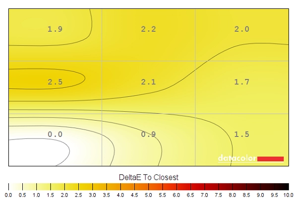
Colour temperature uniformity map UC off
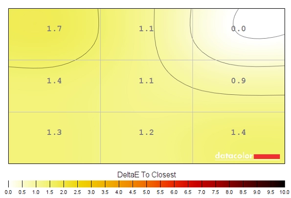
Colour temperature uniformity map UC on
Under both conditions the white point luminance was pleasing, with no significant deviations recorded. The ‘Uniformity’ setting did provide some improvement nonetheless. With our ‘Test Settings’ the maximum deviation was DeltaE 2.5 and the average deviation DeltaE 1.85. With the ‘Uniformity’ mode the maximum deviation was DeltaE 1.7 and the average deviation DeltaE 1.26. As with other areas of uniformity, individual units can vary and might also expect variation beyond the measured points. The ‘Uniformity’ setting should again prove a useful addition for some users.
Contrast in games and movies
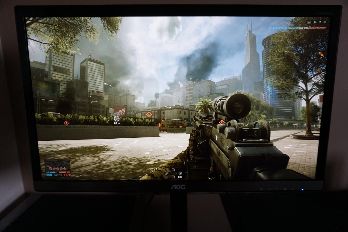
On Battlefield 4 (BF4) the contrast performance was good overall. The level of detail in dark scenes was quite pleasing, particularly centrally. The ‘PLS glow’ caused some loss of detail towards peripheral areas (particularly the bottom two corners from a normal viewing position), but this was less extensive than you might expect. It didn’t cause an obvious ‘flooded’ look that radiated from the corners of the screen but was a bit more subtle (although still noticeable to an extent). Brighter elements such as artificial light sources at night stood out nicely in darker surroundings. Lighter shades such as this had a slightly grainy look to them, although it was more of a fine mist than an obvious course graininess. It didn’t affect the clarity to the extent that some matte surfaces do, nor was it as smooth as others (e.g. the ~32” UHD models which have a very smooth matte surface).
The contrast performance was also respectable on Dirt Rally. Some detail was again lost due to ‘PLS glow’, particularly towards the bottom corners of the screen from an ergonomically correct viewing position. This was again a bit more subdued compared to what you might expect – subtle detail such as tire tread patterns were less distinct than they should be, but retained a degree of visibility even quite near the bottom corners. Brighter elements such as car headlights, fireworks and other light sources at night stood out quite well in the surrounding darkness. These again had a light and misty rather than heavy and smeary grain to them from the screen surface.
Lagom contrast tests
Lagom’s tests for contrast were used to more closely analyse contrast performance, highlighting weaknesses which may not be readily apparent during other testing. The following observations were made.
- Performance on the contrast gradients was good. The darkest blue block blended into the background too readily, whereas all other blocks showed distinct brightness steps and appeared distinct from the black background.
- Performance on the black level test was pleasing. The first few blocks blended into the background, which is usual for a monitor targeting ‘2.2’ gamma. The third block was a bit less distinct than it could be, but the remaining blocks appeared with good steps up in brightness. There was no noticeable dithering.
- The white saturation test was displayed well. The final checkerboard pattern was a bit indistinct from the background, due in part to masking by the screen surface, but the remaining patterns were distinct.
- The greyscale gradient was very smooth without obvious banding or noticeable dithering. There was some very faint banding upon close inspection, but this was very minor.
Colour reproduction
Colour gamut
The colour gamut of the U2477PWQ (red triangle) was compared with the sRGB reference colour space (green triangle), as shown in the image below. The monitor fully covers sRGB with a little extension beyond this. This slight overextension allows the monitor to provide rich but accurate shades within the sRGB space with a little extra vibrancy for general-purpose use. A colorimeter or other calibration device would be able to compensate for this slight overextension quite effectively, if required.
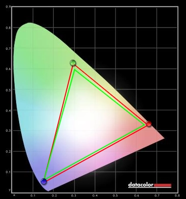
Colour gamut
Colour in games and movies
The colour reproduction was excellent on BF4, with pleasing consistency and a nice rich and varied look overall. There were plenty of vibrant shades with good depth – standing out nicely, but not because they are obviously oversaturated or otherwise represented unrealistically. Vibrant oranges and reds from flames and explosions and deep reds, bright oranges and blues for painted containers were quite eye-catching. The environments looked as they should with a pleasing variety of earth browns and natural-looking greens. In amongst these were some good lush-looking deep shades and a plethora of paler shades that complimented this nicely. The strong consistency helped maintain richness and accuracy throughout the screen and enhanced the subtle variety of shades displayed.
Colour reproduction was also strong on Dirt Rally. The car liveries and track advertising showcased a range of strong and vibrant-looking colours, including; deep reds and blues, bright neon greens and striking highlighter yellows to name but a few. The environments looked much as they should thanks to the accurate and consistent reproduction of even closely matching shades such as greens and browns. There was impressive depth and richness to some of these shades, particularly some of the lush forest greens seen in the Finland rally stages.
We also tested the Blu-ray of Futurama: Into the Wild Green Yonder. The consistent shade reproduction was palpable on this film – it makes an excellent test of this due to large areas of individual shade being displayed on the screen. Appropriate saturation levels were maintained throughout the screen with good strong deep colours, eye-catching neon colours and suitably muted and varied pastel shades. Where bright shades were placed against a dark background (for example bright green cosmic radiation in space) things stood out quite well, although obviously not to the extent that they would on a high contrast VA panel with decent colour gamut. Nonetheless; the colour gamut, light matte screen surface and panel type used here certainly helped provide some good vibrant shades.
Viewing angles
Lagom’s viewing angle tests were used to further explore the idea of colour consistency and the influence of viewing angles. The following observations were made from a normal viewing position, around 70cm from the screen.
- The purple block appeared lilac for the most part with a bit of a pink hue towards the edges, particularly towards the bottom right.
- The red block appeared rich red throughout.
- The green block appeared lime green throughout without any areas that were noticeably more yellow.
- The blue block appeared royal blue throughout.
- The Lagom text appeared blended grey for the most part, with a mild green tint. There was also a slight red hue towards the bottom. The text was free from strong green, orange or red tints and did not flash between these with a bit of head movement. This indicates that the gamma curve of the monitor has weak viewing angle dependency, typical of a PLS (or IPS-type in general) panel. The following image gives a rough indication of how the text appeared using our ‘Test Settings’ with scaling disabled. Scaling interferes with the correct representation of the text in this text but does not influence the viewing angle performance of the monitor in any way.
The following video shows the results of the Lagom text test, a mixed desktop background and a dark desktop background from a variety of different viewing angles. In the final section of the video you can see the aforementioned ‘PLS glow’ that blooms out more noticeably off-angle. Again, this appears a bit more subdued than you might expect given the panel type and size of the screen.
Responsiveness
Input lag
A sensitive camera and a small tool called SMTT 2.0 was used to measure input lag for the U2477PWQ. The monitor was compared to various monitors of known latency. Using this method, we calculated 4.85ms (between 1/4 and 1/3 of a frame) of input lag. This value is influenced both by the signal delay (element you ‘feel’) and pixel responsiveness (element you ‘see’). It indicates a very low signal delay for the monitor which shouldn’t cause issues even for sensitive users.
Perceived blur (pursuit photography)
In this article we explore the factors which affect the responsiveness of a monitor. One of these key concepts is the idea of ‘perceived blur’ and the use of a technique called ‘pursuit photography’ to capture movement in a way that reflects this. Such photography makes use of a moving rather than stationary camera to reflect not only what the screen itself is doing (pixel responses) but also the blur induced due to eye (camera) movement. It is this eye movement that is the chief contributor to the blur perceived on a modern sample and hold display.
The images below are pursuit photographs taken using the UFO Motion Test for ghosting. The test is running at 960 pixels per second with object moving from left to right – a practical speed for such photographs that highlights the key factors nicely. The monitor was set to its four different response time settings; ‘Off, ‘Weak’, ‘Medium’ and ‘Strong’, respectively. The middle row of the test (medium cyan) was used for this analysis. A 60Hz reference has also been included for comparison, which is a Samsung S27A750D set to full brightness (ensures DC backlight control) and using its optimal ‘Faster’ response time setting. This essentially shows what things should look like on a 60Hz sample and hold LCD where pixel responsiveness isn’t a limiting factor.
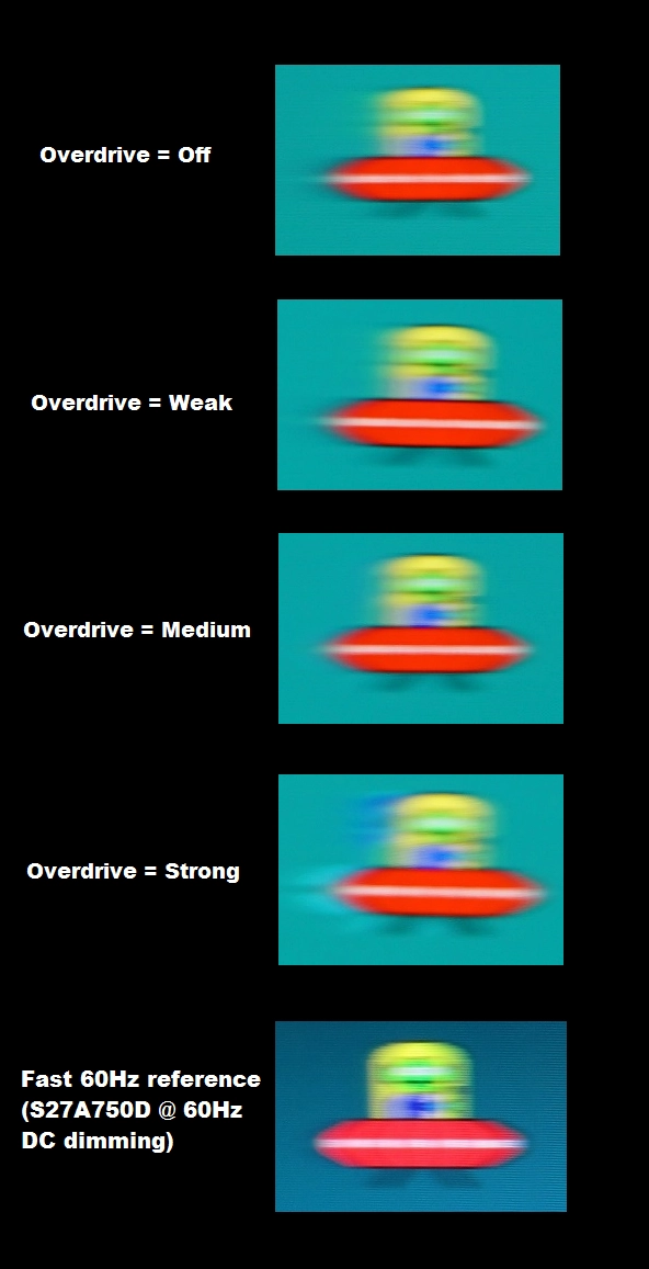
Perceived blur with various settings
With ‘Overdrive’ set to ‘Off’ there is a moderate amount of blur (similar to the reference) with additional trailing behind the object from slower than optimal pixel transitions. The ‘Weak’ setting reduces this additional trailing slightly, but there is still a reasonable amount remaining behind the object. The ‘Medium’ setting reduces this further so that there is only a very small amount of additional trailing behind the object. Although not clear in the image, there is actually a bit of a ‘shadow’ behind the object instead, which is mild overshoot (inverse ghosting) from fairly strong pixel overdrive. The ‘Strong’ setting, as the name suggest, ramps the pixel overdrive up significantly and brings with it obvious overshoot. You can see a colourful trail behind the object that is very obvious in practice.
Considering a broader range of pixel transitions, as we do in the following section, the default ‘Medium’ setting proved optimal. There was a bit of overshoot in places, as we explore, including some that is a bit more obvious than that shown here. The ‘Weak’ mode gave significantly more conventional trailing, though, as acceleration was simply too weak and in places gave little improvement over ‘Off’.
Responsiveness in games and movies
There was a moderate degree of blur on BF4. This was caused predominantly by eye movement and as you would see on even the fastest 60Hz LCDs. There was only a faint whiff of trailing on top of this from slower than optimal pixel responses – so faint that it wouldn’t be picked up by most users even in a side by side comparison. There was a bit of overshoot in places caused by strong pixel overdrive (grey to grey acceleration). If you strafed past dark posts or vehicles against a bright blue sky, for example, you could see a faint almost transparent trail. For some transitions a semi-transparent dark inverse ghosting trail could also be seen. For both forms of overshoot, though, this was quite faint and not at all eye-catching in our view. Sensitivity to such things varies, but we don’t feel the overshoot is at a disturbing level and overall it seemed that the monitors pixel responsiveness was well-tuned.
Dirt Rally provided a similar experience, with the vast majority of blur attributable to eye movement and thus inescapable on any 60Hz sample and hold monitor. There was again a small trace of additional trailing here and there, but nothing particularly noteworthy. There was also a bit of overshoot in places, again manifesting itself as faint partially transparent trails which were not obvious or eye-catching really.
We also tested our Blu-ray movie test titles and didn’t find any issues with sluggish pixel responses or overly aggressive pixel overdrive. The ~24fps at which the films run was the main limit to their fluidity, with the monitor displaying these as any responsive 60Hz LCD would.
The ‘4K’ UHD experience
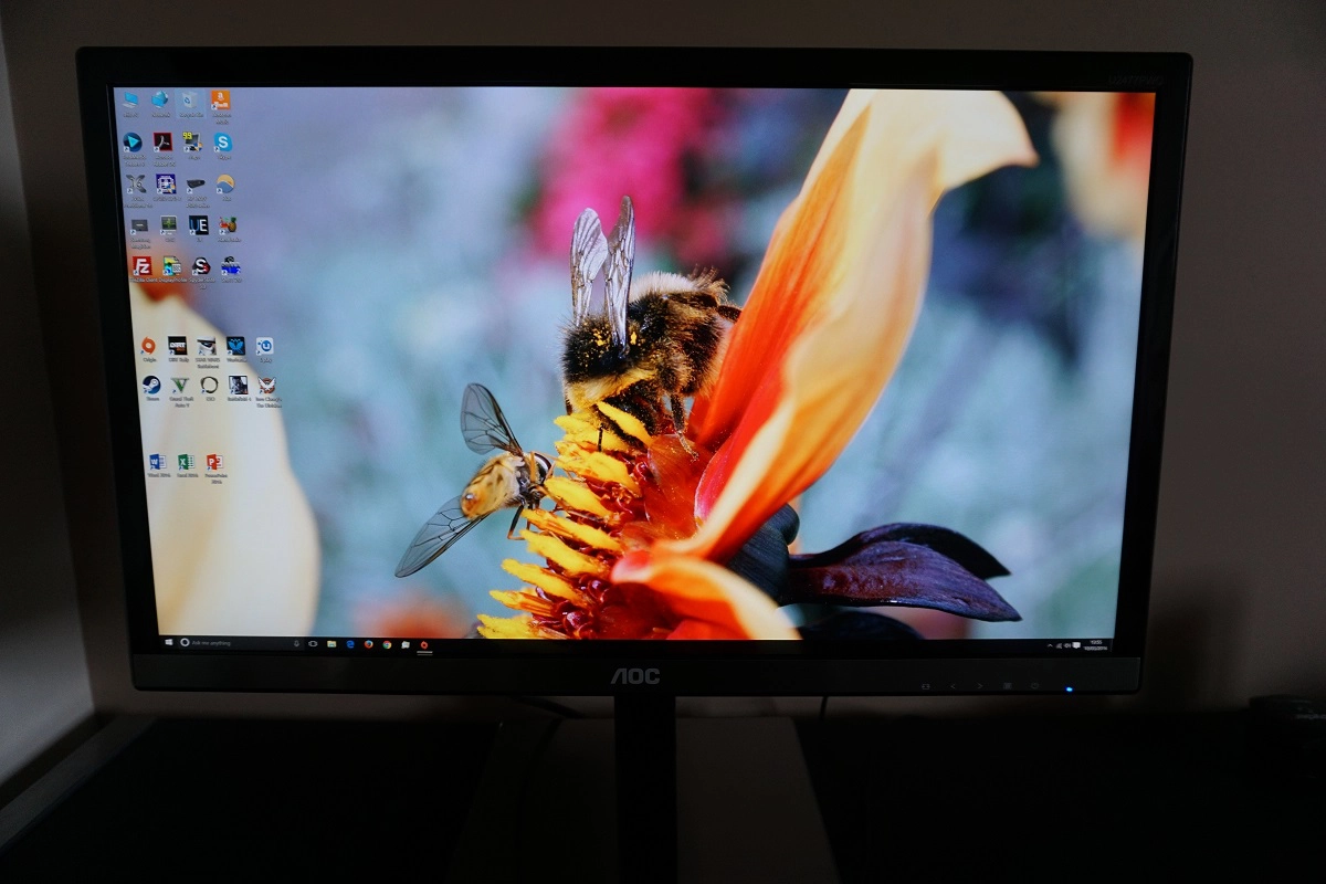
Our ‘UHD Experience’ article discusses the ins and outs of the 3840 x 2160 (‘4K’ UHD) resolution. Although this article focused on a 28” screen, a lot of this applies equally to 23.6” screens such as this one. We’ve actually looked specifically at the UHD experience on a screen of this sort of size in the relevant section of our review of the Dell P2415Q, which is a 23.8” monitor and therefore extremely similar to the 23.6” AOC in terms of pixel density. With its 186.69 PPI (Pixels Per Inch), we found 150% scaling in Windows provided a good balance between readability and real-estate. If you run the monitor at its native 100% setting (no scaling) then text and UI elements are tiny. Whilst still technically usable, if sitting quite close to the screen, we think most users would find this rather uncomfortable and quite odd really and would therefore prefer to use scaling. The photos below show the desktop without scaling (top photo) and with our preferred 150% setting (bottom photo). Note the differences in icon size.
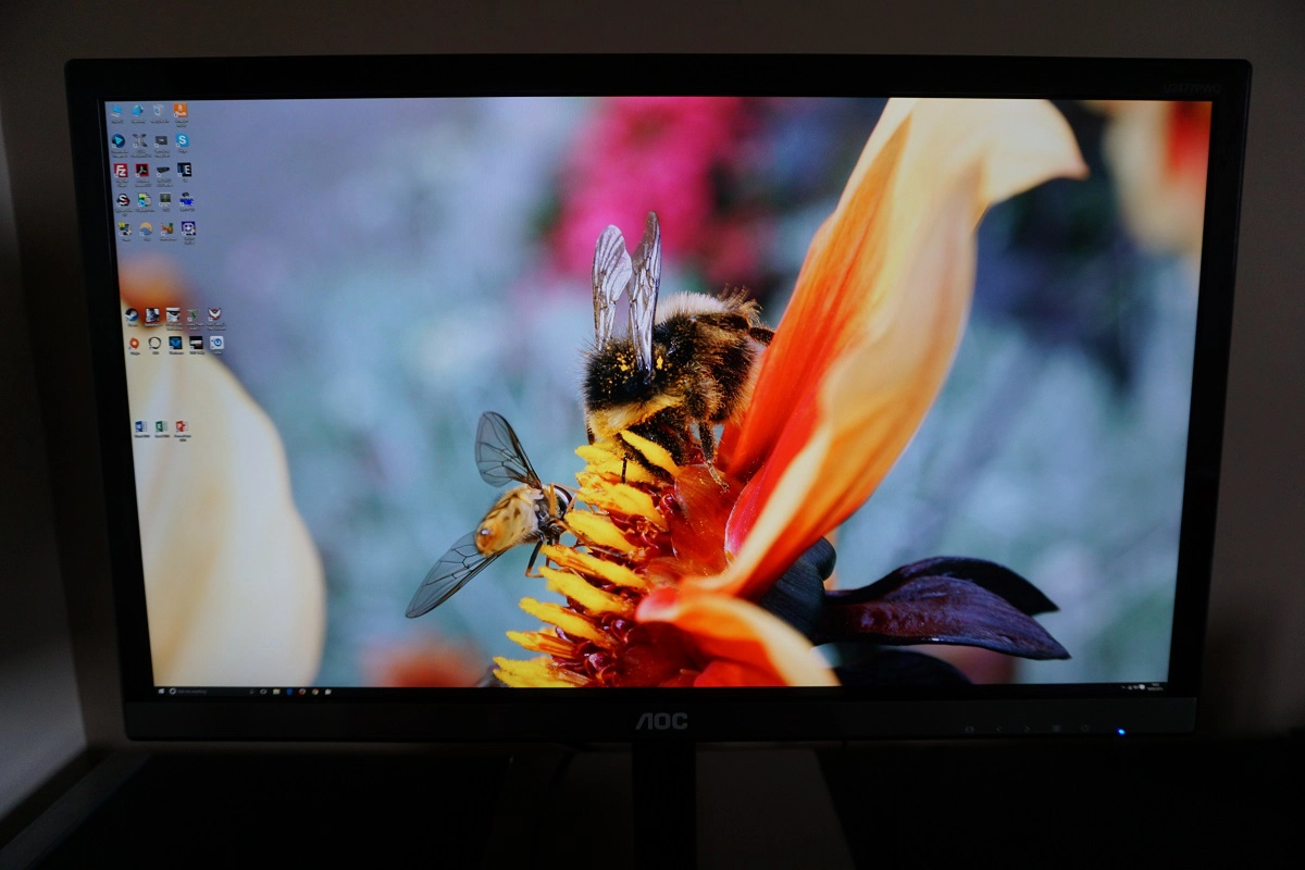
As explored in the P2415Q review, the 150% scaling setting still leaves you with a good amount of real-estate on the screen for general desktop use. And as we explore here, applications with independent zoom control (such as web browsers, office applications and many others) will still allow you to use this independently of any scaling. The image below shows the sort of space you get to play with for multi-tasking and also shows how different applications might handle this 150% scaling. On the left side of the screen you can see the store open in the EA Origin client, which currently ignores scaling entirely and displays everything in the tiny native ‘no scaling’ state. On the right side of the screen you can see our homepage using the default zoom level of the browser for 150% scaling, but this can be independently adjusted as noted previously.
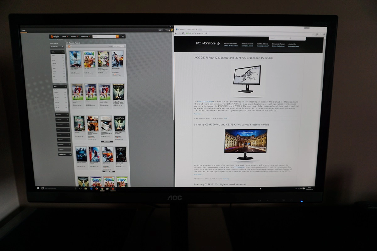
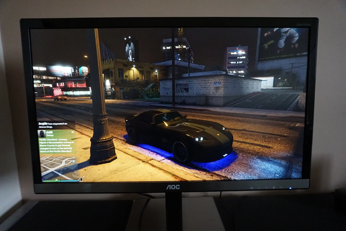
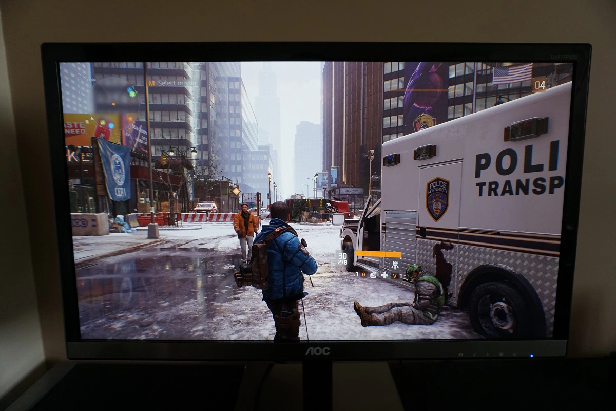
As explored in the Dell review and the article linked to above, the excellent pixel density brings about a significant boost to the clarity and potential detail levels when gaming. We will again reiterate that a 23.6” screen doesn’t really look significantly ‘better’ than a UHD screen up to around 32”, even though the pixel density is a fair bit higher. It’s also important to note that some games certainly make better use of the resolution than others. We would like to bolster our assessment of the UHD gaming experience by discussing a new title that we got our hands on; Tom Clancy’s The Division. This is a very appealing game, visually, that makes excellent use of the UHD resolution. Even with graphics settings set rather low, the overall clarity afforded by the pixel density is excellent. This makes objects in the distance appear very sharp and relatively detailed. Even with the basic AA filtering in the ‘Low’ preset, such objects were free from distracting jagged edges. If you up the graphics details then things start to look very impressive indeed. The clarity of objects into the distance is exceptional, whilst the texture details of many objects even close up was very impressive indeed.
As we’d seen on other titles there were some textures that looked a little flat if you were quite close to them. But no texture on this game looked so poor as to look out of place, it’s just that some made better use of the pixel density than others. The clothes of characters have very detailed material textures, with an appropriate fluffy look or specular lustre depending on the material used. All of the minute creases (and micro-creases, if there’s even such a term) help provide a sense of realism to these materials that simply isn’t there at significantly lower pixel densities. One of the most impressive textures, at least on the area of the game we tested, was the ‘grippy’ metal surface towards the bottom of the police van shown in the top image below. This had a beautiful 3D structure to it and was complimented by very realistic lighting and shadow detail. The images below are simply for illustrative purposes and in no way reflect what things actually look like first-hand on the monitor.
Interpolation and upscaling
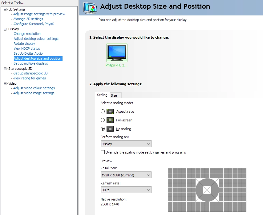
If you find the native 3840 x 2160 (‘4K’ UHD) resolution too demanding for certain applications, it may be tempting to reduce the resolution to something less demanding like 2560 x 1440 (WQHD) or 1920 x 1080 (Full HD). Alternatively, you may wish to connect a device such as a games console that will only run at a lower resolution such as 1920 x 1080. If you do this, an interpolation (scaling) process will be used to display this native resolution. It is best to let the monitor handle this rather than the GPU of the PC. AMD GPU users needn’t worry as the default settings dictate that the monitor rather than GPU will automatically handle the interpolation when gaming. Nvidia GPU users should open their Nvidia Control Panel and navigate to ‘Display – Adjust desktop size and position’. They should then ensure that ‘No Scaling’ is selected and ‘Perform scaling on:’ is set to ‘Display’ as illustrated below.
Many people mistakenly believe that 1920 x 1080 will be displayed ‘perfectly’ on a 3840 x 2160 display without any loss of clarity compared to a native Full HD display using 1:4 pixel mapping. That isn’t generally the case in practice, though, and usually the same sort of interpolation process is used whether you’re trying to display 1920 x 1080 or a different non-native resolution. The AOC actually retains a respectable degree of sharpness when using interpolation to display 1920 x 1080 – there is a degree of softening, but not as much as we’ve seen on some other UHD displays. If you set ‘ClearVision’ to ‘Weak’ (the second OSD button activates this, as per the video) then it actually counteracts some of this softness as well and brings things fairly close to a native Full HD display of similar size. Any higher ‘ClearVision’ setting will provide an overly sharp image. 2560 x 1440 (WQHD) is also displayed well, but only if ClearVision is disabled – otherwise things look overly sharp. There is again a degree of softening, but it’s not extreme. Essentially the monitor uses one of the best interpolation processes we’ve come across on a UHD model, so it’s very usable in non-native resolutions.
If you’re running lower resolution content (such as a Full HD Blu-ray) using software on the PC, but keep the monitor at its native 3840 x 2160, it is the GPU or software that handles the scaling. The monitor does not influence this process. There is a bit of softening but nothing extreme. Given how well the monitor handles interpolation some users may actually find it better to set the monitor itself to Full HD for a slight edge in sharpness for Full HD content compared to 3840 x 2160.
Conclusion
The AOC U2477PWQ strikes a pleasing balance between price, design, practicality and image performance. Despite being one of the lowest priced UHD models on the market, it provides a competent performance in many areas. Its PLS panel was well-tuned to provide rich, accurately represented and consistent colours. Gamma handling was strong straight from the box and with a few tweaks elsewhere the colour reproduction was pleasing. The light matte screen surface and fairly generous (but still not ‘wide’) colour gamut also aided the monitor in this respect. The resolution does in itself also provide definite benefits – exceptional clarity, real-estate and detail in a range of applications. On a 23.6” screen, though, scaling will be something of a necessity for most users for general desktop use – and not all applications handle this particularly well, if at all.
The contrast performance was largely as you’d expect given the panel type – actually slightly better, as the level of ‘PLS glow’ was a bit lower than you’d typically see. This allowed the monitor to retain somewhat more detail towards the peripheral regions of the screen –nonetheless, there was still some noticeable glow. The screen surface is ‘light matte’ as mentioned previously, bringing out a decent level of vibrancy and clarity. The surface texture did impart a light and misty graininess, though, so white and other light colours weren’t as smooth as we’ve seen on some models. There wasn’t the same course or smeary grain seen on some matte surfaces, fortunately. It’s also worth mentioning that a ‘Uniformity’ setting (uniformity compensation mode) also featured, which did what it said on the tin. There was a slight hit in contrast and locked and fairly high brightness settings when using this, however.
Responsiveness was also quite pleasing, overall. There were a few imperfections in terms of some slightly slower than optimal pixel transitions as well as a bit of light overshoot here and there. Overall, though, the pixel responsiveness was quite well-tuned and generally things looked quite in-line with event the fastest 60Hz LCDs. We were also pleased to see that the monitor handled interpolation well – as well as we’ve seen from a UHD model, in fact. This makes the monitor suitable for secondary usage on games consoles or for more demanding games where a lower resolution is preferred for performance reasons. Given the asking price there really is a lot to like about this model – and its flexibility to display non-native resolutions rather well makes it even more approachable.
The bottom line; a monitor that hits the sweet spot between price and performance whilst looking and feeling like quite a premium product.
| Positives | Negatives |
| A well-tuned PLS panel delivered a pleasing range of rich and accurately represented shades, with strong gamma tracking and sRGB coverage. The default ‘Warm’ setting was also an ‘LBL’ (Low Blue Light) setting of sorts | Some tweaking required to colour channels to achieve a good daylight white point and the ‘LBL’ mode was fairly weak – we preferred manual adjustments for a true ‘Warm’ preset |
| Pleasing static contrast and a light matte screen surface that preserved a decent level of vibrancy and clarity – plus relatively low levels of ‘PLS glow’ | There was still noticeable ‘PLS glow’ and the screen surface texture wasn’t as smooth as some matte solutions we’ve seen |
| Quite well-tuned pixel responsiveness making good use of the 60Hz refresh rate and very low input lag. The stand flexibility, inclusion of metal elements and HDMI 2.0 was also nice to see | A bit of light overshoot in places using the optimal ‘Overdrive’ setting, moderately thick bezel and very stiff height adjustment for the stand – perhaps partly because our unit was brand new |
| The 3840 x 2160 ‘4K’ UHD resolution gave excellent real-estate, detail and clarity where scaling was used appropriately. Furthermore, interpolation performance was pleasing | Scaling is not implemented all that well on all applications and it’s pretty much inevitable that some degree of scaling will be preferred on a 23.6” UHD screen |
|

