Author: Adam Simmons
Date published: October 29th 2014
Table of Contents
Introduction
Built with gamers in mind, the AOC g2460Pg combines a fast 144Hz TN panel with Nvidia G-SYNC variable refresh rate technology to try and eliminate stuttering and tearing. Other Nvidia-specific technologies also feature, including ULMB (Ultra Low Motion Blur) to improve motion clarity and 3D Vision 2 for a true 3D viewing experience. On paper this looks like a rather responsive monitor, but experience has taught us never to judge a monitor based on its specifications. In this review we take a look at how the monitor performs in games, movies and a variety of other applications. We aren’t just interested in its responsiveness, of course, and will be prodding and probing its image quality as well.
Specifications
The monitor uses the AU Optronics M240HW01 V8, a 144Hz 1920 x 1080 part. This features 6-bits per subpixel plus FRC dithering, as is common for TN models. A G-SYNC module is also included which gives the monitor support for a number of Nvidia-specific features including G-SYNC and ULMB. 3D Vision 1 and 3D Vision 2 is also supported. A response time of ‘up to’ (as good as) 1ms is specified indicating the presence of very strong grey to grey acceleration, but fortunately this is adjustable to allow the user to find a better balance between speed and an overdrive artifact-free image.
Key talking points of the specifications are highlighted in blue below.
Features and aesthetics
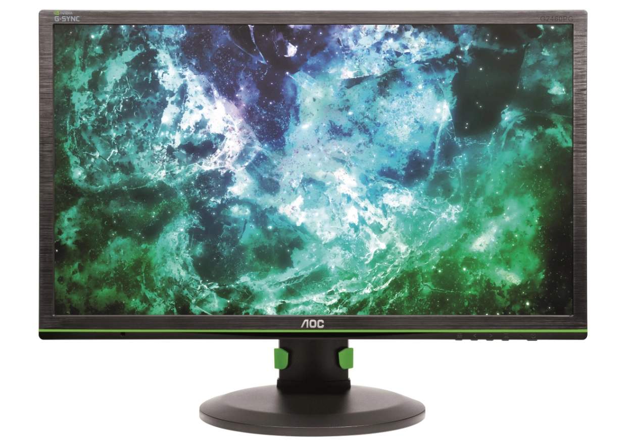
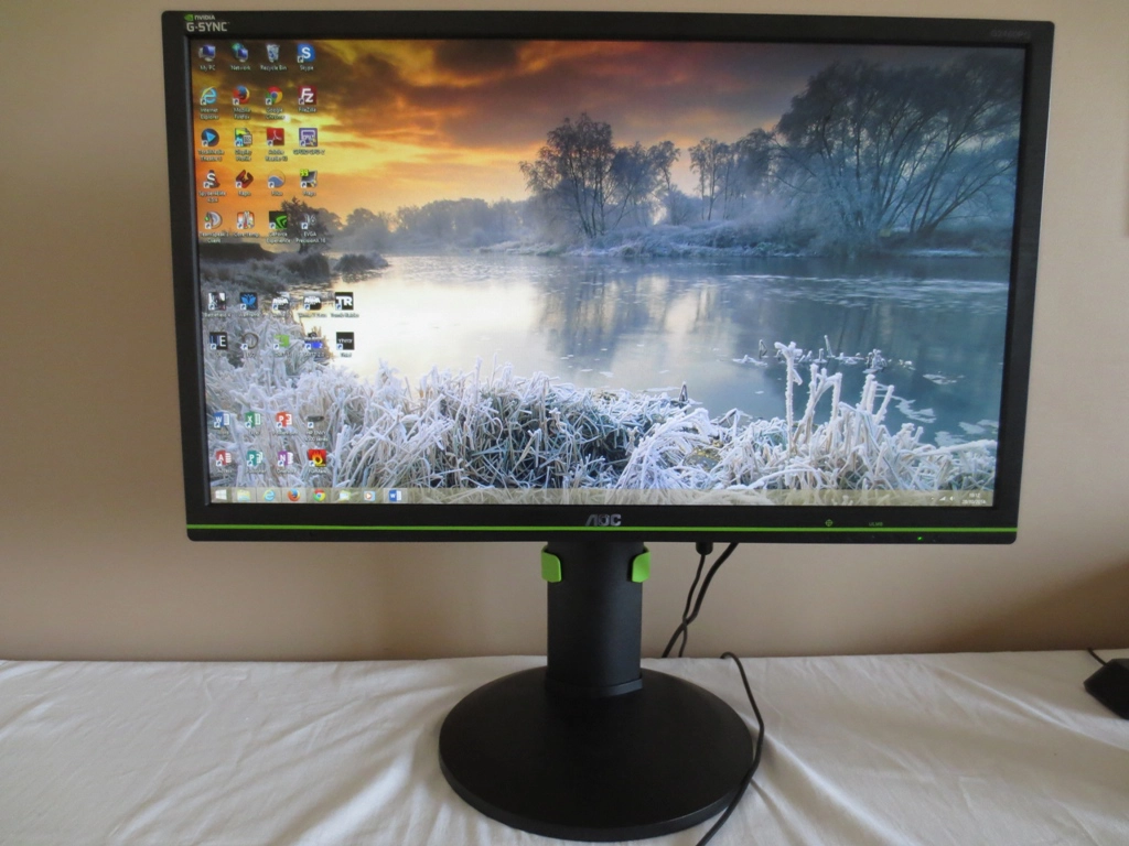
From the front the most striking aspect is probably the ‘Nvidia green’ stripe running along the bottom bezel. This identifies the monitor, along with other labelling, as an Nvidia G-SYNC capable unit. The stripe is painted on and can’t simply be clipped off or anything like that. We found it fairly unobtrusive really and a unique little touch. The bezels are ~15mm (0.59 inches) at the top and sides and ~24mm (0.94 inches) at the bottom. They are matte black plastic with a brushed metal texture. The screen surface is regular (‘medium’) matte anti-glare.
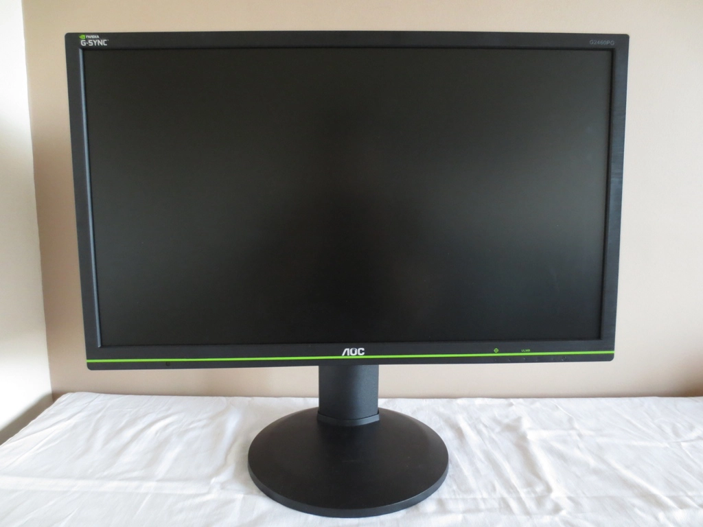
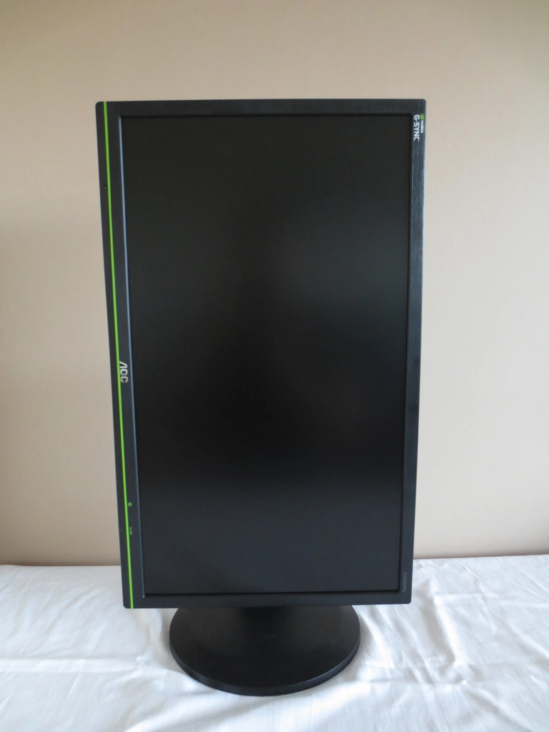
The monitor features a reasonably solid fully adjustable stand allowing you to; tilt the screen (5° forwards, 22° backwards), adjust its height (by 130mm or 5.12 inches), swivel it left or right (around a 270° field of rotation using a turntable mechanism) and pivot it into portrait as shown below. Be aware that the viewing angle limitations limit the practicalities of viewing in portrait orientation as they introduce significant horizontal colour shift in this orientation. At its minimum height in landscape orientation the bottom of the screen clears the desk by 53mm (2.09 inches) with the top 395mm (15.55 inches) above the desk surface.
The OSD (On Screen Display) and related features of the monitor are controlled by pressible buttons towards the right of the bottom bezel, on the underside. The functions are; ‘On-Screen Crosshair’, ‘Change On-Screen Crosshair Design/Left’, ‘ULMB/Right’, ‘Menu’ and ‘Power’. There is a small front-facing power LED to the left of the power button that glows green when the monitor is on and amber if it’s in a low power state. The buttons are tactile (not touch sensitive) and fairly nicely spaced out. They are not illuminated and have simple engraved labels, with the exception of the crosshair activation and ULMB activation features that have quite clear green labels.

The following video runs through the menu system of the monitor. Note that the menu is cut down a bit compared to most AOC monitors as G-SYNC restricts certain manufacturer-specific features. Also note that the ‘Reset’ feature doesn’t reset the colour channels in ‘Color Temp. = User Mode’ so be careful to note the defaults of ’65’ for each channel when making manual adjustments. One thing not mentioned in the video is that the OSD repeat rate is very low, meaning that if you hold down the buttons to increase or decrease a slider value it takes a very long time to actually get a substantial increase or decrease. It’s a bit faster to keep on clicking the buttons instead, but that is hardly comfortable and not as fast as it would usually be to hold down a button on a monitor to move the slider. A bit of a nuisance but not a deal breaker really.
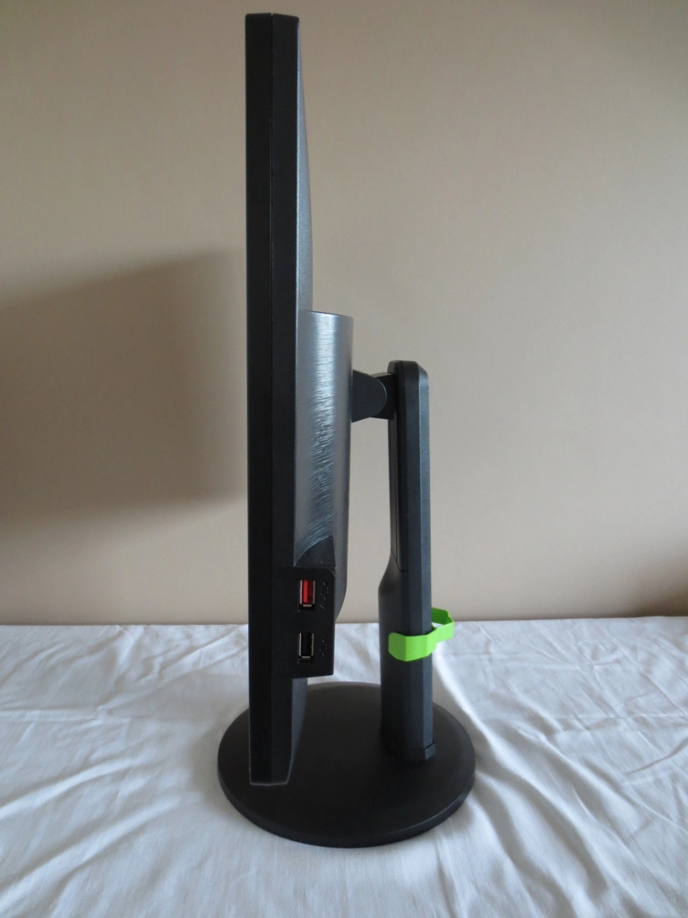
The right side of the monitor features 2 USB 2.0 ports. The upper one is red-coloured and features fast charging capability for connected devices. The monitor is 21mm (0.83 inches) at thinnest point with some more bulk centrally and further down. You can also see an ‘Nvidia green’ cable tidy attached to the stand neck. This is visible from the front, depending on its position and the monitor height, and also the rear. It is easy to clip on or off should you wish not to use it.
The rear shows an ‘Nvidia Eye’ and ‘G-SYNC’ logo at the top right and an AOC logo in the top central region. The stand attaches centrally by 100 x 100mm VESA and can be removed to make way for another VESA solution. The central bulk of the screen has the same brushed metal-effect matte black plastic as the bezels. The rest of the rear is basic matte black plastic.
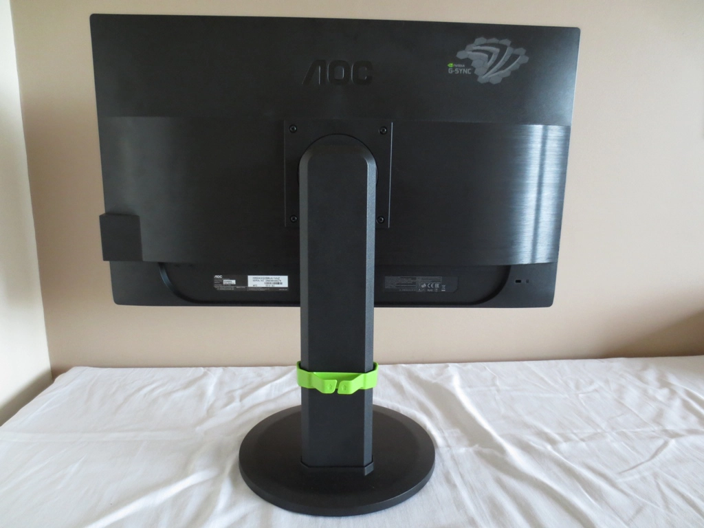
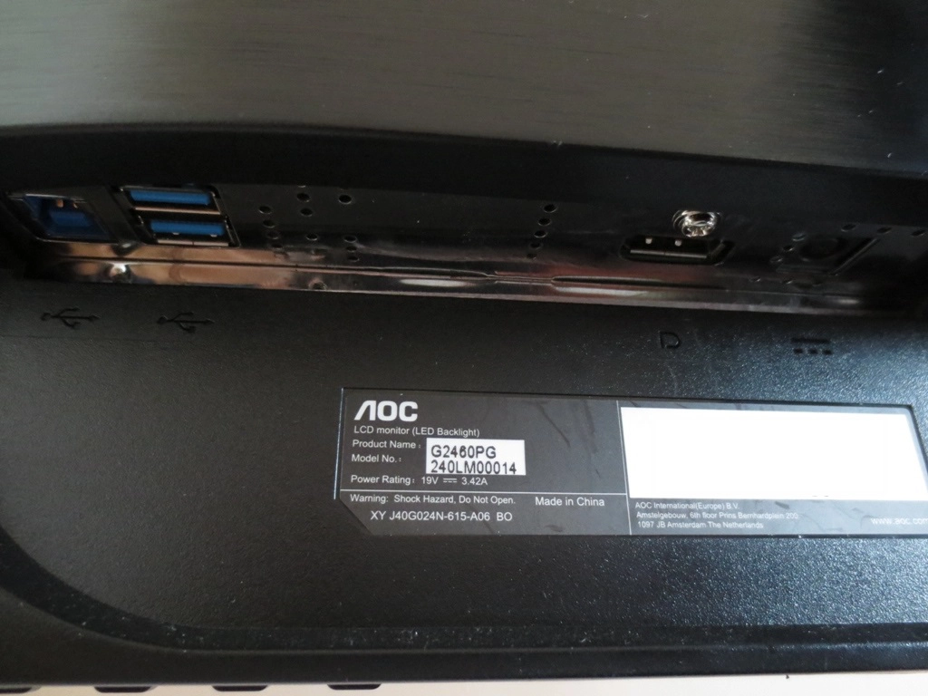
There are ventilation slits at the top of this bulk and the limited selection of ports facing downwards at the bottom. These are; USB 3.0 upstream, 2 USB 3.0 ports, DP 1.2 and DC power input (power brick external to monitor). DisplayPort (DP) is required for its data packed transfer capabilities and the G-SYNC module itself replaces other external electronics – so there is no HDMI, DVI or VGA here. One thing to mention is that the power cable that attaches the ‘power brick’ to the screen is quite short (around 3ft) which doesn’t give you a huge amount of flexibility in where you can place the power brick. The monitor includes a DP cable as well as the necessary power adaptor and cables. It does not include a USB upstream cable, though, which is required if you wish to use the USB ports.
Calibration
Subpixel layout and screen surface
As mentioned in the ‘features and aesthetics’ section, the AOC uses a medium matte screen surface. The outer polarising layer of this has been chemically ‘rouged up’ so that it diffuses ambient light, reducing glare. As this article points out, though, the light emitted from the monitor is also diffused in a similar way. This has an effect on the clarity and potential vibrancy of the image. It also imparts a slight graininess to the image which can be observed most clearly when white and other light shades are displayed. It must be stressed that this surface is considerably smoother (less grainy) than the surfaces used on some other monitors, most notably some older IPS models. The image also appears slightly smoother than on some other TN models, including the ASUS PG278Q which we have had running side by side with this model.
![]()
The subpixel layout of this monitor is RGB (Red, Green and Blue) stripe as illustrated above. RGB is the most common subpixel layout used on LCDs and is the one that most operating systems (including MacOS and Windows) expect to find. It is therefore not necessary to run ClearType. Part of running ClearType is about adjusting things to your personal preferences, though, so it may be worth trying out if you like.
Testing the presets
As usual for an AOC monitor, the g2460Pg is devoid of traditional presets. In fact being a G-SYNC monitor, the functionality of the OSD is cut down even more as shown in the video earlier. There are the usual 3 ‘Gamma’ modes and also some ‘Color Temp.’ settings. You can also activate ULMB (Ultra Low Motion Blur) which has an effect on the image as well. We explored a number of different settings on the monitor and recorded some key values including gamma and white point. The results and some observations for each setting combination are shown in the table below. Our test system used an Nvidia GTX 970 connected by the only display connection available on the monitor (DisplayPort 1.2). Everything not mentioned was left at default – no additional drivers or ICC profiles were loaded, everything was left at their ‘Plug and Play’ defaults. The only things we changed that aren’t otherwise mentioned is that ‘Brightness’ was increased from the default of ‘90’ to ‘100’ and ‘Contrast’ from the default of ‘45’ to ‘50’ when ULMB was activated. This increased brightness without having a significant impact on the image otherwise. With ULMB deactivated brightness was kept at default, with the exception of our test settings.
The refresh rate was set to 144Hz, although this didn’t affect the key readings mentioned here and only had a fairly subtle effect on the overall image. At 144Hz there were some mild ‘interlace-pattern artifacts’, particularly towards the far left of the screen. These manifested themselves as a given shade being composed of very faint horizontal stripes of a shade slightly lighter and darker than the desired shade (interlacing). This was very faint and is also a pretty much universal trait on 120Hz-144Hz monitors. Setting the refresh rate to 120Hz reduced this and setting to 100Hz as good as eliminated it – just something to note, not something to worry about. Note that very similar observations to those in the table were made when connecting to a modern AMD GPU, but ULMB is not available unless you’re using a compatible Nvidia GPU (more on that later).
| Preset Mode | Gamma (central average) | White point (kelvins) | Notes |
| Color Temp. = Warm (Factory Defaults) | 2.3 | 6251K | Very bright with a bit of a red bias but some strong colours. A bit too much depth and saturation overall, particularly towards the top of the screen. Saturation is reduced further down the screen, a side-effect of TN viewing angle restrictions from a normal viewing position. |
| Color Temp. = Normal | 2.3 | 7247K | Remains bright and saturated but a very icy tint is introduced, there’s really nothing ‘Normal’ about the image. |
| Color Temp. = sRGB | 2.3 | 6172K | As factory defaults with a warmer and slightly green tint. |
| Color Temp. = User | 2.3 | 6265K | As sRGB with green tint slightly reduced. |
| Gamma = Gamma2 | 2.1 | 6228K | Colours look a bit washed out in places, lacking the depth they should have. Otherwise similar to factory defaults. |
| Gamma = Gamma3 | 2.5 | 6323K | Colours have an extra depth to them. This counteracts the usual undersaturation further down the screen but makes some shades towards the top appear a bit too deep. Some users will like this setting. |
| ULMB, Pulse Width 100 @ 120Hz | 2.5 | 6389K | Due to backlight strobing, the screen becomes dimmer despite being at ‘100’ brightness. A mild flickering is also induced (like running a CRT at 120Hz) and the gamma is ramped up which gives colours a rather deep look. The colour temperature is not shifted much and we feel many users would find the image appealing. |
| ULMB, Pulse Width 100 @ 100Hz | 2.5 | 6201K | As at 120Hz but a little more flickering (like a 100Hz CRT) and marginally brighter. |
| ULMB, Pulse Width 100 @ 85Hz | 2.5 | 6050K | As at 100Hz but even brighter and slightly more intense flickering. |
| ULMB, Pulse Width 50 @120Hz | 2.5 | 6249K | Significantly dimmer than with Pulse Width 100, otherwise similar. |
| ULMB, Pulse Width 50 @100Hz | 2.5 | 6119K | Significantly dimmer than Pulse Width 100 at 100Hz, otherwise similar. |
| ULMB, Pulse Width 50 @85Hz | 2.5 | 6244K | Dimmer than with Pulse Width 100 at 85Hz but still reasonably bright. |
| ULMB, Pulse Width 10 @120Hz | 2.5 | 6212K | Exceptionally dim. Even after your eyes have ‘adjusted’ to this in a dark room it is not really useable in our opinion. |
| ULMB, Pulse Width 10 @100Hz | 2.5 | 6118K | As above really, only a tiny bit of extra brightness. |
| ULMB, Pulse Width 10 @85Hz | 2.4 | 5953K | A small bit of extra brightness again but too dim for most users even in an entirely dark room. |
| Test Settings (as below) | 2.2 | 6508K | A very nice balance to the image. Obviously the same TN viewing angle restrictions apply, no settings will change that – but the image is quite rich and inviting overall without unwanted tints or other glaring issues. |
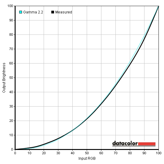
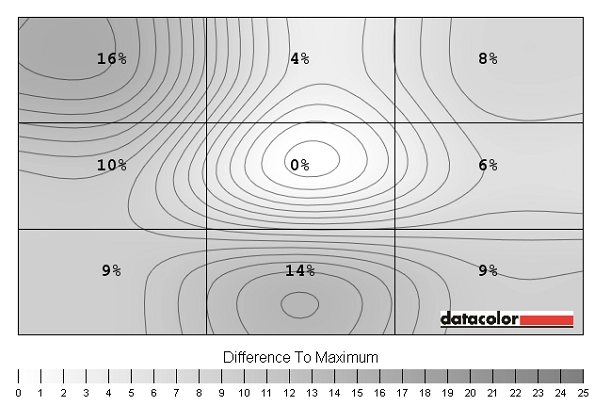
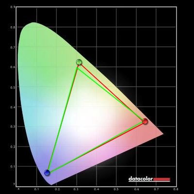
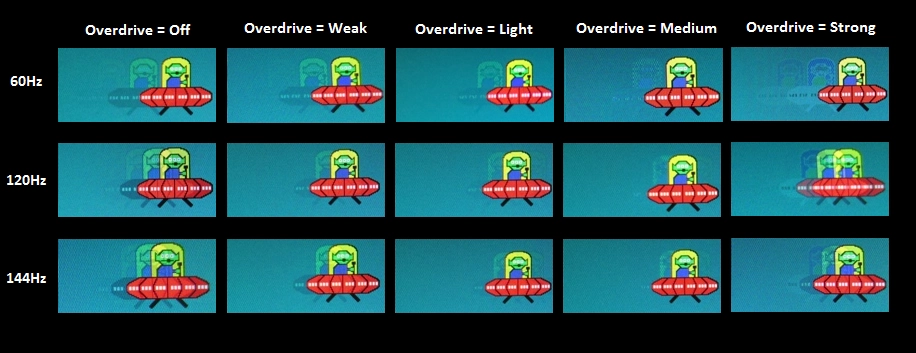
Out of the box the image was far too bright and a bit unbalanced. It certainly didn’t give that dreaded feeling that you usually get when you turn on a 24” 144Hz monitor. That the image is so terrible that ‘fixing it’ will be an uphill struggle and possibly an un-accomplishable task. Our instincts were fortunately correct. There were no presets to mess around with, but there were key settings such as brightness and colour channel controls. There were also the usual 3 ‘Gamma’ modes that AOC likes to put on their monitors, which allows users to further customise the image to their taste. We found that using the default ‘Gamma’ setting but reducing brightness significantly and making some minor alterations to colour channels yielded optimal results. The graph below shows the rather pleasing central gamma reading for the monitor using the ‘Test Settings’ we discuss subsequently. Although it doesn’t please the colorimeter to the same degree, some users may actually prefer ‘Gamma3’. It provides richer and deeper colours, particularly towards the bottom of the screen. In fact if anything colours at the bottom look more like they should (although on our unit some further up looked a bit deeper than they should with this setting). ULMB had a similar effect on the image, significantly increasing the gamma of all gamma modes. Please feel free to experiment with these gamma settings, it’s nice to have them there and everyone has their own preferences for that sort of thing. We’ve also seen quite a bit of variation in the gamma performance of different 144Hz units of the same model before, so don’t just assume that ‘Gamma1’ is always going to be optimal. We really like that there are gamma settings included on this mode, it’s a much nicer way of dealing with potentially ‘washed out colours’ than relying on ICC profiles which aren’t designed for games in the first place and are created on a unit that may differ significantly from your own in its colour setup. We would have liked to see a ‘Low Blue Light’ or equivalent setting as well, as we are great fans of such modes in the evening where it’s important not to expose yourself to too much blue light (it makes our bodies alert – not what you need before bed). We seem to say this in all AOC reviews, but making ‘Normal’ the er… Normal setting and making ‘Warm’ much warmer (ideally <5500K) would be a better approach. For out test settings we significantly reduced brightness and made some changes to the colour channels. We must again stress that each individual unit is different and the settings here should be considered a suggestion rather than something to be followed religiously. Also bear in mind what we said above about ‘Gamma’ modes. We’ve also included the ‘Overdrive’ setting used in our review here just for reference. Contrast= 50 Gamma= Gamma1 R= 62 G= 63 B= 65 Overdrive= Light We used a KM CS-200 luminance meter to measure the brightness of white and black using a range of monitor settings. The static contrast ratios yielded from these values was then calculated. In the table below you can see these values. The lowest black luminance, highest white luminance and highest contrast ratio recorded are highlighted in black. The results from our test settings are highlighted in blue. Please note that the monitor was set to 144Hz unless stated otherwise. Settings not specifically mentioned in the table were left at default. The exception to this was where ULMB was enabled – as mentioned in the calibration section we bumped contrast up to ‘50’ and brightness up to ‘100’ for this to maximise brightness without any observable or recordable ill effect. The average static contrast ratio using factory defaults (brightness only adjusted) was a respectable 1004:1. The fairly unsubstantial changes made to our test settings had a no real impact on contrast ratio, which was recorded as 1013:1. The ‘Warm’ setting, which is the monitor default really makes a similar degree of change to the R, G and B channels to our test settings, just in a different way. The neutral position for each colour channel is ‘65’ as the ‘User’ setting employs by default. The ‘sRGB’ setting also appears to use ‘65’ for each channel, but there is slight additional adjustment there as well that isn’t reflected in the channel values. With all channels in their neutral position with the ‘User’ setting a contrast ratio of 1129:1 was yielded. The contrast ratio dropped to 917:1 using the so-called ‘Normal’ colour temperature setting. Setting gamma to ‘Mode3’ caused a less significant drop in contrast (by way of reducing white luminance slightly) which was undetectable by eye. Activating ULMB caused the most substantial drop in contrast, but this remained around 800:1 which is still decent. The more noticeable impact was on the white luminance, which peaked at 160 cd/m² at 85Hz with a ‘Pulse Width’ of 100. This dropped to 131 cd/m² at 100Hz and 123 cd/m² at 120Hz. Decreasing the ‘Pulse Width’ decreased the brightness further, with between 13 cd/m² and 17 cd/m² being recorded at a Pulse Width of 10. The lowest brightness recorded with ULMB disabled was 38 cd/m² which is still nice and dim. Going purely by the values in the table, the maximum recorded luminance was spot on the specified 350 cd/m² and the minimum white luminance was 13 cd/m². This gave an excellent brightness adjustment range of 337 cd/m². Although not documented in the table, it was possible to get things down to a virtually invisible 0.9 cd/m² (yes, that’s white luminance) by setting ‘Brightness’ to ‘0’ and ‘Pulse Width’ to ‘10’ with ULMB on at 120Hz. As with all current G-SYNC monitors there is no Dynamic Contrast settings available, which we don’t really see as an issue. Unfortunately the photosensor we usually use in conjunction with an oscilloscope was out of action, so we had to rely on alternative methods to determine whether PWM is used. These include using a sensitive camera to try to pick up any flickering or looking out for stroboscopic effects when placing a fan in front of the monitor. We could not detect any sign of PWM usage on this monitor, which either means that the PWM frequency used is very high or more likely that Direct Current (DC) is used to regulate the backlight brightness instead. This should provide some comfort to users who are sensitive to flickering or who worry about visual fatigue when using the monitor. When ULMB is active the monitor does flicker, as that’s exactly what the strobe backlight function is designed to do. Some users are sensitive to PWM flickering but aren’t bothered by ULMB flickering as the nature of the flickering is different. Whilst observing a black screen in a dark room, we could see minor backlight bleed and slight clouding towards the bottom of the screen. We didn’t find this problematic or even noticeable during normal use of the screen. The image below shows how the screen appeared under our test settings in a dark room. We took this photograph from around 70cm back from the screen, which represents a typical viewing distance. Notice that there is no peripheral ‘glow’ from a normal viewing position as you would see on most IPS-type panels. If you view the monitor from off-angle you can see a golden or silver-grey sheen (depending on viewing angle) as demonstrated in the video in the ‘Viewing angles’ section. Please note that backlight bleed varies between individual units of the same model. To assess the uniformity of lighter shades we used a Spyder4Elite to measure the luminance of 9 quadrants running from the top left to bottom right of the screen. The table below shows the percentage deviation between each quadrant and the brightest point on the screen. The luminance recorded at each quadrant is also given. The uniformity of the monitor was variable but pretty reasonable on the whole. The brightest point on the screen was ‘quadrant 5’ in the centre (161 cd/m²). The maximum deviation from this occurred at ‘quadrant 1’ at the top left of the screen and ‘quadrant 8’ at the bottom central region. Here the recorded values were 135.5 cd/m² (16% dimmer than centre) and 139 cd/m² (14% dimmer than centre), respectively. Elsewhere the brightness deviated between 4% and 10% from the central value. It’s worth remembering that individual units of the same model can and do vary with regards to uniformity. Furthermore TN panels such as that used in the g2460Pg exhibit viewing-angle related deviation in perceived brightness which a user can see from a normal viewing position, but that isn’t reflected here. Analysis of colour temperature in this way is even more misleading due to apparent deviations that aren’t picked up by such testing – as such we will not be analysing that in this review. Below is a little graphic (contour map) representing the deviations in recorded uniformity in a more visual fashion. Darker greys represent lower recorded values and hence greater deviation from the brightest point than lighter colours. Percentage deviation between the brightest point and each quadrant is also given as a percentage for clarity. Analysing colour temperature variation on a TN monitor using a colorimeter facing perfectly perpendicular to the screen surface from zero distance is particularly misleading due to the viewing angle related shifts that occur but aren’t reflected in the readings. To that end we will not be providing such analysis in this review. The monitor put in a respectable contrast performance in Battlefield 4, with good distinction between bright and dark shades. When viewing light colours, such as lights inside a dark metro carriage, you could see a slight graininess due to the screen surface. This was not the heavy ‘smeary’ grain that some other matte screens exhibit. Detail in dark areas was pleasing, with all major details and most minor details visible. Unlike on most 144Hz models these areas didn’t look ‘flooded’ due to near-black shades being artificially lightened (gamma enhancement). Instead such areas looked much as they should, which helped maintain a suitable atmosphere. No peripheral loss of detail (common on IPS-type monitors) was observed either. The experience was similar on Dirt 3. Detail levels were largely appropriate whilst light elements contrasted quite well with surrounding dark ones. Car headlights and other bright colours lacked the purity and ‘pop’ of a lighter screen surface but weren’t overly grainy either. We also took a look at the contrast performance in the Blu-ray of Skyfall. Detail levels in dark scenes were good, without the ‘flooded look’ the gamma enhancements on typical 144Hz models would provide. Bright elements with dark surroundings stood out quite nicely, for example candles in the Macau night scenes. To assess the contrast performance of the monitor, more closely we used the Lagom tests for contrast. The following observations were made. The AOC g2460Pg’s colour gamut offers surprisingly complete coverage of the sRGB colour space. There is just a sliver of under-coverage in the green region and red region of this diagram but nothing to stress about. Tracking is otherwise quite close to sRGB with a bit of over-coverage of some shades towards the green corner of this diagram. We haven’t actually seen sRGB coverage this complete on a 24” 144Hz monitor before, even one using this panel – so it seems AOC and Nvidia have done a very good job of configuring this one. Colours on Battlefield 4 had good depth to them and looked natural and in-place. There was a weakening of saturation further down the screen which sapped some of this depth, but overall things looked quite rich rather than ‘washed out’. Vibrant elements such as flames and in-game markers looked fairly vibrant but not to the extent that they do on some monitors with lighter screen surfaces. Some fairly lush and deep-looking greens were also displayed, particularly on the multiplayer map ‘Zavod 311’. On Dirt 3 colours were again richer and more natural than you’d typically see on a 144Hz monitor. Despite shades becoming somewhat lighter further down the screen, the overall depth of colours was good. Natural environments lacked the subtle shade variety that IPS-type panels excel at but still looked quite natural and believable. Some nice deep greens and good golden browns helped in that respect. Car liveries lacked the ‘pop’ and painted-on look of certain glossy screens in particular, but again had good depth and a fairly vibrant appearance. There were some quite striking neon greens and rich cherry reds, for example. The Skyfall Blu-ray looked appropriate and natural. Skin tones showed good saturation and were free from unwanted tints. Wooden colours and earthy browns also looked quite natural, as did deep green vegetation. The monitor also showcased some good vibrant neon shades, where appropriate, such as in the Shanghai night scenes. To close off our subjective assessment we took a look at the Blu-ray of Futurama: Into the Wild Green Yonder. There were some good bright neon greens, pinks and yellows here. Pastel shades also looked largely appropriate – minty greens, bleached yellows, various skin colours etc. With large areas of individual shade sometimes filling a large section of the screen, this title also highlights weaknesses in colour consistency very nicely. The weakening saturation towards the bottom, in inescapable TN weakness, was quite apparent here. It didn’t detract too much from our enjoyment of this film but it did limit the subtle shade variation and identity somewhat. Lagom’s tests for viewing angle were used to assess colour consistency and the influence of viewing angle in a more direct way. The following observations were made from a viewing distance of 70cm. Input lag was calculated on the AOC g2460Pg using a small utility called SMTT 2.0 and a highly sensitive camera. The latency of the monitor was compared with other reference screens of known latency. Using this method we recorded 3.2ms (under ½ a frame at 144Hz) of input lag. This input lag figure is influenced by both the pixel responsiveness of the monitor (element you ‘see’) and the signal delay (element you ‘feel’). This value is indicative of a very low signal delay which was reflected in how responsive the monitor felt in relation to our input. Activating ULMB did not significantly impact this figure (on some runs it was marginally higher and some marginally lower, averaging a very similar value). To assess the pixel responsiveness of the monitor we used the UFO Motion test for ghosting, which is a web-based test, alongside a highly sensitive camera. The test was set to run a ‘1920 Pixels Per Sec’, meaning that the object crossed the screen in around 1 second. The medium cyan background is shown in the image below (middle row of test) at various refresh rates and ‘Overdrive’ settings. The top row in our image shows 60Hz, the middle row shows 120Hz and the bottom row shows 144Hz. The columns show various ‘Overdrive’ settings; ‘Off’, ‘Weak’, ‘Light’, ‘Medium’ and ‘Strong’, respectively. The refresh rate did not significantly impact the pixel responsiveness and hence trailing observed in this test. There are some minor differences in places, but these can be accounted for by the snapshots being captured at slightly different transition phases in some instances. As the refresh rate is increased you can see that the separation distance between each trail and the original object is decreased, however. That is simply because the screen is updating (refreshing) more rapidly at higher refresh rates and the UFO is essentially redrawn more frequently. The monitor offers good flexibility with its pixel overdrive control. With this set to ‘Off’ there is a bold primary trail and weak secondary trail. Using the ‘Weak’ setting weakens the primary trail and as good as eliminates the secondary trail. This indicates that the pixel responsiveness during these transitions has improved. The ‘Light’ setting improves performance further by weakening the trailing so that it is very faint. The ‘Medium’ setting changes the nature of the trailing slightly, introducing a bit of overshoot (artifacting) which is most noticeable in the 60Hz snapshot in this example. The ‘Strong’ setting introducing significant overshoot (‘inverse ghosting’), giving very strong and incorrectly coloured trails. In our analysis of this test and using the monitor more broadly, over a wider range of pixel transitions, we can say that the ‘Light’ setting is our favourite. The default setting (‘Medium’) is actually very good as well, but we did notice some very slight overshoot during actual use. This wasn’t overly distracting and most users probably wouldn’t even see it let alone be distracted by it, but dropping the overdrive to ‘Light’ eliminated this issue without visibly compromising performance elsewhere. The ‘Weak’ setting was also decent and used an effective level of acceleration. There was a very small amount of trailing in places that wasn’t visible in the ‘Light’ or ‘Medium’ setting but this was very minor indeed. The middle three settings are therefore very useable (unlike ‘Off’ and ‘Strong’ in our opinion) with ‘Light’ offering the best balance of high speed without obvious overshoot. In order to assess things in a more realistic way and overcome some of the limitations of static photography (as used above) we used a range of game titles. This provides a greater variety of different pixel transitions and very importantly allows the assessment to take into account the crucial factor of eye movement and how we perceive motion. As pointed out in the responsiveness article, the movement of our eyes is a significant contributor to motion blur regardless of how great pixel responsiveness is. It’s also one of the key reasons why a higher refresh rate improves the motion clarity and why ‘ULMB’ works the way it does (as we explore later). On Battlefield 4 we couldn’t observe any trailing resulting from slow pixel responses on the monitor nor any obvious overshoot from overly aggressive acceleration. Where the frame rate and refresh rate of the monitor matched (i.e. 144fps at 144Hz) the fluidity and connected feeling was excellent. The clarity of motion was very good, meaning that even during fast manoeuvres in a vehicle or in foot the game world retained a good degree of sharpness. The monitor also ‘felt’ very responsive in relation to your input and there were no real hitches getting in the way of man and machine. As the frame rate drops, the motion blur increases and you are hit by stuttering (VSync on) or tearing (VSync off). We still felt that running the game significantly above 60fps felt like a real bonus compared to a 60Hz screen, but without some of the variable refresh rate goodness talked about shortly the experience wasn’t as smooth as it could have been. Dirt 3 told a similar story really. On this title we didn’t feel that the ‘connectedness’ to the vehicle was as important as the connectedness to your character on Battlefield 4. We’re sure that says a lot about our use of the keyboard rather than a ‘proper’ controller for this game, however. The reduction in motion blur and smooth visuals at 144fps was really nice, anyway, and did add to the racing experience. Again there were some hitches in fluidity (tearing or stuttering) as the frame rate dropped away from this magical value, even if it dropped just slightly below it in fact. We didn’t notice any obvious inverse ghosting, either, which is good considering the broad range of pixel transitions presented on this title. There were some very faint hints where light and marginally darker shades moved against one another (snow against bright sky for example) but not something that stood out even to the trained eye. We didn’t notice any issues at all related to slow pixel responsiveness on the Blu-ray film titles we tested. We didn’t notice any overshoot, either. Fluidity was marred somewhat by the low frame rate at which these films run, which is ~24fps (typical for Blu-rays and other movie content currently) but that wasn’t the fault of the monitor. Another thing to note is that the 144Hz frame rate allows this 24fps to divide into it evenly (each frame is repeated 5 times), unlike 60Hz (2.5 times). This gives a bit of an edge in fluidity by greatly reducing ‘judder’ which some users particularly dislike. It still doesn’t have that smoothness you’d get from a high frame rate, though. Rather than repeating what we’ve said on other reviews and articles, we’re going to move on as quickly as possible to our actual ‘real world’ experiences with G-SYNC on the g2460Pg. To give you the briefest of introductions first, G-SYNC is a technology that allows the monitor to respond to the current GPU frame rate (your FPS in game, for example) by adjusting its refresh rate. On a very basic level this gets rid of the stuttering, tearing or juddering that you may notice if the refresh rate stays where it is but the frame rate diverges from it. It does this in a way that provides lower input lag than using VSync and which has similar latency to VSync off at a fixed 144Hz in the variable refresh rate environment. If you’d like to learn more about the technology we’d highly recommend reading our dedicated article about G-SYNC. If you’d like to know how to activate it please refer to the ‘G-SYNC – activating it’ part of the ‘Responsiveness’ section on our review of the PG278Q. The process is exactly the same with any G-SYNC monitor. Please note that the application must be running full screen for this to work and Nvidia recommends disabling VSync in game in addition to ensuring VSync is set to G-SYNC in the Nvidia Control Panel. To kick off our subjective analysis of G-SYNC we’ll start with the very popular FPS title Battlefield 4. Obviously the performance you can expect on this title depends on your system, the settings you’re using and what’s going on in the game world at a given moment. For us the game frequently dropped below 144fps, even if just by 5-10fps. Traditionally this would be accompanied by the aforementioned ‘nasties’ of stuttering or tearing – but with G-SYNC enabled things remained smooth. In fact with such slight drops in frame rate the only way to even see the frame rate had dropped was to observe an FPS counter. There were some instances where frame rate dropped closer to 100fps. In this case the game remained smooth (no stuttering etc.) but there was a little bit of a drop off in ‘connectedness’ and a slight increase in motion blur as you would expect at reduced frame rate. It’s important to note, then, that reduced frame rates are still reduced frame rates with G-SYNC enabled. We also took the monitor for a spin on Dirt 3, which didn’t really tax our system even with the settings turned up rather high. One ‘fun’ way of really breaking our GPU into a sweat was to enable the DSR (Dynamic Super Resolution) feature of our GTX 970. This causes the GPU to render at 3840 x 2160 – obviously the monitor can’t display that and you don’t ‘see’ all of those pixels in their awesome clarity, but things do like better and importantly for this test run slower. The game commonly ran between 50fps and 80fps using these settings. This, again, hit home the fact that low relatively frame rates are relatively low frame rates – and that’s not something that G-SYNC can change. It was definitely a bonus not having tearing, stuttering or other related imperfections due to what would traditionally be a mismatch between frame rate and refresh rate, but you were still left wanting a higher frame rate. Finally we took a look at Tomb Raider, a title on which we like to turn the settings up to ‘Ultimate’. The frame rate commonly fluctuated in the region of around 80-120 fps, which at a static 144Hz would cause stuttering or tearing. G-SYNC worked very nicely here, doing exactly what it was supposed to. And indeed the frame rate was high enough for the game to have a good degree of fluidity. We definitely found that the variable refresh technology aided the experience in this title and of course that same feeling would extend to many other titles that we haven’t specifically tested. Another Nvidia-specific technology which is part of the G-SYNC module (but can’t be activated at the same time as G-SYNC) is ULMB or Ultra Low Motion Blur. As with the previous section we don’t want to spend too much time repeating things we’ve said elsewhere. On a basic level ULMB causes the backlight to ‘strobe’ rather than remain on constantly (‘sample and hold’), so that the backlight actually spends more time off than on. As we explored previously, eye movement is a key cause of motion blur on a typical LCD. When ULMB is enabled and the backlight strobes on and off, the eye movement and hence motion blur is drastically reduced. ULMB requires G-SYNC to be disabled and for the monitor to be set to 85Hz, 100Hz or 120Hz. Further technical information can be found in the ‘Measuring motion blur – strobe vs. sample and hold’ section of our responsiveness article. One issue we came across when activating ULMB on the g2460Pg was some fairly faint but potentially distracting interlacing lines which moved quite slowly down the screen when certain shades are displayed. These lines appeared a slightly lighter shade than the shade that is supposed to be displayed and appeared to crawl down the screen. They are only visible with ULMB enabled at 120Hz, not at 100Hz or 85Hz. Another point to bring up is that the monitor uses a fixed ‘Overdrive’ setting with ULMB enabled that is quite aggressive. This is nowhere near as aggressive as the ‘Strong’ setting with ULMB disabled but does bring about a little bit of overshoot (inverse ghosting) in places. This occurs most commonly where medium and lighter shades are involved, for example on the last row of the UFO Motion Test (light cyan background) as shown below. In the photo it appears quite faint, but in actual use it stands out a bit more. That is partly because the strobe behaviour of the backlight causes multiple repetitions of the object not just the single trail seen in the photo or smooth blur you’d traditionally see. In Battlefield 4, for example, you can see this if you strafe past light metal frames with deeper blue sky in the background – a sort of dark semi-transparent repetition of the frame can be seen. If you were to strafe past a dark wooden post with white clouds in the background, for example, you may notice that the repetitions of the post appear as a brighter semi-transparent shade. Not everyone will notice this or find it distracting during normal gameplay, but it’s worth noting nonetheless. If you push those issues aside and look at the experience as a whole then things are much better. The clarity of motion was exceptional with ULMB enabled, provided the frame rate matched the refresh rate of the monitor. The sort of scenario that we find can cause significant blurring even on a highly responsive 144Hz ‘sample and hold’ monitor is when turning rapidly or spinning around in a vehicle. The Gymkhana mode of Dirt 3 features this sort of motion to quite an extreme degree. With ULMB enabled the sharpness was excellent and the obstacles around could be focussed on during movement in a way that isn’t usually possible. Battlefield 4 features plenty of fairly fast-paced elements as well. Even when just running about on foot and turning quickly, the extra clarity was a nice bonus. Where ULMB really came into its own is where the pace of action was increased significantly, for example when performing strafing runs in attack aircraft. The ability to focus on enemy vehicles and soldiers whilst manoeuvring at in aircraft at high speed almost felt like cheating. We personally can’t tolerate having VSync disabled whether using ULMB or not as we are very sensitive to tearing and resultant juddering. We feel that the latency penalty of having VSync enabled is kind of outweighed by the vastly improved visual clarity of having a solid frame rate = refresh rate situation with a strobe backlight feature enabled. As the frame rate drops below the frame rate of the monitor you get very noticeable stuttering. Because the motion blur is so low, there is nothing to really mask this stuttering and it really spoils the whole experience. The potentially good news is that it is possible to lower the refresh rate to 100Hz or 85Hz for a target frame rate of 100fps or 85fps, respectively. As noted previously that increases flickering, which some users will find bothersome. It also worsens the motion clarity and of course doesn’t feel or look quite the same as the solid 120fps you can see at 120Hz. Even at 85Hz, though, the motion clarity with ULMB enabled was exceptional in our opinion. Indeed the level of motion blur is much reduced compared to 144Hz with ULMB disabled. Some users may also like to play with the ‘Pulse Width’ setting of the monitor. As explored previously this dims the image but improves the motion clarity. We personally found the clarity excellent even at a Pulse Width of ‘100’ and didn’t really like the drop off in brightness as this was reduced much. Everybody is different, however. You can adjust the ‘Pulse Width’ between ’10’ and ‘100’ in increments of 1 single unit, so there is excellent flexibility. If you’re interested in knowing how much clearer motion actually is with ULMB at different refresh rates and pulse width settings and how it compares to ULMB being disabled, you may want to consider something called the MPRT (Moving Picture Response Time). We didn’t have the time or want to suffer the visual discomfort of having to test this as thoroughly as we did on the ASUS PG278Q, but the testing that we did suggested that performance was very similar. The results for the ROG SWIFT (and hence the sort of thing you’d see on the AOC as well) are shown in the graph below. On this graph shorter bars (lower MPRTs) represent improved motion clarity. You can see that a lower refresh rate leads to worse motion clarity. With ULMB enabled raising the Pulse Width (PW) also worsens motion clarity. Even at 85Hz with a Pulse Width of ‘100’ the MPRT is significantly lower and hence motion clarity significantly better than at 144Hz with ULMB disabled, however. You can see that the decrease in MPRT from ‘60Hz’ to ‘144Hz’ with ULMB disabled is also hugely significant. Further analysis on this can be found towards the end of that responsiveness article we keep on talking about. We’ll also be updating that with a few readings from the AOC shortly after the review is published. We also tested ULMB in our film titles but didn’t feel that it worked well at all there. It added a bit of flickering but didn’t really help overcome the hurdle of fluidity that is the low frame rate at which the films are shot. And to finish off, we’d just like to say a few final things about the choice between ‘G-SYNC’ and ‘ULMB’ – because you can’t have both at the same time. G-SYNC works beautifully in variable refresh rate environments, getting rid of tearing and stuttering that results from a divergence between refresh rate and frame rate. In such environments ULMB does not work well, because the stuttering and anything else of that nature sticks out like a sore thumb. If you can consistently match the frame rate to your static refresh rate (120Hz, 100Hz or 85Hz) then ULMB is definitely worth considering for the exceptional motion clarity it can provide. Not everybody likes the slight flickering it introduces and indeed some users find the clarity of 144Hz with ULMB disabled more than good enough for their needs anyway. This monitor supports Nvidia’s 3D Vision (1 and 2) system, but requires the user to buy both the glasses and emitter if they wish to make use of the feature. If you’d like to know more about the technology and also our general impressions of the technology please refer to the ‘Nvidia 3D Vision 2’ sections of the ASUS PG278Q review, just above the conclusion. Some key points to bear in mind: We are also pleased to say that no ‘interlace-pattern artifacts’ were visible as we saw on the SWIFT. For example there weren’t any shadows accompanying certain objects in the game with an interlaced texture. There were some minor convergence issues here and there but they were more to do with the 3D implementation on the game/GPU side than the monitor. A few things we did notice are that in some instances it was possible to see the pixel structure of the monitor. It was fairly faint but most noticeable on certain lighter textures, such as areas of sky. This is a limitation of the pixel density and again not specific to the monitor – it was quite faint and un-distracting really. We also noticed the same issue with the moving horizontal lines that we observed when using ULMB at 120Hz, but this was extremely faint and barely noticeable when playing the game normally. We found the 3D experience on ESO (Elder Scrolls Online) particularly impressive with the 3D Vision 2 system. The depth effects were outstanding, bringing plenty of elements out of the screen rather than just into it as you see with many other titles. This really made for an enjoyable experience and also breathed new life into certain elements of the game. Spell effects, particularly those with finer particles, appeared to ‘float’ out of the screen in a really impressive way. We also have to comment, as we did on the ROG SWIFT review, on how beautiful the ‘High Hrothgar Wraith’ vanity pet (shown below) looked in full 3D. Even though it wasn’t being rendered with the same pixel density as on the SWIFT, as this is a 24” 1920 x 1080 model compared to a 27” 2560 x 1440 model, the transparent textures really worked beautifully well in 3D. Some other impressive effects included stretches of water on the game and other textures with transparent or specular qualities. We also tested 3D Vision 2 on Tomb Raider. The experience on this title was a little different using the default stereoscopic settings as everything goes into the screen – with the exception of some small moving objects (debris, particles etc.) which appeared to hit you in the face at times. Nonetheless the 3D effects on this title were impressive and it seemed to be a very ‘polished’ experience that lent itself well to stereoscopic 3D viewing. We didn’t notice any issues with crosstalk or anything particularly troubling really. With the exception of the occasional and very faint (undistracting) convergence issue everything looked about as natural as active 3D can look. There were some issues with some of the menu systems as certain elements were difficult to focus on due to their plane. When a mouse cursor came onto the screen, in camp menus for example, the cursor itself appeared far closer to you than the thing you’re clicking. It was difficult to pick ‘stand out effects’ on this title, but there were a few elements that worked particularly well in 3D. When it rained or you came into contact with water (walking through a waterfall, for example) the water appeared to trickle down the screen surface. This helped set the perspective, as if you’re looking through a window into Lara’s world which is what the developers intended. Embers from nearby fires were also very impressive, appearing to float in many different planes. The 3D Vision 2 system also supports 3D Blu-rays, allowing you to view such titles in full 3D if your movie software supports it. Unfortunately we didn’t have any 3D Blu-rays to hand at the time of review. At least, none that our Blu-ray drive would actually read. When it comes to 144Hz monitors it’s often the case that responsiveness is very good but image quality verges on poor. People often dismiss this as a limitation of TN panel technology. Whilst that is a contributing factor, much more of the poor performance is down to how the panels themselves are set up. The AOC g2460Pg uses the same AUO 24” 144Hz panel we’ve seen on many models before, but put it to much better use. Whilst the image was a bit garish out of the box, this was largely down to the default brightness being extremely high – not uncommon on modern monitors. Once the brightness was lowered and some slight tweaks were made to colour channels we were presented with a good palette of rich colours. Although it wasn’t required to please the colorimeter, the monitor does include alternative gamma modes which some users will wish to make use of. The colour gamut of the monitor was also a pleasant surprise as it offered the most complete sRGB coverage we’ve seen on a 24” 144Hz model. Although contrast was nothing to scream from the rooftops about, it was as good as you’d hope for from a TN panel. And perhaps equally importantly, there weren’t any funky gamma enhancements in place that would create an artificial and flooded look in dark areas, completely breaking the atmosphere. The overall look to the image was therefore quite appealing, although we would personally have preferred to see the use of a lighter matte screen surface. This is something that is increasingly seen on models with VA, AHVA, IPS and PLS panels and is long overdue for TN panels as well. As for responsiveness, it was – in a word – excellent. The foundation was set for a very solid responsiveness performance with highly adjustable and well-implemented pixel overdrive. This provided fast pixel responses that allowed optimal 144Hz performance without introducing the unsightly inverse ghosting that really puts some users off other monitors. Another key consideration is input lag – which was nice and low on this model and absolutely nothing to worry about. The icing on the cake, though, was the G-SYNC capability of the monitor. This worked exactly as advertised, making those dips in frame rate much less painful by eliminating the stuttering and tearing that comes as part of the territory at fixed refresh rates. We also liked the addition of ULMB, which did its thing as well – massively reducing motion blur. We wouldn’t say the implementation was perfect and it isn’t something that everyone would want to use due to the flickering, reduced brightness and lack of G-SYNC when it is active. The pixel overdrive was boosted a bit too much and is not adjustable with ULMB enabled, providing inescapable inverse ghosting in places. It appears from our testing of other ULMB monitors that this is fairly unavoidable and something that Nvidia themselves tweaks rather than the monitor manufacturers. One issue we came across that isn’t always seen was a strange mobile interlacing line behaviour at 120Hz with ULMB enabled. This wasn’t present at 100Hz or 85Hz with ULMB enabled and was not there in the normal operating mode of the monitor. We actually found the technology very effective at 100Hz and found the 100fps target for optimal performance there quite doable on our system with decent settings, though. So here we have a monitor that is a notch above many other 144Hz models when it comes to image quality but also does a really fine job when it comes to responsiveness. So it’s all good ‘under the hood’. But what about externally? The monitor quite proudly identifies itself as a G-SYNC capable model with a painted-on light green stripe on the bottom bezel, a removable light green cable tidy and G-SYNC and Nvidia logos at various places. Not everyone will like these unique touches, but we found them quite inoffensive and sort of warmed to them. The overall build quality of the monitor was quite similar to others in its class – quite decent with a fully ergonomic stand, in other words. If you can stomach the price, which we feel is quite reasonable for what’s on offer here, then this makes one fine 24” gaming monitor.
Gamma test settings
Test Settings
Brightness= 33 (according to preferences and lighting)
Contrast and brightness
Contrast ratios
Monitor Profile White luminance (cd/m²) Black luminance (cd/m²)) Contrast ratio (x:1) 100% brightness 337 0.34 991 80% brightness 279 0.28 996 60% brightness 223 0.22 1014 40% brightness 170 0.17 1000 20% brightness 107 0.10 1070 0% brightness 38 0.04 950 Factory Defaults (90% brightness) 306 0.30 1020 Color Temp. = Normal 266 0.29 917 Color Temp. = sRGB 340 0.31 1097 Color Temp. = User 350 0.31 1129 Gamma = Gamma2 306 0.30 1020 Gamma = Gamma3 298 0.30 993 ULMB, Pulse Width 100 @ 120Hz 123 0.15 820 ULMB, Pulse Width 100 @ 100Hz 131 0.16 819 ULMB, Pulse Width 100 @ 85Hz 160 0.20 800 ULMB, Pulse Width 50 @ 120Hz 62 0.08 775 ULMB, Pulse Width 50 @ 100Hz 66 0.08 825 ULMB, Pulse Width 50 @ 85Hz 81 0.10 810 ULMB, Pulse Width 10 @ 120Hz 13 <0.02 >750 ULMB, Pulse Width 10 @ 100Hz 14 <0.02 >750 ULMB, Pulse Width 10 @ 85Hz 17 <0.02 >750 Test Settings 162 0.16 1013
PWM (Pulse Width Modulation)
Luminance uniformity

Luminance uniformity table
Luminance uniformity map
Contrast in games and movies
Lagom contrast tests
Colour reproduction
Colour gamut
Colour gamut test settings
Colour in games and movies
Viewing angles
The video below shows the results of the Lagom text test, a light desktop background and dark desktop background as viewed from a variety of viewing angles. You can see fairly pronounced shifts and gamma and colour, particularly where vertical viewing angle is altered. For the dark desktop background you can see a slight ‘glow’ off angle as noted previously. This is not the same as ‘IPS glow’ or anything of that nature and can’t be seen from a normal viewing position.
Responsiveness
Input lag
Pixel responsiveness
Trailing (various 'Response Time' settings)
Responsiveness in games and movies
G-SYNC
ULMB

Overshoot with ULMB
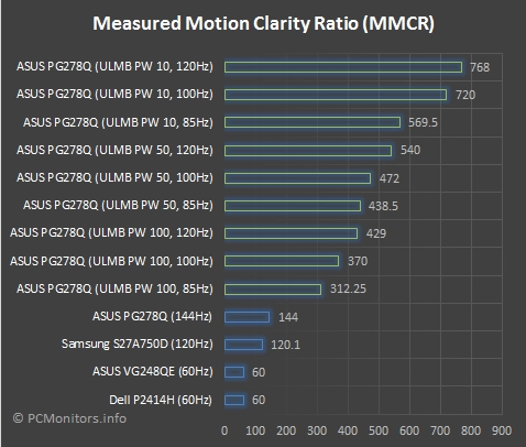
MPRT values on the PG278Q
Nvidia 3D Vision 2

Conclusion
Positives Negatives Very good sRGB gamut coverage and good shade depth and gamma handling after some minor tweaks – plus adjustable gamma modes to suit individual tastes
Weaker colour consistency and viewing angles than non-TN panels. Some minor tweaks were required – so not an optimal ‘out of the box’ performance
Good contrast without hindrance from artificial detail boosts (gamma enhancements), ‘IPS glow’ or anything of that nature We would have preferred to see a lighter matte screen surface adopted for improved vibrancy and clarity Exceptional responsiveness with well-tuned and adjustable pixel overdrive, hardly any input lag and a trio of Nvidia-specific extras – G-SYNC, ULMB and 3D Vision ULMB used non-adjustable and in our opinion overly aggressive pixel overdrive, giving some inverse ghosting in places Good ergonomics, respectable build quality and what we feel is a reasonable price for what’s on offer A very limited port selection and some slightly bold ‘Nvidia green’ touches that won’t be to everyone’s taste
![]()
