Author: Adam Simmons
Date published: February 22nd 2013
Table of Contents
Introduction
Originally designed to enhance the fluidity of active shutter glasses when viewing 3D content, 120Hz monitors have found favour for 2D viewing as well. Gamers in particular appreciate the smooth and fluid feeling that high refresh rates provide. ASUS was the first screen manufacturer to take things one step further for gamers and introduce 144Hz LCDs with their VG278HE. BenQ then followed suit with their 24” XL2411T, a model also sporting a 144Hz refresh rate.
Hot on the heels of BenQ’s latest release comes the ASUS VG248QE. This alternative from the ‘A-team’ uses the same 144Hz panel as the 11T and comes with similar ergonomic flexibility. But there is more to a monitor than just the panel. In this review we’ll be putting the ASUS through its paces in our plethora of game and movie titles as well as assessing performance objectively. Potential performance similarities and differences it is important to note that the VG248QE does have an ace up its sleeves; it’s a global release and isn’t currently missing in major markets such as the United States.
Specifications
The basic specifications reveal that this monitor uses a 144Hz TN panel from AUO with a WLED backlight 1920 x 1080 resolution and a specified 1ms grey to grey response time. The monitor offers plenty of brightness (350 cd/m2 specified) which should come in useful to overcome the dimming effects of active shutter glasses. Despite currently having no direct competition in the United States the VG248QE is priced at a rather attractive $280 or so in this region. In the United Kingdom it retails for around £300 at time of review which is a fair chunk more than the XL2411T and actually slightly more than the XL2420T with its more complete set of inputs. There is obviously a lot more to a monitor than these basic specifications and it will be interesting to see how the ASUS performs in reality.
The key ‘talking points’ of the specification have been highlighted in blue for your reading convenience.
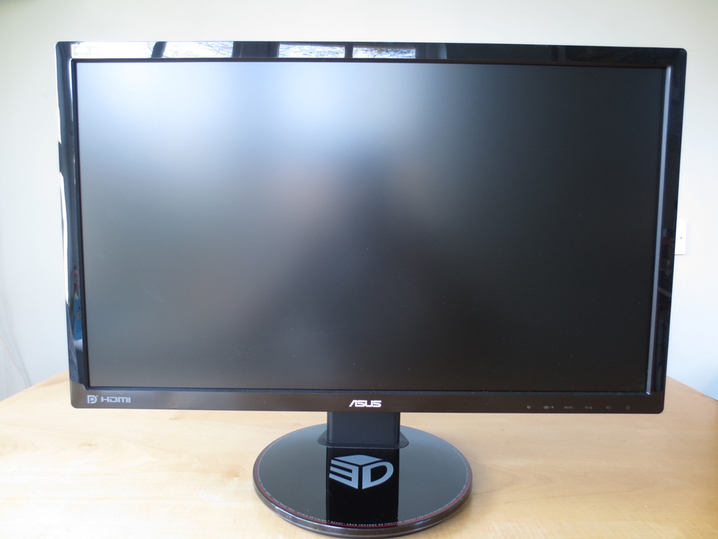
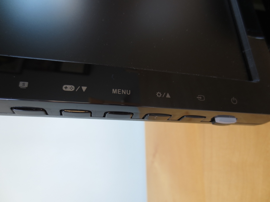
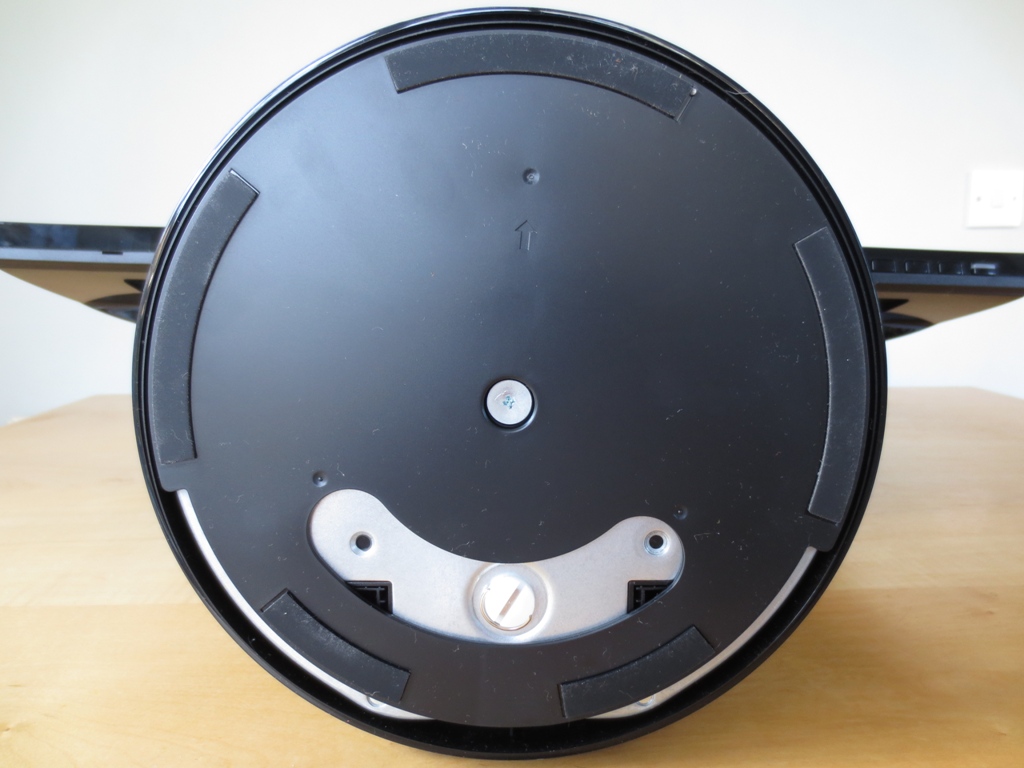
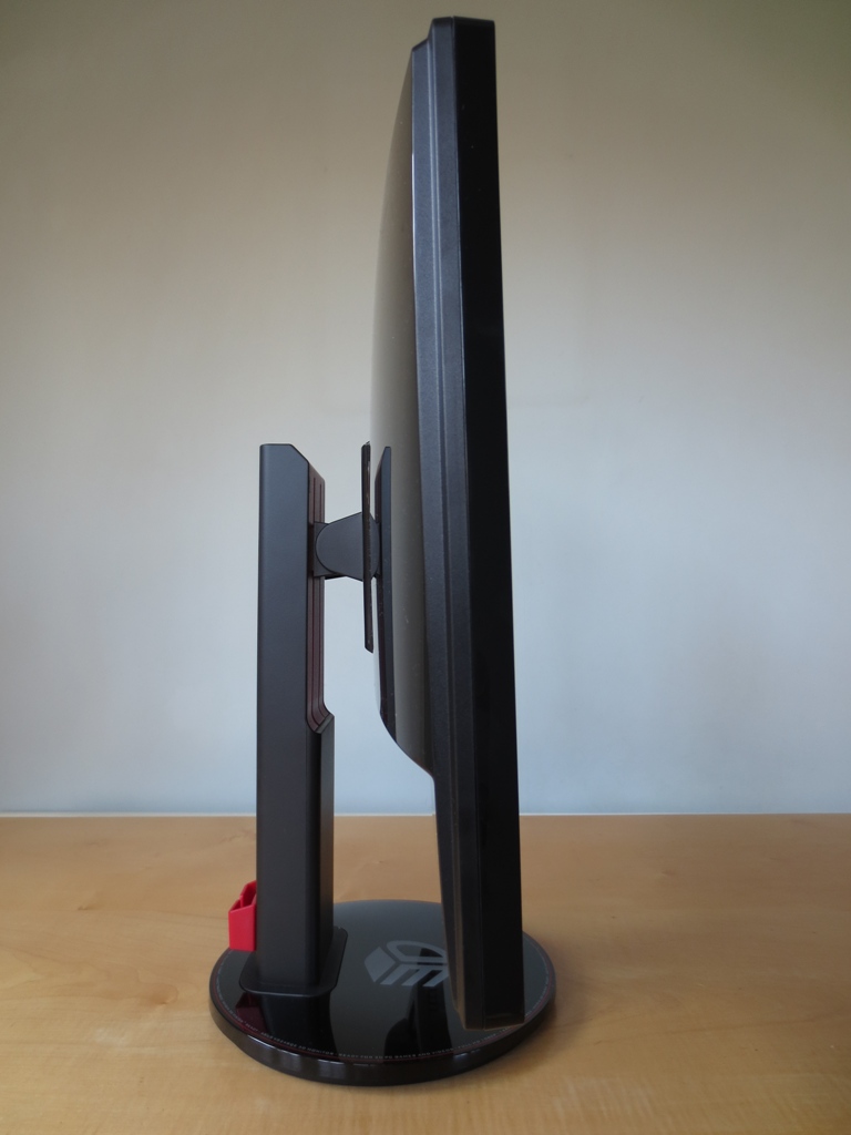
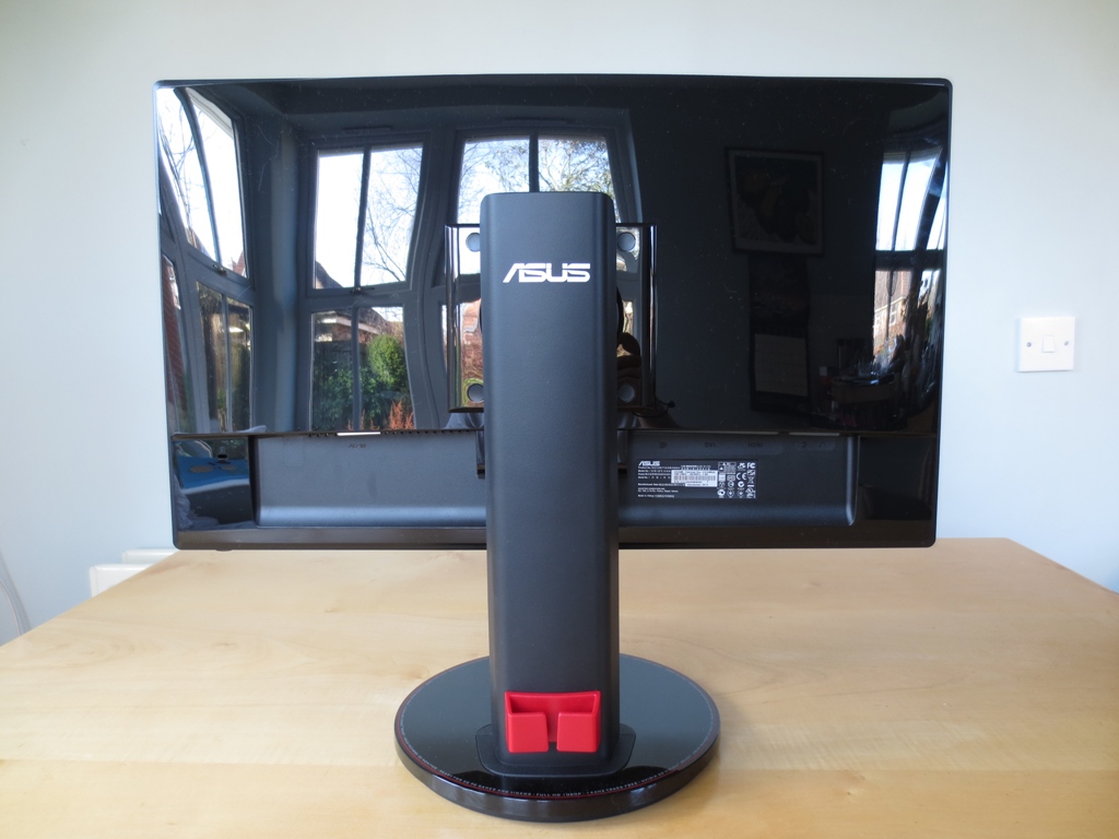
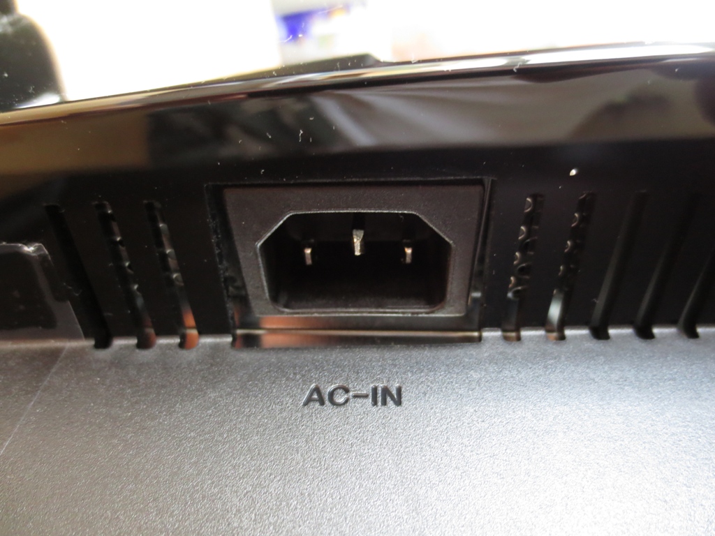
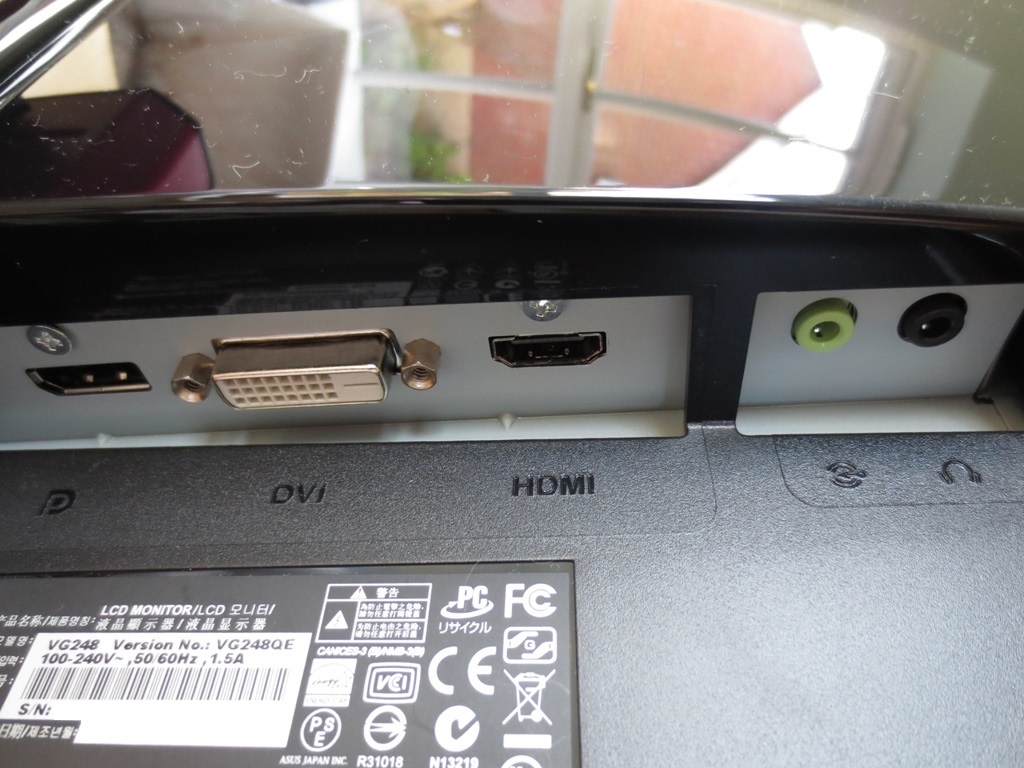
From the front the ASUS VG248QE has the homely black glossy look of many modern monitors. The bezels are a reasonable width – 16mm at the sides, 18mm at the top and 20mm at the bottom. The screen surface is regular matte with a fairly strong anti-glare treatment. This is effective at combating glare but isn’t without consequence on the image clarity and vibrancy. At the bottom right there are labels for the monitor control buttons; ‘Splendid mode’ (presets), ‘GamePlus’ (on-screen crosshair and timer)/down, menu, brightness/up, source select and power. On the underside there are buttons that can be pressed (not touch sensitive) and are nicely spread out and easy to operate. The power button extends further than the others and has a status light which glows blue for ‘on’ and amber for ‘standby’. This isn’t too bright and is not really visible from a normal viewing position, so it doesn’t distract the user. The stand base is circular and advertises some key features around the edge atop a red stripe; ‘144Hz Trace Free’ and ‘Nvidia 3D Vision Ready’ amongst others. It sits very firmly on the desk with plenty of rubber feet and a clever rotation mechanism that allows the monitor to be swiveled. Depending on how you position the monitor it can provide 45° swivel either way, 90° one way or any values in between that add up to the full field of rotation (90°). At the side the VG248QE is glossy towards the front with matte black plastic further back. It is 28mm at thinnest point and protrudes further out at the centre to around 55mm. It isn’t super thin nor is it massively chunky. ASUS haven’t gone mad with form over function and have included a nice solid stand. This offers 4.5 inches (11.5cm) of height adjustment, the aforementioned swivel as well as tilt (15° back, 5° forwards). You can also rotate (pivot) the screen into a portrait orientation – although the restrictive vertical-come-horizontal viewing angles of the TN panel limits the practicalities of this. Although difficult to see in the pictures, or when using the monitor generally, the stand has a 2-tone colour scheme going on. It has dark matte black plastic on the outside and a dark red matte plastic on the inside where the height adjustment grooves lie. At the back this theme continues with a deep red cable tidy at the bottom of the stand neck. There’s also that subtle red stripe running around the outside of the top surface of the stand base. Everywhere else on the back is black with glossy plastics covering most of the area. At the bottom left there’s a Kensington lock socket and centrally there’s the stand attachment. The stand can be removed and an alternative 100 x 100mm VESA solution used if desired. Beneath the stand attachment is a badge of honour. To the left of this is something more functional – a downward-facing AC power input. To the right is a selection of downwards-facing ports; DisplayPort, Dual-Link DVI, HDMI, audio in (line-in) and audio out (headphone jack). ASUS includes a power cable, Dual-Link DVI cable and line-in cable for you in the box. There’s also an information label just under the ports containing the serial number and date of manufacture. To round off this section we had a look at the OSD (On Screen Display). This is well laid out and easy to navigate. The main menu is split into 5 discrete sections. The first, ‘Splendid’, allows you to select a preset or reset that preset to default and remove any customisations made. The second, ‘Colour’, allows you to adjust various image attributes such as brightness, contrast and colour channels. Some features are locked out in certain presets, as explored in the proceeding section. You can also enable Nvidia LightBoost here if you have a compatible graphics card and the Nvidia 3D Vision 1 or 2 set (not included). The third section, ‘Image’, allows other attributes to be adjusted depending on the Splendid mode selected. There is then a self-explanatory ‘Input Select’ section and ‘System Setup’ which allows various other adjustments to be made. The video below gives a brief run through of the OSD and also the ‘GamePlus’ on-screen aimpoint and timer functions of the VG248QE. Using a range of familiar desktop backgrounds, icons and applications (including the Lagom website) and a Spyder4Elite colorimeter we assessed the image performance of the ASUS VG248QE. The table gives an overview of the ‘Splendid’ presets and what the monitor looks like running each. Readings for the white point and average gamma in the centre of the screen, a list of some of the OSD features enabled in each preset and a general description of the image attributes is included. We have also included our observations using our ‘test settings’ and after applying a custom calibrated ICC profile as detailed below. For the purposes of this review we used an AMD Radeon 7950 connected via Dual-link DVI for the vast majority of our testing. An Nvidia 6-series GPU connected by Dual-link DVI was also used to assess presets and determine possible adjustments to test settings. The image performance was visibly very similar on GPUs from both vendors, so this table applies to both. An additional Nvidia-specific ICC profile was also created to take into account slight differences in colour handling. Furthermore an Nvidia GPU was used for some specific feature tests included in the ‘Responsiveness’ section.
As an Amazon Associate I earn from qualifying purchases made using the below link. Where possible, you’ll be redirected to your nearest store. Further information on supporting our work.

Features and aesthetics


![]()
Calibration
Testing the presets
Preset Mode Gamma (central average) White point (kelvins) Extra OSD features Notes Scenery Mode 2.0 7219K Brightness, Contrast, Saturation, Color Temp, Skin Tone, Sharpness, ASCR. Image is piercingly bright with significant oversaturation, an excessively sharp and cold look, bleaching and poor bright shade variety (crushing). Standard Mode 1.8 7196K Brightness, Contrast, Color Temp. Oversaturation and bright-shade crushing reduced significantly. Image is overly bright and looks washed out in places with overpowering whites and many shades lacking depth. Theater Mode 2.1 7163K Brightness, Contrast, Saturation, Color Temp, Skin Tone, Sharpness, ASCR. Similar to ‘Scenery Mode’ with slightly reduced shade crushing. Game Mode 2.0 7169K Brightness, Contrast, Saturation, Color Temp, Skin Tone, Sharpness, ASCR. Similar to ‘Theater Mode’ with slight reduction in shade crushing. Image still has a bleached, overly sharp and very oversaturated look with poor shade variety at the high-end. Night View Mode 2.0 7238K Brightness, Contrast, Saturation, Color Temp, Skin Tone, Sharpness, ASCR. Image appears soft with bleaching, oversaturation and shade crushing. Contrast is very poor with no real depth to blacks and dark shades. sRGB 1.8 6549K None. By far the best balanced preset with minimal shade crushing and good white point. Still too bright with a bit of a washed out look overall. The biggest problem is lack of flexibility – you can’t even change the brightness! Test Settings (Theater Mode with various modifications) 2.1 6500K Brightness, Contrast, Saturation, Color Temp, Skin Tone, Sharpness, ASCR. Much better balanced than any of the Splendid defaults. Some shades are noticeably brighter than they should be. Overall quite a rich look with patches of oversaturation, bleaching and shade crushing persisting. Calibrated settings (Standard Mode with ICC profile) 2.2 6500K Brightness, Contrast, Color Temp. Much better colour balance. Deeper and richer without significant oversaturation or bleaching. Some shade crushing but that’s to be expected after such a rigorous calibration. Standard Mode (60Hz) 2.3 6514K Brightness, Contrast, Color Temp. Very bright by default but excellent balance and a much richer look than anything you can achieve through the OSD at 144Hz.
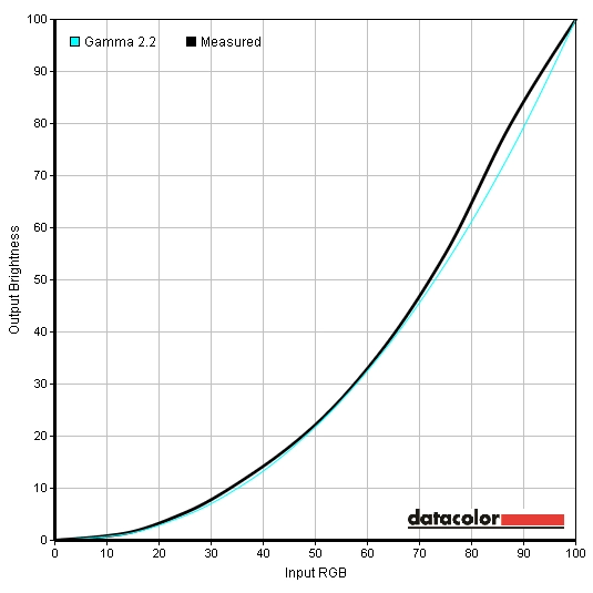
The VG248QE has a range of presets ASUS call ‘Splendid’ modes. From our testing at its native refresh rate it was clear that the image was far from splendid in any of these presets. The ‘sRGB’ preset gave the best balance and shade variety but was hampered by ASUS’ nonsensical decision to chop off all user control in this preset. You can’t even change the brightness from the default, which in this mode is around 300 cd/m2 and therefore far too bright for most conditions. Gamma was far below the 2.2 target (not helped by the excessive brightness) and gave a fairly washed out look to the image but white point was within good range of the 6500K daylight target. ‘Standard Mode’ allows basic settings such as contrast, brightness and colour temperature to be adjusted. Unfortunately it also suffered from some oversaturation in places and a bleached and washed-out look in others – not helped, again, by the poor gamma handling. The images below show the gamma curves in ‘sRGB’ and ‘Standard Mode’, respectively. As you can see the gamma curve in ‘sRGB’ follows an appropriate track but is displaced some way to the left (lower gamma value) of the ideal 2.2 curve until an input RGB of 80 (light shades). In ‘Standard Mode’ the curve tracks to the left at 1.8 but doesn’t follow the correct path and is sort of wiggly. What is very interesting (and rather bizarre) is that running ‘Standard Mode’ at 60Hz yields a much richer and better balanced image that is about as good as we’ve seen from a matte TN panel. It gives a pretty much spot on white point and average gamma of 2.3. As illustrated in the graph below the curve is also straightened out somewhat and bows in the centre rather than going wiggly at the end. Further to these observations we noted that gamma gets progressively lower (and image progressively more washed out looking) as refresh rate increases. Under Standard Mode we recorded average values of 2.3, 2.1, 2.0, 1.9 and 1.8 at 60Hz, 85Hz, 100Hz, 120Hz and 144Hz, respectively. The gamma curves followed a similar track to 60Hz with a central bow rather than a terminal wiggle (sounds like a nasty condition!) These inconsistencies aren’t usual on high-refresh rate monitors as refresh rate is increased. There are sometimes subtle changes but in this case it is almost as if ASUS tuned the image correctly at a baseline of 60Hz and didn’t bother fine-tuning higher refresh rates. Focussing again now on 144Hz, as this is what people buy the VG248QE for… The presets other than ‘Standard Mode and ‘sRGB’ tend to greatly oversaturate colours and eat away at shade variety (shade crushing). The gamma curve below, from ‘Theater Mode’, shows odd gamma behaviour which is fairly typical of most ‘Splendid’ modes. The curve is again displaced to the left but tracks normally until an input RGB (shade brightness) of around 70 where it starts shooting up with a steep gradient. At an input RGB of 85 it becomes suddenly very flat giving a sort of upside down hockey stick effect. You can see some specific shades in this preset, particularly lighter ones, are made to be almost neon in their appearance and heavily saturated. When it came to choosing a preset to modify for our test settings the ‘Theater Mode’ actually provided the best compromise. We used the following settings whilst reviewing the monitor. Sharpness= 40 (eliminates some minor fringing on text – also use ClearType) Brightness= 54 (according to preferences and lighting) Contrast= 43 (default contrast in this preset gives major shade crushing) Color Temp= User Mode Red= 100 Green= 95 Blue= 93 If you’re after accurately represented or deep and full colours at high refresh rates then there isn’t really an awful lot more you can do on the monitor’s OSD. It sort of felt like ASUS were giving us a twig to hammer a nail with. There are further tweaks you can make on a software level, the most comprehensive and effective of which involves using a hardware calibration device to create a custom ICC profile. Some applications, including some games, use their own gamma values and colour system and will either incorrectly apply (even if enforced using software) or ignore the profile. To that end we won’t be using the ICC profile for the testing in our review and will simply be using the test settings above. Having said that, it’s clear that the monitor is not really doing what it should anyway at 144Hz. Furthermore, some people may like a better solution for general desktop work and those games where ICC profiles are used correctly and to full effect. We have decided to provide some ICC profiles that users can download and use on their own systems. It must be understood that each individual VG248QE is slightly different and you may need to make some further adjustments of your own. To use our ICC profiles, do the following. Nvidia GPU users Brightness= 24 (gave 160 cd/m2 on our unit, adjust as required) Contrast= 75 Color Temp= User Mode Red= 100 Green= 90 Blue= 89 A highly sensitive luminance meter (Konica Minolta CS-200 ‘Chroma Meter’) was used to measure the brightness of white and black using a range of monitor settings. From this the resulting contrast ratio was calculated. Unless specifically stated otherwise, assume that default settings were used. The highest white luminance, lowest black luminance and highest contrast ratio are highlighted in black. The results from our test settings and calibration are highlighted in blue. The ASUS VG248QE gave some good static contrast ratios, averaging 1020:1 in ‘Standard Mode’. The peak luminance of 414 cd/m2 is very bright and comfortably exceeds the 350 cd/m2 specified. The minimum luminance recorded (Standard Mode, 0 brightness) was a relatively low 82 cd/m2. This gave a 332 cd/m2 brightness adjustment range which is excellent. Static contrast remained strong in most other presets, too, with the notable exception of ‘Night View’ mode where a dismal 514:1 was observed. The sRGB mode took a slight hit to 906:1 due to the adjustments made to colour channels. Our calibration with the ICC profile applied made further adjustments, giving an even greater drop in contrast to 842:1. Our ‘test settings’, meanwhile, involved substantial changes to various settings, giving a drop to 796:1. There is also a Dynamic Contrast mode called ASCR (ASUS Smart Contrast Ratio) that can be activated in ‘Theater Mode’, ‘Scenery Mode’, ‘Game Mode’ and ‘Night View Mode’. This reacted steadily to changes in scene brightness, dimming or raising the backlight brightness according to the overall lightness or darkness of a scene. Under this mode the monitor tended to go from very bright to extremely bright during mixed scenes and was uncomfortable to view. There is also a more conservative Dynamic Contrast feature called ‘Eco Mode’ that can be activated in any preset. This tended to give lower brightness in mixed scenes – but still became blindingly bright if there was plenty of white or lightness in a scene. The ASUS VG248QE uses PWM (Pulse Width Modulation) dimming for the backlight. The backlight pulses on and off very extremely quickly, with pulse frequency decreasing at lower brightness. Some users are sensitive to this and can suffer eyestrain or general discomfort. If they move onto a screen that doesn’t use PWM and feel ‘much better’ without changing any other viewing habits then that is a strong signal of sensitivity. Unfortunately for these users, all 120Hz+ LCDs on the market at the moment use PWM. Most users suffer no ill consequences, though, and there is quite a bit of ‘PWM paranoia’ going around at the moment. Some reports of eyestrain and discomfort that people believe comes from the use of PWM are actually due to prolonged viewing without a break and dehydration. The video below shows a ‘strobing effect’ that results from the PWM. Note that the human visual system detects a very rapid flickering during normal viewing in sensitive individuals and not a pronounced strobing – this is just to demonstrate its existence. Observing a black screen fill in a dark room revealed a small strip of bleed at the very bottom of the monitor. There was some fairly noticeable clouding and a generally patchy appearance under such conditions. This was most palpable at the right of the monitor but was also visible along the bottom where a strange striated pattern of clouding (like a faint starburst) could be seen. This ran from the inside of the bottom bezel where the minor bleed was present to around an inch above. It was certainly not the worst case of clouding we’ve seen. Some units may be better whilst others may be worse, but it’s good to be aware of the issues and not to be shocked if you encounter them yourself. A mild golden glow could also be seen off-angle under such conditions. This is not visible from a normal viewing position and is typical TN panel behaviour – nothing as pronounced as ‘IPS glow’ for example. When it comes to the uniformity of lighter colours it is best to observe the other extreme of the scale. We used a Spyder4Elite to measure the luminance of 9 equidistant white ‘quadrants’ laid out across the screen from top left to bottom right. The table below shows the luminance recorded at each quadrant as well as a percentage difference between a given quadrant and the brightest point. The luminance uniformity was not great. Under our test settings the brightest point, ‘quadrant 5’ at the centre of the screen, yielded 191.3 cd/m2. The upper left corner (‘quadrant 1’) was significantly dimmer (22% deviation) at 148.8 cd/m2. Elsewhere deviation was 8-14% with ≥16% being most common. Due to viewing angle limitations on TN matrices this isn’t as influential on the end result as it could be, but it still plays a role. For those who prefer a visual representation the contour map represents the deviation graphically. Here lighter greys represent higher luminance and darker greys represent lower luminance. We tested a range of game titles and a movie on the VG248QE to bring everything together. First up was Battlefield 3 where the contrast performance was pretty decent overall. At the low end the visibility of even minor detail was excellent. This was due to poor gamma tracking and colour values rather than supremely strong static contrast, however. Some near-black shades were noticeably brighter than they should have been. This is similar in effect to BenQ’s ‘Black eQualizer’, enhancing the visibility of objects and enemies in dark areas. It also gives a somewhat artificial and flooded look to the image. At the high end there was plenty of brightness. When looking at light colours such as sky and lamps there was also a fair bit of ‘grain’ to the image due to the relatively strong matte screen surface. The second game title tested was Dirt 3. On this title the contrast performance was quite comparable to Battlefield 3. All major detail and most minor detail (including aspects of the car interior and intricate leaf structures on trees) was visible. Things again looked slightly flooded in places, most notably in shaded areas such as the undersides of bridges. The screen surface texture was visible, preventing light sources and suchlike looking ‘pure’ and lifelike. Overall there was enough distinction between light and dark to keep things looking lively, though. We also tested the Blu-ray of The Girl with the Dragon Tattoo. Contrast performance was generally decent on this film. There was again a patchy ‘oil slick’ look to areas containing near-black shades, which are quite widespread on this film. Bright lights didn’t have that luminescent purity and lively look due to the screen surface, either. There was good distinction between black and lighter colours and visibility was good, though, so you didn’t miss any of the action. The final part of this section focuses on the Lagom contrast tests. The following observations were made on the VG248QE. The ASUS VG248QE uses a standard WLED backlight offering coverage of the sRGB colour space. The image below shows the colour gamut of the monitor under our test settings (red triangle) compared to the sRGB colour space (green triangle). The colour gamut corresponds fairly closely to sRGB. There is slight under-coverage of some green shades and extension slightly beyond sRGB for others. This is fairly typical for a standard WLED backlight. Battlefield 3 looked quite lively and vivid under our test settings. In some ways this was welcome as the dull and washed out look that the game usually has (art direction and all that) is something people often dislike. In-game markers, for example, exhibited a mix of fairly neon greens, reds and blues that looked quite fitting. Most elements looked fairly in place and not too loud or oversaturated, but there were exceptions. Rather than looking like a richer and more full-bodied version of the original shade, they looked a different shade entirely. Some of the greens of vegetation were a bit bright and garish, looking painted-on and lacking depth. There was also a lack of shade variety in some cases. Some fires, for example, looked vivid and intense – but too red without licks of more muted oranges and yellows. This was preferable to running the monitor in in its washed-out 144Hz standard mode, though, which makes it look duller than dishwater. On the second game title, Dirt 3, the VG248QE presented some shades nicely. This was particularly the case for very lively bright reds, highlighter yellows, neon greens and cyans on car bodies and around the track. Earthy browns, golden greens and khaki colours in the environment were also quite nicely represented on the whole. In amongst these pleasing shades were some less pleasing ones. Vegetation looked unnatural in places, being too bright and oversaturated. The more muted minty shades also lacked variety and the appropriate pastel hues. Some blue shades also stood out for the wrong reason, such as on water barrels and some car paintjobs, as they were too bright and lacked proper depth. Our first Blu-ray movie title, The Girl with the Dragon Tattoo, the image looked noticeably oversaturated in places. The characters’ skin tones generally had a mildly sunburnt look whilst some other shades became a bit bright and gaudy. Pastel greens and reds tended to pop out in scenes that were supposed to have a full and gritty look. Some vegetation and woody tones also looked a bit off. Most other shades looked in place, though. Character clothes and some objects in the background looked a bit less drab than usual without looking too zany. We also tested the Blu-ray of Futurama: Into the Wild Green Yonder. The monitor seemed a bit more at home on this title with many neon pinks, purples, yellows and blues looking intense. Some of the deeper purples, olive greens and reds also looked lively. These shades didn’t have the ‘painted-on vibrant pop’ you get on glossier displays, though. And unfortunately there was a noticeable lack of shade variety. The muted pastel shades were pretty much non-existent, appearing far too saturated. Although not ideal, the vivid but not overly bright or extremely saturated look of our test settings was preferable to any of the monitor’s naked presets. One thing that isn’t influenced by any monitor settings and that also eats away at distinct shade variety is the viewing angle limitation of TN panel technology. The large blocks of a single shade on this film, particularly on the characters themselves, demonstrated this nicely. A given shade appeared notably lighter further down the screen with additional but more subtle shifts in shade horizontally. To further explore some of the colour consistency limitation of the monitor we used Lagom’s viewing angle tests. The following observations were made. When it comes to the responsiveness of a gaming monitor the input lag is often the first things people want to know about. A monitor could tick all of the other boxes for gaming but then spoil the experience for some users with high input lag. To gauge a representative figure for input lag on we used a recently revised ‘camera and stopwatch’ method. The basic method is fairly limited in its accuracy. In order to improve accuracy it is possible to compare with not just one monitor of known (zero) input lag but with several others of various but known levels of input lag. This gives you a range of ‘milestones’ to work from. By coupling this with an average taken from over 120 readings you can get a fairly decent idea of where a monitor sits on the scale. Convoluted testing methodology aside, we measured just over 2ms (less than half a frame at 144Hz) of input lag on the VG248QE. Whichever way you cut it this is an absolutely minuscule amount of input lag and it won’t cause anybody problems no matter how sensitive they are to input lag. The snappy feeling and instantaneous responses to mouse movement was unmistakable when using the monitor. Even compared to a 60Hz LCD with ‘zero input lag’ the ASUS has an advantage in fluidity in the form of its refresh rate. At 144Hz the monitor is outputting 2.4 times as much visual information every second. This includes 2.4 times as frequent input polling; more rapid updates to mouse cursor position or the position or your character in the game as you move it. It also means that, if your GPU is up to it, you’ll be getting up to 144 discrete frames every second (144fps). Each frame is, therefore, displayed for less than half as long as on a 60Hz monitor. The end result is a huge decrease in visible trailing and a much more ‘connected feel’ as you interact with the game world. The difference is less pronounced compared to a 120Hz monitor, as it’s outputting 1.2 times as much information every second. It is still a difference, though, and to coin the phrase of a popular British supermarket chain; every little helps. To give a visual indication of the pixel performance on a range of typical grey to grey transitions we used a tool called PixPerAn (Pixel Persistence Analyser). The tool is set to the maximum tempo (fastest motion speed) whilst a high-sensitivity camera is used to capture any trailing. The following images were captured at 60Hz with Trace Free (pixel overdrive) set to 0, 20, 40, 60, 80 and 100, respectively. Note that these images are not to be compared directly with models we’ve reviewed prior to 2013 as a new and far more sensitive camera is now used to capture them. It picks out far more trailing than our previous camera regardless of settings and it wouldn’t be fair to compare them in this way. Quite a lot of trailing can be seen with Trace Free (TF) set to 0, with a bold primary trail and noticeable secondary trail. A slight reduction in the secondary trail can be seen at TF20. At TF40 the primary trail becomes fainter but takes on a woven appearance indicative of RTC (Response Time Compensation) errors. These don’t damage the monitor or anything like that (we’ve had people concerned about that before) but can cause various ‘overdrive artifacts’ as observed here. There is no noticeable secondary trail and no troublesome overdrive artifacts such as inverse ghosting. At TF60 (the default setting) the trailing becomes weaker still but slightly more woven – a trend that continues further at TF80. At TF100 the grey to grey acceleration is far too aggressive, creating a mess of inverse and bright trails. This setting (Trace Free 100) is essentially unusable. The images below show the results of the various Trace Free settings at a 120Hz refresh rate. TF0 and TF20 things are essentially similar in this snapshot to at 60Hz. At TF40 primary trailing is still relatively bold but the secondary trail vanishes. At TF60 there is a slight reduction in trailing intensity. At TF80 the trail is weaker still, but takes on a course woven appearance. TF100 is, again, a mess of inverse ghosting and bright trails. It would be easy to compare the snapshots here to those at 60Hz and feel that trailing is actually ‘worse’ in this case. What these freeze frames don’t show you is that the monitor is pumping out twice as many frames every second. As explained in the ‘refresh rate’ section each frame is displayed for half as long. This also means the little car used in this test is now zooming across the screen at twice the speed. The visible reduction in trailing (particularly at TF60 and above) is unmistakable and these pictures are now much less representative of what your eye actually sees than at 60Hz. Shown below are the snapshots taken at 144Hz, again with the respective increase in Trace Free value. TF0 and TF20 tell a fairly similar story to the other refresh rates. TF40 has a slightly more woven appearance compared to 120Hz but not as much as at 60Hz. TF60 is quite comparable to the corresponding snapshot at 120Hz, whilst TF80 gives a slight reduction in trailing. TF100 is, again, a mess. Don’t forget the vital importance of refresh rate. This is now 144Hz with the car moving extremely rapidly – there are 2.4 times as many frames crammed in each second as at 60Hz and 1.2 times as many as at 120Hz. The visible trailing is reduced further as a result and the snapshots become even less representative of what the eye sees. Also remember that these snapshots only look at a fairly limited range of pixel transitions. It’s important to look more broadly at how visible trailing actually is during a wide range of different pixel transitions, between different colours and at various speeds. It also shouldn’t escape your notice that obtrusive overdrive artifacts are only visible at TF100. It is good that ASUS gives such freedom to users with its Trace Free settings and that even at TF80 there are no nasty surprises in this test. To slot everything together we fired up some games. This allowed us to look at pixel responses in a broad range of scenarios and assess the practical influence of the 144Hz refresh rate and very low input lag. For this testing we used a Trace Free setting of 80 as we felt that, overall, this provided the best pixel responsiveness. Trailing was reduced in some instances compared to TF60 without any particularly conspicuous overdrive artifacts being introduced. On Battlefield 3 the ASUS gave a wonderfully connected feeling to the game. When on foot the character responded instantaneously to mouse input. The game world around the character moved seamlessly and exceptionally fluidly. By making full use of the monitor’s refresh rate and running the game at 144fps you could observe very little trailing. The environment any enemies you’re tracking retained a good degree of sharpness even when strafing, turning and running quickly. Driving vehicles on the ground and piloting aircraft was also a joy, without any troublesome trailing. There was a small amount of trailing here and there but it was very faint and short-lived. It was also mostly down to perception and eye movement, as touched upon in the following section. Even when driving like a lunatic in any environment on the game (different pixel transitions) there was no troublesome overdrive trailing, either. There were some glimpses of mild overdrive trailing here and there, such as when moving past dark objects in front of bright blue sky. This was nothing we think would concern the vast majority of users even if they know what to look out for. It’s also worth considering that on graphically intense titles such as this it isn’t always possible to run a consistent 144fps using the graphics settings you might like to use. As frame rate decreases, visible trailing increases; the monitor is displaying each discrete frame for longer and will duplicate some frames. Overdrive artifacts also become a bit more prominent in places. Even at 60fps, though, the trailing isn’t unbearable and is up there with some of the fastest 60Hz ‘pixel responders’ out there. What’s more, you still benefit from the fluid feeling of very low input lag and more frequent input polling which makes things feel very fluid still. We also tested out the monitor’s responsiveness on Call of Duty: Black Ops 2. Whilst not quite as fast-paced as some games like Quake Live, it is still a more demanding test (on-foot, at least) than Battlefield 3. It was the fastest paced FPS title we cared to test, anyway. The monitor put in a strong performance and brought the aforementioned fluidity benefits to the table. Interacting with the world was buttery smooth, whilst the very low levels of trailing kept everything in focus. There was some very mild overdrive trailing in places but it was much less noticeable than any conventional trailing it replaced. You’d have to be looking out for it and know what to look for. Enjoying the game is much less effort for those that like it. We also tested Dirt 3, a title which also benefited from the VG248QE’s fluidity. In particular, the environment and tracked retained excellent sharpness during race modes. Even on some of the fastest 60Hz LCDs cornering will produce noticeable blur. At 144Hz (and running at 144fps) there was nothing so pronounced on the ASUS. There was a touch of very faint inverse trailing in places (for example looking at some white objects lit up by headlights at night) but it didn’t jump out at all. If a user did become bothered by this then they could always reduce Trace Free back to the default setting of 60 to minimise such things further. During the insanely fast-paced Gymkhana mode the monitor performed admirably. Objects remained visible enough for manoeuvring and didn’t meld into a blurry mess. There was certainly blur but it was down more to a combination of the game’s in-built motion blur filter and simply the way the human eye tracks motion. When testing responsiveness on our movie titles we had to revert to a 120Hz refresh rate. At 144Hz we ran into exactly the same problem as in the BenQ XL2411T where the image appeared completely scrambled like white noise. This time we were using CyberLink PowerDVD 10 which is a slightly more recent version but the end result was the same as that shown in the video below. You don’t really gain anywhere near the sort of responsiveness benefits with films as you do with games by running a faster refresh rate. For one thing you aren’t interacting with them. Additionally they don’t run at a frame rate that will match the refresh rate at all – 24fps or so is standard. The Blu-ray movies we tested still had a sort of disconnected and not entirely fluid feeling to them. Fortunately they didn’t suffer from any trailing (overdrive or conventional) as a result of the monitor’s pixel responses, though. Because the frames are all shown multiple times to fill up the refresh rate there was a slim increase in smoothness compared to running at 60Hz but it really wasn’t anything to write home about. This ASUS VG248QE supports ‘LightBoost’, which is an Nvidia technology to complement its 3D Vision 2 system. Essentially what this does is to strobe the backlight on and off very rapidly to give pulses of high brightness on the ‘on’ phase. The strobes occur at 120Hz which is the optimal and currently highest refresh rate supported by 3D Vision – the glasses also ‘sync’ at this rate so the user sees all of the bright-pulse ‘on’ phases. A clever Canadian chap called Mark Rejhon (who runs The Blur Busters Blog) was the first to widely publicise the fact that this strobing can be used to beneficial effect during 2D viewing as well. LCDs normally display a given frame (sample) and continue to display it (hold) until the next frame is due – a process aptly named ‘sample and hold’. Due to the way the human visual system works, your eyes constantly move to track motion on the screen. This results in your eyes being in different positions throughout the frame, even though the image itself is static during the held frame. The smooth tracking movement of your eye itself results in perceived motion blur. This actually accounts for a significant proportion of perceived blur you might see on an LCD no matter how fast the LCD appears on paper. It’s also one of the major reasons a higher refresh rate reduces visible trailing and blur – frames are held for a shorter duration of time and your eyes are given more actual image information (frames) to focus on. Because LightBoost strobes the backlight to give rapid ‘on’ and ‘off’ pulses you only see a given frame for a fraction of the time you normally would. This shortens the length of a visible refresh and reduces the amount of time eyes are tracking across the visible period of a refresh. The end result is a significant reduction in perceived motion blur. We did test LightBoost on the VG248QE in a 2D capacity using our secondary (Nvidia) GPU and do think that it is something some users will love to use. It gave a glassy CRT-like smoothness during motion that is far beyond what an LCD would normally produce regardless of its refresh rate. It’s certainly an interesting development, but it’s not something we are currently prepared to test and discuss extensively in our reviews due to the unofficial, restrictive and forced nature in its current state. We will be looking at the effects of strobing backlight technology and the practical principles behind it in a little more depth in an upcoming article entitled ‘Factors affecting PC Monitor Responsiveness’. If you want to use LightBoost for a CRT-like 2D experience on the VG248QE then instructions are included on the thread – follow the first link in the initial post for full guidance. If you have any concerns or questions feel free to post them in the thread or start a new topic of your own. ASUS are fairly unambiguous in their marketing of the VG248QE on their website, on their printed materials and on the base of the monitor itself. This is designed to be a gaming monitor that delivers a super-responsive experience in fast paced games. With its super-low input lag, very good pixel responsiveness (with configurable overdrive) and 144Hz refresh rate the monitor does deliver a superbly smooth gaming experience. For users with Nvidia graphics cards you also gain the option of gaming in 3D if you buy either the Nvidia 3D Vision 1 or 2 stereoscopic glasses and transmitter. One of the features designed to enhance brightness during 3D viewing, ‘LightBoost’, can also be forcefully enabled during 2D viewing. It requires a little bit of software and driver tweaking and isn’t truly an ‘out of the box’ feature of the monitor. Nevertheless, for determined Nvidia users who lust after their old high refresh rate CRTs this could be what they what they’ve been waiting for. When it came to the colour performance of the monitor a bit of a mixed picture emerges. Obviously this is a TN panel and, as such, the usual colour consistency and viewing angle issues apply. Out of the box, though, the image really isn’t very nice to look at ‘even for a TN panel’. Hardened gamer or not this isn’t really something you should have to put up with. The OSD (On Screen Display) and array of Splendid image presets does allow you to tweak this and, in the process, improve things significantly. No matter what you do through the OSD, though, you sort of end up settling for something that looks ‘reasonable’ rather than something you’re truly happy with. To really rub salt into the wounds, ASUS has managed to give the VG248QE much better image performance if it’s running at 60Hz. This is the first monitor we’ve reviewed for a long time that we feel we really need to give users ICC profiles for. Although not a perfect solution it should give users a much more pleasing image on the desktop which is where pleasing colours are often most in demand. Many modern games also use these profiles correctly. In terms of design the monitor is quite well thought out. It offers a homely glossy look that many users are after whilst providing full adjustability and VESA mountability should the user wish to use it. One thing that isn’t glossy, or anything near, is the screen surface. Whilst certainly not unique in this respect, the ASUS VG248QE has been given a regular and rather ‘heavy’ matte antiglare surface. Newer IPS, PLS and some VA models have demonstrated that there is really very little benefit in such an ‘aggressive’ anti-glare surface. It provides minimal glare reduction benefit over a lighter matte surface under most lighting conditions. Meanwhile, it produces a grainy image and eats away at vibrancy regardless of lighting conditions Contrast performance was also a bit of a mixed bag on this monitor. The static contrast was quite strong and in-line with the specifications of the panel in the majority of presets. Given the sorts of adjustments you have to make to spruce up the image, though, you soon start losing that static contrast. The uniformity, at least of the unit used in this review, was also fairly poor. It was clear that contrast was not as strong in all sections of the screen as it was in the centre. ASUS also gave the monitor rather ‘funky’ gamma tracking and specific low-end colour values. This meant that dark areas in games and movies gained a patchy and somewhat artificial look rather than looking as dark as intended. Similar in effect to BenQ’s ‘Black eQualizer’, this ensures visibility in such areas is not something to worry about even if things don’t look as they are supposed to. As well as improving colour this effect is reduced when the ICC profile is applied and used correctly by a game. So with such a mixed performance, do we recommend this monitor? As always, it depends. If you are after a really responsive gaming monitor without any input lag or potentially distracting levels of inverse ghosting to worry about then this is really a key player at the moment. If you live in the United States then this monitor comes at a truly excellent price and is again easy and cheap enough to return to the big retailers. Once the ICC profiles are applied (mileage may vary) this monitor does give a pleasing performance on applications where they’re supported.
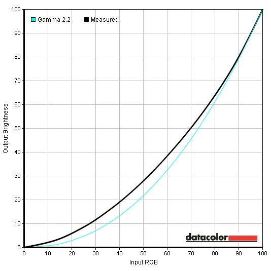
Gamma curve sRGB
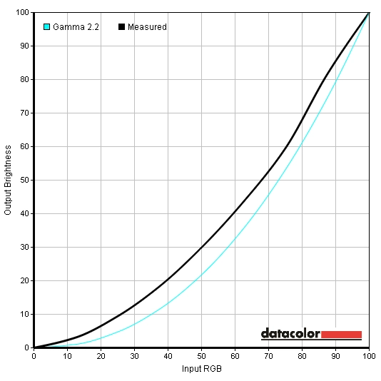
Gamma curve Standard Mode
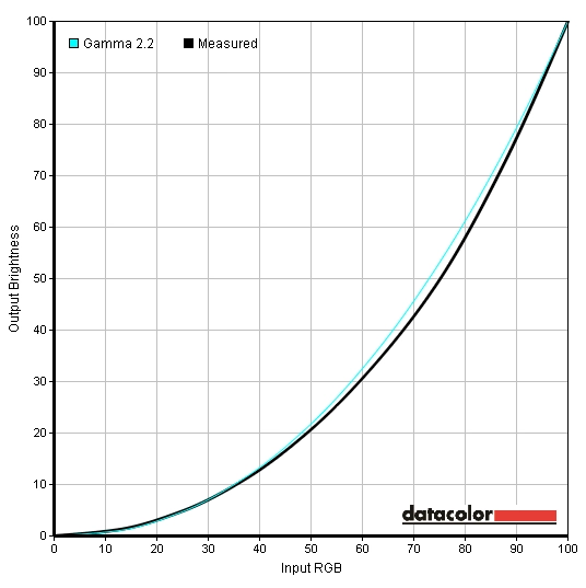
Gamma curve Standard Mode 60Hz
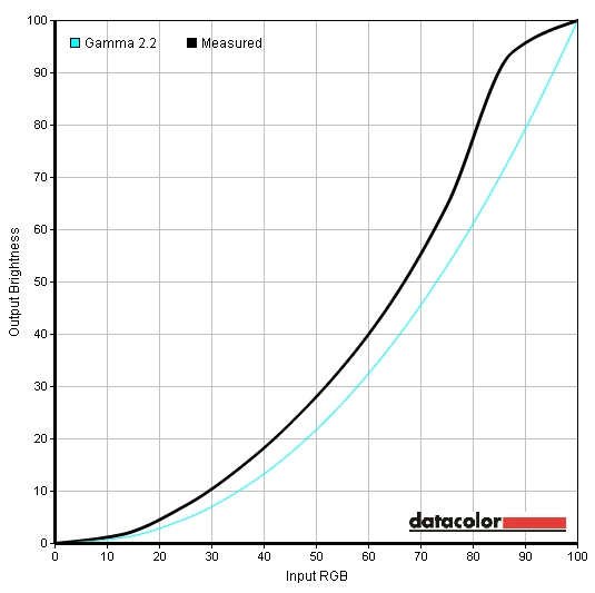
Gamma curve Theater Mode
Test Settings
Splendid= Theater Mode
The image was nowhere near ‘perfect’ but it seemed to be the best way to get the image to look vivid in all applications at 144Hz without extreme shade crushing or bleaching. There was residual oversaturation, some amount of shade crushing and some issues related to strange gamma handling but this seemed the best compromise. The gamma curve now followed a more sensible pattern but still went a bit wacky towards the upper end.
Gamma curve test settings
ICC profiles
AMD GPU users
2) Set the monitor to ‘Standard Mode’ at 144Hz. The following settings were used to create the profiles but feel free to adjust if necessary –
Splendid= Standard Mode
3) Follow these instructions on how to activate the ICC profile. In that article you’ll also find a link to download a useful and very small utility called ‘Display Profile’ which you can use to toggle between ICC profiles. This is useful if you want to switch to default colour settings (essentially no ICC profile active) when running certain applications (games etc.) that don’t use the profiles properly.
Contrast and brightness
Contrast ratios
Monitor Profile White luminance (cd/m²) Black luminance (cd/m²) Contrast ratio (x:1) Standard Mode, 100% brightness 414 0.41 1010 Standard Mode, 80% brightness 349 0.34 1026 Standard Mode, 60% brightness 285 0.28 1018 Standard Mode, 40% brightness 218 0.21 1038 Standard Mode, 20% brightness 150 0.15 1000 Standard Mode, 0% brightness 82 0.08 1025 Test Settings 183 0.23 796 Calibration 160 0.19 842 Scenery Mode 413 0.41 1007 Standard Mode 400 0.40 1000 Theater Mode 401 0.40 1003 Game Mode 400 0.39 1026 Night View Mode 401 0.78 514 sRGB 299 0.33 906
PWM (Pulse Width Modulation)
Luminance uniformity
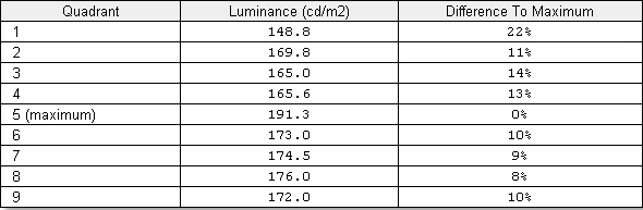
Luminance uniformity table
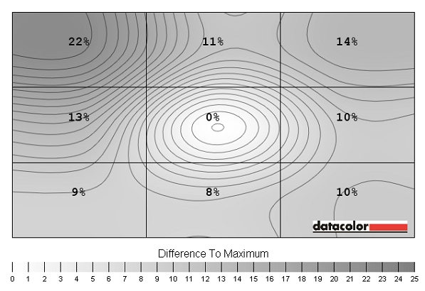
Luminance uniformity map
Contrast in games and movies
Lagom contrast tests
Colour reproduction
Colour gamut
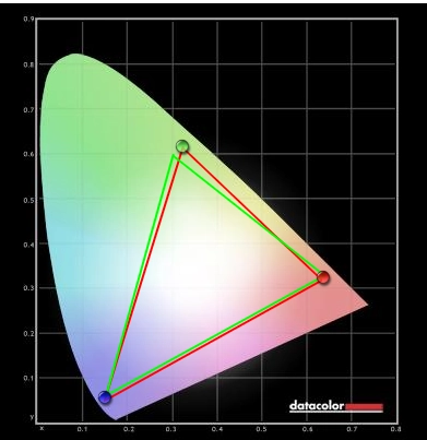
Colour gamut test settings
Colour in games and movies
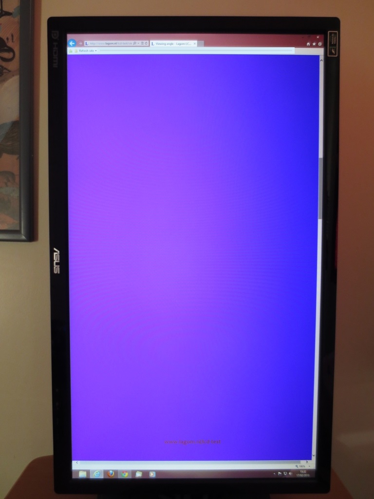
Viewing angles
To help illustrate the performance of the monitor ‘off centre’ we took a video of the Lagom text, a mixed desktop background and dark desktop background from various viewing angles. Subtle differences are difficult to capture on video, but you can see some fairly pronounced shift in contrast and colour in the video as the viewing angle changes. Note in particular a colour inversion after a certain point as the vertical viewing angle goes beyond a certain point. In the final section of the video you might also be able to pick up a bit of clouding and some of that mild off-angle golden glow that was mentioned earlier.
Responsiveness
Input lag
Refresh rate
Pixel responsiveness

Trailing 60Hz TF0

Trailing 60Hz TF20

Trailing 60Hz TF40

Trailing 60Hz TF60

Trailing 60Hz TF80

Trailing 60Hz TF100

Trailing 120Hz TF0

Trailing 120Hz TF20

Trailing 120Hz TF40

Trailing 120Hz TF60

Trailing 120Hz TF80

Trailing 120Hz TF100

Trailing 144Hz TF0

Trailing 144Hz TF20

Trailing 144Hz TF40

Trailing 144Hz TF60

Trailing 144Hz TF80

Trailing 144Hz TF100
Responsiveness in games and movies
LightBoost
Nvidia LightBoost
Conclusion
Positives Negatives Good static contrast performance across most presets and good detail shown in dark areas on games and movies
Image visibility enhancements artificially lighten some near-black shades. There were some clear uniformity issues on our review unit
The matte screen surface offered good glare-reduction and ensured reflections were never an issue The image appeared somewhat grainy from the fairly strong matte surface with reduced vibrancy and clarity ASUS gives the user a fair few image options and ‘Splendid’ presets to play with in the OSD to help fine-tune the image
Regardless of what we did on the OSD the colour setup and gamma tracking was off. ICC profiles offer much relief on the desktop and some games but aren’t a magic bullet covering all situations
A highly responsive monitor with next to no input lag, very low levels of trailing, highly configurable pixel overdrive and a 144Hz refresh rate
Occasional faint overdrive artifacts in places but nothing to worry about really. Trace Free 100 is a useless setting in practice unless you enjoy turning your games into discos
A well thought-out design with full stand adjustability, VESA mounting and the inclusion of DisplayPort, DVI and HDMI. The retail price in the United States is particularly compelling The glossy bezel is a finger-print magnet – and be careful when taking off the protective plastic wrapping as it’s a static shock hazard.
As an Amazon Associate I earn from qualifying purchases made using the below link. Where possible, you’ll be redirected to your nearest store. Further information on supporting our work.
