Author: Adam Simmons
Date published: June 7th 2013
Table of Contents
Introduction
Monitors have been getting larger over the years, but they’ve also been getting wider. Widescreen monitors are omnipresent nowadays with the 16:9 aspect ratio in particular very common. But panel manufacturer LG Display decided that things might be wide, but not wide enough for some users. One of their newest panels combines AH-IPS (In-plane Switching) for top notch colour performance with an unusual 29” screen using a 21:9 aspect ratio (2560 x 1080 resolution). This panel, referred to as ‘super widescreen’ or ‘ultra widescreen’ brings a trend seen in many cinemas to our desktops.
The AOC q2963Pm ‘myMulti-Play’ (re-launched as the AOC Q2963PQ in the US) is one of a number of 21:9 displays brought to market using this intriguing new panel. AOC’s offering is currently the cheapest model available using the technology, but as we’ve seen from their other recent monitors being relatively cheap does not necessarily mean relatively poor quality. We will be putting this screen through its paces using our usual suite or tests and will be exploring the 21:9 experience in games, movies and on the desktop.
Specifications
The monitor uses the aforementioned 29” AH-IPS panel from LG Display with 2560 x 1080 resolution. This makes use of a WLED backlight which is quoted as producing a 250 cd/m2 maximum luminance (typical). AOC quotes a 6ms grey to grey response time, indicating that grey to grey acceleration is used. This monitor is just coming to market at time of writing, available for around £360 ($460) which is a bit cheaper than its rivals.
The key ‘talking points’ of the specification have been highlighted in blue.
Features and aesthetics
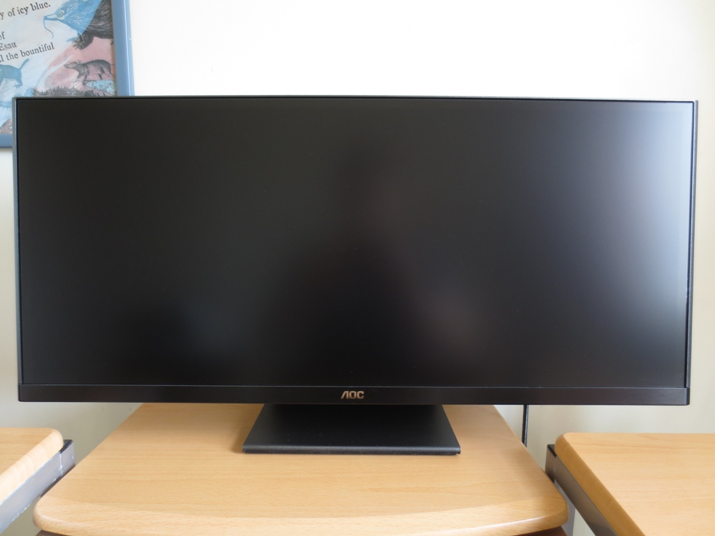
The first thing you will notice about this monitor is its impressive width and obvious bias towards width vs. height. According to our measurements the screen has a 28.75” diagonal viewable area – so close enough to be called 29”. The screen is around 26.4” wide, making it over an inch wider than a 30” 16:10 monitor like the Dell U3014. With a height of only around 11.3”, it essentially shares the vertical viewing area of a 23” 16:9 monitor.
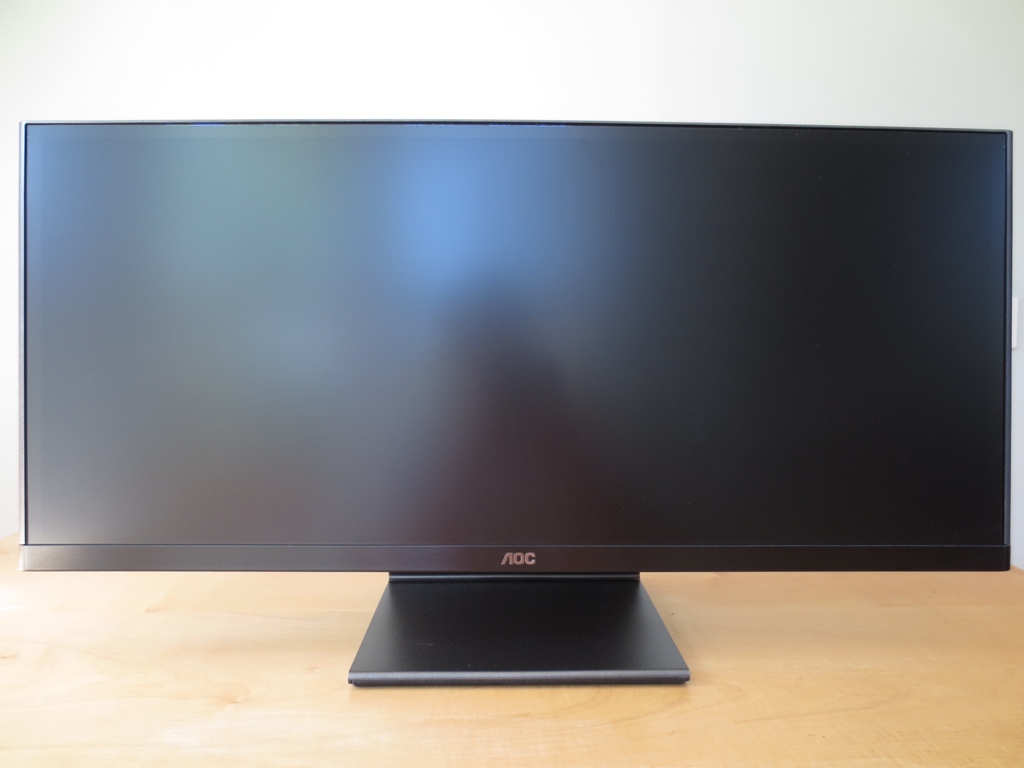
Another thing to note is the screen surface, which is a light anti-glare surface not too dissimilar to the semi-glossy surface of the Dell U2713H(M), U3014 and related models. It gives a relatively smooth and vibrant look to the image which is far less grainy than seen on older IPS models in particular.
There is a 10mm black border around the panel that is visible at the top and sides. This is the ‘inner bezel component’ which is very difficult to see when the monitor is switched off (as shown above) but is fully visible when the monitor is switched on. There is also an additional plastic border (‘outer bezel component’) which is very thin at the top but thicker at the sides. The bottom of the monitor has a brushed metal lip which covers almost all of the inner bezel. The total bezel thickness (inner + outer components) is around 20mm at the sides, 11mm at the top and 21mm at the bottom. The screen is so wide that you don’t really think about the bezels when you’re actually using it.

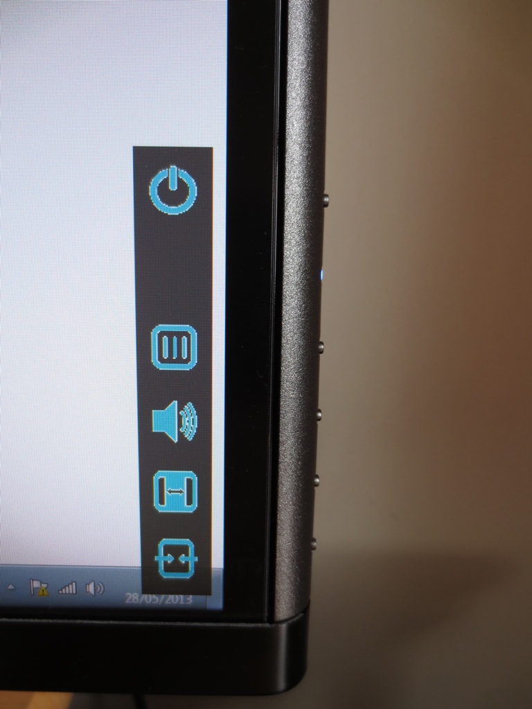
The monitor controls run vertically down the right side, facing perpendicular to the screen face. There is a power button at the top with a blue power LED (amber for standby) beneath it. This is followed by the OSD (On Screen Display) control buttons; menu/up, volume/down, aspect ratio (for non-native resolutions) and source select/enter. If any button is pressed then some on-screen pictures appear alongside them to label their function. The secondary function of each button (given above) applies when you are in the main OSD menu. The power button also has a secondary function – ‘exit’. To power off the monitor you have to push the power button twice – which stops accidental powering off of the monitor if you simply want to bring up the menu labels. The menu label icons look a bit aliased but label their function quite clearly as shown below.
The main OSD menu is responsive and well laid out into distinct sections. The currently active section’s menu icon becomes coloured so you know where you are. First up is ‘Luminance’ which lets you control brightness, contrast, gamma mode and suchlike. Next there is ‘Image Setup’ for manual image adjustments over VGA connections – this is all automatically optimised over digital connections and thus greyed out. Then there is ‘Color Setup’ which allows you to control the colour channels (Red, Green and Blue) manually or use a preset for this. You can also enable DCB (Dynamic Colour Boost) which selectively oversaturates certain shades to bring out different aspects of the image. The next section is ‘Picture Boost’ which allows you to select a rectangle on the screen that can use its own individual brightness and contrast settings – allowing you to highlight a certain part of the image. Following this is ‘OSD setup’ which lets you control the OSD language, time out period and transparency. There is then a ‘PIP’ setting which lets you use two separate sources (for example a PC connected with DP and a games console on HDMI) simultaneously. ‘Picture in Picture’ and ‘Picture by Picture’ options are both available and do what they say on the tin. The final menu section, ‘Extra’, allows you to control the source the monitor uses (manually select or automatic detection) and a few other things such as the aspect ratio for non-native resolutions. A resolution of 1920 x 1080, for example, can be stretched across the screen or run 16:9 with black bars either side. A full overview of the OSD is given in the video below.
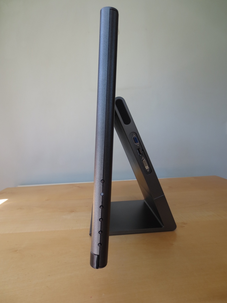
From the side the AOC q2963Pm (AOC Q2963PQ) looks like an art sculpture. The screen itself is reasonably slender but still sturdy at 22mm. The stand angles down and backwards but is not adjustable – only screen tilt is available. There are 3W speakers either side and also some ports running down the right side; VGA, DisplayPort 1.2 and Dual-Link DVI. The speakers produce a reasonable sound with a bit of a richer quality than most built-in monitor speakers will create. Volume output is also decent, although some distortion is apparent above a volume of about 60.
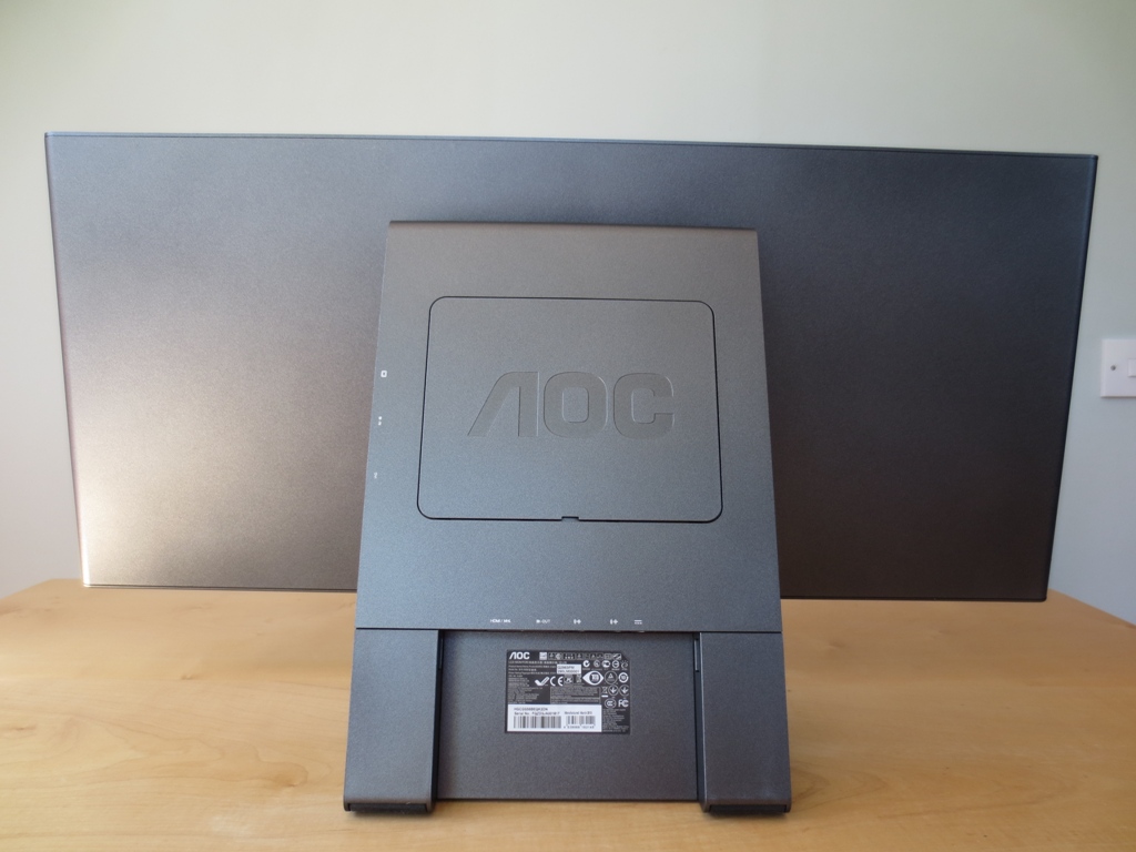
At the rear of the monitor there are two particular points of interest; the removable plastic ‘AOC’ panel in the centre and some downwards-facing ports at the bottom.
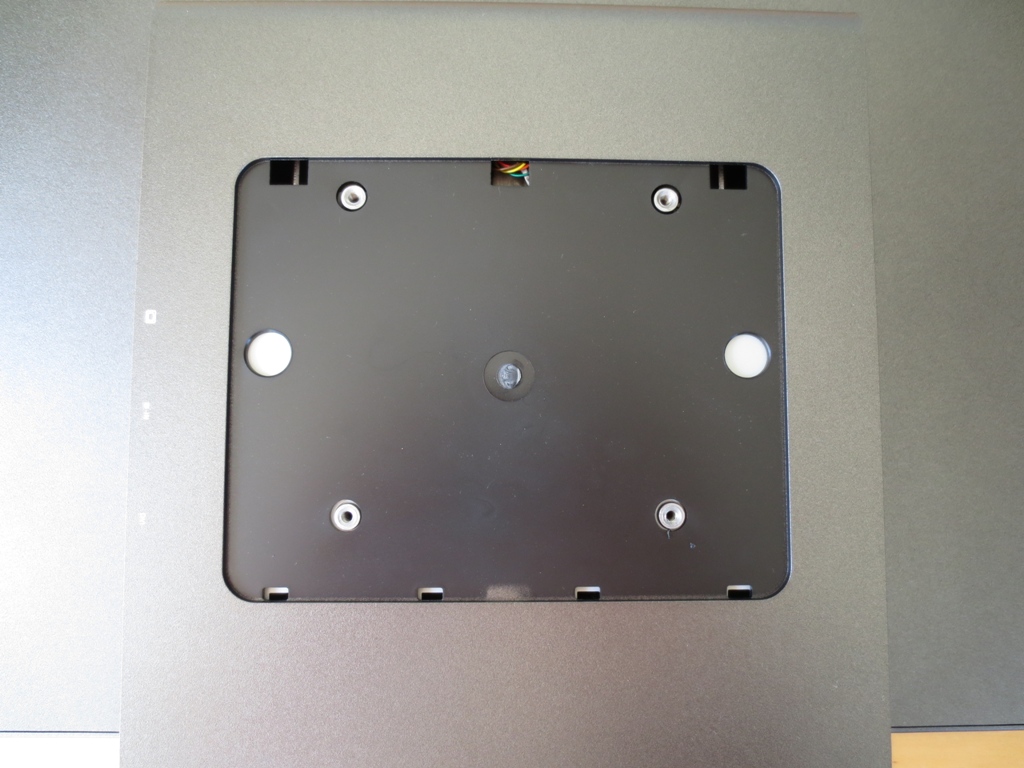
The plastic panel and the foot of the stand can be removed to facilitate wall mounting or attachment to another stand. There are 100 x 100mm VESA holes under this panel as shown below.
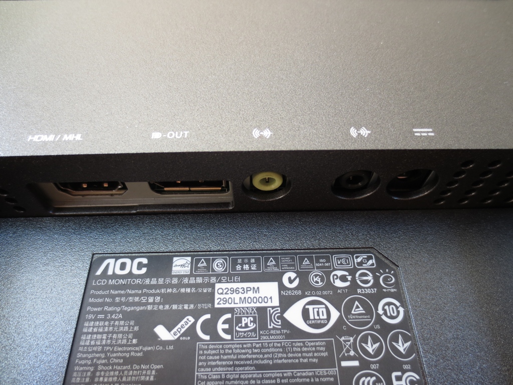
The ports, which complement those found at the side, include MHL-capable HDMI, DisplayPort out (for ‘daisy chaining’), 3.5mm audio in and out and DC power in.
Calibration
Testing the presets
Rather than traditional (and often sub-optimal) presets this monitor has ‘Eco Modes’ which set the brightness to a certain preset level. There are 3 ‘Gamma’ modes which we decided to test instead. Using a range of familiar desktop backgrounds, icons and applications (including games, movies and the Lagom.nl website) as well as a Spyder4Elite colorimeter we assessed the image performance of these gamma modes. We then made slight modifications in the OSD to achieve our ‘test settings’.
Our test system uses an AMD Radeon 7950 connected to the monitor by DisplayPort. We also hooked up a modern Nvidia GPU to check whether there were any obvious vendor-specific differences. DisplayPort and DVI yielded similar results on both GPUs with no obvious vendor-specific differences. HDMI does yield different results and really requires a little bit of work on both AMD and Nvidia systems (see the calibration section of this review). AOC only includes an HDMI cable with the monitor but unless you want to do a little bit of fiddling in the graphics driver we’d recommend using your own DisplayPort or Dual-Link DVI cable instead. The following table shows some basic readings and observations for each gamma mode and for the ‘test settings’ we settled for.
| Setting | Gamma (central average) | White point (kelvins) | Notes |
| Gamma1 | 2.1 | 7527K | Image is overly bright (default brightness is 90) and too cool-looking. Still looks rich and vibrant with no notable oversaturation and an excellent variety of shades. |
| Gamma2 | 2.1 | 7076K | Image appears slightly less ‘cool’ but a bit duller and under-saturated in places. Deep blues and greens lack intensity. |
| Gamma3 | 2.5 | 7309K | Things again look overly cool but shades have great depth and richness. Many shades look too dark really (gamma reading confirms these observations). |
| Test Settings (see below) | 2.2 | 6489K | Better balance with a rich, varied and vibrant look and no ‘cool tint’. |
The q2963Pm (AOC Q2963PQ) offers three different gamma modes, but none of them are able to achieve the target 2.2 using default settings. There is also an underlying cool tint to the image (white point too high) that persists in all gamma modes but is a little weaker using ‘Gamma2’. By lowering the brightness a bit and correcting colour balance gamma fell into place. This is how the gamma curve looked for our test settings (below), sticking close to the desired values.
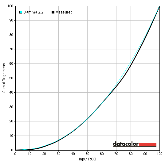
Gamma curve test settings
Test Settings
We stuck with ‘Gamma1’ for our test settings as despite the blue tint it offered the best balance. Switching from the default ‘Color Temp.’ setting of ‘Warm’ to ‘User’, ironically, got rid of the cool tint. This resets the colour channels to ‘50’ each and gets a colour temperature much closer to the 6500K target. There was a slight green tint which completely disappeared by dropping the green channel down just one notch. You have to be careful adjusting the colour channels on this monitor as even 1 notch down seems to have a fairly dramatic effect on the image. It’s important to remember that each individual unit is different so don’t expect perfection after copying these settings directly. Go by your own eyes, set the colour temperature to ‘User’ (if you aren’t happy with ‘Warm’) and gradually adjust the channels as you see fit. We went for the following on our unit. Contrast= 50 Gamma= Gamma1 Color Temp.= User Red= 50 Green= 49 Blue= 50
Brightness= 50 (according to preferences and lighting)
Contrast and brightness
Contrast ratios
We used a Konica Minolta CS-200 Chroma Meter to measure the white and black levels of the monitor using a variety of settings. From this the static contrast ratio was calculated as per the table below. Aside from the adjustments specifically mentioned, assume default settings were used. The values recorded under our ‘test settings’ are highlighted in blue whilst black highlights indicate the highest white luminance, lowest black luminance and highest contrast ratio recorded.
| Monitor Profile | White luminance (cd/m2) | Black luminance (cd/m2))) | Contrast ratio (x:1) |
| ‘Gamma1’, 100% brightness | 266 | 0.24 | 1108 |
| ‘Gamma1’, 80% brightness | 232 | 0.21 | 1105 |
| ‘Gamma1’, 60% brightness | 198 | 0.18 | 1100 |
| ‘Gamma1’, 40% brightness | 161 | 0.15 | 1073 |
| ‘Gamma1’, 20% brightness | 125 | 0.11 | 1136 |
| ‘Gamma1’, 0% brightness | 89 | 0.08 | 1113 |
| Test Settings | 182 | 0.17 | 1071 |
| ‘Gamma2’ | 241 | 0.22 | 1095 |
| ‘Gamma3’ | 238 | 0.22 | 1082 |
The contrast performance of the AOC q2963Pm (AOC Q2963PQ) was impressive, averaging 1106:1 when only the brightness was modified. The alternative ‘Gamma’ settings came at no penalty to contrast and gave very similar values. Our test settings involved switching to the ‘User’ colour mode and lowering the green channel the slightest bit. These changes did very little to harm the contrast, which stood at a very respectable 1071:1. This is really the strongest static contrast performance you’ll see from any IPS monitor so top marks in that respect. The luminance adjustment range was reasonable with the minimum white luminance we recorded standing at 89 cd/m2 and the maximum at 266 cd/m2 (a range of 177cd/m2 range covering lots of very usable values). It is possible to achieve a lower luminance by lowering contrast or colour channels, should you wish to – but this comes at the expense of contrast performance.
There is a dynamic contrast setting called ‘DCR’ (Dynamic Contrast Ratio). This allows the backlight to adjust its brightness according to the lightness or darkness of a particular image. The adjustments here are quite gradual so not to be hugely distracting but tend towards uncomfortably high brightness even when the content is quite a mix of light and dark. This isn’t an operating mode we are personally fans of but it’s there if you want to use it.
PWM (Pulse Width Modulation)
Some good news for those worried about potential flickering is that the AOC q2963Pm (AOC Q2963PQ) does not use PWM (Pulse Width Modulation) to dim the backlight. Regardless of brightness setting it is free from PWM. Some users are concerned by the use of PWM, which involves the backlight rapidly switching on and off at various frequencies to achieve lower luminance. A minority of users are adversely affected by this so it’s good to see that it isn’t used on the AOC.
Luminance uniformity
Whilst looking at a black screen fill in a dark room there was no observable backlight bleed and only very minor clouding on our unit. The clouding was so faint that it could only really be adequately picked up using a camera under absolute darkness – not something to worry about at all in other words. As an IPS panel there was the usual ‘IPS glow’ which manifests itself as a sort of silver-blue and orange sheen in the corners of the screen. If you move your head this ‘sheen’ also moves. We explore the effects of this and also show a video of this phenomenon later on in the review.
We also assessed the luminance uniformity of brighter colours by considering variation in the brightness of white. We used a Spyder4Elite to measure the brightness of 9 equidistant white ‘quadrants’ on the screen running from top left to bottom right. The table below shows the values recorded at each quadrant alongside the percentage difference between said quadrant and the brightest point. The luminance uniformity was excellent overall. The maximum luminance was recorded at the bottom left (‘quadrant 7’) with a value of 183.5 cd/m2. The centre of the screen (‘quadrant 5’) which is typically the brightest point was a mere 1% dimmer at 181.4 cd/m2. The greatest deviation from the brightest point was a pretty reasonable 8% at the top right of the monitor (‘quadrant 3’) where 168.8 cd/m2 was recorded. 6% deviation, 172.1 cd/m2, was recorded right of centre (‘quadrant 6’). Elsewhere deviation was between 1-4% which is very pleasing. Uniformity can of course vary between units but this is a good thing to see nonetheless. The contour map below represents the variation graphically with lighter greys indicating higher luminance. On Battlefield 3 there was a degree of detail loss near the corners due to the fabled ‘IPS glow’. The worst of this was restricted to a fairly small portion of the screen and it was not as extensive as you might expect from such a wide screen. Overall, though, detail levels were good. Even on dingy areas of the Paris Métro, such as inside train carriages, even fairly subtle detail was visible. Lights, sparks, flares and explosions contrasted well with their surrounding and looked nice and lively. You didn’t quite get the smoothness and ‘pop’ that you might see on a glossy screen but these elements didn’t look dull and grainy, either. On Dirt 3 there was again some slight detail loss on areas affected by IPS glow. Some really minor details were not entirely distinct elsewhere, either, but overall levels of details in dark areas was pleasing. For lighter shades things were again bright and fairly smooth, falling short of any sort of brilliant (glossy) smoothness but not appearing muted and grainy. Overall a pleasing contrast experience on this title. We also tested the monitor’s contrast performance on the Blu-ray of Skyfall. Contrast was very good overall with a good level of detail even during dark scenes. IPS glow was there to eat away at a bit of detail towards the very corners of the screen but this didn’t really detract from the experience. Bright elements on the film (flames, fireworks, the neon lights of Shanghai etc.) were nice and bright and contrasted well with their darker surroundings. These elements didn’t quite have the purity you’d see on a glossy screen but were relatively smooth (not obviously grainy). The final part of this section focuses of Lagom’s contrast tests which are good at highlighting weaknesses in contrast performance that may not be apparent in other testing. The AOC q2963Pm (AOC Q2963PQ) did exceptionally well here and put in a performance that is as good as we’ve ever seen from a non-VA panel. And actually in some respects, such greyscale variety for dark shades, better than a VA panel. The AOC q2963Pm (AOC Q2963PQ)’s colour gamut entirely covers the sRGB colour space and actually extends a little beyond this. The image below shows the colour gamut of the monitor under our test settings (red triangle) compared to the sRGB reference (green triangle). This slight ‘over coverage’ provides an extra touch of vibrancy without going to extremes. If absolute colour accuracy is essential then a colorimeter should be able to work with this gamut quite nicely, if it’s not then enjoy the vibrant but accurately represented (and not overblown) shades that can be achieved pretty much out of the box. Battlefield 3 looked as it should in the colour department with varied greens, neutral greys, an array of appropriately saturated earthy browns and good rich sky blues. The rich and warming orange flames and bright yellow sunflowers were quite striking. Other notable vibrant elements included blue, green and red in-game text and markers which looked fairly neon, without being oversaturated and simply the wrong shade. On Dirt 3 there was a sumptuous variety of shades. From the sun kissed red earth of Kenya to the lush Finnish forests, the environments looked in-place with a pleasing variety of accurately represented shades. Some of the deeper leafy greens were particularly impressive with a lush rather than yellow-tinted hue. Vibrant colours such as bold blues, oranges, reds and yellows on the car paints were also nicely represented – vivid and visually appealing with respectable ‘pop’ for a matte screen. The Blu-ray of Skyfall looked very much as it should with an exceptional variety of well represented colours. More vibrant elements such as neon pink and blue lights had good vibrant intensity without looking oversaturated. Skin tones and natural environments showed appropriate levels of saturation and an excellent pastel shade variety. The second Blu-ray we used to gauge colour reproduction was Futurama: Into the Wild Green Yonder. This provided a real feast of colour. Bright and neon colours had a good vibrant intensity whilst ‘quieter’ shades looked suitably muted. The variety of shades displayed was excellent as was the consistency at different points of the screen. A given shade showed no obvious variation regardless of whether it was at the top left, bottom right or anywhere else. This is a definite strength of IPS technology and it’s good to see it put to good effect here. Lagom’s tests for viewing angles further demonstrated strong consistency. As with Lagom’s contrast tests the performance here was pretty much flawless. That is very pleasing, especially given the considerable width of the panel. We observed the following. We have decided to split this section off onto a separate article. This is based on testing which we have done with the AOC q2963Pm (AOC Q2963PQ) but applies to any of the new ultra widescreen models. We used a similar method to that described in our other recent reviews, with a slight twist due to the monitor’s unusual resolution. Running the AOC at a non-native resolution introduced an image processing penalty (latency) due to the scaling process involved. To ensure the monitor was running in its native resolution we used a specialist CRT as a base of comparison rather than an array of LCDs. On the AOC q2963Pm (AOC Q2963PQ) there was around 2ms of input lag (around 1/8th of a frame), which means that the monitor is essentially free from any sort of signal processing delay. Be aware that input lag is not the be all and end all of felt responsiveness. Refresh rate, for example, also plays a role in how responsive a monitor feels. You wouldn’t expect a 60Hz monitor such as this to feel the same as a 144Hz monitor with similar input lag (such as the ASUS VG248QE). Nonetheless such a low level of input lag is certainly something that will appeal to gamers. To help give a visual indication of the pixel responsiveness we used a small tool called PixPerAn (Pixel Persistence Analyser). By using a highly sensitive camera and selecting the fastest available tempo on the application the pixel response behaviour (trailing) can be visualised. This test is somewhat limited in that you are only looking at static captures of what the monitor is displaying during a fairly limited range of pixel transitions. For that reason we provide some subjective analysis as well in the proceeding subsection. Even so this test is particularly useful for demonstrating differences in a monitor’s pixel overdrive (grey to grey acceleration) settings, though. The images below show how the monitor performed with overdrive set to ‘Off’, ‘Weak’, ‘Medium’ and ‘Strong’, respectively. With overdrive ‘Off’ there is a bold primary trail and slight secondary trail. Using the ’Weak’ setting removes the secondary trail captured in the first image and makes the primary trail fainter. The ‘Medium’ setting makes the trailing a bit fainter still and makes a noticeable difference outside of this test, over a wide range of pixel transitions. The ‘Strong’ overdrive setting introduces some light RTC (Response Time Compensation) errors visible as an ‘overdrive trail’ (inverse ghosting). Overall we felt the default setting, ‘Medium’, gave the best balance with moderate acceleration and no observable overdrive artifacts. The ‘Strong’ setting is also very usable as the overdrive artifacts are quite faint and not all that conspicuous. Users should feel free to experiment with either setting, but the default ‘Medium’ setting is what we settled on for the subsequent analysis. On Battlefield 3 there was a moderately low level of trailing. It was clear that pixel overdrive was being used by the monitor – not because of any overdrive artifacts (none were visible) but because trailing was not particularly extensive. Whilst on foot there was a mild and consistent blur that was largely comparable to what can be observed on even the fastest 60Hz monitors. There was some trailing in addition to this, but it was a fairly minor addition really. Turning quickly in vehicles such as the ATV (All-Terrain Vehicle) created a more pronounced blur, not too far off what you’d see on the fastest overshoot-free 60Hz LCDs. Textures didn’t become completely smeared into oblivion as you might see on a non-overdriven IPS panel nor was ‘overdrive trailing’ present as you might see from overly aggressive acceleration. On Dirt 3 there was a moderate level of trailing during the race modes (Rallycross, rally, trailblazer etc.). This was not extensive and smeary, so the track retained a decent degree of sharpness. It was also fairly consistent across different transitions, so racing at night (high contrast transitions) didn’t create any additional trailing. No overdrive artifacts were visible, either. Gymkhana gave a dizzying blur that is usual for any 60Hz monitor – but objects remained distinct from one another and no pesky overdrive trailing was visible. We also tested responsiveness on our Blu-ray movie titles. These run at around 24ps, which is a fairly limited frame rate that sort of breaks up the action and means that even a monitor with fairly weak pixel responsiveness can put in a decent performance. One thing that can spoil the experience are any conspicuous overdrive artifacts, especially problematic on monitors where overdrive is too aggressive and permanently enabled. On the AOC you can of course disable pixel overdrive should you wish, but given the excellent balance using the ‘Medium’ setting there is really no need. There were no such artifacts visible during movies and no problems at all caused by pixel response behaviour. The AOC q2963Pm (AOC Q2963PQ) is the first 21:9 monitor we have tested extensively. Like the average consumer considering screens with this unusual but in some ways enticing aspect ratio we didn’t really know exactly what to expect. Being used to 27” 16:9 monitors which we use as our reference displays at the moment we couldn’t help feeling that something nearly 3 inches wider and 2 inches shorter would not sit well. These doubts soon evaporated as we began our testing and all of us testing the monitor (that’s 3 discrete individuals with quite different tastes in displays) soon warmed to the monitor’s panoramic presence. We had some initial problems with poor flexibility on the movie software we had installed. This was not a fault of the monitor and once we got that sorted by switching to some more appropriate software the ‘ultra wide’ experience really came into its own. It worked beautifully for movies and brought the sort of cinematic feel into your home in a way that was always promised in the past (with 16:9 displays) but never quite delivered. Games were also very enjoyable, engrossing and sort of easier to play at times due to the improved horizontal field of view. Of course it isn’t all about size. The AOC delivered an excellent range of rich and vibrant colours which made games, movies and just browsing the desktop very enjoyable. The light matte screen surface also kept the image free from heavy graininess that would mute colours and spoil clarity. Contrast performance was also pleasing, with static contrast ratios as good as we’ve seen from non-VA LCDs. With just the smallest adjustments on the OSD required to formulate our ‘test settings’ the out of the box performance was essentially very good. Uniformity when displaying black and other colours was exceptional on the unit we tested and so was the consistency of colours – not necessarily something you would expect on such a large screen. Responsiveness was also pleasing with adjustable ‘pixel overdrive’ and a fairly well-balanced ‘medium’ setting that provided quite a sensible level of acceleration. Input lag, which can sometimes tarnish an otherwise attractive monitor for gamers, was also a pleasant surprise as there essentially wasn’t any. Really this monitor is about as good as 60Hz models come from a responsiveness perspective – not far off the fastest 60Hz TN panels in ‘real world use’ whilst leaving them in the dust from a colour quality perspective. Given that this is the lowest priced 21:9 offering at time of writing, it might already be on some people’s radars. Given its overwhelmingly positive performance it might well be something worth targeting.

Luminance uniformity table

Luminance uniformity map
Contrast in games and movies
Lagom contrast tests
Colour reproduction
Colour gamut

Colour gamut test settings
Colour in games and movies
Viewing angles
To demonstrate the relatively minor shift and brightness that you would experience from non-central viewing angles we have taken a video for your viewing pleasure. Towards the end of the video there is a dark background to demonstrate how IPS glow manifests itself from non-central viewing positions.
The 21:9 Experience
Responsiveness
Input lag
Pixel responsiveness

Trailing Overdrive 'Off'

Trailing Overdrive 'Weak'

Trailing Overdrive 'Medium'

Trailing Overdrive 'Strong'
Responsiveness in games and movies
Conclusion
Positives Negatives Strong colour reproduction with good vibrancy, strong shade consistency and very little ‘tweaking’ required to hit desirable gamma and white point criteria
Colour balance not perfect out of the box and colours don’t quite have that painted on glossy look (as this isn’t a glossy screen)
Strong contrast performance and excellent uniformity on our unit. Light matte screen surface gives image a clearer look than stronger matte surfaces Light colours are not completely ‘pure’ as this isn’t a glossy screen (but on the plus side, you don’t have to look at your own reflection) Input lag essentially non-existent whilst pixel overdrive is well balanced by default to reduce trailing without overdrive artifacts (it’s also configurable)
A refresh rate of only 60Hz, although absolutely standard for such a monitor, will place some people in a bit of a quandary
A decent selection of ports including DP and DP out and MHL-capable HDMI. VESA mounting is also supported with a clever removable cover and stand base
The stand that comes with the monitor only allows you to tilt the monitor and not perform other ergonomic adjustments such as changing height
The 21:9 aspect ratio and 2560 x 1080 resolution won our affections, especially for gaming and movie watching – and the price is relatively good The whole experience won’t appeal to everyone – and vertical pixel real-estate is limited compared to 27” 2560 x 1440 models
![]()

