Author: Adam Simmons
Date published: April 1st 2013
Table of Contents
Introduction
Philips are true innovators when it comes to lighting, bringing us everything from colour-changing light bulbs controlled by our phones to cutting edge OLED lighting. When it comes to their monitors, though, they are often outshone by other manufacturers with more widely available and compelling offerings. The Amsterdam-based company is undergoing some restructuring on the display side of things to try to boost their image in markets such as the UK. They are also bolstering their monitor line-up with some innovative products, such as the 278G4DHSD reviewed herein.
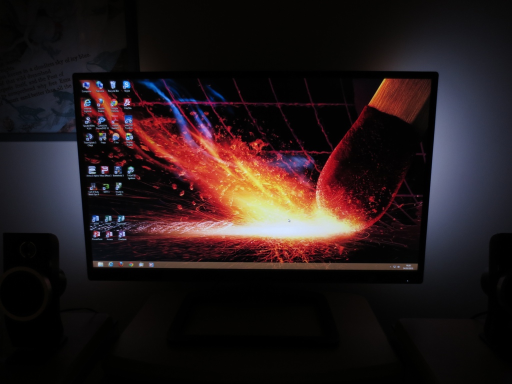
This is a 27” model which also goes by the more memorable title of Gioco 3D display. This monitor combines a glossy 27” AH-IPS screen with 1920 x 1080 resolution and integrated passive 3D. Philips have also added a very unique touch in the form of Ambiglow, a sort of dynamic bias lighting designed to intensify the gaming experience and reduce eyestrain in dark rooms. A similar system has been seen in other peripherals using the amBX monikor and on TVs as Ambilight. All of these unique features are very compelling but don’t mean anything if the monitor itself performs poorly. We put the Gioco through its paces to see how it handles itself as a monitor and not just a gadget factory.
Specifications
The basic specifications highlight the use of a 60Hz 27” AH-IPS panel with a WLED backlight, 1920 x 1080 resolution, 178 degree viewing angles and 250 cd/m2 maximum luminance. There is a grey to grey response time of 7ms specified ‘in 2D mode’ – this monitor features integrated FPR (Film-type Patterned Retarder) passive 3D, too. The monitor is priced at around £280 but isn’t widely available in the UK at time of writing. It isn’t expected to be released onto the US market at any stage.
The key ‘talking points’ of the specification have been highlighted in blue for your reading convenience.
Features and aesthetics
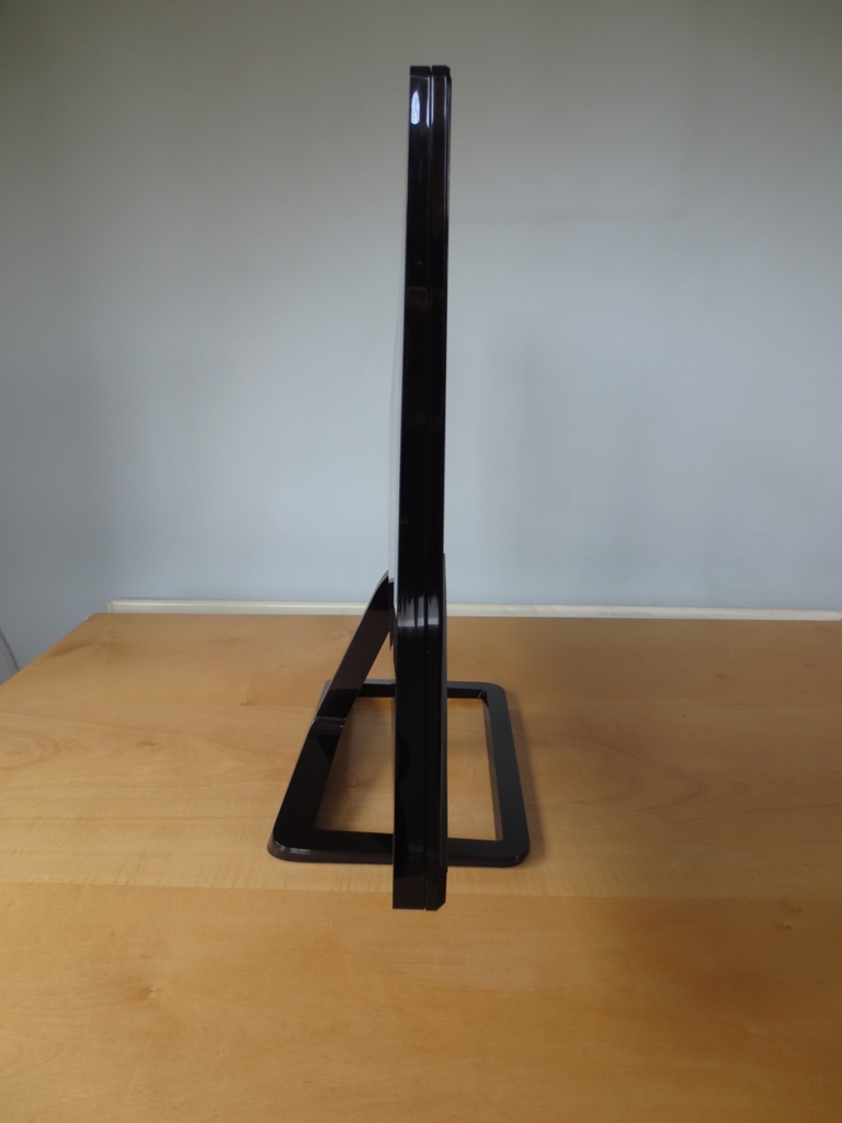
From the front the Philips 278G4DHSD adopts panel manufacturer LG’s ‘invisible bezel’ design. The monitor has a 2mm thick plastic border at the top and sides which appears at first glance to be the bezel. When the monitor is switched on (or upon closer inspection when off) it also becomes apparent that there is a 10mm border around the screen as a sort of ‘inner bezel component’. At around 12mm in total the bezel is still on the slender side.
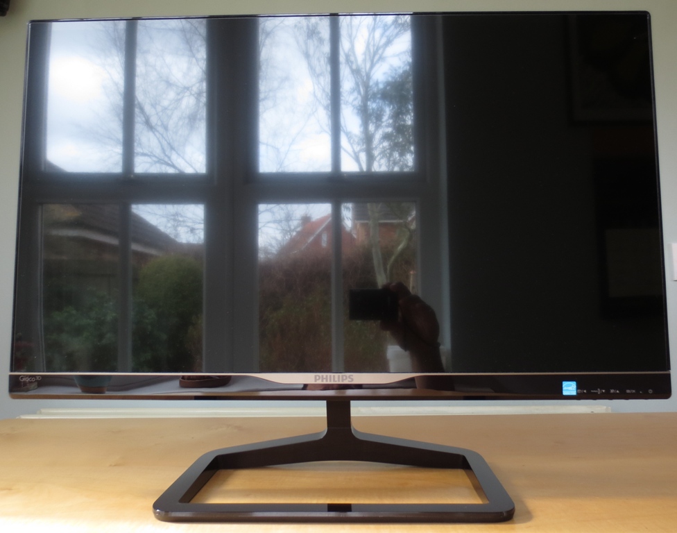
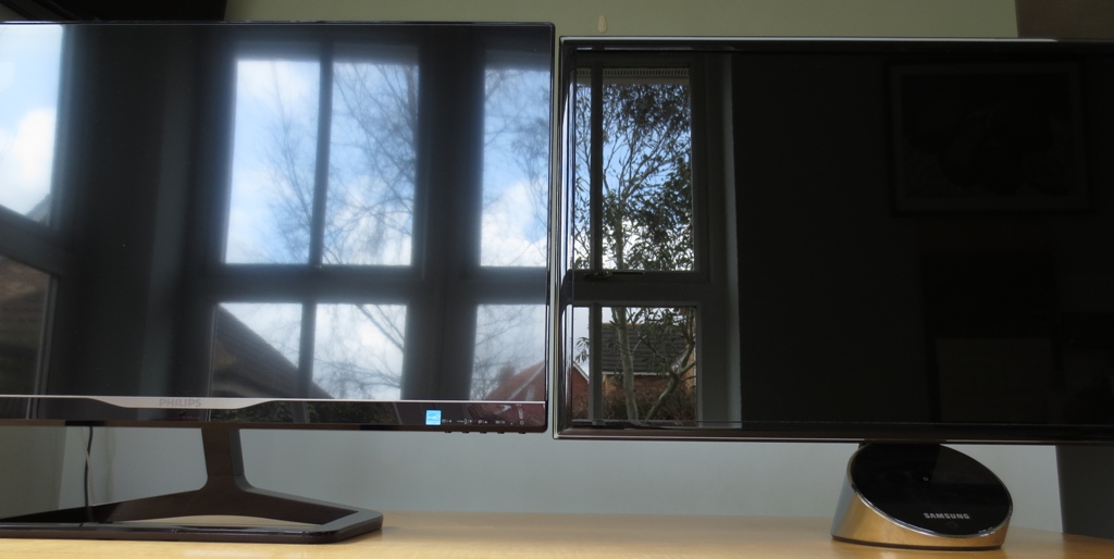
Other points to note include the interesting rectangular frame stand design, which gives the monitor 20 degrees back and 5 degrees forwards tilt, and the glossy screen surface. The screen is of course clearly reflective if bright light is striking it, as illustrated above. Philips have also applied an anti-reflective treatment which reduces reflections somewhat. The image below compares it to Samsung’s Ultra Clear Panel anti-reflective surface on the Samsung S27A750D. Strong direct light is striking the monitors, they are switched off, so this is to be considered pretty much worst case for reflections. You can see the reflection of light from the window appears softer and slightly less distinct on the Philips. On the left of the Samsung, where the light hits and the reflection is visible, detail is more defined. In essence the 278G4’s anti-reflective surface is relatively effective.
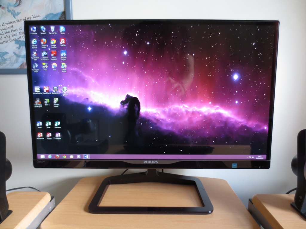
In more suitable lighting, which can include some light coming in from the side or behind the monitor, things improve. The image below shows a dark desktop background with light coming in from a window to the side. It was a moderately bright British spring day outside when this photo was taken, but no strong light was hitting the screen surface directly. Reflections are certainly visible on darker sections but are not as clearly defined or distracting as they could be.
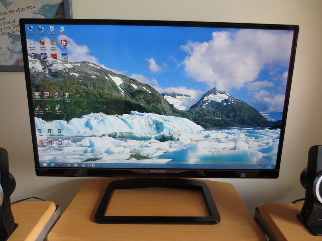
The image below shows a lighter background under similar lighting conditions. Reflections are greatly reduced.
For users who prefer to view content in dim or dark conditions, the monitor has an interesting feature called Ambiglow. The rear of the monitor has 2 sets of 5 LEDs running down the right and left sides. These shine bright light onto the wall behind the monitor, creating ‘ambience’. These lights work best if the room is dark (or dim), the monitor is around 15cm away from the wall and the wall is flat and light coloured.
There are two operating modes for the Ambiglow lights, which can be selected in the OSD (On Screen Display). ‘Auto’ independently controls the left and right side LEDs to give a colour that reflects the corresponding side of the image. It reacts very rapidly to changes in content colour, essentially flicking between different colours very rapidly. A more gradual transition would have been preferable. You can also set the brightness to ‘Bright’, ‘Brighter’ or ‘Brightest’. Even on the ‘Bright’ setting we found Ambiglow distracting in ‘Auto’ mode. The video below demonstrates why.
The second Ambiglow operating mode is ‘SmartBiasLight’. This gives a constant 6500K cool (blueish) white, simulating daylight. This is nice to have during the day if natural light coming into the room is limited (as it often is in Britain). It would be nice if you could manually select a colour or adjust the white point of the light to make it appropriate for night-time viewing. In the evening we simply turned Ambiglow off and instead used a highly configurable ‘Philips LivingColors’ mood light.
The OSD of course lets you do more than just control Ambiglow. It is controlled using buttons on the underside of the monitor, at the bottom right. We didn’t find the menu all that easy to navigate but that could be simply that we aren’t accustomed to Philips displays. The button labels seemed to be somewhat wider than the small buttons themselves and just didn’t seem to line up well. The power button is also indistinguishable from the other buttons texture-wise, meaning it can be accidentally pressed when attempting to navigate the menu in the dark. A dangerous past-time! At least the power light is agreeable, being very small and glowing a gentle and unobtrusive white to indicate the monitor is on. It gently blinks to indicate standby.
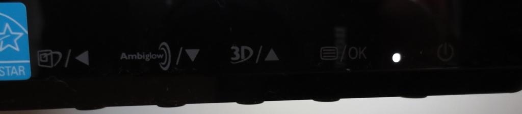
There are 5 buttons; ‘SmartImage Game preset/back’, ‘Ambiglow/down’, ‘3D mode/up’, ‘Menu/OK’ and power. The main menu has plenty of useful features and is quite clearly laid out. The video below runs through some of the main features (clarified in this PDF manual).
From the side the monitor appears reasonably thin; it lumps out a bit at the back, in the centre. It is also thinner at the top (16mm narrowest point) than the bottom (25mm narrowest point, excluding ‘lip’ at bottom).
At the back the monitor has one of the more interesting designs we’ve seen. It is glossy and black with a sort of top-down flattened pyramid look to it. At either side are the Ambiglow LEDs. The ports are arranged inside a matte black triangle above the stand neck.
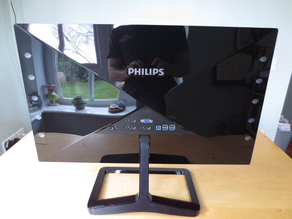
The ports have quite a multi-device focus. There’s a DC power input, audio output, 3 HDMI ports, VGA, USB 3.0 upstream and 4 USB 3.0 downstream ports. There are no VESA holes – just a little ‘hole’ at the bottom right for a Kensington security lock. Philips includes a power cable in the box and a pair of 3D glasses. They may optionally include an HDMI cable
or VGA cable but this depends on region and retailer. You will require your own USB 3.0 upstream cable to make use of the USB ports.
Calibration
Testing the presets
We used some familiar desktop backgrounds, icons and applications (including a website called Lagom) alongside a Spyder4Elite colorimeter to test out the image performance and ‘SmartImage Game’ (SIG) presets. The GPU on our primary test system is an AMD Radeon 7950 which is connected using the included HDMI cable. Initially we noticed some quite noticeable dithering on whites and certain green shades. This was caused by our AMD GPU sending out a YCbCr colour signal over HDMI instead of RGB – the latter being preferred by this monitor. This is very easy to rectify. You simply open Catalyst Control Centre and navigate to ‘My Digital Flat-Panels –> Pixel Format’. You then change from the default ‘YCbCr 4:4:4 Pixel Format’ to ‘RGB 4:4:4 Pixel Format PC Standard (Full RGB)’ as shown below.
![]()
We also tested the monitor using an Nvidia GeForce 600 series to determine whether any significant vendor-specific image variations existed. When connecting to an Nvidia GPU using HDMI the graphics card sends out an incorrect colour signal to the monitor (one designed for a TV). This washes out colours and hugely reduces contrast and black depth. This is quite a significant issue, certainly compared to AMD’s default YCbCr setting which doesn’t really mess things up too much. To rectify this and make everything look as it should for PC use the following steps should be taken in Nvidia Control Panel.
The table below gives readings for white point, average central gamma and some general observations for each preset and our ‘test settings’.
| SmartImage Game preset | Gamma (central average) | White point (kelvins) | Notes |
| Off (default) | 2.4 | 6230K | Image is very bright and cool-looking but rich and vibrant. Some darker shades are excessively deep and look a bit dim given the high overall brightness. |
| FPS | 1.9 | 6746K | Excessively sharp and very bright with significant oversaturation and high-end shade crushing. An eyesore really. |
| Racing | 2.5 | 7576K | A warmer look than the ‘FPS’ preset but similar problems. |
| RTS | 1.8 | 6051K | Better balanced but still some oversaturation and shade crushing at the high-end. Excessive sharpness again. ‘Smart Frame’ enabled by default (presumably to let you highlight the map/radar in-game) |
| Gamer 1 | 2.4 | 7598K | Very cool and bright look with selective and significant oversaturation on reds and blues in particular. Not well balanced but sharpness is correct. |
| Gamer 2 | 2.5 | 6085K | A toned-down and better balanced alternative to ‘Gamer 1’. Still noticeable oversaturation and shade crushing. |
| Test Settings (see below) | 2.2 | 6514K | A rich and well-balanced look with good brightness and appropriate levels of saturation. |
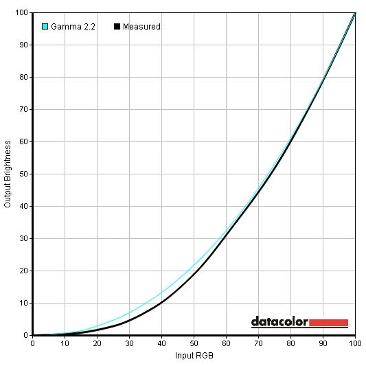
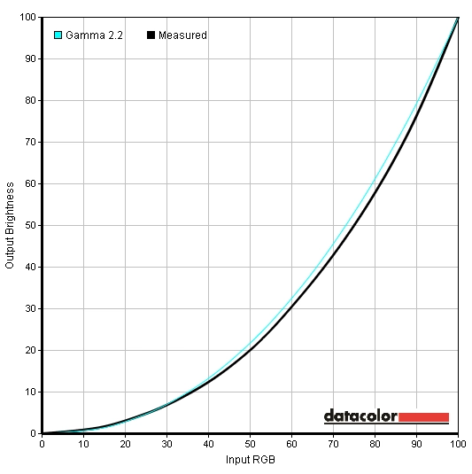
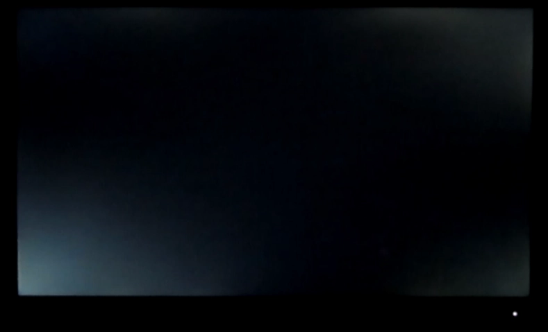
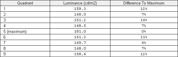
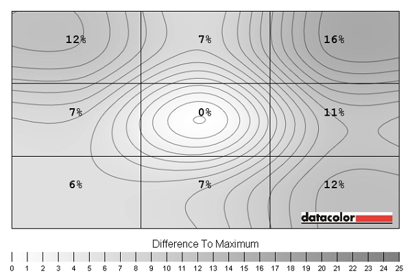
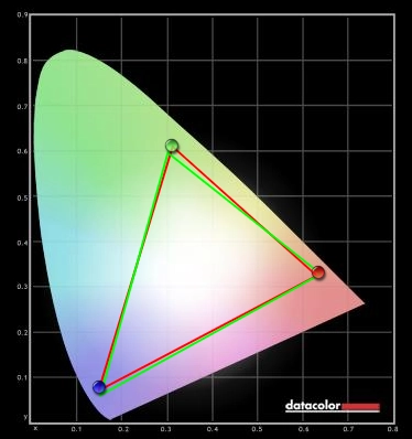
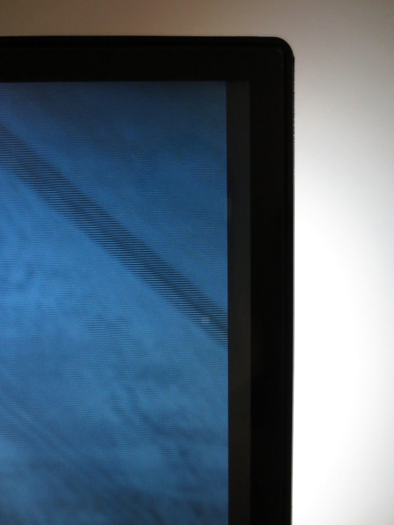
The 278G4 has a range of preset options Philips classify as ‘SmartImage Game’ (SIG) settings. These do various things to upset colour balance, shade range, contrast, sharpness and gamma behaviour. The default setting of ‘Off’ gives far superior performance and provides a rich and vibrant image. The monitor is set to maximum brightness which will be too bright for most users and lighting conditions. Things are a little too blue (cool-looking) as well, as indicated by the ‘cooler than daylight’ colour temperature. The gamma behaviour is a little strange, too. 2.4 on average doesn’t seem too bad but the distribution and tracking of this gamma is a bit more problematic as the graph below illustrates. Most noticeable in the above graph is that dark shades are significantly darker than they should be and well under the 2.2 gamma target. Lighter shades are much closer to the 2.2 target. This means that if you set a comfortable brightness for whites and bright colours then the dark shades will look too deep and in some cases dull. Perhaps counter-intuitively this can be improved by switching ‘Gamma’ on the monitor from ‘2.2’ to ‘2.0’ as shown below. Gamma now tracks more predictably and tracks closer to where it should at the low-end. Gamma tracking using some of the other settings is also a bit iffy, particularly if you enable SIG. We feel it would be less misleading if Philips simply gave their ‘Gamma’ modes arbitrary numbers. This is done by other manufacturers such as Samsung and BenQ. It’s good to have this flexibility in the first place, though. Aside from switching gamma mode we also lowered brightness and adjusted colour balance for our ‘test settings’. The following settings were used. Note that each individual unit will differ, as will personal preferences. These settings should only be used as a guide, feel free to experiment further. Brightness= 60 (according to preferences and lighting) Contrast= 50 Gamma= 2.0 Color= User Define Red= 95 Green= 95 (93 for Nvidia GPU) Blue= 100 The brightness of white and black was measured using a Konica Minolta CS-200 ‘Chroma Meter’. A variety of monitor settings were tested including the SIG (SmartImage Game) presets. From this the resulting contrast ratio was calculated. The highest white luminance, lowest black luminance and highest contrast ratio recorded are highlighted in black. The results from our test settings are highlighted in blue. The Philips 278G4DHSD performed well here with SIG disabled, averaging 1005:1. The peak luminance of 276 cd/m2 is more brightness than most users will need and slightly exceeds the specified 250 cd/m2. Minimum luminance is also good – we recorded 58 cd/m2 at a brightness of ‘0’ and SIG disabled. This gives a luminance adjustment range of 192 cd/m2 which isn’t as high as some other monitors but gives you flexibility where it counts with good minimum and maximum brightness. Our test settings involved changes to colour channels and gamma mode which did lead to a slight drop in contrast to 958 cd/m2. This is still good. Some of the SIG presets caused more substantial drops in contrast, particularly ‘FPS’ and ‘RTS’ which yielded 416:1 and 454:1, respectively. Philips also provides a ‘SmartContrast’ dynamic contrast mode. This is great for users who don’t mind scorching their retinas. It’s also good if you feel that the constant changes of colour from the Ambiglow LEDs aren’t distracting enough and want the backlight to constantly adjust as well. It is no secret that we aren’t fans of ‘Dynamic Contrast’ modes, no matter how well implemented they are. To Philips credit they let users enable ‘SmartContrast’ regardless of which preset and other settings you’re using. They have also gone for a more gentle approach to adjustments which aren’t as distracting as some of the rapid changes from other manufacturers. Given how rapidly scenes can change and the tendency towards high brightness even during mixed images this can be both a blessing and a curse (that’s if you find such modes appealing in the first place). The Philips 278G4DHSD uses PWM (Pulse Width Modulation) to dim the backlight to below 100% brightness. The backlight rapidly flicks on and off extremely rapidly with a decreased and hence potentially more noticeable pulse frequency at lower brightness. This is extremely common and most users aren’t affected at all by PWM. There is also a fair bit of paranoia surrounding PWM at the moment. Some users are sensitive to it, though, and can experience eyestrain and general discomfort after even relatively short periods viewing a monitor that uses PWM. Observing a black screen fill in a dark room revealed some areas of backlight bleed and moderate clouding. This was particularly noticeable in the bottom left of the screen. The image below represents fairly well what you could observe first-hand. It was taken from a few metres back to eliminate the influence of ‘IPS glow’ (discussed subsequently). Not all units will suffer from this level of bleed and clouding but it can be off-putting seeing this highlighted in such an image. We didn’t find it detracted too much from the viewing experience but it would of course be nice if it wasn’t there. The clouding was accompanied by ‘IPS glow’, a phenomena related to light behaviour in the IPS matrix and affecting similar regions of the screen to the clouding. This affects all units in much the same way and is visible from a normal viewing position and distance. Its effect on the image under such circumstances is described shortly. The intensity of the glow increases from sharper viewing angles, which can be seen in the ‘viewing angles’ video further on in the review. It’s also important to consider lighter colours, best exemplified by considering the uniformity of ‘pure white’ at various points on the screen. We used a Spyder4Elite to measure the luminance of 9 equidistant white ‘quadrants’ laid out across the screen from top left to bottom right. The table below shows the luminance recorded at each quadrant and the percentage difference between a given quadrant and the brightest point. The luminance uniformity was quite reasonable overall. The maximum luminance was recorded at ‘quadrant 5’ in the centre of the screen, which was 181.0 cd/m2 under our test settings. ‘Quadrant 3’ at the top right of the screen showed the most significant variation from this, being 16% dimmer at 151.2 cd/m2. The remaining corners of the screen showed 11-12% deviation from centre with single digit variation in all other quadrants. Uniformity can certainly vary between units but let’s assume this is a good representation of the wider picture. For general use and even some colour-dependent tasks like hobbyist photo editing this sort of variation is not really a problem and very common for monitors of this price and market orientation. For any more ‘serious’ colour work this sort of variation is not ideal and models with some sort of uniformity compensation (or specified uniformity) would be preferred. If you prefer a graphical representation of this variation then take a look at the contour map below. In this graphic the lighter the grey, the higher the luminance. On Battlefield 3 there was a good level good dark detail centrally, but there were some problems towards the corners. Due to the moderate clouding at the bottom left corner detail was lost and the image appeared quite flooded. There was some loss of detail in the other 3 corners due to IPS glow, but all major detail could be seen. High brightness elements such as lights, fire, flares and tracers ‘popped out’ very well and appeared very pure thanks to the screen surface. Very faint horizontal lines from the FPR polariser were sometimes visible if you stopped to look for them but were not all that distracting when playing the game. These lines are visible in any applications (even during 2D viewing such as this) and are described in a bit more detail in the ‘3D performance’ section of the review. Dirt 3 gave a similar contrast performance to Battlefield 3. There was loss of ‘dark detail’ in the corners, particularly the bottom left. In other areas of the screen a good level of detail was visible with reasonable visibility of subtle dark detail. Different textures in the car’s cockpit, for example. The high-end was quite impressive in purity and intensity with elements such as car lights being particularly impressive. We also tested the Blu-ray of the latest Bond film, Skyfall. This movie is shot in an ultra-wide format and as such gives black bars at the bottom and top of most monitors (including those with a 16:9 aspect ratio, such as this one). The black bars didn’t appear all that black in a dark room and essentially harvested the IPS glow, backlight bleed and clouding. On the plus side the image itself wasn’t greatly affected by such things – perhaps just a little at the problematic bottom left border. There was some loss of detail in the darkest scenes, such as those set in Shanghai at night. Overall the contrast performance was pleasing, though, particularly at the high end. Fireworks and lights at night really exploded from the screen. The final part of this section looks at the Lagom tests for contrast. The following observations were made on the 278G4DHSD. The Philips 278G4DHSD uses a standard WLED backlight offering coverage of the sRGB colour space. The image below shows the colour gamut of the monitor under our test settings (red triangle) compared to the sRGB colour space (green triangle). The colour gamut corresponds closely to sRGB with just a touch of under-coverage in the blue region and coverage of some extra green shades. Despite the fairly muted colour pallet, there were some nice vibrant elements in Battlefield 3 that stood out on the 278G4. Flames had a warming and lifelike orange glow and in-game markers had a good neon look to them. The engineer repair tool also had a brilliant blue glow to it. This was not quite as striking as we’ve seen on some other glossy monitors (with slightly wider colour gamuts) but was impressive nonetheless. The environments also had a good natural look to them, as they should look within the confines of the game engine. Rocky greys and earthy browns had good neutrality. Subtle woody tones and an array of greens were also displayed well. Dirt 3 gave the monitor a chance to show off its pleasing colour range and consistency. The environments in the game looked appropriately natural on all sections of the screen, with subtle variations maintained throughout. Some of the more muted greens of vegetation were good examples of this. Woody browns also showcased this variety and consistency nicely, helping give shades their own accurately represented identity. Some more vibrant colours in the game, particularly on the car bodies, were also handled well. Some of the deep blues and greens could have done with perhaps a touch more depth but the overall ‘pop’ was very good. We also tested our Blu-ray film titles. Futurama: Into the Wild Green Yonder allowed the Philips to show off its strong shade variety. The range of distinct colours was excellent, from vibrant and striking neon pinks and greens to pastel blues and oranges. It was also immediately obvious that this was no TN or VA panel. Colours remained distinct, solid and accurately represented regardless of their on-screen position. Large areas of a single shade often filled the screen, which highlighted any potential weakness well. There was a fairly noticeable lightening of shades towards the problematic bottom left corner and some very minor lightening in other spots too. Not all units will have such backlight uniformity issues, of course. Skyfall looked very much as it should. Skin tones appeared appropriately saturated and suitably varied. Shade variety was strong with even minor differences (such as similar reds and browns of building roof tops) displayed nicely. Environments also shared this variety and ‘shade identity’, looking very natural. Some of the deeper green vegetation could have perhaps looked a little lusher but the array of greens really made up for this. The more vibrant elements in the film included bright orange explosions and the neon lights of Shanghai. These looked suitably vivid, with neon lights popping out well with particularly eye-catching blues, oranges, pinks and reds. To further explore the strong colour consistency of the monitor we used Lagom’s viewing angle tests. The following was observed. To gauge a representative figure for input lag on we used a recently revised ‘camera and stopwatch’ method. The basic method involves using a camera at high shutter speed to capture the image of a counter (stopwatch) being displayed simultaneously on both an LCD and CRT in clone mode. It is very limited in its accuracy and can only really give a rough idea of input lag; repeat readings give vastly different figures and an average over a large data set is recommended. To improve accuracy we take over 120 readings, and compare with not just one monitor of known (zero) input lag but with several others of various known levels of input lag. This gives you a range of ‘milestones’ to work from. Whilst not as accurate as an oscilloscope, which can be used to determine an absolute reading for signal delay (‘raw input lag’), you still get a decent idea of where a monitor sits on the scale. On the Philips 278G4DHSD we measured just over 4ms (quarter of a frame), which is very low indeed. Whilst not the only driver behind how responsive a monitor feels (refresh rate is also important) this is certainly one less thing to worry about. We had the monitor’s 3D mode and Ambiglow feature disabled for this reading. The 3D processing (especially if offloaded to the GPU) can add considerable input lag as we explore shortly. Ambiglow seems to process things externally, even in its ‘Auto’ mode, so doesn’t influence input lag. We used a small utility called PixPerAn (Pixel Persistence Analyser) to help illustrate pixel response performance over a set of typical grey to grey transitions. The fastest motion speed selectable in the tool was used to represent very rapid motion. A highly sensitive camera was used to capture any trailing on the monitor resulting from its pixel responses. The following images were captured with ‘Smart Response’ (Philips’ configurable grey to grey acceleration) set to ‘Off’, ‘Fast’, ‘Faster’ and ‘Fastest’, respectively. With ‘Smart Response’ set to ‘Off’, a bold primary trail and faint secondary trail is visible – typical signs of very low or no grey to grey acceleration. With this set to ‘Fast’ the secondary trail disappears and the primary trail becomes fainter. The ‘Faster’ setting is similar to ‘Fast’ in this example, maybe a bit lighter. ‘Fastest’ on the other hand yields strong overshoot (inverse ghosting), a result of overly aggressive acceleration. These snapshots certainly don’t tell the whole story as they only look at a fairly limited range of pixel transitions. They are also just snapshots looking specifically at pixel responsiveness, not taking into account refresh rate, perceived motion blur from your own eye movements or anything like that. They are still very useful as a point of comparison, particularly for the behaviour of the different ‘Smart Response’ modes. ‘Fast’ and ‘Faster’ look similar in these snapshots, but when actually using the monitor for gaming (broad range of pixel transitions) the ‘Faster’ mode was certainly optimal. We assessed the responsiveness subjectively using a range of game and movie titles. On Battlefield 3 a moderately low level of trailing was evident whilst on foot. This pace of action was essentially handled well from a pixel response perspective. Driving (or flying) a vehicle upped the pace of action and increased the level of trailing. This was not at all excessive and certainly an improvement over IPS models with weaker overdrive. No conspicuous inverse ghosting was present either, so overall a nice balance was struck. You didn’t get the responsive look and feel of a 120Hz LCD, but you got imperceptibly low input lag and well-balanced grey to grey acceleration. On Dirt 3 there was a moderate level of trailing, particularly noticeable when cornering. This was fairly predictable and didn’t prove overly distracting. No obvious overdrive trailing of ‘smeary’ trails were present either. The insane pace of action of Gymkhana on Dirt 3 is enough to strain even the fastest 60Hz LCDs and it did so here. Even so, there was no texture breakup or other artifacts that would completely spoil the experience. There was just a dizzying blur that adds to the true Gymkhana experience. We also tested the responsiveness of the monitor on our movie titles. Because these run at around 24fps they are limited in their fluidity and are never as strenuous for testing responsiveness as games. Even so, they are certainly good at highlighting any obvious artifacts from excessive grey to grey acceleration. There were no such artifacts and no trailing that could be attributed to the monitor’s pixel responses. A good showing from the monitor there then. The 278G4 uses an LG AH-IPS panel with integrated 3D functionality. The technology used is called FPR (Film-type Patterned Retarder) which uses polarised light to feed each eye a separate image, through a pair of 3D glasses. The FPR layer actually has horizontal lines that are faintly visible on the monitor during normal 2D viewing. Not everyone will notice these, but they are there. If you put on the 3D glasses or wear spectacles that have an anti-glare coating on the lense (this also polarises light) then these lines become much more visible and obtrusive. The glasses which come with the monitor are a no-frills affair, as shown below. They are light-weight, don’t need batteries and are relatively easy and cheap to replace or bolster with additional pairs. In fact ‘RealD’ 3D glasses used in many cinemas polarise light in much the same way and work with this monitor. Not only are the glasses less ‘precious’ (and expensive) than active 3D shutter glasses, such as those used on certain Samsung monitors and for Nvidia 3D Vision, they also don’t flicker due to their passive nature. There are definite advantages to this passive 3D system, but there are also drawbacks. Most pressing of these is the minimum viewing distance required to give a relatively strain-free 3D effect. Regardless of ‘3D mode’ (2D-3D conversion, TriDef or other application-specific stereoscopic mode), depth and separation settings, the absolute minimum viewing distance was around 1.5m (5ft). For PC use that is fairly impractical unless you have a strangely deep desk. Even then, the 27” screen starts to look fairly diminutive from such a distance. Practicalities and loss of immersion aside, we had a look at our game test titles in the third dimension. First up was Battlefield 3 using the integrated 2D-3D conversion. This gave the title a nice 3D effect with fairly decent depth. There were no issues with troublesome crosstalk and the pixel response behaviour was much the same as in 2D mode. Because this is a passive 3D technology and everything is done by the monitor there was no reduction in frame rate when using 2D-3D, either. The 3D glasses do dull the image somewhat but not to the extent of any active shutter glasses we’ve tested. You can turn up the brightness to compensate but things never look quite as vibrant as normal. Another slight issue is that there are 7mm black borders on either side of the image when running the 2D-3D conversion mode, as shown below. The 3D effect was particularly effective on the mission ‘Going Hunting’ with the F/A-18 Hornet cockpit, canopy, controls and HMD (Helmet Mounted Display) all sitting in various different (and correct looking) planes. Clouds, flares, missiles and aircraft outside also had good displacement to them. General ‘on the ground’ action also looked quite natural with decent depth and no show-stopping issues with crosstalk or convergence. For correct convergence, though you mustn’t be too close to the screen. Some users might also want to turn the depth up a bit through the OSD, but be aware that this can increase the likelihood of eyestrain. We also tested Battlefield 3 using the TriDef 3D Ignition software that came with the monitor, upgraded to the latest available version online. The monitor was set to ‘3D (Auto)’ which works correctly with TriDef. By default the scene had much more depth, looking fairly similar to 2D-3D conversion with a depth setting of ‘5’ (rather than ‘3’ which we tested above). This was more straining on the visual system as the discrepancy between what each eye was seeing increased. There were no black borders around the image and no crosstalk issues. The GPU was now doing additional processing, which significantly reduced frame rate (by around 50% in some cases) and also seemed to introduce a fairly substantial degree of additional latency. 2D-3D conversion doesn’t affect frame rate and doesn’t have that sort of effect on latency. We also noticed some convergence issues on some gunsights and the HMD of the Hornet, making these difficult or impossible to focus on. Maybe we were slightly too close to the screen – unfortunately there was a wall stopping us viewing any further back than about 2m. The second game title we tested in 3D was Dirt 3. 2D-3D conversion worked in a similar way, adding some good extra depth with things looking pretty natural. The car interior was particularly impressive with a good depth effect on the steering wheel, dash board and various other components. Some things appeared to be in slightly the wrong plane but not to a troubling degree. The racing environments also had decent depth to them, particularly if you are using an exterior view when driving. Tridef 3D Ignition on Dirt 3 gave an increased depth effect alongside a bit more strain on the visual system – but it didn’t really offer much over 2D-3D with a depth setting of ‘5’. What it did do is knock down the frame rate roughly in half. Everything appeared in the correct plane once your eyes were strained into correct focus. Certain elements, such as the course overlay and the top of the screen, were actually very hard to focus on. The drawbacks over 2D-3D conversion were too significant to recommend the Tridef 3D experience on this title. To test the Philips 278G4DHSD’s 3D capabilities on movies we used both a 3D Blu-ray and a regular Blu-ray. The 3D Blu-ray title was Ocean Wonderland 3D. This is not the most exciting title out there but it does have some excellent depth effects (no pun intended). The monitor outputted everything correctly through its ‘3D (Auto)’ mode and made this title look as great as we’ve seen it from a 3D perspective. The 3D effects were exceptional with some fish and corals appearing to pop quite far out from the screen and other elements seeming to go deep into it. It was certainly a bit more practical than 3D gaming seeing as you could sit back and relax at the correct 1.5m+ viewing distance. This also allowed us to consider viewing angles. The 3D effect requires that you have your eyes lined up with the monitor so that they are fairly central vertically. A normal seated position is fine, but raise your head much above and below this and the 3D effect is lost. Horizontally things are much more flexible and good enough so that others sitting beside you can enjoy the 3D experience. There was no troublesome crosstalk to speak of, either, and as with viewing movies in 2D pixel responsiveness was not a limiting factor. We also tested the regular Blu-ray of Skyfall using 2D-3D conversion. This worked reasonably well, despite getting rid of some of the brilliant vibrancy seen in 2D on this film. The depth effect was not particularly strong, even at the maximum OSD setting, and some objects appeared in slightly the wrong plane. Overall it was an enjoyable added element to the film, provided you’re willing to sit far enough back. A glossy 27” IPS panel, stylish slender-bezel design, 3D functionality and unique ‘Ambiglow’ ambient lighting feature; there is a lot going for the Philips 278G4DHSD. After a little bit of tweaking in the fairly flexible OSD the monitor presented an image that was rich and vibrant with pleasing shade variety. Some shades were not quite as deep as we’d seen on some other glossy monitors, but that’s largely due to how tightly this monitor’s colour gamut confirms to sRGB. The overall experience was certainly one of ‘popping’ colours. We also encountered some issues with grey neutrality when on the desktop. These didn’t really detract from the entertainment experience (where they went entirely unnoticed) but would perhaps post some issues during colour critical work. Fortunately this can be improved using a hardware calibration device which is certainly desirable for such uses anyway. Contrast performance was mostly strong and in terms of static contrast ratios and perceived depth during daylight there was little to complain about. The usual ‘IPS glow’ could be observed but that is simply a characteristic of this ‘king of colour’ panel type. Uniformity was a bit off and backlight clouding was quite strong in the bottom left corner in particular. This can vary between units and wasn’t exactly a show-stopping issue during our testing. We also observed some greyscale colour temperature (grey neutrality) issues, not a problem during games and films but noticeable on the desktop. When it came to responsiveness there was little to grumble about as far as 60Hz IPS goes. Yes there are faster models out there with different panel types and higher refresh rates, but the monitor did well with what it has. It gives highly flexible overdrive options (with a well-balanced ‘Faster’ setting) and has next to no input lag. We had quite mixed feelings about the 3D performance of the monitor. The passive 3D solution worked particularly well for 3D Blu-rays and gave a pretty decent 2D-3D conversion experience for normal 2D Blu-rays. You can sit back, relax and enjoy an extra dimension to the viewing. For gaming we found the ‘Tridef’ experience fairly lacklustre with the loss of vibrancy from the glasses, additional latency and huge reduction in frame rate outweighing the benefits. Fortunately the 2D-3D conversion kept frame rates and latency in check whilst also working rather well. Depth settings were flexible and ranged from ‘not doing anything really’ to ‘straining the eyes nicely’ – or ‘1’ to ‘5’. By far the biggest drawback, from a gaming perspective, is that you need to be at least 1.5m back for the passive 3D effect to work properly on a screen of this size. And whilst the 3D capabilities could be thought of as a bonus, there for when you want it and off when you don’t, there is a slight drawback for 2D viewing as well. Faint horizontal lines were visible to the naked eye, which were not really all that bothersome but still noticeable to us. Anybody wearing glasses with a polarising anti-glare coating would see these intensified significantly. The Ambiglow feature was a bit of a mixed bag as well. The ‘intelligent dynamic disco’ it created in its ‘Auto’ mode was distracting and didn’t really add anything positive to the gaming experience. The ‘SmartBiasLight’ mode, on the other hand, was quite nice to have in dim light. Because it simulates 6500K daylight, though, it isn’t the sort of thing you should be exposed to at night if you want a restful night’s sleep. Being able to adjust the colour of this static light would be a welcome addition. Overall then this monitor is an interesting and innovative one with plenty to like. It’s not perfect by any means, but there aren’t any monitors out there that are.
Gamma curve default
Gamma curve 'Gamma 2.0'
Test Settings
SIG Preset= Off
The image was now very nicely balanced with a rich and quite vibrant look to it. Quite fittingly the monitor had a stronger green channel on the Nvidia GPU so this was lowered by a little more to balance things out. The image was otherwise very similar. The glossy screen surface and IPS panel helped ensure shades were distinct and well-represented with a nice ‘pop’ to them.
Contrast and brightness
Contrast ratios
Monitor Profile White luminance (cd/m2) Black luminance (cd/m2))) Contrast ratio (x:1) SIG Off, 100% brightness 276 0.27 1022 SIG Off, 80% brightness 231 0.23 1004 SIG Off, 60% brightness 188 0.19 989 SIG Off, 40% brightness 145 0.14 1036 SIG Off, 20% brightness 101 0.10 1000 SIG Off, 0% brightness 58 0.06 1010 Test Settings
182 0.19 958 FPS
262 0.63 416 Racing
211 0.24 879 RTS 218 0.48 454 Gamer 1
224 0.25 896 Gamer 2
227 0.24 946
PWM (Pulse Width Modulation)
Luminance uniformity
Backlight uniformity (black)
Luminance uniformity table
Luminance uniformity map
Contrast in games and movies
Lagom contrast tests
Colour reproduction
Colour gamut
Colour gamut test settings
Colour in games and movies
Viewing angles
To help illustrate the performance of the monitor ‘off centre’ we took a video of the Lagom text, a mixed desktop background and dark desktop background from various viewing angles. It’s difficult to capture subtle differences on video but the more extreme shifts that you sometimes see are captured quite well. You can see that the Lagom text stays largely a blended grey at any viewing angle and doesn’t flash between green and orange as you might see on a TN or VA panel. The mixed desktop background shows some slight contrast shifting but no significant changes to colour (such as inversion). The dark background shows IPS glow (and indeed some of the backlight clouding) described earlier.
Responsiveness
Input lag
Pixel responsiveness

Trailing Smart Response Off

Trailing Smart Response Fast

Trailing Smart Response Faster
Trailing Smart Response Fastest
Responsiveness in games and movies
3D performance
FPR passive 3D

Stylish glasses
3D experience in games
2D-3D conversion borders
3D experience in movies
Conclusion
Positives Negatives Strong colour performance with good vibrant ‘pop’ and consistent shade reproduction at any point of the screen
Glossy screen is reflective and is unsuitable for some lighting conditions. The anti-reflective surface treatment is one of the better ones but it doesn’t perform miracles
Strong static contrast and good perceived contrast during daylight with a clean ‘grain free’ look to the image Faint horizontal lines from FPR filter are visible to the keen eye. IPS glow was coupled with uniformity issues on our unit which affected contrast towards the corners Passive 3D capability lets you use cheap, lightweight and electricity-free 3D glasses for an added dimension to games and movies. Worked particularly well for 3D Blu-rays
The minimum viewing distance of 1.5m for a decent 3D effect is restrictive for PC use, particularly games. TriDef seemed to take away more than it added to the viewing experience, 2D-3D conversion was preferable
Ambiglow feature is unique, it’s nice to see innovation. We found it pleasing to use simply as a bias light during dim daylight hours
6500K light is not good during the evening. The alternative is to have the light colour reflect the image, but this turns into a distracting disco for the most part
Hardly any input lag and highly flexible grey to grey acceleration with good balance using the ‘Faster’ setting There are faster monitors out there, but the most significant improvements come from the 120Hz+ model which are weaker in other areas
![]()

