Author: Adam Simmons
Date published: September 19th 2015
Table of Contents
Introduction
The 2560 x 1440 (WQHD) resolution and IPS-type panels are both popular choices amongst consumers at the moment who demand strong colour reproduction characteristics. Usually such models come with an enhanced phosphor WLED backlight, providing excellent coverage of the sRGB colour gamut and some extension beyond this. But a few models provide even more, with comprehensive coverage of both the sRGB and Adobe RGB colour space. The not-so-catchily named Philips 272P4APJKHB (referred to as the P272P4APJKEB in North America) uses an RB-LED with red diodes in addition to the usual blue diodes, plus a green phosphor coating, to provide such capability. We take this monitor for a spin using our usual testing suite. This includes a range of game and movie titles – ones which aren’t really designed with extended colour spaces in mind and that provide some interesting food for thought if you’re considering this monitor in a ‘non-professional’ (or ‘non colour-critical’) capacity.
Specifications
This model features a 60Hz 27” AHVA (Advanced Hyper-Viewing Angle) panel from AUO, with a 2560 x 1440 resolution. This uses 8-bit plus 2-bit FRC colour reproduction, providing an effective 10-bits in total. A 5ms grey to grey response time is specified, although this should of course be approached with scepticism. Key ‘talking points’ of the specification have been highlighted in blue below.
Features and aesthetics
From the front we see a sensible and functional design shared by some older Philips models, such as the 272P4QPJKEB. The bezels are chunky black plastic with a brushed metal texture – 20mm (0.79 inches) at the sides, 26mm (1.02 inches) at the top and 40mm (1.57 inches) at the bottom. This gives the included self-assembly monitor hood, which is designed to reduce glare, something to grip onto. This hood also has a small hatch at the top to feed through a calibration device such as a colorimeter. The screen surface on this model is very light matte anti-glare (‘semi-glossy’, some would call it).


Other features to note from the front include a microphone and 2.0 megapixel webcam in the centre of the top bezels. These are covered by the monitor hood if you’re using it, so you can’t use them with the hood on (it’s easy to detach and re-attach). The webcam has a small white activation LED when it is in use. Note that a USB upstream cable has to be connected for the webcam to function. On the left side of the bottom bezel there is a 3.5mm headphone jack, pointing downwards. In the central region there are 2 infrared sensors. These so-called ‘Power Sensors’ detect if somebody is close to the monitor and therefore considered to be using it. If not the screen dims considerably until the user returns. Note that the camera picks up a small LED light here, but this is at a wavelength invisible to the naked human eye. At the bottom right of the bottom bezel there are touch-sensitive OSD (On Screen Display) controls, a touch-sensitive power button and a very small white power indicator (flashes when on standby). These controls proved reasonably responsive, more so than some touch-sensitive solutions. The following video runs through the features of the OSD.
At the left side of the monitor there are 3 USB 3.0 downstream ports (plus upstream). The top port also supports rapid charging of connected devices. The screen is fairly slender towards the outside, at 21mm (0.83 inches). There is a boxy area towards the centre and then the robust stand, which protrudes back even further. The stand is fully adjustable, offering; tilt (5° forwards, 20° backwards), swivel (65° left and 65° right), height (150mm or 5.91 inches) and rotation into portrait (90° clockwise pivot). The included monitor hood can be reconfigured to allow attachment when the portrait orientation is used. At lowest height the bottom edge of the screen clears the desk by just ~ 2.5mm (1 inch or so) with the top ~430mm (~16.93 inches) above the desk surface. The total depth of the monitor including stand base is around 280mm (11.02 inches) or 310mm (12.20 inches) with hood attached.


The rear of the monitor mixes plain textured black matte black plastic centrally and on the stand neck with a fine ‘honeycomb textures’ matte black plastic elsewhere. The stand attaches centrally by 100mm VESA and can be removed using a quick-release button, allowing an alternative VESA-compliant stand or mount to be used. There are 2 x 2W up-firing speakers tucked away, which provide a basic and rather low quality sound output. There is a Kensington lock socket towards the bottom right as well.

The ports are down-firing. To the left of the stand neck is a DC power input (external power brick – a fairly hefty one at that). To the right, shown below, there are the remaining ports; DP 1.2, Dual-Link DVI-D, 2 HDMI 1.4 ports and a 3.5mm audio input. All of these display inputs support 2560 x 1440 @ 60Hz. Cables for all inputs are generously included with the monitor, too.

Calibration
Subpixel layout and screen surface
The screen surface used on this model is light matte anti-glare, which some users would refer to as ‘semi-glossy’. This provides a strong balance between glare handling and image clarity and vibrancy preservation. It also imparts a slight graininess to the image, far less distracting than the heavier ‘smeary’ grain that some matte surfaces impart. It still does not provide the same vibrancy potential or ‘pop’ as a glossy screen, although the colour gamut of the screen certainly ensures you get plenty of strong colour saturation if you want it.
![]()
The subpixel layout used by the monitor is RGB (Red, Green and Blue) stripe, the standard expected by modern operating systems such as Windows and MacOS. There is therefore no need to worry about fringed text or compulsory adjustment of ‘ClearType’ to improve text clarity. You may still wish to run ‘ClearType’ on Windows systems to help optimise according to your preferences, however.
Testing the presets
Philips have included their usual ‘SmartImage’ presets. There are also plenty of other options that can be manually tweaked in the OSD. Rather than running through all of the ‘SmartImage’ presets, some of which are quite similar to one another and don’t really add much positive to the image, we’ll look at various other setting combinations. The table below shows our observations and some readings (gamma and white point) taken using a Datacolor Spyder5ELITE colorimeter. The monitor was left in its ‘plug and play’ state, connected to a Windows 10 PC. It was connected to an Nvidia GTX 970 via DP 1.2, but our observations using other digital connections and with a modern AMD GPU were similar.
| Monitor Settings | Gamma (central average) | White point (kelvins) | Notes |
| Gamma = 1.8 | 1.8 | 7323K | Very bright with a washed out look, overall, and an obvious ‘cool green’ tint (i.e. green and blue channel too strong relative to red). In amongst the washed out look there are some obviously oversaturated shades as well that stand out like a sore thumb due to their bright neon brilliance. |
| Gamma = 2.0 | 2.0 | 7311K | As above but improved depth. A much richer look overall and definite oversaturation of shades in non-colour managed applications (i.e. those designed to be viewed by displays with sRGB colour spaces). |
| Gamma = 2.2 (Factory Defaults) | 2.2 | 7491K | As above but some more depth. An unmistakably vibrant look to the image, oversaturation with respect to sRGB content. |
| Gamma = 2.4 | 2.4 | 7279K | Now the depth has been cranked up even more. Some shades now appear a fair bit too deep. |
| Gamma = 2.6 | 2.6 | 7252K | As above but considerable extra depth – far too much in places. This makes for some stunning vibrant shades, but this isn’t useful unless you’re specifically targeting such high gamma. |
| Color Temperature = 5000K | 2.2 | 5761K | This is cooler than the ‘5000K’ target by quite some margin. However; it does give the image a warm look and hugely cuts down the blue colour channel and hence blue light output from the monitor. It’s essentially a ‘Low Blue Light’ setting. |
| Color = Adobe RGB | 2.2 | 7892K | As factory defaults, but slightly dimmer and some of the ‘sRGB oversaturation’ is cut down. The green tint is also reduced significantly, although the image is noticeably cool with a strong blue-bias. This is an emulation mode is useful for work within the Adobe RGB colour space, but it will require rebalancing with a colorimeter to try to correct the colour channel imbalances. |
| Color = sRGB | 2.2 | 7891K | This is an sRGB emulation mode, significantly cutting back on the colour gamut and hence saturation. Some colours actually appear weaker (less saturated) than they should and overall the image looks quite washed out. This isn’t just with respect to this monitor running its native colour gamut, but also most ‘standard gamut’ models we’ve looked at recently. |
| Color = User Define | 2.2 | 8059K | As per factory defaults, but even brighter and with a fairly overpowering blue tint. |
| SmartImage = SmartUniformity | 2.2 | 7711K | As per factory defaults in terms of saturation levels, but the green tint is increased such that it appears almost ‘sickly’. This is readily noticeable by eye even if this is the only screen you’re looking at, although your eyes do adapt to this somewhat over time. The image is also a fair bit dimmer. You would ideally adjust brightness and colour balance, but that could potentially nullify the uniformity corrections made here which are only really valid as per the brightness and other parameters used by default with this mode. |
| Test Settings (as below) | 2.2 | 6503K | The brightness is now much more comfortable and overall colour balance and white point improved by manual colour channel correction. There remains oversaturation of non-colour-managed sRGB content. This is very different to oversaturation you can achieve by using a ‘saturation’ slider (Nvidia Digital Vibrance or a similar setting on the monitor OSD) as we explore later. |
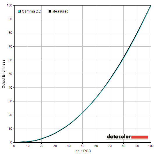
Out of the box the image on the P272P4APJKHB (P272P4APJKEB) was highly bright and saturated, with excellent gamma handling but quite an ‘off’ white point. Across all of the settings we tested, in fact, the gamma handling remained excellent or right where it should be – the gamma shown on the OSD was the gamma you got, with good tracking against the reference curves. The white point, on the other hand, was some way off the mark. The image looked either very cool and green, or simply extremely cool – this was clear by eye, not just from what the colorimeter was saying. Each individual unit is factory calibrated to provide strong gamma tracking and high levels of colour accuracy, with a unique calibration report accompanying each unit. This is shown for our review sample below – note that no promises are made with regard to white point, only absolute colour accuracy and gamma tracking.

There are also two emulation modes included, designed for users doing colour-critical work within a given colour space; ‘sRGB’ and ‘Adobe RGB’. The white point remained way off target in both emulation mode, but the colour gamut (explored later) was restricted as intended. For our test settings we made use of the full native gamut of the monitor, lowering brightness and manually adjusting colour channels as explored below. As below the gamma tracking was spot, so no need to adjust the gamma setting or tweak anything else for our uses.
Gamma test settings
Test Settings
As mentioned previously, the white point required some correction and the brightness lowering. Other than that, things were right where we wanted them for our testing. Any setting not mentioned below was left at default.
SmartResponse= Fast Color= User Define R= 100 G= 95 B= 90
Brightness= 34 (according to preferences and lighting)
Contrast and brightness
Contrast ratios
A Konica Minolta CS-200 was used to measure the luminance of white and black on the screen using a range of settings, including those discussed in the calibration section. Static contrast ratios were calculated based on these readings. The following table shows these readings and calculations. Unless otherwise stated assume default settings were used, with the exception of the ‘Test Settings’. Blue highlights indicate the results from these ‘Test Settings’. Black highlights indicate the highest white luminance, lowest black luminance and highest contrast ratio recorded.
| Monitor Settings | White luminance (cd/m²) | Black luminance (cd/m²) | Contrast ratio (x:1) |
| 100% brightness (Factory Defaults) | 368 | 0.33 | 1115 |
| 80% brightness | 302 | 0.28 | 1079 |
| 60% brightness | 241 | 0.22 | 1095 |
| 40% brightness | 180 | 0.16 | 1125 |
| 20% brightness | 117 | 0.11 | 1064 |
| 0% brightness | 53 | 0.05 | 1060 |
| Gamma = 1.8 | 315 | 0.28 | 1118 |
| Gamma = 2.0 | 313 | 0.28 | 1118 |
| Gamma = 2.4 | 311 | 0.28 | 1111 |
| Gamma = 2.6 | 250 | 0.05 | 5000 |
| Color Temperature = 5000K | 308 | 0.28 | 1161 |
| Color = Adobe RGB | 302 | 0.32 | 947 |
| Color = sRGB | 303 | 0.32 | 947 |
| Color = User Define | 325 | 0.28 | 1161 |
| SmartImage = SmartUniformity | 260 | 0.32 | 813 |
| Test Settings | 160 | 0.15 | 1067 |
With only brightness adjusted the contrast ratio averaged 1090:1, which is decent. Under our test settings we recorded 1067:1, representing a non-significant change there and still a respectable value. The lowest contrast ratio was recorded using ‘SmartImage = SmartUniformity’, at 813:1. There was also a slight drop when using the sRGB and Adobe RGB emulation settings, to 947:1 and 944:1, respectively. The peak contrast ratio was recorded as 1161:1 with ‘Color = User Define’ and all colour channels set to ‘100’. According to the data in the table the maximum luminance we recorded was 368 cd/m² and the minimum white luminance was 53 cd/m², giving an excellent luminance adjustment range of 315 cd/m². An even higher peak luminance would be achieved if using ‘100’ brightness with ‘Color = User Define’, but at any rate much these values are far beyond what most users would require.
There is a ‘SmartContrast’ Dynamic Contrast feature on the monitor which allows the monitor’s backlight to adjust its intensity based on the overall lightness or darkness of shades being displayed at a given time. This can be activated in combination with any other setting, aside from brightness. If this is adjusted after enabling ‘SmartContrast’, it will actually disable the feature without warning. The brightness tends to be uncomfortably bright with this setting even during mixed images, although it does dim fairly effectively when there are plenty of dark elements on the screen. It is no secret that we dislike such settings, but it’s there if you wish to use it.
PWM (Pulse Width Modulation)
The Philips P272P4APJKHB (P272P4APJKEB) uses PWM (Pulse Width Modulation) with a cycling frequency of 240Hz if brightness is reduced at all below ‘100’. This means that the monitor is not flicker-free, despite it being initially marketed as such – we have informed Philips of this. This isn’t necessarily going to be an issue, although some users can experience discomfort or increased eye fatigue as a result of PWM usage. There are also certain ‘artifacts’ during motion that result from its usage, as explored later.
Luminance uniformity
Whilst observing a black screen in a dark room, we could see a low degree of backlight bleed. You can see this in the photo below – it’s nothing to speak of really and not noticeable under normal viewing conditions. The photograph was taken a few metres back from the screen to eliminate ‘AHVA glow’, a characteristic of this panel type. This ‘AHVA glow’ appears as a silvery purple or quite warm golden sheen (depending on where on the screen you’re observing) towards the peripheral sections of the screen. It is most noticeable towards the bottom corners of the screen from a normal viewing position. If you move your head it ‘blooms out’ quite noticeably, as shown in a video a bit later on.

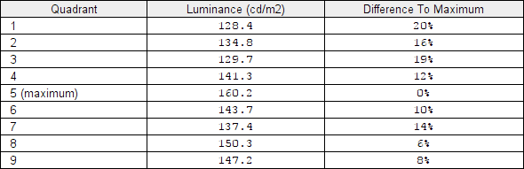
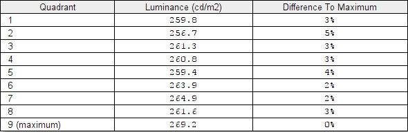
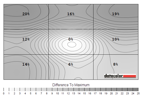
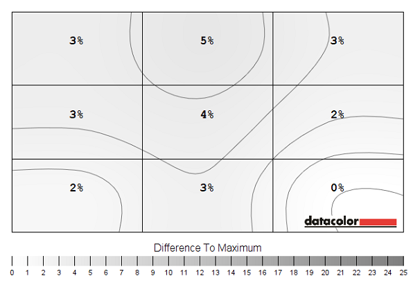
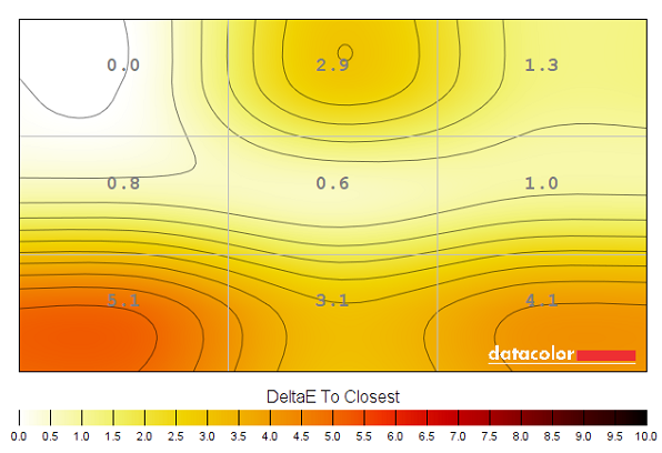
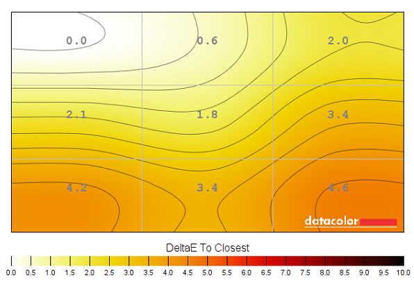
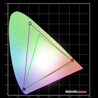
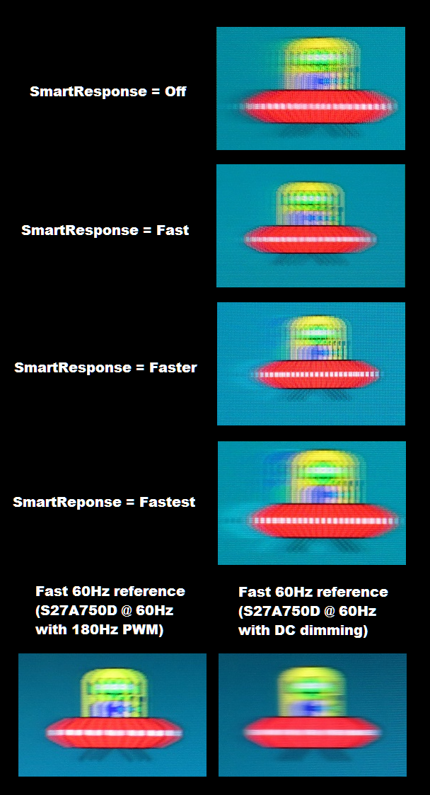
The Spyder5ELITE colorimeter was used to analyse the uniformity of lighter colours, represented by 9 equidistant white quadrants running from the top left to bottom right. The tables below show the luminance recorded at each quadrant and the deviation between a given quadrant and the brightest quadrant. The top table shows the results using our ‘Test Settings’ whilst the bottom one shows results using the ‘SmartUniformity’ (‘SU’) uniformity compensation setting. Using our test settings the luminance uniformity of the screen was quite poor overall. The brightest point on the screen was ‘quadrant 5’ in the centre (160.2 cd/m²). The greatest deviation from that occurred at ‘quadrant 1’ towards the top left (128.4 cd/m², which is 20% dimmer). Elsewhere deviation was 6-19%, which isn’t great. The ‘SmartUniformity’ setting improved things considerably, but for this to work properly you need to the settings used by default there which includes the 269.2 cd/m² peak brightness (recorded at ‘quadrant 9’, towards the bottom right). The maximum deviation from this occurred at ‘quadrant 2’ above the central region (259.8 cd/m² which is 5% dimmer). Elsewhere deviation was 2-4% which is very pleasing. Note that individual units vary when it comes to uniformity. For those who prefer a graphical representation, the contour maps below shows these deviations and predicted values between them. The percentage deviation between each quadrant and the brightest point is given, whilst darker greys represent lower luminance and hence greater deviation from the brightest point than lighter greys. The top graphic is for our test settings whilst the bottom map is using ‘SmartUniformity’. We also assessed the colour temperature (white point) deviations of these same white quadrants, using the Spyder5ELITE. Deviations shown as DeltaE values, with higher values representing greater deviation from the D65 (6500K) daylight white point target. These values are shown in the contour maps below, with darker colours like red and orange representing greater deviation from 6500K than lighter colours like yellow. A DeltaE of <3 here is considered deviation that most users would not readily notice by eye and is therefore not thought of as significant. The upper map shows the results under our test settings whilst the lower map shows results using ‘SmartUniformity’. The colour temperature uniformity with or without ‘SmartUniformity’ was quite variable here. The point cloest to 6500K, in both cases, was the upper right corner. The greatest deviation was DeltaE 5.1 under our test settings (lower left) and DeltaE 4.6 using ‘SmartUniformity’ (lower right). Significant deviations occurred between the brightest quadrants and 3 of the 8 remaining quadrants with the test settings and 4 of the 8 remaining quadrants using ‘SmartUniformity’. The average deviation at the recorded points was DeltaE 2.37 under our test settings and 2.76 using ‘SmartUniformity’. Note that as with all aspects of uniformity, individual units vary and some are likely to be better and some worse than our unit. You can also expect deviation beyond the 9 points measured on the screen. The contrast performance was pleasing overall on Battlefield 4 (BF4). You didn’t get the same atmospheric look that you get on some VA models with much stronger static contrast (and no ‘glow’), but the performance was much as you’d hope for from a well gamma-calibrated IPS-type panel. The visibility in dark areas was largely appropriate, with some loss of detail peripherally due to ‘AHVA glow’. This was particularly apparent towards the bottom corners of the screen from a normal viewing position. Bright elements such as explosions, tracer fire and lights stood out well in the surrounding darkness. Light shades also looked reasonably smooth without an overly grainy look, thanks to the light matte screen surface. The contrast performance was also decent on Dirt Rally. The level of detail was again good in dark areas, save for the peripheral areas of the screen affected by ‘AHVA glow’. Bright elements appeared relatively smooth without any distracting coarse or ‘heavy’ graininess to them, and rather only a fairly light grain. Car headlights and suchlike stood out nicely against their darker surroundings, particularly when those lights were coloured and the immense colour gamut had its effect as we explore later. We also used the Blu-ray of Skyfall to assess contrast performance. Bright elements again stood out nicely against darker backgrounds. The candles lighting up the river at night in Macau, for example, were particularly eye-catching. The 2.40:1 (16:9 letterbox) format of the film also meant that black bars absorbed most of the IPS glow. Detail levels in dark scenes were generally good, with only minor and largely inconsequential detail loss for the most part. A little IPS glow did persist in the bottom corners, but it only affected a small portion of the image. Lagom’s contrast-related tests were used to more closely analyse specific weaknesses in the contrast performance of the monitor. The following observations were made. As noted earlier the P272P4APJKHB (P272P4APJKEB) uses an RB-LED backlight to yield a very wide colour gamut. The graphics below show the gamut of the monitor (red triangle) when it is running the two emulation modes; ‘sRGB’ and ‘Adobe RGB’. These are selectable in the ‘Color’ menu. The gamut of the screen is compared to the sRGB colour space (green triangle) and where applicable the Adobe RGB colour space (purple triangle). The first graphic shows the ‘sRGB’ emulation setting and the second the ‘Adobe RGB’ emulation setting. You can see that the monitor does a reasonable job at emulating both colour spaces, but it isn’t perfect. There is 95% sRGB coverage for the ‘sRGB’ setting and 96% sRGB and Adobe RGB coverage for the ‘Adobe RGB’ setting. It is possible that calibration will improve this slightly, but 100% coverage of the respective colour spaces is unlikely. Still, the results here are decent as far as emulation modes go – the ‘Adobe RGB’ setting in particular shows superbly close tracking at all corners of the triangle apart from the red in this diagram. The modes certainly cut down the native gamut of the monitor which is used for all other ‘Color’ settings. This is shown for our ‘Test Settings’ below. The native colour gamut of the monitor is very wide indeed, offering 100% coverage of the Adobe RGB colour space and extension beyond this. This is particularly true for the red region of this diagram. As noted in this article, specifically in the ‘Making use of those extra colours’ section just prior to the conclusion, this has potentially undesirable effects on much of the content currently available to consumers. Generally games and movies, at least at the moment, are designed to look its best on a screen sticking reasonably close to or extending a little past the sRGB colour space. The designers may want to use broader colour spaces, but given that the vast majority of screens currently only support sRGB there isn’t much point in putting those desires into practice. What this means is that the monitor ‘maps’ all of those sRGB colours onto its much broader gamut, so that many shades will appear considerably more saturated than intended. This isn’t the same as increasing saturation digitally (i.e. ‘Digital Vibrance’ or a ‘Saturation’ setting) which simply pulls shades closer to the edge of the gamut. Instead, the gamut itself is extended – so you maintain strong distinctions between shades, but many shades look far more saturated than they ever physically could on a standard gamut monitor. Some users actually like this effect, whilst others abhor it. We take a subjective look at the sort of effect it has on a range of game and movie titles in the following section. This monitor gave BF4 an unmistakably vibrant look, with very strong colour saturation. The light blue, red, orange and green in-game markers stood out with a certain neon magnificence that you simply don’t get on a standard gamut model. The rich oranges and reds radiating from roaring flames was also impressive, if somewhat overdone. Deep oranges appearing overly red and some yellow shades verging on orange, for example. As far as environments in the game go things looked very rich and for the most part fairly natural. Earthy browns still showed a suitably varied palette and showed relatively weak saturation where appropriate. The greens of vegetation also showed an impressive range, with some exceptionally lush deep greens. Some of the lighter greens had a bit of a limey appearance that is more striking than it should be, though, making some patches of vegetation look a bit artificial. Sky on some of the maps is designed to look a bit more vivid and attractive than it generally does in real life and that was accentuated by this monitor with some truly brilliant blues. Some of the lighter blues stood out a bit too well, though, it has to be said. Dirt Rally also had a highly vibrant look to it, working well with some elements but not others. The Greek rally tracks, for example, have a good mixture of deep browns and faded greens. Some of the patches of earth are supposed to have a mild red hue to them, but this was exacerbated by the colour gamut of the monitor so that it was a bit too strong. The screen also tended to overblow some of the lighter green shades in amongst the vegetation, overpowering some of the duller greens and browns that were intended. The car liveries showed exceptional vibrancy and for the most part worked quite well with the extended gamut. There were some impressively deep reds and blues, for example – although yellows and oranges again appeared too heavily saturated. And indeed some bright reds appeared rather extreme and overbearing. One aspect that was particularly impressive, though, were red LEDs on the car dashboard. These appeared a much richer red than they would on monitors with ~sRGB colour gamuts, perhaps approximating the depth of their real-world counterparts a bit better. We also tested Warframe, where we feel the colour gamut actually worked very nicely. Because this game is set in something very unlike the world that we’re used to, you don’t have that same comparison between how things would look in the real world and how they’re presented on the monitor. Instead there are dazzling ‘power’ effects, lots of brightly coloured blasts of energy and lasers and the like. The deep blues, reds and purples made such elements stand out really nicely, but at the same time they didn’t look out of place. Bright greens any cyans were extremely eye-catching as well. The game environments here are largely composed of quite dull colours in comparison to these bright and flashy colours, with metals or relatively plain shades featuring heavily. These again didn’t look peculiar or out of place despite the extended gamut. On the Blu-ray of Skyfall things looked vibrant and varied. There was certain elements in the film that are supposed to be vibrant and really stood out as such. The neon lights of the Shanghai night scenes showcased some brilliant electric blues and deep blues, whilst flames and fires throughout the film look rich and lively if a bit too saturated in places. Miss Moneypenny also owns a rather striking red dress, which looked truly stunning (if a little too ‘blood red’) on this monitor. The skin tones of characters were displayed with extra saturation, appearing a bit redder in hue than they should. This wasn’t there to the extent that characters looked sunburnt or anything like this, but James Bond certainly a ‘healthy tan’ about him that goes beyond his actual complexion during filming. Pale blues also looked too lively, particularly noticeable on some of the ‘office shirts’ which wouldn’t blend into the office environment quite as well as intended. We also tested the Blu-ray of Futurama: Into the Wild Green Yonder. This showcased some dazzling colours, with some rather arresting vibrancy in places. This was the case right from the get go, with truly dazzling neon green cosmic radiation and some extremely violet-looking planets unlike anything most monitors could display. Deep royal blues, deep yellows and bright oranges were also good, although some darker oranges were too heavily tinted with red. The pastel shades, such as those used on the skins of characters, showed pleasing variety and subtle variation. The consistency of a given shade at various points of the screen was very good, in other words. The saturation levels of such pastel shades was too deep, though. The skin of characters of some of the main characters had a certain red hue to them rather than looking a pale peach. And the red lobster-like space monster called Dr. Zoidberg appeared a more striking red than he should. So again, the representation of what is intended to be sRGB content on a monitor with a much broader colour gamut than that is something of a mixed blessing. It provides an aesthetic that some users will actually like, but that detracts from the intended aesthetic of the content. We used Lagom’s tests for viewing angle to further explore colour consistency and the viewing angle performance of the monitor. The following observations were made from a normal viewing position, around 70cm from the screen. We used SMTT 2.0 (specialist software) alongside a sensitive camera to compare the latency of the P272P4APJKHB (P272P4APJKEB) with a range of monitors where the input lag is known. Using this method and taking over 30 repeat readings we calculated 19.80ms (just over 1 frame) of input lag for the Philips. This is influenced by the element you see (pixel responsiveness) and also the primary element you feel (signal delay). This is indicative of a moderate signal delay, one which may bother some users but that shouldn’t bother others. Our article on responsiveness explores a number of important concepts related to monitor responsiveness. A key concept is that it isn’t just pixel responsiveness that dictates how much motion blur you perceive when viewing moving content on a monitor, but also the movement of your eyes. Both influences can be captured using a technique called ‘pursuit photography’, which uses a moving rather than stationary camera to simulate eye movement. This also highlights other weaknesses such as PWM artifacts and overshoot (inverse ghosting). The following images are pursuit photographs taken with the aid of the UFO Motion Test for ghosting, running at 960 pixels per second. This is a practical speed for taken the photos and also highlights the aforementioned factors nicely. The ‘medium cyan’ background (middle row of the test) is used here with all ‘SmartResponse’ pixel overdrive settings of the monitor; ‘Off’, ‘Fast’, ‘Faster’ and ‘Fastest’. The final two pictures show a 60Hz reference screen, giving an indication of how things should look if pixel responses aren’t a limiting factor. The first of these reference images has the reference monitor (Samsung S27A750D set to its ‘Faster’ response time setting) running at reduced brightness and therefore using PWM to regulate backlight brightness. The second reference image shows the Samsung running at ‘100’ brightness and therefore avoiding the use of PWM (‘DC Dimming’ instead). You can see that, regardless of ‘SmartResponse’ setting, the object and any additional trailing appears quite heavily fragmented. This is due to the use of PWM for backlight modulation as mentioned previously. Using ‘SmartResponse = Off’ you can see a significant degree of trailing behind the object. The ‘Fast’ setting reduces this trailing significantly. The ‘Faster’ setting, meanwhile, introduces obvious inverse ghosting (overshoot), as brightly coloured trails behind the object. It does appear to cut down on some of the ‘conventional trailing’ as well – but the fragmentation remains. The width of the object appears narrower in this photo, but it appears that the camera has focused differently in this instance. The main purpose of this photo was to show the introduction of the overshoot, however. With the ‘Fastest’ setting the overshoot is increased and is now extremely bold and noticeable. From this analysis it is clear the ‘Fast’ provides an optimal balance of pixel responsiveness without the unwanted side-effect of obvious overshoot. This is clear when testing the monitor more broadly, for example when gaming. We provide a thorough subjective analysis of the response behaviour of the monitor in the following section, complete with an analysis of how the PWM artifacts manifest themselves and the effect they have on the experience. We will not be including a section on ‘overclocking’ in this review as we were only able to set the monitor as high as 66Hz comfortably (i.e. without significant frame skipping or other negative consequences). This applied regardless of the connection used, and really setting the monitor to 66Hz compared to 60Hz provides little real benefit. On BF4 the majority of perceived blur came from eye movement and is as you would expect to see on what is technically a must faster 60Hz LCD. There was a degree of weakness in pixel responsiveness beyond this, however. There was a slight but not particularly pronounced degree of additional trailing in places. Perhaps more noticeable was a reasonably light overshoot in places, for example when trees or dark metal gun turrets were in the foreground and bright blue sky was in the background. This produced bright inverse ghosting, which could distract some users but wasn’t particularly pronounced or widespread really. It was certainly not as readily noticeable to our eyes as the artifacts associated with PWM usage. These artifacts were most noticeable on straight edges when moving past rapidly in a vehicle – there were obvious duplicated or split trails. On foot they are particularly noticeable on thin or brightly coloured objects, the best example being neon vertical strip lights running down skyscrapers on the multiplayer map Operation Dawnbreaker. If you move the mouse from side to side, they appear to fragment into multiple instances of each strip light. On Dirt Rally these imperfections in motion performance weren’t so obvious and things generally looked as they would on the best 60Hz performers. There were hints of extra trailing and a little overshoot in places. The extra trailing was mainly confined to certain high contrast transitions, for example during the night stages where light shades (bright lights) moved against darker backgrounds. There wasn’t anything that really stood out and certainly nothing distracting when driving, beyond the blur from eye movement. The aforementioned PWM artifacts were also less noticeable than on BF4, as the movements tended to be gentler and more predictable and there weren’t really many thin objects that usually exaggerate the effect. Finally we assessed the responsiveness of the monitor on our Blu-ray movie test titles. The pace of action here and overall fluidity is severely limited by the low frame rate at which the films run (around 24fps). As such the demands on the pixel responsiveness are much lower and the frame rate itself is really the underlying limitation. In other words, the performance was not hampered by slow pixel responses, overshoot or PWM artifacts – only the frame rate of the content itself. As an LCD monitor, the pixels are a fixed shape and size. The screen is designed to run optimally at 2560 x 1440, where everything that is supposed to appears sharp and clear. If you wish to run the monitor at a lower resolution, for example by connecting a games console or because you don’t have the graphical grunt to run certain games at 2560 x 1440 then you may wish to (or be forced to) use a lower resolution such as 1920 x 1080 (Full HD). The monitor can use an interpolation process to display these non-native resolutions. If you’re a PC user with a dedicated GPU, make sure that the monitor is going to be handling the scaling (interpolation) rather than the GPU as it will yield superior results. AMD GPU users need to open Catalyst Control Centre and navigate to ‘My Digital Flat-Panels – Properties (Digital Flat-Panel)’. Ensure ‘Enable GPU scaling’ is unchecked (not ticked) and hit apply if this box was originally checked and you have unchecked it. Nvidia users should open Nvidia Control Panel and navigate to ‘Display – Adjust desktop size and position’. Ensure ‘No scaling’ is selected and ‘Perform scaling on:’ is set to ‘Display’. This is shown in the image below. When interpolation is used on the Philips to display 1920 x 1080 (Full HD), it actually does quite a decent job at maintaining a decent degree of sharpness. If you compare it side-by-side to a native 27” Full HD display, text generally looks a bit softer and bolder but not as blurry as on some WQHD models using such interpolation. If you open a game or look at certain images you will see that things are a bit softer, they just look less ‘crisp’ and well-defined. Again, this is less extensive softening than seen on some WQHD models which make things look like they’re being observed through a soft-focus lens. In short; the Full HD resolution is useable but not displayed as well as it would be natively. If you leave the monitor running at 2560 x 1440 and display lower resolution content, such as viewing a Full HD movie on the PC, the monitor does not handle the scaling. Instead the GPU or software you’re using will automatically upscale, leading to a slight softening but one that is really quite subtle and some users won’t even notice. The monitor is therefore fine to use for watching Full HD content such as Blu-rays and other movies from a ‘sharpness’ perspective. The Philips 272P4APJKHB may not look flashy and modern, but inside the monitor itself there is certainly some modern technology. With its AHVA panel and RB-LED backlight, it’s designed to provide accurate colour output over a wide colour gamut. From the perspective of our testing, which included game and movie titles predominantly, this extended gamut is not really ideal as it simply isn’t supported by such content at the moment. The look that it gave some elements of games and films was unmistakably vibrant and rich, but also inaccurate. Some may like this look, but others will not. For users who are specifically working within the Adobe RGB colour space or a similar gamut, though, this capability will be highly sought-after. Straight from the box the gamma tracking of the monitor was excellent, with the flexibility to adjust it in the way that is promised in the menu system. The same can’t be said for the colour temperature, however. This was way off target and there was an underlying cool-green tint. Fortunately this could be tackled effectively by making the right adjustments to colour channels; something that a colorimeter, spectrophotometer or similar device will greatly help with. Unfortunately the uniformity of our sample was quite poor, though, and that isn’t something that can be compensated for by a colorimeter. There is a ‘SmartUniformity’ setting that would offer a better base of calibration if uniformity is particularly important for your work, but the colorimeter will definitely need to do some work on the colour channels if our sample is anything to go by. The contrast performance was much as expected overall, with respectable static contrast and the usual ‘AHVA glow’. Despite it being initially marketed as ‘flicker-free’, the monitor uses PWM (Pulse Width Modulation) at any brightness below ‘100’. This isn’t something that will bother all users, but we did readily notice its effect on motion performance with the introduction of ‘PWM artifacts’. The responsiveness was otherwise pretty good for a 60Hz monitor. Input lag was moderate and pixel responses were quite well balanced using the optimal ‘SmartResponse’ setting, overall. Overall this monitor is a solid package (and not just because of the robust chassis) with some useful features and capabilities for some users. If you’re one of those users, we’d certainly consider putting this one on the shortlist.
Luminance uniformity table SU off
Luminance uniformity table SU on
Luminance uniformity map SU off
Luminance uniformity map SU on
Colour temperature uniformity map SU off
Colour temperature uniformity map SU on
Contrast in games and movies
Lagom contrast tests
Colour reproduction
Colour gamut

Colour gamut sRGB setting
Colour gamut Adobe RGB setting

Colour gamut test settings
Colour in games and movies
Viewing angles
Responsiveness
Input lag
Perceived blur (pursuit photography)
Perceived blur with various settings
Responsiveness in games and movies
Interpolation and upscaling

Conclusion
Positives Negatives Excellent gamma tracking sustained across a broad setting range, extended gamut support and a finely calibrated AHVA panel
Poor white point balancing out of the box, clear uniformity issues on our unit and a bit of sRGB and Adobe RGB under-coverage using the emulation modes (but not using the very generous native gamut)
Good static contrast performance and a good luminance adjustment range. The relatively light matte screen surface helped provide a fairly smooth image and preserved vibrancy and clarity better than some matte surfaces ‘AHVA glow’ is present, eating away at some detail for dark shades peripherally and the backlight is not ‘flicker-free’ despite it being initially marketed as such Fairly well balanced pixel overdrive using the optimal ‘SmartResponse’ setting delivered a decent 60Hz performance without much in the way of additional trailing or unsightly overshoot (inverse ghosting)
Moderate input lag, a little overshoot in places and some transitions just a touch slower than is optimal at 60Hz. The use of PWM also introduced ‘PWM artifacts’ during motion
A very solid construction with ergonomically flexible stand, good range of ports and the inclusion of an effective and easily assembled monitor hood
Not the most flattering or modern-looking design
![]()

