Author: Adam Simmons
Date published: January 1st 2018
Table of Contents
Introduction
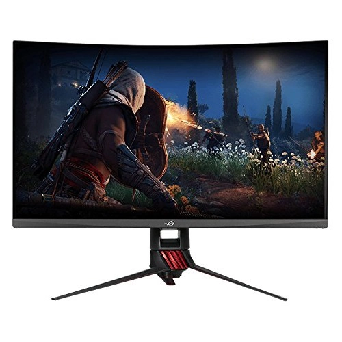
Some users like to have their field of vision filled up by a large screen on their desk. They like to be drawn into the experience, with both their detailed central and peripheral vision engaged. ~32” screens provide a nice size for many users who wish to have a large but not overwhelmingly monstrous screen on their desk. The ASUS XG32VQ is a member of the company’s ROG (Republic of Gamers) Strix lineup, a 144Hz model marketed towards PC gamers but suitable for a multitude of uses. On paper this model is rather similar to the AOC AG322QCX, with different OSD features and styling being the most prominent differentiators. Pricing and availability is an issue with the AOC in some regions as well. The backlight design is also slightly different on the ASUS, as a ‘CELL’ (panel without backlight) is used with a custom backlight solution in both cases. We take a look at the overall performance in our usual gauntlet of tests and see how this model stacks up.
Specifications
The monitor uses a 31.5” Samsung SVA (‘Super’ Vertical Alignment) panel, or more specifically CELL which is the panel excluding backlight infrastructure. This supports a 144Hz refresh rate and a 1800R (relatively steep) curve. True 8-bit colour is supported and a 4ms grey to grey response time is specified. As is usual, this must be approached with caution especially given the panel type used here. Some of the key ‘talking points’ of this monitor have been highlighted in blue below, for your reading convenience.
Features and aesthetics
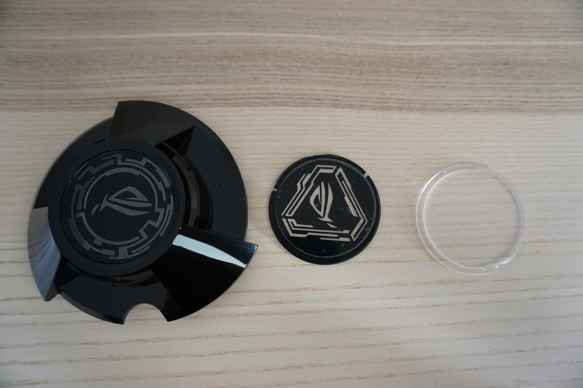
From the front the monitor echoes the stylistic gaming cues that the ROG series are renowned for. The bezels are slender with a dual-stage design, comprising a very thin hard plastic outer component as well as a thicker (but still slender) panel border. The panel border blends in seamlessly when the monitor is switched off. The thickness of the bezels at the top and sides, including both components, is ~9mm (0.35 inches). The bottom bezel is thicker at ~20mm (0.79 inches), which includes a sliver of panel border. The stand base has an interesting and almost alien-like design, with a mixture of matte black plastic with semi-matte red gill-like structures. The monitor has a downward-facing red light projector called ‘Light Signature’ (or ‘LIGHT IN MOTION’, in the OSD). This projects a red ROG motif onto your desk. You can craft your own shapes or simply have a naked red light or use one of the two standard ROG logo designs, as shown in one of the images below. You can also set the brightness to 1 of 3 levels or disable the feature, as we come onto shortly. The most dominant aspect from the front is of course the 31.5” screen, which has a 1800R and uses a light matte anti-glare screen surface. This is something we analyse in more detail shortly.
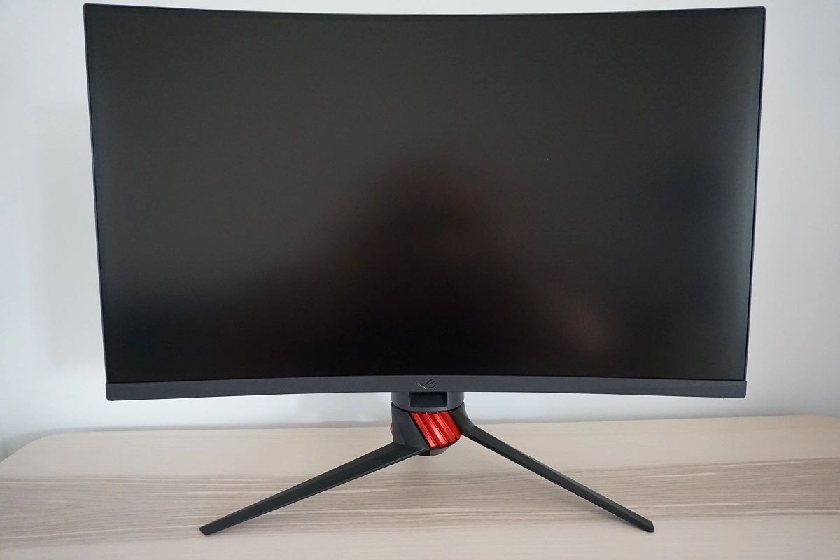
The OSD (On Screen Display) controls are located at the rear of the monitor, arranged vertically down the right side. They include a ‘JOG button’ (joystick) for intuitive control through the main menu as well as a range of shortcut keys. There is a narrow power LED which runs along the depth of the bottom bezel, towards the far right. This glow white when the monitor is active and amber when signal to the PC is lost. The OSD and control system are explored in the video below.
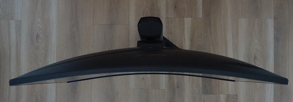
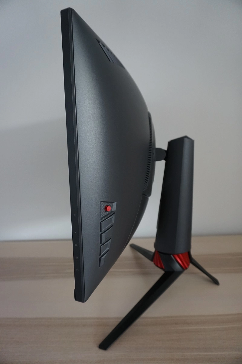
From the side the screen is ~17mm (0.69mm) at thinnest point, lumping out more centrally. You can see the intriguingly-styled but robustly built stand from this angle quite clearly. This offers good ergonomic flexibility; tilt (5° forwards, 20° backwards), swivel (50° left, 50° right) and height adjustment (100mm or 3.94 inches). At lowest height the screen sits ~69mm (2.72 inches) above the desk surface, with the top of the screen ~490mm (19.29 inches) clear of the desk. The total depth of the monitor including stand is ~300mm (11.81 inches), with the screen sitting right at the front. That means it’s a deep stand design that may bring the monitor closer to your eyes than you’d like. We’ve got a fairly deep desk and would still like to be able to push the monitor further back than we could. Users who find this problematic (not all will) may want to consider mounting an alternative stand, which is possible as the monitor is 100 x 100mm VESA compatible.
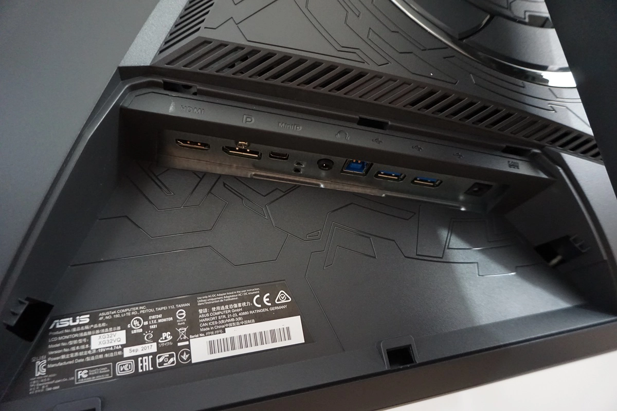
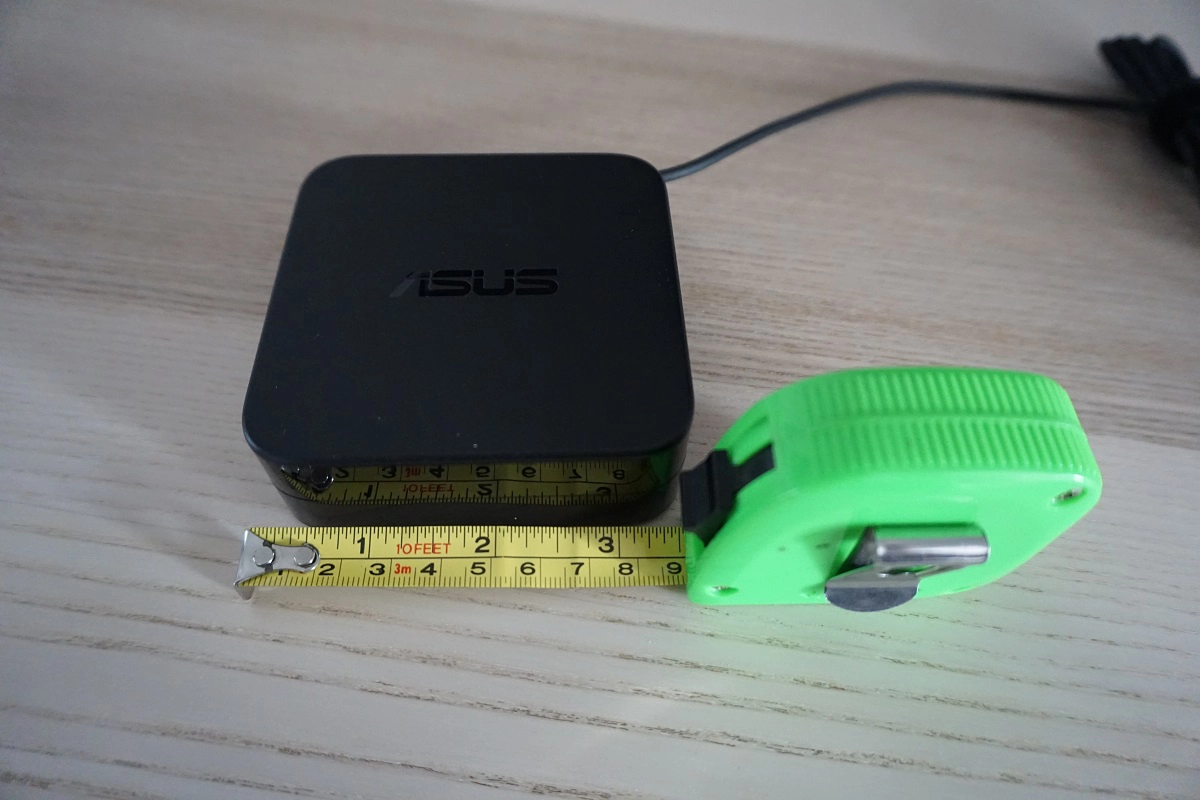
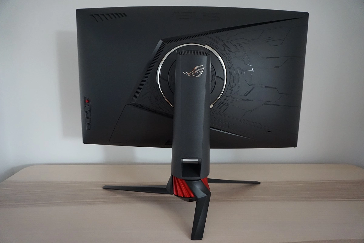
The rear of the monitor also has an intriguing design, with textured matte plastic used throughout, with a patterned area included. The patterned area is flanked by ventilation slats to aid cooling of the monitor. The OSD controls can be seen to the far left and a K-Slot towards the far right. The stand attaches centrally and can be removed to make way for an alternative 100 x 100mm VESA solution. There is a ring of LEDs surrounding the stand attachment point, which as explored in the OSD video can have the colour and animation set via the OSD (‘Aura RGB’) or by using the software included with the monitor (‘Aura Sync’). You can control various other ‘Aura Sync’ peripherals using the software, as detailed here. For those whom don’t have an archaic piece of technology called a disc drive to install the included software, it can instead be downloaded here. The ports are concealed beneath a removable triangular-shaped port cover. They face downwards and include; HDMI 2.0, DP 1.2a and MiniDP 1.2a, a 3.5mm headphone jack, 2 USB 3.0 ports and a DC power input (external ‘power brick’, shown below).
The full refresh rate at the native resolution is available via either DP 1.2a, MiniDP 1.2a or HDMI 2.0 on Nvidia or AMD GPUs. AMD FreeSync is also available on compatible AMD GPUs or systems. An HDMI cable, MiniDP – DP cable and USB 3.0 cable are included in the box alongside a power adaptor. Note that you must connect the USB cable to the upstream port of the monitor if you wish to use the USB downstream ports of the monitor or the ‘Aura Sync’ software.
Calibration
Subpixel layout and screen surface
The images below are macro photographs taken on Notepad with ClearType disabled. The letters ‘PCM’ are typed out to help highlight any potential text rendering issues related to unusual subpixel structure, whilst the white space more clearly shows the actual subpixel layout alongside a rough indication of screen surface. The top image shows the XG32VQ, whilst the bottom image shows the AOC AG251FG TN model for comparison. A light matte anti-glare screen surface is used on this model, handling glare effectively without imparting an obvious ‘smeary’ graininess as some matte screen surfaces provide. There is a light ‘misty’ graininess to the screen surface as explored later on.
![]()
![]()
As shown above, the monitor uses the standard RGB (Red, Green and Blue) stripe subpixel layout. This is the default expected by modern operating systems such as Microsoft Windows and Apple MacOS. You needn’t worry about text fringing from non-standard subpixel layouts as a Mac user and don’t need to run ClearType as a Windows user – although you may wish to adjust this according to preferences. You can see from the top image, taken from this monitor, that the subpixels are slightly squat with relatively ‘thick’ black spaces above and below each row. You can also see that some areas of text are shown with only half of each subpixel illuminated, with fairly distinct gaps in the middle and at the ends of letters where there is no subpixel illumination. Compare this to the bottom image, which shows a more blended appearance without the same half subpixel illumination or abrupt gaps. It’s quite common for Samsung SVA panels to use this sort of arrangement for subpixels – and if the pixel density is high enough (Samsung C27HG70, for example) then it’s not noticeable in practice. On this model the pixel density is not really high enough to offset this, which has implications for text clarity. Some users will notice that text doesn’t look as smooth or clear as it should, appearing slightly jagged in places – particularly small and thin lettering. This isn’t something every user will notice or find bothersome, but others would.
Testing the presets
The XG32VQ features various ‘GameVisual’ presets; ‘Scenery Mode’, ‘Racing Mode’, ‘Cinema Mode’, ‘RTS/RPG Mode’, ‘FPS Mode’, ‘sRGB Mode’, ‘MOBA Mode’ and ‘User Mode’. As is usual, the vast majority of these presets are entirely lacklustre to users who wish for a natural and appropriate look to the image. They upset gamma, cause huge oversaturation and shade crushing and in most cases block off certain settings in the OSD. We cycle through these briefly in the OSD video featured earlier on. We will instead be looking at some of the more interesting and useful settings that can be tweaked in the OSD, such as ‘Gamma’ and the ‘Blue Light Filter’.
The table below shows key readings taken using a DataColor Spyder5ELITE colorimeter alongside some general observations, using various settings. The monitor was left in its ‘Plug and Play’ state, connected to a Windows 10 machine without additional drivers or ICC profiles specifically loaded. It was connected to a Club 3D Radeon R9 290 royalAce Free-Sync compatible GPU via DP 1.2. The monitor was left running for over 2 hours before data for this table was compiled. We also did some testing using an Nvidia GTX 1070 and found the image behaviour to be very similar. Unless otherwise stated, assume that settings were left at default but with the refresh rate set to 144Hz. The refresh rate did not affect our observations on this table or have any noticeable impact on the static image quality of the monitor, only during motion as explored later. When viewing the figures in this table, note that for most PC users ‘6500K’ for white point and ‘2.2’ for gamma are good targets to aim for.
| Monitor Settings | Gamma (central average) | White point (kelvins) | Notes |
| Racing Mode (Factory Defaults) | 2.3 | 7874K | Bright with an obvious cool tint (as in blue-looking, not ‘worthy of credit’). The colour temperature is way off the mark, although gamma tracking is decent. Looking past the obvious colour imbalance caused by the inappropriately cool white point, the image had strong depth and saturation overall with a good distinct shade range displayed. The colour gamut aided this, providing a vivid look without the garish oversaturation associated with viewing ‘sRGB content’ on a wide gamut (~Adobe RGB) model. As is typical for a VA panel, there is some saturation loss towards the edges and bottom of the screen from a normal viewing position. This is related to the viewing angle dependency of the gamma curve, but for a VA panel of this size these changes were actually fairly minor. |
| Gamma 1.8 | 1.9 | 7862K | As above but gamma significantly lower and image appears less saturated – it could be described as faded or ‘washed out’. |
| Gamma 2.5 | 2.7 | 7863K | The image retains the bright and cool look of the factory defaults, but appears far too deep and quite striking. This is due to the gamma now averaging ‘2.7’, which like the colour temperature is way off any common target. |
| Color Temp. Warm | 2.3 | 7464K | Slightly warmer than factory defaults, but certainly not ‘Warm’. |
| sRGB Mode | 2.4 | 7418K | As above with significantly lower brightness and slight changes to gamma. The image appears slightly deeper in places, overly deep in some. Various controls (including brightness and colour channels) are greyed out, so this mode has very little utility. |
| User Mode | 2.3 | 7869K | As factory defaults, but the ‘Saturation’ slider is accessible for a bit of extra flexibility. |
| Blue Light Filter = Level 1 | 2.3 | 7612K | This is supposed to be a ‘Low Blue Light’ (LBL) setting; it’s anything but. The image appears with an obvious cool tint, with the white point being extremely high and only marginally reduced from the factory defaults. This is actually more of a ‘High Blue Light’ setting in effect. |
| Blue Light Filter = Level 2 | 2.3 | 7349K | As above with a slight drop in colour temperature. |
| Blue Light Filter = Level 3 | 2.3 | 7184K | As above with a further drop in colour temperature. |
| Blue Light Filter = Level 4 | 2.3 | 5215K | This setting is relatively dim with a locked brightness control. Fortunately, this one is an effective LBL setting. The image has an obvious cool look and the blue channel is significantly weakened. This is effective for relaxing viewing in the hours leading up to bed, for example, where blue light exposure should be minimised for the sake of good sleep. We used this for our own viewing comfort in the evenings but not for our usual testing where the settings below were used. |
| Test Settings (see below) | 2.3 | 6485K | As factory defaults with much better white point balance and significantly reduced brightness. The image appears better balanced, but remains vibrant and varied. The saturation loss at the edges and bottom of the screen remains and some shades appear a little deeper than they should due to gamma handling. Overall, we feel these settings are appealing for the purposes that this monitor is designed for. |
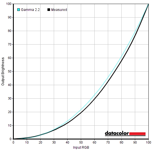
Out of the box the monitor was bright with an obvious cool tint. It looked vibrant and had good shade variety, but the balance was quite off. Following a bit of tweaking in the OSD, we were able to achieve a much better balance. The graph below shows the gamma under our ‘Test Settings’. You can see that there is some variance from the desired ‘2.2’ curve as it sags a bit in places, therefore averaging ‘2.3’. Given the intended uses for this monitor and the perceived gamma shifts that occur anyway, we don’t feel this is a major issue. So we will be performing our testing with the monitor as it is here. However; we appreciate some users might like to use an ICC profile that could potentially correct the gamma tracking. The article linked to provides instructions on applying the profile plus some limitations to be aware of, such as inter-unit variation and some applications not using the profiles correctly. You can download our ICC profile (not used for testing) and try it out if you wish. The profile was created on our unit under our ‘Test Settings’ and corrects the gamma to ‘2.2’ with tight tracking of the desired curve. The monitor also includes some Low Blue Light (LBL) settings referred to as ‘Blue Light Filter’. Conveniently, you can also save various sets of settings under ‘MyFavorite’ in the OSD so you can recall them fairly easily. We’d prefer a more intuitive way to activate and deactivate the LBL settings (or to quickly switch between your saved settings) without going through multiple layers of the OSD. The way BenQ does it for some of their monitors, for example, is very good. Perhaps the more pressing concern, though, was that the ‘Blue Light Filter’ offers 4 different levels of operation (plus ‘Level 0’ which disabled it entirely). Yet only the 4th level actually provided anything approaching ‘Low Blue Light’. The others maintained a very cool white point and a strong blue colour channel, hence did not provide a significant enough blue light output reduction from the monitor to be considered ‘Low Blue Light’ at all. ‘Level 4’ was certainly effective and we used this ourselves for viewing comfort when we weren’t testing, later on in the evening. However; it locked off various controls such as ‘Brightness’ so it made the solution rather inflexible. If users wanted to, they could simply create their own LBL setting by setting the colour channels appropriately (with a relatively low value for the blue channel) and saving these to ‘MyFavorite’ instead. An important part of reducing blue light output from the monitor is also brightness, though, so don’t discount that. For our ‘Test Settings’ we made fairly significant changes to the colour channels and reduced brightness by a fair chunk as well. This allowed us to achieve a better balance to the image than the obviously skewed and cool-tinted factory defaults. Note that individual units vary, particularly when it comes to colour temperature. Assume that any setting not mentioned, including contrast and ‘Gamma’ was left at default. We’ve included the ‘OD’ (Overdrive) setting and Windows refresh rate used as well, just for reference. Brightness= 62 (according to preferences and lighting) Color Temp= User Mode R= 100 G= 90 B= 85 OD= Level 3 Refresh rate (Windows setting)= 144Hz A BasICColor SQUID 3 (X-Rite i1Display Pro) was used to measure the luminance of white and black using a range of monitor settings, including those analysed in the calibration section. From these values, static contrast ratios were calculated. Results are show in the table below. Blue highlights indicate the results under our ‘Test Settings’, whilst black highlights indicate the highest white luminance, lowest black luminance and highest contrast ratio recorded. Assume any setting not mentioned was left at default, with the exceptions already noted in the calibration section.
Gamma 'Test Settings'
Test Settings
GameVisual= Racing Mode
Contrast and brightness
Contrast ratios
Monitor Settings White luminance (cd/m²) Black luminance (cd/m²) Contrast ratio (x:1) 100% brightness 291 0.1 2910 80% brightness 249 0.09 2767 60% brightness 205 0.07 2929 40% brightness 159 0.06 2650 20% brightness 109 0.04 2725 0% brightness 56 0.02 2800 Racing Mode (Factory Defaults, 90% brightness) 272 0.1 2720 Gamma 1.8 272 0.1 2720 Gamma 2.5 271 0.1 2710 Color Temp. Warm 260 0.1 2600 sRGB Mode 183 0.1 1830 User Mode 272 0.1 2720 Blue Light Filter = Level 1 268 0.1 2680 Blue Light Filter = Level 2 266 0.1 2660 Blue Light Filter = Level 3 265 0.1 2650 Blue Light Filter = Level 4 102 0.04 2550 Test Settings (see below) 177 0.07 2529
The average static contrast with only brightness adjusted was 2797:1, which is pleasing and close to the specified 3000:1 for the panel. We recorded 2910:1 at ‘100%’ brightness, coming even closer to that specified value. As noted previously, though, the monitor has significant colour balance issues ‘out of the box’. Once that is corrected, the contrast does drop – but it remains strong. The ‘sRGB Mode’ (which is quite useless in practice due to complete inflexibility and poor image setup) yields the lowest recorded contrast, at 1830:1. The strongest ‘Blue Light Filter’ setting yields a superior 2550:1, which is very pleasing given that such a strong LBL setting would usually affect the contrast more severely. We measured 2529:1 under our ‘Test Settings’, which is pleasing and exceeds the 2150:1 we measured on our AOC AG322QCX sample. That could partly be accounted for by fortunate vs. unfortunate rounding for the black luminance values, but it is still nice to see. The highest white luminance recorded was 291 cd/m², whilst the lowest white luminance recorded was 56 cd/m². This provides a luminance adjustment range of 235 cd/m² and a reasonably dim minimum – albeit significantly higher than the 29 cd/m² recorded on the AOC.
The monitor features a Dynamic Contrast setting called ‘ASCR’ (ASUS Smart Contrast Ratio). This can be activated in the following ‘GameVisual’ modes; ‘Scenery Mode’, ‘Cinema Mode’, ‘RTS/RPG Mode’, ‘FPS Mode’ and ‘User Mode’. As far as Dynamic Contrast modes go, this is quite a good one as it gives you the flexibility to set a limit to how bright it will go. You gain manual control over the brightness, and the monitor will dim from there. The backlight is controlled as a single unit, as usual, and will dim or brighten depending on the level of ‘dark’ or ‘light’ displayed on the screen. Because it works on averages, it can’t account for intricate variations of light and dark. It reacted quite rapidly to changes in scene brightness and dimmed quite effectively for predominantly dark content. Having said that, we didn’t really find it added anything to the experience and prefer full manual control of brightness. Some users do like to use Dynamic Contrast settings, though, and this is one of the better implementations out there.
PWM (Pulse Width Modulation)
The monitor uses DC (Direct Current) to dim the backlight and does not use PWM (Pulse Width Modulation) at any brightness setting. The backlight is therefore considered ‘flicker-free’, which will be welcomes by users who are sensitive to flickering or worried about the side-effects of PWM usage.
Luminance uniformity
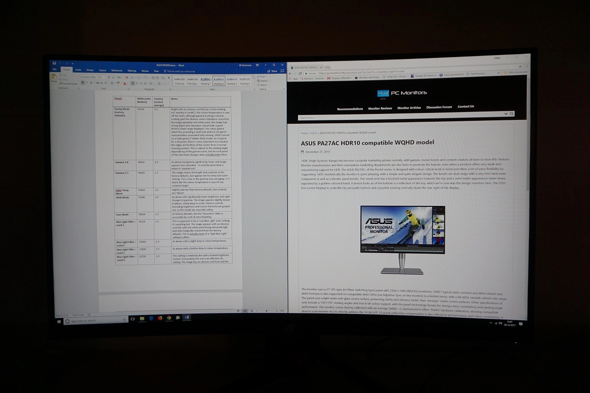
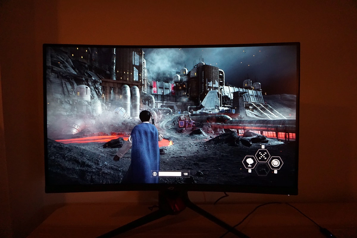
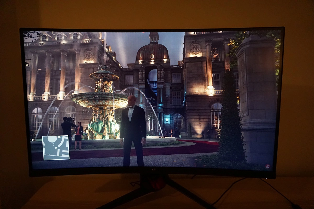
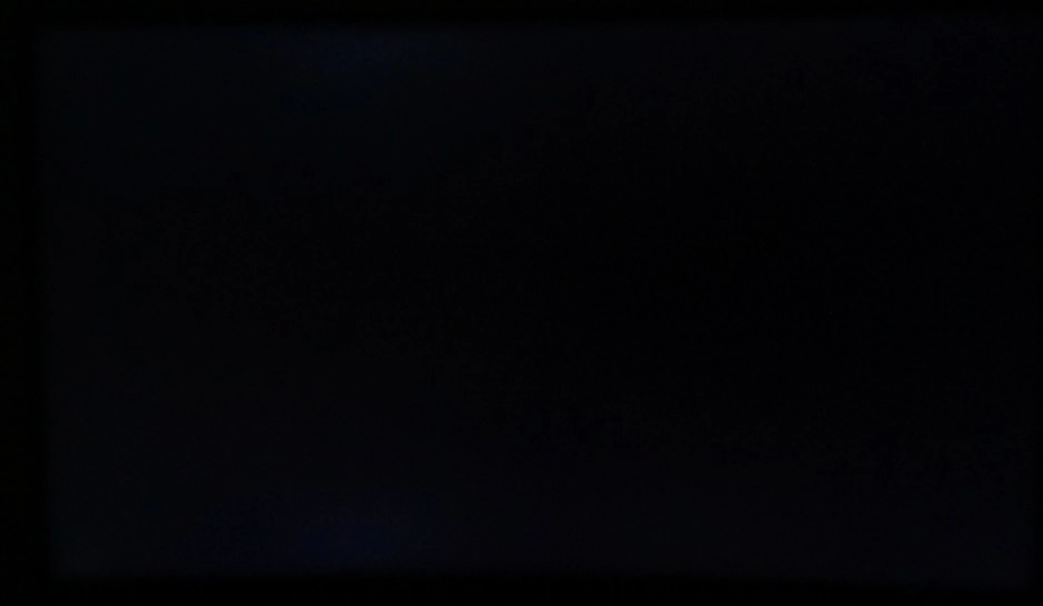
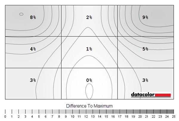
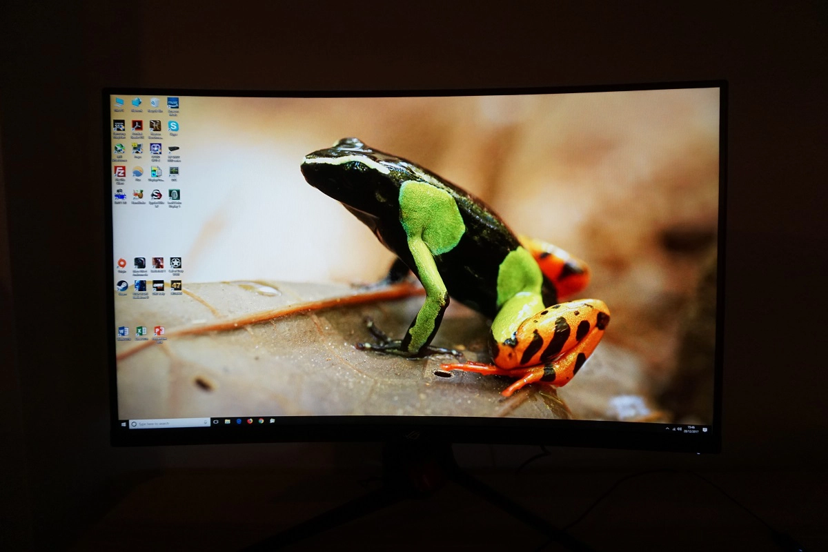
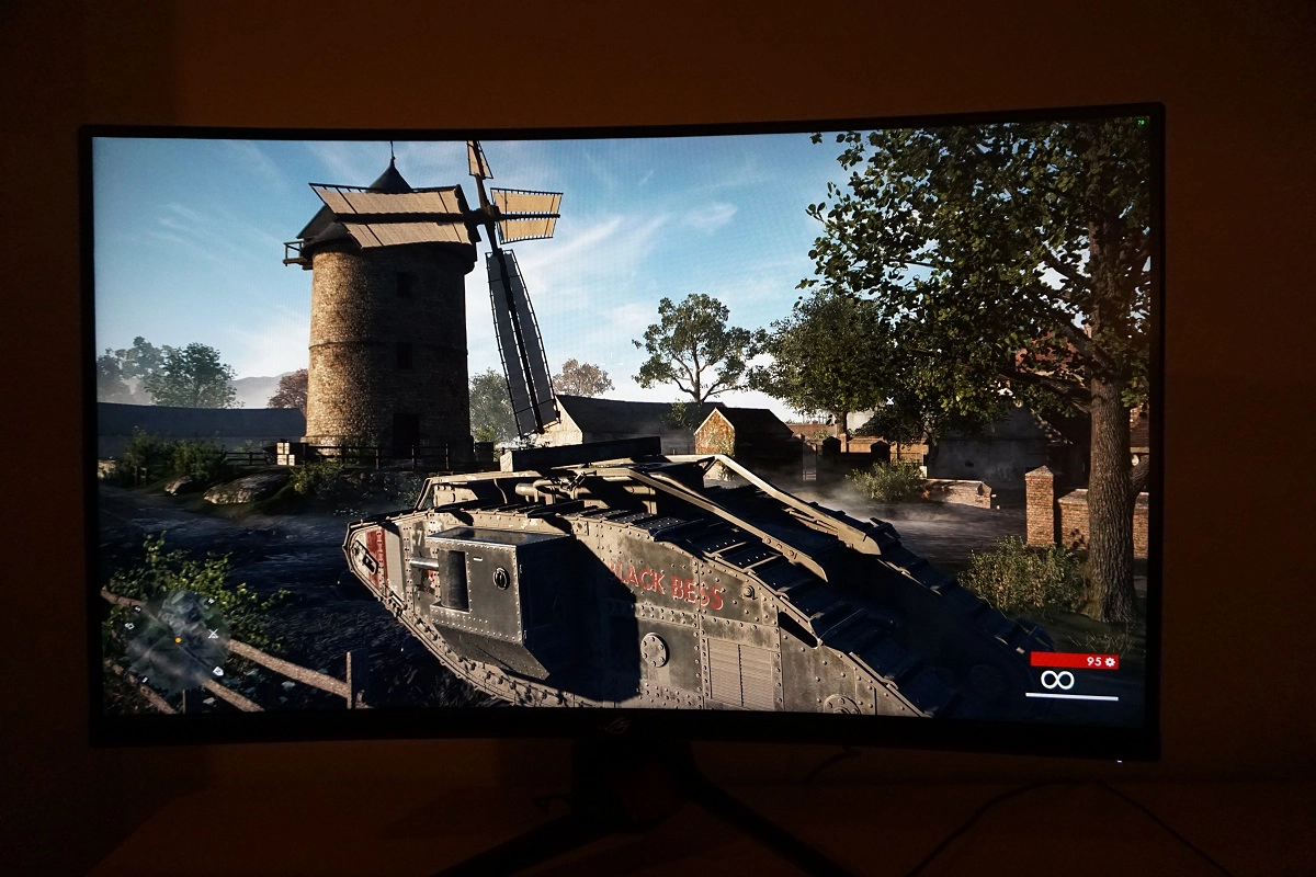
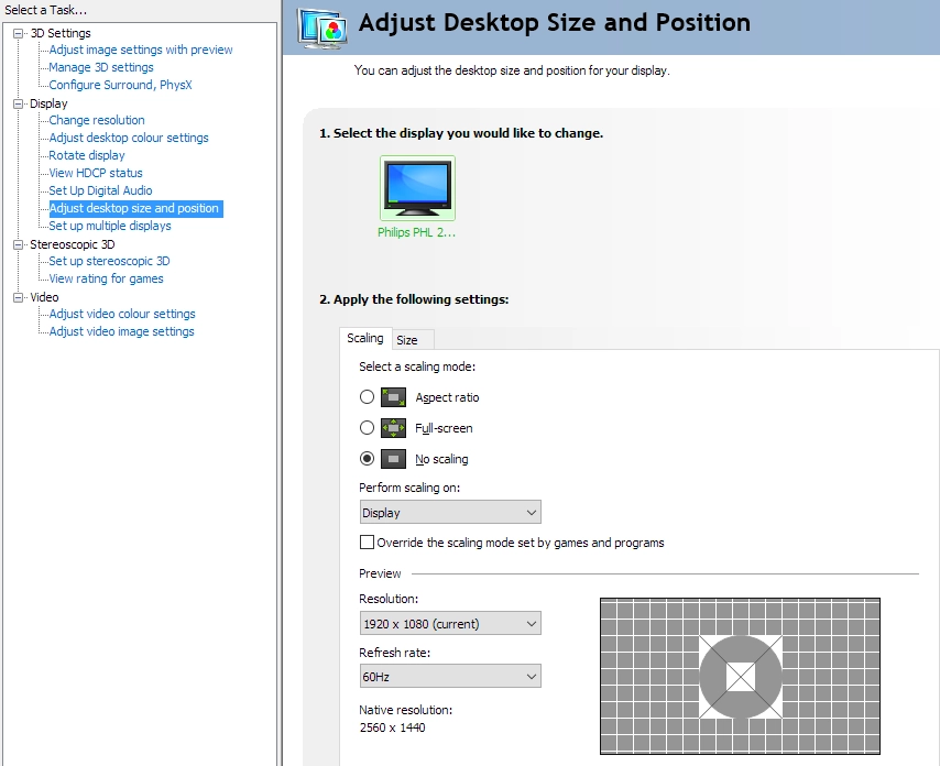
Whilst observing a black screen in a dark room we observed some backlight bleed and clouding towards the bottom of the screen. This is shown in the image below, which was taken in a dark room using our ‘Test Settings’ and camera settings which are representative of what the eye sees when observing the screen. The image was taken a sufficient distance back from the screen to eliminate so-called ‘VA glow’. This is a silverish purple haze that’s visible towards the bottom of the screen, in particular, from a normal viewing position. If you view the monitor from a sharper angle, this ‘VA glow’ blooms out more noticeably. It’s also more noticeable if you sit closer to the screen. It’s not as obtrusive as ‘IPS glow’ and doesn’t impact fine detail in dark scenes to the same extent. Note that individual units vary when it comes to backlight bleed and clouding. The luminance uniformity was strong in this test. The maximum luminance was recorded at ‘quadrant 8’ below the centre of the screen (160.2 cd/m²). The greatest deviation from this occurred at ‘quadrant 3’ towards the top right of the screen (145.2 cd/m², which is 9% dimmer). The remaining quadrants showed 1 – 8% deviation from the brightest point, which is good. Note that individual units vary when it comes to uniformity and you can expect further deviation beyond the points measured. The contour map below gives a graphical representation of these deviations, with darker greys representing lower luminance (greater deviation from brightest point) than lighter greys. The percentage deviation between each quadrant and the brightest point recorded is also provided. We also measured colour temperature (white point) uniformity for the same quadrants. Deviations here are shown in the contour map below and are assigned DeltaE values. A higher value indicates greater deviation from the 6500K (D65) daylight white point target than lower values. Here, a DeltaE >3 is considered significant deviation that most users could readily notice by eye. Greater deviations are also shown using stronger (deeper) yellow shades. Results here are good, with no significant deviations recorded – although DeltaE 2.9 was recorded towards the top right. Individual units vary when it comes to all aspects of uniformity, including colour temperature uniformity, and you can again expect deviation beyond the measured points. Another point to note is that VA models such as this have perceived shifts that aren’t accounted for by these readings, due to viewing angle weaknesses. The monitor put in a competent contrast performance on Battlefield 1 (BF1). The strong static contrast ratio was evident, with bright elements contrasting very nicely amongst darker surroundings. These bright shades had only a light graininess to them (a sort of mist), rather than a messy smeary graininess from the screen surface. A degree of detail was lost in dark areas due to ‘black crush’, whereby the darkest shades blend into one another as a sort of dark mass. More detail is revealed you view the monitor from a slight angle. This is seen to a degree on all VA models, and on this one it was quite tame on this model. The gamma tracking (‘2.3’ average) caused slightly more detail to be lost as well, but detail levels remained pretty decent for dark scenes overall. There was a further reduction in detail towards the bottom of the screen due to ‘VA glow’ and a bit of clouding on our sample, with darker shades becoming lighter and slightly ‘foggy’ in their appearance. Nonetheless, this was less intense and widespread than ‘IPS glow’ or anything of that nature. The overall atmosphere for dark scenes was good. On Dirt Rally the contrast performance was again pleasing overall. Bright elements such as car headlights and other lighting around the track contrasted nicely with darker surrounding shades. The dark nights on some of the race courses on this game appeared quite dark and atmospheric overall, with a bit of detail lost due to ‘VA glow’ and ‘black crush’. The vegetation in the background, for example, appeared as a blended dark mass without having a particularly distinct structure. A reasonable degree of detail was still visible here, but not as much as ideally would be. The vegetation structure and other dark details such as car tyre tread patterns became more visible if the monitor was viewed ‘off angle’. We didn’t find any of this as distracting as ‘IPS glow’, which really eats away at detail towards the bottom of the screen and breaks the atmosphere in dark scenes quite significantly. The ‘TN contrast gradient’ whereby dark shades appear significantly lighter lower down the screen and overly dark further up the screen wasn’t present, either. We also made some observations on the Blu-ray of Star Wars: The Force Awakens. With lots of scenes that demanded strong contrast, for example light saber battles in dark rooms or deep space, this film is a good test in that respect. The monitor provided a good atmosphere to such scenes, with bright elements standing out very nicely against relatively deep shades in the background. The ‘VA glow’ was nowhere near as obtrusive from our viewing position as ‘IPS glow’ would be. With the film being presented in a 16:9 letterbox format, it was good to see the bands appearing fairly dark (more so at the top of the screen) rather than getting in the way too much. Lagom’s contrast tests were used analyse specific strengths and weaknesses in contrast performance. The following observations were made. The colour gamut of the XG32VQ (red triangle) has been compared with the sRGB colour space (green triangle) in the image below. You can see that the monitor comprehensively covers sRGB (100%) with quite a bit of extension beyond this, particularly in the red and green corners of the diagram. This allows the monitor to output all shades within the sRGB colour space and do so with enhanced vibrancy. The colour gamut shown here is very similar to that of the AOC AG322QCX and, at least according to the measurements from our Spyder5ELITE, seems similar to Samsung’s Quantum Dot solutions seen on the likes of the C27HG70 and C32HG70. On Battlefield 1 (BF1) the monitor produced a varied palette of rich colours. The environments showcased a pleasing array of natural-looking green shades, with some quite eye-catching lush shades. Some of the pastel shades appeared somewhat deeper and more saturated than they should, but not in a garish ‘untamed wide gamut’ way where they would look cartoonish and completely out of place. There was also a rich variety of earthy browns, some of which had slightly too strong a red hue but again nothing particularly eye-catching or out of place. There was a good level of vibrancy to elements that called for it such as sparks, fires and explosions – some pleasingly vibrant yellow, orange and red shades were visible. There were some losses of saturation lower down the screen and at the sides, due to the nature of VA panels and the associated viewing angle restrictions. These were far less pronounced than you’d typically see on VA models of this size or indeed many smaller models, although the effect does become more pronounced if you’re sitting relatively close to the screen. As mentioned in the Lagom section that follows, our eyes were generally around 70 – 80cm from the screen during our testing. It was easy to slip forwards a bit given the fairly deep stand design so that the monitor was closer to 60cm from the face – even here the saturation changes were not extreme, but were a bit more pronounced. The overall look remained vivid and lively. On Dirt Rally the environments showed similar richness and variety. There were plenty of impressive lush green shades and earthy brows, with a bit of oversaturation (but nothing we found garish). The monitor did a good job and representing car liveries in a ‘loud and proud’ fashion, with some excellent neon pink and purple shades and some nice deep blues and reds. Some of the red shades were particularly intense and eye-catching due to strong saturation, whilst some oranges appeared slightly more red than they should as well. There were again some saturation losses lower down the screen and towards the flanks, but nothing extreme. On the Blu-ray of Futurama: Into the Wild Green Yonder, the monitor again impressed with its representation of vibrant neon shades and strong deep shades. These were most impressive where neon shades such as pink and green where presented against a contrasting dark background, with the relatively strong static contrast ratio of the monitor helping to aid the ‘pop’ in such instances. This film is also a noteworthy test of colour consistency, with large areas of individual shade filling up large portions of the screen. As expected, there were some noticeable shifts in saturation levels that wouldn’t occur on typical IPS-type panels. But the changes were more constrained than on some VA panels and certainly less significant vertically compared to TN panels. A bit of ‘shade identity’ was lost as a result, for example closely matching skin tones weren’t presented distinctly and uniquely due to them changing depending on where on the screen they’re displayed. Nonetheless, the overall look of this title was appropriate with pleasing richness and variety. Lagom’s tests for viewing angle tests were used to more closely analyse colour consistency and viewing angle performance in. The following observations were made from a normal viewing position, eyes around 70-80cm from the screen. Some monitors suffer from visual artifacts which become most apparent when observing rapid motion of lighter shades on the screen. We refer to these as ‘interlace pattern artifacts’ but they may also be called ‘inversion artifacts’ by some users. They are particularly common or perhaps more readily noticed on high refresh rate models. Sometimes these artifacts manifest themselves as an interference pattern or a mesh of interlaced lines, with the lines alternating between a slightly lighter and slightly darker variant of the intended shade. These are often most eye-catching where they are dynamic, particularly easy to observe with lighter shades such as an explosion or smoke effect in a game. We observed dynamic interlace pattern artifacts, with some shades appearing to break up into a very fine and faint polygonal mesh during motion. Most users wouldn’t notice this and wouldn’t find it distracting as it is quite faint and unobtrusive. It became courser and more obvious at lower refresh rates, though, particularly below 60Hz and if sitting relatively close to the screen. We also observed some static interlacing artifacts, most noticeably towards the bottom left of the screen but also visible in other regions. Some shades appeared to be ‘broken up’ into faint horizontal bands of a slightly darker and slightly lighter variant of the intended shade. These bands are fairly faint so not everyone would notice them, but again we’re just noting them for completeness. Note that they occur regardless of FreeSync being active and are visible at any refresh rate. A small utility called SMTT 2.0 was used alongside a sensitive camera to analyse the latency of the XG32VQ, with over 30 repeat readings taken to maximise accuracy. Using this method, we calculated 4.18ms (under 2/3rds of a frame at 144Hz) of input lag. This value is is influenced by the element you ‘see’ (pixel responsiveness) and also the element you ‘feel’ (signal delay). It indicates a very low signal delay, which helped contribute to an excellent ‘connected feel’ at high frame rates, as we explore shortly. Note that we have no way to accurately measure input lag in the variable refresh rate and frame range environment under which FreeSync is active. In our responsiveness article we explore the key factors affecting the responsiveness of a monitor. One of the key concepts explored here is ‘perceived blur’, which is caused predominantly by the movement of your eyes as you track motion on the screen. It is also influenced by pixel responsiveness. We also explore ‘pursuit photography’, which is a photography technique that uses a moving camera to capture motion on a monitor in a way that reflects both of these elements of perceived blur. This is something that normal static photography or video can’t capture. The following images are pursuit photographs taken using the UFO Motion Test for ghosting, with the test running at its default speed of 960 pixels per second. This is a good practical speed for such photographs and highlights both elements of perceived blur nicely. The UFOs move across the screen from left to right at a frame rate matching the refresh rate of the display. The monitor was set to 60Hz and 144Hz with all of its ‘OD’ (Overdrive) settings; ‘Level 0’, ‘Level 1’, ‘Level 2’, ‘Level 3’, ‘Level 4’ and ‘Level 5’. All rows of the test were examined, which includes a dark (top), medium (middle) and light (bottom) background shade. The final column shows reference shots, namely a Dell S2417DG set to 60Hz and 144Hz. This model offers very fast pixel responsiveness and well-tuned pixel overdrive, so shows what things should look like in this test where response time is not really a limiting factor. At 60Hz you can see that the object itself looks relatively soft and unfocused, reflecting a high degree of perceived blur due to eye (camera) movement. You can also see trailing behind the object, down to the pixel transitions not being performed at an ideal speed. This is most noticeable with ‘OD’ set to ‘Level 0’. It is reduced significantly by increasing this to ‘Level 1’, but still quite bold for the dark background in particular. The changes beyond that are quite subtle, with ‘Level 3’ decreasing trailing for the dark background and also light background, although introducing a bit of overshoot (inverse ghosting) for the medium and light backgrounds. You can see this as a sort of ‘glow’ behind the object, although it’s not particularly strong in these examples. ‘Level 4’ intensifies this, with the overshoot becoming a bit brighter – but there is no clear advantage elsewhere as the trailing is the conventional trailing levels are similar. ‘Level 5’ uses a very aggressive pixel overdrive impulse and results in obvious overshoot, with colourful trails behind the objects. At 144Hz the object itself becomes narrower and more sharply focused, with better fine details visible. This indicates a significant reduction in perceived blur due to eye (camera) movement. There is again noticeable trailing behind the object, which is most pronounced for the dark background and particularly bold with ‘OD’ set to ‘Level 0’. The improvements beyond ‘Level 1’ are fairly subtle, although ‘Level 2’ makes the trail behind the object for the medium background slightly less bold whilst ‘Level 3’ reduces this again. The differences between ‘Level 3’ and ‘Level 4’ are not clear, whereas ‘Level 5’ bumps the acceleration up too much and introduces noticeable overshoot with a halo trail behind the object for the medium and light backgrounds in particular. We analysed a broader range of pixel transitions, both using this test but also more broadly by using a range of game titles (including those assessed below). ‘Level 3’ and ‘Level 4’ seemed very similar, although ‘Level 4’ introduced a little bit of extra overshoot at lower refresh rates in particular. So we simply stuck with the default of ‘Level 3’ for our testing. It is also interesting to compare the results here to the AOC AG322QCX. Focusing in particular on 144Hz performance, using the optimal ‘Medium’ setting on the AOC, things look fairly similar. Although the AOC seems to offer a bit less conventional trailing at the expense of more overshoot, particularly if you consider the medium cyan background here. Considering a broader range of pixel transitions, though, we found both models largely similar in terms of pixel responsiveness. It’s also worth bearing in mind that these models were not performing exactly the same pixel transitions in this test, because their gamma handling is slightly different and so is their general colour setup. They weren’t calibrated in exactly the same way. On Battlefield 1 (BF1) the monitor delivered a very fluid experience, where the frame rate kept pace with the 144Hz refresh rate. It gave exactly the sort of ‘connected feel’ you’d hope for from a low latency 144Hz monitor running at a high frame rate. Interactions with the character and the game environment had a certain instantaneous feel and precision that simply isn’t captured on lower refresh rate models, regardless of their input lag. The monitor outputs 2.4 times as much visual information as a 60Hz monitor (at 60fps) could provide, helping provide this level of responsive feedback. Another advantage of this is a significant reduction in perceived blur, which is something we touched upon earlier with the ‘Test UFO’ pursuit photographs and explored in detail in our responsiveness article. This helps give a superior level of clarity to the moving image, aiding the tracking and engagement of enemies and making the experience visually more comfortable for users who are sensitive to that sort of thing. It’s also important that pixel responsiveness are sufficiently fast as to avoid increasing perceived blur via obvious trailing, too. For the most part that was the case on the XG32VQ. Many of the pixel transitions were fast enough to avoid significantly adding to perceived blur, adding at most a faint powdery trail if any visible trailing at all. However; there were some pixel transitions which were significantly slower than optimal. The most sluggish transitions occur where dark shades are involved in the transitions – not necessarily pure black, but shades that crop up on BF1 at night, in shaded areas or simply where dark elements are being displayed on objects. This is something that affects all VA models, to various degrees. On the XG32VQ there was a degree of ‘smeary’ trailing in places, with some of the weakest pixel transitions causing what we refer to as ‘break-up’ trailing. Many of the darkest shades have tints to them that, for example dark wooden window shutters might have brown or red tones in them. These tints appear subtle on the object itself, but during motion where ‘break-up’ trailing occurs the colours appear to leach out in a more noticeable way. A bit like smearing fountain pen ink with water. The video below shows some examples of this ‘break-up’ trailing and also shows that changing the ‘OD’ (Overdrive) setting does not yield improvement. In fact the strongest, ‘Level 5’, simply introduces obvious overshoot. These problematic transitions were not particularly common on Battlefield 1, but were still found here and there in various situations. These high-contrast transitions are more common on some titles, particularly those designed to be deep, dark and atmospheric. On Dirt Rally, for example, these transitions were common when driving at night due to the fact the night driving experience is designed to be very dark with poor visibility. You could see a smeary quality and some breaking up of mountains and tree tops set against a somewhat brighter night sky. Some people wouldn’t really notice this and it’s not something everybody will find bothersome, so they can instead enjoy the benefits of the 144Hz refresh rate at high frame rates. Others would find it bothersome. It wasn’t as extensive or widespread as we’ve seen on some other VA models recently, such as the Philips BDM4037UW or AOC Q3279VWF. On both BF1 and Dirt Rally, there was occasional overshoot. But it was relatively faint and unobtrusive, certainly worth less attention than those slow pixel transitions we feel. It occurred during certain medium and lighter transitions whereby the trailing appeared a bit brighter than either the background or object colour. A sort of ‘snail-slime’ or semi-transparent trailing, but it was not particularly bright or colourful nor deep and dirty in its appearance. It was therefore fairly faint, although intensified at lower refresh rates as we explore in the FreeSync section. Finally, we made some observations on the Blu-ray film titles we tested. As these were limited to 24fps it didn’t really give the monitor a chance to shine in terms of responsiveness. Nor did these titles expose any obvious weaknesses. Compared to a 60Hz monitor there was some advantage to be gained by the fact 24fps divides evenly into the 144Hz frame rate, which reduces juddering. Some content is of course a different frame rate (sometimes 50fps or 60fps), with higher frame rate content exposing a few of the weaknesses we noted in our game testing. Overall we found the monitor perfectly decent for watching film and TV content at a range of frame rates (including as high as 60fps on Netflix and YouTube), but individual sensitivity to the aforementioned weaknesses does vary. AMD FreeSync is a variable refresh rate technology, an AMD-specific alternative to Nvidia G-SYNC. The monitor dynamically adjusts its refresh rate so that it matches the frame rate being outputted by the GPU, where possible. Both our responsiveness article and the G-SYNC article linked to explore the importance of these two elements being synchronised. At a basic level, a mismatch between the frame rate and refresh rate can cause stuttering (VSync on) or tearing and juddering (VSync off). FreeSync also boasts reduced latency compared to running with VSync enabled, in the variable frame rate environment in which it operates. FreeSync requires a compatible AMD GPU such as the Club3D Radeon R9 290 royalAce used in our test system. There is a list of GPUs which support the technology here, with the expectation that future AMD GPUs will support the feature too. The monitor itself must support ‘VESA Adaptive-Sync’ for at least one of its display connectors, as this is the protocol that FreeSync uses. The XG32VQ supports FreeSync via (m)DP 1.2a (‘DP 1.2a+’) as well as HDMI 2.0 on compatible GPUs. AMD’s recent drivers include Radeon Settings, which makes activation of the technology very simple. So simple, in fact, that it should be automatically enabled once the monitor is connected and ‘Adaptive-Sync/FreeSync’ is set to ‘ON’ in the ‘Image’ section of the OSD. You can check its status by opening ‘AMD Radeon Settings’ and clicking on ‘Display’. You should then ensure that the first slider, ‘AMD FreeSync’, is set to ‘On’. If you hover over this, it will also report the variable refresh rate display supported by the display. Note that the image below is for a different monitor and is just used as an example here. VSync is configured in the ‘Gaming’ section of ‘Radeon Settings’, where it is referred to as ‘Wait for Vertical Refresh’. You can either configure this globally under ‘Global Settings’ or for each game individually. The default is ‘Off, unless application specifies’ which means that VSync will only be active if you enable it within the game itself, if there is such an option. Such an option does usually exist – it may be called ‘sync every frame’ or something along those lines rather than simply ‘VSync’. Most users will probably wish to enable VSync when using FreeSync to ensure that they don’t get any tearing. You’d therefore select either the third or fourth option in the list, shown in the image below. The fifth and final option, ‘Enhanced Sync’, is a new addition which is similar to Nvidia’s ‘Fast Sync’. This is an alternative to VSync which allows the frame rate to rise above the refresh rate (no VSync latency penalty) whilst potentially keeping the experience free from tearing or juddering. This requires that the frame rate comfortably exceeds the refresh rate, not just peaks slightly above it. We tested this only briefly, as it’s more of a GPU feature than a monitor feature, but we found it worked well at frame rates close to or exceeding 200fps. We ran many titles on this monitor with FreeSync enabled and found it worked in much the same way across all of them. If any issues did occur on some titles but not others, that would be a GPU or GPU driver issue rather than an issue with the monitor, anyway. We will be focusing on Battlefield 1 (BF1) for this section. The flexible graphics options allowed us to assess a full range of frame rates with FreeSync active and therefore a full range of refresh rates for the monitor itself. Using settings we were happy to use on our Radeon R9 290 (i.e. ones where the game looked decent but frame rate remained relatively high), the game generally ran at triple digit frame rates. There was considerable fluctuation, particularly where battles intensified or simply the objects or scenes being rendered were inherently more detailed. As a result of this, it was common for the frame rate to dip below 144fps. Without FreeSync enabled, such dips result in tearing and juddering (VSync off) or stuttering (VSync on). Sensitivity to this sort of thing varies, but it’s something we find rather jarring and noticeable even at these relatively high triple-digit frame rates. With FreeSync active and the monitor’s refresh rate matching the frame rate of the game, these imperfections were eliminated and things ‘flowed’ much better. Although FreeSync eliminates these imperfections related to frame rate and refresh rate mismatches, it doesn’t compensate for low frame rates. The ‘connected feel’ and levels of perceived blur were noticeably improved at the upper end (~144fps) compared to lower triple-digit frame rates (~100fps). But it’s fair to say both elements remained pretty strong even at this lower end. If we increased the graphics settings and stressed out our poor little Radeon R9 290, frame rates dipped further. As they did so, the ‘connected feel’ worsened and the levels of perceived blur noticeably increased. Again, this occurred regardless of FreeSync. It was still nice to have FreeSync active, though, to get rid of tearing or stuttering. And at these relatively low frame rates, tearing and stuttering are even more noticeable than at higher frame rates. We observed LFC (Low Framerate Compensation) kick in as intended below 48fps (48Hz), with 47fps for example bumping the monitor up to 94Hz. This kept tearing and stuttering at bay very effectively. When we say ‘kick in’, that makes it sound a lot more abrupt than actually was – the transition between normal FreeSync operation and LFC was entirely seamless. It’s important to note, though, that at such low frame rates the ‘connected feel’ was really quite abysmal and the levels of perceived blur considerably higher than we’d like. We can’t deny that it is nicer to have FreeSync than not have it in such situations, but it is still a huge waste of potential on a monitor like this. At very low frame rates the nature of the motion appeared inherently ‘juddery’ and unsmooth anyway – even if this wasn’t due to refresh rate and frame rate mismatches. It’s really not where you should be aiming to be with a 144Hz monitor. As we almost always observe on FreeSync models, overshoot (inverse ghosting) became more noticeable at reduced frame rates as well. If FreeSync is disabled this isn’t an issue as it’s linked to refresh rate, which stays at 144Hz. The pixel overdrive seems to be optimised for 144Hz and it should really be slackened off for lower refresh rates. G-SYNC models have specific tuning for a wide range or refresh rates and tend to handle this better, whereas FreeSync models are generally just optimised for the upper end. Thankfully the overshoot, although increasingly obvious as refresh rate decreased, was never as bright and ‘in your face’ as we’ve seen on some FreeSync models. Some models become almost disco-like below ~60fps due to overshoot, whereas on this model it remained reasonably constrained overall. A final note on FreeSync is that it can bring some advantages to the video watching experience, too. When watching videos full screen using video software or certain web browsers, the monitor will set its refresh rate to either match or conform to a multiple of the frame rate of the content. This helps smooth out the juddering (stuttering) that results from the two not aligning in this way. You don’t need to keep manually adjusting your refresh rate depending on whether the content was 24fps, 30fps, 50fps or 60fps etc. to minimise juddering. We can confirm that this worked with Microsoft Edge and Google Chrome, but not on Mozilla Firefox. This could depend on the version of the web browsers used, however. With a 2560 x 1440 (WQHD) resolution and 31.5” screen size, the ASUS XG32VQ yields a pixel density of 93.24 PPI (Pixels Per Inch). This is somewhat lower than the 108.79 PPI yielded by 27” WQHD models, meaning the clarity and detail potential is not as good. However; it’s a similar pixel density to a 23 – 24” Full HD monitor. Many users find this comfortable for text viewing, without scaling, whilst the clarity and detail it brings is still pretty decent. The sheer size of the 31.5” screen is itself a draw to many users – and it does make for an immersive experience, one that might be a bit overwhelming at first but which we feel is fairly easy to adapt to. The images below show the ‘desktop real-estate’ and multi-tasking potential offered by the monitor. They’re just for illustrative purposes and don’t really reflect the sheer size of the monitor or how it is to witness first hand. You will also notice from the images above and it being mentioned at various points already, that the screen has a 1800R curve. This is a relatively steep curve, at least ‘on paper’ (lower ‘R’ values = steeper curves). In practice we feel that users are unnecessarily intimidated by the prospect of having a curved monitor. They think it will make things look unnatural, distorted and make for an unwieldy and uncomfortable viewing experience. Sometimes this opinion is reinforced by looking at images where the curve and its effect on the image appears exaggerated or particularly easy to focus on in an unrealistic and artificially constrained way. In reality; the experience is the opposite of all of this. The curve is surprisingly subtle – noticeable, especially at first, but something that’s very easy to get used to. The viewing experience feels perfectly natural and comfortable, whilst you’re drawn in just a little bit more to the image. It gives an extra feeling of depth and immersion (particularly when gaming) that we quite enjoy. Manufacturers will point out that the more uniform viewing distance between the edges and centre of the screen is more comfortable to look at. It also minimises the viewing angle when viewing the peripheral sections of the screen, bringing some improvements to colour consistency from a normal viewing position. Designers or those who require geometric perfection will likely want to avoid curved screens, but everybody else should remain open-minded until they’ve experienced such models for themselves. The images below are again just for illustrative purposes and tend to exaggerate the curve, but they’re just there to show the monitor in action running some game titles. You may wish to run the monitor at a non-native resolution, if you’re connecting the screen to a games console perhaps. Or you’re playing an older game with limited resolution support or a title which your system can’t handle at 2560 x 1440 (WQHD). The monitor provides some scaling functionality over HDMI and DP (plus mDP), which allows it to use an interpolation process to display the non-native resolution (such as 1920 x 1080 Full HD) using all its pixels. This is primarily designed for connecting devices such as games consoles or Blu-ray players that are limited to resolutions such as 1920 x 1080 (Full HD or ‘1080p’). As such, the monitor only supports interpolation at 60Hz, 59Hz or 50Hz. PC users can use the GPU’s scaling process at higher refresh rates if required, but if you want to ensure the monitor is handling the interpolation process you need to be running it at a supported refresh rate. You also need to ensure the GPU driver is correctly configured so that the GPU doesn’t take over with its own scaling process. For AMD users the driver is set up correctly by default to allow the monitor to interpolate where possible. Nvidia users should open Nvidia Control Panel and navigate to ‘Display – Adjust desktop size and position’. Ensure that ‘No Scaling’ is selected and ‘Perform scaling on:’ is set to ‘Display’ as shown in the following image. The interpolation process used by the XG32VQ is actually quite good. It gives a bit of softness to the image that you wouldn’t get when running a native display of similar size (for example a ~32” Full HD display) and textures don’t appear quite as detailed or crisp as a result. Nonetheless, the image didn’t look as soft as we often see from interpolation processes. It was clear that a fairly effective sharpness filter was being applied and actually things looked slightly too sharp in places, but preferable we feel to the overly soft alternative that’s quite common. If you’re sitting some distance from the monitor, beyond arm’s length perhaps, the imperfections in the interpolation process aren’t all that obvious. It’s therefore quite a decent screen to use for games consoles or other devices at 1920 x 1080, as a secondary use. As usual, If you’re running the monitor at 2560 x 1440 and viewing 1920 x 1080 content (for example a video over the internet or a Blu-ray, using movie software) then it is the GPU and software that handles the upscaling. That’s got nothing to do with the monitor itself – there is a little bit of softening to the image compared to viewing such content on a native Full HD monitor, but it’s not extreme and shouldn’t bother most users. For some users, ‘bigger is better’. They want to be drawn into the gaming experience or engrossed in films and websites. The 31.5” screen size of the XG32VQ is certainly good for delivering for such an immersive experience. The 1800R curvature also helped draw you in a bit, although proved to be quite a natural and un-distracting addition that we found very easy to adapt to. In terms of pixel density, this model is not outstanding by any measure, but it delivers a decent enough pixel density to satisfy many users. The 2560 x 1440 (WQHD) resolution itself is also one that affords a good amount of desktop ‘real-estate’ whilst providing reasonable levels of clarity and detail for images and games, on a screen of this size. ‘Out of the box’ it was clear that the monitor was poorly calibrated, at least in terms of brightness (expected) and colour temperature. After some fiddling about in the OSD, we were left with an image that was nicely balanced and had a good vivid look overall. The usual VA colour consistency issues applied, with shades losing saturation lower down the screen and near the edges. But there were plenty of lively-looking shades, with a fairly generous colour gamut helping to deliver strong saturation in places. The use of ‘Quantum Dots’ for the backlight is one was of achieving this sort of colour gamut, although like the AOC AG322QCX this model achieves that sort of gamut without requiring such nanoscopic marvels. The lack of a circular pressure mark from the backlight was also nice, which was an issue we had with the AOC and the backlight design it uses. Contrast was strong. Not as strong as we’ve seen on some VA models, but in line with expectation based on the specifications and our experience with other models using similar panels. Even after calibration, static contrast remained respectable and just a touch higher than what we’d recorded on the AOC version. This delivered a distinctive ‘VA’ quality to the image, with decent shade depth and distinctions between dark and light shades. There was a degree of lightening towards the bottom of the screen due to ‘VA glow’, but from our preferred viewing distance and position this was far less obtrusive than ‘IPS glow’ on a screen of this size. The overall atmosphere for dark scenes was preferable to what you’d see on any non-VA LCD panel type. The screen surface is also worth a not-so-casual mention, as the light anti-glare finish helped preserve clarity and vibrancy quite well whilst delivering effective glare-handling. The screen’s finish wasn’t as smooth as we’ve seen from some light matte anti-glare surfaces, but thankfully kept the image free from obvious smeary graininess. As is always the case with VA models, responsiveness was a mixed bag. There were some weaknesses, which were not as widespread or extensive as those found on some models (such as the AOC Q3279VWF and Philips BDM4037UW), but would still bother some users. Some pixel transitions were slow enough to create ‘smeary’ trailing, some of which we refer to as ‘break-up’ trailing due to the leaching out of some of the colours contained within dark objects. On the plus side, the 144Hz refresh rate was combined with very low input lag to help deliver a very responsive feel to the experience. And with many of the pixel transitions fast enough for decent 144Hz performance, levels of perceived blur were noticeably reduced in many instances. The monitor also supports AMD FreeSync, which worked in much the way we’ve come to expect to remove tearing and stuttering from the frame rate and refresh rate mismatches that would otherwise occur. As usual, there were some imperfections in how things were tuned for lower refresh rates. Overshoot become more pronounced as refresh rate decreased, although this was less ‘in your face’ than we’ve seen on some models thankfully. There were also some ‘interlace pattern artifacts’ that were both static and dynamic in nature, with the dynamic ones becoming more noticeable at lower refresh rates. Not everybody will notice or be bothered by these, even at lower refresh rates. Overall this monitor delivered an enjoyable gaming experience. There were some quirks, but that’s always the case with monitors. It’s all about weighing up what you want from the experience and which imperfections you feel you can tolerate. Some users love large screens, hate ‘IPS glow’ and want a high refresh rate even if there are some imperfections in terms of pixel responsiveness. That’s exactly the sort of experience that the XG32VQ delivers. It’s also worth mentioning other parts of the ‘package’, as this is a ROG Strix product that is proud of its gaming heritage. The design itself was both intriguing and solid, although we weren’t fans of how deep they’d made the stand. We also felt the additions were ‘cool’ but gimmicky (‘Light In Motion’ red projection and ‘Aura Sync’ lighting). A proper bias lighting or ambient lighting feature you can gain clear benefit from at the front of the monitor would be preferred to a distracting red projection and a ring of LEDs only the wall can admire. With its premium design and something that certain users would refer to as the ‘ROG tax’, you can expect it to demand a slight premium in its price compared to the likes of the AOC AG322QCX. Then again, availability out of the gate seems to be much more solid with this one, so acquiring the beast should be easier. The bottom line; a large screen that delivers a rich and engaging experience at high refresh rates. With just a few quirks along the way.
The Spyder5ELITE was used to assess the uniformity of lighter colours, represented by 9 equally spaced white quadrants running from the top left to bottom right of the screen. The table below shows the luminance recorded at each quadrant as well as the percentage deviation between each quadrant and the brightest recorded point.

Luminance uniformity table
Luminance uniformity map
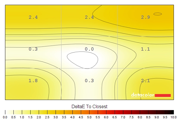
Colour temperature uniformity map
Contrast in games and movies
Lagom contrast tests
Colour reproduction
Colour gamut
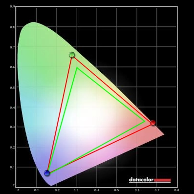
Colour gamut 'Test Settings'
Colour in games and movies
Viewing angles
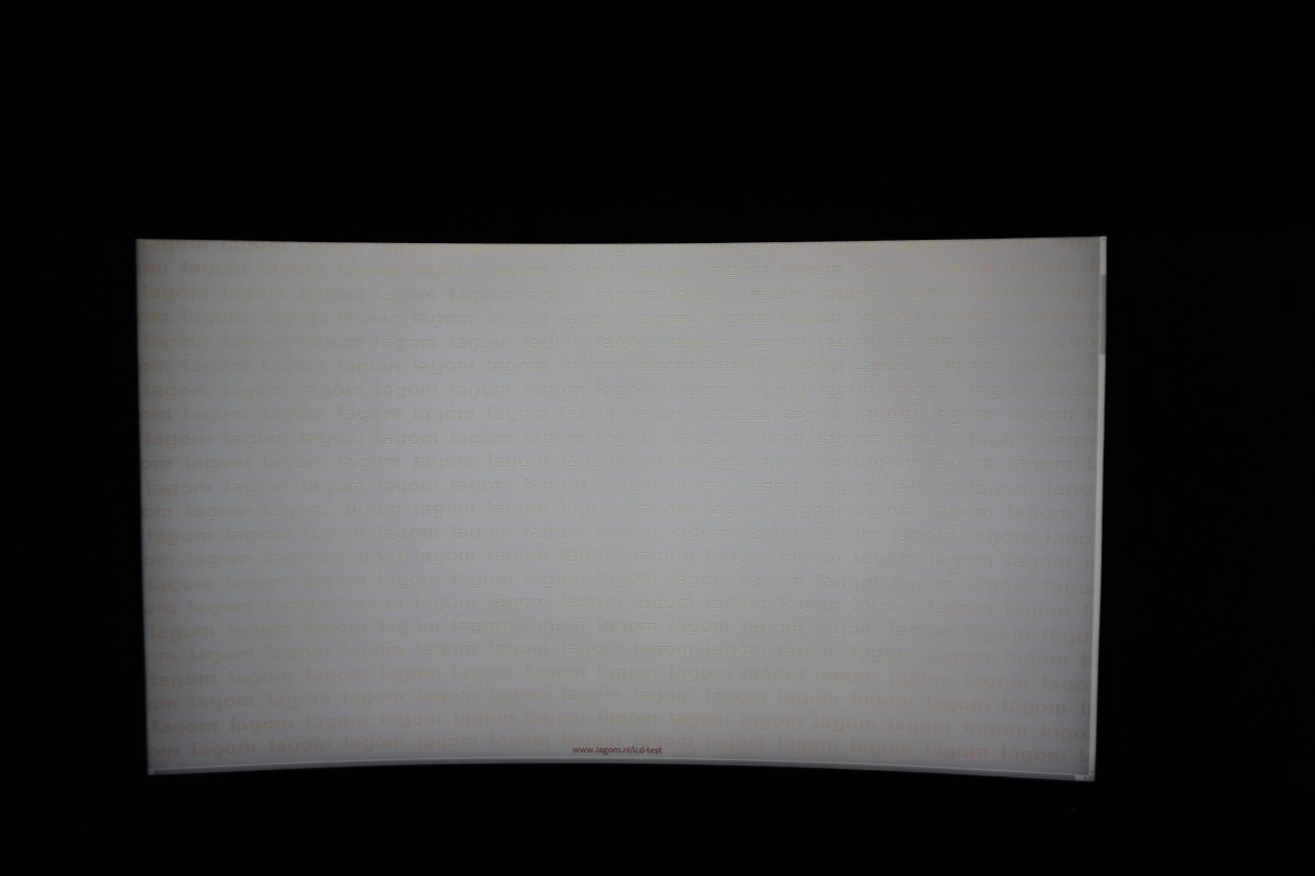
The following video shows how this test appeared from a variety of viewing angles, as well as mixed and dark desktop backgrounds. You can see a loss of contrast and saturation is viewing angles become more extreme, for the mixed desktop background. For the dark background you can see a purple and silver ‘VA glow’ which blooms out from more extreme angles, as noted earlier.
Interlace pattern artifacts
Responsiveness
Input lag
Perceived blur (pursuit photography)
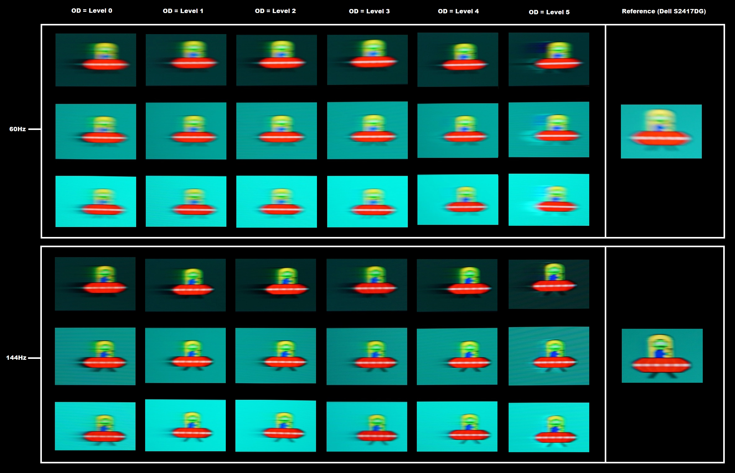
Responsiveness in games and movies
FreeSync – the technology and activating it
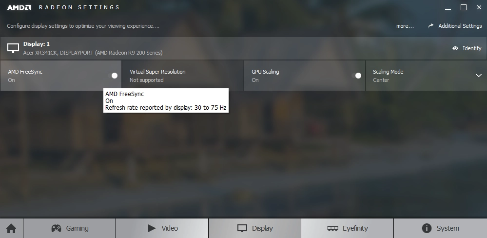
The ASUS supports a variable refresh rate range of 48 – 144Hz. That means that if the game is running between 48fps and 144fps, the monitor will adjust its refresh rate to match. When the frame rate rises above 144fps, the monitor will stay at 144Hz and the GPU will respect your selection of ‘VSync on’ or ‘VSync off’ in the graphics driver. With ‘VSync on’ the frame rate will not be allowed to rise above 144fps, at which point VSync activates and imposes the usual associated latency penalty. With ‘VSync off’ the frame rate is free to climb as high as the GPU will output (potentially >144fps). AMD LFC (Low Framerate Compensation) is also supported by this model, which means that the refresh rate will stick to multiples of the frame rate where it falls below the 48Hz (48fps) floor of operation for FreeSync. If a game ran at 32fps, for example, the refresh rate would be 64Hz to help keep tearing and stuttering at bay. This feature is used regardless of VSync setting, so it’s only above the ceiling of operation where the VSync setting makes a difference.
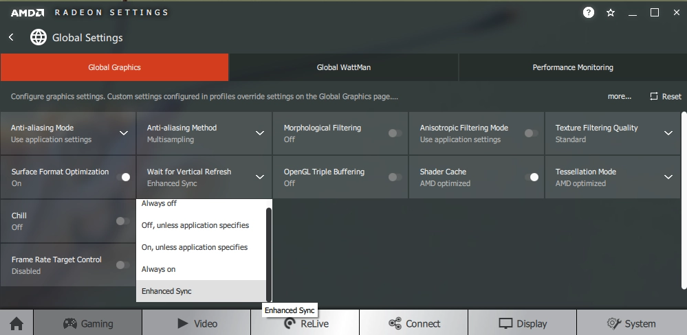
Note that this monitor does not provide any obvious ‘at a glance’ indication that FreeSync is active, such as a change of power LED colour. However; the top right of the OSD displays the current refresh rate of the display. This updates in real-time (or close enough) to reflect changes in the frame rate, so with FreeSync active you’ll see this constantly changing along with frame rate rather than just displaying ‘144Hz’ or whatever static refresh rate you had selected. You will also be able to observe the refresh rate sticking to double the frame rate once LFC kicks in below 48fps (48Hz). This information can also be displayed by enabling the ‘FPS Counter’ feature, which as per the OSD video actually displays the refresh rate of the display and is therefore dependent on FreeSync being active. Finally, it’s worth remembering FreeSync only removes stuttering or juddering related to mismatches between frame rate and refresh rate. It can’t compensate for other interruptions to smooth game play, for example network latency or insufficient system memory.
FreeSync – the experience
The 31.5″ 2560 x 1440 curved experience
Interpolation and upscaling
Conclusion
Positives Negatives Good colour gamut and light matte screen surface help deliver a rich experience, after appropriate tweaking
Weaknesses in colour consistency compared to IPS-type panels and poor default setup
Good static contrast performance delivering good depth to dark shades and allowing lighter shades to stand out well against darker surroundings. The screen surface was free obvious smeary graininess Minor graininess to the screen surface (not the ‘smoothest’ matte surface), some ‘black crush’ and ‘VA glow’ as common to the panel type Very low input lag and a good 144Hz performance overall. FreeSync worked as intended to combat tearing and stuttering
Some sluggish pixel transitions, with ‘smeary’ and ‘break-up’ trailing in places. More overshoot at decreased refresh rates (including with ‘FreeSync’ active as frame rate drops), although less than we’ve seen on some models
A decent pixel density and resolution, what we feel is a useful curve. Plus an attractive and intriguing design with solid build quality and good ergonomic flexibility
May look a bit too ‘gamer-esque’ for some users, the stand is unnecessarily deep due to its ostentatious design and some of the lighting features are quite pointless in most situations
![]()
