Author: Adam Simmons
Date published: June 28th 2017
Table of Contents
Introduction
Models with VA (Vertical Alignment) panels are attractive to some users due to their relatively strong contrast performance and lack of ‘IPS glow’. Until relatively recently, though, they were sluggish things restricted to relatively low refresh rates of typically 60Hz. There has been something of a resurgence in monitors with VA panels recently, with manufacturers combing them with curved screens, higher refresh rates and other new-fangled things like G-SYNC, FreeSync and Quantum Dot backlights. The AOC AG322QCX combines the VA experience with a curved screen of relatively high resolution, 144Hz refresh rate and support for AMD FreeSync via Adaptive-Sync on the monitor. We take a look at this screen which certainly has lots of users buzzing with excitement, putting it through its paces in our usual gauntlet of tests.
Specifications
The monitor uses a 31.5” SVA (‘Super’ Vertical Alignment) panel with support for a 144Hz refresh rate and a 1800R (relatively steep) curve. True 8-bit colour is supported and a 4ms grey to grey response time is specified, which is typical for a VA panel but generally quite misleading as well. Some of the key ‘talking points’ of this monitor have been highlighted in blue below.
Features and aesthetics
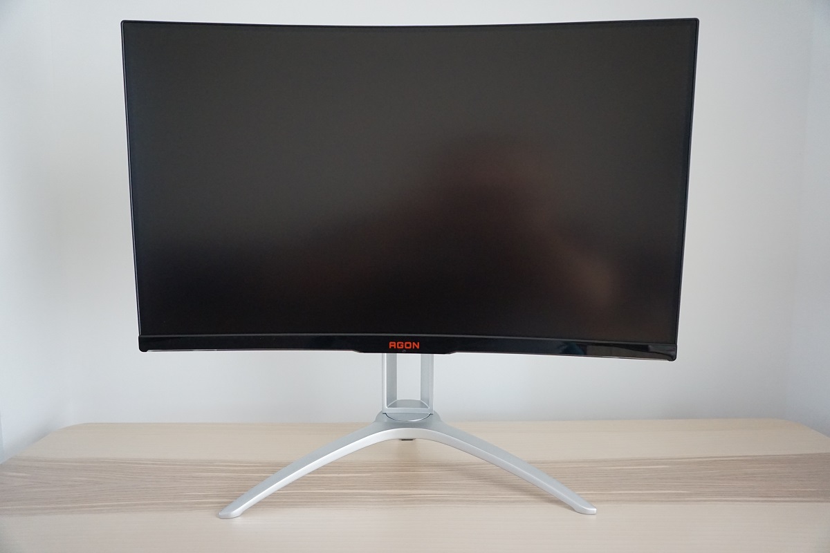
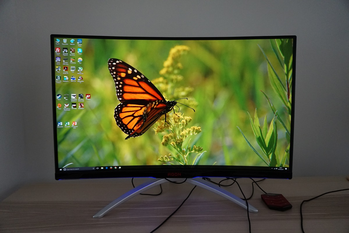
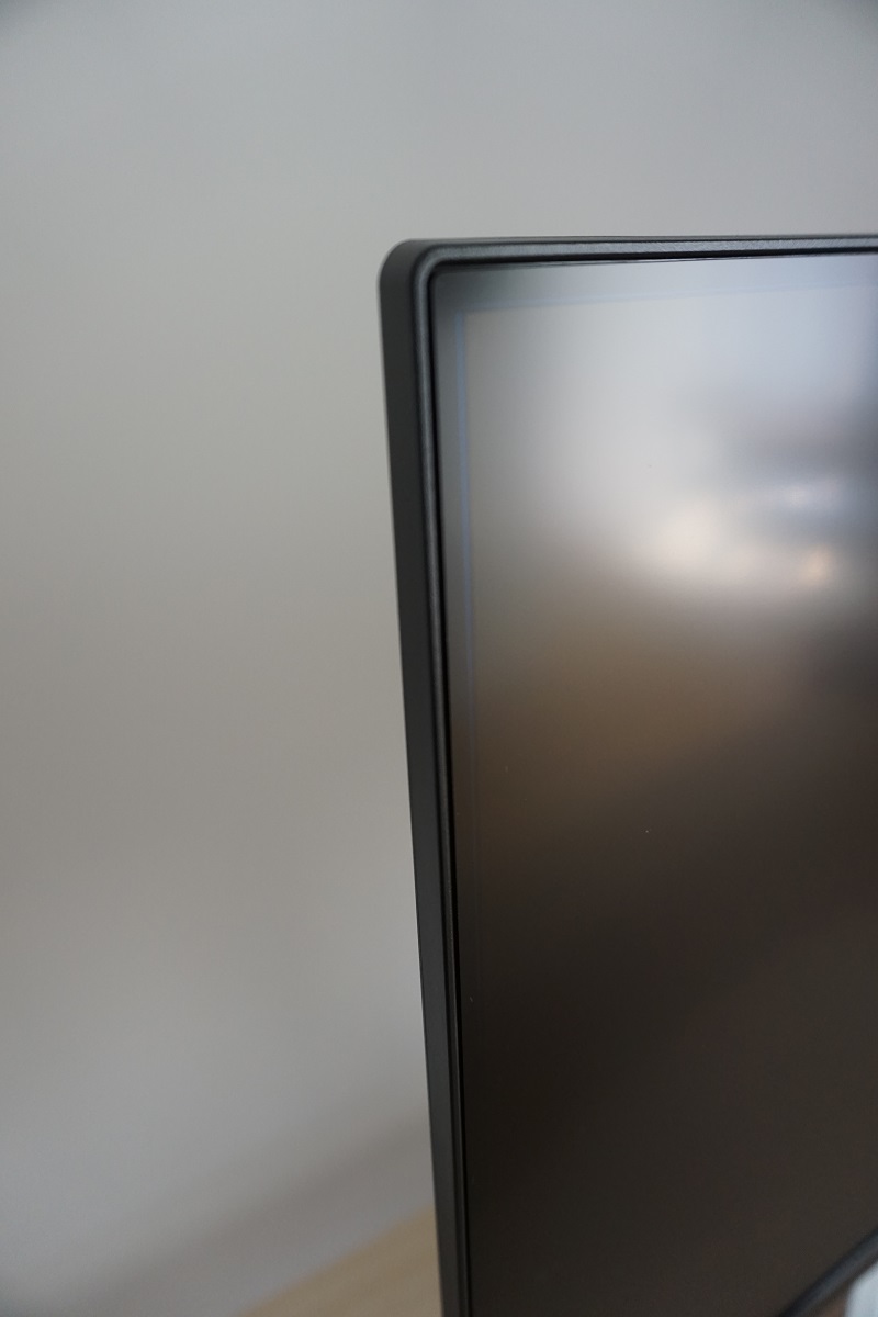
From the front the monitor goes for a homely look. But one that is somewhat rugged looking in some ways. The bezels are slender with a dual-stage design comprising a thin hard plastic outer component as well as a panel border. The panel border appears to blend into the monitor seamlessly when the screen is switched off, but is visible against lighter colours in particular when the screen is switched on. There is a very faint and extremely thin blue line visible from certain angles on the panel border as well, as shown in one of the images below taken from a specific angle with light shining on the region to highlight this line. This isn’t something you notice when using the monitor from a normal viewing position and isn’t at all distracting. The bezels are ~9mm (0.35 inches) thick at the top and sides, including both components. The bottom bezel is thicker matte black plastic and pretty much covers the whole panel border in that region; ~25mm (0.98 inches) plus an extra couple of mm centrally. This central region has a dark red AGON logo, whilst either side of this there are illuminated LED strips. These can be cycled between red, green, blue or off. The brightness of these LEDs can also be changed, as explored in the OSD video shortly. The stand is a heavy-duty but ‘artistically shaped’ affair made from powder-coated metal. The screen surface is light matte anti-glare, as explored shortly.
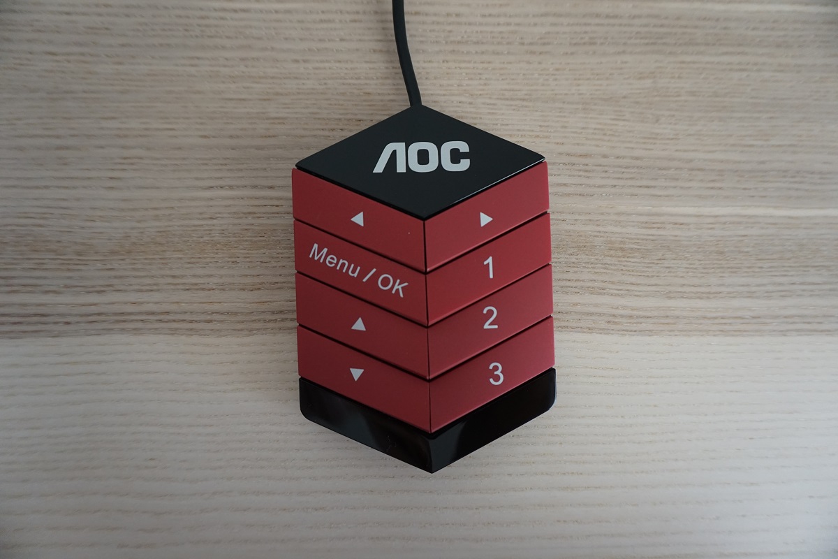
The OSD (On Screen Display) controls are located towards the right of the bottom bezel, with a joystick (JOG button) allowing intuitive navigation. A separate remote is also provided, which connects to the monitor via Mini-USB. This is shown in the image below. Both control mechanisms, the OSD system itself and the functionality of the LED strips is highlighted in the video below.
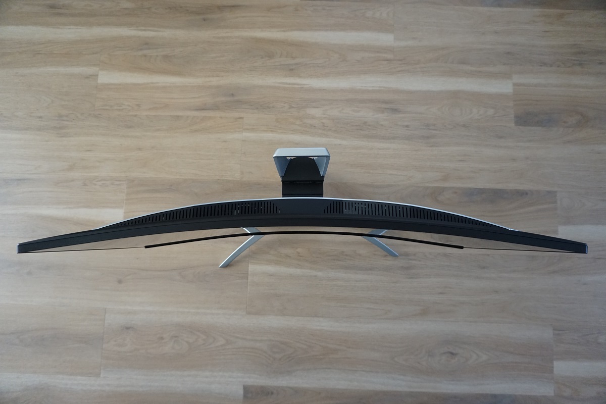
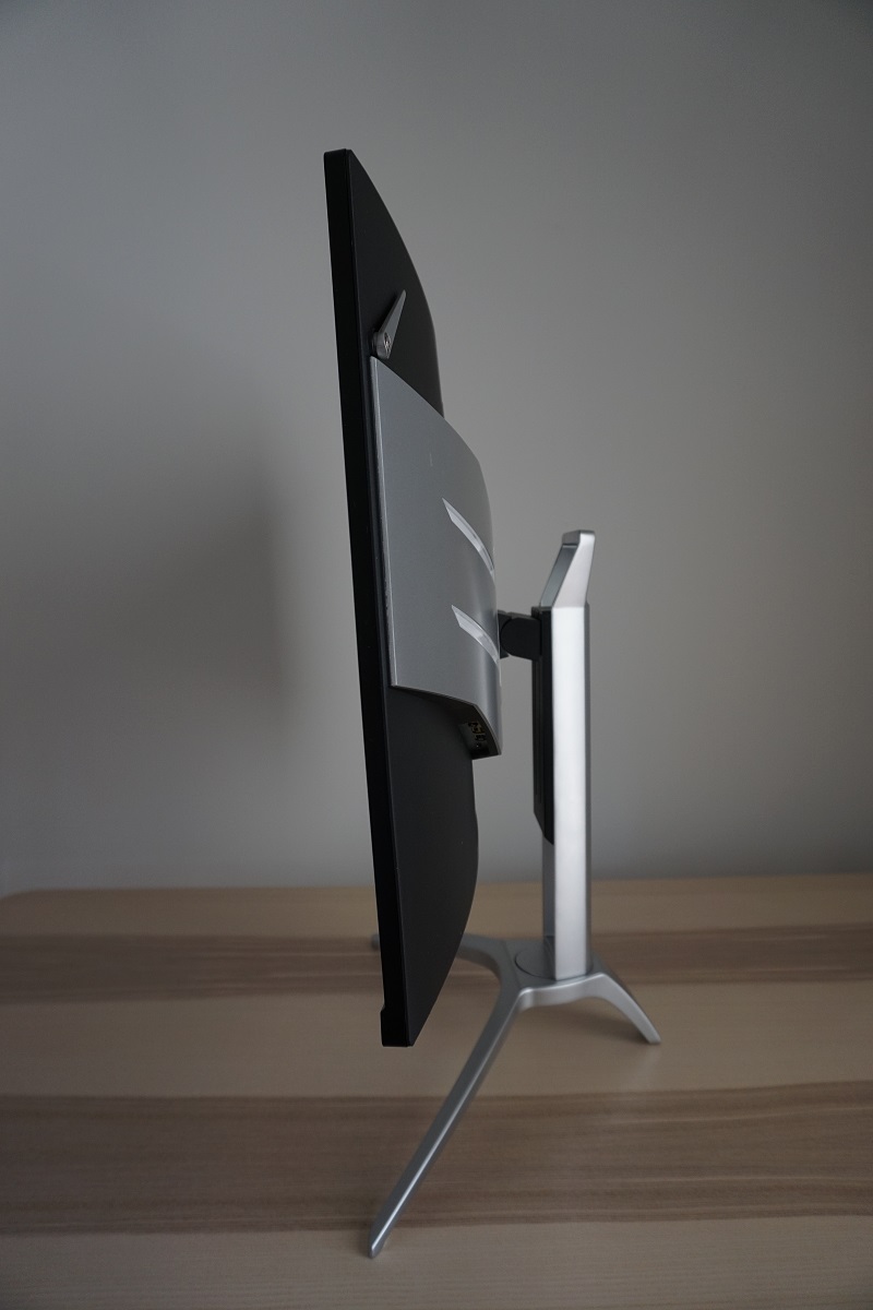
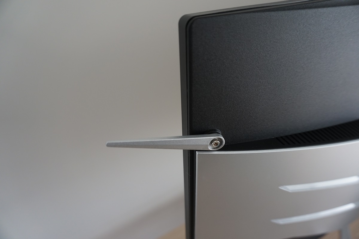
From the side the screen is – ~17mm (0.67 inches) at thinnest point, lumping out more centrally. The right side of the screen features a flip-down headphone hook, which can be folded neatly inwards at the back of the screen when not in use. The included stand’s quite solid nature can be seen from this angle. It offers good ergonomic flexibility; tilt (5.5° forwards, 28° backwards), swivel (30° left, 30° right) and height adjustment (110mm or 4.33 inches). At lowest height the screen clears the desk by ~96mm (3.77 inches) with the top of the screen ~539mm (21.22 inches) above the desk surface. The total depth of the monitor including stand is ~270mm (10.63 inches). The screen sits quite close to the front of the stand, too, so it is a fairly deep stand which may bring the monitor closer to your eyes than you’d ideally like if you have limited desk depth.
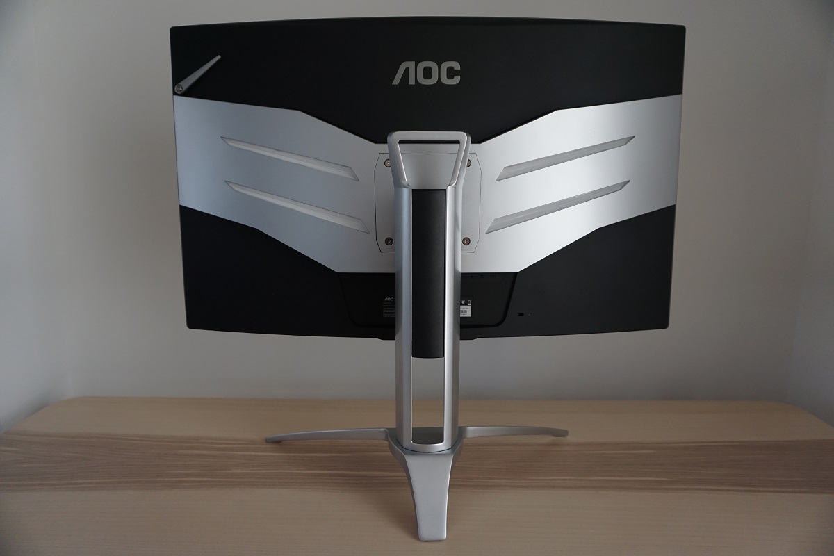
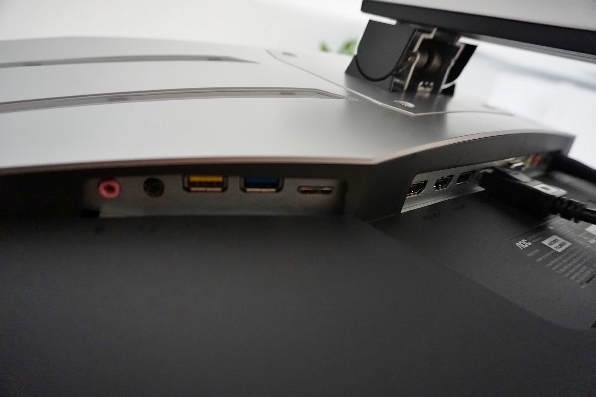
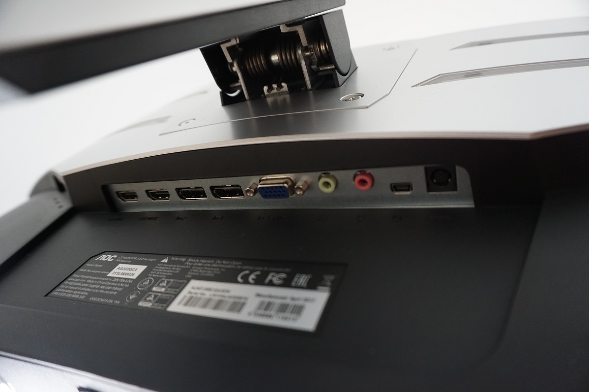
The rear of the screen combines matte black plastic with silver plastic ‘wings’. These wings have strips of LEDs, controlled at the same time as the ones on the bottom bezel (i.e. can be switched to red, green, blue or off). The included stand attaches centrally using 100 x 100mm VESA and can be removed to make way for an alternative VESA 100 stand or mount. The ports of the monitor are down-firing. To the left (first image below) there is; 3.5mm microphone jack, 3.5mm headphone jack, 2 USB 3.0 ports (yellow coloured one supports fast-charging) and a Micro-B USB port. To the right of these (shown more clearly in the second image) there are; 2 HDMI 2.0 ports (Adaptive-Sync supported), 2 DP 1.2a ports (Adaptive-Sync supported), VGA, 3.5mm audio input, 3.5mm microphone jack, Mini-USB (for OSD controller) and DC power input (external power brick). There are also some simple integrated stereo speakers which provide basic but not particularly high-quality sound output. The monitor may emit a buzzing sound with these active when displaying certain content. If you don’t intend to use the integrated speakers, turn ‘Volume’ to ‘0’ in the ‘OSD setup’ section of the menu.
The full refresh rate at the native resolution can be harnessed by either DP 1.2a or HDMI 2.0, via either an Nvidia or AMD GPU. FreeSync is also supported on compatible AMD GPUs. An HDMI cable, DP cable and USB 3.0 cable is included in the box alongside a power cable.
Calibration
Subpixel layout and screen surface
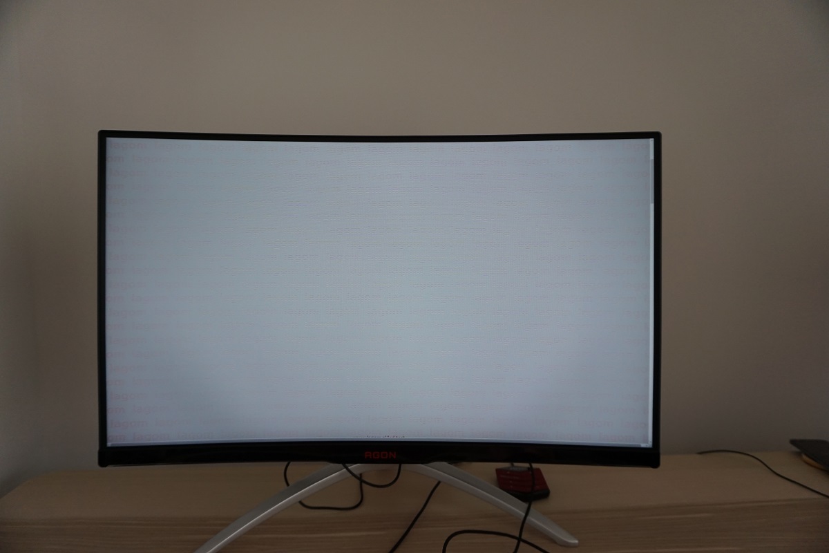
A light (or ‘relatively light’ depending on how you choose to classify it) matte anti-glare screen surface is used on the monitor. This provides good glare-handling characteristics and keeps the image looking relatively smooth, without obvious graininess or ‘smearing’ when observing lighter shades. There is a light misty graininess to the screen surface as mentioned with examples deeper into the review rather than smeary or heavy graininess.
![]()
An RGB (Red, Green and Blue) stripe subpixel layout is used, which is the standard expected by modern operating systems such as Microsoft Windows and MacOS. Apple users therefore needn’t worry about text fringing from non-standard subpixel layouts, whilst Windows users don’t necessarily need to run ClearType. However; as is common on many VA panels (particularly Samsung SVA panels), the subpixels are a bit squat. That is to say they are relatively wide but short, with relatively large gaps between rows. This has a slight impact on text clarity, making some text appear somewhat softer than it might on models with other panel types but similar pixel density. This can be alleviated to an extent by running through ClearType and isn’t something we see as a major issue, although sensitivity to this varies and it could bother some users.
Testing the presets
The monitor has two distinct sets of ‘presets’. There are ‘Eco Mode’ settings which have been a staple of AOC monitors for some time, which simply set the brightness to a certain preset value; ‘Standard’, ‘Text’, ‘Internet’, ‘Game’, ‘Movie’ and ‘Sports’. In addition, there are a range of ‘Game Mode’ settings which have made their way onto some of the company’s newer models, notably in their AGON line-up; ‘FPS’, ‘RTS’, ‘Racing’, ‘Gamer 1’, ‘Gamer 2’ and ‘Gamer 3’. These lock off some of the OSD options, such as ‘Color’ and ‘Gamma’ settings and in some cases the entire ‘Luminance’ menu as well. They also impart varying levels of oversaturation and excessive sharpness. As explored in the OSD video, the final three numbered ‘Gamer’ presets provide access to a greater range of settings than the other ‘Game Mode’ options, but still lock off the ‘Color’ and ‘Gamma’ settings. Rather than get bogged down testing a load of settings we find visually unappealing, we’ll instead look at certain combinations of settings which we do find appealing or otherwise interesting.
The table below shows key readings taken using a DataColor Spyder5ELITE colorimeter alongside some general observations, using a range of settings. The monitor was left in its ‘Plug and Play’ state, connected to a Windows 10 machine without additional drivers or ICC profiles specifically loaded. It was connected to a Club 3D Radeon R9 290 royalAce Free-Sync compatible GPU via DP 1.2. The monitor was left running for over 2 hours before data for this table was compiled. We made similar observations with the monitor connected to an Nvidia GTX 1070. Unless otherwise stated, assume that settings were left at default except for the refresh rate being set to 144Hz. The refresh rate did not affect our observations on this table or have any noticeable impact on the static image quality of the monitor, only during motion as explored later. When viewing the figures in this table, note that for most PC users ‘6500K’ for white point and ‘2.2’ for gamma are good targets to aim for.
| Monitor Settings | Gamma (central average) | White point (kelvins) | Notes |
| Gamma1 (Factory Defaults) | 2.1 | 6284K | Fairly good balance to the image overall, although overly bright and a slightly warm look with a slight green push. The image has plenty of vibrancy and a good range of distinct shades is displayed. There is strong saturation due to the colour gamut, but not the same garish oversaturation associated with viewing ‘sRGB content’ on a wide gamut model. As usual for a VA model, some saturation is lost towards the edges and bottom of screen due to the gamma behaviour (viewing angle restrictions) but this is fairly tame. |
| Gamma2 | 1.9 | 6285K | As above but gamma significantly lower and image appears less saturated (‘washed out’ in places) as a result. |
| Gamma3 | 2.3 | 6285K | As ‘Gamma1’ but the measured gamma is increased slightly to ‘2.3’. The shape of the gamma curve is a bit different as the gamma is actually lower for dark shades and raised fairly significantly for mid-tones. This increases visibility in dark areas a little and makes some shades appear less rich whilst others appear richer. The changes aren’t exactly dramatic, however. |
| Color Temp. sRGB | 2.2 | 7333K | This mode is very bright and the brightness setting is locked along with the colour channels, so it is of limited appeal unless one has a colorimeter or similar device. Although the measured gamma averages ‘2.2’, the tracking is not as close to the curve. There are some significant deviations centrally with a bowing in the curve to the right of the desired ‘2.2’ curve (i.e. gamma is raised for mid-tones). Saturation of some shades noticeably weaker. |
| Color Temp. Normal | 2.1 | 6783K | A cooler look to the image, otherwise as factory defaults. |
| Low Blue Light = Weak | 2.1 | 5825K | This is a weak ‘Low Blue Light’ (LBL) setting. The image appears slightly warmer and blue light output from the monitor is marginally reduced. |
| Low Blue Light = Medium | 2.1 | 5546K | A slightly stronger LBL setting, providing an even warmer image with further blue light reduction. |
| Low Blue Light = Strong | 2.1 | 5223K | The strongest LBL preset on the monitor, providing a significant reduction in the blue colour channel. The image is noticeably warmer (especially before your eyes adjust) compared to the factory defaults, with the intended reduction in blue light output that comes with this. A suitable setting for relaxing viewing in the evening or other times when blue light exposure should be restricted. |
| Test Settings (see below) | 2.1 | 6485K | As factory defaults with better white point balance (less warm and without the green push) and more comfortable brightness. The image is vibrant and varied even accounting for the saturation lost at the flanks and bottom of the screen. |
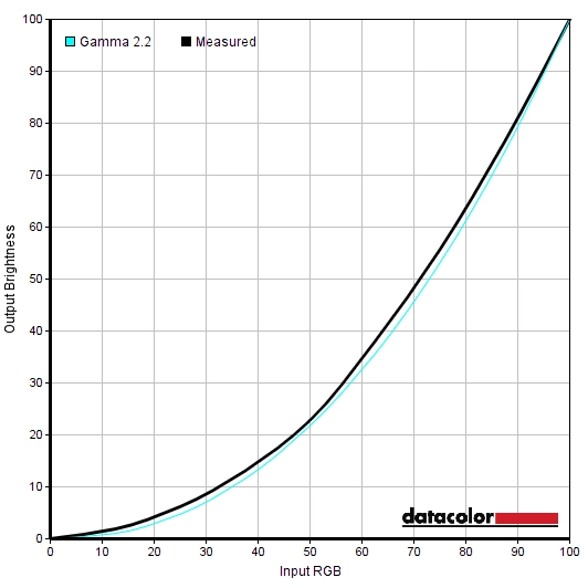
Out of the box the monitor was bright and had a slightly warm tint with a slight green push. It was otherwise quite well-balanced, with good vibrancy and strong (but not garish) saturation. The graph below shows the gamma tracking under our ‘Test Settings’, where various adjustments were made. The gamma bows a bit from the desired ‘2.2’ curve, averaging ‘2.1’. This actually helps alleviate some of the ‘black crush’ associated with VA panels, as we come onto later, and given the colour gamut the monitor was hardly short on depth and vibrancy. So this gamma tracking worked just fine on this monitor for its intended purposes. We will therefore not be providing any ICC profiles, which would likely prove counter-productive when used on a different unit to ours anyway. The monitor also includes some easily accessible ‘Low Blue Light’ settings. Well, fairly easily accessible as they are found on a specific section of the OSD rather than having some quick-access keys associated with them. These worked as intended and cut back on the blue channel, with the ‘Strong’ setting being one we used not for our testing but simply for personal viewing comfort in the evenings. Blue light keeps the body alert and affects your ‘sleep hormones’, so it’s best to cut this out as much as possible in the hours leading up to sleep. Note that these LBL settings are applied over the top of the ‘Color Setup’ settings, so what you select in that section of the OSD influences the result as well. Our observations above were based on the default ‘Warm’ setting being used in conjunction with the LBL settings. For our ‘Test Settings’ we reduced the brightness and made some adjustments to colour channels so that we could get close to our preferred 6500K white point target without a green bias. We’ve included the ‘Overdrive’ setting and refresh rate used for most of our testing, for reference. Note that individual units vary, particularly when it comes to colour temperature. On the second unit we tested, using the factory default (‘Warm’) actually came very close to 6500K. Assume that any setting not mentioned, including contrast and ‘Gamma’ was left at default. Overdrive= Medium Color Temp= User R= 48 G= 47 B= 50 Refresh rate= 144Hz A BasICColor SQUID 3 (X-Rite i1Display Pro) was used to measure the luminance of white and black using a range of monitor settings. From these values, static contrast ratios were calculated. Results are show in the table below, with blue highlights indicating the results for our ‘Test Settings’. Black highlights indicate the highest white luminance, lowest black luminance and highest contrast ratio recorded. Assume any setting not mentioned was left at default, with the exceptions already noted in the calibration section.
Gamma test settings
Test Settings
Brightness= 65 (according to preferences and lighting)
Contrast and brightness
Contrast ratios
Monitor Settings White luminance (cd/m²) Black luminance (cd/m²) Contrast ratio (x:1) 100% brightness 286 0.13 2200 80% brightness 214 0.10 2140 60% brightness 170 0.08 2125 40% brightness 125 0.06 2083 20% brightness 77 0.04 1933 0% brightness 29 <0.02 >1459 Factory defaults (90% brightness) 234 0.11 2127 Gamma2 234 0.11 2127 Gamma3 234 0.11 2127 Color Temp. sRGB 200 0.11 1818 Color Temp. Normal 212 0.11 1927 Low Blue Light = Weak 231 0.11 2100 Low Blue Light = Medium 229 0.11 2082 Low Blue Light = Strong 227 0.11 2064 Test Settings 172 0.08 2150
The average static contrast with only brightness adjusted was 2096:1, which is quite strong and as expected given the specifications. This provides a deeper look to blacks and other dark colours than other panel types, with brighter shades standing out nicely against darker backgrounds. The contrast ratio was recorded as 2150:1 under our ‘Test Settings’, which is pleasing. It dropped only slightly (non-significantly) even with the strongest ‘Low Blue Light’ setting active, to 2064:1. The largest drop in contrast was observed with ‘Color Temp.’ set to ‘sRGB’, at 1818:1. The maximum luminance recorded on this table was 286 cd/m², whilst the minimum white luminance recorded was 29 cd/m². This provides a luminance adjustment range of 257 cd/m² with a good dim minimum and fairly bright maximum.
The monitor includes a Dynamic Contrast setting called ‘DCR’ (Dynamic Contrast Ratio), which allows the backlight to adjust its intensity based on the overall levels of dark and bright shades on the screen. The backlight dims as a single unit (BLU – Backlight Unit), so this can’t accommodate intricate mixtures of bright and dark and simply works on averages for the whole screen. The backlight brightness adjusted rapidly in accordance with changes in scene brightness, dimming quite well for the darkest content but otherwise tending to be quite bright. As usual, we prefer manual adjustment of brightness.
PWM (Pulse Width Modulation)
The monitor uses DC (Direct Current) to dim the backlight and does not use PWM (Pulse Width Modulation) at any brightness setting. The backlight is therefore considered ‘flicker-free’, which will come as welcome news to those who are worried about side-effects from PWM usage.
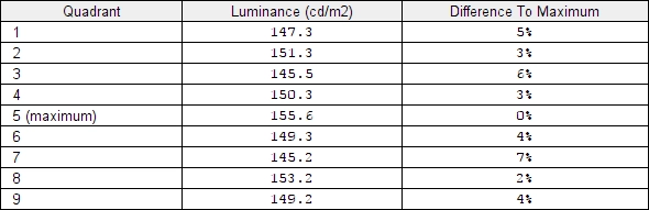
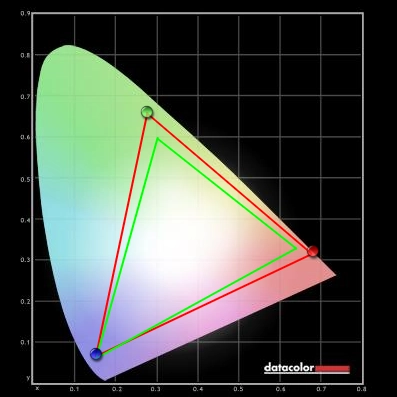
Luminance uniformity
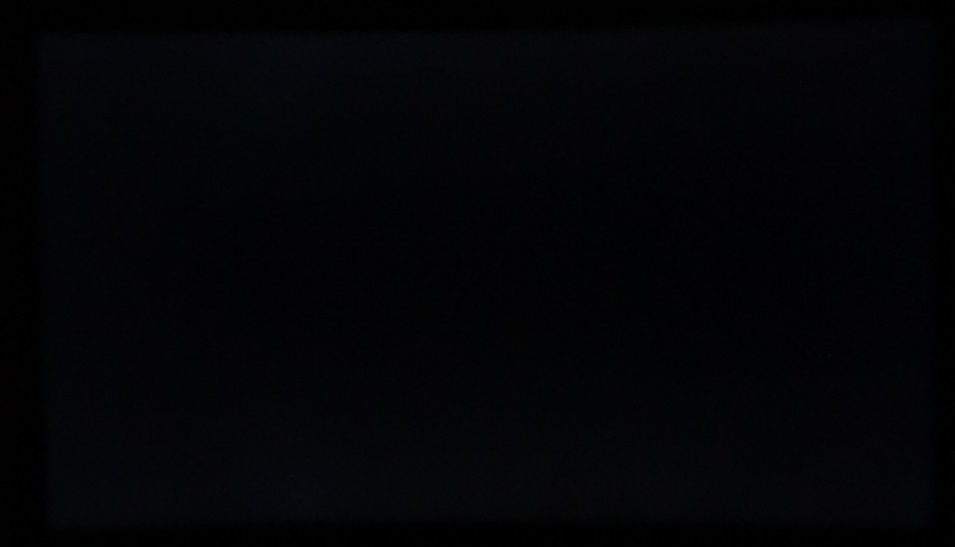
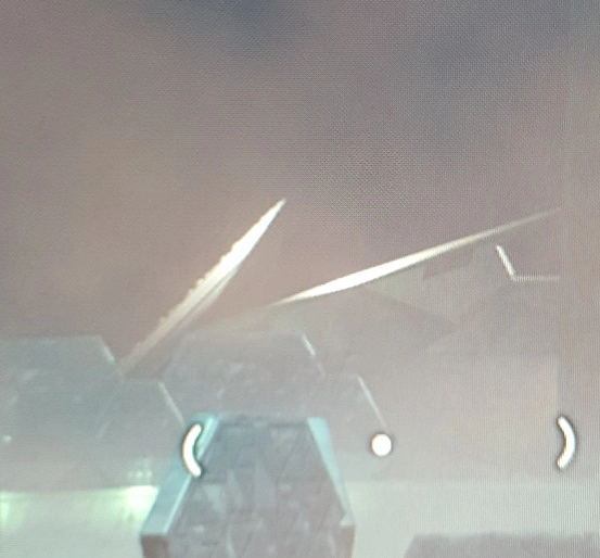
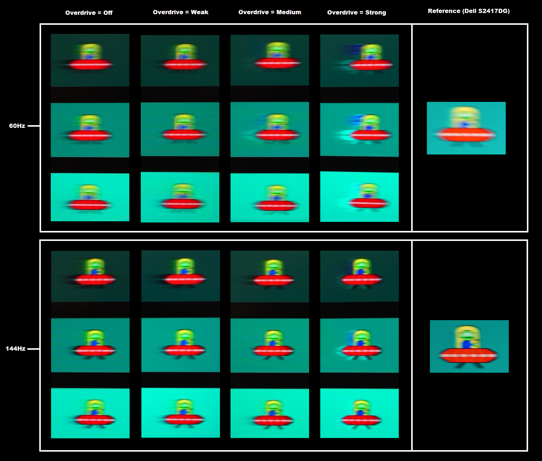
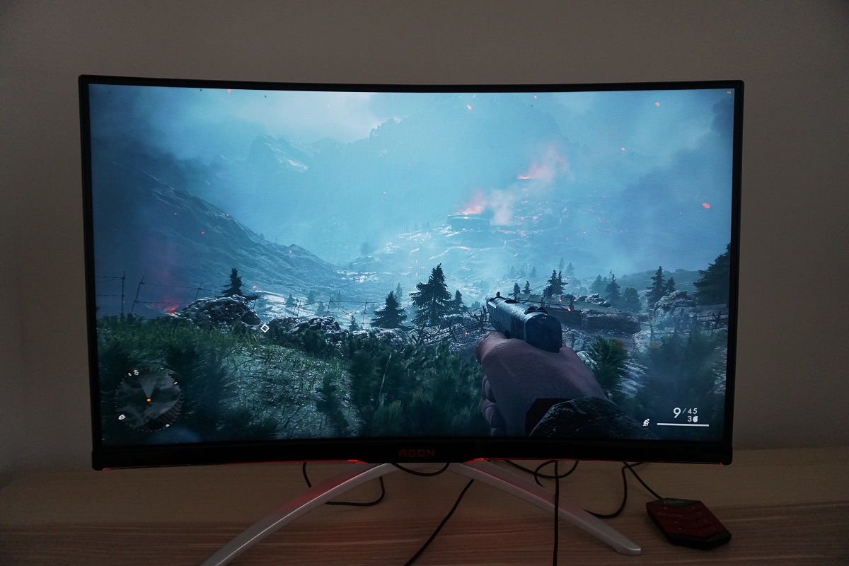
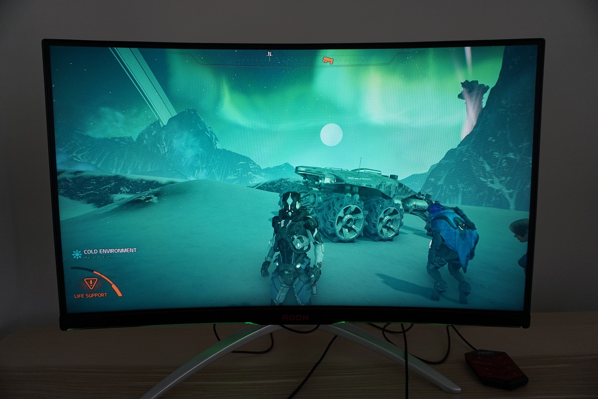
Whilst observing a black screen in a dark room we observed some backlight bleed and clouding in the bottom and to a lesser extent top regions of the screen. This is shown in the image below, which was taken in a dark room using our ‘Test Settings’ and camera settings which are representative of what the eye sees when observing the screen. The image was taken a sufficient distance back from the screen to eliminate so-called ‘VA glow’. This is a silver-purple glow that’s visible towards the bottom of the screen, in particular, from a normal viewing position. If you more to a sharper viewing angle relative to the screen, it blooms out more noticeably. It’s nowhere near as obtrusive as ‘IPS glow’ nor does it impact fine detail in dark scenes to the same extent. Note that individual units vary when it comes to backlight bleed. The luminance uniformity was excellent in this test. The maximum luminance was recorded at ‘quadrant 5’ in the centre of the screen (155.6 cd/m²). The greatest deviation from this occurred at ‘quadrant 7’ towards the bottom left of the screen (145.2 cd/m², which is 7% dimmer). The remaining quadrants showed 3 – 6% deviation from the brightest point, which is impressive. Note that individual units vary when it comes to uniformity and you can expect further deviation beyond the points measured. Indeed, both of the samples we tested actually had some pressure marks as we describe in the viewing angle section that affected white very slightly but lighter greys a bit more. Nonetheless, it’s good to see such a strong performance on this test on our sample. The graphic below is a contour map which uses darker greys to represent lower luminance levels and hence greater deviation from the brightest point than lighter greys. The percentage deviation between each quadrant and the brightest point recorded is also given. We also measured colour temperature (white point) uniformity for the same quadrants. Deviations here are shown in the contour map below and are assigned DeltaE values. A higher value indicates greater deviation from the 6500K (D65) daylight white point target than lower values and a DeltaE >3 is considered significant deviation that would be readily noticed by eye. Greater deviations are also shown using stronger (deeper) yellow shades. Results here were again very impressive. There were no significant deviations recorded, with DeltaE 1.7 being the highest recorded. Note again that individual units vary when it comes to uniformity and that VA models such as this have perceived shifts that aren’t accounted for by these readings, due to viewing angle weaknesses. Regardless, it’s again good to see such a strong performance in this area on our unit. On Battlefield 1 (BF1) the monitor put in a pleasing contrast performance. Dark areas of the game had a pleasing atmospheric look, with good depth to dark shades. Brighter shades pierced the surrounding darkness very nicely, whilst the screen surface provided only a light misty graininess rather than anything smeary or obtrusive. There was a degree of ‘black crush’, whereby the darkest shades blend into one another as a sort of dark mass, with things becoming more distinct if you view the monitor from a slight angle. This is seen to a degree on all VA models, and on this one it wasn’t too severe really. There was still a good level of detail in dark areas, for example you could see creases on clothes and decent detail on rock cracks etc. in the dark. There was also a slight lightening towards the bottom corners of the monitor due to ‘VA glow’ and a bit of clouding on our sample, which as noted earlier is nowhere near as obtrusive or noticeable as the bloom you get from ‘IPS glow’. On Dirt Rally the contrast performance was again strong. Bright elements such as car headlights pierced through darker surroundings very nicely and looked fairly smooth thanks to the screen surface. Night time on this game can be particularly dark, especially if racing around in a forest environment with thick vegetation cover. The monitor displayed a good atmosphere here, with decent depth to dark shades and nothing as obtrusive as ‘IPS glow’ (just some ‘VA glow’ and clouding as noted earlier). The level of detail in such dark scenes was also good, with some fairly minor details such as vegetation structures and tire tread patterns visible. These small details were not as distinct as they ideally would be, owing to black crush, but did not appear ‘flooded’ or artificially enhanced in any way either. Finally, we made some observations on the Blu-ray of Star Wars: The Force Awakens. This film has plenty of scenes which call for a strong contrast performance, with deep dark space lit up by fire, explosions and glowing light sabers. Echoing our other testing, such scenes were handled nicely by the monitor and had the sort of look they demand. There was no atmosphere-breaking ‘IPS glow’ to worry about or washed out looking dark shades, whilst brighter shades stood out with pleasing ‘pop’ against darker backgrounds. The film is presented in 16:9 letterbox format, too, with the black bars at the top and bottom appearing quite dark and unobtrusive. Lagom’s contrast tests were used analyse specific strengths and weaknesses in contrast performance. The following observations were made. The colour gamut of the AG322QCX (red triangle) is compared with the reference sRGB colour space (green triangle) in the image below. You can see that the monitor comprehensively covers sRGB (100%) with fair extension beyond this in the red and green corners of this particular diagram. This allows the monitor to output all shades within the sRGB colour space and provide an enriched level of vibrancy. It’s actually close to the sort of gamut achieved by the use of ‘Quantum Dots’ in an LED backlight, but the backlight here actually just uses enhanced phosphors. AOC dub this ‘SuperColor technology’. Having a fair amount of extension beyond sRGB isn’t ideal for colour accuracy, though, as shades appear somewhat more saturated than they should. This monitor was never marketed for ‘colour critical work’ and really the VA panel type isn’t the best suited for such work anyway. Nonetheless, an sRGB emulation mode is included which can be activated by selecting ‘sRGB’ for ‘Color Temp.’ in the ‘Color Setup’ section of the OSD. As noted earlier colour channels and brightness are locked, so this is only really of use if you have a colorimeter. Even then, you may prefer to simply calibrate from the native gamut. As you can see below, the colour gamut with the ‘sRGB’ setting doesn’t fully cover sRGB and only offers 94% coverage according to our measurements. On Battlefield 1 (BF1) the monitor represented shades in a lively but still natural-looking way. Saturation levels were strong, and there was a bit of an extra red hue to some earthy browns and some pastel greens appeared somewhat more eye-catching than they ideally would. However; the overall look was pleasing, vivid and natural. We were not presented by the level of oversaturation that wide gamut (Adobe RGB+) models produce when displaying content such as this. Content that was designed with the sRGB colour space in mind. The same applied to some skin tones, which shared a slight extra red hue but avoided the sunburnt or clearly incorrect look associated with some untamed wide gamut models. There was a pleasing array of vibrant and minty greens, rich reds and browns and great flashes of vivid orange and red for fires and explosions. There was a degree of saturation lost towards the flanks and bottom of the screen, due to the gamma behaviour typical to VA panels. This was as subtle as we’ve seen from such a large VA panel, and indeed more subtle than on most smaller models. From our preferred viewing distance (70-80cm), shades maintained quite pleasing richness even at the extreme edges and bottom of the screen. Dirt Rally also showcased a pleasing array of vibrant shades. There was again a bit of an extra red hue to some earthy browns, although this was not overwhelming. Environments retained a natural rather than garish and obviously oversaturated look, with a good palette of green and brown shades. There were some impressively lush forest greens, but some of the most eye-catching shades were those contained on some of the car liveries. There were some particularly eye-catching pinks, purples and reds – in fact the intensity of some of the reds was almost distracting at times. Again, not in the garish way presented by some models with an even wider gamut, but certainly a way that stands out well. There was some saturation lost towards the edges and bottom of the screen, but nothing extreme by any means. We also tested the Blu-ray of Futurama: Into the Wild Green Yonder. There were some striking neon shades here, such as electric pinks and blues and bright reds. There are also many more muted pastel shades featured on this film, something that helps give different characters a sense of individuality with sometimes subtle variations on their skin tones or clothes. Presenting such subtly different shades accurately and consistently is something IPS-type panels are known to be particularly good at. Due to the slight loss of saturation in some regions of this screen, the colour consistency wasn’t quite up to that level. But it was rather impressive for a VA panel really, especially such a large one, with shades maintaining good distinct identity across most of the screen. Lagom’s tests for viewing angle tests were used to analyse colour consistency and viewing angle performance in a more specific way. The following observations were made from a normal viewing position, eyes around 70-80cm from the screen. Perceived changes in gamma and saturation can be more pronounced if you sit closer to the screen. Some monitors suffer from visual artifacts which become most apparent when observing rapid motion of lighter shades on the screen. We refer to these as ‘interlace pattern artifacts’ but they may also be called ‘inversion artifacts’ by some users. They are particularly common or at least more readily noticed on high refresh rate models. Sometimes these artifacts manifest themselves as an interference pattern or a mesh of interlaced lines, with the lines alternating between a slightly lighter and slightly darker variant of the intended shade. These are often most eye-catching where they are dynamic, particularly easy to observe with lighter shades such as an explosion or smoke effect in a game. We observed some dynamic interlace pattern artifacts, with some textures appearing to break up into a very fine and faint polygonal mesh. The image below, taken from Mass Effect Andromeda, gives a very rough idea of the interlacing effect. It can be seen towards the top right and right central region of this image, but it’s not really as noticeable in practice as it appears on the image. It’s quite faint (less distracting than on some models that display such patterns) and something not all users would notice. The effect was a bit more pronounced in some places, particularly near the edges of some objects. When thin areas were moving (for example nametags above the heads of a character in a game) you could see that the texture appeared slightly fragmented rather than solid. Again, not bothersome or noticeable to everyone, but worth noting. There were also some static interlacing artifacts. These were most noticeable towards the bottom left quarter of the screen but also there to an extent centrally. They were visible as reasonably faint horizontal bands of a slightly darker and slightly lighter variant of the intended shade. These bands are fairly faint so not everyone would notice them. A small utility called SMTT 2.0 was used alongside a sensitive camera to analyse the latency of the AG322QCX, with over 30 repeat readings taken to improve accuracy. Using this method, we calculated 5.61ms (under 1 frame at 144Hz) of input lag. This value was not influenced by enabling one of the ‘Game Mode’ presets in the OSD and was recorded with ‘Low Input Lag’ set to ‘On’ in the OSD. The measured value was very similar when connected to a FreeSync-compatible GPU, which greys this option out but seem to effectively force it ‘On’ anyway. We have no way to accurately measure input lag in the variable refresh rate and frame range environment under which FreeSync would be active, however. Note that the value is influenced both by the element you ‘see’ (pixel responsiveness) and the element you ‘feel’ (signal delay). It indicates a very low signal delay, which contributed to an excellent ‘connected feel’ as we explore shortly. In our responsiveness article we explore the key factors affecting monitor responsiveness. One of the key concepts explored here is ‘perceived blur’, which is caused predominantly by the movement of your eyes as you track motion on the screen. It is also influenced by pixel responsiveness, although this is generally a less significant (but still important) factor on modern monitors. We also explore ‘pursuit photography’, a technique which uses a moving camera to capture motion on a monitor in a way that reflects both of these elements of perceived blur. This is something that normal static photography or video can’t capture. The following images are pursuit photographs taken using the UFO Motion Test for ghosting, with the test running at its default speed of 960 pixels per second. This is a practical speed for taking such photographs and sufficient to highlight both elements of perceived blur. The monitor was set to 60Hz and 144Hz with its various various ‘Overdrive’ settings tested; ‘Off’, ‘Weak’, ‘Medium’ and ‘Strong’. All rows of the test were used, which differ in the shade level (dark, medium and light). The final column shows reference shots, a Dell S2417DG set to 60Hz and 144Hz. This model offers very fast pixel responsiveness and well-tuned pixel overdrive, so shows what things should look like in this test where response time is not really a limiting factor. At 60Hz you can see that the object itself looks relatively soft, broad and quite ‘fuzzy’ in its appearance. This indicates a relatively high level of perceived blur caused by eye (camera) movement. There are various degrees of trailing behind the object, too, which comes down to pixel responsiveness. As this is a VA panel, there is quite a bit of variation between the speed of pixel responses depending on the grey level (i.e. shade depth) that the monitor is transitioning to and from. With ‘Overdrive = Off’ you can see a significant amount of trailing behind the object for the dark background, a little less but still a lot for the medium background and significantly less (but still some) for the light background. Using the ‘Weak’ setting reduces the trailing slightly in all cases, particularly for the medium background. Trailing is still most significant for the dark background. The ‘Medium’ setting ramps up the pixel overdrive significantly, causing obvious bright trails of inverse ghosting (overshoot) behind the object. This is particularly prominent with the medium background, but still visible for the dark background and to a lesser extent the light background. Using the ‘Strong’ setting causes extremely strong overshoot; an unmistakable mess of inverse ghosting is now visible, particularly for the medium background. At 60Hz, it’s quite clear that ‘Weak’ is the optimal setting in this test – reflecting our experiences more broadly. At 144Hz the object itself is significantly narrower and more sharply focused. This reflects the lower level of perceived blur caused by eye (camera) movement. This comes with the territory when the frame rate and refresh rate is increased from 60fps@60Hz to 144fps@144Hz. There is again various degrees of trailing behind the object, with the characteristics looking quite different to 60Hz for some of the ‘Overdrive’ levels. With this set to ‘Off’ the trailing is largely comparable to 60Hz – significant trailing, particularly for the dark background. The ‘Weak’ setting cuts this down a little bit, particularly for the medium background. The ‘Medium’ setting further cuts down the trailing and unlike at 60Hz, does not replace it with obvious overshoot. There is a small trace of overshoot with the medium background, but this is fairly subtle really and actually looks quite comparable to the reference shot. There is still a fair degree of trailing for the dark background, but less so than with the ‘Weak’ setting. There is a minor reduction with the light background as well, although the trailing here is already rather light even with weaker overdrive settings. The ‘Strong’ setting again introduces obvious overshoot. Unlike at 60Hz, the ‘Medium’ setting is now the one we consider optimal – again reflected by more general use of the monitor. Note that although refresh rates between ‘60Hz’ and ‘144Hz’ are not documented here, they were tested. Results lie some way between these two, with overshoot becoming more and more noticeable as frame rate decreases. At 100Hz, for example, we’d still give the edge to ‘Medium’ as it does cut down on some of the conventional trailing of ‘Weak’. The level of overshoot is some way between what you see at 60Hz and 144Hz as well, a little closer to 144Hz but certainly more pronounced. This presents an interesting choice for users who wish to use FreeSync, as the monitor dynamically adjusts refresh rate and therefore the optimal setting to use wouldn’t always be the same. This is explored in more detail deeper into the review. On Battlefield 1, where the frame rate kept up with the 144Hz refresh rate, the experience was fluid. The monitor provided what we refer to as excellent ‘connected feel’, with inputs from the controller (mouse and keyboard) translating very rapidly into movement on the screen. This is not only down to the low input lag of the monitor, which does help in this respect, but the fact it is outputting up to 2.4 times as much information every second as a 60Hz monitor. This provided a nice ‘competitive edge’ and we did feel our ability to aim consistently, quickly and accurately was greatly aided by this strong ‘connected feel’. Another advantage of the monitor outputting up to 2.4 times the information every second is perceived blur, which as demonstrated in the ‘Test UFO’ images earlier is greatly reduced when comparing 144Hz (@144fps) to 60Hz (@60fps). To truly minimise this as much as possible, though, it’s also important that pixel response time can do these high refresh rates and frame rates justice. Overall the monitor put in a respectable pixel response performance, able to make very good use of the 144Hz refresh rate and high frame rate potential that brings. Many of the transitions occurred quickly enough for a strong 144Hz performance, bringing with it the sort of low levels of perceived blur enjoyed on the fastest 144Hz (non strobing) LCD models. This kept the game world and enemies within it in much sharper focus than on even the fastest 60Hz monitors, or indeed on this monitor at much lower frame rates. It made tracking and engaging enemies that bit easier and just made the overall gaming experience more comfortable and enjoyable. There were some weaknesses in pixel responsiveness, however. There were some transitions that were a fair bit slower than optimal, between certain medium shades and medium-dark shades. Such transitions are not all that uncommon and it gave a little bit of a powdery trail behind certain objects – increasing perceived blur slightly. We found this perfectly tolerable as the trailing was by no means extreme. There was also a little bit of overshoot in places, usually manifesting itself as a weak ‘snail trail’ semi-transparent trail behind objects. This was faint and blended in fairly well for overshoot, so wasn’t bothersome in our view. As is typical for the VA panel type, the weakest pixel transitions on this model occurred where darker shades were brought into the mix. This gave more extensive trailing, the most pronounced of which we refer to as ‘break-up’ trailing. This is whereby very dark shades that appear pretty much black to the user, but actually have slight tints of other colours mixed in, have those more colourful elements leach out. It leaves a trail which is akin to wetting fountain pen ink on a page. On BF1 such transitions were not very common, fortunately. So there wasn’t the sort of widespread smeary trailing that some VA models are prone to and we found the advantages of the high refresh rate and low latency shone through regardless on titles like this. It’s important to note, though, that on some game titles these high-contrast transitions with lots of dark elements and bright contrasting elements are far more common. On Dirt Rally, where frame rates were suitably high, there was clear benefit from the high refresh rate. This applied both visually, in terms of perceived blur, and also in terms of felt responsiveness (‘connected feel’). At the level we play this game at we can’t really rant about how this gave a competitive advantage, but to some racing fans it certainly would and even so it was nicer having the game environment a bit more sharply focused when racing around the tracks. The same sort of weaknesses observed on BF1 were there again, particularly where darker shades were involved. These were common on this title when racing at night, but also when driving past shaded areas of vegetation. There was some ‘break-up’ trailing that gave a slightly smeary look in places, but we didn’t observe anything too eye-catching or distracting. It’s worth noting that this is subjective and some users would find this sort of trailing more bothersome than others. On the whole things were significantly better than on many VA models we’ve tested, including older high refresh rate models such as the Acer Z35 where weaknesses were more widespread, but weaknesses did still exist. Finally, we made some observations on the Blu-ray film titles we tested. As these were limited to 24fps it didn’t really give the monitor a chance to shine in terms of responsiveness, but equally didn’t expose any obvious weaknesses. Compared to a 60Hz monitor there was some advantage to be gained by the fact 24fps divides evenly into the 144Hz frame rate, which reduces juddering. The monitor can also be set to 23Hz or 24Hz for users who prefer the refresh rate to match the frame rate exactly. AMD FreeSync is a variable refresh rate technology, an AMD-specific alternative to Nvidia G-SYNC. The monitor dynamically adjusts its refresh rate so that it matches the frame rate being outputted by the GPU, where possible. Both our responsiveness article and the G-SYNC article linked to explore the importance of these two elements being synchronised. At a basic level, a mismatch between the frame rate and refresh rate can cause stuttering (VSync on) or tearing and juddering (VSync off). FreeSync also boasts reduced latency compared to running with VSync enabled, in the variable frame rate environment in which it operates. FreeSync requires a compatible AMD GPU such as the Club3D Radeon R9 290 royalAce used in our test system. There is a list of GPUs which support the technology here, with the expectation that future AMD GPUs will support the feature too. The monitor itself must support ‘VESA Adaptive-Sync’ for at least one of its display connectors, as this is the protocol that FreeSync uses. The AG322QCX supports FreeSync via DP 1.2a (or ‘DP 1.2a+’) as well as HDMI 2.0 on compatible GPUs. AMD’s recent drivers include Radeon Software Crimson, which makes activation of the technology very straightforward. It should be enabled automatically, but you can check its status by opening ‘AMD Radeon Settings’ and clicking on ‘Display’. You should then ensure that the first slider, ‘AMD FreeSync’, is set to ‘On’. If you hover over this, it will also report the variable refresh rate display supported by the display. Note that the image below is for a different monitor and is just used as an example here. VSync is configured in the ‘Gaming’ section of ‘Radeon Settings’, where it is referred to as ‘Wait for Vertical Refresh’. You can either configure this globally under ‘Global Settings’ or for each game individually. The default is ‘Off, unless application specifies’ which means that VSync will only be active if you enable it within the game itself, if there is such an option. Such an option does usually exist – it may be called ‘sync every frame’ or something along those lines rather than simply ‘VSync’. Most users will probably wish to enable VSync when using FreeSync to ensure that they don’t get any tearing. You’d therefore select either the third or final option in the list, shown in the image below. We tested the monitor on a range of game titles, including Dirt Rally, Mass Effect Andromeda and Battlefield 1. The overall principles of FreeSync and the benefits it brought were quite similar on all of the titles we tested, so we will simply focus our attention on Battlefield 1 for the purposes of this section. The flexibility with the graphics settings meant it was possible to test the full variable refresh rate range of the monitor, from 45fps and below all the way up to 144fps. With fairly conservative settings the game tended to run at triple-digit frame rates, sometimes reaching up to the maximum of 144fps. With FreeSync enabled slight dips below this maximum were of little consequence, whereas without the technology enabled we found the tearing (VSync off) or stuttering (VSync on) to be very noticeable. As the frame rate dropped to the lower end of those triple-digit values (~100fps), the connected feel dropped a little and there was a greater degree of perceived blur. But things were still good in both respects, providing an experience that even the fastest 60Hz LCDs would not provide. Although FreeSync couldn’t overcome the slight increase in perceived blur and lower connected feel compared to running at higher frame rates, it certainly still did its thing. Sensitivity to tearing and stuttering varies, but we find it rather obnoxious whilst running games at ~100fps on a 144Hz monitor. So having the monitor match the frame rate with its refresh rate and hence removing such mismatches was much appreciated. Increasing the level of graphical detail provided an inevitable drop in frame rate. Depending on the settings used and the scenes being rendered, the frame rates we observed could fluctuate anywhere from around 30fps to ~100fps. Again, it was always beneficial having FreeSync active. At relatively low frame rates any stuttering and tearing becomes even more pronounced when a variable refresh rate technology is not employed and a relatively high static refresh rate is used. Having these imperfections removed was certainly a nice bonus. But as frame rate decreased, the connected feel ebbed away and significantly increased levels of perceived blur came into play. There is certainly a gulf between running the game at around 60fps compared to 144fps, for example, and things became down right painful with further drops. By around 40fps it felt like everything was running in slow motion – and relatively speaking, that’s pretty much what’s happening. There was no abrupt transition below 45fps as LFC kicked in – this worked as intended, with the monitor sticking to multiples of the frame rate with its refresh rate. There was also more noticeable overshoot, particularly some bright trailing in places, at reduced frame rates. This seemed to be inversely proportional to frame rate (i.e. as the frame rate fell, the overshoot become ever-more pronounced). Although it’s very crude, we’d actually say that the ‘Weak’ setting for ‘Overdrive’ was preferable at ~60fps and below. Possibly ~80fps and below depending on preferences. This was due to lower levels of overshoot and no real benefit in reducing perceived blur for faster settings at such frame rates. In our considerable experience, overdrive tuning for different refresh rates is something that monitors featuring Nvidia G-SYNC tend to do better. That’s not surprising given that it’s something Nvidia specifically works with manufacturers to tune for different refresh rates. In contrast to using a ‘one size fits all’ solution for the pixel overdrive. Most monitors with a 2560 x 1440 (WQHD) resolution are 27”, giving a pixel density of 108.79 PPI (Pixels Per Inch). With a 31.5” screen, the pixel density sits at 93.24 PPI – close to the pixel density of a 23 – 24” Full HD monitor. This is a pixel density that many users find quite comfortable for reading text without scaling and it brings a decent level of detail and clarity when gaming or viewing graphical content. It also provides a good amount of useful ‘screen real-estate’ for productivity purposes – something that is explored by graphic comparison with the Full HD resolution in this article. The screen size itself is rather large and is something people will have their own personal preferences for. We did not find this in any way overwhelming and actually quite enjoyed the immersive experience it provided when gaming in particular. The images below are just for illustrative purposes, providing an indication of the sort of productivity potential of the monitor. Another important aspect to consider with this screen is the 1800R curve, which is reasonably steep ‘on paper’ but also something we feel some users may misunderstand. When users who haven’t actually experienced a curved screen discuss the concept with others, they might use words as ‘distorted’, ‘unnatural’, ‘weird’ and other similar language to describe it. In practice it is not only something that you quickly come accustomed to, it is also something which feels very natural and visually comfortable. It’s not something to shy away, unless perhaps you’re a designer who requires geometric perfection, as we feel it enhances the experience. Many users who initially described the curve in the negative way we just described would likely change their tune after some eyes-on experience with such a screen as well. Images of the monitor tend to exaggerate the curve and can potentially add to these negative thoughts about it. In practice the effect is subtle – the viewing experience just has a little more depth to it. The manufacturers might also point out that the more uniform viewing distance between the edges and centre of the screen is more comfortable. It also minimises the viewing angle when viewing the peripheral sections of the screen, bringing some improvements to colour consistency from a normal viewing position. Potentially enhanced viewing comfort isn’t something we could back up scientifically, especially as we don’t tend to find flat screens inherently uncomfortable just because they’re flat. But we certainly didn’t find this screen uncomfortable and found the addition of the curve to be a nice but natural one. The images below show the monitor in action in various game titles, note that these are just for illustrative purposes and do not give a good idea of how the screen is to use in person. There are some circumstances where the full native 2560 x 1440 resolution either can’t be used or isn’t practical. If for example you hook up the monitor to a games console, which might be limited to 1920 x 1080 (Full HD), or are running a more demanding PC game. The monitor provides some basic scaling functionality over both DP and HDMI, designed primarily to support devices such as games consoles and Blu-ray players. If you run the monitor at 1920 x 1080 (Full HD), for example, the monitor will use an interpolation process to translate that onto its 2560 x 1440 pixels. This only occurs if you select 50Hz or 60Hz (common refresh rates for AV devices), whereas at higher refresh rates and indeed resolutions GPU scaling is relied upon instead. If you want the monitor to handle the scaling by using its interpolation process at 1920 x 1080 @ 50/60Hz and you’re using a PC, you need to make sure the GPU driver is correctly configured for this. For AMD users the driver is set up correctly by default to allow the monitor to interpolate where possible. Nvidia users should open Nvidia Control Panel and navigate to ‘Display – Adjust desktop size and position’. Ensure that ‘No Scaling’ is selected and ‘Perform scaling on:’ is set to ‘Display’ as shown in the following image. The interpolation process used by the AG322QCX does a better job than GPU scaling in that the image doesn’t look quite as soft when compared to running 1920 x 1080 on a native Full HD display. However; there is still a fair degree of softening, which can be noticed quite readily if you’re sitting at a desk using the monitor on a PC. This can be avoided entirely by using GPU scaling, as a PC user, and ensuring 1:1 pixel mapping is used. You will get a large black border around the screen as only 1920 x 1080 pixels will be illuminated, so this probably isn’t a good enough compromise for PC users. Games console users don’t have this luxury anyway, as the monitor does not have hardware 1:1 pixel mapping support and they have no ‘GPU driver’ to fall back on. However; the softening of the monitor’s interpolation process is not so extreme that the effect is too obvious from a distance. If you’re viewing the monitor from considerably further away than arms length, which is fairly common for console gaming, it’s quite passable really. The video below summarises some of the key points raised in this written review and shows the monitor in action. The video review is designed to complement the written piece and is not nearly as comprehensive. There have been an increasing number of high refresh rate displays, curved displays and relatively large displays popping up. The AG322QCX covered all of this with its 31.5” curved screen. With a 1800R curvature, it’s certainly a ‘feature’ of the monitor and it is something you’ll notice when using the monitor. We don’t mean that in a bad way, though, as the effect was subtle enough to avoid giving an uncomfortable or strange experience. Quite the opposite in fact – just a bit of extra depth and certainly a comfortable and natural-feeling viewing experience. The 2560 x 1440 (WQHD) resolution does not give an outstanding pixel density when spread out across a 31.5” screen, but it still yields a decent pixel density. One that is similar to a ~24” Full HD screen and therefore a decent balance of readability and real-estate is provided. For gaming this is the sort of pixel density many will be accustomed to as well – so nothing to write home about in terms of clarity or detail, but nothing shockingly bad either. The monitor was set up quite nicely out of the box, with just a few tweaks required to bring things into line with our own preferences for testing. The relatively light matte screen surface and colour gamut helped bring out some rather vibrant and eye-catching colours – in fact the colour gamut rivalled some Quantum Dot displays we’ve used, even though they aren’t actually used here. The VA panel provided good colour consistency, allowing richness to be better maintained at various areas of the screen compared to some screens using the technology. The curve may also have helped a bit in this respect. The colour reproduction characteristics worked perfectly well for ‘entertainment purposes’ and general-purpose use. However; the extra saturation from colour gamut and lack of IPS-type colour consistency are less than ideal for uses where strong colour accuracy is required. The monitor put in a pleasing contrast performance, giving a distinct ‘VA’ look with decent shade depth and bright shades that stood out nicely against darker surroundings. Contrast was certainly not as good as you’d see on some screens, but was significantly better than what you’d see on any non-VA LCD really. The lack of ‘IPS glow’ was nice as well, with less obtrusive ‘VA glow’ affecting peripheral areas of the screen. There was also a degree of ‘black crush’, which is expected on a VA panel, but about as little of this as we’ve seen. This left the monitor able to produce quite a convincing atmosphere in dark scenes whilst maintaining decent depth and detail levels. Uniformity was interesting in that it was quite strong as measured by the colorimeter. There was what appeared to be some pressure mark caused by the backlight design, though, and this affected both of the units we tested. This wasn’t particularly noticeable in our view but is still something we feel is worth noting. The Achilles heel of any VA model is responsiveness. This model was certainly not perfect in that regard, although it was still was one of the more capable VA models we’ve tested in terms of responsiveness. The 144Hz refresh rate was combined with suitably low input lag, bringing the sort of ‘connected feel’ one would hope for from a high refresh rate gaming monitor. Pixel responsiveness was also decent overall, allowing the monitor to provide a good low level of perceived blur at high frame rates and complement its high refresh rate nicely. There were some weaknesses, particularly during dark transitions, whereby some more pronounced trailing could be seen. This was not as widespread as we’ve seen on some VA models, where frequent smearing would mar the experience and really limit the appeal regardless of refresh rate. There were still those niggling ‘sluggish’ transitions though, which some users really dislike – and these crop up more commonly on some titles than others. The monitor also provided support for AMD FreeSync, which worked as we would hope to combat tearing and stuttering from traditional refresh rate and frame rate mismatches. As frame rate dropped, though, some quite strong overshoot was introduced using the ‘Overdrive’ setting that worked best at higher refresh rates. This weakness is by no means unique to this monitor, but is certainly an area that G-SYNC models tend to fair better in. Overall the monitor put in a competent image performance in all areas, but just like any monitor wasn’t perfect. In addition to the colour consistency and responsiveness weaknesses mentioned above, the monitor displayed interlace pattern artifacts (both static and dynamic). These were not extreme and not something every user would notice, but it’s always nice to be able to say that a monitor doesn’t exhibit these at all. Depending on your perspective the styling might not be a big plus point either, particularly the large glossy plastic bezel at the bottom and rather deep stand. Nonetheless, the ergonomic flexibility and overall solid feel of the stand was quite welcome we feel. The monitor comes in at what we feel is a fair price for the features and performance on offer and certainly feel this will be a welcome addition to the desks of some gamers. The bottom line; quite a well-rounded monitor that provides a vibrant and responsive gaming experience, with strengths that we feel are more noticeable than its weaknesses.
The Spyder5ELITE was used to assess the uniformity of lighter colours, represented by 9 equidistant white quadrants running from the top left to bottom right of the screen. The table below shows the luminance recorded at each quadrant and the percentage deviation between a given quadrant and the brightest point recorded.
Luminance uniformity table
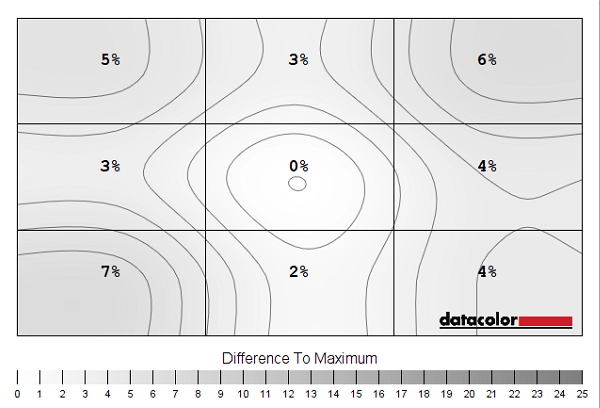
Luminance uniformity map
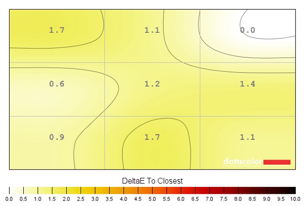
Colour temperature uniformity map
Contrast in games and movies
Lagom contrast tests
Colour reproduction
Colour gamut
Colour gamut 'Test Settings'

Colour gamut 'sRGB'
Colour in games and movies
Viewing angles
The following video shows how this test appeared from a variety of viewing angles, as well as mixed and dark desktop backgrounds. Note the purple and silver ‘VA glow’ from extreme angles for the dark background, as noted earlier. You can also see some dark regions towards the bottom of the video when lighter greys are presented, such as for the Lagom text in the video. These are circular pressure marks on our unit, which were also there (although slightly fainter) on our second unit. This appears to be related to the backlight design on this model and it isn’t something we found overly bothersome when just using the monitor normally.
Interlace pattern artifacts
Interlace Pattern Artifacts
Responsiveness
Input lag
Perceived blur (pursuit photography)
Responsiveness in games and movies
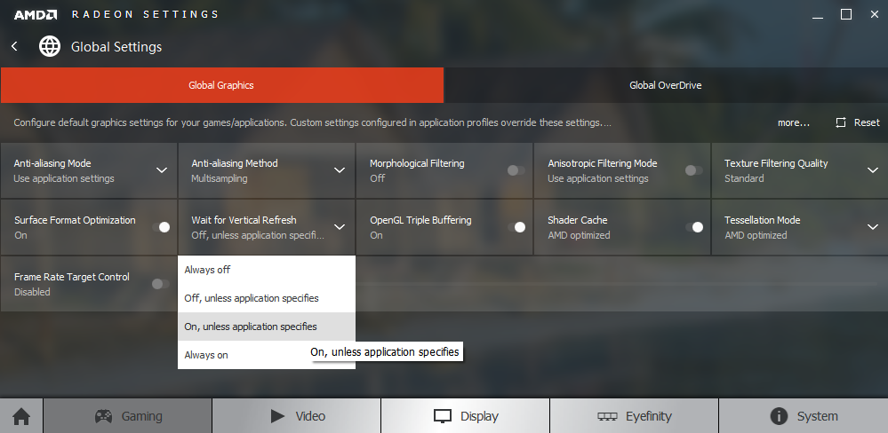
FreeSync – the technology and activating it

The AOC supports a variable refresh rate range of 48 – 144Hz. That means that if the game is running between 48fps and 144fps, the monitor adjusts its refresh rate to match. When the frame rate rises above 144fps, the monitor will stay at 144Hz and the GPU will respect your selection of ‘VSync on’ or ‘VSync off’ in the graphics driver. With ‘VSync on’ the frame rate will not be allowed to rise above 144fps, at which point VSync activates and imposes the usual associated latency penalty. With ‘VSync off’ the frame rate is free to climb as high as the GPU will output (potentially >144fps). AMD LFC (Low Framerate Compensation) is also supported by this model, which means that the refresh rate will stick to multiples of the frame rate where it falls below the 48Hz (48fps) floor of operation for FreeSync. If a game was running at 35fps, for example, the refresh rate would be 70Hz to keep tearing and stuttering in check. This feature is used regardless of VSync setting, so it’s only above the ceiling of operation where the VSync setting makes a difference.
There are a few final things to note related to the technology. Firstly, the application must be running in fullscreen mode, not a window (borderless or otherwise). Secondly, this monitor does not provide any obvious ‘at a glance’ indication that FreeSync is active, such as a change of power LED colour. In the ‘Extra’ section of the OSD it will have ‘FreeSync’ listed as the ‘V. Frequency’ if the technology is enabled in the graphics driver, but this does not tell you whether it is currently being used by an application or not. Hopefully the difference that the technology makes in practice will be an obvious enough indication that it is working, however.
FreeSync – the experience
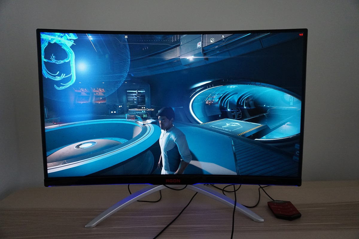
The 31.5″ 2560 x 1440 curved experience
Interpolation and upscaling

Video review
Conclusion
Positives Negatives Decent out of the box colour setup, a surprisingly generous colour gamut and relatively light matte screen surface help deliver a vibrant image. Colour consistency was pleasing for such a large VA panel, too
Gamma did not adhere perfectly to ‘2.2’ using any setting, but we didn’t feel this was detrimental for the intended uses of the monitor. Some colour consistency weaknesses compared to IPS-type models
Strong static contrast, providing respectable depth to dark shades and allowing lighter shades to stand out well against darker surroundings. The screen surface was free from heavy/smeary graininess Minor graininess to the screen surface (not the ‘lightest’ or smoothest matte surface we’ve seen), a small amount of ‘black crush’ and some ‘VA glow’ Very low input lag and a competent 144Hz performance, with pixel responsiveness that is especially good overall for a VA panel. FreeSync did its thing to combat tearing and stuttering when used with a compatible AMD GPU
Some weaknesses in pixel responsiveness, adding to perceived blur and introducing some more noticeable (‘break-up’) trailing in places. Overshoot became significantly more noticeable as refresh rate was decreased (including with ‘FreeSync’ active as frame rate drops)
Good ergonomic freedom from the stand, what we feel is a beneficial curve to the screen and a size and pixel density that some users will find rather appealing
Lacks the ‘wow factor’, detail and clarity that some models with higher pixel densities offer and a design that could be a bit divisive. That applies to many models, of course
![]()

