Author: Adam Simmons
Date published: July 31st 2014
Table of Contents
Introduction
For a while now ‘4K’ has been touted as the next big thing for displays. Manufacturers have been showing off ‘4K’ TVs at trade shows for a number of years and now the technology has made its way onto smaller displays. The Samsung U28D590D features a 28” panel with UHD (Ultra High Definition) resolution of 3840 x 2160 – which is what most manufacturers are actually referring to when they use the buzzword ‘4K’. The monitor certainly looks sleek on the outside and boasts some fairly decent specifications, but what is it actually like in practice? We put this screen through its paces in our gantlet of ‘real world’ tests to find out.
Specifications
This monitor uses the aforementioned 28” ‘4K’ UHD panel, which is manufactured by Taiwanese manufacturer Innolux (formerly Chimei Innolux and Chimei Optoelectronics or CMO). This uses Twisted Nematic technology to yield rapid pixel response times (which look good on paper) at the expense of somewhat restricted viewing angles. Another figure which looks nice on paper is the 10-bit colour performance, with the monitor supporting up to 1.07 billion colours. This is a positive change from the 6-bit + FRC common on TN panels and many of the more affordable IPS-type panels. It must be stressed that, as with many of these specifications, you rarely get a full indication of what to expect in practice. Even so we’ve highlighted these nice figures for you in blue below with our subsequent testing filling in the gaps.
Features and aesthetics
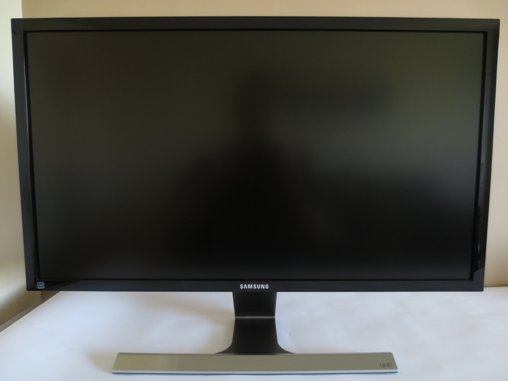
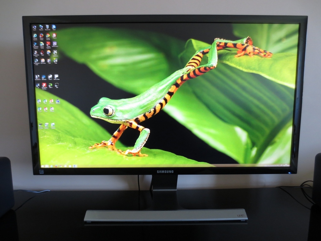
From the front the monitor has a contemporary appearance. The glossy black plastic bezels are of a moderate thickness (18mm or 0.71 inches) at all edges. There is a power LED at the bottom right, which glows a moderately bright medium blue. His can be configured to turn off when the monitor is in operation, if you prefer. The stand has a T-shaped design with a thin metallic angled front plate and matte silver plastic elsewhere. The right of the stand’s front plate is labelled ‘UHD’, which is of course a major highlight of the screen. The screen surface is relatively light matte, comparable to the surface used by Samsung on their AD-PLS panels. This provides a clearer and potentially more vibrant image than a stronger anti-glare surface. You can see some outlines of objects and the cameraman in the first image, which was taken in a bright room flooded with natural summer daylight. When the monitor is displaying content and lighting in the room is controlled there is no issue with glare, as shown in the second image.
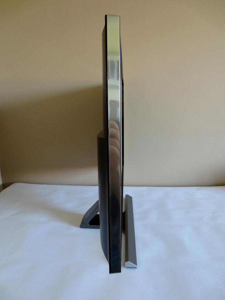
The side of the screen uses a chrome-effect silver plastic surround. The screen itself is reasonably thin at around 20mm (0.79 inches) at thinnest point, bulking out a bit centrally. The interesting stand shape can also be seen from this angle. The stand attaches at the bottom of the monitor and affords only slight tilt adjustment to the screen. The stability of the monitor is fairly standard for such a design – a bit of wobble if you knock the screen but nothing that should cause problems during general use.
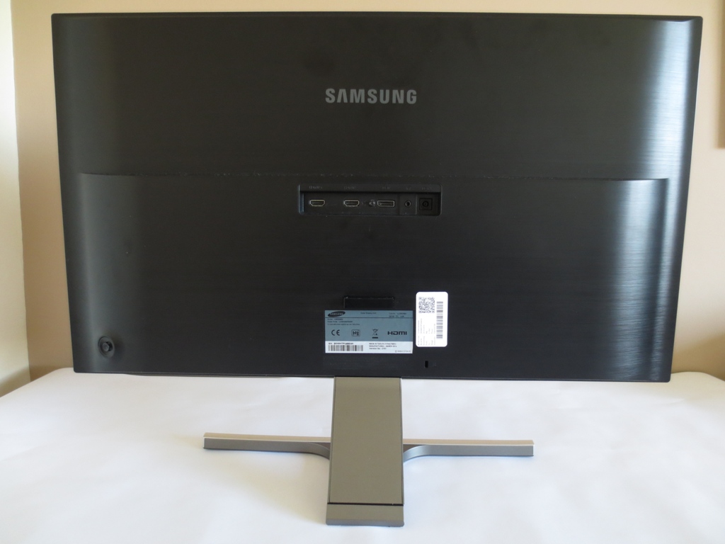
The rear has a faux brushed metal (matte black plastic) finish. The ports are located centrally; 2 HDMI 1.4 ports, DP 1.2 input, 3.5mm headphone jack and a DC power input (external ‘power brick’). Beneath that you will find a cable-tidy clip and Kensington lock socket.
The OSD (On Screen Display) is controlled by a ‘JOG button’ (small joystick) shown at the bottom left of the image. It can be controlled by the fingers of the right hand when the monitor is places in its usual forward-facing orientation. This system proved responsive and intuitive. Twiddling the joystick in any direction provides a quick menu that allows you to adjust brightness, contrast and sharpness with a further twiddle of the joystick up or down. A side to side twiddle allows you to adjust the volume for the 3.5mm headphone jack. If you press the joystick in on this menu or before entering this quick menu you gain access to the feature menu. This allows you to select one of four main options, each one corresponding to a to a different joystick direction; ‘Source’, ‘Menu’, ‘PIP/PBP’ and ‘Power Off’. Once an option is highlighted a further click of the joystick inwards selects it. Indeed the monitor can’t be powered off with a single button press, but that’s a minor inconvenience given the well thought out system as a whole. The following video will give you a better idea of how the system works and the menu options available.
Calibration
Correcting the colour signal
The monitor runs at its full native resolution and refresh rate (3840 x 2160 @ 60Hz) over DisplayPort 1.2. This is treated by Nvidia GPUs as a ‘PC’ resolution with the correct ‘Full Range RGB (0-255)’ colour signal and is also treated appropriately by AMD GPUs. Connecting a PC via one of the two HDMI 1.4a inputs limits the refresh rate to 30Hz at the native resolution and has the resolution listed in the Nvidia Control Panel as ‘4k x 2k, 3840 x 2160 (native)’ in the ‘Ultra HD, HD, SD’ list. Fortunately, as such TVs have similar colour signal requirements as modern monitors, Nvidia feed it the correct ‘Full Range RGB (0-255)’ colour signal. So regardless of the connection used there is no need to worry about colour signal issues at native resolution (or indeed PC-specific resolutions such as 2560 x 1440).
If you wish to run the monitor at a resolution of 1920 x 1080, which it will do at 60Hz regardless of the connection used, then you will encounter some issues with the colour signal. Using HDMI the image will look quite respectable when running at 1920 x 1080 @ 60Hz as the ‘HDMI Black Level’ option is available in the monitor OSD. There is some noise in places (a bit like dithering of sorts) so it is best to set this to ‘Normal’ and enforce the correct ‘Full Range RGB (0-255)’ colour signal. The ‘HDMI Black Level’ option is, as the name suggests, not available when using DisplayPort and you will notice a severe hit in contrast and washed out look until the signal is corrected. AMD users may have some slightly different issues to contend with when running this resolution over HDMI. This article provides further information on all of these issues and how to correct them.
Testing the presets
The U28D590D has a number of ‘MagicBright’ presets available; ‘Custom’, ‘Standard’, ‘Cinema’ and ‘Dynamic Contrast’. 3 ‘Gamma’ settings are also available, and there are two alternative presets (of sorts) that can be activated instead of one of the ‘MagicBright’ presets. Firstly there is the ‘Game Mode’, which blocks access to a number of monitor settings including the ability to select a ‘MagicBright’ preset. Secondly, as this monitor uses a TN panel, Samsung gives access to ‘MagicAngle’ modes as an alternative to ‘MagicBright’. These settings greatly alter the gamma behaviour and colour representation of the monitor, designed to improve the viewing experience in different ‘viewing situations’; ‘Lean Back Mode 1’, ‘Lean Back Mode 2’, ‘Standing Mode’, ‘Side Mode’, ‘Group View’ and ‘Custom’. There are a couple of minor firmware bugs to note when using one of these ‘MagicAngle’ settings. When you select a ‘MagicAngle’ mode and then alter settings such as colour channels, the usual behaviour is for the ‘MagicAngle’ setting to switch to ‘Custom’, but it doesn’t. You can also select a ‘Gamma’ mode, despite the fact these should be greyed out – and indeed selecting a ‘Gamma’ mode with ‘MagicAngle’ active has no effect on the image whatsoever.
The table below gives key readings such as gamma and white point using a range of settings on the Samsung. There are certain settings which can be accessed in some modes but not others, so these are listed. We also give general impressions on the image when using a given setting. The settings featured in this table were selected because we feel they are the most appealing or interesting for their effect on the image. The remaining settings have quite a negative impact on the image and we didn’t want to waste precious reviewing time explaining why they are best avoided.
Our test system used the DisplayPort cable included with the monitor, running on an Nvidia GeForce GTX 780. Windows 8.1 was used and because the monitor is ‘plug and play’, like most modern screens, no additional drivers or profiles were installed. The image is very similar when using a modern AMD GPU over DisplayPort, so these observations are also applicable to AMD users. We confirmed this by hooking the monitor up to an AMD Radeon 270X which provided similar key readings.
| Monitor Profile | Gamma (central average) | White point (kelvins) | Extra OSD settings | Notes |
| Magic Bright = Custom (Factory Defaults) | 2.2 | 7136K | Brightness, Contrast, Sharpness, Magic Upscale, ‘Color’ menu | Image is exceptionally bright with a cool green tint, a little oversaturation in places (particularly greens) and a slight washed out look in others. In particular colours are bled of depth quite significantly towards the bottom as the gamma is reduced – a side-effect of the restrictive TN panel viewing angles. |
| Magic Bright = Standard | 2.2 | 7171K | Brightness, Contrast, Sharpness, Magic Upscale, ‘Color’ menu | As ‘Custom’ but brightness a bit more comfortable, reducing washed-out look of some shades in the process. |
| Magic Angle = Group View | 2.2 | 6490K | Brightness, Contrast, Sharpness, Magic Upscale, ‘Color’ menu | Sometimes ‘Magic Angle’ settings provide superior richness (and indeed gamma behaviour) to the 3 ‘Gamma’ modes. Not true in this case, but the image gains extra depth without the extent of oversaturation seen in ‘Game Mode’. Some users may like this setting. |
| Color Tone = Warm 2 | 2.1 | 5054K | Brightness, Contrast, Sharpness, Magic Upscale, ‘Color’ menu | This is Samsung’s version of a ‘Low Blue Light’ setting or ‘Reading’/’Paper’ mode. The image is noticeably warmer with significant reduction in the blue channel – we like this for relaxing evening viewing. |
| Game Mode | 2.2 | 7212K | Brightness | There is considerable oversaturation in this mode, a noticeable loss of shade variety and excessive sharpness which cannot be adjusted. If users prefer this ‘vibrant’ look, we’d recommend considering ‘Magic Angle = Group View’ as a vibrant but less garish alternative. |
| Gamma = Mode2 | 2.0 | 7226K | Brightness, Contrast, Sharpness, Magic Upscale, ‘Color’ menu | As ‘Custom’ but image appears quite washed out due to reduced gamma. |
| Gamma = Mode3 | 2.4 | 7227K | Brightness, Contrast, Sharpness, Magic Upscale, ‘Color’ menu | As ‘Custom’ with some extra depth in places. Some users may like this setting for the slight extra hint of vibrancy and somewhat reduced ‘washed out’ look further down the screen. |
| Test Settings (modified as below) | 2.4 | 6542K | Brightness, Contrast, Sharpness, Magic Upscale, ‘Color’ menu | Brightness is now more comfortable and image appears richer and better balanced. A little bit too much depth to some shades towards the top of the screen but nothing dull or garishly oversaturated. Quite a vibrant look overall. |
| Calibrated Settings (ICC profile applied, see below) | 2.2 | 6500K | Brightness, Contrast, Sharpness, Magic Upscale, ‘Color’ menu | Quite similar to ‘Test Settings’ without ICC profile applied really, a few shades appear a little less deep in the centre of the screen but are subject to the same inconsistencies at different points of the screen. |
The image looks fairly rich out of the box but overly bright with a bit of a cool green tint. There is a bit of a washed out look in placed, accentuated towards the bottom of the screen. This is nothing like the unbalanced and faded look that some TN panels in particular produce, but further improvement can be made by a bit of tweaking in the OSD. Amongst the settings you can play with is the ‘Game Mode’ featured that made its way onto Samsung’s 2014 models. In practice this gave the image an artificial, oversaturated and overly sharp look which wasn’t really to our taste at all. There is a useful colour temperature preset called ‘Warm 2’ which is essentially the same as a ‘Low Blue Light’ setting or the ‘Reading’/’Paper’ modes found on the models of other manufacturers. For those who prefer something a little more blue but still quite relaxing on the eyes there is the less warm ‘Warm 1’ mode as well.
The most useful setting to adjust, aside from brightness, is the ‘Gamma’ mode, which can be set to one of 3 different values. As you can see from the table above and the graph below, the default gamma setting of ‘Mode1’ does the best job at pleasing the colorimeter. Compare this with the rather unconventional gamma behaviour of ‘Game Mode’, for example, and things look rather good on the face of it. And indeed compared to the graph from our test settings, which show a bit of a bow in the curve, ‘Mode1’ would appear the best option. But these graphs and gamma readings don’t tell the full story. One critical point to note is that a given shade is not perceived by the user, from their normal viewing position, in the same way as it’s seen by a colorimeter on a TN panel monitor. The colorimeter views a small section in the middle of the screen from pretty much point blank at a perpendicular angle. The eyes view the monitor from a distance (around 70cm for the purposes of our testing) and look up, down or across at some sections of the screen. Due to the viewing angle restrictions of TN technology this alters the perceived gamma and colours on the monitor in a way that a colorimeter’s readings simply don’t reflect. In particular perceived gamma is reduced considerably towards the bottom of the screen, and for some shades towards the edges as well. Further up the screen it is increased compared to the central point. And although colour values are influenced by gamma, it is of course not the only factor influencing colour representation. Indeed when we compared the monitor in its fully calibrated state (using a colorimeter-created ICC profile specific to that monitor and system) to the OSD-tweak only state, ‘Mode1’ always provided more of a washed out look overall when the ICC profile wasn’t applied. Many shades were hankering for extra depth, despite the gamma curve (below) appearing quite similar. Comparing this calibrated state or indeed the calibrated state using ‘Mode3’, to our ‘Test Settings’ (‘Mode3’ plus other OSD tweaks) revealed much less of a stark contrast in the image. The shade depth appeared much more appropriate overall and it didn’t have the same washed out quality towards the bottom of the screen in particular. The gamma behaviour as reported by the colorimeter was much the same as the profiled or unprofiled ‘Mode1’ state but quite different to the perceptually similar ‘Mode3’ state. In short; we preferred running the monitor in ‘Gamma = Mode3’ despite what the colorimeter’s central readings may suggest. It’s always important not to become too fixated on the individual graphs or numbers and instead consider the end result (image). As discussed above some fairly significant changes were made to brightness and the colour channels to create our ‘Test Settings’. These settings can be used on other units as a baseline to adjust from, or at least for a subjective comparison to be drawn, but note that individual units can and do differ. Brightness= 35 (according to preferences and lighting) Contrast= 75 Gamma= Mode3 R= 50 G= 40 B= 40 As discussed above, our test settings provide a similar image representation overall with and without an additional ICC profile applied on top. Some people still like to use ICC profiles, which may help refine the gamma (centrally at least) so it better fits the 2.2 standard. As explored in this article some games will not use the ICC profiles correctly (if at all). With this in mind and the fact the overall changes to the image are fairly minor we will not be using the ICC profiles for our main testing. Below you will find two ICC profiles created using the Spyder4Elite. Both profiles are designed to be applied on top of our test settings, for the sake of simplicity. It is important to remember that individual units differ and it is entirely possible that the ICC profiles will have a detrimental effect on image quality. You may like to combine them with different adjustments in the OSD. We’ve included a profile for ‘Gamma Mode = 3’ as used in our review and also ‘Gamma Mode = 1’ for users who prefer to use that gamma mode. The end result looks very similar with both gamma modes once the ICC profile is applied. We’ve included this additional ICC profile because it saves you having to switch between ‘Mode3’ and ‘Mode1’ depending on whether you’re using the ICC profile for a specific application or not. To make use of our ICC profiles do the following: A Konica Minolta CS-200 luminance meter was used to measure the luminance of white and black using a range of monitor settings. The resulting static contrast ratio was calculated using these figures. The table below shows these values with blue highlights indicating the highest white luminance, lowest black luminance and peak contrast ratio recorded. Black highlights indicate the results under our test settings and also with an ICC profile applied. With the exception of our test settings and ICC all settings not explicitly mentioned were left at default on the monitor. The average contrast ratio of the U28D590D sat at 909:1 with brightness only adjusted, excluding at ‘0’ brightness where the measurement lacked accuracy due to the low luminance levels involved. This is a decent performance for a TN panel. What was particularly pleasing was the exceptional luminance adjustment range offered by the monitor. The peak luminance recorded was a retina-scorching 391 cd/m² whilst the minimum white luminance sat at an extremely low 15 cd/m². This gave a massive and generally unheard of luminance adjustment range of 386 cd/m². The contrast ratio under our test settings dropped to 820 cd/m², due to the considerable alterations to colour channels required. Applying our ICC profile on top of had little effect on the contrast ratio, which sat at 815 cd/m². These figures are still quite respectable and don’t really make a noticeable difference in practice. The most significant drop in contrast occurred when setting the ‘Color Tone’ to ‘Warm2’, with a static contrast of 727:1 recorded. Again, this is still a perfectly workable value. As usual a ‘Dynamic Contrast’ setting is included as a ‘Magic Bright’ preset. You can’t adjust colour tone, gamma, brightness, contrast sharpness or really do anything else to the image using the monitor OSD with this setting active. The monitor takes over, adjusting the backlight brightness according to how ‘light’ or ‘dark’ the content on the screen is. As usual the backlight is adjusted as one unit (BLU or Backlight Unit) and can’t account for the subtle mixture of light and dark content that is commonly displayed on a monitor. During even mixed scenes with plenty of darkness the monitor tends to adopt an uncomfortably high brightness using this setting. It rapidly responds to changes in on-screen content, which means it is certainly ‘Dynamic’ but can prove a little distracting at times. The backlight also dims very effectively for the darkest scenes. This isn’t a mode we personally like using, but it’s there for those who do. The Samsung uses a hybrid solution to dim the backlight. The monitor does not use PWM (Pulse Width Modulation) as long as the brightness is kept above ’30’ in the OSD, instead using DC (Direct Current) regulation. The monitor is therefore flicker-free under such conditions. At or below a brightness of ‘30’ PWM is used to regulate the backlight, which can induce flicker which some users may find bothersome. This solution seems to have enabled Samsung to provide a truly exceptional luminance adjustment range of on this monitor, as noted above. Whilst observing a black screen in a dark room under our test settings we could see a small area of slight backlight bleed at the very bottom edge of the monitor. There was also some slight clouding towards the corner where the screen took on a slightly lighter grey hue compared to the darker areas surrounding it. This area became more visible off-angle as it became considerably lighter than the surrounding area. We didn’t notice this during normal testing in even a fairly dimly lit room and it didn’t affect our impression of the monitor. The picture below shows the uniformity of the screen when displaying black in a dark room under our test settings. As you can see the dark uniformity is actually rather pleasing with no major problems. This picture was taken 70cm from the screen. As you can see there is no peripheral ‘glow’ as you would see on most IPS-type panels. There is a slight golden-grey and blue sheen once you move to more acute angles, as demonstrated in the viewing angles video later on in the review. The Spyder4Elite was used to assess the luminance of lighter colours as well, represented by 9 white quadrants running down the screen from top left to bottom right. The following table shows the percentage deviation between a given quadrant and the brightest point recorded on the screen alongside the luminance recorded at each quadrant. The luminance uniformity was pretty decent overall. The peak brightness was recorded at ‘quadrant 5’ in the centre of the screen (163.7 cd/m²). The greatest deviation from this occurred at ‘quadrant 2’ above the central quadrant, where 143.5 cd/m² was recorded which is 12% dimmer than centre. There was also an 11% deviation at ‘quadrant 8’ below the central quadrant where 145.7 cd/m2 was recorded. Elsewhere the luminance was between 1-8% of the central value which is pleasing. It’s worth remembering that individual units can vary in their uniformity. The contour map below shows the deviations on our unit graphically with darker greys representing lower luminance than lighter greys. It’s important to note that there can be deviation on a finer scale (at points of the screen not measured, for example). Furthermore the viewing angle restrictions of the TN panel mean that the perceived brightness of a given point doesn’t necessarily reflect that recorded by an instrument looking at that spot straight on. From a normal viewing position the top of the screen tends to appear somewhat darker than the bottom. The viewing angle can affect the apparent black depth of text, for example, and also has a significant effect on the perceived gamma and colour temperature. We feel analysing the colour temperature at different points of the screen is particularly misleading for this reason, so this isn’t something that we include in our assessment of TN models such as this. The contrast performance on Battlefield 4 was good. Although black and other dark shades lacked the depth and ‘inkiness’ that a VA panel might produce, visibility in dark scenes was appropriate. Unlike on most IPS-type panels there was no ‘glow’ impeding visibility towards the edge, although the viewing angles did cause a slight lightening of blacks towards the bottom. Bright shades contrasted well, for example lights in a dark room. Such elements lacked the absolute purity and brilliance of a glossy screen but had only a fairly light misty texture to them rather than a smeary look or strong graininess. The contrast was pleasing overall on Dirt 3. Dark areas had respectable detail levels maintained throughout the screen, without any significant loss of detail. Some of the most subtle details, such as car tire treads, lacked the distinctiveness you’d get on a VA panel but were as good as we’ve seen from other panel types really. Bright elements such as car headlights penetrated the darkness nicely and were free from heavy grain. The contrast performance was also pleasing on the Blu-ray of Skyfall. There was a good level of detail in dark scenes without a ‘flooded’ or washed out look. Detail levels were maintained quite evenly throughout the scene without peripheral glow. Bright elements such as neon lights penetrated the surrounding darkness well and had reasonable ‘pop’ to them. Lagom’s tests for contrast were used to highlight weaknesses in contrast performance that other testing may not readily reveal. Due to the colour management system used by Mozilla, these tests are represented differently on Firefox compared to most other web browsers. We used Internet Explorer 11 for the following observations. The Samsung U28D590D’s colour gamut follows sRGB quite closely. There is a little under-coverage in certain red shades in particular and a little over-coverage as well in this 2D representation of the colour gamut. Colours looked rich and varied overall on Battlefield 4. Subtle shade variety, for example the range of greens and browns of vegetation, was held back a bit by the restrictive TN viewing angles. For example, a dark green may look particularly lush and vibrant towards the centre of the screen or further up, but becomes lighter further down. Likewise a minty green in the centre of the screen may take on an overly deep look towards the top of the screen. We feel that the rich look overall is more important to most gamers, though, and that’s something the Samsung delivered. Vibrant elements such as roaring flames and deep sky blues looked suitably vivid, for example. Dirt 3 also had a pleasing look. Environments looked fairly lush and natural, despite the aforementioned TN restrictions. Some Finnish forest greens weren’t quite as deep as we would have liked to see, accentuated somewhat by the viewing angle ‘fade’ further down the screen. Overall things looked vivid, though. This was particularly evident on the car paint jobs which showed off some good bold blues, deep oranges and strong bright greens. Some reds looked slightly lighter than they should further down the screen but didn’t have the slightly anaemic look that ‘Gamma = Mode1’ gives them. Colours looked natural and appropriately vivid, overall, on the Skyfall Blu-ray. Skin tones appeared appropriately saturated. Despite the viewing angle restrictions of the panel technology, apparent shade veriety was good. This was helped somewhat by the thick black bars at the top and bottom of the picture where the most extreme variations in colour would usually be observed. Some colours were not quite as vibrant as we’ve seen, for example the red neon lights of Shanghai. They were fairly lively nonetheless. Bright pinks and electric blues stood out particularly nicely in those scenes. Colours looked quite lively on the Blu-ray of Futurama: Into the Wild Green Yonder. There were plenty of dashing neon shades, some good deep shades and various pastel shades. With its solid blocks of individual colour this film also highlighted the TN viewing angle limitations quite nicely. A given shade appeared lighter towards the bottom of the screen and deeper towards the top. If you consider the red exoskeleton of the giant lobster-like character Dr Zoidberg, for example, the red appeared relatively faded at the bottom third of the screen and a little too saturated at the top section. This also had an effect on closely matching pastel shades, causing them to lose distinction and individuality. Lagom’s tests for viewing angle were used to analyse the viewing angle performance and colour consistency of the monitor more closely. The following observations were made from a viewing distance of 70cm which we felt was comfortable for a screen of this size. The video below shows the results of the Lagom text test, a light desktop background and dark desktop background as viewed from a variety of viewing angles. You can see a fairly pronounced colour shift (and indeed inversion) vertically and a moderate contrast shift horizontally as the viewing angle is altered. This is again quite typical for a TN panel and not a specific flaw of this monitor alone. On the dark desktop background you can see the slight golden and blue-grey glow mentioned previously from acute viewing angles. The input lag of the U28D590D was calculated using SMTT 2.0, a sensitive camera and a range of displays of known latencies to compare with. We measured 33.2ms (just over 2 frames) of input lag. This measurement is influenced by both signal delay (the element of lag you ‘feel’) and pixel responsiveness (the element you ‘see’). This is quite a high value, one which will bother some users but not others. Unfortunately we didn’t have any other screens at our disposal which supported the UHD resolution and had to run the screen at 1920 x 1080. To us the monitor felt somewhat more responsive when running the UHD resolution, for some reason, so it is possible that forcing the monitor to run at a non-native resolution increases the signal delay and hence increases input lag. We used the UFO Motion Test for ghosting and a highly sensitive camera to assess the pixel responsiveness of the monitor. This test was set to run at a speed of ‘3840 Pixels Per Sec’, so that the UFO travelled across the entire width of the screen in 1 second. The snapshots below show the middle row of this test (medium cyan background) with the monitor ‘Response Time’ set to ‘Standard’, ‘Faster’ and ‘Fastest’. We have also included a snapshot from a very fast reference, the Samsung S27A750D set to ‘Faster’ and running at 60Hz. The ‘Standard’ setting shows a fairly bold primary trail and a faint secondary trail, typical of a TN panel without effective grey to grey acceleration. The ‘Faster’ setting changes the appearance of the primary trail slightly, making it somewhat fainter. The second trail has as good as vanished using this setting. The ‘Fastest’ setting introduces an extreme amount of overshoot (inverse ghosting), obvious artifacts from overly aggressive pixel overdrive (grey to grey acceleration). Really this setting only exists so that Samsung can claim the monitor to have a 1ms response time. In actual fact response time varies considerably depending on the shades involved in the transition and are considerably slower on this particular transition when you’re not running the ‘Fastest’ setting. As these images highlight the pixel responsiveness is a bit weaker than our fast 60Hz reference, which you can see has only a weak primary trail. The separation between the original object and its trail and the size of the image is different because the S27A750D is a 1920 x 1080 monitor. The UFO is set to cover ‘1920 Pixels Per Second’ rather than ‘3840 Pixels Per Second’ so that it crosses both monitors in 1 second. What this test shows is that the ‘Faster’ setting is optimal for the UD590, something that is quite clear from wider testing. What it doesn’t show is how our eyes actually perceive the motion – only how a camera sees it at one single moment in time. As mentioned previously it is important to consider a range of different pixel responses and also how our eyes perceive motion in order to truly appreciate how a monitor performs in motion. Some important technical background reading can be found in our responsiveness article. A key fact to appreciate is that eye movement accounts for a large degree of the motion blur we see on a monitor and actually nullifies pixel responsiveness up to a point. This is linked more closely to refresh rate. We tested some games and movies to give an idea of how everything came together in practice. On Battlefield 4 there was a moderate degree of blur. This was caused primarily by the movement of your eyes as you follow the on-screen action, rather than poor pixel responsiveness. The 60Hz refresh rate of the monitor was therefore the main culprit. There was an additional layer of trailing in places due to some slower than optimal pixel transitions, however. A good example of this was when you strafe past a gunmetal grey vehicle-mounted machinegun or a rotor blade of a helicopter. If there are light grey or white clouds in the background, a slightly extended trail will appear beside the mounted weapon or rotor blade. This does not occur to the extent seen on some VA panels (a smear) but is a little more visible than on some 60Hz TN and IPS-type models. Again it must be stressed that, overall, transitions were snappy enough that they weren’t adding to perceived blur. Samsung were clearly quite conservative with their grey to grey acceleration. The ‘Response Time = Faster’ setting here provides a good improvement over the panel’s native behaviour (‘Response Time = Normal’) without introducing obvious overshoot. On Dirt 3 there was a moderate degree of motion blur, visible during even fairly gentle cornering around the track. Again this was primarily caused by eye movement, closely allied to refresh rate. We could notice a slight amount of additional trailing in places due to some slower pixel responses, but this didn’t really jump out. It was pretty much impossible to notice when focusing on playing the game and even then requires quite a keen eye to pick up. There was some mild overshoot in places, for example where white and medium-dark greys move against each other. The moon against a patch of grey sky that it illuminates, for example, provided a grey outline that was slightly darker than either shade involved in the transition. Road signs and reflective orange barrier tape illuminated by headlights showed this to a small degree as well. This was really very minor and not something most users will notice, let alone be bothered by. To round off this section we looked at our Blu-ray movie titles. The pixel responses didn’t impose any restrictions here; there was no trailing that they contributed to nor any noticeable overshoot. The low frame rate at which Blu-ray titles such as this run (around 24fps) was the main barrier to high fluidity here. We have published an article to accompany the review which looks at our experiences running the ‘4K’ UHD (3840 x 2160) resolution on the U28D590D. As you can see the experience was quite mixed, but we certainly got a lot of enjoyment out of the resolution of the monitor and feel that it has a lot of potential for the future. We should also make mention that we noticed very occasional flashes which other users have reported on this and other monitors using the same panel. Small white lines would appear on the screen for a split second. This occurred using the supplied DP cable and another fairly high quality DP cable manufactured by ‘Cable Matters’. This occurred infrequently and wasn’t at all distracting in our opinion. There were sometimes a matter of hours between instances of the flickering and the flickering was extremely brief. The exact cause of this issue isn’t known at time of writing, although there are various theories – the most promising of which suggests it may be something that Nvidia (and AMD) can fix driver side. As we’ve already explored, the ‘4K’ UHD resolution of 3840 x 2160 brings plenty of clarity and real-estate benefits to the table – but is also a demanding resolution to run when gaming. Furthermore you may be thinking about hooking up a device such as a games console to the monitor, in which case 1920 x 1080 is the maximum resolution you’ll be running. When running this monitor at a non-native resolution there is no 1:1 pixel mapping function, so the monitor will interpolate the content so that it fits the whole screen. People theorise that running this monitor at 1920 x 1080 should provide similar sharpness to a native 1920 x 1080 screen of equivalent size as the Full HD resolution uses exactly half as many pixels horizontally and half as many vertically compared to its native UHD resolution. In practice the monitor’s interpolation process is not as perfect as that and you do lose a significant degree of sharpness compared to running the content on a native 1920 x 1080 screen. On Battlefield 4, for example, objects such as vehicles and tree foliage looks noticeably softer than they should. Textures are somewhat blurred – indeed it looks like a considerably lower resolution than ‘1920 x 1080’. This can’t be rectified by adjusting the sharpness control on the monitor – that simply makes things look bizarre. Running the 2560 x 1440 resolution tells a similar story in some respects as things looks softer than running that resolution natively on a screen of similar size. Despite lacking the absolute sharpness of a real native 2560 x 1440 resolution, again with the sharpness control offering no relief, the image was quite reasonable overall using this setting. Some textures looked quite as they should, but edges appeared somewhat softer on the whole. This at least meant that anti-aliasing was less of a requirement. So if there are some game titles that you really struggle to run at the UHD resolution, dropping to WQHD and perhaps even disabling MSAA is an option. We tested a number of other resolutions that are both slightly higher and slightly lower than this and none were preferable really. If you run a Blu-ray movie or other film content on the monitor via software on the PC, the best results are achieved by keeping the monitor at its native resolution. The content, for example a 1920 x 1080 Blu-ray, is upscaled by the GPU to fit the monitor’s resolution. We didn’t notice a significant loss of sharpness compared to watching our Blu-ray test titles on a native 1920 x 1080 display of similar size. Things still looked much as they should really, so film lovers shouldn’t really worry about the resolution difference between the monitor and the content they wish to view. Whenever you look at a monitor in detail there are always positives and negatives. Going by the usual merits such as contrast, colour performance and responsiveness the U28D590D proved something of a ‘middle of the road’ solution. On the one hand colours were rich and quite pleasing, following some tweaking in the OSD. As far as TN panels go this was one of the better ones we’ve come across in the colour department. This was aided by a fairly generous colour gamut, relatively light matte screen surface, 10-bit colour support and good gamma options. On the other hand the viewing angle and colour consistency restrictions prevented this monitor being suitable for accurate colour manipulation – and also affected the range of subtle shades the monitor could display. Contrast performance was again not up there with the best LCDs. After all – this isn’t a VA panel. The contrast performance was quite decent as far as TN technology goes, though. Static contrast ratios were pretty close to that specified and expected and the overall distinction in dark scenes was good. Lighter colours were displayed fairly cleanly thanks to the screen surface and it was also nice to be free from the shackles of ‘IPS glow’. This glow is something that that affects most IPS-type panels and puts some users off such technology. Responsiveness was also a bit of a mixed bag. The monitor was certainly far from being free of input lag and had some slightly slower than optimal pixel transitions. The ‘1ms’ specified response time is quite clearly there for marketing and marketing alone, achieved by using a massively aggressive and artifact ridden setting which has little practical appeal. Having said that, the monitor did generally do enough to make good use of its 60Hz refresh rate. There were no major barriers to visual motion performance other than refresh rate itself. At such a refresh rate there is absolutely no need to have lightning fast pixel responses – the motion blur you see comes predominantly from your eye movement. Looking at the bigger picture we feel that Samsung did a good job, within the constraints placed upon them by what is clearly a natively quite ‘slow’ TN panel. This monitor was a new experience for us, being the first ‘4K’ UHD we’ve tested in depth. The technology in general felt a bit ahead of its time, as proper support for the resolution was quite patchy in desktop applications, movies and indeed games. Despite these issues with scaling, high graphical requirements and the fact not everything used the resolution to its potential – we really quite enjoyed using the monitor. We can certainly see the benefits (quite literally) and feel that better software support and a greater array of ‘4K’ hardware are both inevitable. And something to look forward to. For those who really can’t wait, the U28D590D provides a decent all-round UHD experience at quite a tempting price.

Gamma 'Factory Defaults'

Gamma 'Game Mode'

Gamma 'Test Settings'

Gamma 'ICC Gamma = Mode 1'

Gamma 'ICC Gamma = Mode 3'
Test Settings
Magic Bright= Custom
ICC profiles
2) Set the monitor up using our test settings. If you prefer using ‘Mode 1’ for ‘Gamma’ and plan to use that profile then set the gamma mode appropriately. The profiles were both created using a brightness of ‘35’, yielding 165 cd/m2 on our unit after the profile was applied.
3) Have a browse of this article for instructions on installing the ICC profile. The article also highlights some limitations, applying to games in particular. You may also like to make use of the ‘Display Profile’ utility mentioned in the article for quick enabling and disabling of the ICC profile.
Contrast and brightness
Contrast ratios
Monitor Profile White luminance (cd/m2) Black luminance (cd/m2)) Contrast ratio (x:1) 100% brightness 391 0.43 909 80% brightness 323 0.35 923 60% brightness 263 0.29 907 40% brightness 198 0.22 900 20% brightness 117 0.13 900 0% brightness 15 <0.02 >750 Magic Bright= Standard 243 0.27 900 Magic Angle= Group View 391 0.43 909 Color Tone= Warm2 298 0.41 727 Game Mode 391 0.43 911 Gamma= Mode2 383 0.42 912 Gamma= Mode3 382 0.42 910 Test Settings 164 0.20 820 ICC profile (Gamma = Mode3) 163 0.20 815
PWM (Pulse Width Modulation)
Luminance uniformity

Luminance uniformity table

Luminance uniformity map
Contrast in games and movies
Lagom contrast tests
Colour reproduction
Colour gamut

Colour gamut test settings
Colour in games and movies
Viewing angles
Responsiveness
Input lag
Pixel responsiveness

Trailing with various 'Response Time' settings
Responsiveness in games and movies
The ‘4K’ UHD Experience
Interpolation
Conclusion
Positives Negatives Following some OSD adjustments colours were rich and showed decent shade variety. Good gamma settings from Samsung and high native bit depth helped provide one of the best colour performances we’ve seen from a TN panel The default colour setup left a bit to be desired, particularly in terms of white point. The usual TN drawbacks with colour consistency and viewing angles applied Contrast performance was quite good overall, allowing the monitor to show good detail levels in dark scenes. The relatively light matte screen surface helped provide a reasonably ‘clean’ picture as well Some uniformity issues with our unit and a slight graininess introduced by the screen surface – an even lighter ‘semi-glossy’ surface would have been preferred by us, but that’s subjective Good pixel responsiveness overall meant the monitor was able to put its 60Hz refresh rate to good use Quite high input lag according to our testing and some slight weaknesses in pixel responsiveness here and there A stunning resolution creating a uniquely detailed gaming and movie experience and giving plenty of desktop real-estate – at quite a good price Application support for the resolution is quite patchy currently and some users will lament the loss of adjustable stand or VESA mounting 
