Author: Adam Simmons
Date published: January 21st 2014
Table of Contents
Introduction
We recently reviewed the Dell P2414H, the first ‘Professional Series’ model we’ve tested that we feel is worthy of its title. The U2414H makes use of a similar 23.8” AH-IPS panel, but is instead a member of the UltraSharp series. It distinguishes itself from the ‘P’ model on the outside with extremely slender bezels and a different selection of ports. In this review we’ll be putting the monitor through its paces and seeing how it compares to the impressive P2414H.
Specifications
As is usual for an affordable AH-IPS panel, 6-bit+ FRC (Frame Rate Control) dithering is employed. Given how well such panels mask this dithering we really don’t see this is a problem for the vast majority of users, and if it were possible to have a ‘true 8-bit’ panel at this price without compromising performance elsewhere it would have been used instead. As per usual Dell specifies an 8ms grey to grey response time, but as we explore it’s important to look beyond these often misleading figures. The price at time of writing is slightly higher than the ‘P’ model, as you might expect, but remains within reach for many people wanting a stylish and potentially high-performance monitor.
The key ‘talking points’ of the specification have been highlighted in blue below.
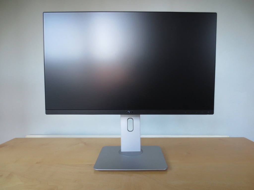
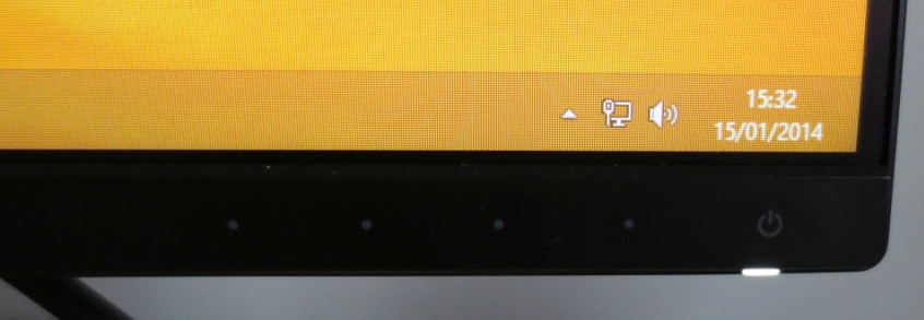
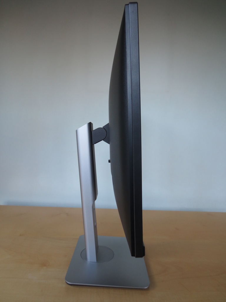
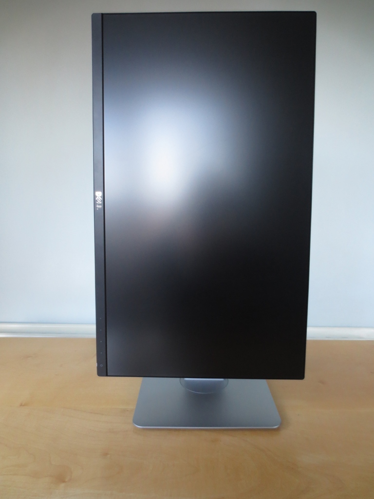
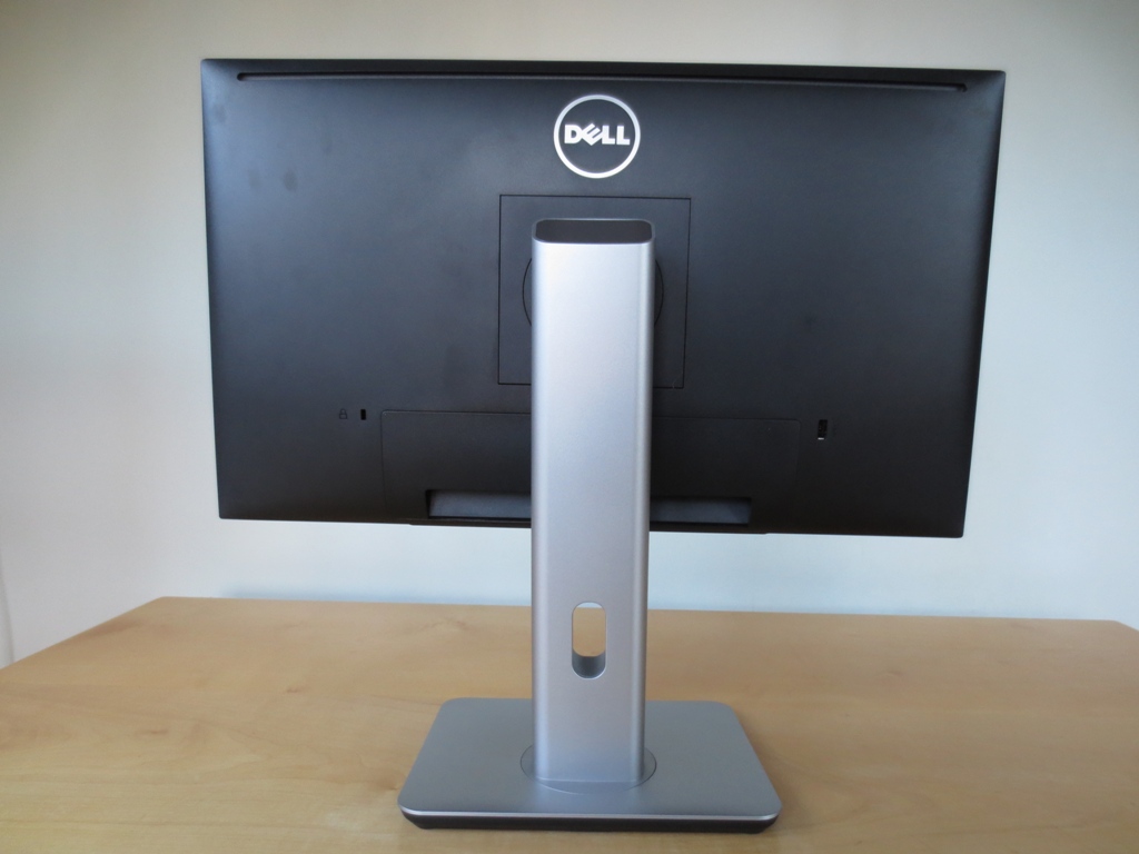
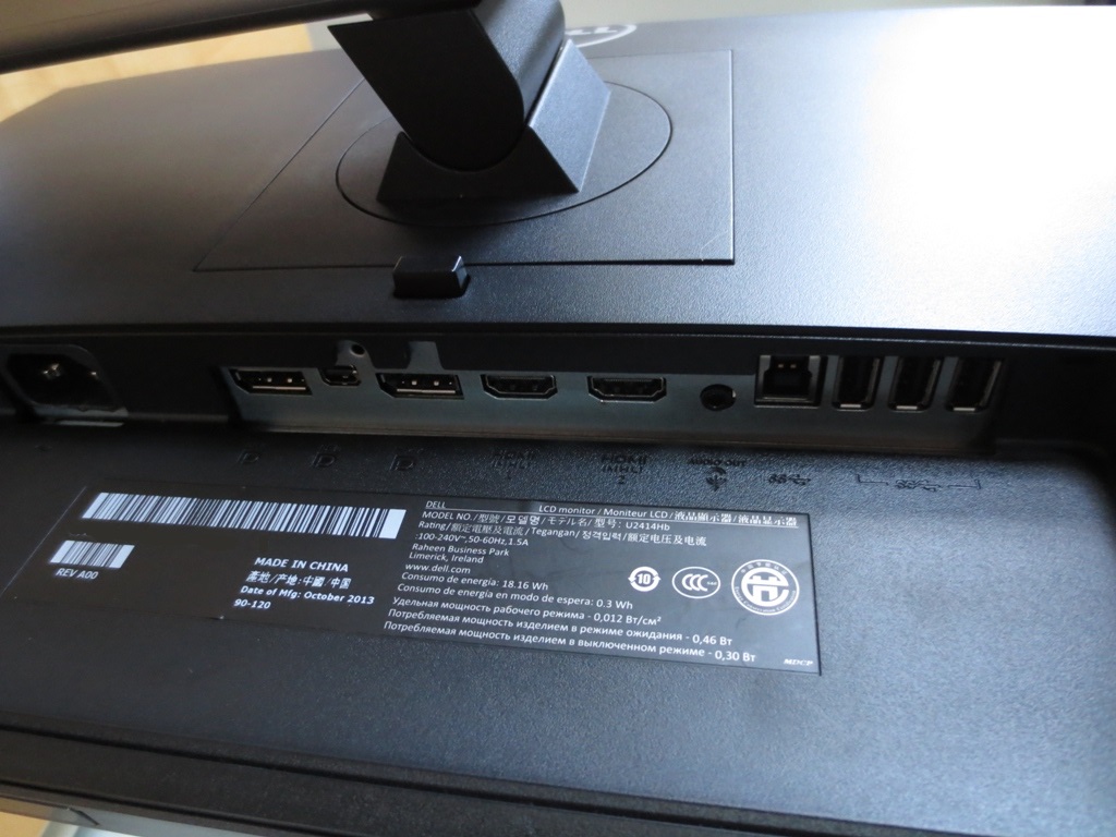
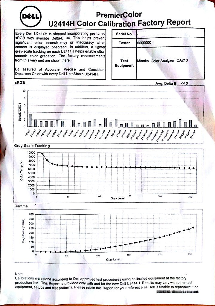
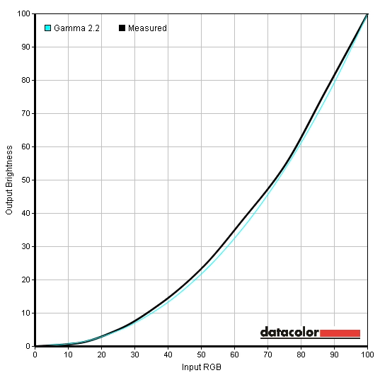
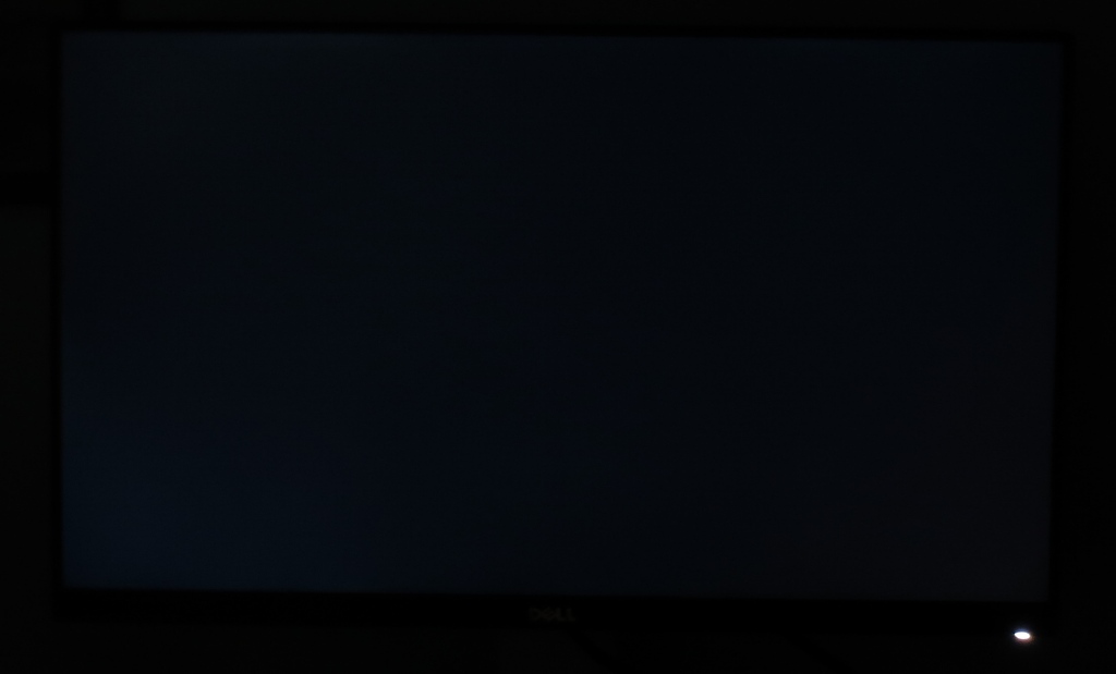
The most striking aspect of the monitor is undoubtedly the extremely thin bezel. As we’ve seen with some other monitors this has two parts to it. There is a hard matte plastic border which is around 1mm at the top and sides. There is then a border around the panel itself which blends in extremely well when the monitor is switched off. This is also exceptionally slender at around 5mm. The total border around the image is therefore around 6mm (<0.24 inches) which is exceptionally slim. Once switched on the full border can be seen – and it is very slender, as shown below. This makes the monitor well suited to multi-display setups where thicker bezels can get in the way a bit. Other points to note include the use of a relatively light matte anti-glare screen surface, the same as used on the P2414H and other ‘Full HD’ AH-IPS models. This potentially gives the image a clearer, less grainy and slightly more vibrant look than ‘heavy’ matte surfaces seen on the likes of the Dell U2412M. It is not as light as the ‘semi glossy’ surfaces seen on some other models, including 27” WQHD IPS ones. The bottom bezel of the monitor is around 18mm (0.71 inches), housing OSD (On Screen Display) controls and a power button to the right. These are touch-sensitive, facing forwards. They’re reasonably responsive to the touch – not the most responsive touch controls we’ve seen on a monitor but not frustrating unresponsive either. The power light glows an unobtrusive gentle white when the monitor is on and flashes intermittently when the monitor is on standby. If you prefer you can disable the power LED when the monitor is active in the ‘Energy Settings’ of the OSD. Some other useful features in the OSD include two customisable ‘Shortcut Keys’, which are activated using the first two control buttons before you enter the main OSD menu. By default these are set to ‘Preset’ and ‘Brightness’, whilst the third button is ‘Menu’ and the fourth is ‘Exit’. After entering the main menu the buttons are navigational; ‘Up’, ‘Down’, ‘Enter’ and ‘Return’. As the video below shows, the OSD system is fairly straightforward and easy to navigate. Further details in the PDF user guide. The side of the monitor reveals the fairly solid and fully adjustable stand. This allows you to adjust tilt (21° back, 5° forwards), swivel (45° either way) and height (140mm or 5.5 inches). At lowest height the bottom of the monitor is 36mm (1.42 inches) off the desk whilst the top of the monitor stands around 355mm (13.98 inches) clear of the desk surface. You can also pivot (rotate) the monitor 90° clockwise into portrait if you wish. The rear of the monitor is typical Dell affair. Lots of black matte plastic (silver matte plastic on the stand) and a 100 x 100mm VESA attachment to which the included stand attaches. The stand can be quickly detached by pressing the button beneath the attachment point, so an alternative 100mm VESA-compatible solution can be used instead. The ports face downwards and can be concealed beneath a removable plastic cable routing cover, as shown in the image below. To the left of this is a Kensington lock socket and to the right is a USB 3.0 port with fast charging capability. The ports of the monitor include; AC power input, DP 1.2a input, MiniDP 1.2a input, DP 1.2a output (for MST daisy chaining), 2 MHL-capable HDMI ports, 3.5mm audio out, USB 3.0 upstream and 3 further USB 3.0 downstream ports (4 total – only one with fast charging). As you can see Dell have made good use of the available space, cramming many useful inputs and outputs in. There is no space-hogging DVI or VGA. If you have a GPU with DVI as the only output you can use a simple DVI to HDMI cable. Dell includes a DisplayPort cable and USB 3.0 upstream cable in the box. An Nvidia GTX 780 was used on our test system and we tested both DisplayPort and HDMI – with interesting results. When using either DisplayPort or HDMI the GPU sent out the wrong colour signal (‘Limited Range RGB 16-235’ instead of ‘Full Range RGB 0-255’). This reduced gamma, skewed white point, hugely impacted contrast and simply gave everything a washed out look. We are quite used to seeing this with Nvidia GPUs connected via HDMI as that is their default behaviour – treat the connected device as an HDTV. But we aren’t used to seeing this over DisplayPort which is currently a PC-only output. We tested the ‘MiniDP’ port as well as the full sized DP port using both DP 1.1 and DP 1.2. The screenshot below shows that the native resolution of the monitor (1920 x 1080) is listed under ‘Ultra HD, HD, SD’ as ‘1080p, 1920 x 1080 (native)’ when connected by DisplayPort. This list of resolutions is designed for output in RGB 16-235 to devices such HDTVs. The resolution should instead be listed under ‘PC’ as ‘1920 x 1080 (native)’, but as shown below it isn’t. This can be rectified for both DisplayPort and HDMI by creating a custom resolution with a 59.999Hz refresh rate. This will be treated by any application* as 60Hz but uses the correct Full Range RGB 0-255 colour signal. The process for setting this up is shown in the video below. Unfortunately this utility doesn’t do anything to the DisplayPort signal. We only had one U2414H with us for testing, but suspect that running them in ‘Surround’ using the MST/Daisy Chain capability of the monitor will use the correct signal as well because the resolution used (5760 x 1080) is PC only. If not a solution would be to use HDMI ports (or DVI ports using a DVI to HDMI cable) on the GPU(s). We simply used the HDMI connection and the utility to correct the colour signal (universally – even for games that ignore custom resolutions) and the difference in gamma, colour depth and contrast compared to an uncorrected signal was remarkable. AMD GPU users don’t have to worry about this and should be able to use DisplayPort or HDMI quite happily. The Dell U2414H has numerous different presets available; ‘Standard’, ‘Multimedia’, ‘Movie’, ‘Game’, ‘Paper’, ‘Color Temp.’, ‘sRGB’ and ‘Custom Color’. Different presets have different customisation options available within the menu. In the table below we’ve included some basic readings (gamma, white point) using the default settings in each preset (with Dynamic Contrast disabled), some notes on the image as well as the extra OSD settings available. Note that these ‘extra’ settings are those that don’t apply to all presets tested here. Some basic functionality such as contrast and brightness adjustment is available for all presets tested here. The results using our test settings are also included, which are discussed later. Our test system used an Nvidia GTX 780 connected using HDMI with the signal corrected as above. Connecting the monitor using DP to an AMD GPU yields similar results. This table was produced using a keen eye and a Spyder4Elite colorimeter – using the Lagom.nl website, familiar images and applications to help assess performance. The U2414H produced a bright but rather well balanced image straight from the box. The gamma tracked just a bit below the ‘2.2’ target in places but still maintained a rich and varied look. The monitor includes a number of presets, some of which are much better and more useful than others. The ‘Paper’ preset is essentially a reading mode which produces a much warmer image with less blue light, making it more relaxing on the eyes – particularly in the evening where blue light levels should typically be restricted. Most of the presets were actually very close to the ‘6500K’ daylight white point target as well. The colorimeter identified excellent balance between the red and blue channels but slight weakness in the green channel in most cases. The ‘sRGB’ preset uses the factory calibration – the preset which is used to create the ‘PremierColor Color Calibration Factory Report’ individually for each unit. The image below shows a copy of the report included with our unit. The green channel was again flagging behind just slightly and there was a slight loss of distinction in some deep red and pink shades. You are unable to customise the colour channels in the ‘sRGB’ preset. Although not perfect we feel that many users would be very comfortable with the thorough factory corrections performed in the ‘sRGB’ preset and will probably settle for this mode. We do like to tinker a bit, though, so decided to make some adjustments to both colour channels and brightness in the ‘Custom Color’ preset. Gamma tracking was good but not as tight to the 2.2 curve as the impressive ‘sRGB’ mode. The effect on the image for our uses was quite minor, though, and overall things looked rich but appropriately saturated. According to our testing of the ‘sRGB’ preset the white point was just a touch below the 6500K white point target but gamma tracking was exceptionally accurate. Not only did it average ‘2.2’, it stuck to the curve with great precision (below) and produced an impressively well balanced image. Rather than jumping in and using our test settings below, we’d recommend seeing how you find the sRGB mode. Be aware that individual units vary and the corrections we made on our unit may not be optimal in all cases. You can use these settings as a base or copy them directly if you like, but be sure to trust your own eyes and what looks good on your unit as well! Because of the rather pleasing factory-calibrated ‘sRGB’ preset we won’t be providing any ICC profiles for this monitor. The corrections made by Dell are specific to each unit and we feel an ICC profile would only really provide an edge over this if it’s done on your own unit, by your own colorimeter. Brightness= 52 (according to preferences and lighting) Contrast= 75 Red= 100 Green= 98 Blue= 99 We used a KM CS-200 light meter to measure white and black luminance levels, from which we calculated static contrast ratios. The results are shown in the table below for various brightness settings in the ‘Custom Color’ preset and also the settings discussed in the calibration section. Unless otherwise stated default settings were used, but in all cases ‘Dynamic Contrast’ was disabled. Blue highlights in the table indicate results using our test settings. Black highlights indicate the highest white luminance, lowest black luminance and peak contrast ratio recorded. With an average static contrast ratio of 1224:1 in ‘Custom Color’, the U2414H put in an impressive performance. Our test settings involved only very minor adjustments to colour channel and didn’t have a significant effect on contrast which remained at 1193:1. The ‘Standard’ preset involved some predetermined colour channel adjustments but contrast again remained strong at 1150:1. A similar story for the ‘Color Temp’ preset, set to 6500K by default, which yielded a contrast ratio of 1165:1. Under ‘sRGB’ the contrast dropped slightly to 1043:1, which is still pleasing considering that the full factory calibration is enforced on this preset. The remaining presets had a slightly more pronounced effect on contrast but it still remained around 1000:1, dropping to 968:1 at lowest using the very poorly balanced ‘Movie’ preset. Many modern Dell monitors offer a settings called ‘Energy Smart’ which is like a less extreme (and bright) Dynamic Contrast setting that can be activated regardless of setting. This model lacks this setting and actually only has the traditional ‘Dynamic Contrast’ mode which is restricted to the ‘Game’ and ‘Movie’ presets. The backlight reacts rapidly to changes in scene brightness and seems to be uncomfortably bright (for our taste) during most mixed images and certainly during bright images. It is able to become very dim and essentially shut off during a black screen-fill and become fairly dim during predominantly dark images. The U2414H does not use PWM (Pulse Width Modulation) to moderate backlight brightness and instead uses DC (Direct Current) modulation. In other words the monitor has a ‘flicker-free’ backlight. This will come as comforting news to those who find PWM-regulated backlights uncomfortable to look at. When observing a black screen in a darkened room, using our test settings, there was just a slight hint of backlight bleed in the bottom left corner and top left of the screen. This is shown in the image below. It should be noted that the amount of backlight bleed can vary between individual units. One factor that doesn’t vary is ‘IPS glow’ which is a sort of greyish blue or golden haze (depending on viewing angle). This is visible from a normal viewing position and people often mistake this for backlight bleed – it actually entirely masked the backlight bleed on our unit from a normal viewing position. The image below gives a fairly good representation of what we saw in a darkened room when viewing the monitor centrally and from a distance that eliminates the glow so that only the backlight bleed is visible. To assess the uniformity of lighter colours a Spyder4Elite was used. This measured the white luminance levels of 9 equidistant white ‘quadrants’ running from the top left to bottom right of the screen. The table below shows these values alongside the percentage deviation from the brightest recorded point of the screen. The luminance uniformity of the screen was very good. The brightest point was ‘quadrant 4’ just left of centre (182.6 cd/m2). The central region, ‘quadrant 5’, showed just 1% deviation from this (180.8 cd/m2). The highest deviation from the brightest point occurred at ‘quadrant 7’ and ‘quadrant 8’, a 9% deviation (165.9 cd/m2 and 167.0 cd/m2, respectively). Elsewhere deviation was 3-8% which is pleasing. It should be noted that individual units can vary when it comes to uniformity, but it’s always pleasing to see such a good performance. For those who prefer a graphical representation, the contour map below combines these results alongside some estimated data. Here darker greys represent lower luminance and hence greater deviations from the brightest point. We also analysed the consistency of colour temperature for the same 9 white quadrants. Deviations are given as DeltaE values, indicating the variation between each quadrant and the point closest to 6500K (D65). Darker colours indicate greater deviation. Anything below DeltaE 3 is generally considered to be slight enough deviation to escape notice ‘by eye’ during normal use. There was no significant deviation here. The top left corner (‘quadrant 1’) was closest to 6500K in this analysis. The greatest deviation occurred in the bottom central region (‘quadrant 8’) with a DeltaE of 2.3. Elsewhere DeltaE was between 0.9 and 1.6 which is excellent. As with all other uniformity issues you can expect a degree of variation between individual units. That shouldn’t take anything away from the strong performance our unit put in here, though. On Battlefield 4 there was a degree of detail loss peripherally due to IPS glow, particularly in the bottom corners of the screen from a normal viewing position. Elsewhere contrast was good without significant loss of detail and good distinctions between light colours and darker surrounding shades. Bright colours, particularly patches of sky in the daylight and artificial lights in the dark, exhibited slight graininess compared to a semi-glossy (or of course fully glossy) screen surface. Such areas were free from the heavy grain or ‘smeary’ look that accompanies some older IPS models such as the U2412M, however. As with Battlefield 4, there was some peripheral loss of detail on Dirt 3 due to IPS glow. More central regions (away from the bottom corners in particular) showed quite a good level of detail in dark areas. Bright elements such as car headlights at night and the bright daylight sky contrasted well with this, but lacked the same ‘purity’ and grain-free appearance of a glossy or semi-glossy screen. The clarity and graininess was less pronounced than on stronger matte surfaces. We also assessed contrast performance using the Blu-ray of the latest Bond film Skyfall. IPS glow caused some fairly limited detail loss peripherally – partly ‘absorbed’ by the black bars on the top and bottom of this 2.40:1 aspect title. Some fairly minor detail such as creasing on clothing in dark scenes could be made out, despite lacking the distinctness and bold look that they have on a good high-contrast VA panel. Bright elements such as candles and lights at night contrasted well with the surrounding darkness. Such elements exhibited slight but not heavy graininess due to the screen surface. The Lagom tests for contrast allow specific weaknesses to be identified, even those that may not be obvious during other testing. The following observations were made. The Dell U2414H’s colour gamut matches sRGB quite closely. There was slight under-coverage in some shades and slight over-coverage in others. The word ‘slight’ is key here and this shouldn’t cause any issues for most users. The gamut represented below is for our test settings, but none of the presets (including the sRGB mode) have a significant effect on colour gamut. This is quite clearly a standard gamut monitor and it does quite a good job at covering the sRGB colour space. Battlefield 4 had an inviting look with excellent shade variety and appropriate depth overall. Although not exhibiting the same vibrant pop as a good glossy screen, in particular, things did still look rich and vibrant. The variety of closely matched khaki shades and different colours on various camouflage patterns was particularly impressive. Some more vibrant shades within the game, such as the warm orange glow of flames and the bright cyan in-game markers also stood out quite nicely. Dirt 3 had an appropriately natural, rich and varied look to its racing environments. The Finnish forest showcased an excellent variety of greens – from closely matched misty shades to golden greens and more deep and lush shades. All were displayed with excellent distinction. The Kenyan rally tracks exhibited a good range of dusty brows and khaki colours, again with pleasing distinction and consistency even for closely matched shades. The more vibrant colours in the game, such as highlighter greens, strong oranges and bright reds featured on car paint jobs also had good depth and variety. They didn’t have the same ‘pop’ as you’d see on a decent glossy monitor in particular but were quite lively. The Blu-ray of Skyfall had an appropriate and natural look. Skin tones appeared suitably varied with good levels of saturation. Elements within the environments, such as vegetation and buildings, also showed pleasing variety and saturation. Some of the more vibrant shades within the film exhibited quite a good vivid look. These included the bright neon blue and purple lights of Shanghai at night. We also considered the colour performance of the monitor on the Blu-ray of Futurama: Into the Wild Green Yonder. This title really played to the strengths of this well-configured IPS panel. The consistency of individual shades (such as character skin tones) was very strong, allowing the monitor to correctly display an array of closely matching shades with good distinction. There were some good deep and neon colours as well, such as bright greens and yellows and deep purples. These had a rich look – not a match for the arresting vibrancy we’ve seen on some recent semi-glossy VA panels with their exceptional contrast, but far from washed out. We analysed colour consistency more closely using the Lagom viewing angle tests. The following observations were made. We measured around 4ms (1/4 of a frame) of input lag using a similar method to that used in this review. This means the signal delay of the monitor is very low and shouldn’t provide a barrier to gaming. We used a utility called PixPerAn (Pixel Persistence Analyser) and a highly sensitive camera to capture the trailing (commonly referred to as ‘ghosting’) that resulted from the pixel responses of the monitor. The movement speed (tempo) was set as high as it would go on this test, so consider it to be the worst case scenario as far as this specific test goes. The first picture shows the result on the U2414H and the bottom picture the P2414H for comparison. As you can see above (top picture) there is a moderate primary trail and a very weak overdrive trail, indicating a good degree of grey to grey acceleration with no obvious overshoot from overly ‘aggressive’ grey to grey acceleration. This closely mirrors what we saw on the Dell P2414H (bottom picture). It’s important to bear in mind that PixPerAn only takes into account what the camera sees – and that is trailing resulting from the pixel response behaviour of the monitor. These pixel responses vary depending on the shades involved in the pixel transition (PixPerAn tests a limited range of shades) and these are only one piece of a much larger jigsaw anyway. There is a very thorough analysis of the factors affecting pixel responsiveness in our dedicated article on the subject. Our ‘real world’ testing below pulls all of these factors together and gives subjective impressions on a range of game and movie titles. Whilst running around on foot on Battlefield 4 there was a degree of blur, particularly when strafing past objects. Rather than being caused by sluggish pixel transitions, this was mainly caused by eye movement as motion is tracked on the screen. Zipping around in a fast vehicle such as a buggy intensified this blur, but everything looked quite similar to even the fastest 60Hz monitors. In other words; pixel responsiveness was not really a limiting factor here. Furthermore there was no noticeable inverse ghosting (overshoot) from overly ‘aggressive’ grey to grey acceleration, either. As with Battlefield 4, pixel responsiveness was not a major limiting factor when it came to the visual fluidity of Dirt 3. There was a moderate level of blur, particularly when cornering, but not significantly more than you’d see on even snappy 60Hz TN panels with good pixel overdrive. This was the case across the broad range of pixel transitions occurring on Dirt 3 – whether driving at night or the day in Finland, Kenya, the US or Norway. Gymkhana was a dizzying experience with more pronounced blur, but this predominantly a refresh rate limitation. Again there was no noticeable inverse ghosting, the presence of which would have spoilt the experience for some users. To round things off we also tested our Blu-ray movie titles. There were no issues at all caused by the monitor’s pixel responsiveness. No overdrive trailing was visible nor any ‘conventional’ trailing due to slow pixel transitions. The low frame rate at which the films run (around 24fps) was the main barrier to fluidity, but that isn’t something the monitor can control. After the impressive performance displayed by the Dell P2414H, we were eager to see what the company’s other 23.8” model, the U2414H, was made of. It was interesting to discover that this model actually uses a slightly different panel, albeit a similar one of the same size and panel type (AH-IPS). This UltraSharp model didn’t disappoint us, putting in an impressive performance in several key areas. Aside from ‘IPS glow’, a characteristic of the panel type rather than the monitor itself, the uniformity and contrast performance was very impressive. The static contrast is as good as we’ve seen from a non-VA LCD panel and our unit showed good consistency with its white point and brightness at different points of the screen. Colour performance is of course a key focus of the UltraSharp series. Dell included a factory-calibrated ‘sRGB’ preset which was very impressive. Gamma tracking was as perfect as we’ve seen it without even minor deviation from the target 2.2 gamma curve whilst colours were displayed with the richness and accuracy you’d hope for. The white point deviated slightly from the 6500K daylight target in this preset but not wildly so. Gamma dropped slightly to an average of ‘2.1’ on the remaining presets, but the image retained a good rich look and nice balance. The white point was configured particularly nicely in some of the presets, including the default ‘Standard’ preset and the ‘Color Temperature’ preset set to ‘6500K’. There was just a slight weakness in the green channel, but this was easily remedied in the ‘Custom Color’ preset. One of the most appealing and unique features of this monitor, for many people, is the extremely thin bezel and panel border area – a mere 6mm. This makes the monitor particularly attractive for multi-display setups. One key consideration for people interested in gaming on such a monitor, in particular, is of course responsiveness. Fortunately this monitor ticked all of the boxes you can expect a 60Hz LCD to tick. Motion blur was not hampered by the pixel responsiveness of the monitor – Dell struck a superb balance here by giving just enough acceleration for solid 60Hz performance without introducing any unwanted overdrive artifacts such as inverse ghosting. Input lag was also very low in our testing, which is another box ticked. After reading our review of the recent 23.8” ‘P Series’ model, some users were particularly excited by the thought of a monitor with similar performance but super-slender bezels. And perhaps the thought of the factory-calibrated ‘sRGB’ mode is also appealing, or those USB 3.0 ports, or native MHL-capable HDMI ports. Fortunately the U2414H delivered the sort of all-round performance these users will have been hoping for. Whilst we don’t think this monitor really distances itself too far from the cheaper P2414H with its image performance alone, that isn’t necessarily a bad thing.
Features and aesthetics
Calibration
Correcting the colour signal
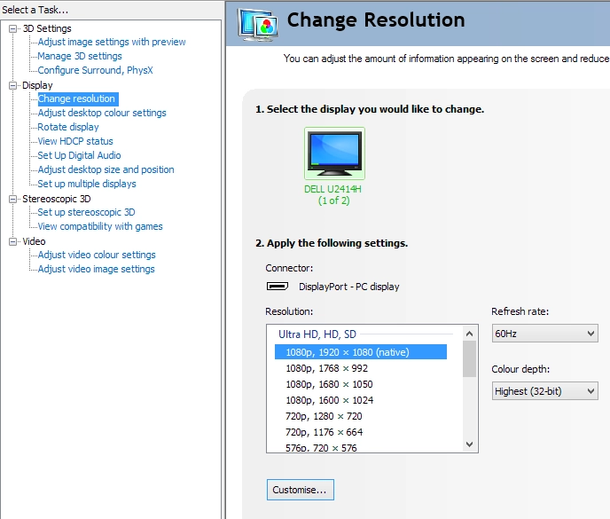
Resolutions in Nvidia Control Panel designed for HDTVs
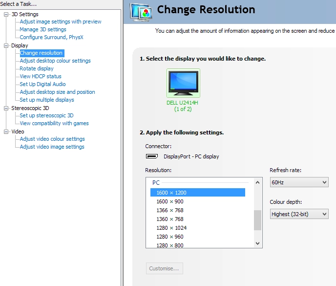
The PC resolutions list lacks the native 1920 x 1080
*Some games seem to ignore custom resolutions and will instead revert to using the default Limited Range RGB 16-235. That is why a preferred method for correcting the colour signal over HDMI is to use this utility. You just run the .exe file included in the .zip and click the button at the top right which is labelled ‘Set Full Range (0-255)’. You then simply restart your computer. You don’t have to re-run the tool every time the computer starts up, only if you ‘clean install’ a new graphics driver or replace your OS.
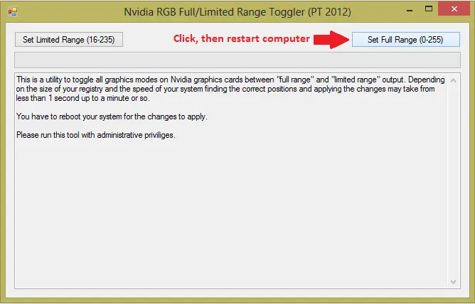
Nvidia RGB Full Range Toggler
Testing the presets
Preset Mode Gamma (central average) White point (kelvins) Extra OSD features Notes 'Standard' 2.1 6471K Sharpness Bright but well balanced aside from a slight weakness in green channel. Overall a good variety to the image and some good rich shades. ‘Multimedia’ 2.1 6206K Sharpness Image is slightly dimmer and duller than ‘Standard’ with a slight warm tint. ‘Movie’ 2.1 8907K Hue, Saturation, Sharpness, Dynamic Contrast Extreme blue tint, completely unbalanced image with some strong oversaturation. Not sure why this would lend itself well to movie viewing. ‘Game’ 2.1 6354K Hue, Saturation, Sharpness, Dynamic Contrast Fairly similar to multimedia but brighter with slightly less of a warm tint. Some shades look quite oversaturated. ‘Paper’ 2.1 5220K Sharpness Dim with a warm tint – similar to a ‘Reading’ or ‘Low Blue Light’ mode and good for restful viewing, particularly in the evening. ‘Color Temp’ 2.1 6503K Sharpness (plus colour temperature adjustments – 5000K, 5700K, 6500K, 7500K, 9300K, 10000K) Similar to ‘Standard’, very close to target white point (6500K) but slight green channel weakness remains. ‘sRGB’ (factory calibrated, see below) 2.2 6419K Sharpness Very minor loss of distinction in some shades at the high end, such as strong pinks and reds. Weakness in green channel reduced somewhat and an impressively well-balanced and rich look overall. ‘Custom Color’ 2.1 6671K Sharpness (plus colour channel adjustments – R, G, B) Similar to standard with a slightly cool tint. Test Settings (‘Custom Color’ modified as below) 2.1 6502K Sharpness (plus colour channel adjustments – R, G, B) Rich and well-balanced with no relative weakness in green channel. Just a tiny bit of depth lost in places compared to ‘sRGB’ due to slightly lower gamma.
Gamma test settings
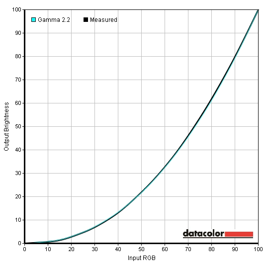
Gamma 'sRGB' preset
Test Settings
Preset Mode= Custom Color
Contrast and brightness
Contrast ratios
Monitor Profile White luminance (cd/m²) Black luminance (cd/m²) Contrast ratio (x:1) ‘Custom Color’ 100% brightness 288 0.24 1200 ‘Custom Color’ 80% brightness 255 0.21 1214 ‘Custom Color’ 60% brightness 207 0.17 1218 ‘Custom Color’ 40% brightness 154 0.13 1185 ‘Custom Color’ 20% brightness 98 0.08 1225 ‘Custom Color’ 0% brightness 39 0.03 1300 Test settings 179 0.15 1193 ‘Standard’ 253 0.22 1150 ‘Multimedia’ 191 0.19 1005 ‘Movie’ 184 0.19 968 ‘Game’ 193 0.19 1016 ‘Paper’ 113 0.11 1027 ‘Color Temp’ 233 0.20 1165 ‘sRGB’ 240 0.23 1043
PWM (Pulse Width Modulation)
Luminance uniformity
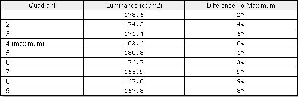
Luminance uniformity table
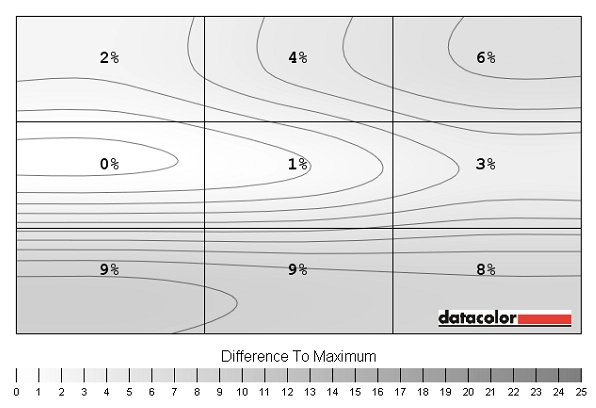
Luminance uniformity map
Colour temperature uniformity map
Contrast in games and movies
Lagom contrast tests
Colour reproduction
Colour gamut
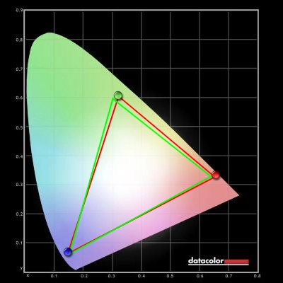
Colour gamut test settings
Colour in games and movies
Viewing angles
Responsiveness
Input lag
Pixel responsiveness
Trailing on PixPerAn (U2414H)

Trailing on PixPerAn (P2414H)
Responsiveness in games and movies
Conclusion
Positives Negatives A pleasing colour performance with strong shade variety, a rich look and a pleasing factory-calibrated ‘sRGB’ mode. The screen surface is lighter than on older IPS models like the U2412M, preserving greater levels of vibrancy and clarity
The screen surface doesn’t deliver the same grain-free image as a semi-glossy matte surface. Gamma in all presets but ‘sRGB’ sits a little lower than desired at ‘2.1’ on average – whilst white point is fixed and not quite touching the 6500K daylight point in the ‘sRGB’ preset
Static contrast is as good as we’ve seen on non-VA LCD panels IPS glow is there (a panel characteristic) This monitor is about as responsive as 60Hz LCDs come with well-implemented pixel overdrive and low input lag
The 60Hz refresh rate will limit the appeal for some users, but that’s just where this technology is at the moment
Good fully adjustable stand and superbly thin bezels make this an attractive as well as functional monitor
The colour signal requires correcting on both HDMI and DisplayPort if you’re using an Nvidia GPU – slightly inconvenient and in the case of DisplayPort slightly odd as well
