Author: Adam Simmons
Date published: October 20th 2012
Table of Contents
Introduction
Early members of Dell’s S-series monitors were praised for their slender build and good general performance. But users are increasingly turning away from such humble Twisted Nematic (TN) panels. In recent months we have seen something of an onslaught of increasingly cheap monitors using ‘alternative’ panel types, in particular models using LG’s In-Plane Switching (IPS) technology. Another trend we have seen even more recently is a move away from ‘heavy’ matte anti-glare surfaces which impede image clarity and vibrancy and onto lighter ‘semi glossy’ and indeed fully glossy alternatives. Dell’s new 2012 S-series models really draw these trends together by doing away not only with the TN panels but also the matte screen surface.
The Dell S2440L is the ‘medium sized’ member of the new series and also happens to be the only member to use a Vertical Alignment (VA) rather than IPS panel. Companies such as BenQ have been producing highly affordable LED-backlit VA panel models of this size for some years now, with strong contrast, improved viewing angles and good colour reproduction. They have really worked hard to chip away at the traditional Achilles heel of VA panels, too, massively improving the responsiveness with some of their recent models. Dell have been studying this market carefully and aren’t prepared to go in half-hearted – their S2440L has an ace up its sleeves. With its glossy glass-covered screen surface it could really build upon the strong contrast credentials of the panel type. It is all very exciting in theory, but a lot depends on how everything has been put together. Can this monitor really fulfill its potential? That is what we shall find out.
Specifications
The basic specifications of the monitor include its previously discussed LED-backlit VA panel. This is an AU Optronics AMVA with the usual 1920 x 1080 resolution, 60Hz refresh rate and 178 degree viewing angles. It supports ‘true 8-bit colour’ and has a quoted contrast of 5000:1 which is 5 times higher than what you would see quoted for TN and IPS technology. Dell have also included grey to grey acceleration which is useful given that this is intended to be an ‘entertainment monitor’. For this they quote 6ms, so nothing too bold there then. The RRP of the monitor is also fairly enticing at around £200 ($230) at time of review – with limited retail availability that is expected to pick up.
These key ‘talking points’ of the specification have been highlighted in blue.
Features and aesthetics
The front of the Dell S2440L is dominated by the glossy and glassy 24” screen. The face of this is seamless with an edge-to-edge glass cover and gently rounded corners. The bezel is relatively thin for a glass fronted screen, in particular, at around 17mm for all edges. The finish is highly reflective with both the glass on the outside and screen on the inside appearing to be untreated glossy surfaces. This is of course most noticeable when the monitor is switched off and facing direct light as shown below.
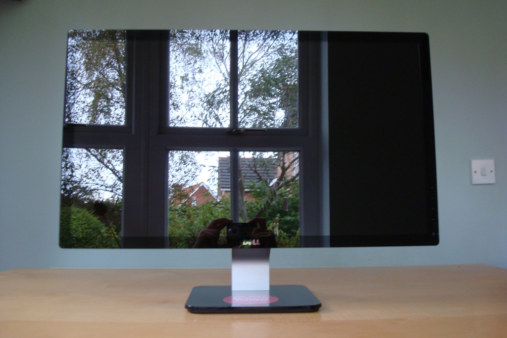
In more suitable conditions, free from strong direct light and with the monitor switched on, reflections are reduced. On bright days they could still prove problematic, though, especially when viewing dark content. The images below show the monitor switched on and displaying a dark and then a mixed desktop background. There is daylight coming in from a window to the left on a bright autumn day with the monitor set up as detailed in the calibration section. Reflections are certainly still visible on dark areas in particular and still evident to a lesser extent on lighter content.
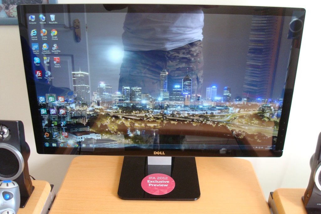

If lighting conditions are even more tightly controlled or there are lower levels of ambient light then reflections are reduced further. The images below show a dark and mixed desktop image, respectively, on a dull autumn day. It is worth remembering that Dell aren’t trying to punish users with this glossy screen surface, but rather trying to enhance the image quality of the monitor. As explored deeper into the review and in this article there are definite clarity and vibrancy benefits to be had from such a glossy solution.

Other points of interest visible from the front include the stand, which has a very simple and flat-looking glossy black plastic base. This is attached to the screen using a silver matte plastic neckpiece. Also of significant is the touch-sensitive control area at the bottom of the right bezel edge. This proved fairly responsive to the touch with even light presses registering. There is also a touch-sensitive power button with a dim and unobtrusive white LED to the right of it to indicate that the monitor is on. This turns orange when the monitor enters standby and stays a ‘gentle’ white when the monitor is displaying an image. In the image below it appears much bluer than it does in reality but you can see how everything is laid out at least.
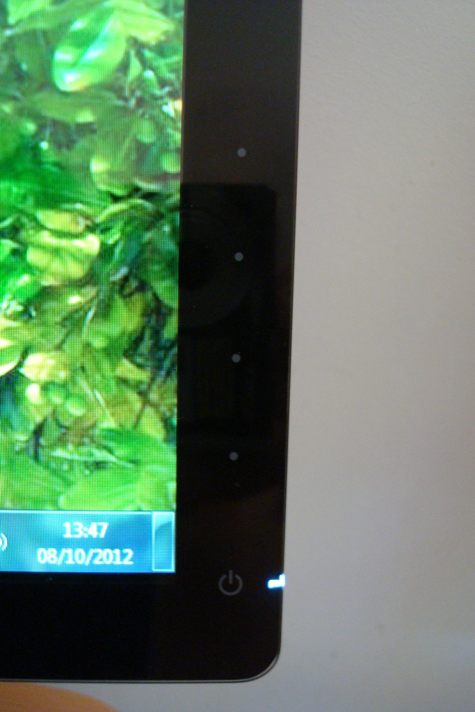
The Dell S2440L’s OSD (On Screen Display) is controlled by these touch-sensitive pads. In Dell’s usual style a single press of any of these buttons will bring up a ‘quick menu’ with 4 sections, each section belonging to its corresponding button. The first two sections (‘Preset Modes’ and ‘Brightness/Contrast’) are so-called shortcut keys which are customisable in the main menu. The key features of this quick menu and the main menu are shown in the following video. Some features are only available in certain presets and when running a VGA connection and will appear greyed out otherwise.
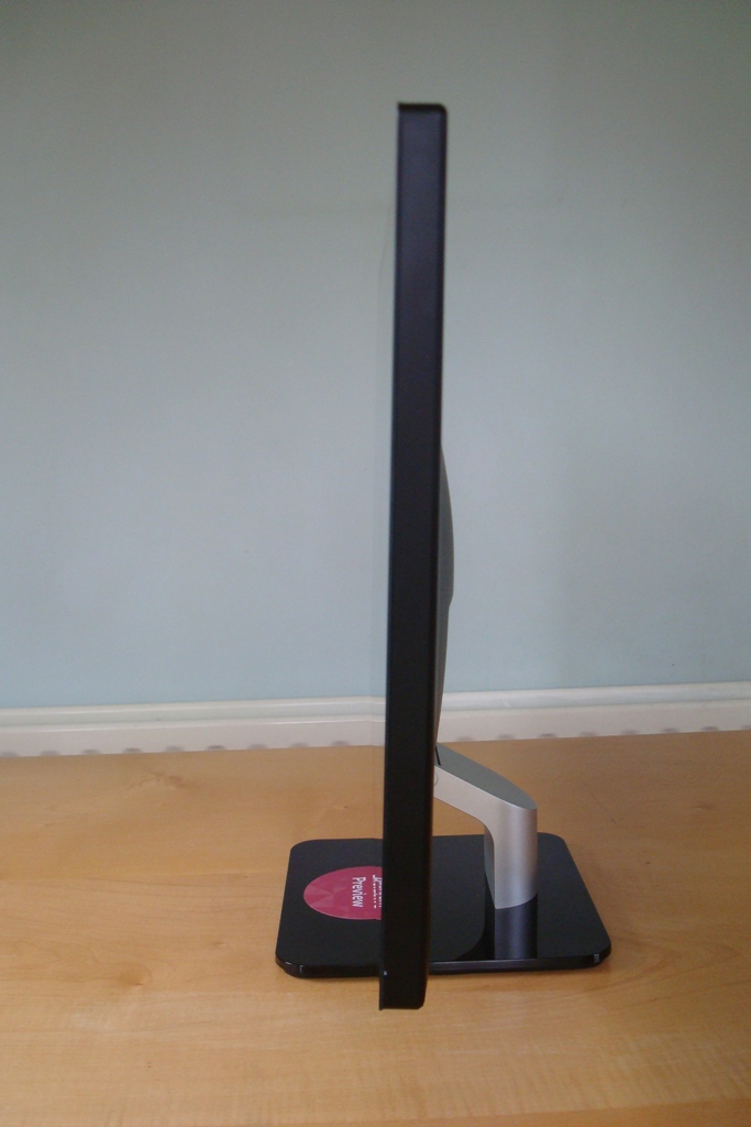
There is literally not a lot to the monitor from the side. You can see the glass screen cover ‘seamlessly’ transition to matte black plastic. Thanks to the WLED backlight and external power adaptor it’s only 17mm thick at the edges – although a bit thicker in the middle where the ports are located and the stand protrudes backwards.
The rear of the monitor has a matte black plastic finish, complimenting the matte silver plastic stand neck and Dell logo.
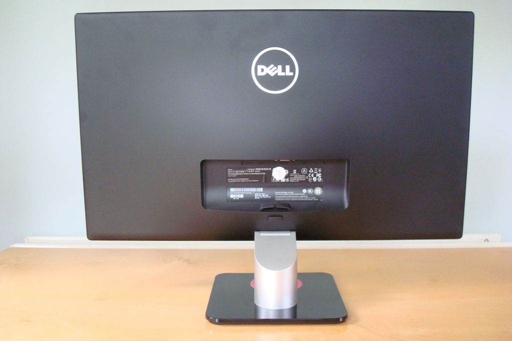
Just above the stand there is a release button, cable-tidy, information label and of course the ports (facing downwards as shown below). Although the stand is detachable there are no VESA holes on this model to allow convenient alternative mounting – another reason for its relatively slender profile.
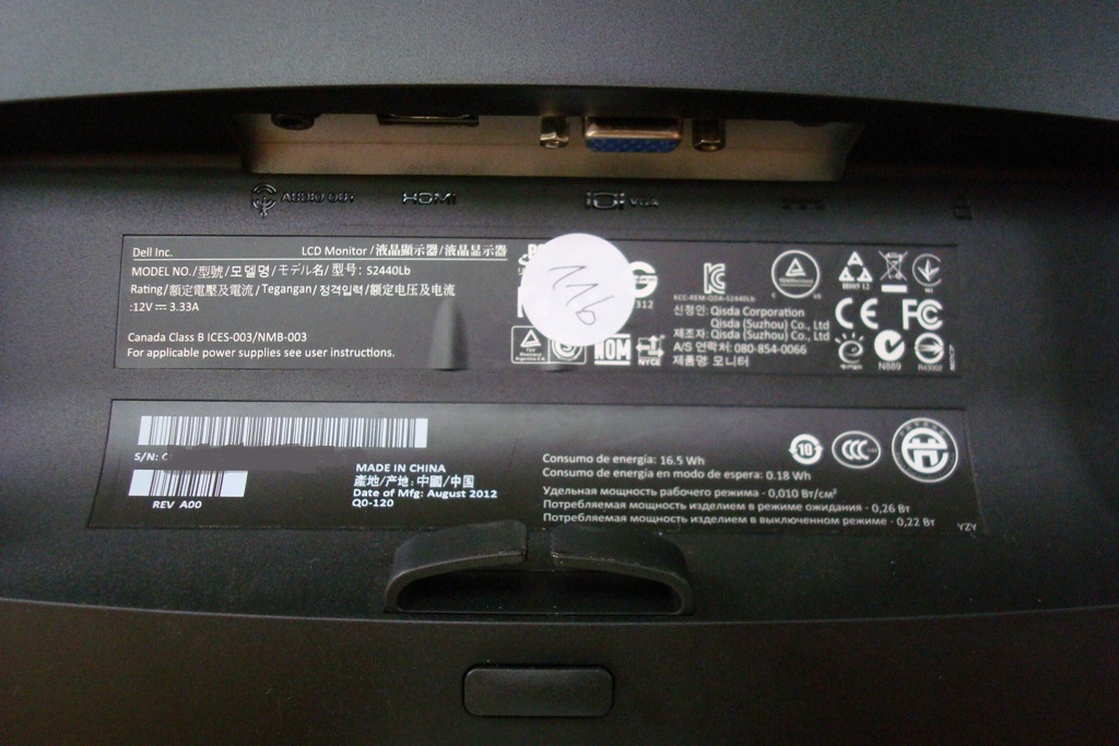
The port selection is quite limited on this model – audio out, HDMI, VGA and DC (power) input. There is also a Kensington lock socket just to the right of the ports. The monitor comes with a VGA cable and the power adaptor but doesn’t include an HDMI cable. You’ll need to use your own to make use of this digital input.
Calibration
By default the image was overly ‘cold’ looking and lacked some depth and balance. It was quite bright but not eye-piercingly so during the daytime. We used some familiar images, a Spyder4Elite colorimeter, the Lagom website and observed various games and movies to ascertain what corrections if any could be made to the image. To put it bluntly, most of the presets messed up the image in various ways by crushing shade variety, oversaturating colours, further upsetting white balance and applying excessive sharpness. And the options to alter these things were greyed out! One preset we did find particularly useful, though, was ‘Custom Color’ – aptly named as it allows you to adjust individual colour channels for red, green and blue.
During out testing we also discovered an interesting little ‘trick’ with this monitor. This only applies to AMD GPUs such as the Radeon 7950 used on our test system. When connected via the monitor’s only digital input (HDMI) we navigated to ‘Catalyst Control Centre –> My Digital Flat-Panels –> Pixel Format’ and changed this from the default ‘YCbCr 4:4:4 Pixel Format’ to ‘RGB 4:4:4 Pixel Format PC Standard (Full RGB)’. The screen then re-established connection and lists ‘RGB’ for the input colour format in ‘Color Settings’ on the monitor’s OSD. This didn’t alter the colour significantly (we checked for tell-tale signs of colour signal range issues) but added a little extra contrast – around 150:1 extra which is a nice little freebie. The setting to change is shown in the screenshot below.
![]()
Interestingly Nvidia GPUs respond very differently. They use ‘RGB’ by default over HDMI but it seems to be quite a messed up signal for Nvidia cards on the S2440L. The low-end shades become crushed and, most significantly, black is displayed as a murky grey – yielding an abysmal contrast ratio of around 300:1 under default settings. This can be resolved by navigating to ‘NVIDIA Control Panel –> Adjust desktop color settings –> Digital color format’ and selecting ‘YCbCr444’ as shown below.
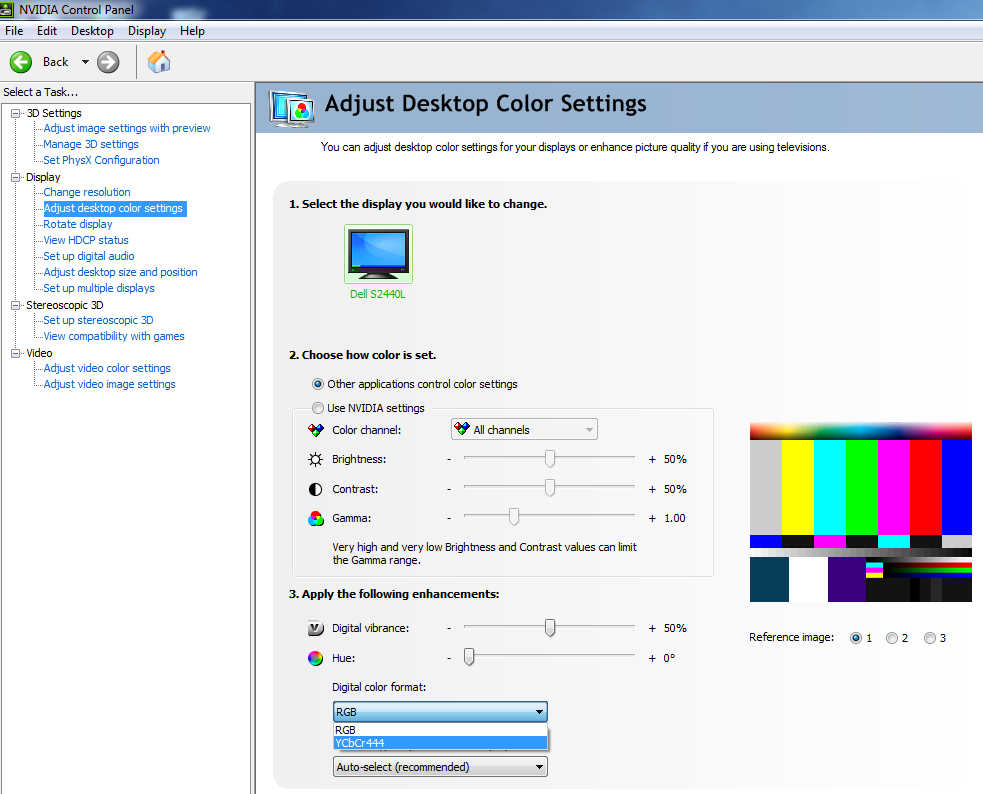
It was strange to have to make this correction given that the YCbCr444 signal can sometimes have undesirable consequences such as limiting colour range. We carefully analysed shade range at the often-affected low end in particular and cross-compared with the AMD card’s RGB and YCbCr 4:4:4 settings. There was no observable negative effect. The contrast was now raised significantly and the overall image was quite comparable to on the AMD card. We settled for the following settings for both cards – but all subsequent analysis is done on the AMD Radeon 7950 as per usual.
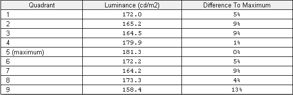
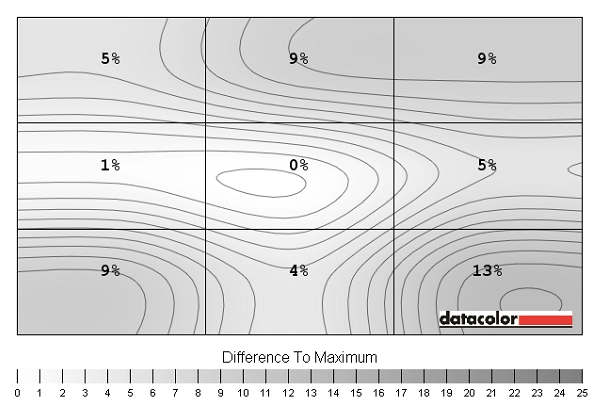
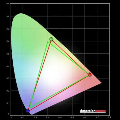
Preset Mode= Custom Color
Brightness= 75 (according to preferences and lighting)
Contrast= 75
Red= 100
Green= 90
Blue= 89 This could potentially deny some shades a bit of depth and richness. It seems that the monitor made up for this though with its glossy coating and colour gamut with a good solid and rich look to colours. Some of the blue shades and dark reds in particular looked nice and vibrant without the image looking oversaturated. We used a KM CS-200 ‘Chroma Meter’ to measure the luminance of ‘white’ and ‘black’ under a range of settings and calculated the resulting contrast ratio. Unless otherwise stated assume default settings were used with any dynamic contrast mode disabled. Blue highlights on the table indicate the results for our test settings whilst black highlights indicate the highest white luminance, lowest black luminance and highest contrast ratio recorded. Contrast performance on the S2440L was excellent, averaging 3094:1 under ‘Standard’ mode. This was a little lower than the rather optimistic 5000:1 specified for the panel, though. Performance in ‘Text’ and ‘Custom Color’ presets was also particularly strong (>3000:1) using their default settings. Given the fairly significant adjustments made to the colour channels for our test settings a drop in contrast was expected – but the 2714:1 recorded is still very strong. The ‘Game’, ‘Movie’, ‘Warm’, ‘Cool’ and ‘Multimedia’ presets yielded the weakest contrast ratios, ranging from 2343:1 to 2700:1. It was really the unbalanced image that was the main problem for these modes, though. Regardless of the preset being used we can confirm that the backlight does not use PWM (Pulse Width Modulation) to regulate brightness. Some people are particularly sensitive to the rapid ‘on-off’ pulses that accompany PWM backlight dimming so this will come as welcome news to such individuals. Looking at the screen in a dark room we observed no noticeable backlight bleed. This is generally less of an issue for VA panels as they are so effective at blocking light but that doesn’t make them immune to such issues. You could see a mild purple sheen (VA glow, if you like) towards the bottom corners of the screen in a dark room which became more noticeable ‘off angle’. Unlike IPS or PLS glow this didn’t cause any substantial loss of detail in the affected areas from a normal viewing position and was not as obtrusive. You can see this phenomenon on the video accompanying the ‘Viewing angles’ section of the review. We also wanted to consider the uniformity of the screen whilst displaying lighter colours than black. For this we used a Spyder4Elite colorimeter to measure the luminance of ‘pure white’ at various points across the screen using the test settings. 9 equally spaced sections of the screen (quadrants) are measured and compared to the brightest point of the screen. The table below shows these readings alongside the percentage difference to the brightest point. The results were good overall. The highest deviation from the brightest point (181 d/m2 at ‘quadrant 5’ in the centre) was observed at the bottom right corner of the screen (‘quadrant 9’ – 158.4 cd/m2 which is 13% dimmer than centre). Elsewhere deviation was a single-digit percentage point with ‘quadrant 4’ to the left of centre showing just 1% deviation. These deviations are shown alongside extrapolated values visually in the contour map below. The brightest point (centre) appears the lightest shade of grey with progressively darker shades representing lower luminance values. To blast off our subjective testing of contrast performance we took a look at the popular FPS title Battlefield 3. Even the most minor detail could be seen in dark and shaded areas which is excellent. The warped undersides of vehicles and minor texture detail on weapon optics, for example, were distinctly visible. Bright elements such as explosions, flares, tracer fire and lights were also impressive and bursting with life. The clarity and purity was also excellent thanks to the glossy screen surface which helped build up the visual atmosphere. Next up we went for an adrenaline-fuelled spin on the driving game Dirt 3. The contrast performance was once again excellent. At the low end there was no unintended loss of detail with even minor elements such as material textures inside the car visible in the shade. The high-end was again impressive both in its intensity and lifelike purity – headlights and floodlights at night were particularly dazzling. The Dell S2440L was also a strong performer on movies. We tested the Blu-ray of ‘The Girl with The Dragon Tattoo’ which had plenty of dark and dingy scenes and bright lights to admire. There were no issues with contrast with all appropriate detail visible – even slight differences such as a black pupil and a surrounding dark brown iris were distinct. Bright parts of scenes such as fire and lights also pierced the darkness nicely and looked very pure. To round off this section we also considered performance on the Lagom LCD contrast tests. The Dell S2440L’s colour gamut (red triangle) was compared to sRGB (green triangle) under our testing settings using the Spyder4Elite’s reporting functionality. The results are shown in the image below. The colour gamut corresponds roughly with sRGB with extension beyond on some green shades and under-coverage on others. The coverage of blues and associated shades (purple and red mixes) is quite comprehensive and extends beyond the boundaries of sRGB on this representation. There is no emulation mode which would force the gamut into conforming more closely to sRGB. This is still considered a standard gamut unit and this kind of coverage shouldn’t be something most users should be at all concerned about. It actually seemed to add a bit of depth and excitement to the ‘entertainment experience’ as we discovered on our game and movie test titles. Our first game test title, Battlefield 3, was displayed with a good variety and richness to colours. Some of the deep blues in particular (on road signs for example) were remarkably deep and solid. The bright cyans and darker blue glow of the engineer’s repair too as it repaired vehicles was also quite spectacular. There were some good deep reds on show, too, and some nice warm oranges that brought life to fires and explosions. The second game title, Dirt 3, was a better showcase of natural colours with its realistically presented and un-tinted environments. Vegetation showed a nice range of woody brons and greens – including some fairly deep and ‘lush’ shades. Equally impressive was the array of vibrant shades on car models, banners around the track and the game menu. Blues were particularly impressive here with subtle variations and some impressive deep hues. Rich reds were also displayed alongside a range of oranges and yellows. In fact all of the vibrant shades had a nice ‘jump off the screen’ quality to them, as if they were painted on. Our movie test titles offered some more colour variety to play with. The Girl with The Dragon Tattoo looked natural and as it should with a very good variety of shades. Character skin tones were all subtly different shades, appearing appropriately saturated without any unwanted tint. The good colour performance and strong contrast of the monitor worked well together in this film. We also looked at performance on the Blu-ray of Futurama: Into the Wild Green Yonder which showcased a good range of stronger and more vivid colours such as vibrant blues, purples, pinks, greens, oranges and yellows (a bit of everything really). Alongside this were some good pale (or pastel) shades. With its large areas of solid individual colours this title is also a good test for colour consistency. In this regard the S2440L fares well. Whilst not quite as consistent as IPS or PLS panels the colour shift of a given shade across the screen was far less pronounced than on a 24” TN panel. This aspect is looked at in a bit more depth in the proceeding section. Our subjective testing of the monitor suggested that colour consistency was placed some way between TN and IPS/PLS technologies, as you would expect from a VA panel. The Lagom test for viewing angles helped confirmed that this was the case and excellent tests for highlighting any particular weaknesses in this area. This aspect of a monitor is particularly important for colour-critical tasks, for example. Traditionally the Achilles heel of VA panel and increasingly becoming a game of meaningless numbers, pixel responses are often a cause for concern. Dell specify a fairly modest 6ms grey to grey response time for this model which at least tells you one thing – it uses pixel overdrive. That’s certainly good news for gamers because without it everything would be a smeary mess. To analyse how S2440L handled some typical rapid grey to grey transitions we used PixPerAn (Pixel Persistence Analyser) set to its fastest speed and a camera at high ISO. The result is shown below. You can see a bold primary trail but not the several additional trails that would accompany a non-overdriven monitor of this persuasion. There is a fairly conspicuous dark trail (or inverse ghost) which is an indication of the voltage being applied too strongly to try to boost the speed of these transitions. There is no option to adjust or disable the grey to grey acceleration – we took a look at the implications of this for both games and movies. The experience on Battlefield 3 was mainly quite smooth without excessive trailing, particularly when on foot. In fact you would be forgiven for thinking you’re using an overdriven IPS or even TN panel at times. In most cases any overdrive-related artifacts were faint and inconspicuous if at all observable. There were some notable exceptions, though, where the sort of negative trailing observed on PixPerAn kicked in quite noticeably. This was particularly the case during high-contrast transitions between dark to medium and much lighter shades (or vice-versa). Not everyone will be particularly sensitive to this and it may not cause any problems – on this title severe instances were few and far between. However; problematic transitions are more commonplace on other titles due to the pace and visual design. We observed some quite ‘heavy’ inverse ghosting on Mass Effect 3, for example, where dark-coloured objects are silhouetted against lighter backdrops (and vice versa) and the action is generally more frantic. We had a generally very playable experience on Dirt 3 with only mild to moderate blur when turning in particular. Most of the time the track retained a good degree of sharpness and could be followed with relative ease. There were instances when inverted trails would flare up – perhaps not surprising given the diversity of colours and pace on this title. Bright white lights and reflective road signs catching headlights in dim surroundings were probably the best example of this. The video below attempts to highlight some of the negative trailing that could be observed on this title – pay particular attention to lights and reflective surfaces such as road signs and orange barriers. On our movie test titles there were some instances where overdrive trailing was evident, although these were very occasional. Usually the framerate limitation and slight juddering would break up the motion enough for this to be a non-issue and most scenes were as smooth as you’d see on even the fastest 60Hz TN monitor. To end on a positive but nonetheless important note we gauged a rough idea of the Dell S2440L’s input lag using a similar method to our other recent reviews. We measured around 4ms (quarter of a frame) of input lag which is very low and shouldn’t present any particular problems to gamers. How responsive a monitor feels is down to a number of factors beyond just raw input lag but this was one of the snappiest responders to our mouse movements that we’ve come across in VA form. The Dell S2440L is quite a unique monitor really, combining an LED-backlit VA panel with a glossy edge to edge glass display. The glossy surface not only looks quite fetching on the outside, it allows the monitor to display its image directly without the light being diffused by matte surface. The colour balance on the monitor needed some correction and so did the pixel format for HDMI on the Nvidia graphics driver. Once that was done the image was clear and crisp with well-defined and inky looking blacks and a pleasing variety of good solid-looking colours. Coupled with the strong contrast performance, where we measured an average of over 3000:1, the monitor certainly had a lot to flaunt. We were particularly impressed with how it handled deep blues and reds – although the balance was some way off under default settings and we did have to make some fairly significant colour balance adjustments on our unit. On the flip side the monitor was highly glossy. With no anti-glare filter beneath and no noticeable anti-reflective qualities, either, you would certainly want to use it in a controlled lighting environment. Bright ambient light, particularly when displaying dark content, would cause the viewer to become part of the picture. The responsiveness of the monitor was also pleasing in some ways, but had its caveats. We observed exceptionally low input lag and many pixel transitions being handled well. This is certainly an area where modern VA panels have shown a lot of progress – there were instances where you would feel you were using an overdriven IPS or TN rather than a VA panel. But these transitions were handled by an aggressively implemented pixel overdrive algorithm which, unfortunately, is no magic bullet. Some pixel changes are natively very slow on VA panels (high contrast ones between dark and much lighter colours) and these ones didn’t show such clean acceleration. Overdrive artifacts such as dark trailing (overshoot) became prominent where such transitions were dominant. So there are some compromises for serious gamers and image editors, or indeed those with uncontrolled lighting environments. But for those that like to dabble in a bit of everything and are looking for a relatively affordable but high quality monitor then this is one to look out for. It isn’t perfect (which monitor is?) but the Dell S2440L is quite a unique product with a lot to offer.
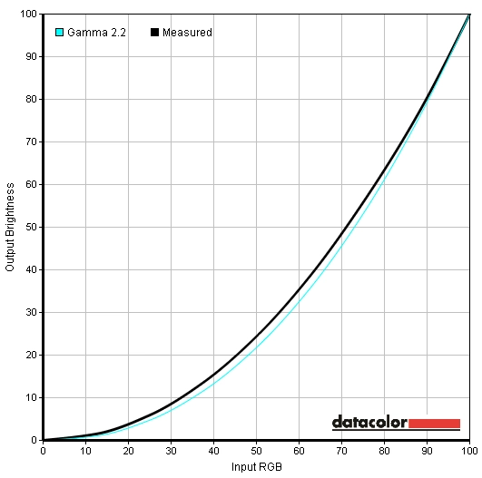
These settings gave better balance and depth to the image, although the colour channel adjustments required to compensate for the weak reds and strong blues were quite considerable. On many monitors such changes would have to be carefully considered due to the detrimental effect on contrast. However; as we explore later this monitor has plenty of contrast to chip away at. The white point was now appropriately balanced for daylight viewing at 6500K and there was no particular cast to the image. The gamma curve was slacking just a touch at 2.1 on average with some noticeable drops on some mid-tones as illustrated by the graph below.
Gamma curve test settings
Contrast and brightness
Monitor Profile White luminance (cd/m2) Black luminance (cd/m2) Contrast ratio (x:1) ‘Standard’, 100% brightness 245 0.08 3063 ‘Standard’, 80% brightness 212 0.07 3029 ‘Standard’, 60% brightness 172 0.06 2867 ‘Standard’, 40% brightness 127 0.04 3175 ‘Standard’, 20% brightness 82 0.03 2733 ‘Standard’, 0% brightness 37 0.01 3700 Test settings, 75 brightness, 75 contrast (custom RGB) 190 0.07 2714 ‘Multimedia’ 189 0.07 2700 ‘Movie’ 182 0.07 2600 ‘Game’ 177 0.07 2529 ‘Text’ 191 0.06 3183 ‘Warm’ 170 0.07 2429 ‘Cool’ 164 0.07 2343 ‘Custom Color’ 225 0.07 3214
By default the ‘Game’ and ‘Movie’ modes have dynamic contrast enabled which we disabled for the purposes of the table above. This reacts in a fairly natural way to changes in brightness, not too rapidly or too slowly. Although we aren’t fans of dynamic contrast in general this is one of the better implementations we’ve seen. There is also some flexibility offered in this respect. If you recall on the video of the OSD there is a setting called ‘Energy Smart’ in ‘Other Settings’. This is essentially similar to dynamic contrast but with a lower maximum luminance. Furthermore; it can be enabled in any preset.
Luminance uniformity table
Luminance uniformity map
Colour reproduction
Colour gamut
Viewing angles
We also took a look at the influence of off-centre viewing angles on performance on the Lagom text and on the general image quality. The following video shows the results of the text test, a mixed desktop background and a dark desktop background from a variety of viewing angles. The mixed desktop background is probably the best at showing the contrast shift that occurs at decentralised angles both horizontally and vertically. This shift was stronger than on IPS and related technologies but weaker than on TN – note the lack of colour inversion vertically which distinguishes this from the latter. The dark image shows the purple sheen of what could be considered ‘VA glow’ which intensifies off-angle. This was not as prominent or intense as the sheen of IPS glow which tends to bloom out readily and is much more significant from direct viewing positions.
Response times
Ghosting
Conclusion
Positives Negatives Excellent contrast performance with good black depth and a bright, clear and clean image
Contrast ratio fell short of the optimistic 5000:1 specified by panel manufacturer AUO
A good range of shades and a good level of vibrancy from this glossy VA panel monitor Colour consistency and viewing angles not as good as on IPS or PLS and default colour balance not ideal Very low input lag and some good pixel responsiveness shown
Some pixel transitions were problematic, causing a noticeable dark trail (overshoot)
A nice look to the screen with a clean design and edge-to-edge glass. Also a competitive price tag Limited stand adjustability and connectivity, no VESA mounting and reflections on the screen can be a problem
![]()

