Author: Adam Simmons
Date published: September 17th 2013
Table of Contents
Introduction
Although some new 24” 16:10 monitors do crop up now and then they are a relatively rare breed compared to their dominant 16:9 cousins. The BenQ BL2411PT is an interesting monitor not only because of it ticking the 16:10 box, but because it’s BenQ’s first IPS (In-Plane Switching) monitor. This is an interesting change of direction for a company that focuses much of their efforts these days on VA (Vertical Alignment) and TN (Twisted Nematic) panel technologies. Alongside promise of improved viewing angles and colour performance from the IPS matrix a big selling point for this monitor is its ‘flicker free’ backlight. We put this screen through its paces in our gauntlet of movies, games and other tests.
Specifications
The monitor features an IPS panel with 1920 x 1200 resolution that outputs colours using 6-bit+ FRC (Frame Rate Control) dithering. This is very common on (non-VA) monitors of this price and given the excellent dithering algorithms used by LG is of little or no consequence for most users. Other points to note include a 5ms grey to grey response time, indicating that grey to grey acceleration is used and a typical retail price of £250 in the UK. This is comparable to the launch price of the U2412M which is now marginally cheaper given its age. This monitor is currently not available globally, with no local availability in the United States for example.
The key ‘talking points’ of the specification have been highlighted in blue.
Features and aesthetics
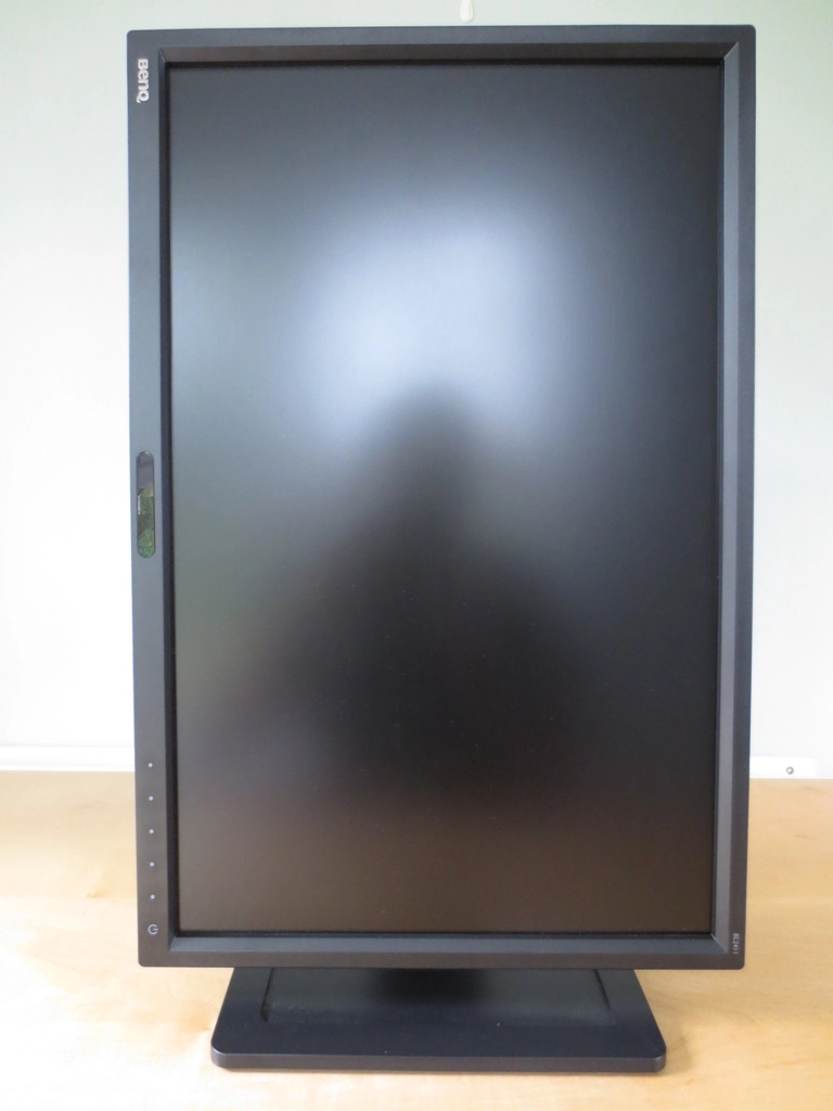
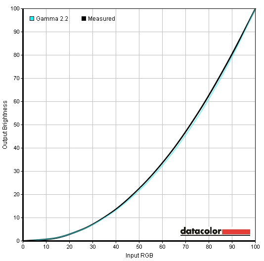
The front of the monitor has quite a smart appearance with fairly angular matte plastic bezels and a solid stand base. The bezels are reasonably thin at around 16mm (0.63 inches) at the top and sides. At around 22mm (just under an inch) the bottom bezel is slightly thicker but also houses the OSD control buttons and power button to the right. Central to the bottom bezel is the ‘Eye Protect Sensor’. This is an ambient light sensor which, when enabled, will adjust the screen brightness according to ambient light. Another sensor found here is the ‘Eco Sensor’, a proximity sensor that switches the monitor into a reduced brightness ‘Eco mode’ when nobody is using it. Another important aspect to mention is the screen surface, which is light matte anti-glare. Whilst not quite what we’d refer to as ‘semi glossy’ (as seen on WQHD IPS/PLS and some VA models) this surface provides a much less grainy looking image and preserves greater vibrancy than stronger matte surfaces. It gives a slightly less grainy appearance to the image than the surfaces used on current ‘Full HD’ AH-IPS panels, too. The OSD (On Screen Display) and power buttons are proximity and touch activated. Once the monitor is switched on and a finger comes near the control area, the touch-sensitive buttons are illuminated. Only buttons with a currently active function (this depends on where you are in the menu system) are illuminated. In the image below you can see that all but the far left button is active and illuminated. The leftmost button is inactive in this image and remains unilluminated. All button areas are marked with a light grey ‘blob’ that is visible when they aren’t illuminated. The power LED is a fairly unobtrusive pale white when the monitor is on, flashing amber when the screen is on standby. The buttons themselves are reasonably responsive once you get the hang of them. We found a gentle downwards swipe worked best. The menu system itself is a bit laggy, though, taking some time to respond to input which makes the whole thing feel a bit cumbersome at times. Before entering the main menu each button has a quick access function assigned to it; ‘Custom Key 1’ (Picture Mode by default), ‘Custom Key 2’ (Input Select by default), ‘Custom Key 3’ (Volume by default), ‘Menu’ and ‘Exit’. A particularly useful feature which some models overlook is the ability to customise these ‘Custom Keys’, as the name suggests, in the main menu. They can be assigned one of the following functions; ‘Picture Mode’, ‘Display Mode’, ‘Brightness’, ‘Contrast’, ‘Auto Adjust’ (VGA only), ‘Volume’, ‘Mute’, ‘Input’, ‘Eye Protect’, ‘Eye Protect Meter’, ‘Eco Sensor’, ‘Eco Sensor Meter’ and ‘Smart Reminder’. The main menu has a host of other useful features as well and is laid out in BenQ’s latest ‘Intuitive UI’ style. Some nice features include the ability to select 1 of 5 gamma modes and 10 sharpness settings – although the default values are technically optimal for PC use. Depending on the preset being used, as mentioned in the calibration section, the ‘Eye Protect’ ambient light sensor and ‘Eco Sensor’ proximity sensor can be activated and configured. Even when they aren’t enabled these sensors emit a very faint blinking red light to let you know they’re functional. This is very dim and not distracting even in a dark room, so not something to be concerned about. The video below gives a rundown of the OSD system on the BL2411PT. Further information can be found in the PDF user manual. From the side the monitor appears a reasonable thickness. It isn’t super thin and therefore isn’t as susceptible to the sort of flexation that can exacerbate backlight bleed and suchlike. Nor is it massively chunky. The stand is fully adjustable, offering; tilt (5 degrees forwards, 20 degrees backwards), height (130mm, 5 inches), swivel (45° left and right) and pivot (90° clockwise into portrait) adjustment. The stand is fairly robust but not quite as solid or heavy-duty as on some models from other manufacturers such as Philips, NEC and Dell. BenQ’s standard adjustable design, as seen here, is relatively lightweight but still not overly flimsy or limited in its adjustability. The rear of the monitor is fairly plain with matte black plastic. The stand is attached by 100 x 100mm VESA. It can be removed and an alternative VESA-compatible stand or mount used in its place. There is also a cable tidy attached to the stand, a button which unlocks the height mechanism and at the bottom right, a Kensington lock socket. There are a pair of simple 1W up-firing speakers towards the top of the monitor (just above the stand attachment point) which provide simple and fairly low-quality sound output. Towards the bottom there are downwards facing ports. These are shown in the image below with the screen in portrait orientation simply because it gave a clearer shot. To the left of the stand, when the monitor is in normal landscape orientation, is an AC power adaptor and switch. To clarify, the power supply is internal on this monitor (there is no external power brick) and there is a main switch to completely shut off all power to the monitor. To the right of the stand there is a 3.5mm line-in (audio in) port, 3.5mm headphone jack (audio out), DisplayPort input, DVI-D input and VGA input. As a 16:10 monitor designed primarily for PC users there is no HDMI port. Several ‘Senseye 3’ presets are available on this model; ‘Standard’, ‘Movie’, ‘Photo’, ‘sRGB’, ‘Reading’, ‘Eco’, ‘M-book’ and ‘User’. The ‘Standard’, ‘sRGB’ and ‘User’ presets give the most pleasing image with the remaining presets providing a mixture of obvious oversaturation, excessive and not adequately correctable sharpness, reduced shade range and a completely out of whack white point. As a result we focused on the 3 decent presets plus ‘Reading’ mode which we feel does serve a useful purpose for many users. The ‘M-book’ preset is designed to provide better matching between the image displayed by a Mac Book and this display so, presumably also serves a purpose, but we are testing the monitor with a desktop PC so are excluding this from our analysis. We also assessed the image using the 5 ‘Gamma’ modes in the ‘Standard’ Senseye preset. It should be noted that these are also selectable in the ‘User’ preset which is identical to ‘Standard’ with some additional settings. Our test system used an Nvidia GTX 780 connected to the monitor using a DisplayPort cable. It should be noted that using a DVI cable or either DP or DVI on an AMD GPU gives a very similar image. We used a number of familiar images and applications as well as a Spyder4Elite colorimeter to assess the image performance of the aforementioned presets and gamma settings. The following table gives a reading for the white point and gamma recorded in the centre of the screen using various settings alongside the picture options available (preset dependent) and a subjective assessment of the image. The BL2411PT was, as per usual, very bright out of the box. It also had a bit of a cool tint with a slight purple hue to it but nothing major or un-correctable. After some small adjustments the monitor provided a rich and well balanced image with excellent gamma handling and a good daylight white point. The ‘sRGB’ mode wasn’t really much use as, despite appropriate gamma behaviour, the cool purple tint remained and couldn’t be corrected as the colour channels are locked in this preset. The ‘Reading’ preset was interesting as it adjusted the image in such a way that it is more restful on the eyes. You can make these adjustments manually in the ‘User’ preset but it would be annoying to have to adjust manually between that and normal day time settings. There are also a range of gamma modes selectable in the ‘Standard’ and ‘User’ presets which allow you to essentially select an average gamma of between 1.8 and 2.6 in increments of 0.2. There were no funky little blips on the gamma curve using any of these settings, so they stuck to the corresponding curve nicely. For our test settings (below) we stuck with the default gamma setting of ‘3’ as this mirrored the 2.2 standard very nicely as shown in the following image. As mentioned above the monitor had a cool tint and was too bright out of the box. To counteract this we selected ‘User’ mode, lowered the brightness and made some minor adjustments to colour channels. We settled for the following to achieve a nice rich and balanced image that would work well for our testing. Be aware that individual units are all slightly different so feel free to use our settings as a base but make your own adjustments from there if necessary. Brightness= 37 (according to preferences and lighting) Contrast= 50 Gamma= 3 Color Temperature= User Define Red= 99 Green= 100 Blue= 95 Using a KM CS-200 we measured the white luminance, black luminance and calculated the resultant contrast ratio using a range of monitor settings. The results are shown in the table below, with black highlights indicating the highest white luminance, lowest black luminance and highest contrast ratio yielded. Blue highlights indicate the results using our test settings as described in the calibration section. The BenQ BL2411PT produced an average static contrast (where brightness only was adjusted) of 1203:1 which is as high as we’ve seen from a non-VA LCD panel. This strong performance was maintained when ‘Gamma’ mode was changed and in the ‘sRGB’ preset. Our test settings involved some minor adjustments to colour channels but this had little effect on the contrast ratio which remained at 1193:1. The ‘Reading’ preset involved a quite significant forced shift in colour temperature giving a drop in contrast to a still very respectable 1050:1. The highest brightness we recorded was 303 cd/m2 (very close to the specified 300 cd/m2) and the lowest brightness was 96 cd/m2. It’s good to see a 2 figure minimum, although some users may like a brightness that is even lower. This can be achieved by lowering the colour channels at the expense of contrast and image performance. At any rate the luminance adjustment range of 199 cd/m2 is decent but not exceptional. The monitor also features a Dynamic Contrast mode that can be activated in ‘Movie and ‘Photo’ modes. In this mode the backlight (brightness) rapidly adjusts to how light or dark the image is. The strength of the effect can be adjusted between ‘1’ and ‘5’, with lower values giving a more limited luminance adjustment range. Even at the lowest setting the scene tends to be too bright for most mixed images but dark content is handled better. This mode essentially does what it says on the tin but is limited in its appeal due to the poor presets that accompany it and the fact that scenes are often a complex mixture of light and dark content. Because the backlight is all controlled as one unit the image of the whole screen must be adjusted to suit the overall makeup of a given scene. The BL2411PT is part of BenQ’s ‘Eye-Care’ initiative and is specifically marketed as ‘flicker free’. We can confirm that this is the case and that the monitor does not use PWM (Pulse Width Modulation) at any brightness to regulate the backlight. Some users are sensitive to this flickering and suffer unfavourable side-effects by using such monitors, so it’s nice for them to know that this monitor is ‘flicker free’ as promised. When looking at a black screen in a darkened room, using our test settings, there was a very small amount of backlight bleed in the bottom right corner. This was not at all bothersome during actual use and was drowned out by ‘IPS glow’ during normal use anyway. ‘IPS glow’ is a concept explored in more detail and shown in a video later in the review. It manifested itself as a silvery sheen that ‘blooms’ if you move to view the monitor from an angle but is also visible when viewing the monitor from a normal position. We used a Spyder4Elite to assess the luminance uniformity of lighter colours. The luminance of 9 equidistant white ‘quadrants’ was recorded and the luminance of each quadrant compared to the brightest value. The table below shows the brightness recorded at each quadrant and the deviation between a given quadrant and the brightest point of the screen. The luminance uniformity was pretty decent really. The maximum luminance was recorded at ‘quadrant 5’ in the centre of the screen (184.4 cd/m2). The highest deviation from this was recorded at ‘quadrant 7’ at the bottom left of the screen (160.6 cd/m, 13% dimmer than centre). Elsewhere the screen was 5-11% dimmer than the centre. These deviations were not the lowest we’ve seen but certainly not the highest. Really there about as good as you typically see from a monitor without any sort of uniformity compensation built in – and such models come at a premium. It’s important to remember that, as with backlight bleed, individual units of the same model can vary when it comes to brightness uniformity. The graphic below gives a visual representation of these differences with lighter greys representing lower deviation from centre than darker greys. On Battlefield 3 the contrast performance was good, on the whole, with a respectable level of detail in dark areas and decent contrasting bright colours. Whites and light colours did not appear overly grainy as they would on some older IPS monitors and had decent purity. There was some loss of detail towards the edges of the screen as a result of ‘IPS glow’, which is a typical IPS characteristic and not something specific to this monitor only. It affected a relatively small portion of the screen from a normal viewing position. On Dirt 3 contrast performance was also quite pleasing. Aside from the relatively small peripheral section affected by IPS glow detail in dark areas was good. Bright elements such as car headlights pierced the surrounding darkness nicely and didn’t look overly grainy. Such elements did not have the glossy purity and ‘pop’ but were much smoother than seen on older models such as the Dell U2412M. We also tested the contrast performance on the Blu-ray film Skyfall. With exception to some peripheral regions affected by IPS glow, detail levels during dark scenes were quite respectable. At the high-end bright colours didn’t appear absolutely ‘pure’ and ‘smooth’ as they would on a glossy display but showed good intensity and didn’t appear overly grainy. Lagom’s contrast tests are useful for highlighting even relatively minor strengths and weaknesses in a monitor’s contrast performance. We observed the following. The BenQ BL2411PT offers comprehensive coverage of the sRGB colour space, as shown below. There was slight over coverage, particularly in the green region on this diagram, but nothing alarming. If this is going to be an issue for users (i.e. colour critical work) it is something that calibration will fix very readily. The monitor does provide a good base for proper calibration using appropriate hardware. In Battlefield 3 the colour performance was very pleasing with everything looking much as it should. Earthy browns and khaki colours showed the correct tone and appropriate variety. The greens of vegetation included some particularly good minty and fairly rich deep shades without an inappropriate and unappealing yellow hue. Whilst vibrant elements didn’t have the ‘in your face pop’ of a decent glossy screen they still looked quite vivid and lively. The warm orange glow of raging fires and deep yellows of markers on the HUDs of aircraft were particularly impressive. On Dirt 3 there was an excellent variety of rich and natural colours. Greens were particularly impressive with some good deep and lush shades shown alongside a good range of lighter shades. The rally tracks in Finland showcased this variety particularly nicely. Dusty khaki colours found on the Kenyan rally tracks also had a good natural look to them without any inappropriate tints or inconsistency at different points of the screen. The car paint jobs were dashing and vibrant with some impressive deep reds, yellows and blues. There were also various bright ‘neon’ shades that stood out well. On our first Blu-ray test title, Skyfall, performance was strong with rich and appropriately saturated colours. An excellent variety of subtly different shades (such as skin tones) was displayed. Some impressively vivid deep red and blue shades were also evident in some scenes, such as the Shanghai night scenes where neon lighting features. The second Blu-ray tested was Futurama: Into the Wild Green Yonder. Colour performance was again strong with vivid colours such as neon greens, bright pinks and yellows standing out very nicely. Strong and deep colours (particularly red) were also displayed well. In amongst these more striking shades there was a pleasing range of ‘quieter’ shades. Even closely matched skin tones and other colours throughout the scene revealed even the slightest of distinctions. The ability of a shade to remain very consistent regardless of on-screen position and therefore have its own correct ‘identity’ is a luxury afforded to users by IPS technology. To delve deeper into the strengths of this monitor’s colour consistency we used Lagom’s tests for viewing angle. The following observations were made. Using a similar method to that described in our other recent reviews (such as this one) we measured just over 4ms (1/4 of a frame) of input lag on the BL2411PT. This indicates a very low signal delay that will not hamper the gaming experience on this monitor. We used a tool called PixPerAn (Pixel Persistence Analyser) to analyse the pixel responsiveness of the monitor using its three ‘AMA’ (Advanced Motion Acceleration) settings. The test is set to its highest running speed to simulate rapid movement and a highly sensitive camera used to capture any trailing (ghosting or pixel persistence) as a result of the monitor’s pixel response behaviour. The images below show the results with AMA set to ‘Off’, ‘High’ and ‘Premium’, respectively. With AMA ‘Off’ there is a fairly bold primary trail and a very faint secondary trail, typical for an IPS model with little or no pixel overdrive employed. With AMA set to ‘High’, the default setting, the primary trail is somewhat fainter and there is no secondary trail visible. Considering a broader range of pixel transitions, as we do shortly, this mode offers a considerable reduction in trailing and was adopted for our subjective testing. Setting AMA to ‘Premium’ provides far too much acceleration with obvious RTC (Response Time Compensation) artifacts. The resulting overshoot (inverse ghosting) is visible in the PixPerAn image as trails that are dark or very bright rather than a blended combination of the foreground and background colour. This is very noticeable in practice over a broad range of pixel transitions so we don’t recommend using the ‘Premium’ setting. PixPerAn is quite limited in the range of pixel transitions it shows and that results are captured as a snapshot from a camera. In the real world our eyes constantly move to track movement on the screen, whether we’re aware of this or not. This creates significant motion blur, particularly on a 60Hz LCD, regardless of what the pixels themselves are doing. Games also feature a much broader range of pixel transitions, which is important because pixel response times vary depending on the shades involved. To try to tie everything together we assessed performance subjectively whilst playing some games and watching some movies. Our first test title was Battlefield 3 (BF3). Regardless of the pace of action (be it running about on foot or flying a helicopter) the level of motion blur was as good as you can expect from a 60Hz monitor. There was no noticeable trailing resulting from sluggish pixel responses nor was there any observable inverse ghosting resulting from excessive grey to grey acceleration. Clearly BenQ have reached an excellent balance with ‘AMA High’, giving pixel responsiveness that is just as good as it needs to be for optimal 60Hz performance. Our second test title was Dirt 3. This showcases a good range of pixel transitions and a fast pace of action, making it a good test for weaknesses in a monitor’s pixel responses. As on BF3 the pixel responses were not a limiting factor and the level of motion blur was very much comparable with what you would see on even the fastest 60Hz monitors. Even in the fast-paced Gymkhana mode there was no unsightly trails or overdrive artifacts caused by weaknesses in the pixel responsiveness. We also used our Blu-ray movie test titles to see if there were any observable artifacts or other limitations caused by the monitor’s pixel response behaviour. Although fluidity was somewhat limited by the relatively low movie frame rate of 24 or so frames per second, there was no trailing nor any artifacts attributable to the monitor’s pixel responses. It has been a while since we last reviewed a 24” 16:10 monitor; the Dell U2412M some 2 years back. These sorts of monitor are a relative rarity on the market these days, especially models with the same sort of relatively affordable price as the U2412M. The BenQ BL2411PT is a refreshing model to see on the market, not just because it fills this 24” 16:10 niche, but because of some welcome changes that have been included. With this model BenQ and panel manufacturer LG have shown that they are quite in-touch with the desires of users for relatively slender bezels, a flicker free backlight and a light matte screen surface. Whilst anti-glare properties are certainly attractive for a monitor designed for office as well as home use there is little need to go completely overboard – it’s nice to see that toned down a bit here, preserving greater image clarity and vibrancy. Colour reproduction is one area where IPS monitors can really excel, and here the BL2411PT did not disappoint. Following some relatively minor adjustments colour balance and gamma handling were just where we like them to be. The strengths of the IPS panel’s consistent colours, the good default setup, comprehensive sRGB coverage provided by the backlight and the light matte screen surface all combined to give a rich and rewarding experience. Contrast performance was as good as we’ve seen on an IPS panel with static contrast values comfortably exceeding the specified 1000:1. IPS glow did eat away at a bit of detail towards the edges of the screen. This isn’t something at all unique to this monitor but rather a characteristic of the panel type. With a large part of our testing focusing on gaming it is important not just that the monitor delivers pleasing image quality but also feels and looks responsive. We were pleasantly impressed with this model in that respect. Input lag was very low and grey to grey acceleration (AMA, Advanced Motion Acceleration) well implemented to provide a level of motion blur and overall responsiveness on par with the fastest 60Hz LCD monitors out there. With this sort of performance there is absolutely no need to opt for a 60Hz TN panel to seek superior responsiveness. Overall this was a pleasant monitor to use and review. Both externally and internally a lot of thought has gone into making for an enjoyable viewing experience – whether you’re playing games, editing photos or just surfing the internet. With its thus far unique combination of price, performance and features this is certainly one to consider.
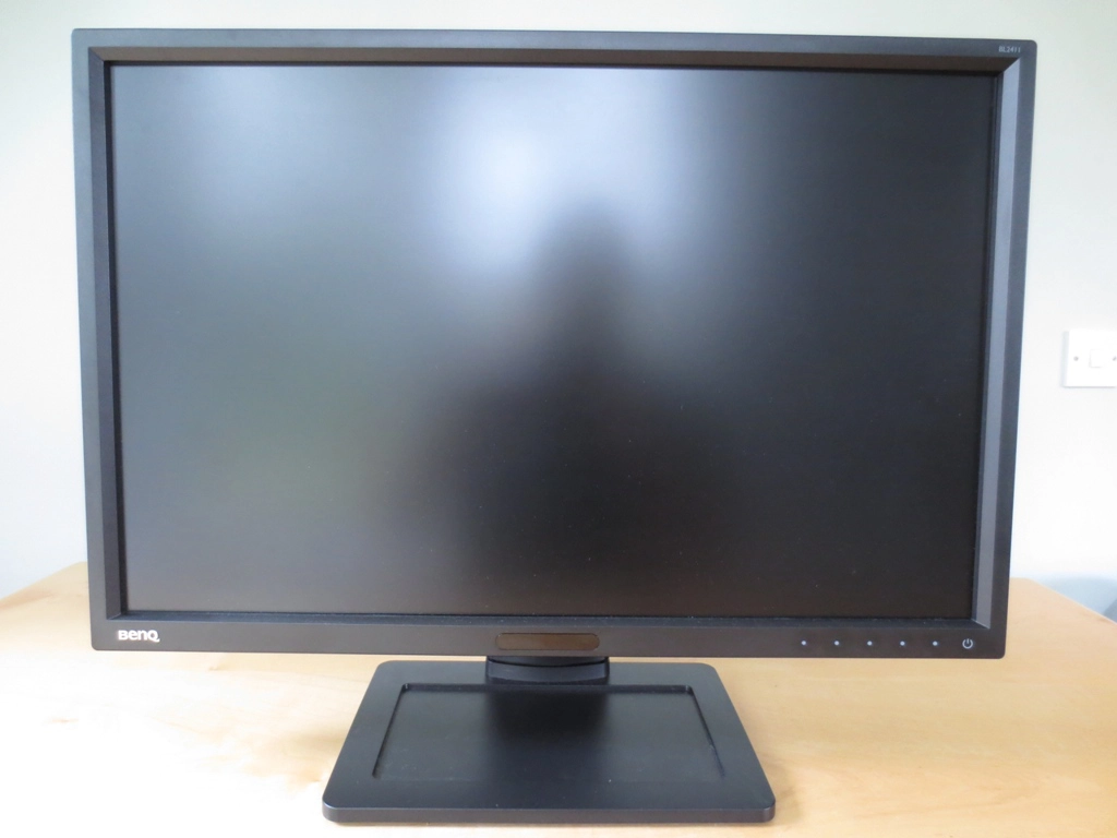
A smart look
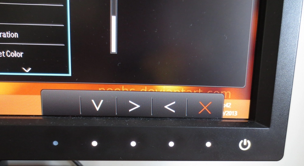
Illuminated controls
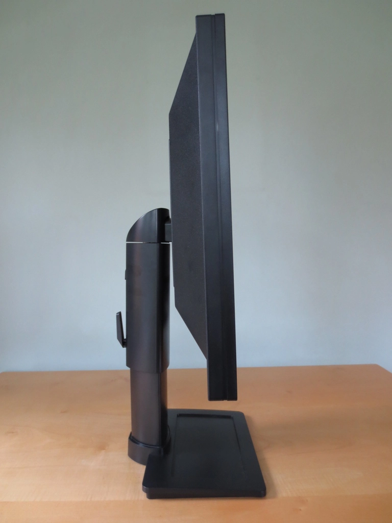
Not too thin or chunky
Good adjustability
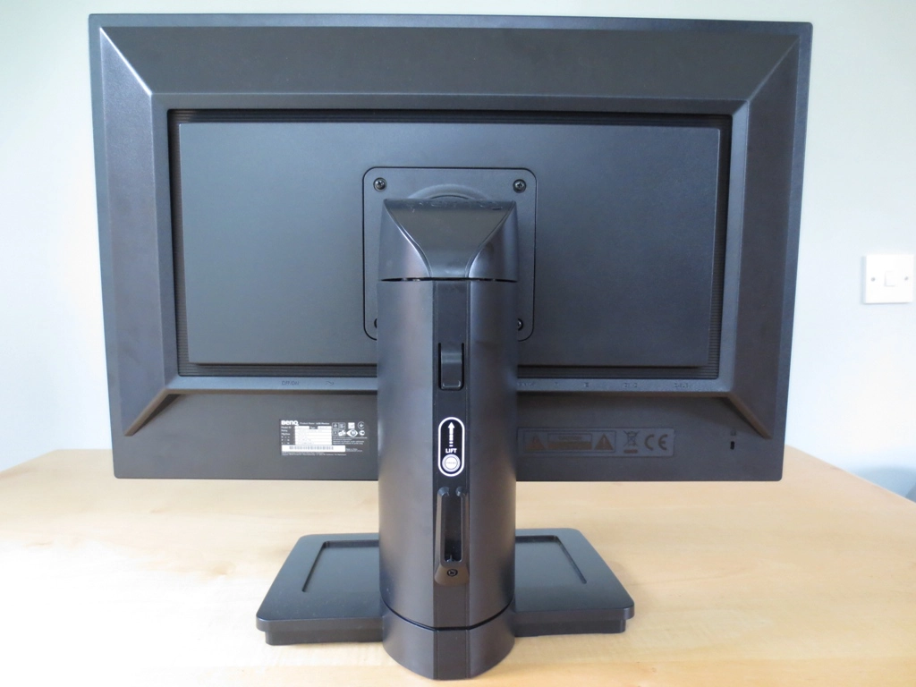
The rear side
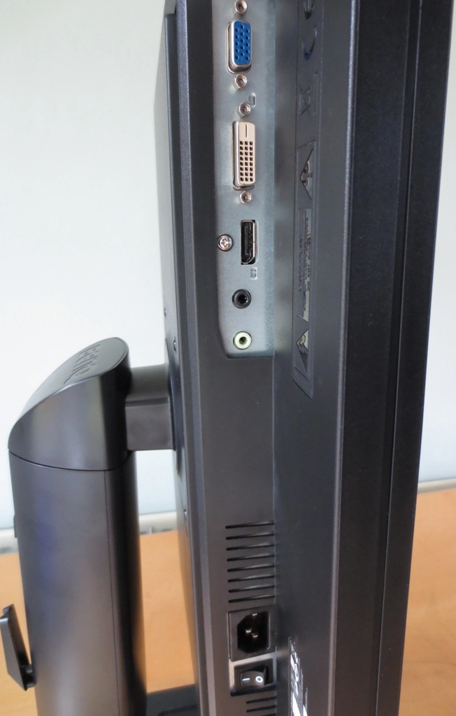
Good ports for PC users
Calibration
Testing the presets
Splendid Mode (Preset)
Gamma (central average)
White point (kelvins) Extra OSD features Notes ‘Standard’, Gamma 1
1.8 6756K Brightness, Contrast, Sharpness, Gamma, Color Temperature (Normal, Bluish, Reddish), Reset Color, AMA. ECO Sensor and Eye Protect also available. Very bright (default brightness is 100) with shades lacking appropriate depth. A bit of a cool somewhat purple tint overall due to a relative weakness in the green channel. ‘Standard’, Gamma 2
2.0 6841K As above. Very bright with a slight improvement in depth but still lacking in that respect. Slight purple tint remains.
‘Standard’, Gamma 3 2.2 6810K As above. Slight purple tint and excessive brightness remains but image is much deeper with good richness and variety. Slightly oversaturated from high brightness, though. ‘Standard’, Gamma 4 2.4 6797K As above. As ‘Gamma 3’ but more depth and oversaturation quite noticeable in places due to both brightness and gamma. ‘Standard’, Gamma 5 2.6 6750K As above. Yet more depth, clearly too much in fact with obvious oversaturation and crushing of dark shades. High brightness and purple tint remain. ‘sRGB’
2.2 6833K Brightness, Contrast, Sharpness, Reset Color, AMA. ECO Sensor also available. A fairly noticeable cool and somewhat purple tint. Sharpness and brightness is too high (adjustable) but overall balance to image is reasonable. ‘Reading’
2.2 4755K As ‘sRGB’. This preset gives a dim and warm image (strong red channel, weaker green and very weak blue) that is supposed to be more restful on the eyes. The sharpness is also reduced to try to give a sort of ‘book like’ appearance. Test Settings (‘User’ modified as below)
2.2 6523K Brightness, Contrast, Sharpness, Gamma, Color Temperature (Normal, Bluish, Reddish, User Define), Hue, Saturation, Reset Color, AMA. ECO Sensor also available. Image is well balanced with a rich and varied look. The brightness and white point has been improved to correct the slight oversaturation and tint preset by default.
Gamma Test Settings
Test Settings
Picture Mode= User
Contrast and brightness
Contrast ratios
Monitor Profile White luminance (cd/m2) Black luminance (cd/m2) Contrast ratio (x:1) ‘Standard’ 100% brightness 303 0.25 1212 ‘Standard’ 80% brightness 262 0.22 1191 ‘Standard’ 60% brightness 223 0.18 1239 ‘Standard’ 40% brightness 181 0.15 1207 ‘Standard’ 20% brightness 140 0.12 1167 ‘Standard’ 0% brightness 96 0.08 1200 Test settings
179 0.15 1193 ‘Standard’ Gamma 1
303 0.25 1212 ‘Standard’ Gamma 2
303
0.25 1212 ‘Standard’ Gamma 4
303 0.25 1212 ‘Standard’ Gamma 5
302 0.25 1208 ‘sRGB’
281 0.24 1171 ‘Reading’
126 0.12 1050
PWM (Pulse Width Modulation)
Luminance uniformity
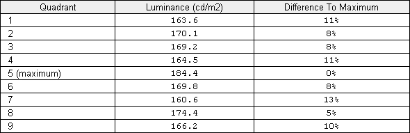
Luminance uniformity table
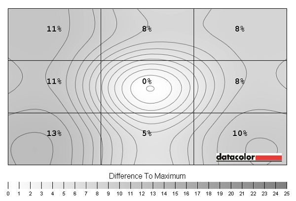
Luminance uniformity map
Contrast in games and movies
Lagom contrast tests
Colour reproduction
Colour gamut
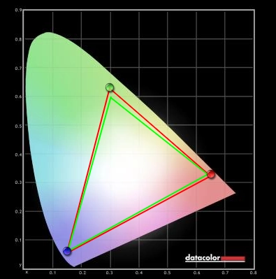
Colour gamut test settings
Colour in games and movies
Viewing angles
The following video shows how little variation there is in overall contrast and colour as the viewing angle is changed (i.e. where ‘off centre’ viewing angles are considered). The camera’s white balance and focus settings were not set correctly which makes things look a bit funky at times. Hopefully you can still see that there are no overly pronounced shifts in colour and contrast and evidently greater consistency off-angle than seen on VA or TN panels. The final section of the video highlights the aforementioned ‘IPS glow’.
Responsiveness
Input lag
Pixel responsiveness

Trailing AMA 'Off'

Trailing AMA 'High'

Trailing AMA 'Premium'
Responsiveness in games and movies
Conclusion
Positives Negatives Colours are rich, varied and well-represented following a few minor adjustments in the OSD. Colour consistency is also strong with relatively little shade variation at different points of the screen
Colours are certainly more appealing than on models with stronger matte anti-glare surfaces (such as the Dell U2412M) but don’t have quite the same pop and smoothness as a glossy surface
Very good static contrast performance figures and a respectable contrast performance in practice. Whites and light colours are not overly grainy IPS glow is present which some users find irksome. Lighter colours on the screen were not as smooth and ‘pure’ as on models with even lighter matte or glossy screens Very low input lag and carefully implemented grey to grey acceleration gives a performance that matches even the fastest 60Hz LCDs
Some users would prefer a greater refresh rate than 60Hz for extra fluidity – and BenQ’s ‘Premium’ AMA setting needs renaming in this case
Good ergonomic flexibility, thin bezels and a good selection of ports for PC users
No HDMI and no local availability in the US
![]()

