Author: Adam Simmons
Date published: April 9th 2014
Table of Contents
Introduction
There are several attractive benefits to the 2560 x 1440 (WQHD) resolution compared to the current standard 1920 x 1080 (Full HD). The gulf in price between models with this resolution and the standard ‘Full HD’ resolution from mainstream manufacturers is quite wide, though, and that alone can put many users off. The AOC q2770Pqu uses a high quality PLS (Plane to Line Switching) panel with 2560 x 1440 resolution – but as usual with AOC there is a big focus on value for money here, too. We put this attractively priced WQHD offering through its paces in our rigorous gauntlet of tests.
Specifications
The PLS panel (also referred to as ‘S-PLS’ or Super Plane to Line Switching) features a WQHD resolution and supports true 8-bit colour without dithering. A 5ms grey to grey response time is specified, a fairly usual but somewhat misleading figure quoted for IPS-type panels such as this. The monitor also features wide viewing angles and comes at a nice low price.
For your reading convenience the key ‘talking points’ of the specification have been highlighted in blue below.
Features and aesthetics
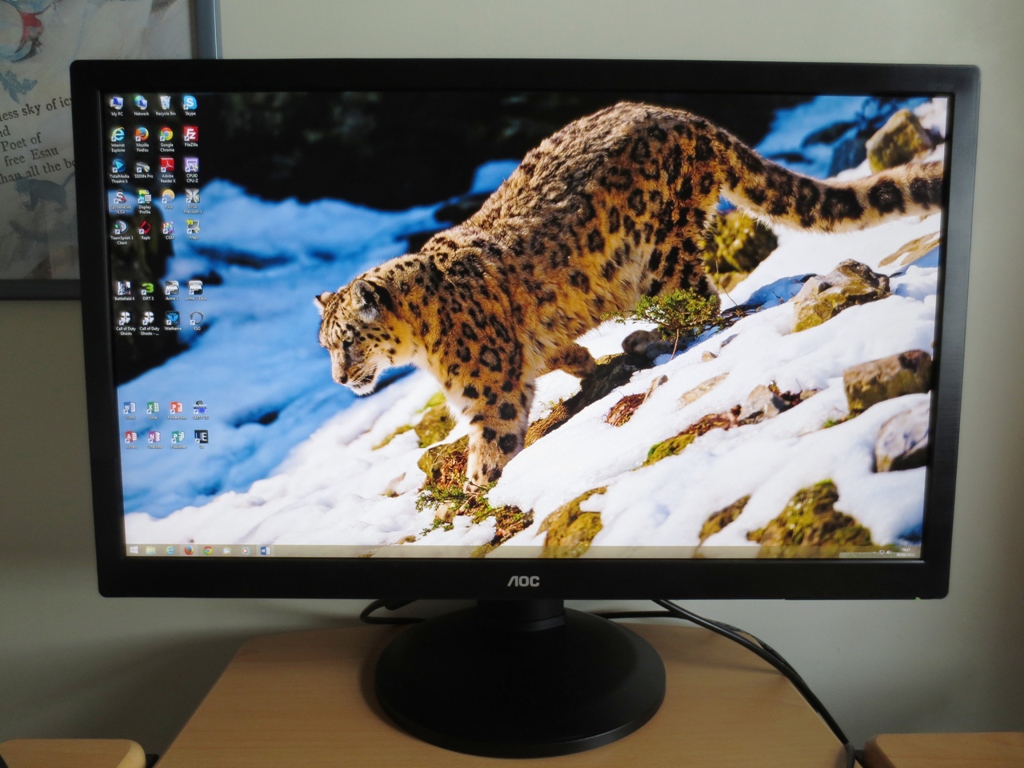
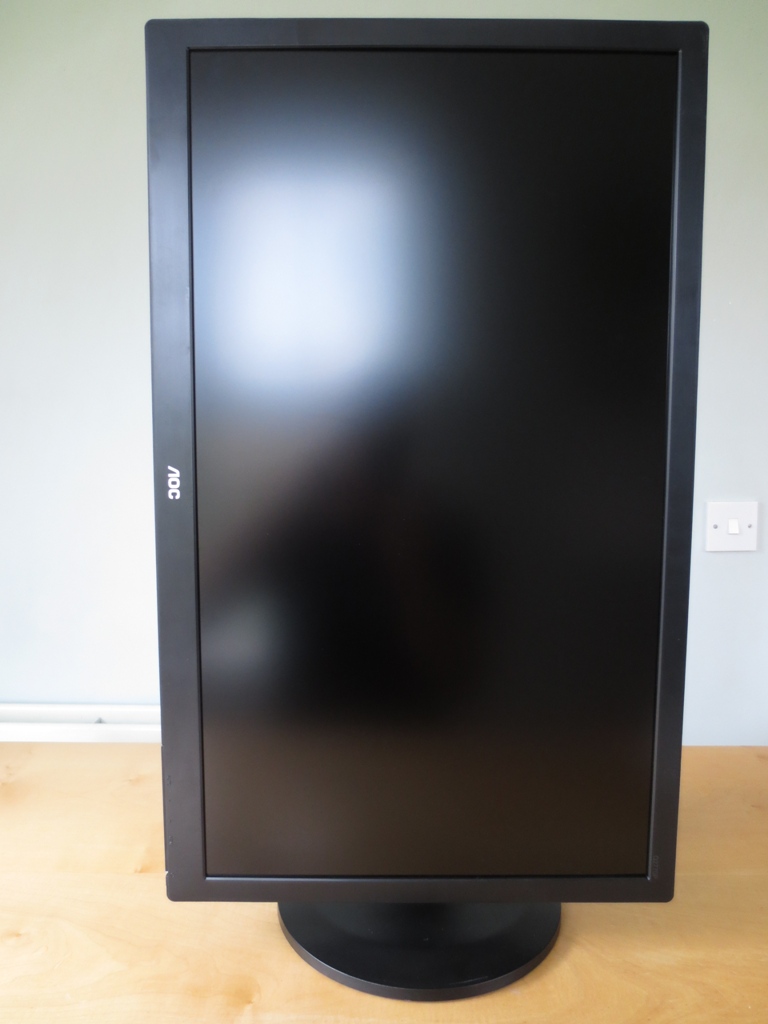
From the front the monitor has black plastic bezels with a brushed metal effect, something we’ve seen on several recent AOC monitors. The bezels are 17mm (0.67 inches) thick at the top and sides and 26mm (1.02 inches) at the bottom. The screen surface is very light matte anti-glare (‘semi glossy’) as seen on other PLS and IPS-type panels. This helps to providing good glare reduction whilst maintaining a relatively smooth and vibrant image.
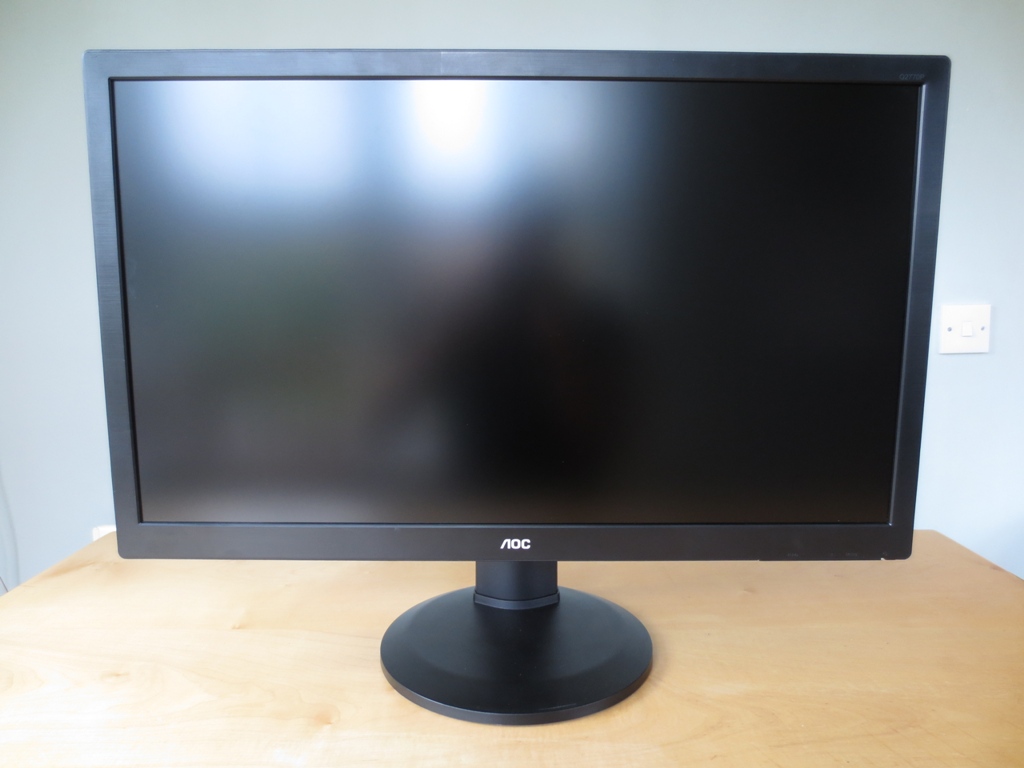
Once the monitor is switched on and put in a sensible lighting environment (i.e. without strong direct light hitting the screen surface) you’re free to admire the image rather than an outline of your head and upper body.
At the bottom right there are the monitor controls and power buttons, facing downwards. These have a satisfying click which no doubt please those who dislike the touch-sensitive alternative. The power button is transparent, allowing light from the power LED to shine through. This lights green when the monitor is on and amber when it’s on standby. The buttons have the following functions; ‘Source Select/Back’, ‘Clear Vision/Up’, ‘Volume/Down’ and ‘Menu/Enter’.
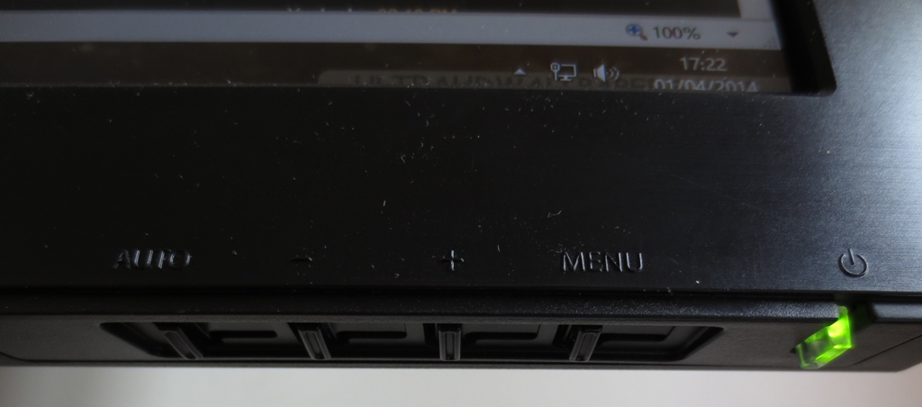
The menu is laid out in that familiar AOC ‘widescreen’ style. There are the usual controls such as ‘Contrast’ and ‘Brightness’ alongside some extra features such as selectable ‘Gamma’ modes, adjustable ‘Overdrive’ and configurable RGB colour channels. The video below gives a run-through of the monitor OSD with commentary. This is the first (and hopefully not last) time that an audio commentary has been included on our OSD videos, so excuse the lack of polish.
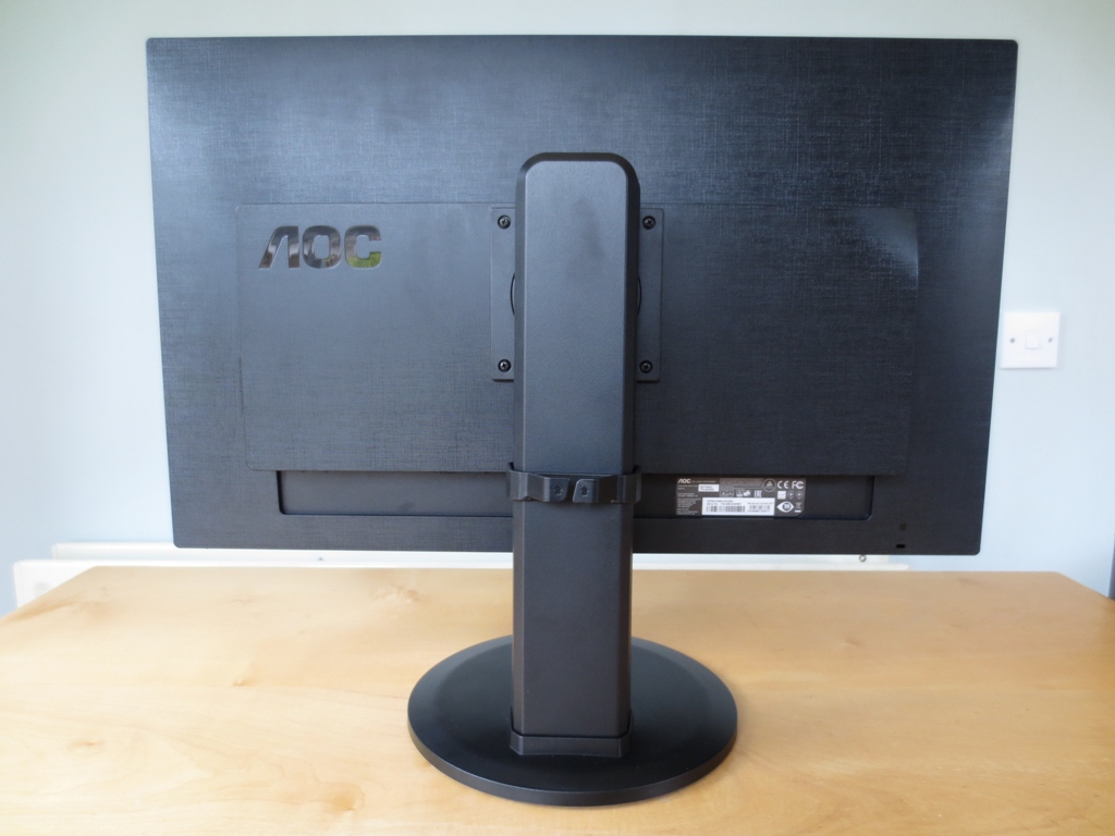
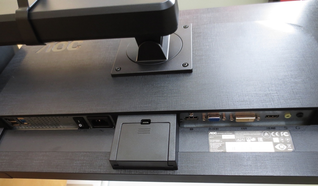
From the side the AOC is relatively sleek for a monitor of this class. The screen is around 17mm (0.67 inches) at thinnest point, stepping out to around 38mm (~1.50 inches) centrally. The stand is fully adjustable, allowing; tilt (25° back, 5° forwards), swivel (around 270° field of rotation using a turntable mechanism), height (130mm or 5.12 inches) and pivot (90° clockwise) into portrait. At lowest height the bottom bezel of our unit cleared the desk by 53mm (2.09 inches) and the top by 443mm (17.44 inches). At the right side there are 2 USB 3.0 ports. The bottom port, coloured yellow, features fast charging for connected devices.
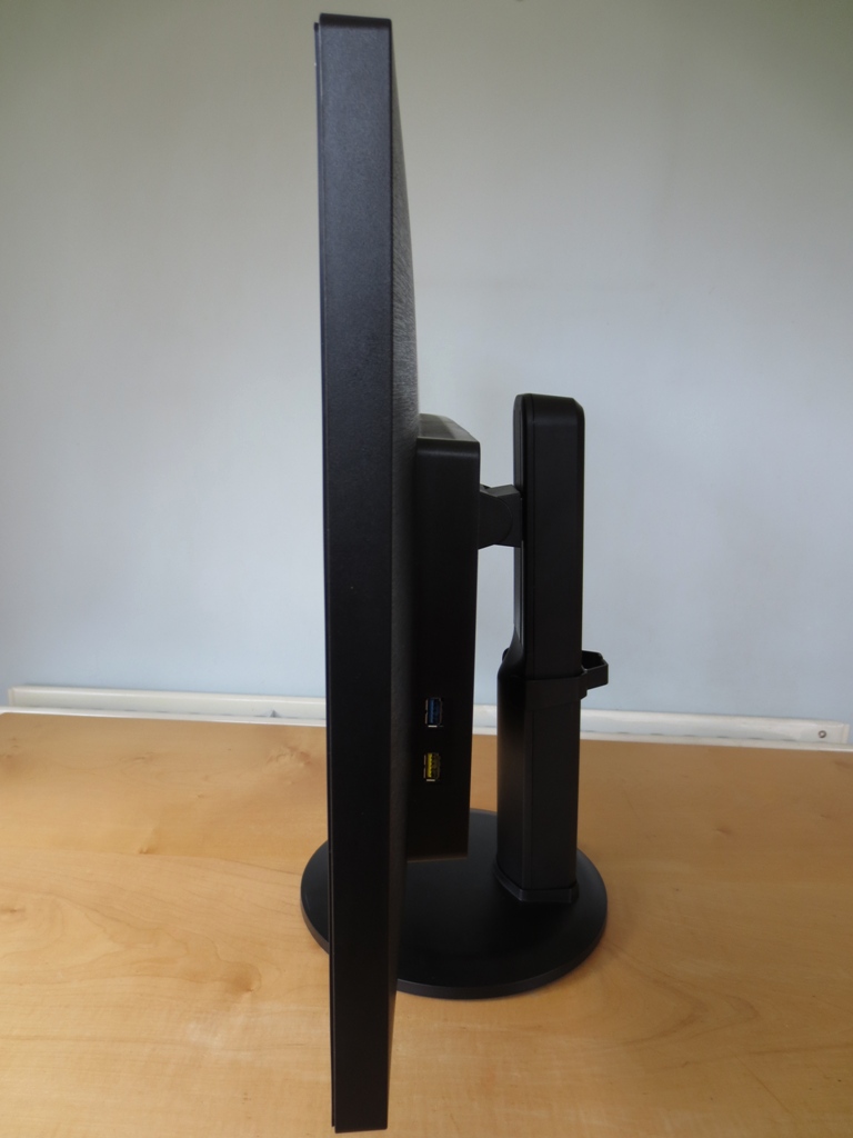
The rear of the monitor uses matte black plastic with a woven texture. The stand attaches by 100 x 100mm VESA – it can be unscrewed to make way for an alternative 100mm VESA solution. Although not clear in the picture, the upper right of the rear ‘plate’ where the stand attaches (the bit that ‘lumps out’ when viewed from the side) actually slopes downwards. At first we thought the monitor had been bashed here, but it is an intentional part of the design as you can see upon closer inspection. Towards the top of this ‘plate’ there are 2W stereo up-firing speakers. These offer a reasonable sound output with decent enough volume and a somewhat tinny but not distorted sound. These won’t replace a decent standalone speaker set but are decent enough for basic sound output.
The ports of the monitor are fairly generous, facing downwards and running along the bottom of this central area. There are; 2 USB 2.0 ports, USB 3.0 upstream, a ‘zero watt’ power switch, AC power input (internal power adaptor), DP, VGA, DVI, HDMI 1.4, 3.5mm audio input and 3.5mm headphone jack. There is also a Kensington Security Slot to the right of the port area.
Calibration
Testing the presets
The q2770Pqu doesn’t include any real presets, just a range of ‘Eco Mode’ options which adjust the brightness by varying amounts to suit different tasks. We quite like this approach as we feel presets are often quite pretentious. Gaming and movie presets are usually the worst offenders as they essentially dupe users into settling for oversaturated or an otherwise inaccurate image representation ‘because the monitor said so’. For those who like to tweak things the monitor gives users access to three discrete ‘Gamma’ modes and also some ‘Color Temp.’ settings, alongside the ability to individually alter the colour channels if you prefer.
The table below focuses on key image characteristics such as gamma and white point (readings taken using a Spyder4Elite colorimeter) using the various ‘Gamma’ settings and setting ‘Color Temp.’ to ‘User’. Except for our test settings, all settings except for those explicitly mentioned were kept at default. Our test system used an Nvidia GTX 780 connected via DisplayPort. The image characteristics were exactly the same whether using a Dual-Link DVI cable or HDMI cable. The HDMI port fully supports 2560 x 1440 @ 60Hz under HDMI specification 1.4, which most modern GPU HDMI ports now support as well. Similar results can be expected using modern AMD GPUs.
| Monitor Profile | Gamma (central average) | White point (kelvins) | Notes |
| Gamma1 | 2.2 | 6069K | Very bright with good vibrancy. Image is a touch warm but generally quite well balanced with good shade depth and variety. |
| Gamma2 | 1.9 | 6027K | As ‘Gamma1’ but a more washed out appearance and generally less faithful colour reproduction. |
| Gamma3 | 2.3 | 6027K | As ‘Gamma1’ with extra depth, particularly in dark shades which are selectively boosted to appear considerably deeper than they should be. |
| Color Temp. = User | 2.2 | 6163K | The image appears just a touch ‘cooler’ but still somewhat warm. It is slightly brighter than the default ‘Warmer’ setting as well. |
| Test Settings 1 (‘Gamma1’ modified as below) | 2.2 | 6491K | A rich and varied image with good balance and shade representation. |
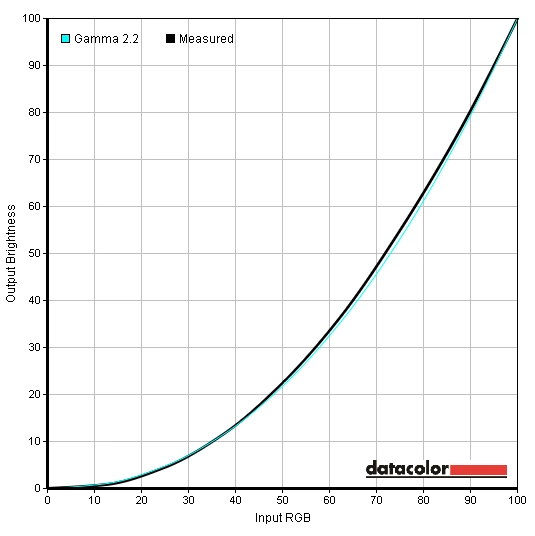
The AOC q2770Pqu produced quite a pleasing image out of the box. It was a bit on the bright side, which is almost invariably the case with monitors these days. The image was also slightly warm-looking compared to the 6500K daylight target, which is perhaps not surprising given that the default ‘Color Temp.’ setting is ‘Warm’. There were two alternative gamma modes available which altered the gamma behaviour of the monitor, but the best accuracy was achieved by sticking to the default ‘Gamma1’ setting. The gamma averaged 2.2 but strayed a little from the ideal curve in places. After just a few tweaks to the colour channels and a considerable drop in brightness the image became very nicely balanced. The colour temperature was now very close to the 6500K target and gamma remained at 2.2 on average but tracked the ‘ideal’ curve just a little more tightly. The image below shows the gamma curve under our ‘Test Settings’. There was slight deviation in places but nothing alarming. For most users the colour and gamma performance here will be very pleasing and more than adequate. For those who require things to be more tightly calibrated there will really be no substitute for calibration of your own individual unit with your own colorimeter or spectrophotometer. With fairly minor deviations such as this, gains in accuracy made on one unit (using ICC profiles) can be offset or even reversed by applying the same ICC profile on another unit. So we will not be providing any ICC profiles and will instead give you some adjustments to the OSD alone. Below you will find the settings we used as our ‘Test Settings’ in this review. As pointed out above you can expect a degree of inter-unit variation. Use these settings as a suggestion but don’t take them as gospel. Many users will be quite happy with the image output of this monitor after simply reducing brightness. If you do feel the need to adjust colour channels you should only find it necessary to switch the ‘Color Temp’ setting to ‘User’ and make minor alterations to the red channel. Contrast= 50 Gamma= Gamma1 Color Temp.= User Red= 47 Green= 50 Blue= 50 A Konica Minolta CS-200 luminance meter was used to measure the luminance of black and white using various monitor settings. From this the static contrast ratio was calculated. The table below shows these readings and the contrast calculations with the maximum white luminance, minimum black luminance and highest static contrast ratio highlighted for convenience. The results from our test settings are highlighted in blue. With only brightness adjusted but everything else left at the factory defaults an average contrast ratio of 830:1 was recorded. This is pretty standard for a WQHD PLS monitor. The contrast was raised slightly to 871:1 by changing ‘Color Temp.’ to ‘User’. This removes the slight colour channel adjustments made by default. The contrast ratio dropped slightly to 781:1 and 775:1 using ‘Gamma 2’ and ‘Gamma 3’, respectively. Under our test settings a contrast ratio of 841:1 was recorded which is decent. The luminance adjustment range of the monitor was also quite good, with a peak brightness of 283:1 and minimum white luminance of 71 cd/m2 yielding 212 cd/m2 of adjustability. The monitor has a DCR (‘Dynamic Contrast Ratio’) mode which allows the backlight to dynamically adjust according to the relatively lightness or darkness of the image. This adjusts at a reasonably rapid pace to changes in scene brightness and tended to provide an uncomfortable brightness during mixed images. During a dark screen fill the backlight failed to shut off completely, only going down to an equivalent screen brightness of around 25% with DCR disabled. We aren’t fans of dynamic contrast modes no matter how well implemented they are as they control the entire backlight as one unit on monitors and can’t really account for the intricate mixture of light and dark in a scene. We’ve certainly seen a better implementation than this and some worse implementations – at any rate, this mode is there if you want to use it. The monitor does not use PWM (Pulse Width Modulation) to regulate the backlight brightness and instead uses Direct Current (DC) modulation. The backlight is therefore considered ‘flicker-free’ which will come as welcome news to users who suffer visual discomfort when viewing monitors that use PWM. Looking at a black screen fill in a dark room revealed no problematic backlight bleed. There were a few patches of fairly minor clouding here and there and just a hint of backlight bleed at the far right corner. The image below shows this. This image was taken 2m back from the monitor to eliminate so-called ‘PLS glow’. From a normal viewing position you can see a silvery blue or slightly golden sheen (depending on viewing angle) towards the bottom two corners of the screen in particular. This blooms out quite noticeably if you move your head as demonstrated in a video featured in the ‘Viewing angles’ section of the review. The uniformity of lighter colours is also important to consider. A Spyder4Elite was used to measure the white luminance of 9 equidistant white quadrants running from the top left to bottom right of the screen. This allowed the luminance uniformity of white to be assessed. Weaknesses here can indicate potential issues for the uniformity of various other light shades. The following table gives these readings alongside the percentage deviation between each quadrant and the brightest point on the screen. The luminance uniformity of the monitor was very good. The brightest point recorded on the screen was the central quadrant, ‘quadrant 5’ (142.6 cd/m2). All other quadrants were within 10% of this with the greatest deviation occurring at the top right of the screen (‘quadrant 1’, 128.4 cd/m2). Individual units can vary when it comes to any measurement of uniformity but it’s certainly good to see such a good performance from the AOC here. The contour map below represents this information graphically with darker greys showing the greatest deviation from the brightest point on the screen. We also measured deviation in white point (colour temperature) which is another important uniformity consideration. The contour map below shows deviations in DeltaE between each quadrant (the same quadrants measured previously) and the point closest to the 6500K (D65) daylight white point. A DeltaE >3 represents significant deviation that some users would be able to spot fairly easily by eye. On this map darker colours represent greater deviation from 6500K than lighter colours. With no significant deviations in colour temperature at the points measured performance here was good. The point closest to 6500K was ‘quadrant 4’ to the left of centre. The highest deviation occurred at the top right of the screen at 2.6 DeltaE. Again it should be remembered that individual units can vary with their performance here, but good results from our unit nonetheless. For the most part the contrast performance on Battlefield 4 was pleasing. There was a degree of detail loss towards the corners of the screen in particular due to PLS glow. For most of the screen a good level of detail was visible in dark areas. Light elements pierced through the darkness nicely, a contrast picked up well on the dark tunnels (and inside train carriages) on ‘Operation Metro 2014’, for example. These light colours and white areas didn’t appear overly grainy either, thanks to the very light matte screen surface. The only noteworthy loss of detail occurred peripherally on Dirt 3, again due to PLS glow. Some minor dark details in car interiors, for example, were not as distinct as they could be. Overall detail levels were good, though. Bright elements stood out well, appearing to have only a light misty grain from the screen surface – not the ‘dirty’ smears seen on old IPS panels in particular. Detail levels were appropriate in dark scenes, overall, on the Blu-ray movie Skyfall. A degree of detail was lost towards the corners of the image, again from the PLS glow. Bright components contrasted well with darker surroundings with only a relatively light mist-like grain added by the screen surface. The Lagom contrast tests help highlight slight weaknesses that may not be obvious during other testing. The following observations were made. The AOC q2770Pqu offers comprehensive (100%) coverage of the sRGB colour space. There is a little bit of extension beyond sRGB but this is actually a fair bit more constrained than we’ve seen on other WQHD models such as the Samsung S27B971D and Dell U2713HM. This allows the monitor to provide faithful sRGB colour accuracy ‘out of the box’ with a rich but appropriate look. The colour performance on Battlefield 4 was very pleasing in both the variety and vibrancy of shades. The environments had a fairly life-like richness to them with a variety of subtle variations of green and brown shades that only ‘IPS-type’ panels can deliver for LCDs. Some of the rich autumnal browns and oranges of some vegetation and the golden orange glow of roaring flames were particularly pleasing. The vivid azures of certain areas of sky was also pleasing without looking garish or oversaturated. The AOC gave Dirt 3 the look it craves. Environments were rich and believable with an excellent variety of shades. Various greens of plants and trees, for example, had a lifelike richness and consistency that even the best TN and VA panels just can’t match. This strong shade vibrancy and consistency was also reflected in the appropriately dashing colours of car liveries and advertising around the track. Rich reds, deep blues and dark oranges were particularly impressive. The Skyfall Blu-ray showcased colours with an excellent variety and rich quality to them. Environments showed a pleasing variety of natural browns, greens and greys. Ski tones were displayed with appropriate saturation levels and pleasing variety of subtly different shades. Some impressively vibrant reds, oranges, blues and purples were displayed at some points of the film. These stood out nicely without appearing too heavily saturated. The Blu-ray of Futurama: Into the Wild Green Yonder played to the strengths of this monitor’s colour reproduction. The strong shade consistency helped bring out an excellent range of colours; each shade appeared largely as it should regardless of where on the screen it is displayed. Strong reds, deep blues and a range of other good dark shades were present. ‘Neon’ shades such as bright pinks and cyans also stood out well. In amongst these more striking shades was a pleasing range of pastel shades, again with a strong consistency that brought out pleasing diversity. Colour consistency was analysed more closely using Lagom’s tests for viewing angle. The following observations were made. The 2560 x 1440 resolution of the q2770Pqu gives you a nice boost in desktop real-estate over a 1920 x 1080 resolution and also helps games look sharp and detailed. Running some modern games at this resolution is quite stressful on the GPU, though, so perhaps running the monitor at 1920 x 1080 on some occasions might be tempting. Games consoles are currently only capable of sending the monitor a 1920 x 1080 signal at most so for console gaming it’s important to consider how this non-native resolution is handled. Usually at this point in the review we’ll tell you that running 1920 x 1080 on a 2560 x 1440 is a bad idea due to how poor sharpness is compared to even a native 1920 x 1080 display of the same size. In this case we’re actually quite impressed by how the AOC handles the non-native ‘Full HD’ resolution. As usual an interpolation process is used to fit (essentially stretch) those 1920 x 1080 pixels of content across the screens 2560 x 1440 pixels. You do lose some sharpness compared to displaying the same content on a 27” monitor with a native 1920 x 1080 resolution, but in this case it’s actually relatively subtle. Comparing games like Battlefield 4 and Dirt 3 side by side with a native Full HD 27” display (a glossy one at that) wasn’t as shocking as usual. Things looked a touch softer but not anywhere near as soft as we usually see – it didn’t seem like you were looking at the game world through a soft-focus lens. Upscaled content (playing 1080p Blu-rays on a PC at 2560 x 1440 for example) was displayed well. There was a very slight loss of sharpness compared to running the same Blu-ray on a native 1920 x 1080 monitor of equivalent size but this was very slight and certainly isn’t something that should put you off choosing this monitor for movie viewing. One general issue to note is that there is an ‘Image Ratio’ setting in the ‘Extra’ section of the OSD menu that should allow you to select 1:1 scaling if for some reason you would like a non-native resolution to be displayed with black borders rather than stretched to fit. This remained greyed out regardless of whether DP or HDMI was used and whether the monitor was set to 1920 x 1080 or 2560 x 1440 with either the monitor or GPU handling the scaling. Input lag was determined using SMTT 2.0 alongside a highly sensitive camera and comparison with a number of reference monitors where the latency is known. On the AOC we measured 22.6ms (over 1 frame) of input lag. This is a fairly standard level of input lag for multi-input WQHD monitors such as this. It will bother some users but others will find this comfortable enough for gaming and other uses. We used PixPerAn (Pixel Persistence Analyser) running at its maximum speed and a highly sensitive camera to assess the pixel responsiveness of the monitor. All four ‘Overdrive’ settings were assessed; ‘Off’, ‘Weak’, ‘Medium’ and ‘Strong’. The images below show the results using each of the respective overdrive settings. With pixel overdrive disabled you can see a bold primary trail and faint secondary trail, fairly typical for a very lightly accelerated PLS panel. The ‘Weak’ setting does little to improve things in the pixel transitions involved in this test, giving fairly similar results. The ‘Medium’ setting eliminates the secondary trail, although the primary trail remains bold. The ’Strong’ setting does, as the name suggests, use a strong overdrive impulse which causes noticeable inverse ghosting (overshoot). In broader testing (including games) we felt that the default ‘Medium’ setting was optimal as it provided the best balance with decent acceleration and no observable inverse ghosting. If you compare this ‘Medium’ setting to the optimal ‘AMA High’ setting on the BenQ BL2710PT we reviewed recently (image below) you can see that the primary trail is somewhat fainter on the BenQ. This indicates that the BenQ is technically providing faster pixel transitions – and doing so without noticeable issues. As we note in this article it’s very important to look not only at a broader range of pixel transitions than would be shown on PixPerAn, but also take into account that your eyes see things differently to how a camera captures things. In particular the movement of your own eyes actually creates a blur that masks a lot of what the monitors pixels are actually doing. This is strongly influenced by refresh rate on a normal LCD monitor, which is identical at 60Hz on both the AOC and BenQ. That brings us neatly onto our game testing which ties this all together. On Battlefield 4 there was a moderate degree of blur at its most intense when moving quickly in an agile vehicle. There was a small degree of trailing in places due to some slightly slower than optimal pixel response times – this was fairly unsubstantial, however. Whilst the AOC exhibits a small amount of trailing during some transitions, the overall level of motion blur is largely comparable to even the fastest 60Hz monitors and linked to the movement of an individual’s own eyes. There were no particularly problematic or widespread weaknesses in pixel responsiveness that significantly impacted the overall gaming experience. There was no noticeable inverse ghosting (overshoot issues) either, which was good to see. As with Battlefield 4, there was a moderate degree of blur on Dirt 3. This was evident even during fairly gentle cornering, but was again largely down to the aforementioned refresh rate limitations. There was a slight blur on top of this in places, but this didn’t really jump at us even when specifically comparing the monitor to a very snappy TN panel running at 60Hz beside it (the Samsung S27A750D). Overall we felt the level of grey to grey acceleration used by AOC here was appropriate. Perhaps just a touch of extra acceleration could have been used without any negative impact – but the positive impact of this would have been fairly limited really. We also tested the monitor on our Blu-ray movie titles. There were no issues at all imposed by the pixel responsiveness here. The fluidity of the action is limited somewhat by the frame rate of the films, which is around 24fps. That is of course not a fault of the monitor and it’s good to see no monitor-specific problems here. Monitors with ‘WQHD’ (2560 x 1440) resolutions are nothing new and are now an attractive choice for many users looking for good all-round performance. The AOC q2770Pqu is the company’s first and so far only ‘WQHD’ monitor, slipping in alongside some well-established models such as the Dell U2713HM and ASUS PB278Q. One particularly appealing aspect of AOC’s offering is of course the price, which at £350 at time of writing is by far the cheapest 2560 x 1440 offering from a mainstream manufacturer. Nothing about its performance really suggested that AOC were cutting any corners to put out a lower cost but somehow inferior product. And in some respects this model offers even more than some of the more expensive offerings from other manufacturers. The image was pleasing straight from the box and after a few minor adjustment ticked all the important boxes. Colours were rich, vibrant and varied but at the same time accurately represented. There were no fancy (or indeed gimmicky) presets, just access to important controls such as brightness, contrast, colour channel adjustment and a few discrete gamma modes. Some competing PLS models offer colour gamuts that extend well beyond sRGB in some areas and don’t always offer an ‘sRGB emulation’ mode to help combat this, meaning accuracy suffers. This monitor offered full sRGB coverage without the same extent of over-coverage we’ve seen on many competing models, providing a very appealing mix of accuracy and vibrancy. The contrast performance was fairly standard for a PLS panel. The ‘semi-glossy’ screen surface helped maintain a smooth-looking image which, when coupled with a decent static contrast ratio, allowed for good distinction between light and dark content. As we’ve come to expect from such monitors there was a degree of detail loss in the bottom corners of the screen in particular due to ‘PLS glow’, however. Uniformity was impressive on our unit overall, too, showing that the monitor didn’t skimp on build quality either. And indeed the quite robust stand and generous compliment of inputs (including USB 3.0 ports) is also worthy of praise. The responsiveness of the monitor was not exactly its strong point, but again echoed what we’ve seen on similar models. There was a moderate degree of input lag which is quite usual for 2560 x 1440 models such as this. There was also a moderate degree of motion blur when gaming, largely linked to the 60Hz refresh rate. A small amount of trailing could also be observed beyond what you’d see on a faster 60Hz panel but this was fairly inconsequential. There was no unsightly inverse ghosting, either, which is always a nice thing to avoid if possible. Overall this is a well thought-out, capable and praise-worthy WQHD monitor. Even if it were more expensive it would be worth considering, but given its very attractive price tag it’s a very compelling choice indeed. It’s just a shame that this model isn’t more widely available (no local US availability for example) and will likely fly under many people’s radar.
Gamma test settings
Test Settings
Brightness= 30 (according to preferences and lighting)
Contrast and brightness
Contrast ratios
Monitor Profile White luminance (cd/m2) Black luminance (cd/m2)) Contrast ratio (x:1) 100% brightness 283 0.34 832 80% brightness 244 0.29 841 60% brightness 205 0.25 820 40% brightness 162 0.19 853 20% brightness 95 0.14 843 0% brightness 71 0.09 789 Factory defaults (90% brightness, Gamma 1)
264 0.32 825 Gamma2 250 0.32 781 Gamma3 248 0.32 775 Color Temp. = User 270 0.31 871 Test Settings 143 0.17 841
PWM (Pulse Width Modulation)
Luminance uniformity
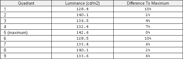
Luminance uniformity table
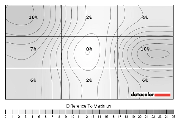
Luminance uniformity map
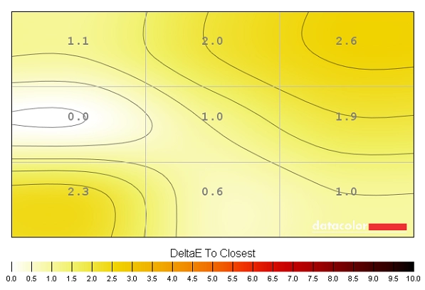
Colour temperature uniformity map
Contrast in games and movies
Lagom contrast tests
Colour reproduction
Colour gamut
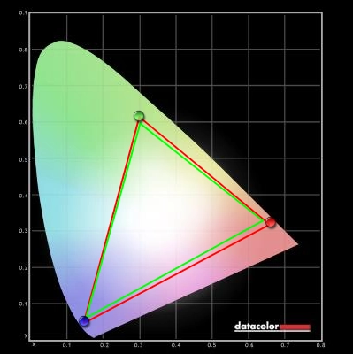
Colour gamut test settings
Colour in games and movies
Viewing angles
Interpolation
Responsiveness
Input lag
Pixel responsiveness

q2770Pqu trailing 'Overdrive Off'

q2770Pqu trailing 'Overdrive Weak'

q2770Pqu trailing 'Overdrive Medium'

q2770Pqu trailing 'Overdrive Strong'

BL2710PT trailing 'AMA High'
Responsiveness in games and movies
Conclusion
Positives Negatives Pleasing colour performance with excellent sRGB coverage, very light matte (‘semi glossy) screen surface and a rich and vibrant look to the image. Very good out of the box performance made even better with just a little tweaking
Some minor deviations from the ideal 2.2. gamma curve – for uses where this would be an issue a proper individual calibration is highly recommended anyway
Contrast performance is similar to other PLS offerings, aided by the screen surface which gives a relatively clear look to the image Still a very light misty grain from the screen surface and the usual characteristic ‘PLS glow’ which eats away at some detail towards the screen corners Quite a good balance to the pixel overdrive (also adjustable) to provide a decent degree of acceleration without introducing unwanted artifacts (inverse ghosting)
Moderately high input lag will put some users off. AOC could have pushed their ‘Medium’ overdrive just a little further without undesirable artifacts, although the benefits of this are questionable anyway
Surprisingly good handling of non-native 1920 x 1080 resolution, a robust build with good ergonomic flexibility and a pleasing array of ports. The price is also very attractive
Availability limited in certain regions – limited local availability in the United States at time of writing
![]()

