Author: Adam Simmons
Date published: July 29th 2015
Table of Contents
Introduction
The Samsung S24D390HL impressed us with its combination of colour quality, impressive default setup, keen responsiveness and overall value for money. The design wasn’t to everyone’s taste, though, and the included stand could be considered a bit flimsy (or wobbly) as well as ergonomically limited. The S24E390HL, as the model number suggests, is the follow-up to this model. Whilst stand adjustability remains just as limited, the design has changed to one that looks like it could be sturdier. We will be looking at such aesthetic and design aspects of the monitor as well as the all-important performance, putting it through its paces in a range of ‘real world’ tests.
Specifications
This model features a 60Hz 23.6” AD-PLS (Advanced Plane to Line Switching) panel, using the usual 6-bit + FRC dithering. This is handled very well by modern panels and shouldn’t be considered an issue for the vast majority of users. A 4ms grey to grey response time is specified, which is 1ms lower than that specified on the former model but should again be taken with a pinch of salt. Key ‘talking points’ of the specification have been highlighted in blue below.
Features and aesthetics
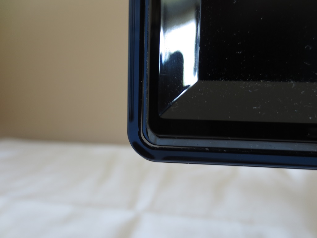
The screen has a fairly unique design, with glossy black plastic bezels bordered by coloured Perspex. This Perspex border has a ‘cool ice alcohol’ accent, a so-called ‘Touch of Colour’. This is essentially a subtle grey-blue partially transparent addition to add unique visual flair to the screen. It is perhaps most noticeable in the central region of the bottom bezel, where it droops down to show the Samsung logo. The bezels are quite slender at the top and sides – around 12.5mm (0.49 inches) including the Perspex border. There is also a very slender panel border, barely half a mm along for the most part. This panel border was ever so slightly thicker on the right edge on our unit, just under 1mm. The chassis is designed in such a way as to minimise excess pressure on the panel and other screen components and help minimise uniformity issues across the screen. The backlight is located at the right edge so it doesn’t want to be pinching super-tightly here. As explored in more detail later, the screen surface is medium (or ‘relatively light’) matte anti-glare.
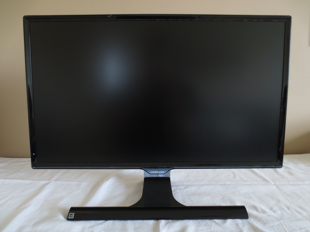
From the side the ‘Touch of Colour’ layer dominates. You can see that the stand neck also uses this material. The stand of the monitor allows tilt (~2° forwards, ~15° backwards) as the only ergonomic adjustment option. The bottom of the screen clears the desk surface by ~90mm (~3.54 inches) with the top of the screen ~405mm (~15.95 inches) above the desk. The screen is pretty much exactly 1 inch (25.40mm) thick at thinnest point, lumping out centrally and protruding further back where the stand attaches. The total stand depth is ~185mm (~7.28 inches).
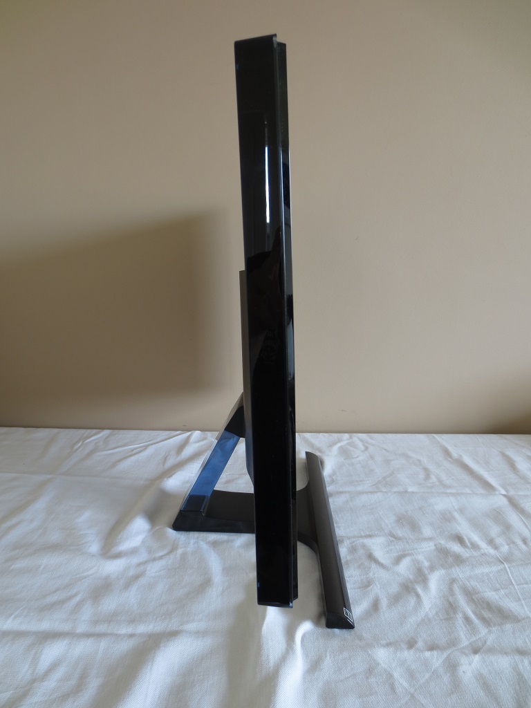
From the rear you can see that the stand attaches with a wide neck-piece near the bottom of the monitor. The screen sits quite firmly in the stand and doesn’t wobble about anywhere near as readily as its predecessor if the desk is knocked. There are no VESA holes here. The rear surface of the screen is mainly a brushed-metal textured matte black plastic. In the central region, a bit below the centre in fact, are the ports of the monitor; HDMI, VGA, 3.5mm headphone jack and DC power input (external power converter). There is also a K-Slot just below and to the right of the ports.
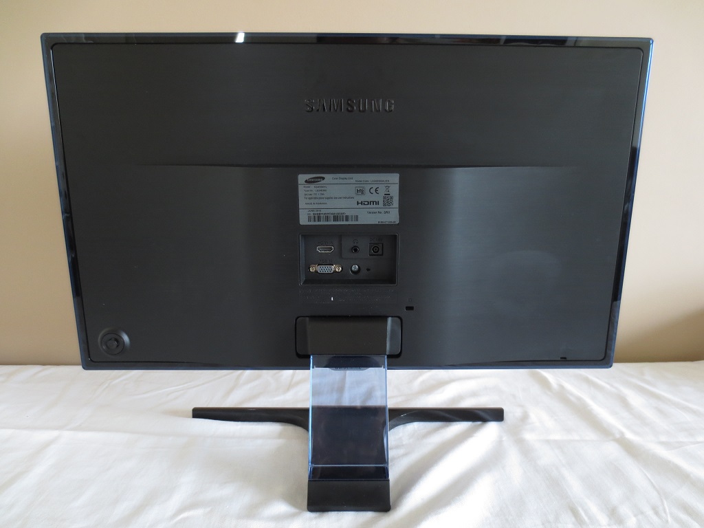
Towards the far left (right if looking at the monitor from the front) is a JOG button or joystick that allows you to navigate through the OSD (On Screen Display) of the monitor. The following video highlights the functionality of this system.
Calibration
Correcting the colour signal
The test system used for this review has an Nvidia GTX 970, which was connected to the monitor using HDMI. As is usual for Full HD displays connected via HDMI, the GPU treats the monitor as an HDTV and sends out a ‘Limited Range RGB 16-235’ rather than the preferred ‘Full Range RGB 0-255’ signal. The monitor is actually designed to work quite well with either signal type and is setup to expect a ‘Limited Range RGB 16-235’ signal by default. On most monitors this would give an obviously washed out look to the image with hugely reduced contrast and far less vivid colours.
On the Samsung the representation of the image was actually very good, looking superficially quite similar to when corrected (as below) but with some issues that the keen eye would spot. Most noticeably the monitor uses somewhat stronger (more noticeable) dithering to counteract the lower shade range of the RGB 15-235 signal. Regardless of these minor issues, the pleasing handling of the limited range signal is good for users with laptops or integrated GPUs where changing the colour signal isn’t so straightforward. For dedicated desktop GPUs you can improve things, however. To correct it so both the GPU and monitor can use the optimal ‘Full Range RGB 0-255’ signal, you should do the following:
1) Open Nvidia control panel and navigate to ‘Display – Change resolution’. As of driver version 347.09, there is a drop-down option for ‘Output dynamic range’ which is set to ‘Limited’ by default. You should set this to ‘Full’ and press ‘Apply’. There is further information in this article. There is also guidance on corrections which AMD users should also make in their Catalyst Control Centre.
2) Enter the OSD of the monitor (main menu) and scroll down through the ‘Picture’ options until you reach ‘HDMI Black Level’. Change this from the default ‘Low’ to ‘Normal’.
Subpixel layout and screen surface
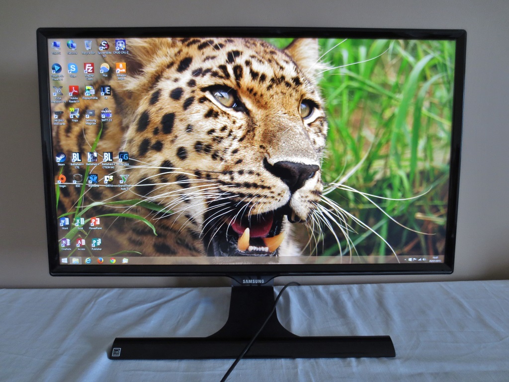
As mentioned previously, a medium (some may call it ‘relatively light’) matte anti-glare screen surface is used on this monitor. This has a fairly typical haze value for a 1920 x 1080 model, providing strong glare-handling characteristics. The screen surface is actually quite smooth in its appearance, however. Whites and light colours don’t look overly grainy, with just a light misty grain rather than a ‘smeary’ look. This is preferable to the slightly ‘rougher’ screen surface employed by competing AH-IPS models and many TN models as it give a smoother look to the image.
![]()
The subpixel layout of the monitor is the typical RGB (Red, Green and Blue) stripe, shown above. This is the default and most common subpixel layout which operating systems including Windows and MacOS are configured to handle correctly by default. There is no need to run Windows ClearType, unless you’ve configured this for another monitor or are otherwise unhappy with default text handling.
Testing the presets
The ‘MagicBright’ presets included with this monitor are rather thin on the ground; ‘Custom’, ‘Standard’, ‘Cinema’ and ‘Dynamic Contrast’. ‘Standard’ is simply the same as ‘Custom’ with a lower preset brightness, whilst the ‘Dynamic Contrast’ mode serves a specific purpose as we explore later. The less said about the overly-sharp, oversaturated and cool-tinted mess that is ‘Cinema’, the better. There is also a ‘Game Mode’ setting which is somewhat similar to this but slightly less extreme. In addition to these modes, there are some useful settings available in the OSD, such as ‘Gamma’ modes and ‘Color Tone’ settings. There is also a new ‘Eye Saver Mode’, which is designed to provide an image that is relaxing on the eyes.
In the table below we explore some of these settings, looking at the general image characteristics for each as well as some key readings such as white point and gamma. The readings were taken using a Datacolor Spyder5ELITE colorimeter. The monitor was kept in its ‘plug and play’ state, connected to a system using Windows 8.1. There were no additional drivers or ICC profiles loaded. Unless otherwise stated assume everything not mentioned was left at default. The exception to this is the settings related to the colour signal, explored previously.
| Monitor Settings | Gamma (central average) | White point (kelvins) | Notes |
| Gamma = Mode1 (Factory Defaults) | 2.2 | 6815K | The image is quite bright with a bit of a cool-green tint. The image has a good level of vibrancy and pleasing shade variety, however. |
| Gamma = Mode2 | 2.0 | 6817K | As above, but some shades lacking in depth. The look is now a bit more washed out and less vibrant. |
| Gamma = Mode3 | 2.4 | 6819K | As ‘Mode1’ but extra depth in places. Some shades appear too deep and some a little dull as a result of this, but overall a very rich look to the image. |
| Color Tone = Warm2 | 2.3 | 4627K | This is an effective ‘Low Blue Light’ setting, maintaining good depth and contrast whilst greatly reducing blue light emission. |
| Eye Saver Mode | 2.7 | 4454K | This is an alternative ‘Low Blue Light’ setting, which is very effective in reducing blue light output. It also makes the image dim (brightness is not adjustable) and flooded with very low contrast – this is intentional as it arguably improves viewing comfort. |
| Game Mode | 2.2 | 6836K | This gives the image an overly sharp and over-saturated look which can’t be corrected. Don’t be fooled into thinking this will be the best mode to use for gaming, it’s far from it if you like things to look as the creators intended. |
| Test Settings (modified as below) | 2.2 | 6498K | The image has excellent balance with a rich, natural look and plenty of subtle shade variety. |
Out of the box the S24E390HL gave an image that was bright, but aside from a slight cool-green tint, quite well balanced. Although the default gamma mode (‘Mode1’) proved optimal for good tracking of the usual 2.2 curve, there is also the flexibility to aim for a target of 2.0 (‘Mode2’) or 2.4 (‘Mode3’). The new ‘Eye Saver Mode’ is one which has good utility, as it certainly gave an image that was very relaxing on the eyes. It greatly reduces blue light output, dims the image and significantly hugely weakens contrast. That last point is something that is a bit contentious, as although theoretically low contrast can be ‘less strenuous’ on the eye, the opposite can also be true. It really depends on individual sensitivity, preference and ambient lighting.
Although we see the utility in this ‘Eye Saver Mode’, we actually preferred to use the ‘Warm2’ setting as a ‘Low Blue Light’ setting for relaxing evening viewing. This does not have anywhere near the same negative impact on contrast, allows the user to adjust brightness and was just as relaxing in our experience. One mode we really don’t see the utility of is the ‘Game Mode’, introduced as a rather unwelcome addition to the ‘D’ series models of last year. This messes up pretty much every key image attribute imaginable to great an overly sharp, overly saturated and generally quite ugly image. Although the gamma averages 2.2, the curve is far from conventional using this mode, as you can see below. For those who prefer accurate shade reproduction, the default gamma tracking of the monitor is much better. The following graphic shows the gamma tracking using our ‘Test Settings’, but note that the gamma tracking ‘out of the box’ is actually very similar. You can see that the monitor conforms very well to the 2.2 curve in this representation. For our test settings we made some adjustments to the colour channels and reduced the brightness. There was no need to modify the gamma mode nor any need, for our uses, to apply any sort of ICC profile. Given the likelihood of inter-unit variation and for some reasons explained here, providing such a profile for you to download would likely be counter-productive. This inter-unit variation and the fact that changes in colour balance can be expected over time means that you can’t simply use our test settings and expect perfection on your unit. You should use them as a base, but feel free to experiment further, particularly with the colour channels. Some users may also prefer ‘Mode3’ for gamma if they prefer even deeper-looking shades. Any settings not mentioned below were left at default. We have also included the ‘Response Time’ setting used in the review just for reference. Brightness= 65 (according to preferences and lighting) Response Time= Faster Color Tone= Custom R= 50 G= 45 B= 46 HDMI Black Level= Normal (refer to ‘Correcting the colour signal’ above) We used a KM CS-200 light meter to measure white and black luminance levels. Using these readings, static contrast ratios were calculated. The table below shows this data using a range of different monitor settings, including those mentioned in the calibration section. Unless otherwise stated assume that any setting not mentioned was left at default, save for the corrected HDMI colour signal as noted in the calibration section. Various changes were also made to our ‘Test Settings’ as detailed previously. Black highlights on this table indicate the peak white luminance, lowest black luminance and highest static contrast ratio recorded. Blue highlights show the results using our ‘Test Settings’.
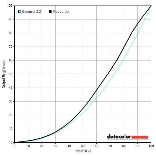
Gamma 'Game Mode'
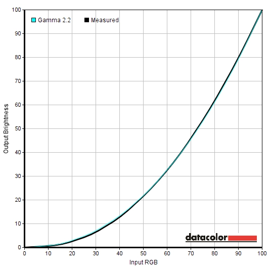
Gamma test settings
Test Settings
MagicBright= Custom
Contrast and brightness
Contrast ratios
Monitor Settings White luminance (cd/m²) Black luminance (cd/m²) Contrast ratio (x:1) 100% brightness 245 0.21 1167 80% brightness 204 0.18 1133 60% brightness 161 0.14 1150 40% brightness 120 0.10 1200 20% brightness 73 0.06 1217 0% brightness 27 0.02 1350 Gamma = Mode2 246 0.20 1230 Gamma = Mode3 245 0.20 1116 Color Tone = Warm2 183 0.20 915 Eye Saver Mode 101 0.90 112 Game Mode 246 0.23 1070 Test Settings 157 0.15 1047
The average contrast ratio with only brightness adjusted was an impressive 1203:1, which is really about as high as you’ll see from a non-VA LCD panel. Following the adjustments made to our ‘Test Settings’, contrast remained strong at 1047:1. There was a bit of a drop when using the ‘Warm2’ colour tone setting, as you might expect given the significant changes made to the colour channels for this. This was nowhere near as pronounced as the drop when using ‘Eye Saver Mode’, however. Contrast here was recorded as 112:1 – but be aware that this very low contrast is intentional in this mode as mentioned previously. There is a school of thought that having the monitor display more even luminance with ‘light’ and ‘dark’ appearing more similar to each other helps reduce strain on the eyes. Indeed they do not have to adapt to changes in light from the monitor itself so much. In reality ambient light fluctuations can necessitate such visual adaptation anyway, but if you’re sensitive to that sort of thing and keep your lighting environment quite constant you may find this mode rather useful. However; we found using ‘Warm2’ just as comfortable in reality and a more enjoyable experience overall.
The maximum luminance recorded was 245 cd/m² and the lowest an exceptionally low 27 cd/m². This gives the user a strong luminance adjustment range of 218 cd/m² with plenty of useable values. There is also a ‘Dynamic Contrast’ mode (‘MagicBright’ setting) which allows the backlight to dim or brighten depending on how light or dark the overall image currently being displayed is. The backlight reacted rapidly to changes in scene brightness in this mode, but tended to be overly bright during mixed images even where there was plenty of dark content on the screen. We will simply reinforce the notion that this isn’t a sort of mode that we ever like using and find manual brightness control preferable, but this mode is there if you want to use it and it does what it says on the tin.
PWM (Pulse Width Modulation)
The S24E390HL does not use PWM (Pulse Width Modulation) at any brightness level and instead uses DC (Direct Current) to alter backlight brightness. In other words the backlight is considered ‘flicker-free’, which will come as welcome news to some users who are either sensitive to flickering, find PWM-modulated backlights fatiguing or dislike PWM artifacts.
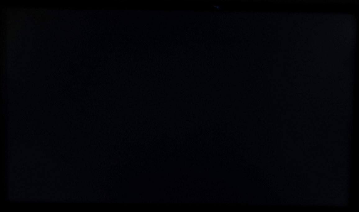
Luminance uniformity
Whilst observing a black screen in a dark room we could see no obvious backlight bleed. There was just a little hint of it here and there, for example towards the top left corner. Note that individual units vary in this regard and you shouldn’t expect them all to offer such low levels of backlight bleed. The image below was taken from a central viewing position a few metres back from the monitor. This eliminates ‘PLS glow’, a silvery-blue sheen that can be observed at peripheral sections of the screen from a normal viewing position. The effects of this are explored in the review. This glow also blooms out and intensifies as you move your head ‘off-angle’ as illustrated in a video in the viewing angles section of the review.
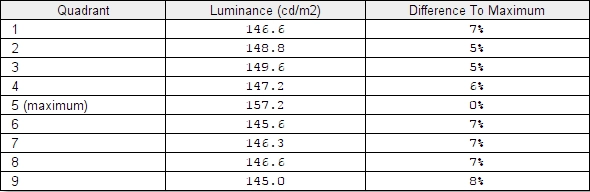
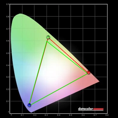
The Spyder5ELITE was used to analyse the uniformity of lighter colours. 9 equally spaced white quadrants were analysed with the colorimeter, running from the top left to bottom right of the screen. The following table shows the luminance values recorded at each quadrant as well as the percentage deviation between each quadrant and the brightest recorded point. The luminance uniformity of the screen was strong. The brightest point was ‘quadrant 5’ in the centre of the screen (157 cd/m²). The greatest deviation from this occurred at ‘quadrant 9’ (145 cd/m² which is 8% dimmer than centre). Elsewhere brightness was between 5-7% of the central value, impressively consistent. The contour map below shows these deviations graphically, with darker greys representing lower luminance and hence greater deviation from the central point than lighter greys. The consistency of colour temperature was also analysed using the Spyder5ELITE. Deviations here are assigned DeltaE values, showing how far each quadrant strays from the 6500K (D65) daylight white point target. Greater DeltaE values represent higher deviation from this target, with any value > DeltaE 3 considered significant deviation that some users would readily notice by eye. The results here were not as consistently pleasing as for luminance uniformity. The upper right corner (‘quadrant 3’) showed a significant deviation of DeltaE 3.6 from the point closest to 6500K (‘quadrant 4’, to the left of centre). ‘Quadrant 2’ in the upper central region had borderline significant deviation from the ideal (DeltaE 3). Elsewhere deviation was DeltaE 0.3 – 1.7 which is pleasing. Note that all aspects of uniformity can vary between individual units, and you can also expect deviation beyond the points measured here. There is typically greater deviation at the very edges of the screen where the backlight is located, for example. On our unit the far right edge appeared significantly cooler than the rest of the screen, corresponding to the backlight location. This didn’t bother us during normal use and it’s very common to see one or more edges of a screen display some sort of uniformity issue on modern LCDs. On Battlefield 4 (BF4) the contrast performance was pleasing overall. There was some loss of detail and atmosphere towards peripheral regions of the screen, particularly the bottom corners from a normal ergonomically correct viewing position. This is due to the aforementioned ‘PLS glow’. Elsewhere, and for most of the screen, the level of detail was pleasing. There was quite good depth to dark elements whilst bright elements stood out very well – muzzle flashes, explosions and tracer fire were all quite eye-catching. These bright elements and others beside, such as bright daylight sky, had only a fairly light graininess to them. This was not heavy or ‘smeary’ looking and was an improvement over competing AH-IPS models. The contrast performance was good overall on Dirt 3. The level of detail maintained in dark areas was largely appropriate, save for the peripheral sections affected by ‘PLS glow’. Here the darkest shades became a fair bit lighter than they should be and subtle distinctions such as creased leather inside the car were lost. Bright shades contrasted well with their darker surroundings, particularly car headlights. These elements had a light rather than smeary graininess to them. Lacking the smoothness of some of the lightest matte surfaces and certainly glossy surfaces, but an improvement over many matte surfaces. Contrast was also assessed using the Blu-ray of Skyfall. Whilst dark elements didn’t have the same inky depth as they would on a good VA panel, the level of detail in dark scenes was strong. The areas of the screen affected by ‘PLS glow’ lightening the black bars at the top and bottom of this 2.40:1 aspect ratio title rather than the image itself. Lighter elements contrasted nicely with artificial lights and explosions at night standing out particularly nicely. The Lagom tests for contrast allow specific weaknesses in a monitors contrast performance to be identified. The following observations were made. The Samsung S24E390HL’s colour gamut (red triangle) was compared to the sRGB colour space (green triangle). As you can see in the representation below, the sRGB colour space coverage is rather comprehensive. There is very close tracking for the most part with just the tiniest sliver of under-coverage in the ‘cyan region’ of this representation. There is some over-coverage in the green region of this diagram in particular. As explored below, this gives the monitor a vibrant but natural-look which suits general usage very well. The lack of worryingly high over-coverage or any real under-coverage also works well for colour-critical work. This also makes the monitor a good target for calibration using a colorimeter or similar device, should the user demand such a level of accuracy. Colour reproduction was very pleasing on BF4, with everything looking much as it should. Environments showed a superb range of natural green and brown shades, with some impressively lush deep greens and a pleasing array of subtly different lighter shades. The overall shade representation was pleasingly rich, but appropriately so. Red, green and blue in-game markers had a very good ‘neon’ look to them, for example. Red signal flares were an impressively rich red whilst fires showcased some excellent strong oranges. The intensity of some shades gave the game a really lively quality, but not in the garish oversaturated way that some weaker monitors would display it. The rich and varied colours produced by the monitor worked very nicely on Dirt 3. The racing environments looked natural and as they should, with a consistent richness that greatly aided apparent shade variety. There were some good lush forest greens and rich golden browns alongside a spectrum of lighter shades. There were also plenty of impressive vibrant shades, particularly on the car paintjobs. Bright pinks, strong oranges, deep reds and neon greens were amongst some of the more eye-catching shades here. Colours were represented well on the Blu-ray of Skyfall. There were some fairly striking vibrant shades, for example rich orange flames and bright cyan neon lights. The monitor didn’t ‘overblow’ deep blues so that they appear a sort of copper sulfate colour even when they shouldn’t, but instead gave them a more natural and appropriate depth. There were also some pleasing deep oranges, which again some monitors would slightly oversaturate so that they appear too red. Natural environments looked as they should with a pleasing range of earthy browns and plant-like greens. Skin tones also showed appropriate saturation and variety. We also observed the Blu-ray of Futurama: Into the Wild Green Yonder. Broadly speaking there are three different groups that a shade on this film could be said to fall into. Firstly there are neon shades, bright colours such as shocking pinks, electric blues and light greens. Secondly there are deep colours, such as dark blues, purples and reds. And finally there are pastel shades, more subtle shades such as the colours of the skin tones and clothes of various characters and the colours used for various objects in the world. The S24E390HL did a good job at presenting all types of shade. Whilst some of the neon shades didn’t have the same ‘pop’ that a glossy screen surface or model with a more generous colour gamut might give, they certainly looked vivid. Dark shades were appropriate in their depth and pastel shades suitably muted and varied. The strong consistency of colours really helped give these pastel shades their own ‘identity’, without the sort of shade overlap and muddying of some shades that models with weaker viewing angles suffer from. Lagom’s tests for viewing angle tests help explore the idea of colour consistency and viewing angle performance. The following observations were made from a normal viewing position, eyes around 70cm from the screen. Using a sensitive camera and small tool called SMTT 2.0, we compared the latency of the S24E390HL with a range of monitors with known input lag. Using this method and taking over 30 repeat readings, we measured 5.38ms (around 1/3 of a frame) of input lag. This value is influenced both by what you feel when using the monitor (the signal delay) and also what you see (pixel responsiveness). This value indicates a very low signal delay which shouldn’t concern most gamers who are happy with a 60Hz display. In this article we explore the key factors that contribute to the responsiveness of a monitor. We explore the very important notion that what you see on a monitor in motion depends not just on what the pixels themselves are doing, but also what your own eyes are doing. They move to track motion on the screen, which itself induces a level of blur that is strongly influenced by refresh rate. We also introduce the concept of ‘pursuit photography’, which uses a moving camera to capture the motion performance of a monitor in a way that reflects what the eye sees. This method captures what the monitor’s pixels are doing (including any conventional trailing or ‘inverse ghosting’ that may occur) but also reflects perceived blur due to physical movement of the camera (‘eye’). The following images are pursuit photographs taken using the UFO Motion Test for ghosting. This is running at 960 pixels per second, a practical speed to record such images and sufficient to highlight what the pixels are doing. The middle row of the test (‘medium cyan’ background) is used throughout with the monitor set to various response time settings; ‘Normal’, ‘Faster’ and ‘Fastest’. There is also a capture taken with the monitor running at 75Hz, something it can do comfortably at the native resolution as we come onto a little later. And finally there is a 60Hz reference monitor, a Samsung S27A750D set to full brightness (eliminates PWM) and 60Hz, using its ‘Faster’ response time setting. Using the ‘Normal’ setting, you can see quite a significant degree of blur on top of what you would ideally see at the 60Hz refresh rate (i.e. the 60Hz reference). This is due to response times during these transitions being sluggish. Using the ‘Faster’ setting activates the pixel overdrive (grey to grey) acceleration of the monitor and very effectively speeds up these transitions. There is still a little bit of blur on top of the 60Hz reference, but this is massively reduced compared to the ‘Normal’ setting. Using the ‘Fastest’ setting ramps up the grey to grey acceleration so that it becomes overly aggressive. Although that little bit of extra conventional trailing has now been cut back, a far more obtrusive spate of inverse ghosting (overshoot) has been introduced. This manifests itself as eye-catching blue trails behind the object. We also tested the monitor at 75Hz using the optimal ‘Faster’ setting, which cut down on the perceived blur in this test compared to running the monitor at its default 60Hz. If you focus on the head of the alien you can see that it is a bit better defined than at 60Hz. The ‘legs’ at the bottom of the UFO are clearer than even the 60Hz reference now. In addition to the perceived blur being reduced, where the frame rate exceeds 60fps and ideally matches the 75Hz refresh rate (i.e. 75fps), there is an increased ‘connected feeling’ with the display. There is a decreased delay between frames and more content (up to 1.25 times) being displayed every second. Obviously this doesn’t give the same experience as you’d get on a 120Hz or 144Hz monitor, but it still gives a bit of an edge over 60Hz which some users would appreciate. The monitor will comfortably run at up to 75Hz at 1920 x 1080 when connected by HDMI. By this we mean there is no change in image quality (gamma, colour temperature, contrast etc.) and no frame skipping – so it is ‘true 75Hz’. We could actually push the monitor to 76Hz with default timings, but any higher and there was obvious degradation in image quality (i.e. complete loss of sharpness and then flickering artifacts). In order to run the monitor at 1920 x 1080 @ 75Hz you must create a ‘custom resolution’. There is no need to fiddle with timings or anything like that, so it’s a fairly straightforward process. The video below runs through how this can be done using the Nvidia Control Panel, or for AMD users, using a tool called CRU (Custom Resolution Utility). On BF4 things were largely as you’d see on even the fastest 60Hz monitors. There was a moderate blur when running about on foot or zipping about in a vehicle. This was primarily caused by eye movement, and for the most part pixel responsiveness did not present any weakness on top of this. There were a few transitions that appeared to be slower than optimal, but not worryingly so. Where bright shades moved against darker shades there was a bit of extra trailing on top of what you’d expect from a ‘perfect’ 60Hz sample and hold reference. The best example of this was when viewing white hot objects using the thermal optics of a vehicle. The cooler backgrounds generally appeared a medium-dark grey which contrasted well with the bright white objects – the trail behind those white objects was somewhat more pronounced than it could be. We didn’t feel this was really significant enough to impede a user’s enjoyment and indeed it’s not the sort of thing most users are even likely to notice. Overshoot (inverse ghosting) on the other hand can be quite obtrusive and noticeable – but fortunately there was no significant overshoot from this monitor. There were very faint traces here and there that you’d really have to look out for to notice. Our observations were similar on Dirt 3. The blur was, again, predominantly caused by eye movement rather than slow pixel response times. And indeed for the most part pixel responses were just as snappy as they needed to be for optimal 60Hz performance without introducing either trailing or noticeable overshoot. When driving at night some of those slightly slower pixel transitions came into play, for example lights and torches set against a murky background. Even here the extra little bit of trailing was not at all problematic and didn’t really impede the experience. All IPS-type panels have some pixel transitions like this that are a little bit slower than optimal, unless they ‘hide’ them by strong acceleration that gives a bit of overshoot instead. The predecessor to this monitor (S24D390HL) also exhibits a bit of trailing above what is optimal here and there – and it also has a little more overshoot than this model. Really we feel the balance Samsung has struck here is as good as you’ll see from an IPS-type 60Hz monitor. And if you find things problematic it’s more than likely that you’d be dissatisfied with any 60Hz LCD. To round off this section we fired up our Blu-ray movie test titles to see if there were any problems with responsiveness there. There was nothing that stood out, even under close scrutiny, as the pixel responses were more than fast enough to handle the pace of action here. Furthermore they did so without any noticeable overshoot being introduced. The fluidity of action on these films is limited by the 24fps at which the titles run, but that isn’t something the monitor itself can address. The Samsung S24E390HL is the successor to the S24D390HL, a monitor for which we have been full of praise and happily recommending to users. Without shifting away to using a different panel, there was really little that could be done to improve on the core performance of the SD390. Indeed the SE390 offered a similar experience overall, which is largely a good thing. The ‘out of the box’ image setup was very good, requiring some tweaks to colour channels but with excellent gamma tracking using the default mode. Colours had that richness and variety we’d hope for from an AD-PLS panel with generous sRGB colour space coverage. The screen surface also aided the vibrancy somewhat, but moreover gave the image less of a grainy look than monitors with comparable AH-IPS panels. Static contrast was quite strong overall, slightly exceeding the specified 1000:1 even following the adjustments made to our ‘Test Settings’. There was the usual ‘PLS glow’, which ate away at some of the peripheral details in dark scenes. A new feature added to this model is the ‘Eye Saver Mode’. This proved to be an effective ‘Low Blue Light’ setting, although we didn’t find the huge hit in contrast necessary for our own visual comfort when using the screen and therefore preferred to use the ‘Warm2’ colour tone to reduce blue light output. Responsiveness was also pleasing, with very little input lag and well-tuned grey to grey acceleration. There were some pixel responses that were just a little slower than would be optimal for a 60Hz LCD, but overall things were as good as you could hope for from such a model. The responsiveness was similar to the SD390, with a slight cut in already very low levels of overshoot using the optimal response time setting. The most notable changes to the monitor were aesthetic and structural. The stand is more similar to that used on the S24D590PL than the S24D390HL; with a T-shaped base and broad stand neck that offers superior stability or ‘wobble resistance’. The JOG button (joystick) used to control the OSD was also carried over from the SD590 series. So no longer do users have to choose between the more solid construction and convenient OSD control of the SD590 series or the superior image setup of the SD390 series. Overall we feel this is a monitor worthy of praise. Although not hugely different to its predecessor, we feel that Samsung did well to take the “if it ain’t broke” approach to the image setup whilst improving exterior qualities and features.
Luminance uniformity table
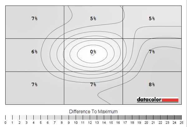
Luminance uniformity map
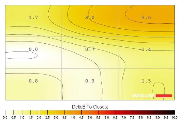
Colour temperature uniformity map
Contrast in games and movies
Lagom contrast tests
Colour reproduction
Colour gamut
Colour gamut test settings
Colour in games and movies
Viewing angles
Responsiveness
Input lag
Perceived blur (pursuit photography)
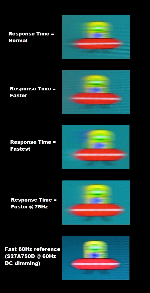
Perceived blur with various settings
Running a custom resolution (overclocking)
This is what would be considered a ‘mild’ overclock for a monitor and one which the screen handles very comfortably. There is minimal risk involved and in all likelihood the monitor will last for its useful life in much the same way as if it was run at its native 60Hz refresh rate. Even so, as with any form of overclocking you’re doing this at your own risk. The risk may well be very low, but we accept no liability should anything happen to the monitor which may or may not be due to running it at an increased refresh rate. For the sake of this review, including the section that follows, the monitor was run at 60Hz as normal.
Responsiveness in games and movies
Conclusion
![]()
Positives Negatives Strong gamma tracking straight from the box and a rich and varied image from the AD-PLS panel with generous sRGB coverage and relatively light matte screen surface (less grainy than competing AH-IPS models)
Some slight adjustments required to colour channels to better balance things and some slight graininess from the screen surface in places – although nothing most users would find problematic
Pleasing static contrast and the inclusion of a new ‘Eye Saver Mode’ which certainly provided a comfortable viewing experience ‘PLS glow’ is present, as expected, which eats away at peripheral dark detail. We also preferred to use ‘Warm2’ as an effective and relaxing ‘Low Blue Light’ setting without the hit in contrast and fixed brightness of ‘Eye Saver Mode’ Perceived motion performance was about as good as you can expect from a 60Hz LCD, there was very little input lag and the ability to comfortably run the monitor at ~75Hz
Some very minor overshoot or extra trailing in places, but nothing that most users would notice – indeed if you’re sensitive enough to notice these things then 60Hz LCDs are likely not for you anyway
A unique design and more solid construction than its predecessor, plus the inclusion of a ‘JOG’ button for intuitive OSD navigation are welcome additions
Very limited range of ports, ergonomic inflexibility with the stand and lack of VESA holes may put some users off
![]()

