Author: Adam Simmons
Date published: November 13th 2014
Table of Contents
Introduction
Not one for memorable names, Philips have put a model out there with another instantly forgettable model code – the 272G5DYEB. Although the name might not stick in your head, Philips are hoping the gaming performance of the monitor just might. This monitor features a highly responsive 144Hz 27” TN panel with headline features including Nvidia G-SYNC variable refresh rate technology, ULMB strobe backlight technology and support for the 3D Vision (version 1 and 2) stereoscopic active 3D solutions. These features are understandably very exciting for gamers with Nvidia GPUs who want the smoothest gameplay experience that LCDs can deliver. But how does the monitor itself perform and do these features live up to the hype? That’s what we intend to find out.
Specifications
The monitor uses a 27” panel with 144Hz refresh rate and 1920 x 1080. As is common for TN panels this features 6-bits per subpixel plus FRC dithering. The monitor includes a G-SYNC module which provides support for that technology and related ones such as ULMB and 3D Vision, as mentioned in the introduction. A 1ms grey to grey response time is specified with an adjustable ‘SmartResponse’ pixel overdrive solution included.
Key talking points of the specifications are highlighted in blue below.
Features and aesthetics
From the front the monitor has a robust look. The bezels are quite chunky – 26mm (1.02 inches) at the top, 20mm (0.79 inches) at the sides and 38mm (1.50 inches) at the bottom. They’re made of matte black plastic. The screen surface is regular (‘medium’) matte anti-glare which has effective glare-busting properties.
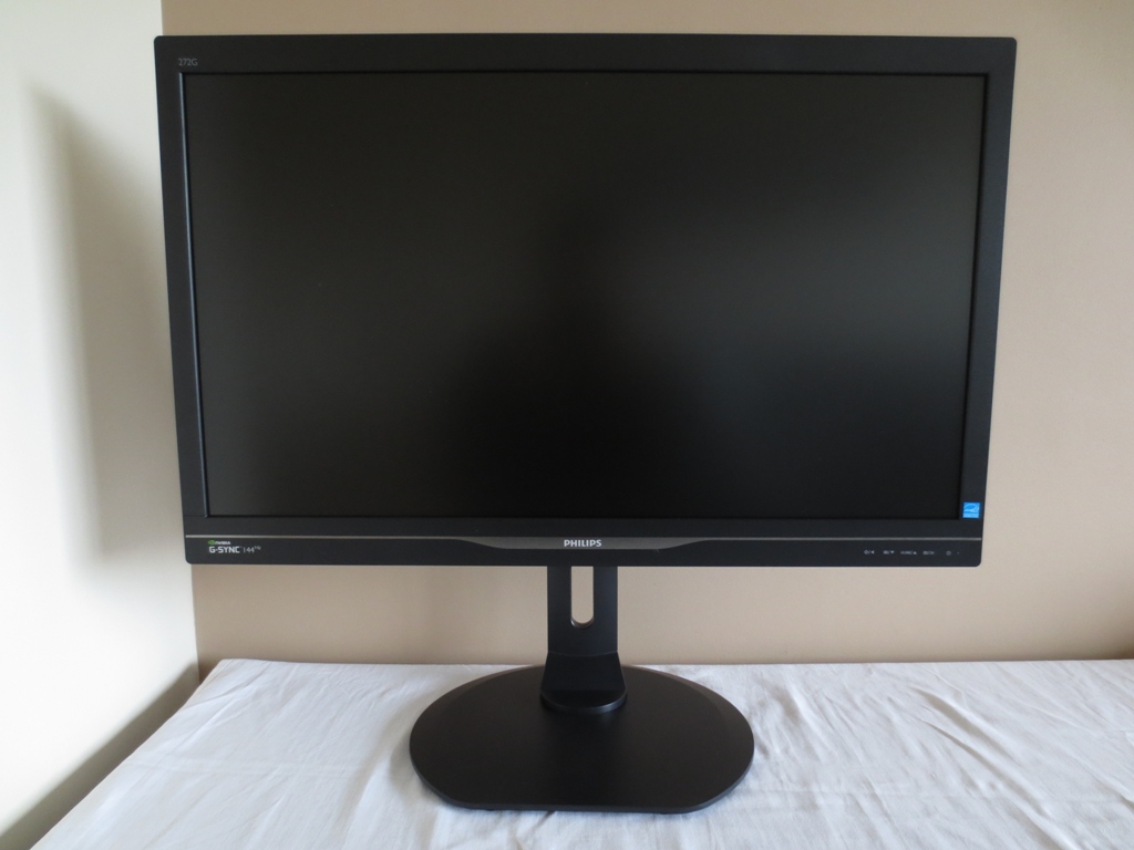

The bottom bezel also lets you know of the monitor’s main selling point at the left side (Nvidia G-SYNC 144Hz). There is a central dark silver band that is thickest centrally around the Philips logo. This looks like brushed metal and has a very slight shine to it but it’ actually matte black plastic. In blends in quite well with the rest of the bezel and doesn’t catch the eye as you might think it would from some of the press photographs. At the right of this bottom bezel are the touch-sensitive OSD (ON-Screen Display) controls. They are, from left to right; ‘True Point (On-Screen Crosshair)/Back’, ‘True Point Menu (Select Crosshair Design)/Down’, ‘ULMB/Up’, ‘Menu/OK’ and power.
There is also a small (pinhead) white power LED that glows an icy white when the monitor is on and flashes when the monitor is on standby. This power LED is on constantly if the monitor is switched on and running in its ‘Normal’ mode without any Nvidia-specific features enabled. The exception to this, confusingly, is that if you exit 3D (Nvidia 3D Vision) mode or turn off ULMB after using either feature and return to normal mode it will also begin flashing. If you turn the monitor off then on again it will remain static. If you enable G-SYNC it will also start flashing, but will stop flashing on its own once G-SYNC is disabled. It is therefore a useful indicator of G-SYNC being used, provided you remember that it will flash after disabling 3D or ULMB mode until you turn the monitor off then on again. Confusing, we know, but not something we were really bothered by. The following video gives a run-through of the menu controls and OSD of the monitor.
The monitor is fully adjustable and feels as sturdy as it looks. It gives you the ergonomic flexibility to adjust the screen height by 150mm (5.91 inches), tilt the screen up to 5° forwards and 20° backwards and swivel it left or right up to 65°. At lowest height the bottom of the screen clears the desk by ~30mm (1.18 inches) whilst the top sits ~433mm (17.00 inches) above the desk. You can also pivot the screen 90° clockwise into portrait. Be aware that you will see obvious horizontal colour and white point shift in portrait mode due to TN viewing angle limitations.
The side of the monitor shows off the stand design. There is a ‘boxy area’ where this attaches which also houses a USB hub. This hub is on the left side of the monitor if viewing from the front and houses 4 USB 3.0 downstream ports (plus 1 upstream). One of these downstream ports supports fast charging for connected devices. Surrounding this box the screen itself is a fair bit thinner, at around 20mm (0.79 inches).
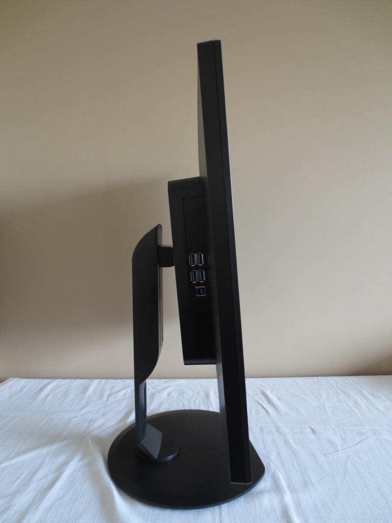
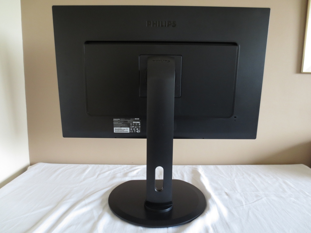
The rear of the monitor shows that the stand attaches to the ‘boxy area’ centrally. The screen has a 100 x 100mm VESA point. You can attach an alternative stand or mount the screen in a different way using this VESA point. The included stand is detached using a quick-release button under the attachment point. The box around this uses a plain matte black plastic, like the stand. The surrounding screen area has a fine honeycomb-textured matte black plastic (with small shallow-indented hexagons). There is a K-Slot at the bottom right.
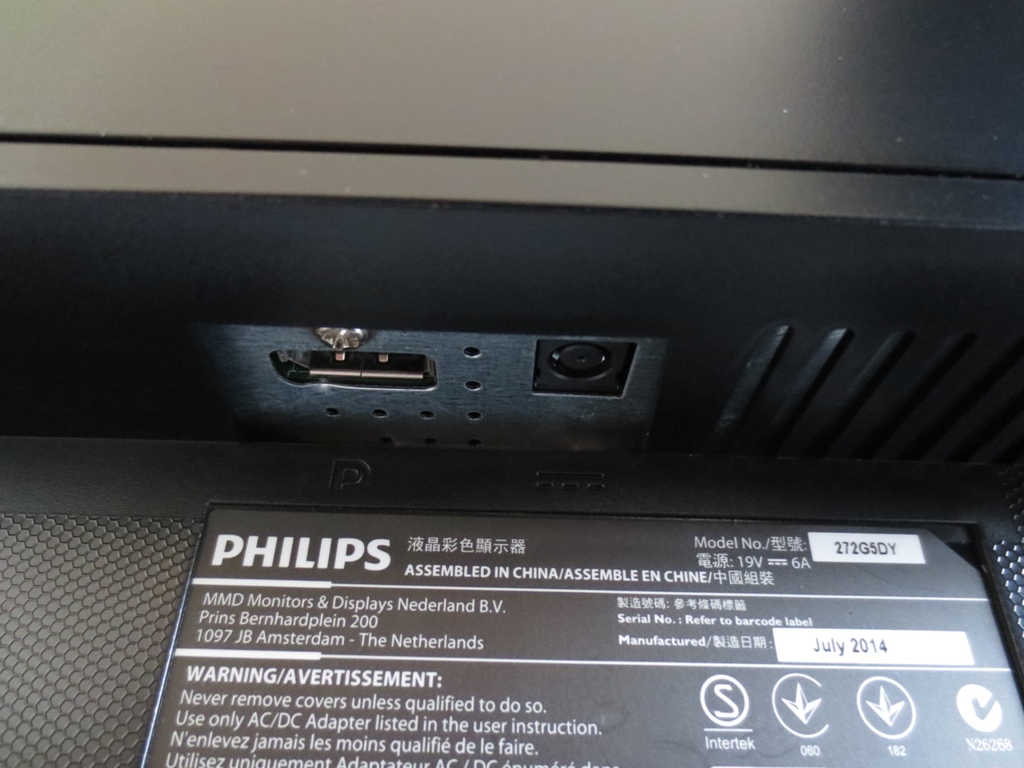
You may notice a thin gap at the top of the ‘boxy area’. That is a ventilation area to help keep the screen cool. At the bottom of the ‘boxy area’, to the left of the stand, there are the remaining ports of the monitor; DP 1.2 and DC power input (external power brick). G-SYNC requires the data packet transfer capabilities of DisplayPort and it would require the addition of additional accessory electronics and add considerable cost to the product to offer another port (such as HDMI) which bypasses the G-SYNC board. The necessary power adaptors, DP cable and USB 3.0 upstream cable are included in the box.
Calibration
Subpixel layout and screen surface
This monitor uses a ‘medium’ (regular) matte screen surface, as noted previously. This has a matte anti-glare outer polarising layer that is rough rather than smooth. As noted in this article that helps reduce unwanted glare and eliminate unwanted reflections due to ambient light, but impacts the light emitted from the monitor itself in a similar way. This affects both the vibrancy and clarity of the image and imparts a sight graininess to lights and white colours. This is something that most users have grown use to (matte surfaces are extremely common on LCD screens) and it doesn’t really bother them, but some users dislike this. The graininess from this surface is not ‘extreme’ and doesn’t impart a smeary or dirty look to the image like you may observe with some older IPS models in particular (such as the Dell U2711 and U2412M), which is good.
![]()
The Philips has the standard RGB (Red, Green and Blue) stripe layout as shown above. This is the common standard and is the layout that most operating systems (including Windows and MacOS) will be expecting by default. It is therefore not necessary to worry about having to mess around with ClearType settings on Windows or text that looks completely wrong on a Mac system. Some users may wish to adjust ClearType to suit their preferences, however.
Testing the presets
The 272G5DYEB doesn’t feature the usual ‘SmartImage Game’ presets as it is a G-SYNC monitor with certain functionality stripped from it. It does feature a range of ‘Gamma’ and ‘Color Temperature’ settings, however. Activating the ULMB (Ultra Low Motion Blur) feature also affects the image. We explored a number of setting combinations and have listed what we feel are the more ‘interesting’ ones in the table below. For those we have taken key readings (gamma and white point) and commented on how the image appears using those settings. Note that setting the ‘Color Temperature’ to ‘sRGB’ or ‘User Define’ (with all channels at ‘100’) provided identical performance to the default ‘6500K’ setting and therefore they were not mentioned in the table.
Our test system used an Nvidia GTX 970 connected, unsurprisingly, by DisplayPort 1.2. Where ULMB was disabled any settings not mentioned were left at default (with the exception of our ‘Test Settings’). We simply had the monitor in its ‘Plug and Play’ state without any additional drivers or ICC profiles loaded. The monitor was set to 144Hz with ULMB disabled. At 144Hz and to a lesser extent 120Hz there were some artifacts which manifested themselves as a sort of horizontal interlacing pattern – stripes of a lighter than intended shade. This is very common on 144Hz monitors and not something most users will be troubled by. Aside from that the refresh rate had no impact on the static image quality on this monitor. With ULMB activated we increased contrast from the default of ‘45’ to ‘50’, as this increased brightness without significantly impacting the image otherwise.
| Preset Mode | Gamma (central average) | White point (kelvins) | Notes |
| Color Temp. = 6500K (Factory Defaults) | 2.0 | 6564K | Very bright with a decent balance. The gamma is a bit ‘wonky’, averaging 2.0 at the centre with some deviation from the standard curve. The colour saturation remains decent overall, but shades become a little weaker towards the bottom (typical TN viewing angle issue from a normal viewing position). |
| Color Temp. = 5000K | 2.0 | 5482K | This is like a mild ‘Low Blue Light’ setting or reading mode. Good for relaxing evening viewing. |
| Gamma = 1.8 | 1.7 | 6566K | As factory defaults with a fairly washed out look (obvious under-saturation) |
| Gamma = 2.0 | 1.9 | 6564K | A fair degree of under-saturation, otherwise similar to factory defaults. |
| Gamma = 2.4 | 2.2 | 6535K | As factory defaults but a richer look (improved saturation) overall. Apart from the brightness the image balance is very pleasing. |
| Gamma = 2.6 | 2.4 | 6532K | A little too much depth in places but a rich look overall and good saturation levels towards the bottom of the screen. Some users will like this setting. |
| ULMB, Pulse Width 100 @ 120Hz | 2.1 | 6564K | Due to backlight strobing, the screen takes a hit in brightness regardless of the ‘100’ brightness setting. Like running a CRT at 120Hz a mild flickering is induced as well. The image remains well balanced and it’s only really brightness that’s the key change. |
| ULMB, Pulse Width 100 @ 100Hz | 2.1 | 6549K | As 120Hz with slightly more flickering (like a 100Hz CRT) and very slightly higher brightness. |
| ULMB, Pulse Width 100 @ 85Hz | 2.0 | 6596K | As at 100Hz with more noticeable flickering and a fair brightness boost. |
| ULMB, Pulse Width 50 @120Hz | 2.1 | 6506K | Significantly dimmer than with Pulse Width 100, otherwise similar. |
| ULMB, Pulse Width 50 @100Hz | 2.1 | 6511K | Significantly dimmer than Pulse Width 100 at 100Hz, otherwise similar. |
| ULMB, Pulse Width 50 @85Hz | 2.1 | 6521K | Significantly dimmer than with Pulse Width 100 at 85Hz (and indeed any other refresh rate with Pulse Width 100). |
| ULMB, Pulse Width 10 @120Hz | 2.1 | 6517K | Extremely dim and of little practical use even in a dark room in our opinion. |
| ULMB, Pulse Width 10 @100Hz | 2.1 | 6551K | Just a smidge of extra brightness compared to 120Hz at the same Pulse Width setting, otherwise similar. |
| ULMB, Pulse Width 10 @85Hz | 2.0 | 6484K | As above with a slight increase in brightness (still extremely dim). |
| Test Settings (as below) | 2.2 | 6484K | An appropriate look to the image with very good balance. The TN restrictions mentioned elsewhere still apply, but the image has a good depth and richness to it overall. |
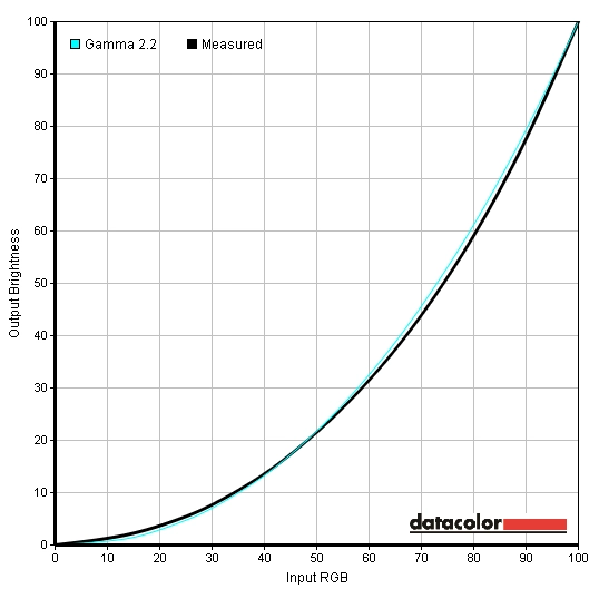
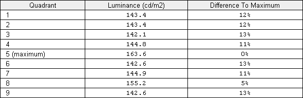
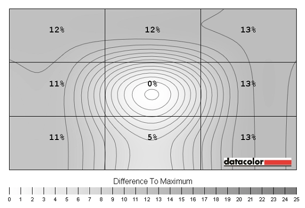
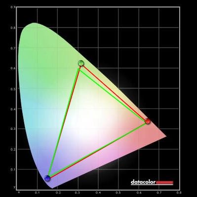
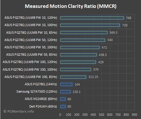
Out of the box the image was fairly well-balanced aside from the high brightness. The image was far more pleasing overall than on the majority of 144Hz monitors without a garish oversaturated look, completely washed out look or extreme gamma biases. Although some of the functionality is stripped back from the OSD, some key useful features such as a range of ‘Gamma’ modes remains. You can also manually adjust the colour channels, but we found that was unnecessary on our unit as the white point was right where it should be for the common 6500K daylight target. The ULMB setting dimmed the image significantly and raised gamma just a touch. The overall balance (including white point) remained quite similar to how it was with ULMB disabled, though. You certainly didn’t get the sort of huge shifts that are associated with forcing ‘LightBoost’ during 2D viewing on older models. After whacking down the brightness and switching the ‘Gamma’ setting to ‘2.4’ things fell into place. The gamma curve using these adjustments, adopted for our ‘Test Settings’, is shown below. Some users may prefer an even deeper look to the image and should feel free to experiment with other gamma settings such as ‘2.6’. This actually helps counteract the innate weakening saturation towards the bottom of the monitor which is a key viewing angle characteristic of the TN matrix, but can make some shades further up appear a little deeper than they should. We also found the ‘5000K’ ‘Color Temperature’ setting worked nicely as a sort of Low Blue Light or reading mode. This was actually somewhat cooler than 5000K (5482K at default brightness) but still cut out the blue channel significantly. It would have been nice if this could be very quickly toggled on or off but it’s still nice having a hardware-based setting like this. Our test settings involved a brightness reduction and changing the gamma mode, but no adjustments were required to the ‘Color Temperature’ settings which is great to see. Bear in mind that individual units can differ and you may feel it is necessary to use the ‘User Define’ setting and adjust the colour channels manually. Feel free to experiment with other gamma modes (particularly ‘2.6’) as well. We’ve also included the ‘SmartResponse’ setting used in our review here just for reference. Contrast= 50 Gamma= 2.4 SmartResponse= Fast We used a KM CS-200 luminance meter to measure the brightness of white and black using a range of monitor settings. The static contrast ratios yielded from these values was then calculated. In the table below you can see these values. The lowest black luminance, highest white luminance and highest contrast ratio recorded are highlighted in black. The results from our test settings are highlighted in blue. Please note that the monitor was set to 144Hz unless stated otherwise. Settings not specifically mentioned in the table were left at default. The exception to this was where ULMB was enabled – as mentioned in the calibration section we bumped contrast up to ‘50’ and brightness up to ‘100’ for this to maximise brightness without any observable or recordable ill effect. The average static contrast ratio using factory defaults (brightness only adjusted) was 1112:1, which is pleasing and about as good as we’ve seen from TN technology. Our test settings didn’t involve any changes to colour channels and therefore had no significant impact on contrast ratio – this sat at 1073:1. Increasing gamma mode had a very minor (undetectable by eye) impact on the contrast ratio, with the lowest setting (‘1.8’) yielding 1123:1 and the highest setting (‘2.6’) giving 1108:1. The black point remained the same but the brightness output dropped by a few cd/m². What was also nice to see was that the ‘5000K’ colour temperature had only a fairly minor impact on contrast – this remained at 1023:1. The maximum luminance recorded was 292 cd/m² and the minimum white luminance was 47 cd/m² (ULMB disabled). Enabling ULMB dropped brightness significantly – more so as Pulse Width is reduced or refresh rate is raised. Setting the refresh rate to 120Hz and Pulse Width to 10 gave an incredibly dim 9 cd/m². Interestingly lowering the brightness (not recorded on the table) didn’t seem to reduce this value but it did affect other shades considerably. Going by the values in the table the monitor had a luminance adjustment range of 283 cd/m² which is very good. As with all current G-SYNC monitors there is no Dynamic Contrast settings available, but that isn’t a feature we appreciate having anyway. This monitor does not use PWM (Pulse Width Modulation) to moderate its brightness, instead using Direct Current (DC) modulation at all brightness levels. This means the backlight can be considered ‘flicker free’ which helps reduce visual fatigue and discomfort. The exception to this is when ULMB is activated, a mode which by its very nature involves flicker. Some users who are sensitive to PWM find the flicker of ULMB quite tolerable, however. Whilst observing a black screen in a dark room, we could see slight backlight bleed and a small degree of clouding towards the bottom of the screen. This didn’t cause any issues during normal use and wasn’t really noticeable to be honest. The image below shows the screen in a dark room using our test settings. This photograph was taken from 70cm back from the screen which represents a fairly typical viewing distance. There is no ‘IPS glow’ or anything of that type which you would see on most IPS-type panels from this distance. Black depth does become visibly weaker towards the bottom of the screen (much as colours become less saturated) from a normal viewing position, however. If you move off-centre there is a mild golden or silver-grey sheen which blooms out a little at extreme viewing angles. This is far weaker than ‘IPS glow’ and does not present itself if you’re sitting in front of the monitor normally. To assess the uniformity of lighter shades we used a Spyder4Elite to measure the luminance of 9 equidistant quadrants running from the top left to bottom right of the screen. The table below shows the percentage deviation between each quadrant and the brightest point on the screen alongside the recorded luminance at each quadrant. The uniformity of the monitor was quite decent overall. The brightest point on the screen was ‘quadrant 5’ in the centre (163.6 cd/m²). The surrounding quadrants were quite consistently 11-13% from this value (142.1 cd/m² at ‘quadrant 3’ towards the top right being the dimmest point). The exception to this and the lowest deviation recorded was ‘quadrant 8’, below centre, with a luminance of 155.2 cd/m² (5% dimmer than centre). It is worth remembering that there is a degree of perceived brightness shift related to viewing angle on TN panels such as the 272G5DYEB which isn’t reflected in these values. Equally important is that uniformity for both light and dark colours (including this test and ‘backlight bleed’ mentioned previously) varies between individual units of the same model. Some units may be similar to ours, some may be better and some may be worse. For those who prefer a graphical demonstration of the uniformity variation discussed above, there is a contour map below which show the deviations. Here darker greys represent lower luminances and hence higher deviation from the central bright point. Percentage deviation between each point and the brightest point is also given. Due to the viewing angle behaviour of TN panels it is particularly misleading to analyse colour temperature variation using a sensor which lies perfectly perpendicular to the screen at point blank. For that reasons we will not be providing such analysis on this review. The contrast performance on Battlefield 4 was good. Dark areas showed an appropriate level of detail that was quite consistent throughout the screen. There wasn’t the dreaded ‘flooded look’ that is quite typical on many 144Hz monitors due to their gamma behaviour. Instead near-black shades appeared quite dark, as they should. Brighter elements contrasted nicely, despite a slight graininess from the matte screen surface. As with Battlefield 4, contrast was good overall on Dirt 3. Shade detail in dark areas was as you’d hope for from a well-calibrated TN LCD. There were no nasty atmosphere-breaking gamma enhancements or obnoxious detail-eating areas of ‘glow’. Bright elements appeared slightly grainy but stood out nicely. They didn’t have the dirty look of some strange matte screen surfaces (as if somebody smeared Vaseline over the screen), thankfully. We also assessed contrast performance using the Blu-ray of Skyfall. Detail levels in dark scenes were appropriate without artificial enhancement. Blacks and deep colours didn’t have the inky look that a good VA panel can provide but didn’t look flooded either. Bright shades contrasted nicely with darker surroundings, as evident in scenes where explosions occurred at night or bright lights (such as candles) shone through the darkness. To assess the contrast performance of the monitor more closely we used the Lagom tests for contrast. The following observations were made. The Philips 272G5DYEB’s colour gamut offers good sRGB coverage. There is a small amount of under-extension on some shades and a bit of over-extension, particularly in the green region on this diagram. This allows the monitor to produce a little extra saturation for some shades, which most users will quite like, without the overall colour representation becoming noticeably oversaturated. Colour representation on Battlefield 4 was respectfully rich. As noted in the calibration section there was weakening saturation further down the screen, but overall shades had good depth. A lighter screen surface would have encouraged a little more vibrancy in places, but there was some good deep greens, bright glowing oranges and bold reds. The environments looked quite natural and vibrant elements such as fires and brightly painted containers stood out nicely. On Dirt 3 the monitor produced fairly vibrant colours on the car liveries and the menu systems. Neon greens, deep blues, bright pinks and strong yellows amongst others. Saturation again weakened a bit further down the screen (a TN trait) and the screen surface held back the ‘wow factor’ a bit, but the overall look was quite vibrant yet natural. The racing environments also benefited from some good shade depth and a reasonably accurate shade representation overall. The Kenya rally tracks showed some good dusty greens and browns whilst the Finnish forest tracks were fairly lush and vibrant. Colours looked natural and much as they should on the Skyfall Blu-ray. The thick black bars at the top and bottom of the screen (due to the ‘UltraWide’ aspect ratio common to films like this) helped cut off the areas that would usually show the greatest viewing angle related colour inconsistencies. Skin tones and environments appeared appropriately saturated. Other elements showed good shade variety and looked much as they should really. Unlike Skyfall, the Blu-ray of Futurama: Into the Wild Green Yonder is represented in a 16:9 aspect ratio and therefore fills the entire screens. This, coupled with the fact that large areas of a single shade often fills a lot of the screen, really highlights the TN-related colour inconsistencies. A given shade appears lighter further down the screen and technically only appears as it should in the central region of the screen. As a result you don’t get the same distinction between closely matching shades as you might otherwise see. Nonetheless there was quite a decent variety of pastel shades. Furthermore there were lots of fairly vibrant-looking neon and deep shades which stood out quite well. To further explore the colour consistency of the monitor and see how viewing angle influences the colours displayed by the monitor from a normal viewing position, we used the Lagom tests for viewing angle. The following observations were made from a viewing distance of 70cm. The following video demonstrates the Lagom text test, a light desktop background and dark desktop background from a variety of viewing angles. Here you can see quite pronounced colour shifts, particularly vertically. Past a certain point, vertically, colour inversion can also be seen. Unlike ‘IPS glow’ this can’t be seen from a normal viewing position and doesn’t flare up in the same way. Input lag was calculated on the Philips 272G5DYEB by comparing with a range of monitors of known latency using SMTT 2.0 and a highly sensitive camera. We recorded 3.0 ms (under ½ a frame at 144Hz) of input lag. This input lag figure is influenced by both the element of input lag that you ‘see’ (pixel responsiveness) and the element that you ‘feel’ (signal delay). This indicates a very low signal delay that shouldn’t bother even the most sensitive of users. When ULMB was active we couldn’t record a significant change in latency with the average value being very similar. The monitor’s pixel responsiveness was analysed using the UFO Motion test for ghosting. This web-based test was used alongside a highly sensitive camera to capture the pixel response behaviour of the monitor using various ‘SmartResponse’ settings and refresh rates. The medium cyan background (middle row) of the test was used. It was run at ‘1920 Pixels Per Sec’, so the UFO crossed the screen in around 1 second. The following image shows the results with the top row showing the results at 60Hz, the middle row at 120Hz and the bottom row at 144Hz. The columns show respective ‘SmartResponse’ pixel overdrive settings; ‘Off’, ‘Fast’, ‘Faster’ and ‘Fastest’. You can see from this testing that the refresh rate had very little influence on the pixel responsiveness for these transitions. The separation distance between the object and each trail decreases as refresh rate is increased, as the screen is updating (refreshing) more frequently and therefore the UFO is redrawn more often. The nature of the trailing itself does not really change, however. The ‘SmartResponse’ settings, on the other hand, significantly impacted the nature of the trailing. With the ‘Off’ settings there was a bold primary trail and a slight secondary trail. The ‘Fast’ setting eliminated the secondary trail and weakened the primary trail. The trail here has a slight woven appearance which indicates very mild overshoot not really detectable by eye. The ‘Faster’ setting increases the woven appearance, indicating that the overshoot is becoming a bit stronger – these artifacts can just about by seen by eye, but they aren’t obvious. The ‘Strong’ setting ramps up the acceleration massively and induces obvious overshoot – colourful inverse ghosting artifacts are obvious in the snapshots and by eye. We found the ‘Fast’ setting optimal in practice. Although the difference here appears quite slight, on some transitions the ‘Faster’ setting induces some slightly bolder inverse ghosting. It’s still quite faint and would escape the notice of most users, but it isn’t there with the ‘Fast’ setting whilst no additional ‘conventional trailing’ is added either. Feel free to experiment for yourself (we feel both the ‘Fast’ and ‘Faster’ settings are very useable) but be aware of our preferences and the mode we settled on for our testing below. The static photographs assessed previously do not reflect how our eyes see motion. As this article explains it is very important to take eye movement into account – as it is in fact this eye movement that accounts for most of the motion blur you see when looking at movement on a ‘sample and hold’ monitor such as this. That is a key reason why perceived motion blur is massively reduced as refresh rate is increased – more frequent screen updates reduces the amount of time the eye spends moving. In order to put all of this together (pixel responsiveness, latency and our eye movement) it helps to subjectively assess a range of game titles. The first title we looked at was Battlefield 4. The pixel responsiveness was clearly excellent, without the use of an overly aggressive pixel overdrive algorithm (using the ‘Fast’ setting we preferred). In other words, we didn’t notice any trailing resulting from sluggish pixel responsiveness, nor any obvious overshoot (inverse ghosting). Where the frame rate matched the refresh rate (144fps at 144Hz) the connected feeling was excellent. The interaction with the game world was slick and smooth and the levels of motion blur was low – the experience was vastly different to playing on a 60Hz monitor. As the frame rate dropped below this, the level of motion blur increases in proportion to the drop. The level of connectedness and fluidity of your character as it interacts with the game world also takes a hit. Furthermore, the fact that the refresh rate and frame rate are no longer ‘in sync’ produced tearing and juddering textures (VSync off) or stuttering (VSync on). We still felt having well above 60fps (for example 100fps) was a nice bonus over a 60Hz monitor but didn’t find the experience optimal at all. The second title we tested was Dirt 3. On this title our GPU comfortably maintained 144fps a lot of the time, so the issues with reduced frame rates weren’t there. Of course if we were to disable VSync and not use any sort of frame rate limiter the frame rate would comfortably climb above this at times, inducing tearing and the like. The fluidity as you drove at great speed on this title was a nice bonus to the gameplay. The course remained relatively sharp and it made focusing on the track that little bit easier. The responsiveness of the vehicle to user input was also improved, but we were playing with a keyboard so this wasn’t really all that noticeable. If you were a keen racer with a steering wheel, though, this extra connectedness would be very nice to have. We also tested our Blu-ray film titles. The frame rate of these is limited to around 24fps and therefore the monitor wasn’t used to anywhere near its full potential. There were no issues forced upon the experience due to sluggish pixel responses or overly aggressive pixel overdrive – no trailing or inverse ghosting from the monitor in other words. Fluidity was certainly limited by the low frame rate of the films and of course we weren’t interacting with them so the low latency didn’t come into play either. One bonus of the 144Hz refresh rate (or indeed 120Hz) compared to 60Hz is that the 24fps divides evenly. This means each frame can be ‘cleanly’ repeated a certain number of times every second (4 times at 120Hz or 5 times at 144Hz), reducing the ‘judder’ which some users really dislike. Monitors traditionally operate at a fixed refresh rate, for example 60Hz, 120Hz or 144Hz. When the frame rate of your game doesn’t match this refresh rate, certain visual issues occur. If you have VSync enabled, you get stuttering and if VSync is disabled you get tearing and juddering. These sort of issues were described in the previous section during our game testing. G-SYNC is a technology which allows the monitor to dynamically adjust its refresh rate to match the frame rate of the game, avoiding such issues. On this monitor it operates between 30Hz and 144Hz. For a further look at this technology and the limitations of the usual static refresh rate please refer to our G-SYNC article. If you’d like to know how to activate it please refer to the ‘G-SYNC – activating it’ part of the ‘Responsiveness’ section on our review of the ASUS PG278Q. The process is exactly the same with any G-SYNC monitor. It should be noted that the application must be running full screen for this to work and Nvidia recommends disabling VSync in game in addition to ensuring VSync is set to G-SYNC in the Nvidia Control Panel. The first title we tested to see how G-SYNC worked on the 272G5DYEB was Battlefield 4. This title has highly variable rates – as we mentioned early on in the ‘Responsiveness’ section, the frame rate rarely stayed at 144fps on our system using our preferred settings. It commonly dropped a bit to around 110-130fps. The interaction with the game world felt very fluid and the overall experience very smooth. These drops in frame rate did increase motion blur and decrease this ‘connected feel’ in much the same way as without G-SYNC, but with G-SYNC these drops were nowhere near as noticeable as without. There was no stuttering or tearing from frame and refresh rate misalignments. There was the occasional stutter every now and then, but that was due to network latency or coding – nothing G-SYNC can fix. At times the frame rate dipped even further, sometimes well below 100fps. It was nice to have the usual stuttering or tearing eliminated in such cases, but the overriding fluidity and motion blur impact of the relatively low frame rate could still be seen and felt. Next we took a look at Warframe. This title is known to have extremely variable frame rates, so is a good test for G-SYNC. A lot of the time the frame rate would dip just a bit below 144fps, which would traditionally lead to ‘frustrating’ stuttering and the like. With G-SYNC these drops were much less obnoxious and things maintained a smooth look and feel. Sometimes there were insane amounts of action where the screen became blitzed by dozens of different special effects all at the same time. The frame rate sometimes dropped sharply, at times as low as 40-70fps or so. The ‘connectedness’ was really lost at such frame rates and the level of motion blur was relatively high. It was a nice bonus not having to endure stuttering, tearing or juddering – but it was still a ‘system shock’. We even saw the frame rate dip below 30fps on one occasion, which is below the floor of G-SYNC on this monitor. It therefore acted as ‘VSync on’ but at such painfully low frame rates this was neither here nor there. Finally we took a look at Tomb Raider, a title which worked particularly well with G-SYNC. The frame rate generally fluctuated between 80 and 120fps using our preferred ‘Ultimate’ settings. With a static 144Hz or 120Hz this would induce stuttering or tearing and juddering. With G-SYNC, though, the fluctuations were much less noticeable. Although it is still a case of ‘the higher the better’ with frame rates, the frame rate remained high enough for the connectedness to remain decent. Many other titles will run in this sort of ‘frame rate zone’ – it’s really these slight to moderate dips in frame rate that G-SYNC helps make much more bearable. ULMB (Ultra Low Motion Blur) is an Nvidia-specific strobe backlight technology which is enabled on G-SYNC monitors. As with G-SYNC, a compatible Nvidia GPU is required and the mode must be activated independently of other technologies (i.e. no G-SYNC and ULMB at the same time). We won’t spend too much time explaining the technology as that’s done in great detail in our responsiveness article. The basic concept is that the backlight blinks on and off in-sync with the refresh rate of the monitor (either 85Hz, 100Hz or 120Hz for this mode). It spends most of its time in the ‘off’ state but blinks on briefly up to 120 times per second (120Hz). Compared to the usual backlight behaviour of this and other typical LCDs, where the backlight is always ‘on’, your eyes spend a lot less time tracking motion. If you recall it is this eye movement which is the most significant contributor to the blur you see when using a modern monitor – so reducing that movement reduces perceived blur. To enable ULMB you must set the monitor to either 85Hz, 100Hz or 120Hz and ensure G-SYNC is disabled in the Nvidia Control Panel. You can activate the feature in the ‘Setup’ section of the OSD or use the dedicated button on the monitor. There are a couple of issues to be aware of when running ULMB, other than the brightness hit and flickering that we’ve already covered. We mentioned in the calibration section that some faint artifacts could be seen, particularly at 144Hz. These look like a sort of horizontal striped interlacing pattern, quite tightly spaced together. With ULMB activated these were a bit more pronounced and could be seen quite clearly on certain lighter shades, for example sky and smoke textures. This occurred regardless of refresh rate. Another issue is that ULMB forces the use of an (overly) aggressive pixel overdrive solution. This causes ‘inverse ghosting’ which can appear as a translucent trail that is dark and shadowy or bright depending on the shades involved in the transition. It was not obnoxious in the same way as setting ‘SmartResponse’ to ‘Fastest’ normally, but it can’t be removed and will bother some users. Furthermore the strobe behaviour of the backlight causes the trails to fragment rather than appear as a single smooth trail. At times you can see faint repetitions of some objects, during particularly fast motion and where certain shades are involved. This is universal to all monitors we’ve tested so far using ULMB. For most users it’s fair to say that these issues will be considered quite minor. The overall image clarity when the monitor is displaying moving content, using ULMB, is exceptional and of potentially great benefit from a competitive point of view. On Dirt 3 the extra clarity isn’t really something we’d consider ‘game changing’ on the normal racing modes unless you’re highly sensitive to motion blur and find it uncomfortable gaming at ‘regular 144Hz’. On the infamous Gymkhana mode, though, we find the experience quite dizzying on ‘sample and hold’ monitors even when they’re running 144fps at 144Hz. ULMB helps things remain incredibly sharp and well-defined during motion which takes this dizziness away. You could say that makes the experience less authentic in a way, but people don’t generally play games and actively want to experience visual discomfort. On Battlefield 4, provided the frame rate matched the refresh rate, the motion clarity was excellent. Turning your character quickly didn’t create the usual blur of the game world (usually seen to a degree even at 144Hz) – the environment remained sharp. This made enemies very easy to track and target. Even during very fast-paced action on this title, that remained the case. One thing that’s crucially important for ULMB to work properly is that the frame rate can match the refresh rate of the monitor. Because the clarity is so good there is no motion blur there to mask stuttering and other such responsiveness imperfections – they becoming painfully obvious and really cause the smoothness to suffer. We found that the motion clarity was excellent even at 85Hz or 100Hz (where the frame rate target is 85Hz or 100Hz, respectively) with ULMB enabled but preferred the overall connected feel and relative lack of flickering at 120Hz. As we mentioned in the G-SYNC section, Warframe is a game with extremely variable frame rates. Due to this and the fact that the game style we didn’t feel ULMB was really very useful on this title. It did improve motion clarity as you would expect, but the drawbacks tended to outweigh the benefits. There was no reason to gain that competitive edge and the highly variable frame rates screamed out for G-SYNC. That’s really a key thing to remember about ULMB and G-SYNC – the former can be useful if your frame rate consistently matches the frame rate, whereas the latter is useful in variable frame rate environments. Oh and we didn’t find ULMB added anything to movies so we won’t be saying anything more about them. Some people may still like this effect on movies, but the low frame rate (typically ~24fps) really limits its usefulness. There is a setting called ‘Pulse Width’ (PW) which alters how long the backlight is kept ‘off’ compared to ‘on’ when using ULMB. As we’ve explored previously, a lower setting will yield lower brightness. This is because the backlight spends even longer on the ‘off’ period than at higher PW settings. This also further improves the clarity of motion, although it must be stressed that many users will find the clarity excellent at a PW of 100, as we did. And the extra brightness was helpful, especially during daylight. You can adjust the PW by single unit increments, which gives excellent flexibility. It is possible to assess the clarity of motion at the different PW settings and also various refresh rates (85Hz, 100Hz and 120Hz). These results can then be compared to monitors that do not use a strobe backlight, including the Philips itself with ULMB disabled. There is a value called MPRT (Moving Picture Response Time) which gives an indication of the motion clarity of the display taking into account eye movement and perceived blur, with lower values indicating better clarity. We’ve done enough analysis on all of the G-SYNC monitors we’ve tested to conclude that the ULMB implementation is very similar on all of them. We therefore won’t be repeating some of the extremely detailed, time consuming and at times painfully testing we performed on the ASUS PG278Q. The behaviour of the Philips (MPRT values) are much the same, so what you would see is much as in the graph below. Here shorter bars indicate lower MPRT values and hence better motion clarity. You can see that higher refresh rates improve the motion clarity, whether the monitor is using a strobe backlight (green bars) or not (blue bars). The jump in clarity when using ULMB is profound. Decreasing PW improves the motion clarity from an already excellent level and so does raising the refresh rate. Shortly after this review is published we will be adding some values specifically taken on the Philips 272G5DYEB to the relevant section near the end of our responsiveness article. We also tested ULMB in our film titles but didn’t feel that it worked well at all there. It added a bit of flickering but didn’t really help overcome the hurdle of fluidity that is the low frame rate at which the films are shot. And to finish off, we’d just like to say a few final things about the choice between ‘G-SYNC’ and ‘ULMB’ – because you can’t have both at the same time. G-SYNC works beautifully in variable refresh rate environments, getting rid of tearing and stuttering that results from a divergence between refresh rate and frame rate. In such environments ULMB does not work well, because the stuttering and anything else of that nature sticks out like a sore thumb. If you can consistently match the frame rate to your static refresh rate (120Hz, 100Hz or 85Hz) then ULMB is definitely worth considering for the exceptional motion clarity it can provide. Not everybody likes the slight flickering it introduces and indeed some users find the clarity of 144Hz with ULMB disabled more than good enough for their needs anyway. This monitor is fully compatible with Nvidia 3D Vision 1 and 2, but requires the kit is bought separately (i.e. there is no integrated transceiver and no glasses are included). You can find out more about this technology and our general impressions of the 3D Vision 2 kit by reading the ‘Nvidia 3D Vision 2’ sections of our PG278Q review, just above the conclusion. Some key points to bear in mind: The first title we tested with 3D Vision 2 was Thief. The depth effects on this title were quite good, adding another element of immersion to the game. Using the default settings all elements appeared either at the plane of the screen surface or going into it. On one hand this removes a bit of the ‘in your face’ factor we quite like from the 3D experience, on the other some users would find it makes it a bit more comfortable on the eyes. There are two sliders in the ‘Display’ options of the game that change this experience. The first is ‘Stereo separation’ which is what the scroll wheel on the 3D Vision emitter controls. The second is ‘Stereo depth’ – increasing this can give that ‘pop out of the screen’ look we wanted. Everyone will have their own preferences, but we found setting these both to the middle gave an impressive ‘pop out’ 3D experience without being too visually uncomfortable. Most objects in the environments showcased really good depth effects using these settings. The character’s hands when climbing ropes and the perspective when firing arrows from a bow was particularly impressive. There were some slight convergence issues in places where certain objects appeared to have a sort of faint semi-transparent woven-textured repetition of the object beside them. When picking locks (which happens a lot on this game) it was difficult to focus on the indicators, but the hand, pin and door handle showed great perspective and looked rather impressive. Next, we tested Tomb Raider using the system. The in-game basic graphics options have two sliders which alter the 3D experience; ‘Depth’ and ‘Strength’. We found the best balance between impressive ‘in your face’ 3D effects and visual comfort could be achieved with each slider up ¼ of the way. If you’re close to a wall and you shift the camera so that Lara fills much of the screen, the depth effects are incredible. Her glossy hair flowed out of the screen and the perspective on her bow (that is one of her weapons, incidentally) and stored arrows was very impressive. The sense of perspective when hanging off buildings or zip-lining down ropes was excellent. The 3D models of weapons when you go to upgrade them at a camp at artifacts as you find them were also pleasing in full 3D. As with Thief, the 3D experience was generally nicely polished. There were again a few instances of ‘cross-hatched’ semi-transparent repetitions of certain artifacts. Some of the menu systems were difficult to navigate through due to the mouse cursor appearing in a completely different plane to what you’re clicking. Overall 3D worked well on this title and made for an enjoyable and different way to play. The 3D Vision 2 system also supports 3D Blu-rays, allowing you to view such titles in full 3D if your movie software supports it. The only 3D Blu-ray we had to hand and could test was Ocean Wonderland 3D. This worked exactly as it should, with some very impressive depth effects. Shoals of fish, corals and the main ‘character’ of the film (a sea turtle) frequently popped out of the screen in much the same way you’d see when watching a 3D film at the cinema. Unlike passive 3D systems, these effects work just as well if you’re sitting a normal distance from the screen as a little way back from the screen. There isn’t the sort of restrictive 1.5m+ minimum viewing distance which would lend itself better to TV viewing than monitor viewing. Every now and then a monitor or monitor technology comes along that really changes the gaming experience. Since the inception of the LCD monitor, responsiveness is an element that his seen consistent improvement over the years. With 144Hz refresh rates now comfortably supported by advanced pixel overdrive solutions, players can feel much more ‘connected’ to their game world. But as the frame rate drops away even slightly this feeling begins to fade. G-SYNC puts a stop to this almost irrepressible urge to keep that frame rate hitting the monitors refresh rate by making sure that the refresh rate is hitting the frame rate instead! Genius. As the third G-SYNC monitor we’ve thoroughly tested the responsiveness performance of the monitor came as no surprise – but it was still excellent. The pixel overdrive solution was implemented brilliantly and was highly flexible, there was no real input lag to speak of and the high refresh rate delivered a really smooth experience. The trio of Nvidia extras also worked nicely, two of which (ULMB and G-SYNC) are tightly focused on improving the responsiveness of the gaming experience. G-SYNC was certainly nice in the variable refresh rate environments that are common on modern games, but low frame rates remained low frame rates regardless of this. The ULMB strobe backlight feature presented a nice alternative for when the frame rate was consistently hitting the refresh rate. The downside of this included an aggressive and non-adjustable pixel overdrive solution (with some overshoot and inverse ghosting), a bit of dimming of the screen and a mild flickering. The upside, provided the frame rate was where it should be, was a profound reduction in motion blur. We’ve also noticed that all of the G-SYNC monitors we’ve tested had a relatively pleasing image for 144Hz monitors – and the 272G5DYEB was no exception. The colour temperature was bang on the ‘6500K’ daylight target and adjustable gamma modes made it easy to adjust gamma appropriately. Colours lost a bit of saturation further down the screen (a viewing angle restriction of the TN technology required to make such a responsive monitor) and the screen surface dampened the vibrancy a bit. But overall, colours had a good richness than was a far cry from the usual washed out mess that 144Hz usually present you with. The contrast performance was also decent. Not entering the great atmospheric depths of ‘VA panel’ contrast, but still as you would expect from a decent TN panel without any major drawbacks to hamper the experience. We also enjoyed the 3D capabilities of the monitor. We’re not the biggest fans of that sort of technology in general, but we can’t deny it made some of our single player titles more engrossing and interesting to play (or replay). The Philips 272G5DYEB may not be the cheapest gaming monitor out there and it may not have the most breath-taking image quality. But its responsiveness is second to none and its image quality is so much better than what most people associate with 144Hz monitors. Couple this ‘inner beauty’ with a remarkably solid and fully adjustable stand and there is a lot to like about this model.
Gamma test settings
Test Settings
Brightness= 40 (according to preferences and lighting)
Contrast and brightness
Contrast ratios
Monitor Profile White luminance (cd/m²) Black luminance (cd/m²)) Contrast ratio (x:1) 100% brightness 290 0.26 1115 80% brightness 252 0.23 1096 60% brightness 211 0.19 1111 40% brightness 163 0.15 1087 20% brightness 109 0.10 1090 0% brightness 47 0.04 1175 Color Temp. = 5000K 266 0.26 1023 Gamma = 1.8 292 0.26 1123 Gamma = 2.0 291 0.26 1119 Gamma = 2.4 288 0.26 1108 Gamma = 2.6 288 0.26 1108 ULMB, Pulse Width 100 @ 120Hz 90 0.10 900 ULMB, Pulse Width 100 @ 100Hz 45 0.05 1000 ULMB, Pulse Width 100 @ 85Hz 118 0.13 908 ULMB, Pulse Width 50 @ 120Hz 98 0.11 891 ULMB, Pulse Width 50 @ 100Hz 50 0.05 1000 ULMB, Pulse Width 50 @ 85Hz 60 0.06 1000 ULMB, Pulse Width 10 @ 120Hz 9 <0.02 >600 ULMB, Pulse Width 10 @ 100Hz 10 <0.02 >600 ULMB, Pulse Width 10 @ 85Hz 12 <0.02 >600 Test Settings 161 0.15 1073
PWM (Pulse Width Modulation)
Luminance uniformity

Luminance uniformity table
Luminance uniformity map
Contrast in games and movies
Lagom contrast tests
Colour reproduction
Colour gamut
Colour gamut test settings
Colour in games and movies
Viewing angles
Responsiveness
Input lag
Pixel responsiveness
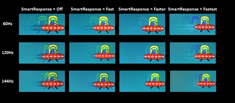
Trailing (various 'SmartResponse' settings)
Responsiveness in games and movies
G-SYNC
ULMB – the technology
ULMB – the experience
ULMB – the numbers
MPRT values on the PG278Q
Nvidia 3D Vision 2
Conclusion
Positives Negatives Excellent out of the box white point. Pleasing shade depth and gamma handling following slight adjustments –adjustable gamma modes are nice to have as well
The colour consistency (and hence colour accuracy) is limited by the TN panel with weakening saturation further down the screen from a normal viewing position
The contrast performance was as you’d hope for from a decent TN panel, without any major issues or strange gamma behaviour which would break the atmosphere of many games We personally prefer lighter screen surfaces – there are other matte solutions out there which provide strong glare-busting without such an impact on the clarity and vibrancy but none are used on current 144Hz models Excellent responsiveness with no significant input lag, well-tuned and adjustable pixel overdrive and Nvidia extras – G-SYNC, ULMB and 3D Vision ULMB has a fixed overdrive solution which is a little stronger than it needs to be in our opinion, giving some inverse ghosting in places Very good build quality and ergonomics, something we’ve come to expect from Philips monitors that look like this A very limited port selection and a price that not everyone will agree with
![]()

