Author: Adam Simmons
Date published: November 10th 2015
Table of Contents
Introduction
When it comes to fluid gaming with that ‘connected’ feeling that gamers want, buying a monitor with a higher refresh rate (such as 144Hz) is an excellent starting point. Actually maintaining a frame rate that matches this refresh rate can be challenging, however. And as the frame rate departs from the refresh rate, users are left with potentially distracting tearing, juddering or stuttering. Variable refresh rate technologies such as Nvidia G-SYNC and AMD FreeSync aim to smooth things out by adjusting the refresh rate of the display to match the frame rate of the content. The AOC G2460PF is one of the most affordable models currently available that features a variable refresh rate technology (support for FreeSync). We look at how the monitor works with this capability and also how the screen itself performs in a range of tests, including subjective analysis of various game and movie titles.
Specifications
This model features a 144Hz (variable with Adaptive-Sync) panel from AUO. We are now very familiar with this panel, as it’s used on the vast majority of 24” 144Hz monitors currently. We have highlighted some key talking points in blue below. Amongst these are the viewing angles, which are somewhat higher than would usually be specified for such a panel – but really, it’s just AOC being a bit cheeky with the figures. There is also a 1ms grey to grey response time, a figure you must also approach with a great deal of scepticism. But if specifications told the full story, there would be no need for a review, would there?
Key talking points of the specifications are highlighted in blue below.
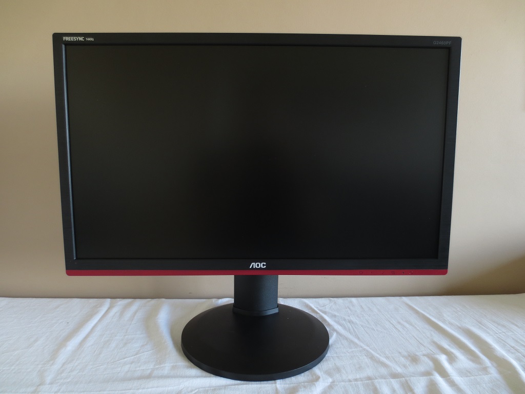
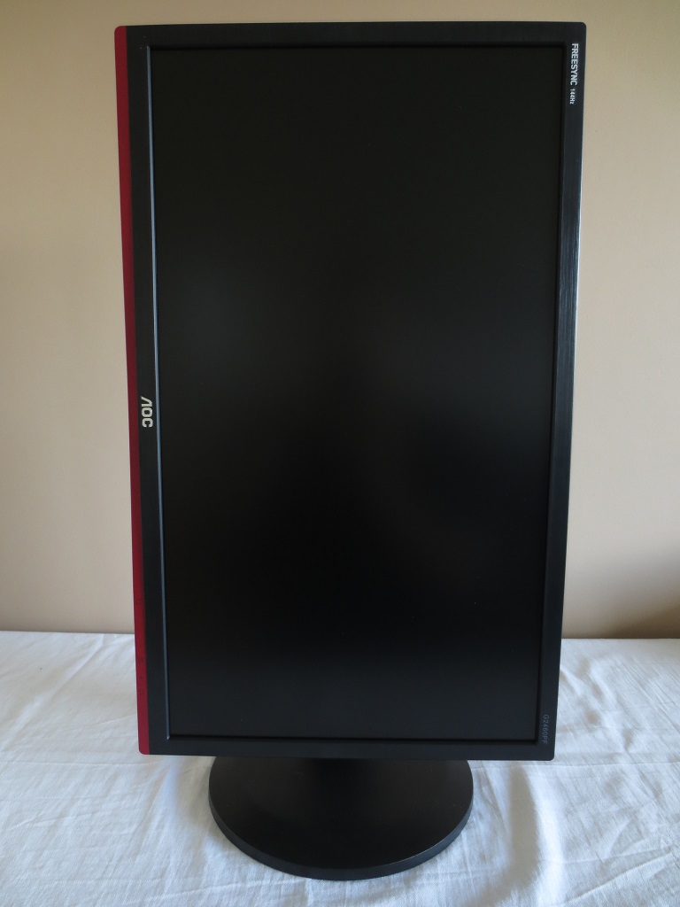
The front of the monitor has a fairly familiar style, similar to previous AOC gaming monitors like the G2460PG. To identify this as a monitor supporting AMD FreeSync, there is a dark red painted stripe at the bottom. And if that was too subtle a hint, ‘FREESYNC 144Hz’ has been slapped onto the top left for you. The bezels have a brushed metal texture, but are matte black plastic. They are ~15mm (0.59 inches) at the top and sides and ~24mm (0.94 inches) at the bottom. The screen surface is regular (‘medium’) matte anti-glare, as explored later. At the right side of the screen there are two USB 2.0 ports. The top one, coloured red, supports fast charging of connected devices. At thinnest point the monitor is ~21mm (~0.83 inches), lumping out further down and centrally. The included stand offers good ergonomic freedom; tilt (5° forwards, 22° backwards), height (130mm or 5.12 inches), swivel (270° left or right, using a turntable on the underside of the base) and pivot (rotation 90° clockwise into portrait). Note that the attractiveness of having the monitor in portrait orientation is severely limited by its viewing angle restrictions. At its minimum height the bottom edge of the screen sits ~ 41mm (~1.61 inches) above the desk with the top edge ~381mm (~15.00 inches) above the desk. This model uses a medium (‘regular’) matte screen surface, as noted previously. This fairly strongly roughened outer surface surface provides strong glare handling characteristics at the expense of affecting the clarity and vibrancy to a greater degree than lighter matte screen surfaces. In this respect whites and light colours do have a bit of a grainy look to them, although not to the same extent you’d see on some models (particularly older IPS panels). The usual RGB (Red, Green and Blue) stripe subpixel layout it used, shown in the image above. This is the default layout expected by Windows, MacOS and other modern operating systems. There is no need to run ClearType as a Windows user or any need to worry about ‘text fringing’ and other such issues caused by non-standard subpixel layouts in MacOS. Windows users may wish to use ClearType to fine-tune according to preferences, though. As a rather unusual step for an AOC monitor, there are some presets known as ‘Game Mode’ options in addition to the simple ‘Eco Mode’ preset brightness values. We do not feel they bring anything positive to the experience, though, as noted in the OSD video earlier. They pull various shades closer to the edge of the gamut, causing oversaturation and crushing the shade range. Providing a more saturated but less accurate look to the image that strays from what the game developers will have intended. We will therefore not be testing them further. There are some additional settings such as ‘Gamma’ modes and ‘Color Temp.’ settings that we will be exploring in this section. The table below shows our observations using a range of settings, as well as gamma and white point readings taken with a Datacolor Spyder5ELITE colorimeter. Assume any setting not noted in the table was left at default. Windows 10 was used with a beta driver for the monitor that AOC supplied to us for the review. The monitor was connected to a Club3D Radeon R9 290 royalAce FreeSync-compatible GPU connected via DP. We made similar observations using an Nvidia GTX 970 and using either GPU over Dual-Link DVI, too.
Features and aesthetics
The OSD (On Screen Display) and power state of the monitor are controlled by physical buttons, towards the right of the bottom bezel. These face downwards and have engraved labels at the front. This functionality is shown in the video below. There is a small power LED between the ‘Menu’ and ‘Power’ labels. This glows green when the monitor is on and amber when it’s in a low power state (standby).
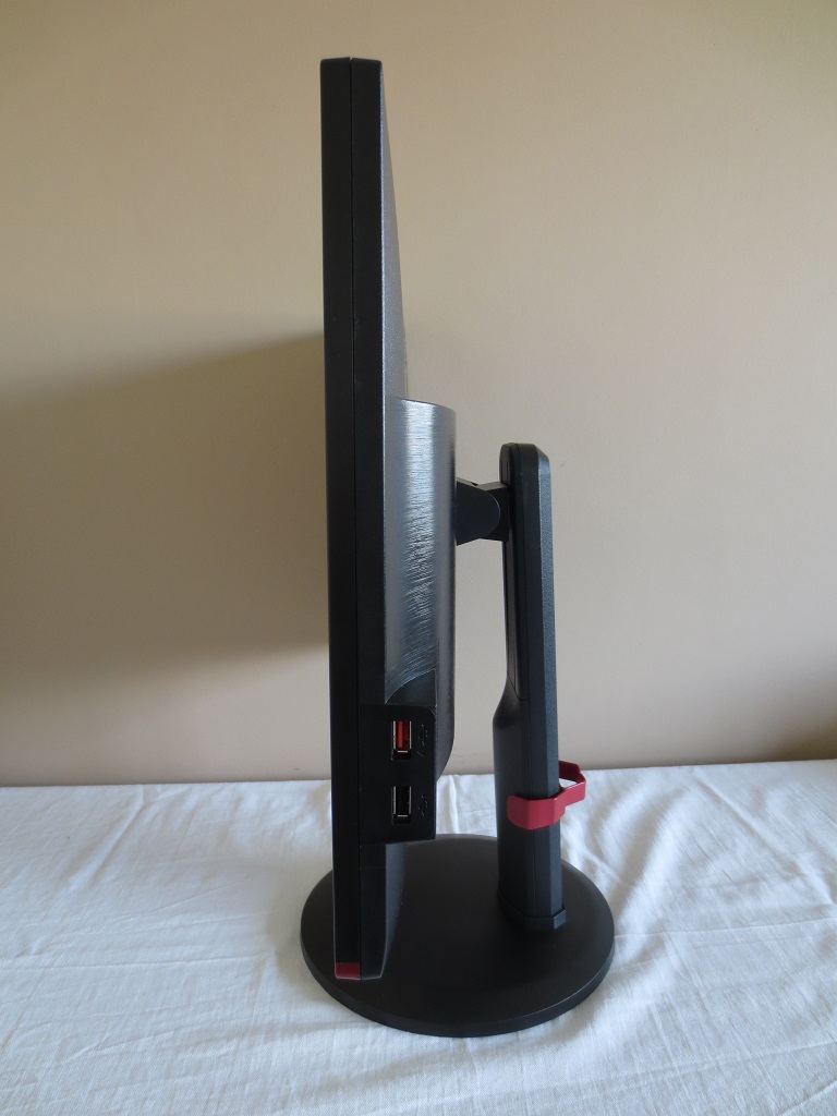
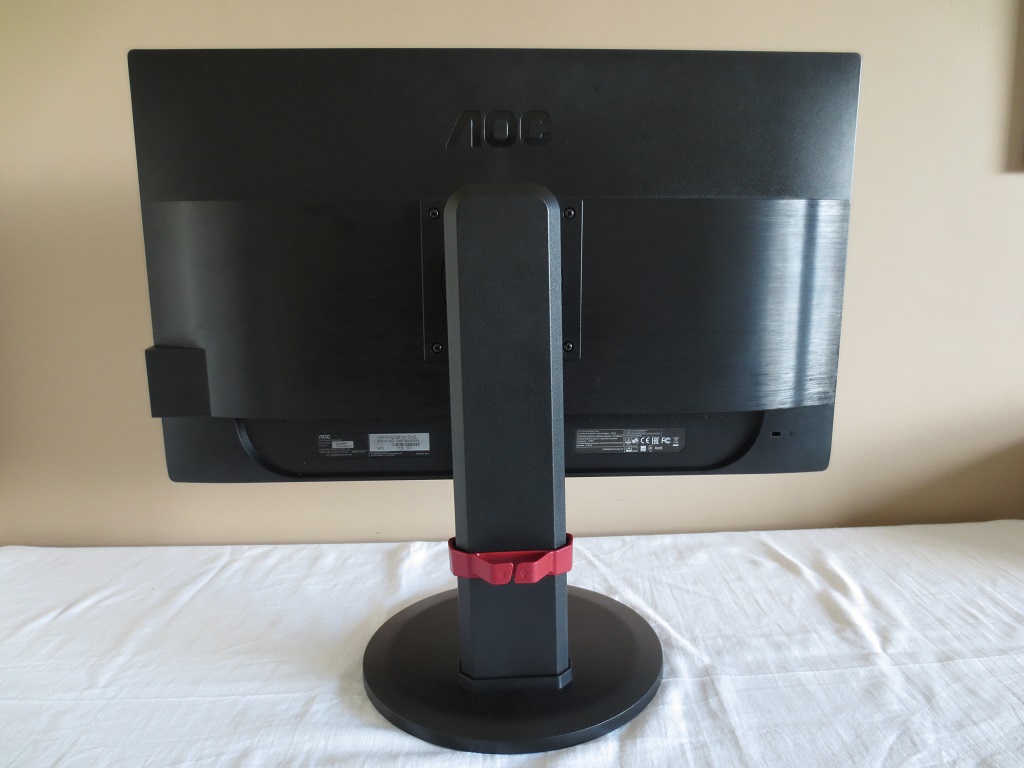
The rear of the monitor features matte plastics throughout. The central area has a brushed metal texture and the rest regular matte. The stand attaches by 100mm VESA and can be unscrewed if you wish to use an alternative VESA 100 stand or mount. There is a dark red clip-on cable tidy that can be attached to the stand neck. This wraps around so that it is also slightly visible from the front, if the screen is high enough and the cable tidy is attached low enough. There is a K-Slot towards the bottom right and simple up-firing 2W stereo speakers for basic and fairly low quality sound output.
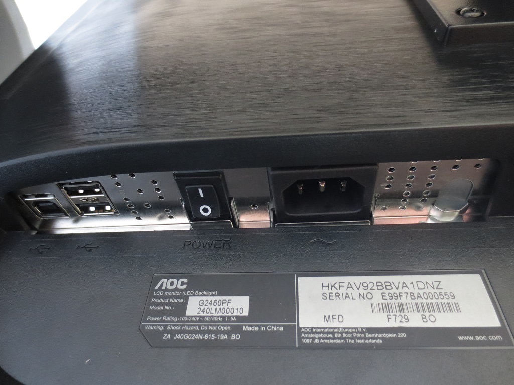
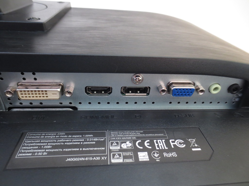
There are a number of down-firing ports. To the left of the stand base, as viewed from these rear, there is; USB 2.0 upstream, 2 further USB 2.0 downstream ports (4 total), a ‘Zero Power’ switch (to minimise standby power consumption) and an AC power input (internal power converter). These are shown in the first image below. To the right of the stand base, shown in the second image below, are the remaining inputs. These are; Dual-Link DVI, HDMI (with MHL), DP 1.2a (Adaptive-Sync support), VGA, 3.5mm audio input and 3.5mm headphone jack. Note that ‘FreeSync’ is only supported over DP on GPUs which support it. DP and Dual-Link DVI both support 144Hz output, whereas HDMI is limited to 60Hz on this monitor. Standard cables included with the screen are; VGA, Dual-Link DVI, DP, 3.5mm audio cable, USB cable and power cable.
Calibration
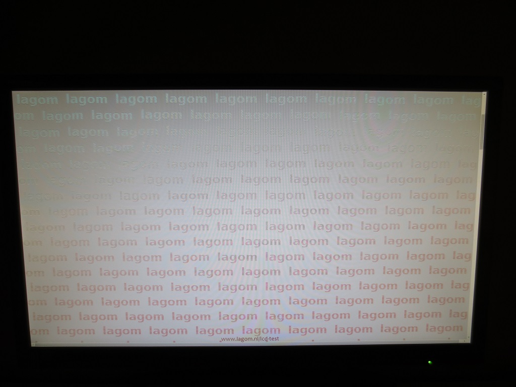
Subpixel layout and screen surface
![]()
Testing the presets
Monitor Settings Gamma (central average) White point (kelvins) Notes Gamma1 (Factory Defaults) 1.6 6319K Very bright with a ‘flooded’ (washed out) look. The central white point and overall colour balance is quite good, however. Given the panel technology used, the perceived gamma and saturation is reduced further down the screen from a normal viewing position and raised higher up the screen. So the ‘flooded’ look was rather extreme towards the bottom of the screen. Gamma2 1.4 6367K As ‘Gamma1’ but now extremely washed out. Many shades lacked appropriate depth and simply looked wrong. Gamma3 1.8 6284K As ‘Gamma1’ with some extra depth. Some shades have reasonable depth, particularly further up the screen. This was not the case further down the screen, though, and overall many shades were sapped of appropriate saturation levels. Gamma3 @60Hz 2.1 6247K The gamma curve is dependent upon refresh rate. The look is much richer than at 144Hz. Really this model could have done with some extra gamma settings or ones which raised gamma further at 144Hz. Note that 100Hz and 120Hz are some way between 60Hz and 144Hz in terms of gamma, but much closer to 144Hz really. Color Temp. Normal 1.6 6768K A slightly cool tint is introduced, but otherwise as ‘Gamma1’. Color Temp. User 1.6 6510K Similar to factory defaults but white point better balanced for ‘6500K’ centrally. Optimal OSD settings (see below) 1.8 6494K As ‘Gamma3’ with much more comfortable brightness. There remains a generally under-saturated washed-out look further down the screen in particular, but the overall balance is reasonable and better than on some 24” 144Hz models we’ve tested. Relaxing evening viewing (see below) 1.8 4690K The blue colour channel is weakened significantly (green is also lowered to prevent an obvious green tint). This is essentially a ‘Low Blue Light’ mode, massively reducing blue light output from the monitor and providing a lower luminance which suits dimmer lighting environments and evening viewing. Test settings (ICC profile applied, see below) 2.2 6501K The ICC profiles corrects gamma tracking so that it conforms correctly to the standard 2.2 curve. This provides a much richer look to the image overall and helps alleviate some of the ‘washed out’ appearance towards the bottom as well. The top of the screen has higher gamma compared to the centre, though, so shades do appear too deep higher up. Generally users would prefer this to the ‘flooded’ alternative, however.
Straight from the box the image on the G2460PF was excessively bright and looked quite bleached really. Surprisingly, this isn’t the worst default setup we’ve seen from 24” models using the same panel – but it certainly wasn’t the best either. This could be alleviated somewhat by switching to ‘Gamma3’ and lowering the brightness significantly – right down to ‘0’, in fact. As we’ve seen with some other models using this same panel, though, the gamma curve is dependent on the refresh rate and the gamma value is raised significantly to produce a richer image at 60Hz. Due to the viewing angle dependency of the gamma curve, perceived gamma was significantly lower towards the bottom of the screen than the central regions and higher towards the top as well. Note that with ‘FreeSync’ enabled, the gamma behaviour remains as at 144Hz regardless of the dynamic refresh rate of the monitor.
At 144Hz the low gamma sapped the image of depth and richness, so we found the overall representation to be favourable after applying a custom ICC profile on top of the ‘Optimal OSD settings’. The top graph below shows the gamma tracking using these optimal settings, which although being as good as you can get in the OSD at 144Hz certainly leaves a lot to be desired. The bottom graph shows the tracking using our ICC profile, purposefully designed to track the 2.2 curve centrally on our unit.
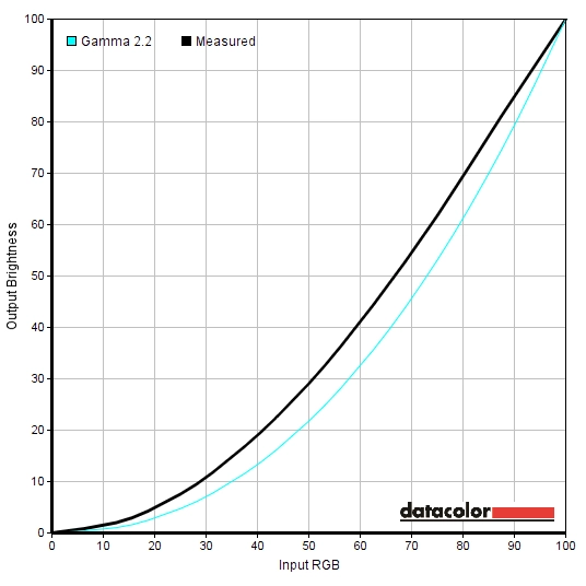
Gamma optimal OSD settings
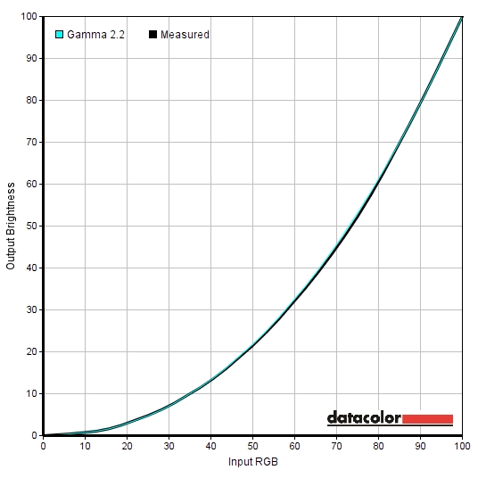
Gamma ICC profile
Optimal OSD settings
As noted above, the white point was very nicely balanced straight from the box. No manual adjustments were actually required to the colour channels of our unit, we simply had to change to the ‘User’ setting for ‘Color Temp.’ However; be aware of inter-unit variation and the fact that some units may require slight tweaks to the colour channels. ‘Gamma3’ was used as the highest gamma was obtained by using this setting, although there was still a lot of room for improvement as noted earlier. Brightness was hugely reduced compared to the default settings, too. Any setting not mentioned below was left at default. We’ve included the ‘Overdrive’ setting and refresh rate used here as well, just for reference.
Brightness= 0 (according to preferences and lighting) Gamma= Gamma3 Color Temp.= User R= 50 G= 50 B= 50 Refresh rate= 144Hz Overdrive= Light
Relaxing evening viewing
Some monitors have dedicated ‘Low Blue Light’ modes or a similar setting such as a ‘Reading’ or ‘Paper’ mode. This model does not have such a mode, therefore manual adjustments are required to significantly reduce blue light output and create a warmer, more relaxing and less stimulating image. The following settings are just an example of the sorts of adjustment you could make to achieve this.
We used these settings for our own viewing pleasure later in the evening but not for any of our testing. The ICC profile can be applied on top of this if preferred. Gamma= Gamma3 Color Temp.= User R= 50 G= 32 B= 25 Refresh rate= 144Hz Overdrive= Light
Brightness= 0 (according to preferences and lighting)
Test Settings (ICC profile)
As noted earlier it was not possible to get a particularly pleasing image using OSD adjustments alone on this monitor. The low gamma was a key thing hampering this, at 144Hz. The ICC profile below is specific to our unit and may not be optimal for all units. What it should do, however, is raise the gamma and create a richer look if you feel that is required. Because our unit was very well balanced in terms of white point, the colorimeter didn’t have to make significant adjustments to meet its 6500K target. You can therefore adjust colour channels if it is required on your unit without worrying that the ICC profile is counteracting your changes.
Although applications such as games don’t fully use ICC data, many games do respect the gamma table data from the ICC profile and therefore it can often improve the image significantly on monitors such as this. Given this fact, the ICC profile was applied for our testing. This is a bit off-piste for us, but we have engaged with numerous users who have tested this profile for us on their G2460PFs over a range of game titles prior to the publication of this review. There was a very positive response to the welcome difference made when using the ICC profile, so we felt it was appropriate to use it for our testing rather than persistently commenting on how ‘washed out’ the image looked. To make use of our profile do the following:
2) Set the monitor up according to the ‘Optimal OSD settings’, but feel free to adjust the brightness and colour channels if desired. Using a brightness of ‘0’ provided 162 cd/m² on our unit with the ICC profile applied.
3) This article provides instructions on how to activate the profile and also highlights some limitations to be aware of when gaming in particular. As noted, though, the vast majority of modern game titles will at least perform gamma correction based on the profile which is key for this monitor. Some titles deactivate the profile upon exiting back to Windows, in which case the ‘DisplayProfile’ utility mentioned there will come in handy for quick re-activation.
Contrast and brightness
Contrast ratios
A highly accurate light meter (KM CS-200) was used to measure the luminance of white and black on the screen using a range of settings. From these readings, static contrast ratios were calculated. This data is shown in the following table. Unless otherwise stated assume settings were left at default, with the exception of the ‘Test Settings’, ‘Relaxing evening viewing’ and ‘Calibrated Settings’. Blue highlights on the table indicate the results of these, whilst black highlights on the table indicate the highest white luminance, lowest black luminance and highest static contrast ratio recorded.
| Monitor Settings | White luminance (cd/m²) | Black luminance (cd/m²) | Contrast ratio (x:1) |
| 100% brightness | 356 | 0.35 | 1017 |
| 80% brightness | 318 | 0.31 | 1026 |
| 60% brightness | 279 | 0.27 | 1033 |
| 40% brightness | 238 | 0.23 | 1035 |
| 20% brightness | 197 | 0.19 | 1037 |
| 0% brightness | 154 | 0.15 | 1027 |
| Factory defaults (90% brightness) | 343 | 0.33 | 1039 |
| Gamma2 | 341 | 0.34 | 1003 |
| Gamma3 | 334 | 0.33 | 1012 |
| Gamma3 @60Hz | 333 | 0.32 | 1041 |
| Color Temp. = Normal | 341 | 0.35 | 974 |
| Color Temp. = User | 379 | 0.35 | 1083 |
| Optimal OSD settings | 162 | 0.16 | 1013 |
| Relaxing evening viewing | 103 | 0.15 | 687 |
| Test Settings | 162 | 0.16 | 1013 |
With brightness only adjusted, the average contrast ratio was a pretty decent 1029:1. The peak contrast ratio was recorded with ‘Color Temp.’ set to ‘User’ and all channels in their neutral ‘50’ position and gamma mode at the default ‘Gamma1’; 1083:1. The optimal OSD settings provided a slightly lower value (1013:1), possibly due to unlucky rounding and a little drop off due to changing the gamma mode. Following the application of our ICC profile on top of this the static contrast ratio remained unchanged at 1013:1. The fairly hefty changes made for the ‘Relaxing evening settings’ caused a significant drop in static contrast, to 687:1. The maximum luminance recorded was 379 cd/m², whilst the minimum white luminance was recorded as 154 cd/m² which is a fair bit higher than some users would want to use. This provides a fairly weak luminance adjustment range of 225 cd/m², with the fairly high minimum luminance being the main bone of contention for some users.
The monitor has a Dynamic Contrast mode called ‘DCR’ (Dynamic Contrast Ratio). You can’t access certain settings with this activated, such as brightness, contrast or gamma settings. This setting allows the backlight to adjust its intensity (the brightness control of the monitor) based on the relative level of ‘light’ or ‘dark’ on the screen. The dimming was effective where predominantly dark content was displayed, although mixed content tended to be uncomfortably bright. We personally prefer manual brightness adjustment, but this mode is there if you wish to try it out.
PWM (Pulse Width Modulation)
The G2460PF does not use PWM (Pulse Width Modulation) to regulate backlight brightness and instead uses DC (Direct Current) modulation. You can therefore consider the backlight to be ‘flicker-free’, which will come as welcome news to those who are sensitive to flickering or want to try to minimise eye fatigue. It also means that the monitor is free from ‘PWM artifacts’ during motion.
Luminance uniformity
Observing a black screen fill in a dark room revealed slight backlight bleed towards the bottom of the monitor. This was quite minor really and not something we feel was actually noticeable during normal use. It is worth bearing in mind that individual units can vary when it comes to all uniformity issues (including backlight bleed). Unlike on models with IPS-type panels, there is no ‘glow’ evident from a normal viewing position. If you view dark content from an angle on the monitor there is a slight silver or golden sheen, but this does not bloom out as obviously as on your typical IPS-type panel. The image below shows how black appeared in a dark room on the monitor.

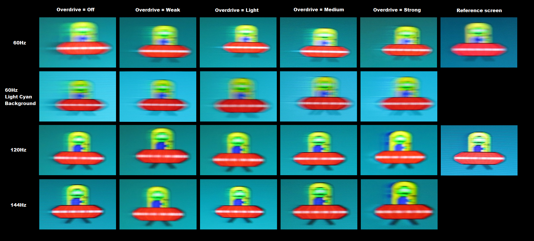
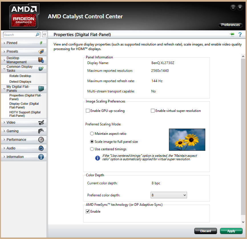
We used the Spyder5ELITE colorimeter to assess the uniformity of lighter colours, which were represented by 9 equidistant white quadrants running from the top left to bottom right of the screen. The below table gives the luminance recorded at each quadrant as well as the deviation between a given quadrant and the brightest quadrant. The luminance uniformity of the screen was quite good overall. The brightest point recorded was ‘quadrant 5’ in the centre of the screen (165.3 cd/m²). The greatest deviation from this occurred at ‘quadrant 8’ below centre (148.2 cd/m² which is 12% dimmer). ‘Quadrant 1’ and ‘quadrant 2’ also deviated 12% from the central bright point, whilst 4 of the remaining 5 quadrants were 10% dimmer than centre. The remaining point, ‘quadrant 7’ towards the bottom right, was just 4% dimmer than centre at 158.7 cd/m². It is worth noting that individual units vary when it comes to uniformity and that the viewing angle limitations of the panel mean that perceived luminance varies somewhat depending on which point of the screen you’re looking at. The contour map below represents these deviations graphically, with darker greys representing lower luminance (greater deviation) than lighter greys. Due to the aforementioned viewing angle limitations, we will not be providing any analysis of colour temperature uniformity using a colorimeter. The perceived variation in colour temperature, even from a normal viewing position, would not be reflected by these readings and therefore they would be highly misleading. The contrast performance on Battlefield 4 (BF4) was quite good overall. Bright elements contrasted reasonably well with their darker surrounding and there was no peripheral ‘IPS glow’ or anything of that nature. The level of detail in dark and shaded areas was excellent, but actually appeared to be aided ‘artificially’. We have seen this behaviour to some extent universally on models which use this same panel, whereby many near-black shades appear lighter than they should. This reveals unintended detail and affects the atmosphere in dark areas, creating a slightly blocky or ‘oil slick’ appearance for these shades displayed lighter than they should rather than a blended appearance. This was most pronounced towards the bottom of the screen where the gamma is lowest, although overall was not as extensive as we’ve seen on some models using this panel. Some shades affected by this also took on a bit of a green cast from the ICC profile, as noted in the Lagom section. At the high-end the medium matte screen surface created a bit of a grainy appearance which was most noticeable on the lightest shades, such as white. This isn’t something that all users would notice or find bothersome, just something to bear in mind. Dirt Rally again highlighted decent contrast overall with strong (but artificially enhanced) low-end visibility. Shadows areas around vegetation, for example, didn’t look as deep and atmospheric as it should. The underside of wheel arches and the inside of the car also had some unintended detail revealed, giving an ‘oil slick’ look in places with blocks of lighter than intended colour rather than a smooth blended appearance. This was not too extreme, though, particularly towards the centre and top of the monitor. There was certainly no noticeable loss of detail in such areas. Bright elements looked slightly grainy but stood out well in absolute darkness (for example at night). There was no ‘IPS glow’ or anything of that nature to weaken the detail levels peripherally, either. We usually round this section off by looking at the contrast performance in the Blu-ray of Skyfall. Unfortunately we were having some issues with our Blu-ray drive and were unable to test this. Lagom’s test for contrast were used to more closely analyse strengths and weaknesses in contrast performance. The following observations were made. The AOC G2460PF’s colour gamut (red triangle) was compared to the sRGB reference colour space (green triangle), as shown below. You can see that the coverage of the sRGB colour space is rather comprehensive. There is just a tiny sliver of under-coverage and actually a bit of over-coverage in the green corner of this diagram. This allows the monitor to display some shades with a little extra vibrancy but staying quite faithful to the sRGB colour space really. Colours were mainly displayed in quite a rich fashion on BF4. The vibrancy was held back somewhat by the screen surface and colour gamut, but the overall representation of colours was fairly vivid. Fortunately the ICC profile’s gamma correction worked on this title, preventing things looking ‘washed out’. There were some quite lush greens as well as good muted green shades, giving vegetation and the natural game environments quite a natural look. As noted in the calibration section, there is a weakening of saturation further down the screen due to the viewing angle behaviour of the panel. This meant that many shades appeared weaker towards the bottom of the screen – lush greens appeared somewhat faded and rich brown earth appeared a more clay-like colour, for example. There were some quite vibrant-looking shades such as rich orange flames and bright neon lights to admire as well. Dirt Rally told a similar story, with the ICC profile’s gamma table respected and therefore most shades appearing quite rich overall rather than ‘washed out’. There was again weakening saturation further down the screen and a bit too much depth further up the screen. This meant that shades were not represented consistently, and indeed some shades that are supposed to be darker than others can actually appear lighter depending on where on the screen those shades are displayed. And vice-versa. It also means that subtle variations of shades (such as greens and browns in the environment) are not represented distinctly. Moving on from panel type restrictions, there were some good and fairly vibrant pinks, greens and yellows (amongst others) displayed for the car liveries. The corrections made to gamma in the ICC profile certainly helped in this respect. We also observed the colour reproduction characteristics of the monitor on Warframe. In its ‘Borderless Fullscreen’ setting, the gamma table of the ICC profile was respected. Unfortunately FreeSync currently requires that an application is running in exclusive ‘Fullscreen’, and doing so causes the ICC profile to be ignored. Given this, many shades appeared less saturated than they should, except perhaps at the very top of the screen (which we don’t spend much time looking at whilst playing this game). The deep red health orb, for example, looked anaemic whilst the deep blue health orb appeared an icy blue instead. The game didn’t look completely flooded and washed out, though, and there were still some fairly nice neon-looking cyans and bright blues and brilliant pinks. Unfortunately we couldn’t assess the colour performance in our usual Blu-ray test titles, as we were having some issues with our Blu-ray drive and were unable to test these. Lagom’s tests for viewing angle tests were used to more closely analyse the concept of colour consistency and viewing angle weaknesses. The following observations were made from a normal viewing position with eyes around 70cm from the screen. We used a SMTT 2.0, a small testing tool, alongside a sensitive camera, to compare the latency of the G2460PF with a range of monitors with known latency. Over 30 repeat readings were taken to maximise accuracy. Using this method, we measured 3.66ms (just over ½ a frame at 144Hz) of input lag. This value includes both the element of input lag you see (pixel responsiveness) and that you feel (signal delay) and indicates a very low signal delay that shouldn’t bother even sensitive users. In this article we take a detailed look at some key concepts related to monitor responsiveness. One of the most important take-home messages in that article is that what you see on a monitor is not just dictated by what the monitor itself is doing (i.e. the pixel responses) but also the movement of your eye as it tracks motion on the screen. This motion is actually a key contributor to perceived motion blur, generally more influential than the pixel responses on a modern monitor in fact. There is a specialist method of photography called ‘pursuit photography’ introduced in the article. This can capture not only what the monitors pixels are doing but also reflects the blur induced by eye movement. The following images are pursuit photographs taken using the UFO Motion Test for ghosting, with the test running at 960 pixels per second. This proved a practical speed for these photographs to be taken and showed all of the key elements that constitute perceived blur on a monitor. Note that the interlacing lines on some shots are moire from camera and not visible when viewing the monitor. The ‘medium cyan’ background was used for all but the second row of photos, where a ‘light cyan’ background was used. A range of refresh rates (60Hz, 120Hz and 144Hz) and ‘Overdrive’ settings were used (Off, Weak, Light, Medium and strong). The final column shows reference monitor that is able to perform its pixel transitions fast enough so that they do not become a limiting factor. This is a Samsung S27A750D set to full brightness (this eliminates PWM) and using its optimal response time setting for the respective resolution (60Hz and 120Hz). Note that the ‘light cyan’ background was only used at 60Hz but not higher refresh rates because it showed some interesting differences there. At higher refresh rates performance for both the ‘medium’ and ‘light’ cyan backgrounds was quite comparable. At 60Hz you can see a distinct trail behind the object that is not visible on the reference screen using ‘Overdrive = Off’. This is trailing from slower than optimal pixel responses. With the ‘Weak’ setting this trailing became fainter. It isn’t obvious in this image, but this is actually formed by a bit of overshoot (inverse ghosting) from strong grey to grey acceleration rather than conventional trailing caused by slower than optimal pixel responses. This trail is quite similar using the ‘Light’ setting and the ‘Medium’ setting, perhaps becoming a bit stronger progressively. The difference looks more pronounced in the shots given the presence of moire for the ‘Light’ and ‘Medium’ captures but not the ‘Weak’ capture – so apologies for that. Using the ‘Strong’ setting the overshoot becomes much stronger, with an obvious ‘halo’ effect from inverse ghosting behind the UFO. At 60Hz with the ‘light cyan’ background, things are quite comparable with ‘Overdrive = Off’ to the ‘medium cyan’ background. Using the ‘Weak’ there is a fair degree of overshoot visible. This remains very similar using the ‘Light’ setting, although perhaps appears a little less obvious in the image due to colour tone. With the ‘Medium’ setting it becomes somewhat stronger and with the ‘Strong’ setting stronger still. The interesting difference between the ‘medium’ and ‘light’ cyan backgrounds here is really that the overshoot is a bit more pronounced, or indeed that it’s more obviously overshoot rather than conventional trailing. At 120Hz you can see that the object itself is sharper (less blurred), reflecting the lower levels of perceived blur you would see now the refresh rate is higher. With the ‘Off’ setting there is a bit of trailing due to slower than optimal pixel responses. Setting the overdrive to ‘Weak’, ‘Light’ or ‘Medium’ yields similar results at this refresh rate. You can see a relatively faint trail behind the object, which again is mild overshoot rather than conventional trailing. It’s fainter than it is at 60Hz, especially when considering the red body of the UFO. With the ‘Strong’ setting there is extremely obvious overshoot, with the trail appearing either a bright blue (behind the body) or dark blue (behind the cockpit area) as different transitions are being performed. There are actually multiple overshoot trails here if you look carefully. Results at 144Hz were very similar to at 120Hz. Things are perhaps just a touch sharper as there is marginally less perceived blur, but really it’s a minor factor due to the relatively close refresh rates. The benefit here is certainly less significant than when comparing 120Hz or 144Hz to 60Hz. This analysis reveals some interesting points to note about the pixel response behaviour of the monitor. At 60Hz the overshoot is generally more noticeable, particularly where the background is relatively light in shade. The ‘Weak’, ‘Light’ and ‘Medium’ settings seem very much comparable to one another at 120Hz and 144Hz, but the overshoot is perhaps a touch stronger on the ‘light cyan’ background using the ‘Medium’ setting. When considering a broader range of transitions and using the monitor in the real world (i.e. when gaming) it becomes quite obvious that the ‘Light’ setting is preferable to ‘Medium’ due to the reduced overshoot at lower refresh rates. It does not seem to suffer from being ‘slower’ in any appreciable way, either. The ‘Weak’ setting meanwhile seems very similar to ‘Light’ aside from adding a little bit of conventional trailing here and there. It is not exactly the clearest cut choice, but we opted for ‘Light’ due to it seeming to be the best optimised overall. Where the frame rate of the game was in keeping with the 144Hz refresh rate of the monitor, the experience was very smooth and fluid on BF4. The connectedness to the game world was very strong, with the monitor seeming to respond very swiftly to user input. The level of motion blur at high frame rates was significantly reduced compared to on a 60Hz monitor as well, with the refresh rate and frame rate combination making tracking and engaging enemies to be that much easier. The game world and things moving about within it simply remained much sharper in comparison. The overshoot (inverse ghosting) observed in the previous section was there and fairly ubiquitous, but also quite faint on the whole. Some of the more obvious examples of this included dark objects with much brighter shades in the background, for example a dark metal gun turret on a vehicle with white clouds in the background. This contrast allowed the overshoot trail to be relatively visible, although it was still not particularly strong. Because the overshoot at 144Hz is generally fairly innocuous it should not be a problem for most users whilst they’re actually playing the game. The overall fluidity and lack of motion blur was far more noticeable, which this slight overshoot didn’t really detract from. Certainly compared to BenQ’s XL Series monitors running ‘AMA High’, for example, this was more subtle. Dirt Rally also highlighted similar strengths and weaknesses in the response performance. The genre of game, at least at the level we play at, didn’t really benefit so much from the more connected feel provided by the high refresh rate and frame rate. The level of motion blur was greatly reduced at high frame rates (ideally matching the refresh rate), however. This meant that there was less blur during cornering in particular and the track was easier to focus on – something more capable players of this genre might appreciate. There was again widespread but quite faint overshoot, something that was not obvious enough to detract from the gameplay and was only really noticeable when you look out for it. Individual sensitivity to such things varies, but it’s a safe bet that most users will find this quite inconsequential at 144Hz and will still be able to appreciate the fluidity offered by the monitor. AMD FreeSync is a variable refresh rate technology which we touch upon in the ‘Variable refresh rate’ section of this article. As with Nvidia G-SYNC, the idea here is to adjust the refresh rate of the monitor ‘on the fly’ to try to match the frame rate of the content. Both the responsiveness article and ‘G-SYNC’ article explain the importance of matching the frame rate and refresh rate, so we won’t go into detail about that. Essentially it’s important to eliminate tearing and juddering (VSync off) or stuttering (VSync on) that occurs due to misalignment between the frame rate of the content and refresh rate of the monitor. Compared to enabling VSync there is a reduction in latency in these fluid variable refresh rate environments as well, but unfortunately we don’t have an accurate way to measure this difference. The technologies have a similar goal in mind, but go about achieving it differently. Whereas G-SYNC uses a proprietary ‘G-SYNC board’, that replaces the scaler and assistive electronics of the monitor, FreeSync makes use of ‘VESA Adaptive-Sync’. Adaptive-Sync is a capability integrated into some DP port controllers as an optional extension of DP 1.2a (sometimes dubbed ‘DP 1.2a+’). This enables variable refresh rate technology such as AMD FreeSync to be used. The key advantage to this over G-SYNC is that it reduces the cost to the monitor manufacturer and hence the end user. It also allows the manufacturer to have their usual OSD settings and port selection without Nvidia dictating this. The advantage of G-SYNC is that Nvidia have tighter control of the image setup and pixel overdrive implementation and ensure consistency throughout the refresh rate range. Furthermore, G-SYNC also has an interesting addition that The AOC G2460PF uses DP 1.2a with support for Adaptive-Sync and therefore supports AMD FreeSync. This requires a compatible GPU – there are some compatible models listed here, but it’s expected future GPUs from the company will also support this automatically. We are using a Club3D Radeon R9 290 royalAce for the purposes of this review. When you connect a compatible GPU to the monitor for the first time you are actually notified that you’re using a FreeSync-capable display and should enable the technology. To do this simply open CCC and navigate to ‘My Digital Flat-Panels – Properties (Digital Flat-Panel)’, ensure the checkbox at the bottom of the page is ticked and then press ‘Apply’. This page and checkbox is shown in the image below. Note that the FreeSync operating range for the monitor is 35 – 144Hz. You must ensure you’re using the new driver, available to download from AOC’s website, otherwise you’ll be stuck with a 48Hz lower limit. Some users have reported issues with the FreeSync range even after installing that driver, so alternatively you can use this beta driver that was provided to us during the review. The GPU will respect your choice of ‘VSync off’ or ‘VSync on’ in the graphics driver, too. If you’ve got ‘VSync off’ you’ll get tearing or juddering below 35fps and above 144fps. If you’ve got ‘VSync on’ then you’ll get stuttering if the frame rate dips below 35fps and the usual VSync latency if the frame rate tries to rise above 144fps. Because this is not a WHQL-signed driver, you’ll need to disable driver signature enforcement to install it. Advice on how to do this on Windows 8.1 and Windows 10 can be found here. Once you’ve got this disabled as advised, navigate to ‘Control Panel – System and Security – System – Device Manager’. Find the monitor, which should be listed as ‘Generic PnP Monitor’ (or alternatively with the correct name if you’ve already installed the official driver) and double click this. Go to the ‘Driver’ tab, press ‘Update Driver…’ and locate the .inf file from the beta. Restart the computer and you should be good to go. On BF4 the game frequently dropped below 144fps (and indeed fairly often below 120fps as well) on our system. This was using fairly modest settings, not whacking everything up to ‘Ultra’. Without FreeSync enabled there was obvious stuttering (VSync on) or tearing and juddering (VSync off) as soon as the frame rate departed even slightly from the frame rate. Contrary to what some believe, enabling triple buffering does not remove this stuttering with VSync on – it can certainly help, but to us there is an obvious difference when the frame rate is laser locked to the refresh rate or when it departs from this even slightly. With FreeSync enabled these drops did not cause such effects and you were left with a much smoother and more playable experience. There can still be the occasional stuttering from other unrelated factors (memory issues, network latency etc.) but it made these slight drops in frame rate far more palatable. As frame rate dropped further, which happened rarely on this title with the settings we were using, you don’t get any additional stuttering or tearing or anything like that with FreeSync enabled. But you do start to lose the benefits of the higher frame rates. One of the best ways of consistently hitting the frame rate hard in this title is to pump up the ‘resolution scale’ slider value so that the GPU has to work (potentially a lot) harder. Perceived blur increases and you can also start to observe more obvious overshoot issues as explored previously. Remember that at high frame rates (refresh rates) there is fairly widespread overshoot, but it appears as a faint trail that is generally a bit darker than the blend of the shade of the object. At lower frame rates (refresh rates) it appeared as a bright (halo) trail that is a fair bit brighter than either shade involved in the transition. If you move your character or viewpoint so that dark leaves of a tree are moving against a bright medium blue sky, for example, you would see this bright inverse ghosting trail as a sort of outline behind the leaves. This becomes increasingly bright and obvious as frame rate falls further, standing out reasonably well at 60fps and becoming rather obvious by 40fps. On The Elder Scrolls Online (ESO), the frame rate generally fluctuated between 50fps and 100fps using the settings we like to use, but usually sat above 70fps. The game has a built-in 100fps cap, without any game file tweaks being applied, so this explains the upper limit. Without FreeSync the game would feel very smooth and fluid in less graphically intensive areas, such as indoors, where it could quite consistently run at 100fps. As soon as the pace of the action increased and the framerate fell at all below this there would be obvious tearing or stuttering. With FreeSync, the drops below this are much less noticeable – especially if the frame rate remains reasonably high (80fps+ for example). At times where the action really intensified the frame rate dropped further, sometimes coming quite close to the FreeSync floor of 35fps but very rarely dropping below this (and only momentarily if so). Again, FreeSync does not make low frame rates feel like high frame rates and there is still the associated increase in blur and a less connected feel in comparison. But the fluctuations are much less jarring than with the technology disabled. The aforementioned increase in overshoot also came into play at such frame rates, but we still feel this was preferable to setting the monitor to 100Hz+ without FreeSync. We could go on to talk about various other titles and our experience with FreeSync, but really we’d just be repeating ourselves. It is undoubtedly a nice addition to the monitor. It allows you to have a nice level of smoothness and fluidity without interruption from tearing and stuttering, without having to sacrifice image quality such that your frame rate consistently matches the refresh rate. It’s certainly best if you can keep the frame rate as high as possible (low frame rates are still low frame rates), but these drops are still much less jarring than without the technology enabled. We also observed increasingly obvious overshoot as frame rate fell. This won’t bother all users but it would be nicer if it wasn’t there, particularly as there are no such issues if you leave the monitor at a high refresh rate such as 144Hz without FreeSync. This isn’t an issue with FreeSync itself, but rather how the pixel overdrive works on the monitor at lower refresh rates such as 60Hz and below. Having tested quite a number of 24” 144Hz monitors, we know that providing a nice image ‘out of the box’ is not to be expected. We also know that, more often than not, you can improve the image with the right OSD tweaks – but will often need to go beyond that to get the best from the monitor. The AOC G2460PF did not buck this general trend, providing (centrally recorded) gamma that was simply too low regardless of the settings used in the OSD. We were able to improve the overall image representation significantly by fully calibrating with an ICC profile; something that isn’t really ideal for a gaming monitor. The image looked richer on the whole and far more pleasing. However; the usual TN issues remained regardless, most notably inconsistent colour reproduction with weakening saturation further down the monitor even from a normal seated viewing position. So having established colour reproduction was not really the strong point of this monitor, particularly without intervention by an ICC profile, we move onto contrast. This was much as expected from the panel used. The static contrast was decent, whilst there was no ‘IPS glow’ or anything of that nature to worry about. The monitor was therefore able to do a decent job at creating reasonably atmospheric dark scenes. There was some artificial detail enhancement going on that is very common indeed on all models that use this specific panel, though, which sapped this atmosphere a bit in places by revealing unintended detail. When it came to the responsiveness the news was certainly better – but not perfect. The monitor was able to provide a good fluid experience at high frame rates, thanks to its 144Hz refresh rate. The pixel overdrive implementation was a bit flaky. It generally worked well at higher refresh rates, with only minor and rather inconspicuous overshoot and no conspicuous conventional trailing using the right ‘Overdrive’ setting. Meanwhile the very low input lag and simply the high refresh rate itself gave a really nice ‘connected feel’ to gaming that competitive gamers in particular will love. At lower refresh rates (60Hz for example) the overshoot became more conspicuous. Not to horrendous levels that will make users want to claw their own eyes out, but certainly to a level that is more noticeable than at high refresh rates. And this persisted regardless of the ‘Overdrive’ setting – unless of course you turned it off entirely, which then produced significantly conventional trailing instead. The saving grace for this monitor and indeed its major selling point is the inclusion of AMD FreeSync variable refresh rate technology. We can’t deny that this was a significant bonus that improved the playability massively in those common situations where frame rate starts to fall below the refresh rate of the monitor. What this technology does not do is make low frame rates feel like frame rates – you need the highest possible frame rates to benefit most from reduced motion blur and the ‘connected feel’ when gaming. But it’s certainly nice not having the experience interrupted by the usual stuttering or tearing that accompanies refresh rate and frame rate mismatches, right the way down to 35Hz. The aforementioned issue with overshoot at lower refresh rates also came into play with FreeSync enabled, as the monitor uses those lower refresh rates dynamically when the frame rate creeps down. We still feel that having FreeSync enabled is of great benefit, overall, which outweighs this imperfect overdrive implementation. The bottom line; this monitor has its fair share of problems. But it is a fairly inexpensive entry into the world of FreeSync that provides a fluid and generally enjoyable gaming experience.
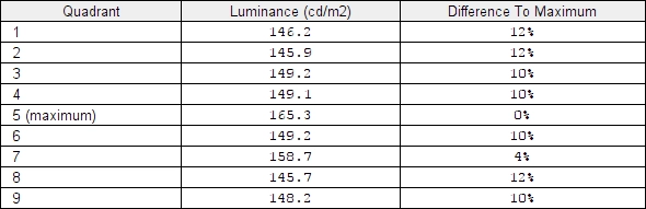
Luminance uniformity table
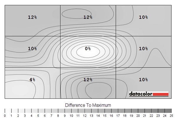
Luminance uniformity map
Contrast in games and movies
Lagom contrast tests
Colour reproduction
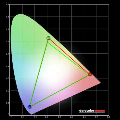
Colour gamut
Colour gamut test settings
Colour in games and movies
Viewing angles
The video below shows how this text test appears from a variety of off-centre viewing angles. It also shows a mixed and dark desktop background from a range of viewing angles. Note for the dark background there is a silvery grey or golden sheen that blooms out from various viewing angles, as noted earlier in the review. This is not visible from a normal viewing position, unlike ‘IPS glow’ and is not as strong.
Responsiveness
Input lag
Perceived blur (pursuit photography)
Responsiveness in games and movies
FreeSync – the technology and activating it
FreeSync currently lacks (added feature of the new ‘Radeon Software Crimson’ suite called ‘Low Frame Rate Compensation’) that can help to minimise stuttering below the floor of operation. It is able to set the refresh rate to a multiple of the frame rate if the actual frame rate drops below the floor of G-SYNC operating. So if the frame rate was 20fps, for example, the monitor would set itself to 40Hz so that the frame rate divides into it evenly. Regardless of this, low frame rates are still low frame rates as we explore below.
FreeSync – the experience
Conclusion
Positives Negatives Excellent colour channel balance for 6500K white point on our unit and reasonable colour representation following a full calibration
Obvious gamma issues requiring an ICC profile to correct properly, which isn’t ideal. The usual TN colour inconsistencies, including weakening saturation further down the screen
Decent static contrast and no ‘IPS glow’ or anything of that nature to worry about Minimum luminance will be too high for some users and the screen surface is fairly grainy 144Hz refresh rate and FreeSync technology provided a good fluid gaming experience – there was no real input lag to speak of and the pixel responses were snappy
Some overshoot, particularly at lower refresh rates – including when FreeSync is active and the frame rate drops to around 60Hz or below
The price is not to be sniffed at for a monitor that supports FreeSync – and the stand offers good ergonomic flexibility
We know not everyone is a fan of the red stripe on the bottom bezel, even though it is quite easy to ignore during normal use of the monitor
